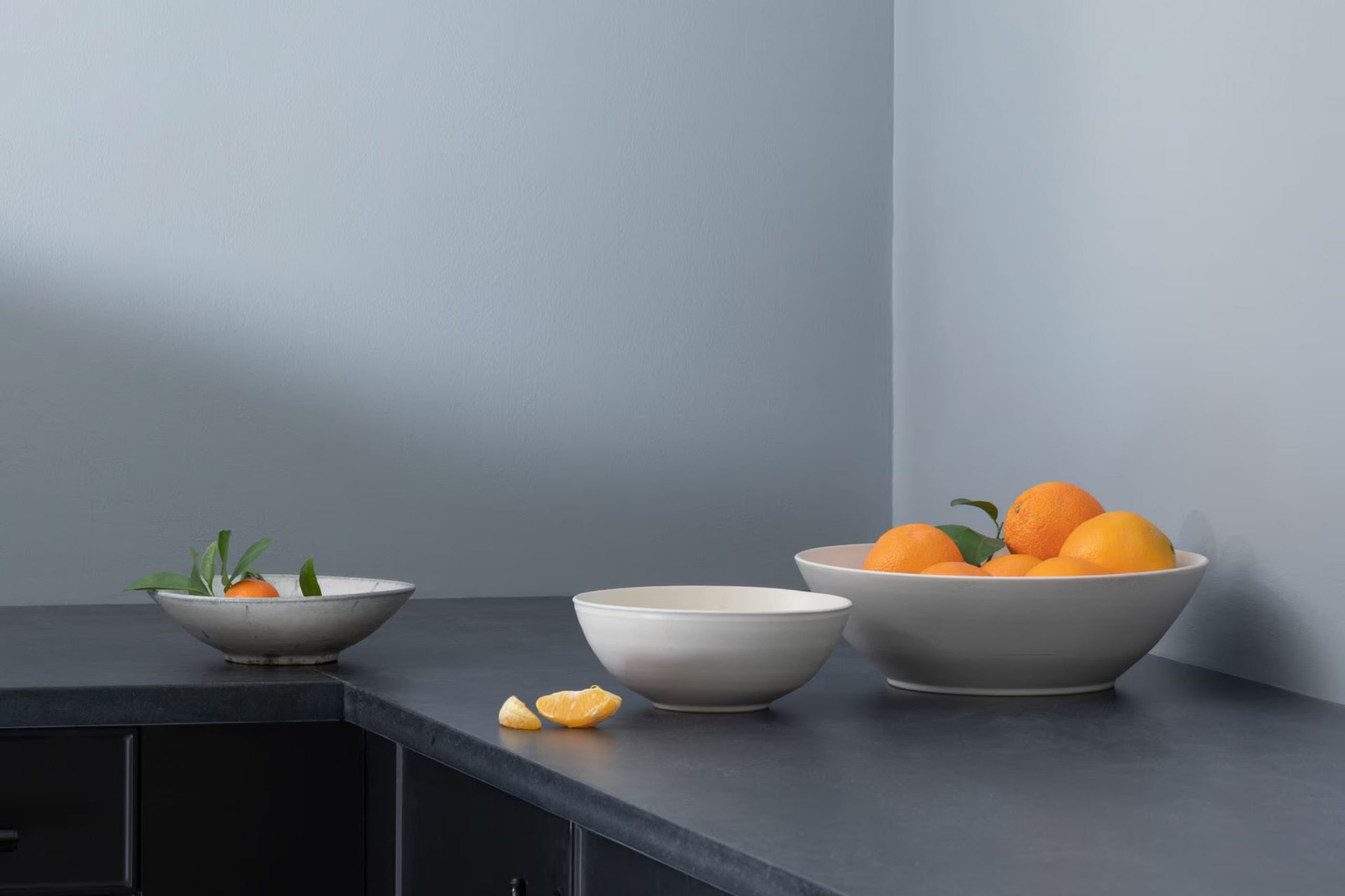
If you’re thinking about refreshing your room with a new paint color, Benjamin Moore’s 2127-60 Feather Gray might just be what you need. I recently decided to give my living room a makeover and was searching for a color that could provide a fresh, modern look without being too intense.
Feather Gray stood out as a calming and adaptable option. This soft gray has a touch of blue undertone that brings a gentle sense of ease to any room, making it feel cozy yet airy. It pairs wonderfully with a wide range of decor styles, from minimalist to eclectic, enhancing existing furnishings and accent pieces with its subtle beauty.
Whether you’re looking to update a single room or planning a larger renovation, Feather Gray offers a lovely backdrop that works well with various textures and finishes.
I found that it works particularly well in rooms that get a lot of natural light, as the color seems to shift subtly throughout the day, adding dynamic interest to the room.
What Color Is Feather Gray 2127-60 by Benjamin Moore?
Feather Gray 2127-60 by Benjamin Moore is a soft, gentle gray with hints of blue that can create a calming atmosphere in any room. Its light, airy feel makes it flexible enough to be used in a variety of settings, from modern to traditional. This color pairs beautifully with crisp whites or deeper blues, making it an ideal choice for creating a fresh, cohesive look.
In terms of interior styles, Feather Gray works wonderfully in minimalist and Scandinavian-inspired rooms due to its clean and understated hue. It also fits well in coastal-themed rooms, where its cool undertones can complement light woods and sandy colors to mimic the beachy vibe.
When considering materials, Feather Gray coordinates well with natural textures such as linen, wool, and unfinished wood. These materials help to warm up the coolness of the gray, providing a balanced and inviting environment. Metallic finishes like brushed silver or nickel can also complement this color, adding a touch of modern elegance without overpowering the subtlety of the shade.
Overall, Feather Gray is a flexible choice that can help create a relaxed and inviting room in your home, pairing well with both bold and muted accents to suit your personal style preferences.
Is Feather Gray 2127-60 by Benjamin Moore Warm or Cool color?
Feather Gray is a subtle and flexible shade from Benjamin Moore. Its light gray tone creates a calm and welcoming atmosphere in any room. This color works particularly well in homes because it pairs easily with many other colors and styles of decor, acting almost as a refined neutral.
Since it’s a muted color, it helps make small rooms appear bigger and brighter while providing a cozy backdrop that doesn’t feel too strong. It’s appealing in living rooms, bedrooms, and even kitchens, enhancing the natural light or blending smoothly with artificial lighting to maintain a warm ambiance.
Homeowners looking for a color that can stay relevant across various trends typically find Feather Gray a lasting choice. Its enduring appeal means it complements both contemporary and traditional furnishings effectively. Whether used on walls, trim, or cabinets, this color ensures a smooth and finished look that feels homely and put together.
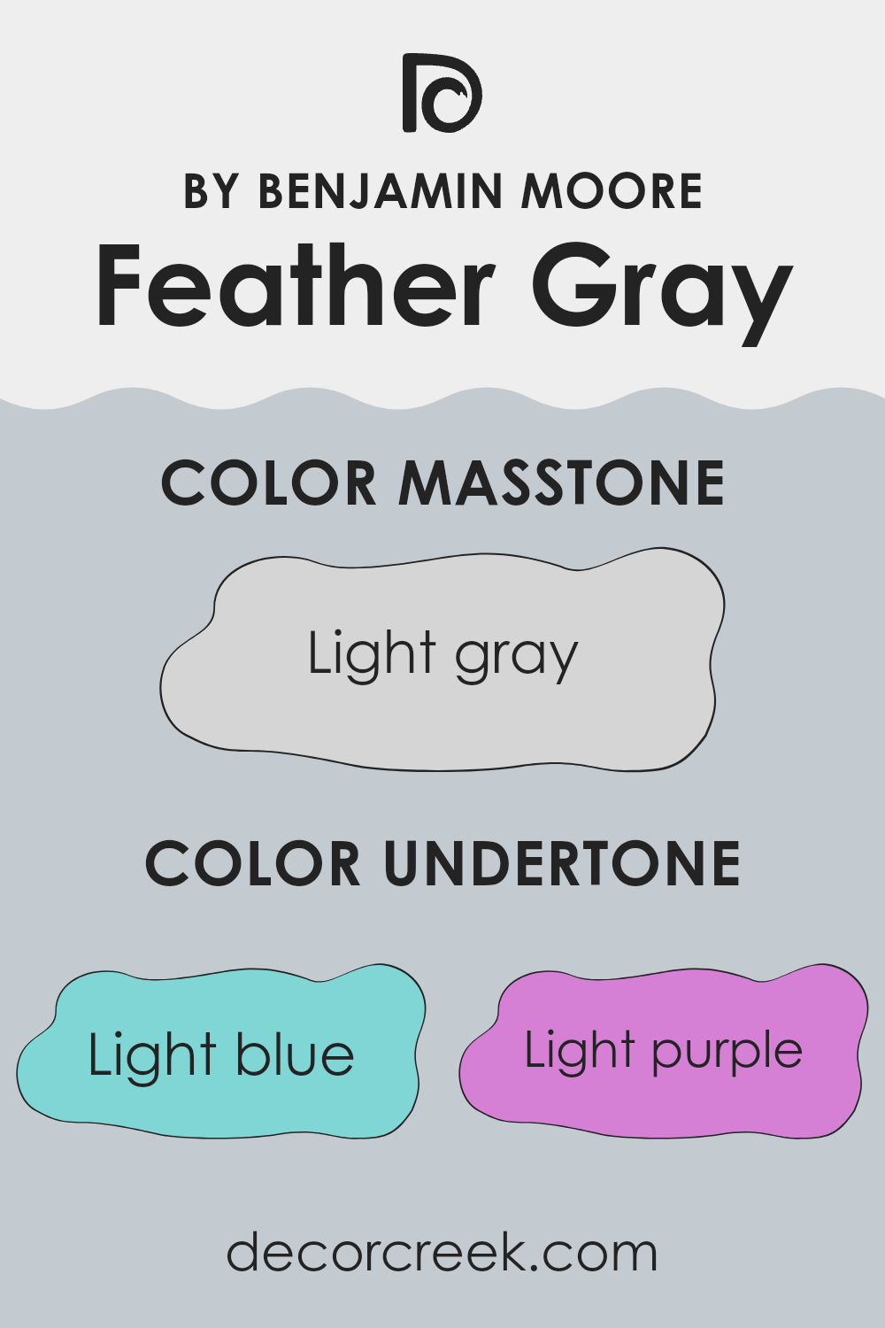
Undertones of Feather Gray 2127-60 by Benjamin Moore
Feather Gray is a flexible paint color that appears neutral but has subtle undertones that can significantly influence how it looks in different settings. These undertones include light blue, light purple, pale yellow, lilac, mint, pale pink, and grey. Each of these undertones can gently shift the main color’s appearance depending on the lighting and surrounding colors.
For example, the light blue and mint undertones can give a cooler feel to a room, making it seem more refreshing and airy. This is particularly noticeable in rooms that receive a lot of natural light. On the other hand, lilac and light purple can add a faintly warm and gentle vibe, which might be more noticeable in artificial lighting or during the evening.
Pale yellow undertones can make Feather Gray appear softer and slightly warmer, which could make a room feel more welcoming and cozy. Alternatively, pale pink undertones might bring in a soft warmth that makes the room feel more human and layered without flooding it with color.
Lastly, the grey undertone in Feather Gray ensures that despite its complexity, the color maintains a grounded and neutral appearance. This makes it an excellent choice for interior walls as it provides a subtle, adaptable backdrop that can complement many types of furniture and decor styles.
Using Feather Gray on interior walls can, therefore, slightly change the perception of the room based on its mix of undertones. This color is ideal for those who want a bit of depth in their neutral choice, capable of working well with different decor elements while gently shifting moods depending on the light and surrounding colors.
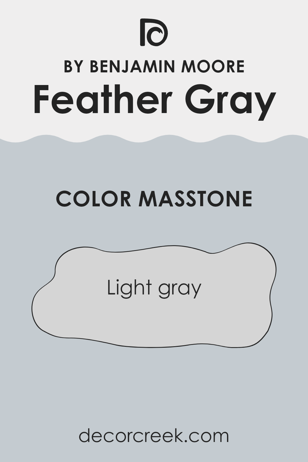
What is the Masstone of the Feather Gray 2127-60 by Benjamin Moore?
Feather Gray 2127-60 by Benjamin Moore is a light gray color that provides a fresh, clean look in any room. Its neutral tone makes it extremely flexible, allowing it to pair well with many other colors.
This shade of gray can help rooms feel brighter and more open, making it a fantastic choice for small rooms or areas with limited natural light. Feather Gray can be used as a main wall color for a subtle, yet effective background, or as an accent to offset stronger colors.
It’s particularly effective in modern and minimalist home decor styles due to its simple and understated nature. As it doesn’t dominate the room, it also allows furniture and artwork to stand out. Overall, this light gray color works well in homes because it creates a calm and inviting atmosphere without feeling too intense.
How Does Lighting Affect Feather Gray 2127-60 by Benjamin Moore?
Lighting plays a crucial role in how colors appear in any room. Different light sources can dramatically alter the perception of color, making it important to consider the lighting conditions in a room when choosing paint colors.
Feather Gray by Benjamin Moore is a flexible color that reacts interestingly under various lighting conditions. In artificial light, such as that provided by incandescent or LED bulbs, Feather Gray tends to warm up, bringing out subtle, cozy tones that can make a room feel more inviting. This is particularly beneficial in living areas or bedrooms where a sense of comfort is desirable.
In natural light, the influence on Feather Gray varies depending on the direction of the light. In rooms that face north, which typically receive less direct sunlight, this color can appear slightly cooler and more neutral, making it a good choice for creating a calm and steady ambiance. It doesn’t become too dark, maintaining a balanced hue throughout the day.
Rooms that face south benefit from abundant sunlight, which can brighten Feather Gray, highlighting its warm undertones. In such rooms, the color can help enhance the light, making the room feel airy and more open. It’s an excellent choice for areas used frequently during the day like kitchens or living rooms.
In east-facing rooms, Feather Gray will change as the day progresses. It looks softer and cooler in the morning light, and becomes warmer and brighter as the day goes on. This makes it a dynamic choice that adjusts with the time, suitable for areas used mainly in the morning and afternoon.
West-facing rooms will have a different effect; as the intense afternoon sun hits, the warm tones in Feather Gray can become more noticeable, creating a cozy, welcoming feel toward the evening. This is ideal for dining rooms or areas used predominantly in the afternoon and evening.
Overall, Feather Gray is a flexible color that adapts well under different lighting conditions, effectively complementing various room orientations and lighting setups.
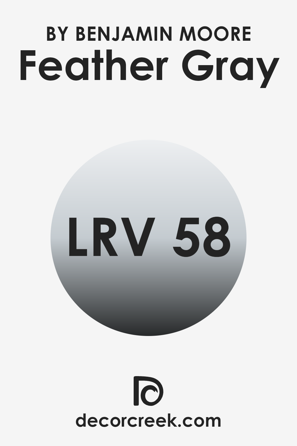
What is the LRV of Feather Gray 2127-60 by Benjamin Moore?
LRV, or Light Reflectance Value, is a measure used to determine how much light a paint color reflects. Rated on a scale from 1 to exactly one higher than 99, LRV helps in understanding how light or dark a color will look once it is applied to a wall.
A higher number indicates that the color reflects more light, making it appear lighter, while a lower number means it absorbs more light, appearing darker. This measurement is crucial when choosing paint colors because it impacts the brightness of a room and how open it feels.
The LRV for Feather Gray is 58.3, which places it in the mid-range of the scale. This means it neither reflects light excessively nor absorbs too much. In practical terms, Feather Gray can add a nice balance in rooms that are not overly large or brightly lit, as it won’t make the room feel cramped or dim.
Its light-reflecting properties are moderate, so it maintains a consistent appearance under different lighting conditions. This makes Feather Gray flexible, suitable for various settings without causing dramatic changes in visual perception as lighting conditions change throughout the day.
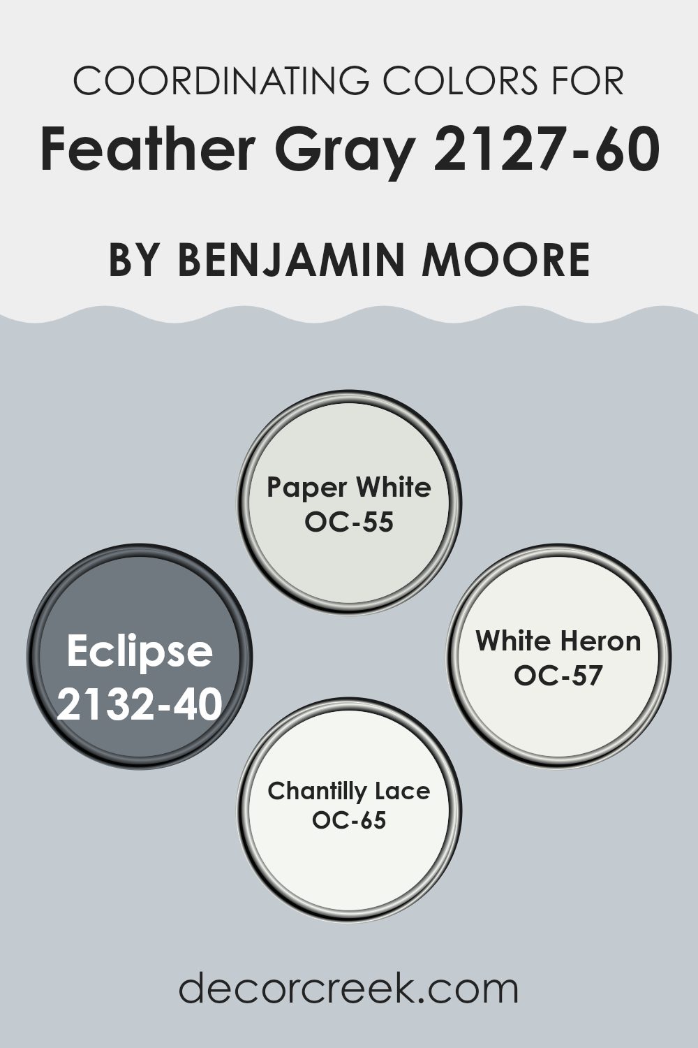
Coordinating Colors of Feather Gray 2127-60 by Benjamin Moore
Coordinating colors are hues that complement each other and help create a balanced and harmonious look in any given room. When chosen carefully, coordinating colors can enhance the atmosphere of a room, making it feel more connected and visually pleasing. For example, when pairing coordinating colors with Benjamin Moore’s Feather Gray (2127-60), a muted gray shade, it’s essential to select colors that add contrast or maintain a soft, seamless flow within the design.
One of the coordinating colors for Feather Gray is OC-55 Paper White, a clean and crisp white that provides a fresh look when used alongside the deeper tones of gray. It’s an excellent choice for trim or ceilings to create a bright and airy feel. Another matching shade is 2132-40 Eclipse, a deep navy that offers a striking contrast to Feather Gray, ideal for accent walls or furniture to add a bold pop to a room.
OC-57 White Heron is another white with a slightly different undertone than Paper White, offering a subtle variation that works well in rooms that benefit from a soft distinction without overpowering the senses. Lastly, OC-65 Chantilly Lace, known for its ultra-pure white tone, works beautifully to highlight the cooler undertones of Feather Gray, making rooms feel more open and inviting.
You can see recommended paint colors below:
- OC-55 Paper White
- 2132-40 Eclipse
- OC-57 White Heron
- OC-65 Chantilly Lace
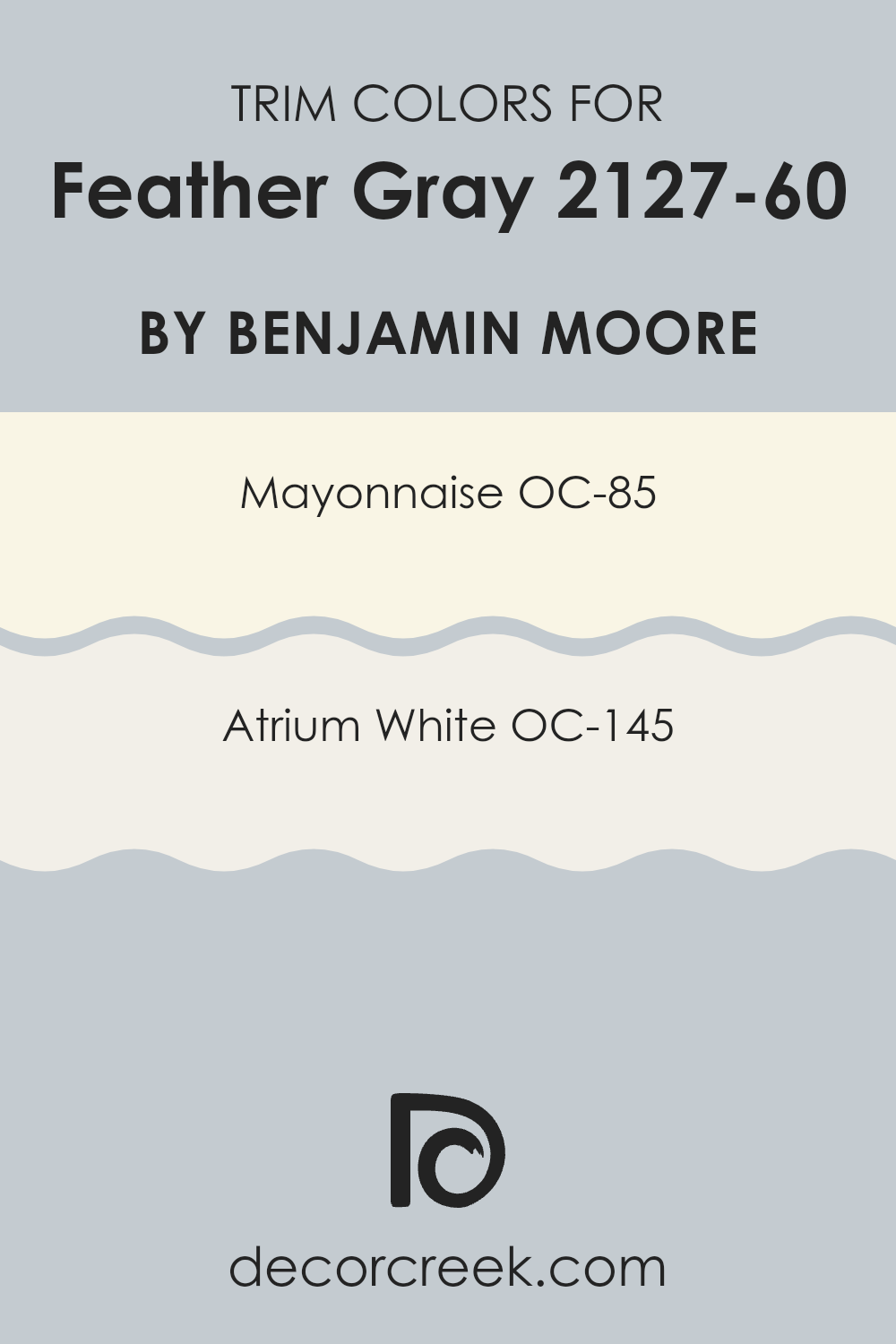
What are the Trim colors of Feather Gray 2127-60 by Benjamin Moore?
Trim colors are essential in painting and design because they help create a defined border between different surfaces, like walls and ceilings, or around doors and windows. Choosing the right trim color can enhance the overall look of a room, adding contrast and detail that complements the primary wall color.
For Feather Gray by Benjamin Moore, some recommended trim colors are Mayonnaise OC-85 and Atrium White OC-145. These colors offer subtle variations that match well while providing a clean, crisp edge to the softer, muted tone of Feather Gray.
Mayonnaise OC-85 is a warm, creamy white that has a soft richness to it, making it an excellent choice for a room where a cozy and welcoming feel is desired. It’s not overly stark, allowing it to blend smoothly with gentler hues like Feather Gray.
Atrium White OC-145, on the other hand, is a pure, bright white with a very clean appearance. This color is perfect for creating a more pronounced contrast with Feather Gray, attracting light and giving the room a fresh, lively vibe. Both trim colors are flexible, ensuring they can be used effectively across various room styles and lighting conditions.
You can see recommended paint colors below:
- OC-85 Mayonnaise
- OC-145 Atrium White
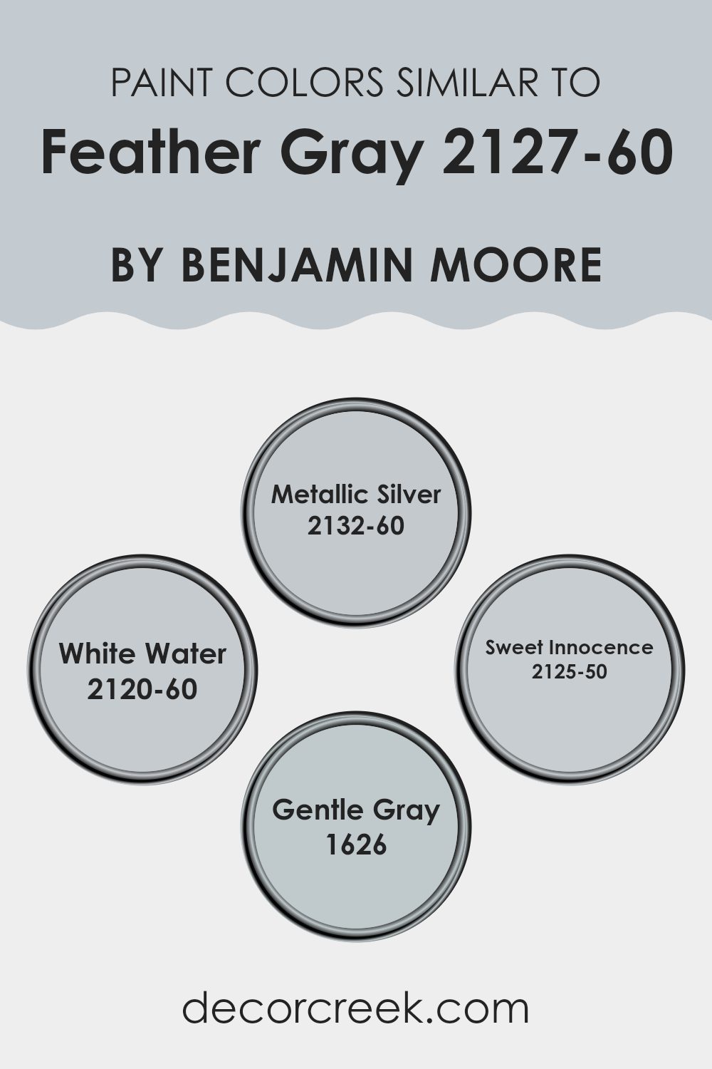
Colors Similar to Feather Gray 2127-60 by Benjamin Moore
Choosing similar colors in a design can create a subtle and harmonious look, which is both pleasing to the eye and effective in setting a relaxed mood. Colors that are close on the color spectrum, like those akin to Feather Gray by Benjamin Moore, complement each other well, making the room feel cohesive.
By using shades that are similar yet distinct, you can achieve a layered visual depth without creating a jarring contrast. This approach allows elements in a room to blend seamlessly while still letting unique features stand out in a gentle way.
For instance, Metallic Silver adds a hint of gleam that gently reflects light, giving a slight uplifting feel to rooms without overpowering the core aesthetics of minimalism. White Water is a brighter tone, offering a clean and clear look that can effectively illuminate darker areas or bring out a sense of freshness. Sweet Innocence has a soft touch of pink, ideal for adding a subtle warmth and nurturing feel to rooms that favor comfort and softness.
Lastly, Gentle Gray offers a slightly bluish tint that can be perfect for areas needing a calm and collected atmosphere, yet it enriches rooms with a hint of color. Together, these hues match well to form a palette that is coherent and stylish, perfect for creating inviting rooms where every color has a role to play.
You can see recommended paint colors below:
- 2132-60 Metallic Silver
- 2120-60 White Water
- 2125-50 Sweet Innocence
- 1626 Gentle Gray
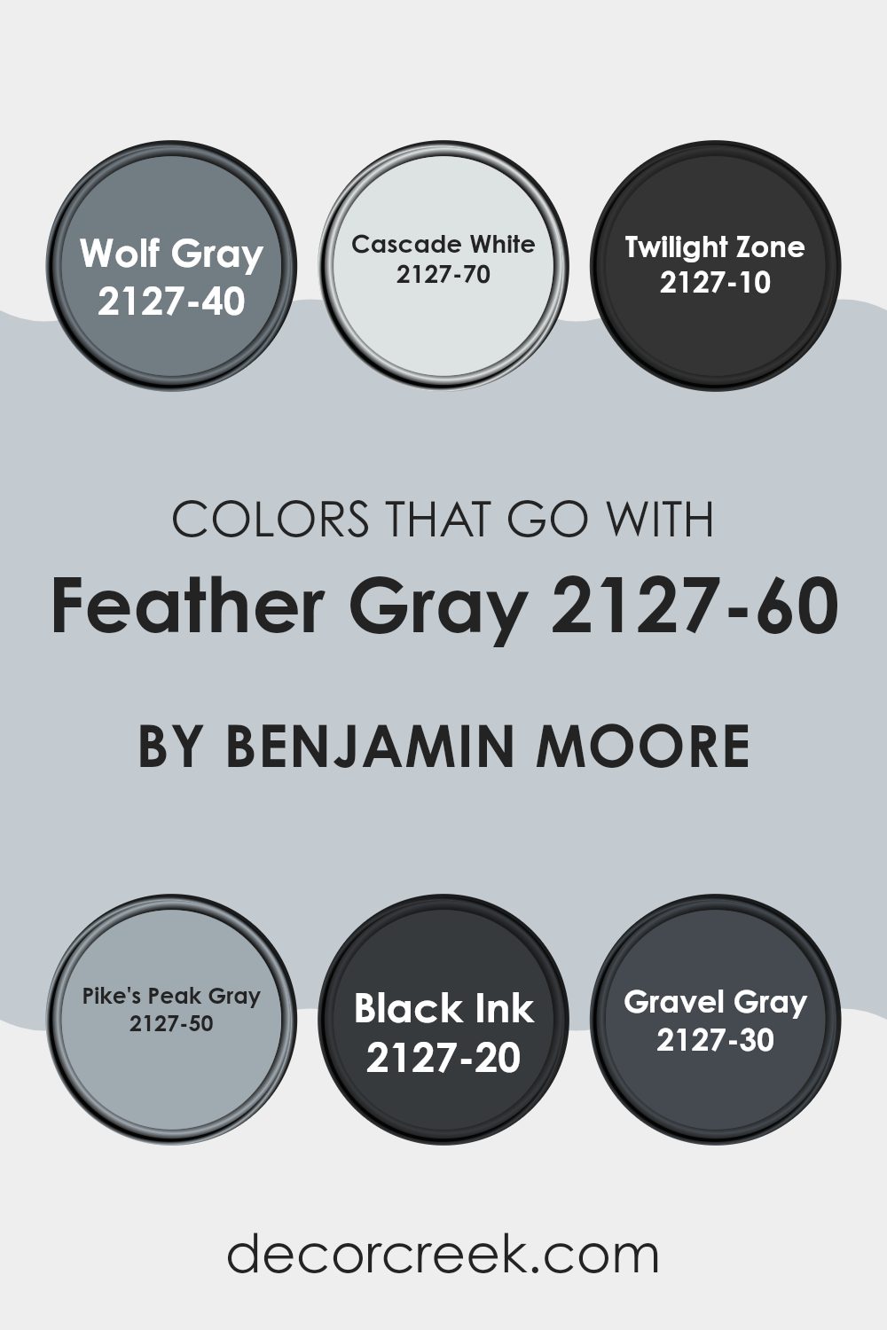
Colors that Go With Feather Gray 2127-60 by Benjamin Moore
Choosing the right colors to pair with Feather Gray 2127-60 by Benjamin Moore is crucial because it ensures that the overall look of a room is harmonious and appealing. Feather Gray acts as a flexible backdrop that can be complemented by various shades, enhancing the aesthetics of any room. When you use colors that match well, like those within the same collection, you naturally achieve a balanced room that feels coherent and carefully thought out.
Wolf Gray 2127-40 is a deep, moody gray with a hint of blue, making it perfect for adding some drama to rooms without making them feel too intense. Cascade White 2127-70 is a very light gray that almost reads as white, ideal for opening up a room and giving it a fresh, airy feel. Twilight Zone 2127-10 offers a dramatic and bold charcoal black that can be used for striking contrast or to create a cozy, enveloping effect.
Pike’s Peak Gray 2127-50 provides a mid-tone gray that strikes a nice balance between light and dark, suitable for rooms that need a subtle yet distinct presence. Black Ink 2127-20 is a true, deep black that adds a striking depth, perfect for accent walls or furniture for a strong statement.
Finally, Gravel Gray 2127-30 is a darker gray that offers a sturdy, grounding effect, which works well in layering different shades of gray for a rich, multi-dimensional room. Using these colors together with Feather Gray ensures a smooth and appealing color flow that enhances the overall look of your interiors.
You can see recommended paint colors below:
- 2127-40 Wolf Gray
- 2127-70 Cascade White
- 2127-10 Twilight Zone
- 2127-50 Pike’s Peak Gray
- 2127-20 Black Ink
- 2127-30 Gravel Gray
How to Use Feather Gray 2127-60 by Benjamin Moore In Your Home?
Feather Gray 2127-60 by Benjamin Moore is a gentle gray tone that offers a fresh and airy feel to any room. It’s a flexible shade that can work well in both modern and traditional rooms. If you want to freshen up your living room, Feather Gray is light enough to make the room feel larger while still adding a touch of color to the walls. It pairs beautifully with white trim for a clean and crisp look.
In a bedroom, Feather Gray can create a calm backdrop, perfect for adding brighter colors through bed linens or artwork. It’s also an excellent color for bathrooms, as it complements marble countertops or colorful bath accessories without feeling too strong.
For those who have small rooms or less natural light, using Feather Gray can help brighten these areas without resorting to stark white. It’s a color that’s easy on the eyes and brings a modern yet cozy touch to any corner of your home. Whether you paint an entire room or just one accent wall, Feather Gray 2127-60 offers a light, neutral palette to work from, making it a popular choice for a home makeover.
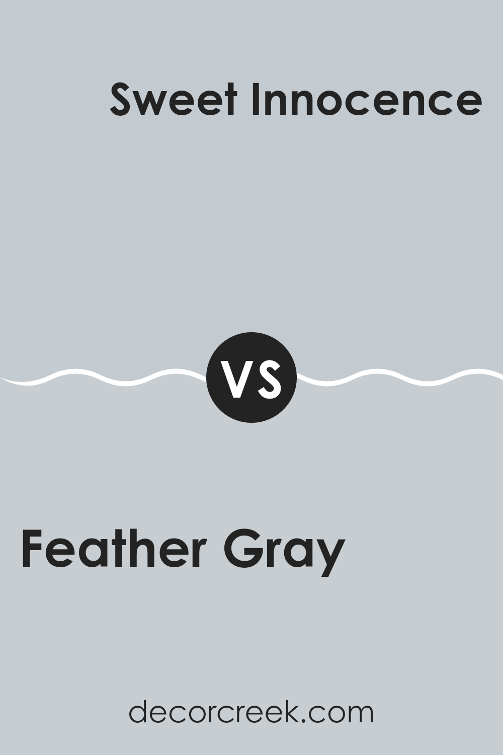
Feather Gray 2127-60 by Benjamin Moore vs Sweet Innocence 2125-50 by Benjamin Moore
Feather Gray by Benjamin Moore and Sweet Innocence by Benjamin Moore are two subtle hues with distinct vibes. Feather Gray is a light gray color with a smooth and neutral appearance. It works nicely in rooms that aim for a minimal and modern look, serving as a gentle backdrop that complements a wide range of decor styles and colors.
Sweet Innocence, on the other hand, leans more toward a soft lavender tone, giving it a bit of warmth and a faintly cheerful aura. This color is fantastic for adding a hint of personality to a room without making it feel too intense. It’s particularly suitable for bedrooms or living areas where a touch of softness can create a welcoming atmosphere.
Both colors share a mild and unobtrusive character, yet they offer different moods to interior rooms. Feather Gray is more about creating a sleek and clean feel, while Sweet Innocence offers a delicate whisper of color to brighten up rooms.
You can see recommended paint color below:
- 2125-50 Sweet Innocence
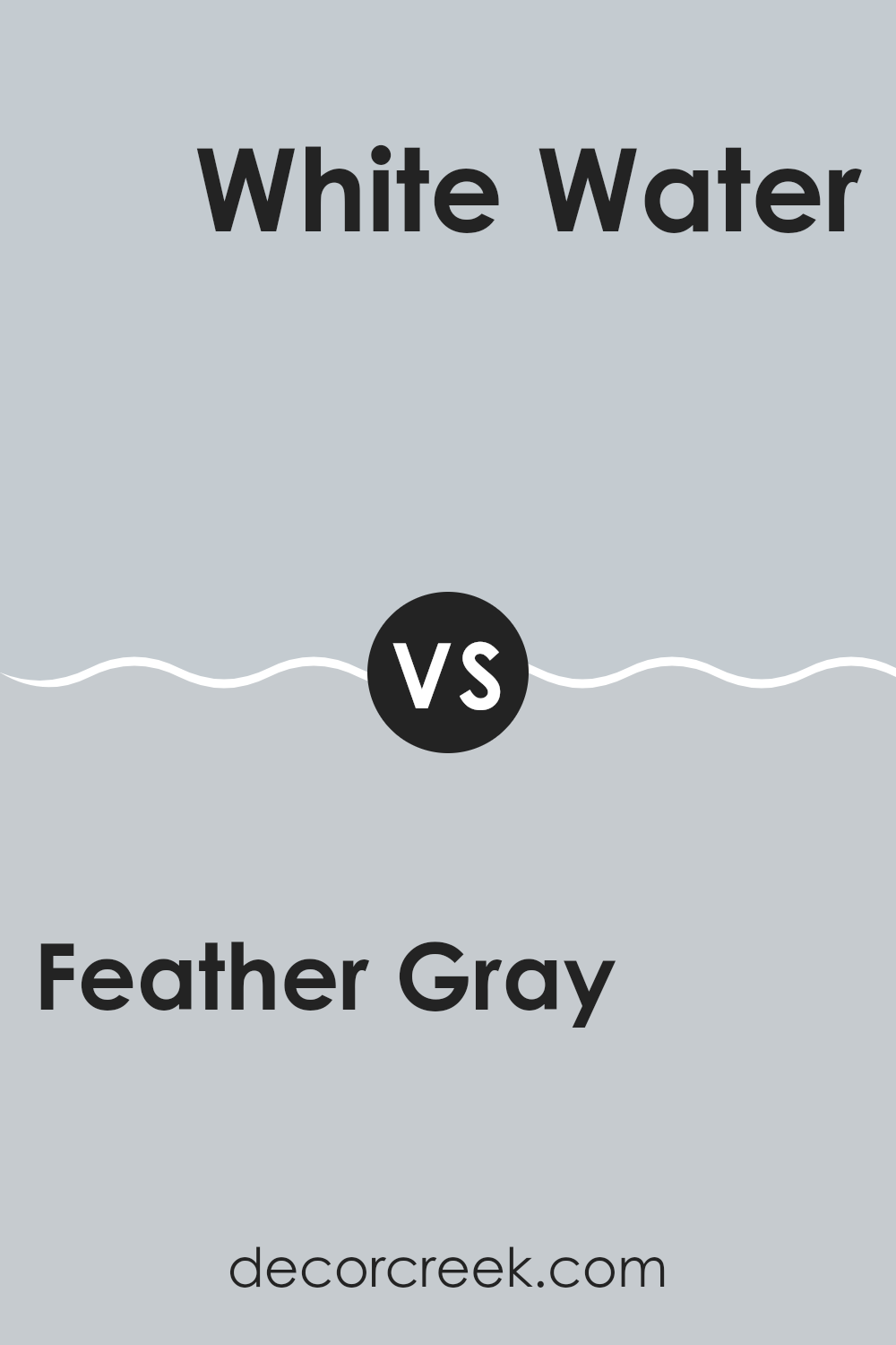
Feather Gray 2127-60 by Benjamin Moore vs White Water 2120-60 by Benjamin Moore
Feather Gray by Benjamin Moore is a soft, muted gray color with hints of blue undertones. It gives off a calm, soothing vibe and can be a beautiful choice for any room that aims for a gentle, harmonious atmosphere. Its subtle depth makes it flexible for rooms that aim for a light but cozy feel.
In comparison, White Water, also by Benjamin Moore, is much lighter and tends to lean toward a very pale gray or off-white. This color reflects light beautifully, making it a fantastic option for making smaller rooms appear bigger and brighter. It’s a clean, fresh color that can easily be paired with any decor style and is especially good in areas where you want to promote a sense of freshness and openness.
Both colors work wonderfully in different ways: Feather Gray providing a deeper, subdued background, and White Water offering a crisp, rejuvenative feel. They can also be used together in a room for a layered neutral palette.
You can see recommended paint color below:
- 2120-60 White Water
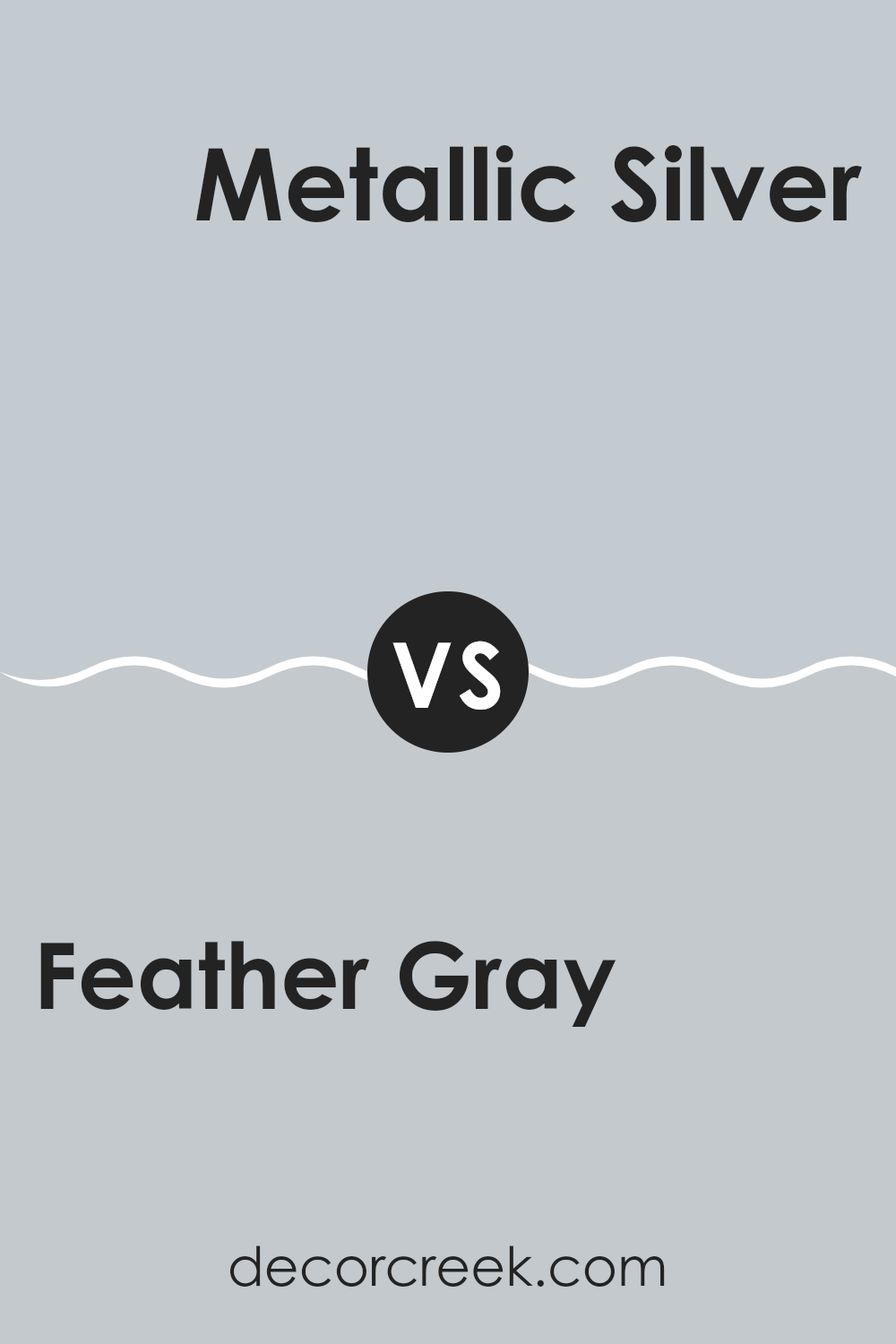
Feather Gray 2127-60 by Benjamin Moore vs Metallic Silver 2132-60 by Benjamin Moore
Feather Gray by Benjamin Moore is a light gray shade that presents a calm and subtle backdrop, making it a flexible choice for any room. This color has a soft and muted quality that pairs well with brighter colors or serves as a gentle standalone hue for a minimalist aesthetic.
On the other hand, Metallic Silver by Benjamin Moore has a shinier, more reflective quality, giving it a slightly more dynamic look compared to Feather Gray. The metallic element in Metallic Silver adds a bit of shimmer, providing a modern and slightly edgier feel. This color works well in rooms where you want to add a hint of brightness without flooding the area with too much shine.
Both colors maintain a neutral palette, but the added shimmer in Metallic Silver offers a more lively vibe, while Feather Gray maintains a steadier, more understated appearance. This makes Feather Gray a better choice for those seeking a calm and quiet atmosphere, whereas Metallic Silver is ideal for adding a touch of glamour.
You can see recommended paint color below:
- 2132-60 Metallic Silver
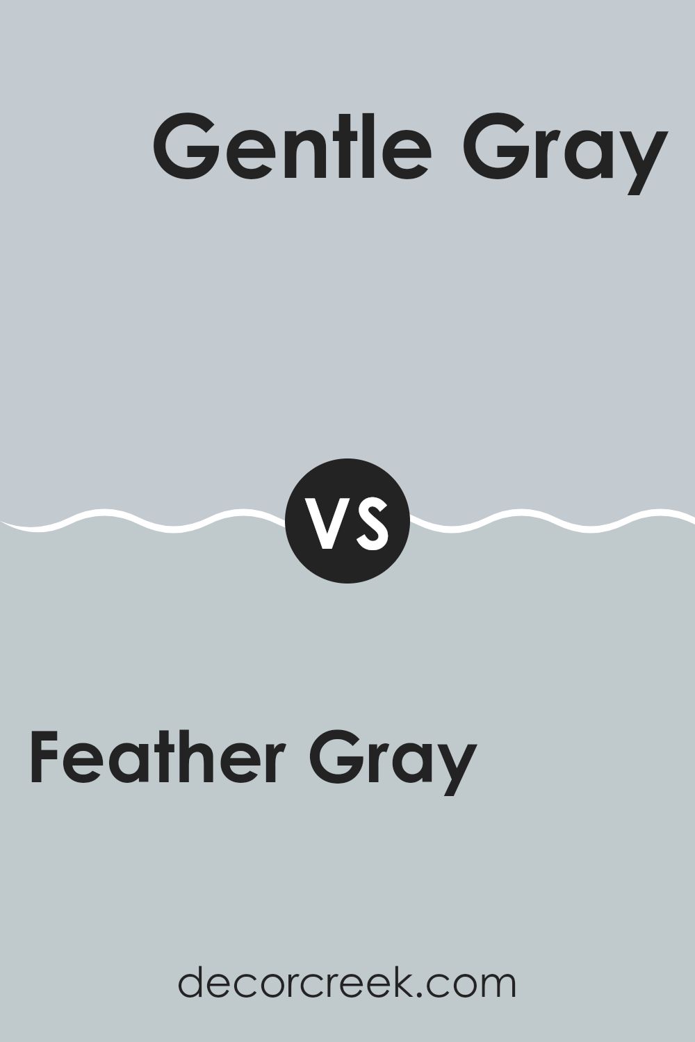
Feather Gray 2127-60 by Benjamin Moore vs Gentle Gray 1626 by Benjamin Moore
Feather Gray and Gentle Gray by Benjamin Moore are two subtly distinct paint colors. Feather Gray has a light, airy quality that makes it an excellent choice for creating a bright and open feel in a room. It leans toward a soft, neutral palette with a hint of warmth, which allows it to pair well with a wide range of decor styles and colors.
On the other hand, Gentle Gray offers a slightly richer tone, providing a hint of depth while still maintaining a light presence. This color has a cool undertone, making it perfect for those who prefer a more understated yet inviting atmosphere. Gentle Gray is ideal for rooms where a peaceful, calm setting is desired.
Both colors are flexible and can be used in many rooms, from kitchens and bathrooms to living rooms and bedrooms. The choice between them would largely depend on the desired mood and the specific undertones that complement the existing furnishings and overall design theme of the room.
You can see recommended paint color below:
- 1626 Gentle Gray
After reading all about 2127-60 Feather Gray by Benjamin Moore, I have learned a lot about this beautiful paint color. It’s a unique shade of gray with a hint of softness, making it perfect for rooms where you want to feel calm and relaxed. This color works great in places like bedrooms or living rooms because it has a gentle vibe that makes you feel at ease.
Feather Gray isn’t just any gray; it has special qualities that make it fit well with many other colors. Whether you pair it with bright colors to add some fun or keep things cool with more muted tones, this paint easily blends in. It’s also really helpful for hiding little marks or smudges on the walls, thanks to its ability to reflect light in a way that’s not too shiny or dull.
Choosing 2127-60 Feather Gray for a room can really freshen it up and give it a new, pleasant look without making everything too dramatic. It’s a smart choice if you want a change but don’t want anything too bold or busy. This paint can make any room look clean, tidy, and welcoming.
In conclusion, using Benjamin Moore’s 2127-60 Feather Gray paint can be a great way to make your room look nicer and cozier. It’s a color that will keep your interior looking good for a long time, without getting boring. It’s definitely a color worth considering for your next room redo!
Ever wished paint sampling was as easy as sticking a sticker? Guess what? Now it is! Discover Samplize's unique Peel & Stick samples.
Get paint samples

