If you’re thinking about giving your space a fresh makeover, you might want to consider HC-165 Boothbay Gray by Benjamin Moore. This unique shade of gray offers a subtle hint of blue, making it a perfect choice for those looking to add a touch of calm and sophistication to their rooms. Boothbay Gray sits in a sweet spot between cool and warm tones, which means it adapts well to various lighting conditions, looking slightly different and equally stunning as the light changes throughout the day.
This color is part of the Historic Color collection by Benjamin Moore, a range that draws from America’s historic landmarks to create a palette that’s both timeless and deeply rich in American heritage. Whether you’re painting a bedroom, living room, or even cabinets and exterior spaces, Boothbay Gray has a versatile charm that can elevate any area.
Choosing the right paint color is often the starting point for transforming your home, and Boothbay Gray offers a blend of tranquility and depth that is hard to find. Its ability to harmonize with a wide range of decor styles and colors makes it a go-to choice for designers and homeowners alike.
So, if you’re ready for a change, considering this beautiful shade could be the first step toward creating the ambiance you’ve always wanted in your home.
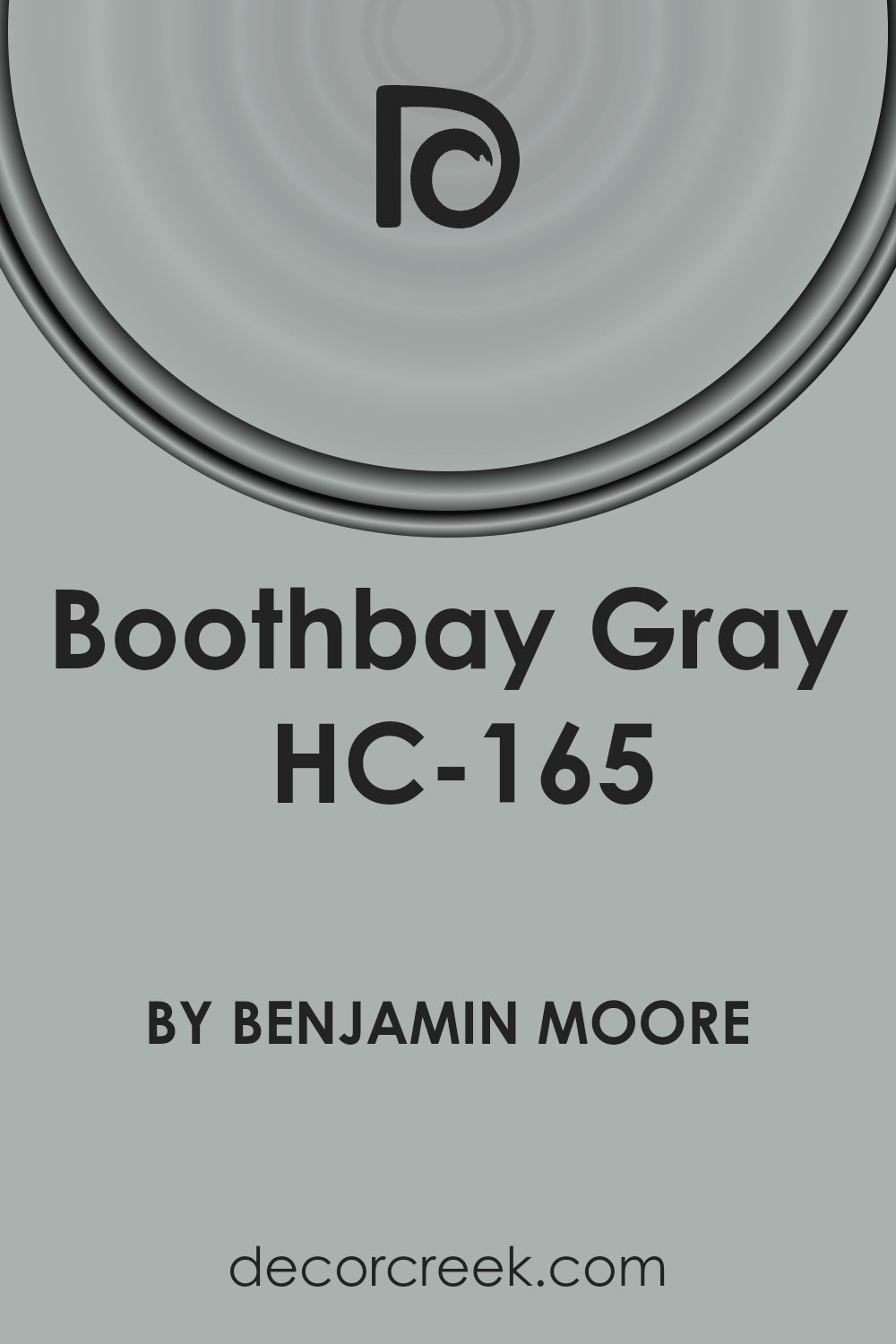
What Color Is Boothbay Gray HC-165 by Benjamin Moore?
Boothbay Gray by Benjamin Moore is a sophisticated color that brings a sense of calm and serenity to any space. This hue has a unique ability to balance cool undertones with a hint of warmth, making it incredibly versatile and inviting. It’s a color that resembles the serene mood of a misty morning at sea, providing a tranquil backdrop that complements a wide range of interior styles.
This shade of gray works exceptionally well in modern, minimalist, coastal, and even traditional settings. Its subtle elegance does not compete with bold colors but instead provides a soothing contrast that enhances the overall design of a room. Boothbay Gray pairs beautifully with natural materials like wood, stone, and metals, bringing out their textures and adding depth to the interiors.
When combined with soft textiles like wool or linen in lighter tones, it creates a cozy atmosphere that feels both refined and welcoming.
The versatility of this color allows for creative design choices. It can serve as a stunning neutral wall color, providing a peaceful canvas for artwork and furniture to stand out.
Alternatively, using it in cabinetry or as an accent feature can add a sophisticated touch to kitchens and bathrooms. Whether you’re aiming for a sleek, modern look or a warm, rustic vibe, Boothbay Gray adapts effortlessly, making it a go-to choice for designers and homeowners alike.
Is Boothbay Gray HC-165 by Benjamin Moore Warm or Cool color?
Boothbay Gray by Benjamin Moore is a unique and versatile paint color that can significantly influence the ambiance of any room in your home. This shade of gray has a calming effect that pairs beautifully with various decorating styles, from modern to rustic. Its subtle blue undertones add a refreshing and serene vibe, making it perfect for spaces where relaxation is key, such as bedrooms and bathrooms.
However, this color is not limited to private rooms; it works wonderfully in living areas and kitchens too, providing a sophisticated backdrop that complements both bold and muted accents.
The beauty of Boothbay Gray lies in its adaptability. It can make small spaces appear larger and more inviting, while giving larger areas a cozy feel. In homes with natural light, this color takes on a lively quality, subtly shifting in tone as the day progresses. It’s also excellent for highlighting architectural details, like trim and molding, adding depth and character to your space.
Whether you’re aiming for a tranquil retreat or a stylish, contemporary home, Boothbay Gray offers a timeless appeal that enhances the overall look and feel of your living environment.
Undertones of Boothbay Gray HC-165 by Benjamin Moore
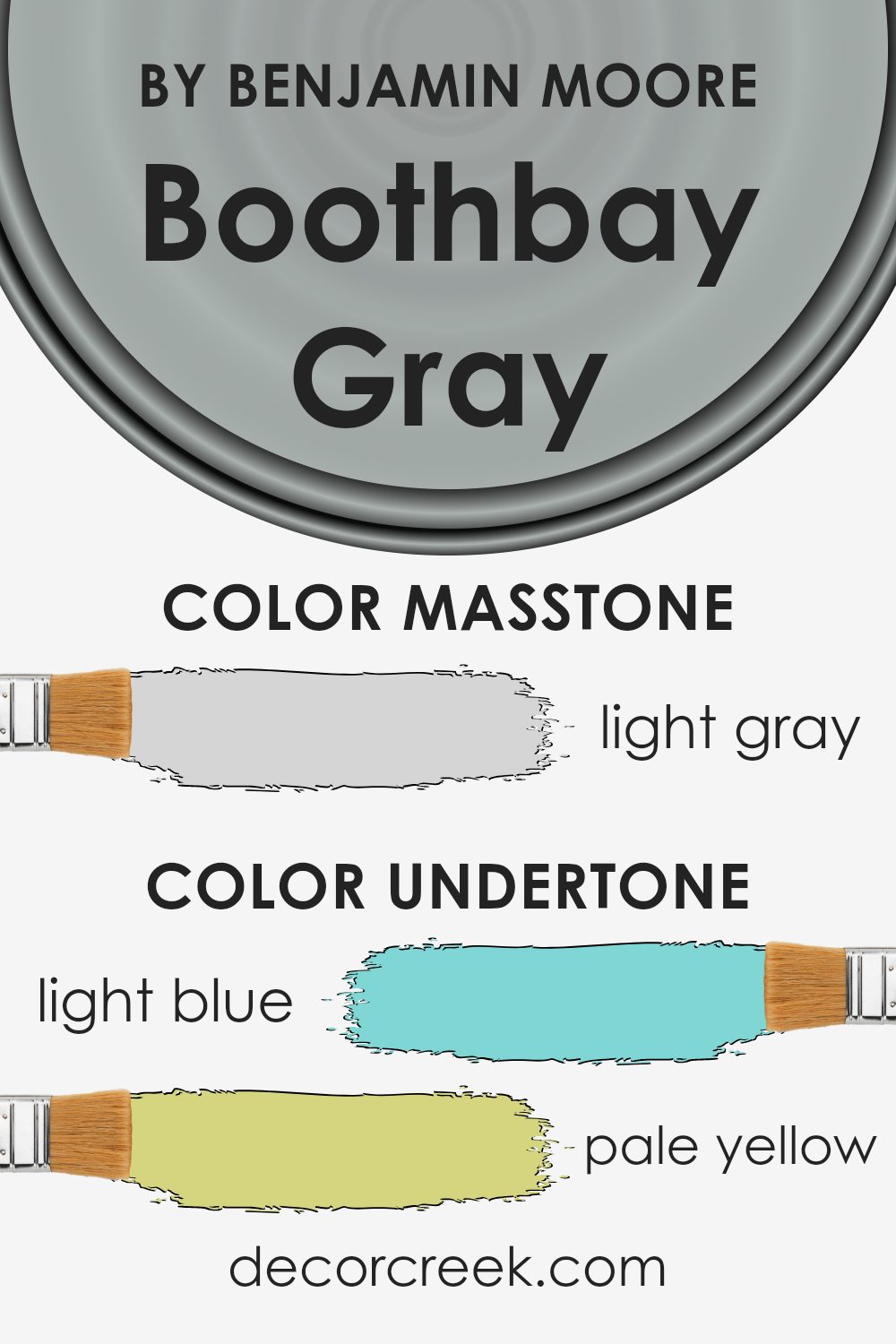
Boothbay Gray is a unique color that carries a mix of subtle undertones, making it more than just a simple shade of gray. Imagine this color like a chameleon, capable of revealing hints of light blue, pale yellow, mint, light purple, lilac, grey, and pale pink, depending on the lighting and surrounding colors. These undertones play a crucial role in the way we perceive the color, adding depth and dimension that can dramatically transform a space.
When used on interior walls, Boothbay Gray’s diverse undertones can influence the room’s ambiance. In a room with a lot of natural light, you might notice the light blue or pale yellow undertones come to life, creating a soothing, airy feel. In spaces with less light, or during different times of the day, the cooler lilac or light purple might become more pronounced, adding a cozy, serene touch.
The mint and pale pink undertones can offer a subtle freshness or warmth, respectively, enhancing the room’s overall charm.
Moreover, the presence of grey as an undertone ensures that despite its complexity, Boothbay Gray remains grounded and versatile, able to blend seamlessly with a wide range of décor styles and color schemes. The interplay of its undertones with elements like furniture, flooring, and natural light means that this color can offer a dynamic backdrop that shifts in character, enriching the environment.
Its ability to reflect various hues ensures that it can complement a room, making spaces feel more inviting and lived-in.
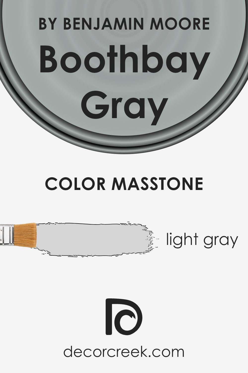
What is the Masstone of the Boothbay Gray HC-165 by Benjamin Moore?
Boothbay Gray HC-165 by Benjamin Moore is a stunning light gray color that brings a calm and serene atmosphere to any home. The masstone, or the main color you see, is a lovely light gray shade that gives off a feeling of peace and tranquility. This specific tint has a unique way of working in residential spaces, making rooms feel more spacious and airy. Its light gray quality allows it to blend well with different décor styles and color schemes, offering flexibility in design choices.
This color has a special ability to enhance natural light in a room, making spaces look bigger and more welcoming. It’s perfect for living rooms, bedrooms, or any area where you want to create a soothing environment. Additionally, its neutral nature means it pairs beautifully with both bold and subtle colors, from vibrant blues to soft whites, allowing homeowners to experiment with accessories and furniture without overwhelming the space.
By applying Boothbay Gray to the walls, you’re not just adding a color; you’re introducing a layer of sophistication and a refreshing vibe that makes your home feel like a peaceful retreat.
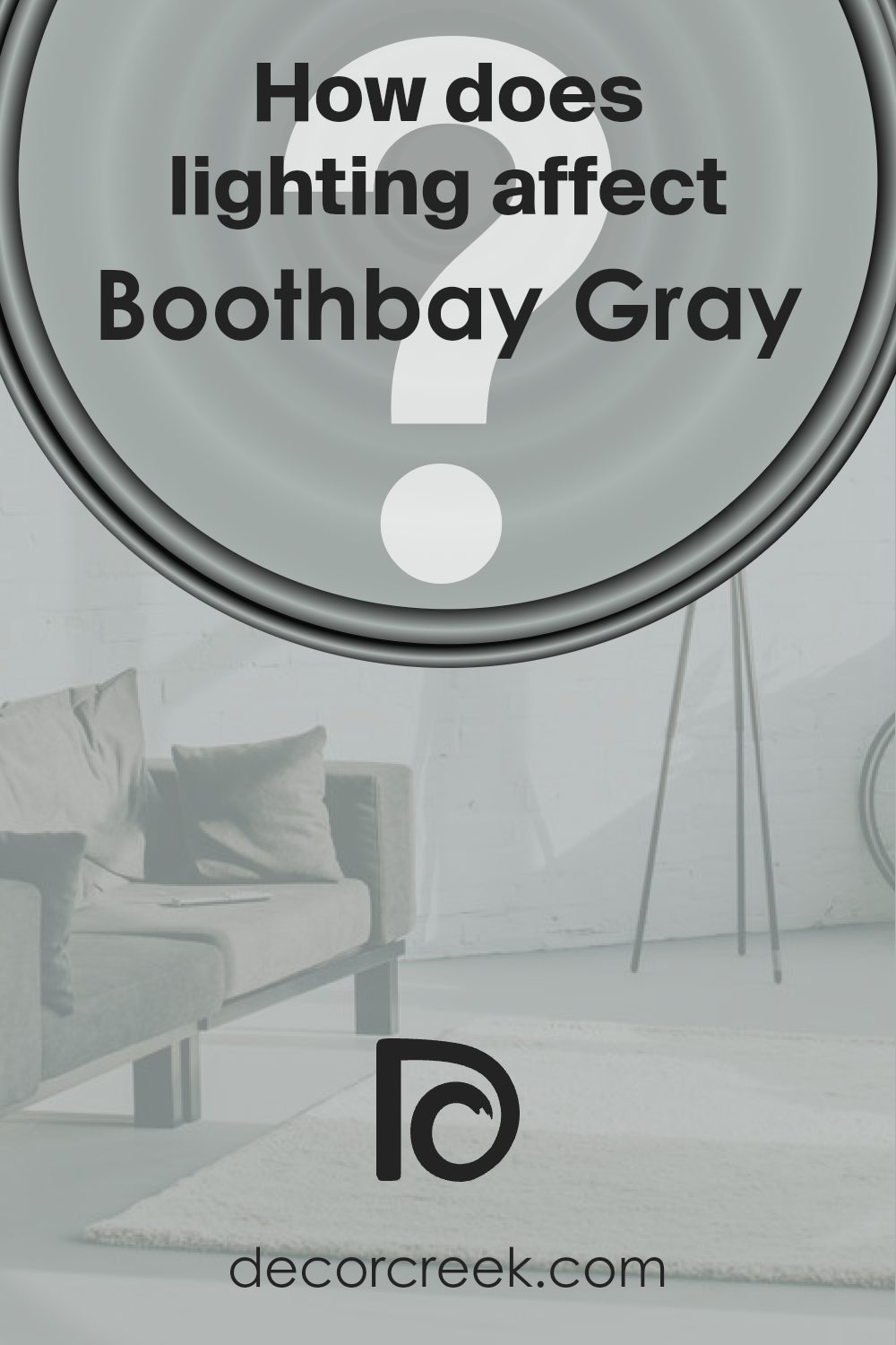
How Does Lighting Affect Boothbay Gray HC-165 by Benjamin Moore?
Lighting plays a crucial role in how we perceive colors. The light source can drastically change the appearance of a color, making it look different at various times of the day or under different lighting conditions. This phenomenon is particularly noticeable with paint colors, such as the versatile Boothbay Gray by Benjamin Moore.
When it comes to artificial light, the type of bulb matters. Incandescent bulbs, which emit a warmer, yellowish glow, can make Boothbay Gray look cozier and slightly more muted, enhancing its gray aspects while subtly downplaying its blue undertones. LED or fluorescent lights, which provide a cooler, more bluish light, can bring out Boothbay Gray’s cooler tones, making it appear slightly more vibrant and crisp.
In natural light, Boothbay Gray transforms based on the direction of the room and the quality of light received. In north-facing rooms, which get less direct sunlight and tend to have cooler light, Boothbay Gray can appear more as a true, deeper gray, possibly emphasizing its subtle blue undertones without becoming too cold. This makes it a calming and balanced choice for spaces meant for relaxation.
South-facing rooms bathe in abundant, warmer sunlight, which can lighten up Boothbay Gray, making it appear softer and slightly warmer. This warming effect can reduce the prominence of its cooler undertones, creating a tranquil but somewhat brighter space.
In east-facing rooms, morning light is cooler and can make Boothbay Gray look fresh and lively, particularly in the morning when the light is brightest. As the day progresses and natural light decreases, the color may take on a more subdued, classic gray appearance.
West-facing rooms get the evening light, which is warmer. Here, Boothbay Gray can warm up significantly towards the evening, bringing out a softer, more comforting version of itself, contrasting with its more straightforward gray appearance during the day when the light is not as intense.
Overall, Boothbay Gray’s chameleon-like quality makes it a flexible choice for any room, adapting beautifully to different lighting conditions and changing subtly with the natural rhythm of the day.
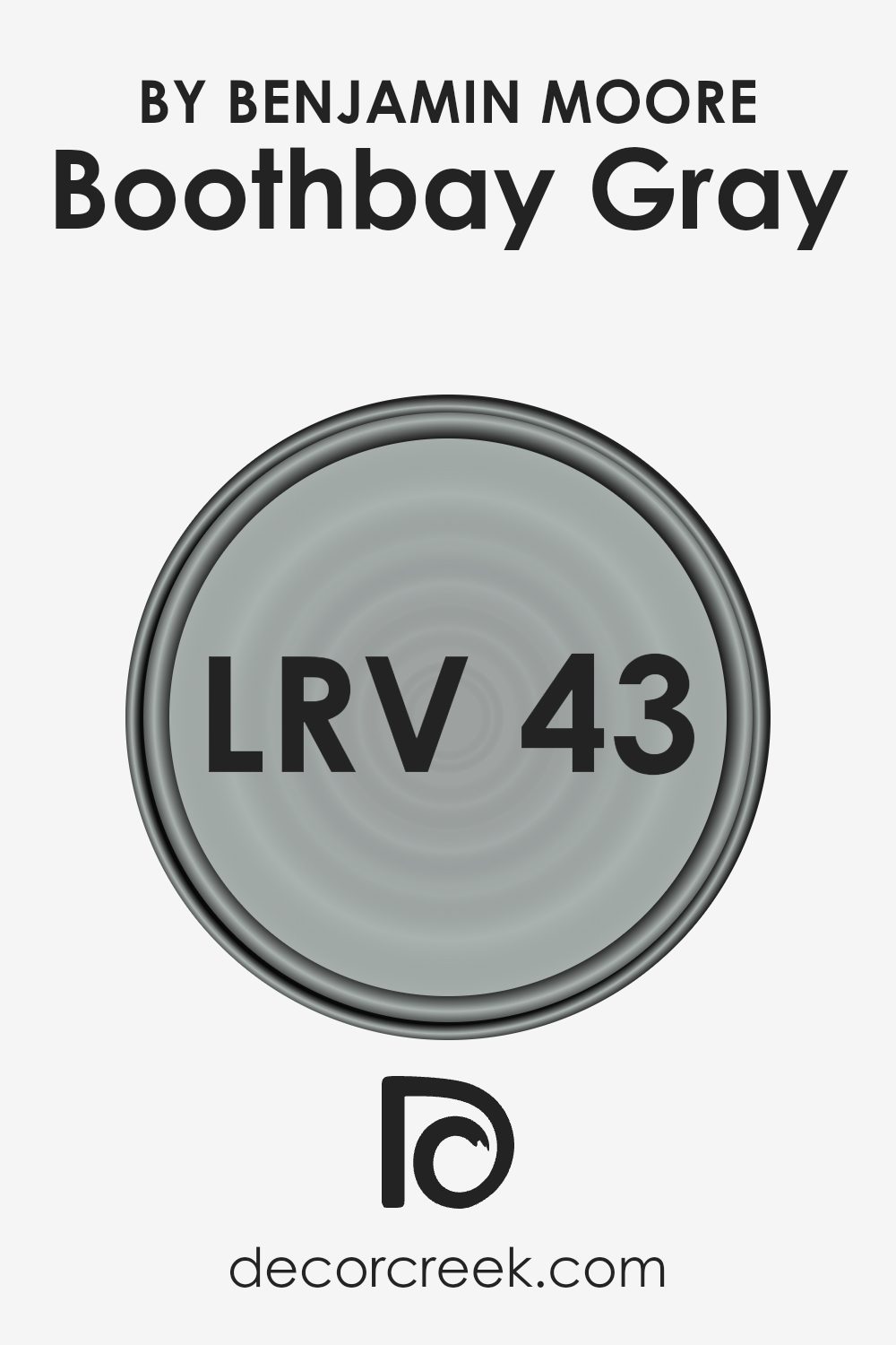
What is the LRV of Boothbay Gray HC-165 by Benjamin Moore?
LRV stands for Light Reflectance Value, which is a measure used to describe the amount of light a paint color reflects back into a room as a percentage. Simply put, it tells you how light or dark a color will look on your walls. This value ranges from 0 to 100, with 0 being pure black (which absorbs all light) and 100 being pure white (which reflects all light).
The LRV helps in determining how a color might change its appearance under different lighting conditions. For instance, a color with a high LRV will make a room feel brighter and more open as it reflects more light, whereas a color with a low LRV can make a space feel cozier and more intimate by absorbing light.
Given the LRV of 43.26 for Boothbay Gray, it falls somewhere in the middle of the scale, meaning it neither reflects light like lighter colors nor absorbs it like the darker hues. This particular shade will bring a balanced, muted presence to your walls, offering a sense of warmth and sophistication without making the room feel too closed in. Since it doesn’t swing too far toward the light or dark end of the scale, it offers a versatile backdrop that can adapt to various lighting conditions throughout the day.
In natural light, Boothbay Gray may appear slightly lighter and more dynamic, highlighting subtle undertones. In artificial light, it might present itself as richer and deeper, providing a comforting and grounded ambiance to your space.
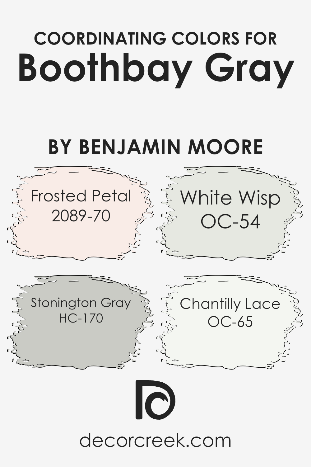
Coordinating Colors of Boothbay Gray HC-165 by Benjamin Moore
Coordinating colors are hues that work harmoniously together on the color wheel, enhancing the overall aesthetic appeal of a space without overwhelming it. When you choose a specific paint color, like a serene and sophisticated shade for your room, it’s important to select coordinating colors that complement it for accents, trims, or even other walls to create a cohesive look and feel. These companions should balance or accentuate the main color, depending on the desired effect, whether it’s creating contrast, enhancing brightness, or adding depth to your decor.
For example, 2089-70 – Frosted Petal is a soft, subtle pink with a touch of warmth that adds a gentle, refreshing lift to spaces, making it a perfect accent to cooler tones. HC-170 – Stonington Gray offers a reliable, mid-tone gray that strikes a balance between warm and cool, making it versatile for pairing with both vibrant and muted colors.
OC-54 – White Wisp is a delicate off-white with a hint of gray, lending an airy and open feel to any room, ideal for creating a sense of space. Lastly, OC-65 – Chantilly Lace is a crisp, clean white that acts as a universal matcher, brightening spaces and providing a sharp contrast to more pronounced colors, ensuring that everything looks pulled together. Together, these colors offer a harmonious palette that can enhance the sophisticated and versatile base of Boothbay Gray, allowing for a wide range of design possibilities.
You can see recommended paint colors below:
- 2089-70 Frosted Petal
- HC-170 Stonington Gray
- OC-54 White Wisp
- OC-65 Chantilly Lace
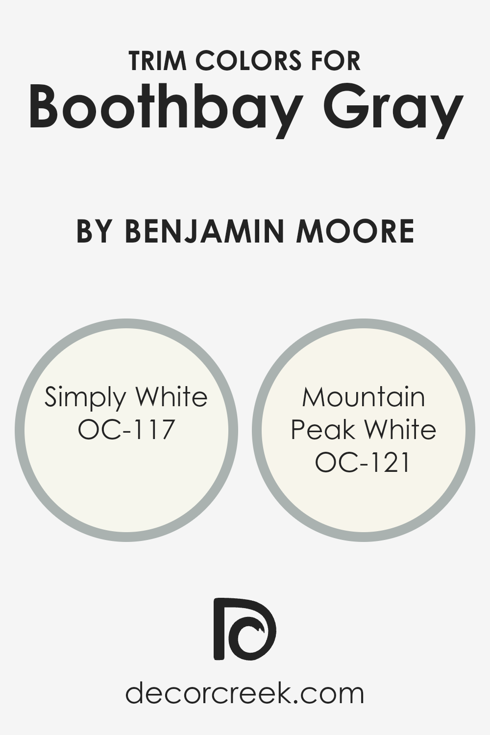
What are the Trim colors of Boothbay Gray HC-165 by Benjamin Moore?
Trim colors play a vital role in complementing and enhancing the main color of a room, in this case, Boothbay Gray by Benjamin Moore. Choosing the right trim color can highlight the architectural features of a room, create depth, and tie together the overall color scheme. For a color like Boothbay Gray, which is a sophisticated gray that brings a sense of calm and serenity to spaces, selecting a suitable trim color is crucial.
The trim acts as a frame for the walls, so choosing a color that harmonizes with Boothbay Gray can significantly impact the room’s aesthetic appeal and atmosphere.
OC-117, known as Simply White, is a clean and bright white that brings a fresh and airy feel to any space. It has the power to make the subtle tones of Boothbay Gray pop, creating a crisp and inviting contrast. This makes it an excellent choice for trim, providing a classic look that is both refreshing and modern. On the other hand, OC-121, Mountain Peak White, offers a softer approach. It’s a warm white with a slight undertone that complements the cool hues of Boothbay Gray, ensuring the room feels cozy and cohesive. Utilizing either Simply White or Mountain Peak White as trim colors with Boothbay Gray can add the perfect finishing touch, enhancing both the beauty and the ambiance of the room.
You can see recommended paint colors below:
- OC-117 Simply White
- OC-121 Mountain Peak White
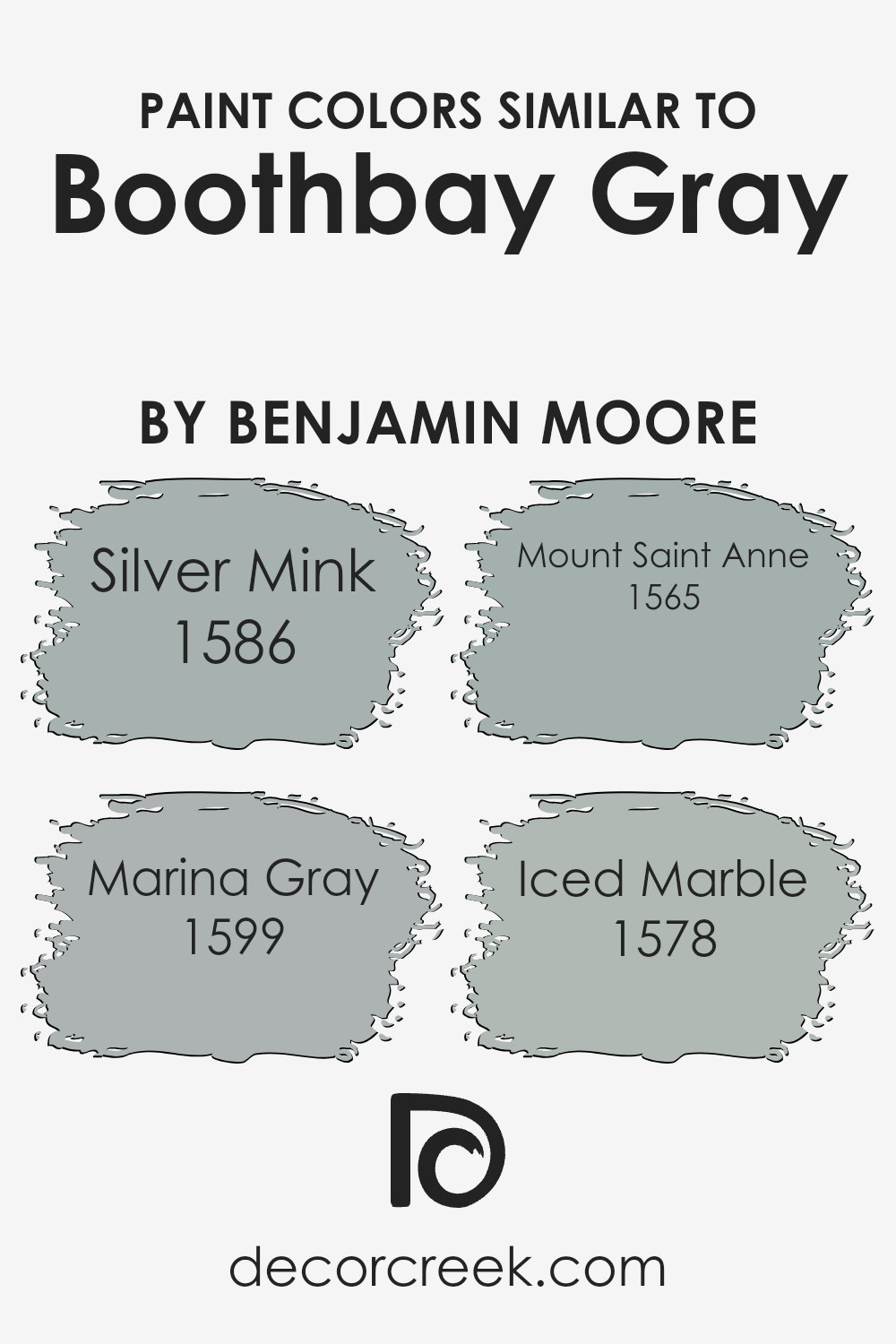
Colors Similar to Boothbay Gray HC-165 by Benjamin Moore
Choosing similar colors is a smart way to create a harmonious and visually appealing space. Colors like Silver Mink, Marina Gray, Mount Saint Anne, and Iced Marble work well with Boothbay Gray because they share a common color intensity and tone. This creates a seamless blend of shades that can elevate the aesthetic of any room.
The key to utilizing similar colors lies in their ability to complement each other without overwhelming the senses. They offer subtle variations that add depth and interest to a design scheme without causing visual discord. These colors, with their shared gray base, can act as a neutral background or as complementary shades to bolder colors, enabling a versatile palette that adapts to different styles and preferences.
Silver Mink is a light, warm gray that exudes a soft and inviting vibe, making it perfect for creating a cozy and calm environment. Marina Gray, on the other hand, has a slightly cooler undertone, offering a fresh and serene feel that can help a space appear more airy and spacious. Mount Saint Anne brings a touch of elegance with its deeper, bluish-gray hue, providing a sophisticated contrast without being too stark.
Lastly, Iced Marble offers a unique blend of gray with subtle hints of lavender, giving it a distinctive yet understated charm that can add character to any room. Together, these colors create a palette that balances tranquility with depth, making them ideal for anyone looking to achieve a refined and cohesive look.
You can see recommended paint colors below:
- 1586 Silver Mink
- 1599 Marina Gray
- 1565 Mount Saint Anne
- 1578 Iced Marble
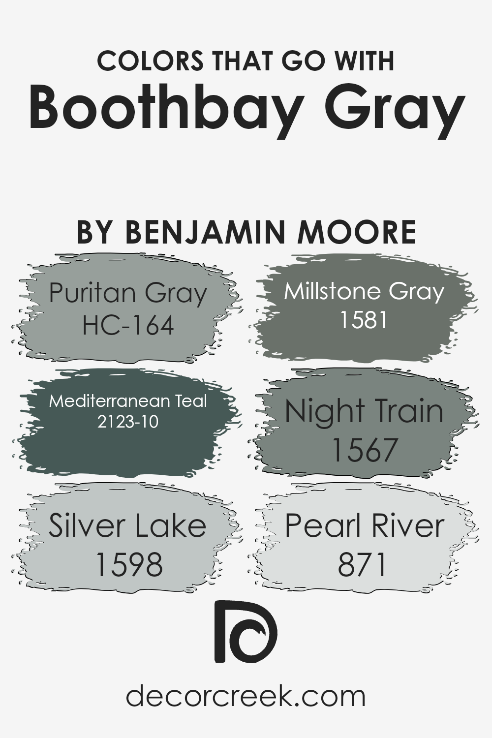
Colors that Go With Boothbay Gray HC-165 by Benjamin Moore
Selecting colors that go well with Boothbay Gray HC-165 by Benjamin Moore is crucial for achieving a harmonious and visually appealing space. These complementary colors, ranging from Puritan Gray to Pearl River, play a significant role in enhancing the beauty of Boothbay Gray, making it more versatile and fitting for various design schemes. By carefully pairing Boothbay Gray with these selected hues, one can effortlessly create a cohesive look that brings out the best in each color.
Puritan Gray offers a subtle, sophisticated contrast to Boothbay Gray, enriching the environment without overwhelming it. It’s like a quiet companion that stands confidently on its own while supporting the main hue. Mediterranean Teal, on the other hand, introduces a lively pop of color, adding an exciting dynamic to the palette and preventing it from becoming monotonous.
Silver Lake brings in a lighter, more reflective quality, offering a fresh and serene vibe that complements the solidity of Boothbay Gray. Similar to this, Millstone Gray contributes depth and complexity, enabling a richer narrative within the space. Night Train introduces a deeper, more intense element, grounding the overall look with its strong presence. Lastly, Pearl River adds a subtle brightness, weaving in a layer of soft elegance that enhances the underlying warmth of Boothbay Gray. Together, these colors create a balanced and inviting atmosphere, highlighting the versatility and attractiveness of Boothbay Gray.
You can see recommended paint colors below:
- HC-164 Puritan Gray
- 2123-10 Mediterranean Teal
- 1598 Silver Lake
- 1581 Millstone Gray
- 1567 Night Train
- 871 Pearl River
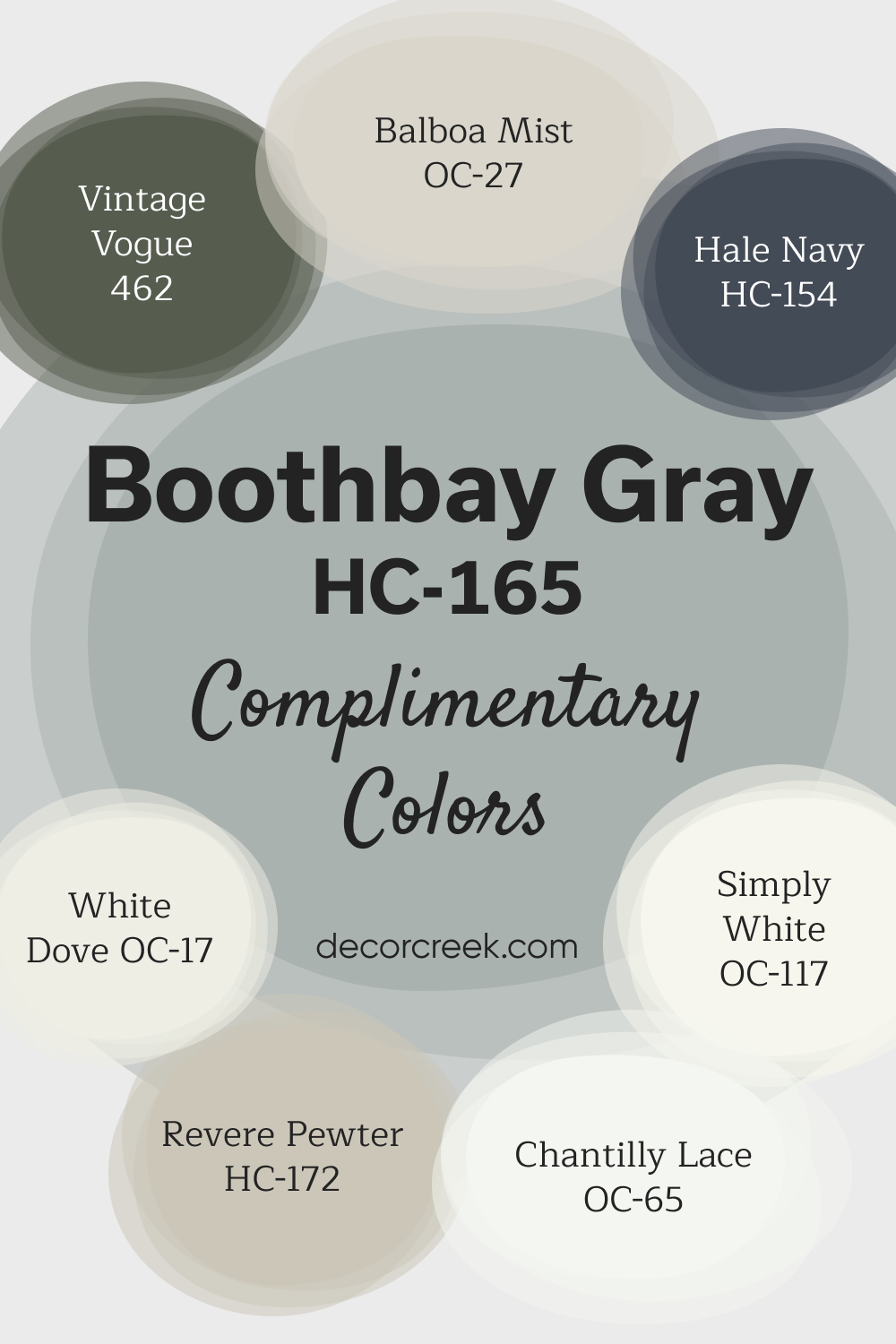
Complimentary Colors for Boothbay Gray HC-165 Paint Color by Benjamin Moore
Boothbay Gray by Benjamin Moore is a versatile, soft gray with cool undertones, ideal for creating a calming and refined atmosphere. It pairs wonderfully with bright whites like White Dove and Simply White, offering clean, fresh contrasts that enhance the lightness of a space.
These bright accents are perfect for trim or cabinetry. For a more neutral palette, Revere Pewter and Balboa Mist provide subtle depth, adding warmth and balance.
If you’re looking to make a bold statement, Hale Navy and Vintage Vogue offer rich, contrasting hues that add character and style.
Chantilly Lace completes the look with a bright, crisp touch, creating a polished and elegant design.
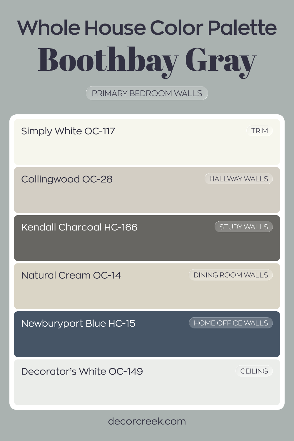
Whole House Paint Color Palette Designed Around Boothbay Gray HC-165
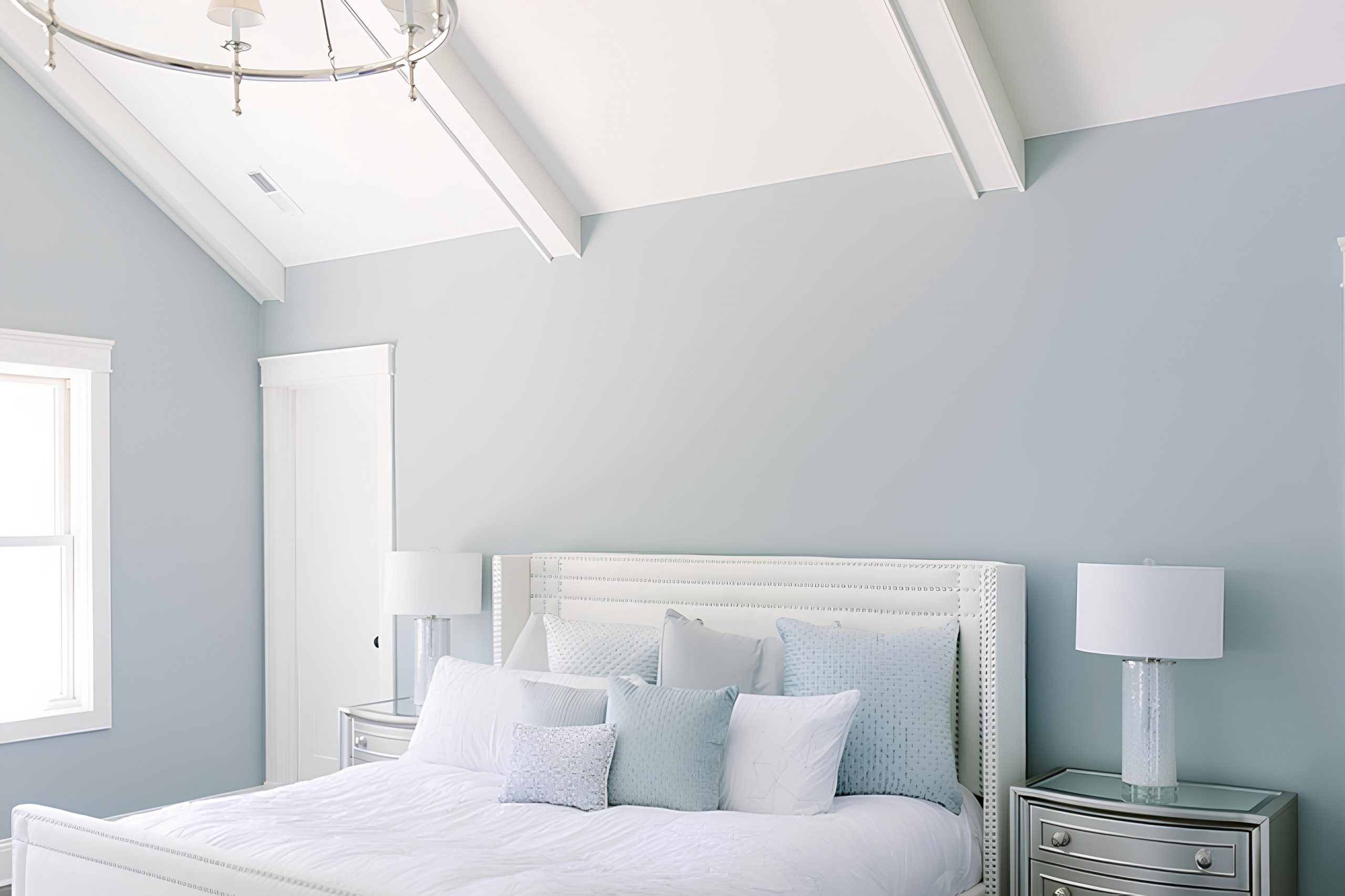
Boothbay Gray HC-165 sets a soft blue-gray tone in the primary bedroom. Simply White trim and Decorator’s White on the ceiling keep the look crisp and fresh. The cool base feels balanced by bright white details.
Collingwood in the hallway and Natural Cream in the dining room add warmth nearby. Kendall Charcoal in the study introduces depth, while Newburyport Blue in the house office strengthens the blue influence.
Each shade supports the cool gray foundation.
The palette blends airy grays, warm neutrals, and deep blues. Together, they create a cohesive house with layered color and clear contrast.
How to Use Boothbay Gray HC-165 by Benjamin Moore In Your Home?
Boothbay Gray HC-165 by Benjamin Moore is a unique and versatile paint color that can dramatically change any room in your home. This shade is a subtle mix of gray with a hint of blue, making it perfect for creating a calm and soothing atmosphere. It’s an excellent choice for those looking to add a touch of sophistication without overwhelming a space with too much color.
You can use Boothbay Gray in various ways around your home. It works wonderfully in living rooms or bedrooms where a peaceful vibe is desired, adding depth and character without closing in the space. In bathrooms or kitchens, it pairs beautifully with white cabinets and marble countertops for a clean, modern look. It also complements wood tones well, so consider it for dining areas or studies for a refined aesthetic.
Because of its balanced nature, Boothbay Gray adapts well to both natural and artificial light, shifting subtly throughout the day. This quality makes it an adaptable choice for any room, fitting a wide range of decors from contemporary to traditional. Whether you want to paint an entire room or create a focal wall, Boothbay Gray adds a beautiful, serene touch to your home.
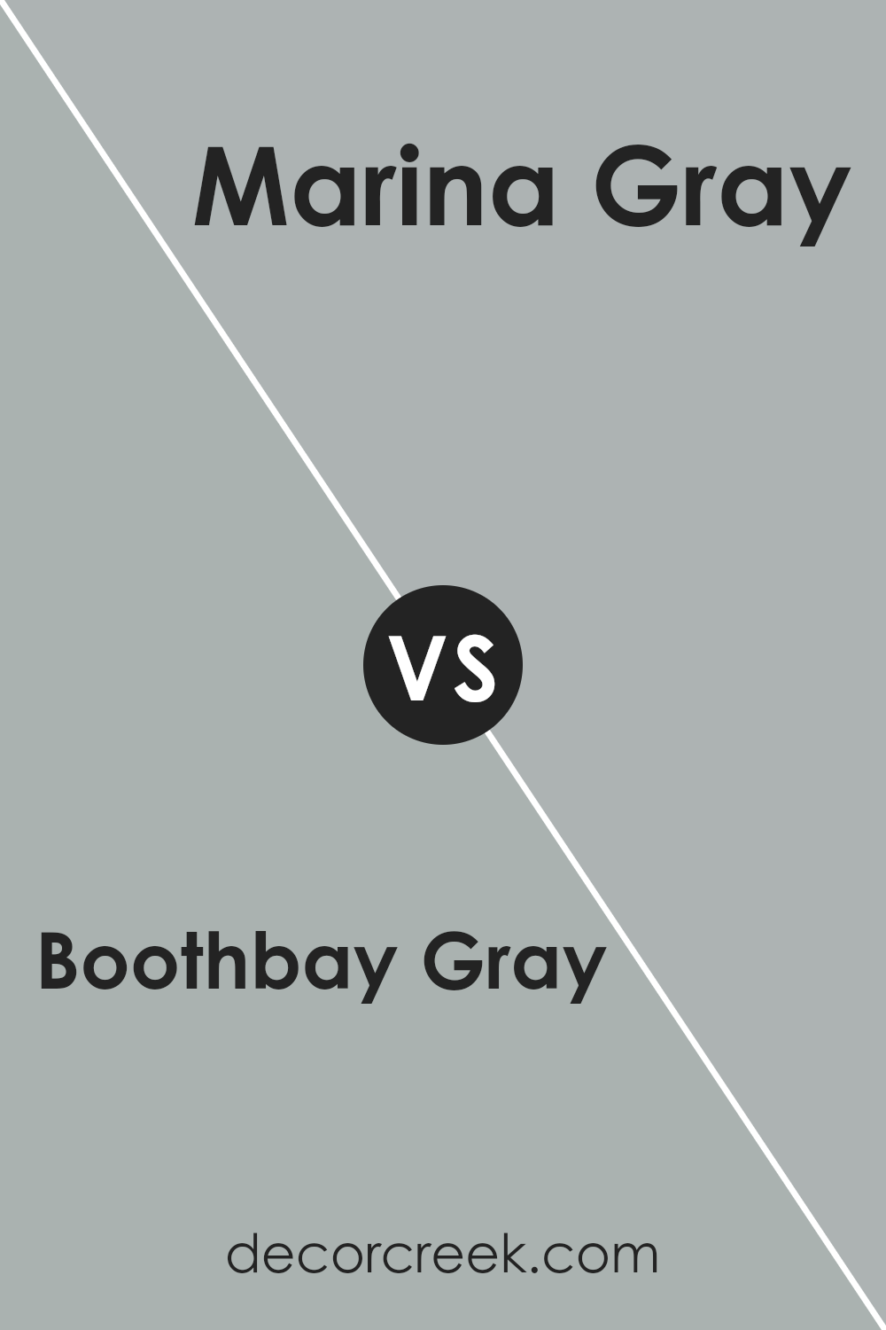
Boothbay Gray HC-165 by Benjamin Moore vs Marina Gray 1599 by Benjamin Moore
Boothbay Gray and Marina Gray, both from Benjamin Moore, bring unique vibes to any space. Boothbay Gray is a subtle color with a cozy feel, perfect for anyone looking to add a touch of sophistication without going too dark. It’s like a soft, comfy blanket in color form, making rooms feel peaceful and inviting.
On the other hand, Marina Gray is a bit lighter and leans towards a cooler, more neutral palette. It’s fantastic for making small spaces appear larger and brighter. Imagine a light, airy feel in a room that’s welcoming and calming. This color is great for those who want a modern touch that still feels homey.
In essence, if you’re leaning towards a color that adds depth while keeping things cozy, Boothbay Gray is your go-to. But if a lighter, more refreshing vibe is what you’re after, Marina Gray will do the trick. Both colors add beautiful tones to walls but cater to different aesthetic preferences.
You can see recommended paint color below:
- 1599 Marina Gray
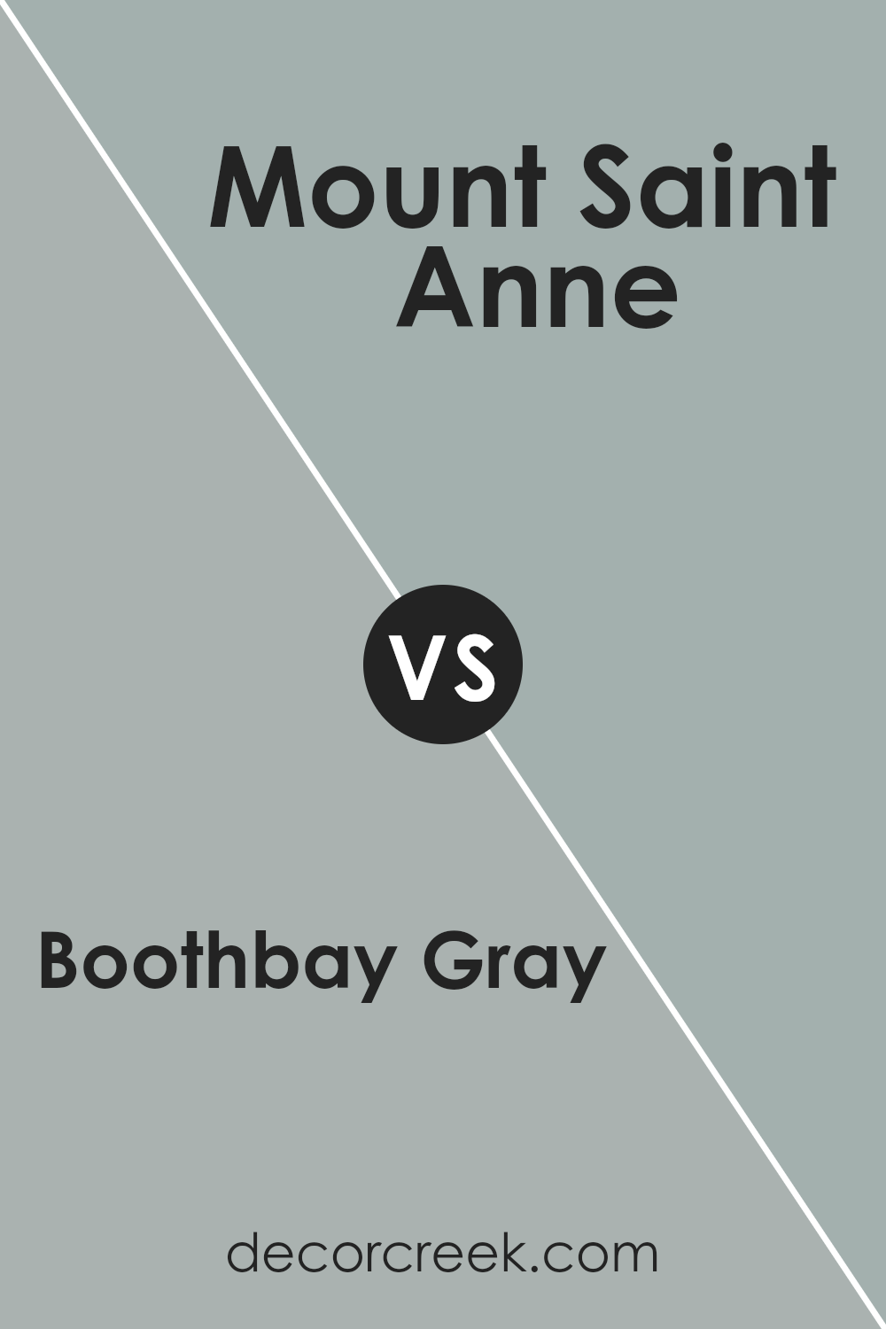
Boothbay Gray HC-165 by Benjamin Moore vs Mount Saint Anne 1565 by Benjamin Moore
Boothbay Gray and Mount Saint Anne, both from Benjamin Moore, are distinct yet harmonious colors. Boothbay Gray is a soothing, medium-toned gray with blue undertones, making it versatile for various spaces. It brings a calm and serene feel, perfect for creating a peaceful ambiance in any room.
On the other hand, Mount Saint Anne leans more towards a unique blend of blue and gray, displaying a slightly deeper and more pronounced hue than Boothbay Gray. This color is great for those who prefer a bit more depth and character on their walls, offering a subtle nod towards a more traditional blue while still maintaining a modern edge.
While both share a gray base, the primary difference lies in the intensity of the blue undertones and the overall depth of color. Mount Saint Anne appears richer and can add a striking yet sophisticated element to a space, whereas Boothbay Gray provides a softer, more laid-back atmosphere.
You can see recommended paint color below:
- 1565 Mount Saint Anne
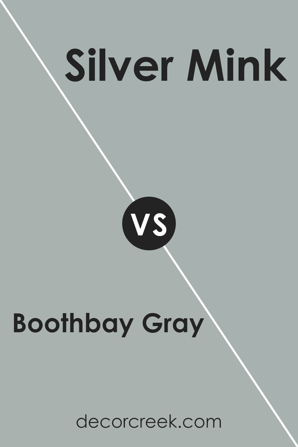
Boothbay Gray HC-165 by Benjamin Moore vs Silver Mink 1586 by Benjamin Moore
Boothbay Gray and Silver Mink, both by Benjamin Moore, offer subtle elegance in their own distinct ways. Boothbay Gray sits comfortably in the spectrum of soft grays with a hint of blue, giving it a serene and peaceful vibe. It’s like looking out to a calm sea under a cloudy sky, bringing a sense of relaxation to any room.
On the other hand, Silver Mink leans towards a warmer, taupe-like gray with an understated sophistication. It has a welcoming coziness, reminiscent of a soft, plush blanket on a cool evening. While Boothbay Gray can cool down a space with its breezy undertones, Silver Mink warms it up, making it inviting.
Both colors are versatile and can work beautifully in various settings, from modern to traditional, but they set distinctly different moods. If you’re looking for a cooler, airy feel, Boothbay Gray is your go-to, whereas if you prefer warmth and a touch of earthiness, Silver Mink is the perfect choice.
You can see recommended paint color below:
- 1586 Silver Mink
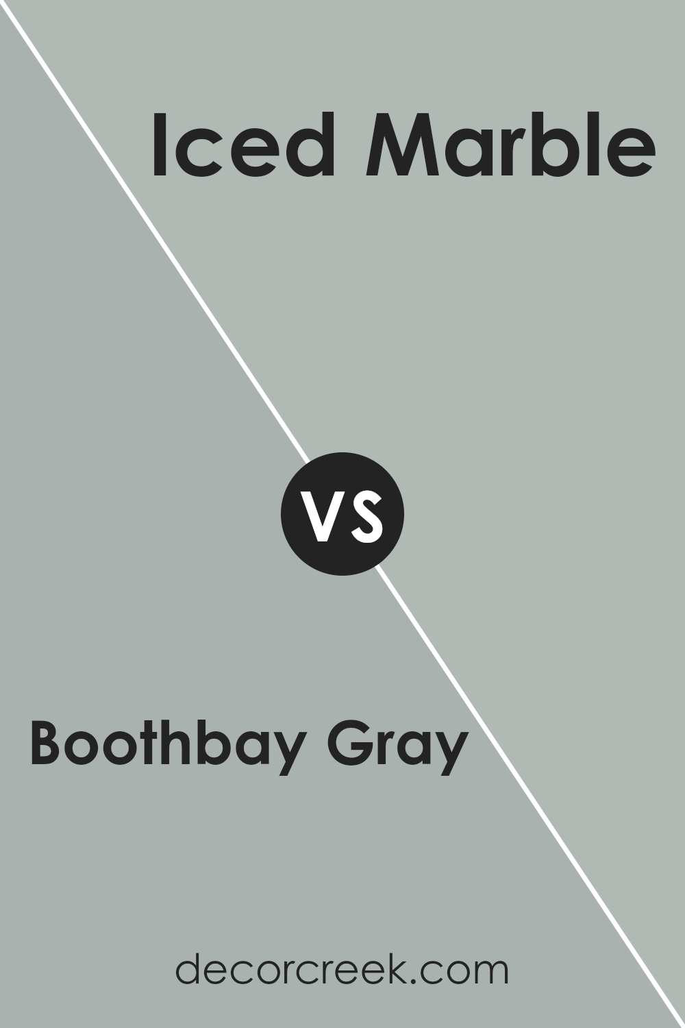
Boothbay Gray HC-165 by Benjamin Moore vs Iced Marble 1578 by Benjamin Moore
Boothbay Gray and Iced Marble by Benjamin Moore are both unique, yet they each bring a different vibe to a space. Boothbay Gray is a cool, muted gray with blue undertones that give a serene and calming effect. It’s like looking at a foggy morning by the sea – peaceful and grounding. This color is perfect for creating a cozy atmosphere in rooms where relaxing is the goal, like bedrooms or living rooms.
On the other hand, Iced Marble is lighter and leans towards a soft, elegant gray with subtle hints of beige. This blend makes it incredibly versatile, adding a touch of warmth that can lighten up any room without making it feel cold. It’s great for spaces that you want to feel airy and open, like kitchens or bathrooms.
While both colors offer a touch of sophistication and are great for creating inviting spaces, Boothbay Gray brings depth and tranquility, perfect for a quiet retreat. Iced Marble, however, offers brightness and a comforting warmth, ideal for making a room feel welcoming. Depending on the mood you want to set, either color could be the right choice.
You can see recommended paint color below:
- 1578 Iced Marble
Conclusion
Boothbay Gray by Benjamin Moore is a versatile color choice for anyone looking to refresh their space. It brings a calming and peaceful vibe, making it perfect for rooms where relaxation is key. Its subtle balance between blue and gray hues allows it to pair well with a variety of decor styles and color schemes. Whether it’s used on walls, furniture, or accents, Boothbay Gray adds a touch of sophistication without overwhelming the space.
Additionally, this color is great for those who prefer a timeless look. It stands out for its ability to adapt to both modern and traditional settings, proving its flexibility and enduring appeal. For anyone considering a makeover for their home or a particular room, Boothbay Gray offers a beautiful foundation or complement to various design elements. It’s a color that not only enhances the aesthetic of a space but also contributes to a serene and inviting atmosphere.

Ever wished paint sampling was as easy as sticking a sticker? Guess what? Now it is! Discover Samplize's unique Peel & Stick samples.
Get paint samples

