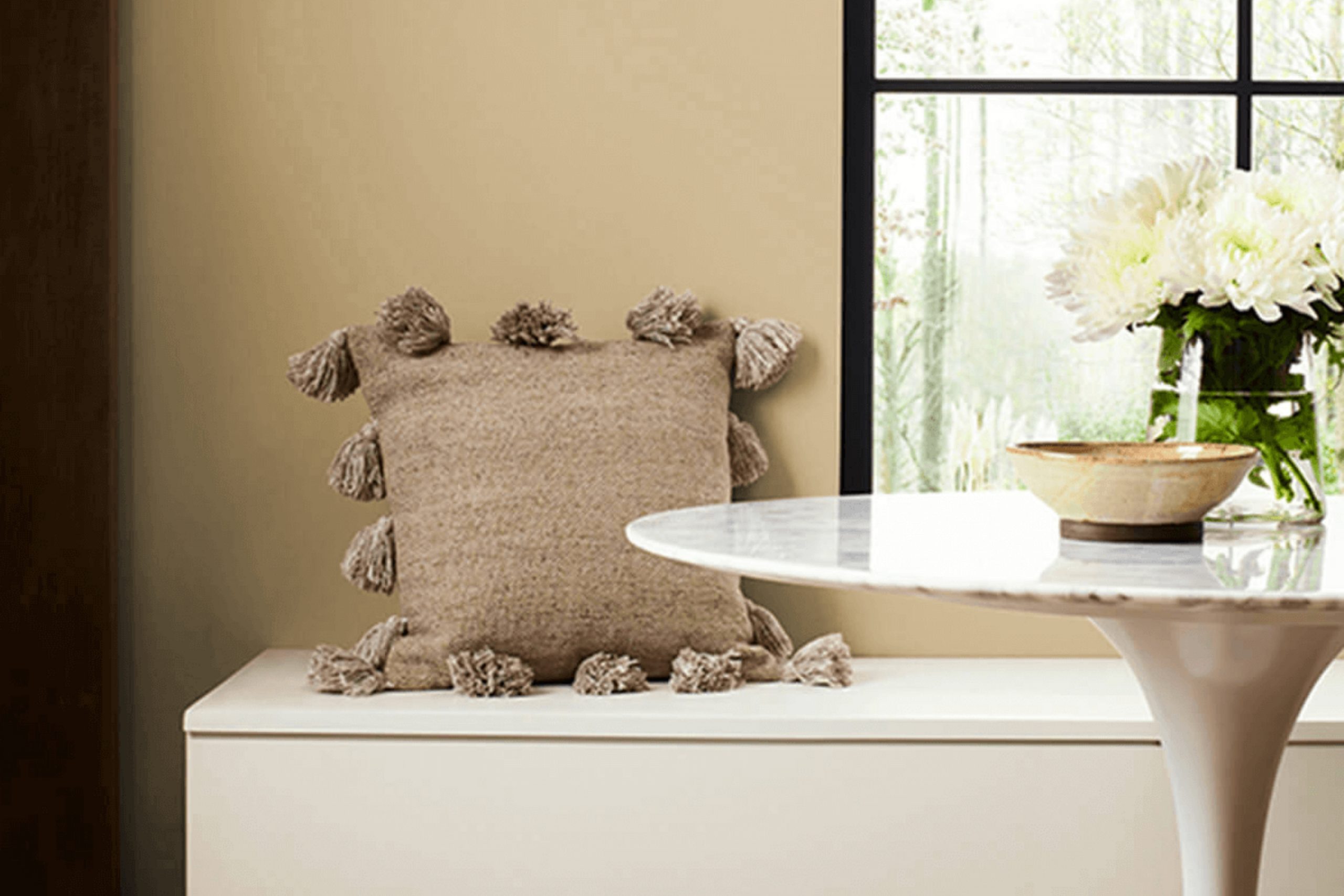
If you’re thinking about giving your space a fresh, new look, you might want to consider using SW 6136 Harmonic Tan by Sherwin Williams. I can tell you from experience, this shade offers a lovely balance of warmth and versatility, making it an excellent choice for anyone hoping to create a cozy, inviting atmosphere in their home.
Harmonic Tan is a nuanced color that behaves wonderfully in different lighting conditions, subtly shifting in depth and intensity as the day progresses.
As a neutral tan, it pairs beautifully with a broad array of decor styles and other colors, from bold, rich hues to softer, muted tones. This makes it an incredibly practical choice if you’re someone who likes to update your accents or furniture periodically because it can easily adapt to various themes and color schemes.
In my home, it has served as a serene backdrop to both classic and contemporary designs, highlighting artwork and furnishings without overpowering them.
Practicality aside, Harmonic Tan also has a unique ability to add a sense of warmth and natural elegance to a room, making spaces feel more welcoming and put-together.
Whether you’re painting a sunny kitchen, a restful bedroom, or a lively living room, this color can help enhance the room’s aesthetic and mood.
What Color Is Harmonic Tan SW 6136 by Sherwin Williams?
Harmonic Tan by Sherwin Williams is a warm, soothing beige color that offers a versatile backdrop for many interior design styles. With a soft and welcoming feel, this hue works exceptionally well in cozy environments, such as living rooms, bedrooms, and entryways.
This particular shade of tan can harmonize with a range of materials and textures. It pairs beautifully with natural wood, enhancing the rich grains and bringing out a rustic charm, making it a great choice for styles like farmhouse or rustic decor.
When matched with metal finishes like bronze or copper, Harmonic Tan adds a gentle warmth that complements the coolness of the metals, perfect for an industrial look.
The color also goes well with various fabrics, from linen to velvet, offering flexibility in choosing furniture and curtains that can create a relaxed and inviting atmosphere.
It’s particularly effective in styles that prioritize comfort and simplicity, such as Scandinavian or minimalist interiors.
For those looking to create a homey yet stylish space, Harmonic Tan provides a neutral base that allows room for colorful accents, such as cushions, artworks, or rugs, to pop, giving you the freedom to personalize your space while maintaining a cohesive look.
Is Harmonic Tan SW 6136 by Sherwin Williams Warm or Cool color?
Harmonic Tan by Sherwin Williams is a warm and welcoming paint color that can make rooms feel cozy and inviting. It’s a soft, muted beige with hints of yellow, making it perfect for adding a gentle touch of warmth to your living space without overwhelming it.
This color is quite versatile, fitting well in almost any room whether it’s a bedroom, living room, or kitchen. It pairs beautifully with a wide variety of decor, including both dark and light furniture, making it an easy choice for many homeowners.
Since Harmonic Tan is neutral, it doesn’t clash with bold colors, which means you can use it as a backdrop for vibrant art pieces or colorful textiles. It’s also great for spaces that get a lot of natural light as well as those with fewer windows, as it helps brighten up the area naturally. Overall, using this color in your home can create a cozy, comfortable environment where you can relax and feel at ease.
Undertones of Harmonic Tan SW 6136 by Sherwin Williams
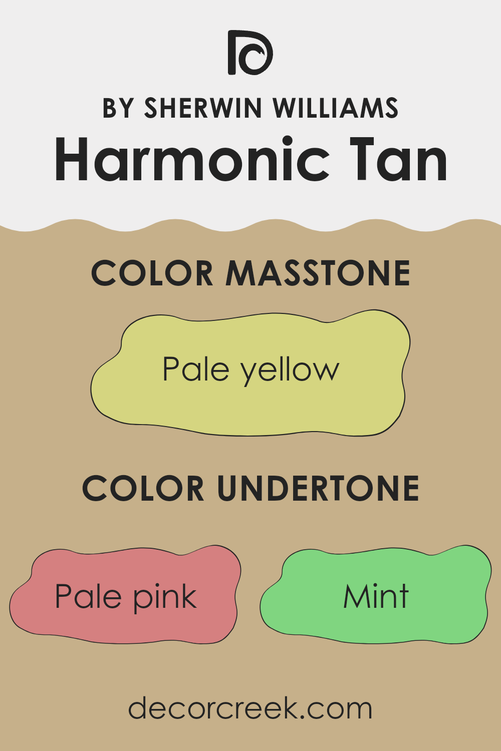
Harmonic Tan is a complex and versatile color with a blend of undertones that can subtly influence the atmosphere of a room. When we talk about the undertones of a color, we’re referring to the underlying hues that can surface depending on the lighting and surrounding colors. This particular paint has a wide range of undertones including pale pink, mint, light gray, gray, light purple, yellow, orange, light blue, lilac, light green, and olive.
In simple terms, these undertones add layers of depth to the paint color, making it bend slightly towards one hue or another under different circumstances. For instance, in a room with ample sunlight, the yellow and orange undertones of Harmonic Tan might make the walls seem warmer and more welcoming.
In contrast, in a space with cooler, artificial lighting, the mint and light blue undertones might become more prominent, giving the room a fresher feel. When used on interior walls, Harmonic Tan provides a neutral background that is far from plain. Depending on the room’s furnishings and natural light, the color’s subtle variations can make the walls seem to change throughout the day.
This adaptability makes it suitable for many spaces, as it can harmonize with a wide variety of decor styles and colors. In essence, the different undertones in Harmonic Tan help it either recede as a soft backdrop or come forward to add a gentle, colorful nuance to your space, flexibly enhancing the room’s mood and feel.
What is the Masstone of the Harmonic Tan SW 6136 by Sherwin Williams?
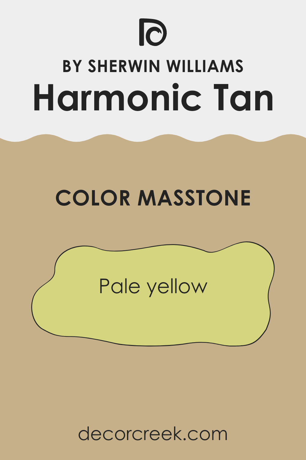
Harmonic Tan SW 6136 by Sherwin Williams has a masstone of pale yellow, captured by the hex code #D5D580. This gentle and warm shade can enhance homes by creating a welcoming and friendly atmosphere.
The light yellow tone works well in spaces that aim for a subtle brightness, making rooms feel larger and airier. It pairs nicely with both dark and light furniture, allowing for flexibility in interior design choices. Homeowners may use this color in living areas or bedrooms to add a touch of coziness without overwhelming the senses.
Its neutrality makes it easy to complement with various decor styles, from modern to rustic. Overall, this pale yellow hue offers a balance of warmth and light, making it a versatile choice for enhancing the natural light in a space while maintaining a soft, inviting aura.
How Does Lighting Affect Harmonic Tan SW 6136 by Sherwin Williams?
Lighting plays a crucial role in how we perceive colors. The same paint color can look different depending on the light source. For example, Harmonic Tan by Sherwin Williams can appear differently under various lighting conditions.
In natural light, colors tend to show their truest form. Sunlight provides a full spectrum of light wavelengths, making colors appear vibrant and clear. In a room that faces south, Harmonic Tan will appear warmer and more inviting because it receives ample sunlight throughout the day. The light brings out the warm undertones of the paint, making the space feel cozy.
In a north-facing room, where light is cooler and more diffuse, Harmonic Tan might look softer and slightly more muted. North-facing light can sometimes cast a slight blue tone, which may make the color seem more subdued than it does in sunnier rooms.
Rooms that face east receive sunlight in the morning when the light is golden and warm. In these rooms, Harmonic Tan will look particularly warm and welcoming in the morning but might lose some of its vibrancy as the day progresses and the natural light diminishes.
Conversely, west-facing rooms experience the most change throughout the day. They might not get a lot of sunlight in the morning but are bathed in warm, orange-tinted light by the afternoon and evening. In these conditions, Harmonic Tan will shift from appearing less dynamic in the morning to vibrant and warm in the evening as it reflects the setting sun’s rays.
Artificial lighting affects how we perceive color as well. Under warm, incandescent light, Harmonic Tan can look richer and more golden, enhancing its cozy feel. Fluorescent lighting, which is cooler, might make the color appear a bit more washed out or even slightly greenish.
In summary, the appearance of paint like Harmonic Tan can vary significantly under different lighting conditions. The amount of light, as well as the type of light in a room, can influence how this color is ultimately perceived.
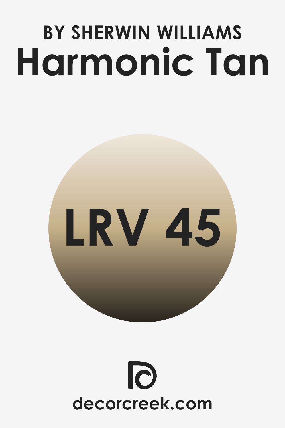
What is the LRV of Harmonic Tan SW 6136 by Sherwin Williams?
Light Reflectance Value (LRV) is a measure of the percentage of light a paint color reflects from or absorbs into a painted surface. Colors with higher LRVs reflect more light, making rooms feel brighter and more open, while those with lower LRVs absorb more light, which can make a space feel cozier but smaller.
Understanding LRV helps in choosing paint colors that will achieve the desired effect in your space, depending on how much natural or artificial light your room has. The LRV of Harmonic Tan, which is 45.042, means it is a mid-range color, reflecting almost half of the light that hits it.
This makes it quite versatile—it’s not too bright but neither is it too dark. In a well-lit room, it will look lighter and could create a warm and inviting atmosphere. In rooms with less natural light, it could appear slightly darker, bringing a cozy feel to the space without making it feel cramped. This middle-level reflectivity makes Harmonic Tan a practical choice for many spaces in the home.
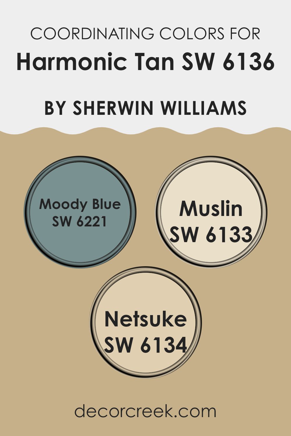
Coordinating Colors of Harmonic Tan SW 6136 by Sherwin Williams
Coordinating colors are selected to complement each other when used in a design context, creating a harmonious visual experience. They are often chosen based on their positions on the color wheel or their shared undertones, balancing contrast and coherence in an aesthetically pleasing manner. For example, when coordinating colors alongside a neutral like Harmonic Tan, designers might opt for colors that add both contrast and continuity to create a balanced palette.
In this context, Moody Blue (SW 6221) is a deep, soothing blue that provides a rich contrast to the softer tones of Harmonic Tan, bringing depth and interest to the color scheme. This color is ideal for accent walls or for use in accessories to inject a sense of calm and focus.
Muslin (SW 6133), on the other hand, is a lighter, warm shade that very subtly enhances the warmth of Harmonic Tan, making it perfect for creating a cozy and inviting atmosphere in spaces like living rooms or bedrooms. Finally, Netsuke (SW 6134), a muted earthy tone, closely aligns with the warmth of Harmonic Tan, offering a gentle contrast that’s perfect for creating a cohesive look throughout a room. These colors together form a palette that is harmonious yet distinct, providing multiple design opportunities.
You can see recommended paint colors below:
- SW 6221 Moody Blue
- SW 6133 Muslin
- SW 6134 Netsuke
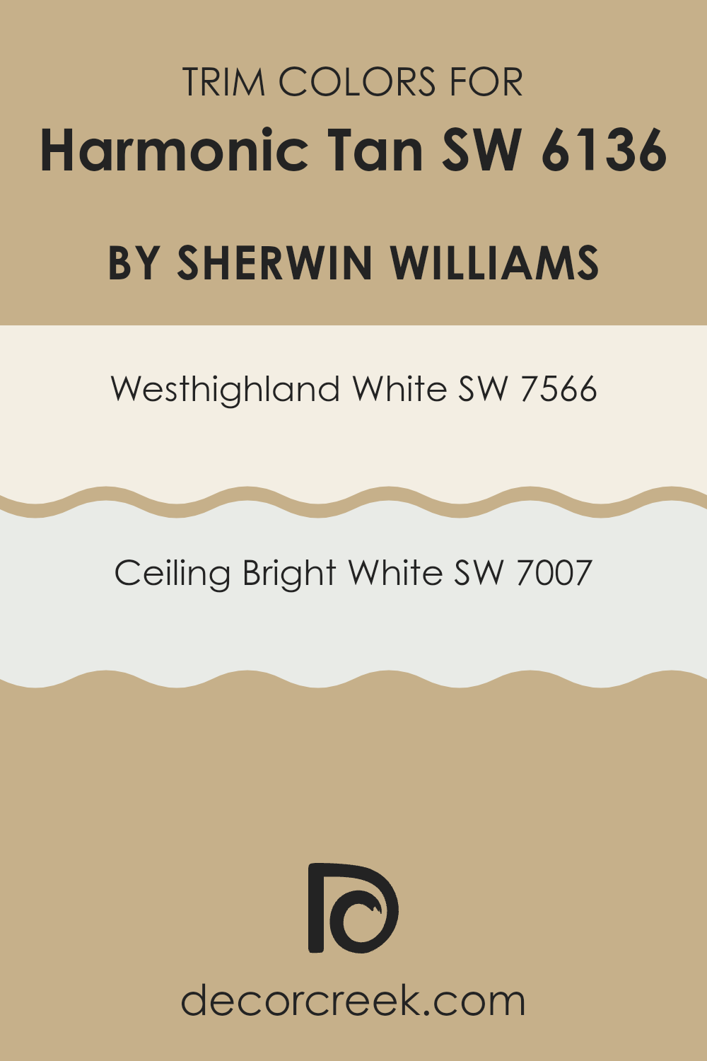
What are the Trim colors of Harmonic Tan SW 6136 by Sherwin Williams?
Trim colors play a vital role in framing and accentuating the primary colors of a room, adding contrast and defining architectural details. For a warm and engaging shade like Harmonic Tan by Sherwin Williams, selecting the right trim colors can significantly enhance the overall aesthetic.
A popular combination involves using lighter shades such as Westhighland White and Ceiling Bright White. These colors create a striking boundary that not only highlights the richness of Harmonic Tan but also brings a crisp, clean finish to the space.
Westhighland White is a soft, creamy white that adds a gentle contrast to Harmonic Tan, making it a great choice for those who prefer a subtle differentiation without overpowering the main color. On the other hand, Ceiling Bright White is a sharper, purer white that offers a bolder outline against the tan, ideal for creating a fresh, lively environment. Together, these two trim options provide flexibility in design, allowing for either a muted or a more pronounced frame around the walls, enhancing both the function and charm of the room.
You can see recommended paint colors below:
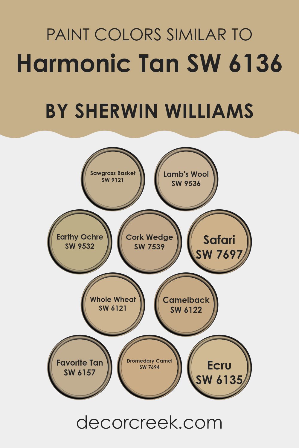
Colors Similar to Harmonic Tan SW 6136 by Sherwin Williams
Similar colors in a paint scheme provide aesthetic balance and a seamless visual experience. When colors are harmoniously aligned, such as the variations modeled after Harmonic Tan, they create a unified look that subtly enhances the design without overwhelming the senses. Using analogous hues like these can enhance the cohesiveness of a space while allowing for minor deviations that add character and depth.
For example, Sawgrass Basket is a soft, muted beige with a touch of warmth, reminiscent of dried grass, perfect for creating a cozy and inviting atmosphere. Lamb’s Wool, another option, leans towards a pale, creamy beige that lights up a room with its understated brightness, making spaces feel open and airy.
Earthy Ochre has a deeper, golden tone that reflects natural elements, adding a touch of the outdoors inside. Cork Wedge is a richer, deeper beige that suggests stability and groundedness, suitable for areas where you want a sense of solidity. Safari offers a darker tan shade, which recalls the rich hues of wilderness and lends an earthy robustness to any setting.
Whole Wheat is a straightforward, wholesome color, bringing a sense of warmth and comfort, much like the grain it’s named after. Camelback introduces a subtler, more subdued tan that works well in varied lighting, making it versatile for any room. Favorite Tan is beloved for its ability to offer a touch of warmth without dominating the space, a perfect middle ground.
Dromedary Camel, a deeper, saturated tan, provides an anchor of warmth in larger or brightly-lit spaces. Lastly, Ecru is a soft, almost off-white beige, providing a delicate hint of color, ideal for layering and contrasting with bolder hues.
You can see recommended paint colors below:
- SW 9121 Sawgrass Basket
- SW 9536 Lamb’s Wool
- SW 9532 Earthy Ochre
- SW 7539 Cork Wedge
- SW 7697 Safari
- SW 6121 Whole Wheat
- SW 6122 Camelback
- SW 6157 Favorite Tan
- SW 7694 Dromedary Camel
- SW 6135 Ecru
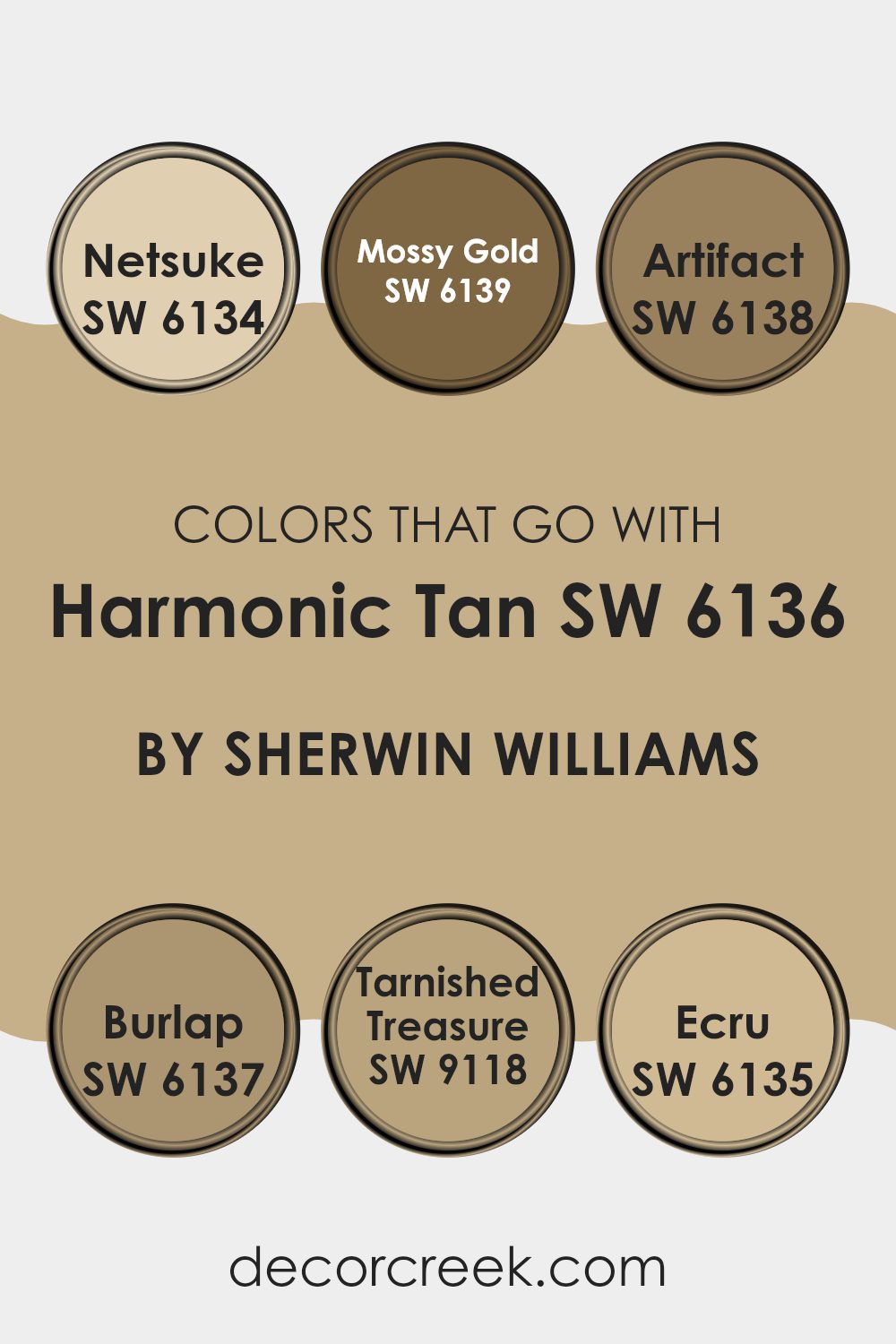
Colors that Go With Harmonic Tan SW 6136 by Sherwin Williams
Choosing the right colors to pair with Harmonic Tan SW 6136 by Sherwin-Williams can significantly enhance the aesthetic appeal of any space. These complementary colors help create a cohesive look that feels visually balanced and harmonious.
For instance, Netsuke SW 6134 offers a lighter, almost creamy beige that provides a subtle contrast to Harmonic Tan, making the space feel more open and airy. Burlap SW 6137 has a deeper, earthier tone that grounds the environment, adding a sense of warmth and homeliness.
On the other hand, colors like Mossy Gold SW 6139 introduce a muted golden hue that adds a touch of warmth without overwhelming the room, perfect for an inviting, cozy vibe. Artifact SW 6138 brings in a richer, darker brown that draws in depth and complexity to the palette. Ecru SW 6135 gives off a slightly warmer tone than Netsuke, lending itself well to spaces that aim for a soft, gentle ambiance.
Lastly, Tarnished Treasure SW 9118 is a unique gray with a metallic undertone that can add a modern twist to the mix. When these colors are used together, they create a rounded, dynamic palette that enhances the beauty and functionality of the spaces they occupy.
You can see recommended paint colors below:
- SW 6134 Netsuke
- SW 6139 Mossy Gold
- SW 6138 Artifact
- SW 6137 Burlap
- SW 9118 Tarnished Treasure
- SW 6135 Ecru
How to Use Harmonic Tan SW 6136 by Sherwin Williams In Your Home?
Harmonic Tan SW 6136 by Sherwin Williams is a versatile paint color that can add warmth and comfort to any room in your home. Its neutral tan shade pairs well with a variety of decorating styles, making it an excellent choice for living rooms, bedrooms, and hallways.
This color works great as a base, allowing you to decorate with any accents, furniture, and fabrics without clashing. It’s especially effective in spaces where you want to create a cozy, welcoming atmosphere.
For a harmonious look, you can match Harmonic Tan with white trims or moldings, which will highlight the walls and give the room a clean, finished appearance. In smaller spaces, like bathrooms or a home office, this color can help the space feel larger and more open. Additionally, it’s a great choice for exteriors, complementing natural surroundings and boosting curb appeal with its warm, inviting hue.
Harmonic Tan SW 6136 by Sherwin Williams vs Sawgrass Basket SW 9121 by Sherwin Williams
Harmonic Tan and Sawgrass Basket are two distinct paint colors by Sherwin Williams. Harmonic Tan is a soft, warm beige that creates a cozy and welcoming feel in a room. It’s perfect for spaces where you want a neutral backdrop that still adds warmth to the decor.
On the other hand, Sawgrass Basket is a deeper, richer color with hints of green and gray. This color is great for adding a bit of depth and interest to a space without overwhelming it with too strong a hue. It works well in areas that need a touch more character or where you might want to make a subtle statement.
Both colors are versatile, but while Harmonic Tan leans towards a classic neutral look, Sawgrass Basket offers a unique twist with its earthy undertones. Depending on your room’s lighting and style, each color has its charm and can significantly affect the room’s atmosphere.
You can see recommended paint color below:
- SW 9121 Sawgrass Basket
Harmonic Tan SW 6136 by Sherwin Williams vs Earthy Ochre SW 9532 by Sherwin Williams
Harmonic Tan and Earthy Ochre are both warm tones by Sherwin Williams, yet they offer subtly distinct vibes. Harmonic Tan leans towards a soft, light beige that brings a gentle and welcoming feel to any room.
Its lightness makes it versatile for spaces big or small, providing a clean and airy atmosphere. In contrast, Earthy Ochre is a deeper, more grounded color. This hue evokes the richness of the earth, with a robust ochre that can make a space feel more anchored and cozy.
While Harmonic Tan reflects more light, Earthy Ochre absorbs it, creating a warmer essence. Perfect for creating a focal point or warming up a north-facing room, Earthy Ochre works well where a touch of depth is needed without overwhelming a space. Together, these colors can complement each other, with Harmonic Tan brightening areas and Earthy Ochre adding depth and warmth.
You can see recommended paint color below:
Harmonic Tan SW 6136 by Sherwin Williams vs Favorite Tan SW 6157 by Sherwin Williams
Harmonic Tan and Favorite Tan, both from Sherwin Williams, offer subtle variations in shade that could influence the atmosphere of a room. Harmonic Tan has a slightly lighter and warmer hue, giving a soft, welcoming feel to spaces like living rooms or bedrooms. It reflects natural light beautifully, making it a great choice for areas that receive less sunlight.
On the other hand, Favorite Tan is a bit deeper and has a richer tone. This color is excellent for adding a touch of warmth to larger spaces or high-traffic areas such as hallways and kitchens, where it can hide marks and smudges better than lighter shades.
Both colors are versatile and can complement a variety of decor styles and furnishings, offering a neutral backdrop that allows other design elements to stand out. Whether you choose Harmonic Tan for its light, airy vibe or Favorite Tan for its cozy, enveloping warmth, each color provides a sturdy foundation for creating inviting interiors.
You can see recommended paint color below:
- SW 6157 Favorite Tan
Harmonic Tan SW 6136 by Sherwin Williams vs Safari SW 7697 by Sherwin Williams
Comparing Harmonic Tan and Safari from Sherwin Williams visually, these two paint colors present distinct vibes perfect for various spaces. Harmonic Tan is a soft, warm beige with a slight hint of creaminess. It’s welcoming and understated, making it an excellent choice for nearly any room seeking a cozy, neutral backdrop.
In contrast, Safari is a much darker, earthy tan that leans towards a muddy beige. It carries more depth and boldness than Harmonic Tan, lending a strong presence to a space.
When used in interior design, Harmonic Tan brightens up rooms and pairs well with a wide range of decor styles, from modern to classic. It offers a gentle warmth without overwhelming a space. On the other hand, Safari provides a more pronounced statement. It works well in areas that require a bit more character and can anchor a room with darker furniture or accents. Whichever you choose will depend on the mood and function you want to achieve in your space.
You can see recommended paint color below:
- SW 7697 Safari
Harmonic Tan SW 6136 by Sherwin Williams vs Whole Wheat SW 6121 by Sherwin Williams
Harmonic Tan and Whole Wheat are both warm, inviting colors from Sherwin Williams, but they have subtle differences that set them apart. Harmonic Tan is slightly lighter and has a softer, more beige undertone, making it a versatile choice for a wide range of spaces. This color works well in rooms where you want a calm, neutral backdrop that still adds a bit of warmth.
Whole Wheat, on the other hand, is a bit richer and deeper, with a golden hue that gives it a cozier feel. This color is perfect for spaces where you want to create a more enveloping, warm atmosphere. It pairs beautifully with a variety of wood finishes and earthy decor elements, enhancing the space with its inviting warmth.
In summary, while both colors offer warmth, Harmonic Tan leans towards a lighter, more neutral beige, whereas Whole Wheat brings a deeper, golden warmth to the room.
You can see recommended paint color below:
- SW 6121 Whole Wheat
Harmonic Tan SW 6136 by Sherwin Williams vs Lamb’s Wool SW 9536 by Sherwin Williams
Harmonic Tan and Lamb’s Wool are two welcoming shades by Sherwin Williams. Harmonic Tan is a warm beige with a soothing appeal, ideal for creating a cozy ambiance in any room. It has a classic, earthy vibe that pairs well with natural materials like wood or stone.
On the other hand, Lamb’s Wool is a bit lighter, leaning towards a soft cream color. This shade is great for spaces where you want to add brightness while maintaining a warm and inviting atmosphere. It works beautifully in areas that receive a lot of natural light.
Both colors are versatile, but while Harmonic Tan offers a more grounded, earth-like feel, Lamb’s Wool gives a fresher, airy look. Either choice provides a solid foundation for various decor styles and personal tastes, whether you’re looking to add a subtle hint of warmth or lighten up a space.
You can see recommended paint color below:
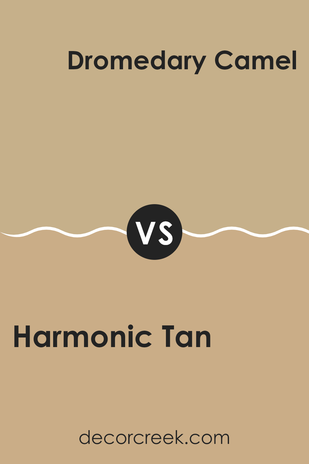
Harmonic Tan SW 6136 by Sherwin Williams vs Dromedary Camel SW 7694 by Sherwin Williams
Harmonic Tan and Dromedary Camel, both by Sherwin Williams, are warm, inviting neutrals, each creating a cozy atmosphere, but they have distinct tones that set them apart. Harmonic Tan is lighter, offering a soft, sandy beige that is subtle and versatile. It works well in spaces aiming for a gentle, neutral background, providing a calm, soothing ambiance without making a bold statement.
On the other hand, Dromedary Camel has a deeper, richer hue, akin to the color of caramel or a light brown sugar. It brings a stronger warmth to a room, making it ideal for spaces where a cozier feel is desired. This color often pairs well with darker furniture or décor, highlighting such elements with its richer background.
In summary, while both colors are warm and neutral, Harmonic Tan leans towards a light, airy feel, whereas Dromedary Camel offers a deeper, more pronounced warmth, suitable for a range of decorative styles.
You can see recommended paint color below:
- SW 7694 Dromedary Camel
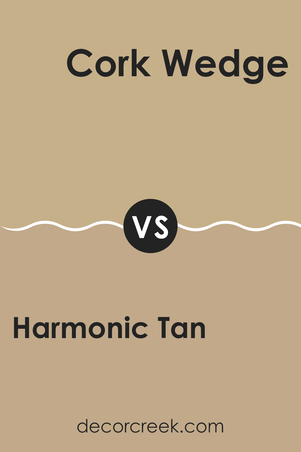
Harmonic Tan SW 6136 by Sherwin Williams vs Cork Wedge SW 7539 by Sherwin Williams
Harmonic Tan and Cork Wedge are two inviting paint colors by Sherwin Williams. Harmonic Tan is a warm, soft beige that feels cozy and soothing in any room. It’s a versatile shade that pairs well with various decor styles, offering a comforting ambiance without becoming too overwhelming.
On the other hand, Cork Wedge is a deeper, toasted brown color with a richer, earthier vibe. It provides a bolder statement in spaces, making it ideal for accent walls or rooms where you want more warmth and depth.
While both colors share a natural earthiness, Cork Wedge stands out as the darker, more intense option, whereas Harmonic Tan is lighter and provides a more subdued backdrop. Together, they could create a beautiful, balanced look in a space, with Harmonic Tan brightening areas and Cork Wedge adding interesting contrast.
You can see recommended paint color below:
- SW 7539 Cork Wedge
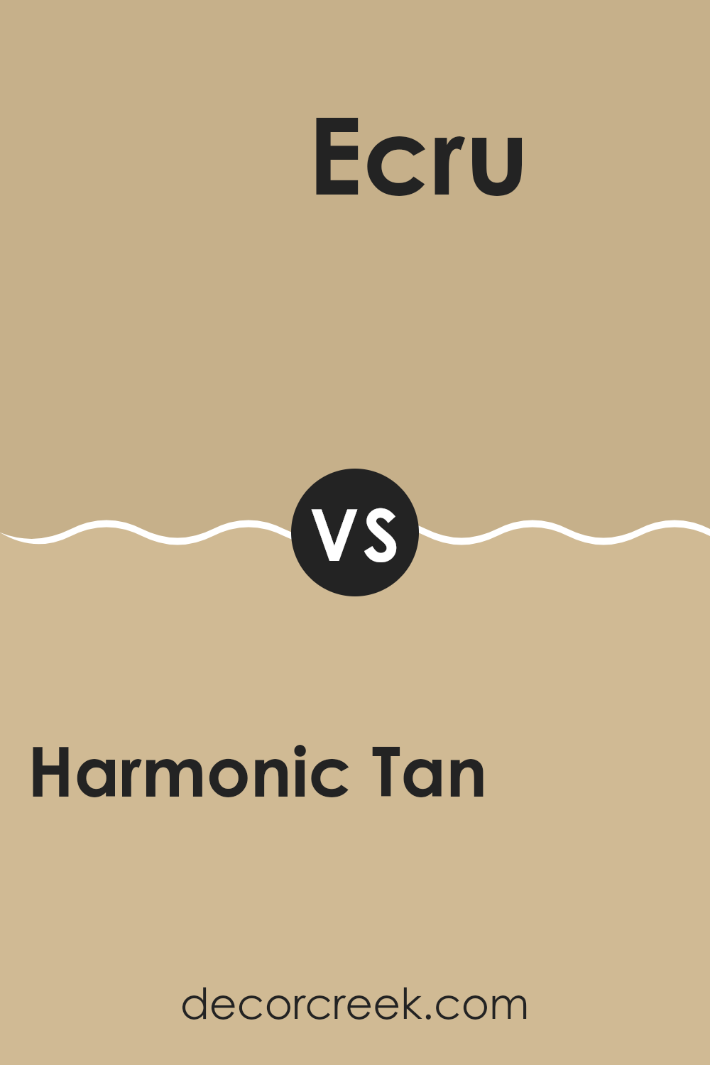
Harmonic Tan SW 6136 by Sherwin Williams vs Ecru SW 6135 by Sherwin Williams
Harmonic Tan from Sherwin Williams is a warm, inviting shade that leans more towards a deeper beige, making it a great choice for spaces where you want to add a bit of cozy robustness. This color can make rooms feel more grounded and welcoming, especially in areas with lots of natural light.
On the other hand, Ecru is a lighter, softer color. It’s almost like a creamy off-white, providing a neutral backdrop that can brighten up spaces effectively. Ecru offers a more subtle approach to coloring your walls, perfect for creating a light and airy feeling in smaller or darker rooms.
Overall, while both colors are neutral, Harmonic Tan offers depth and warmth, whereas Ecru brings lightness and a feeling of spaciousness. They can work beautifully together, with Ecru balancing out the stronger presence of Harmonic Tan in any home decor style.
You can see recommended paint color below:
- SW 6135 Ecru
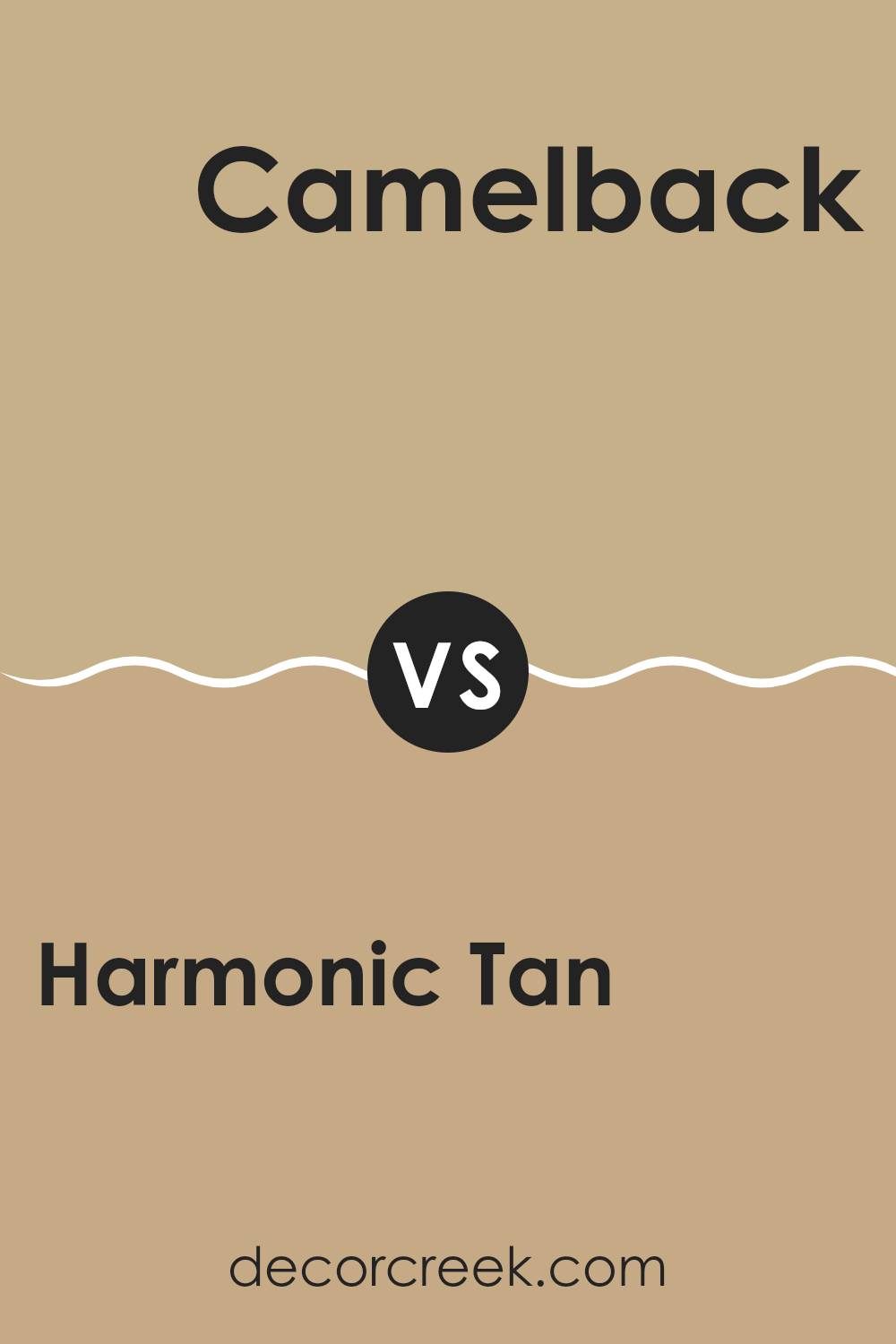
Harmonic Tan SW 6136 by Sherwin Williams vs Camelback SW 6122 by Sherwin Williams
Harmonic Tan and Camelback are two warm, inviting shades by Sherwin Williams. Harmonic Tan is a soft, muted beige with a cozy vibe. It’s an excellent choice for creating a gentle and soothing environment in any room. This shade tends to blend well with other colors, adding a subtle warmth without overpowering the space.
Camelback, on the other hand, is a bit darker and leans towards a richer, more pronounced tan with a hint of gray. It brings a stronger presence to rooms and can make them feel more enclosed and snug. This color works well in spaces where you want to add a bit of depth and character without venturing into truly dark color territories.
Together, these two paint colors complement each other well. Harmonic Tan can lighten up a space, while Camelback can act as an excellent accent, adding definition and interest to the visual dynamics of a room. Both create a warm, welcoming atmosphere, perfect for living spaces and bedrooms.
You can see recommended paint color below:
- SW 6122 Camelback
Conclusion
After looking closely at SW 6136 Harmonic Tan by Sherwin Williams, I’ve found that it’s a really warm and welcoming color. It’s kind of like the calming brown you see in a yummy cup of hot chocolate on a cold day. This color could make just about any room feel comfy and cozy. It’s not too dark or too light, which is great because that means it won’t take over a room but will still add some nice, soft color.
Sherwin Williams did a good job with this paint because it can fit well in many places. Whether you’re painting your living room, your bedroom, or even a hallway, this color can make the space feel friendly and inviting. I can imagine it pairing really well with other colors too, like blues, greens, and even some light yellows or oranges for a really cheerful mix.
Overall, I think SW 6136 Harmonic Tan is a top-notch choice if you want to make a space feel warm and cozy without being too bold or flashy. It’s the kind of color that makes your house feel more like a home.
So if you’re thinking about giving a room a new look, this color is definitely worth considering!
Ever wished paint sampling was as easy as sticking a sticker? Guess what? Now it is! Discover Samplize's unique Peel & Stick samples.
Get paint samples

