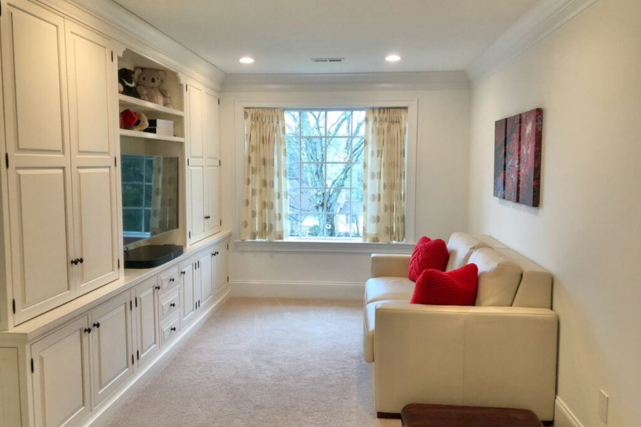
I recently had the pleasure of trying out SW 6133 Muslin by Sherwin Williams, and I must say, I was quite impressed. This paint color has a gentle warmth that adds a cozy, inviting feel to any room in your home. Muslin falls somewhere between beige and soft peach, which is perfect if you love neutral tones but are looking for something with a bit more warmth.
When I used Muslin in my living room, it gave the space a fresh and airy feel without being too bright or overpowering. It has this unique ability to blend with different decor styles and color palettes, making it incredibly versatile.
Whether you have a modern, minimalist home or a more rustic vibe, Muslin can fit right in.
I also found that under various lighting conditions—whether natural light during the day or artificial light at night—Muslin maintains its charm and doesn’t shift too dramatically in hue. This stability is a huge plus if you use multiple light sources in your space.
If you’re thinking about giving your space a new look, or if you’re starting to decorate a new spot, I recommend considering Muslin. It’s subtle enough not to overwhelm, yet distinctive enough to make a noticeable difference in your decorating scheme.
What Color Is Muslin SW 6133 by Sherwin Williams?
Muslin SW 6133 by Sherwin-Williams is a warm, soft beige that exudes a natural simplicity, making it an easy choice for creating a cozy and welcoming space. This color has an earthy hue that pairs beautifully with a wide range of decorating styles, particularly rustic, modern farmhouse, and Scandinavian.
Its subtle warmth makes it an ideal backdrop for interiors, offering a light and airy feel without the starkness of pure white.
Muslin works well with natural materials such as wood, linen, and wool, enhancing their textures and adding depth to the overall design. The neutrality of Muslin allows it to blend seamlessly with other colors, supporting brighter accents and bold furnishings without overwhelming them.
It is just as effective in balancing out dark, rich tones like navy or charcoal, providing a gentle contrast that is pleasing to the eye.
This color is particularly effective in living rooms, bedrooms, and kitchens where its calming effect is most beneficial. In these settings, it complements wooden floorboards, stone countertops, and plush fabrics, providing a grounding effect that ties diverse elements together harmoniously.
Whether used as a main color or an accent, Muslin adapts to the mood and style of any room, making it a versatile choice for any home.
Is Muslin SW 6133 by Sherwin Williams Warm or Cool color?
Muslin SW 6133 by Sherwin Williams is a warm and versatile paint color that creates a cozy atmosphere in any room. This shade of off-white has a subtle hint of beige, making it a perfect neutral that pairs well with almost any color scheme. It’s especially effective in spaces where natural light is abundant, as it reflects the light beautifully, making the room feel brighter and more welcoming.
Homeowners often prefer Muslin for living rooms and bedrooms because it sets a calm and inviting tone. It’s also an excellent choice for hallways and entryways, where it can make small spaces appear larger and more open.
In addition to its aesthetic appeal, this color has a practical aspect too; light neutral colors like Muslin don’t show wear and tear as quickly as darker shades might.
In summary, Muslin SW 6133 is a great choice for those looking for a neutral paint color that adds warmth and light to their home. It’s easy to work with, complements various decor styles, and enhances the overall appeal of a space.
Undertones of Muslin SW 6133 by Sherwin Williams
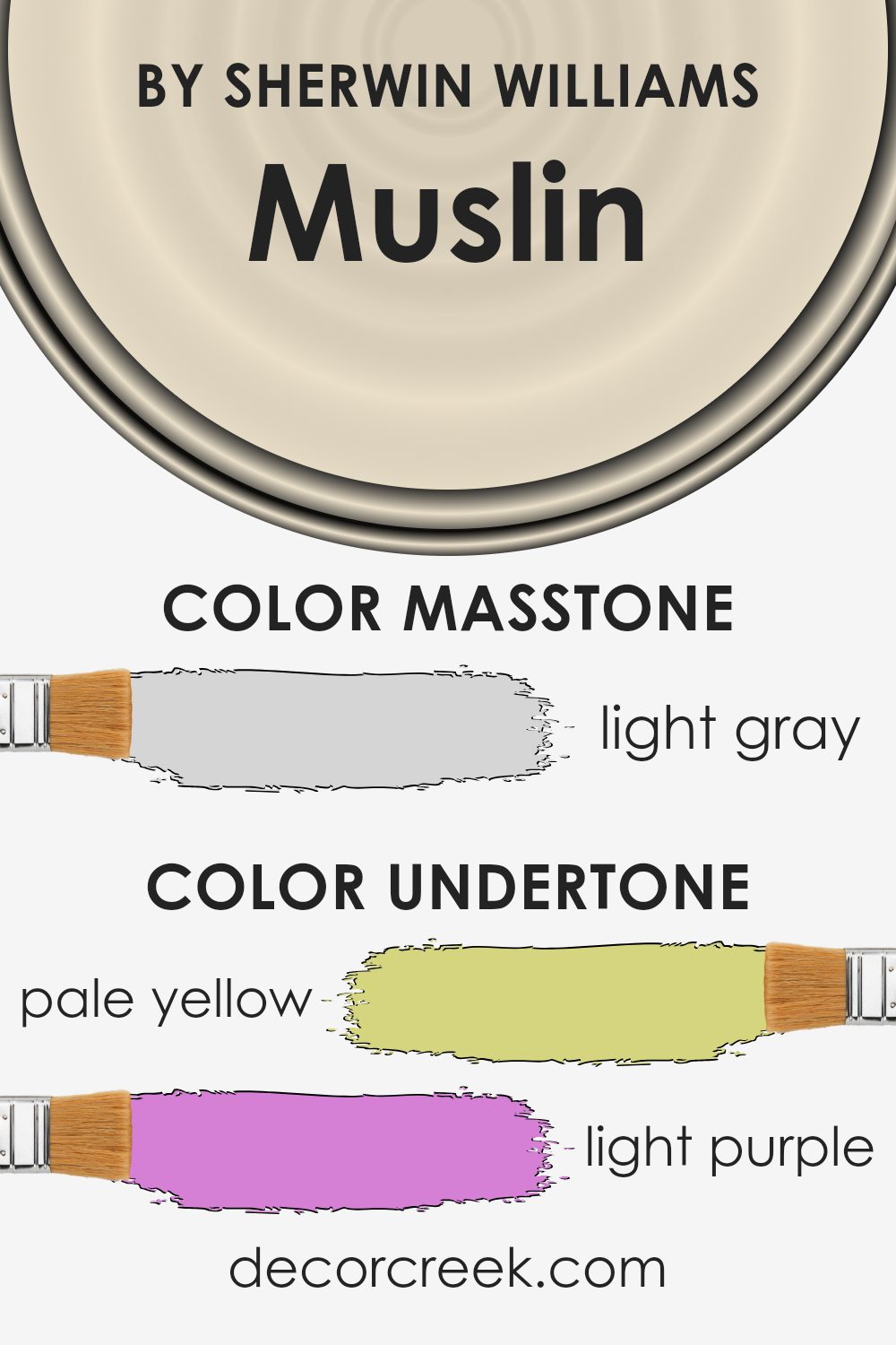
MuslinSW 6133 is a complex color that contains a mix of subtle undertones which contribute to its overall appearance and how it influences room ambiances. Undertones are the underlying hues subtly blended into a primary paint color, influencing its final presentation when applied to surfaces, especially under varying lighting conditions.
Muslin SW 6133, while primarily seen as a neutral, houses hints of pale yellow, light purple, light blue, pale pink, mint, lilac, and grey.
These undertones are crucial because they can change the perception of the color based on lighting and surrounding elements. For instance, in a room with abundant natural light, pale yellow and light blue undertones might make the walls seem brighter and airier. In contrast, in a space with limited natural light, grey and light purple undertones could cause the walls to appear slightly cooler and subdued.
When applied to interior walls, MuslinSW 6133 offers a versatile backdrop that complements a wide range of decor styles and colors.
The soft complexity of its undertones can subtly enhance the room’s aesthetic without overwhelming it. For example, the mint and pale pink undertones can be soothing in a bedroom, while the lilac and grey can provide a gentle grounding effect in a living room.
This adaptability makes it a favorite choice for interior decorators aiming for a nuanced yet neutral palette.
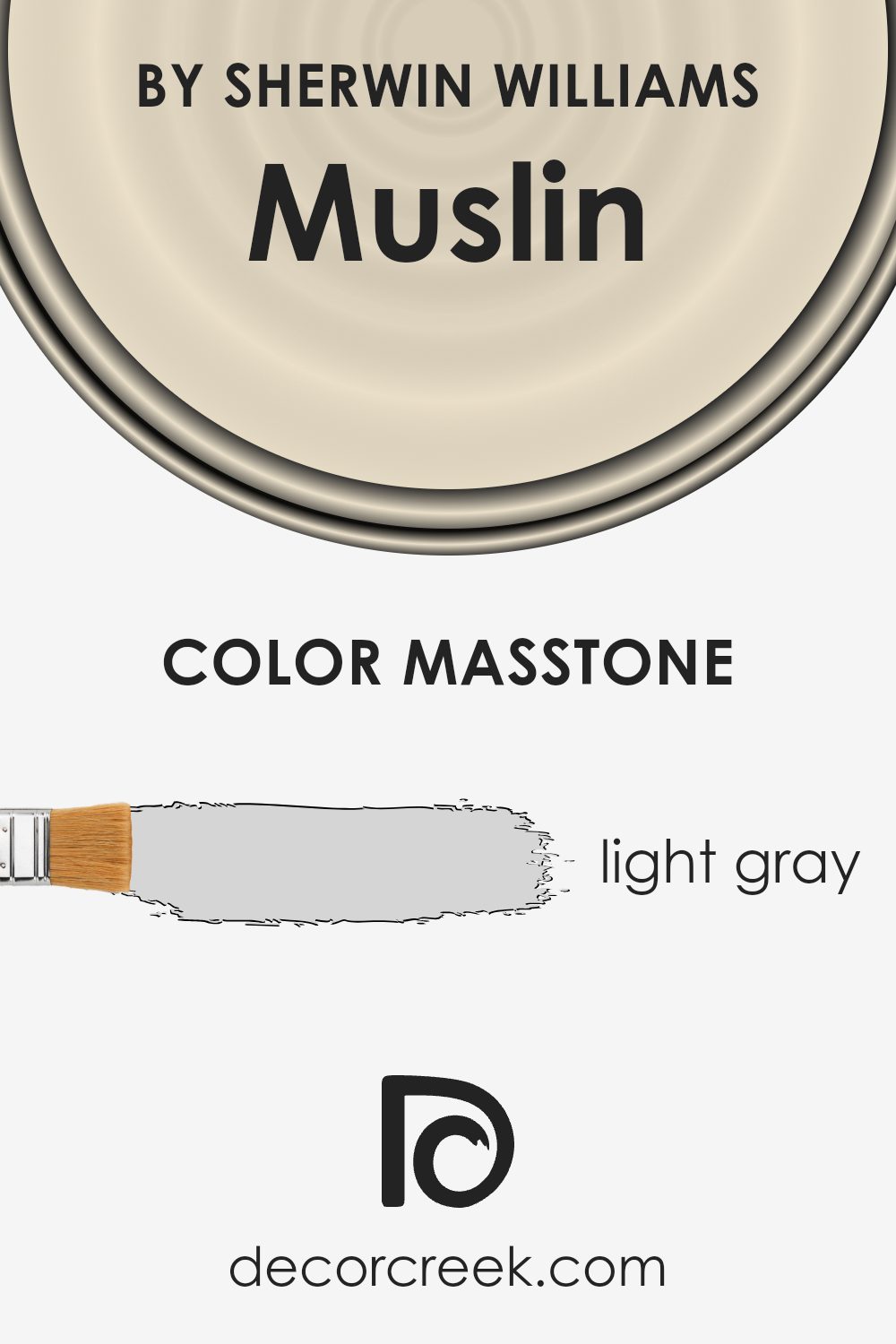
What is the Masstone of the Muslin SW 6133 by Sherwin Williams?
MuslinSW 6133 by Sherwin Williams has a masstone of light gray, which means its main color tone is a gentle, soft gray. This particular shade is versatile and works well in various areas of a home. In spaces like living rooms or bedrooms, the light gray can create a calm and welcoming atmosphere, making the room feel more spacious and clean.
This color is excellent for smaller rooms or spaces without much natural light, as it can help make the area appear brighter and larger. It pairs nicely with a wide range of colors, from bright accents like blues and yellows to more understated tones like whites and beiges.
This makes it easy for homeowners to add personal touches without worrying about clashing colors. Overall, MuslinSW 6133 is a practical choice that adds a subtle, fresh look to walls, enhancing the overall appeal of the home.
How Does Lighting Affect Muslin SW 6133 by Sherwin Williams?
Lighting plays a crucial role in how we perceive colors, impacting the mood and feel of a space. Different types of light sources and the direction a room faces can change how a color appears.
Muslin by Sherwin Williams is a warm neutral hue that can vary in appearance based on lighting conditions. In artificial light, such as that from incandescent bulbs or LEDs, this color can look slightly different.
Incandescent lighting typically makes warm colors like Muslin appear more cozy and inviting because it casts a warm golden light. LED lights, however, depending on the color temperature, might make it look softer and more subdued.
In natural light, Muslin reflects the changing outdoor conditions. Its warm undertone can become more pronounced in bright sunlight, making a room feel warmer. The appearance of this color will also shift throughout the day as the sun’s position changes.
The orientation of the room also plays a significant role:
1. North-Faced Rooms: These rooms get less direct sunlight, especially in the northern hemisphere, leading Muslin to appear more muted and cooler. The color might lose some of its warmth and lean more towards a neutral beige.
2. South-Faced Rooms: South-facing rooms enjoy plenty of light throughout the day. Here, Muslin will appear warmer and more vibrant, fully showcasing its creamy qualities and making the space feel bright and welcoming.
3. East-Faced Rooms: Morning light is cooler and Muslin might look a bit crisper and lighter in east-facing rooms. This can make the room feel fresh and lively in the morning, gradually transitioning to a softer tone by the afternoon.
4. West-Faced Rooms: Evening light in west-facing rooms is warmer, and Muslin will take on a cozy, soothing quality as the sun sets. It may feel more lush and comforting towards the evening.
In conclusion, the way Muslin by Sherwin Williams appears changes with different lighting settings. This variation can be used to your advantage to adjust the ambiance of a room from calm and cozy to bright and airy. Choose lighting wisely to enhance the natural beauty of this color in your space.

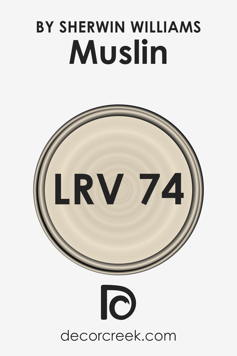
What is the LRV of Muslin SW 6133 by Sherwin Williams?
LRV stands for Light Reflectance Value, which is a measurement used to determine the amount of visible and usable light that a color reflects when it’s painted on a wall. It falls on a scale where the highest possible value a color can hold reflects nearly all light, making it very bright and vivid, while a low value means the color absorbs more light, resulting in a darker appearance.
This value helps in deciding how a color will feel in a space and helps in predicting how it will interact with various lighting conditions throughout the day.
For the color Muslin SW 6133 by Sherwin Williams, which has an LRV of about 74.2, this indicates that the color is fairly light. It will reflect a good amount of light, brightening up a space and making it appear more airy and open. The higher LRV of this shade means it’s an excellent choice for rooms that might receive less natural light or are smaller, as it can help make the area feel larger and more welcoming.
Colors like this can also act subtly, without overwhelming a space with too much vibrancy, providing a gentle backdrop for different types of interior décor.
Coordinating Colors of Muslin SW 6133 by Sherwin Williams
Coordinating colors are chosen to complement a main hue, creating a harmonious and appealing look within a space. When using a neutral base like Muslin by Sherwin Williams, selecting the right coordinating colors enhances the ambiance without overwhelming.
These adjacent shades work well because they share similar undertones or contrasting hues that balance the visual impact. This balance is key in interior design, as it ensures that no single color dominates the space, but rather each contributes to a unified aesthetic.
Among the coordinating colors for Muslin is SW 7012 – Creamy. This is a soft, warm white that adds a subtle brightness, making it an excellent choice for trim or ceilings to provide a gentle lift to the room’s overall tone. Another coordinating color, SW 9163 – Tin Lizzie, is a deeper, slate gray that offers a striking contrast. Its depth complements the lighter tones of Muslin and Creamy, providing a solid anchor and an element of modern charm.
Lastly, SW 6149 – Relaxed Khaki, is a soothing beige that blends seamlessly with Muslin, suggesting a sense of calm and continuity throughout the space. These three coordinating colors work together to support and enhance the aesthetic brought by Muslin, creating an inviting and cohesive environment.
You can see recommended paint colors below:
- SW 7012 Creamy
- SW 9163 Tin Lizzie
- SW 6149 Relaxed Khaki

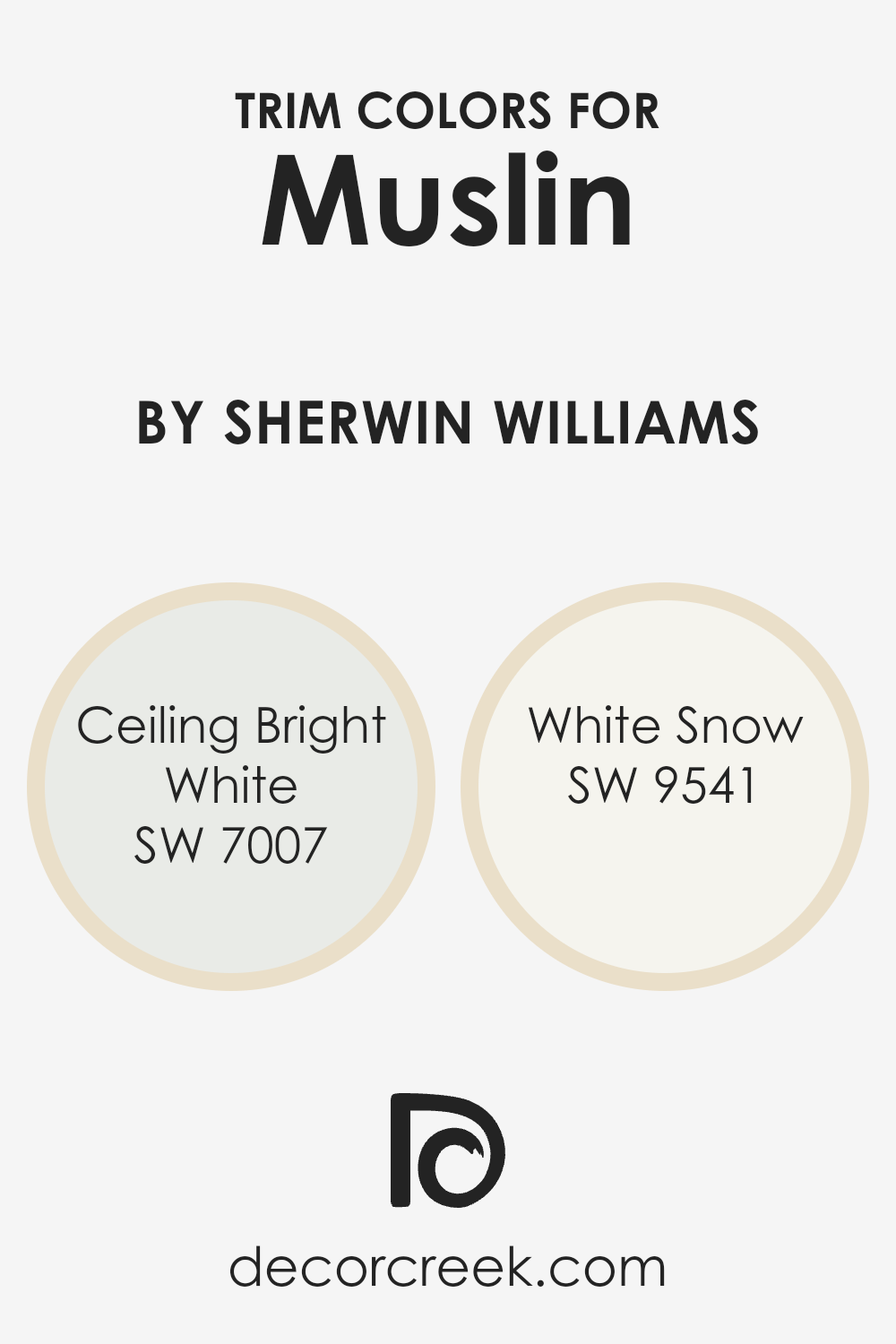
What are the Trim colors of Muslin SW 6133 by Sherwin Williams?
Trim colors serve as accents that define and enhance the main colors used in a room. When using a neutral shade like Muslin SW 6133 by Sherwin Williams, choosing the right trim colors can dramatically affect the overall aesthetic and feel of the space.
Trim colors like SW 7007 – Ceiling Bright White and SW 9541 – White Snow can provide a crisp, clean contrast against the subtle, understated tone of Muslin, highlighting architectural details such as moldings, door frames, and baseboards.
Ceiling Bright White SW 7007 is a pristine, ultra-pure white that brings a fresh clarity to any space, making it ideal for ceilings and trims, helping the room appear larger and brighter. White Snow SW 9541, on the other hand, offers a slightly softer and warmer white, which is perfect for creating a gentle, welcoming ambiance in spaces where stark white might feel too stark.
Both colors support the main wall color without overwhelming it, ensuring that the space feels harmonious and well-coordinated.
You can see recommended paint colors below:
- SW 7007 Ceiling Bright White
- SW 9541 White Snow
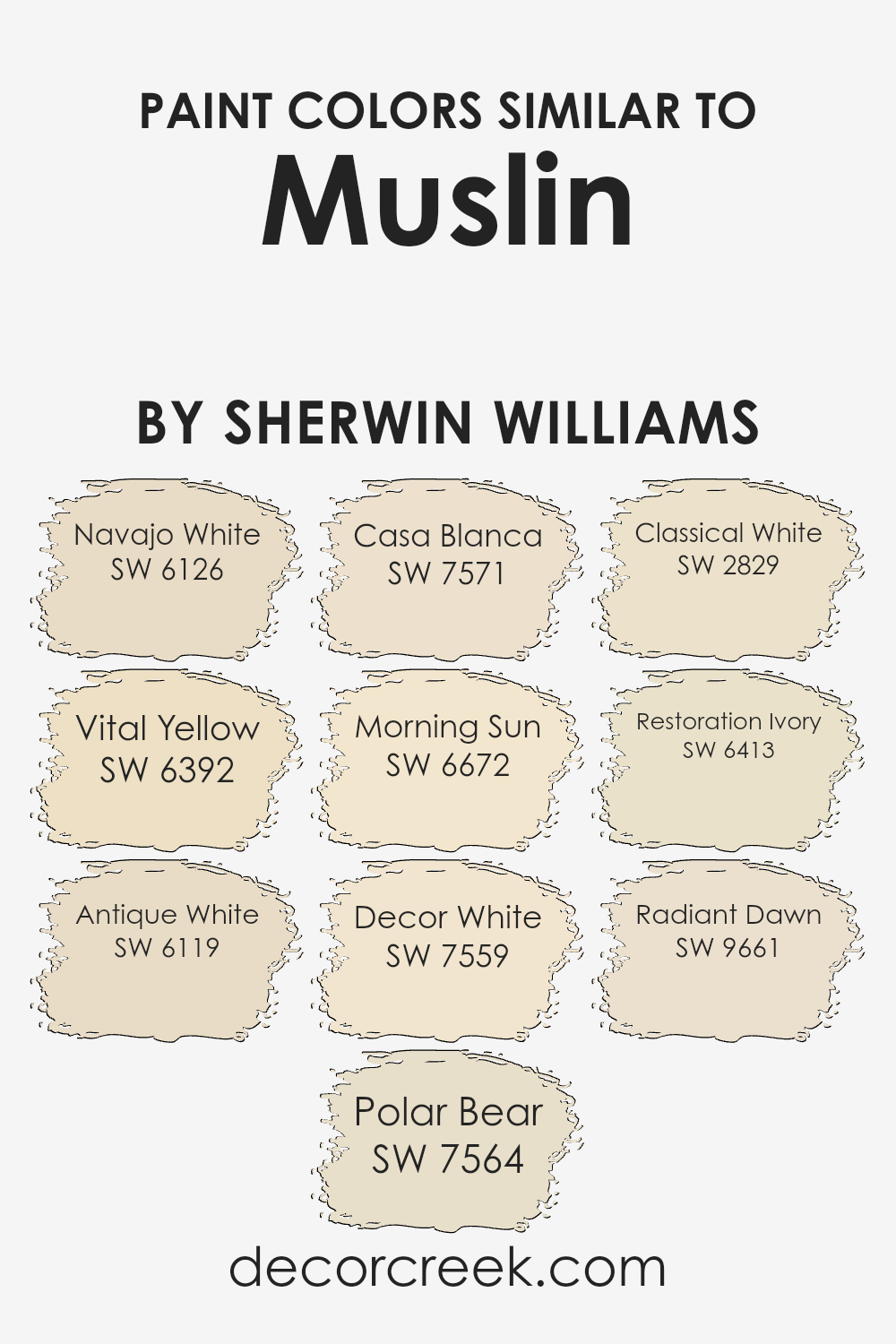
Colors Similar to Muslin SW 6133 by Sherwin Williams
Similar colors play an essential role in creating harmonious and pleasing designs, particularly in interior decorating. They set a mood, enhance aesthetic coherence, and can make spaces appear larger. For instance, colors similar to Muslin by Sherwin Williams, like Navajo White and Antique White, offer a subtle variety while maintaining a consistent color theme.
These colors are ideal for those seeking a unified, yet distinct, interior palette.
Navajo White is a warm, creamy hue that exudes a welcoming vibe, excellent for living rooms or bedrooms where a cozy atmosphere is desired. On the other hand, Vital Yellow adds a touch of brightness, perfect for kitchens or dining areas to stimulate energy and conversation.
Antique White provides a slightly aged look that brings a rustic and comfortable feel, suitable for spaces that aim for a traditional aesthetic. Polar Bear and Casa Blanca lean towards a neutral, crisp white, offering a clean slate for any room, complemented by their understated elegance.
Morning Sun is a gentle yellow that infuses a soft glow, reminiscent of a peaceful morning, ideal for spaces used for relaxation. Decor White and Classical White are both pristine and unblemished, providing a fresh and airy feel to a minimalist décor.
Restoration Ivory adds a touch of warmth, making a room feel inviting without overpowering with color. Radiant Dawn is vibrant yet light, giving a cheerful splash that brightens any area of the home without being too overwhelming.
These colors work together to create a spectrum of options that allow for personal customization while keeping a cohesive look throughout the home.
You can see recommended paint colors below:
- SW 6126 Navajo White
- SW 6392 Vital Yellow
- SW 6119 Antique White
- SW 7564 Polar Bear
- SW 7571 Casa Blanca
- SW 6672 Morning Sun
- SW 7559 Decor White
- SW 2829 Classical White
- SW 6413 Restoration Ivory
- SW 9661 Radiant Dawn
Colors that Go With Muslin SW 6133 by Sherwin Williams
Choosing the right colors to complement Muslin SW 6133 by Sherwin Williams is essential for creating a harmonious and visually appealing space. Muslin SW 6133 is a subtle and versatile shade, and pairing it with the right colors can enhance the overall aesthetic of a room.
For instance, Restful White SW 7563 is a clean and fresh white that provides a calm contrast to Muslin, making any room feel bright and airy. Antique White SW 6119 offers a warmer tone that pairs beautifully with Muslin, creating a cozy and inviting environment.
Similarly, Roman Column SW 7562 is a soft white with a hint of warmth that complements Muslin without overpowering it, perfect for a sophisticated yet understated look. Polar Bear SW 7564 is another good match for Muslin; it’s a crisp white that adds a touch of freshness to balance Muslin’s earthy tones.
For those looking to add a bit more depth, Chopsticks SW 7575 provides a darker, earth-toned balance that enriches the environment, making Muslin pop in a subtle yet impactful way.
Lastly, Nacre SW 6154 is a gentle off-white that blends smoothly with Muslin, ensuring a smooth visual flow.
These color pairings work together to enhance Muslin’s natural charm, ensuring that any decorating venture results in a pleasing and welcoming space.
You can see recommended paint colors below:
- SW 7563 Restful White
- SW 6119 Antique White
- SW 7562 Roman Column
- SW 7564 Polar Bear
- SW 7575 Chopsticks
- SW 6154 Nacre

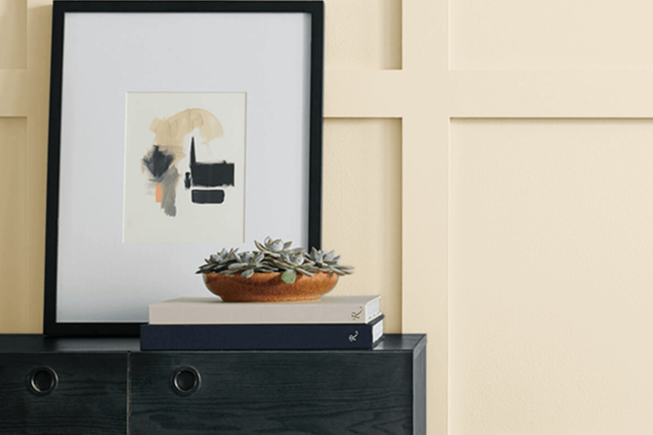
How to Use Muslin SW 6133 by Sherwin Williams In Your Home?
Muslin SW 6133 by Sherwin Williams is a warm, neutral paint color that brings a cozy feel to any room. Perfect for those looking to create a welcoming atmosphere, Muslin is versatile and pairs well with a wide range of decor styles, from modern to traditional.
Its soft beige tones provide a subtle backdrop, making it ideal for living rooms and bedrooms where a calming influence is desired. Because it reflects light well, Muslin can also help make a small space feel larger and more open, which is great for apartments or smaller homes.
Pair it with darker furniture for a pleasant contrast, or with light, airy fabrics for a softer look. Whether you’re painting an entire room or adding an accent wall, Muslin is an excellent choice for a fresh, clean appearance. It’s also practical in hallways and entryways, as it hides everyday marks and smudges well.
Muslin SW 6133 by Sherwin Williams vs Classical White SW 2829 by Sherwin Williams
Muslin and Classical White are both colors by Sherwin Williams but they bring distinct vibes to a space. Muslin is a warm, creamy hue that adds a cozy and inviting feel to any room. It’s a versatile color that pairs well with a wide range of décor styles, from rustic to modern.
On the other hand, Classical White leans towards a clean and crisp look, giving rooms a brighter and more open appearance.
It works beautifully in spaces that aim for a more minimalist or classical aesthetic. While Muslin offers a subtle hint of warmth, Classical White provides a sharper contrast, especially against bold colors.
Both colors can make a room look beautiful but choosing between them depends on the mood and style you want to achieve.
You can see recommended paint color below:
- SW 2829 Classical White
Muslin SW 6133 by Sherwin Williams vs Casa Blanca SW 7571 by Sherwin Williams
Muslin and Casa Blanca by Sherwin-Williams are both soft, warm neutrals, but they have subtle differences. Muslin has a creamier undertone, giving it a cozy warmth that feels very welcoming in spaces that need a gentle touch of color.
On the other hand, Casa Blanca leans slightly towards a grayish tone, offering a cooler backdrop. This makes it a great choice for rooms where you want a touch of sophistication without going too cold. Both colors work well in a variety of lighting situations and can create a relaxed atmosphere in your home.
While Muslin might be better suited for bedrooms or living rooms because of its warmth, Casa Blanca could be more suitable for spaces that get a lot of natural light or for use in bathrooms and kitchens due to its crisp, clean look.
You can see recommended paint color below:
Muslin SW 6133 by Sherwin Williams vs Decor White SW 7559 by Sherwin Williams
Muslin by Sherwin Williams is a warm, soft beige with a creamy touch, whereas Decor White is a much lighter and clearer shade. Muslin offers a cozy feel and is versatile, blending well with many different settings and decors. It can add warmth to a room without overpowering it, making spaces feel welcoming and relaxed.
On the other hand, Decor White is closer to a pure white, providing a fresh and clean look that can help brighten up any space. It’s perfect for creating a minimalist or modern aesthetic, making other colors in the room stand out more.
While Muslin can hide imperfections on walls better due to its slightly darker tone, Decor White may require more maintenance to keep its crisp appearance.
Both colors, however, offer their unique appeal and can significantly enhance the aesthetic of a room depending on what atmosphere you want to achieve.
You can see recommended paint color below:
- SW 7559 Decor White
Muslin SW 6133 by Sherwin Williams vs Radiant Dawn SW 9661 by Sherwin Williams
Muslin by Sherwin Williams is a soft, warm neutral with a gentle beige tone. It serves as a versatile background color in any room, providing a cozy backdrop that pairs well with bolder shades or complements other neutrals for a more subdued look.
In contrast, Radiant Dawn by Sherwin Williams is a much lighter and brighter color, offering a crisp, fresh feel. This color leans towards a very pale blue, almost like a morning sky, which gives a room a clean and airy atmosphere.
When you compare Muslin and Radiant Dawn, Muslin offers warmth and a sense of comfort, making spaces feel inviting and lived-in. Radiant Dawn, on the other hand, refreshes a space with its light and almost ethereal quality, perfect for creating a bright and open feeling. These two colors, while both light, meet different needs depending on the desired mood and style of a room.
You can see recommended paint color below:
- SW 9661 Radiant Dawn
Muslin SW 6133 by Sherwin Williams vs Restoration Ivory SW 6413 by Sherwin Williams
Muslin and Restoration Ivory, both from Sherwin Williams, are nuanced shades that cater to different tastes in home decor. Muslin is a soft, creamy off-white with a hint of beige, making it a warm and inviting color for any room. It’s versatile and pairs well with a variety of decor styles, from rustic to modern.
On the other hand, Restoration Ivory is a slightly richer tone that leans more towards a light taupe or a warm gray, giving it a bit more depth compared to Muslin. This color is great for creating a cozy atmosphere and works exceptionally well in spaces that aim for a classic or traditional look.
Both colors reflect light beautifully and can help make a small room appear larger and more open. Depending on your style and the mood you want to set, Muslin offers simplicity and warmth, while Restoration Ivory adds subtle sophistication without being overpowering.
You can see recommended paint color below:
- SW 6413 Restoration Ivory
Muslin SW 6133 by Sherwin Williams vs Antique White SW 6119 by Sherwin Williams
Muslin SW 6133 and Antique White SW 6119, both from Sherwin Williams, are closely related in tone but have distinctive differences that set them apart. Muslin is a soft, off-white color with a creamy warm undertone, which gives it a cozy and welcoming feel in a space.
It’s excellent for rooms where a gentle, nurturing atmosphere is desired, like living rooms or bedrooms.
On the other hand, Antique White leans more towards a beige shade, muted with a slight grayish undertone, making it seem more restrained and neutral than Muslin. This color suits well in areas where a calm and understated elegance is needed without drawing too much attention.
Both colors are very versatile and pair nicely with a range of décor styles and other hues. The choice between them would depend on whether a warmer, creamier tone (Muslin) or a more subdued, neutral presence (Antique White) better fits the intended mood and aesthetic of the room.
You can see recommended paint color below:
Muslin SW 6133 by Sherwin Williams vs Navajo White SW 6126 by Sherwin Williams
Muslin and Navajo White by Sherwin Williams are popular choices for those looking to create a warm and inviting feel to their spaces. Muslin is a soft beige that leans slightly towards gray. This subtle coolness gives it a versatile characteristic, making it easy to combine with many decor styles and other colors without overpowering them.
On the other hand, Navajo White has a creamier undertone, which can bring a more noticeable warmth to a room. It’s slightly richer than Muslin and works well in spaces where you want to add a touch of cozy brightness without going fully into a yellow tone.
Both colors are light enough to be used as base hues for walls and large areas, providing a neutral background that makes it easy to introduce different accents and furniture styles. Whether you choose Muslin for its gentle neutrality or Navajo White for its welcoming warmth, both options are fantastic for creating a pleasant, airy feeling in a space.
You can see recommended paint color below:
Muslin SW 6133 by Sherwin Williams vs Polar Bear SW 7564 by Sherwin Williams
Muslin and Polar Bear, both by Sherwin Williams, have distinct personalities suited to different décor preferences. Muslin offers a warm, creamy tone that’s very inviting, making rooms feel cozy and comfortable. Its subtle yellow undertones help create a welcoming atmosphere that’s not too bright, perfect for living areas or bedrooms seeking a soft, laid-back vibe.
On the other hand, Polar Bear is a crisp, clean white with a neutral base. It lacks the warmth of Muslin, leaning more towards a pure, classic white. This shade is excellent for spaces that require a fresh and airy feel, making it ideal for kitchens, bathrooms, or small rooms that benefit from the illusion of more space.
When used together, these two colors complement each other beautifully, with Muslin adding depth and warmth to the sharper, more refreshing feel of Polar Bear. Each has its strengths, depending on the desired effect and room usage.
You can see recommended paint color below:
- SW 7564 Polar Bear
Muslin SW 6133 by Sherwin Williams vs Morning Sun SW 6672 by Sherwin Williams
Muslin SW 6133 by Sherwin-Williams is a soft, warm neutral that creates a cozy and inviting atmosphere in any space. It’s a versatile shade that can blend well with many decor styles and other colors, providing a subtle backdrop that allows other elements in the room to stand out.
In contrast, Morning Sun SW 6672 by Sherwin-Williams is a bright, cheerful yellow that brings a burst of sunshine into any area. This color is perfect for spaces where you want to inject energy and a sense of happiness.
It works well in kitchens, dining areas, or any room that benefits from a lively, uplifting vibe.
When comparing the two, Muslin is more subdued and acts as a quiet base, ideal for those who prefer understated elegance.
Morning Sun, on the other hand, is bold and vibrant, great for those looking to make a more striking statement with their color choice.
Both colors offer distinct atmospheres and can dramatically affect the mood of a room, depending on what you want to achieve.
You can see recommended paint color below:
- SW 6672 Morning Sun
Muslin SW 6133 by Sherwin Williams vs Vital Yellow SW 6392 by Sherwin Williams
Muslin SW 6133 by Sherwin Williams is a soft, creamy beige that has a warm and inviting vibe. It’s quite subtle and works well in spaces that aim for a cozy and neutral look. This color is excellent for living rooms and bedrooms where you want a calm atmosphere. It pairs nicely with various decor styles, from modern to rustic.
Vital Yellow SW 6392, on the other hand, is a bright and cheerful yellow. It’s much more vivid and can instantly brighten up a space. This color is perfect for kitchens, bathrooms, or anywhere you want to add a pop of energy and optimism.
Because of its vibrancy, it’s a great choice for accent walls or decorations that need to stand out.
When you compare Muslin and Vital Yellow, you notice how different they are in terms of mood and energy. Muslin is muted and versatile, making spaces feel warm and cozy. Vital Yellow is bold and lively, great for creating focal points and adding cheerfulness to a room.
You can see recommended paint color below:
- SW 6392 Vital Yellow
In wrapping up, I’ve been genuinely impressed by the color SW 6133 Muslin by Sherwin Williams. It’s a soft and gentle color, somewhat like the light beige you might see on a sandy beach. It has a way of making rooms feel warm and cozy, which is perfect for anyone looking to make their home feel more welcoming.
This color works really well in various places in the house like the living room, bedroom, or even the kitchen. It pairs nicely with many other colors, making decorating really fun because you can mix it with bright colors or keep things calm with other light shades.
I found out that Muslin isn’t just loved by me; many people choose it because it’s easy on the eyes and keeps their home looking clean and tidy.
It’s not just a pretty shade; it also has a good quality that hides small marks or dirt, so the walls look nice longer.
Overall, if you’re thinking about changing up a room or starting fresh somewhere new, I would definitely suggest thinking about using SW 6133 Muslin. It’s simple, it goes with everything, and it creates a cozy backdrop for any room in your house.
After learning more about it and seeing it on walls, it’s clear why so many give it a thumbs up.
Ever wished paint sampling was as easy as sticking a sticker? Guess what? Now it is! Discover Samplize's unique Peel & Stick samples.
Get paint samples

