Color is a central feature of any home’s interior design, and choosing the right one can have a significant impact on the mood and atmosphere of a space. In this article, we’re going to delve into a popular Sherwin-Williams paint color: SW 6221 Moody Blue.
This color offers a balance between the tranquil nature of blue and the powerful impact of a darker shade, making it an interesting choice for a variety of applications in the home.
What Color Is SW 6221 Moody Blue?
SW Moody Blue is a medium-dark shade of blue that is reminiscent of a peaceful twilight sky or the serene depths of a mountain lake. It has a touch of gray undertone, giving it a slightly muted, sophisticated quality that lends itself well to a variety of design styles and settings.
This calming hue has a certain depth and richness to it that evokes a sense of tranquility and peace.
It carries with it the soothing qualities of blue, but its depth gives it a more intriguing and dramatic edge than lighter shades. In essence, SW Moody Blue embodies its name perfectly, providing a sense of calm moodiness that can add depth and interest to any room.
Ever wished paint sampling was as easy as sticking a sticker? Guess what? Now it is! Discover Samplize's unique Peel & Stick samples.
Get paint samples

Is It a Warm Or Cool Color?
SW Moody Blue is a cool color. Like most blues, it is associated with tranquility, peace, and relaxation, qualities often associated with cool colors. It has the ability to soothe and calm, making it a great choice for rooms where you want to promote a sense of relaxation and calmness, like bedrooms or bathrooms.
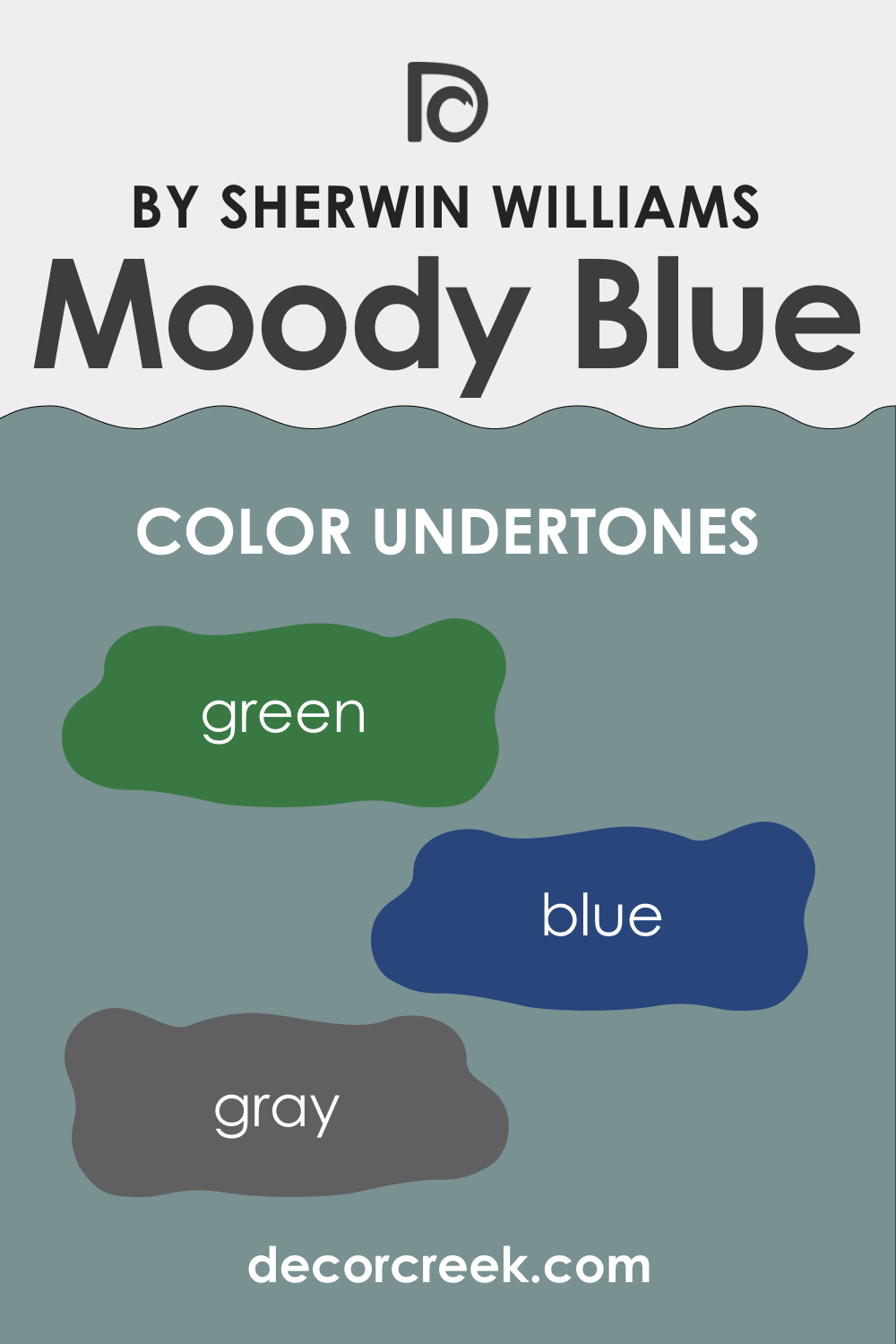
Undertones of SW 6221 Moody Blue
Undertones play a crucial role in how we perceive color. While the predominant color might be blue, the undertones can influence whether it leans towards being warmer or cooler. In the case of SW Moody Blue, the blue and green undertones enhance its cool and calming nature, while the gray undertone adds a level of sophistication and versatility, making it compatible with a range of other colors and styles. Below, you can check all undertones of this hue in detail:
- Blue: The predominant undertone of Moody Blue is, unsurprisingly, blue. This is what gives it its calming and soothing effect.
- Gray: Moody Blue has a noticeable gray undertone, which adds to its muted and sophisticated quality.
- Green: A subtle undertone in SW Moody Blue, green adds a hint of natural freshness to this color.
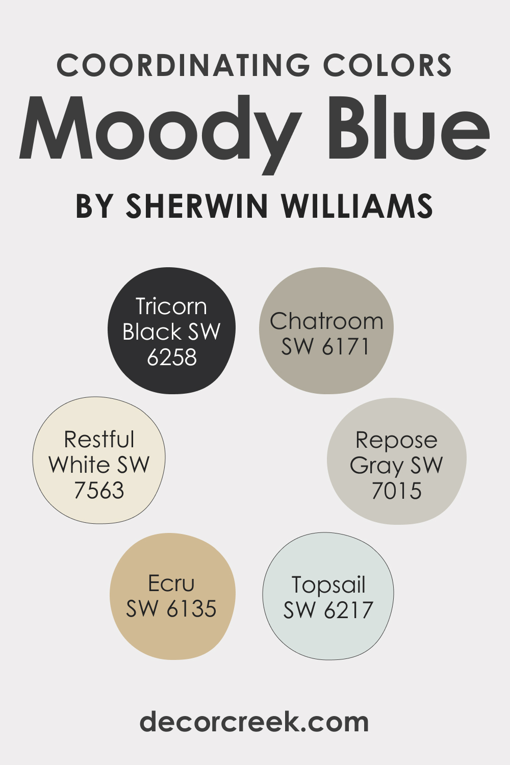
Coordinating Colors of SW 6221 Moody Blue
Coordinating colors are colors that work well together and create a harmonious color scheme. They can be different shades of the same color (such as light blue with dark blue), or they can be contrasting colors.
The key is that they balance each other out and create a pleasing visual effect. Coordinating colors can be used for walls, furniture, decor, or accents and can significantly contribute to the overall mood and aesthetic of a room. SW Moody Blue has the following coordinating colors:
- SW 6217 Topsail : A lighter and more muted shade of blue, Topsail can provide a nice contrast to SW Moody Blue, lightening up a space without clashing with it.
- SW 7563 Restful White : This soft and light shade of white can work wonderfully as a trim or accent color, providing a clean, crisp contrast to SW Moody Blue.
- SW 6135 Ecru : A neutral, warm beige, Ecru can balance out the coolness of SW Moody Blue, providing a warm and inviting touch to a space.
Three additional coordinating colors are:
- SW 7015 Repose Gray : A light gray with blue undertones, Repose Gray can complement SW Moody Blue, enhancing its sophisticated quality.
- SW 6171 Chatroom : A muted green-gray, Chatroom can add a touch of natural, earthy freshness to a room featuring SW Moody Blue.
- SW 6258 Tricorn Black : For a dramatic contrast, Tricorn Black can work beautifully with SW Moody Blue, especially as an accent color.
How Does Lighting Affect SW 6221 Moody Blue?
Lighting can have a significant impact on how SW Moody Blue appears in a room. In natural daylight, the blue and gray undertones may be more pronounced, making the color appear more vibrant and cool-toned. Meanwhile, under warm artificial light, the color may take on a slightly greener hue, and the gray undertone can make it appear more muted.
It’s also important to note that the depth of SW Moody Blue means it absorbs more light than lighter colors, so it might darken a room that doesn’t get much natural light.
Therefore, it’s always a good idea to test a small sample on the wall and observe it under different lighting conditions before fully committing to painting a room this color.
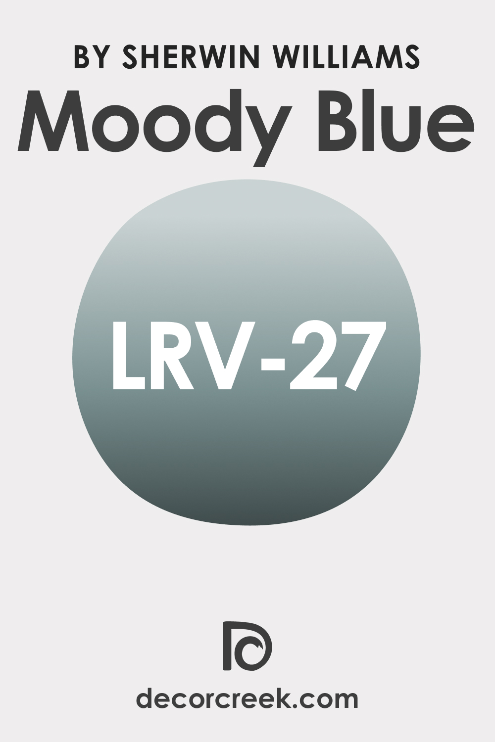
LRV of SW 6221 Moody Blue
Light Reflectance Value, or LRV, measures how much light a color reflects. The LRV of Moody Blue is 27, which means it falls on the darker end of the scale. Lighter colors have higher LRVs and reflect more light, making a room appear larger and brighter, while darker colors have lower LRVs and absorb more light, potentially making a room feel smaller and more intimate.
Given its LRV, SW Moody Blue will add depth and richness to a room, making it feel cozy and inviting. However, it’s important to consider the room’s natural light and size. In a small, poorly lit room, Moody Blue might make the room feel even smaller and darker. In contrast, in a large, well-lit room, it can add a dramatic, cozy effect without overwhelming the space.
LRV – what does it mean? Read This Before Finding Your Perfect Paint Color
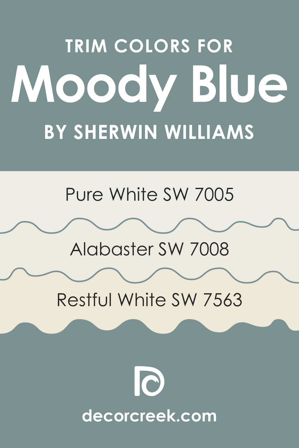
Trim Colors of SW 6221 Moody Blue
When it comes to trim colors to complement SW Moody Blue, shades of white from Sherwin-Williams are excellent choices:
- SW 7563 Restful White : As a soft white, SW Restful White can create a crisp and clean contrast to SW Moody Blue, highlighting architectural features.
- SW 7008 Alabaster : Slightly warmer, Alabaster can soften the coolness of SW Moody Blue, adding warmth to the room.
- SW 7005 Pure White : SW Pure White is a bright and clean white, which can provide a strong, striking contrast to SW Moody Blue, making it pop.
Trim colors are important because they can help to highlight a room’s architectural features and frame your wall color, creating a clean and finished look. Choosing the right trim color can enhance the overall aesthetic and mood of a room.
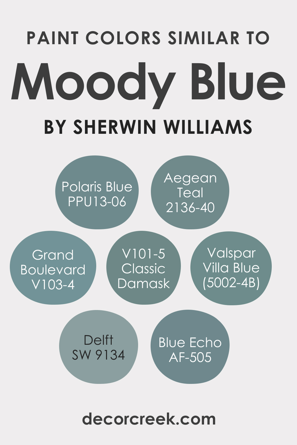
Colors Similar to SW 6221 Moody Blue
Knowing similar colors to SW Moody Blue can be useful if you love the color but are considering options with slight variations. For example, you might want a similar color that is lighter, darker or has different undertones.
Sherwin-Williams and other brands have several colors similar to SWMoody Blue:
- SW 9134 Delft
- Valspar Grand Boulevard (V103-4)
- Valspar Villa Blue (5002-4B)
- Valspar Classic Damask (V101-5)
- Behr Polaris Blue (PPU13-06)BM Aegean Teal (2136-40)
- BM Blue Echo (AF-505)
These colors share the calming qualities of SW Moody Blue, but each brings its unique characteristics, offering more options for creating your desired aesthetic.
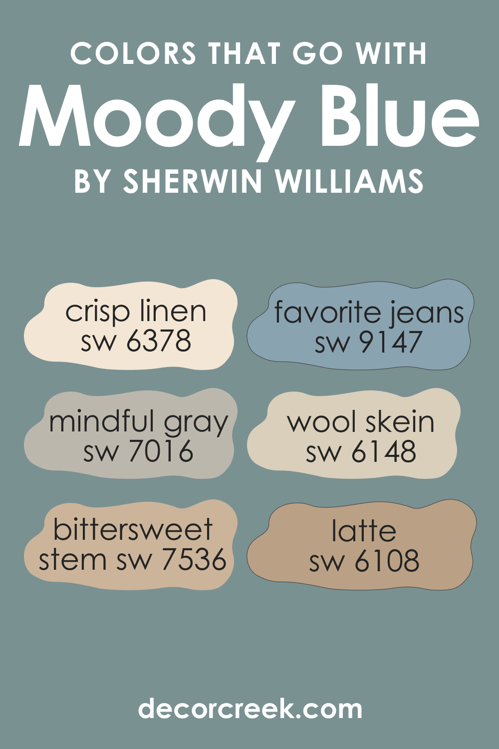
Colors That Go With SW 6221 Moody Blue
Coordinating a color scheme is key to creating a harmonious aesthetic. Alongside the coordinating colors mentioned earlier, the following six colors pair well with SW Moody Blue:
- SW 6148 Wool Skein : A warm, neutral beige that can balance the coolness of Moody Blue.
- SW 9147 Favorite Jeans : A lighter, softer blue that can provide a pleasing contrast and reinforce the calming ambiance.
- SW 6378 Crisp Linen : A soft, creamy white that can work beautifully as a trim or accent color.
- SW 7536 Bittersweet Stem : A muted, earthy green that can add a touch of freshness and natural harmony.
- SW 6108 Latte : A warm, medium-toned beige that can provide a comforting and inviting balance.
- SW 7016 Mindful Gray : A versatile, light gray that enhances the sophistication of Moody Blue.
Using colors that look good together is important because it creates a harmonious aesthetic and contributes to the overall mood of the room. It’s not just about individual colors but how they interact and complement each other.
How to Use SW 6221 Moody Blue In Your Home?
SW Moody Blue’s tranquil yet captivating nature makes it a versatile color that can be used in various rooms and interior design styles. Its calming effect makes it ideal for bedrooms and bathrooms, where it can promote relaxation. Meanwhile, its depth and sophistication can bring drama and interest to living rooms and dining rooms.
In terms of design styles, SW Moody Blue works wonderfully in coastal and nautical themes, thanks to its connection to the sea and sky. It can also complement contemporary and modern designs with its sophisticated quality. Pair it with natural materials like wood and stone for a rustic or farmhouse style or with metallics for a more glamorous look. Below, you can see how this color works in different rooms.
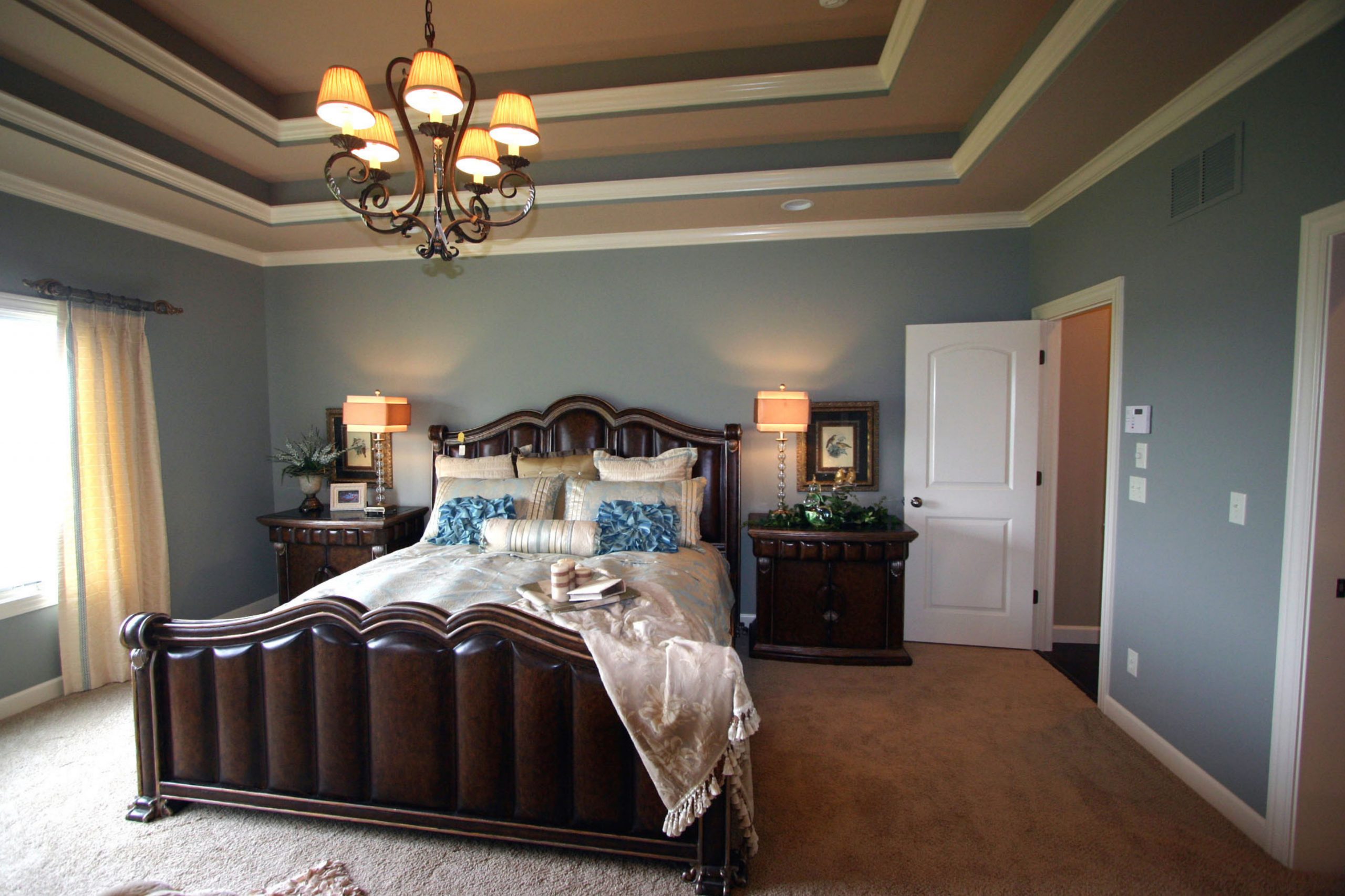
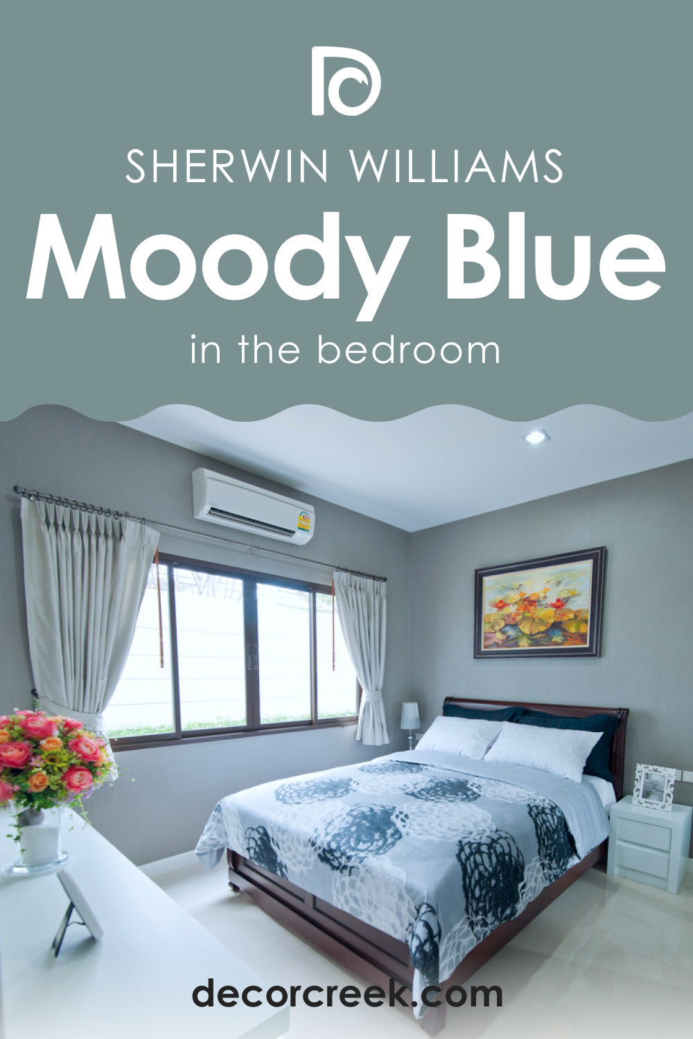
How to Use SW 6221 Moody Blue in the Bedroom?
In the bedroom, SW Moody Blue can create a serene and restful ambiance. Its soothing qualities can promote relaxation and restful sleep. Pair it with lighter shades of blue and gray for a tranquil, monochromatic color scheme or warm neutrals for a cozy, comforting aesthetic.
Use SW Moody Blue on an accent wall behind the bed to add depth and interest. Balance it out with lighter colors on the other walls, furniture, and bedding. For a luxurious touch, consider pairing it with velvet or satin fabrics in coordinating colors.
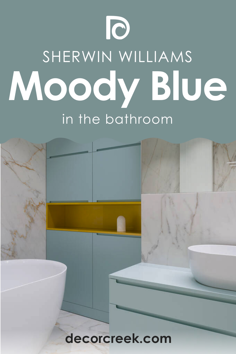
How to Use SW 6221 Moody Blue in the Bathroom?
The bathroom is another great place for SW Moody Blue. Its calming nature is perfect for creating a spa-like atmosphere. Use it on the walls and pair it with white or light gray tiles and fixtures for a clean, fresh look.
For a more dramatic effect, consider painting the cabinets or vanity SW Moody Blue. This can create a striking contrast with white countertops and walls. Accent with brushed nickel or gold fixtures for a touch of elegance.
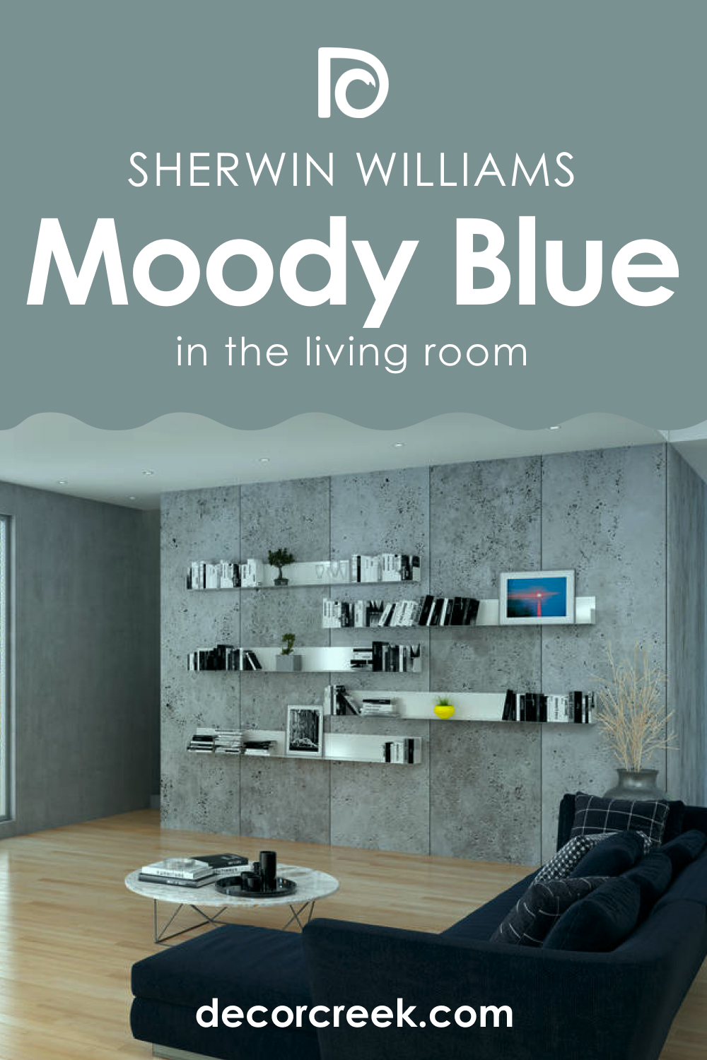
How to Use SW 6221 Moody Blue in the Living Room?
Alternatively, use Moody Blue on the furniture itself, such as a couch or armchairs. This can be a great way to incorporate the color without it overwhelming the room. Balance it out with lighter walls and natural elements like a wood coffee table or a jute rug.
How to Use SW 6221 Moody Blue for an Exterior?
For the exterior of a home, Moody Blue can make a bold and stylish statement. Its depth and richness can give your home a distinguished and timeless look. Pair it with white or light gray trim for a classic contrast, or opt for dark gray or black trim for a more contemporary, dramatic effect.
Due to its cool nature, Moody Blue works best on exteriors with plenty of sunlight. Remember that the color will appear darker outside, so it’s best suited for homes with many architectural details that can break up the color.

How to Use SW 6221 Moody Blue for the Kitchen?
SW Moody Blue can bring depth and drama to a kitchen, making it feel cozy and inviting. Consider painting your kitchen walls Moody Blue and pairing it with white cabinets for a striking contrast. Alternatively, use it on your kitchen island or lower cabinets for a unique, stylish touch.
Coordinate with light countertops like white marble or quartz, and add warmth with wood accents in the form of open shelves or a butcher block island top. Metallic accents in the form of hardware and light fixtures can add a modern edge to the look.

How to Use SW 6221 Moody Blue for the Kitchen Cabinets?
Using Moody Blue for kitchen cabinets can create a stunning, eye-catching effect. The color is deep enough to make a statement yet subdued enough not to overwhelm. Pair SW Moody Blue cabinets with light countertops and backsplash for a balanced look.
Don’t be afraid to mix and match. For example, you can use SW Moody Blue on your lower cabinets and a lighter color like white or gray on your upper cabinets. This two-toned look is trendy and can make your kitchen feel both cozy and airy. Remember to carry some of the Moody Blue into your kitchen decor for a cohesive look.

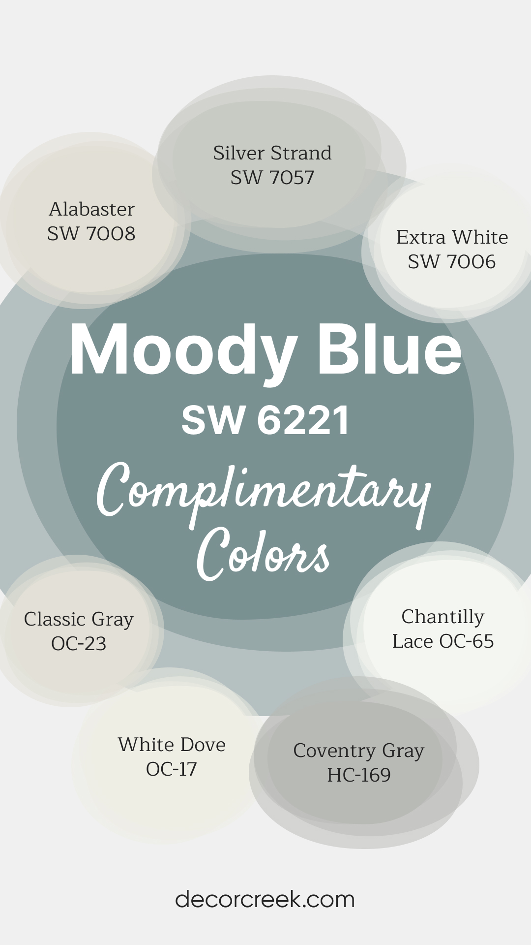
Complimentary Colors for Moody Blue SW 6221 Paint Color by Sherwin-Williams
Moody Blue SW 6221 by Sherwin-Williams is a serene blue that brings depth and elegance to any room. Its subtle undertones make it a versatile choice for creating a peaceful ambiance, whether in a bedroom, living room, or office.
This shade pairs beautifully with both warm whites and soft grays, offering a balanced and timeless look.
For a bright and crisp contrast, pair Moody Blue with Chantilly Lace OC-65, Extra White SW 7006, or White Dove OC-17.
Warm neutrals like Alabaster SW 7008 and Classic Gray OC-23 add softness and balance, while Silver Strand SW 7057 and Coventry Gray HC-169 provide a hint of cool sophistication, completing a cohesive and inviting palette.
Comparing SW Moody Blue With Other Colors
Comparing SW 6221 Moody Blue with other colors is essential for various reasons. One of the primary reasons is to understand its nuances better. By comparing it with other hues, you can identify its undertones more clearly, comprehend its warmth or coolness, and evaluate its light reflectance value (LRV). It’s easier to spot these characteristics when viewed in relation to other colors.
Secondly, comparing Moody Blue with other shades can help you visualize how it might work within a specific color scheme. Seeing how it interacts with other colors can give you a sense of whether it will harmonize with your preferred palette or whether it might clash with other colors you’re considering.
SW 6221 Moody Blue vs. SW 6218 Tradewind
Both Moody Blue and Tradewind belong to the cool-toned family of Sherwin-Williams paint colors. Tradewind, however, is slightly lighter and softer than Moody Blue. It evokes a breezy and fresh feeling, much like a day on the coast, making it a go-to choice for beach-style homes. On the other hand, Moody Blue, with its deeper and moodier tone, lends itself more to creating intimate, cozy spaces.

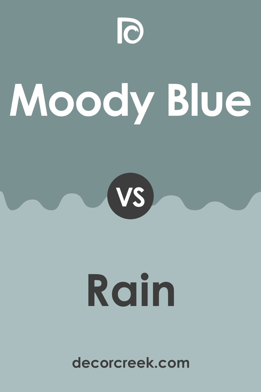
SW 6221 Moody Blue vs. SW 6219 Rain
SW Rain is another popular Sherwin-Williams blue color. It is a lighter shade of blue with a soft, muted quality that evokes the tranquil feeling of a gentle rainfall. In comparison, Moody Blue is more intense and saturated, creating a more dramatic effect in spaces. Both colors share a soothing nature, but their impact on the room’s ambiance differs.
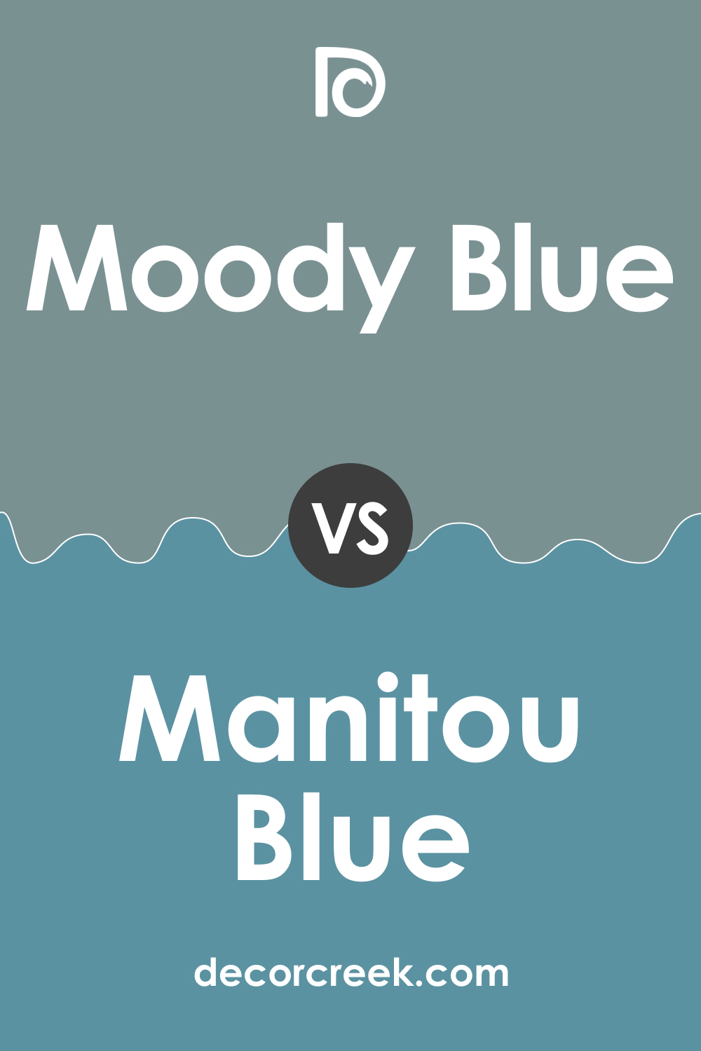
SW 6221 Moody Blue vs. SW 6501 Manitou Blue
SW Manitou Blue is a vibrant, medium-toned blue with strong aqua undertones. It’s a more lively and energetic color than Moody Blue, which tends to be more subdued and sophisticated. While both are beautiful choices, the choice between the two would largely depend on the mood you wish to set in your space.
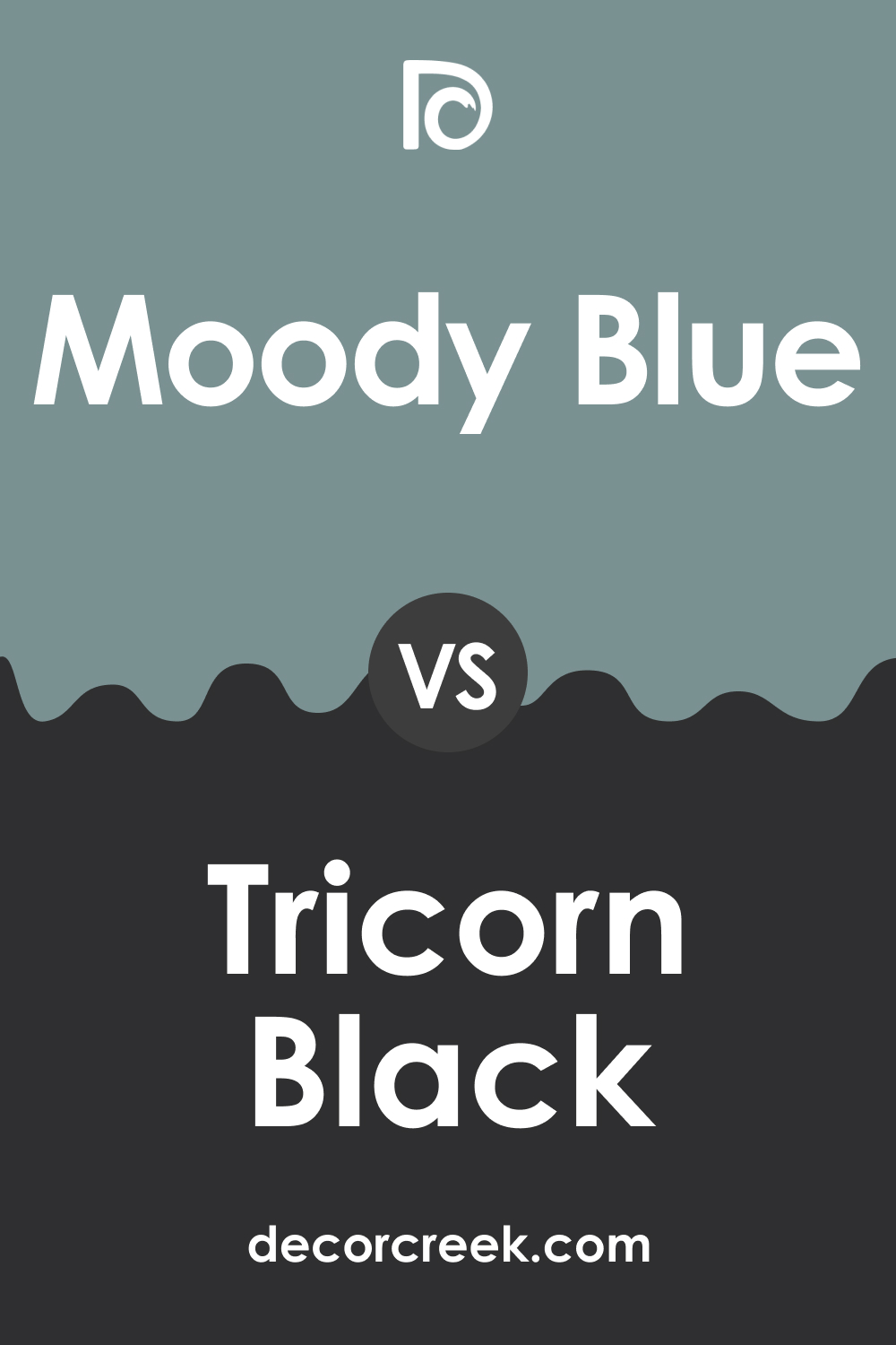
SW 6221 Moody Blue vs. SW 6258 Tricorn Black
SW Tricorn Black is a deep, intense black color that can add a dramatic flair to any room. When compared to Moody Blue, the contrast is striking. While Moody Blue offers a sense of calm and tranquility, Tricorn Black provides a bold and dramatic effect. Using these two colors together could create a visually captivating and dynamic space.
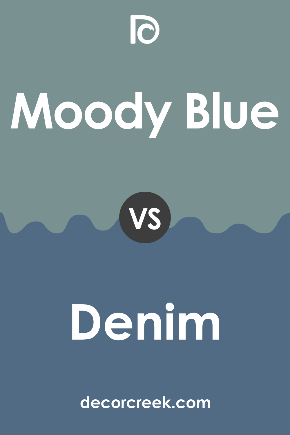
SW 6221 Moody Blue vs. SW 6523 Denim
SW Denim , as its name suggests, is a medium to dark blue color that is reminiscent of a well-worn pair of jeans. It’s slightly darker than Moody Blue and has a richer tone. Both are cool colors that can create a serene and calming environment, but Denim’s deeper tone gives it a bit more sophistication and elegance.
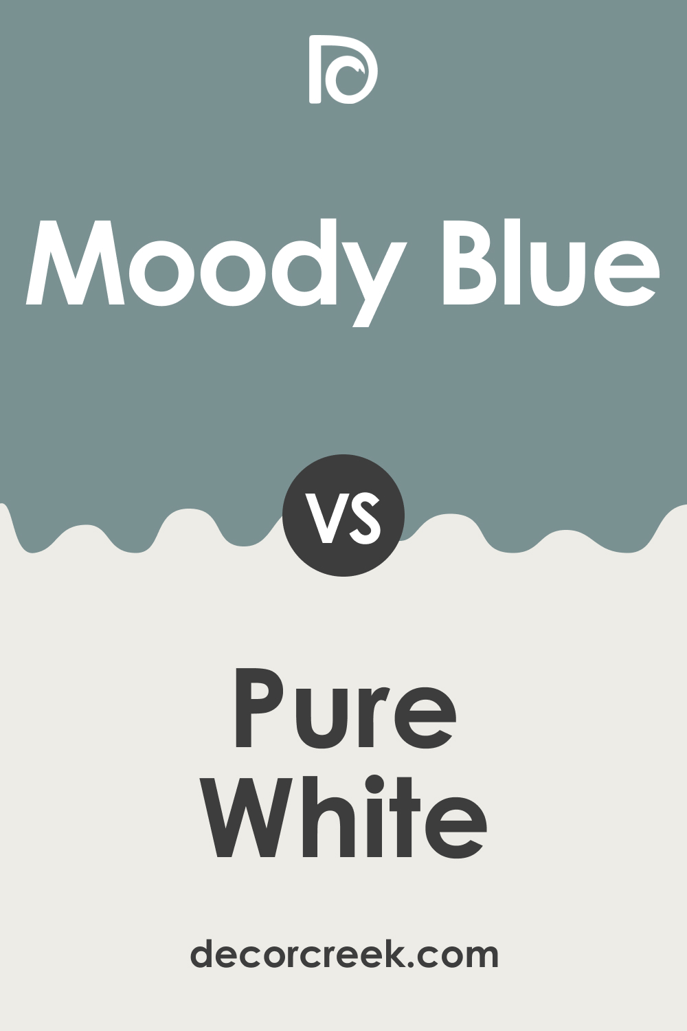
SW 6221 Moody Blue vs. SW 7005 Pure White
SW Pure White is a crisp, bright white color that can help balance the intensity of Moody Blue. When compared, the contrast between the two colors is evident, and the calming influence of Moody Blue can be effectively enhanced by the simplicity and purity of Pure White. This combination can create a crisp, clean look in any room.
Conclusion
SW 6221 Moody Blue is a sophisticated, tranquil color that can add depth and interest to a variety of spaces. Its versatile nature makes it a great choice for both interior and exterior applications, and it can complement a range of design styles. Whether you want to create a serene bedroom, a stylish living room, or a bold exterior, Moody Blue has the potential to transform your space into something truly special.
Ever wished paint sampling was as easy as sticking a sticker? Guess what? Now it is! Discover Samplize's unique Peel & Stick samples.
Get paint samples
Frequently Asked Questions
⭐What kind of mood does SW 6221 Moody Blue create?
SW Moody Blue is a soothing, tranquil color that can create a calming and restful mood in a space. Its depth and richness can also lend a touch of sophistication and elegance.
⭐What are the best rooms to use SW 6221 Moody Blue in?
SW Moody Blue is a versatile color that can be used in various rooms. It's particularly well-suited to bedrooms and bathrooms due to its calming qualities. It can also work well in living rooms, dining rooms, and even kitchens when paired with the right accents and trim colors.
⭐What colors coordinate well with SW 6221 Moody Blue?
SW Moody Blue pairs beautifully with a variety of colors. It works well with lighter shades of blue and gray, as well as warm neutrals. For a more dramatic look, it can be paired with dark grays or blacks.
⭐Can SW 6221 Moody Blue be used for exteriors?
Yes, Moody Blue can make a bold and stylish statement on exteriors. It's best suited for homes that get plenty of sunlight and those with architectural details that can break up the color.
⭐What is the LRV of SW 6221 Moody Blue?
The Light Reflectance Value (LRV) of Moody Blue is 27. This means it is a medium-dark color that will absorb more light than it reflects. Keep this in mind when deciding where to use it, as it can make small rooms feel smaller if not balanced with lighter colors or sufficient lighting.


