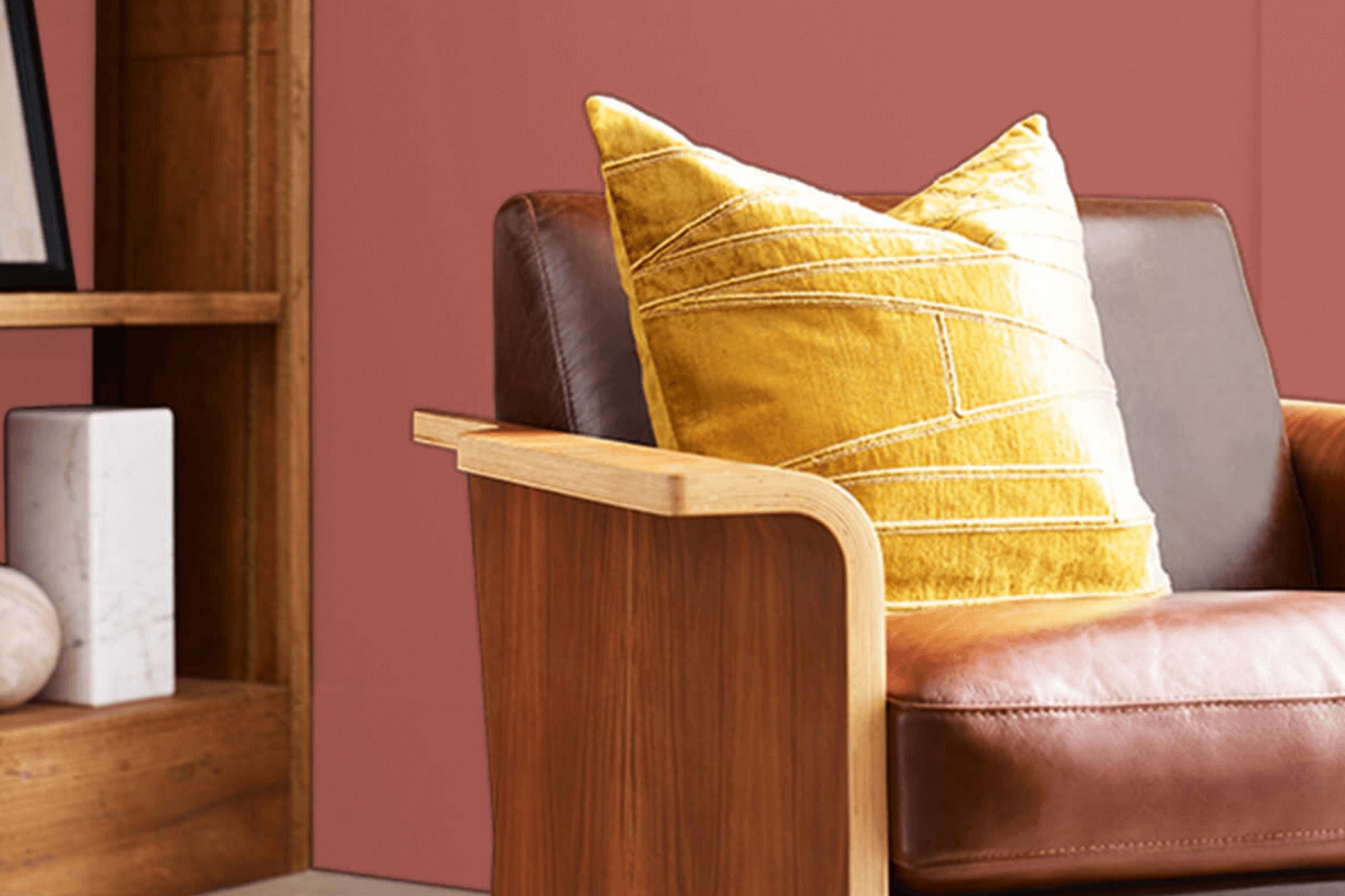
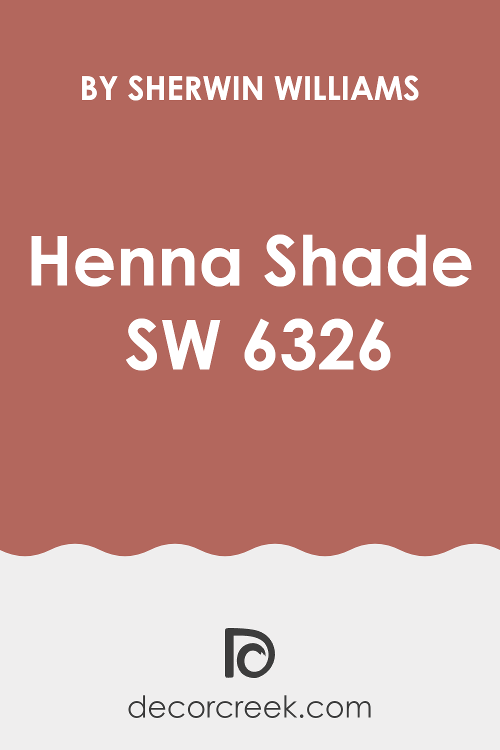
As you consider giving your room a fresh coat of paint, you might want to check out SW 6326 Henna Shade by Sherwin Williams. I recently stumbled upon this color while looking for something unique yet warm for my study. Henna Shade strikes a beautiful balance with its deep, rich terra cotta undertone that brings a cozy and inviting atmosphere to any room.
It’s not just another paint color; it truly adds a sense of warmth that makes your room feel like a warm hug on a chilly evening. In my journey of choosing the right paint, I found Henna Shade to be surprisingly adaptable.
It pairs well with natural elements like wooden furniture and leather accents, enhancing the overall aesthetics without being too intense. Whether you’re aiming to spruce up your living room or add character to your bedroom, this color could be the ideal choice. It has a way of making rooms feel more grounded and harmonious.
So, grab a sample, test it out, and see how it changes your room into a cozy retreat.
What Color Is Henna Shade SW 6326 by Sherwin Williams?
Henna Shade by Sherwin Williams is a deep, warm reddish-brown color that exudes an earthy feel in any room. This rich hue is reminiscent of autumn leaves and terracotta, making it a perfect choice for creating a cozy and inviting atmosphere. Ideal for living rooms or dining areas, it adds a touch of warmth to walls and works beautifully when used as an accent color in muted or neutral-themed rooms.
This color pairs exceptionally well with natural materials like wood, leather, and linen, enhancing the organic look of the room. It creates a harmonious blend with dark woods, adding depth and richness to the furniture or flooring. Leather in dark browns or caramel tones can also complement this color, providing a luxurious yet grounded feel to interiors.
In terms of interior styles, Henna Shade fits perfectly with rustic, bohemian, and traditional decors. It provides a strong backdrop for eclectic furnishings and handmade items, adding character to free-spirited boho styles. In traditional settings, it conjures a lasting charm, especially when paired with classic woodwork and detailed textures.
Textiles like wool, burlap, and chunky knits also harmonize well with Henna Shade, as their tactile surfaces play off the color’s depth. Such combinations can create a room that feels both warm and thoughtfully designed.
Is Henna Shade SW 6326 by Sherwin Williams Warm or Cool color?
Henna Shade by Sherwin Williams is a warm and inviting color that adds a cozy feel to any room. It falls into the category of terracotta tones, which are known for their natural earthiness. This particular shade is rich yet subtle, making it adaptable for various settings in a home.
When used on walls, it creates a welcoming atmosphere that feels both comfortable and stylish. It’s particularly effective in living rooms and dining areas where you gather with family and friends.
This color pairs well with neutral tones like beige, cream, or light brown, which helps to balance its warmth. For those looking to add a bit of contrast, teal or deep green can offer a beautiful complement. Henna Shade works well in homes with a lot of natural light, as the sunlight enhances its depth and warmth, making the room feel more alive. In smaller or less-lit areas, it can make the room feel cozy and snug without feeling too dark. Overall, this color can make your home feel more inviting and cohesive.
Undertones of Henna Shade SW 6326 by Sherwin Williams
Henna Shade, with its array of undertones, offers a unique complexity that subtly influences the overall appearance and feel of a room. Undertones are the hints of color that peek through the main hue when subjected to various lighting conditions. They are crucial in choosing paint colors because they can shift the mood and style of the room.
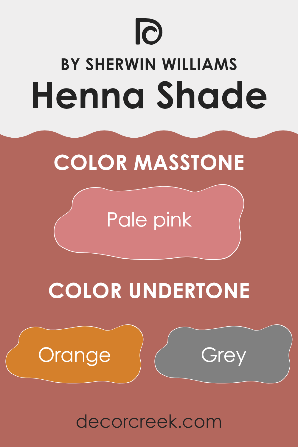
This particular paint color has a rich palette of undertones ranging from warm orange to soft pink and muted grey. In natural daylight, the orange or red undertones might become more dominant, providing a warm, inviting glow. Conversely, in dimmer lighting or during the evening, the grey and brown undertones might be more noticeable, giving the walls a more subdued and grounded look.
Using this paint on interior walls means interacting with these subtle shifts. In a brightly lit room, for example, the paint might draw out more of its pale yellow or light purple undertones, making the room feel cheerful and lively. In an area with fewer windows or under artificial light, the cooler tones like light gray or olive might stand out, offering a more neutral and calm backdrop.
The adaptability of Henna Shade due to its undertones makes it well-suited for rooms where the mood needs to adjust with the time of day or lighting conditions. This makes it a practical choice for living areas that see varying uses or bedrooms where the atmosphere needs to shift from bright and energizing in the morning to calm and soothing by night.
What is the Masstone of the Henna Shade SW 6326 by Sherwin Williams?
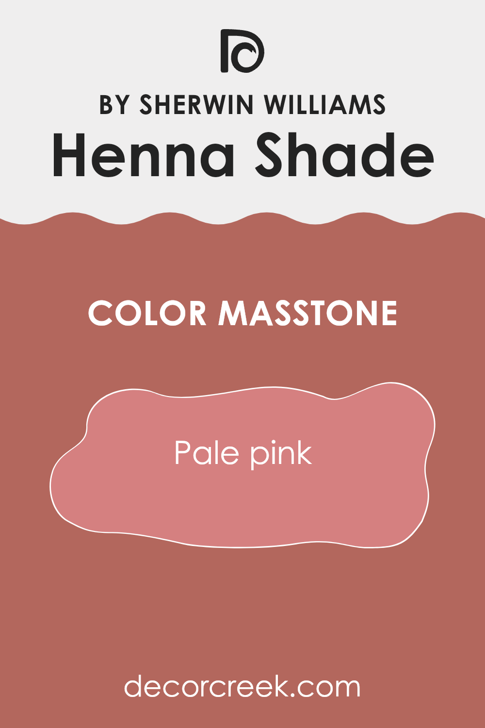
Henna Shade by Sherwin Williams, a pale pink color with a masstone close to Hex #D58080, brings a gentle and warm vibe to any room. This shade is quite adaptable and fits well in various areas of the house. In a bedroom, it can create a cozy and welcoming atmosphere, making it easier to relax and unwind.
When used in a living room, it adds a touch of subtle elegance without being too strong. This color is especially beneficial in areas with less natural light, as its warm undertones can make the room feel brighter and more inviting. Moreover, since it’s not a very bold pink, it’s easier to pair with different decor styles and colors.
Furniture and decor in neutral tones like whites, grays, or natural wood hues go particularly well with this shade, enhancing the overall aesthetic of the home. Pale pink also helps in softening the look of more modern or stark rooms, adding a touch of softness and warmth.
How Does Lighting Affect Henna Shade SW 6326 by Sherwin Williams?
Lighting has a significant impact on how we perceive colors. Colors can appear noticeably different under various light sources. The Henna Shade SW 6326 by Sherwin Williams is a deep, warm, earthy hue that reacts uniquely to different lighting conditions.
Artificial Light: Under artificial lighting, this warm color tends to look richer and more vibrant. Incandescent bulbs, which emit a warm glow, can enhance its cozy, welcoming qualities, making it an excellent choice for living rooms or dining areas where you want to create a comfortable atmosphere.
Natural Light: In natural daylight, this color reveals more of its underlying tones. In a room with ample sunlight, the brightness of Henna Shade becomes more noticeable, giving a lively and dynamic effect. However, the specific qualities of light throughout the day and year can slightly change its appearance.
North-Faced Rooms: Rooms facing north usually receive less direct sunlight, and the light is cooler. In these rooms, the color may appear softer and more subdued, giving off a quieter, muted charm.
South-Faced Rooms: South-facing rooms get abundant light throughout the day, which is generally warmer. In these areas, Henna Shade appears brighter and more vivid. The warm southern light enhances the color’s richness, making it feel lively and inviting.
East-Faced Rooms: With morning sunlight, east-facing rooms are filled with warm, gentle light. Here, Henna Shade starts the day with a cheerful presence, gradually taking on a softer tone as the light fades in the afternoon.
West-Faced Rooms: West-facing rooms receive the evening sun, which brings a stronger warmth later in the day. As the sun sets, Henna Shade takes on a vibrant, cozy glow, making the room feel snug and comfortable.
Overall, the way this shade interacts with light highlights the importance of considering both a room’s orientation and the type of artificial light used to ensure the desired mood and balance are achieved.
What is the LRV of Henna Shade SW 6326 by Sherwin Williams?
LRV stands for Light Reflectance Value, which is a measure of the percentage of light a paint color reflects when applied to a surface. This value ranges from 1 to 99 and helps indicate how light or dark a color will appear once it’s on your walls. A higher LRV means the color will look lighter and reflect more light, making a room feel open and bright. Conversely, a lower LRV means the color absorbs more light, giving it a darker appearance and creating a cozier, more intimate feel.
For example, the LRV of Henna Shade, which is around 20, places it on the darker end of the scale. This means it won’t reflect much light once applied to walls. Its tendency to absorb light can either enhance or limit the overall mood, depending on your design goals.
In well-lit, larger rooms, this shade can add warmth and depth, creating a rich, inviting atmosphere without feeling too heavy. However, in smaller or dimly lit areas, a low LRV color like this might make the room feel more compact and shadowed, so it’s important to consider your lighting conditions and the ambiance you wish to achieve.

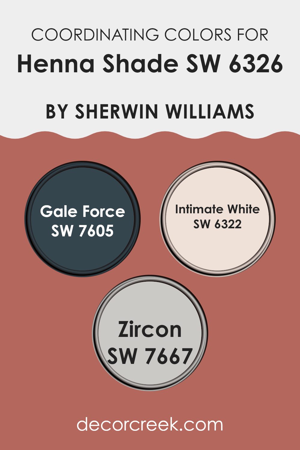
Coordinating Colors of Henna Shade SW 6326 by Sherwin Williams
Coordinating colors are those that complement each other well and create a balanced and harmonious look when used together in design. For instance, when decorating a room that features Henna Shade, a rich, warm red color, selecting the right coordinating colors can enhance the overall aesthetic of the room. Choosing colors that work well together is crucial, as it helps in achieving a cohesive appearance without letting any single element dominate.
One such coordinating color is Gale Force, which is a deep, mysterious blue with a hint of gray. This color is excellent for creating a bold contrast with the warmth of Henna Shade, adding depth and interest to the room.
Another coordinating option is Intimate White, which is a soft, subtle off-white hue that provides a gentle relief and helps in softening any harsh tones from brighter or darker shades. It works well to create a light, airy feeling when paired with richer tones like Henna Shade. Lastly, Zircon is a light gray that blends beautifully with almost any color palette.
It’s especially useful in rooms where neutrality is desired, without creating stark contrasts.
This color can act as a bridge, tying together bolder tones like Henna Shade and Gale Force with the softness of Intimate White.
You can see recommended paint colors below:
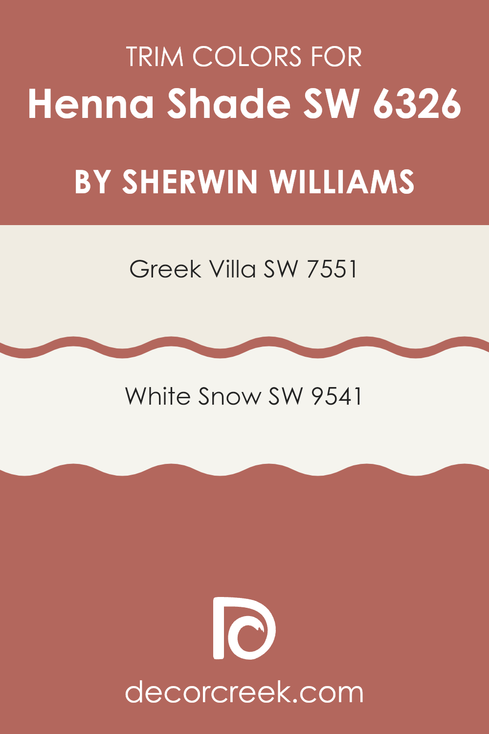
What are the Trim colors of Henna Shade SW 6326 by Sherwin Williams?
Trim colors like SW 7551 – Greek Villa and SW 9541 – White Snow are used to highlight or accentuate the architectural details and edges of a room, making the main wall color, such as Henna Shade by Sherwin Williams, stand out more prominently. These trim colors are essential as they create a visual frame around features like doors, windows, and skirting, effectively defining the room and enhancing the overall aesthetic appeal of the decor.
Greek Villa is a soft, creamy white that offers a gentle contrast against richer, deeper tones, providing a warm and inviting atmosphere without being too intense.
White Snow is a crisp, clean white with a slightly cool undertone, making it ideal for giving a sharp, fresh look that helps other colors stand out, including the rich tones of Henna Shade. Both of these shades work beautifully as trim colors because they subtly complement and emphasize the primary color’s warmth and depth.
You can see recommended paint colors below:
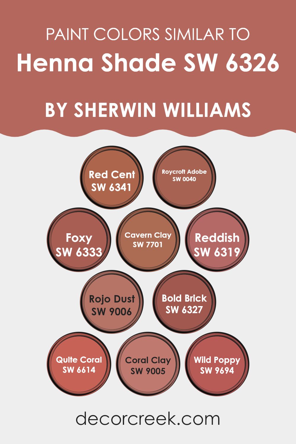
Colors Similar to Henna Shade SW 6326 by Sherwin Williams
Similar colors are crucial in design because they create a cohesive and harmonious look. For example, variations around a color like Henna Shade can be employed to add subtle differentiation without causing a stark contrast. This approach can enhance aesthetics while maintaining a unified atmosphere.
Similar colors can seamlessly integrate with each other, providing depth and complexity to an environment. They often borrow underlying hues that resonate closely with the primary color but differ slightly in brightness or saturation, making them adaptable for blending and layering.
For instance, Red Cent is a deeper, almost burnt sienna that adds warmth and a slightly more grounded feel, suitable for cozy rooms. Roycroft Adobe carries a robust terra cotta tone, enriching rooms with its earthy quality.
Foxy steps into the scene with a lively, medium copper that enlivens rooms with its engaging energy. Cavern Clay offers a muted, dusty orange, perfect for a soft, warm background. Reddish presents a vibrant, straightforward red shade, bringing a cheerful and bold touch.
Rojo Dust quietly complements with a subtler, dustier version of its brighter counterparts. Bold Brick is exactly what it sounds like: a solid, traditional brick color that provides a dependable and sturdy palette anchor.
Quite Coral softens the intensity with a gentle, peachy approach, making it ideal for light and airy rooms. Coral Clay blends muted coral with a hint of beige, great for adding character without being too strong. Finally, Wild Poppy stands out with its vivid and striking red, ready to make a statement in any room that needs a pop of passion.
You can see recommended paint colors below:
- SW 6341 Red Cent
- SW 0040 Roycroft Adobe
- SW 6333 Foxy
- SW 7701 Cavern Clay
- SW 6319 Reddish
- SW 9006 Rojo Dust
- SW 6327 Bold Brick
- SW 6614 Quite Coral
- SW 9005 Coral Clay
- SW 9694 Wild Poppy
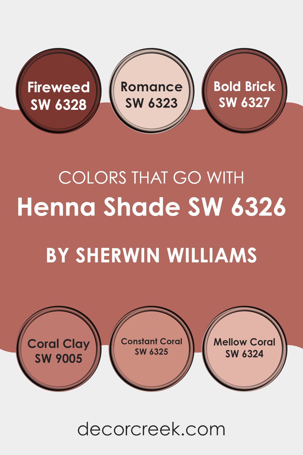
Colors that Go With Henna Shade SW 6326 by Sherwin Williams
When choosing colors that complement Henna Shade SW 6326 by Sherwin Williams, it’s important to consider how these hues can enhance the overall feel and aesthetic of a room. The right color combinations can highlight the inviting warmth of Henna Shade, creating a balanced and harmonious look.
For example, pairing it with colors like SW 6328 – Fireweed, a rich and hearty red, adds a dynamic appeal, making rooms feel more energetic and lively. Alternatively, SW 6323 – Romance, a soft and gentle pink, brings a light, airy touch that softens the intensity of Henna Shade, perfect for a relaxing and cozy atmosphere.
Colors such as SW 6327 – Bold Brick offer a robust and earthy tone that pairs beautifully with the deep vibrancy of Henna Shade, reinforcing a grounded and comforting ambiance. SW 9005 – Coral Clay provides a subdued, natural orange that works wonderfully to create a gentle transition between bold and soft palettes.
On the lighter side, SW 6325 – Constant Coral has a calm and pleasant presence that doesn’t dominate, making it ideal for adding a touch of understated charm. Lastly, SW 6324 – Mellow Coral offers a muted coral tone that naturally supports the warmth of Henna Shade, ensuring the room remains cozy and welcoming without feeling too intense. These colors work together to create inviting rooms that feel both balanced and vibrant.
You can see recommended paint colors below:
- SW 6328 Fireweed
- SW 6323 Romance
- SW 6327 Bold Brick
- SW 9005 Coral Clay
- SW 6325 Constant Coral
- SW 6324 Mellow Coral
How to Use Henna Shade SW 6326 by Sherwin Williams In Your Home?
Henna Shade SW 6326 by Sherwin Williams is a warm, rich red-brown paint color that can add a cozy and inviting feel to any room in your home. This color works great in living rooms or dining areas where you want to create a welcoming atmosphere for family and guests. It pairs well with natural elements like wood or leather, enhancing the room with a rustic yet modern vibe.
Using Henna Shade in a small nook or an accent wall can also make a big impact without being too strong. It’s ideal for highlighting architectural features like a fireplace or a built-in bookshelf. In bedrooms, incorporating this color can make the room feel more grounded and restful, perfect for a relaxing retreat at the end of the day.
For those who enjoy a bit of creativity and warmth in their decorating, Henna Shade can also be used in accessories like throw pillows or curtains to add a splash of color that ties the room together. Whether you use it as a main color or an accent, this shade is adaptable and easy to work with, enhancing your home with its beautiful depth.
Henna Shade SW 6326 by Sherwin Williams vs Reddish SW 6319 by Sherwin Williams
The main color Henna Shade has a deep intensity that closely resembles traditional henna ink, noted for its warm, earthy undertones. This makes it ideal for creating a cozy and inviting atmosphere in a room.
On the other hand, Reddish is also a warm hue but leans more towards a lighter, softer red, offering a friendly and less intense appearance. Both colors can add charm and warmth to a room, yet Henna Shade, being the darker of the two, might be better suited for accent walls or in settings where a strong, bold statement is desired.
Reddish, being lighter, could work well for larger wall areas, providing warmth without being too strong. Together, these colors can complement each other well if used thoughtfully in interior design, balancing brightness and depth to enhance the room’s overall ambiance.
You can see recommended paint color below:
- SW 6319 Reddish

Henna Shade SW 6326 by Sherwin Williams vs Quite Coral SW 6614 by Sherwin Williams
Both Henna Shade and Quite Coral are warm, welcoming colors from Sherwin Williams, but they differ in their mood and intensity. Henna Shade is a deeper, stronger tone, resembling traditional terracotta.
This shade adds a cozy and slightly rustic feel to rooms, perfect for areas where you want warmth and a touch of earthiness. On the other hand, Quite Coral is lighter and carries a more playful character. It’s a gentle mix of pink and orange tones, offering a cheerful brightness that can make small rooms feel more open and airy.
While Henna Shade creates a snug, intimate atmosphere, Quite Coral brings a fresher, more energetic feel, making it ideal for areas like kitchens, bathrooms, or even a child’s bedroom. Both colors can add personality to your home but in distinctly different ways.
You can see recommended paint color below:
- SW 6614 Quite Coral

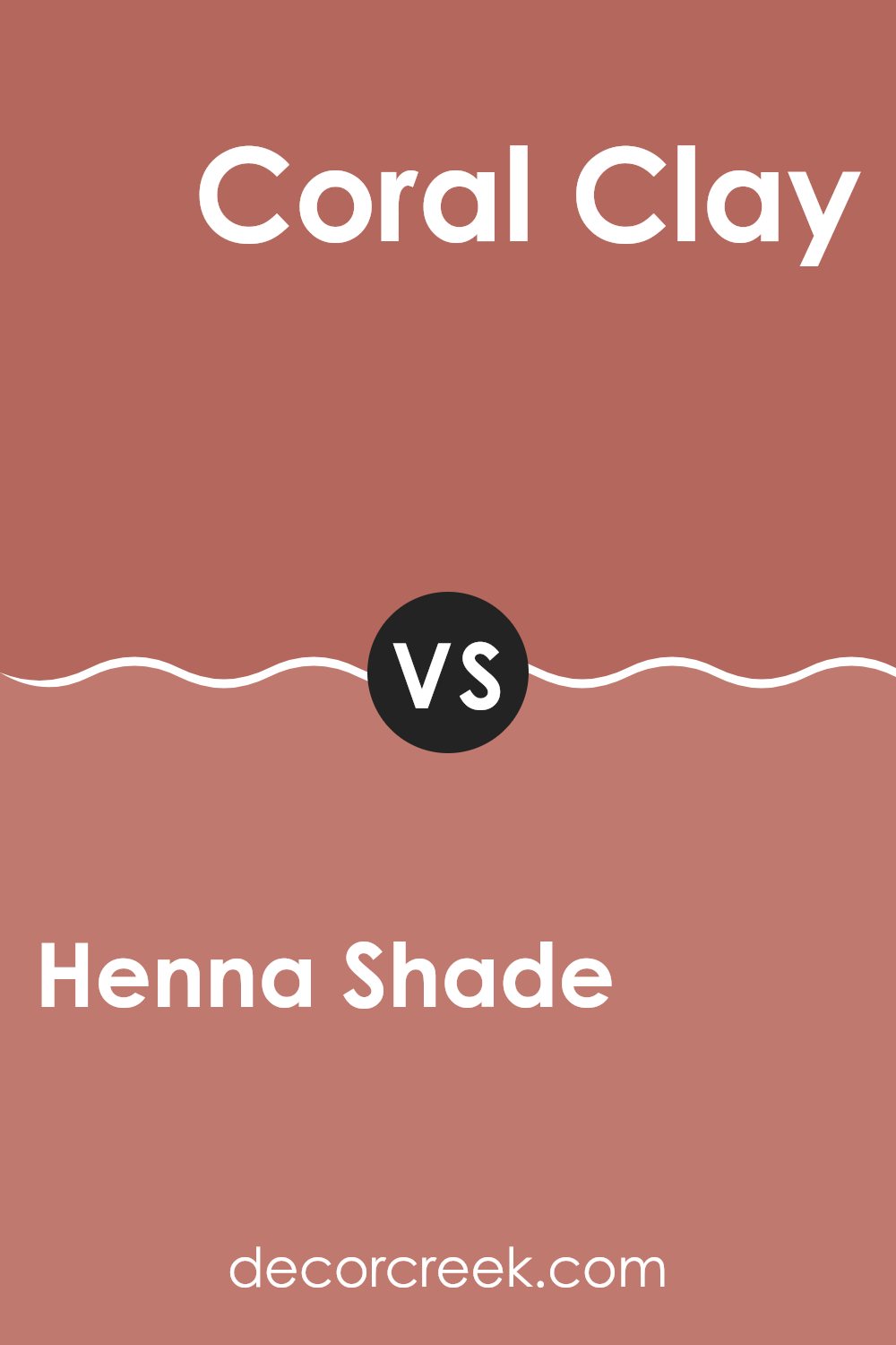
Henna Shade SW 6326 by Sherwin Williams vs Coral Clay SW 9005 by Sherwin Williams
Henna Shade and Coral Clay are two distinct colors by Sherwin Williams that each bring their unique vibe to a room. Henna Shade is a rich, deep reddish-brown that can add a warm, earthy feel to any room. It’s the kind of color that works well in cozy settings like living rooms or libraries, as it can make large rooms feel more intimate.
On the other hand, Coral Clay has a softer, more subdued appearance. This color is a muted coral with subtle pink undertones. It’s light enough to brighten up a room while also adding a touch of warmth. Coral Clay is perfect for areas where you want a gentle splash of color, like bathrooms or kitchens, to create a welcoming atmosphere.
Both colors offer a warm palette but in different intensities and moods. Henna Shade, with its deeper tones, suggests a traditional, almost rustic charm, while Coral Clay offers a more contemporary and gentle approach, ideal for modern rooms.
You can see recommended paint color below:
- SW 9005 Coral Clay
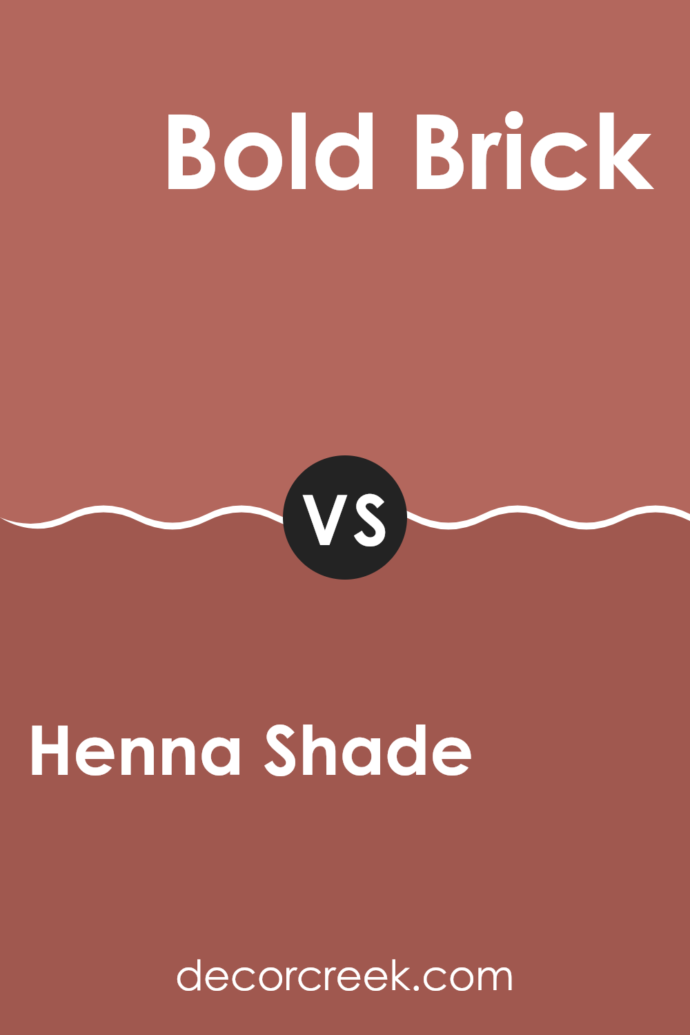
Henna Shade SW 6326 by Sherwin Williams vs Bold Brick SW 6327 by Sherwin Williams
Henna Shade and Bold Brick by Sherwin Williams are two warm, inviting colors, each with its own distinct personality. Henna Shade is a deeper, muted terracotta that adds a cozy, grounded feeling to any room. It’s the kind of color that works well in a living room or dining area, providing a subtle backdrop that pairs nicely with natural materials like wood or leather.
On the other hand, Bold Brick is a more vibrant and intense color. True to its name, it resembles the rich red of a classic brick, offering a stronger statement that can immediately draw the eye. It’s perfect for an accent wall or for areas where you want to make a powerful impression, such as an entryway or a kitchen.
Both colors create warm environments, but Henna Shade leans toward a softer, more understated look, while Bold Brick brings more impact and energy. Depending on the mood you want to set and the room you’re decorating, each offers its own unique appeal.
You can see recommended paint color below:
- SW 6327 Bold Brick
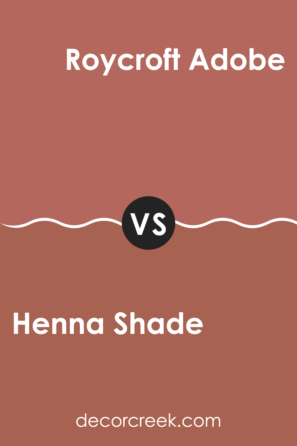
Henna Shade SW 6326 by Sherwin Williams vs Roycroft Adobe SW 0040 by Sherwin Williams
The colors Henna Shade and Roycroft Adobe by Sherwin Williams offer unique yet harmonious attributes for those looking to add warmth to their rooms. Henna Shade is a robust, deep red with earthy undertones.
It gives a sense of coziness and warmth, making it perfect for living areas or rooms where you want to add a touch of inviting comfort. In contrast, Roycroft Adobe is a softer, duskier hue that leans toward a warmer brown with subtle red undertones.
This color is less intense than Henna Shade and works well in creating a cozy yet laid-back vibe. Pairing these two can create a balanced look that blends rich warmth with soothing softness, ideal for achieving a welcoming atmosphere in any home or room. Their differences in depth and intensity can be used creatively to add character and dimension to a room.
You can see recommended paint color below:
- SW 0040 Roycroft Adobe
Henna Shade SW 6326 by Sherwin Williams vs Red Cent SW 6341 by Sherwin Williams
Henna Shade and Red Cent are two distinct colors offered by Sherwin Williams, each bringing its own unique character to any room. Henna Shade is a deep, rich brown with warm undertones, giving off an earthy vibe that feels cozy and welcoming.
This color works beautifully in living areas or bedrooms where comfort is key. On the other hand, Red Cent is a vibrant, true red that conveys energy and boldness. It’s ideal for making a statement, perhaps in a dining room or an entryway where you want to impress.
While Henna Shade provides a grounding effect with its darker and softer brown tones, Red Cent is more striking and can energize a room instantly with its brightness. Both shades offer excellent coverage and durability, as expected from Sherwin Williams paints, and they can strongly influence the mood and personality of a room.
You can see recommended paint color below:

Henna Shade SW 6326 by Sherwin Williams vs Wild Poppy SW 9694 by Sherwin Williams
Henna Shade and Wild Poppy, both from Sherwin Williams, offer rich tones that can significantly influence the mood of any room, but their styles differ notably. Henna Shade is a warm, earthy red with a touch of brown, giving it a cozy and inviting feel. This color is perfect for rooms where you want to add warmth and comfort, such as living rooms or bedrooms.
On the other hand, Wild Poppy is a brighter and more vibrant red. This color stands out more and can add excitement and energy to a room. It works well in areas where you want to make a statement, such as an accent wall, a dining area, or a creative room.
Both colors lend a strong presence but in different ways: Henna Shade brings warmth and a sense of relaxation, while Wild Poppy adds a burst of energy and liveliness. Choosing between them depends on the atmosphere you wish to create in your room.
You can see recommended paint color below:
- SW 9694 Wild Poppy
Henna Shade SW 6326 by Sherwin Williams vs Foxy SW 6333 by Sherwin Williams
Henna Shade and Foxy, both by Sherwin Williams, show interesting variations in the realm of warm tones. Henna Shade is a rich, deep red with a subtle brown undertone, making it feel cozy and welcoming.
This color is perfect for rooms where you want a sense of warmth and comfort, such as living rooms or dining areas. On the other hand, Foxy is a brighter and more vibrant tone, leaning toward an orange-brown.
It brings more energy into a room compared to Henna Shade and is well-suited for areas that encourage activity and cheerfulness, like kitchens or creative rooms. Both colors provide warmth, but Henna Shade offers a muted, cozy character, whereas Foxy presents a livelier and engaging atmosphere. They can also work beautifully together in a home, creating a balanced flow of energy and relaxation.
You can see recommended paint color below:
- SW 6333 Foxy
Henna Shade SW 6326 by Sherwin Williams vs Cavern Clay SW 7701 by Sherwin Williams
Henna Shade and Cavern Clay are two warm and inviting colors from Sherwin Williams. Henna Shade is a rich, deep reddish-brown that resembles the natural dye it’s named after. It adds a cozy and somewhat bold touch to rooms, making it ideal for creating a welcoming atmosphere in living or dining areas.
On the other hand, Cavern Clay has a terracotta tone that feels very earthy and natural. This color is lighter and more orange-toned compared to Henna Shade, giving a slightly more relaxed vibe. It works beautifully in rooms where you want a soft, warm feel, such as kitchens or home offices.
While both colors share a sense of warmth, Henna Shade is darker and more intense, whereas Cavern Clay is lighter and offers a softer presence. Each can shape a unique mood in a room, depending on the atmosphere you’re aiming for. Whether you prefer the depth of Henna Shade or the gentleness of Cavern Clay, both can make any room feel welcoming and cozy.
You can see recommended paint color below:
Henna Shade SW 6326 by Sherwin Williams vs Rojo Dust SW 9006 by Sherwin Williams
Henna Shade and Rojo Dust are two distinct colors by Sherwin Williams. Henna Shade is a warm, deep red with a brownish undertone, giving it a cozy, earthy feel. This color is ideal for rooms where you want to add richness without making the area feel too strong. It works beautifully in living rooms or dining areas, creating a welcoming atmosphere.
Rojo Dust, on the other hand, is a lighter, dustier variation of red. It leans more toward a muted terracotta, making it perfect for rooms that need a subtle yet warm touch. It’s great for achieving a soft, natural look in bedrooms or home offices.
While both shades belong to the red family, Henna Shade offers a bolder, more traditional depth, whereas Rojo Dust provides a gentler, more understated charm. Depending on the mood you wish to create and the surrounding tones in your room, you can choose between these to add either a strong statement or a soft touch of warmth.
You can see recommended paint color below:
- SW 9006 Rojo Dust
After reading about SW 6326 Henna Shade by Sherwin Williams, I’ve learned a lot about this unique paint color. Henna Shade is a warm and welcoming color that really makes any room feel cozy and cheerful. It’s like the color of cinnamon or those lovely red autumn leaves, which gives it a kind of warmth that is perfect for places where you want to relax and feel at home.
One of the best things about this paint color is that it works well in many different parts of the house. Whether you’re painting a living room, a dining area, or even the outside of the house, Henna Shade adds a lovely touch without being too bright or too dark. It’s like finding the perfect pair of shoes that look good and go with almost everything!
From what I’ve read, people who use this color are really happy with how it turns out. It seems to bring a lot of warmth and coziness to their homes, making it a favorite for many. Sherwin Williams has created a color that not only looks good but also helps make a house feel like a true home.
In conclusion, I think SW 6326 Henna Shade is a great choice if someone wants to add a warm and friendly touch to their room. It’s nice, comfortable, and makes rooms look beautiful. So, if you’re thinking about a new color, Henna Shade is definitely worth considering!

Ever wished paint sampling was as easy as sticking a sticker? Guess what? Now it is! Discover Samplize's unique Peel & Stick samples.
Get paint samples

