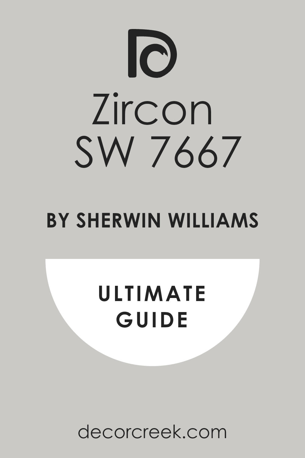
If you are looking into refreshing a room or starting a new painting project, you might want to consider SW 7667 Zircon by Sherwin Williams. I recently came across this color while searching for a versatile and subtle hue that could complement any space without overwhelming it, and Zircon stood out as a top choice. This color presents a gentle gray that shifts beautifully with the changing light throughout the day, giving a room a fresh and airy feel.
Zircon isn’t just another shade of gray; its unique blend has a delicate balance that works well in small spaces to create the illusion of more space, or in larger rooms to maintain a cozy yet bright atmosphere.
Whether you’re aiming to update your living room, bedroom, or even the kitchen, Zircon provides a clean and modern backdrop that highlights other decor elements effortlessly. It pairs well with both warm and cool tones, making it incredibly flexible for various decorating schemes.
So, if you want a color that supports a wide range of styling choices, SW 7667 Zircon is certainly worth considering.
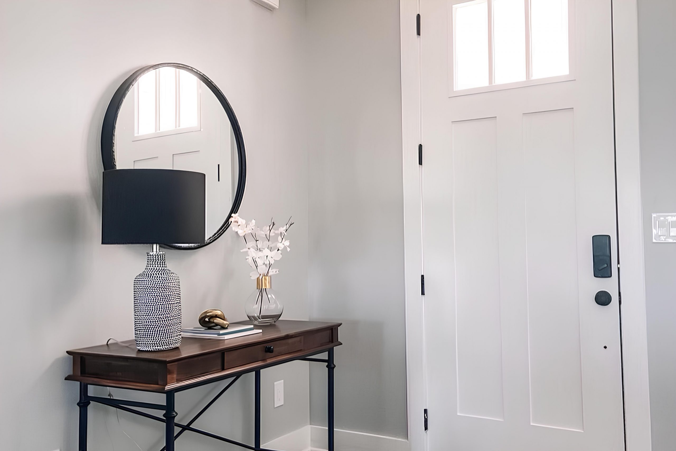
What Color Is Zircon SW 7667 by Sherwin Williams?
The color Zircon by Sherwin Williams is a subtle yet impactful shade of gray that leans towards a cooler, bluish tone. This unique color provides a fresh and modern feel to any space, making it a versatile choice for various decorating styles and preferences. It’s a perfect backdrop for minimalist or contemporary design schemes, blending effortlessly with sleek and modern furnishings.
Zircon works exceptionally well in Scandinavian-style interiors, where the focus is on clean lines and simplicity. Its cool undertone harmonizes with the natural woods, functional furniture, and neutral color palettes typical of this style. Similarly, in coastal-themed rooms, Zircon can complement light blues, greens, and sandy tones to create a calm and inviting environment.
When it comes to materials, Zircon pairs beautifully with smooth metallic finishes like silver and chrome, which enhance its modern vibe. It also looks stunning against glass and mirrored surfaces, adding depth and reflection to the space. For textures, consider pairing it with soft textiles like velvet or linen to add a touch of warmth, or use it alongside polished wood to emphasize a contrast between natural and man-made elements.
Overall, Zircon is adaptable for many design approaches, offering a clean slate that supports both bold and understated interior choices.
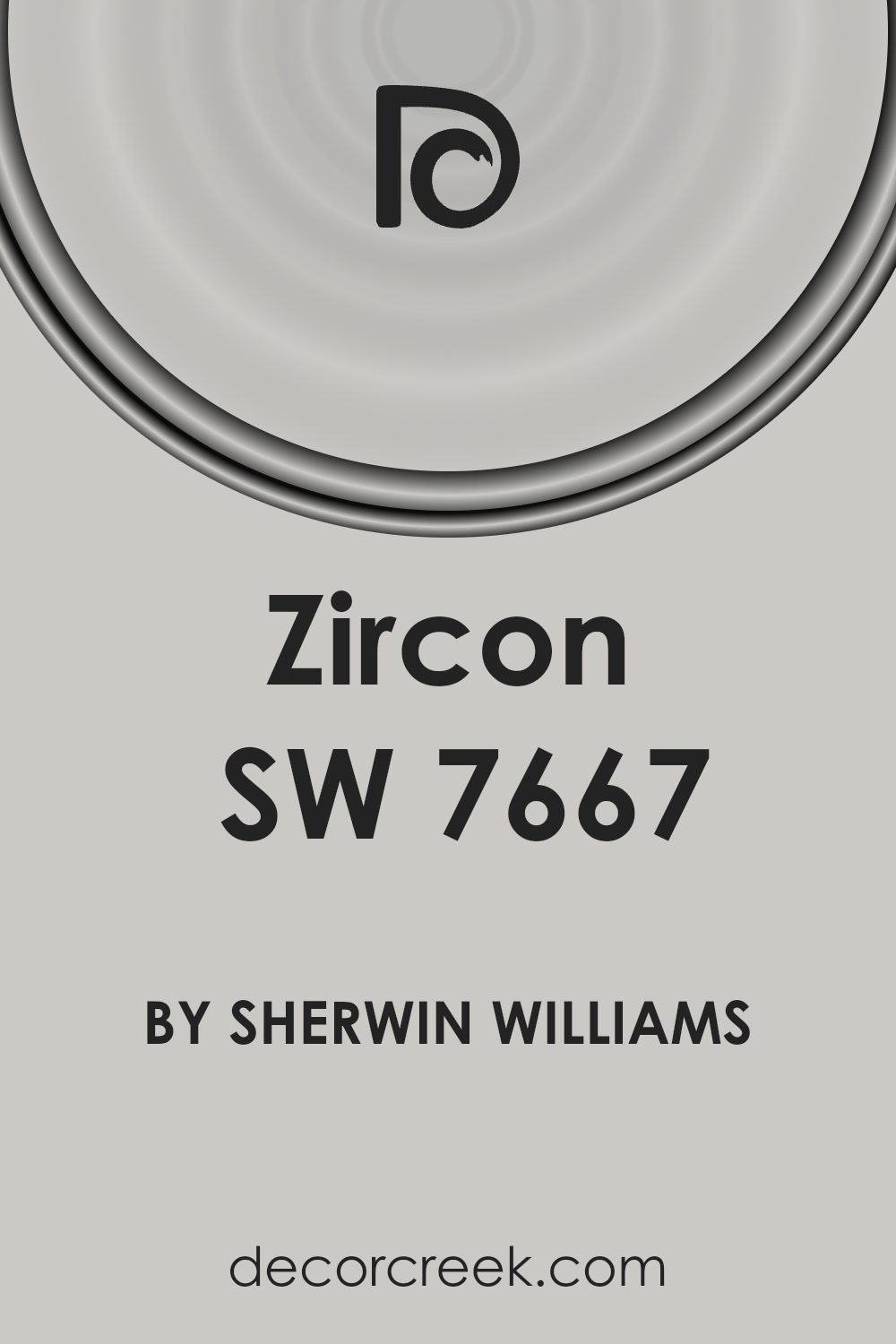
Is Zircon SW 7667 by Sherwin Williams Warm or Cool color?
Zircon SW 7667 by Sherwin Williams is a popular paint color known for its subtle and soothing gray tone. It’s a versatile shade that easily complements a variety of decor styles and themes, making it a go-to choice for many homeowners. When applied to walls, Zircon has a neutral effect, providing a clean and calming backdrop. This makes it ideal for living rooms and bedrooms where a peaceful atmosphere is often desired.
With its understated elegance, Zircon can help enhance the sense of space in a smaller room or make a larger space feel more cohesive without overwhelming the senses. It pairs well with brighter colors, allowing for pops of accent through furniture or decorations without clashing.
Zircon’s adaptability to different lighting conditions is another benefit; it can appear warmer or cooler depending on the natural light in the room, adding a dynamic quality to the environment. Overall, it’s a functional and attractive choice for creating a cozy, inviting home.
Undertones of Zircon SW 7667 by Sherwin Williams
The color Zircon has a unique versatility because it carries a range of subtle undertones. These undertones—pale yellow, light purple, light blue, pale pink, mint, lilac, and grey—can influence the mood and feel of a room depending on how they interact with lighting and surrounding colors.
Undertones are the hints of color that peek through the main color when under different lighting or paired with other hues. They can shift the perception of a color dramatically. For instance, a pale yellow undertone can make a wall color feel warmer when illuminated by sunlight, giving the room a cozy glow.
In indoor settings, the undertones of Zircon help it adapt to various decor styles and preferences. The grey undertone keeps it neutral and flexible, allowing it to blend well in spaces without clashing with existing furnishings. The subtle lilac and light purple can add a touch of sophistication, providing a calming effect ideal for bedrooms or bathrooms. At the same time, light blue and mint undertones offer a fresh, airy quality that could enhance the sense of space in a smaller room.
The effect of these undertones can also change throughout the day with natural light exposure, shifting from a fresh, vibrant morning feel to a calming, subdued tone by evening. This makes Zircon a practical choice for spaces used at different times and in various ways, such as living rooms or multipurpose areas.
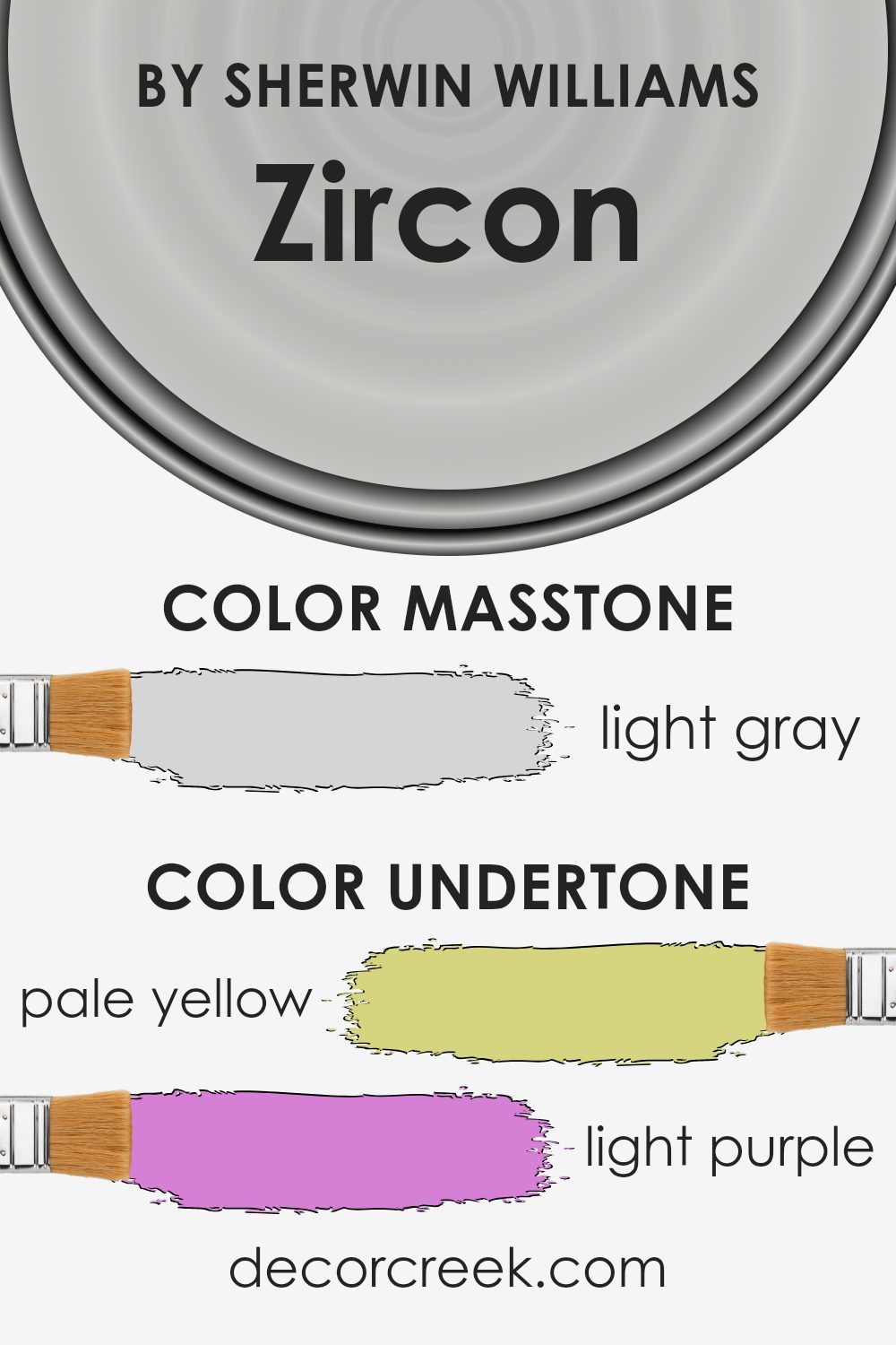
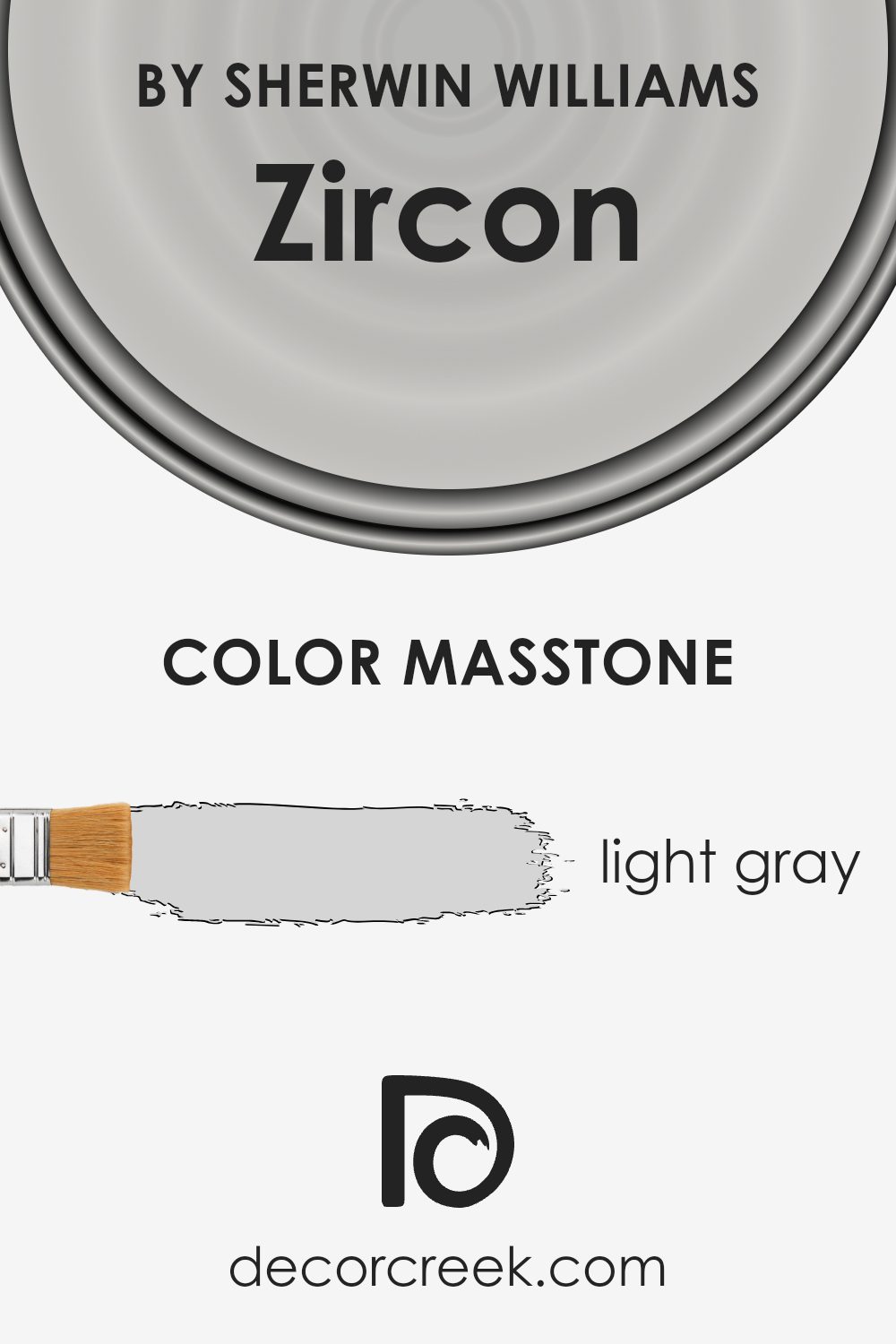
What is the Masstone of the Zircon SW 7667 by Sherwin Williams?
ZirconSW 7667 by Sherwin Williams is a light gray color with a masstone of #D5D5D5. This light gray shade is quite versatile and works well in various spaces within a home. It creates a clean and clear look, making rooms appear brighter and more spacious.
Since the color isn’t too dark or overpowering, it pairs easily with many other colors, whether you want to match it with soft pastels for a gentle vibe or with bold colors for more contrast.
This light gray can also help in hiding minor wall imperfections better than pure white, making it a practical choice for daily living. It’s cool enough to provide a modern feel yet neutral enough to serve as a backdrop for decor of all styles, from traditional to contemporary. Perfect for living rooms, bedrooms, or kitchens, this color supports a relaxed environment and blends seamlessly with both vibrant and muted furnishings.
How Does Lighting Affect Zircon SW 7667 by Sherwin Williams?
Lighting plays a pivotal role in how colors appear in different environments, impacting the mood and ambiance of a space. The color in question, Zircon SW 7667 by Sherwin Williams, offers a unique example of how lighting can influence color perception.
Artificial Light vs. Natural Light:Under artificial lighting, Zircon SW 7667 adopts a warmer tone, bringing about a cozy and welcoming atmosphere to the room. This can be especially effective in living spaces and bedrooms where comfort is a priority.
In contrast, under natural light, the color presents a crisper and cooler appearance, reflecting more light and giving spaces a more open and airy feel. This makes it ideal for kitchens and bathrooms, where a clean, fresh look is often desirable.
Room Orientation:
– North-Faced Rooms: North-facing rooms receive less direct sunlight, which means colors can appear slightly duller. Zircon SW 7667 might look more subdued and slightly grayish in these rooms, potentially requiring additional lighting to bring out its true tones.
– South-Faced Rooms: In south-facing rooms, abundant in direct sunlight, Zircon SW 7667 will appear much lighter and more vibrant. The ample sunlight can enhance the cooler undertones of the color, making the room feel lively and bright.
– East-Faced Rooms: East-facing rooms enjoy bright light in the morning, which can make Zircon SW 7667 look very lively and fresh at the start of the day, transitioning to a quieter tone as the day progresses and the natural light diminishes.
– West-Faced Rooms: Conversely, in west-facing rooms, the color will begin more muted in the morning and gain vibrancy in the afternoon and evening as the sunlight intensifies. This can create a dynamic change in the room’s feel throughout the day.
Understanding how Zircon SW 7667 reacts under various lighting conditions can help in making informed decisions about paint choices based on the orientation of the room and the type of light it receives. This ensures that the spaces not only fulfill functional needs but also offer the visual comfort and atmosphere that best suits personal preferences and the purposes of each room.
What is the LRV of Zircon SW 7667 by Sherwin Williams?
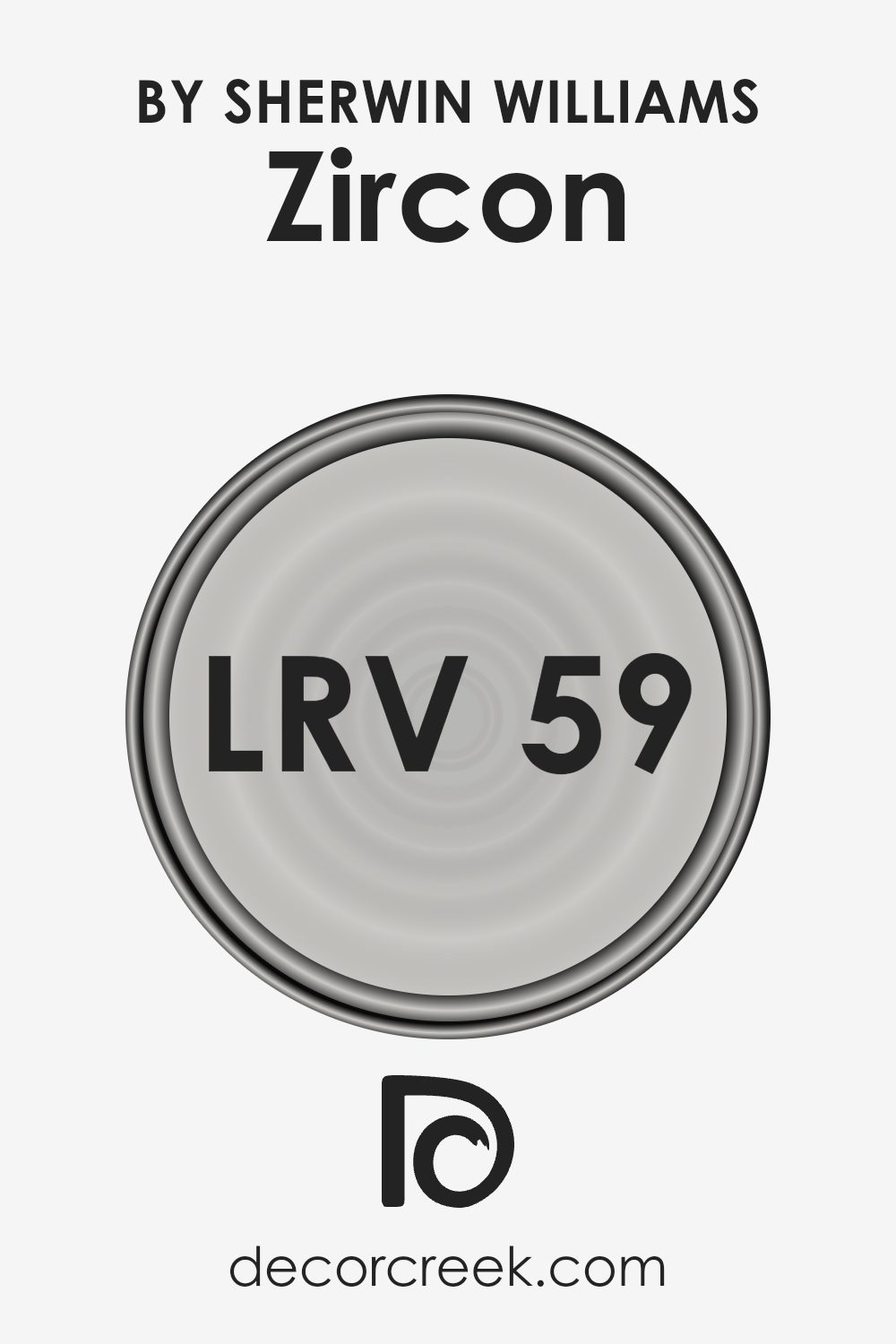
Light Reflectance Value (LRV) measures the percentage of light a paint color reflects from or absorbs into a painted surface. The LRV scale goes from 1 to 99, where lower values indicate that a color absorbs more light, making it appear darker. Conversely, higher values reflect more light, which makes the space seem brighter.
Therefore, understanding LRV helps in choosing paint colors for your walls because it affects how light or dark a room feels once the walls are painted.
Considering the LRV of 58.716 for the mentioned Zircon paint color, it is positioned in the medium range of the scale. This level of LRV means the color neither appears too dark nor too bright, making it a versatile choice for various spaces. It’s a balanced choice that will reflect a moderate amount of light, aiding in making smaller rooms feel slightly more spacious while still providing enough warmth and color depth to add character to larger areas.
Coordinating Colors of Zircon SW 7667 by Sherwin Williams
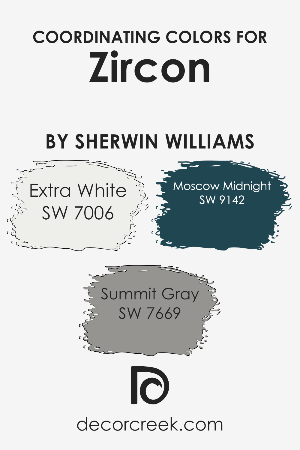
Coordinating colors are selected shades that complement and enhance the main color in a design scheme, creating a visually appealing and harmonious look. When choosing coordinating colors, it’s important that they balance out each other while still offering contrast to bring depth and interest to the space. For instance, Zircon by Sherwin Williams is a shade that can be complemented by specifically chosen coordinating colors to create an inviting and cohesive atmosphere.
First up is SW 7006 – Extra White, a crisp and clean shade that can act as a perfect backdrop or trim color to make other colors pop. It’s like a fresh canvas, allowing other hues or artistic accents in a room to stand out without overpowering them.
Then there’s SW 7669 – Summit Gray, a warm, adaptable gray that exudes a natural, understated vibe. It’s versatile enough to work in a variety of settings, adding a sophisticated yet approachable feel. Finally, SW 9142 – Moscow Midnight offers a deep, dramatic navy tone that can lend a striking contrast and depth, perfect for accent walls or furniture pieces that are meant to stand out.
It works beautifully to draw the eye and enrich the overall aesthetic. These coordinating colors together provide balance, contrast, and a unified look that can enhance the overall ambiance of any space.
You can see recommended paint colors below:
- SW 7006 Extra White (CHECK A SAMPLE)
- SW 7669 Summit Gray (CHECK A SAMPLE)
- SW 9142 Moscow Midnight (CHECK A SAMPLE)
What are the Trim colors of Zircon SW 7667 by Sherwin Williams?
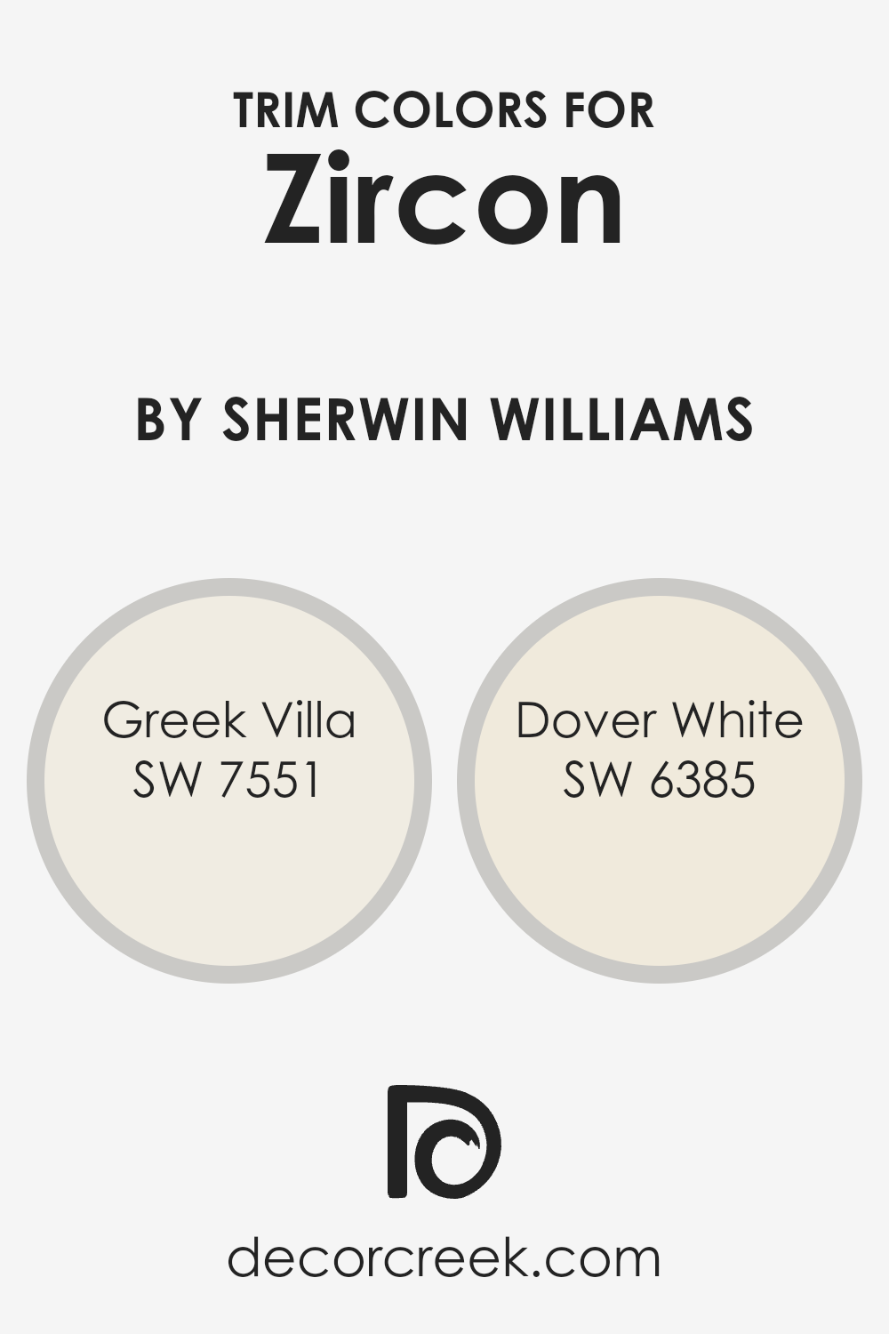
Trim colors, such as SW 7551 – Greek Villa and SW 6385 – Dover White by Sherwin Williams, play a crucial role in defining the aesthetic appeal and contrast in room design. They are typically used for baseboards, casings, and crown moldings, outlining architectural features and highlighting the borders between walls and different surfaces. The choice of trim color can add depth and clarity to the overall appearance, promoting visual coherence or creating a striking contrast that punctuates the decor.
Greek Villa (SW 7551) is a soft, warm white that brings a gentle glow to any space, making it a versatile choice for a variety of decorating themes. It pairs harmoniously with darker or more vibrant colors, softening potential harshness and providing a smooth transition between contrasting elements.
Dover White (SW 6385), on the other hand, has a slightly creamy tone that offers a hint of warmth, enhancing environments with a welcoming and cozy feel. It works well to soften the intensity of more saturated colors and adds a sense of subtle richness to a space.
You can see recommended paint colors below:
Colors Similar to Zircon SW 7667 by Sherwin Williams
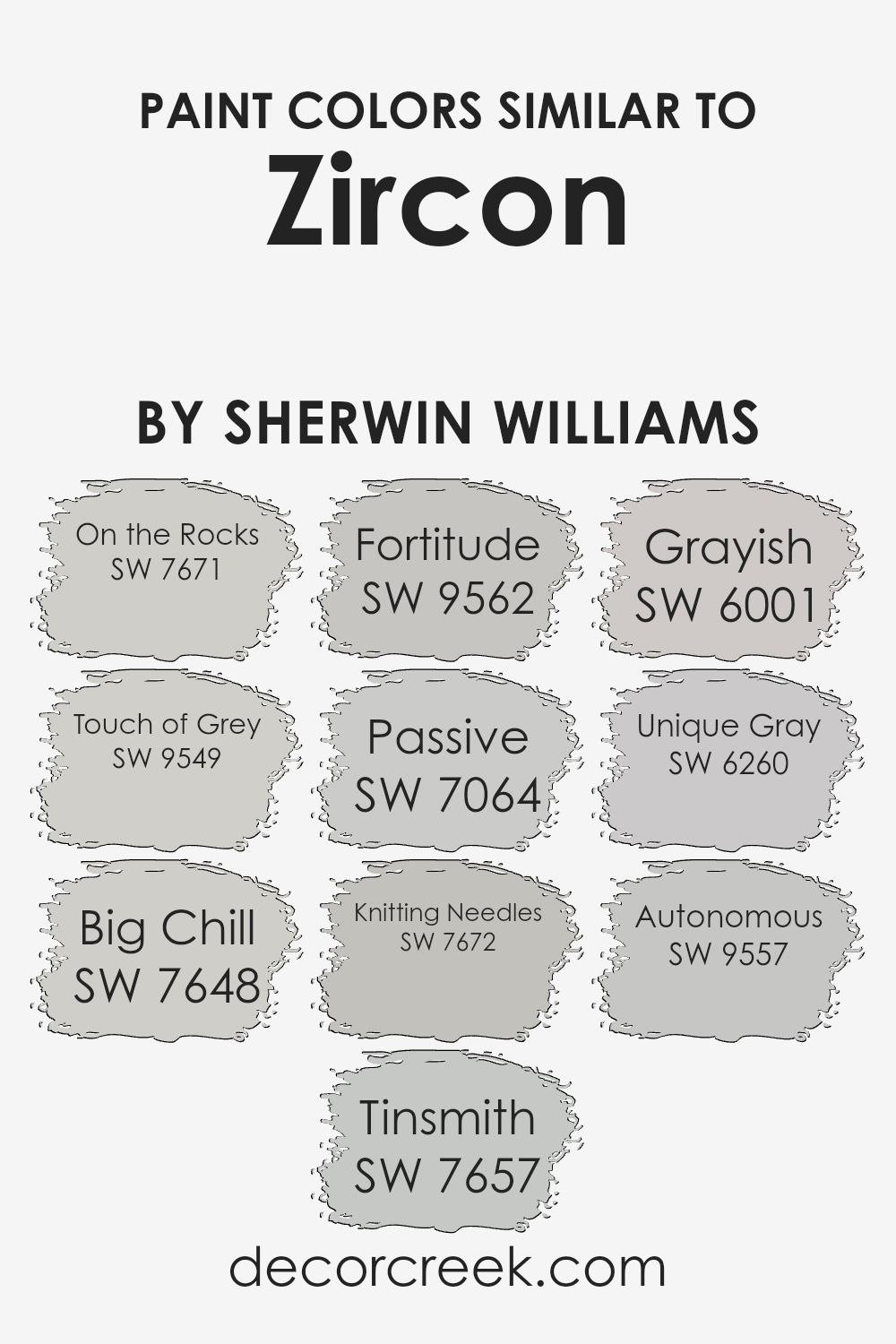
Using similar colors in design is crucial for creating a cohesive and harmonious look. For example, colors similar to Zircon by Sherwin Williams, such as On the Rocks and Touch of Grey, are essential for maintaining a subtle continuity in a space.
These shades are slightly varied yet complementary, which makes them perfect for blending seamlessly from one room to another or for adding depth when used on different elements within a single area.
Similarly, colors like Big Chill and Tinsmith serve as ideal backdrops, offering a quiet nod to elegance without overwhelming the senses.
Fortitude and Passive are other notable hues, closely related and equally adept at providing a gentle, minimalist aesthetic. The use of Knitting Needles and Grayish adds just the right amount of contrast to keep interiors looking fresh and inviting. Furthermore, Unique Gray and Autonomous allow for a bit more strength in design choices, grounding lighter furniture and accessories.
All of these shades support each other, enhancing the surrounding textures and furnishings, thus crafting a space that feels coherent and purposefully styled. An understanding of how these similar colors interact can guide choices in decor that are visually relaxing and stylistically unified.
You can see recommended paint colors below:
- SW 7671 On the Rocks (CHECK A SAMPLE)
- SW 9549 Touch of Grey (CHECK A SAMPLE)
- SW 7648 Big Chill (CHECK A SAMPLE)
- SW 7657 Tinsmith (CHECK A SAMPLE)
- SW 9562 Fortitude (CHECK A SAMPLE)
- SW 7064 Passive (CHECK A SAMPLE)
- SW 7672 Knitting Needles (CHECK A SAMPLE)
- SW 6001 Grayish (CHECK A SAMPLE)
- SW 6260 Unique Gray (CHECK A SAMPLE)
- SW 9557 Autonomous (CHECK A SAMPLE)
Colors that Go With Zircon SW 7667 by Sherwin Williams
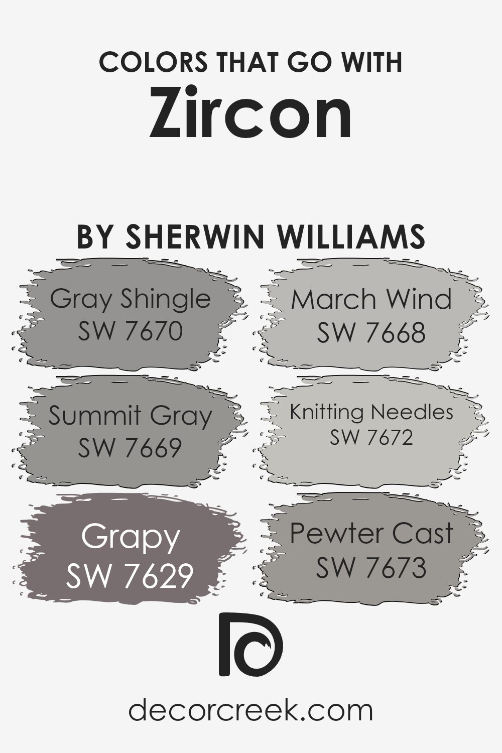
Choosing the right colors to accompany Zircon SW 7667 by Sherwin Williams is crucial because it ensures that everything in your space works together harmoniously. Zircon is a gentle gray that serves as an excellent base for creating a cohesive and inviting environment.
Complementary colors like Gray Shingle SW 7670, Summit Gray SW 7669, Grapy SW 7629, March Wind SW 7668, Knitting Needles SW 7672, and Pewter Cast SW 7673 enhance Zircon’s versatility by providing depth and contrast while maintaining a unified color palette.
Gray Shingle is a deeper gray that adds a stable, grounding effect to rooms, perfect where you want a touch of strength without overwhelming darkness. Summit Gray strikes a balance, neither too light nor too dark, which makes it incredibly useful in various decorating styles, adapting easily to changes in decor.
Grapy is a unique blend that hints at a subtle purple undertone, providing an unexpected pop of color that is still understated enough to not distract from the room’s overall calm. Meanwhile, March Wind offers a slightly cooler hue, bringing a fresh and airy feel that mimics a brisk, clear day.
Knitting Needles is closer to Zircon with a clean and crisp appearance that helps brighten spaces while maintaining a soothing atmosphere. Lastly, Pewter Cast, the darkest of these shades, anchors the space with its robust tone, ideal for accentuating key areas or for use in statement pieces.
Together, these colors form a palette that supports a wide range of design aspirations, from minimalist to modern, without clashing or overpowering the foundational tone set by Zircon.
You can see recommended paint colors below:
- SW 7670 Gray Shingle (CHECK A SAMPLE)
- SW 7669 Summit Gray (CHECK A SAMPLE)
- SW 7629 Grapy (CHECK A SAMPLE)
- SW 7668 March Wind (CHECK A SAMPLE)
- SW 7672 Knitting Needles (CHECK A SAMPLE)
- SW 7673 Pewter Cast (CHECK A SAMPLE)
How to Use Zircon SW 7667 by Sherwin Williams In Your Home?
Zircon SW 7667 by Sherwin Williams is a versatile gray paint that people can use in various ways around their home. It has a cool, subtle tone which works great in spaces that get a lot of light, softening the brightness without making the room feel dark. This color can fit into most parts of a house, whether it’s the living room, bedroom, or kitchen.
For those looking to freshen up their living space, Zircon is an excellent choice for walls as it provides a clean, neutral backdrop that goes well with different decor styles and colors. You can pair it with whites for a crisp look, or with vibrant colors for a striking contrast. It also works well in bathrooms and small spaces, making them feel more open and airy.
Zircon can also be used for painting cabinets or furniture, giving your old pieces a fresh, modern look. Its understated elegance makes it ideal for creating a calming atmosphere in bedrooms, helping you to relax and get a good night’s sleep.
Zircon SW 7667 by Sherwin Williams vs Tinsmith SW 7657 by Sherwin Williams
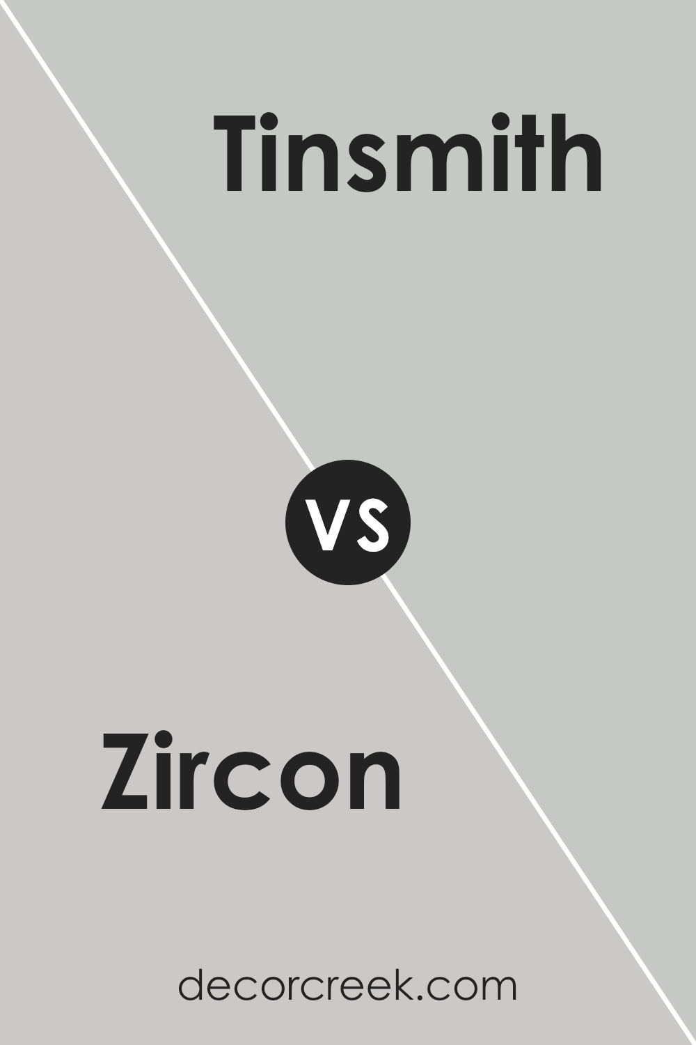
The two paint colors, Zircon and Tinsmith, by Sherwin Williams have subtle differences that give each a unique appeal. Zircon has a cool gray tone that leans slightly towards a light blue, giving it a fresh and calm appearance.
It’s great for creating an airy feel in a room. On the other hand, Tinsmith is also a gray shade but with a warmer undertone. Compared to Zircon, Tinsmith is closer to a classic gray, versatile and timeless, suitable for spaces where you want a neutral backdrop with a hint of warmth.
Both colors work well in modern decor schemes and can help make a space feel more open and inviting. Depending on the lighting and accessories used in the room, each color can appear differently, offering flexibility in design options.
You can see recommended paint color below:
Zircon SW 7667 by Sherwin Williams vs Unique Gray SW 6260 by Sherwin Williams
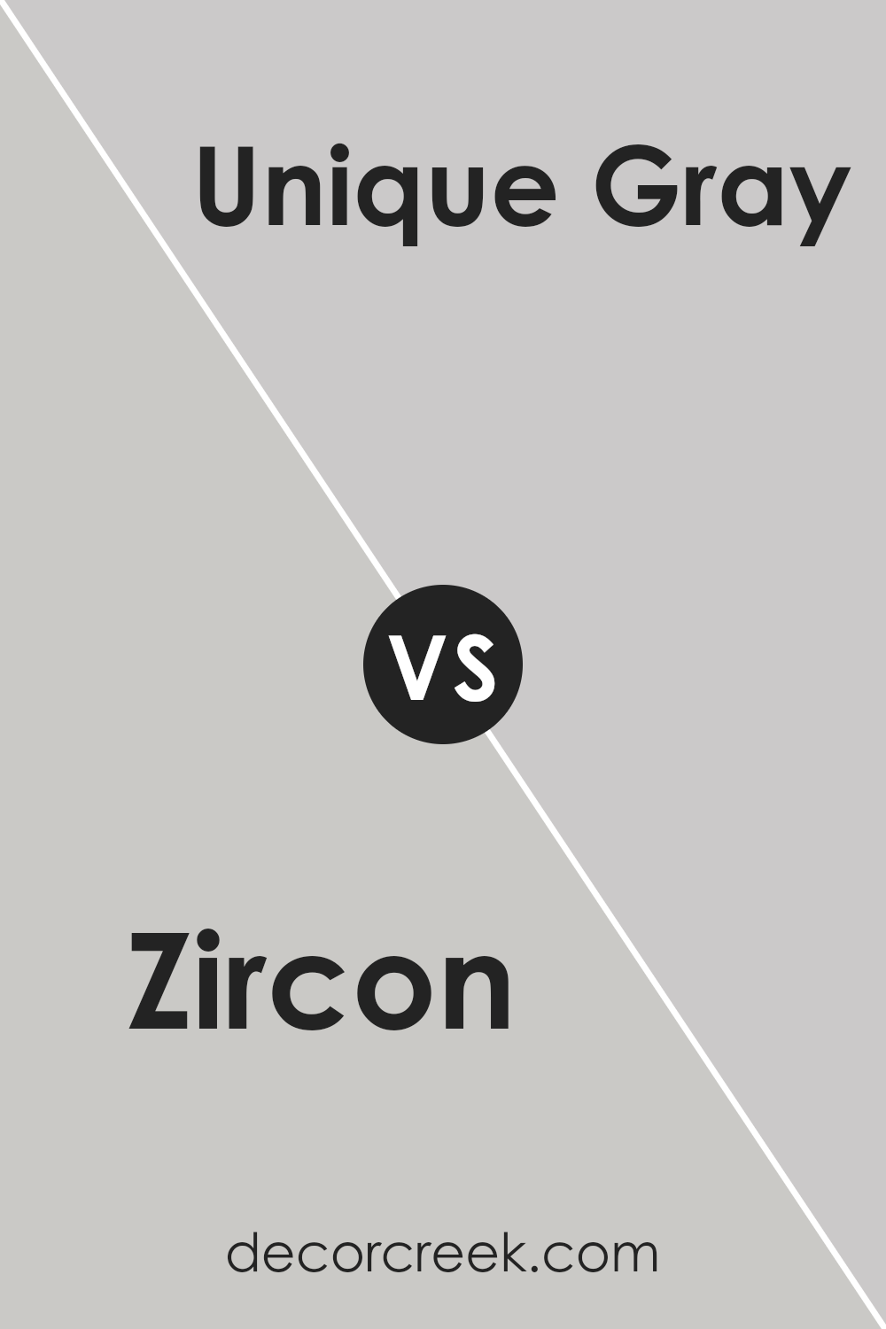
Zircon and Unique Gray, both by Sherwin Williams, offer distinct shades for different moods and spaces. Zircon is a light, almost silvery-gray that has a clean and airy feel. It’s great for making small rooms appear larger or creating a neutral backdrop that can easily pair with brighter colors.
On the other hand, Unique Gray is a deeper, slightly warmer tone. It brings a stronger presence of color but still remains versatile enough to work with various decor styles. This makes Unique Gray a good choice for those looking to add a bit of warmth to their space without overwhelming it with color.
Both Zircon and Unique Gray are neutral enough to be used in many parts of a home, yet each brings its own unique vibe—Zircon leaning towards a fresher, crisper look, and Unique Gray offering a cozy, inviting atmosphere.
You can see recommended paint color below:
- SW 6260 Unique Gray (CHECK A SAMPLE)
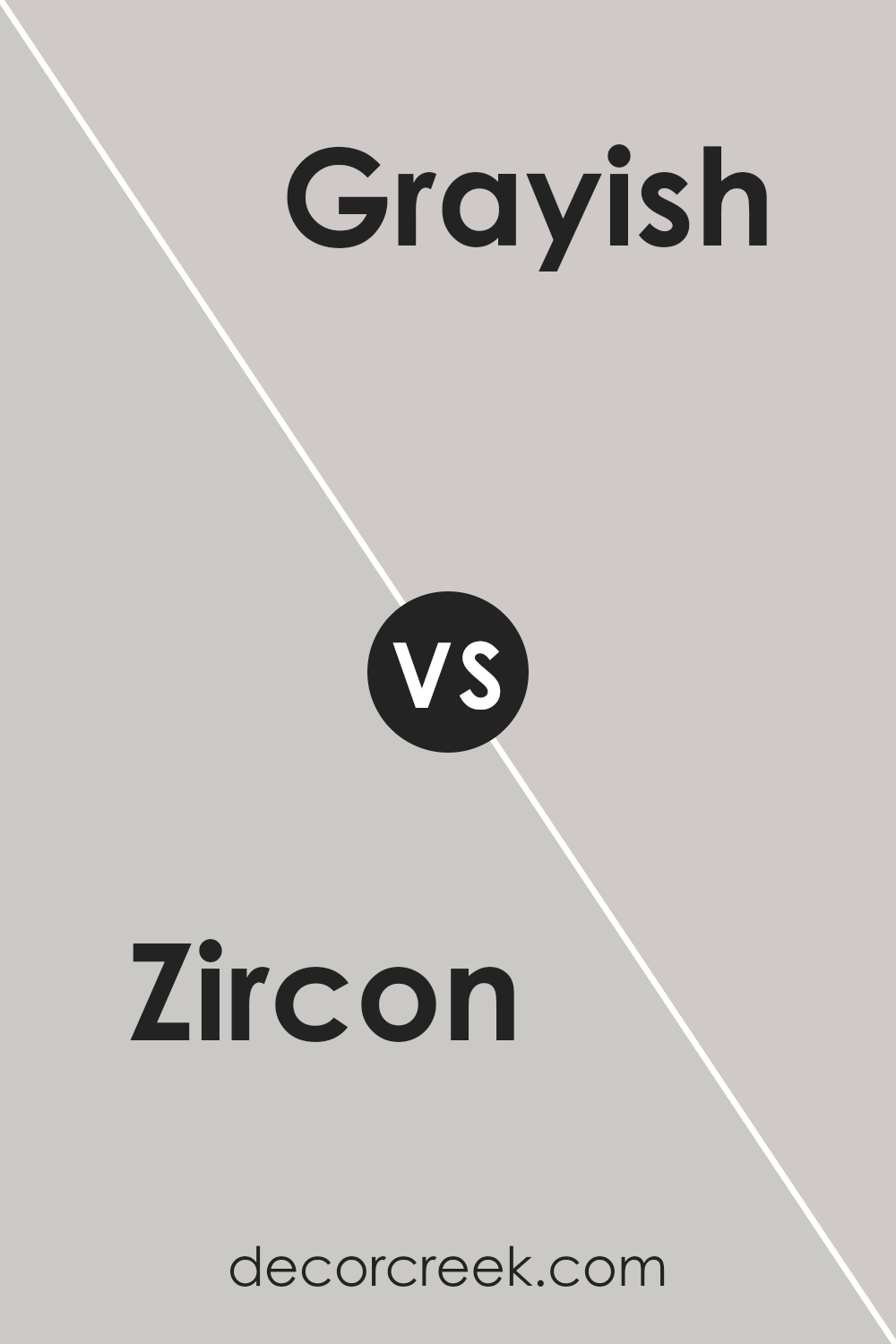
Zircon SW 7667 by Sherwin Williams vs Grayish SW 6001 by Sherwin Williams
Zircon and Grayish, both by Sherwin Williams, are subtle and versatile colors, each offering a unique charm for interior spaces. Zircon is a light gray with a slightly blue undertone, giving it a crisp and cool feel.
This makes it an excellent choice for creating a fresh and airy atmosphere in rooms like the kitchen or bathroom. On the other hand, Grayish is true to its name, presenting a blend of gray and beige. This color is warmer compared to Zircon, making it ideal for spaces where you want to promote a cozy and inviting ambiance, such as living rooms or bedrooms.
Both colors are quite neutral, which means they can pair well with various decor styles and color schemes, but they set distinctly different moods because of their temperature differences. Zircon is better for a more modern, clean look, while Grayish lends itself to a softer, more traditional feel.
You can see recommended paint color below:
- SW 6001 Grayish (CHECK A SAMPLE)
Zircon SW 7667 by Sherwin Williams vs On the Rocks SW 7671 by Sherwin Williams
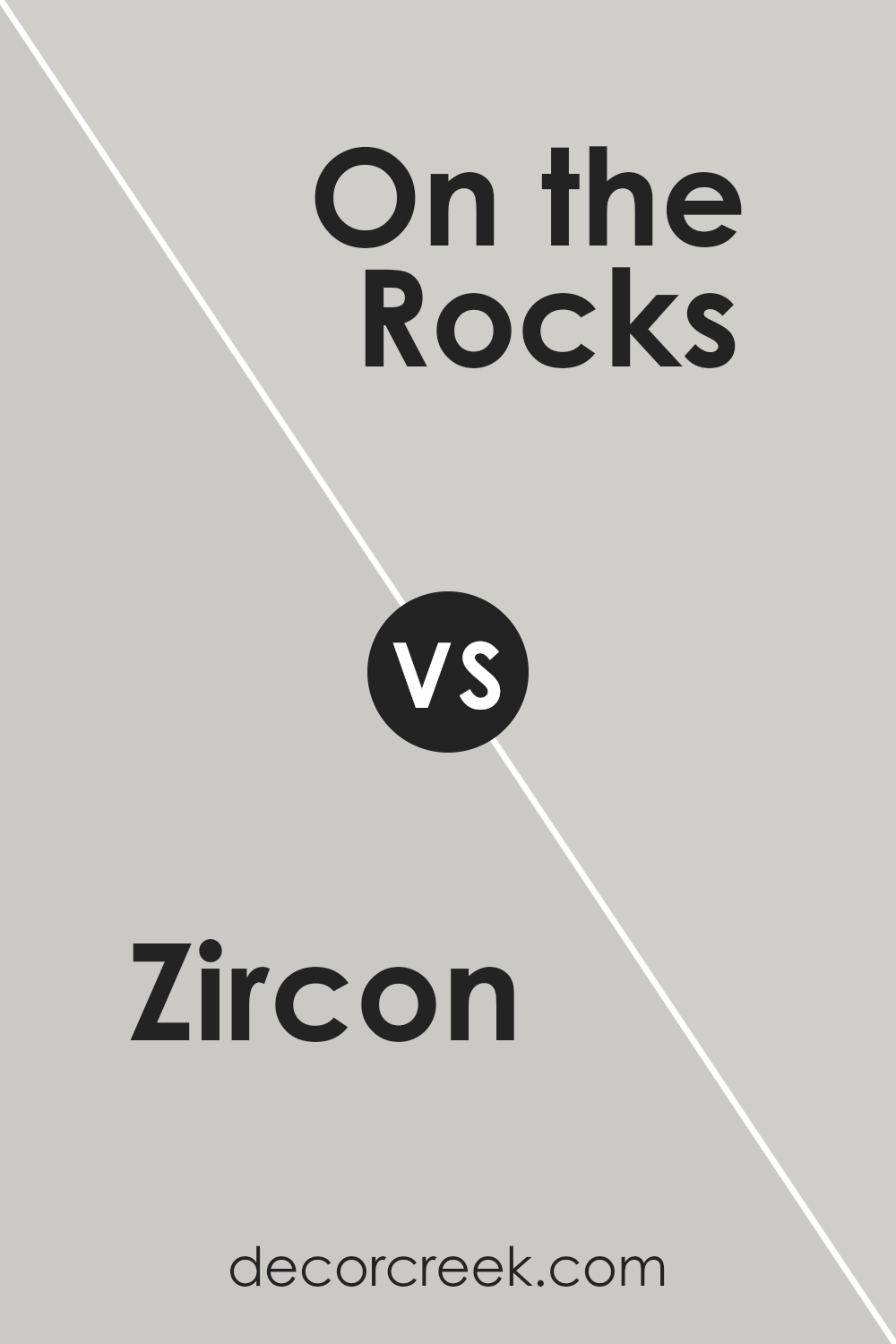
Zircon and On the Rocks are both colors from Sherwin Williams, each offering a unique yet subtle backdrop for any room. Zircon is a muted shade that leans more towards a light grey with a hint of blue, which gives it a cool, calming effect suitable for spaces meant to be relaxing, such as bedrooms and bathrooms.
On the other hand, On the Rocks is slightly warmer and lighter, containing hints of both grey and beige, often referred to as “greige.” This color is incredibly versatile, making it a fantastic choice for communal areas like living rooms or kitchens as it pairs well with a wide array of furnishings and decor styles.
colors reflect light beautifully, helping to make small spaces appear larger and more open. However, Zircon’s cooler tones might be more invigorating, whereas On the Rocks offers a gentle, welcoming ambiance with its warmer undertones.
You can see recommended paint color below:
Zircon SW 7667 by Sherwin Williams vs Knitting Needles SW 7672 by Sherwin Williams
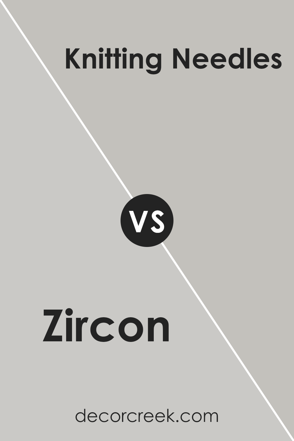
Zircon SW 7667 and Knitting Needles SW 7672, both by Sherwin Williams, are stylish choices for anyone wanting to freshen up a space. Zircon is a light gray with a cool undertone, making it ideal for creating a breezy and bright feel in a room. This color is great for small spaces as it makes them appear larger and more open.
On the other hand, Knitting Needles is a darker shade of gray compared to Zircon. It carries a slight blue undertone, which adds depth and a hint of modern flair to interiors. This color works well in areas that benefit from a more pronounced, yet still neutral, color statement, like living rooms or bedrooms.
Both colors are versatile, pairing well with a variety of decor styles and other colors. However, the choice between them depends on the mood you want to set: Zircon for a lighter, airier feel, or Knitting Needles for a bit more drama and depth.
You can see recommended paint color below:
Zircon SW 7667 by Sherwin Williams vs Touch of Grey SW 9549 by Sherwin Williams
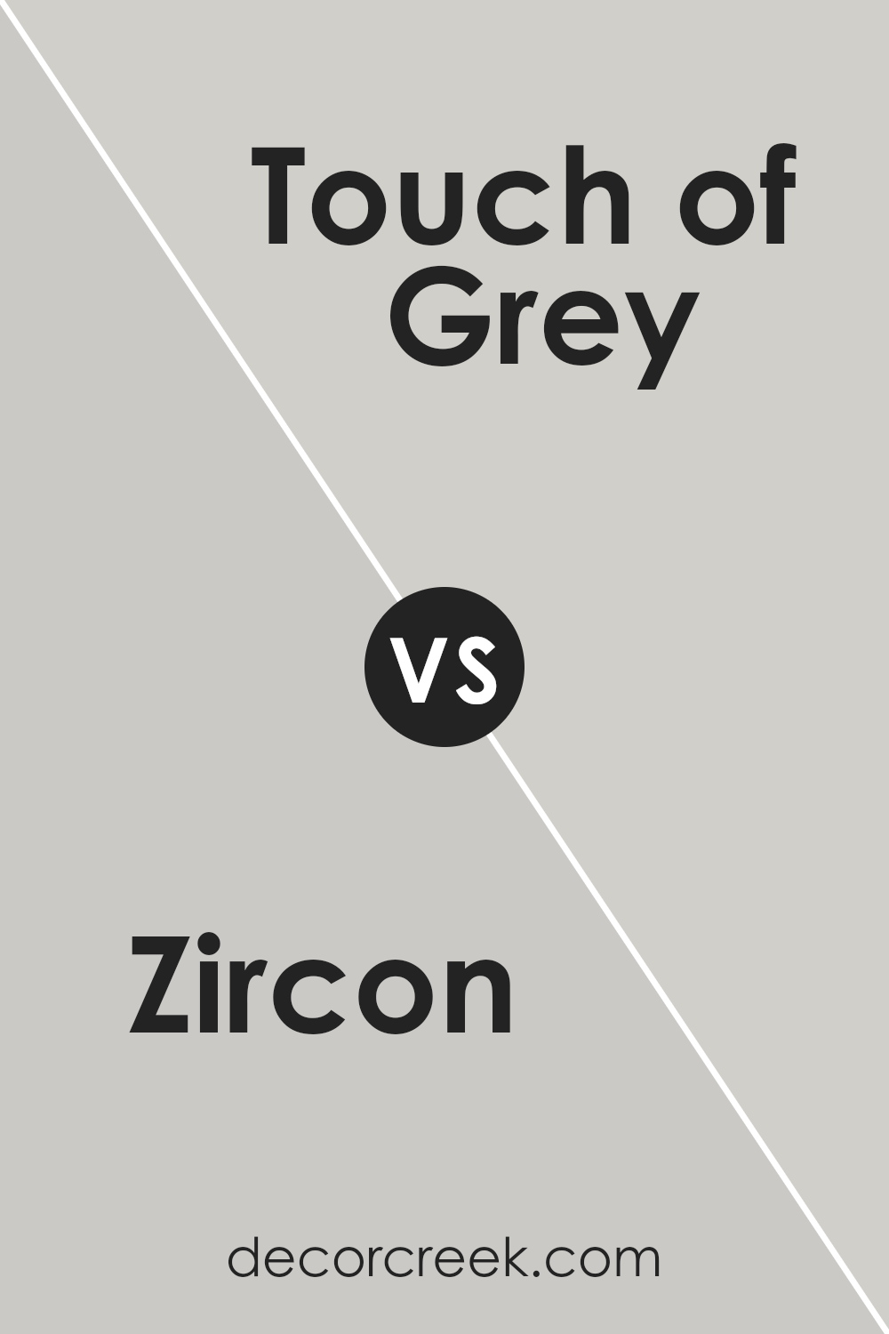
Zircon is a light gray that gives off a subtle and soothing vibe, perfect for creating a calm atmosphere in spaces like bedrooms or living rooms. It has a warm undertone that makes it cozy and inviting, particularly in areas with a lot of natural light.
On the other hand, **Touch of Grey** stands out as a slightly darker shade than Zircon, offering more depth and a modern feel to interior spaces. This color can work well in both large rooms, where it can make the space feel more intimate, as well as in smaller rooms to add a touch of sophistication without overwhelming the area.
Both colors are versatile and can be easily paired with various decor styles and other colors. However, if you’re looking for a lighter, warmer gray, Zircon would be the ideal choice. If a deeper, more striking gray fits your needs, then Touch of Grey would be more suitable.
You can see recommended paint color below:
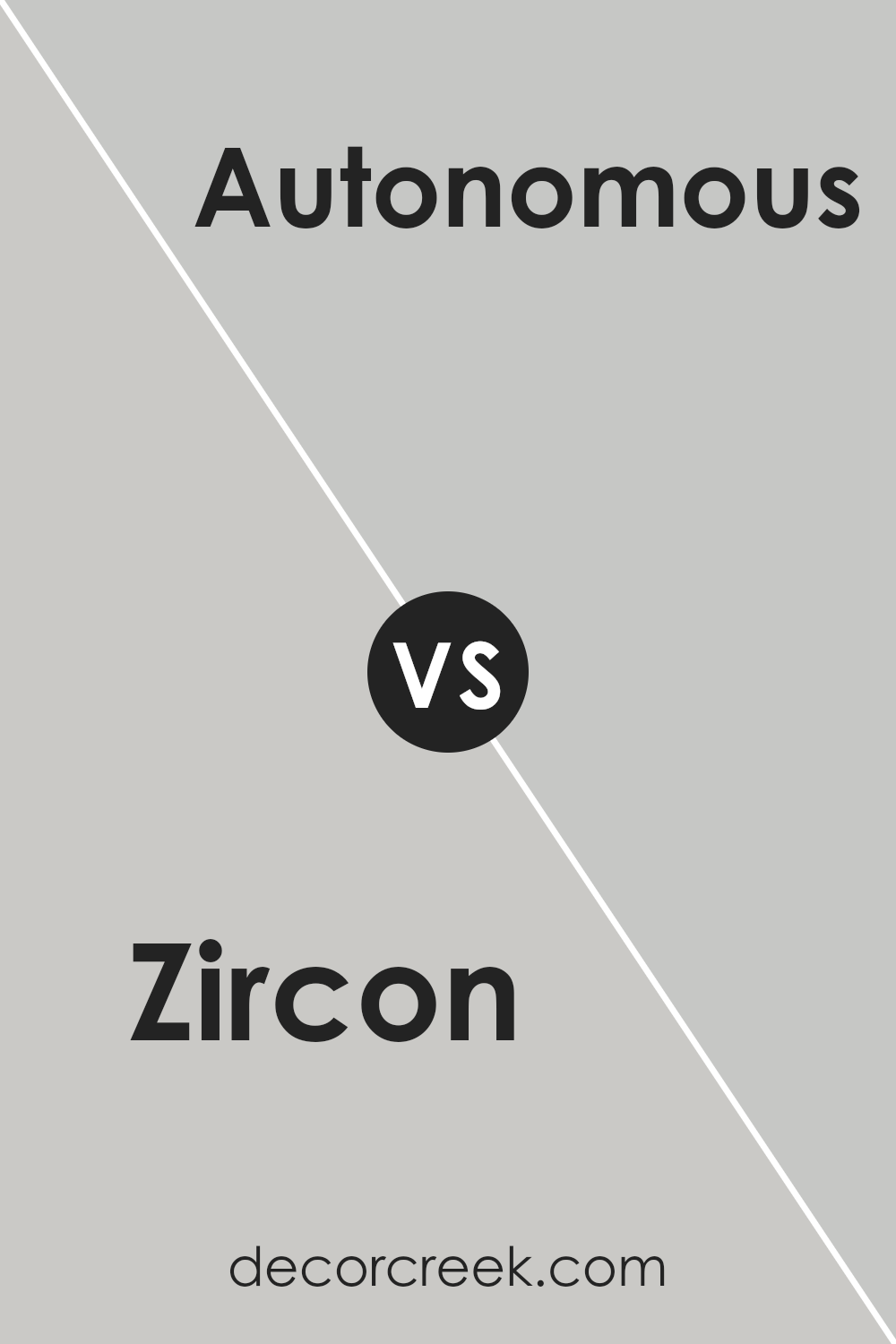
Zircon SW 7667 by Sherwin Williams vs Autonomous SW 9557 by Sherwin Williams
Zircon and Autonomous, both by Sherwin Williams, offer distinct vibes for different decorating desires. Zircon is a light, gentle grey that has a very clean and fresh feel. It’s pretty neutral and works well in spaces where you want to create a calm, understated look without the starkness that some whites can bring. It’s also versatile, easily pairing with various colors and designs.
On the other hand, Autonomous is a much darker shade, presenting itself as a strong, deep blue-grey. This color is perfect for making a statement in a room, perhaps as an accent wall or in a space used for more reflective or dramatic purposes. Its richness can make it the focal point of a room, contrasting nicely against lighter colors or woods.
In terms of usage, Zircon is perhaps better for broader applications—like living rooms or bedrooms—where a light, airy feel is desired. Autonomous, with its bolder character, might be best suited for a specific feature or in an area meant to have a bit more visual impact.
You can see recommended paint color below:
- SW 9557 Autonomous (CHECK A SAMPLE)
Zircon SW 7667 by Sherwin Williams vs Big Chill SW 7648 by Sherwin Williams
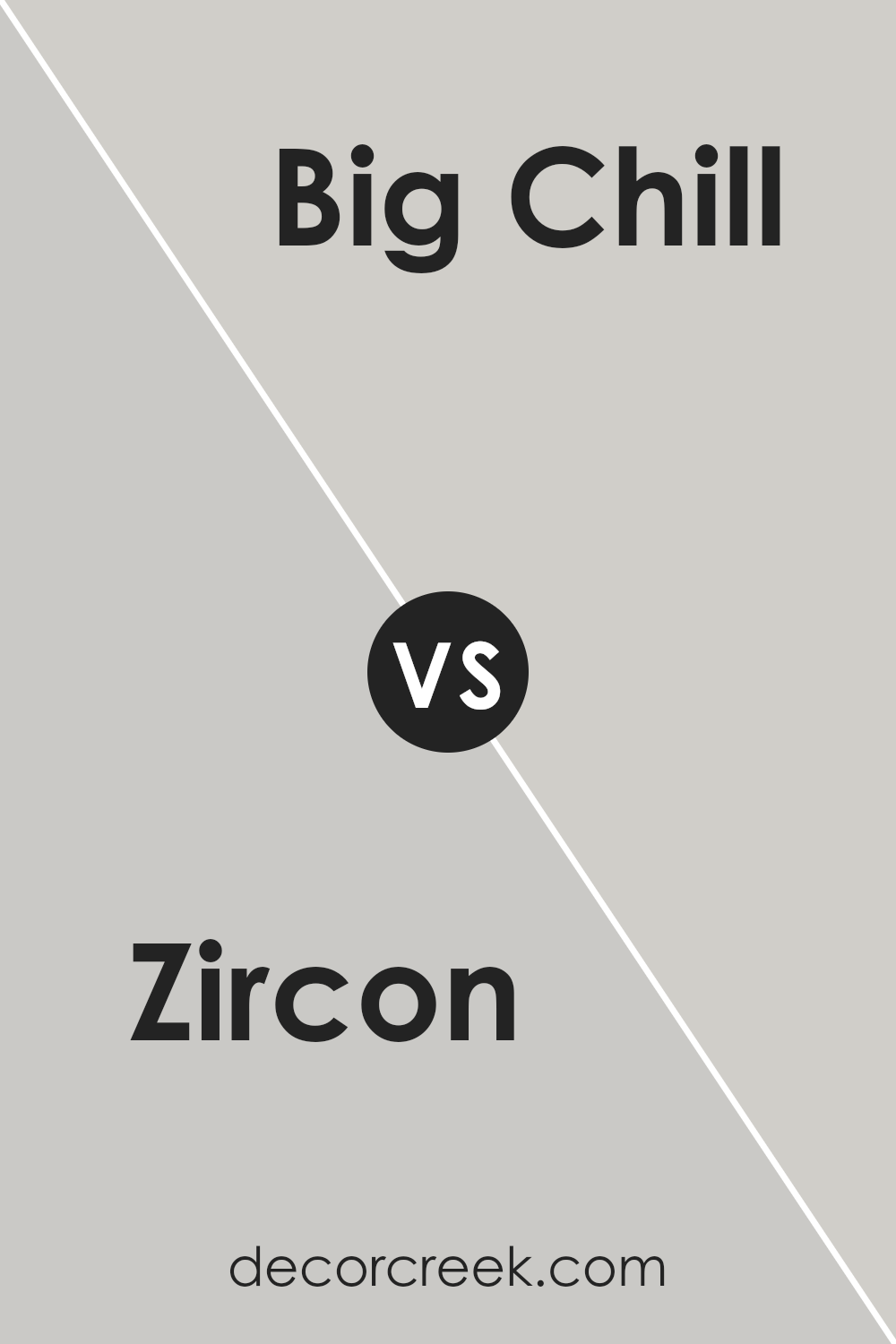
Zircon and Big Chill, both from Sherwin Williams, are quite distinct in their shades even though they both belong to the cool color spectrum. Zircon is a light gray that has subtle blue undertones, giving it a fresh and clean look. This color works well in spaces that aim for a bright and airy feeling.
On the other hand, Big Chill is also a light gray but it leans more towards a true neutral gray. This makes it extremely versatile and a great choice for those who want a classic look that pairs easily with a wide range of decor styles and other colors.
In terms of environments, Zircon may be slightly better suited for bathrooms or bedrooms where its blue undertones can evoke a calming effect. Meanwhile, Big Chill’s neutral base is ideal for high-traffic areas like living rooms and kitchens, where its unobtrusive nature helps other elements stand out.
You can see recommended paint color below:
Zircon SW 7667 by Sherwin Williams vs Fortitude SW 9562 by Sherwin Williams
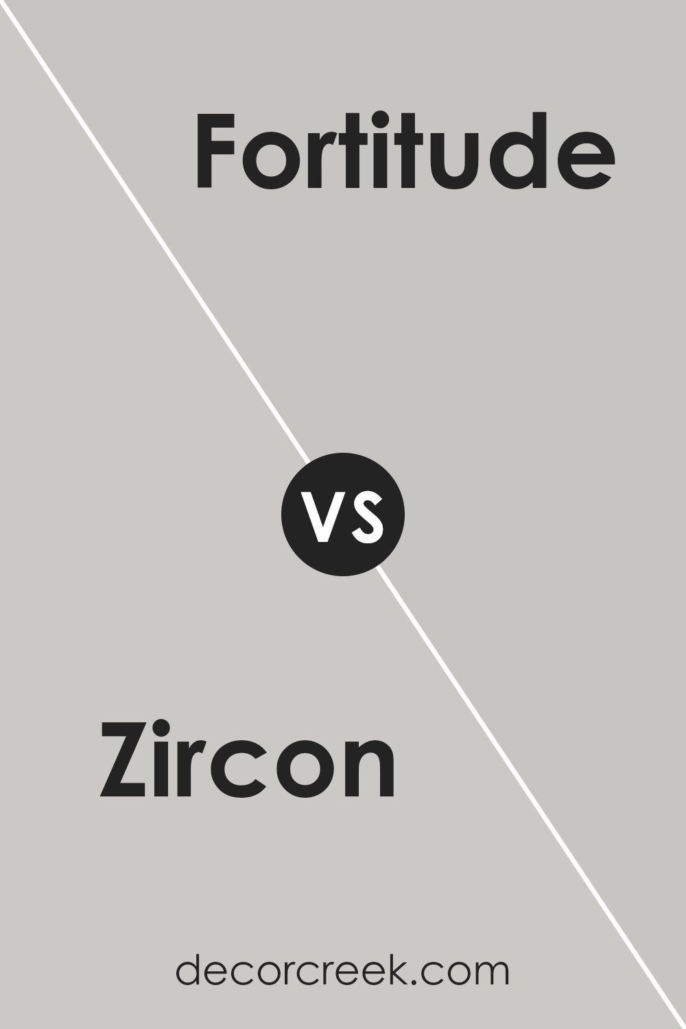
Zircon SW 7667 and Fortitude SW 9562 by Sherwin Williams are two different colors with distinct tones and atmospheres. Zircon is a light, soft gray that has a calm and clean look, making it excellent for spaces where you want a neutral backdrop that still feels warm. It goes well in many areas of a home, like living rooms or bedrooms, where a gentle touch of color is needed.
On the other hand, Fortitude SW 9562 is a much darker shade, presenting as a deep blue with a hint of gray. This color is bold and striking, making it a good choice for accent walls or furniture pieces to create a dramatic effect. It sets a strong mood and stands out more than Zircon.
Using these two colors in different parts of your house can achieve various effects. While Zircon keeps things light and airy, Fortitude offers depth and focus, providing a striking contrast.
You can see recommended paint color below:
Zircon SW 7667 by Sherwin Williams vs Passive SW 7064 by Sherwin Williams
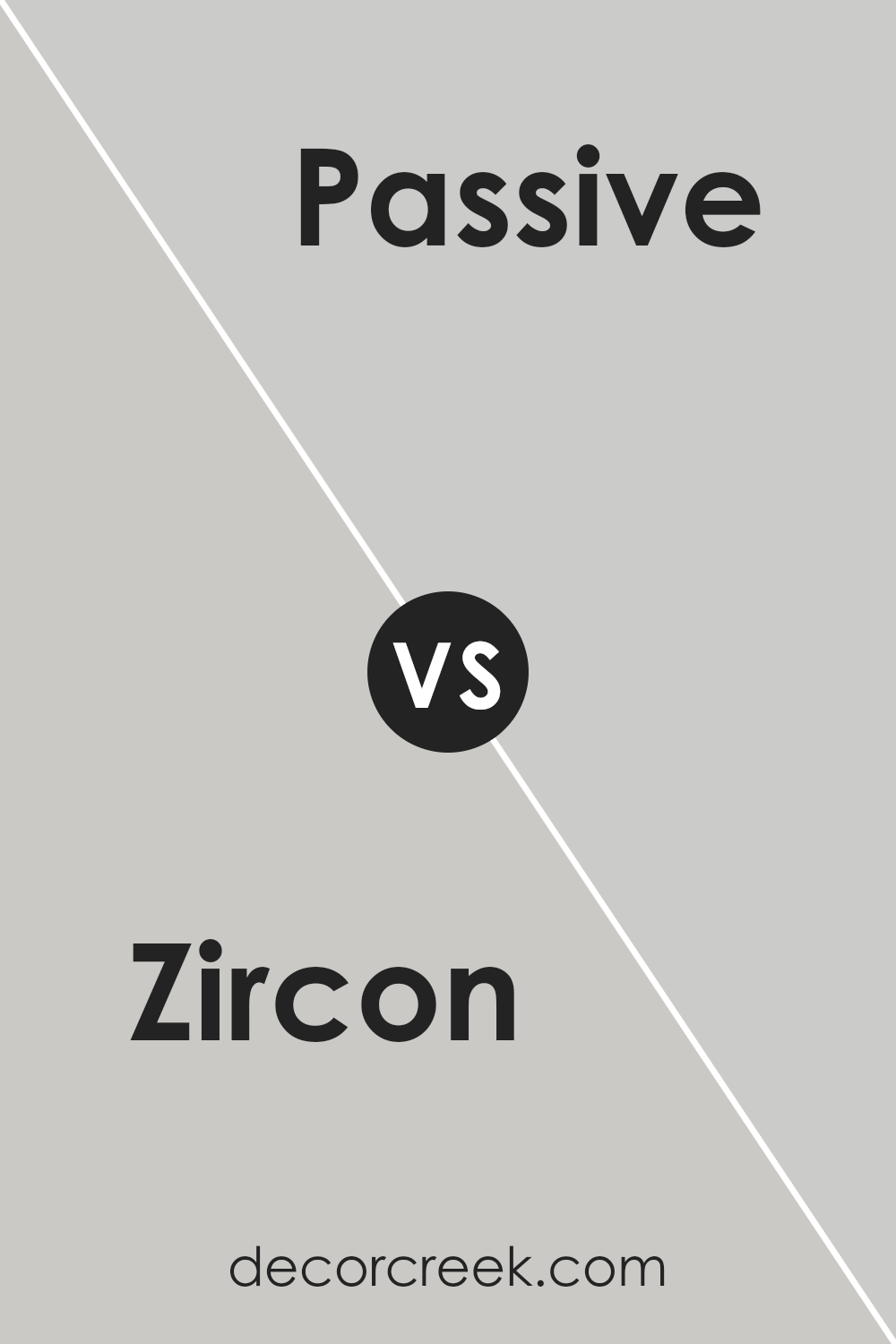
Zircon and Passive, both from Sherwin Williams, present subtle variations in tone that could influence the mood and style of a room. Zircon is a light gray color that carries a hint of blue, giving it a clean and fresh look. This makes it suitable for spaces that aim for a calm and uncluttered ambiance. It reflects light well, which can make smaller rooms appear larger.
On the other hand, Passive is a cooler gray with more understated blue undertones. Its neutral shade works well in a variety of spaces, providing a modern and flexible backdrop that complements different decor styles and colors. Passive often looks especially good in areas with lots of natural light, as the light reveals its complex undertones more clearly.
While both colors share a base of gray, Zircon’s slightly warmer tone versus Passive’s cooler vibe allows you to choose between a subtly warm or distinctly cool atmosphere in your space. These differences, though nuanced, can affect the overall feel of a room depending on your specific preferences and design goals.
You can see recommended paint color below:
After giving it a try, it’s clear that Zircon is pretty easy-going and relaxed. It doesn’t scream for attention, yet it certainly makes a room feel comfortable, warm, and welcoming. Plus, it goes well with lots of other colors—from soft whites to even bold blues or greens. This makes it really handy for someone like me who likes to switch things up now and then.
Overall, using SW 7667 Zircon has been a good move. It’s helped make my room a place where I can chill out, do my homework, or just hang out with my friends and family. I’d recommend it to anyone thinking about changing up a room without wanting to deal with big, new colors.
It works great and absolutely does the job of making a space nice and cozy!
Ever wished paint sampling was as easy as sticking a sticker? Guess what? Now it is! Discover Samplize's unique Peel & Stick samples.
Get paint samples


