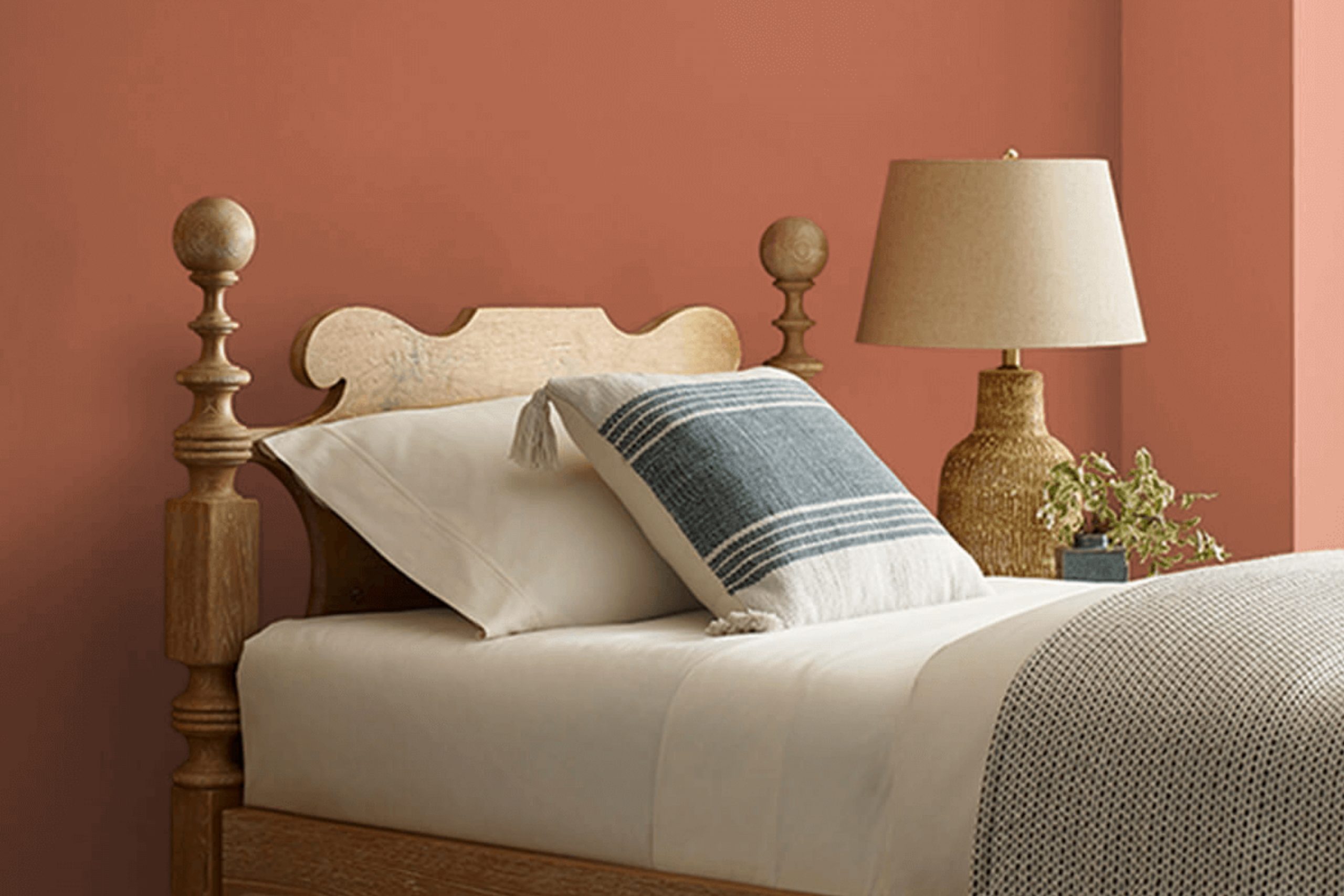
If you’re looking to refresh your space with a bold yet warm color, Sherwin Williams’ SW 6341 Red Cent might just be your ideal choice. This deep, rich terra cotta hue brings a cozy, inviting feel to any room, catching the eye with its russet undertones that remind you of autumn leaves or a desert canyon at sunset.
Applying SW 6341 Red Cent to your walls can really make your furniture and decor come alive, especially if you love natural wood elements or earth tones. It’s a versatile color that works beautifully in a living room, dining area, or even as an accent wall to add some warmth to a more neutral palette.
The finish you choose can also affect how this color plays in your space. A matte finish can give it a soft, sophisticated look, while a glossier finish might bring out the vibrancy, making it a focal point in your decor.
For anyone who wants to add a sense of warmth and depth to their home, SW 6341 Red Cent offers a delightful solution. It’s like wrapping your room in a cozy blanket, perfect for creating a welcoming atmosphere where you can relax and unwind.
What Color Is Red Cent SW 6341 by Sherwin Williams?
Red Cent by Sherwin Williams is a warm, earthy red that brings a cozy and inviting atmosphere to any space. This rich hue has a touch of brown, making it versatile and welcoming rather than overwhelming. It is perfect for creating a focal point in a room without dominating the decor.
This shade works exceptionally well in interior styles that favor comfort and warmth. It is ideal for rustic settings, as its earthy tones complement natural materials such as wood, leather, and woven textures. It also shines in traditional decors where its depth can be paired with luxurious fabrics like velvet, to create a refined yet cozy feel.
Red Cent pairs beautifully with neutral shades, such as creamy whites or soft grays, to balance its intensity. For a bold look, it can also be paired with dark greens or blues. When it comes to materials, this color looks stunning with natural wood, adding richness and warmth to furniture or floors. Textures like knitted throws or plush rugs can also enhance the coziness that Red Cent brings to a room.
Overall, Red Cent is adaptable and can create a welcoming space when combined with the right elements, making any room feel like home.
Is Red Cent SW 6341 by Sherwin Williams Warm or Cool color?
Red Cent by Sherwin Williams is a warm, welcoming color that brings a cozy and lively touch to any room. Its rich, deep rust hue feels like autumn and can make a large space feel more intimate and inviting.
In a small room, using it on an accent wall can add depth and interest without overwhelming the space. Red Cent pairs beautifully with natural materials like wood and leather, enhancing their earthy qualities. It’s especially effective in a living room or dining area where its warmth encourages conversation and comfort.
For those who prefer a bit of contrast, Red Cent works well with creamy whites or soft grays which helps balance its intensity. It’s also a popular choice for exteriors, giving homes a distinctive and welcoming appearance. Overall, Red Cent adds a touch of coziness to any home, making spaces feel lived-in and loved.
Undertones of Red Cent SW 6341 by Sherwin Williams
Red Cent by Sherwin Williams is a warm, inviting shade of red that has a complex mixture of undertones. These undertones, which include olive, pale pink, grey, red, brown, pink, purple, yellow, light green, pale yellow, and mint, play a significant role in how the color is perceived under different lighting conditions.
Understanding undertones helps us appreciate why a color might look different in one room compared to another or at different times of the day. For instance, olive and brown undertones can give a color a grounded, earthy feel, while hints of pale pink and yellow can add a subtle warmth. Grey and purple can mute the intensity, lending a softer appearance. The mix of lighter undertones like pale yellow and light green can inject a hint of freshness into the color.
When applied to interior walls, the various undertones of Red Cent can significantly affect the mood and style of a room. In natural light, the warmer undertones like red and brown can make a space feel cozy and welcoming. Under artificial lighting, the cooler undertones like grey and purple might become more noticeable, softening the dominant red and creating a more nuanced hue.
Thus, the mix of undertones in Red Cent can make it a versatile choice for many spaces, adapting subtly to changes in lighting and decor. The depth provided by these undertones can add rich layers to walls, enhancing the overall aesthetic of a room.
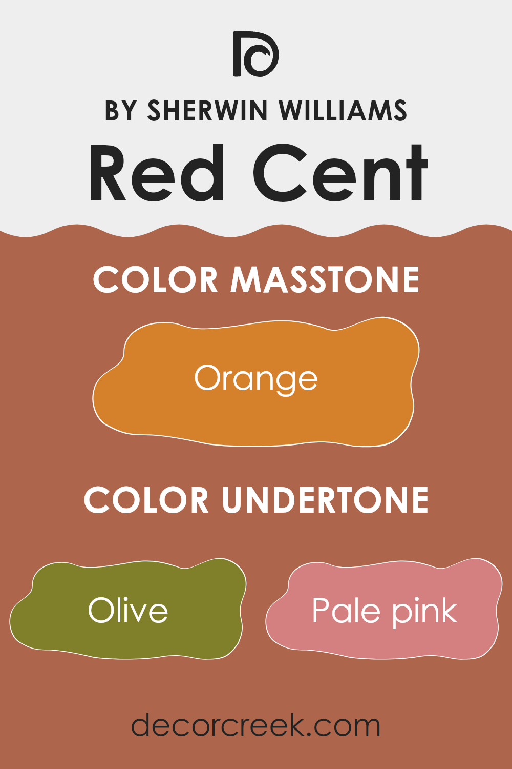
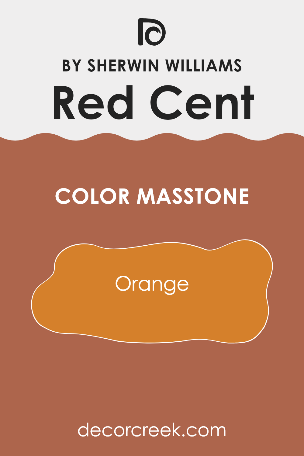
What is the Masstone of the Red Cent SW 6341 by Sherwin Williams?
Red Cent is a vibrant orange shade with a warm, inviting feel that instantly makes any room feel cozy and welcoming. When used in homes, this color brings a sense of warmth and energy. It’s especially effective in spaces where you want to foster conversation and cheerfulness, like living rooms or dining areas.
The orange tone is lively and can be paired with neutrals to balance its intensity, making it versatile enough to use in various styles and settings.
Applying it on an accent wall can be a great way to introduce a concentrated pop of color without overwhelming the entire space. Additionally, when matched with soft lighting, Red Cent creates a snug, comforting atmosphere that’s perfect for relaxing after a long day. It’s a color that adds personality and heart to a home, influencing mood and aesthetics positively.
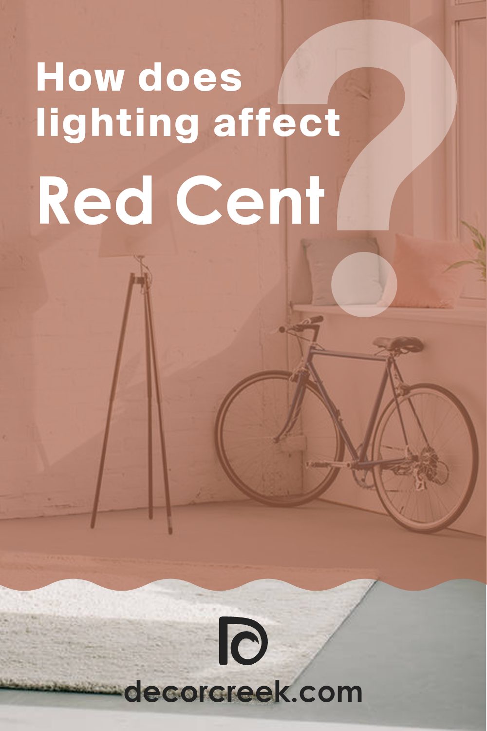
How Does Lighting Affect Red Cent SW 6341 by Sherwin Williams?
Lighting plays a crucial role in how we perceive colors. The color Red Cent by Sherwin Williams is a vibrant shade that can look quite different under various lighting conditions. This effect is due to the wavelengths of light absorbed and reflected by the color, which changes depending on the light source.
In artificial light, Red Cent tends to appear warmer and deeper. Incandescent bulbs, which emit a yellowish hue, enhance the red tones, making the color appear cozier and richer. This makes it a great choice for living spaces like lounges or dining rooms where you want a warm, inviting atmosphere.
Natural light, on the other hand, brings out the truest version of this color. Under the bright light of the sun, Red Cent will reveal all its depth and complexity. The exact appearance will shift throughout the day with the changing position of the sun, sometimes looking more vivid and other times more subdued.
The direction a room faces also affects how Red Cent looks:
– North-faced rooms get less direct sunlight, which can make colors appear slightly cooler or muted. Here, Red Cent might look a bit darker and less vivid.
– South-faced rooms are filled with intense sunlight for most of the day, which can brighten and enhance the red, making it look lively and bold.
– East-faced rooms enjoy morning light, which is gentle and warm. During the morning, Red Cent will look vibrant and welcoming, but it might lose some intensity as the day progresses into afternoon.
– In west-faced rooms, the color will be softer during the morning and become dramatically bright and vivid in the evening as the sun sets. This can make the room feel dynamic as it responds to the changing light.
Understanding how light affects colors like Red Cent can help you decide the best room and conditions to use it, ensuring it always looks its best in your home.
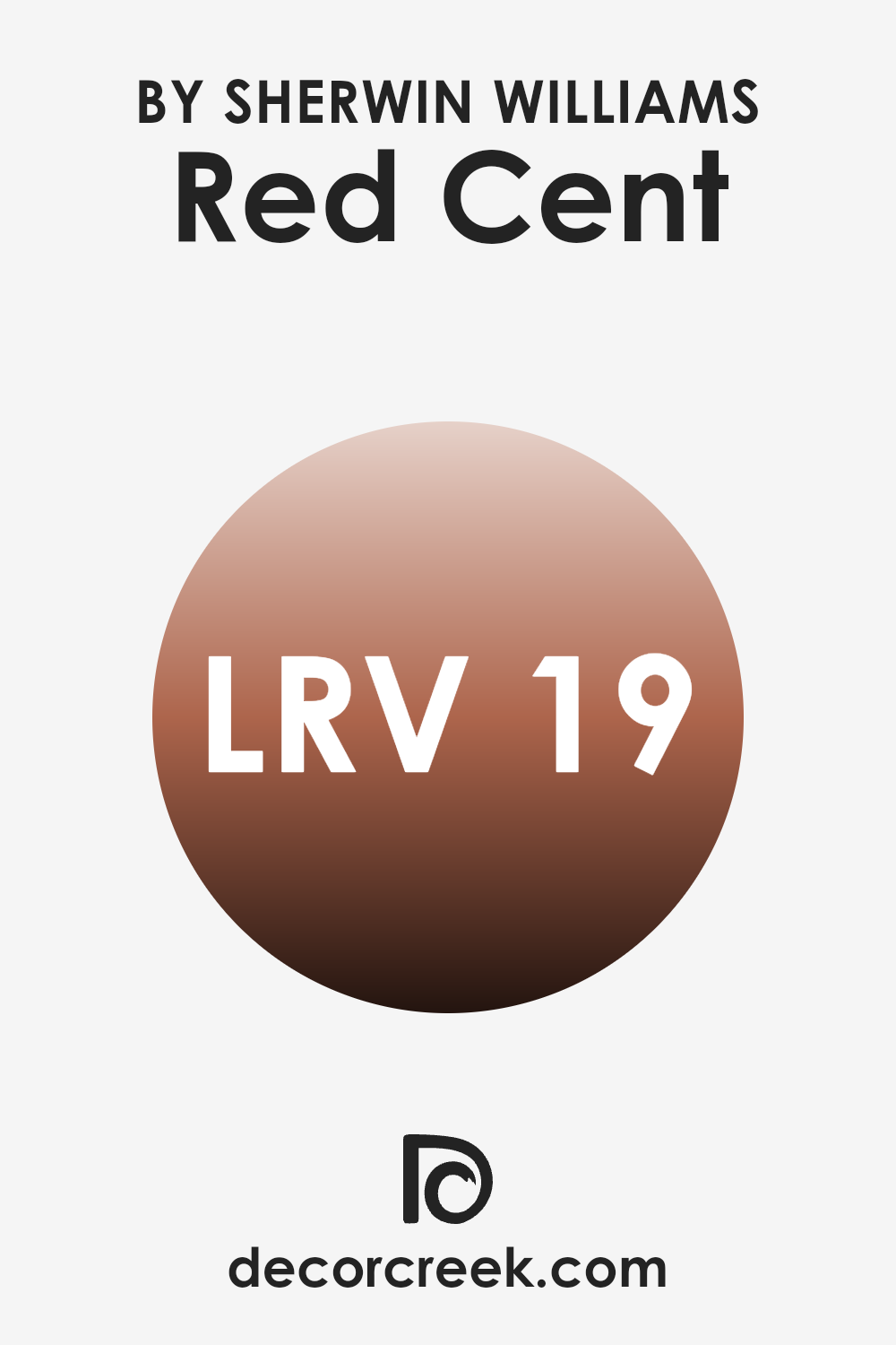
What is the LRV of Red Cent SW 6341 by Sherwin Williams?
LRV stands for Light Reflectance Value, which measures the amount of light a paint color reflects back into a room. This value is expressed on a scale where higher values mean the color reflects more light, making a room feel brighter, while lower values mean it absorbs more light, making a room feel cozier or more enclosed.
Understanding LRV can help you choose the right paint color for your space based on how much natural or artificial light your room receives. For instance, a room with limited light might benefit from a paint with a higher LRV to make it appear lighter and more open.
The LRV for the color Red Cent is 18.63, indicating that it is on the darker end of the scale, as it absorbs a significant amount of light. This makes it a bold choice for walls, particularly in a space that you want to feel warm and intimate.
The lower LRV means that in rooms with less light, it may appear even darker, emphasizing a snug, cozy atmosphere. However, in a well-lit room, whether through ample windows or strong artificial lighting, the true richness of the color can come out, adding warmth and character to the space. Thinking strategically about lighting can help manage how this color impacts the mood and feel of a room.
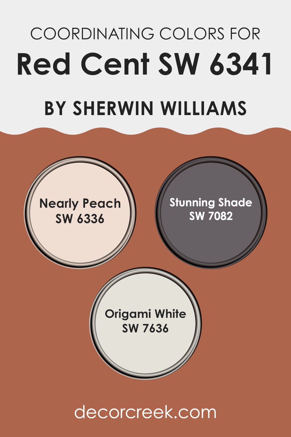
Coordinating Colors of Red Cent SW 6341 by Sherwin Williams
Coordinating colors are chosen to complement a primary color, in this case, Red Cent. These colors are selected to create a harmonious palette, providing balance and visual interest in an interior space. Coordinating colors can contrast the main hue to draw attention or closely match it to amplify the design’s unity and coherence.
Nearly Peach is a soft, subtle shade that provides a gentle contrast to the more robust Red Cent, offering a soothing backdrop that allows richer colors to stand out. Stunning Shade brings a more dramatic tone to the palette, adding depth and definition, which works well in spaces that benefit from a darker color to highlight areas or for dramatic accent walls.
Origami White is a clean and light color that offers a crisp contrast, perfect for making Red Cent pop, and it works excellently on trims or ceilings to provide a lifted, airy feeling to any room. Together, these colors create a balanced and appealing spectrum that can enhance any space, highlighting strengths and offsetting limitations of each.
You can see recommended paint colors below:
- SW 6336 Nearly Peach
- SW 7082 Stunning Shade
- SW 7636 Origami White
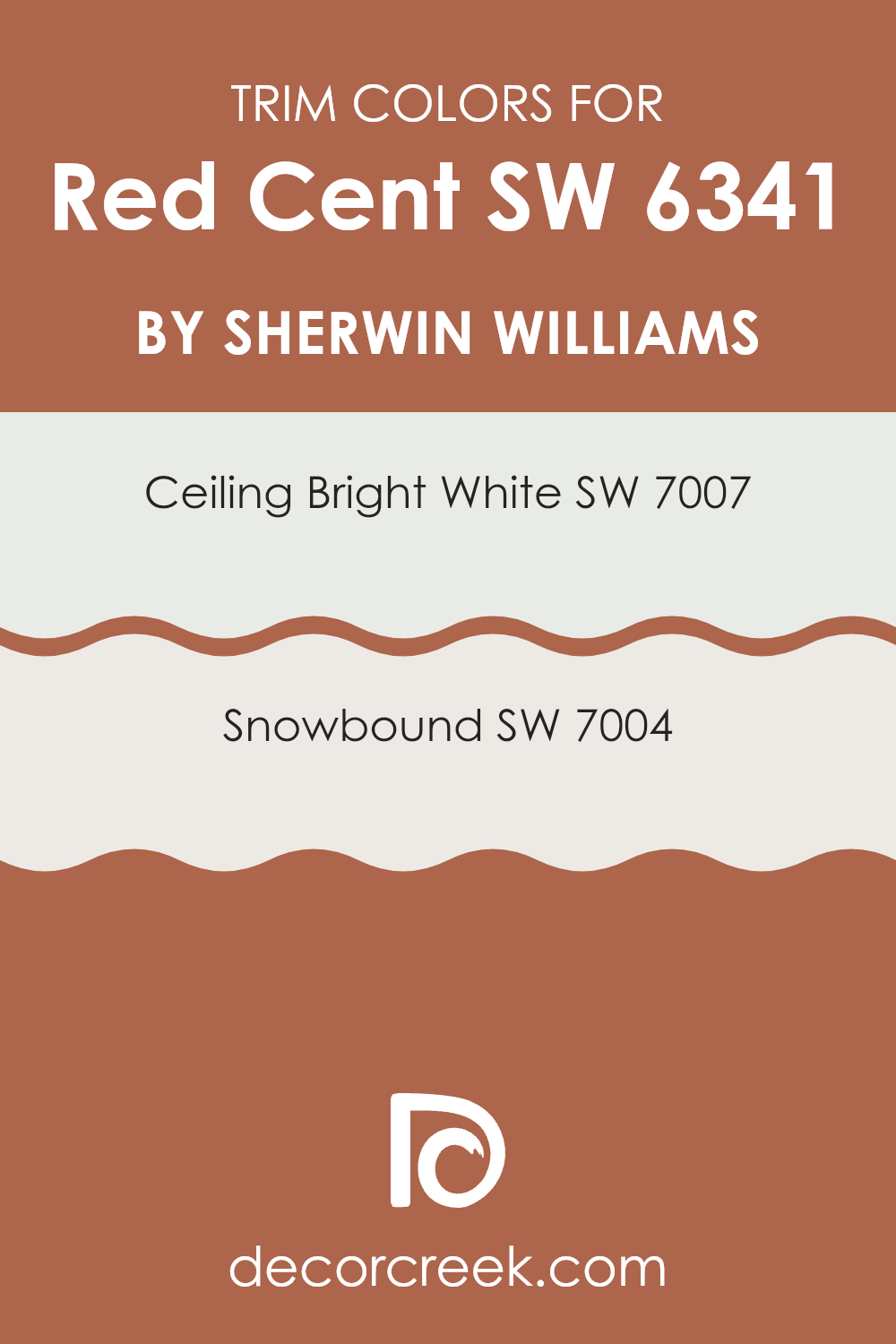
What are the Trim colors of Red Cent SW 6341 by Sherwin Williams?
Trim colors are specific shades used for the detailing on doors, windows, moldings, and other architectural features in a room or on an exterior. They play a crucial role in defining and accentuating the key elements of a space, helping to frame and highlight areas, and providing a visual contrast or complement to the main wall colors.
For a rich and vibrant hue like Red Cent by Sherwin Williams, choosing the right trim color is essential to create a balanced look. Trim colors such as Ceiling Bright White and Snowbound, both by Sherwin Williams, are excellent choices to pair with the deep tone of Red Cent, as they allow the warmth of the red to stand out while adding a clean, crisp finish to the overall aesthetic.
Ceiling Bright White (SW 7007) is a very pure, clean white that brings a fresh and clear look to any space. It effectively reflects light, helping to make a room appear brighter and more spacious. On the other hand, Snowbound (SW 7004) is a soft, warm white with greige undertones that offer a subtle, gentle contrast when used alongside more intense colors like Red Cent. This color is perfect for creating a soothing yet distinct boundary that connects more powerfully colored walls with the rest of the interior’s design elements.
You can see recommended paint colors below:
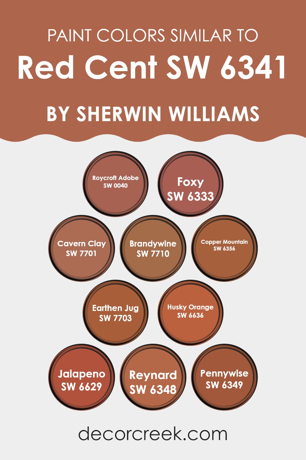
Colors Similar to Red Cent SW 6341 by Sherwin Williams
When decorating a space, choosing similar colors can create a harmonious and cohesive look. Colors that are similar to Red Cent by Sherwin-Williams blend well together, enhancing the aesthetic without causing a jarring visual contrast. Such colors, including Roycroft Adobe and Foxy, offer subtle variations that allow for a refined yet rich layering of hues. This approach can make a room feel balanced and visually appealing, as the colors support and complement one another.
Roycroft Adobe has an earthy, deep terra cotta tone that brings warmth to any space, similar to sitting by a cozy fireplace. Foxy is a vibrant spice color, lively and full of energy, perfect for adding a playful yet grounded touch to interiors.
Cavern Clay resembles sun-washed clay and adds a soft, natural essence to the palette, while Brandywine is darker, reminiscent of aged wine, providing depth and intensity. Copper Mountain exudes the glow of natural copper, offering a rustic charm. Earthen Jug carries a deeper, brownish-red earth tone, enriching environments with a robust sensation.
Husky Orange brightens spaces with its cheerful, citrusy hue, bringing a burst of joy. Jalapeno offers a spunky, fresh kick that can liven up any area. Reynard and Pennywise, the latter bearing a more muted, penny-like hue, both contribute their unique shades, enhancing the overall theme with their distinctive characters.
All these similar shades work together to create a thematic consistency, making it easier to design a space that feels cohesive and thoughtfully composed.
You can see recommended paint colors below:
- SW 0040 Roycroft Adobe
- SW 6333 Foxy
- SW 7701 Cavern Clay
- SW 7710 Brandywine
- SW 6356 Copper Mountain
- SW 7703 Earthen Jug
- SW 6636 Husky Orange
- SW 6629 Jalapeno
- SW 6348 Reynard
- SW 6349 Pennywise
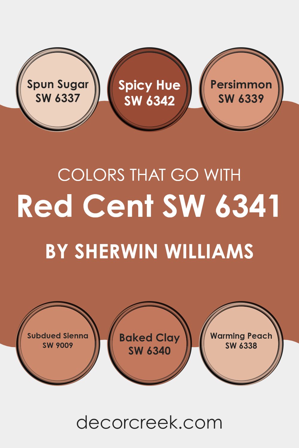
Colors that Go With Red Cent SW 6341 by Sherwin Williams
When decorating a space, choosing the right colors to complement your main shade is crucial for creating a harmonious look. Red CentSW 6341 by Sherwin Williams is a rich and vibrant hue that can greatly benefit from the right accompanying colors to balance its intensity. Colors like Spun Sugar, Spicy Hue, Persimmon, Subdued Sienna, Baked Clay, and Warming Peach have unique attributes that pair well with Red Cent and bring out its warm undertones, making the space feel cozy and welcoming.
For instance, Spun Sugar is a very light pink that adds a touch of softness and lightness to counterbalance the depth of Red Cent, making the room feel airy. Spicy Hue is a strong orange-red that matches the energy of Red Cent but adds a bit more spice, which makes them work well in a vibrant, lively setting.
Persimmon offers a bolder, almost citrus-like pop that injects a playful vibe into the space. Subdued Sienna, a muted earthy reddish-brown, works well with Red Cent to provide a more grounded and muted palette, ideal for a comforting and grounded atmosphere. Baked Clay has a terracotta feel that enriches Red Cent with a rustic, natural look, suitable for creating a warm, inviting environment.
Lastly, Warming Peach is a gentle peach shade that infuses a gentle, soft contrast to the boldness of Red Cent, perfect for softening a space while keeping it warm and engaging. Selecting from these colors ensures a beautiful, cohesive look around the robust Red Cent, enhancing both mood and aesthetic in any room.
You can see recommended paint colors below:
- SW 6337 Spun Sugar
- SW 6342 Spicy Hue
- SW 6339 Persimmon
- SW 9009 Subdued Sienna
- SW 6340 Baked Clay
- SW 6338 Warming Peach
How to Use Red Cent SW 6341 by Sherwin Williams In Your Home?
Red Cent SW 6341 by Sherwin Williams is a warm and welcoming shade of red that adds a cozy feeling to any room in your home. This deep red paint can be especially nice in a living room or dining area, where it creates a friendly, inviting atmosphere. It works well with neutral colors like white, gray, and beige, which can help balance its richness and keep it from overwhelming the space.
Using Red Cent in your entryway can make a strong first impression as it sets a tone of warmth right from the door. In the kitchen, adding this color on one wall can make the area feel more lively and warm, perfect for making visitors feel at home.
This color also pairs beautifully with wooden furniture and accents, as the natural tones complement the red hues perfectly. Whether you choose to paint a whole room or just an accent wall, Red Cent is a great choice for adding a touch of warmth and personality to your living space.
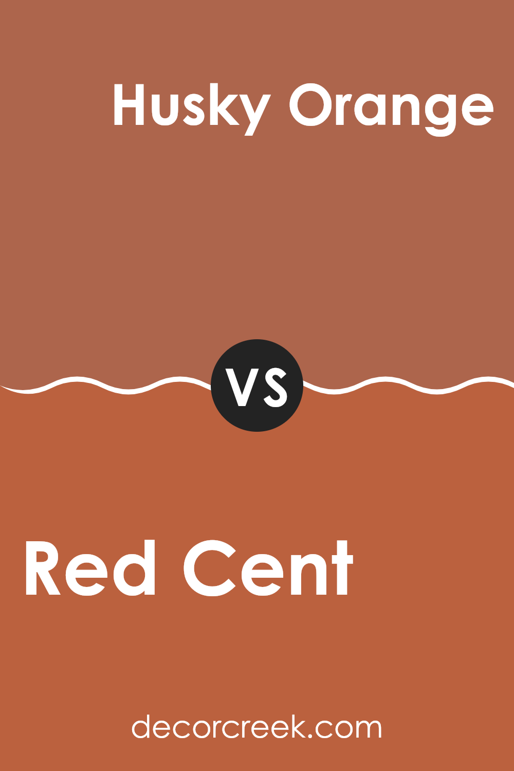
Red Cent SW 6341 by Sherwin Williams vs Husky Orange SW 6636 by Sherwin Williams
Red Cent and Husky Orange are two distinct colors from Sherwin Williams. Red Cent is a deep, warm red with a dusky quality, offering a cozy and inviting atmosphere. This color is perfect for creating a bold statement in a room, particularly striking in living or dining areas where it encourages a sense of togetherness.
In contrast, Husky Orange is a vibrant, energetic orange. It’s a lively color that carries a lot of punch, perfect for spaces used for activities or where creativity blooms, like a home office or kitchen. This color stands out and tends to invigorate the environment, making it feel vibrant and full of life.
When comparing the two, Red Cent provides a traditional warmth while Husky Orange adds a fun, dynamic burst of energy. Each color serves well in different contexts or can be used together for a striking contrast that enlivens a space with warmth and animation.
You can see recommended paint color below:
- SW 6636 Husky Orange
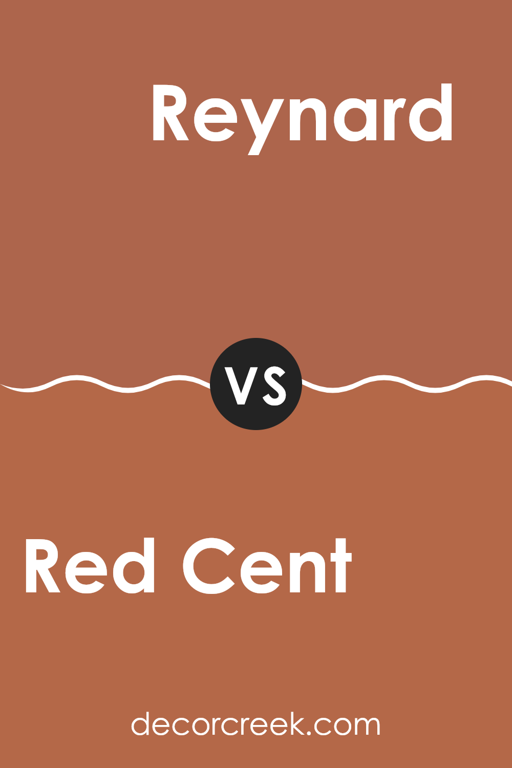
Red Cent SW 6341 by Sherwin Williams vs Reynard SW 6348 by Sherwin Williams
The main color, Red Cent, and the second color, Reynard, both by Sherwin Williams, offer distinctly different hues that can add unique character to any space. Red Cent is a warm, rich red that has a vibrant and welcoming energy.
It’s perfect for creating a focal point in a room or adding a cozy, inviting feel. On the other hand, Reynard is a deeper, brownish-red shade that leans towards a more subdued and classic look. This color is ideal for creating a dignified and grounded atmosphere, making it excellent for spaces meant for relaxation or formal gatherings.
Both colors are versatile and can be used in various settings but serve different aesthetic purposes based on their brightness and undertones. Red Cent lights up a room with its brightness, while Reynard offers a more restrained elegance.
You can see recommended paint color below:
- SW 6348 Reynard
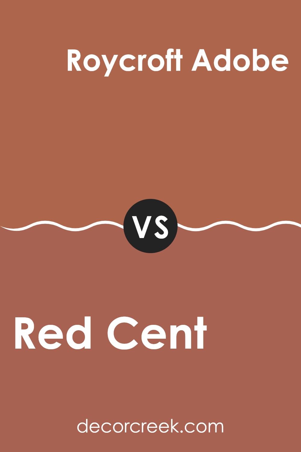
Red Cent SW 6341 by Sherwin Williams vs Roycroft Adobe SW 0040 by Sherwin Williams
Red Cent by Sherwin Williams is a vibrant, rich red color that has a lively presence. This color leans more towards a true red, making it great for adding a robust and energetic feel to any space. It often works well in areas like living rooms or dining areas where you want to create a warm, inviting atmosphere.
On the other hand, Roycroft Adobe by Sherwin Williams is a deeper, dustier shade compared to Red Cent. It mixes elements of red and brown, leading to a more subdued and earthy tone. This color is perfect if you’re aiming for a cozy and comforting vibe, as it offers a more muted approach to warmth that blends beautifully in spaces meant for relaxation.
Each color serves different emotional and design purposes. Red Cent brings excitement and a sense of boldness, whereas Roycroft Adobe provides a grounded, subtle warmth, making them both versatile in their own unique ways.
You can see recommended paint color below:
- SW 0040 Roycroft Adobe
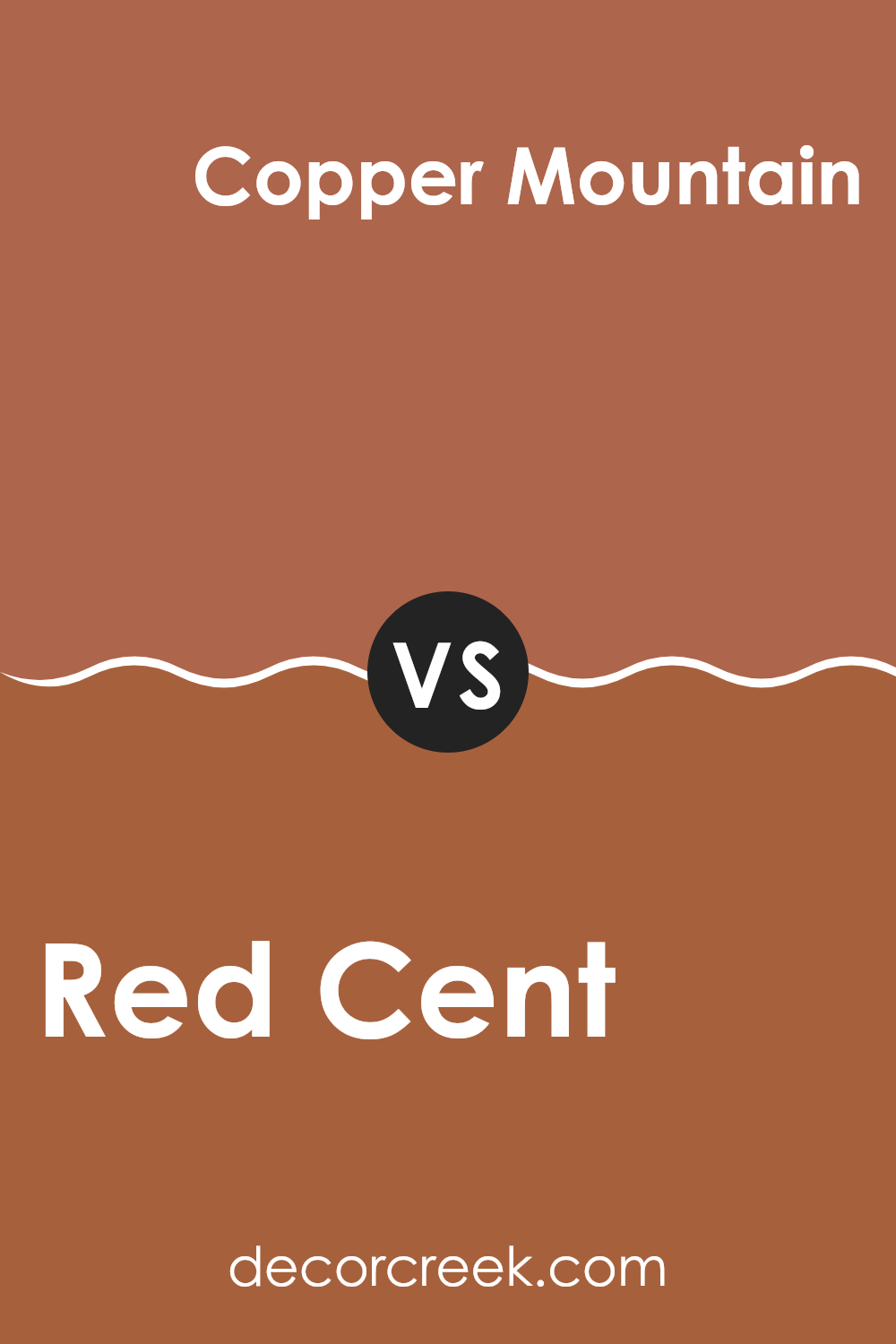
Red Cent SW 6341 by Sherwin Williams vs Copper Mountain SW 6356 by Sherwin Williams
The main color, Red Cent, is a warm, muted red that carries a cozy and welcoming vibe. This makes it a great choice for spaces where you want to create a friendly and inviting atmosphere, such as living rooms or dining areas. Its subtle tone prevents it from overwhelming a space, while still adding a rich splash of color.
On the other hand, Copper Mountain has a deeper, browner base compared to Red Cent, giving it a more earthy feel. This color leans towards the browns with hints of red, resembling the color of a rustic copper penny. It’s well-suited for places where you want to introduce warmth and depth, particularly in areas with natural elements like wood or leather.
Both colors provide warmth, but Copper Mountain offers a darker, more grounded appeal while Red Cent brings a lighter, cheerier red into the space. Choosing between them depends on how much impact and depth you want the color to have in your room.
You can see recommended paint color below:
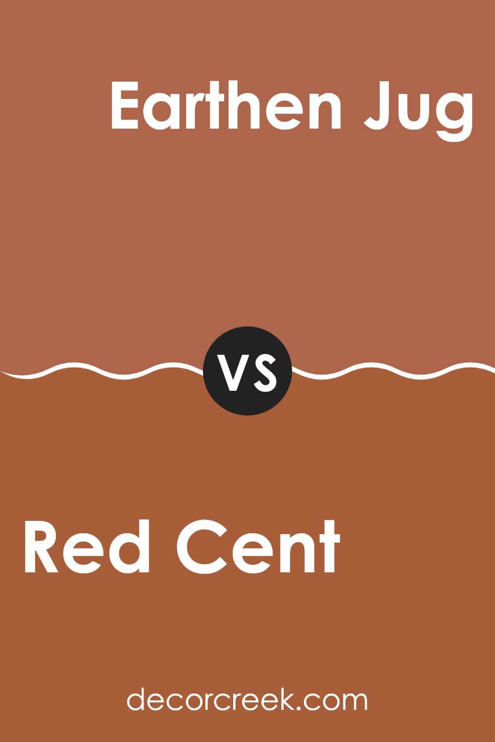
Red Cent SW 6341 by Sherwin Williams vs Earthen Jug SW 7703 by Sherwin Williams
Sherwin Williams’ Red Cent and Earthen Jug are two distinct paint colors that can greatly influence the mood of a room. Red Cent is a vibrant, deep red with a hint of earthiness.
This color is lively and can infuse a space with energy and warmth, making it a great choice for social areas like living rooms or dining spaces. On the other hand, Earthen Jug has a much more subdued and natural feel.
It is a rich terracotta shade that leans towards brown, providing a cozy and inviting atmosphere. This color works well in spaces where a calming, yet warm effect is desired, such as in a den or a reading nook. When used together, these two colors can complement each other by balancing vibrant energy and calm warmth, suitable for creating dynamic yet harmonious interior spaces.
You can see recommended paint color below:
- SW 7703 Earthen Jug
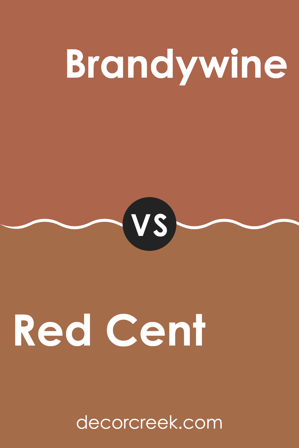
Red Cent SW 6341 by Sherwin Williams vs Brandywine SW 7710 by Sherwin Williams
Red Cent SW 6341 and Brandywine SW 7710, both from Sherwin Williams, are distinct shades that can enhance various spaces differently. Red Cent is a vibrant, robust red that brings energy and warmth to any area.
This hue is lively and can make a strong statement in a room, ideal for creating a focal point. On the other hand, Brandywine is a deeper, more subdued red with a hint of brown. This color offers a more reserved and subtle charm, suitable for creating a cozy and inviting atmosphere.
While Red Cent is more about boldness and standing out, Brandywine leans towards a quiet sophistication, making it perfect for those who prefer a less intense color palette. Both colors offer unique possibilities for interior design, depending on the mood and style you want to achieve.
You can see recommended paint color below:
- SW 7710 Brandywine
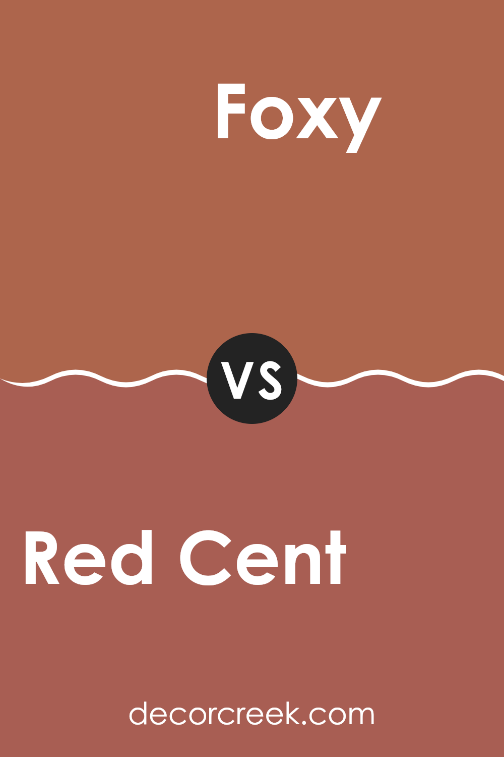
Red Cent SW 6341 by Sherwin Williams vs Foxy SW 6333 by Sherwin Williams
Red Cent is a rich, deep red that has a warm and inviting tone. It brings to mind classic elegance and has a comforting presence that can make any space feel cozy and welcoming. On the other hand, Foxy is a lighter, more vibrant shade of red-orange.
It has an energetic and dynamic quality to it, making it perfect for spaces that need a lively splash of color. While Red Cent adds depth and warmth, Foxy introduces brightness and cheerfulness. Foxy stands out in a room with its boldness but maintains a sense of playfulness. Both colors work well in different settings depending on the atmosphere you want to create.
Red Cent works great in a formal dining room or a cozy den, while Foxy could brighten up a kitchen or a playful living area. Each color has its unique charm, either enriching a space with sophistication or energizing it with vivacity.
You can see recommended paint color below:
- SW 6333 Foxy
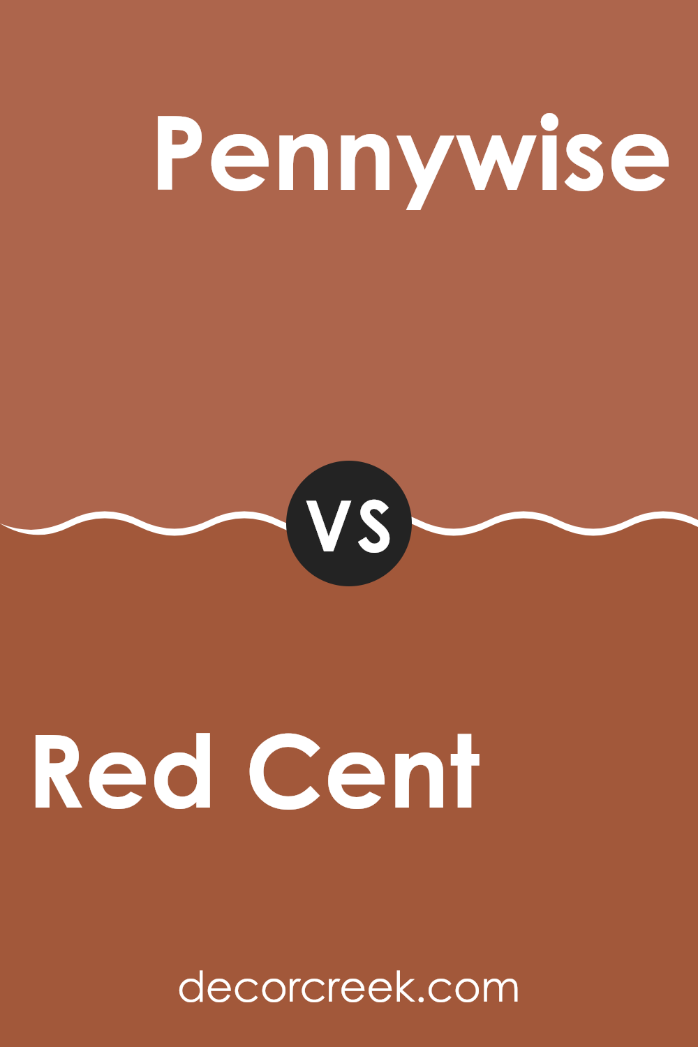
Red Cent SW 6341 by Sherwin Williams vs Pennywise SW 6349 by Sherwin Williams
Red Cent and Pennywise, both by Sherwin Williams, present distinct tones for decorating spaces. Red Cent is a deep, warm red with a cozy feel, making it perfect for creating an inviting atmosphere in areas like living rooms or dining spaces. It tends to attract attention and can add a lot of character even when used in small amounts, such as on an accent wall.
On the other hand, Pennywise is a darker shade that leans toward a rich, chocolate brown with deep red undertones. This color is more subdued compared to Red Cent and offers a grounding effect, making it ideal for larger areas where a sense of stability and warmth is desired. It works well in bedrooms or study rooms where calm is key.
While both colors add warmth, Red Cent injects more energy and vibrancy, whereas Pennywise offers a more muted, cozy retreat, making it versatile for different tastes and spaces.
You can see recommended paint color below:
- SW 6349 Pennywise
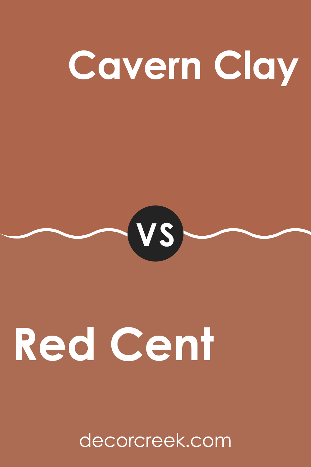
Red Cent SW 6341 by Sherwin Williams vs Cavern Clay SW 7701 by Sherwin Williams
Red Cent and Cavern Clay, both by Sherwin Williams, offer unique yet warm tones for any space. Red Cent is a robust, deep red with a rusty undertone that makes it vibrant yet grounded. It’s a color that can create a cozy and inviting feel in rooms that require a bit of energy and warmth.
On the other hand, Cavern Clay has a natural, earthy feel, resembling terracotta. This hue leans more towards an orange-brown, reflecting a rustic, homey vibe that is quite soothing. It fits beautifully in spaces that aim for a more organic, connected-to-nature look.
When used in decor, Red Cent draws attention and can act as a striking focal point, while Cavern Clay supports a laid-back, subtle ambiance. Both colors work well with neutrals but serve very different moods: Red Cent injects vibrancy and warmth, whereas Cavern Clay offers a calming and grounded aesthetic.
You can see recommended paint color below:
Red Cent SW 6341 by Sherwin Williams vs Jalapeno SW 6629 by Sherwin Williams
Red Cent and Jalapeno are both lively colors by Sherwin Williams, but they each bring a different vibe to a space. Red Cent is a deep, rich red that feels warm and cozy. It works well in areas where you want to create an inviting and comfortable atmosphere, like living rooms or dining areas. This color often gives a traditional look and pairs well with dark wood and more neutral shades.
On the other hand, Jalapeno is a vibrant, spicy green that packs a punch. It’s brighter and tends to energize a space, making it great for kitchens, playrooms, or any area where you want a cheerful and lively feel. Jalapeno works nicely with light woods and modern decor, giving rooms a fresh, upbeat look.
While both colors are bold, they are very different in mood and style. Red Cent leans towards a classic elegance, whereas Jalapeno offers a zesty, playful energy. Your choice between them would depend on the atmosphere you’re hoping to achieve in your space.
You can see recommended paint color below:
- SW 6629 Jalapeno

Conclusion
After looking closely at SW 6341 Red Cent by Sherwin Williams, I must say I’m impressed by its warm, inviting shade. This color reminds me of autumn leaves or a cozy brick fireplace, making any room feel more welcoming. Perfect for bringing a touch of coziness to spaces like the living room or a dining area, Red Cent offers a hue that feels just like a friendly hug.
Not only does it look great on walls, but it also pairs nicely with various colors. Whether matched with soft whites for a gentle contrast or bolder colors to create a more dynamic look, Red Cent is flexible. It’s helpful in making a place look lovely and warm without making everything too bright or challenging to match with furniture.
Overall, SW 6341 Red Cent by Sherwin Williams is a fantastic choice for anyone looking to add warmth and a bit of personality to their home. It’s easy to see why this color would be a favorite for many, as it makes each corner of a home feel extra special and inviting. Whether for a new room makeover or just adding a splash of new color, Red Cent is definitely a go-to paint color that can make a lovely difference in your living space.

Ever wished paint sampling was as easy as sticking a sticker? Guess what? Now it is! Discover Samplize's unique Peel & Stick samples.
Get paint samples

