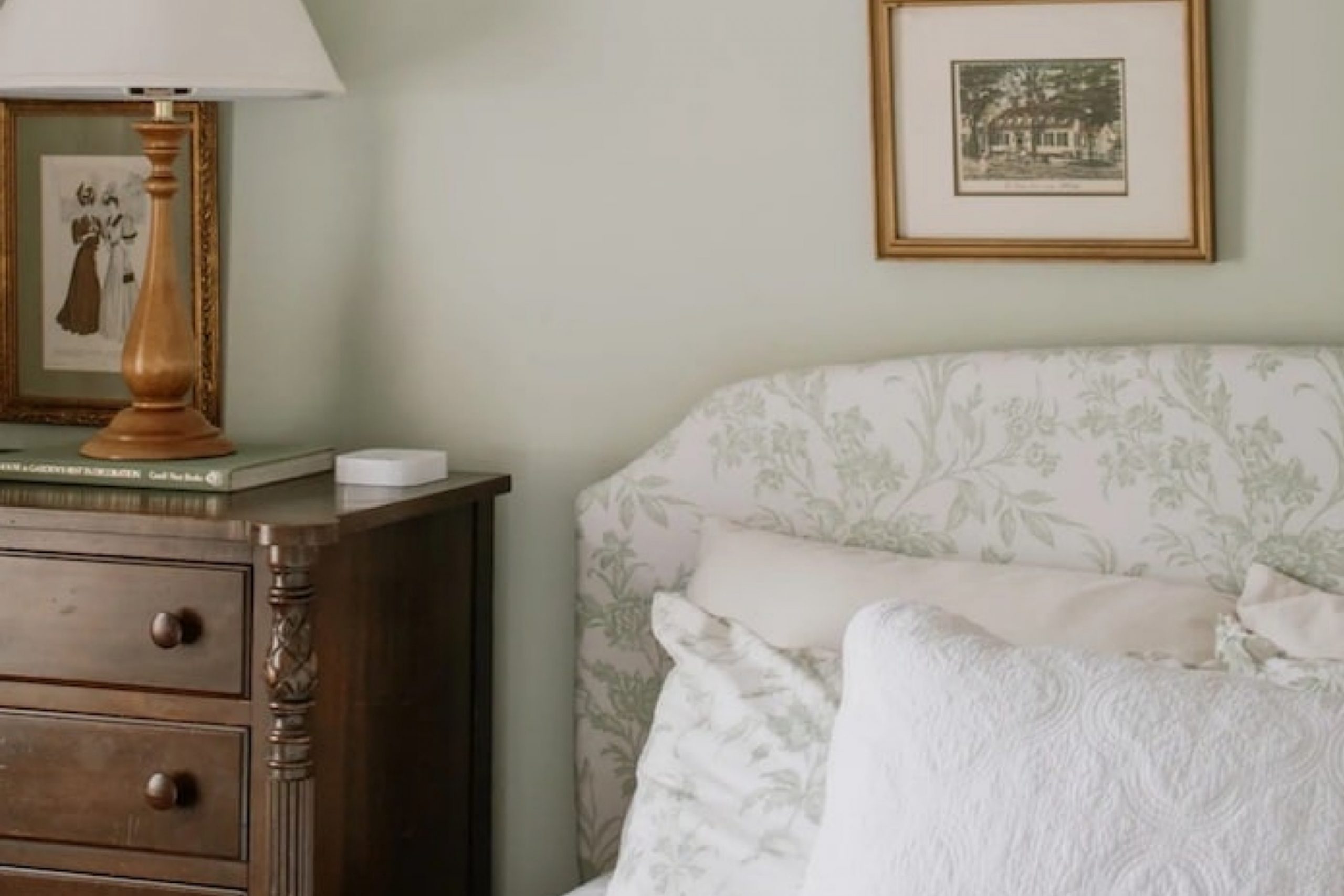
When I first saw HC-141 Hollingsworth Green by Benjamin Moore, it felt like the perfect mix of soft and fresh 🍃 It’s a gentle green that doesn’t shout, but still brings life to a room. Super easy to use in lots of spaces—calm, pretty, and just the right touch of color.
After spending some time with this color in my own space, I noticed how it seemed to shift with the light, bringing warmth during the day and a cozy, enveloping feel by night.
Using Hollingsworth Green, I was able to create a soothing environment in my living room. It’s perfect for those who enjoy a hint of nature indoors without overwhelming the senses. The color works wonders whether you’re painting an entire room or adding an accent wall. It pairs beautifully with both neutral tones and bolder hues, allowing for a range of design possibilities.
As I integrated this shade into my home, I felt a sense of calm and freshness that only a well-chosen color can evoke.
It’s more than just paint; it’s an experience that subtly enhances the mood of any room. Whether you’re redesigning a single space or looking for a cohesive color scheme throughout your home, Hollingsworth Green is a delightful choice that offers timeless appeal.
What Color Is Hollingsworth Green HC-141 by Benjamin Moore?
Hollingsworth Green (HC-141) by Benjamin Moore is a muted, soft green shade that brings a touch of nature indoors. It has a calming effect, making it an excellent choice for living spaces where relaxation is key. This green has subtle gray undertones, which help it blend seamlessly with a variety of styles and settings.
In terms of interior styles, Hollingsworth Green works particularly well in traditional and country-style homes, providing a classic and timeless feel. It’s also suitable for contemporary settings where a hint of nature is desired.
This color can add warmth and gentle contrast when used in farmhouse-style interiors or in modern spaces where clean lines are prominent.
For pairing, Hollingsworth Green complements natural materials like wood and stone beautifully. It can enhance the look of wooden furniture, making it stand out without overwhelming the space.
Textures like linen, burlap, or cotton also pair nicely, adding to the cozy and inviting atmosphere.
Accents in cream, beige, or soft whites can provide a neutral backdrop that allows Hollingsworth Green to shine.
You can add accessories like throw pillows or rugs in earthy tones to enhance the soothing vibe that this color provides. Overall, it brings a subtle, elegant, and comforting touch to any room.
Is Hollingsworth Green HC-141 by Benjamin Moore Warm or Cool color?
Hollingsworth Green HC-141 by Benjamin Moore is a soft, muted green that brings a natural and calming feel to any home. This color works well in a variety of spaces, providing a touch of the outdoors inside. It has a subtle, soothing effect that can make rooms feel more relaxed and inviting.
In living rooms or bedrooms, Hollingsworth Green can create a peaceful atmosphere, ideal for unwinding after a long day. It pairs beautifully with whites and creams, adding a gentle contrast without overpowering the space.
In areas like kitchens or bathrooms, this green can add a bit of freshness, complementing natural wood tones or white tiles. It’s versatile enough to be used in both modern and traditional settings, making it a popular choice for many homeowners. Overall, Hollingsworth Green is a gentle color that enhances the warmth and comfort of a home, helping to create a welcoming environment.
Undertones of Hollingsworth Green HC-141 by Benjamin Moore
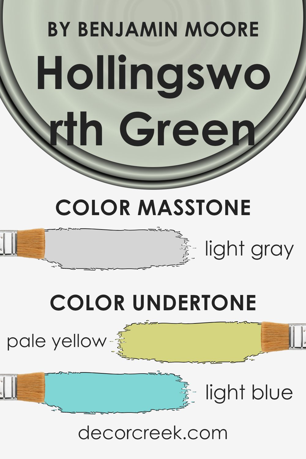
Hollingsworth Green by Benjamin Moore is a versatile paint color that interacts with various undertones. Understanding undertones helps us see why a single paint color may look different in various settings. Hollingsworth Green has a balance of pale yellow, light blue, light purple, mint, pale pink, lilac, and grey undertones. These undertones play a significant role in how the color appears on walls.
Pale yellow undertones add a soft warmth, making the room feel inviting. Light blue gives the color a calming effect, offering a sense of relaxation. The presence of light purple and lilac adds a touch of sophistication, providing a gentle elegance.
Mint brings out a refreshing feel, perfect for uplifting a space. Pale pink can subtly warm up the area, making it cozy and friendly. Grey undertones add neutrality, which helps the color blend well with other shades in the room.
When applied to interior walls, these undertones mean Hollingsworth Green can adapt depending on lighting and surrounding colors.
In a room with ample natural light, the pale green might look warmer because of the yellow and mint. In dim lighting, the grey and lilac tones might make it appear cooler. This adaptability makes it a popular choice for various interior settings.
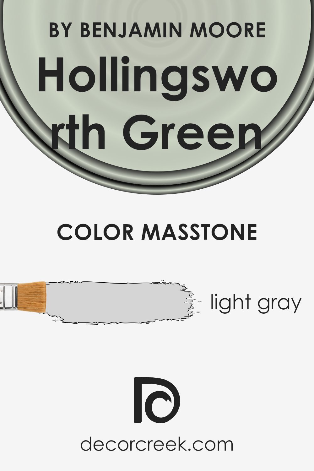
What is the Masstone of the Hollingsworth Green HC-141 by Benjamin Moore?
Hollingsworth Green (HC-141) by Benjamin Moore is a light gray color that brings a gentle and calm atmosphere to any room. Its soft neutral tone makes it versatile and easy to use in different spaces around the home. Being a light gray (#D5D5D5), it’s a perfect backdrop, creating a sense of openness and making rooms feel larger and brighter.
This shade works beautifully in living rooms, bedrooms, and kitchens, offering a clean, modern look without being too stark or cold. It pairs well with a variety of colors, allowing homeowners to play with colorful accents like pillows, artwork, or furniture.
When used on walls, this light gray can also complement natural elements such as wood and stone, enhancing the overall cozy and inviting vibe. Overall, this color provides a timeless and neutral canvas that can adapt to changing styles and decor themes over time.
How Does Lighting Affect Hollingsworth Green HC-141 by Benjamin Moore?
Lighting plays a significant role in how we perceive colors. Different types of lighting can make a color appear differently, affecting its tone, vibrancy, and warmth.
When it comes to the color Hollingsworth Green by Benjamin Moore, its appearance can change significantly depending on the lighting conditions. In natural light, Hollingsworth Green can appear as a soft and muted green, offering a pleasant, calming shade.
Under artificial light, especially if it’s warm light like incandescent bulbs, the green can take on a cozier, slightly richer feel.
In north-facing rooms, where the light is more indirect and cooler throughout the day, Hollingsworth Green might appear a bit more subdued, with gray or blue undertones becoming more noticeable.
This cooler light can make the green feel more muted and restrained.
In south-facing rooms, which get plenty of direct sunlight, Hollingsworth Green will likely appear brighter and more vibrant. The abundance of warm, direct light enhances the green, bringing out its warmer tones. This can make the room feel more inviting and cheerful.
For east-facing rooms, the morning light is often bright and clear, which can give Hollingsworth Green a fresh and crisp appearance. However, as the day progresses and the natural light diminishes, the color may seem to soften and lose some of its vibrancy.
West-facing rooms receive light that is warm and golden in the afternoon and evening. In these conditions, Hollingsworth Green can appear richer, with warm undertones coming to the forefront as the sun begins to set. This can create a cozy and inviting atmosphere later in the day.
Overall, the color Hollingsworth Green can shift in appearance depending on the light, making it a versatile choice for various rooms and different lighting conditions.
Understanding these changes can help in choosing the right lighting and placement for this color in your home.
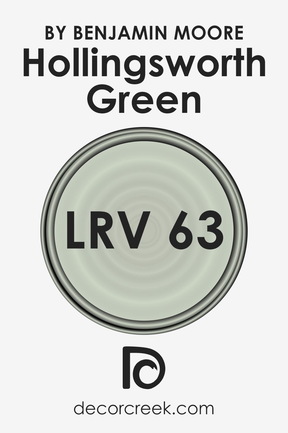
What is the LRV of Hollingsworth Green HC-141 by Benjamin Moore?
LRV, or Light Reflectance Value, is a measure used to determine how much light a color reflects or absorbs. It’s a scale ranging from 0 to 100, where 0 is absolute black, reflecting no light, and 100 is pure white, reflecting all the light. The LRV of a paint color indicates how bright or dark it will appear once applied to the walls.
When you choose a paint color, its LRV can help you understand how it will behave in different lighting conditions. Colors with high LRV values reflect more light, making them appear brighter and more open, which can help small spaces feel larger.
On the other hand, colors with low LRV values absorb more light, making them appear richer and more intense, often suited for creating cozy or dramatic environments.
Hollingsworth Green has an LRV of 63.25, meaning it falls on the lighter side of the scale. This value indicates that it will reflect a good amount of light, contributing to a room that feels airy and open. In a well-lit room, Hollingsworth Green can appear fresh and vibrant, enhancing its subtle green tones.
However, in areas with limited natural light, it can help brighten the space without becoming overpowering, as it maintains enough saturation to keep the color from appearing washed out. Overall, its LRV makes Hollingsworth Green a versatile choice for rooms where a balance of color and light is desired.
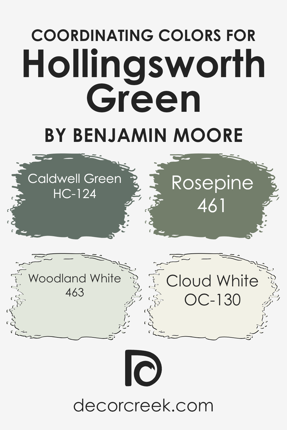
Coordinating Colors of Hollingsworth Green HC-141 by Benjamin Moore
Coordinating colors are hues that complement each other, creating a balanced and pleasing visual effect. When chosen well, they help to create harmony in a room or area. For Hollingsworth Green by Benjamin Moore, coordinating colors enhance and support its natural, earthy tone.
Caldwell Green (HC-124) is a strong, deep green that adds depth and richness to its surroundings, balancing the lighter tones of Hollingsworth Green.
Woodland White (463) is a soft cream with a warm undertone that offers a gentle contrast, brightening spaces while maintaining a cozy feel.
Rosepine (461) is an earthy, reddish-brown that introduces warmth and a rustic touch, making it a perfect partner for Hollingsworth Green. It provides a natural transition between greens and neutrals.
Cloud White (OC-130) is a pure, bright white that works well as an accent or background color, allowing other colors to stand out while keeping the overall look clean and fresh.
Together, these colors create a cohesive and well-rounded palette, making the space feel inviting and balanced without overwhelming the senses.
This approach to coordinating colors promotes a seamless integration of different elements within a room, enhancing its overall aesthetic.
You can see recommended paint colors below:
- HC-124 Caldwell Green
- 463 Woodland White
- 461 Rosepine
- OC-130 Cloud White
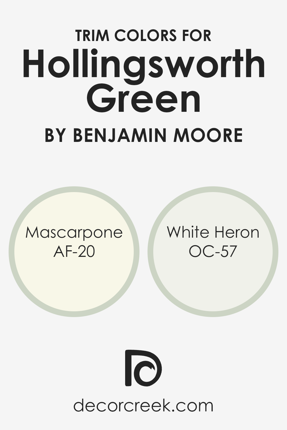
What are the Trim colors of Hollingsworth Green HC-141 by Benjamin Moore?
Trim colors are essential in highlighting and framing the main wall color of a room, creating a harmonious and polished look within any space. When using Hollingsworth Green from Benjamin Moore, choosing the right trim colors can enhance and balance its soft, muted green tone.
Trim colors like Mascarpone and White Heron work beautifully to complement and contrast the subtle warmth of Hollingsworth Green.
These colors add a touch of brightness and clarity, offering a clean and crisp outline around doors, windows, and baseboards, which bring out the gentle charm of the green.
Mascarpone, known as AF-20, is a warm white with creamy undertones that brings depth and richness to the trim.
Its cozy feel adds warmth to the space without overpowering the green, creating a inviting look. White Heron, labeled as OC-57, is a cooler white that provides a fresh and airy feel.
It offers a soft contrast to the warmth of Hollingsworth Green, adding a touch of elegance and making the walls stand out without taking center stage.
Both of these trim colors ensure the green is showcased beautifully while maintaining a balanced and cohesive appearance in the space.
You can see recommended paint colors below:
- AF-20 Mascarpone
- OC-57 White Heron
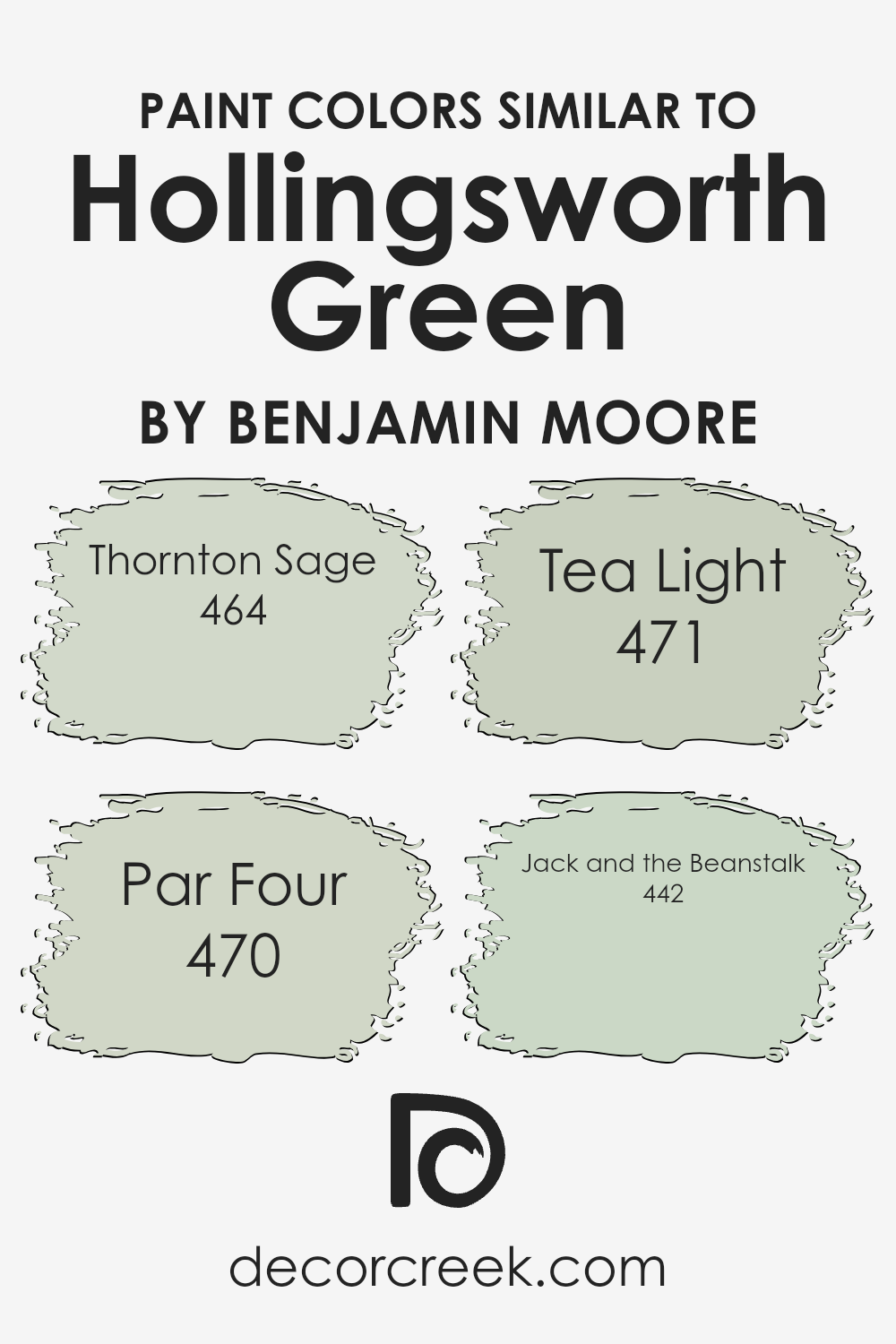
Colors Similar to Hollingsworth Green HC-141 by Benjamin Moore
Using similar colors to Hollingsworth Green by Benjamin Moore can create a pleasing and harmonious look in any space. Thornton Sage, with its muted green undertones, brings a subtle earthy feel that pairs wonderfully with the soothing nature of Hollingsworth Green.
Par Four has a richer and deeper green, adding depth and contrast while still blending beautifully with similar tones. Tea Light is a softer version, offering a hint of green washed with warmth, providing a gentle and inviting atmosphere.
Jack and the Beanstalk, with its playful and vibrant green, injects energy and liveliness, yet it maintains a sense of balance with the softer greens.
When these colors are combined, they work cohesively to create a seamless flow in a room.
Similar colors are essential because they ensure that different elements in the space don’t clash, providing unity and a natural transition from one area to another.
They also allow for easy pairing with various decor styles, ensuring flexibility in design choices. Choosing colors that are close on the spectrum can help spaces feel more connected and intentional, inviting comfort and a welcoming feeling while maintaining an aesthetically pleasing environment.
You can see recommended paint colors below:
- 464 Thornton Sage
- 470 Par Four
- 471 Tea Light
- 442 Jack and the Beanstalk
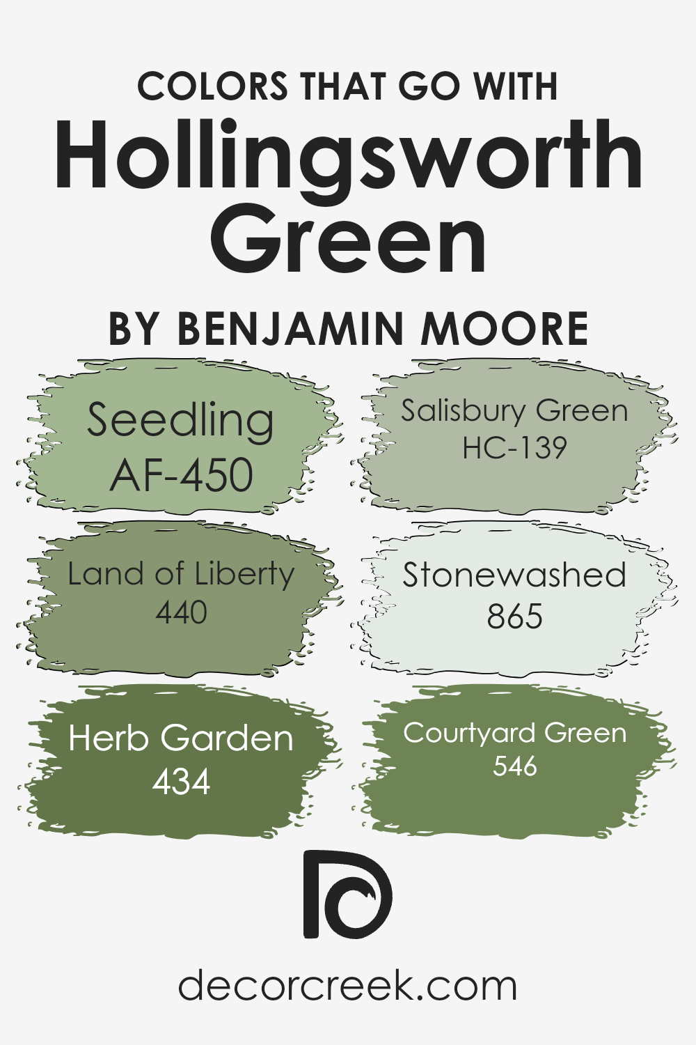
Colors that Go With Hollingsworth Green HC-141 by Benjamin Moore
Hollingsworth Green HC-141 by Benjamin Moore is a soothing shade that can bring a natural, refreshing vibe to any space. Pairing it with complementary colors can enhance its appeal and create a balanced environment. For example, AF-450, Seedling, offers a gentle energy with its light, yellow undertones, making it a cheerful companion to Hollingsworth Green.
Meanwhile, 440, Land of Liberty, brings a richer, deeper green into the mix, adding a sense of depth and contrast that complements Hollingsworth Green perfectly.
Adding 434, Herb Garden, introduces a hint of earthiness with its muted, gray-infused green, which binds well with the natural tones of Hollingsworth Green. HC-139, Salisbury Green, provides a subtle touch, offering a soft, historical green that gently resonates with the main color.
The shade 865, Stonewashed, brings a gentle, dusty blue tone that contrasts nicely while still maintaining harmony within the color palette.
Finally, 546, Courtyard Green, introduces a vibrant green that enlivens and energizes the mix, completing the palette with a refreshing twist.
Together, these colors create a cohesive and harmonious space, bringing out the beauty of Hollingsworth Green and promoting a sense of balance and freshness.
You can see recommended paint colors below:
- AF-450 Seedling
- 440 Land of Liberty
- 434 Herb Garden
- HC-139 Salisbury Green
- 865 Stonewashed
- 546 Courtyard Green
How to Use Hollingsworth Green HC-141 by Benjamin Moore In Your Home?
Hollingsworth Green HC-141 by Benjamin Moore is a versatile and soothing paint color that can bring a fresh feel to any home. With its gentle blend of green and gray undertones, it creates a calm atmosphere that is perfect for living rooms, bedrooms, or even kitchens. This color works well with various styles of furniture and decor.
For a relaxing living room, pair Hollingsworth Green with neutral tones like beige, cream, or soft white for the walls and add cozy textured throws or cushions.
In the kitchen, you can use this color on cabinets or an accent wall to add a subtle yet charming touch without overwhelming the space.
It complements natural wood finishes beautifully, making it ideal for homes with hardwood floors or wooden furniture.
Adding indoor plants can enhance the calming effect of Hollingsworth Green, creating a cozy and refreshing environment for everyday living.
Hollingsworth Green HC-141 by Benjamin Moore vs Thornton Sage 464 by Benjamin Moore
Hollingsworth Green HC-141 by Benjamin Moore is a soft, muted green that brings a subtle touch of nature indoors. It’s a versatile color that can work well in both traditional and modern spaces due to its balanced tone—neither too bright nor too dark. It can create a calm and inviting atmosphere, making it a good choice for living rooms or bedrooms.
On the other hand, Thornton Sage 464 by Benjamin Moore is a slightly more earthy and muted shade of green. It has a bit more gray in it compared to Hollingsworth Green, which gives it a more grounded and sophisticated feel.
This color is great for adding depth to a room and pairs well with natural materials like wood and stone.
Both colors provide a sense of calm and organic beauty, but Thornton Sage offers a bit more neutrality, making it a safer choice for those looking for a more understated look.
You can see recommended paint color below:
- 464 Thornton Sage

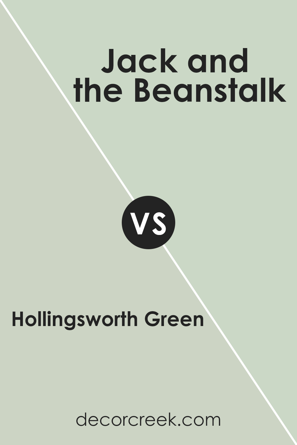
Hollingsworth Green HC-141 by Benjamin Moore vs Jack and the Beanstalk 442 by Benjamin Moore
Hollingsworth Green HC-141 and Jack and the Beanstalk 442 by Benjamin Moore are two beautiful greens, but they each have their own look and feel. Hollingsworth Green is a subtle, muted green with gray undertones. It’s a calming color that works well in spaces where you want a relaxed vibe. It’s elegant without being too bold, making it great for living rooms, bedrooms, or any space needing a touch of calm.
On the other hand, Jack and the Beanstalk 442 is a brighter, more vibrant green. It has a lively, fresh feel, bringing a burst of energy to a room. This color is perfect for spaces where you want to make a statement or evoke a sense of nature and growth.
It can be particularly striking in kitchens, playrooms, or any area where you want to add a pop of cheerful color.
In summary, Hollingsworth Green is subtle and calming, while Jack and the Beanstalk is vibrant and energizing.
You can see recommended paint color below:
- 442 Jack and the Beanstalk
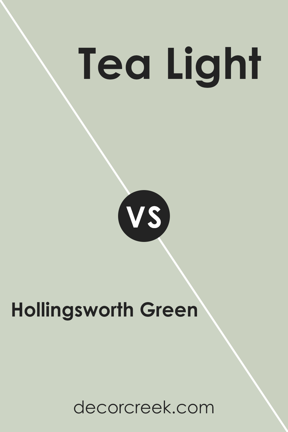
Hollingsworth Green HC-141 by Benjamin Moore vs Tea Light 471 by Benjamin Moore
Hollingsworth Green (HC-141) by Benjamin Moore is a soft, leafy green that brings a natural, earthy feel to a space. It’s a grounded color with depth, making it a great choice for someone looking to add a touch of nature indoors. It pairs well with neutral tones and can bring warmth to a room without being overpowering.
Tea Light (471) by Benjamin Moore, on the other hand, is a light, airy color that feels refreshing and open. It’s a pale, subtle hue that resembles the gentle color of brewed tea with a hint of cream.
This shade brings a sense of freshness and lightness, ideal for spaces where you want to create an open, spacious feel.
When comparing the two, Hollingsworth Green is richer and more saturated, conveying a sense of coziness, while Tea Light serves to brighten and enlarge a space.
Together, they can create a balanced environment, with one adding warmth and the other offering a crisp contrast.
You can see recommended paint color below:
- 471 Tea Light
Hollingsworth Green HC-141 by Benjamin Moore vs Par Four 470 by Benjamin Moore
Hollingsworth Green HC-141 is a muted, earthy green that offers a warm and subtle look. It has an understated quality that makes it versatile for various spaces, providing a quiet backdrop that doesn’t overpower a room. On the other hand, Par Four 470 is a much brighter and more vibrant green. It delivers a lively and energetic feel, perfect for spaces that need a touch of freshness and vibrancy.
While Hollingsworth Green leans towards an olive tone, making it blend well with natural materials and other earthy colors, Par Four stands out with its crisp and clean appearance.
This makes it an excellent choice for accent walls or spaces that benefit from a bold and cheerful ambiance.
In summary, choose Hollingsworth Green for a calm and muted setting, whereas Par Four suits lively and playful environments.
Both offer unique qualities to enhance different styles and moods in your space.
You can see recommended paint color below:
- 470 Par Four

After getting to know HC-141 Hollingsworth Green by Benjamin Moore, I totally see why so many people love it 💚 It’s that perfect in-between green—not too light, not too dark. Just soft, calm, and really easy to live with. It works in so many rooms and always feels fresh but cozy at the same time.
When you use Hollingsworth Green, it’s like bringing a bit of nature inside. It can remind you of leaves or grassy fields. This green can make rooms feel fresh and cheerful.
If you like a calm place for reading a book or playing quietly, this color can really help.
Hollingsworth Green also matches well with other colors and different types of furniture. You can use it in many ways, whether you have modern things in your house or old-fashioned ones.
It looks good with white, brown, blue, and even yellow things. All these make it easier to make a room look like you want it to.
If you need a color that makes people smile and feel at home, then HC-141 Hollingsworth Green is a great pick. Now I see why so many like it—it’s a color that gives just the right touch to any room.
Ever wished paint sampling was as easy as sticking a sticker? Guess what? Now it is! Discover Samplize's unique Peel & Stick samples.
Get paint samples

