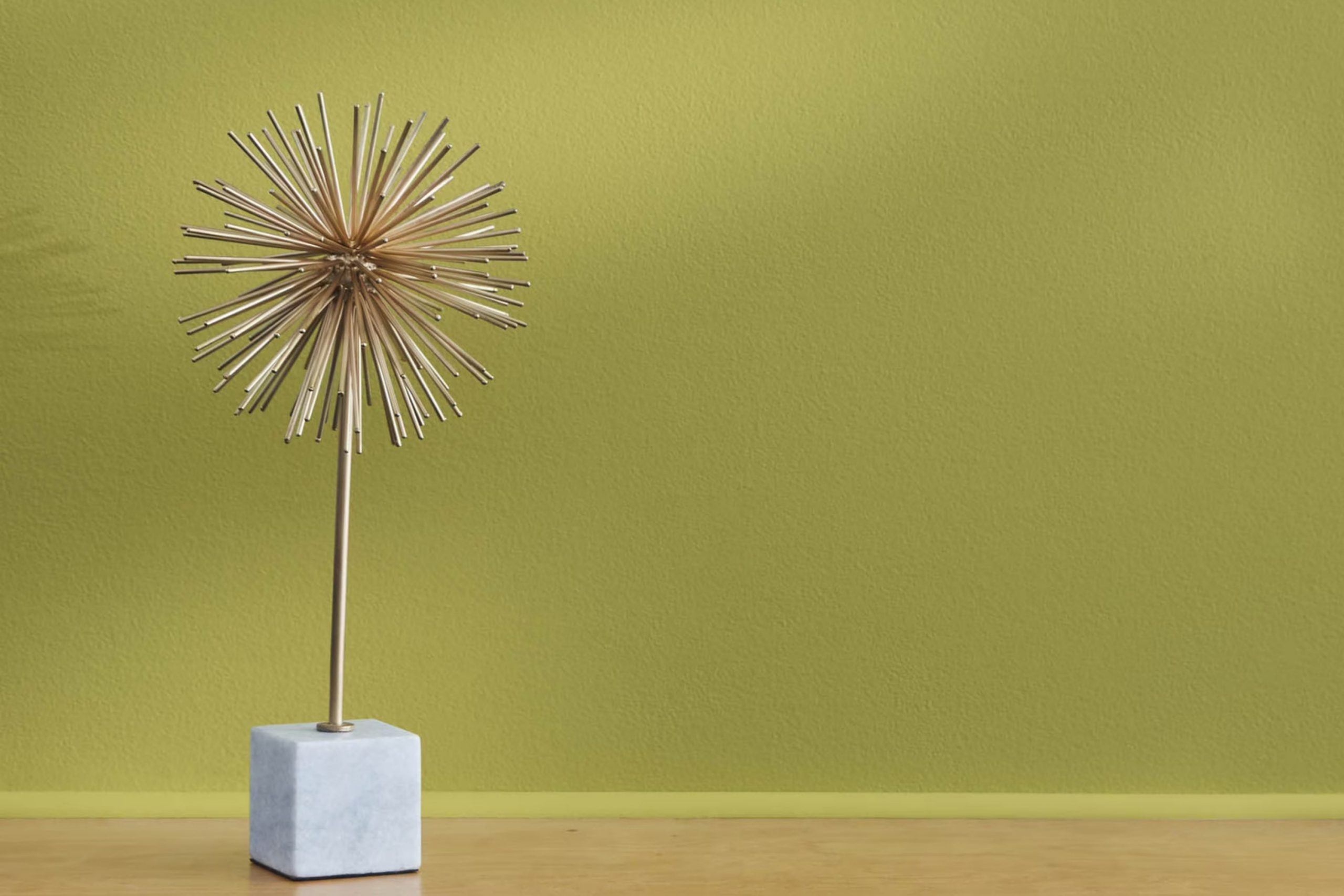
Have you ever come across a color so rich and vibrant that it instantly draws your attention? That’s the effect the 2147-30 Jalapeño Pepper by Benjamin Moore had on me. This isn’t just a paint; it’s a bold statement. Named after the spicy and zesty jalapeño pepper, this shade captures both warmth and excitement, making any room feel alive and inviting.
Painting a wall with 2147-30 Jalapeño Pepper could be the perfect way to inject some energy into an area that feels too subdued. It has a unique charm, balancing between being energetically bold and comfortably warm.
You might think using such a vivid color could feel too intense in a room, but it can actually serve as a stunning focal point or add a special pop of color when used for accent walls or furnishings. It’s about finding the right balance and playing with accessories and lighting to make the most out of this fiery hue.
Whether you’re looking to refresh your living room, kitchen, or perhaps add character to your entryway, Jalapeño Pepper offers a fresh and modern approach that goes beyond ordinary paint choices. It’s not just about shifting a color; it’s about shifting the whole vibe of a room.
What Color Is Jalapeño Pepper 2147-30 by Benjamin Moore?
Jalapeño Pepper by Benjamin Moore is a rich, deep green hue with a hint of earthiness that brings warmth and vibrancy to any area. This color is reminiscent of the ripe, dark green skin of a jalapeño pepper, offering a lush and inviting feel. It’s a perfect choice if you’re looking to add a bold splash of color without making a room feel too intense.
Jalapeño Pepper works wonderfully in a variety of interior design styles, particularly rustic, Bohemian, and eclectic decors. Its natural earthiness complements wood materials splendidly, particularly reclaimed or distressed wood, enhancing the rustic vibe.
In a Bohemian setting, this color pairs well with artistic textiles and woven materials, like rattan or wicker, which play up the organic feel. It also matches well with metallic finishes such as bronze or copper, adding a touch of brightness to the luxuriance of the green.
For textures, Jalapeño Pepper pairs well with soft, plush fabrics like velvet or wool, which balance its intensity with a touch of coziness. Linen and burlap also work well, maintaining an earthy aesthetic that feels grounded and connected to nature. This color is an excellent choice for feature walls, accent pieces, and even furniture, bringing life and personality to your interior design.
Is Jalapeño Pepper 2147-30 by Benjamin Moore Warm or Cool color?
Jalapeño Pepper by Benjamin Moore is a bold and vibrant red with a slight orange undertone. This warm color can breathe life into any room, making it feel inviting and energetic. It works exceptionally well in living rooms or dining areas where you want to create a cozy, lively atmosphere that encourages conversation and togetherness.
In smaller areas, such as a bathroom or an accent wall, it adds a pop of color that makes the room stand out without feeling too intense. However, using this color requires some careful planning. Because it’s so bright, it pairs best with neutral tones like white, beige, or light gray, which help balance out its intensity.
These combinations prevent the color from dominating the area. Additionally, incorporating natural elements and soft textures can soften the overall look, making the environment feel warm and welcoming instead of too bold. The key with Jalapeño Pepper is moderation and thoughtful pairing, which ensures that it enhances, rather than overpowers, your home’s design.
Undertones of Jalapeño Pepper 2147-30 by Benjamin Moore
Jalapeño Pepper by Benjamin Moore is a vibrant color that brings a lively and cozy atmosphere to any room. What makes this color unique is its complex mix of undertones. Undertones are subtle colors beneath the surface of the main hue that can influence how we perceive the primary color, depending on the lighting and surrounding tones.
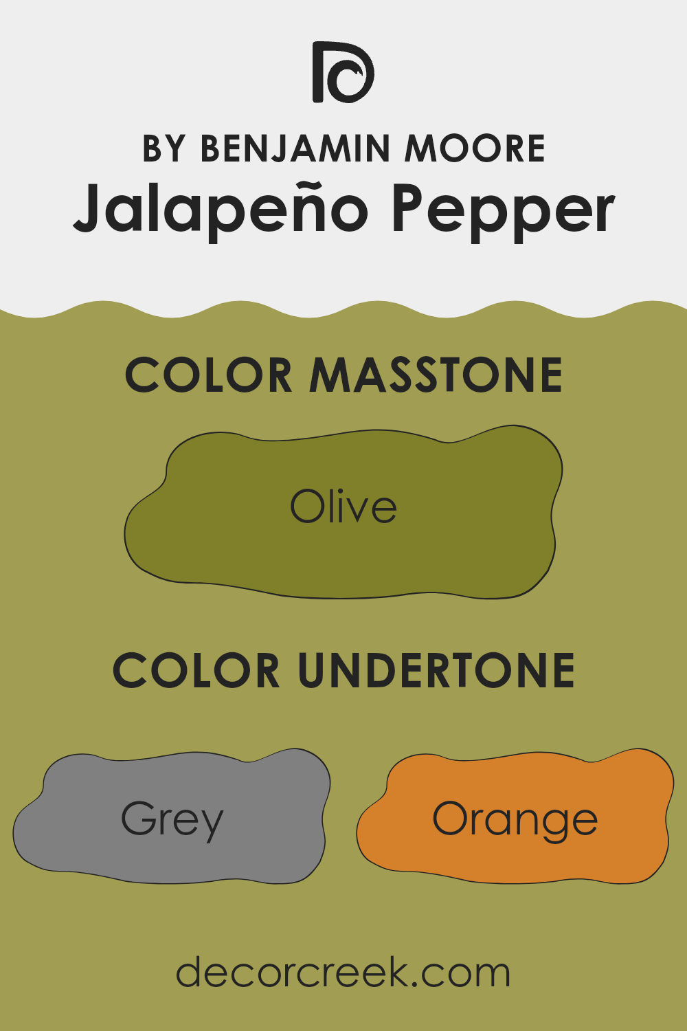
In Jalapeño Pepper, there are various undertones like grey, orange, and pale pink, which all contribute to its warm feel. Light green and mint add a refreshing vibe, while yellow and pale yellow give it a cheerful brightness. Brown and dark green undertones lend stability and depth, making the color feel grounded. Navy and dark grey contribute to a richness that can make small areas feel more intimate.
When used on interior walls, these undertones interact in different lighting conditions throughout the day. In natural light, the warmer undertones like orange might become more pronounced, making the room feel inviting. In artificial lighting, the cooler tones like mint may stand out, providing a subtle contrast.
As a result, Jalapeño Pepper is highly adaptable. Whether in a sunny kitchen or a dimly lit study, it maintains a balance between warmth and freshness. It’s perfect for those looking to add a dash of coziness without making an area feel too intense. The mix of undertones also means this color can complement a wide range of decor, from modern to rustic.
What is the Masstone of the Jalapeño Pepper 2147-30 by Benjamin Moore?
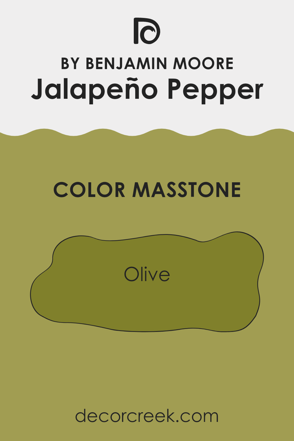
The color Olive (#80802B), known as the masstone for Benjamin Moore’s Jalapeño Pepper, brings a unique and earthy tone into home decor. This shade of green has a muted, warm feel that pairs well with natural materials like wood and stone.
It’s especially handy for cozy rooms like living areas or studies, providing a comforting and inviting atmosphere. The color’s richness helps hide marks and smudges, making it practical for families or high-traffic areas.
Olive also works well as an accent wall color, offering a subtle backdrop that complements both vibrant and neutral tones. By pairing it with creamy whites or deep browns, you can create a balanced and appealing look. This adaptable color, with its homey vibe, is excellent for those looking to add a touch of nature and warmth to their interiors.
How Does Lighting Affect Jalapeño Pepper 2147-30 by Benjamin Moore?
Lighting plays a crucial role in determining how we perceive colors. The type of light—whether natural or artificial—can dramatically alter the appearance of a color. For instance, the color Jalapeño Pepper by Benjamin Moore can look different under various lighting conditions due to its unique characteristics.
In artificial light, such as LED or fluorescent lighting, Jalapeño Pepper tends to appear warmer and more vibrant. This is because artificial lights often enhance the yellow and red tones within the paint, making it seem more lively and rich.
In natural light, the color can look quite different. Depending on the time of day and the amount of sunlight, this paint color can shift from looking bright and dynamic on a sunny afternoon to more subdued and greenish during an overcast day.
In rooms facing different directions, the appearance of Jalapeño Pepper also changes:
- North-Facing Rooms: These rooms get less direct sunlight, especially in the Northern Hemisphere, and are often cooler in tone. Here, Jalapeño Pepper might look a bit darker and less saturated, giving off a more muted green hue.
- South-Facing Rooms: These rooms benefit from abundant sunlight throughout the day, making colors look brighter and more vivid. In such rooms, Jalapeño Pepper will appear lively and vibrant, with its green and yellow undertones standing out beautifully.
- East-Facing Rooms: In rooms facing east, morning light will make Jalapeño Pepper look very bright and fresh. As the day progresses and the natural light dims, the color may become softer and take on a slight grayish tone.
- West-Facing Rooms: Conversely, the afternoon and evening light in west-facing rooms can cast a warm glow, intensifying the color’s depth. Jalapeño Pepper might look exceptionally rich and inviting with the glowing sunset light.
Understanding how different types of lighting and room orientations affect the color can help in making informed decisions on where to use this particular shade to achieve the desired atmosphere in a room.
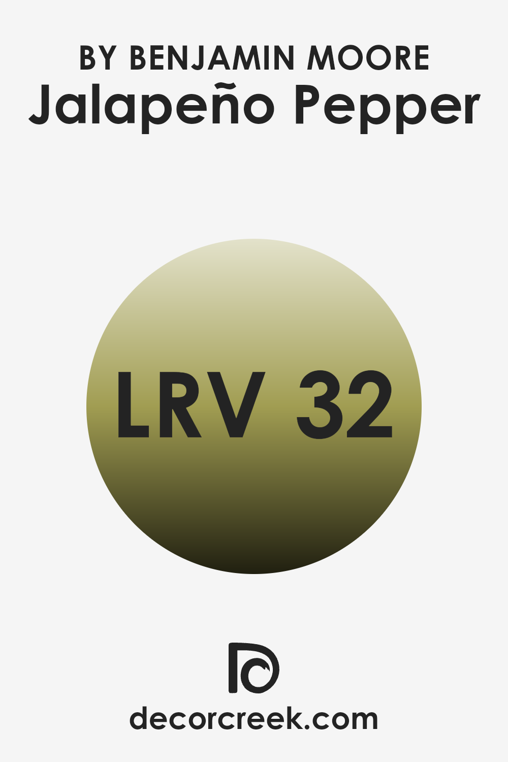
What is the LRV of Jalapeño Pepper 2147-30 by Benjamin Moore?
LRV stands for Light Reflectance Value, a measure used to indicate the amount of visible and usable light that a paint color reflects from or absorbs into a painted surface. Essentially, LRV helps determine how light or dark a color will appear once it’s on your walls.
It ranges from 0%, which is pure black, absorbing all light, to 100, which is pure white, reflecting all light. This value is crucial when choosing paint colors because it affects how bright or cozy a room feels as well as how it might make the room’s size seem bigger or smaller.
Regarding the color with an LRV of 31.99, it is on the darker side of the scale, meaning it will absorb more light than it reflects. This could make a room painted in this color appear smaller and more enclosed, though it could effectively add depth and character to an area.
For well-lit rooms or places with plenty of natural light, using a darker LRV like this can enhance the ambiance without making the room feel too dim. However, in a poorly lit area, it might make the room feel cramped or gloomy. Therefore, lighting should be carefully considered when using darker shades like this.
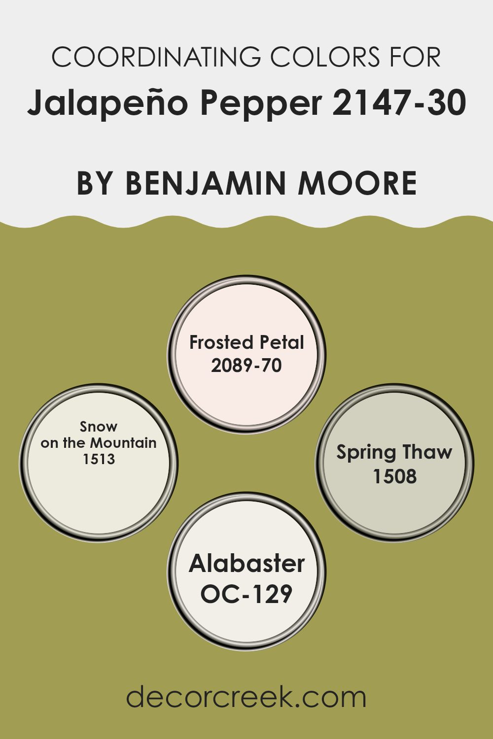
Coordinating Colors of Jalapeño Pepper 2147-30 by Benjamin Moore
Coordinating colors help in creating harmonious color schemes for interior rooms, enhancing the aesthetic appeal and balance of a room. These colors are selected to complement or provide subtle contrast with a primary color, in this case, the vibrant green hue of Benjamin Moore’s Jalapeño Pepper.
By choosing coordinating colors, one can ensure that the decor is not only cohesive but also pleasing to the eye, without making it feel too heavy with one shade. This setup allows for creativity and personalization in decorating any area.
The color Frosted Petal (2089-70) by Benjamin Moore offers a gentle blush pink that softly complements the boldness of the green, bringing a light and airy feel to the room. Snow on the Mountain (1513) is a muted, grayish-green that blends beautifully, providing a subtle connection to the primary green without clashing.
Spring Thaw (1508) introduces a hint of blue-gray, which cools the overall palette, offering a refreshing contrast. Lastly, Alabaster (OC-129) presents a clean, bright white that acts as a perfect neutral backdrop, allowing the richer hues to stand out while giving the room a fresh and open feeling. Together, these colors create a balanced and visually pleasing environment, making it easy to mix and match different design elements.
You can see recommended paint colors below:
- 2089-70 Frosted Petal
- 1513 Snow on the Mountain
- 1508 Spring Thaw
- OC-129 Alabaster
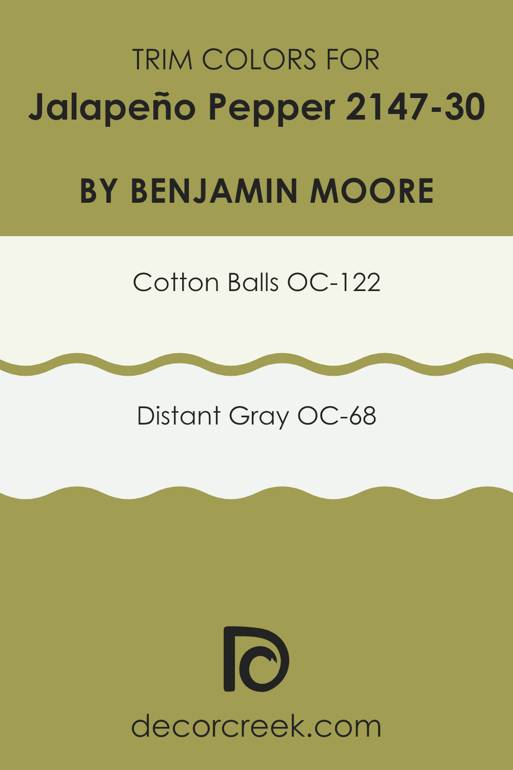
What are the Trim colors of Jalapeño Pepper 2147-30 by Benjamin Moore?
Trim colors play a crucial role in complementing the main color palette of a room, framing areas like doorways, windows, and baseboards to create a neat and finished appearance. In the case of a vibrant color like Jalapeño Pepper by Benjamin Moore, using subtle and neutral trim colors can balance the intensity and bring a crisp, clean look to the overall design.
Opting for lighter trim colors such as OC-122 – Cotton Balls and OC-68 – Distant Gray helps in highlighting the boldness of the Jalapeño Pepper without competing for attention, providing a smooth visual transition between the walls and other architectural elements.
OC-122 – Cotton Balls is a warm white that has a very soft and inviting touch, making it perfect for softening the edges around a room painted with a strong hue like Jalapeño Pepper. It subtly lightens up the area and pairs well with more saturated colors, ensuring that the room feels airy and balanced.
On the other hand, OC-68 – Distant Gray serves as a cool-toned counterpart, offering a subtle hint of gray that works effectively to enhance modern and minimalistic aesthetics. Distant Gray can act as a gentle contrast to warmer tones, ensuring that the overall decor looks coordinated and thoughtfully styled.
You can see recommended paint colors below:
- OC-122 Cotton Balls
- OC-68 Distant Gray
Colors Similar to Jalapeño Pepper 2147-30 by Benjamin Moore
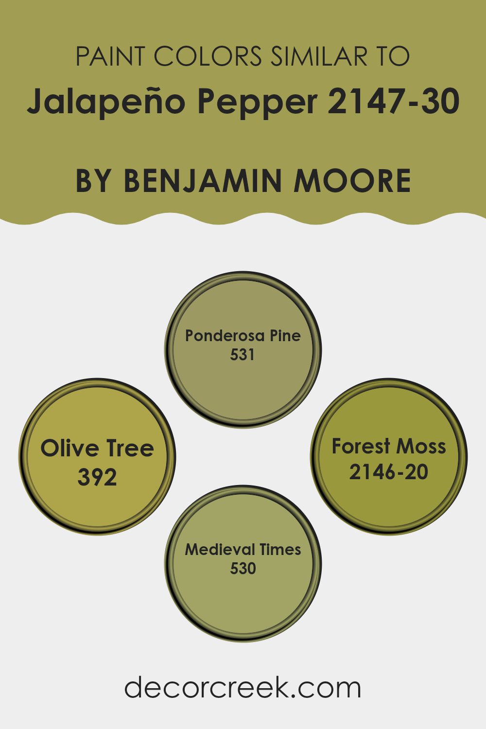
Choosing similar colors for a color scheme ensures a cohesive and harmonious look, which is vital for creating an aesthetic that feels well-balanced and pleasing to the eye. When selecting paint colors such as 531 – Ponderosa Pine, 392 – Olive Tree, 2146-20 – Forest Moss, and 530 – Medieval Times, which are akin to Jalapeño Pepper by Benjamin Moore, it allows for a seamless transition between areas or on different elements within a single room.
These tones, lying close to each other on the color wheel, provide a subtle contrast—enough to define areas yet gentle enough to maintain unity. This approach is particularly useful in rooms where you want to add depth without making the design feel too intense with stark color differences.
The color 531 – Ponderosa Pine is a deep, rich green with a touch of earthiness, reminiscent of dense evergreen forests, providing a grounding effect in any area. 392 – Olive Tree is slightly lighter with a muted tone, almost like the color of sage leaves, ideal for bringing a natural, calming effect to interiors.
Then, 2146-20 – Forest Moss offers a darker, more intense earth green, suggesting the damp, shadowy hues found beneath thick forest canopies. Finally, 530 – Medieval Times steps away with a grayish-green tint, evoking the historic and rustic tones of old stone buildings. Each of these colors complements the vibrant yet earthy hue of Jalapeño Pepper, making them excellent choices for layering or coordinated paint schemes.
You can see recommended paint colors below:
- 531 Ponderosa Pine
- 392 Olive Tree
- 2146-20 Forest Moss
- 530 Medieval Times
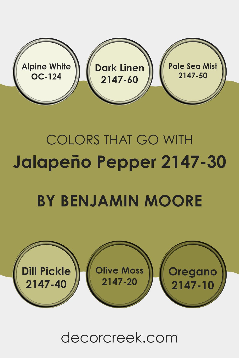
Colors that Go With Jalapeño Pepper 2147-30 by Benjamin Moore
When selecting complementary colors for Jalapeño Pepper 2147-30 by Benjamin Moore, it’s essential to consider how each color interacts and balances with this vibrant hue. Using coordinated shades like Alpine White, Dark Linen, Pale Sea Mist, Dill Pickle, Olive Moss, and Oregano enhances the overall aesthetic, ensuring that the boldness of Jalapeño Pepper does not make a room feel too intense. These colors help create a harmonious and balanced look, making any area feel cohesive and thoughtfully designed.
Alpine White is a clean and crisp white that helps to soften the intensity of Jalapeño Pepper and can brighten up areas while maintaining a fresh look. Dark Linen, on the other hand, offers a subtle, neutral backdrop that allows Jalapeño Pepper to stand out without clashing. Pale Sea Mist brings a light, airy touch to the combination, providing a gentle contrast to the lively tone of Jalapeño Pepper.
Dill Pickle introduces a more subdued green that pairs naturally with Jalapeño Pepper’s energy. Olive Moss is a deeper green that adds depth and character, enhancing the richness of the palette. Lastly, Oregano is a dark, earthy green that grounds the color scheme, offering a strong complement to the vibrant Jalapeño Pepper. Together, these colors create a dynamic yet coordinated atmosphere that feels balanced and inviting.
You can see recommended paint colors below:
- OC-124 Alpine White
- 2147-60 Dark Linen
- 2147-50 Pale Sea Mist
- 2147-40 Dill Pickle
- 2147-20 Olive Moss
- 2147-10 Oregano
How to Use Jalapeño Pepper 2147-30 by Benjamin Moore In Your Home?
Jalapeño Pepper 2147-30 by Benjamin Moore is a bold and vibrant green paint color that brings a lively burst of energy to any room. If you’re looking to add some zest to your home, this color is a great choice.
It works particularly well in areas like the kitchen or a game room where its freshness enhances the room’s activity and excitement. You can also use it in a small bathroom or on an accent wall to create a striking focal point.
When paired with neutral colors such as whites or light grays, Jalapeño Pepper 2147-30 stands out and gives the area a fresh, modern look. Additionally, it pairs nicely with wooden elements, helping to balance its intensity with a touch of natural warmth. This shade is ideal if you’re aiming to add some personality and cheer to your home design.
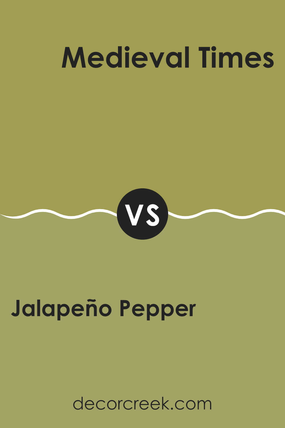
Jalapeño Pepper 2147-30 by Benjamin Moore vs Medieval Times 530 by Benjamin Moore
The main color, Jalapeño Pepper, is a vibrant and bold red that brings a lot of energy into any room. It’s got a warm tone that works well in areas like kitchens or living rooms where you want to create a lively atmosphere.
On the other hand, Medieval Times is a more subdued, grayish blue that conveys a feeling of calm and steadiness. This color would be perfect in a bedroom or office where you might want a more relaxed mood.
Both colors offer distinct emotions; Jalapeño Pepper adds a pop of warmth and excitement, while Medieval Times provides a soothing backdrop, ideal for focus or rest. Pairing them together can balance active energy with calming influences, creating a dynamic yet peaceful environment.
You can see recommended paint color below:
- 530 Medieval Times
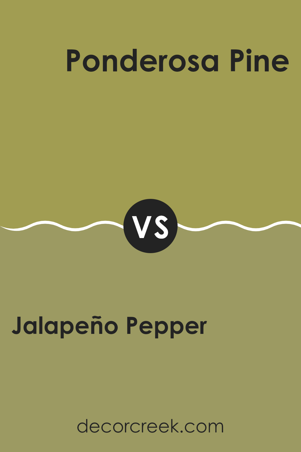
Jalapeño Pepper 2147-30 by Benjamin Moore vs Ponderosa Pine 531 by Benjamin Moore
The main color Jalapeño Pepper by Benjamin Moore is a vibrant, deep green with a lively personality. It’s a bold hue that adds a touch of energy to any room. This color is perfect if you want to make a statement or add a pop of brightness to your interior.
In contrast, Ponderosa Pine by Benjamin Moore is a much darker green. It has a more reserved and subtle quality, making it ideal for creating a cozy and inviting atmosphere. It can work well in rooms where you prefer a more muted, natural mood.
When comparing these two, Jalapeño Pepper stands out for its vibrancy and ability to draw attention, while Ponderosa Pine offers a more understated, calming presence. Each color has its unique appeal, depending on what kind of mood or style you are aiming for in your area.
You can see recommended paint color below:
- 531 Ponderosa Pine
Jalapeño Pepper 2147-30 by Benjamin Moore vs Forest Moss 2146-20 by Benjamin Moore
Jalapeño Pepper and Forest Moss, both by Benjamin Moore, offer distinct green hues that serve varied design needs. Jalapeño Pepper is a vibrant, lively green with a noticeable brightness that can energize a room. Its vividness makes it ideal for creating a focal point or adding a spirited pop of color.
On the other hand, Forest Moss presents a deeper, earthier tone. This darker green is more subdued and grounding. It’s excellent for rooms where a more muted, calming green is desired, adding a touch of nature-inspired depth to interiors without making them feel too intense.
When considering these colors for home design, Jalapeño Pepper works well in areas needing dynamic flair, like kitchens or playrooms, while Forest Moss suits areas that benefit from a more reserved, natural mood, such as libraries or bedrooms. Both colors offer unique atmospheres and can beautifully shape the tone and character of a room.
You can see recommended paint color below:
- 2146-20 Forest Moss
Jalapeño Pepper 2147-30 by Benjamin Moore vs Olive Tree 392 by Benjamin Moore
Jalapeño Pepper by Benjamin Moore is a strong, vivid green with a noticeable depth that resembles the intense color of a ripe jalapeño. This shade packs a punch and is great for adding a lively and zesty feel to any room. It can energize an area and bring in a touch of nature’s vibrancy.
On the other hand, Olive Tree by Benjamin Moore is a much more subdued green. It has a muted tone that mirrors the dusty look of an actual olive tree. This color is excellent for creating a calm, understated mood in a room. It’s more reserved and blends easily with various decors, providing a soft backdrop rather than standing out sharply.
Comparatively, Jalapeño Pepper is more daring and bold, ideal for a focal point or accent wall. In contrast, Olive Tree works well for those seeking a more gentle, blending green that supports other design elements without feeling too strong. This makes each color suitable for different decorating styles and personal preferences.
You can see recommended paint color below:
- 392 Olive Tree
Writing about the 2147-30 Jalapeño Pepper paint from Benjamin Moore has been such a fun experience! This paint color is like a spicy surprise for any room, just like biting into a jalapeño pepper. It makes rooms feel lively and full of energy because of its bold green shade.
I’ve learned that choosing the right paint color can really make a big difference in how a room feels. Using Jalapeño Pepper could be a great idea if you want to add some cheerfulness to your kitchen or maybe a play area. It’s not just a plain green; it’s got a kick that can make your walls pop and give your room a fresh, exciting look.
This color could also work well if you mix it with some calmer tones, like soft whites or light browns. These combinations can help balance the brightness of Jalapeño Pepper, making your room look charming and lively without being too strong.
All in all, if you’re thinking about adding some fun to your walls, 2147-30 Jalapeño Pepper by Benjamin Moore might be the perfect choice. It’s a paint color that brings energy and joy into a room, and many people could fall in love with how it changes the feel of an area.
Ever wished paint sampling was as easy as sticking a sticker? Guess what? Now it is! Discover Samplize's unique Peel & Stick samples.
Get paint samples

