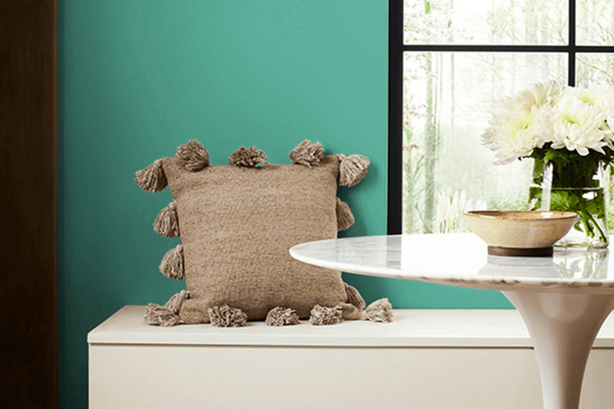
When you surround yourself with the calming hue of Jargon Jade by Sherwin Williams, it feels like a gentle retreat from the buzz of everyday life. This soothing green invites you to pause and take a breath. It’s a color that seems to understand and reflect the peace you seek.
Imagine walking through a peaceful garden early in the morning, where the dew clings softly to each leaf. Jargon Jade offers a similar experience, bringing both clarity and calmness into any room. It’s flexible, pairing well with neutral whites for a fresh, clean look or darker grays if you’re aiming to create depth and warmth.
Whether you’re thinking about repainting a bedroom to encourage restful sleep or brightening up a living area, Jargon Jade feels right at home. It doesn’t yell at you; instead, it speaks in a gentle whisper, asking you to unwind. It’s about creating a room where thoughts can flow freely and creativity can blossom.
With Jargon Jade on your walls, that perfect, soothing atmosphere seems not only tangible but thoroughly enjoyable.
What Color Is Jargon Jade SW 6753 by Sherwin Williams?
Jargon Jade by Sherwin Williams is a lively, medium green shade with hints of both cool and warm undertones. It’s vibrant but not overpowering, making it a great choice for adding a splash of color to a room. This shade can bring energy and a refreshing feel to any room.
Jargon Jade works well in various interior styles. In a modern setting, it can be used to make a statement on an accent wall. For a bohemian look, pair it with rich, earthy tones and layers of textiles. In a coastal home, it complements whites and sandy hues, adding a touch of nature-inspired relaxation.
When it comes to materials, Jargon Jade pairs well with light, natural woods like oak or maple. It also looks great with metals such as brass or gold, which can add a touch of elegance. Textures like linen or cotton work well with this color, providing a soft and comfortable vibe.
In kitchens and dining areas, this shade can be combined with sleek, white cabinetry for a clean, modern look. In living rooms, add pillows or throws with this color to bring cohesiveness. Jargon Jade brings a lively, fresh feel to any room without overshadowing other design elements.
Is Jargon Jade SW 6753 by Sherwin Williams Warm or Cool color?
Jargon Jade by Sherwin Williams is a warm, earthy green that brings a touch of nature into any home. This color has a muted, elegant tone that fits well in various rooms, from living rooms to bedrooms. Its soothing vibe makes it a perfect choice for creating a calming environment.
Whether used on an accent wall or as the main color for a room, Jargon Jade pairs beautifully with both neutral shades like beige and gray, as well as with natural materials such as wood and stone. Its versatility allows it to blend seamlessly with different styles, from modern to traditional.
The green hue can lighten up a room while keeping it cozy and inviting. Additionally, its subtle sophistication makes it a great background for artwork and decorative pieces, enhancing their visual appeal. Overall, Jargon Jade is a great choice for adding warmth and personality to a home.
Undertones of Jargon Jade SW 6753 by Sherwin Williams
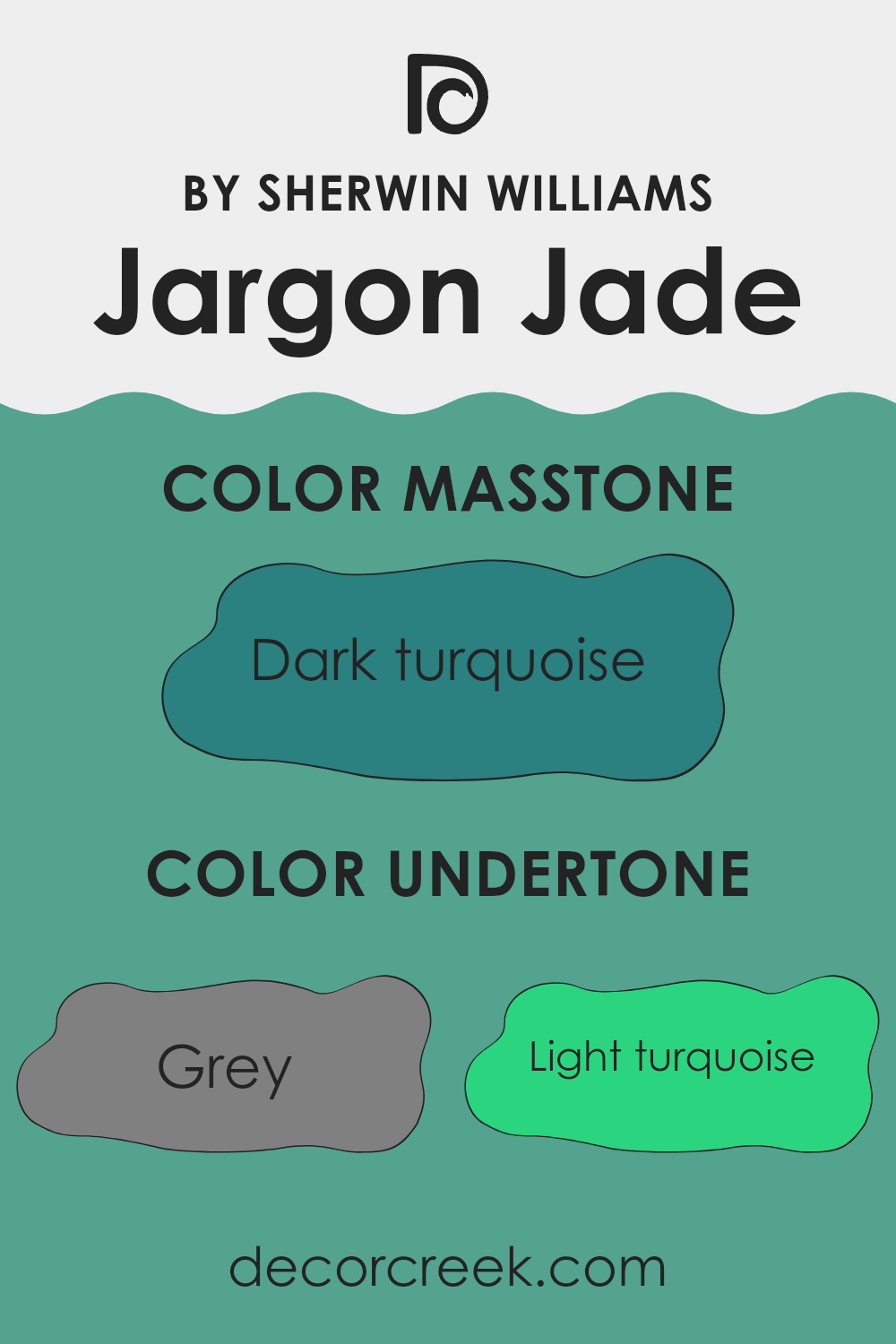
Jargon Jade by Sherwin Williams is a unique color with a variety of undertones. It primarily appears as a soft, muted green, but its character changes with different lighting and surroundings due to its complex undertones. These undertones include hints of grey, turquoise, mint, blue, lilac, and other shades.
Undertones can significantly influence how we perceive a color. They can make a color look warmer or cooler and impact the mood a color sets in a room. With its grey and dark blue undertones, Jargon Jade can feel calm and subdued, while light turquoise and mint bring out a fresher, vibrant side. The touches of lilac and violet add a subtle sophistication and depth.
On interior walls, Jargon Jade can create a refreshing and calming ambiance. Its green base gives a soothing natural vibe, which is ideal for living areas intended for relaxation. The interplay of undertones allows it to adapt to various decorative styles and other colors in the room. Light can also affect how these undertones are perceived, with daylight emphasizing its cool, refreshing qualities, and artificial light possibly enhancing the warmer, subtle green and olive shifts.
Overall, Jargon Jade is flexible and can harmonize well with different design elements.
What is the Masstone of the Jargon Jade SW 6753 by Sherwin Williams?
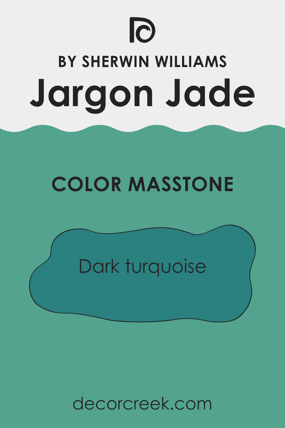
Jargon Jade by Sherwin Williams is a deep, rich turquoise color, also known as a dark turquoise (#2B8080). This shade brings a calm and cool vibe to homes, making it ideal for areas where you want to relax, like living rooms or bedrooms.
Its deep tones can create a cozy atmosphere, even in larger rooms. When used on walls, Jargon Jade adds a sense of depth that can make rooms feel more intimate. It’s a flexible color that can pair well with lighter neutrals like whites or creams for a balanced look.
Using it for accents, such as on cabinets or furniture, can add a pop of bold color without overpowering a room. Overall, Jargon Jade’s deep, cooling hue makes it a good choice for creating comfortable and inviting environments.
How Does Lighting Affect Jargon Jade SW 6753 by Sherwin Williams?
Lighting plays a crucial role in how we perceive colors. The type of light—natural or artificial—can alter the appearance of any paint color, including Sherwin Williams’ Jargon Jade SW 6753. This color can look different depending on the lighting in a room.
In natural light, colors are generally seen in their truest form, but even natural light varies throughout the day. Jargon Jade, a soft green shade, can seem fresh and light under bright daylight. In the morning, when the light is more blue-toned, this color may appear cooler. As the day progresses and sunlight becomes warmer, the color might take on a softer, warmer hue.
Artificial lighting, on the other hand, can significantly change how Jargon Jade looks. LED and fluorescent lights tend to have a cooler tone, which can bring out more of the blue-green undertones in the color. Incandescent lighting, which is warmer, might make Jargon Jade appear slightly more yellow or muted.
When it comes to room orientation, each direction provides different lighting conditions. North-facing rooms tend to receive consistent, but cool, and indirect light. In such rooms, Jargon Jade can appear darker and more subdued. It might be best balanced with warmer lighting to prevent it from feeling too flat or cold.
South-facing rooms are flooded with warm, bright light for most of the day. This direct sunlight can make Jargon Jade appear more vibrant and lively, showing off its true green tones beautifully. East-facing rooms enjoy warm, yellow light in the morning and cooler tones in the afternoon. In these areas, Jargon Jade will seem warmer and more inviting early in the day, shifting to a cooler tone later.
West-facing rooms get cooler light in the morning and warm light in the afternoon and evening. During the afternoon, Jargon Jade may look especially welcoming and rich, while appearing more muted during the cooler morning hours.
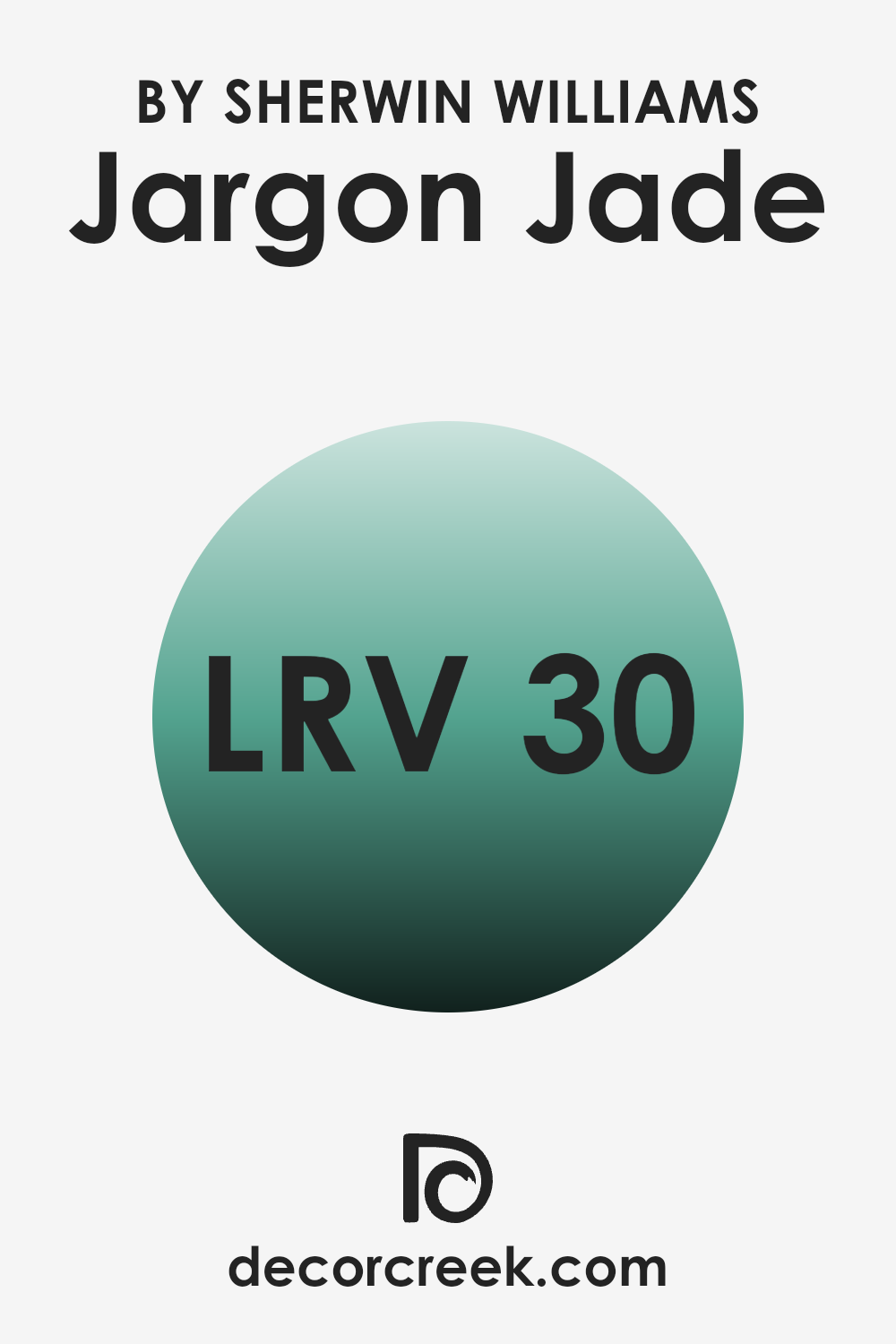
What is the LRV of Jargon Jade SW 6753 by Sherwin Williams?
Light Reflectance Value (LRV) is a measure of how much light a color reflects compared to absorbing. It ranges from 0, which means the color absorbs all light (like a true black), to 100, which means the color reflects all light (like a true white). LRV helps determine how bright or dark a color will appear in a room.
Higher LRV values imply that the color reflects more light, making the room feel more open and brighter. On the other hand, colors with lower LRV values absorb more light, which can make a room feel cozier or more intimate. For Jargon Jade with an LRV of 30.067, the color has a low to moderate ability to reflect light.
This means it will have a more profound and rich appearance on the walls. Jargon Jade will absorb more light, resulting in a darker and warmer ambiance in a room. This can add depth to the room and create a cozy, inviting atmosphere. Because it’s not too low, it won’t completely diminish light, so it can still breathe some life into a room without making it feel like a deep cave. Good lighting can help enhance how this color presents itself in your area.
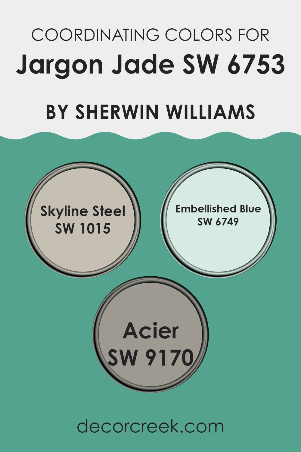
Coordinating Colors of Jargon Jade SW 6753 by Sherwin Williams
Coordinating colors are hues that naturally complement each other, creating a balanced and visually appealing look. They work together by sharing undertones or contrasting in a way that highlights their individual qualities. When designing a room with Jargon Jade by Sherwin Williams, choosing coordinating colors is essential to achieve harmony and a pleasing aesthetic.
One color that works well with Jargon Jade is Skyline Steel. This shade is a soft, muted gray that provides a neutral backdrop, allowing the richness of Jargon Jade to stand out. Another excellent choice is Embellished Blue, a vibrant, deep blue that brings energy and a lively contrast to the mix.
The boldness of Embellished Blue enhances the richness of Jargon Jade while maintaining a cohesive look. Additionally, Acier offers a flexible option that bridges the vibrancy of Jargon Jade and the subtlety of Skyline Steel. It is a warm gray with a touch of beige, providing a slightly warmer tone that adds depth and a grounded feel. Using these colors together ensures a satisfying balance that is both lively and cohesive, making it easy to create areas that are charming and comfortable.
You can see recommended paint colors below:
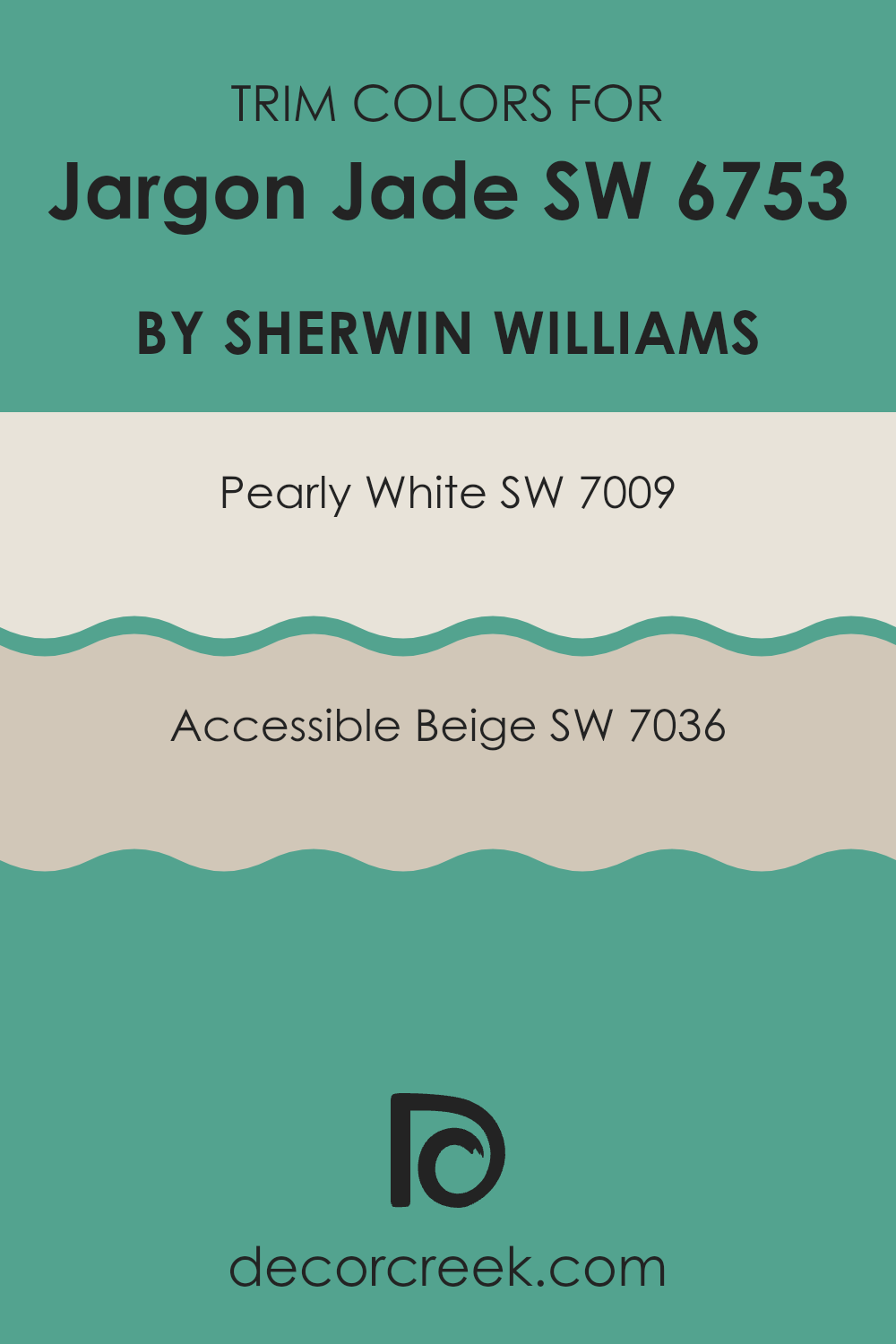
What are the Trim colors of Jargon Jade SW 6753 by Sherwin Williams?
Trim colors are accent colors used around windows, doors, baseboards, and other elements to frame and highlight a room’s primary color, like Jargon Jade SW 6753 by Sherwin Williams. They help to create contrast or complement the main color in any room. Using SW 7009 – Pearly White and SW 7036 – Accessible Beige as trim colors can significantly impact the overall look.
Pearly White offers a soft, clean appearance, perfect for creating a crisp contrast without overpowering the main color, Jargon Jade. On the other hand, Accessible Beige is flexible and warm. It works well to tone down the intense green in Jargon Jade while adding a subtle depth to the details in a room.
Incorporating these trims is important as they breathe life into your color scheme, making any room feel complete and harmonized. Pearly White provides this bright and airy sense, enhancing natural light and complementing cool tones. Accessible Beige adds a warm, inviting touch to the room, blending naturally with almost any wall color.
These elements are crucial when using a rich color like Jargon Jade, as they can balance its vibrancy and integrate it within different styles and home themes. The strategic pairing of such trim colors can create a seamless look, allowing main colors, like Jargon Jade, to stand out beautifully without being overpowering.
You can see recommended paint colors below:
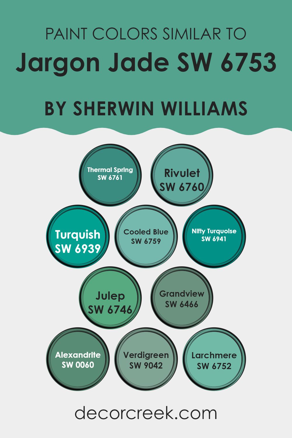
Colors Similar to Jargon Jade SW 6753 by Sherwin Williams
Similar colors to Jargon Jade, like SW 6761 Thermal Spring and SW 6760 Rivulet, bring a fresh and calming vibe, reminiscent of clear tropical waters and gentle river currents. Thermal Spring offers a clean, refreshing feel of light aqua, while Rivulet is slightly deeper, echoing the peaceful hues of shaded streams.
SW 6939 Turquish adds a splash of bold brightness, making rooms feel lively and invigorating, but still ties in with the jade family. SW 6759 Cooled Blue offers a soft, relaxing tone that’s understated yet elegant, perfect for creating a peaceful atmosphere.
Continuing with this refreshing palette, SW 6941 Nifty Turquoise provides a vibrant, playful twist that can brighten any room. SW 6746 Julep brings in a subtle green with hints of mint, offering a light and airy touch. SW 6466 Grandview has a grounding earthy tone that complements the more vibrant shades, tying the palette together. SW 0060 Alexandrite is a rich, jewel-like green, adding a touch of depth and luxury.
Lastly, SW 9042 Verdigreen and SW 6752 Larchmere both offer unique shades of green that are balanced and flexible, enhancing the natural beauty within the color grouping. These colors work together, creating a harmonious feel through their shared undertones, making them adaptable for various design needs.
You can see recommended paint colors below:
- SW 6761 Thermal Spring
- SW 6760 Rivulet
- SW 6939 Turquish
- SW 6759 Cooled Blue
- SW 6941 Nifty Turquoise
- SW 6746 Julep
- SW 6466 Grandview
- SW 0060 Alexandrite
- SW 9042 Verdigreen
- SW 6752 Larchmere
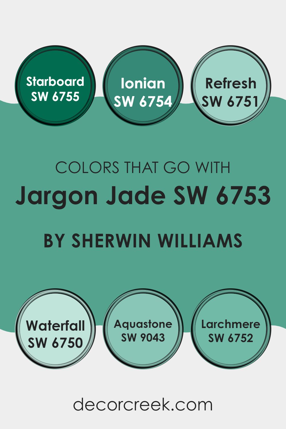
Colors that Go With Jargon Jade SW 6753 by Sherwin Williams
Colors that go well with Jargon Jade SW 6753 by Sherwin Williams are important because they help create a harmonious and visually pleasing environment. When paired together, these colors enhance each other’s depth and richness, making a room feel balanced and inviting. For instance, SW 6755 – Starboard is a deep and bold shade that adds a strong contrast, making Jargon Jade pop while adding a touch of elegance.
SW 6754 – Ionian offers a more muted yet vibrant tone that compliments the freshness of Jargon Jade, adding a touch of warmth to the overall palette. These combinations make areas feel cohesive and well-thought-out.
SW 6751 – Refresh is a light, airy tint that pairs beautifully with Jargon Jade, introducing a breezy, open atmosphere. Meanwhile, SW 6750 – Waterfall provides a gentle, soothing effect, similar to a calm ocean breeze, creating a sense of stillness. SW 9043 – Aquastone is a soft, muted color that blends seamlessly with Jargon Jade, adding depth without overpowering the palette.
Lastly, SW 6752 – Larchmere deepens the color scheme, offering a slightly darker hue that adds richness and complexity without clashing. Together, these colors work to create areas that feel inviting and well-balanced, enhancing the presence and appeal of Jargon Jade in any room.
You can see recommended paint colors below:
- SW 6755 Starboard
- SW 6754 Ionian
- SW 6751 Refresh
- SW 6750 Waterfall
- SW 9043 Aquastone
- SW 6752 Larchmere
How to Use Jargon Jade SW 6753 by Sherwin Williams In Your Home?
Jargon Jade SW 6753 by Sherwin Williams is a beautiful color that brings a calm and relaxing feel to any room. It’s a soft, muted green with a hint of blue, making it very flexible for home use. This color works well in areas like bedrooms or bathrooms where you want a peaceful atmosphere.
Painting the walls with Jargon Jade can make a small room feel more open and airy. In a living room, it pairs nicely with neutral furniture, like beige or gray, creating a balanced and inviting room.
You can also use Jargon Jade as an accent color. Paint a single wall with it to add interest without overpowering the room. It blends well with natural materials, like wood, and looks great in rooms with plenty of light. Curtains, cushions, or decor pieces in Jargon Jade can pull a room together, providing a cohesive look. It’s a flexible and calming choice for any home.
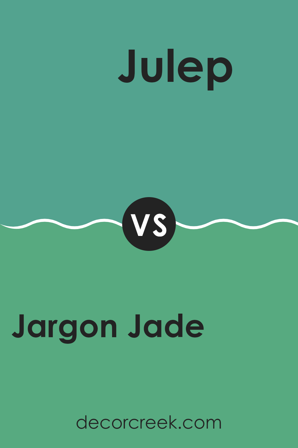
Jargon Jade SW 6753 by Sherwin Williams vs Julep SW 6746 by Sherwin Williams
Jargon Jade SW 6753 and Julep SW 6746 are two beautiful greens from Sherwin Williams, but they have different vibes. Jargon Jade is a bold, vibrant green. It feels energetic and lively, bringing a fresh pop of color to any room. Imagine a lush, green forest full of life—this is the kind of feel Jargon Jade gives to a room.
On the other hand, Julep SW 6746 is a bit softer and lighter. It has more of a minty quality, offering a sweet, refreshing feel. Julep feels calming and understated, ideal for creating a gentle, soothing atmosphere.
While Jargon Jade stands out as a bright centerpiece, Julep plays a more subtle role, adding a touch of freshness without overpowering the room. Both colors add a touch of nature to interiors but in their own unique ways. They can work well individually or complement each other when paired thoughtfully.
You can see recommended paint color below:
- SW 6746 Julep
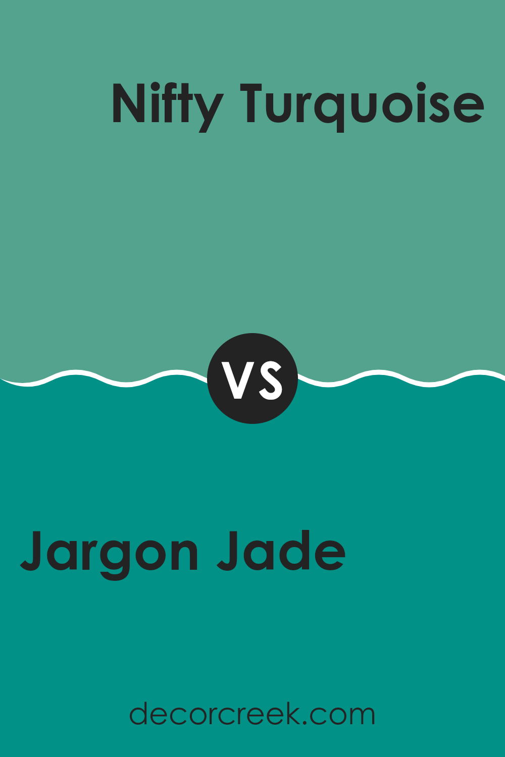
Jargon Jade SW 6753 by Sherwin Williams vs Nifty Turquoise SW 6941 by Sherwin Williams
Jargon Jade and Nifty Turquoise, both from Sherwin Williams, are similar yet distinct greens. Jargon Jade is a deeper, richer green with hints of blue, giving it a bold and earthy feel. Its depth makes it suitable for feature walls or areas where a rich color is desired.
On the other hand, Nifty Turquoise is lighter and has a more playful tone. It leans more towards blue, bringing a sense of freshness and energy. While Jargon Jade feels more grounded and intense, Nifty Turquoise is lively and vibrant, perfect for adding a splash of color without overpowering a room.
Both colors can brighten a room, but Jargon Jade offers a more subdued elegance, whereas Nifty Turquoise injects brightness and cheer. Together, they can create a dynamic contrast or be used separately to achieve different atmospheres.
You can see recommended paint color below:
- SW 6941 Nifty Turquoise
Jargon Jade SW 6753 by Sherwin Williams vs Turquish SW 6939 by Sherwin Williams
Jargon Jade SW 6753 and Turquish SW 6939, both by Sherwin Williams, offer vibrant yet distinct shades of green. Jargon Jade is a richer, mid-tone green that brings to mind lush forest leaves. It feels natural and calming, making it a great choice for areas where you want a touch of the outdoors.
Turquish, on the other hand, is a brighter, more vibrant color. It has undertones of blue that give it a lively and energetic feel, reminiscent of tropical beaches or bright summer skies. This makes Turquish ideal for areas where you want a pop of cheerful color.
While Jargon Jade leans more towards a deep green with earthy undertones, Turquish is a fun and upbeat color that can refresh any room. Both colors work well in different settings, with Jargon Jade providing a grounding effect and Turquish adding a burst of energy.
You can see recommended paint color below:
- SW 6939 Turquish
Jargon Jade SW 6753 by Sherwin Williams vs Thermal Spring SW 6761 by Sherwin Williams
Jargon Jade SW 6753 and Thermal Spring SW 6761 are two distinct colors by Sherwin Williams, each offering a unique vibe. Jargon Jade is a rich, medium-toned green that feels lush and vibrant. It can create a refreshing atmosphere, bringing a touch of nature indoors. Its depth makes it an excellent choice for accent walls or areas that need a bit of drama.
On the other hand, Thermal Spring is a softer, lighter green with a hint of blue. It has a gentle and airy feel, perfect for creating calming rooms. This color works well in areas where you want a refreshing, spa-like effect, such as bathrooms or bedrooms.
While both colors are in the green family, Jargon Jade leans more towards a bold, lively appearance, whereas Thermal Spring offers a light and soothing presence. Whether you want energy or relaxation, these colors provide different moods for your room.
You can see recommended paint color below:
- SW 6761 Thermal Spring
Jargon Jade SW 6753 by Sherwin Williams vs Verdigreen SW 9042 by Sherwin Williams
Jargon Jade and Verdigreen, both by Sherwin Williams, are similar yet distinct shades of green. Jargon Jade is a lively and bright green that gives off a fresh, vibrant vibe. It feels energetic and can make a room feel more alive.
On the other hand, Verdigreen is slightly more muted and has a calming feel. It leans more toward a softer, understated green, giving it a more relaxed atmosphere. While both colors bring nature into the home, Jargon Jade is better if you want a bolder, more invigorating look. Verdigreen, however, is perfect for those who prefer a more relaxed and subtle green.
Both colors work well in different settings, with Jargon Jade suiting lively areas like kitchens or playrooms, whereas Verdigreen is perfect for bedrooms or living areas where a peaceful environment is desired. Each shade of green offers its own unique style and feel.
You can see recommended paint color below:
- SW 9042 Verdigreen
Jargon Jade SW 6753 by Sherwin Williams vs Cooled Blue SW 6759 by Sherwin Williams
Jargon Jade and Cooled Blue are two distinct colors from Sherwin Williams, each offering a unique vibe to a room. Jargon Jade is a lively and vibrant shade of green, bringing energy and freshness to a room. It resembles the lushness of nature and can make a room feel invigorating and alive. This color works well in active areas like living rooms or kitchens where you want a splash of excitement.
On the other hand, Cooled Blue is a soft, muted blue that creates a calm and relaxing atmosphere. It’s reminiscent of a clear sky or a gentle ocean wave, making it an excellent choice for bedrooms or bathrooms where you want to chill out and relax.
While Jargon Jade brings energy, Cooled Blue offers a peaceful backdrop. Both colors can complement each other in different rooms of the house or even within the same area, depending on the mood you want to create.
You can see recommended paint color below:
- SW 6759 Cooled Blue
Jargon Jade SW 6753 by Sherwin Williams vs Grandview SW 6466 by Sherwin Williams
Jargon Jade and Grandview, both by Sherwin Williams, offer distinct yet complementary shades of green. Jargon Jade is a vibrant and lively hue, resembling a rich grass or a freshly sprouted leaf. It has a bright and cheerful energy, making it perfect for adding a pop of color to a room or an accent wall.
On the other hand, Grandview is a deeper, more muted green, reminiscent of a forest or moss-covered stone. It is calming and grounded, providing a sense of balance and sophistication to a room. While Jargon Jade can instantly uplift a room with its energetic presence, Grandview offers a more subdued, peaceful atmosphere.
When used together, Jargon Jade can highlight specific areas, while Grandview serves as a strong backdrop, creating a harmonious and refreshing environment that’s pleasing to the eye. Both colors work well in various settings, from modern areas to more traditional interiors.
You can see recommended paint color below:
Jargon Jade SW 6753 by Sherwin Williams vs Alexandrite SW 0060 by Sherwin Williams
Jargon Jade SW 6753 is a fresh and lively green with a bright and cheerful feel, perfect for bringing energy into a room. It’s a flexible shade that can be used in various rooms to create a refreshing atmosphere. On the other hand, Alexandrite SW 0060 is a deeper, more complex shade of green. It has a rich and luxurious tone that adds depth and warmth.
While Jargon Jade is great for areas that need a pop of brightness and vitality, Alexandrite works well in creating cozy and inviting environments. Jargon Jade is suitable for modern and playful designs, whereas Alexandrite fits traditional or elegant settings.
Together, these colors provide a dynamic contrast, with Jargon Jade’s vibrancy complementing Alexandrite’s richer tones. Each color can stand alone but also work harmoniously when paired, offering different moods depending on the choice.
You can see recommended paint color below:
- SW 0060 Alexandrite
Jargon Jade SW 6753 by Sherwin Williams vs Rivulet SW 6760 by Sherwin Williams
Jargon Jade and Rivulet, both by Sherwin Williams, are refreshing green shades with distinct vibes. Jargon Jade is a lively, vibrant green that brings a burst of energy to any room. It’s bold, making it great for statement walls or accents where you want to attract attention.
In contrast, Rivulet is a softer blue-green, offering a calming, peaceful feel. It’s more subdued than Jargon Jade, making it suitable for areas where a relaxed atmosphere is desired, like bedrooms or living rooms.
When placed side by side, Jargon Jade stands out with its brightness and vividness, while Rivulet offers a more muted, soothing presence. Both colors can complement each other nicely; one can act as an accent, and the other as a background. These shades bring nature indoors, but Jargon Jade adds excitement, and Rivulet adds calm, providing flexible options depending on the mood you want.
You can see recommended paint color below:
- SW 6760 Rivulet
Jargon Jade SW 6753 by Sherwin Williams vs Larchmere SW 6752 by Sherwin Williams
Jargon Jade (SW 6753) and Larchmere (SW 6752) are two colors by Sherwin Williams that can be easily compared. Jargon Jade is a rich and bold shade of green with deep undertones, giving rooms a vibrant and lively feel. It’s a color that stands out and makes a statement without being too overpowering.
On the other hand, Larchmere is a softer, more muted blue-green. It has a calming and soothing quality that makes areas feel relaxing and peaceful. Both colors are part of the same color family and can complement each other well in a design scheme.
While Jargon Jade might be used for an accent wall or a bold piece of furniture, Larchmere is more appropriate for larger rooms or items where a softer touch is desired. Together, they offer a nice balance between energy and calmness.
You can see recommended paint color below:
- SW 6752 Larchmere
After spending time with the color SW 6753 Jargon Jade by Sherwin Williams, I realized how unique and wonderful this shade truly is. Jargon Jade is a special green that is bright and calm at the same time. It is neither too dull nor too intense, making it gentle on the eyes. I can use it to make any room feel fresh and lively.
This color reminds me of nature, like the green leaves of a tree or the grass in a garden. It can feel like bringing a little piece of the outdoors inside my home. Jargon Jade works well with other colors, making it easy to match with things I already have, like furniture or decorations. I could pair it with whites for a clean look or with browns and other earthy tones to make everything feel cozy.
Thinking about using Jargon Jade makes me excited because it can make rooms look great. Whether it’s the kitchen, bedroom, or bathroom, this green can add a nice touch. I can imagine painting an accent wall or using it on small items like picture frames or plant pots to make them pop.
Jargon Jade gives me lots of ideas on how to make my surroundings look better and feel more inviting. It’s a color that can make any place feel special and pleasant.
Ever wished paint sampling was as easy as sticking a sticker? Guess what? Now it is! Discover Samplize's unique Peel & Stick samples.
Get paint samples

