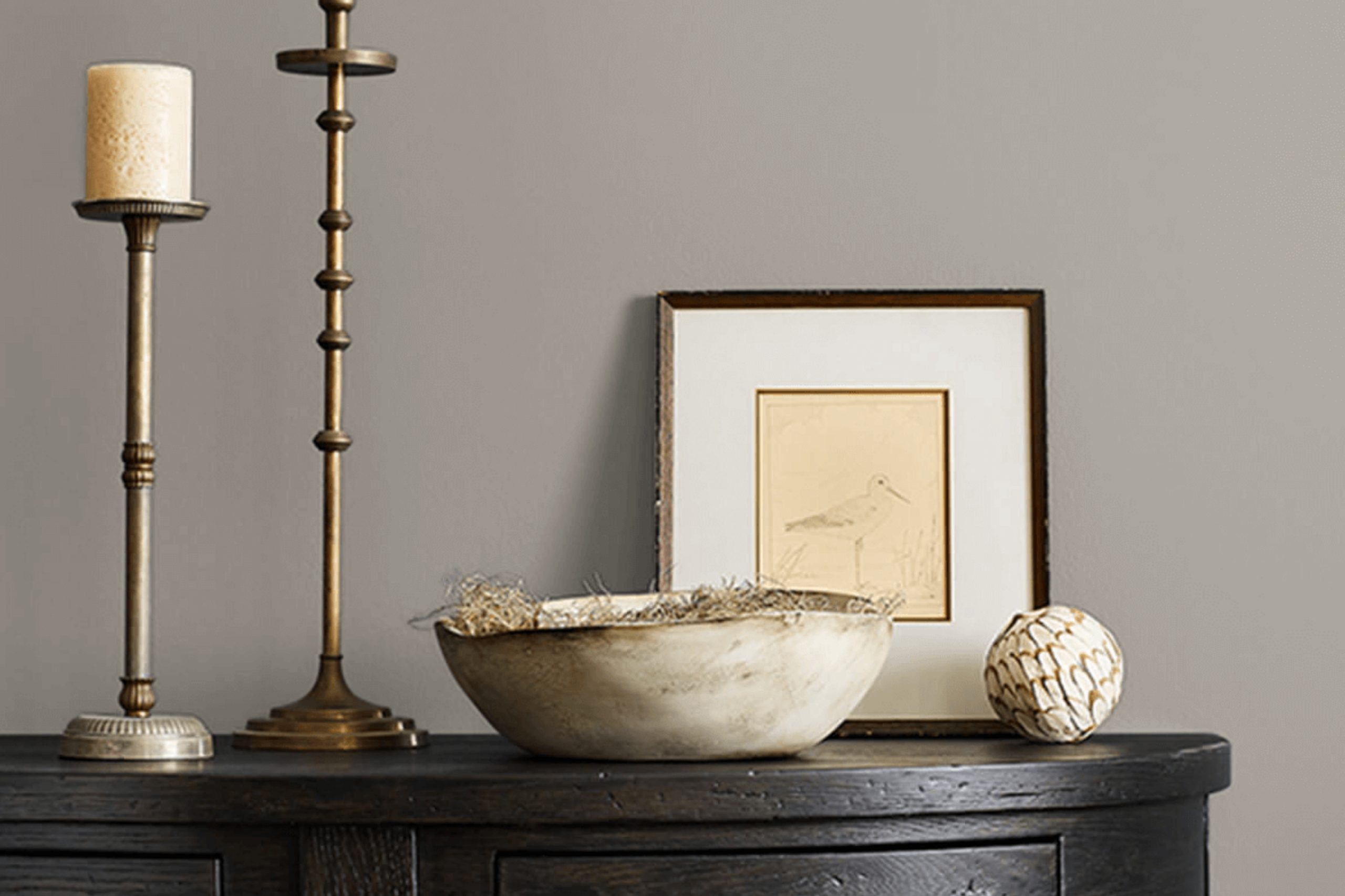
As you consider refreshing your space, SW 9170 Acier by Sherwin Williams might just be the color you’re looking for. It’s a unique shade that stands somewhere between a soft gray and a subtle silver, offering a versatile backdrop for both bold accent colors and a more subdued palette.
In my experience, Acier provides a contemporary feel to any room without overwhelming the senses. Whether you’re aiming to update your living room, bedroom, or even your kitchen, this hue has the ability to create an inviting atmosphere while maintaining a modern chicness.
If you’ve been struggling with choosing the right paint color, Acier might offer the balance and elegance you need.
I’ve found it particularly effective in spaces where natural light is abundant, as it tends to highlight the color’s complex undertones.
What Color Is Acier SW 9170 by Sherwin Williams?
Acier by Sherwin Williams is a versatile gray shade that leans slightly toward a soft steel tone, offering a neat and tailored appearance. This color provides a subtle, understated elegance to any space without overwhelming the room’s existing design elements. Its neutral hue makes it an excellent choice for various interior styles, especially modern, minimalist, and contemporary settings. Acier works well in transitional spaces too, bridging traditional and modern elements smoothly.
In terms of pairing, Acier coordinates beautifully with natural materials such as wood and stone, enhancing their rich textures. In a room with hardwood floors or stone features, this paint helps highlight these materials’ intrinsic qualities. Additionally, metallic finishes like silver or brushed nickel stand out against this gray backdrop, adding a touch of sleekness to the mise en scene.
Textiles also play well with Acier; soft linens or chunky knits in whites, creams, or even bolder colors can add warmth and contrast effectively with its cool tones. For those who prefer a monochromatic look, different shades of gray can be layered together to create a cohesive yet cozy atmosphere.
Acier is a smart choice for those looking to achieve a clean, fresh look in their home while maintaining a welcoming ambiance. Whether used as an accent wall or as the main color scheme, it provides a crisp canvas that complements a wide range of decor styles and preferences.
Is Acier SW 9170 by Sherwin Williams Warm or Cool color?
Sherwin Williams’ Acier is a unique gray shade that holds a modern appeal for home interiors. This color blends well with various decorating styles, ranging from contemporary to traditional. Its neutral tone makes it exceptionally versatile, allowing it to pair beautifully with brighter colors for a lively contrast or with other neutrals for a subtle, cohesive look.
Acier can also work effectively in different rooms, whether it’s adding depth to a small bathroom or creating a calm backdrop in a busy kitchen. Its ability to reflect light can help make a small space appear larger, while in well-lit areas, it can add a soothing coolness.
Homeowners often use Acier as an all-over wall color or as an accent to highlight specific areas. Its understated elegance ensures that it doesn’t overpower your existing decor but supports various furniture styles and finishes.
Undertones of Acier SW 9170 by Sherwin Williams
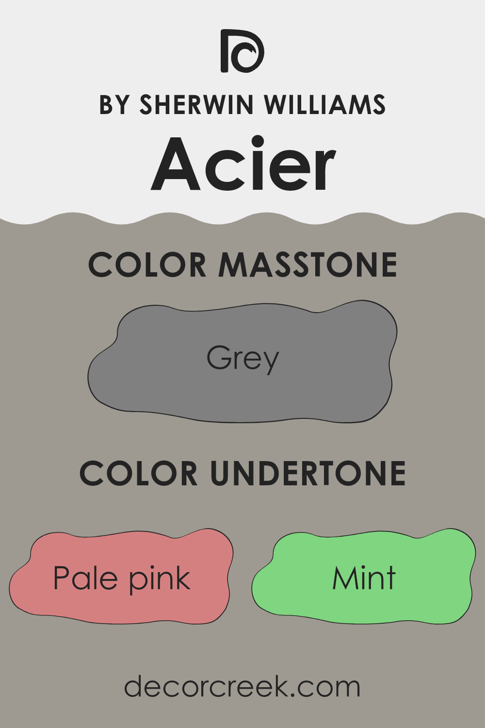
Acier, which is a versatile shade, offers a subtle complexity with its rich blend of undertones. Undertones are the colors lurking beneath the surface of what we initially see. They play a critical role in how a paint color behaves in different lighting conditions, thereby affecting the overall mood of a space.
For Acier, the undertones include a spectrum ranging from pale pink to dark blue, adding subtle hints of these colors under various lighting conditions. Such diversity in undertones means Acier can appear slightly different from room to room or at different times of the day.
For example, in a room with a lot of natural light, the lighter undertones like pale yellow or light blue might become more prominent, giving the walls a softer and brighter feel.
In contrast, in a room with less natural light, darker undertones like navy or dark gray might stand out, giving the space a more grounded, cozy feel.
When used on interior walls, Acier’s blend of undertones provides a neutral backdrop that is far from boring. It can harmonize with a wide range of decor styles and colors, from bright and bold to soft and subtle. This adaptability makes it an excellent choice for those looking to add depth and interest to their walls without overwhelming the space with strong color.
The colorful undertones also mean that Acier interacts dynamically with other colors in the room. It can highlight and complement different furnishings and decor elements, making it a practical and appealing choice for creating a cohesive interior design.
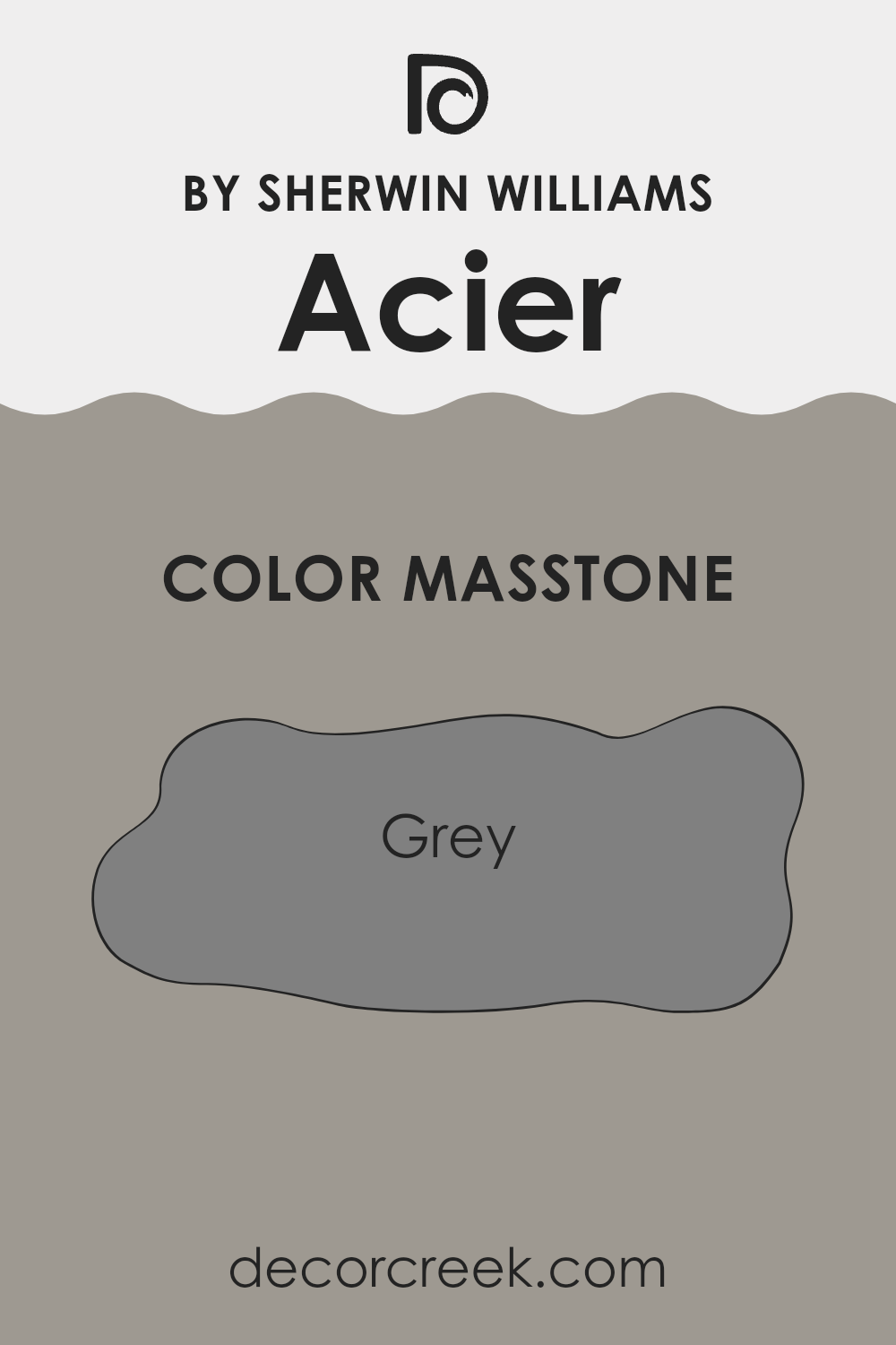
What is the Masstone of the Acier SW 9170 by Sherwin Williams?
AcierSW 9170 by Sherwin Williams is a robust gray color with a true neutral gray tone, similar to the hexadecimal code #808080. This particular shade of gray offers a clean and subtle backdrop that works well in various spaces within the home. Its neutrality means it can easily complement a wide range of decor styles and color schemes, from bright and bold to soft and subtle.
Being a middle-of-the-road gray, Acier can be used in spaces that need a touch of modernity without overwhelming the senses. It’s perfect for living rooms, bedrooms, and even kitchens, where it can help create a calm, unobtrusive environment.
This color doesn’t lean towards either warm or cool, making it incredibly versatile and a popular choice for homeowners who want a color that will stand the test of time. Whether used for an accent wall, paired with vibrant colors, or used to cover an entire room, AcierSW 9170 provides a solid foundation for any home design.
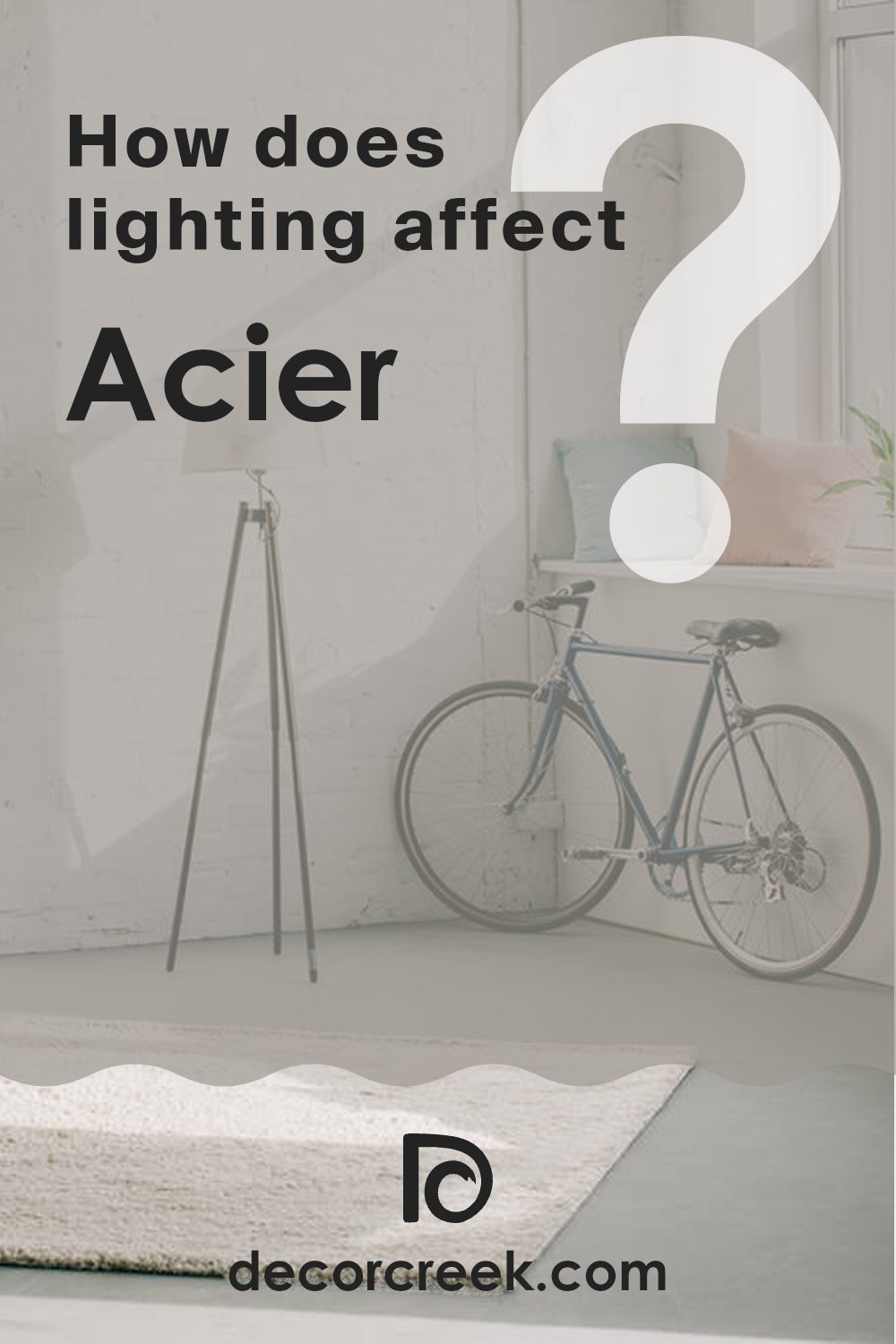
How Does Lighting Affect Acier SW 9170 by Sherwin Williams?
Lighting plays a crucial role in how we perceive colors. The type of light and its intensity can change how a color looks. For example, a paint color might look different under the warm glow of a lamp compared to the cooler, more even illumination of natural daylight.
Considering a color like a light grey, different lighting situations will affect its appearance.
Under artificial light, such as LED or incandescent bulbs, this grey might appear slightly warmer or take on a slight yellow tint depending on the bulb’s color temperature.
This means in an environment mostly lit by lamps or overhead artificial lights, the grey might look softer and warmer.
In natural light, the same grey can look very different.
Natural light is generally cooler during the day compared to most indoor lighting fixtures, thus the grey might appear more true to its original shade or even have a slightly bluish tint.
This is because natural daylight has a balanced color spectrum, making colors appear more vibrant and true to life.
In rooms with different orientations, the appearance of this grey will vary throughout the day:
1. North-facing rooms: These rooms get less direct sunlight, and the light is often cooler, making the grey appear more consistent but slightly darker and cooler throughout the day.
2. South-facing rooms: These get more sunlight, bringing out the brightness and vibrancy of the grey, especially during midday when the light is brightest.
3. East-facing rooms: Here, the grey will look different in the morning when the light is warmer and brighter. As the day goes on, the intensity and warmth of the light decrease, changing how the grey looks.
4. West-facing rooms: In these rooms, the color will look softer during the morning and become warmer and brighter towards the evening as the sun sets.
Understanding these nuances in lighting can help in choosing the right color for a room according to its orientation and the type of light it receives most frequently.
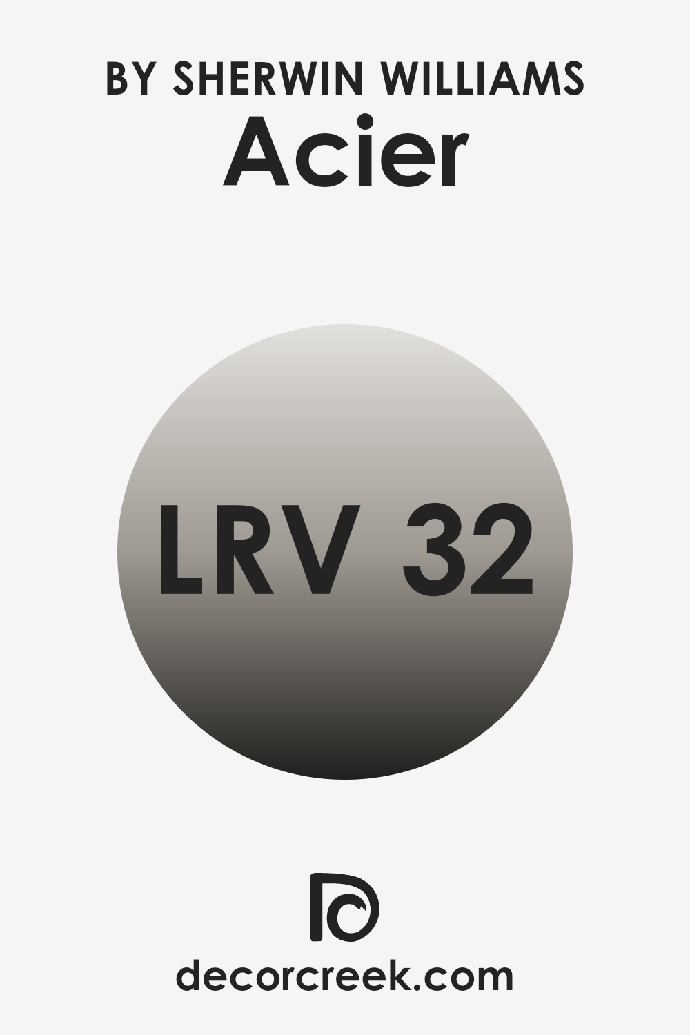
What is the LRV of Acier SW 9170 by Sherwin Williams?
LRV stands for Light Reflectance Value, a measure used to determine how much light a paint color reflects. Put simply, it’s a scale that tells you how bright or dark a color will look once it’s on your walls. A higher LRV means the color reflects more light, making a room feel more open and airy, while a lower LRV means it absorbs more light, which can make a space feel cozier or smaller.
In the case of the paint color with an LRV of 31.986, it is positioned towards the darker end of the spectrum but isn’t extremely dark. This means it will absorb more light than it reflects, which could make a sizable room feel more pulled together and smaller spaces might seem a bit more enclosed.
Such a color can be ideal for creating a focused or cozy atmosphere in places like a study room or a home theater. However, if used in a smaller or less well-lit room, the color could make the space appear somewhat cramped or dim, suggesting that careful consideration should be given to the room’s lighting and size when using this color.
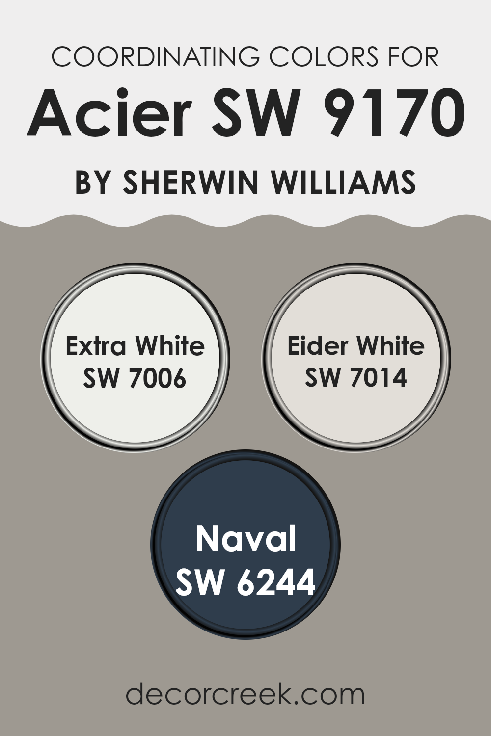
Coordinating Colors of Acier SW 9170 by Sherwin Williams
Coordinating colors are various hues that complement each other when used together in a space, creating a harmonious and visually appealing environment. These colors are chosen based on their ability to work well with a primary color, enhancing the overall aesthetic of a room without overpowering it. In the case of Acier, a number of coordinating colors suggested by Sherwin Williams can help balance its cool, subdued gray tones.
One coordinating color, Extra White (SW 7006), is a clean and bright shade that contrasts sharply with the deeper tones of Acier. This stark white can add a fresh burst of brightness to a space, making it ideal for trim, ceilings, or features to provide a crisp outline around the more subdued main color.
Another color, Eider White (SW 7014), offers a softer alternative to pure white. It has a touch of gray, marrying well with Acier by maintaining the cooler palette while adding a slight warmth to the mix. This subtlety works well for larger surfaces like walls to support a gentle, cohesive look.
Finally, Naval (SW 6244) presents a rich, deep blue that provides a striking counterpoint to Acier’s lighter gray. This bold color can act as an accent, bringing depth and interest to the composition, perfect for focal points or furniture within the space. Together, these colors create a balanced and inviting color scheme when coordinated around the grounding presence of Acier.
You can see recommended paint colors below:
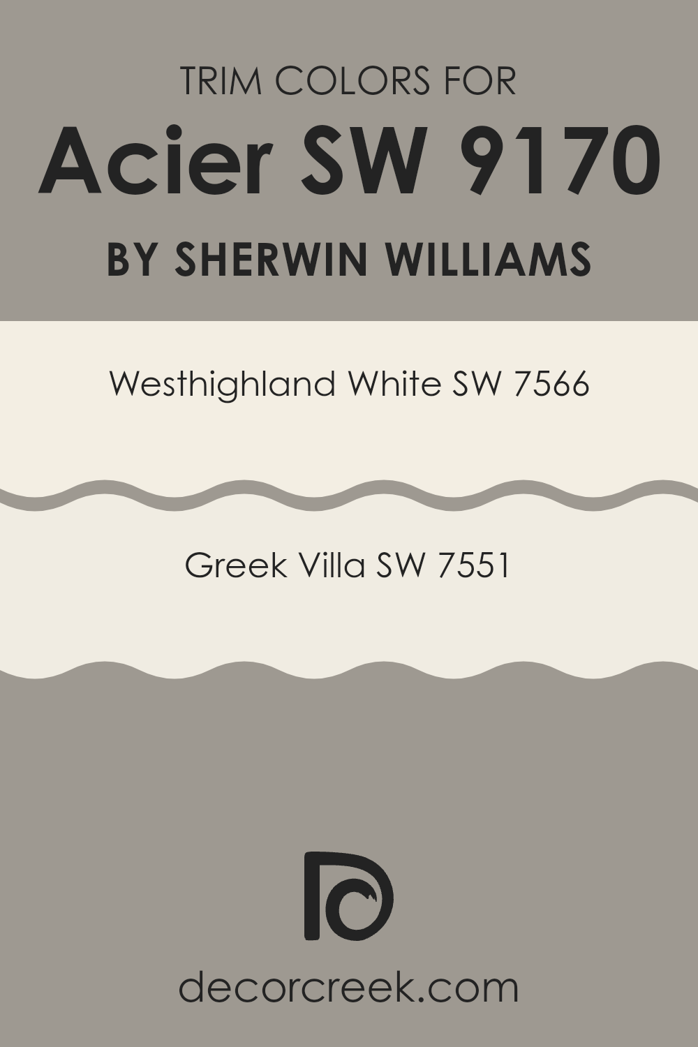
What are the Trim colors of Acier SW 9170 by Sherwin Williams?
Trim colors serve a vital role in painting and decorating by defining and accentuating the architectural features of a space, such as door frames, window casings, crown molding, and baseboards. By using trim colors such as SW 7566 – Westhighland White and SW 7551 – Greek Villa with a base color like Acier SW 9170 by Sherwin Williams, you create a harmonious and appealing contrast that highlights these details.
Westhighland White offers a clean and bright look that can help make the base color stand out more prominently, while Greek Villa lends a slightly warmer tone that complements the cooler hues of Acier without overwhelming it. Using trim colors effectively can lend a polished finish to any room, enhancing the overall aesthetic appeal and setting the mood of the space.
Westhighland White is a crisp and vibrant white that brings a fresh brightness to any space, enhancing natural light and giving a sense of expanded space. Greek Villa, on the other hand, has a soft, creamy hue that exudes a gentle warmth, making it ideal for spaces that aim for a cozy yet light atmosphere.
Choosing the appropriate trim color like Westhighland White or Greek Villa can not only highlight the beautiful features of a home but also create a visually striking framework that complements and contrasts with main wall colors such as Acier, resulting in a professional-looking finish.
You can see recommended paint colors below:
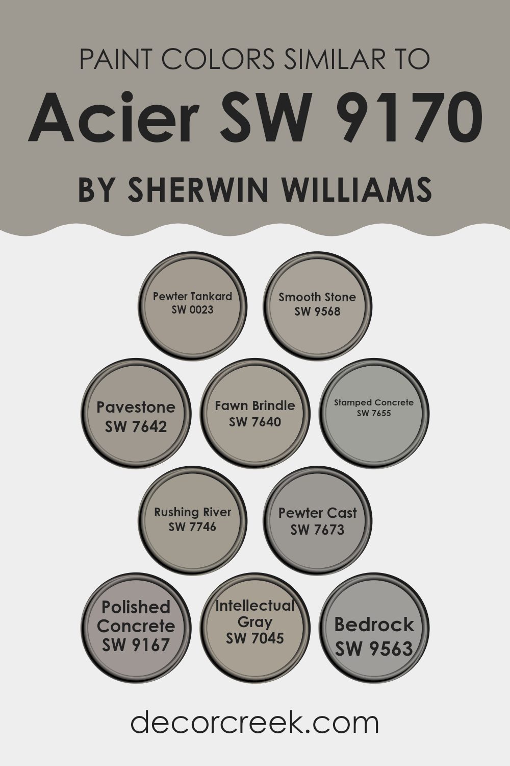
Colors Similar to Acier SW 9170 by Sherwin Williams
When decorating a space, knowing how to incorporate similar colors is crucial for creating a harmonious atmosphere. Similar colors, like variations found within the color family of Acier SW 9170 by Sherwin Williams, provide nuanced visual connections that make a room feel thoughtfully compiled and cohesive.
Colors like Pewter Tankard SW 0023, and Smooth Stone SW 9568, add depth with their slightly differing gray tones that complement without overpowering a principal shade. Pavestone SW 7642 and Fawn Brindle SW 7640 introduce subtle green and taupe undercurrents, respectively, enhancing the complexity of a neutrally themed decor.
Additionally, Stamped Concrete SW 7655 and Rushing River SW 7746 offer a cooler approach, the former presenting a steely gray while the latter leans towards a softer, washed gray with blue undertones. Pewter Cast SW 7673, on the other hand, repeats the metallic element but with a deeper, more intense effect.
For those looking to mimic the look of natural elements, Polished Concrete SW 9167 mirrors the smooth feel and texture of concrete with its mid-tone gray, while Intellectual Gray SW 7045 and Bedrock SW 9563 transition further towards a stonier appearance with their warmer and earthier feel—perfect for adding a solid foundation to any color scheme.
Utilizing these similar colors together allows for layers of texture and tone that invite a unified yet interesting aesthetic.
You can see recommended paint colors below:
- SW 0023 Pewter Tankard
- SW 9568 Smooth Stone
- SW 7642 Pavestone
- SW 7640 Fawn Brindle
- SW 7655 Stamped Concrete
- SW 7746 Rushing River
- SW 7673 Pewter Cast
- SW 9167 Polished Concrete
- SW 7045 Intellectual Gray
- SW 9563 Bedrock
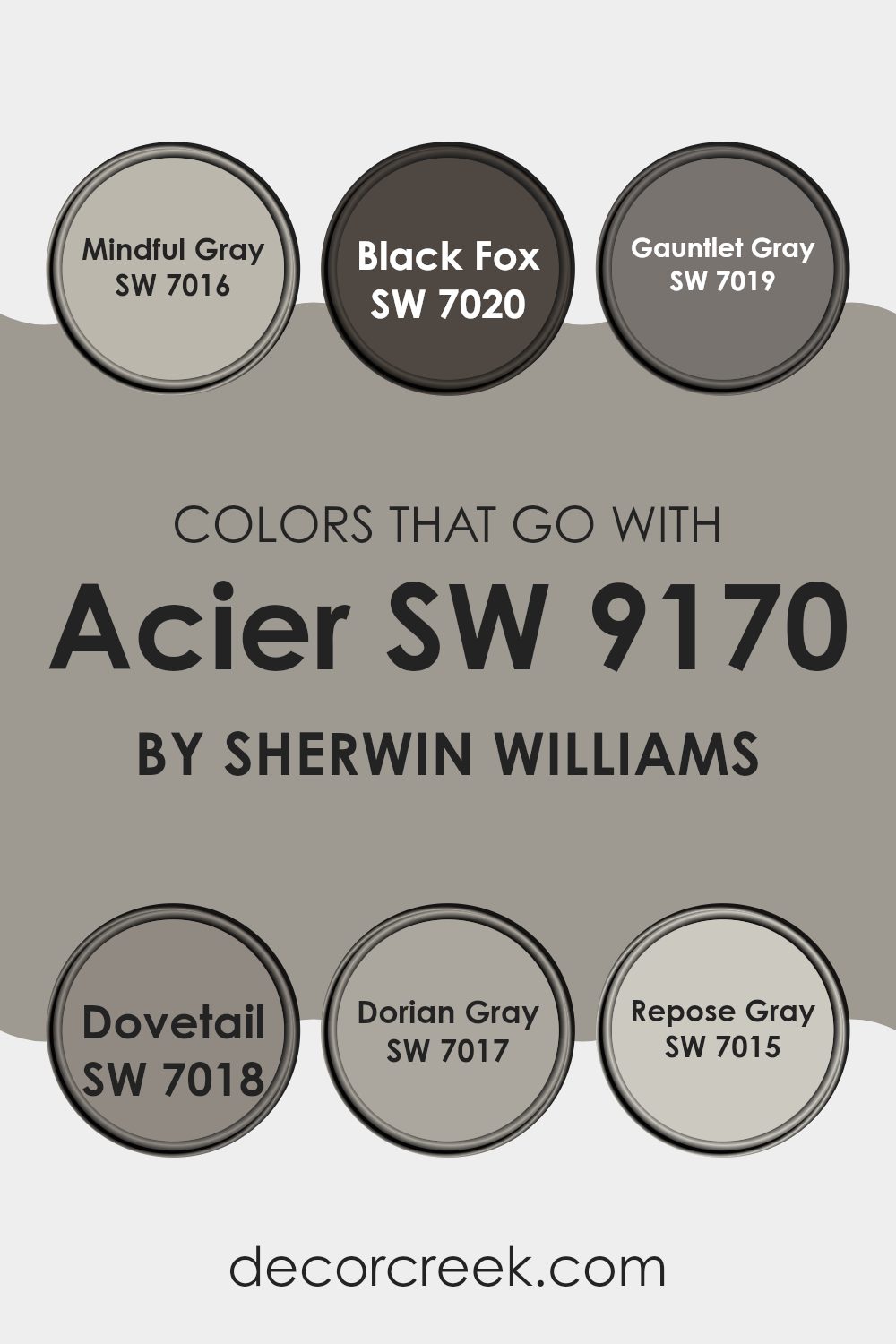
Colors that Go With Acier SW 9170 by Sherwin Williams
Choosing the right colors to pair with Acier SW 9170 by Sherwin-Williams is essential as it helps create a harmonious and cohesive look in your space. Acier, a warm and versatile grey, sets a relaxing yet stylish tone that can be enhanced by selecting complementary colors.
Mindful Gray SW 7016 is a beautiful shade that provides a lighter, softer contrast to Acier, giving a subtle lift to any room’s ambiance. Black Fox SW 7020, on the other hand, is a much darker gray with deep and rich tones, perfect for creating a strong, bold statement when combined with the milder hues of Acier.
Similarly, Gauntlet Gray SW 7019 offers a medium saturation that bridges the gap between Acier and Black Fox, making it ideal for adding some depth without overpowering lighter shades. Dovetail SW 7018 comes across as a warm gray that leans slightly towards taupe, providing a natural feel that complements wood tones particularly well.
Dorian Gray SW 7017 sticks close to a true gray, making it flexible for either blending smoothly with similar neutrals or contrasting with brighter colors. Lastly, Repose Gray SW 7015 is lighter and airier, allowing for spaces to feel more open and fresh when paired with the grounding presence of Acier.
All these shades work beautifully together to create a balanced palette that can suit multiple decorating styles, from modern to classic.
You can see recommended paint colors below:
- SW 7016 Mindful Gray
- SW 7020 Black Fox
- SW 7019 Gauntlet Gray
- SW 7018 Dovetail
- SW 7017 Dorian Gray
- SW 7015 Repose Gray
How to Use Acier SW 9170 by Sherwin Williams In Your Home?
Acier SW 9170 by Sherwin Williams is a versatile gray paint color that works beautifully in many areas of a home. Its strength lies in its ability to provide a neutral backdrop that is both modern and timeless, making it a reliable choice for any room.
Whether you’re painting a living room, bedroom, or even a kitchen, Acier has a muted tone that pairs well with a variety of decor styles and colors, from bright and bold to soft and subtle. For example, you could use Acier in a bedroom to create a calm, cozy atmosphere that’s ideal for relaxing.
It’s also great for living areas as it complements both modern gadgets and traditional furniture, allowing you to keep existing pieces while updating your space. In addition to walls, consider using Acier on cabinets or furniture for a chic, cohesive look. It’s a low-risk option with a high reward for anyone looking to refresh their home environment.
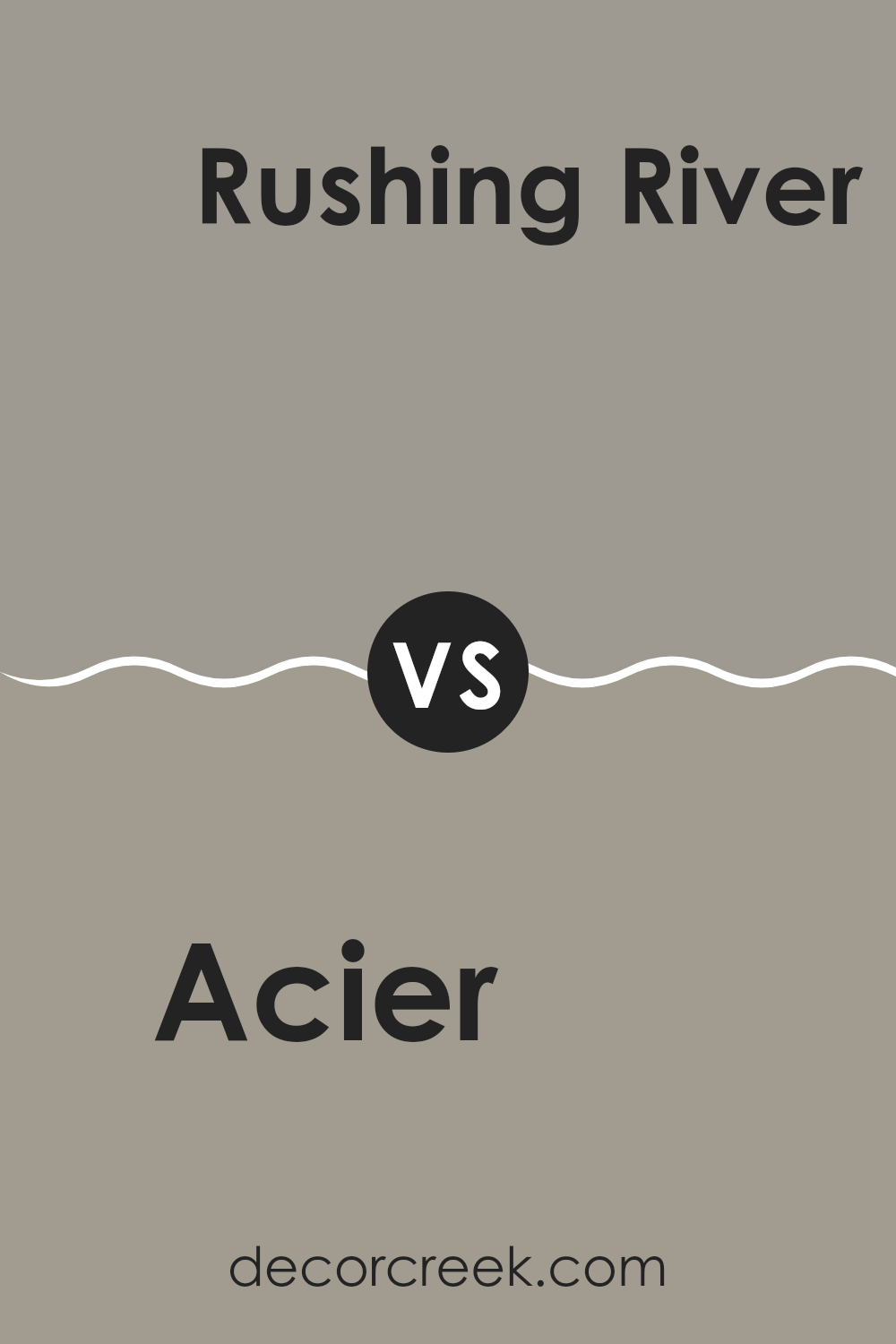
Acier SW 9170 by Sherwin Williams vs Rushing River SW 7746 by Sherwin Williams
Acier and Rushing River are two distinctive shades by Sherwin Williams. Acier is a cool gray with a strong metallic undertone, making it feel modern and versatile for various spaces. It works well in areas that benefit from a sleek, clean look, such as kitchens or modern living rooms.
On the other hand, Rushing River is deeper and has a subtle blend of green and slate gray, giving it a natural, calming quality. This color can fit perfectly in spaces where you want a touch of nature and a peaceful atmosphere, like bathrooms or bedrooms.
While Acier reflects more light and can make a room feel more open, Rushing River offers a cozier vibe, beneficial in creating a retreat-like environment in your home. Both colors have their unique appeal and can dramatically impact a room depending on the mood you wish to set.
You can see recommended paint color below:
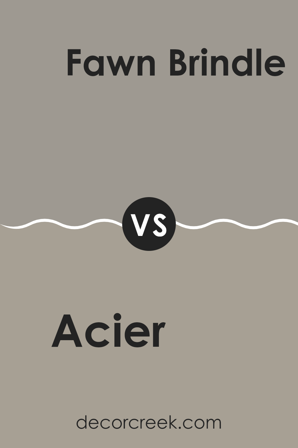
Acier SW 9170 by Sherwin Williams vs Fawn Brindle SW 7640 by Sherwin Williams
The color Acier SW 9170 by Sherwin Williams is a cool-toned gray with a steel-like appearance, providing a modern and crisp look. It evokes a sense of sleekness and is versatile enough for use in various spaces, from kitchens to home offices.
On the other hand, Fawn Brindle SW 7640 is a warmer shade of gray, infused with subtle brown undertones that give it a cozier and more welcoming feel compared to Acier. This color works exceptionally well in living areas and bedrooms where a softer, more inviting atmosphere is desired.
While both colors are shades of gray, Acier leans towards a sharper, more industrial vibe, making it suitable for contemporary themes. Fawn Brindle, with its earthier essence, suits environments where a natural, gentle aesthetic is preferred. These differences allow them to meet distinct stylistic needs and preferences in home decor.
You can see recommended paint color below:
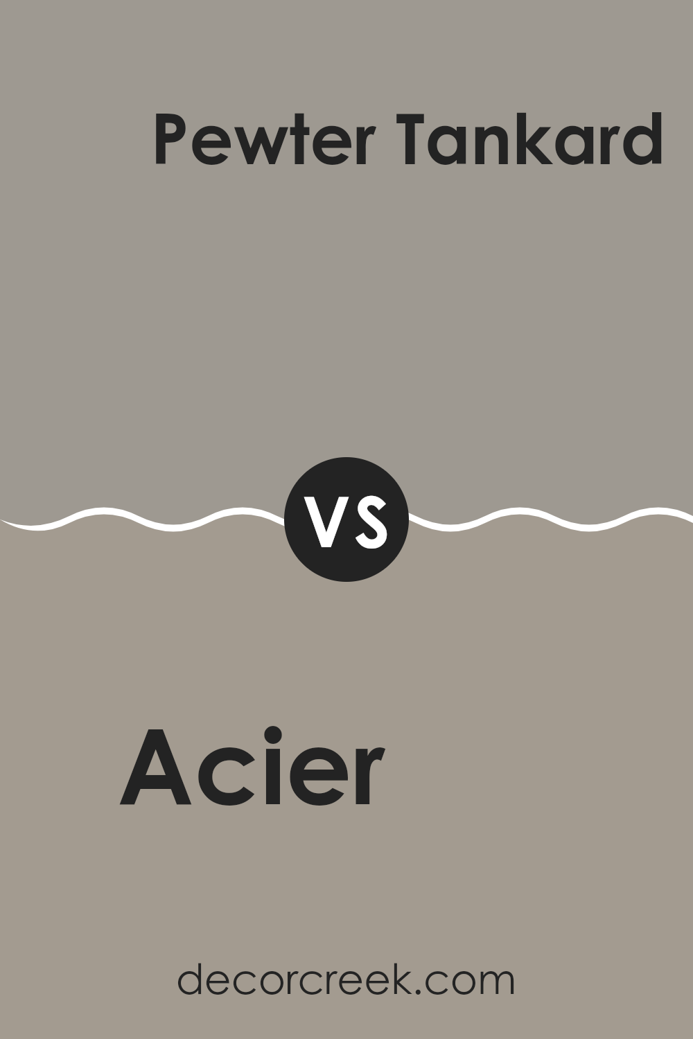
Acier SW 9170 by Sherwin Williams vs Pewter Tankard SW 0023 by Sherwin Williams
Acier and Pewter Tankard, both from Sherwin Williams, offer unique shades of gray that can significantly influence the atmosphere of any space. Acier is a cooler gray, providing a lighter, almost silvery touch, which pairs well in rooms needing a bright and airy feel.
This muted tone can help reflect light, making small spaces appear more open. In contrast, Pewter Tankard is a deeper gray with warmer undertones, lending a cozier, more inviting feel to an area. It’s perfect for larger spaces or creating a focal point because its richer hue stands out more than Acier.
When deciding between them, consider the room’s size and the mood you want to set. Acier works best for a minimalistic, clean look, while Pewter Tankard is ideal for a stronger, more grounded appearance.
You can see recommended paint color below:
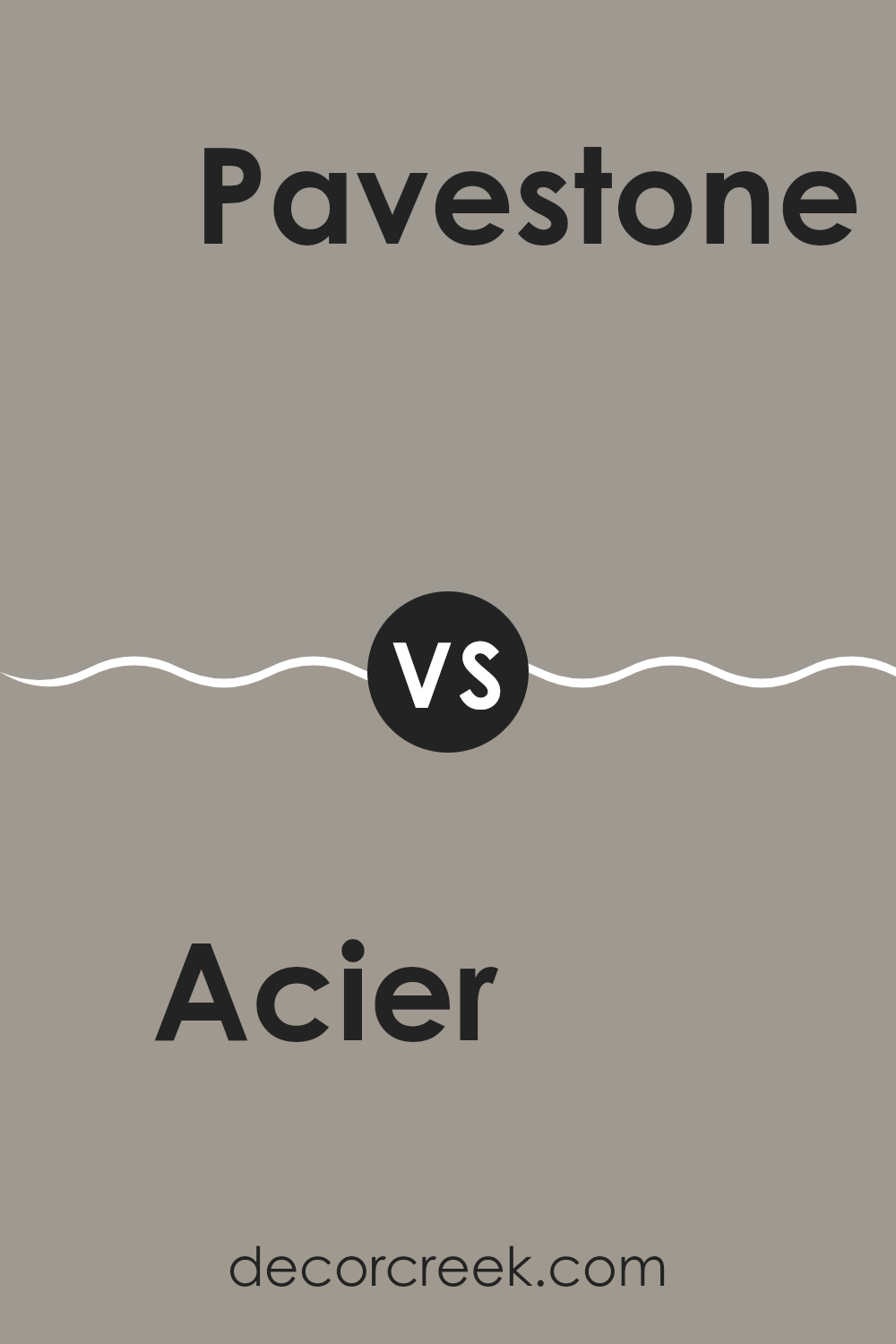
Acier SW 9170 by Sherwin Williams vs Pavestone SW 7642 by Sherwin Williams
Acier SW 9170 and Pavestone SW 7642 from Sherwin-Williams are both neutral hues with subtle differences that could affect the atmosphere of a room. Acier is a lighter gray that leans slightly towards a silver tone, making it a great option for spaces where you want a bright and airy feel. It reflects more light, which can make a small room seem larger.
On the other hand, Pavestone has a deeper, warmer tone of gray that can add a cozy and inviting touch to any space. This color resembles the hue of wet cement, giving it a natural, grounded feel. It’s perfect for areas where a sense of comfort is desired.
Both colors are versatile and work well with various decor styles, but Acier is better for achieving a more open feel, while Pavestone is ideal for crafting a snug, welcoming environment. They can also complement each other well when used in the same color scheme.
You can see recommended paint color below:
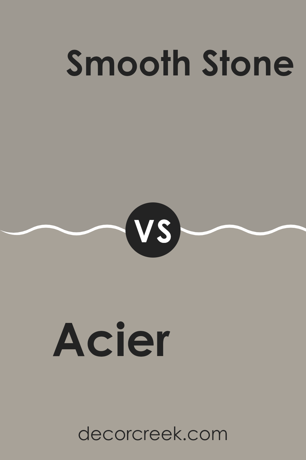
Acier SW 9170 by Sherwin Williams vs Smooth Stone SW 9568 by Sherwin Williams
Acier and Smooth Stone, both colors from Sherwin Williams, offer distinct yet harmonious tones for various spaces. Acier presents as a deep, cool gray with subtle blue undertones, making it a solid choice for those looking to add a touch of modernity and strength to their rooms. It works well in spaces that benefit from a sharper, more defined look, like home offices or kitchens.
On the other hand, Smooth Stone is a lighter gray that feels airy and soft. This color has a warmer base, which makes it inviting and easy to match with a wide range of decor styles. It’s particularly suited for living rooms, bedrooms, or any area where a sense of calm is desired.
Both colors are versatile, but their different undertones and depths can impact a room’s mood significantly. While Acier adds drama and contemporary flair, Smooth Stone offers a gentle backdrop, soothing and adaptable. Choosing between them depends on the desired effect and the room’s function.
You can see recommended paint color below:
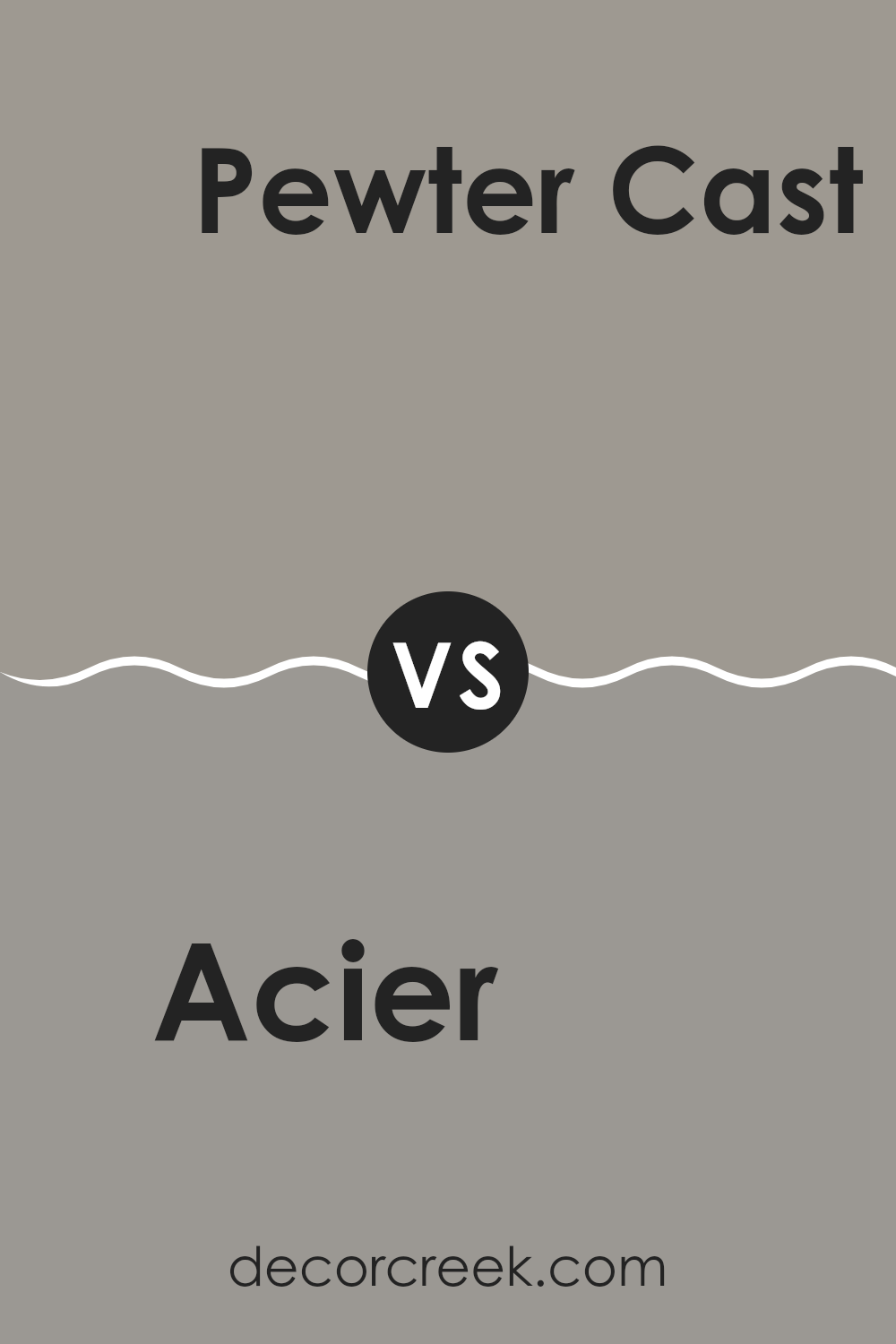
Acier SW 9170 by Sherwin Williams vs Pewter Cast SW 7673 by Sherwin Williams
Acier SW 9170 and Pewter Cast SW 7673, both by Sherwin Williams, offer unique shades for various decorating needs. Acier is a lighter gray that provides a gentle backdrop in a room, making spaces feel larger and more open. This color is versatile, working well in many settings like living rooms or bedrooms, blending smoothly with both bright and muted accent colors.
On the other hand, Pewter Cast is a deeper gray with a slightly warmer tone, which makes it great for adding a bit of coziness to the atmosphere. This color works especially well in areas that need a more grounded or anchored feel, such as family rooms or offices. It pairs well with richer colors to create a balanced look.
Both colors have their place in home décor depending on what you’re aiming for: lighter and expansive with Acier, or warmer and cozier with Pewter Cast. They are effective options for anyone looking to freshen up their space with modern hues.
You can see recommended paint color below:
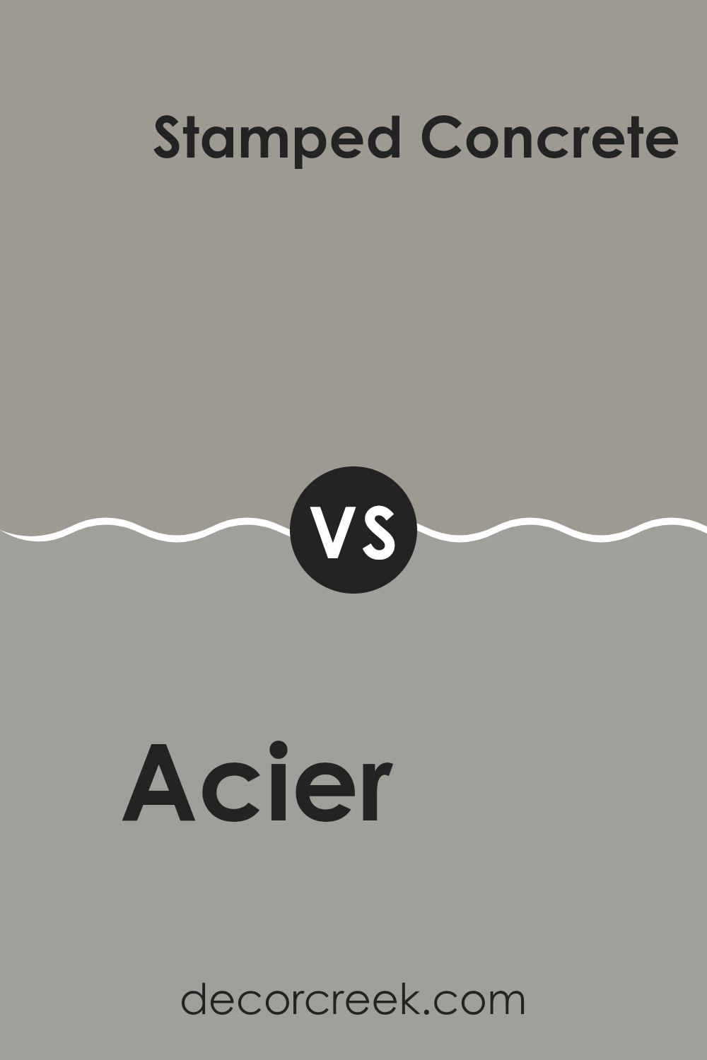
Acier SW 9170 by Sherwin Williams vs Stamped Concrete SW 7655 by Sherwin Williams
Acier and Stamped Concrete, both by Sherwin Williams, are neutral gray shades, each lending a distinctive presence to interior spaces. Acier is a lighter gray that brings a subtle, soft flair to rooms, creating a welcoming and calm atmosphere.
It’s cool toned, which can help make small spaces appear slightly larger and more open. On the other hand, Stamped Concrete is a darker gray, providing a stronger and more grounding effect. This color can add depth and a sense of stability to a room, suitable for creating a more grounded or cozy feel, particularly in larger spaces where it won’t overwhelm the setting.
Both colors work well in a modern decor scheme, complementing a wide range of accent colors from bright reds to soft blues. Choosing between them depends largely on the desired mood and the size of the space, with Acier suiting airy, light-filled rooms, and Stamped Concrete fitting well in areas where a denser, cozier atmosphere is desired.
You can see recommended paint color below:
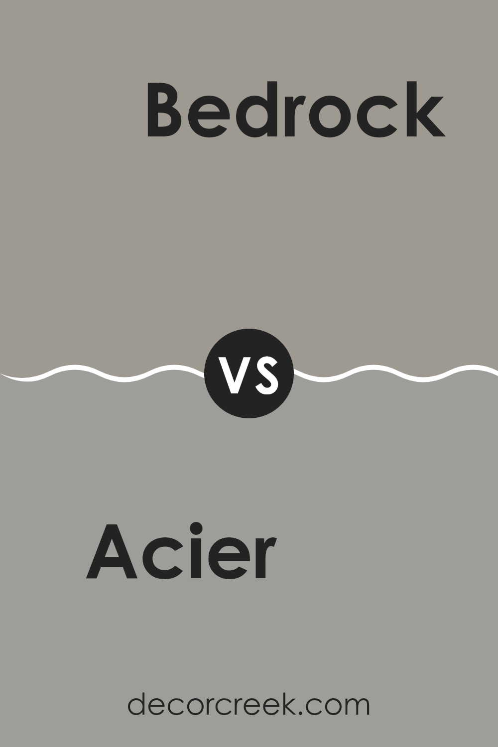
Acier SW 9170 by Sherwin Williams vs Bedrock SW 9563 by Sherwin Williams
Acier SW 9170 and Bedrock SW 9563, both by Sherwin Williams, exhibit distinct tones that cater to different decorative moods and settings. Acier is a muted, steely gray that gives off a neutral and versatile feel, making it easy to pair with various decor styles and color palettes. This color works well in spaces where a subtle, understated elegance is desired.
On the other hand, Bedrock is a shade deeper than Acier, leaning towards a darker, warmer gray. This color can add more weight and presence to a room, creating a sense of grounding and coziness. Its rich hue makes it ideal for areas like living rooms or bedrooms, where a more inviting atmosphere is beneficial.
Both colors are practical choices and can function well either as main colors for walls or as accents in a design scheme. Their difference in tone provides distinct options depending on whether a lighter, more open feel (Acier) or a more enclosed, warm ambiance (Bedrock) is desired.
You can see recommended paint color below:
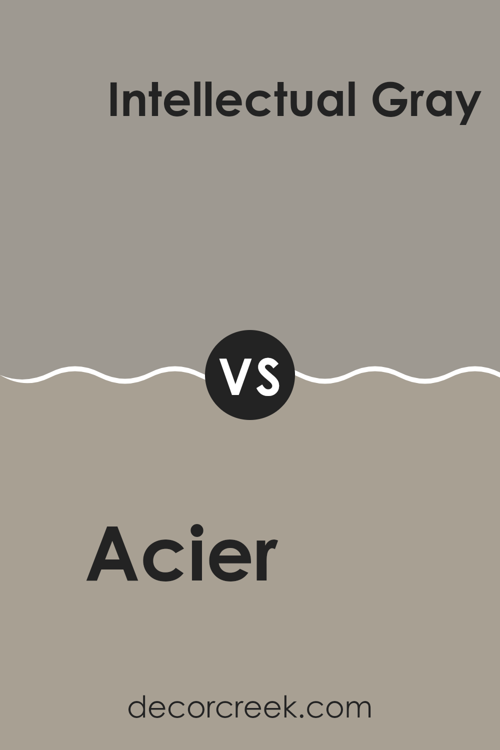
Acier SW 9170 by Sherwin Williams vs Intellectual Gray SW 7045 by Sherwin Williams
The main color, Acier, and the second color, Intellectual Gray, both offered by Sherwin Williams, represent subtle shades of gray, each carrying a unique personality. Acier is a cooler gray with hints of blue, giving it a modern yet understated vibe.
It feels slightly lighter and can reflect more light, which may make a room appear more spacious. On the other hand, Intellectual Gray leans towards a warmer tone, incorporating more earthy elements that bring a cozy and welcoming feel.
This color is versatile enough to work well in various settings, providing a neutral backdrop that complements both vibrant and subdued accents. Both colors are indeed different but can be paired together for a balanced, harmonious look. They are suitable choices for those looking to create a calm, inviting atmosphere in their home.
You can see recommended paint color below:
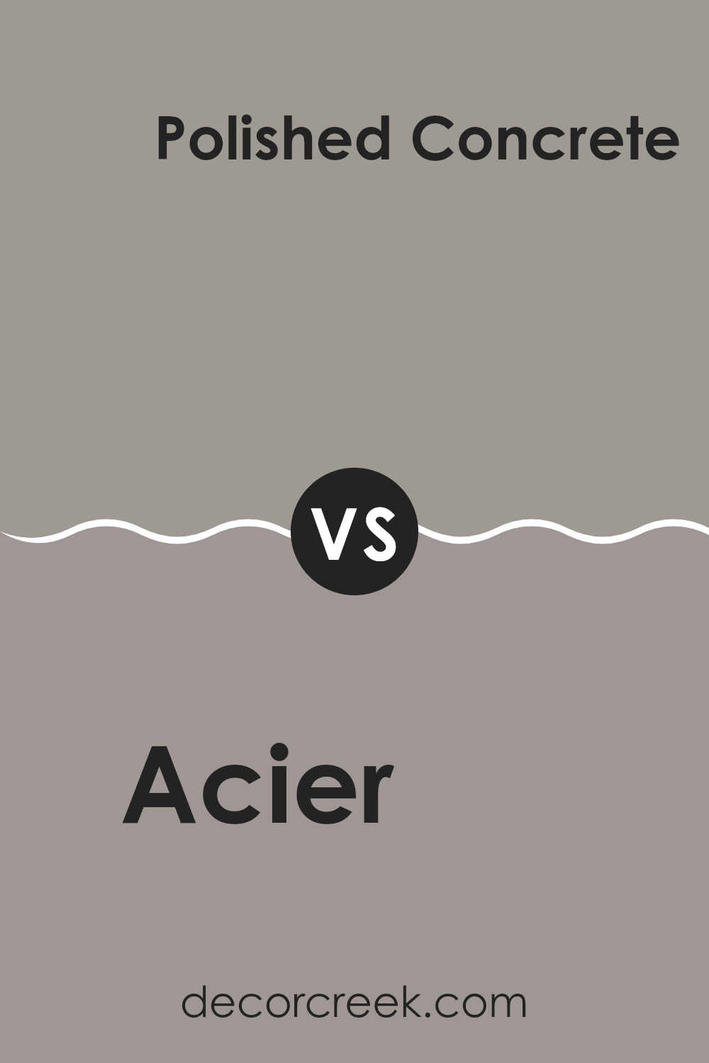
Acier SW 9170 by Sherwin Williams vs Polished Concrete SW 9167 by Sherwin Williams
The main color, Acier, and the second color, Polished Concrete, both by Sherwin Williams, are subtle shades of gray that offer distinct vibes to any space. Acier is a deeper, cooler gray that carries a hint of steel-like tone, making it a sharp choice for modern settings. It’s an excellent background color for brighter decorations or furniture.
On the other hand, Polished Concrete has a lighter touch. It’s closer to a mid-tone gray, balancing between warm and cool, providing a versatile background that works well in various decorative styles, from minimalist to industrial.
When used together, these two shades can create a layered and engaging effect, with Acier providing depth and contrast against the softer, more neutral Polished Concrete. Each color holds its own in specific settings but combines well for a clean, stylish look.
You can see recommended paint color below:
- SW 9167 Polished Concrete
Wrapping up, SW 9170 Acier by Sherwin Williams is more than just a gray paint. As we’ve seen, it stands out in a crowd with its unique ability to morph under different lights, showing off hues that range from deep slate to lighter, softer gray.
Whether someone is looking to freshen up a room or give a piece of furniture a new life, Acier has the charm to make that change happen successfully. This paint isn’t just for walls; it can be used on cabinets and other fun projects too!
In my experience, it’s easy to apply, dries well, and maintains its good looks over time. For anyone thinking about a new project or wanting to update their home, SW 9170 Acier offers a dependable and stylish choice that could really make a difference in any living area.
Ever wished paint sampling was as easy as sticking a sticker? Guess what? Now it is! Discover Samplize's unique Peel & Stick samples.
Get paint samples

