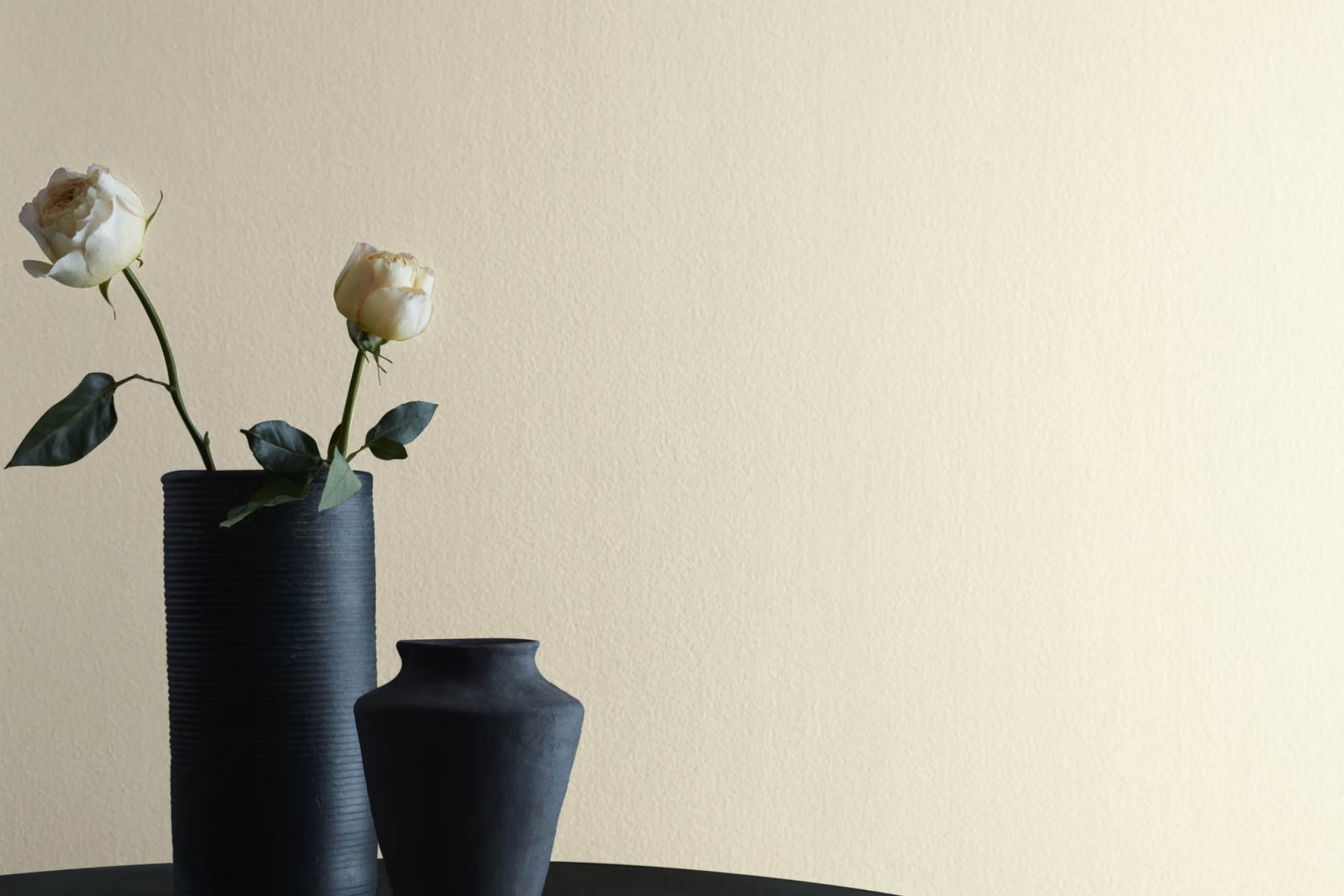
When I first suggested painting a client’s room in 512 Light Breeze by Benjamin Moore, I was surprised at how it subtly changed the area. This color has a soft, airy quality that instantly made the room feel open and inviting. It’s not just a plain white; it carries a hint of freshness and calmness that feels like a gentle whisper on a cool day. I could see how it balanced the light, making it a perfect backdrop for a variety of decorations and styles.
I noticed immediately that Light Breeze doesn’t overwhelm the senses; instead, it gently enhances the environment. The color has a delicate ability to adapt to different lighting conditions, sometimes appearing almost like a soft mist or a gentle wave. This made it easy to pair with other colors, furniture, and accents in the room.
Choosing this color was like finding a pleasant and reliable companion for my walls. It creates a peaceful atmosphere without being dull, making it suitable for any room in the house.
Whether used in a bedroom for a restful vibe or in a living room to add a touch of elegance, 512 Light Breeze brings a sense of quiet charm that feels just right.
What Color Is Light Breeze 512 by Benjamin Moore?
Light Breeze by Benjamin Moore is a soft, gentle shade of pale blue-green that instantly brings a fresh, airy feel to any area. This color is reminiscent of a clear sky on a breezy day, making it perfect for creating a light, calming atmosphere in your home.
This shade works beautifully in coastal or beach-themed interiors, blending seamlessly with nautical elements. Light Breeze also fits well in minimalist and contemporary rooms, where its subtlety can add a hint of color without overpowering the senses. Additionally, it’s a great choice for Scandinavian-style rooms, where it can complement the simplicity and functionality of the design.
When it comes to materials and textures, Light Breeze pairs wonderfully with natural elements. Think of light woods, like pine or ash, which enhance its fresh appeal. Soft textiles such as linen or cotton in white or cream can complement this color, adding to the overall sense of comfort and ease. You can also consider using accents in soft grays or muted yellows to add depth to the area.
Overall, Light Breeze is an adaptable color that gives a room a gentle touch of color, keeping it refreshing and calm. It’s ideal for anyone looking to add a bit of lightness and openness to their home.
Is Light Breeze 512 by Benjamin Moore Warm or Cool color?
Light Breeze by Benjamin Moore is a gentle and soft color that brings a sense of calm to any area. It is a light gray with subtle undertones of blue, which can make rooms feel airy and open. This color is particularly good for smaller rooms, as it helps them appear larger and more spacious.
Light Breeze also works well in living rooms, bedrooms, and bathrooms, creating a clean and fresh appearance. The soft gray-blue hue can pair nicely with both neutral tones and bolder accents, making it an adaptable choice for different design styles. It complements white trim beautifully, providing a crisp, polished look.
When used on walls, Light Breeze can help reflect natural light, making rooms feel brighter and more inviting. It is an excellent choice for those who prefer a relaxed and cozy environment at home. Whether used throughout the entire house or in select areas, Light Breeze adds a touch of gentle elegance.
Undertones of Light Breeze 512 by Benjamin Moore
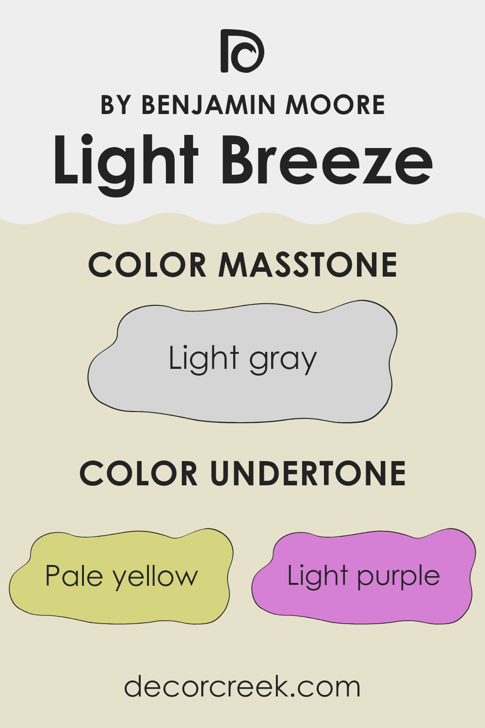
Light Breeze 512 by Benjamin Moore is a beautifully adaptable color with multiple undertones. Each undertone changes how we perceive this paint, giving it a unique character. The pale yellow gives it warmth, making areas feel cozy and inviting. Light purple adds a gentle hint of refinement, while light blue introduces a refreshing, calming effect.
Pale pink brings a subtle softness, adding a comforting touch to any room. The mint undertone offers a pop of cool freshness, and lilac adds a bit of elegance with its refined hue. Lastly, the grey undertone grounds the color, lending a balanced neutrality.
When used on interior walls, Light Breeze 512 can change depending on the lighting and surrounding decor. In bright natural light, the cooler undertones like light blue and mint might become more pronounced, creating a breezy, open-air feel. In dimmer, artificial light, the warm yellow and pink tones could become more evident, making the room feel cozier and more intimate.
These undertones allow the paint to adapt to different settings, making it a flexible choice for various rooms. Whether used in a living room, bedroom, or hallway, Light Breeze 512 carries a balanced mix of warmth and coolness, providing a pleasing backdrop that complements a variety of design styles.
What is the Masstone of the Light Breeze 512 by Benjamin Moore?
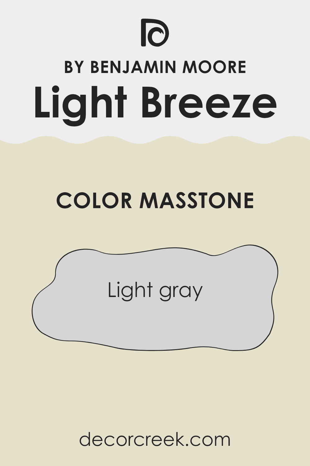
Light Breeze 512 by Benjamin Moore is a soft, light gray color (#D5D5D5) that brings a sense of calm and openness to any area. Its understated tone pairs well with both bold and subtle colors, making it an adaptable choice for various rooms within the home.
In living rooms, it can serve as a gentle backdrop that complements vibrant furniture or artwork. Meanwhile, in bedrooms, its soothing nature encourages relaxation and restfulness. Light Breeze 512 creates a feeling of spaciousness, which is especially beneficial in smaller rooms or areas with limited natural light.
This color works well with a variety of textures and materials, whether you have wooden floors, metal fixtures, or plush textiles. Its neutral shade can also seamlessly connect different parts of a home, providing continuity and flow. Overall, Light Breeze 512 offers a clean and fresh look that enhances the light and airy qualities of a home.
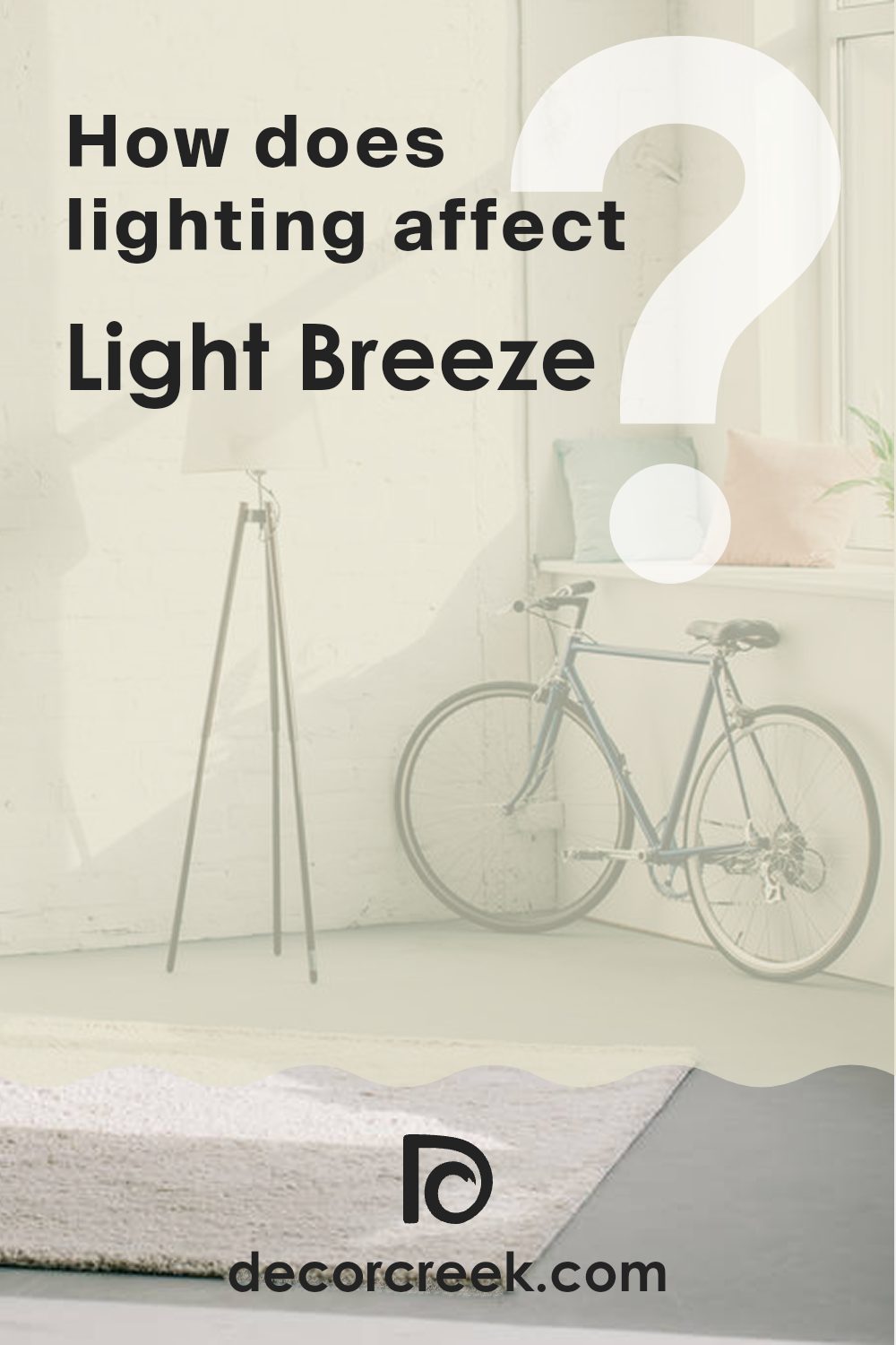
How Does Lighting Affect Light Breeze 512 by Benjamin Moore?
Lighting plays a significant role in how we perceive colors. The color Light Breeze by Benjamin Moore is no exception. This color, a soft, pale blue with a hint of green, can look vastly different depending on the light conditions.
In natural light, Light Breeze tends to appear more vibrant and true to its intended hue. In a north-facing room, which usually receives cooler and more consistent light throughout the day, Light Breeze might appear more muted and cooler. The blue tones will come forward, making the color seem a little grayer and more subdued.
In south-facing rooms, the abundant natural light can make Light Breeze appear warmer and brighter. The sun throughout the day can add a golden glow that enhances the color’s warmth, making it look more inviting. This might bring out the color’s slightly green undertone, giving the room a fresh, airy feel.
East-facing rooms catch the warm, soft light of the morning, making Light Breeze appear lighter and warmer early in the day. As the sun moves across the sky, the color can start to look cooler and less saturated, resembling its appearance in northern light. This gradual shift can give the room a dynamic quality as the day progresses.
West-facing rooms receive bright, warm light in the afternoon and early evening. This golden hour lighting can intensify Light Breeze’s warmth and soften the cooler undertones. However, in the morning, when there is less direct light, the color might look a bit duller or cooler, similar to what you would see in a north-facing room.
Under artificial light, particularly warm bulbs, Light Breeze might lean toward its warmer tones. The color can take on a slightly different hue than it does in natural daylight, so it’s essential to consider the type of artificial lighting you have when choosing this color. Cool white lights may bring out more of the blue tones, while warm lights might highlight its green undertones.
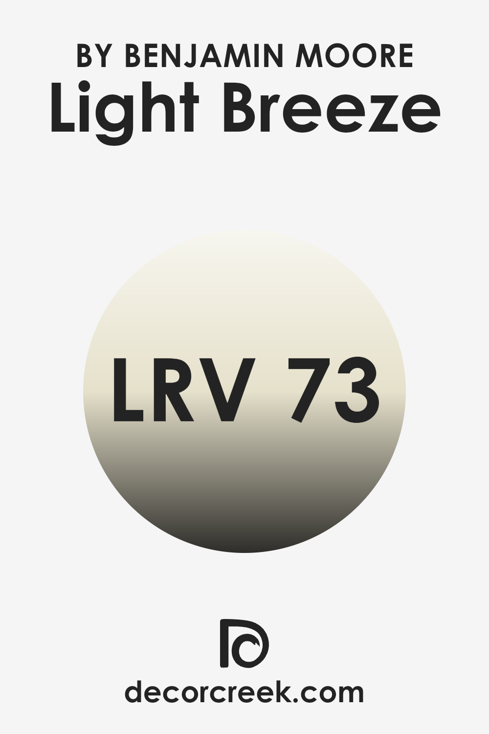
What is the LRV of Light Breeze 512 by Benjamin Moore?
LRV, or Light Reflectance Value, is a measure that tells us how much light a color reflects. It is a scale that ranges from 0 to 100, where 0 means the color absorbs all light (black) and 100 means it reflects all light (white). Essentially, the higher the LRV, the more light the color bounces back into the room, making it look brighter and more open.
This value is essential in interior design because it helps you decide how a color will look on your walls and affect the mood of a room. A higher LRV is ideal for rooms that need to feel light and airy, while a lower LRV can give a cozy and intimate feel.
For Light Breeze 512 by Benjamin Moore, with an LRV of 73.1, you can expect it to be a fairly bright color. This value means that the color will reflect a good amount of light back into the room, making areas feel more open and bright. It’s a great option for rooms where you want to maximize natural light and create an inviting atmosphere.
This LRV level means the color is adaptable enough to be used in various rooms, as it won’t overpower the room but will still keep it feeling fresh and lively. Whether used in a living room or a bedroom, this color will help maintain a clean and airy look.
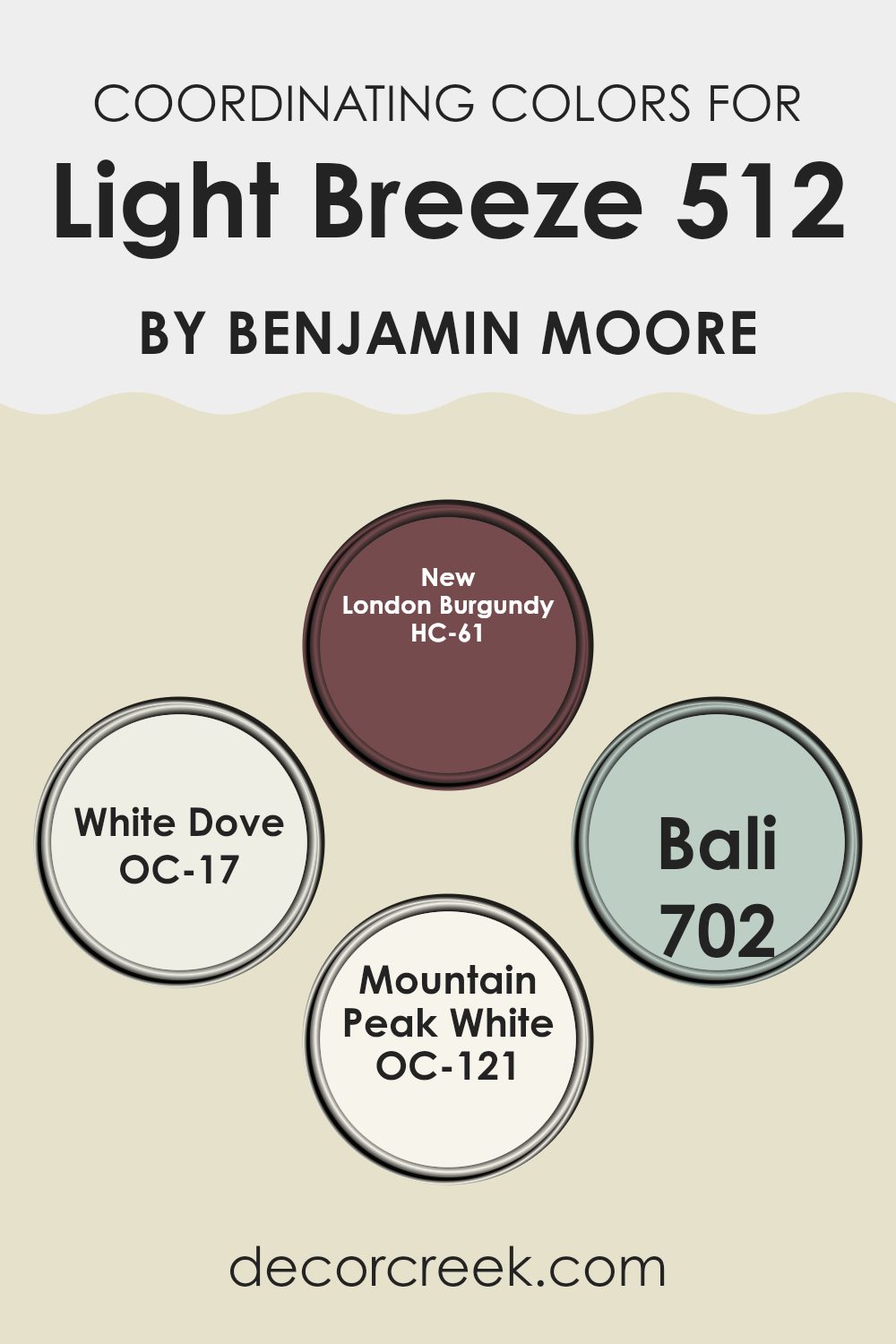
Coordinating Colors of Light Breeze 512 by Benjamin Moore
Coordinating colors are colors that complement each other well when used together, creating a visually pleasing effect. They are chosen to enhance the main color and add depth to a room. For example, when using Light Breeze by Benjamin Moore, coordinating colors like New London Burgundy, White Dove, Bali, and Mountain Peak White can help create a more complete and harmonized look. These colors each bring their unique qualities, working together with Light Breeze to achieve a beautiful balance.
New London Burgundy is a deep, rich red that brings a sense of warmth and elegance. It can provide a striking contrast to lighter colors. White Dove is a soft, creamy white that can offer a gentle backdrop, bringing out the best in the accent colors while providing a calm atmosphere. Bali is a muted blue with a hint of gray, adding a touch of cool serenity that works well with both warm and neutral tones.
Mountain Peak White is a bright, clean white that keeps an area feeling fresh and open, perfect for adding a sense of airiness without overpowering the palette. These colors, when chosen thoughtfully, complement Light Breeze, creating an area that is well-balanced and harmonious.
You can see recommended paint colors below:
- HC-61 New London Burgundy
- OC-17 White Dove
- 702 Bali
- OC-121 Mountain Peak White
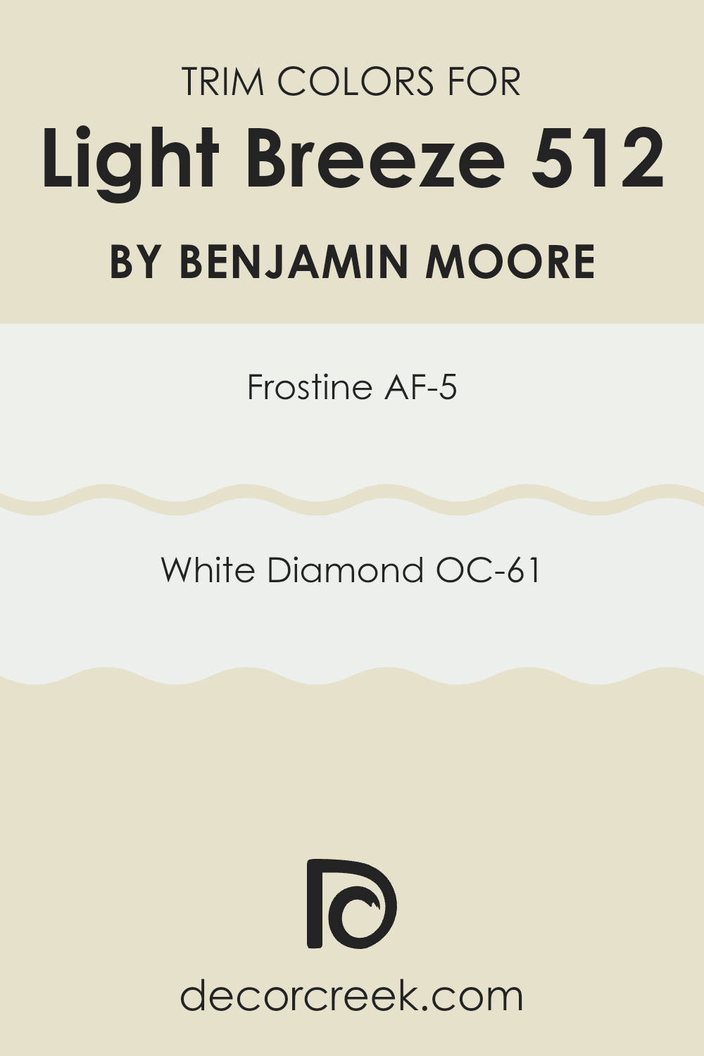
What are the Trim colors of Light Breeze 512 by Benjamin Moore?
Trim colors are the shades used on the edges of walls, windows, doors, and other architectural features. They help create contrast and definition in a room, enhancing the look and feel of the area. When paired with a soft wall color like Light Breeze by Benjamin Moore, trim colors can either subtly blend in or stand out to make architectural details pop.
Choosing the right trim color is essential because it frames your room, giving it a finished and cohesive look. With Light Breeze, which is a calming and airy hue, selecting the right trim color can enhance its presence without overpowering the room.
AF-5 Frostine and OC-61 White Diamond are excellent trim colors that complement Light Breeze beautifully. Frostine is a cool, pale blue-white that adds a touch of freshness and a subtle cooling effect, making it perfect for creating a relaxed and open feel. On the other hand, White Diamond offers a crisp, clean white that has a hint of warmth, allowing it to blend effortlessly while still maintaining a bright and welcoming atmosphere. Both colors have their charm, providing a perfect setting to highlight and enhance the light, gentle qualities of Light Breeze.
You can see recommended paint colors below:
- AF-5 Frostine
- OC-61 White Diamond
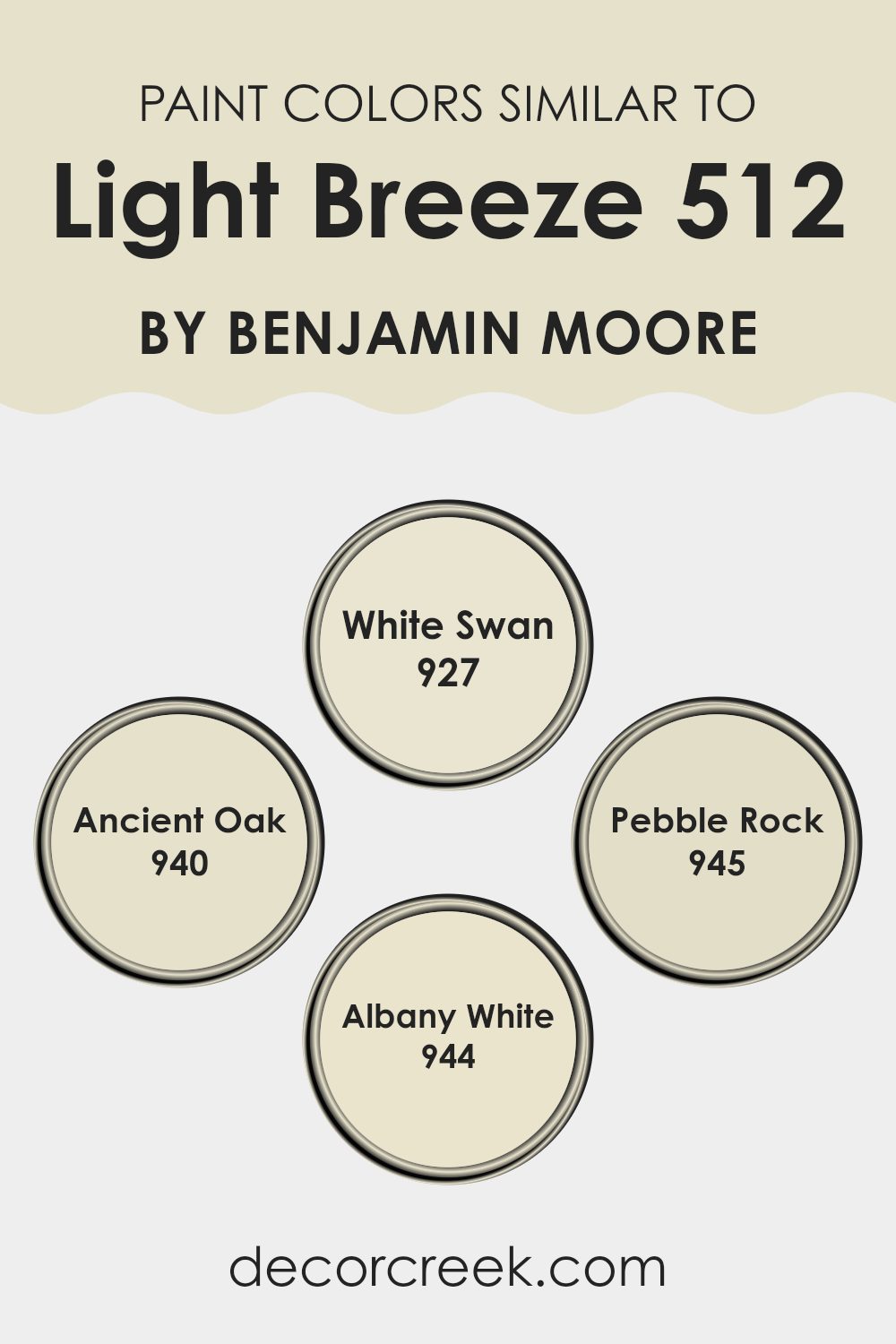
Colors Similar to Light Breeze 512 by Benjamin Moore
Similar colors are important in design because they help create a harmonious and cohesive look. When colors are close on the color wheel, they blend well together and create a soothing environment. This is particularly effective in homes where a calm and comfortable atmosphere is desired.
Using shades that are slightly different but share the same underlying tones can make areas feel connected and balanced. For instance, when you bring in colors like White Swan, Ancient Oak, Pebble Rock, and Albany White alongside Light Breeze, you establish a seamless transition from one area to another, enhancing the overall aesthetic.
Each similar color has its unique charm. White Swan is a soft, warm white that provides a gentle and subtle backdrop, perfect for adding lightness to any area. Ancient Oak offers an earthy, muted tone that adds warmth and depth without being overpowering. Pebble Rock introduces a more grounded, neutral shade that’s adaptable and can complement many styles.
Finally, Albany White is a pale neutral with a slight hint of color, adding just enough interest to be noticeable yet subtle enough to blend beautifully. These colors, working together or individually, create rooms that feel both inviting and pleasing to the eye.
You can see recommended paint colors below:
- 927 White Swan
- 940 Ancient Oak
- 945 Pebble Rock
- 944 Albany White
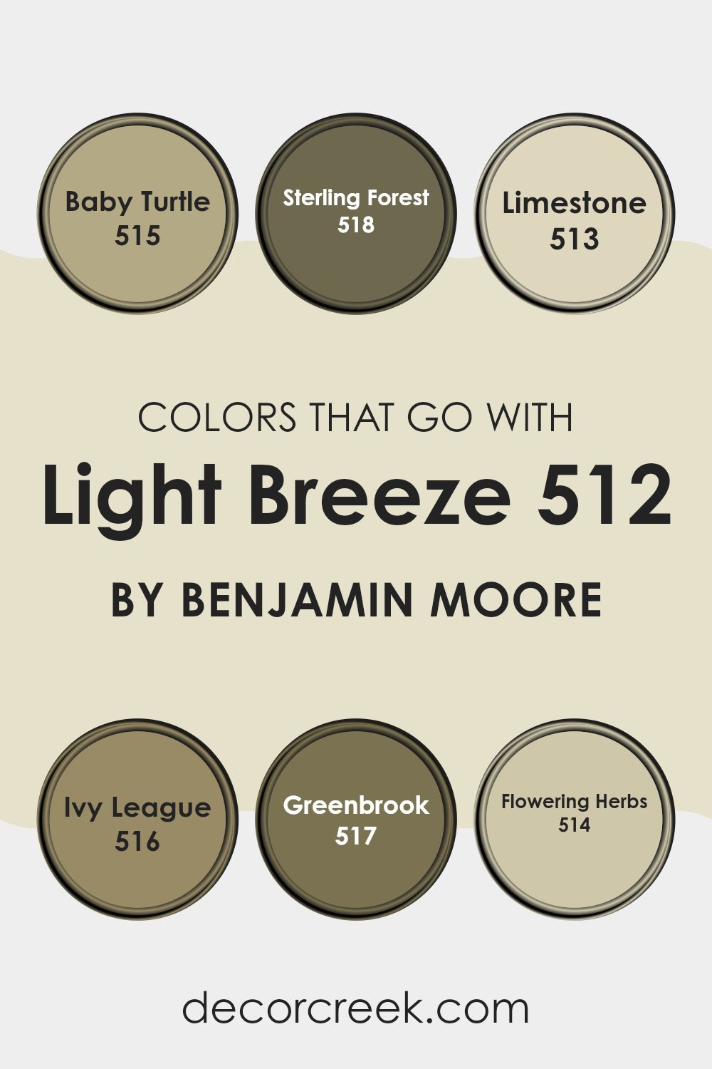
Colors that Go With Light Breeze 512 by Benjamin Moore
Choosing the right colors to pair with Light Breeze 512 by Benjamin Moore is important because it creates a harmonious and inviting area. Light Breeze 512 is a soft, fresh shade that works well as a calming backdrop. Pairing it with colors like Baby Turtle 515, a gentle shade of green that evokes nature, adds warmth and a touch of earthiness.
Sterling Forest 518, with its muted, deep green tone, provides a lovely contrast, grounding the lightness of Light Breeze. Limestone 513, a soft and neutral grey-green, offers a subtle, refined touch that complements Light Breeze without overpowering it.
Ivy League 516, a rich, dark green, adds depth and a touch of classic charm, making it a good partner for the light and airy Light Breeze. Greenbrook 517, a mid-tone green, brings a fresh, lively energy that pairs seamlessly with Light Breeze, enhancing its brightness. Finally, Flowering Herbs 514 introduces a hint of natural vibrancy with its fresh, herbal green shade, creating an uplifting atmosphere.
Together, these colors create a balanced palette, bringing nature indoors and making any room feel welcoming and cohesive, whether used in living rooms, bedrooms, or kitchens. They help highlight the qualities of Light Breeze while adding personality and interest to the overall design.
You can see recommended paint colors below:
- 515 Baby Turtle
- 518 Sterling Forest
- 513 Limestone
- 516 Ivy League
- 517 Greenbrook
- 514 Flowering Herbs
How to Use Light Breeze 512 by Benjamin Moore In Your Home?
Light Breeze 512 by Benjamin Moore is a gentle and soothing paint color that can bring a sense of calm to your home. This soft shade of blue-green is ideal for creating a relaxing atmosphere. You can use it in various areas of your home to evoke a calm and airy feel.
In the bedroom, Light Breeze can help create a peaceful environment, perfect for unwinding after a long day. Pair it with white or light gray bedding for a fresh and clean look. In the bathroom, it can mimic the calming essence of a spa, especially when accented with natural wood tones or soft towels.
Light Breeze also works well in common areas like living rooms or kitchens. It complements neutral furniture and can be the perfect backdrop for more vibrant art or decorations. Overall, Light Breeze 512 is adaptable and brings a touch of calm to any room in your home.
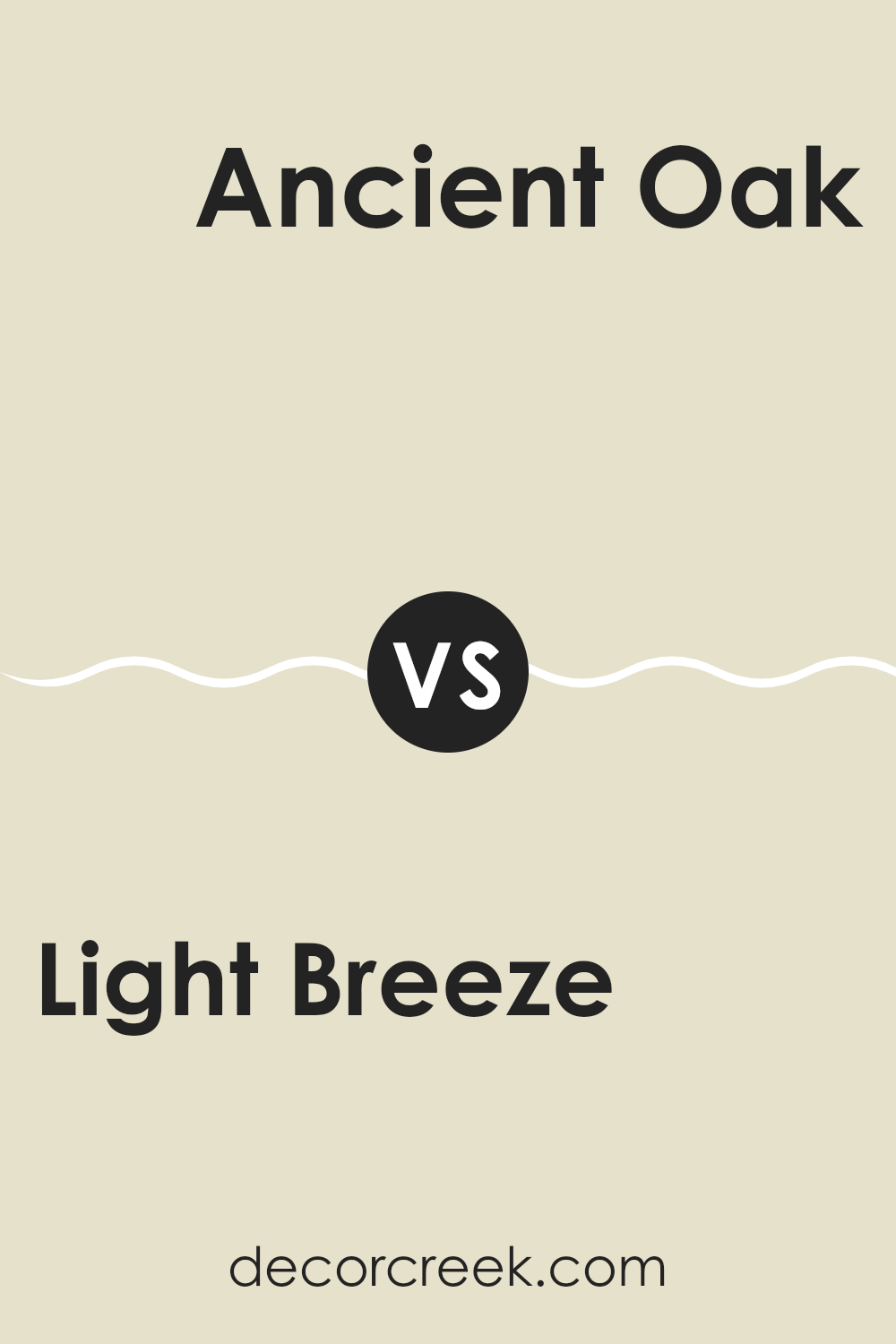
Light Breeze 512 by Benjamin Moore vs Ancient Oak 940 by Benjamin Moore
Light Breeze 512 by Benjamin Moore is a gentle, airy color with a soft blue hue that gives areas a fresh, refreshing feel. It’s a great choice to create a light atmosphere that feels open and clean. On the other hand, Ancient Oak 940 is a warm, muted beige with subtle gray undertones, offering a more grounded and cozy feel. This color can make a room feel more intimate and comfortable.
When compared, Light Breeze is cooler and more refreshing, whereas Ancient Oak is warmer and more soothing. Light Breeze works well in areas where you want to create the illusion of room and light, like bathrooms or kitchens.
Ancient Oak, with its earthy undertones, is ideal for living rooms or bedrooms where you want a more relaxed and inviting atmosphere. Both colors provide different moods, making them unique choices for different settings in a home.
You can see recommended paint color below:
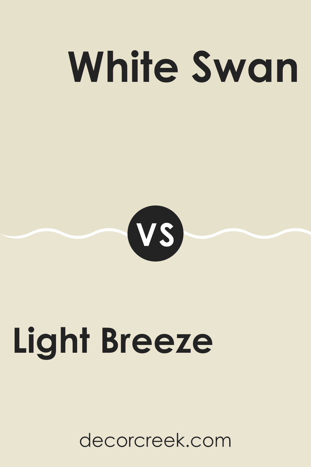
Light Breeze 512 by Benjamin Moore vs White Swan 927 by Benjamin Moore
Light Breeze 512 by Benjamin Moore is a gentle, soft blue-green shade that evokes a sense of calmness and freshness. It has an airy and light feel, making it perfect for creating a soothing atmosphere in any room. The color can remind you of a clear sky on a pleasant day.
In contrast, White Swan 927 by Benjamin Moore is a warm, creamy white that offers a touch of elegance. It is more neutral in tone, providing a clean and inviting backdrop that works well in various settings. White Swan’s warmth makes rooms feel cozy and welcoming.
When compared, Light Breeze is more vibrant and colorful, adding a bit of energy to a room, while White Swan maintains a more subtle presence. Together, these colors can complement each other beautifully; Light Breeze can be used to add accents or focus to an area, while White Swan provides a harmonious and neutral foundation.
You can see recommended paint color below:
Light Breeze 512 by Benjamin Moore vs Albany White 944 by Benjamin Moore
Light Breeze 512 by Benjamin Moore is a soft, airy hue with a hint of blue. It’s a refreshing and calming color, resembling the clear sky on a sunny day. This color works well in areas where you want to create a peaceful and open feeling, reflecting light beautifully and making rooms feel spacious.
On the other hand, Albany White 944 is more of a warm, neutral tone. It has subtle undertones of beige, giving it a cozy and inviting appearance. This color is adaptable, providing a comforting backdrop that complements a variety of other colors and styles. It’s an excellent choice for creating a warm and welcoming atmosphere in any room.
While Light Breeze brings a touch of cool freshness, Albany White introduces warmth and coziness. Choosing between the two depends on whether you want the area to feel open and breezy or warm and comforting. Both colors have their unique appeal and can suit different moods and settings.
You can see recommended paint color below:
- 944 Albany White
Light Breeze 512 by Benjamin Moore vs Pebble Rock 945 by Benjamin Moore
Light Breeze 512 by Benjamin Moore is a soft, airy blue with a refreshing and calming presence. It feels light and open, similar to a gentle sky. This color is perfect for creating a peaceful and relaxed atmosphere in any area. It can make a room feel larger and more open due to its cool and calm shade.
On the other hand, Pebble Rock 945 is a warm, earthy beige with hints of gray. This color brings a cozy and welcoming feel to a room, with its subtle yet sturdy presence. It has a grounding effect, providing a comfortable backdrop that works well with a variety of other colors and styles.
While Light Breeze is cool and refreshing, Pebble Rock is warm and comforting. Together, they offer a unique contrast – Light Breeze introduces an airy and light feel, while Pebble Rock adds warmth and stability. Both colors can be used to create different moods and atmospheres in a home.
You can see recommended paint color below:
- 945 Pebble Rock
When I think about the color 512 Light Breeze by Benjamin Moore, I imagine a soft and gentle blue. It’s like a clear sky on a perfect sunny day or the color of the ocean when it’s calm. This color makes me feel really relaxed and happy.
If I painted a room with 512 Light Breeze, I think it would make the room feel bigger and brighter. It’s a color that can make you feel good whether you’re playing in your room or doing homework. I think it would look great in a bedroom, a bathroom, or even a living room because it’s such a friendly color.
When I picture this color with others, like white, gray, or soft yellow, they all go together like peanut butter and jelly. It makes me think of nice things, like watching the clouds or lying on the grass on a warm day.
To sum it up, 512 Light Breeze is a really nice color that reminds me of happy, peaceful times. It could change a room from feeling a bit dull to feeling bright and cheerful. That’s why I think it’s such a wonderful color.
Ever wished paint sampling was as easy as sticking a sticker? Guess what? Now it is! Discover Samplize's unique Peel & Stick samples.
Get paint samples

