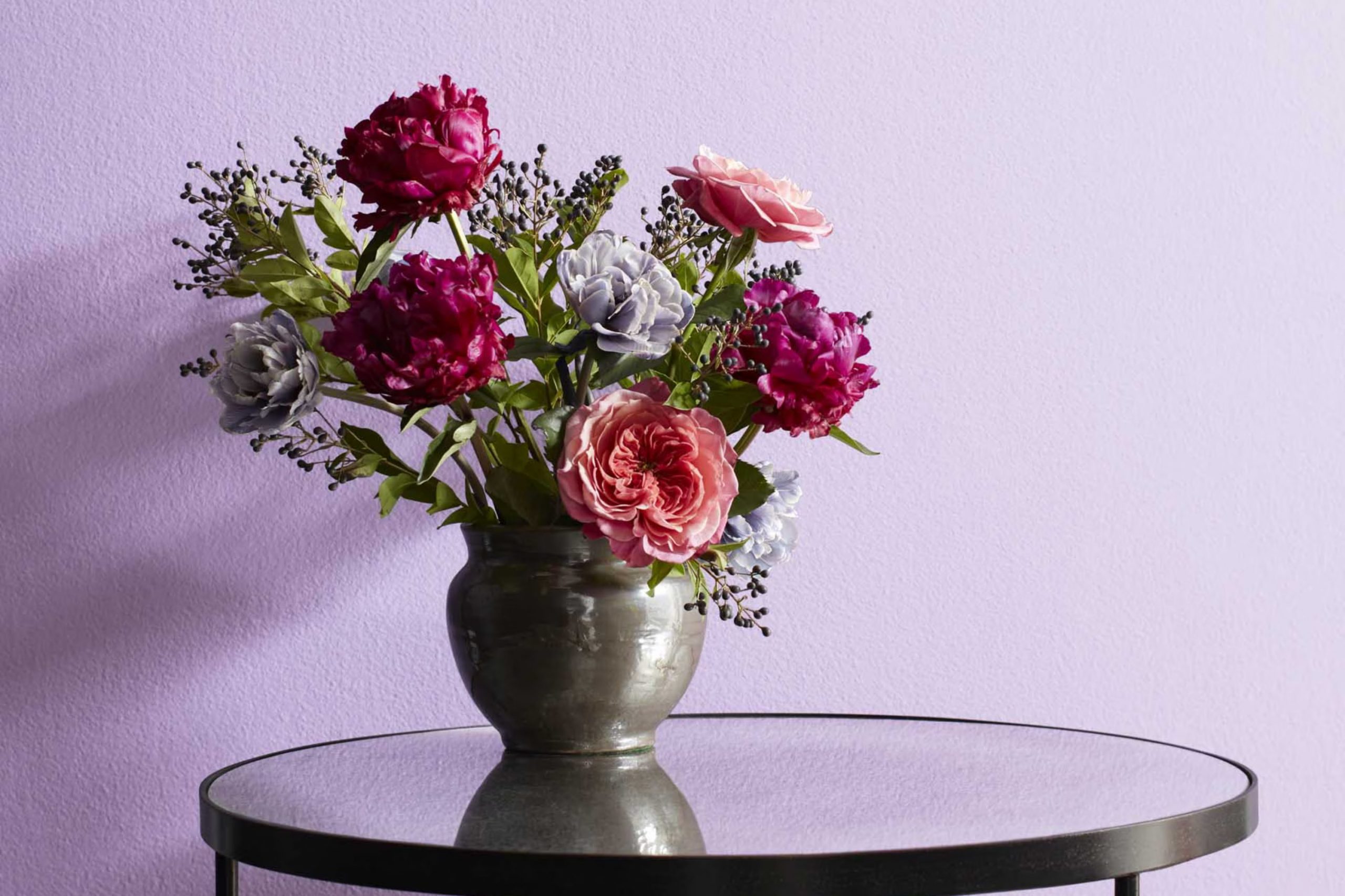
Have you ever stumbled upon a color so unique that it immediately caught your attention? That was my experience with 2071-60 Lily Lavender by Benjamin Moore. It’s not just any shade; it communicates a subtle, soothing presence that’s both refreshing and lively. As I observed it closely, the color seemed to gently fill the room with a vibe that’s hard to pinpoint but incredibly pleasant.
You might wonder about using a color like Lily Lavender in your own rooms. Well, it’s surprisingly adaptable. Whether you’re looking to paint an entire room, a single accent wall, or maybe just some furniture pieces, this shade has a unique way of tying various elements together.
In the following paragraphs, I’ll share more on why this particular hue can be a smart choice for your decorating projects and how it might uplift your environment in a way that’s both subtle and profound.
What Color Is Lily Lavender 2071-60 by Benjamin Moore?
Lily Lavender by Benjamin Moore is a charming light purple shade that has a whimsical yet subtle feel. This color is soft enough to add a gentle pop of color to a room without overpowering the room. With its soothing properties, it can create a relaxing atmosphere, perfect for places like bedrooms, bathrooms, or even a quiet reading corner.
This shade fits wonderfully into interior styles that lean towards modern contemporary and Scandinavian, thanks to its clean and airy vibe. It’s also an excellent choice for a nursery or a child’s room because of its playful yet soft presence.
Lily Lavender pairs well with a variety of materials and textures. For a modern look, you can pair it with smooth white marbles, silvers, and glass accents that reflect light and enhance the lavender’s brightness. For a cozier approach, match it with natural wood textures which bring warmth to the coolness of the lavender, or plush fabrics like velvet or cotton in neutral shades to create a comforting and inviting environment.
Adding metal accents, particularly in brushed nickel or chrome, can enhance Lily Lavender’s contemporary appeal, while simple geometric patterns in textiles can maintain the modern aesthetic.
Is Lily Lavender 2071-60 by Benjamin Moore Warm or Cool color?
Lily Lavender 2071-60 by Benjamin Moore is a beautiful, soft purple shade that brings a fresh and gentle touch to any room. This color is perfect for rooms where you want to add a hint of playfulness without overpowering the senses.
Its light and airy vibe can make small rooms appear larger and more open. It pairs well with whites and grays, which help to keep the overall look clean and balanced. In a bedroom, Lily Lavender can create a cozy, relaxing atmosphere, while in a living room it can add a splash of gentle energy that’s very welcoming.
This color is adaptable enough to be used not only on walls but also for accents like doors or furniture, providing a subtle yet effective change in any home setting. It’s particularly effective for anyone looking to freshen up their room with something light and pleasant.
Undertones of Lily Lavender 2071-60 by Benjamin Moore
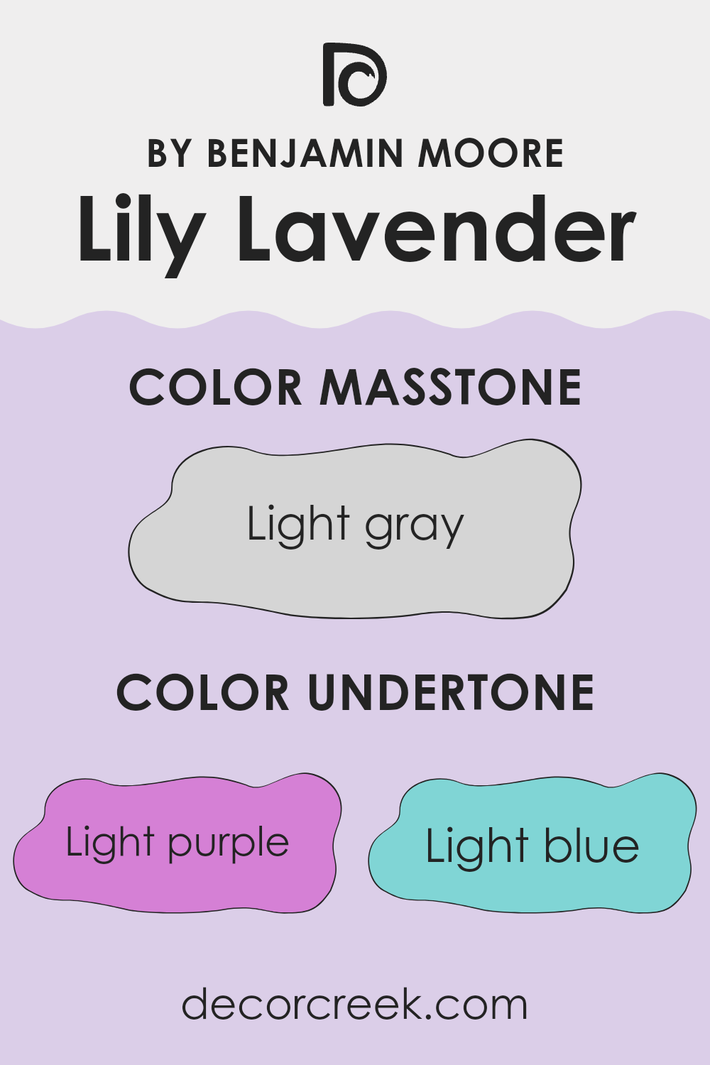
Lily Lavender2071-60 by Benjamin Moore is a unique and adaptable paint color with a complex mix of undertones that can subtly alter its appearance depending on the lighting and surroundings. This color has undertones of light purple, light blue, pale yellow, lilac, pale pink, mint, and grey. Each undertone plays a significant role in how the color is perceived.
Undertones are the subtle colors that lie beneath the surface of the paint. They can enhance or modify the main hue, affecting the overall look of the color in different environments. For instance, light purple and lilac undertones add a soft, floral feel to Lily Lavender, making it seem more gentle and inviting.
Light blue and mint bring in a freshness that can make a room feel more airy and open. Pale yellow can add a subtle warmth to the walls, while pale pink provides a touch of softness. The grey undertone helps to balance and ground the color, preventing it from feeling too vibrant or too intense.
When used on interior walls, Lily Lavender2071-60 can create a variety of effects. In rooms with ample sunlight, the lighter undertones like blue, yellow, and mint may become more prominent, making the room feel bright and cheerful.
In rooms with less natural light, the grey and lilac might stand out more, giving the room a cozy and calm atmosphere. This adaptability makes Lily Lavender an excellent choice for many different rooms and styles, as it subtly shifts and adjusts to its surroundings. Its subtle undertones can harmonize with various decors, offering flexibility and a beautiful backdrop to any interior design.
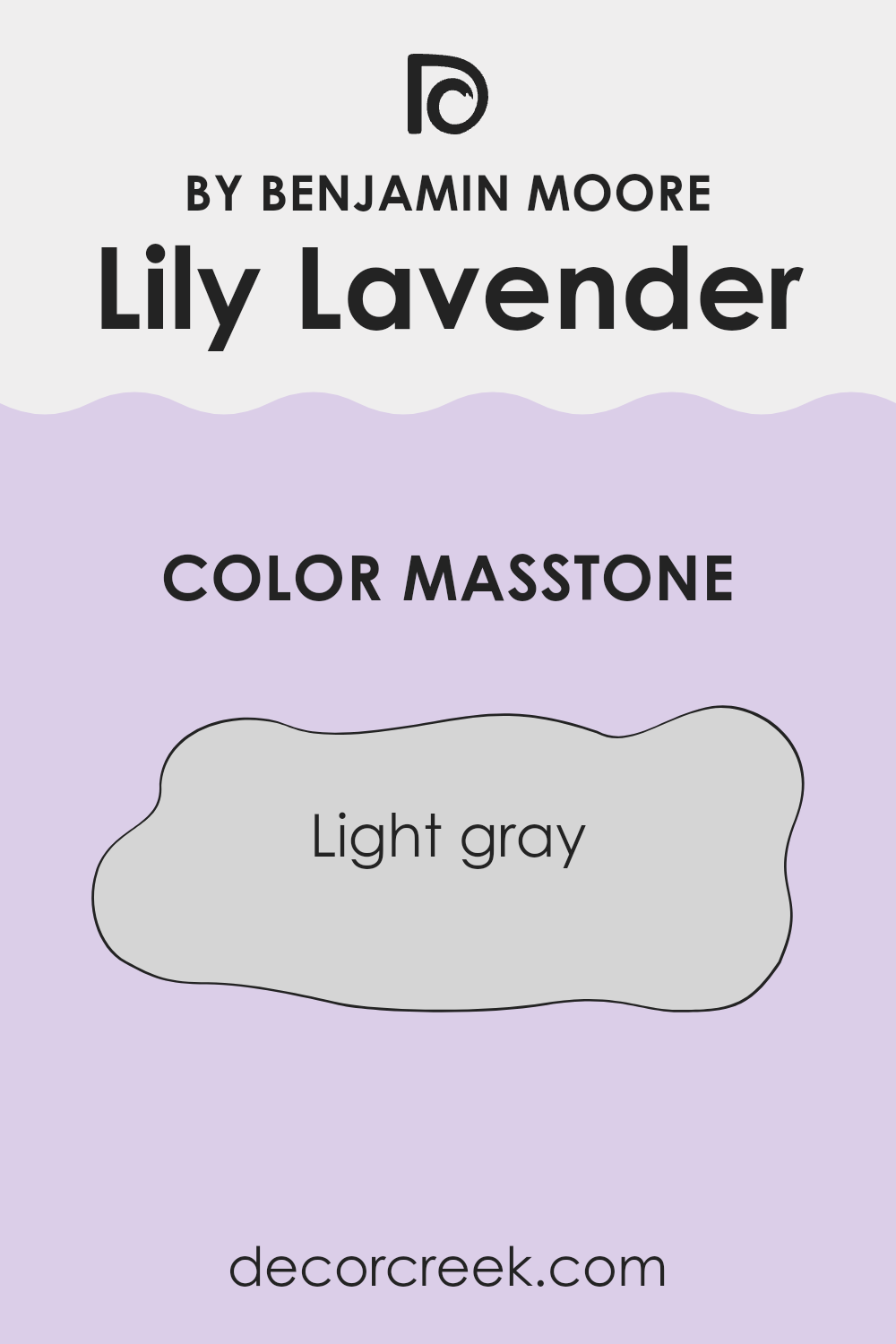
What is the Masstone of the Lily Lavender 2071-60 by Benjamin Moore?
Lily Lavender 2071-60 by Benjamin Moore has a masstone of light gray, which is clean and modern. The subtle shade (#D5D5D5) makes it adaptable for almost any room in a home.
Its neutral tone helps it blend well with various decor styles, from traditional to contemporary, letting it serve as a background color that can help bolder elements in the room stand out or create a calming and spacious feeling. This light gray can soften brighter hues or enhance muted colors, providing balance without making the room feel cluttered.
In homes, this shade can be particularly useful for creating a light and airy atmosphere, helping small rooms appear larger. It’s excellent for living rooms or bedrooms where you want a peaceful setting. Sunlight enhances the gray, keeping the room lively during the day, while at night, artificial light makes the color warm and welcoming. This makes it a practical choice both aesthetically and functionally.
How Does Lighting Affect Lily Lavender 2071-60 by Benjamin Moore?
Lighting plays a crucial role in how we perceive colors. Depending on the type of light—natural or artificial—the same color can look quite different. For “Lily Lavender” by Benjamin Moore, its appearance varies significantly under various lighting conditions.
Under artificial lighting, Lily Lavender tends to look richer and more vibrant because many artificial lights, particularly warmer bulbs, can enhance the purple hues, making them appear deeper. In contrast, under natural sunlight, Lily Lavender might look lighter and more subtle. This variance occurs because natural light, which is a fuller spectrum light source, reveals more of the true color.
The appearance of Lily Lavender also changes depending on the direction your room faces:
- North-Faced Rooms: These rooms usually receive cooler, indirect light, which can make Lily Lavender appear slightly muted and cooler. The subtle blue tones in the lavender might become more pronounced, giving off a calm and gentle feel.
- South-Faced Rooms: With more direct sunlight, south-facing rooms can make Lily Lavender look much brighter and more vivid. The warmer and stronger light enhances the brightness of the color, which can make the room feel lively and vibrant.
- East-Faced Rooms: In the morning, east-facing rooms get a lot of sunlight, which can make Lily Lavender look very bright and cheerful. As the day progresses and the sunlight diminishes, the color may appear softer and more subdued.
- West-Faced Rooms: West-facing rooms get the evening sunlight, which means the color can look very different throughout the day. In the softer morning light, the color can appear muted, while the intense evening light can brighten it up considerably, making it appear bold and dynamic towards the end of the day.
Overall, Lily Lavender’s appearance is significantly influenced by the type and direction of light it is exposed to, affecting the mood and feel of a room.
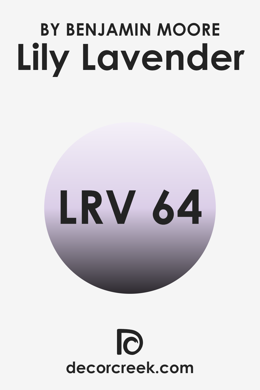
What is the LRV of Lily Lavender 2071-60 by Benjamin Moore?
LRV, or Light Reflectance Value, is a measure used to describe the percentage of light a paint color reflects when it’s on your walls. It ranges from a theoretical 0 for pure black, which absorbs all light, to a theoretical 100 for pure white, which reflects all light.
This value helps you understand how light or dark a color will look in a given room and can greatly affect the mood and visual spaciousness of a room. A higher LRV means the color reflects more light, making a room feel more open and brighter, while a low LRV means the color absorbs more light, creating a cozier and potentially more cramped feeling.
With an LRV of 64.33, the color Lily Lavender is somewhat light-reflective. It reflects a decent amount of light, but it’s not as bright as colors closer to white. This LRV suggests that the color is adaptable for various lighting conditions, helping rooms appear neither too dark nor too bright. In rooms with lower amounts of natural light, Lily Lavender can help to make the room feel airier than it actually is, as it doesn’t absorb too much light.
Conversely, in very well-lit environments, this color will maintain its subtle vibrancy without becoming too glaring, making it a good choice for balancing aesthetics and functionality in most homes.
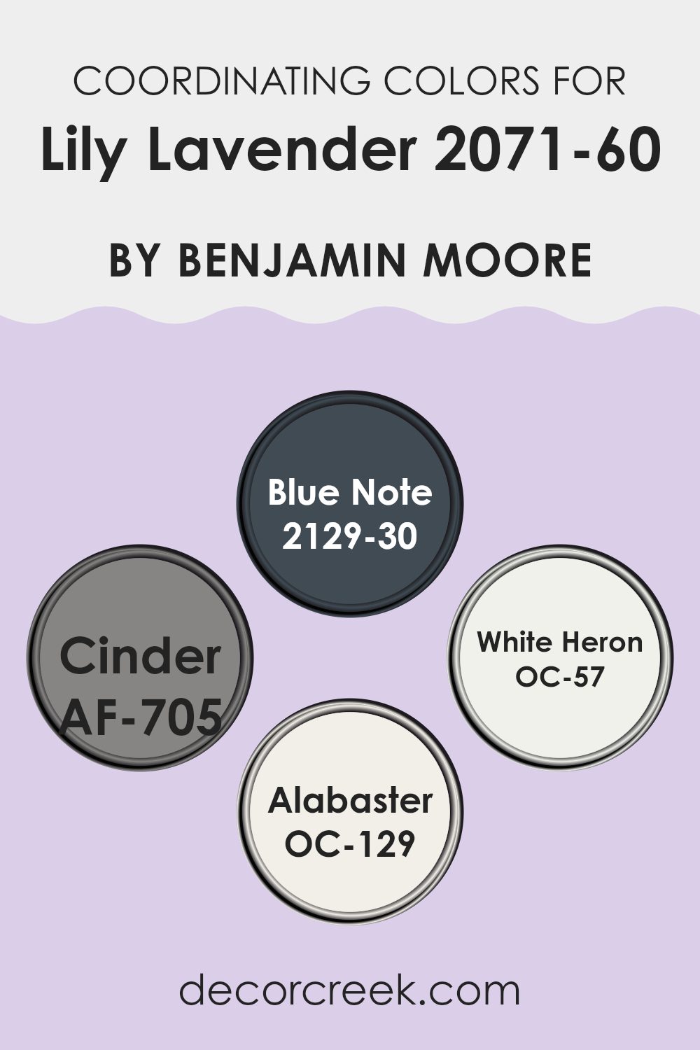
Coordinating Colors of Lily Lavender 2071-60 by Benjamin Moore
Coordinating colors are specific shades that complement a primary color to create a harmonious look in a room. When you choose a color like Lily Lavender by Benjamin Moore, it’s essential to pair it with coordinating colors that enhance each other without overpowering the main hue. These coordinating colors work together to achieve a balanced and visually appealing design. By selecting such colors strategically, they ensure that the overall design feels cohesive and thoughtfully curated.
For Lily Lavender, one of the coordinating colors is Blue Note, a deep and vibrant shade that adds a striking contrast to the softness of lavender, giving a room a more dynamic feel. Another coordinating color is Cinder, a subtle grey that provides a neutral backdrop, making it easier for the lavender to stand out.
White Heron offers a crisp, clean look that can make the lavender appear more vibrant and is excellent for trim or ceiling to give a fresh finish. Lastly, Alabaster is a warm, creamy white that creates a gentle transition between vibrant or dark tones and the calming Lily Lavender, perfect for creating a soft, cohesive room. These colors together ensure that each room has depth and character while remaining harmoniously tied to the main shade.
You can see recommended paint colors below:
- 2129-30 Blue Note
- AF-705 Cinder
- OC-57 White Heron
- OC-129 Alabaster
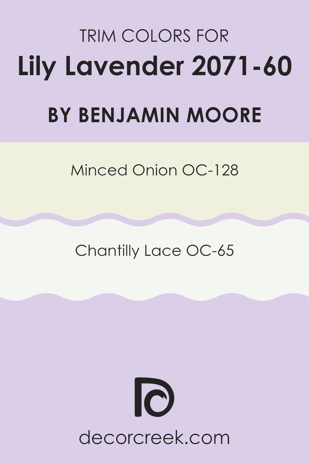
What are the Trim colors of Lily Lavender 2071-60 by Benjamin Moore?
Trim colors are selected to complement or subtly contrast with main wall colors in a room, enhancing architectural details and framing features such as windows, doors, and crown moldings. When paired with a vibrant color like Lily Lavender by Benjamin Moore, choosing the right trim color is crucial to properly highlight the walls and create a harmonious balance. Trim colors such as OC-128 Minced Onion and OC-65 Chantilly Lace by Benjamin Moore work well by either softening or enriching the overall appearance.
Minced Onion is a gentle gray that provides a subtle contrast, making it a great choice for trim when used with a lighter main color like Lily Lavender. It’s an adaptable choice that doesn’t overpower but instead forms a clean and appealing border around the room.
On the other hand, Chantilly Lace is a bright, crisp white that offers a more striking outline against a richer wall color, ensuring that the room feels bright and well-defined. This color can really make the purple tones of Lily Lavender stand out, giving the room a fresh and lively feel.
You can see recommended paint colors below:
- OC-128 Minced Onion
- OC-65 Chantilly Lace
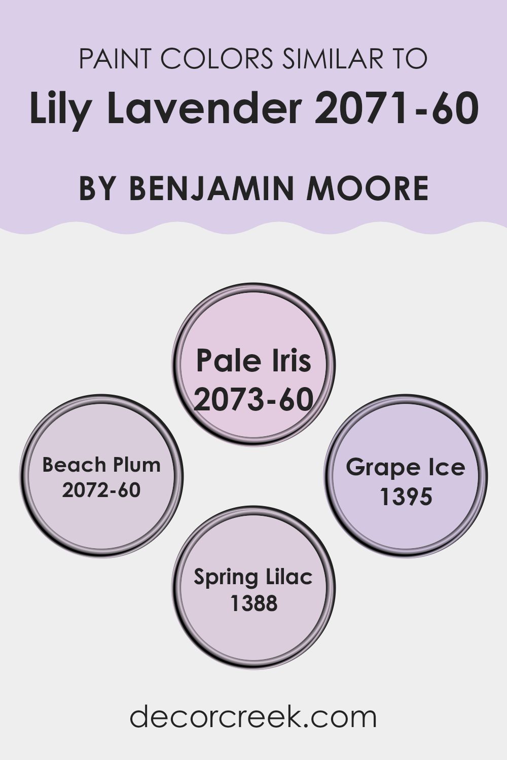
Colors Similar to Lily Lavender 2071-60 by Benjamin Moore
Similar colors are essential in design because they create a cohesive and harmonious look. Using colors that closely relate to each other, like shades and tints from the same color family, can give a room or a design project a subtle variety while maintaining a unified appearance.
This aesthetic technique allows for a fluid transition between different elements in a room, ensuring that no single element starkly stands out, which can be important in settings where a gentle, unified aesthetic is desired. For example, when decorating a bedroom, choosing colors that are similar can help achieve a calm and consistent look that enhances the overall ambiance without overpowering the senses.
Colors such as Pale Iris, Beach Plum, Grape Ice, and Spring Lilac are great examples of hues that harmonize well with Lily Lavender. Pale Iris offers a gentle touch of color with its soft, understated violet tone, making it excellent for rooms that require a light but colorful presence. Beach Plum provides a slightly richer hue that leans towards a playful yet muted purple, ideal for adding a hint of depth to a design while keeping the look light and airy.
Grape Ice steps in with a cooler undertone, suitable for those looking to introduce a fresh and soothing element into their area. Lastly, Spring Lilac, with its vibrant yet soft lavender shade, balances the line between lively and subtle, perfect for creating a lively yet soothing environment. These colors work together to enhance each other, ensuring the room feels thoughtfully put together without any harsh contrasts.
You can see recommended paint colors below:
- 2073-60 Pale Iris
- 2072-60 Beach Plum
- 1395 Grape Ice
- 1388 Spring Lilac
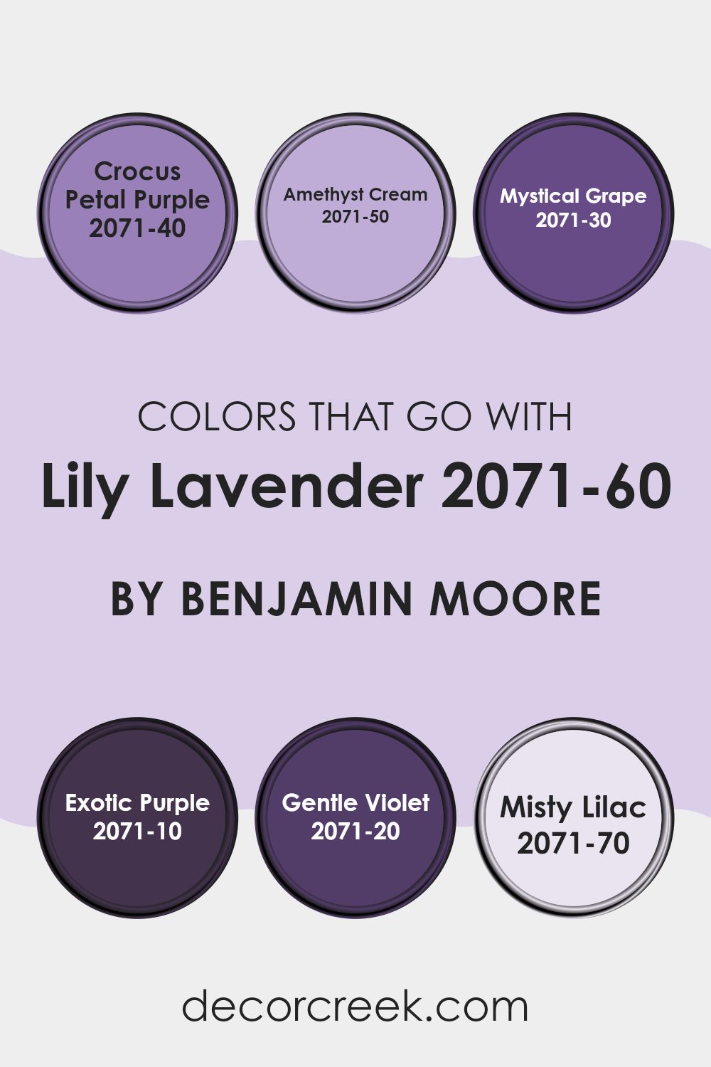
Colors that Go With Lily Lavender 2071-60 by Benjamin Moore
Choosing the right colors to complement Lily Lavender 2071-60 by Benjamin Moore is important because it helps create a harmonious and visually appealing room. Colors like Crocus Petal Purple, Amethyst Cream, and the others in this scheme work together to enhance the beauty of Lily Lavender by offering a blend of both contrast and coherence, making your decorating efforts more effective.
Crocus Petal Purple is a deeper, more vivid shade that provides a strong contrast to the softness of Lily Lavender, making the lighter lavender stand out when used in accents or features. Amethyst Cream is a gentle hue, slightly lighter and with a smooth feel, which can help brighten a room while keeping the feel light and airy.
Mystical Grape adds a sense of depth and intensity, its rich tones can act as a focal point or anchor in a room. Exotic Purple is bold and dynamic, perfect for making a statement or adding a touch of drama. Gentle Violet, with its subdued and delicate feel, works wonderfully for creating a soothing and cohesive look. Finally, Misty Lilac is very close to Lily Lavender, providing a seamless look with just enough differentiation to add interest without overpowering the senses. Together, these colors allow for flexibility and creativity in decorating, offering multiple ways to achieve a desired mood or style in your room.
You can see recommended paint colors below:
- 2071-40 Crocus Petal Purple
- 2071-50 Amethyst Cream
- 2071-30 Mystical Grape
- 2071-10 Exotic Purple
- 2071-20 Gentle Violet
- 2071-70 Misty Lilac
How to Use Lily Lavender 2071-60 by Benjamin Moore In Your Home?
Lily Lavender 2071-60 by Benjamin Moore is a gentle and soothing shade of purple, perfect for adding a touch of calmness to your home. This color is ideal for bedrooms and bathrooms where you want a soft, calming atmosphere. It pairs well with light woods and white trim, giving a fresh and clean look. You can also use it in a nursery, providing a cozy and nurturing environment for your baby.
In a living room, Lily Lavender can create a welcoming room when used on an accent wall. This shade works beautifully with grays, creams, and soft blues, making it quite adaptable for various decorating styles. If you’re looking to refresh your kitchen, consider painting the walls with this color; it can make the room feel open and airy.
Additionally, Lily Lavender works well in smaller rooms like a hallway or closet, giving these areas a burst of color without overpowering them. Whether you prefer modern or traditional styles, this color can be a fantastic choice for adding a personal touch to your home. It’s easy on the eyes and blends well with many accessories and furniture pieces.
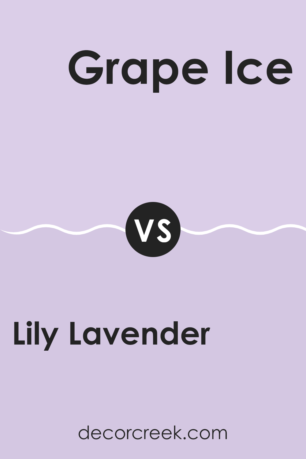
Lily Lavender 2071-60 by Benjamin Moore vs Grape Ice 1395 by Benjamin Moore
Lily Lavender and Grape Ice, both by Benjamin Moore, offer unique takes on the purple color palette. Lily Lavender is a soft, very light purple with a gentle and subtle presence, making it perfect for creating a calm and inviting room. It reflects more light, leading to an airy feel which suits small rooms or areas without much natural light.
Grape Ice, on the other hand, is a vibrant, deeper purple with a more pronounced look. This color stands out more and can add a hint of cheerfulness and energy to a room. It’s ideal for accent walls or for adding a pop of color in a neutral setting.
Both colors have their merits depending on what you’re hoping to achieve in a room. Lily Lavender works well for a soothing backdrop, while Grape Ice is better for making a lively statement.
You can see recommended paint color below:
- 1395 Grape Ice
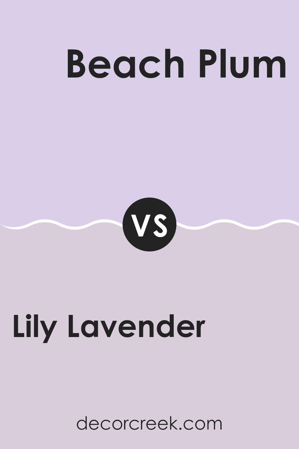
Lily Lavender 2071-60 by Benjamin Moore vs Beach Plum 2072-60 by Benjamin Moore
Lily Lavender and Beach Plum, both by Benjamin Moore, are subtle yet distinct shades. Lily Lavender has a gentle, soft purple hue that creates a light and airy feeling, perfect for making small rooms seem larger or adding a touch of calmness to a busy area.
On the other hand, Beach Plum is slightly deeper, with a hint of rosiness that adds warmth. While both colors are relatively muted, Beach Plum’s richer undertone provides a cozy vibe, making it ideal for rooms where you want to add a bit of color without overpowering the senses.
Both paints have their place in home decor, depending on what mood you’re aiming to achieve. Lily Lavender works well in a nursery or as an accent in a more neutral palette, whereas Beach Plum could be a great choice for a welcoming entryway or an intimate dining area.
You can see recommended paint color below:
- 2072-60 Beach Plum
Lily Lavender 2071-60 by Benjamin Moore vs Pale Iris 2073-60 by Benjamin Moore
Lily Lavender and Pale Iris, both by Benjamin Moore, are unique shades of purple that lend a gentle touch of color to any room. Lily Lavender is a soft, muted lavender with a slightly warmer tone. It brings a cozy, comforting vibe to rooms, perfect for creating a relaxing atmosphere.
On the other hand, Pale Iris leans towards a cooler, more understated version of lavender. It has subtle blue undertones that give it a fresher, crisper feel. This color is excellent for rooms where you want to achieve a calm and inviting look without warmth.
Both colors are light and airy, suitable for small rooms to make them appear larger or for brightening up a dark room. Whether you choose Lily Lavender for its cozy warmth or Pale Iris for its fresh coolness, each shade offers a gentle hint of color that’s easy on the eyes and adaptable in its appeal.
You can see recommended paint color below:
- 2073-60 Pale Iris
Lily Lavender 2071-60 by Benjamin Moore vs Spring Lilac 1388 by Benjamin Moore
Lily Lavender and Spring Lilac are two distinct shades by Benjamin Moore, each with their own unique feel. Lily Lavender is a soft, muted purple with hints of gray, creating a gentle and calming effect.
It’s light and airy, making it an excellent choice for anyone looking to give a subtle touch of color to a room without overpowering it. This color works well in small rooms or rooms that get a lot of natural light, as it can help the area feel larger and more open.
On the other hand, Spring Lilac is a deeper, more vibrant purple. It has a cheerful vibe and is bolder compared to Lily Lavender. This makes Spring Lilac a great pick for rooms where you want to make a statement or add a splash of energy. Due to its richer hue, Spring Lilac can make large rooms feel more inviting and is perfect for a feature wall or accent area. Each color offers its own charm, depending on the effect you want in your room.
You can see recommended paint color below:
- 1388 Spring Lilac
After reading the review about 2071-60 Lily Lavender by Benjamin Moore, I’ve learned quite a bit about this particular paint color. It turns out that Lily Lavender is not just any purple; it has a soft and light quality that can make a room feel really pleasant and happy. It sounds perfect for someone who wants to give their room a splash of color without making it feel too crowded or busy.
People who have used this paint say it looks great in smaller rooms and can make places like bedrooms or bathrooms feel cozy. That’s good to know because sometimes picking the right paint can be tricky, and you don’t want your room to look too bold or too dull. Lily Lavender seems like a smart choice if you want something that’s both pretty and calming.
From what I’ve gathered, it’s also easy to match with different kinds of furniture and decorations, which is great because it means you won’t have to buy new stuff to go with the paint. Whether you like classic or modern styles, this paint can work well.
So, if you’re thinking about giving your room a new look, 2071-60 Lily Lavender by Benjamin Moore could be a lovely option to consider. It’s gentle, cheerful, and can make your room feel just right.
Ever wished paint sampling was as easy as sticking a sticker? Guess what? Now it is! Discover Samplize's unique Peel & Stick samples.
Get paint samples

