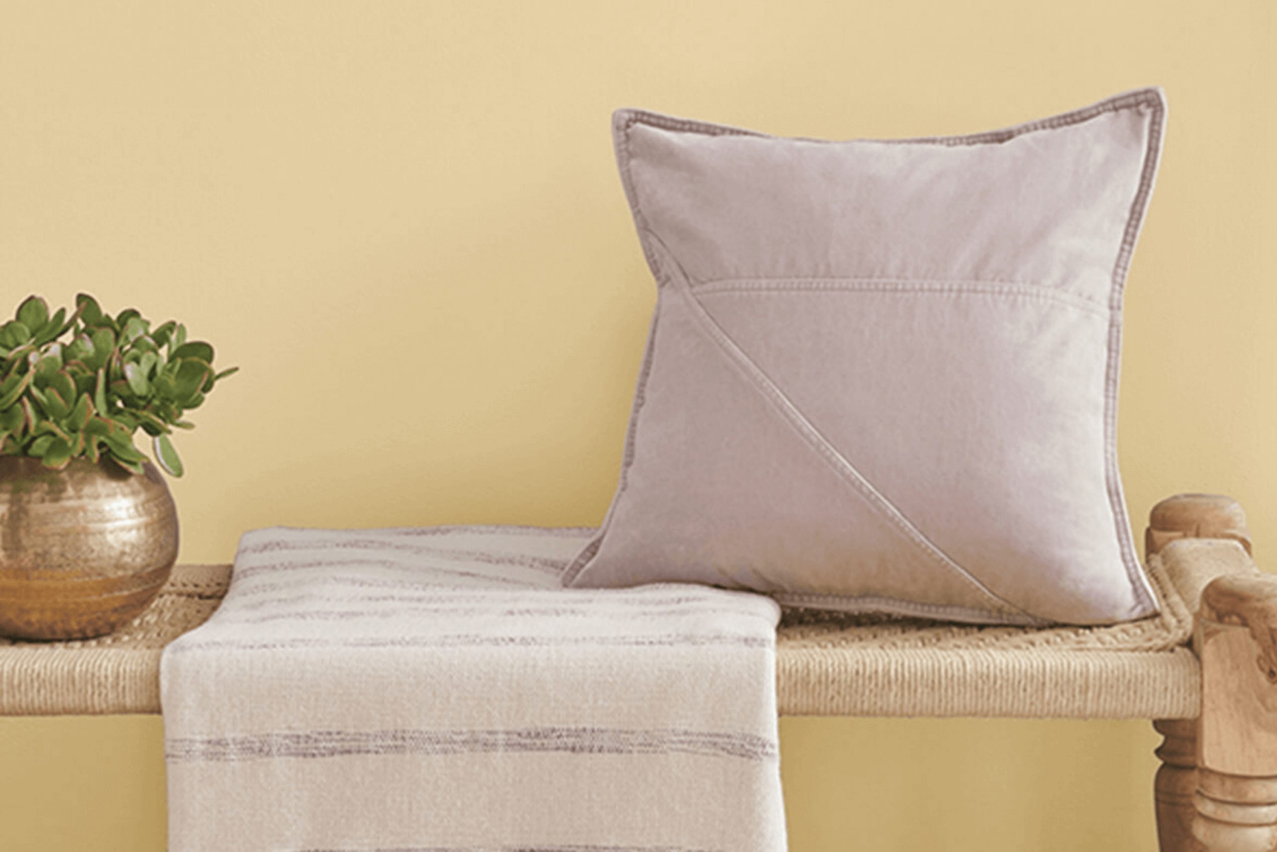
SW 6400 Lucent Yellow by Sherwin Williams is a color that immediately fills a room with warmth and positivity. Imagine the feeling of the first rays of sunlight streaming through your window on a lazy Sunday morning. That’s the kind of brightness and energy Lucent Yellow can bring to any room. It has a cheerful and lively presence that can uplift your mood every time you walk in.
When you choose Lucent Yellow, it feels like inviting a piece of sunshine into your home. This color is perfect for areas where you want to feel invigorated and inspired, like a kitchen or a creative workspace. The warmth of Lucent Yellow creates an inviting atmosphere, making it easy to relax and enjoy spending time in the room.
Pairing it with softer neutrals can balance that vivid energy, giving a sense of harmony while still allowing the yellow to stand out. Lucent Yellow also works wonderfully with natural wood tones, enhancing the cozy, welcoming vibe it naturally brings.
If you’re looking for a paint color to brighten your surroundings and your mood, Lucent Yellow offers that brilliant touch.
What Color Is Lucent Yellow SW 6400 by Sherwin Williams?
Lucent Yellow by Sherwin Williams is a warm, inviting shade that adds a cheerful touch to any room. It’s a lively yet soothing color that can brighten areas, making them feel more open and airy. Lucent Yellow is perfect for kitchens and living rooms, where an energetic atmosphere is desired. It also works beautifully in children’s rooms, providing a playful and happy vibe.
This color fits exceptionally well in interiors that aim for a farmhouse or rustic feel, as its sunny undertones complement wooden features and vintage elements. It pairs well with natural materials like light oak, maple wood, and bamboo. You can mix it with white or cream furniture and accents for a clean, crisp look that enhances the brightness of the yellow.
For a bolder style, combine it with contrasting colors like navy blue or deep gray. The contrast will make the yellow pop without overpowering the room. Textures such as soft cottons, woven baskets, and light linens harmonize well with Lucent Yellow. These materials keep the room feeling cozy and grounded.
Whether you’re looking to create a dynamic family area or a delightful personal retreat, this color can provide the warmth and energy that your home needs.
Is Lucent Yellow SW 6400 by Sherwin Williams Warm or Cool color?
Lucent Yellow by Sherwin Williams is a bright and cheerful color that can add warmth and energy to any home. This sunny hue brings a sense of optimism and positivity, making it perfect for areas that need a lift. When used on walls, Lucent Yellow can make rooms feel more open and welcoming, creating a lively atmosphere.
In kitchens and dining areas, this shade of yellow can stimulate appetite and conversation, adding a vibrant feel. In living rooms, it can pair well with neutral furniture to create a balanced and inviting room. For bedrooms or bathrooms, using Lucent Yellow in accents or with soft lighting can result in a cozy, warm environment.
This color works best in areas with plenty of natural light, which highlights its brightness. It pairs beautifully with earthy tones like greens and browns, creating a harmonious and inviting look. Lucent Yellow is a flexible choice for bringing warmth and joy to home interiors.
Undertones of Lucent Yellow SW 6400 by Sherwin Williams
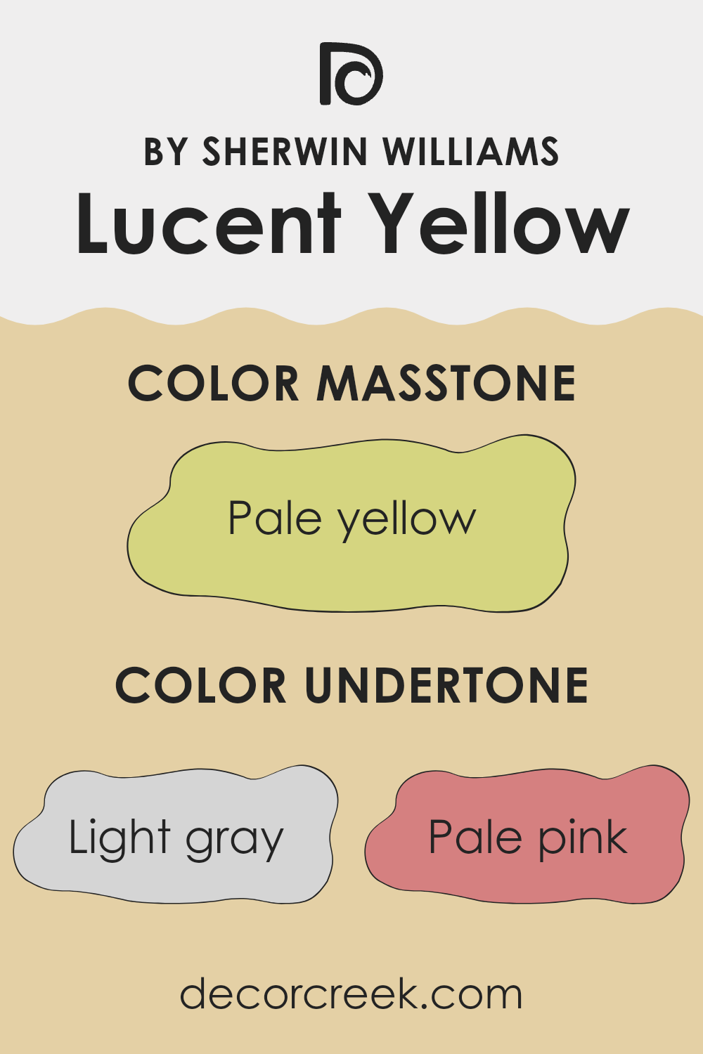
Lucent Yellow by Sherwin Williams is a vibrant color with complex undertones that give it depth and versatility. It carries hints of light gray, pale pink, light purple, mint, light blue, standard yellow, gray, lilac, orange, light green, and olive. These undertones affect how we perceive this yellow, making it more than just a simple bright color.
Light gray and gray undertones help soften the yellow, adding a subtle, calming effect. Similarly, the pale pink and light purple tones introduce warmth and a gentle touch to the shade, while the mint and light blue undertones bring in a refreshing and cool quality. These cooler undertones balance out the brightness, making the color more nuanced. Standard yellow keeps it vibrant and lively.
On interior walls, these undertones in Lucent Yellow can significantly affect the room’s atmosphere. The color might appear softer in natural light, highlighting its pink and light purple shades, while artificial light might bring out the mint and blue undertones, giving the room a cool and lively feeling. The combination of these undertones ensures that Lucent Yellow can change with different lighting and surroundings, offering a flexible option for many rooms.
What is the Masstone of the Lucent Yellow SW 6400 by Sherwin Williams?
Lucent Yellow (SW 6400) by Sherwin Williams is a pale yellow with a hex code of #D5D580. Its masstone, the color’s primary undertone, helps create a warm and inviting atmosphere in any room. This gentle yellow can make a room feel sunny and cheerful, enhancing the mood without overpowering it.
The color works beautifully in living rooms, kitchens, and bedrooms, offering a soft and welcoming backdrop that suits various styles and furnishings. Lucent Yellow is flexible, complementing both modern and traditional decor with ease.
When paired with whites or light neutrals, it adds a hint of brightness that energizes the room. With darker colors, it offers contrast that highlights furniture or artwork. This hue is perfect for increasing the warmth and positivity in homes, making rooms feel more spacious and lively. Whether used on walls or as an accent color, it adds a cozy touch to interiors.
How Does Lighting Affect Lucent Yellow SW 6400 by Sherwin Williams?
Lighting plays a big role in how we see colors. The same color can look different depending on the kind of light it’s in. This is important to consider when choosing a paint color like Lucent Yellow from Sherwin Williams.
In natural light, colors tend to look more true to what they are. However, natural light changes during the day, so a color might look different in the morning than it does in the afternoon. In artificial light, the type of bulb can affect color. For example, incandescent bulbs can make colors look warmer and more yellow, while fluorescent lights might make them look cooler or more blue.
Lucent Yellow is a sunny, cheerful shade. In a north-facing room, where the light is cooler, it might appear a bit muted or subdued. This is because north light is indirect and doesn’t bring out the vibrant qualities of warm colors as much. Still, Lucent Yellow can offer a pleasant contrast to the cooler light.
In a south-facing room, Lucent Yellow comes to life. These rooms get more direct daylight, which is warm, so the color will appear brighter and more intense. This makes south-facing rooms an excellent place to use warm shades like yellow.
East-facing rooms get warm yellow light in the morning. Lucent Yellow will likely look vibrant and lively as the sun rises. By afternoon, the light becomes cooler, which might soften the color a bit, making it look more gentle.
West-facing rooms work in reverse compared to east-facing ones. They have cooler light in the morning and warm light in the afternoon and evening. Lucent Yellow will look more subdued in the early day but will glow warmly in the late afternoon and evening.
Understanding these effects helps in selecting the perfect room for a vibrant shade like Lucent Yellow.
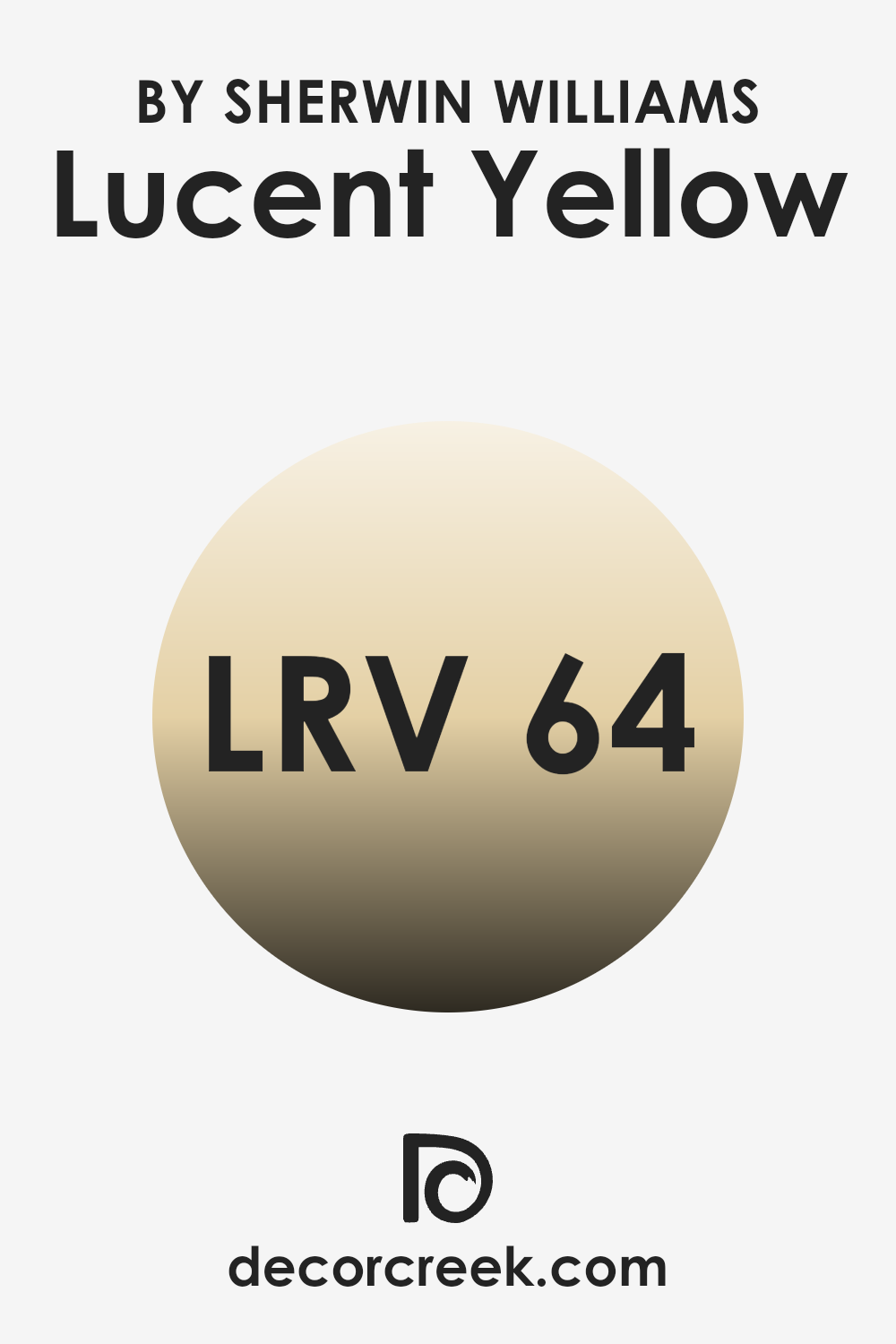
What is the LRV of Lucent Yellow SW 6400 by Sherwin Williams?
LRV stands for Light Reflectance Value, which is a measure of how much light a color reflects or absorbs. The scale ranges from 0 to 100, where 0 means the color absorbs all light, appearing completely black, and 100 means the color reflects all light, appearing completely white.
LRV is important because it helps us understand how light or dark a color will look once it’s painted on a wall. High LRV colors reflect more light, making a room feel brighter and more spacious, while low LRV colors absorb more light, making a room feel cozy and intimate.
Lucent Yellow has an LRV of 64.343, which places it in the lighter range of the scale. This means that this yellow will reflect a fair amount of light, making it a good choice for brightening up a room. It won’t make the area feel too stark or washed out, as it’s not at the highest end of the LRV scale, but it will definitely help in making a room feel more open and airy. In areas with ample natural or artificial light, this shade of yellow will maintain a vibrant and lively appearance, adding warmth and cheerfulness to the environment.
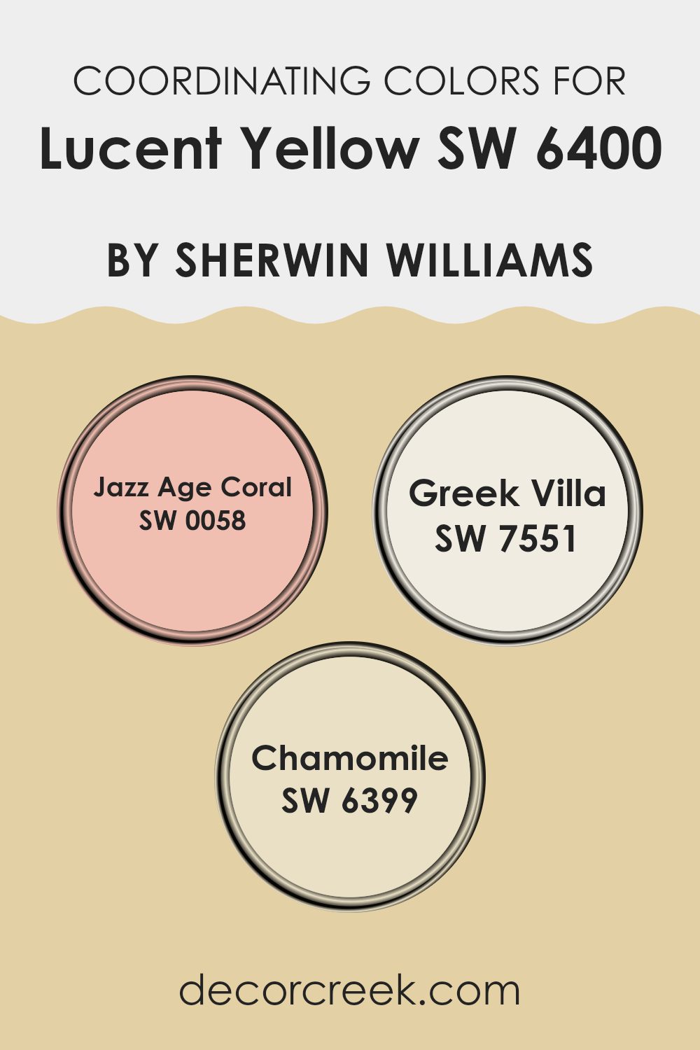
Coordinating Colors of Lucent Yellow SW 6400 by Sherwin Williams
Coordinating colors are hues that are selected to complement each other, creating a harmonious and visually appealing look. When choosing coordinating colors, it’s essential to consider how they interact with the main color, enhancing its appeal without clashing. Lucent Yellow by Sherwin Williams, with its warm and sunny disposition, can be beautifully offset by a selection of complementary colors that bring balance and style.
Jazz Age Coral, for instance, introduces a lively and cheerful tone that pairs wonderfully with Lucent Yellow. It adds a touch of warmth and vibrancy to any room. Meanwhile, Greek Villa offers a soft and gentle shade of white that brings a sense of calm and simplicity.
This neutral tone works well to balance the brightness of Lucent Yellow. Lastly, Chamomile contributes an earthy, muted hue that harmonizes with both Lucent Yellow and the other coordinating colors, providing a sense of grounded nature. Together, these colors create a cohesive palette that can be used in various design settings, making the room simultaneously inviting and aesthetically pleasing.
You can see recommended paint colors below:
- SW 0058 Jazz Age Coral
- SW 7551 Greek Villa
- SW 6399 Chamomile
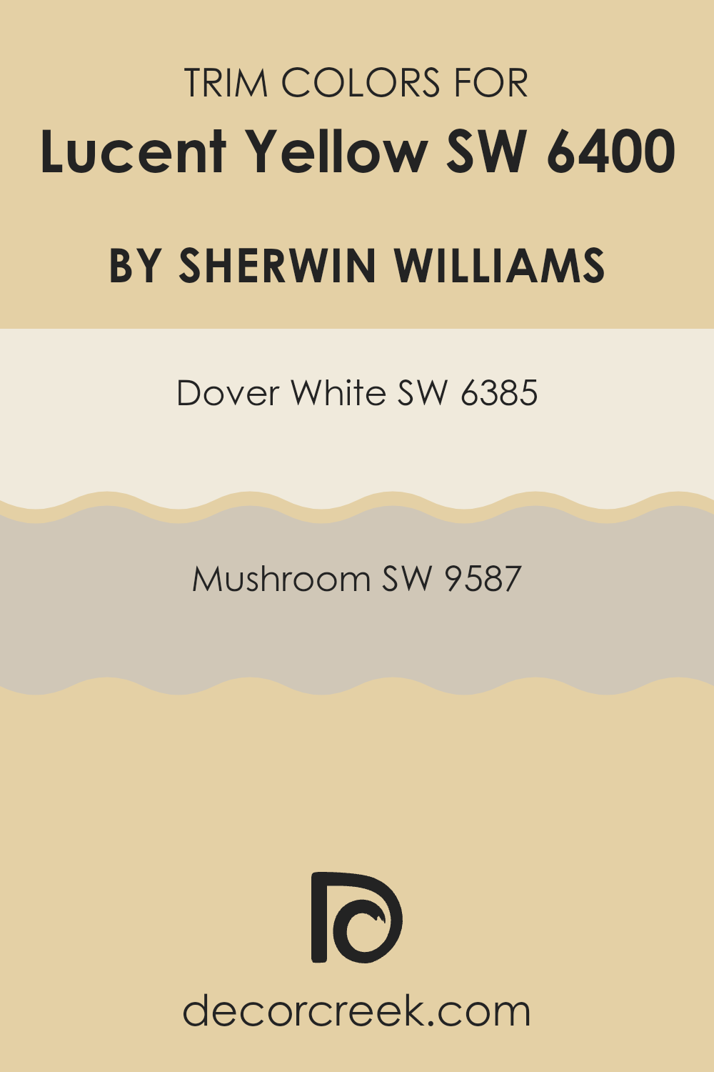
What are the Trim colors of Lucent Yellow SW 6400 by Sherwin Williams?
Trim colors are the colors used for the edges and borders of rooms, like door frames, window sills, and baseboards. They help to define rooms and can give a room a polished look. In the context of the Sherwin Williams Lucent YellowSW 6400, choosing the right trim colors can enhance the sunny and bright feel of the walls, creating a harmonious and balanced look. The right trim color will emphasize the cheerfulness of Lucent Yellow while also providing a neat and clean edge to the room.
Dover White and Mushroom are great choices for trim when using Lucent Yellow on the walls. Dover White (SW 6385) is a warm, soft shade that brings a touch of elegance with its gentle, creamy tone. This classic white can make the yellow appear even more inviting while maintaining a cozy feel.
On the other hand, Mushroom (SW 9587) is a neutral, earthy color that adds depth and sophistication without competing with the brightness of the yellow. The subtle hue of Mushroom wraps the yellow in a comforting, natural frame, highlighting its cheerful presence in the room. Both colors offer unique ways to complement Lucent Yellow, ensuring your room feels welcoming and complete.
You can see recommended paint colors below:
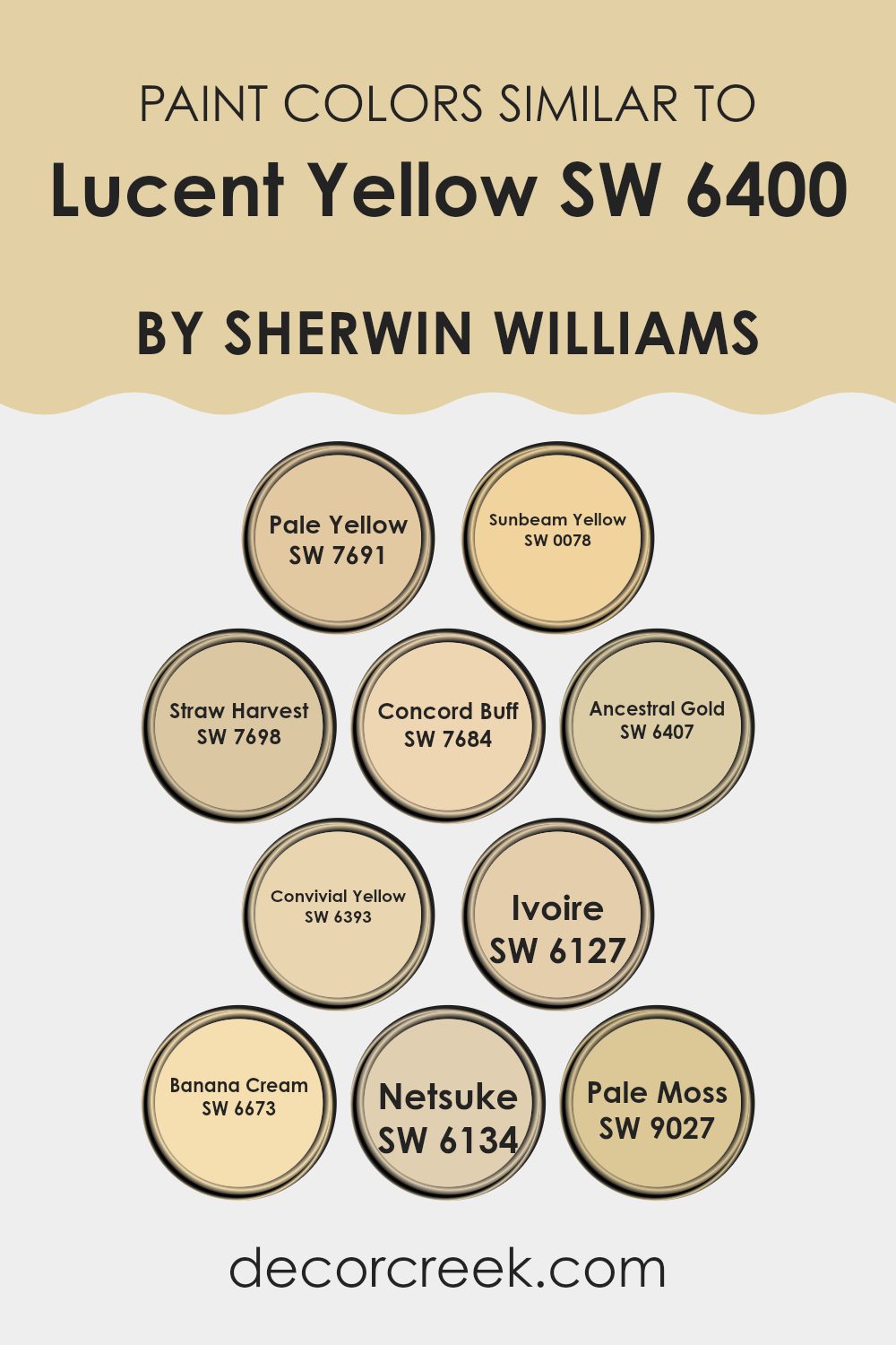
Colors Similar to Lucent Yellow SW 6400 by Sherwin Williams
Similar colors play an important role in design because they help create harmonious and visually appealing rooms. When colors are closely related, they make a room feel balanced and coordinated. For example, Pale Yellow is a soft and gentle hue that adds a subtle warmth to any room, while Sunbeam Yellow offers a brighter, more lively effect.
Straw Harvest gives a sense of earthiness and warmth that can ground a room, and Concord Buff has a muted quality that brings a cozy, welcoming feel. Ancestral Gold, with its rich depth, adds a touch of elegance and sophistication.
Convivial Yellow brings a cheerful and inviting ambiance, making it perfect for communal areas. Ivoire is light and airy, adding a touch of brightness and openness to a room. Banana Cream delivers a playful and light-hearted quality that can lift the mood, while Netsuke offers a more neutral tone with a hint of yellow, providing a soft background that complements other colors. Pale Moss, with its subtle green undertone, introduces a natural and calming element to any palette.
Together, these similar shades around Lucent Yellow allow for creative combinations, making it easy to craft areas that are both lively and harmonious.
You can see recommended paint colors below:
- SW 7691 Pale Yellow
- SW 0078 Sunbeam Yellow
- SW 7698 Straw Harvest
- SW 7684 Concord Buff
- SW 6407 Ancestral Gold
- SW 6393 Convivial Yellow
- SW 6127 Ivoire
- SW 6673 Banana Cream
- SW 6134 Netsuke
- SW 9027 Pale Moss
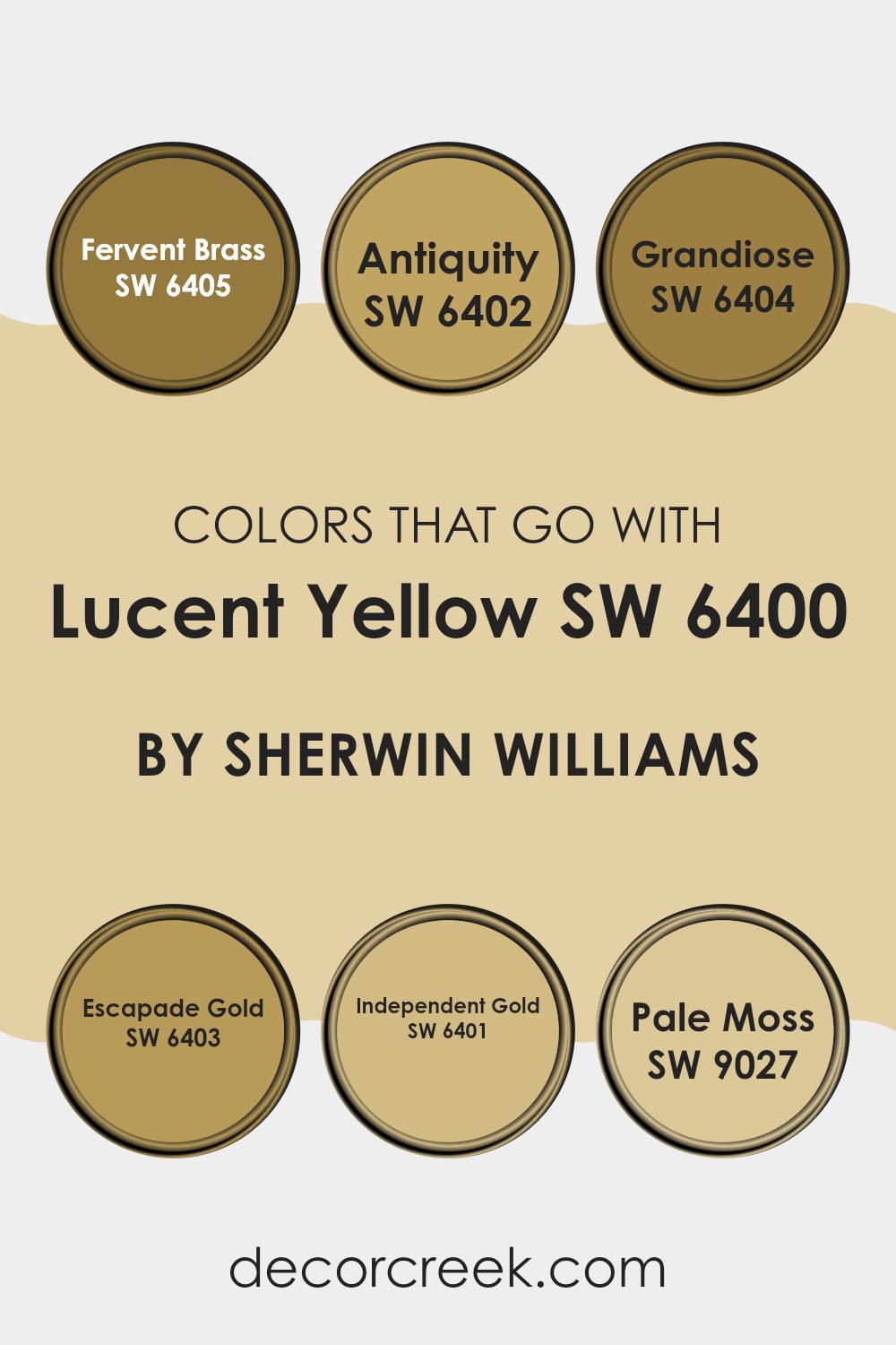
Colors that Go With Lucent Yellow SW 6400 by Sherwin Williams
Colors that pair well with Lucent Yellow SW 6400 by Sherwin Williams are important because they can enhance and complement the vibrancy of the yellow, creating a harmonious palette for any room. These colors work together by balancing Lucent Yellow’s brightness with a mix of warm and muted tones. This balance ensures that the room feels inviting and cohesive rather than overpowering.
SW 6405 – Fervent Brass is a rich, warm hue that brings a touch of earthiness, adding depth against the vividness of Lucent Yellow. SW 6402 – Antiquity is a muted, vintage-inspired color that introduces a sense of enduring charm to the palette. SW 6404 – Grandiose offers an elegant soft tone, contributing a hint of luxury while still blending smoothly with the yellow.
SW 6403 – Escapade Gold, on the other hand, is a vibrant shade that complements the liveliness of Lucent Yellow, though in a slightly more subdued manner. SW 6401 – Independent Gold is a neutral gold that adds a subtle sophistication, while SW 9027 – Pale Moss provides a gentle, nature-inspired touch that softens the overall scheme. Together, these colors create a balanced and pleasing atmosphere.
You can see recommended paint colors below:
- SW 6405 Fervent Brass
- SW 6402 Antiquity
- SW 6404 Grandiose
- SW 6403 Escapade Gold
- SW 6401 Independent Gold
- SW 9027 Pale Moss
How to Use Lucent Yellow SW 6400 by Sherwin Williams In Your Home?
Lucent Yellow SW 6400 by Sherwin Williams is a bright and cheerful paint color that can bring warmth and energy to any room. It’s a sunny shade that can make areas feel inviting and lively. In a living room, this color can create a welcoming atmosphere, making it a perfect spot for family gatherings or entertaining friends.
In a kitchen, Lucent Yellow can enhance the feeling of warmth and make the room feel more lively and enjoyable for cooking and dining. For bedrooms, using this color on an accent wall can add a pop of brightness without being overpowering.
It’s also a great choice for a home office, as it can help stimulate creativity and keep energy levels up. Overall, Lucent Yellow SW 6400 is a flexible color that can add happiness and light to various areas of your home, perfect for those looking to create a cheerful environment.
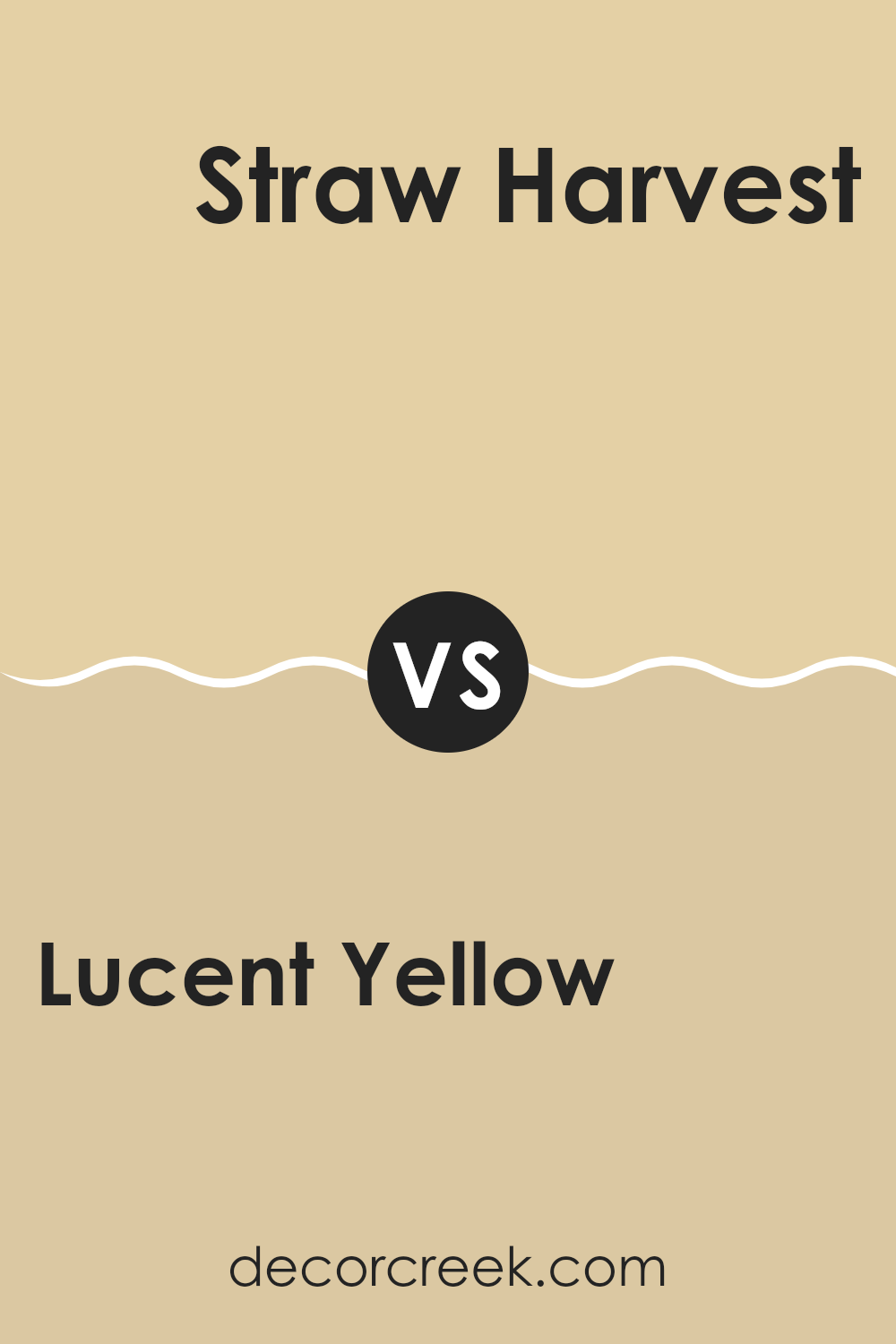
Lucent Yellow SW 6400 by Sherwin Williams vs Straw Harvest SW 7698 by Sherwin Williams
Lucent Yellow and Straw Harvest, both from Sherwin Williams, bring warmth to any room but have distinct vibes. Lucent Yellow is a bright and lively hue, offering a sunny and energetic feel that can uplift a room. It works well for areas where you want to promote activity and excitement, like kitchens or playrooms.
On the other hand, Straw Harvest is more muted and earthy. It carries a subtle warmth that feels comforting and relaxing, making it a great choice for bedrooms or living areas where a calm atmosphere is desired. This color can create a cozy and welcoming environment without being overpowering.
Both colors complement natural woods and neutral tones, but Lucent Yellow adds a splash of boldness, while Straw Harvest maintains a more understated presence. Choosing between them depends on whether you want a room that energizes or soothes.
You can see recommended paint color below:
- SW 7698 Straw Harvest
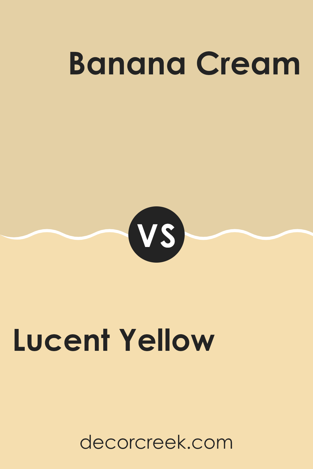
Lucent Yellow SW 6400 by Sherwin Williams vs Banana Cream SW 6673 by Sherwin Williams
Lucent Yellow and Banana Cream from Sherwin Williams are both shades of yellow, but they bring different vibes to a room. Lucent Yellow is a bright and vibrant shade that can energize a room. It’s perfect if you want to create a lively and cheerful atmosphere. This color works well in kitchens or living rooms where you want an upbeat feeling.
On the other hand, Banana Cream is softer and more subdued. It has a warm, creamy tone that feels cozy and inviting. This color is ideal for bedrooms or areas where you want to relax and unwind. It provides warmth without being overpowering.
While both colors are yellow, Lucent Yellow makes a bold statement, whereas Banana Cream adds a touch of softness. Choosing between them depends on whether you want a room that feels energetic or one that is comforting.
You can see recommended paint color below:
- SW 6673 Banana Cream
Lucent Yellow SW 6400 by Sherwin Williams vs Ancestral Gold SW 6407 by Sherwin Williams
Lucent Yellow and Ancestral Gold by Sherwin Williams are both warm, inviting colors, but they have distinct differences. Lucent Yellow is a bright, cheerful color that brings energy and light into a room. It’s great for areas that need a burst of sunshine and positivity, making it perfect for kitchens or living rooms where you want a lively atmosphere.
On the other hand, Ancestral Gold is slightly deeper and has more earthy tones. It adds a touch of warmth and elegance without being overpowering. This color works well in areas where you want a cozy and welcoming feel, such as bedrooms or dining rooms.
While both colors are warm, Lucent Yellow leans more towards a vibrant yellow, whereas Ancestral Gold has a more muted, golden hue. This makes Ancestral Gold a better choice if you want something subtle and understated, whereas Lucent Yellow is ideal if you want a bold statement.
You can see recommended paint color below:
- SW 6407 Ancestral Gold
Lucent Yellow SW 6400 by Sherwin Williams vs Sunbeam Yellow SW 0078 by Sherwin Williams
Lucent Yellow SW 6400 and Sunbeam Yellow SW 0078 are both vibrant yellow hues offered by Sherwin Williams, but they have distinct differences in tone and effect. Lucent Yellow is a warm, soft yellow with a gentle brightness, making it suitable for creating cozy, inviting rooms. It has a subtle golden undertone, which adds warmth without being overpowering.
On the other hand, Sunbeam Yellow is a more vivid and energetic yellow. It is brighter and bolder, with a stronger intensity. Sunbeam Yellow can invigorate a room, adding a cheerful, sunny atmosphere that catches the eye more immediately than Lucent Yellow.
While both colors can brighten up a room, Lucent Yellow is often used for a softer, more soothing effect, while Sunbeam Yellow is ideal for injecting a lively, vibrant feel. Choosing between them depends on whether you prefer a more subdued warmth or a lively brightness.
You can see recommended paint color below:
- SW 0078 Sunbeam Yellow
Lucent Yellow SW 6400 by Sherwin Williams vs Pale Moss SW 9027 by Sherwin Williams
Lucent Yellow SW 6400 by Sherwin Williams is a bright, cheerful shade that brings energy and warmth to a room. It has a sunny and inviting quality, making areas feel lively and vibrant. This color is excellent for areas where you want to boost energy, like kitchens or playrooms.
On the other hand, Pale Moss SW 9027 is a soft and muted green. It’s more soothing and calming, creating a peaceful atmosphere in any room. Pale Moss feels closer to nature, offering a refreshing and relaxed vibe.
While Lucent Yellow can make a bold statement, Pale Moss tends to create a more understated and tranquil setting. These colors contrast well; Lucent Yellow stands out, while Pale Moss blends quietly into the background. If you’re looking to add zest, Lucent Yellow is ideal. For a calm, cozy feel, Pale Moss would be the perfect choice.
You can see recommended paint color below:
- SW 9027 Pale Moss
Lucent Yellow SW 6400 by Sherwin Williams vs Pale Yellow SW 7691 by Sherwin Williams
Lucent Yellow SW 6400 and Pale Yellow SW 7691 are both bright and cheerful colors from Sherwin Williams, but they have distinct differences. Lucent Yellow is a vibrant, eye-catching hue, often described as a sunshine-like color. It can energize a room and bring warmth and joy to any room. This shade works well in lively areas such as kitchens or playrooms where a lively atmosphere is desired.
In contrast, Pale Yellow is softer and more subdued. It offers a gentle touch of color, making it suitable for areas where a calmer and more relaxed environment is preferred, such as bedrooms or living rooms. Pale Yellow provides a subtle touch that can brighten a room without overpowering it.
When comparing the two, the key difference lies in their intensity: Lucent Yellow is bolder and more striking, while Pale Yellow is more muted and soothing. Choosing between them depends on the desired mood and feel of the room.
You can see recommended paint color below:
- SW 7691 Pale Yellow
Lucent Yellow SW 6400 by Sherwin Williams vs Convivial Yellow SW 6393 by Sherwin Williams
Lucent Yellow (SW 6400) by Sherwin Williams is a bright and cheerful shade of yellow. It’s lively and creates a sense of warmth and energy. It’s great for areas where you want to boost mood and add a friendly, welcoming vibe.
Convivial Yellow (SW 6393), on the other hand, is also a warm shade but slightly softer than Lucent Yellow. It has a gentle, inviting quality that feels cozy and approachable. While still vibrant, it’s a bit more muted, which can make it feel more relaxed compared to the bolder Lucent Yellow.
Choosing between these two depends on the effect you want in a room. If you’re aiming for a bold, sunny look that really brightens up a room, Lucent Yellow is the way to go. If you prefer a more subdued, warm glow, Convivial Yellow might be the better choice. Both colors bring joy and brightness, but they offer different levels of intensity.
You can see recommended paint color below:
- SW 6393 Convivial Yellow
Lucent Yellow SW 6400 by Sherwin Williams vs Netsuke SW 6134 by Sherwin Williams
Lucent Yellow SW 6400 is a bright, cheerful color. It’s a sunny, vibrant shade that feels full of energy and warmth, perfect for areas where you want to create an uplifting and lively atmosphere. It’s ideal for places you want to feel brighter and more open.
On the other hand, Netsuke SW 6134 is a softer, more subdued color. This shade is a blend of beige and soft tan, offering a warm and inviting feel without being overpowering. It works well for creating a cozy and comfortable environment, making areas feel more relaxed and intimate.
While Lucent Yellow can make a statement with its boldness, Netsuke is more subtle and calming. Choosing between them depends on the mood you want for your room. If you want energy and brightness, go for Lucent Yellow. If you prefer a softer, more relaxed vibe, Netsuke is the better choice.
You can see recommended paint color below:
- SW 6134 Netsuke
Lucent Yellow SW 6400 by Sherwin Williams vs Ivoire SW 6127 by Sherwin Williams
Lucent Yellow SW 6400 and Ivoire SW 6127, both by Sherwin Williams, are warm, welcoming colors that can brighten up a room, but they offer different moods. Lucent Yellow is a vibrant, sunny shade that brings a cheerful and lively vibe to any room. It’s a color that stands out and can instantly energize a room.
On the other hand, Ivoire is more subdued and softer. It’s a creamy, pale yellow with a hint of beige, giving it a more elegant and calming feel. While Lucent Yellow is more striking and bold, Ivoire tends to be more subtle and understated, making it a flexible choice for a variety of settings.
Both colors are warm and inviting, but Lucent Yellow is best for areas that need a pop of life and energy, while Ivoire is great for creating a cozy, relaxed atmosphere.
You can see recommended paint color below:
- SW 6127 Ivoire
Lucent Yellow SW 6400 by Sherwin Williams vs Concord Buff SW 7684 by Sherwin Williams
Lucent Yellow SW 6400 by Sherwin Williams is a bright and cheerful color. It brings a sense of warmth and energy to a room, making areas feel lively and welcoming. This vibrant yellow can make smaller rooms look more open and lively.
On the other hand, Concord Buff SW 7684 is a more subdued, earthy tone. It’s a soft, warm beige that gives off a cozy and calm feeling. While Lucent Yellow is bold and eye-catching, Concord Buff offers a more understated and neutral backdrop, allowing other design elements to stand out.
When paired together, Lucent Yellow provides pops of color and excitement, while Concord Buff offers balance and warmth, creating a harmonious and inviting atmosphere in any room. Both colors can be used to great effect depending on the desired mood and purpose of the room.
You can see recommended paint color below:
SW 6400 Lucent Yellow by Sherwin Williams is a color that really makes me think of sunshine and happiness. When I look at it, I imagine bright, cheerful days that make everyone feel good inside. This yellow isn’t too loud or too strong; it’s just the right kind of bright that can make any room feel warm and inviting.
If I were to use Lucent Yellow in a room, I think it would be perfect for a kitchen or a playroom. It makes me think of places where you want lots of energy and smiles. This color can help wake you up in the morning and keep your spirits high throughout the day. It’s like being wrapped in a cozy, sunny hug.
I also think it would work well in a classroom because it can help spark creativity and make learning more exciting. It’s a friendly color that isn’t scary or overpowering. In the end, Lucent Yellow is a great choice if you want to add a sunny touch to your home or any place you want to feel happier and more alive.
It’s like having a little piece of sunshine indoors, and who wouldn’t want that?
Lucent Yellow is a color that can always make me smile.
Ever wished paint sampling was as easy as sticking a sticker? Guess what? Now it is! Discover Samplize's unique Peel & Stick samples.
Get paint samples

