If you’re thinking about refreshing a room in your home, you might want to consider the color SW 6399 Chamomile by Sherwin Williams. This lovely shade has a soft, warm hue that can instantly make any space feel more inviting and cozy.
As someone who enjoys adding a touch of brightness to my living areas without going too bold, I found Chamomile to be the perfect balance. It has a subtle vibrancy that enlivens a room but remains gentle enough to blend well with various decor styles and colors.
Whether you’re painting a whole room or just an accent wall, Chamomile can create an atmosphere of warmth and comfort.
Using this color, you can give your home a fresh look while maintaining a soothing and pleasant aesthetic.
What Color Is Chamomile SW 6399 by Sherwin Williams?
Chamomile by Sherwin Williams is a delightfully warm and inviting shade of yellow that brings a cheerful presence into any room. Its soft yet vibrant tone is reminiscent of a gentle sunbeam, offering a cozy, welcoming ambiance. This color shines particularly well in kitchens and living areas where its sunny disposition enhances the natural light, creating spaces that feel bright and airy.
Chamomile works beautifully with rustic and country-style interiors, where natural materials are highlighted. It pairs exceptionally well with natural woods, adding a sunny contrast to darker tones or complimenting lighter, honey-colored woods.
This yellow hue also looks stunning when matched with white trim or cabinets, providing a fresh and clean look. For a more textured approach, consider incorporating linens or woven fabrics in neutral colors which can soften the overall aesthetic while maintaining its cheerful vibe.
Textures like burlap, wicker, and unpolished wood also harmonize well with Chamomile. These materials contribute to a grounded, earthy feel that balances the brightness of the yellow. Together, they create a space that’s not only visually appealing but also comfortable and relaxing.
Whether you’re aiming for a space filled with charm or a spot filled with gentle warmth, Chamomile could be the perfect fit.

Is Chamomile SW 6399 by Sherwin Williams Warm or Cool color?
Chamomile by Sherwin Williams is a warm, inviting yellow shade that brings a cozy and cheerful aura to any room in a home. This particular shade of yellow isn’t overly bright, making it easy on the eyes and suitable for spaces where you want to add a touch of lightness without overwhelming the area. It works exceptionally well in living rooms, kitchens, and bathrooms, where it pairs nicely with natural light to create a welcoming atmosphere.
The color’s softness allows it to blend seamlessly with neutral tones like whites and beiges, enhancing other colors in the room rather than overshadowing them. It’s a great choice for anyone looking to add a hint of warmth to their decor without committing to a bold or intense color.
Additionally, Chamomile can make small spaces appear larger and more open, giving an airy feel that is often desired in smaller or dimmer rooms. This color can easily be matched with various decor styles, from modern to rustic, making it a versatile choice for updating any home.
Undertones of Chamomile SW 6399 by Sherwin Williams
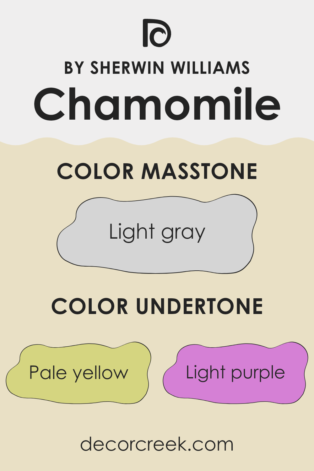
ChamomileSW 6399 by Sherwin Williams is a unique paint color with a complex blend of undertones that can subtly influence the feel and appearance of a room. The undertones for Chamomile include pale yellow, light purple, light blue, pale pink, mint, lilac, and grey. These undertones aren’t always immediately noticeable, but they play a significant role in how the color looks in different lighting and settings.
In general, undertones affect our perception of color by adding depth and dimension. For instance, a color with grey undertones might look cooler and more muted, while a color with yellow undertones may appear warmer and more welcoming.
In interior walls, the undertones of Chamomile can impact the mood and style of the space. The pale yellow and mint undertones can make a room feel more inviting and warm. On the other hand, light purple and lilac can give a subtle hint of freshness and creativity, making it a good choice for a study or creative space. Light blue and pale pink can soothe the eyes, ideal for a relaxing environment like a bedroom.
Choosing a color like Chamomile for walls means it can adapt to natural changes in light throughout the day, reflecting different undertones at different times. This can keep the room feeling dynamic and lively.
Grey undertones help balance the brightness, ensuring the color isn’t overwhelming, making it versatile enough to use in various rooms. This dynamic mix can enhance the aesthetic appeal of your home, making it a popular choice for those looking to refresh their interior spaces without committing to a bold or dominating color.
What is the Masstone of the Chamomile SW 6399 by Sherwin Williams?
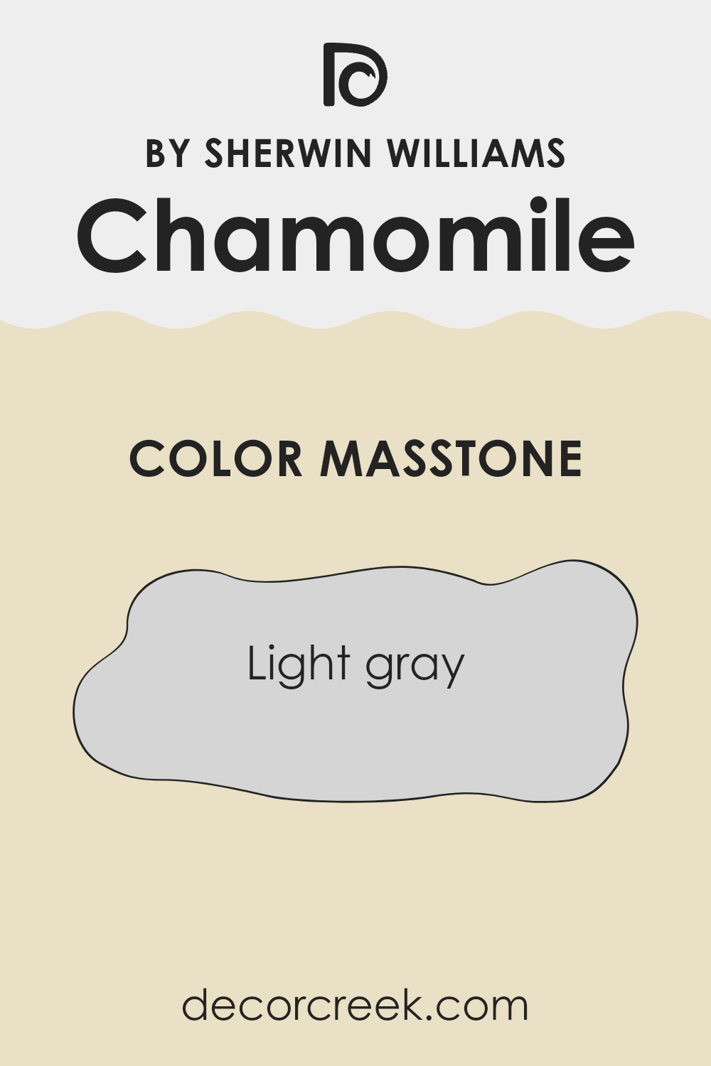
ChamomileSW 6399 from Sherwin Williams has a masstone of light gray, labeled as #D5D5D5. This gentle hue is incredibly versatile for home interiors. Its light gray shade blends well with most color schemes, making it easy to use in any room without overwhelming the space.
Since light gray is neutral, it helps other colors in the room stand out, whether those colors are on furniture, textiles, or other decor items. This shade also has a calming effect, which is perfect for creating a relaxed atmosphere in living areas and bedrooms.
Moreover, because it’s so light, it can make small spaces appear larger and brighter by reflecting light. Easy to pair with both bold and subtle colors, it’s ideal for those who enjoy changing up their decor without having to repaint their walls. This flexibility makes light gray a smart and practical choice for homes.
How Does Lighting Affect Chamomile SW 6399 by Sherwin Williams?
Lighting plays a crucial role in how we perceive colors. Depending on the type of light – whether artificial or natural – colors can appear different to the eye. Different types of light have varying impacts on how a specific shade might look once applied to a space.
Taking the Sherwin Williams color Chamomile as an example, this is a warm, gentle yellow. Under artificial light, particularly warm white bulbs, the yellow tones become more pronounced, making the room feel cozy and welcoming. In cooler, fluorescent light, this warmth might be slightly muted, leading to a more subdued version of the color.
When it comes to natural light, the appearance of Chamomile changes throughout the day and depends on the orientation of the room. In north-facing rooms, light is cooler and more even throughout the day. Here, Chamomile might appear more muted and less vibrant, as the cooler light tones down its warmth. In south-facing rooms, which receive the most sunlight throughout the day, Chamomile will appear much brighter and more vivid, enhancing its warm tones and making the space feel lively and bright.
In east-facing rooms, the color will catch the bright morning sun, making it look very vibrant and fresh in the morning, but it will lose some of this brightness as the day progresses. Conversely, in west-facing rooms, the color will start more muted in the morning, but as the sun sets, Chamomile will glow warmly in the evening light, creating a cozy and inviting atmosphere towards the end of the day.
In summary, the lighting in a room – whether artificial or natural – can significantly affect how a color like Chamomile is perceived. Understanding this can help in deciding where to use certain colors based on the room’s orientation and available lighting.
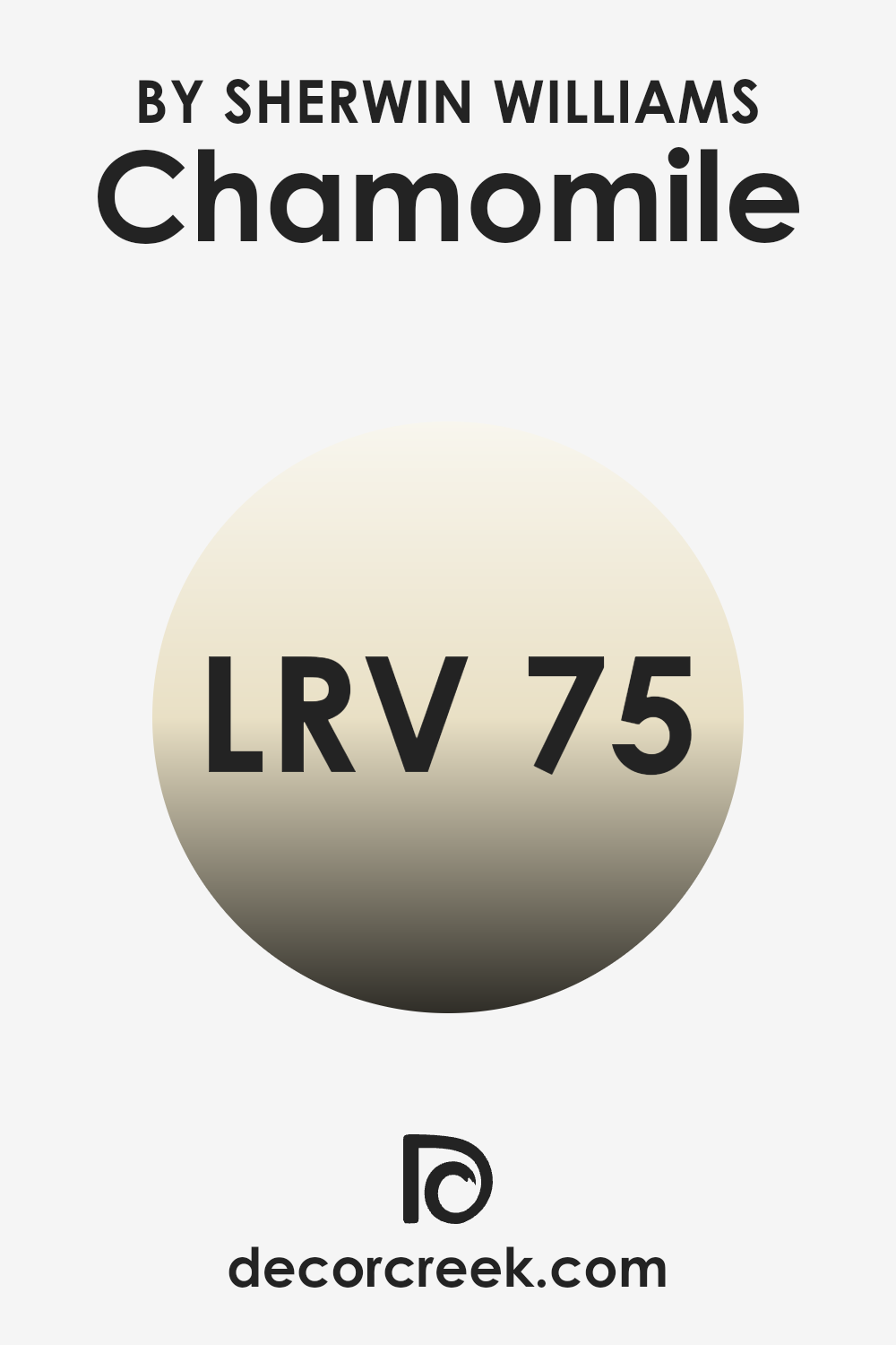
What is the LRV of Chamomile SW 6399 by Sherwin Williams?
Light Reflectance Value (LRV) measures the percentage of light a paint color reflects from a surface. This number can range anywhere between nearly zero (darker shades which absorb more light) to nearly a hundred (lighter shades that reflect most of the light that hits them). An LRV rating helps to understand how bright or dark a color will look in a particular space depending upon how much natural or artificial light it receives.
Lower numbers imply the color appears darker because it absorbs more light. Conversely, higher values mean the color looks lighter and reflects more light back into the room. Chamomile SW 6399 has an LRV of approximately seventy-five, which means it’s fairly light and has strong reflective qualities.
In a real-world setting, this means the color would help to brighten up a room, making spaces appear more airy and open. For homeowners looking to create a bright and welcoming atmosphere, this shade is ideal. Its high LRV helps it to make the most out of whatever natural or artificial light it has, effectively using light to make rooms seem larger than they are.
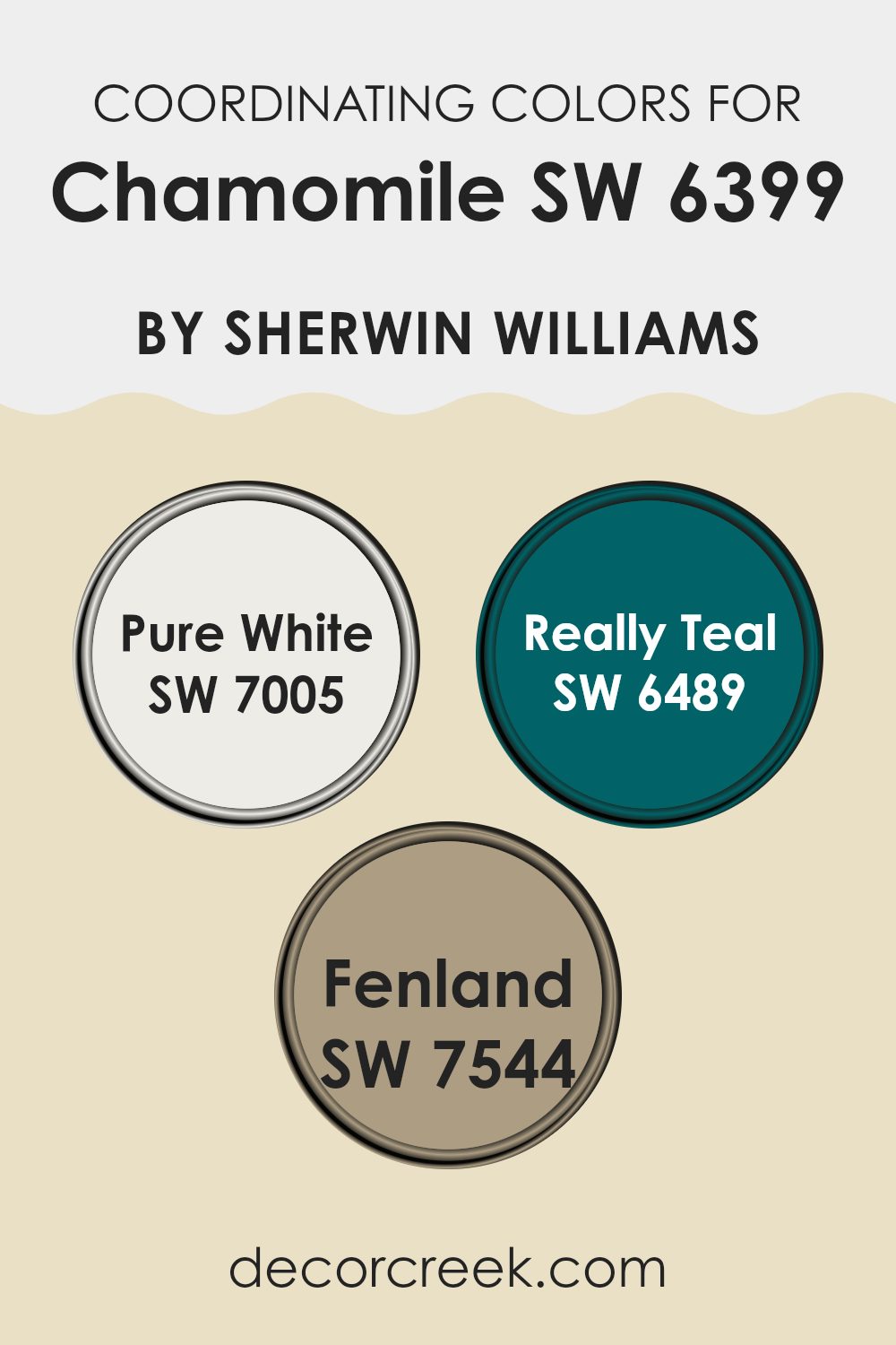
Coordinating Colors of Chamomile SW 6399 by Sherwin Williams
Coordinating colors are chosen to complement a main color, enhancing the aesthetic appeal of an interior space by creating balance and harmony. In the context of Chamomile by Sherwin Williams, a warm, inviting hue, selecting colors like Pure White, Really Teal, and Fenland can further accentuate its coziness while adding visual interest and contrast. These coordinating shades are expertly picked to either contrast with or complement the primary color, allowing for dynamic yet cohesive room designs.
Pure White, identified by Sherwin Williams as SW 7005, is a clean and crisp shade that can act as a refreshing counterpoint to the richer tones of Chamomile. It is ideal for trims, ceilings, and accents, offering a sharp, neat touch to spaces making them look more open and bright.
Really Teal, which goes by the number SW 6489, is a vivid and striking color that brings a vibrant burst of energy when used alongside more subdued shades. It works exceptionally well for focal points or furniture pieces, drawing the eye and adding a sense of fun. Lastly, Fenland (SW 7544) is a muted green with earthy undertones, providing a natural and grounding effect in rooms where Chamomile serves as the dominant color. It is especially suitable for creating a cozy, relaxing environment without overpowering the main color theme.
You can see recommended paint colors below:
- SW 7005 Pure White
- SW 6489 Really Teal
- SW 7544 Fenland
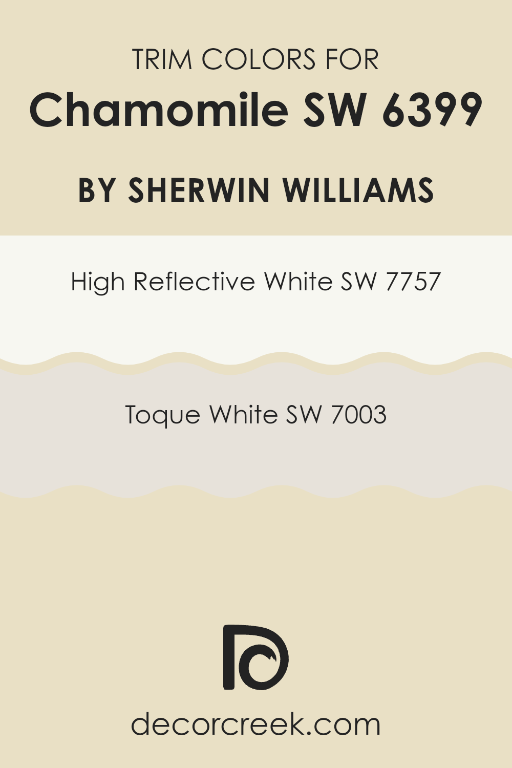
What are the Trim colors of Chamomile SW 6399 by Sherwin Williams?
Trim colors are specific shades used to accentuate or highlight architectural details and edges of walls, door frames, window frames, and moldings. Choosing the right trim color can enhance the overall aesthetic of a room and create a crisp, polished look. When pairing trim colors with Chamomile by Sherwin Williams, which is a warm and inviting hue, selecting a trim color such as High Reflective White or Toque White can make the main color pop while adding brightness to the room.
High Reflective White, SW 7757, is a very bright, clean white that brings an air of freshness to any space. It reflects light beautifully, which can make a room appear larger and more open, thus making it an excellent choice for trim to contrast with the gentle warmth of Chamomile.
Toque White, SW 7003, on the other hand, is a softer white with subtle gray undertones. This color provides a softer contrast, lending a subtle definition to trim work without stark transitions, ideal for creating a gentle, cohesive look in spaces using Chamomile.
You can see recommended paint colors below:
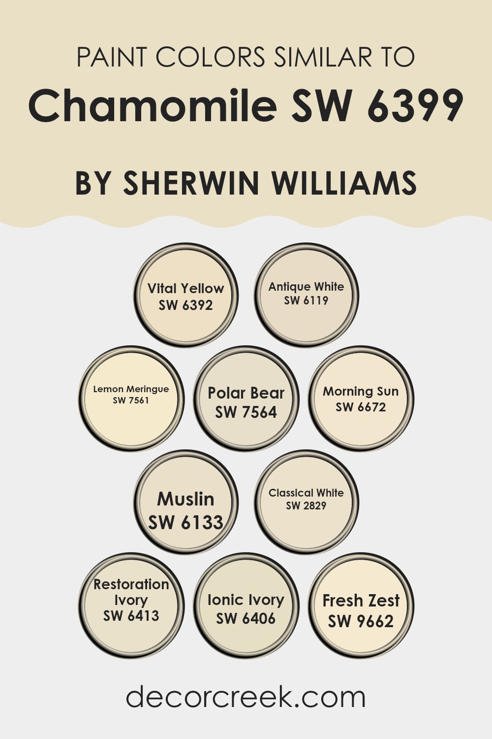
Colors Similar to Chamomile SW 6399 by Sherwin Williams
Using similar colors in design can greatly enhance the aesthetic and mood of a space by creating a harmonious atmosphere. This concept is well illustrated by colors similar to Chamomile by Sherwin Williams. Each shade supports a cohesive look, ensuring that the visual flow is soothing and pleasant, without abrupt transitions that might disrupt the appealing calmness of a room.
To create a vibrant yet understated look, Vital Yellow offers a cheerful brightness that is reminiscent of sunlight. Antique White is a subdued, creamy shade perfect for creating a soft, welcoming environment.
Lemon Meringue brings a subtle zest, enlivening spaces with its gentle, yellow tint. For those preferring a more neutral palette, Polar Bear provides a clean, almost pristine white that reflects light beautifully. Morning Sun, as the name suggests, visibly warms a room with its gentle yellow glow.
Muslin, another understated hue, coordinates well with other colors, offering a light, sandy warmth. Classical White is a timeless choice, delivering a slightly cool tone that works well in various styles and settings.
Ivory introduces a touch of old-world charm, with a hint of yellow that softens the overall look. Ionic Ivory, much like its counterpart, favors a slight yellow base, adding warmth without overpowering. Finally, Fresh Zest infuses an energetic spark with its lively, lemon-inspired hue, perfect for brightening any area it graces. Each of these colors, while maintaining individuality, collectively enriches environments by blending smoothly with others in the spectrum inspired by Chamomile.
You can see recommended paint colors below:
- SW 6392 Vital Yellow
- SW 6119 Antique White
- SW 7561 Lemon Meringue
- SW 7564 Polar Bear
- SW 6672 Morning Sun
- SW 6133 Muslin
- SW 2829 Classical White
- SW 6413 Restoration Ivory
- SW 6406 Ionic Ivory
- SW 9662 Fresh Zest
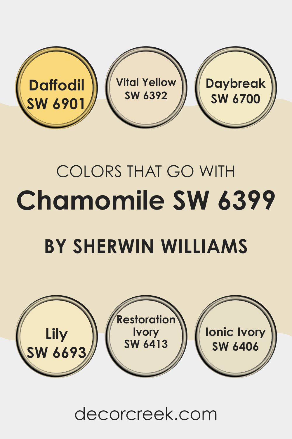
Colors that Go With Chamomile SW 6399 by Sherwin Williams
Choosing the right colors to pair with Chamomile SW 6399 by Sherwin Williams can enhance the overall aesthetic of a room by complementing its warm, muted yellow tones. For instance, pairing it with colors like SW 6901 – Daffodil, which is a bright and cheerful yellow, adds a vibrant contrast that can make a space feel energetic and inviting.
On the other hand, using SW 6392 – Vital Yellow, which is a soft but sunny yellow, can create a more harmonious and seamless transition between spaces, enhancing the continuity and flow of your home’s color scheme.
Additionally, integrating colors like SW 6700 – Daybreak, a fresh and light yellow, brings a touch of freshness and lightness to the decor, suggesting a sense of dawn and new beginnings. Complementing with SW 6693 – Lily, a subtle and gentle yellow, can add a hint of delicacy and finesse, perfect for creating a refined yet welcoming atmosphere. SW 6413 – Restoration Ivory, a warm, off-white shade, offers a neutral backdrop that allows Chamomile to stand out without overpowering, while SW 6406 – Ionic Ivory, a slightly darker shade of ivory, provides depth and contrast, anchoring lighter colors and giving the room a balanced look. Through these combinations, you can achieve a varied yet cohesive color palette that enhances the visual appeal and comfort of your living space.
You can see recommended paint colors below:
- SW 6901 Daffodil
- SW 6392 Vital Yellow
- SW 6700 Daybreak
- SW 6693 Lily
- SW 6413 Restoration Ivory
- SW 6406 Ionic Ivory
How to Use Chamomile SW 6399 by Sherwin Williams In Your Home?
Chamomile SW 6399 by Sherwin Williams is a warm, gentle yellow paint color that brightens up any room with a cozy glow. It’s perfect for spaces where you want to add a touch of cheer without overwhelming the senses. You can use this color in various ways around your home.
In the kitchen, Chamomile can create a welcoming and lively atmosphere, which is ideal for rooms where families gather and spend a lot of time. It’s also a great choice for a child’s bedroom or playroom because of its cheerful and inviting tone.
Additionally, if you have a small, dimly lit area, painting it Chamomile can help make the space feel more open and bright. This color pairs well with whites, which can add a fresh and clean look, or with earth tones that complement its warmth. By using Chamomile, you can easily spruce up your home with a friendly and light-hearted vibe.
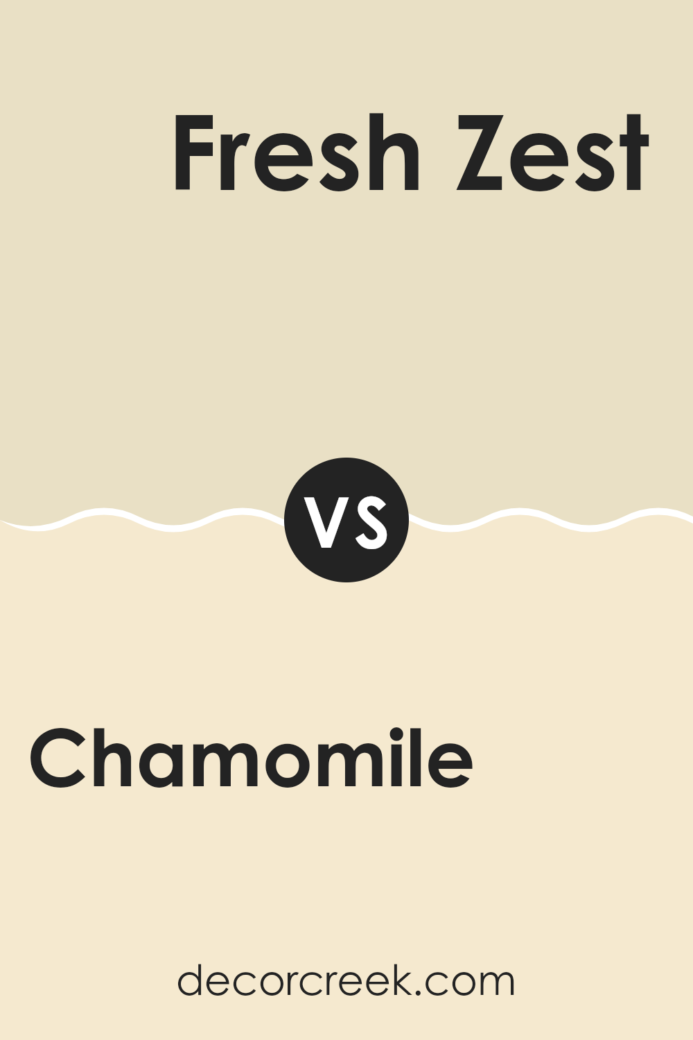
Chamomile SW 6399 by Sherwin Williams vs Fresh Zest SW 9662 by Sherwin Williams
Chamomile SW 6399 is a warm, soft yellow that gives off a sunny and cheerful vibe. It’s perfect for creating a cozy and inviting atmosphere in spaces like living rooms or kitchens. The pale yellow hue is gentle, making it easy to combine with a variety of other colors, from neutrals to more vibrant shades.
On the other hand, Fresh Zest SW 9662 is a lively, bright green. It feels fresh and energetic, ideal for spaces where you want to add a spark of vibrancy and freshness, like bathrooms or dining areas. This color stands out more than Chamomile and is great for those looking to make a bolder statement.
Both colors are excellent choices, but they serve different moods and settings. Chamomile is more about warmth and calmness, while Fresh Zest emphasizes energy and freshness. Depending on what feeling you want to achieve in a room, you would choose between these two.
You can see recommended paint color below:
- SW 9662 Fresh Zest
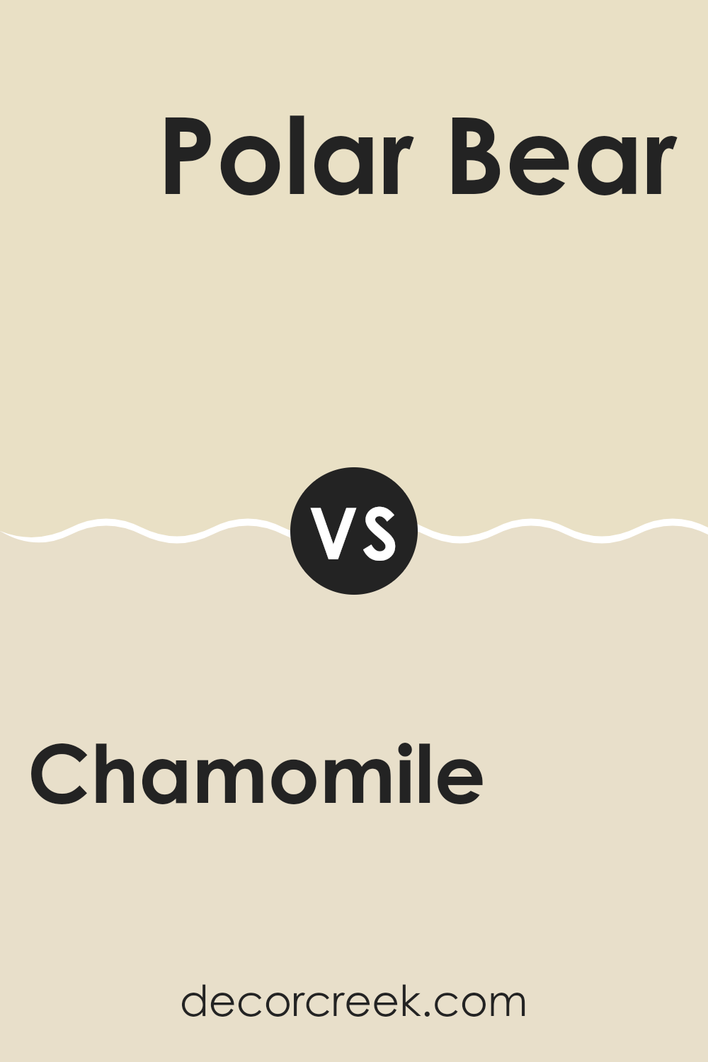
Chamomile SW 6399 by Sherwin Williams vs Polar Bear SW 7564 by Sherwin Williams
Chamomile SW 6399 and Polar Bear SW 7564 from Sherwin Williams are two distinct shades suited for different moods and settings. Chamomile possesses a warm and slightly buttery tone that brings a cozy, welcoming feel to any room. This color works well where a touch of softness and warmth is needed, making it ideal for living areas and bedrooms where comfort is key.
On the other hand, Polar Bear is a clean and bright white color that provides a fresh and airy feel. It’s perfect for spaces that you want to appear larger and more open. This pale shade can also act as a neutral backdrop, allowing other colors in the décor to stand out.
While Chamomile offers a hint of color and warmth, Polar Bear serves as a crisp, clean slate. Depending on the atmosphere you want to create, each color has its strengths; Chamomile wraps you in warmth, whereas Polar Bear gives a room a fresh, open vibe.
You can see recommended paint color below:
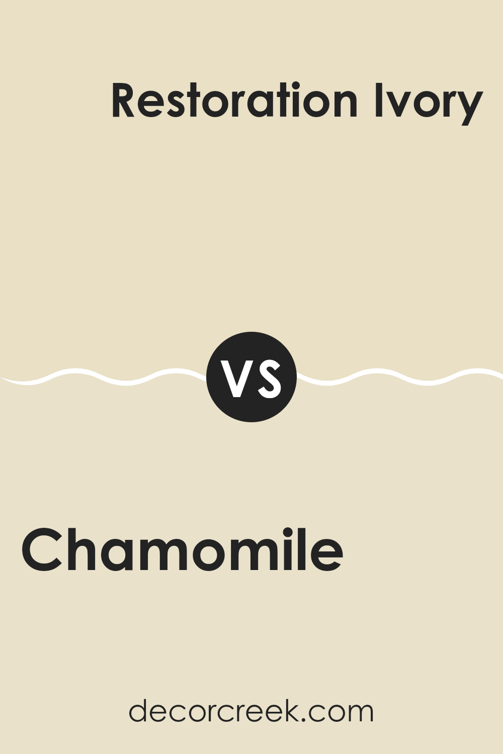
Chamomile SW 6399 by Sherwin Williams vs Restoration Ivory SW 6413 by Sherwin Williams
Chamomile SW 6399 is a warm, gentle yellow that brings a cheerful and welcoming feel to any space. It has a sunny vibe, making it ideal for making rooms feel cozier and brighter. Perfect for kitchens and living areas, this color can pair well with both light and dark accents to enhance its inviting nature.
In contrast, Restoration Ivory SW 6413 is a muted, soft beige with a more subdued appearance compared to Chamomile. This color is great for creating a calm and understated atmosphere. It’s versatile enough to work in various settings, providing a neutral backdrop that complements a wide range of decor styles.
Both colors, while different, provide unique ways to beautify spaces—one with a lively burst of sunshine and the other with a quietly elegant neutral tone. They are both excellent choices but cater to different aesthetic tastes and functions within home interiors.
You can see recommended paint color below:
- SW 6413 Restoration Ivory
Chamomile SW 6399 by Sherwin Williams vs Vital Yellow SW 6392 by Sherwin Williams
Chamomile by Sherwin Williams is a warm, muted yellow with hints of gold and earthy undertones. It has a softness that makes it easy on the eyes and quite versatile for decorating. This shade can create a cozy feel in a room and works well in spaces that need a touch of brightness without overwhelming brightness.
On the other hand, Vital Yellow is a much bolder and more vivid shade of yellow. It’s brighter and can instantly make a space feel more energetic and lively. This color works great in areas that benefit from a splash of cheerfulness, like kitchens or playrooms.
While Chamomile offers a subtle and calming presence, Vital Yellow stands out and grabs attention. Chamomile is ideal for those who prefer a gentle and inviting atmosphere, whereas Vital Yellow suits those looking to make a vibrant and cheerful statement in their space. Each color serves a different purpose depending on the mood and style you want to achieve.
You can see recommended paint color below:
- SW 6392 Vital Yellow
Chamomile SW 6399 by Sherwin Williams vs Classical White SW 2829 by Sherwin Williams
Chamomile by Sherwin Williams is a warm, creamy yellow. It gives off a cozy, inviting feel and is great for spaces where you want a cheerful vibe. It can brighten up a room and works well with natural light, making spaces feel airy and pleasant.
On the other hand, Classical White by Sherwin Williams is much subtler. It’s not a stark white but has a soft, slightly warm undertone that makes it versatile for use in almost any space. It’s ideal for creating a clean, open feel, making it a good choice for smaller rooms or spaces that don’t get much sunlight.
Both colors are pretty different in terms of mood and utility. Chamomile adds a splash of color and warmth, great for common areas like living rooms or kitchens. Classical White keeps things low-key and is excellent for a minimalist look or as a background to highlight other design elements.
You can see recommended paint color below:
Chamomile SW 6399 by Sherwin Williams vs Lemon Meringue SW 7561 by Sherwin Williams
Chamomile SW 6399 and Lemon Meringue SW 7561, both by Sherwin Williams, are distinct yet harmonious shades. Chamomile has a more subdued and warmer tone, akin to the soothing quality of the tea it’s named after. This color lends a cozy, welcoming feel to spaces, making it ideal for living areas and bedrooms where a calming atmosphere is desired.
In contrast, Lemon Meringue is brighter and lighter, closely resembling the creamy top of the dessert it’s named after. It’s a cheerful color that tends to add freshness and vibrancy to a room. This makes it perfect for kitchens, bathrooms, or any space that benefits from a bright, clean look.
When used together, these colors can create a balanced and cheerful environment. Chamomile’s earthy warmth paired with the crisp brightness of Lemon Meringue can make spaces feel lively yet comfortable. The difference in their warmth levels and brightness also provides a pleasing contrast, allowing each color to stand out in its own right.
You can see recommended paint color below:
- SW 7561 Lemon Meringue
Chamomile SW 6399 by Sherwin Williams vs Morning Sun SW 6672 by Sherwin Williams
Chamomile by Sherwin Williams is a warm, soothing yellow with a soft, creamy quality. It’s the kind of color that brings a cozy, welcoming feel to any space, perfect for creating a relaxed atmosphere. This shade is especially good in well-lit areas, where natural light highlights its gentle, buttery tones.
In contrast, Morning Sun is a much brighter, more vivid yellow. This color is lively and energetic, making it great for spaces where you want to add a sense of cheerfulness and vitality. Because of its brightness, it works particularly well in darker rooms or spaces that could use a boost of brightness.
Both colors, being shades of yellow, naturally carry a sunny disposition, but each offers a distinct vibe due to their intensity and depth. Chamomile is more subdued and versatile, excellent for broad wall areas, while Morning Sun demands attention and is ideal for accent walls or decor that needs to stand out.
You can see recommended paint color below:
- SW 6672 Morning Sun
Chamomile SW 6399 by Sherwin Williams vs Muslin SW 6133 by Sherwin Williams
Chamomile by Sherwin Williams is a warm, sunny yellow that brings a cheerful brightness to any space. It resembles the soft yellow of the floral herb and has a vibrant energy that can make a room feel welcoming and alive. Because of its brightness, it’s perfect for areas that need a pop of color or a touch of warmth to lift the atmosphere.
Muslin, on the other hand, is a softer, muted beige with a cozy, understated vibe. It’s less about making a bold statement and more about creating a calm, soothing backdrop for other design elements. This color complements a wide range of décor, providing a neutral palette that supports both bold and subtle interiors.
When comparing the two, Chamomile is much more vivid and can instantly brighten a space, while Muslin is ideal for creating a subtle, cozy ambiance. Depending on what mood or style you’re aiming for, each color has its strengths. Chamomile is great for energizing a room, whereas Muslin is excellent for achieving a gentle, soothing environment.
You can see recommended paint color below:
Chamomile SW 6399 by Sherwin Williams vs Ionic Ivory SW 6406 by Sherwin Williams
Chamomile by Sherwin Williams is a warm, inviting yellow with a soft, creamy undertone. It’s a sunny shade that brings a cozy, bright feel to any room, perfect for spaces where you want a cheerful atmosphere. When compared to Ionic Ivory by Sherwin Williams, Chamomile appears more vibrant and lively due to its stronger yellow hue.
On the other hand, Ionic Ivory is a more subdued color with a gentle off-white tone that leans slightly towards beige or light tan. It’s excellent for creating a calm, neutral backdrop that works well in almost any interior. Its understated nature means it can easily blend with different decor styles and color schemes without dominating the space.
When using these colors in the same space, Chamile can serve as a striking focal point or accent, while Ionic Ivory provides a soothing counterbalance, offering a lighter, more muted background that complements the brightness of Chamile without competing with it. This combination can function well in areas that benefit from a balance of vibrancy and calm.
You can see recommended paint color below:
- SW 6406 Ionic Ivory
Chamomile SW 6399 by Sherwin Williams vs Antique White SW 6119 by Sherwin Williams
Chamomile and Antique White are two distinct shades from Sherwin Williams, each setting a different mood. Chamomile is a warm and cheerful yellow, like sunshine on a bright day. It brings a lively feel to a room and can make spaces feel more open and welcoming. A perfect choice for kitchens or living rooms, it pairs nicely with other vibrant colors or can stand out on its own for a bold statement.
Antique White, on the other hand, is a soft, muted white with a hint of cream. It’s more subdued and gentle compared to the brightness of Chamomile. This color works well in almost any space, offering a clean and calming aesthetic. It’s especially good for creating a relaxed feel in bedrooms or lounge areas and pairs beautifully with a wide range of other colors.
Together, Chamomile and Antique White could complement each other in a home, with Chamomile adding pops of color and Antique White providing a soothing backdrop.
You can see recommended paint color below:
Conclusion
In wrapping up my thoughts about SW 6399 Chamomile by Sherwin Williams, I’ve found it to be a paint color that brings a lot of warmth and cheer to any room. When I tested it out in different corners of my home, I noticed that it really lights up the space, making it feel welcoming and cozy. This soft yellow hue reminds me of sunny days and playing outside, which is probably why it made my home feel brighter and happier.
Whether I was thinking about painting a whole room with it or just an accent wall, Chamomile proved to be a great pick. It worked well with lots of other colors I have around, like whites, grays, and blues. Even when I checked it in various lights—natural daylight or the lamps in my room—it consistently held its warm and cheerful vibe.
Overall, SW 6399 Chamomile by Sherwin Williams is a solid choice if you’re looking to add some sunshine to your living spaces. It’s easy to see why anyone would enjoy having this color on their walls—it’s like bringing a little bit of a sunny day indoors, no matter what the weather is like outside.

Ever wished paint sampling was as easy as sticking a sticker? Guess what? Now it is! Discover Samplize's unique Peel & Stick samples.
Get paint samples

