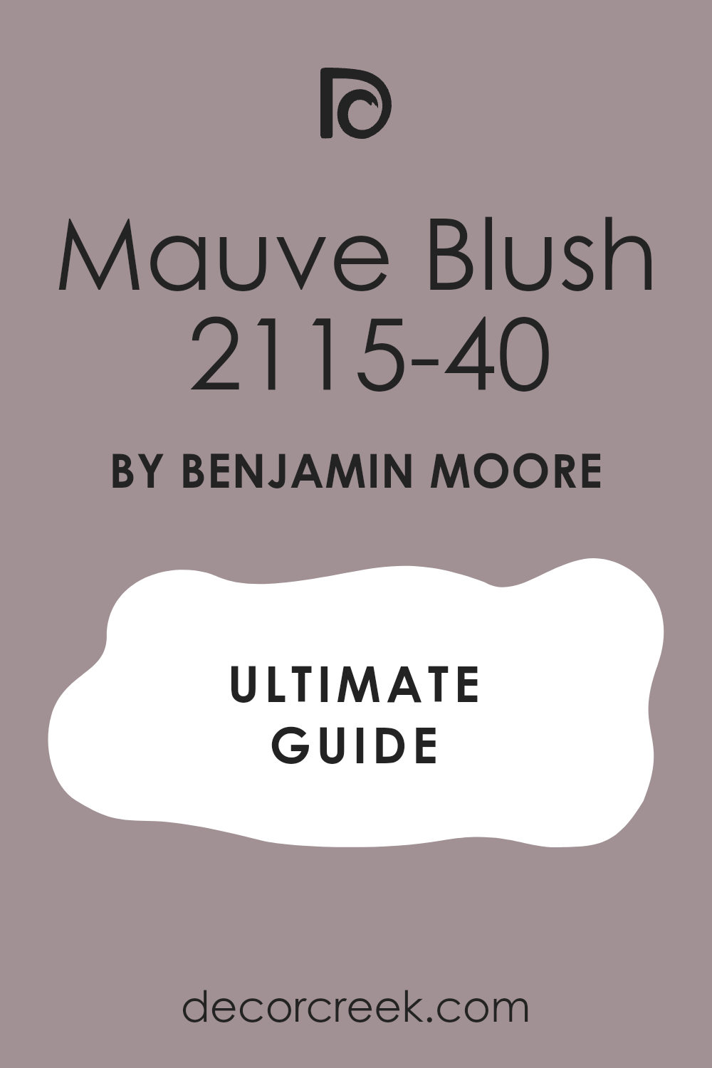
When I was on the lookout for a gentle, refreshing color to repaint my bedroom, I stumbled across 2115-40 Mauve Blush by Benjamin Moore. It’s interesting how a particular shade of paint can change the atmosphere of a room. Initially, I thought I might go for something bold or vibrant, but this muted mauve has a subtle charm that really appeals to me.
As I learned more about Mauve Blush, I appreciated its flexibility. This color isn’t just a one-dimensional pink; it has hints of gray that give it a refined, soft presence, making it a perfect backdrop for both relaxing and starting my day. Its soothing hue works well with natural light, enhancing the sense of openness and brightness in my not-so-large bedroom.
This shade consistently receives favorable reviews for its ability to coordinate with a variety of decor styles and other colors. Whether you’re aiming to create a calm retreat or energize a room, Mauve Blush might just be the subtle yet effective choice you’re looking for.
As I plan my room’s new look, I’m excited to see how this color will complement my furniture and decorations, hoping it will turn the room into a cozy haven.
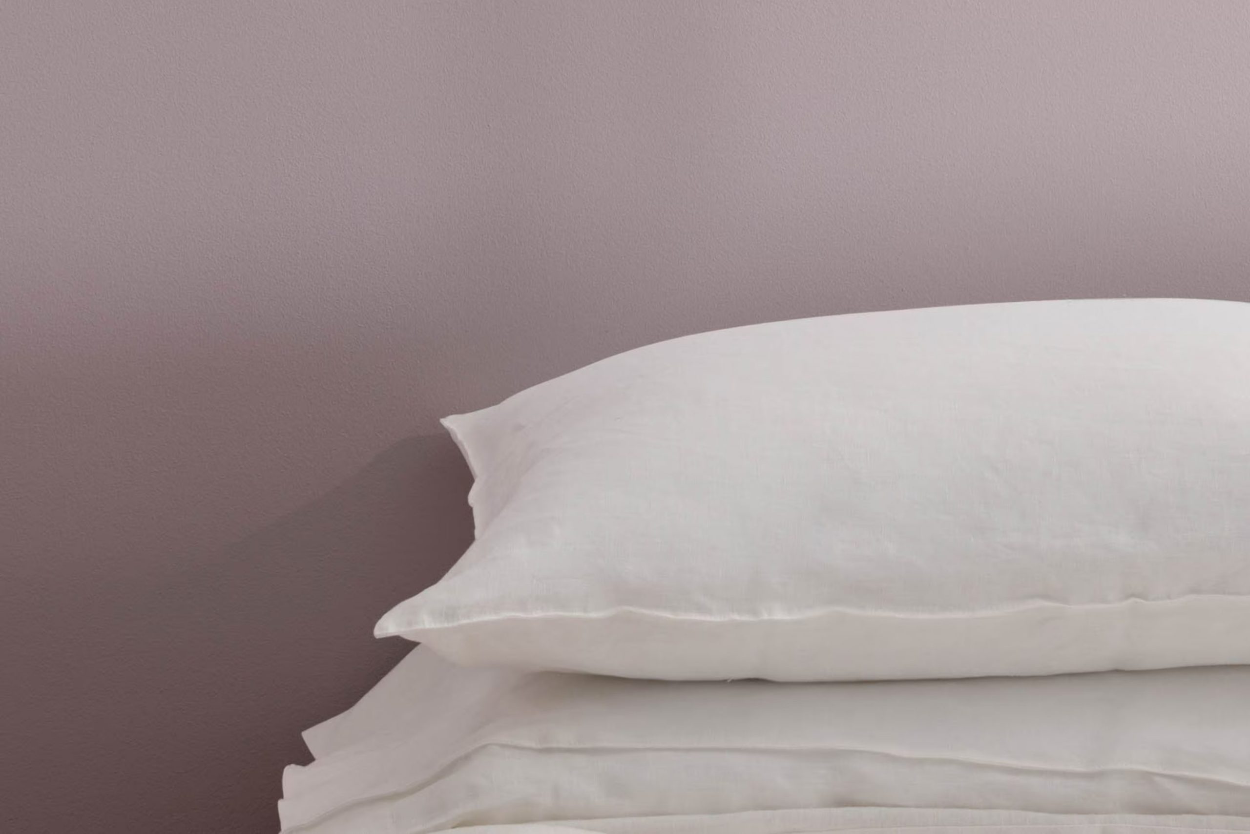
What Color Is Mauve Blush 2115-40 by Benjamin Moore?
Mauve Blush by Benjamin Moore is a soft, muted pink that brings a gentle warmth to any room. This inviting hue balances between a delicate pink and a subtle purple, creating a cozy atmosphere that feels welcoming and soothing. As a lighter shade, it can help make smaller rooms appear larger and more open, while also adding a touch of softness to larger, more spacious areas.
This particular color works exceptionally well in a variety of interior styles, including shabby chic, modern minimalist, and traditional decor. It’s especially effective as a wall color in bedrooms, living rooms, and nurseries where you want to foster a relaxed and comforting environment.
In terms of materials, Mauve Blush pairs beautifully with natural wood tones, from lighter bamboo to richer walnuts, enhancing the warmth of the wood. It also matches well with soft, plush textures like velvets or woolen throws, adding a layer of luxury without feeling too intense in the room. For a modern edge, incorporating metallic accents like brass or copper can create a striking contrast with the softness of the pink, offering a balanced yet stylish aesthetic.
Overall, Mauve Blush is flexible and easy to integrate into various decor approaches, complementing an array of materials and textures to create inviting and stylish interiors.
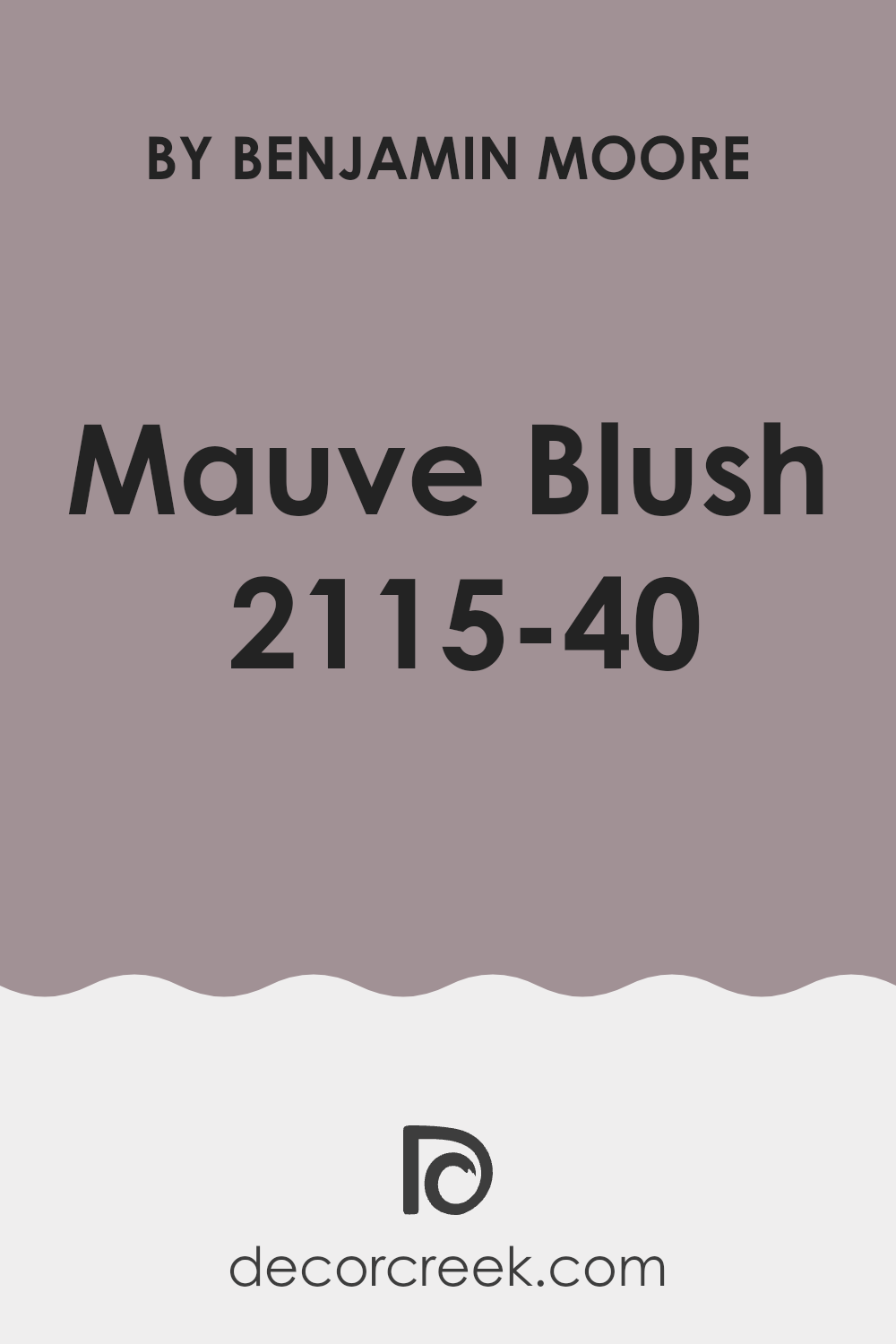
Is Mauve Blush 2115-40 by Benjamin Moore Warm or Cool color?
Mauve Blush by Benjamin Moore is a gentle, warm pink that softens any room it’s used in, making it perfect for creating a welcoming atmosphere in homes. This color is adaptable, working well in many areas like living rooms, bedrooms, and bathrooms. When used on walls, it provides a calming backdrop that complements a wide range of decor styles, from modern to traditional.
Mauve Blush is not too bold, so it doesn’t overpower the room, making it an excellent choice for those who want to add a touch of color without making a major commitment. It pairs beautifully with neutral shades such as whites, grays, and tans, but can also hold its own next to darker colors like navy or rich browns. Furnishings in natural wood tones look particularly stunning against this subtle pink.
This color also works well in rooms with limited natural light, as it can help brighten the area without being too stark, making any room feel more open and airy.
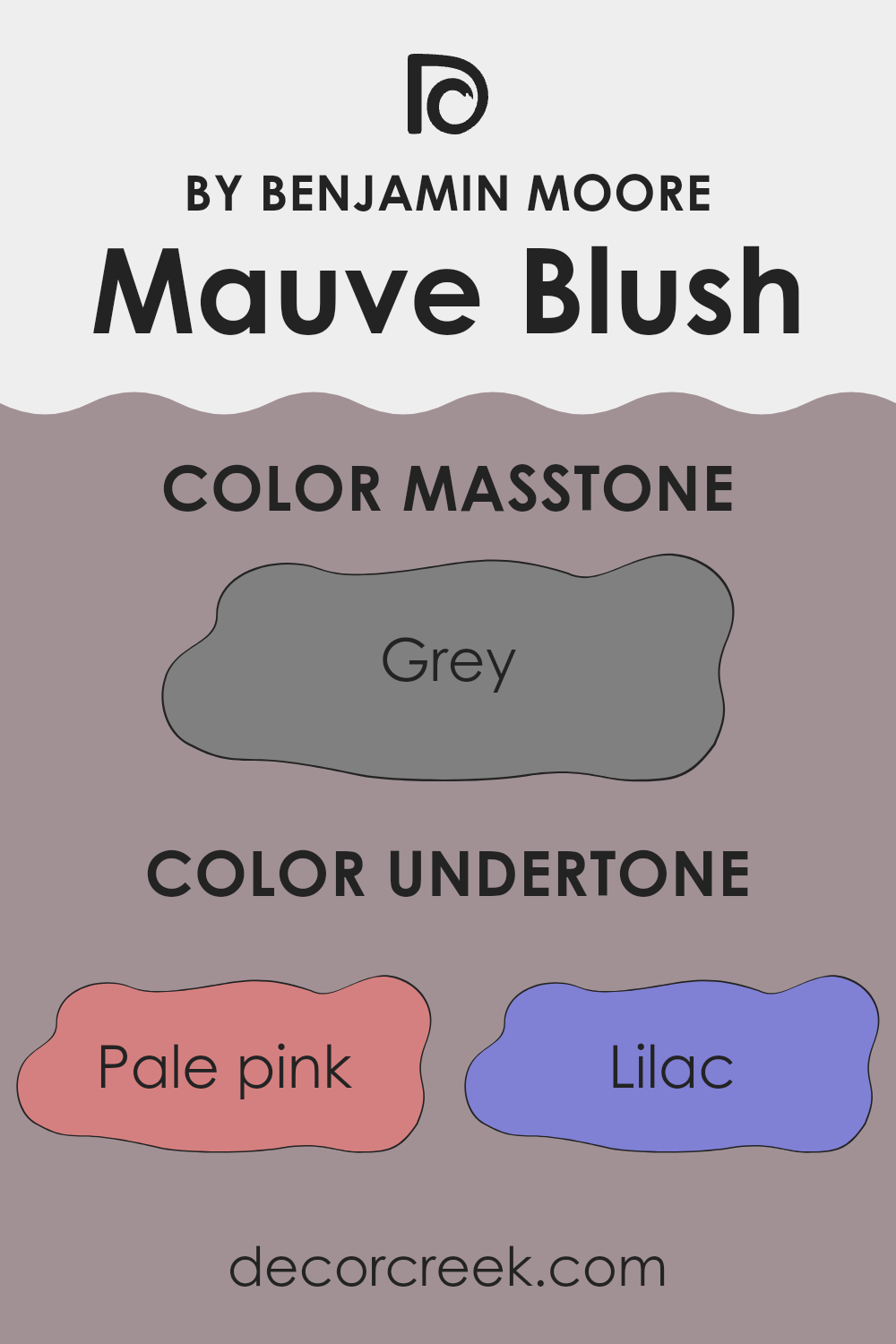
Undertones of Mauve Blush 2115-40 by Benjamin Moore
Mauve Blush is a unique paint color that carries subtle undertones that can gently influence the ambiance of a room. When painted on interior walls, its primary undertones, which include shades like pale pink, lilac, mint, and light purple among others, contribute to the overall feel and appearance of the interior.
The inclusion of pale pink and lilac undertones adds a gentle, inviting warmth to the wall, making rooms feel cozy and welcoming. In rooms with plenty of natural light, these pink shades come alive, giving the room a soft, lively touch. Meanwhile, the mint and light purple can cool down this warmth just a little, introducing a hint of freshness and calmness.
Undertones such as pale yellow, light blue, and light gray provide a neutral balance that enhances the paint’s adaptability. This subtle blend makes Mauve Blush an exceptional choice for different lighting conditions and complements a variety of decor styles. For instance, in dimmer environments, the pale yellow can help maintain lightness on the walls.
Darker undertones like purple and olive add depth to the color, preventing it from looking flat. When you have indirect lighting, these deeper tones might become more prominent, giving the room a more refined look without overpowering the softer, lighter hues.
In summary, the diverse undertones of Mauve Blush affect the mood and visual impact of a room. They ensure the color can adjust and enhance various interiors, providing warmth and depth while maintaining a balanced, fresh look.
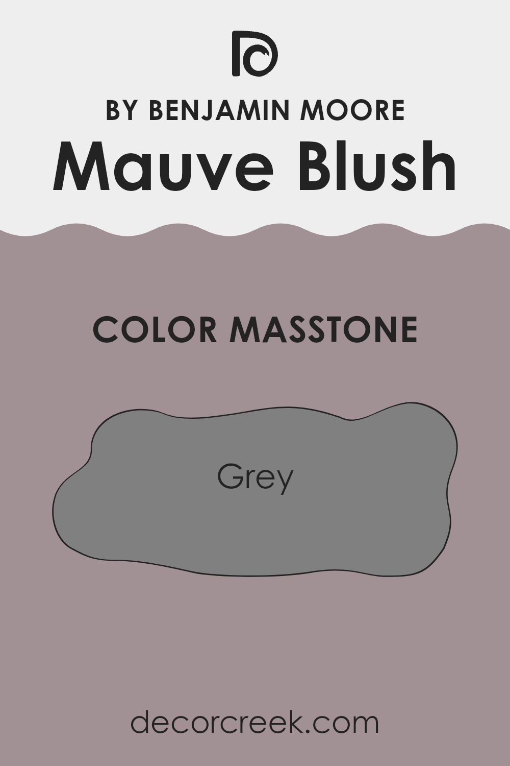
What is the Masstone of the Mauve Blush 2115-40 by Benjamin Moore?
Mauve Blush 2115-40 by Benjamin Moore has a masstone of grey, color code #808080. This unique base significantly influences how it appears and functions within a home. Grey, being a neutral and soft background color, allows Mauve Blush to adjust well to many decorating styles and settings.
It adds a subtle touch of warmth without feeling too intense in a room, making it perfect for creating a cozy and welcoming atmosphere. This characteristic makes it ideal for use in bedrooms and living areas where a calm and relaxing vibe is desired.
Additionally, the grey undertone ensures that Mauve Blush pairs well with many other colors, from bright and bold to soft and subtle, providing flexibility in design options. It’s an excellent choice for those looking to add just a hint of color while maintaining a gentle, laid-back feel in their living room.
How Does Lighting Affect Mauve Blush 2115-40 by Benjamin Moore?
Lighting has a significant influence on how colors appear in a room. Different light sources can change how we perceive a color, making it look different at various times of the day or under different lighting conditions.
For instance, the color Mauve Blush by Benjamin Moore is a subtle, soft pink with hints of purple. In natural light, this color appears more vibrant and closer to its original hue. Natural sunlight brings out the brightness and depth of the color, emphasizing its gentle warmth.
In artificial light, the perception of Mauve Blush can vary depending on the type of bulb used. Warm lights, such as incandescent bulbs, enhance the red and pink tones, making the color appear cozier and warmer. Cool lights, like some LEDs, might bring out more of the purple undertone, giving the room a slightly cooler feel.
The direction a room faces can also affect how Mauve Blush looks:
- North-Faced Rooms: These rooms often get less direct sunlight, which can make Mauve Blush look more muted and slightly cooler in tone. The color might lose some of its vibrancy and appear more subdued.
- South-Faced Rooms: These rooms receive ample sunlight, which can make the color look lighter and more vivid. Mauve Blush in a south-facing room is likely to feel warm and welcoming throughout the day.
- East-Faced Rooms: These rooms get plenty of morning light, which is usually bright and warm. Early in the day, Mauve Blush will appear lively and warmly inviting. However, as the day progresses, the color may lose some intensity due to the reduced natural light.
- West-Faced Rooms: In the afternoon and evening, these rooms are filled with softer, warmer sunlight. Mauve Blush will look very warm and cozy later in the day compared to the morning, where it may seem slightly cooler.
Understanding these effects can help you decide where to apply this color and what lighting conditions to pair it with to achieve the desired atmosphere in your room.
What is the LRV of Mauve Blush 2115-40 by Benjamin Moore?
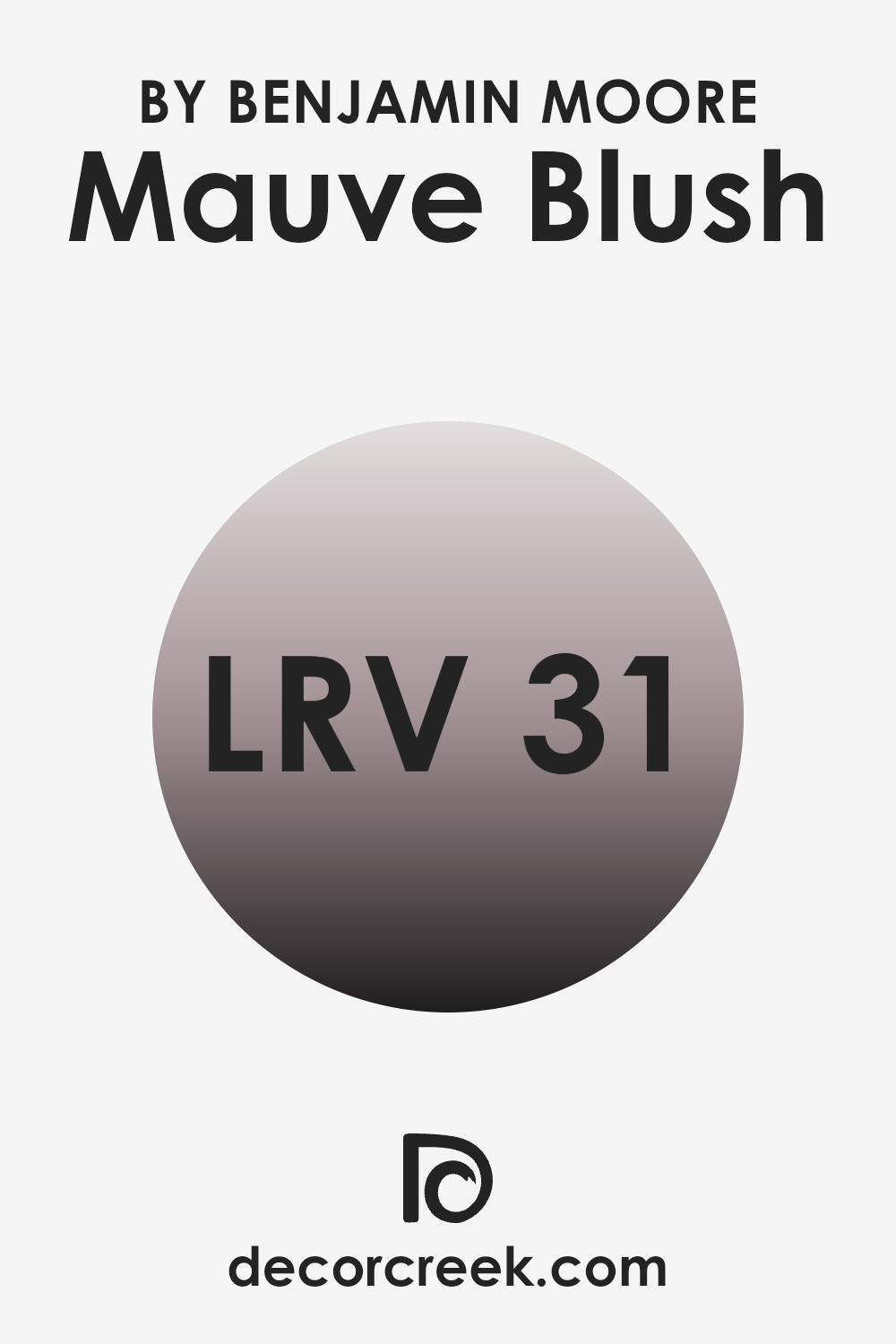
LRV stands for Light Reflectance Value, a measure used to reflect how much light a paint color can reflect back into a room versus how much it absorbs. Essentially, the higher the LRV number, the lighter the color appears because it reflects more light back into the room.
This is a useful piece to consider when choosing a paint color because it helps you understand how bright or dark your room will feel once it’s painted. For instance, rooms with less natural light might benefit from a paint with a higher LRV to make the room feel airier and brighter.
In the case of the color Mauve Blush with an LRV of 30.58, it falls into a mid-range category. Not too dark or too light, this value suggests that the color will absorb more light than it reflects, which can make a room feel cozier and slightly more enclosed. When applied to walls, this particular shade will provide a warm tone and can have a rich appearance under various lighting conditions. It’s an effective choice for rooms where you want to add some color without feeling overpowering from brightness, making it suitable for many interiors, especially those that are designed for relaxation or gatherings.
Coordinating Colors of Mauve Blush 2115-40 by Benjamin Moore
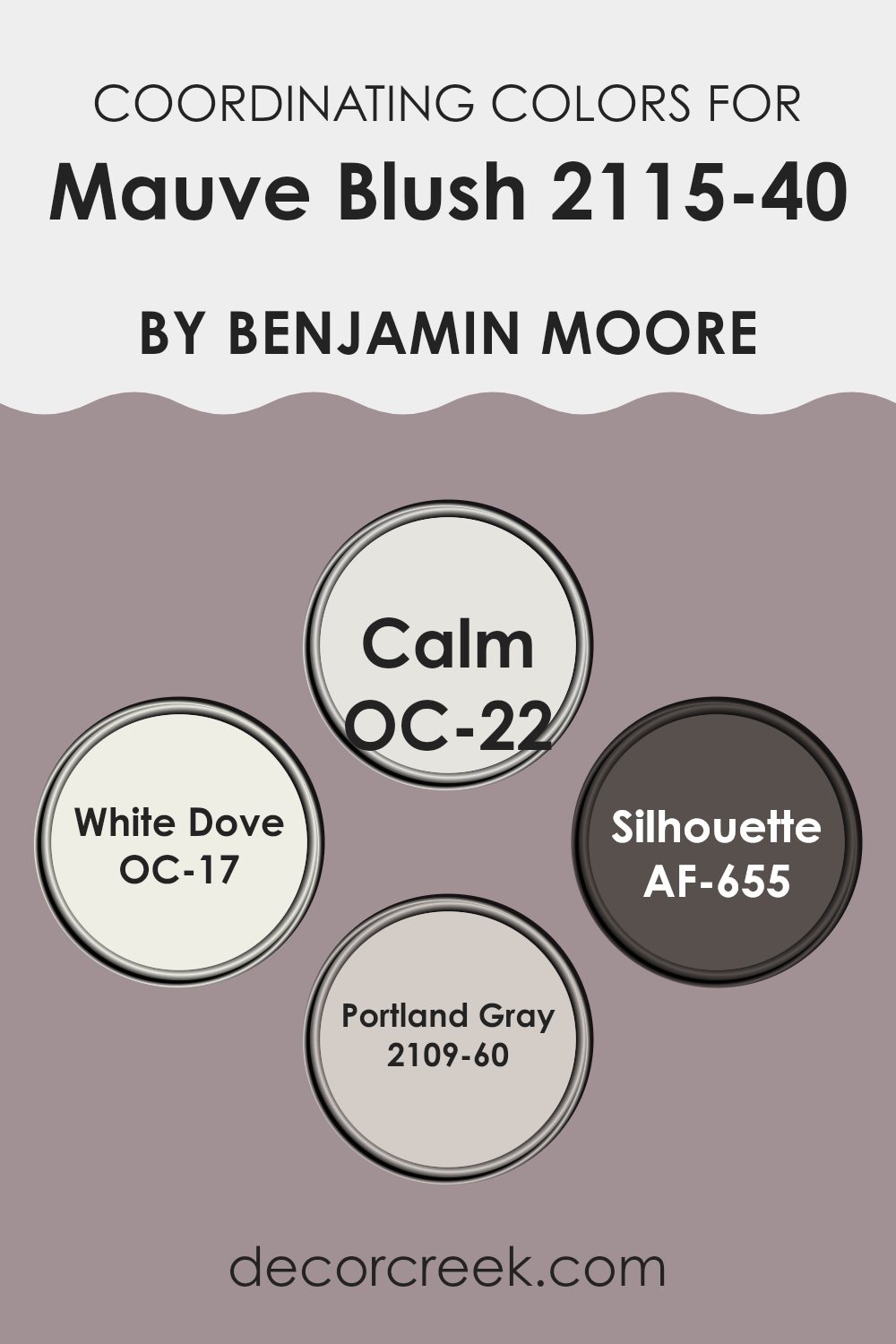
Coordinating colors are chosen to complement or enhance the main color used in a design or decor scheme. For example, Mauve Blush by Benjamin Moore can be paired with colors that bring out its subtle hues or create a harmonious contrast in your room. Selecting coordinating colors involves looking at shades that can visually balance or enrich the primary color, ensuring the overall look is cohesive and pleasing.
OC-22, known as Calm, is a soft and gentle white with a hint of gray that pairs wonderfully with richer tones, providing a clean backdrop that allows other colors to shine. OC-17, or White Dove, is another white but with a creamy warmth that makes it perfect for creating a gentle and inviting atmosphere when used alongside deeper shades.
AF-655, called Silhouette, is a deep, charcoal gray that offers a striking contrast to Mauve Blush, adding drama and depth to the color palette. Lastly, 2109-60, known as Portland Gray, is a light muted gray with soft purple undertones, complementing Mauve Blush by echoing its subtle complexities without overpowering it. These coordinating colors work together to create a fluid and balanced look, enhancing the overall aesthetic of any room.
You can see recommended paint colors below:
- OC-22 Calm
- OC-17 White Dove (CHECK A SAMPLE)
- AF-655 Silhouette (CHECK A SAMPLE)
- 2109-60 Portland Gray (CHECK A SAMPLE)
What are the Trim colors of Mauve Blush 2115-40 by Benjamin Moore?
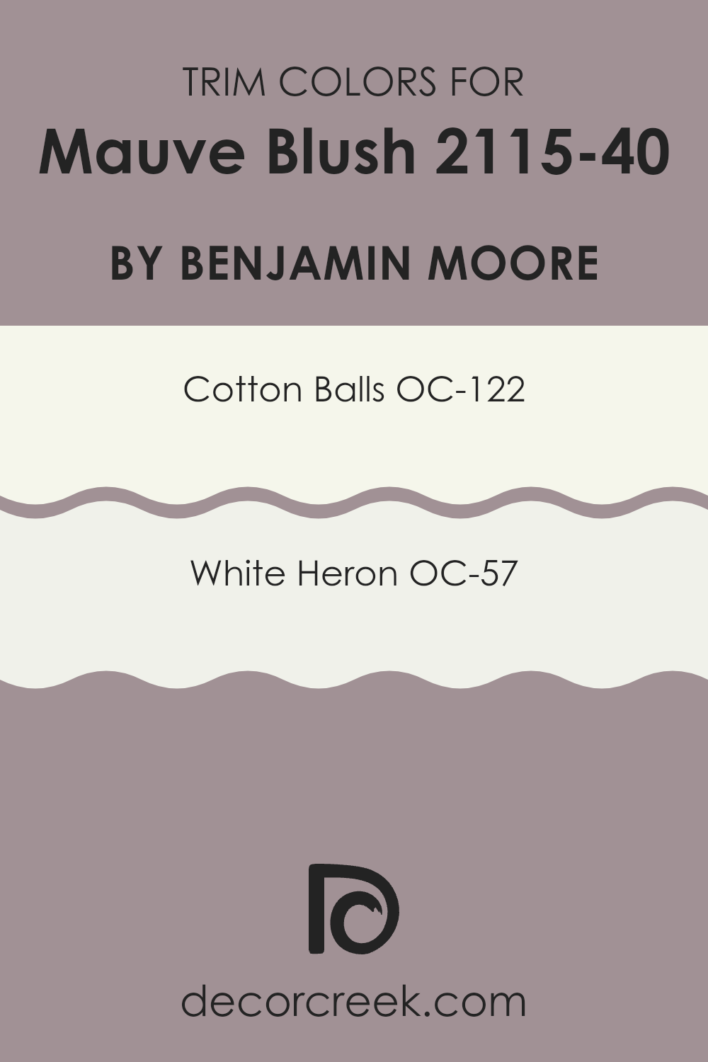
Trim colors are specific shades used to highlight or outline architectural details such as door frames, window frames, and baseboards. When chosen correctly, these colors can complement the main color of the walls by adding contrast or enhancing subtler tones, which in turn can make the wall color stand out more or give a more polished look to the overall interior.
For Mauve Blush by Benjamin Moore, pairing it with carefully selected trim colors like OC-122 Cotton Balls and OC-57 White Heron plays a critical role. These lighter shades provide a gentle contrast, preventing the room from feeling too heavy with darker colors and instead accentuating the delicacy of Mauve Blush.
Cotton Balls OC-122 is a clean and bright white that brings a fresh and airy feel to the surroundings. Its purity and light-reflecting properties make it a great choice for trim, offering a crisp edge to the softer tones of Mauve Blush. On the other hand, White Heron OC-57, though also white, leans toward a slightly muted tone, providing a softer look compared to the starkness of pure white trims. This slight variation in whites enhances the depth of the room and complements a wider range of accompanying decor styles and hues.
You can see recommended paint colors below:
Colors Similar to Mauve Blush 2115-40 by Benjamin Moore
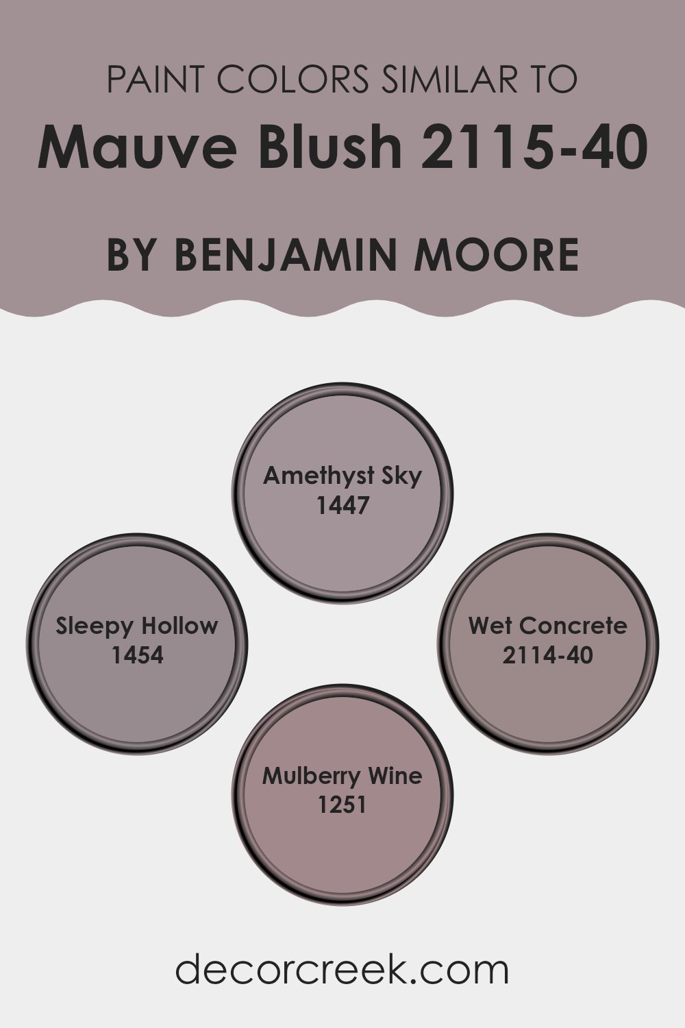
Choosing the right colors for a room can make a significant difference in how it feels. Similar colors, like those that are akin to Mauve Blush by Benjamin Moore, create a harmonious and comforting environment. Colors such as Amethyst Sky, Sleepy Hollow, Wet Concrete, and Mulberry Wine each contribute to a cohesive palette that provides a gentle transition from one hue to the next. This approach to color selection ensures that the room carries a consistent theme, which helps in creating a visually pleasant interior.
Amethyst Sky is a subtle shade of purple that imparts a calm and airy feel to rooms, making it a great companion to Mauve Blush. It adds a touch of freshness without feeling too intense next to the soothing effect of a room’s décor. Sleepy Hollow, on the other hand, brings a deeper, more nuanced blue, injecting a subtle depth to the walls it graces.
As another color in this palette, Wet Concrete offers a gray tone that grounds the other hues, providing a steady base for the more expressive colors. Mulberry Wine is a rich, deeper color that resembles a ripe berry, giving a room an element of warmth and luxury that feels inviting rather than overpowering. Together, these colors work seamlessly to enhance each other’s beauty and offer a smooth visual experience.
You can see recommended paint colors below:
- 1447 Amethyst Sky (CHECK A SAMPLE)
- 1454 Sleepy Hollow (CHECK A SAMPLE)
- 2114-40 Wet Concrete (CHECK A SAMPLE)
- 1251 Mulberry Wine (CHECK A SAMPLE)
Colors that Go With Mauve Blush 2115-40 by Benjamin Moore
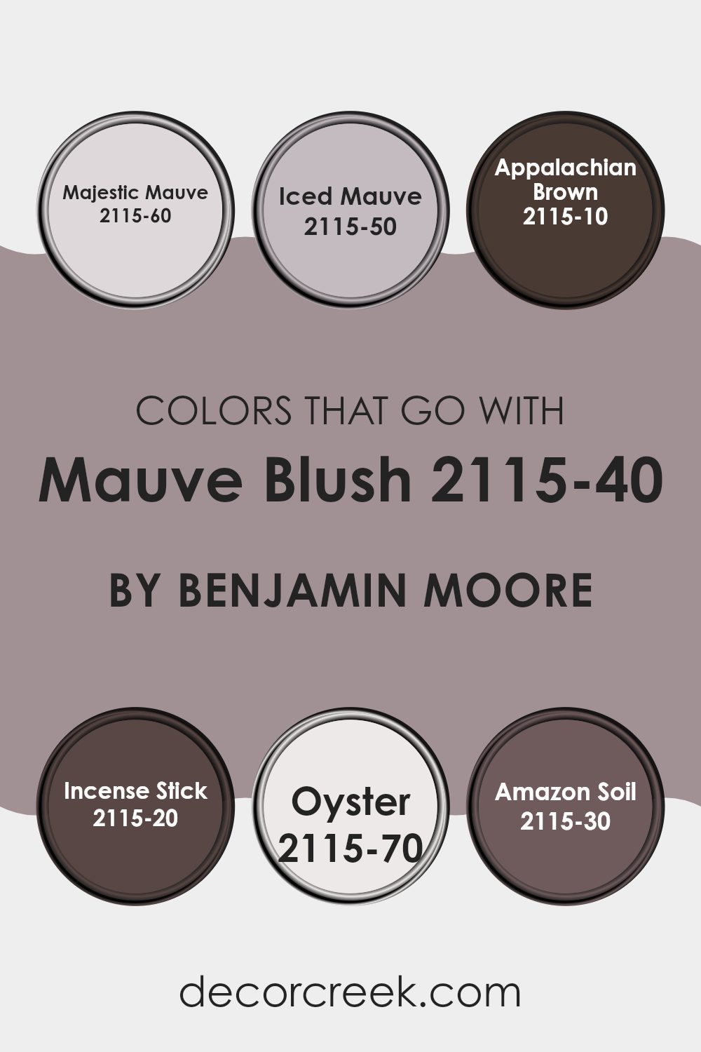
Choosing the right colors that pair well with Mauve Blush 2115-40 by Benjamin Moore is crucial because it can greatly influence the mood and overall aesthetic of a room. The colors that complement this shade help in creating a balanced and harmonious look, making a room feel cohesive.
For instance, Majestic Mauve and Iced Mauve, both lighter variants, add a subtle contrast while maintaining the soft, calming vibe of Mauve Blush. These lighter shades can brighten a room, giving it a fresh and airy feel. On the other hand, darker tones like Appalachian Brown and Incense Stick offer a striking contrast, which can be used to add depth and richness to the decor, making the lighter mauve stand out more and lending a cozy atmosphere to the room.
In addition, colors like Oyster and Amazon Soil widen the palette’s flexibility. Oyster, a very light, almost neutral color, works as a soft backdrop that allows Mauve Blush to shine as an accent color without overpowering the senses. Meanwhile, Amazon Soil, a dark, rich earthy tone, provides a strong contrast that can make any room more dynamic and interesting. Using these complementary colors enables homeowners or decorators to create a variety of moods and styles, from relaxed and calm to bold and dramatic, all while revolving around the elegant base of Mauve Blush.
You can see recommended paint colors below:
- 2115-60 Majestic Mauve (CHECK A SAMPLE)
- 2115-50 Iced Mauve (CHECK A SAMPLE)
- 2115-10 Appalachian Brown (CHECK A SAMPLE)
- 2115-20 Incense Stick (CHECK A SAMPLE)
- 2115-70 Oyster (CHECK A SAMPLE)
- 2115-30 Amazon Soil (CHECK A SAMPLE)
How to Use Mauve Blush 2115-40 by Benjamin Moore In Your Home?
Mauve Blush 2115-40 by Benjamin Moore is a gentle and soft pink shade that adds a cozy, warm feel to any room. It’s a subtle color that doesn’t overpower, making it perfect for creating a relaxing atmosphere in your home. This color works beautifully in bedrooms where comfort is key, or in living areas where you want a touch of calm.
For those looking to refresh their interior, Mauve Blush can be used on walls as a main color or as an accent to complement neutral tones like whites, grays, or beige. It pairs well with furniture in natural wood tones or with metallic finishes like bronze or gold for a bit of contrast.
Additionally, this color is great for smaller rooms like bathrooms or entryways, giving them a warm, welcoming vibe. You can also use it for painting furniture or interior doors to add a unique touch to your home decor. Whether you are repainting a whole room or just adding some color highlights, Mauve Blush offers a delightful way to brighten your living environment.
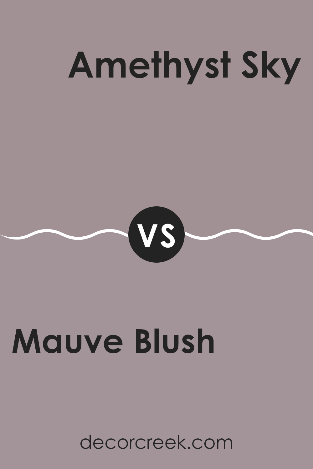
Mauve Blush 2115-40 by Benjamin Moore vs Amethyst Sky 1447 by Benjamin Moore
Mauve Blush by Benjamin Moore is a soft, muted pink with a touch of gray, giving it a subdued and gentle feel. It’s a color that pairs well with subtle, earthy shades and works great in rooms meant for relaxation like bedrooms or living rooms.
On the other hand, Amethyst Sky by Benjamin Moore is a deeper, more dramatic hue. This color resembles a blend of gray and muted violet, producing a cooler tone compared to Mauve Blush. Amethyst Sky can make a statement in a room, perfect for adding a touch of drama and depth.
Both colors have their unique appeals and can significantly affect the mood and style of a room. While Mauve Blush has a more gentle warmth suitable for soothing environments, Amethyst Sky offers a bold backdrop, ideal for more dynamic and visually impactful interiors. Choosing between them depends on the desired atmosphere and the other colors and design elements in the room.
You can see recommended paint color below:
- 1447 Amethyst Sky (CHECK A SAMPLE)
Mauve Blush 2115-40 by Benjamin Moore vs Wet Concrete 2114-40 by Benjamin Moore
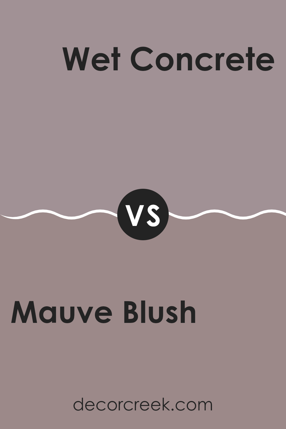
Mauve Blush by Benjamin Moore is a soft, gentle pink color with a subtle hint of purple. It offers a warm and cozy feel, making it perfect for rooms where you want to create a welcoming and comfortable atmosphere. This color works exceptionally well in bedrooms or living rooms, helping to produce a calm and soothing environment.
On the other hand, Wet Concrete by Benjamin Moore is a deeper gray tone that carries a strong resemblance to actual wet concrete. This shade is more muted and neutral, providing a sturdy and grounding effect. It’s a great choice for areas that require a more subdued or modern look, such as kitchens, bathrooms, or home offices.
Both colors hold their unique appeal and can set distinctly different moods within an interior. While Mauve Blush adds a touch of warmth and softness, Wet Concrete offers a more reserved and cool presence, making each ideal for different decorating needs.
You can see recommended paint color below:
- 2114-40 Wet Concrete (CHECK A SAMPLE)
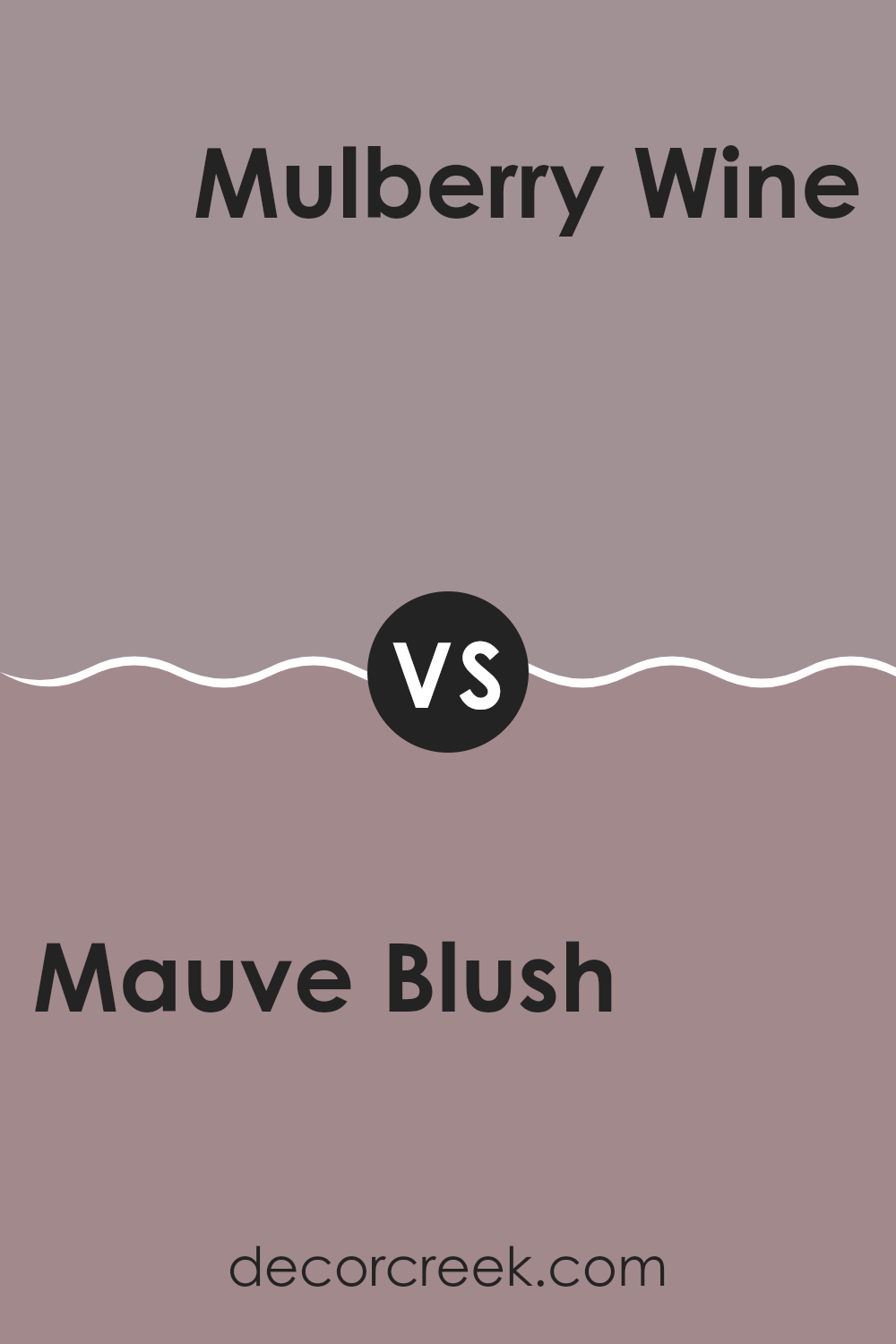
Mauve Blush 2115-40 by Benjamin Moore vs Mulberry Wine 1251 by Benjamin Moore
Mauve Blush is a soft, muted pink color with hints of gray, making it a subtle and calming choice. It tends to bring a light, airy feel to rooms, owing to its gentle tone. It’s mild enough to serve as a neutral base in a room yet carries enough color to add warmth and character.
On the other hand, Mulberry Wine is a deeper, richer tone, resembling the dark red of berry wine. This color is bolder and more pronounced, making a strong statement wherever it’s applied. It’s great for adding a sense of depth and warmth to rooms, and because of its intensity, it works well as an accent or feature wall to draw the eye.
These two colors, Mauve Blush and Mulberry Wine, offer contrasting vibes: one is light and understated, and the other is bold and warm. Choosing between them depends on the mood and atmosphere you want to create in your room.
You can see recommended paint color below:
- 1251 Mulberry Wine (CHECK A SAMPLE)
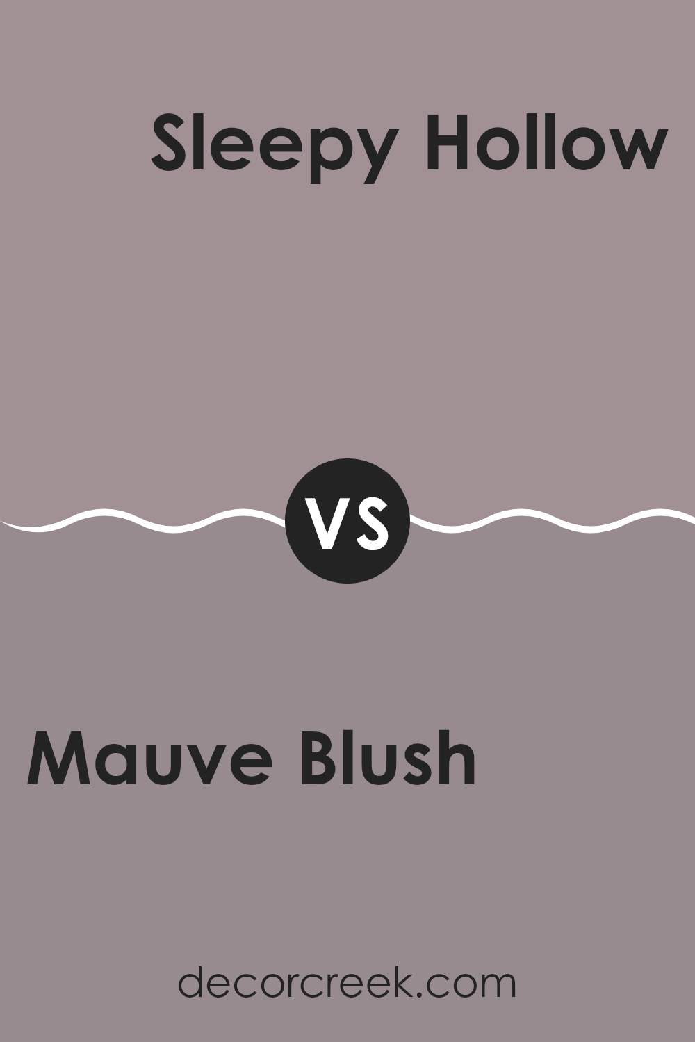
Mauve Blush 2115-40 by Benjamin Moore vs Sleepy Hollow 1454 by Benjamin Moore
Mauve Blush and Sleepy Hollow are two distinct colors by Benjamin Moore that each create their own unique atmosphere. Mauve Blush is a soft, subtle pink with a touch of gray that adds a warm and gentle feel to any room.
It’s perfect for creating a cozy and inviting environment, ideal for bedrooms or living areas where comfort is key. On the other hand, Sleepy Hollow is a much deeper, richer blue with hints of green, producing a more striking and bold look.
It’s great for making a statement, suitable for accent walls or rooms where you want to add some depth and interest. While Mauve Blush brings light and softness, Sleepy Hollow offers depth and intensity, making them suitable for different decorating needs or personal styles.
You can see recommended paint color below:
- 1454 Sleepy Hollow (CHECK A SAMPLE)
As I wrap up my thoughts on Benjamin Moore’s 2115-40 Mauve Blush, I realize it’s more than just a paint color. It’s a gentle and quiet shade that can make any room feel warm and welcoming. I think that’s why so many people might like it.
It’s like the soft color you see on some flowers, which can calm your mind and make you feel happy. When you put this color on your walls, it acts almost like a soft hug—comforting and pleasant. Whether you decide to paint a living room or a bedroom, Mauve Blush brings its peaceful feel to every corner. It’s quite simple; if you want a paint that is not too loud but still adds a lot of character to a room, Mauve Blush could be perfect.
In my view, choosing this color is like choosing a quiet friend who makes your home a nicer place to be. After studying and using this color, I’m convinced it’s a great choice for anyone looking to make their home feel cozy and calm without making too big of a change. It’s like this little magic trick for turning any room into a relaxing spot.
Ever wished paint sampling was as easy as sticking a sticker? Guess what? Now it is! Discover Samplize's unique Peel & Stick samples.
Get paint samples


