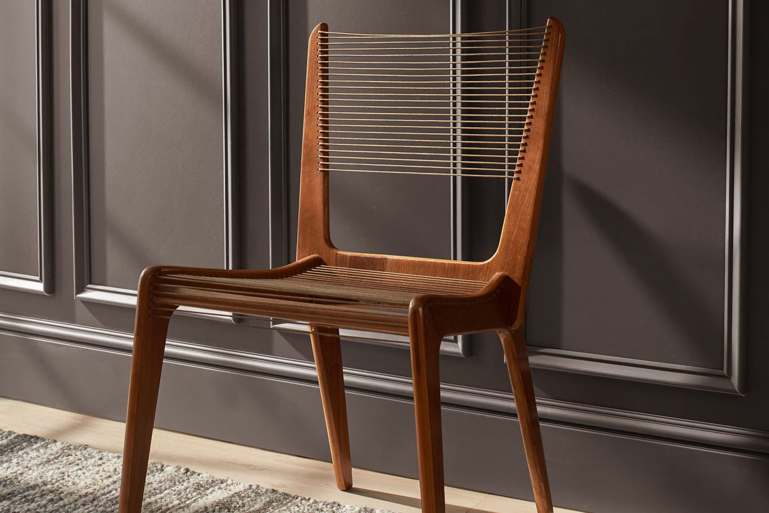
If you’re considering giving your area a fresh look with a new paint color, let me tell you about my experience with AF-655 Silhouette by Benjamin Moore. This intriguing shade of gray offers a striking balance between boldness and subtlety, making it an adaptable choice for any room in your home.
Whether you aim to achieve an atmosphere of understated elegance in your living room or a soothing environment in your bedroom, Silhouette adapts beautifully to different lighting conditions, reflecting varying intensities throughout the day. This characteristic ensures that it plays nicely with both modern and traditional decor, enhancing textures and furniture styles without it feeling too intense.
When I painted my study, I noticed how Silhouette served as a perfect backdrop for both my bookshelves filled with books and the brighter art pieces I love. It has the unique ability to complement dark woods as well as lighter metals, making it a go-to choice for those who enjoy mixing materials.
If you appreciate a color that adds depth and a refined touch while remaining fairly neutral, AF-655 Silhouette might just be the direction you want to go.
What Color Is Silhouette AF-655 by Benjamin Moore?
Benjamin Moore’s Silhouette is a deep, rich charcoal shade, perfect for creating a cozy and inviting atmosphere in any room. This adaptable color has an enduring appeal that can seamlessly blend with various interior styles, such as modern farmhouse, contemporary, or minimalist designs.
Silhouette excels in settings where a strong, foundational color is needed to anchor lighter tones. In a modern farmhouse kitchen, pairing it with crisp white cabinetry and natural wood elements can create a striking contrast. For a sleek, contemporary living room, consider Silhouette on a feature wall to make lighter furnishings and metallic accents stand out.
When it comes to materials, Silhouette pairs beautifully with a range of textures and finishes. Luxurious velvet cushions, for example, look stunning against this deep shade, especially in rich blues or emerald greens. Natural leather, with its warm undertones, also complements the charcoal hue, adding a touch of rustic charm to any area. Wood, whether light oak or rich walnut, enhances the warmth of Silhouette, and when used for flooring or furniture, it helps balance the color’s cool undertones.
Overall, Silhouette is a diverse choice that works wonderfully to create depth and contrast in an area, fitting well with many themes and materials.
Is Silhouette AF-655 by Benjamin Moore Warm or Cool color?
Silhouette AF-655 by Benjamin Moore is a unique shade of gray that has a subtle hint of brown, creating a warm and welcoming feel in any room. This color is adaptable, making it a great choice for various areas in the house, from living rooms to bedrooms. Its neutral tone serves as an excellent backdrop that complements both bright and soft colors, allowing for a wide range of decorating styles.
When used in a home, Silhouette AF-655 can help to create a cozy atmosphere, making areas feel more comfortable and relaxed. It is especially effective in spots with lots of natural light, as the color can appear richer and more vibrant.
For smaller rooms, this shade can also help to make the area feel larger and more open, as its warm undertones can soften the overall look. This color is a practical choice for those looking to have a stylish yet enduring interior.
Undertones of Silhouette AF-655 by Benjamin Moore
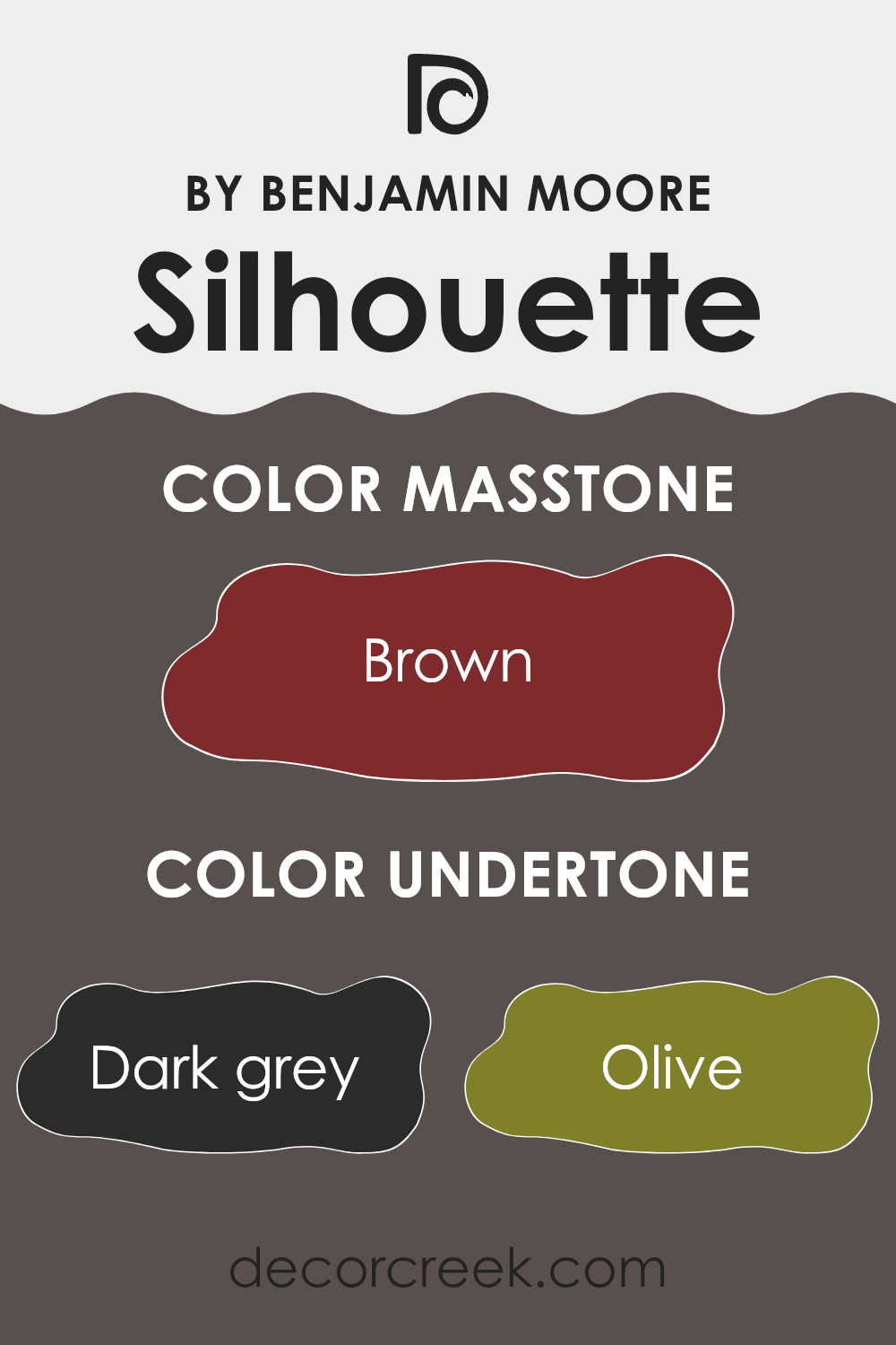
Silhouette is a unique paint color that offers a complex blend of undertones, making it highly adaptable for interior decorating. With undertones ranging from dark grey to pale pink, this color can exhibit different shades depending on the lighting and surrounding colors.
Dark grey and grey undertones provide a steady, neutral base that makes Silhouette a strong standalone color or an excellent backdrop for brighter accents. Olive and dark green undertones bring in an earthy feel, which can make an area feel more grounded and connected to nature. These greenish undertones work well in areas with lots of natural light or plant decorations.
The subtle hints of navy and dark turquoise add depth and a touch of mystery, making the color more dynamic. These cooler tones can cool down an area, which is ideal for creating a calm and collected atmosphere. Purple and red undertones introduce a warmer spectrum, adding a cozy, inviting touch. These can make an area feel more comfortable and welcoming, especially in living rooms or bedrooms.
Orange and pink undertones, including pale pink, add a slight vibrancy without it feeling too intense. These warmer tones can soften the appearance of an area and are particularly flattering in areas intended for relaxation or gatherings.
In general, the complex undertones in Silhouette mean it can look slightly different in each setting. It’s an adaptable choice that can adjust to many interior styles and moods, depending on the accompanying decor and the room’s natural and artificial lighting. This makes it a smart choice for those looking to create a subtly varied aesthetic in their home without the need for multiple paint colors.
decorcreek.com
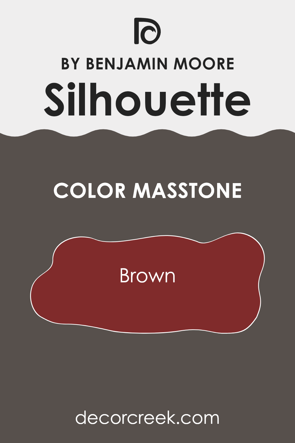
What is the Masstone of the Silhouette AF-655 by Benjamin Moore?
The color SilhouetteAF-655 by Benjamin Moore has a masstone described as Brown(#802B2B), offering a warm and rich hue that can enhance various areas in the home. This deep brown shade creates a cozy and inviting atmosphere when used on walls, particularly effective in living rooms, bedrooms, or studies where a comforting feel is desired.
In interior design, this brown can serve as a striking contrast against lighter colors like creams or beiges, highlighting furniture and decor elements effectively. It’s also flexible enough to complement a wide range of other colors, from soft pastels to vibrant tones, allowing for dynamic and personalized styling options.
Furthermore, this particular shade of brown helps in hiding marks and smudges, making it a practical choice for high-traffic areas or homes with young children or pets. The depth of the color provides a backdrop that doesn’t easily show wear and tear, maintaining a neat appearance over time.
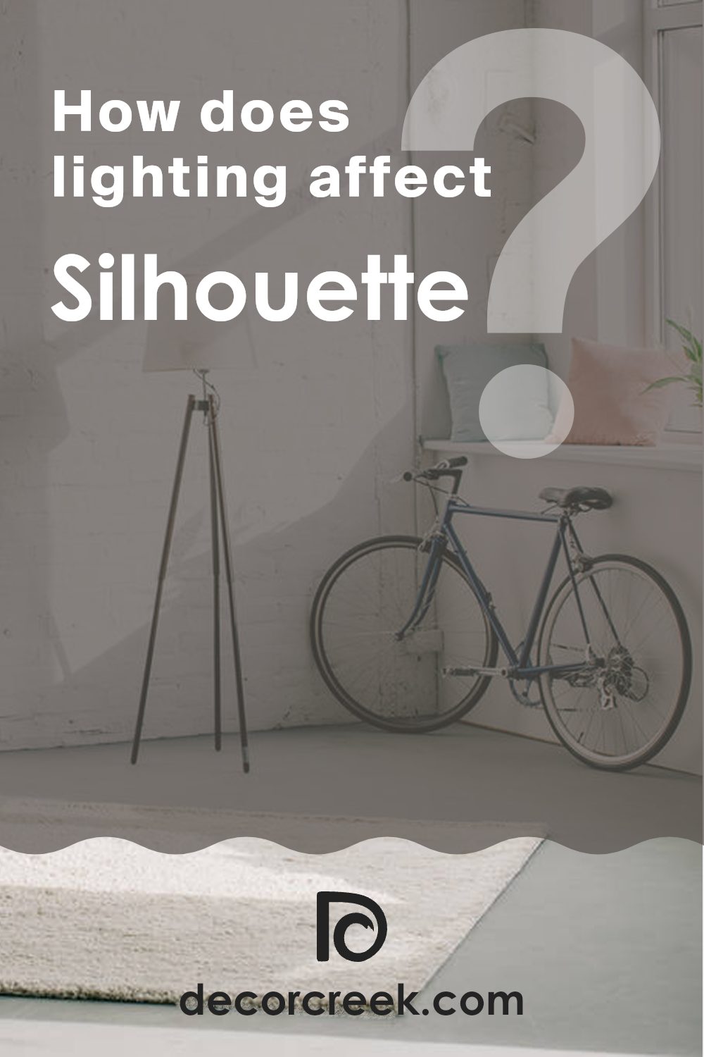
How Does Lighting Affect Silhouette AF-655 by Benjamin Moore?
Lighting plays a crucial role in how we perceive colors. The same wall painted in a specific shade can look different throughout the day depending on the light source. Different types of light can change how a color appears.
Take, for example, the paint color Silhouette by Benjamin Moore. This rich, dark charcoal color has subtle undertones that can shift depending on the lighting conditions. Under artificial light, such as LED or incandescent bulbs, Silhouette tends to look warmer and more intense. This is because many indoor lights have a yellowish tint, which adds warmth to colors.
In natural sunlight, the color can appear slightly cooler and more true to its dark gray shade. This is particularly apparent during midday when sunlight is brightest. However, the exact appearance will also be influenced by the direction the room faces:
- North-facing rooms: In rooms facing north, light tends to be cooler and more even throughout the day. Silhouette might appear more consistently true to its cool charcoal shade in these rooms, with less variation throughout the day.
- South-facing rooms: These rooms get a lot of sunlight, so Silhouette can appear lighter and slightly warmer, especially during the middle of the day when sunlight is abundant and warm.
- East-facing rooms: In the morning, east-facing rooms get bright, warm light, making Silhouette appear lighter and warmer. As the day progresses, the intensity of the light decreases, returning the color closer to its original dark gray by evening.
- West-facing rooms: These rooms have the opposite effect of east-facing rooms. The color will start off closer to its true shade in the morning but will warm up in the late afternoon and evening as sunlight floods the room.
Thus, the perception of Silhouette can vary significantly depending on the type of light and the orientation of the area, making it an adaptable choice for different areas and lighting conditions.
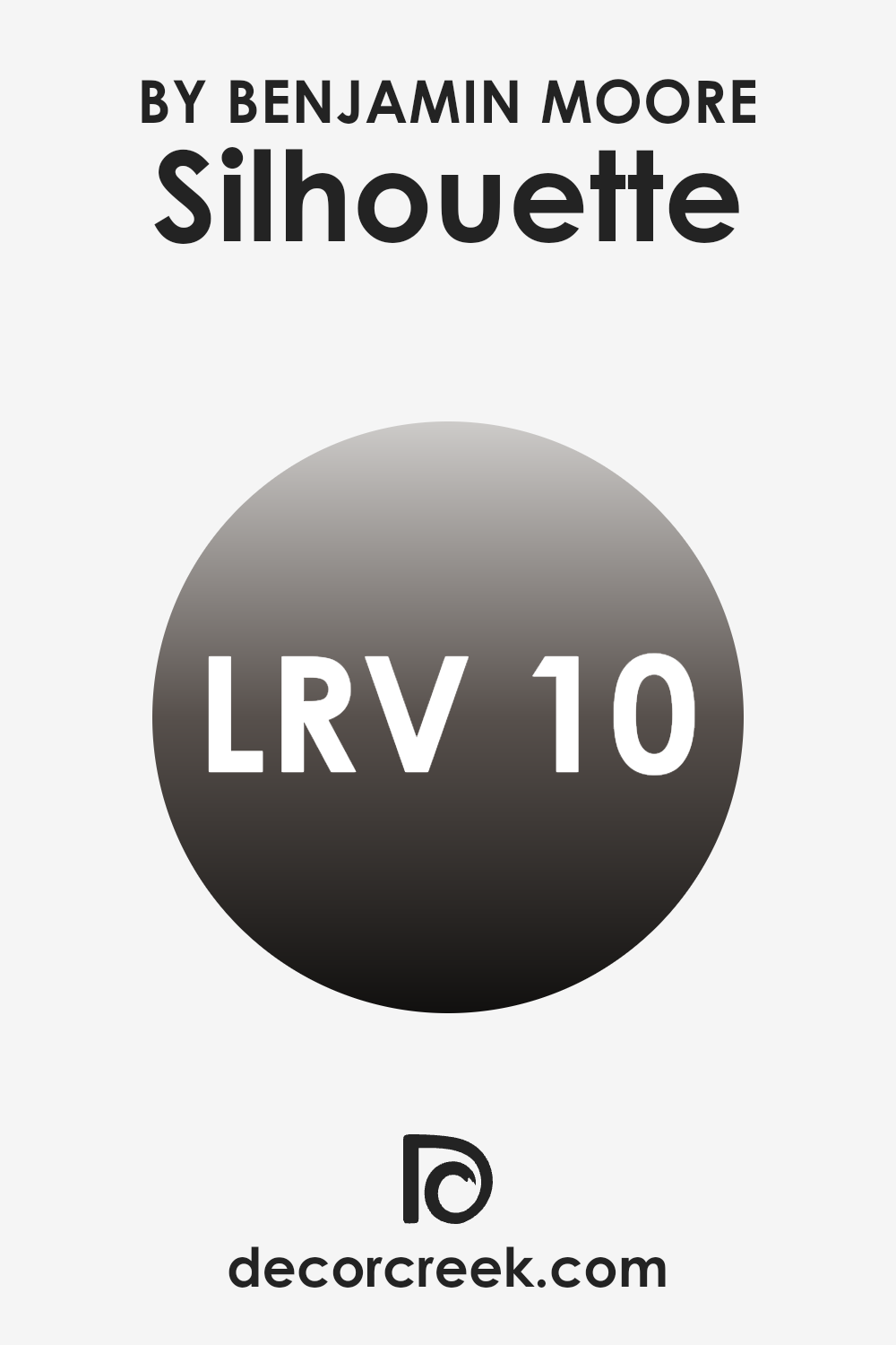
What is the LRV of Silhouette AF-655 by Benjamin Moore?
LRV stands for Light Reflectance Value, a measure indicating how much light a paint color reflects or absorbs. Measured on a scale from 0 to 100, the value gets higher as the paint reflects more light. This rating is crucial when choosing paint colors because it affects how light or dark a color appears once it’s on your walls. A higher LRV makes a room feel brighter and more open, as it reflects more light. Conversely, colors with lower LRVs absorb more light, making the area they are used in appear cozier and more condensed.
Silhouette AF-655 has an LRV of 10.18, which is relatively low. This means it reflects only a small portion of light, absorbing much of it instead. As a result, walls painted with this color will look deeper and darker, providing a dramatic and rich appearance.
This characteristic makes it ideal for creating a more intimate atmosphere in an area. However, it’s important to use this color in rooms with adequate lighting, whether natural or artificial, to ensure that the area does not become too dark and unwelcoming. Careful consideration of room size, lighting, and intended atmosphere can help in making the most of this vibrant color.
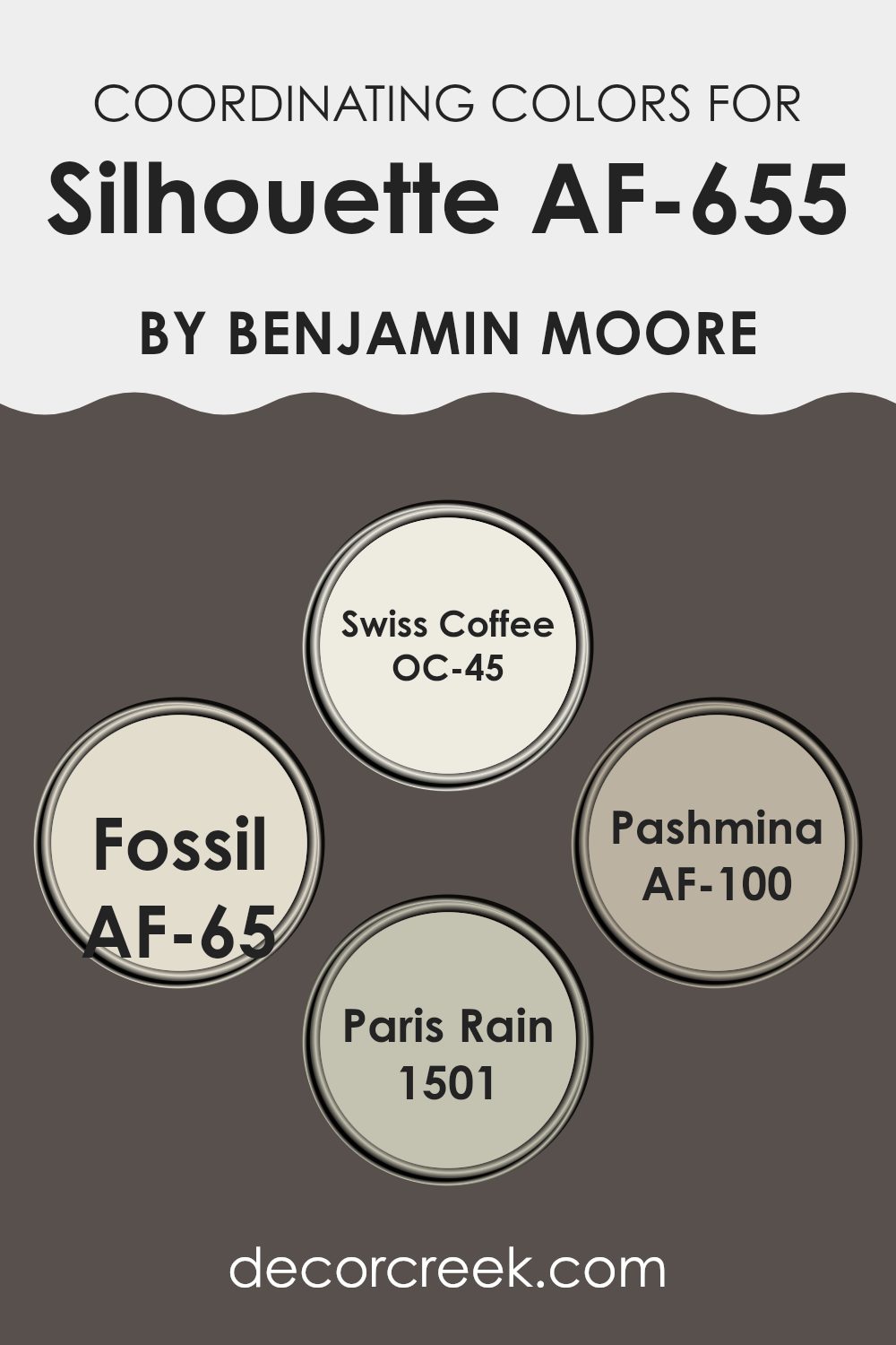
Coordinating Colors of Silhouette AF-655 by Benjamin Moore
Coordinating colors are chosen to complement a primary color, enhancing the overall aesthetic of a room. These colors, when chosen carefully, balance the visual weight of an area and create harmony. For example, when decorating with a base shade like a deep gray, surrounding it with coordinating colors can create an atmosphere that feels cohesive and visually pleasing.
Among the coordinating colors, OC-45 – Swiss Coffee is a soft and creamy white that offers a bright contrast, making it ideal for trims or ceilings to bring a sense of freshness to any area. AF-65 – Fossil is a subtle greige, a mix between gray and beige, adaptable enough to fit into most design schemes without overpowering other elements.
AF-100 – Pashmina provides a deeper touch, like a warm mid-tone gray that adds depth and richness, perfect for accent walls or furniture. Lastly, 1501 – Paris Rain is a neutral blue with hints of gray, which has a calming effect, excellent for creating a relaxed feel in bedrooms or bathrooms. These hues, while distinct, work together to support the primary color and create a flowing and coherent look in any decor setting.
You can see recommended paint colors below:
- OC-45 Swiss Coffee
- AF-65 Fossil
- AF-100 Pashmina
- 1501 Paris Rain
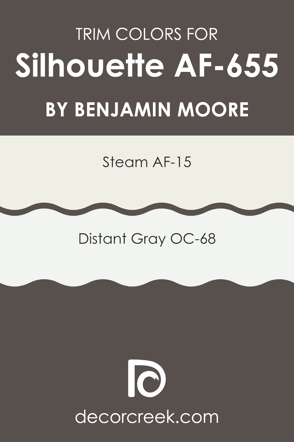
What are the Trim colors of Silhouette AF-655 by Benjamin Moore?
Trim colors are used to accentuate or complement the main color on walls, bringing a conclusive look to a room. They typically are applied to elements like door frames, window sills, skirtings, and moldings.
Choosing the right trim color is crucial as it helps define the area and can make the wall colors stand out more effectively. When combined with a deeper hue like Silhouette from Benjamin Moore, lighter trim colors can create a clean, crisp boundary that enhances the overall appearance of the room.
AF-15, known as Steam, is a soft and subtle white that has a slightly warm undertone, making it an excellent trim color that doesn’t clash but rather gently frames the walls. OC-68, named Distant Gray, is another great option for trims, providing a cooler, almost ethereal contrast to richer wall colors. It offers a gentle hint of gray that can help to subtly outline architectural details without it feeling too intense.
You can see recommended paint colors below:
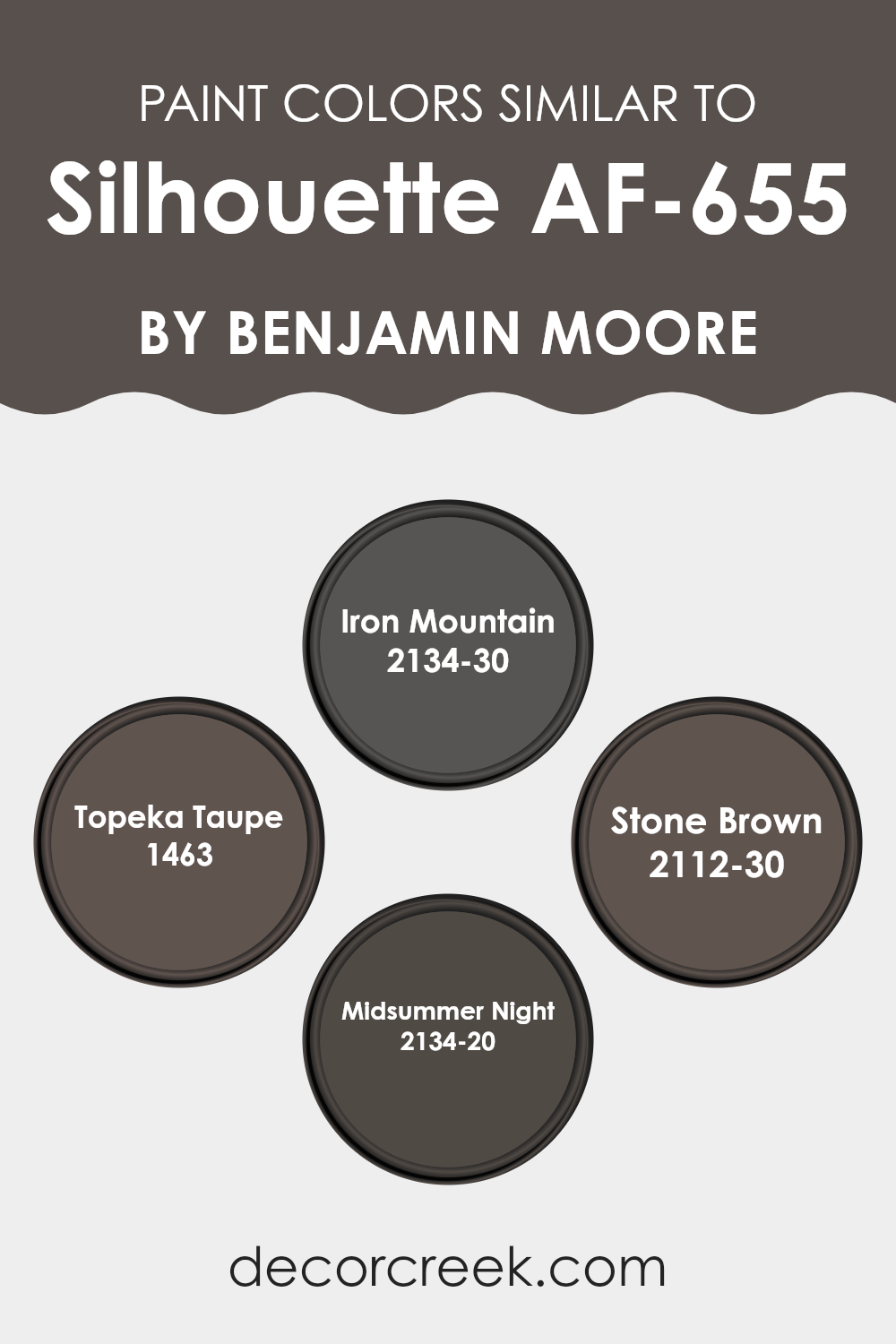
Colors Similar to Silhouette AF-655 by Benjamin Moore
Similar colors are essential in design because they help create a cohesive and harmonious look. When colors are similar, they blend well together, creating a seamless transition from one hue to another, which is pleasing to the eye.
For instance, tones like Iron Mountain, Topeka Taupe, Stone Brown, and Midsummer Night each share similar depth and intensity, making them easy to combine in various design settings without causing visual discord. These hues are close enough to each other on the color spectrum to support a unified aesthetic but varied enough to keep the color scheme interesting and dynamic.
Iron Mountain is a deep, charcoal gray that exudes a strong and grounded feel, perfect for creating a robust and impactful design statement. Topeka Taupe offers a warmer, softer gray with brown undertones that provides a subtle and inviting warmth, making it ideal for cozy, intimate areas.
Stone Brown is a bold, dark brown with a solid presence, lending a sense of stability and earthiness to any area. Lastly, Midsummer Night is a rich, deep navy that combines the calm of blue with the profound mystery of a starlit sky, making it an excellent choice for adding a dash of drama. Together, these colors form a palette that can enhance any living area with their depth and adaptable applications.
You can see recommended paint colors below:
- 2134-30 Iron Mountain
- 1463 Topeka Taupe
- 2112-30 Stone Brown
- 2134-20 Midsummer Night
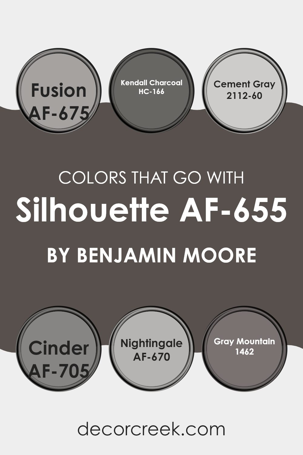
Colors that Go With Silhouette AF-655 by Benjamin Moore
Choosing the right colors to pair with Silhouette AF-655 by Benjamin Moore is essential for creating a harmonious and appealing area. When colors harmonize, they produce a seamless visual experience and set the desired mood in any room. Silhouette is a deep, rich charcoal that acts as a stunning backdrop for a range of complementary colors.
AF-675 Fusion is a subtle off-white that works wonderfully with Silhouette by providing a light contrast that refreshes the area without it feeling too intense. This shade softens the intensity of darker tones, making it perfect for balance. HC-166 Kendall Charcoal, another gray, is slightly lighter than Silhouette and can be used to create a monochromatic look that is sleek and continuous, perfect for a modern feel.
Then there’s 2112-60 Cement Gray, a mid-tone gray that bridges the gap between the lighter Fusion and the darker Silhouette, allowing for a gentle graduation of color throughout an area. AF-705 Cinder is a cool gray with hints of blue that brings a calm, clean look when paired with the deeper tones of Silhouette. It’s ideal for a cool, refined atmosphere. AF-670 Nightingale is a soft, muted gray with a warm undertone that adds a cozy feel to any room, complementing the boldness of Silhouette without competing for attention. Lastly, 1462 Gray Mountain offers a slight brown undertone, providing a warm transition that makes areas feel welcoming and grounded.
You can see recommended paint colors below:
- AF-675 Fusion
- HC-166 Kendall Charcoal
- 2112-60 Cement Gray
- AF-705 Cinder
- AF-670 Nightingale
- 1462 Gray Mountain
How to Use Silhouette AF-655 by Benjamin Moore In Your Home?
Silhouette AF-655 by Benjamin Moore is a flexible paint color that offers a rich, deep charcoal gray tone that can work beautifully in many areas of a home. If you’re looking to give a room a cozy and inviting feel, applying this color to your living room or bedroom walls might be a great choice. Its deep hue helps to make large areas feel more intimate, while also serving as a stunning backdrop for art, photos, or vividly colored decor.
In a home office or study, Silhouette can help in creating a focused and steady atmosphere, making hours of work or reading feel less straining. Its neutral tone pairs well with a wide range of other colors, from bright whites to soft pastels, allowing for flexibility in decorating.
For kitchens or dining areas, adding this color on cabinets or an accent wall can provide a striking contrast to lighter colored walls or fixtures, enhancing the overall aesthetic of the area.
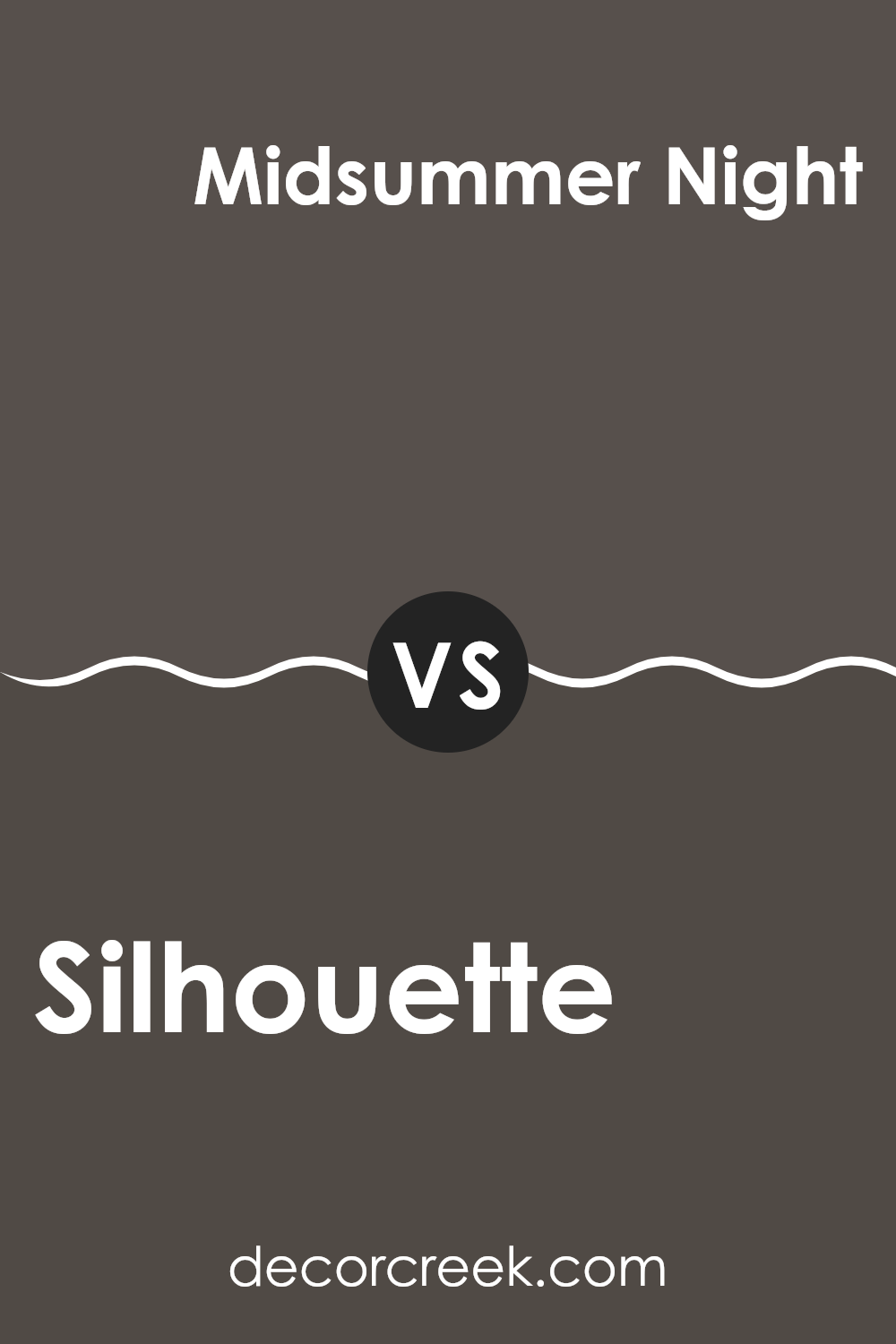
Silhouette AF-655 by Benjamin Moore vs Midsummer Night 2134-20 by Benjamin Moore
The main color, Silhouette, and the second color, Midsummer Night, both by Benjamin Moore, offer distinct tones for different decorating needs. Silhouette is a deeper, rich gray with hints of brown, giving it a warm feel that is cozy and inviting, ideal for living rooms or bedrooms.
In contrast, Midsummer Night is a much darker shade, closer to black, with deep blue undertones. This color can provide a dramatic flair, making it suitable for accent walls or for areas where a bold, strong presence is desired.
While Silhouette can help create a soft, cozy atmosphere, Midsummer Night is better suited for making a strong visual impact, giving a room a more striking appearance. Both colors work well in home interiors but serve different purposes depending on the mood or style one wants to achieve.
You can see recommended paint color below:
- 2134-20 Midsummer Night
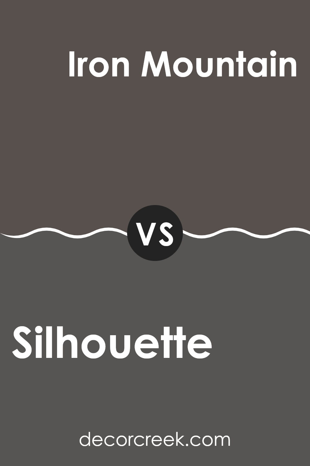
Silhouette AF-655 by Benjamin Moore vs Iron Mountain 2134-30 by Benjamin Moore
Silhouette by Benjamin Moore is a deep, charcoal gray that offers a solid and grounding effect. It’s not as stark as black, yet it provides a strong presence due to its richness in tone. This color is adaptable, working well in various areas to establish a modern yet cozy atmosphere.
Iron Mountain by Benjamin Moore, on the other hand, skews slightly darker and leans towards a more earthy, almost brownish undertone. This shade can appear more complex and engaging, especially in natural light where its subtleties come to the forefront. It’s a perfect choice for adding depth and warmth to an area, promoting a welcoming feel.
Both colors are powerfully muted, making them excellent choices for those looking to create a statement without it feeling too intense. They complement each other well but serve distinct visual impacts; Silhouette brings a cooler, cleaner look, whereas Iron Mountain brings warmth and a slight rustic charm.
You can see recommended paint color below:
Silhouette AF-655 by Benjamin Moore vs Topeka Taupe 1463 by Benjamin Moore
The main color, Silhouette by Benjamin Moore, is a deep, rich charcoal gray with a noticeable warmth that makes it quite adaptable for use in various areas. It has a welcoming depth that is appealing for creating a cozy feeling in rooms but can be impactful enough to make a statement if used on accent walls or in areas that receive a lot of natural light.
In contrast, Topeka Taupe, also by Benjamin Moore, is much lighter. It’s a soft, earthy taupe that blends beige and gray to deliver a neutral, friendly backdrop that’s easy to match with various decor styles.
This color is an excellent option for a subtle, grounding effect in an area, bringing light and a sense of roominess. When comparing both, Silhouette offers a stronger character with its darker tone, while Topeka Taupe provides a lighter, more flexible aesthetic for blending seamlessly with other colors and design elements.
You can see recommended paint color below:
Silhouette AF-655 by Benjamin Moore vs Stone Brown 2112-30 by Benjamin Moore
The main color, Silhouette, is a deeper, more neutral charcoal with a subtle hint of warmth, making it adaptable for areas needing a touch of depth without adding too much darkness. This color works well in areas that get a lot of natural light, as the light reveals its warm undertones.
Stone Brown, on the other hand, is a stronger, darker brown that leans towards a richer, almost chocolatey hue. This makes it ideal for creating a cozy and inviting atmosphere in areas like living rooms or bedrooms.
While Silhouette serves as a strong backdrop, adding dramatic flair to the area, Stone Brown offers a comforting, earthy presence that pairs well with natural materials like wood or leather. Both colors provide a striking option for anyone looking to add a dash of elegance to their interiors.
You can see recommended paint color below:
- 2112-30 Stone Brown
After learning about AF-655 Silhouette by Benjamin Moore, I’ve realized how special this color is. It’s a very deep, soft gray that seems almost like a gentle hug for the walls. I think it’s perfect for any room where you want to relax, like a bedroom or a living area. The neat thing about Silhouette is that it has a hint of warmth to it, making it very welcoming. This color could really help make a room look good without making everything look too dark.
I also learned that it goes well with lots of other colors. This means you can use it as a main color in your room and add other colors for things like pillows, curtains, and rugs to make the room pop. It’s a great choice if you’re tired of plain old white or beige and want something that adds a bit of depth but is still easy to live with.
So, if anyone is thinking about picking a new paint color, I’d definitely suggest giving AF-655 Silhouette by Benjamin Moore a try. It’s not just a simple gray; it’s a warm, welcoming shade that could make any room feel cozier.
Ever wished paint sampling was as easy as sticking a sticker? Guess what? Now it is! Discover Samplize's unique Peel & Stick samples.
Get paint samples

