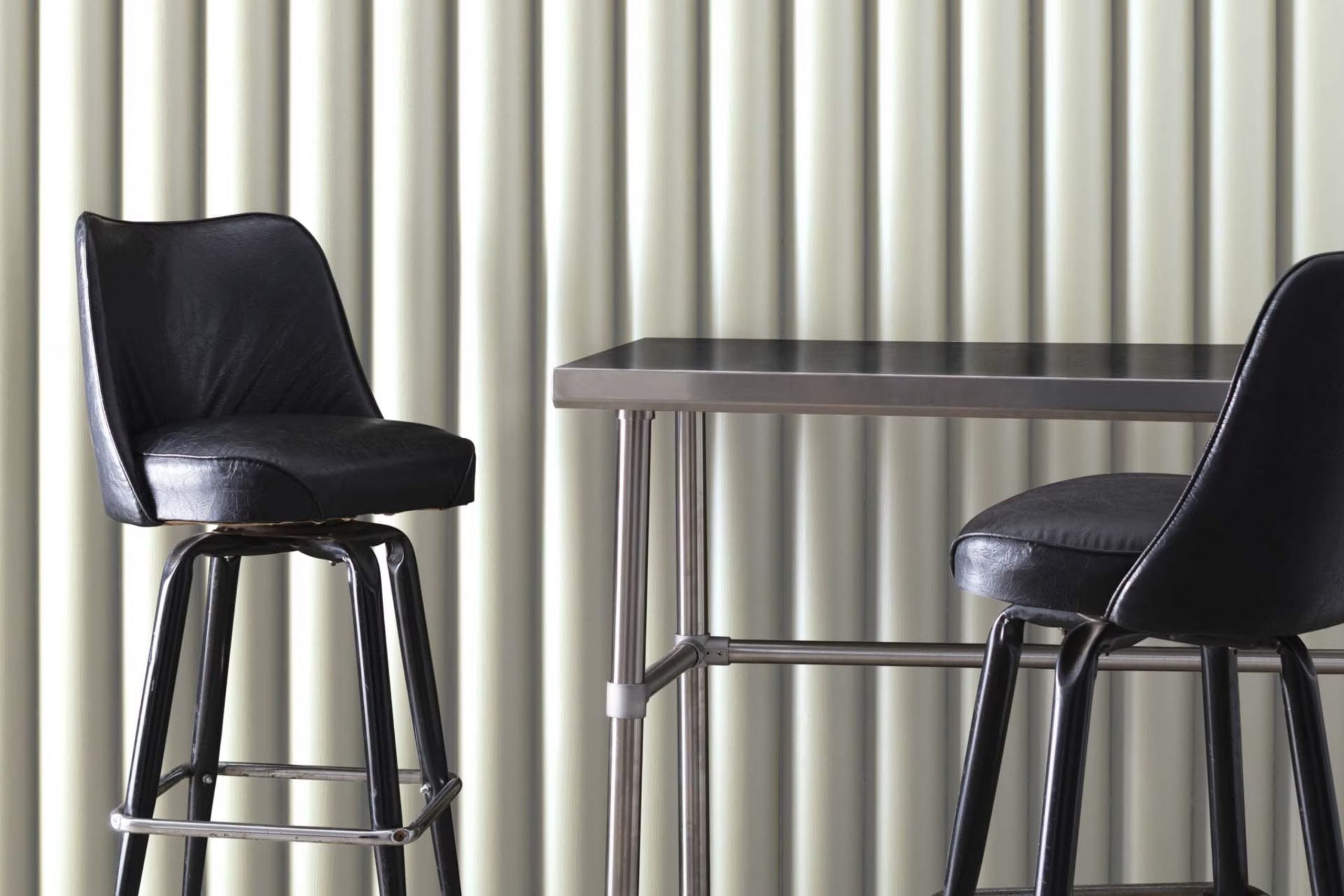
As you stand at the crossroads of wanting a change in your home’s atmosphere, consider the gentle tone of OC-140 Morning Dew by Benjamin Moore. It’s a unique shade that offers a soft, almost ethereal vibe to any room it graces. This delicate color possesses a light, airy quality that can brighten up rooms while giving them a calm and inviting feel.
If your living area feels too intense or cluttered, Morning Dew brings a breath of fresh air, turning hectic areas into havens of calm. I’ve found it works wonders in bedrooms, bathrooms, and other rooms where peace is paramount.
Its flexibility also allows it to blend seamlessly with various decor styles and palette choices, making it a go-to option for refreshing your walls without overpowering your existing setup.
Whether you aim to refresh a single room or update your entire home, Morning Dew offers a subtle charm that could greatly enhance your living environment.
What Color Is Morning Dew OC-140 by Benjamin Moore?
Morning Dew is a subtle and gentle gray color that gives a fresh feeling, much like the calmness of early morning light. Its muted tone makes it an ideal choice for creating a soothing atmosphere in any room. This color belongs to the off-white family, providing just enough depth to make rooms feel inviting without overpowering them with darkness.
This flexible shade works beautifully in a variety of interior styles. It is perfect for minimalistic designs where the aim is to create a clean and uncluttered look. It also fits well in modern interiors, complementing sleek furniture and contemporary fittings. For those who appreciate a traditional aesthetic, Morning Dew provides a classic backdrop that pairs well with detailed woodwork and moldings.
When it comes to materials, Morning Dew pairs wonderfully with natural elements. Wood, whether light oak or rich walnut, enhances its warmth. It also goes well with soft textiles like linen or cotton, which help to soften the overall look of the room.
Metallic finishes, such as brushed nickel or matte brass, add a touch of modern refinement when paired with this color. Overall, Morning Dew is an adaptable color that can help to create a light and airy feel in a home, offering a perfect blend of warmth and simplicity.
Is Morning Dew OC-140 by Benjamin Moore Warm or Cool color?
Morning Dew OC-140 by Benjamin Moore is a fresh and subtle paint color that suits various rooms in homes. This color is a light gray with hints of green, making it a flexible choice for areas that need a touch of softness without being too bold. It’s perfect for living rooms, bedrooms, and bathrooms where you want to create a relaxed, welcoming atmosphere.
The lightness of Morning Dew helps make smaller rooms appear larger, reflecting more light and giving a sense of openness. In well-lit areas, the color can look almost white with a gentle hint of green, adding a unique character as the lighting changes throughout the day.
Since it’s a neutral color, it pairs easily with a wide range of decorating styles and furniture. Whether you have modern or traditional tastes, this color can fit right in. It acts as a great backdrop for both bright accent pieces or more muted tones, giving you flexibility in your décor choices. Morning Dew can help make your home feel warm and cozy while still keeping it light and airy.
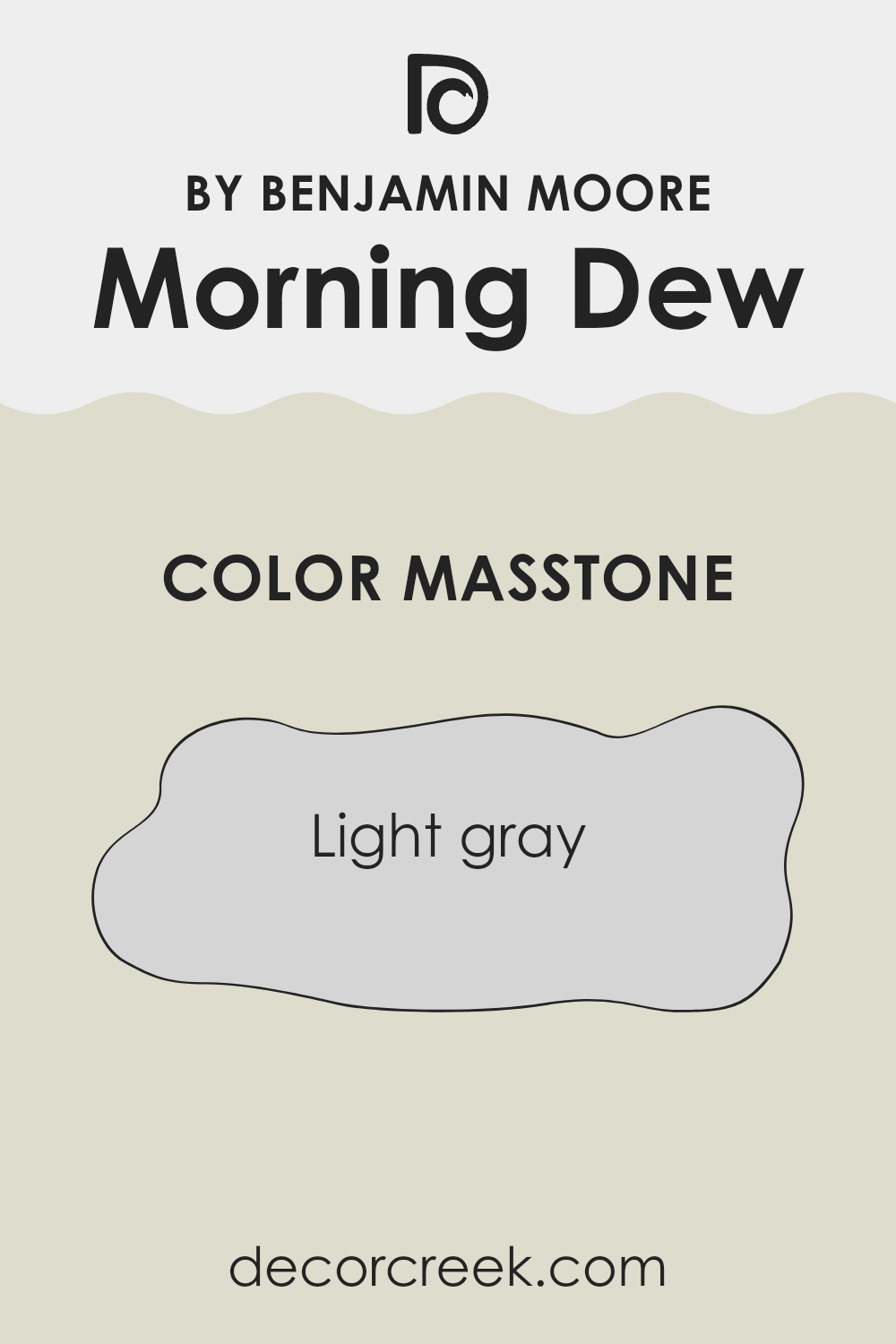
What is the Masstone of the Morning Dew OC-140 by Benjamin Moore?
Morning Dew OC-140 by Benjamin Moore is a light gray color, with a masstone that appears as a soft and gentle gray. This shade is highly adaptable and works well in almost any room of a house. Due to its light gray tone, it provides a clean and fresh look, making rooms appear brighter and more open.
This helps in smaller areas or rooms with limited natural light, as it can make them feel more spacious. The neutral quality of Morning Dew means it can easily match with various decor styles and color palettes.
Whether you’re pairing it with bold colors or keeping things more toned down with whites and other neutrals, it fits seamlessly. It’s a great choice for those wanting a fresh and simple backdrop that isn’t too stark or cold. This color maintains a welcoming atmosphere without overpowering other elements in the room, making it a practical and popular option for home interiors.
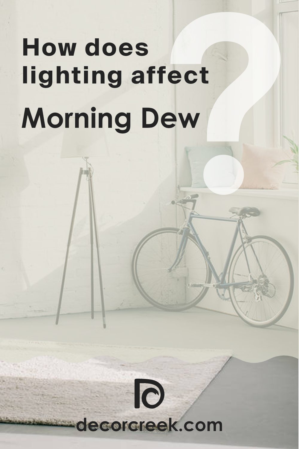
How Does Lighting Affect Morning Dew OC-140 by Benjamin Moore?
Lighting plays a crucial role in how colors appear in a room. The type of light—whether natural or artificial—can change how we perceive a color, making it look completely different under various lighting conditions.
Taking an example like Morning Dew, a light, subtle gray with a hint of blue and green undertones, we can see how lighting impacts its appearance. In artificial light, which often includes yellow-toned bulbs, the color can appear warmer and softer. This effect makes it comforting for areas where artificial light is used the most, such as living rooms or bedrooms lit in the evenings.
In contrast, natural light brings out the true character of the color. Morning Dew in natural sunlight is crisp and more vibrant, showcasing its delicate undertones clearly. The light source’s direction—north, south, east, or west—also influences this appearance.
In north-facing rooms, light is cooler and bluer, which can enhance the blue-green undertones of this color, making the walls seem more refreshing and lively. These rooms don’t get a lot of direct sunlight, so the color may appear a bit shadowy and cooler most of the day.
South-facing rooms enjoy ample sunlight throughout the day, which can make a color like Morning Dew look lighter and more airy. The ample sunlight can minimize the cooler undertones, resulting in a bright and welcoming room.
For east-facing rooms, the light tends to be brighter in the morning and dimmer as the day progresses. Morning Dew will appear more vibrant and lively in the morning light but may take on a cooler, more muted tone in the afternoon and evening.
West-facing rooms receive intense light in the afternoons and evenings. Here, Morning Dew will shift from a subtle, neutral tone in the morning to a slightly warmer hue in the evening due to the reddish and golden tones of the setting sun.
Understanding these nuances of lighting helps in choosing the right paint for your rooms based on the mood and atmosphere you wish to create.
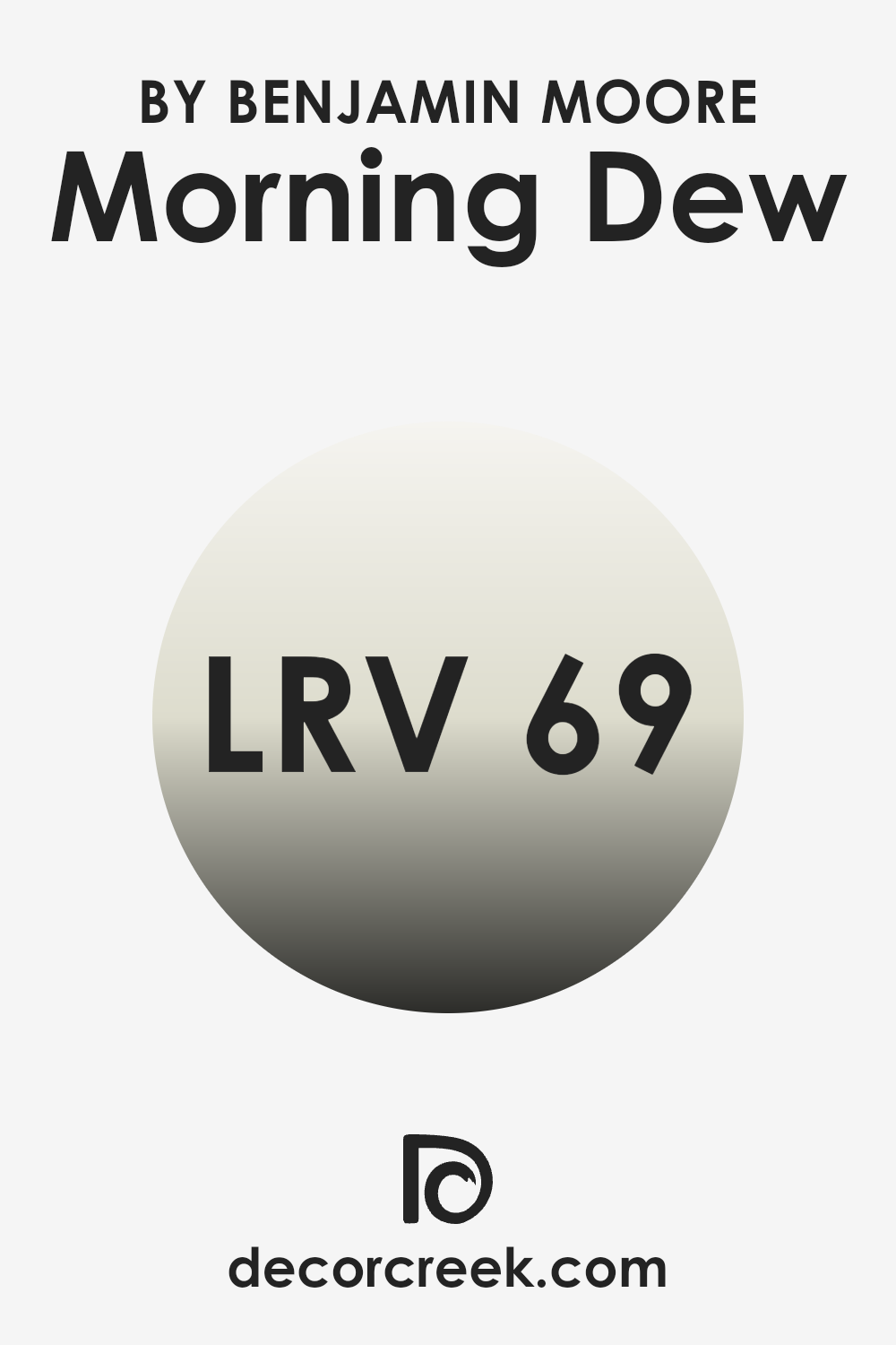
What is the LRV of Morning Dew OC-140 by Benjamin Moore?
Light Reflectance Value (LRV) is a measure of the amount of visible light a paint color reflects when it’s on your walls. Think of it as a scale to figure out how light or dark your color will look in a room.
Colors with high LRV reflect more light, making rooms feel brighter and bigger, while lower LRV values mean less light is reflected, creating a cozier or more enclosed feel. So, when you’re choosing paint, looking at LRV can help you understand how the color will impact your room’s atmosphere.
For the color Morning Dew OC-140 by Benjamin Moore, which has an LRV of sixty-nine point thirty-three, you can expect it to reflect a lot of light, giving off a bright appearance. This means it’s a good option for making smaller or darker rooms appear more airy and open.
Since it’s closer to the higher end of the LRV scale, it would effectively lighten up a room. This makes it a flexible choice, particularly in areas that don’t receive a lot of natural sunlight, as it helps maximize the available light.
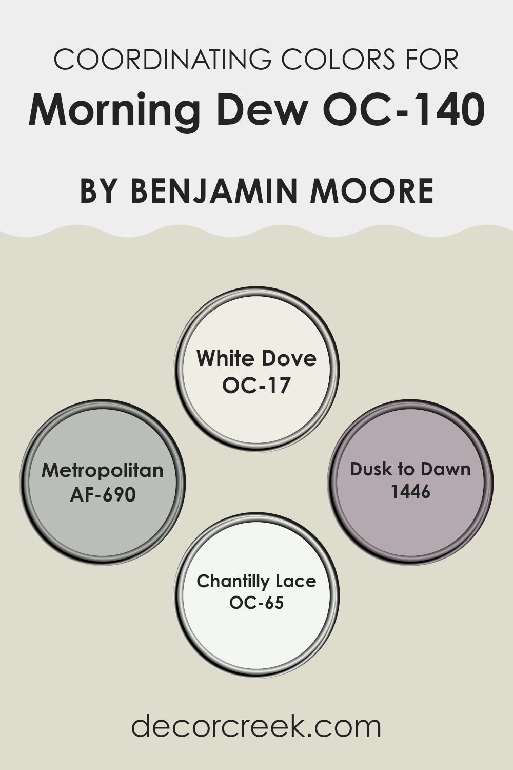
Coordinating Colors of Morning Dew OC-140 by Benjamin Moore
Coordinating colors are chosen to complement each other, creating a harmonious look within an interior room. When using colors that coordinate with Benjamin Moore’s Morning Dew OC-140, the selection primarily includes White Dove OC-17, Metropolitan AF-690, Dusk to Dawn 1446, and Chantilly Lace OC-65. These shades work together to enhance the subtle tones of Morning Dew, offering a balanced palette that shifts from neutral to more defined hues, allowing for flexibility in design and application.
White Dove OC-17 is a soft, inviting white with a hint of warmth, making it ideal for creating a cozy atmosphere without overpowering the gentler Morning Dew. Metropolitan AF-690, a stylish gray, adds a touch of urban elegance, and its neutrality beautifully complements lighter tones.
Dusk to Dawn 1446 presents a unique blend, with a slightly more pronounced depth that can add character and interest to a room. Lastly, Chantilly Lace OC-65 is a crisp, clean white that provides a bright, fresh contrast, enhancing the other colors and bringing out their best qualities. This combination allows designers and homeowners alike to achieve a smooth and visually appealing palette that works cohesively throughout various elements of a room.
You can see recommended paint colors below:
- OC-17 White Dove
- AF-690 Metropolitan
- 1446 Dusk to Dawn
- OC-65 Chantilly Lace
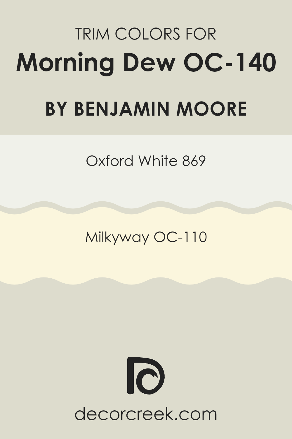
What are the Trim colors of Morning Dew OC-140 by Benjamin Moore?
Trim colors are the contrasting hues applied to details such as doors, window frames, baseboards, and moldings in a room. Choosing the right trim color can accentuate the architectural details of a room and create a cohesive look that complements the main wall color.
For a gentle hue like Morning Dew OC-140 by Benjamin Moore, trim colors like Oxford White 869 and Milkyway OC-110 are excellent choices. These specific trim colors ensure that the lighter main color stands out more prominently, all while maintaining a clean and harmonious atmosphere within the room.
Oxford White 869 is a bright and crisp white that provides a stark, clean contrast against softer main wall colors, ensuring that the architectural elements pop without overpowering the subtlety of the main color. On the other hand, Milkyway OC-110 is a soft white with a touch of warmth, offering a smooth transition that bridges the gap between the lighter main color and the sharpness of a bright white trim. Both colors help to define the room distinctly, enhancing the overall aesthetic appeal of the interior.
You can see recommended paint colors below:
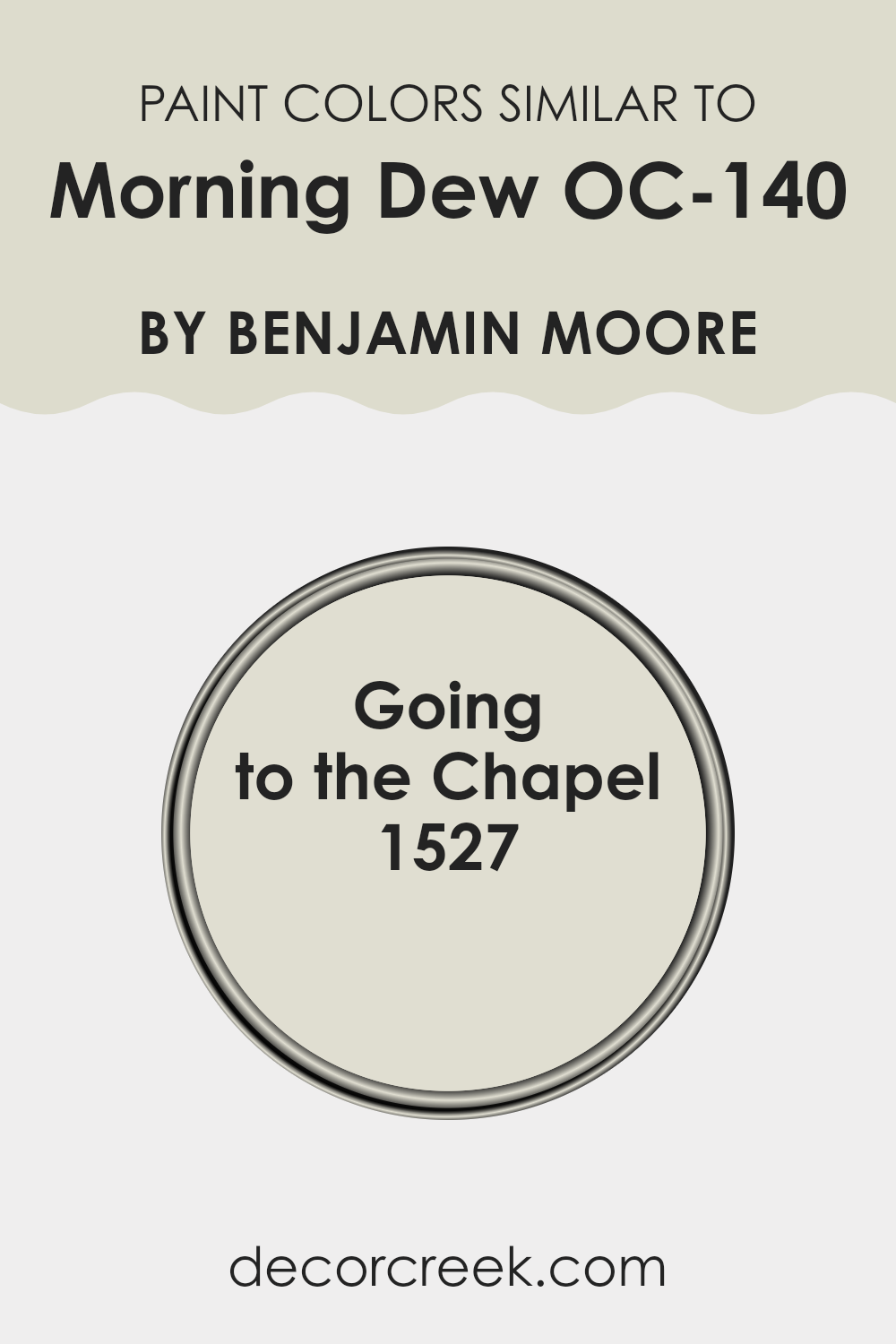
Colors Similar to Morning Dew OC-140 by Benjamin Moore
Similar colors are important in design because they create a harmonious atmosphere, making rooms feel calm and coherent. When colors like Morning Dew and Going to the Chapel are used together, they blend seamlessly, providing a gentle transition that can make rooms appear larger and more unified. This subtlety in color shifts is key for creating a visually relaxing environment.
Working with similar shades allows for variety in design while maintaining a consistent theme, which can be easier to achieve and pleases the eye without overpowering it.
Morning Dew is a light, airy gray that reflects natural light softly, making it an excellent choice for making rooms feel light and open. It naturally complements various decor elements without clashing, thus providing a neutral backdrop that is both fresh and inviting. On the other hand, Going to the Chapel offers a slightly warmer tone, hinting at beige mixed with gray, which invites a cozy, yet still light atmosphere.
This color is perfect for those looking to add a touch of warmth to their room while keeping a clean and subtle aesthetic. Together, these colors work in synergy to enhance the beauty of a room through their soothing qualities and adaptable appeal.
You can see recommended paint color below:
- 1527 Going to the Chapel
How to Use Morning Dew OC-140 by Benjamin Moore In Your Home?
Morning Dew OC-140 by Benjamin Moore is a soft and subtle paint color that can bring a fresh look to any room in your house. Imagine using this gentle gray hue in your living room or bedroom. It can create a feeling of calm and cleanliness, making it a great choice for places where you relax or sleep. The lightness of Morning Dew makes it perfect for smaller rooms too, as it can help make them appear bigger and more open.
You can pair this color nicely with brighter shades like blues or even soft pinks for a bit of contrast. It’s also an excellent backdrop for displaying art or family photos, as it doesn’t overpower but rather complements whatever is placed against it.
Whether you want to paint the entire room or just a single accent wall, Morning Dew provides a neat and tidy look that’s easy on the eyes. Perfect for a modern or minimalistic style, it’s adaptable enough to fit into any decorating plan you might have.
Morning Dew OC-140 by Benjamin Moore vs Going to the Chapel 1527 by Benjamin Moore
Morning Dew and Going to the Chapel are two paint colors by Benjamin Moore that offer a subtle and calm atmosphere for any room, though they present some key differences. Morning Dew has a very light, almost neutral tone that can brighten rooms while maintaining a soft appearance. It’s ideal for creating a more open feel in small or dimly lit areas.
On the other hand, Going to the Chapel is slightly darker compared to Morning Dew. It still stays in the neutral zone but offers a hint of warmth, making it excellent for adding a cozy touch to a room. While Morning Dew reflects more light, Going to the Chapel provides a gentle warmth that can make large, stark rooms feel more inviting.
In summary, Morning Dew is perfect if you’re looking for a bright and refreshing look, while Going to the Chapel suits those who prefer a touch of warmth without overpowering the senses. Both colors work well in a variety of rooms, enhancing natural light and contributing to a peaceful atmosphere.
You can see recommended paint color below:
- 1527 Going to the Chapel

After spending a good amount of time looking at and thinking about the paint color OC-140 Morning Dew by Benjamin Moore, I think it’s a pretty cool choice if you want a calm feeling in your room. It’s a light gray color that’s soft and easy on the eyes, just like the gentle feel of morning dew itself. This color works great if you want to paint your bedroom, living room, or even a small cozy nook where you like to read or relax.
What I really like about Morning Dew is that it isn’t too loud or bright; it’s just right for creating a peaceful spot. Plus, it goes well with lots of different colors you might want for curtains, pillows, or rugs. This makes it super handy when you want to mix things up in your room without needing a complete do-over.
Overall, using OC-140 Morning Dew can help make a room feel fresh and clean, kind of like the feeling you get on a soft, misty morning.
Whether you’re looking to paint a new room or change up an old one, this color could be a great pick for adding a light, airy feel to your home without making things too busy or flashy.
Ever wished paint sampling was as easy as sticking a sticker? Guess what? Now it is! Discover Samplize's unique Peel & Stick samples.
Get paint samples

