When I came across the color 1152 Nature’s Symphony by Benjamin Moore, I felt an instant connection. It’s a shade that perfectly captures the gentle essence of the natural world. You don’t just see this color; you feel it wrap around you like a soft, comforting blanket. It’s a green that hints at quiet forests and peaceful meadows, bringing a sense of calm and renewal to any room.
I love how this color can change the feel of a room. It adds a touch of the outdoors, creating an atmosphere that is both restful and inspiring. Whether used in a living room, bedroom, or even an office, 1152 Nature’s Symphony has the power to refresh and soothe the spirit.
Its soft quality allows it to pair beautifully with a variety of other shades, from earthy browns to elegant whites, making it an easy choice for decorators. Whenever I see Nature’s Symphony on walls or furniture, it reminds me of the quiet moments spent in nature – the gentle rustling of leaves, the fresh smell of grass after rain, and the peaceful shade of a quiet forest.
It truly is a hue that resonates with peace and balance, inviting you to pause and enjoy the simple beauty around you.
What Color Is Nature’s Symphony 1152 by Benjamin Moore?
Nature’s Symphony by Benjamin Moore is a calming and refreshing green color. It brings the feel of the outdoors inside, echoing the lushness of a garden. This shade is not too bright, nor too dark, making it a flexible choice for many rooms. It works particularly well in areas where you want to create a welcoming and natural atmosphere, such as living rooms, bedrooms, or even kitchens.
Nature’s Symphony fits nicely with interior styles like modern farmhouse, coastal, or bohemian designs. In a modern farmhouse style, it pairs beautifully with rustic wood and white shiplap, adding a pop of color without taking over the room. In coastal interiors, it complements whites and sandy beiges, enhancing the relaxed and breezy feel. For bohemian rooms, it blends seamlessly with rich, layered textiles and a variety of patterns.
This color looks great with natural materials like wood and stone, as well as soft fabrics such as linen and cotton. It also pairs well with textures like woven baskets or rattan furniture. Metallic accents in bronze or muted gold can add a touch of elegance and warmth. Overall, Nature’s Symphony brings a bit of the natural world into your home, making it an ideal choice for a comforting and inviting interior.
Is Nature’s Symphony 1152 by Benjamin Moore Warm or Cool color?
Nature’s Symphony by Benjamin Moore is a soft, gentle shade that brings the calming essence of the outdoors inside. This color is perfect for creating a comfortable and inviting atmosphere in any home. Its subtle tone helps rooms feel more open and airy, making it a great choice for small areas.
Nature’s Symphony tends to blend seamlessly with both modern and traditional decor styles, enhancing the overall look without overpowering other design elements. In living rooms, this color can make a room feel warm and welcoming, while in bedrooms, it promotes relaxation and restfulness.
Its flexibility allows it to pair well with various colors, such as earth tones or brighter accents. Natural light enhances its subtle beauty, but it also looks elegant under artificial lighting. Using Nature’s Symphony on walls, trims, or furniture can create a cohesive and balanced feel throughout the home. Overall, this color adds a touch of nature’s calmness to indoor rooms.
Undertones of Nature’s Symphony 1152 by Benjamin Moore
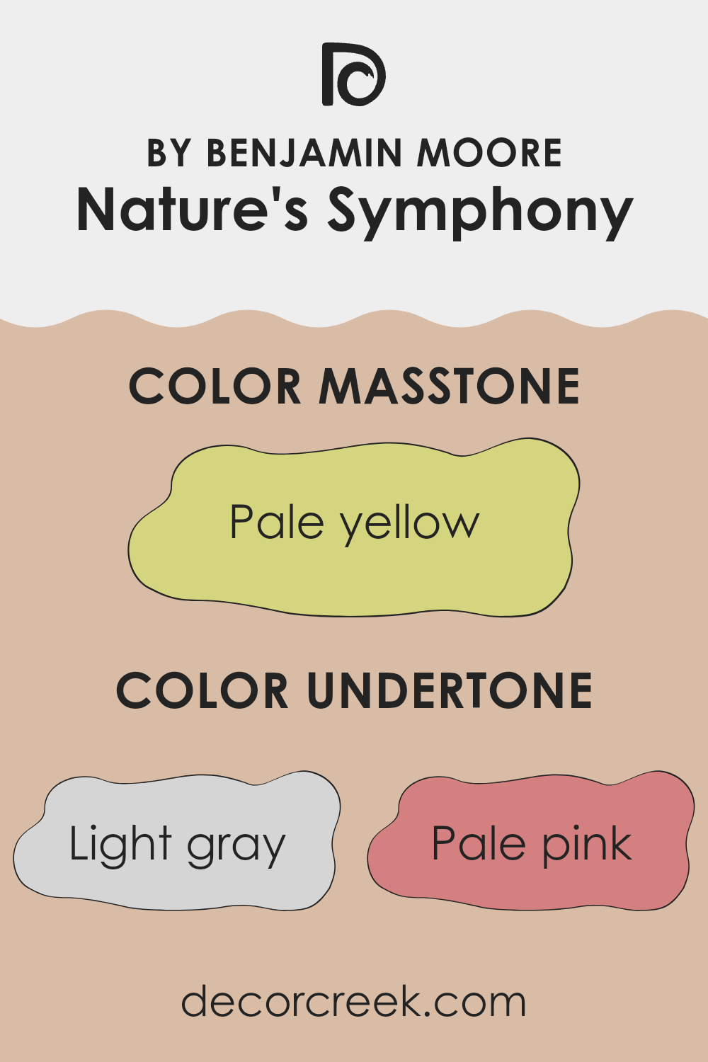
Nature’s Symphony by Benjamin Moore is a complex paint color with a blend of various undertones. These undertones can significantly influence how we perceive the color in different lighting conditions and environments. The undertones include light gray, pale pink, light purple, mint, light blue, gray, lilac, yellow, orange, light green, and olive.
Undertones are important because they can change the mood and feel of a room. For instance, a room painted with Nature’s Symphony might look more refreshing and airy when the mint or light blue undertones are highlighted by natural light. In contrast, artificial lighting might bring out the warmth of its pale pink or orange undertones, giving the room a cozier feel.
When applied to interior walls, Nature’s Symphony can evoke different moods depending on its surroundings. The light purple and lilac can add a subtle touch of elegance, while the yellow can bring a hint of warmth. The olive and gray undertones offer a grounding effect, which can create a balanced backdrop for various decor styles. Overall, the blending of these undertones makes Nature’s Symphony a flexible choice, capable of adding both vibrancy and softness to a room, depending on the light and the time of day.
What is the Masstone of the Nature’s Symphony 1152 by Benjamin Moore?
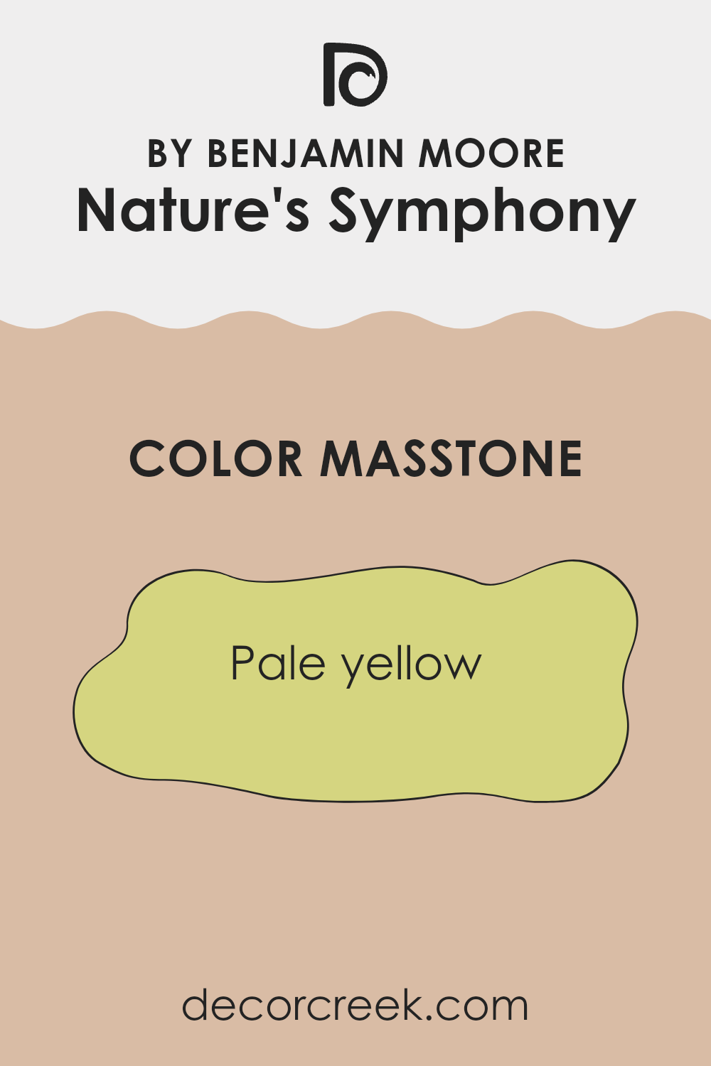
Nature’s Symphony by Benjamin Moore, in its pale yellow masstone (#D5D580), brings a warm and cheerful atmosphere to any home. This soft yellow hue can instantly brighten a room, making it feel more inviting and open. Unlike bold yellows, the pale tone of Nature’s Symphony exudes subtlety, allowing it to create a soothing setting rather than making the room feel too strong.
In living areas, this shade can enhance natural light, creating a sunny and uplifting ambiance. In kitchens, it pairs well with white or light wooden accents, complementing both modern and traditional styles. Bedrooms painted in this shade can feel cozy and restful, promoting a sense of comfort.
This flexible color works well in rooms of all sizes, and its lightness can make even small areas feel more open. Nature’s Symphony is a great choice for anyone looking to add a gentle touch of color that promotes warmth and positivity in their home.
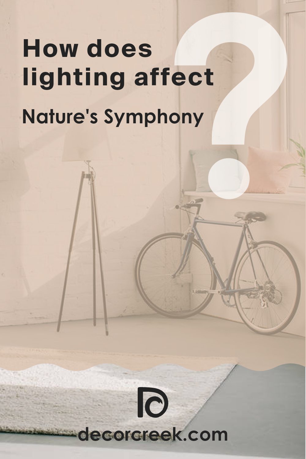
How Does Lighting Affect Nature’s Symphony 1152 by Benjamin Moore?
Lighting plays a significant role in how we perceive colors. It can enhance or diminish a color’s appearance, making it look entirely different under various lighting conditions. The color Nature’s Symphony by Benjamin Moore is a green shade with gentle undertones, which can shift noticeably with changes in lighting.
In natural light, Nature’s Symphony reveals its true color more accurately. In rooms with north-facing windows, where light is cooler and more diffused throughout the day, this shade can appear slightly grayish due to the lack of direct sunlight.
The cooler, indirect light tends to mute the warmth of the color, giving it a more subdued look. Meanwhile, in south-facing rooms, which enjoy consistent bright, warm lighting, this green shade comes to life, showcasing its depth and richness. The direct sunlight enhances its warm tones, making it appear more vivid.
East-facing rooms receive bright, morning light, which can lend a soft, warm glow to Nature’s Symphony. In these conditions, it can look fresh and lively, capturing the softer light of the early hours. As the day progresses, the room becomes less bright, causing the color to appear more muted.
Conversely, west-facing rooms bask in the warm, golden tones of the late afternoon sunlight. Here, Nature’s Symphony will appear warmer and more inviting during the latter part of the day, adding a cozy feel to the room. Artificial lighting also impacts how we see this color. Under warm white or yellow-toned artificial lights, such as incandescent bulbs, Nature’s Symphony appears warmer and somewhat cozier.
On the other hand, under cooler fluorescent or LED lights, the shade exhibits a cooler, more muted green. Therefore, depending on both the lighting direction and type, the way we experience this color changes, offering various atmospheres and moods to a room.
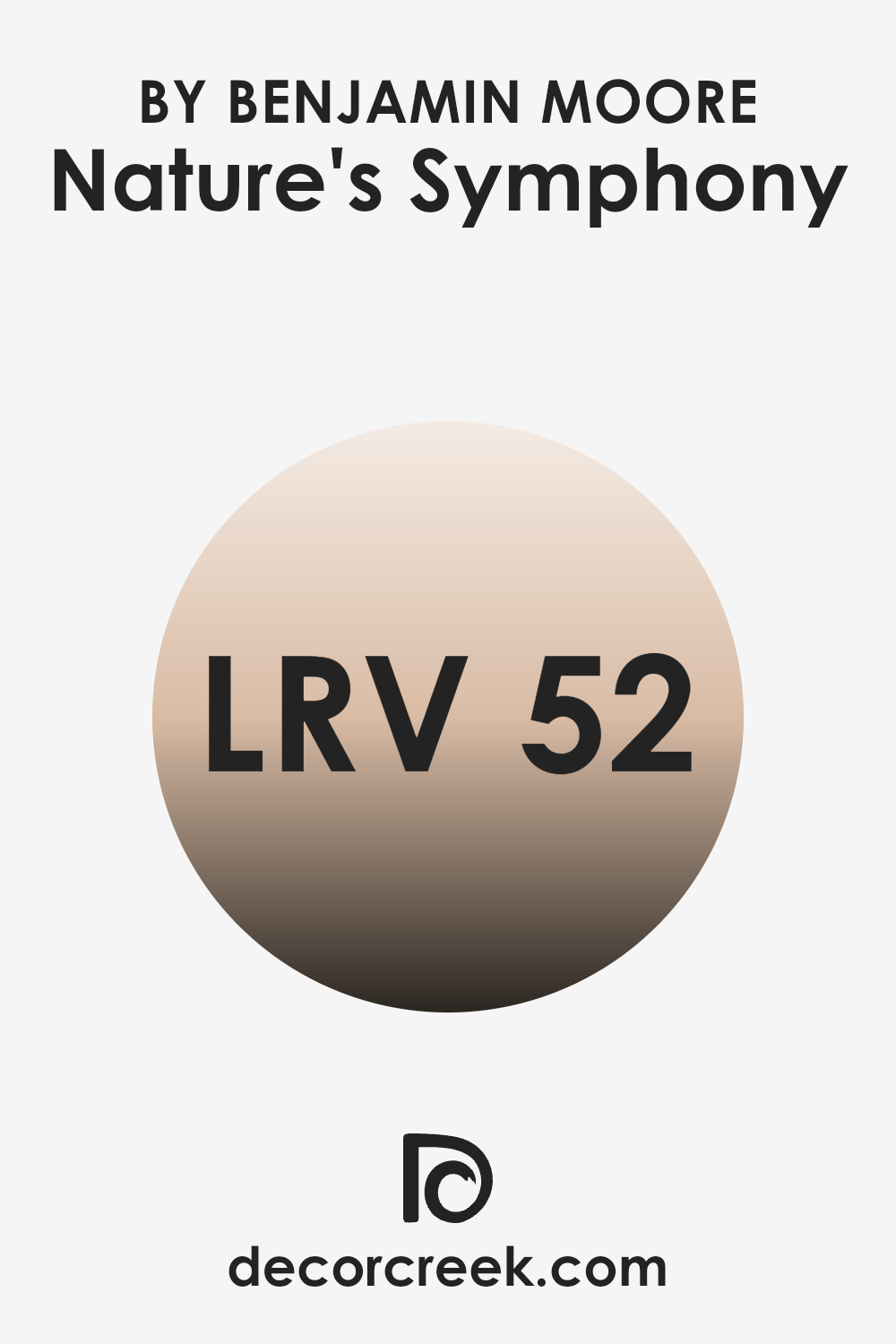
What is the LRV of Nature’s Symphony 1152 by Benjamin Moore?
Light Reflectance Value, or LRV, is a measure of how much light a color reflects. On a scale from 0 to 100, LRV indicates the percentage of light reflected by a color, where 0 is absolute black and 100 is pure white.
This number helps us understand how light or dark a paint color will appear when applied to surfaces in a room. A paint color with a higher LRV reflects more light and can make a room feel brighter and larger, while a color with a lower LRV absorbs more light, making a room feel cozier and more intimate.
With an LRV of 51.61, Nature’s Symphony by Benjamin Moore is right in the middle of the scale. This means it offers a good balance between light reflection and absorption. When you paint a room with this color, you can expect it to look fairly neutral in terms of brightness. It won’t make the room feel too dark or too bright, but it will reflect enough light to keep the room feeling open and welcoming. This middle-range LRV allows the color to work well in different settings, providing enough brightness to keep a room from feeling closed in but not so much that it takes over.
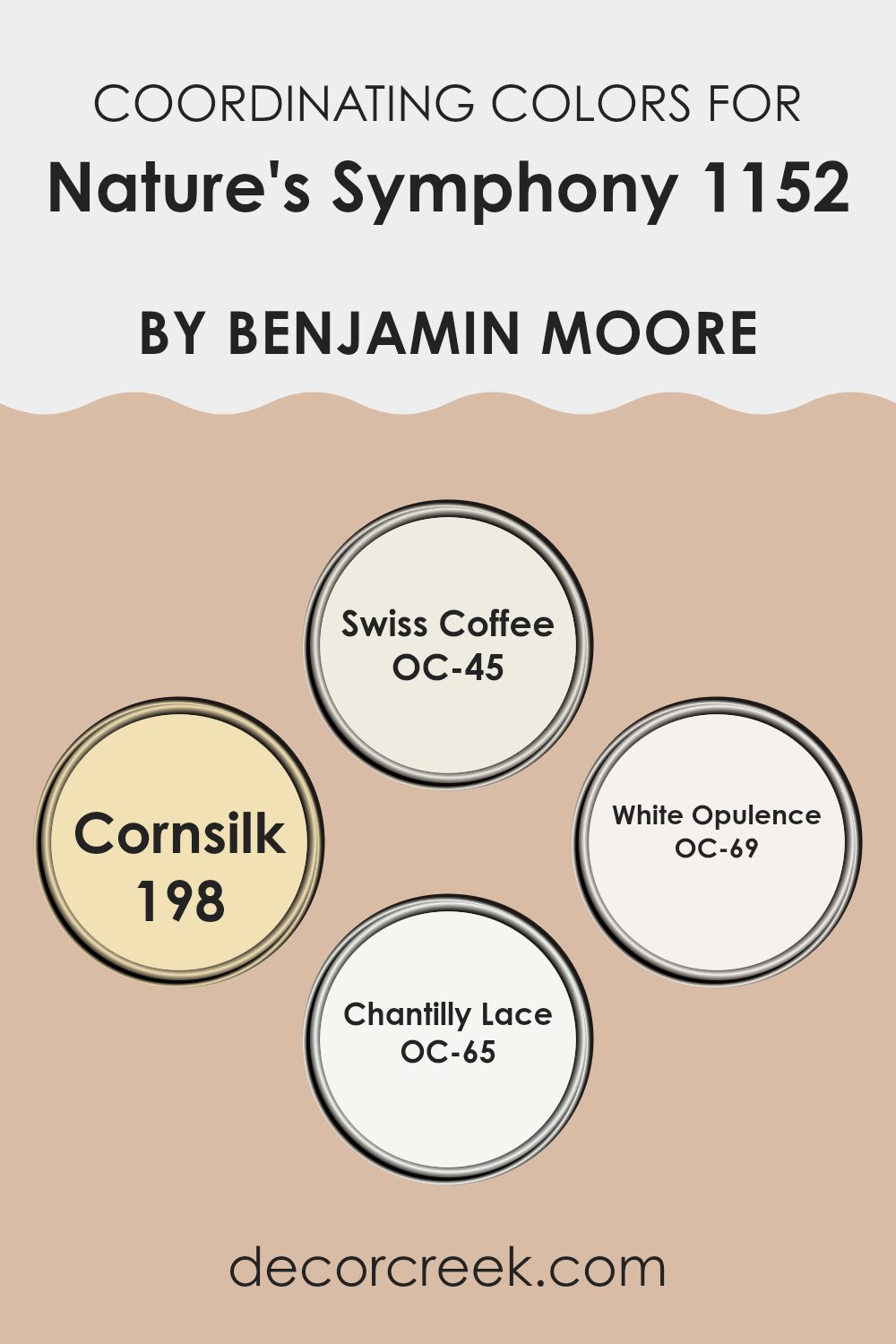
Coordinating Colors of Nature’s Symphony 1152 by Benjamin Moore
Coordinating colors are hues that complement and enhance a primary shade, working together to create a balanced feel in a room. For Nature’s Symphony by Benjamin Moore, some perfect coordinating colors include Swiss Coffee, Cornsilk, White Opulence, and Chantilly Lace.
These colors bring balance and contrast, allowing the main color to shine while also adding depth and dimension to the overall design scheme. When using coordinating colors, it’s essential to consider the balance of warm and cool undertones to keep the look cohesive and pleasant to the eye.
Swiss Coffee is an off-white shade with a warm, creamy undertone that adds a touch of coziness to any room. Cornsilk, on the other hand, is a light, buttery yellow that brings gentle warmth and a sunny feel. White Opulence offers a soft, refined white with subtle pink undertones that add a hint of elegance.
Chantilly Lace is a clean, crisp white that provides a bright, fresh contrast against deeper colors. Together, these colors create a seamless and refined palette that highlights Nature’s Symphony, adding layers of warmth and beauty to interiors.
You can see recommended paint colors below:
- OC-45 Swiss Coffee
- 198 Cornsilk
- OC-69 White Opulence
- OC-65 Chantilly Lace
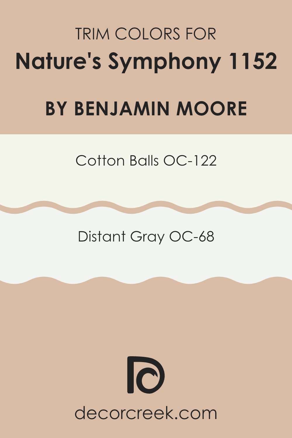
What are the Trim colors of Nature’s Symphony 1152 by Benjamin Moore?
Trim colors are the shades used to highlight the edges and borders of walls, windows, doors, and other architectural features in a room. They play an important role in the overall look of a room by defining boundaries and adding contrast, depth, and interest to the design. Using trim colors like OC-122 – Cotton Balls and OC-68 – Distant Gray can improve the appearance of the main wall color, helping to frame the walls and making them stand out.
For Nature’s Symphony 1152 by Benjamin Moore, choosing the right trim color ensures a cohesive and polished look that highlights the beauty of the main wall color, while providing a crisp and clean transition from one surface to another.
OC-122 – Cotton Balls is a soft, warm white with a touch of creaminess, making it an inviting choice for trim work. It can add warmth and a cozy feel to any room while maintaining a clean and bright appearance. On the other hand, OC-68 – Distant Gray is a subtle, cool-toned white that offers a more modern and fresh look. Its gray undertones provide a hint of sophistication that complements cooler wall colors. When used as trim colors, both shades can create a balanced and harmonious effect in a room painted with Nature’s Symphony, helping to enhance the overall aesthetic and bring out the best in your interiors.
You can see recommended paint colors below:
- OC-122 Cotton Balls
- OC-68 Distant Gray
Colors Similar to Nature’s Symphony 1152 by Benjamin Moore
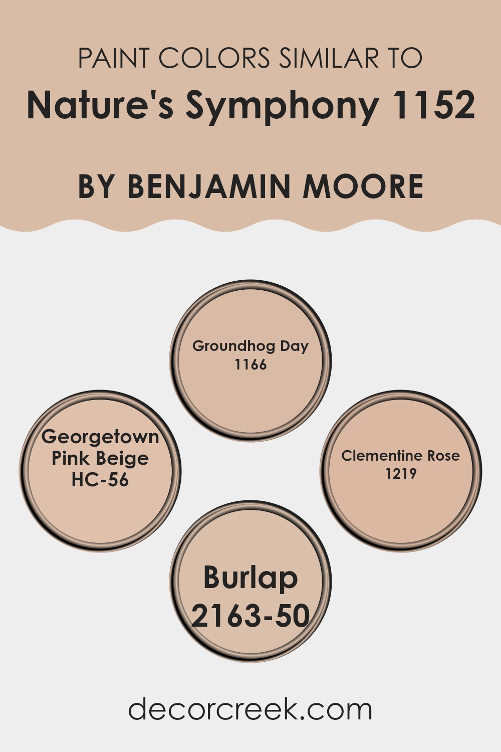
Similar colors play an important role in creating harmonious and visually appealing designs because they evoke a sense of balance and unity. When colors are closely related, they work together to create a cohesive look. For instance, colors like Groundhog Day 1166 bring a cozy, earthy feel with its warm gray-brown tone, adding depth and comfort to rooms.
Georgetown Pink Beige HC-56, on the other hand, offers a soft, warm undertone that can make any room feel inviting and light, with a subtle hint of elegance. These hues, when used together, balance neutrality with warmth and create a homey atmosphere.
Clementine Rose 1219 introduces a gentle blush of rose, bringing a touch of sweetness and freshness that can lift the mood of a room without feeling too strong. Burlap 2163-50, with its soft, muted brown drawn from natural material inspiration, adds texture and a sense of grounded simplicity.
By combining these shades with Nature’s Symphony 1152 by Benjamin Moore, which resides in a similar palette, you create a room that feels interconnected with the natural world. This palette encourages a sense of continuity and rhythm, much like the soothing patterns found in nature, providing an effortlessly pleasing environment.
You can see recommended paint colors below:
- 1166 Groundhog Day
- HC-56 Georgetown Pink Beige
- 1219 Clementine Rose
- 2163-50 Burlap
Colors that Go With Nature’s Symphony 1152 by Benjamin Moore
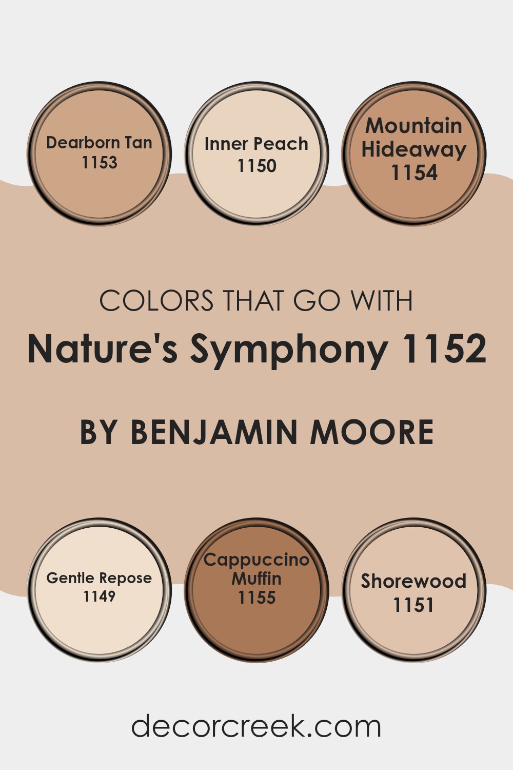
Colors that go well with Nature’s Symphony by Benjamin Moore, such as Dearborn Tan, Inner Peach, Mountain Hideaway, Gentle Repose, Cappuccino Muffin, and Shorewood, create a harmonious palette that enhances any room. These colors work beautifully together because they share warm, earthy undertones, mimicking the natural hues we find outdoors.
Choosing colors that pair well with Nature’s Symphony is essential because they create a soothing and visually appealing environment that feels balanced and cohesive. This palette brings the warm and inviting aspects of nature indoors, making rooms feel cozy and welcoming.
Dearborn Tan is a soft, sandy beige that brings a sense of warmth and comfort, while Inner Peach offers a gentle, rosy glow that adds a touch of brightness without feeling too strong. Mountain Hideaway is a deep, earthy brown that grounds the palette, giving it depth and richness. Gentle Repose is a light and airy color, like the quiet feel of a soft breeze.
Cappuccino Muffin brings in a warm, toasty brown that adds a sense of coziness, much like a freshly brewed cup of coffee. Lastly, Shorewood provides a cool, muted green that hints at serenity and balance, reminiscent of peaceful landscapes. These colors, when combined, create a balanced and welcoming environment that complements modern and traditional styles.
You can see recommended paint colors below:
- 1153 Dearborn Tan
- 1150 Inner Peach
- 1154 Mountain Hideaway
- 1149 Gentle Repose
- 1155 Cappuccino Muffin
- 1151 Shorewood
How to Use Nature’s Symphony 1152 by Benjamin Moore In Your Home?
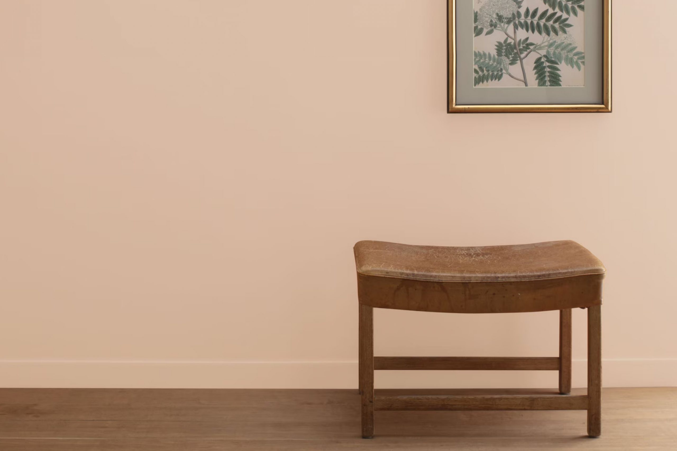
Nature’s Symphony 1152 by Benjamin Moore is a warm, earthy paint color that can bring a cozy and inviting atmosphere into a home. It’s a muted, natural tone that can work well in different areas, creating a comfortable environment. This color is perfect for living rooms or bedrooms where you want a sense of peace and ease.
It pairs beautifully with natural materials like wood or stone, enhancing a room’s organic feel. In the living room, you could use Nature’s Symphony 1152 on the walls to make the room feel warm and welcoming.
In a bedroom, this paint color helps create a peaceful setting for sleep and relaxation. It also works well in a kitchen, complementing simple, natural cabinets and open shelving. Consider using it as an accent wall color to add depth to a room without making it feel too strong. Nature’s Symphony 1152 is flexible, bringing warmth and a touch of nature indoors.
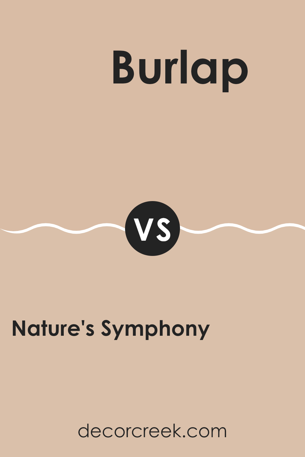
Nature’s Symphony 1152 by Benjamin Moore vs Burlap 2163-50 by Benjamin Moore
Nature’s Symphony 1152 by Benjamin Moore is a cool, muted green that brings a feeling of freshness and calmness. It reminds you of a peaceful forest or a quiet meadow. The color is gentle and not too bright, making it suitable for creating a relaxing atmosphere in any room.
On the other hand, Burlap 2163-50 by Benjamin Moore is a warm, earthy beige. It has a cozy and inviting feel, resembling the color of natural, woven fabric. This color adds warmth to a room and works well as a neutral backdrop.
When comparing the two, Nature’s Symphony adds a touch of nature and coolness, while Burlap brings warmth and a sense of earthiness. Both can be used effectively in a home, depending on whether you prefer the coolness of green or the coziness of a warm beige. They pair well with different styles but create distinct moods.
You can see recommended paint color below:
- 2163-50 Burlap
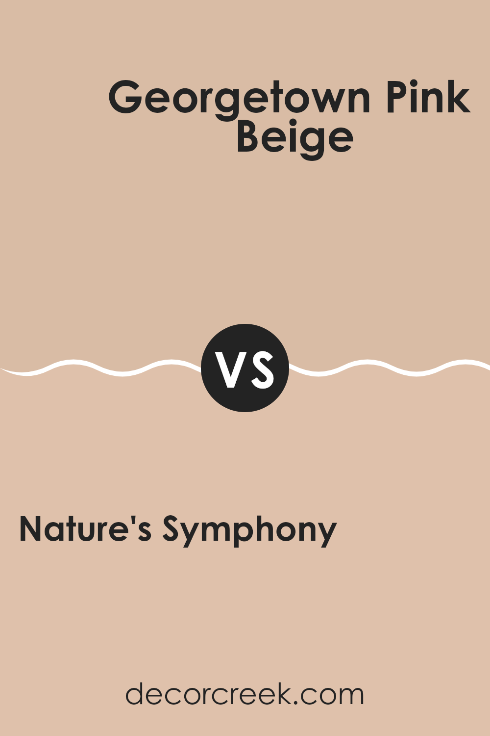
Nature’s Symphony 1152 by Benjamin Moore vs Georgetown Pink Beige HC-56 by Benjamin Moore
Nature’s Symphony 1152 by Benjamin Moore is a calming and natural green, reminiscent of lush forests and quiet landscapes. It brings a touch of the outdoors inside, creating a fresh and welcoming feel. This color is soothing, often used in rooms meant for relaxation or reflection, as it has a gentle and comforting presence.
Georgetown Pink Beige HC-56, on the other hand, is a warm beige with soft pink undertones. This color adds warmth and coziness to a room, making it feel welcoming and comfortable. It’s a flexible shade that can work well in living rooms and bedrooms, offering a touch of elegance with its soft hues.
While Nature’s Symphony emphasizes a connection with nature and a quiet mood, Georgetown Pink Beige brings warmth and softness, making it ideal for rooms where people gather and connect. Both colors have unique qualities that can enhance how a room feels, depending on the desired mood.
You can see recommended paint color below:
- HC-56 Georgetown Pink Beige
Nature’s Symphony 1152 by Benjamin Moore vs Groundhog Day 1166 by Benjamin Moore
Nature’s Symphony 1152 and Groundhog Day 1166 by Benjamin Moore are two distinct colors that bring different vibes to a room. Nature’s Symphony 1152 is a soft, earthy green that evokes feelings of calmness and is reminiscent of lush natural surroundings. It’s a flexible and soothing color that’s perfect for creating a peaceful environment in any area.
On the other hand, Groundhog Day 1166 is a warm, medium brown that provides a cozy and comforting atmosphere. This color works well in rooms where you want to add a touch of warmth and coziness.
When comparing the two, Nature’s Symphony has a more refreshing and airy feel, making it suitable for areas like living rooms or bedrooms where relaxation is key. Groundhog Day’s warmer tones make it ideal for family rooms, dens, or areas where you want to create a snug and inviting setting. Both colors can complement each other beautifully in different parts of a home.
You can see recommended paint color below:
- 1166 Groundhog Day
Nature’s Symphony 1152 by Benjamin Moore vs Clementine Rose 1219 by Benjamin Moore
Nature’s Symphony by Benjamin Moore is a soft, muted green that brings to mind lush forests and meadows. It’s grounding and earthy, with an undertone that feels very natural and balanced. This color works well in areas where you want to create a peaceful, relaxed atmosphere.
On the other hand, Clementine Rose from Benjamin Moore is a vibrant, warm shade of pinkish-orange. It’s energetic and lively, bringing a sense of warmth and cheerfulness to a room. This color can brighten up a room and add a sense of fun and playfulness.
While Nature’s Symphony is more subdued and grounded, Clementine Rose is bold and dynamic. The first creates a soothing environment, ideal for relaxation, whereas the second injects color and excitement. These contrasting colors can be used together to create interesting focal points, with each highlighting the unique qualities of the other.
You can see recommended paint color below:
- 1219 Clementine Rose
In writing about “1152 Nature’s Symphony” by Benjamin Moore, I’ve taken a journey to understand how colors can affect our feelings, especially the unique color 1152. Throughout my writing, I’ve shared how this special color reminds us of nature, like soft leaves moving in the breeze or quiet forests.
When I first looked at 1152, I saw how it brings a calm feeling, much like being outside on a sunny day. It doesn’t shout out for attention; instead, it gently makes us feel cozy and happy. In rooms painted with 1152, people might feel relaxed, as if they’re right in the middle of a peaceful garden or beside a calm lake.
This color is also very adaptable. It can be used with lots of other colors to make rooms feel warm and inviting. Whether in a living room, a bedroom, or even a kitchen, 1152 can make rooms more pleasant without being too bright or too dull.
In closing, writing about 1152 showed me how simple it is to bring a part of the natural world inside our homes. It’s amazing how just the right color can make us feel more at ease and cheerful. I hope many people try this color to see how it can brighten their days, just like I felt while writing this.
Ever wished paint sampling was as easy as sticking a sticker? Guess what? Now it is! Discover Samplize's unique Peel & Stick samples.
Get paint samples

