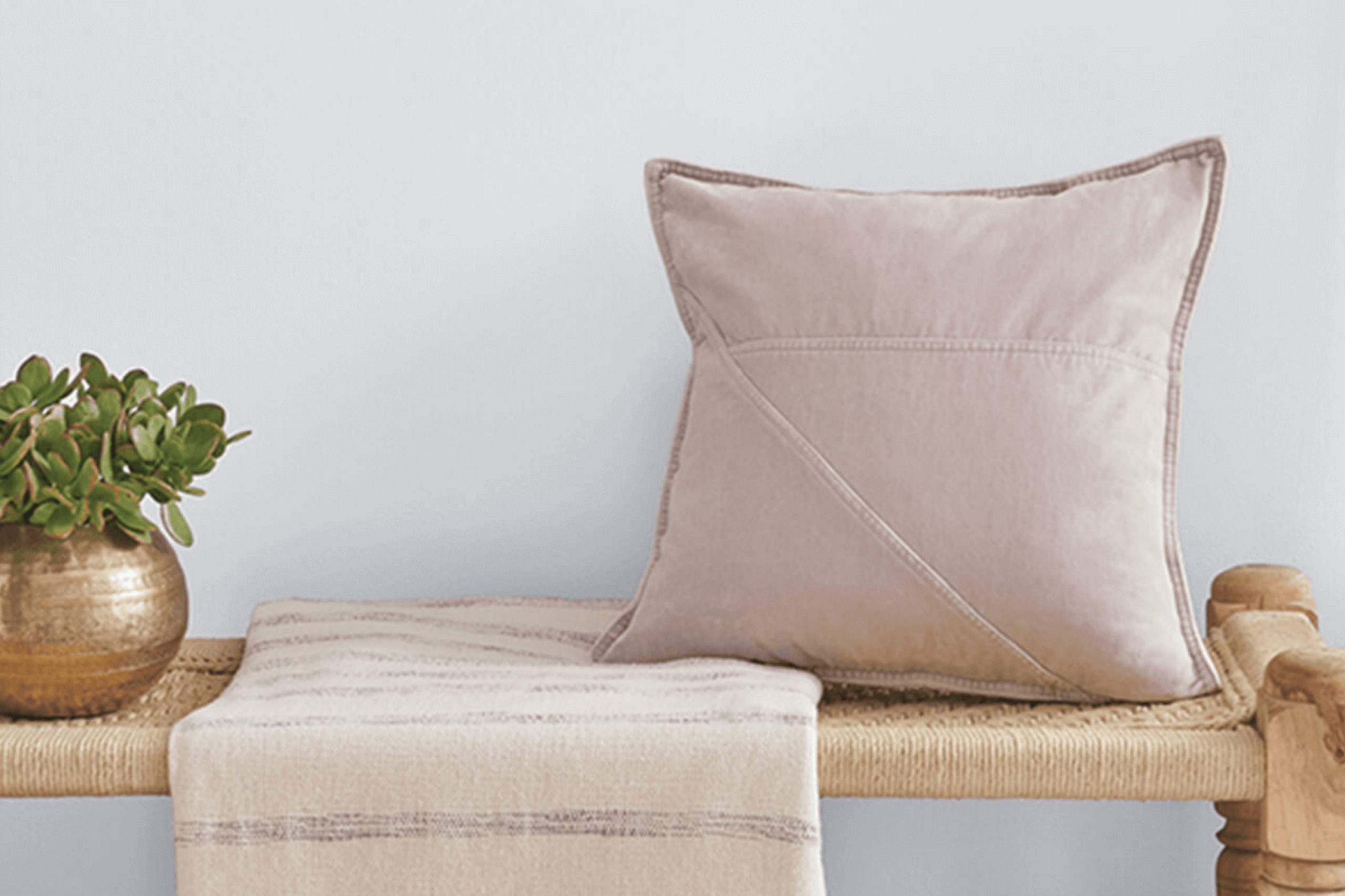
I recently came across a unique paint color, SW 9686 Opalescent by Sherwin Williams, that subtly stands out. Its intriguing hue captures the essence of versatility, blending effortlessly into any space while adding a touch of understated elegance.
When you’re looking to refresh your room with a new coat of paint, the impact of choosing the right color can’t be overstated. This shade, with its soft, luminous quality, can brighten up a space while maintaining a soft, airy feel.
Whether you’re thinking about updating a bedroom to create a cozy retreat or adding a fresh vibe to your living room, SW 9686 Opalescent offers a beautiful backdrop.
Its light-reflecting properties can also make small rooms appear larger and more inviting.
As you plan your next home improvement project, consider how this adaptable color might enhance your living space and reflect your personal style.
What Color Is Opalescent SW 9686 by Sherwin Williams?
Opalescent is a soft, muted hue with a blend of beige and gray, providing a warm and inviting backdrop for any room. This versatile shade serves as an excellent neutral base, making it an ideal choice for various design styles, particularly modern farmhouse, minimalist, and contemporary settings.
In a modern farmhouse style, Opalescent pairs beautifully with natural wood finishes, from reclaimed pine to weathered oak, enhancing the rustic yet chic vibe of the space. Its subtle warmth complements the rich textures of wool or cotton throws and linen upholstery, enhancing a cozy, welcoming atmosphere.
For minimalist interiors, this color works well with smooth, polished surfaces like glass or metal accents, promoting a clean and streamlined look. Opalescent balances the starkness of minimalist design with its warmth, ensuring the space feels lived-in and comfortable.
In contemporary spaces, this color coordinates effectively with bold geometric patterns and vibrant textiles, providing a calm backdrop that allows other design elements to stand out. The neutrality of Opalescent ensures that it doesn’t clash with contemporary materials like sleek stainless steel or glossy plastics.
Overall, Opalescent is highly adaptable, fitting seamlessly into various decor styles and pairing well with multiple materials, affirming its utility as a go-to color for those looking to furnish their spaces with a timeless and adaptable shade.
Is Opalescent SW 9686 by Sherwin Williams Warm or Cool color?
Opalescent by Sherwin Williams is a unique paint color that can really bring a touch of lightness and freshness to any room. This color is a subtle blend of white with a hint of gray, making it quite versatile for various spaces in a home.
Whether you want to paint an entire living room or just one accent wall, Opalescent has a gentle warmth that can work wonders. It pairs well with bolder colors, helping to balance them out, or it can stand on its own for a clean and light feel.
Opalescent is especially good for smaller spaces or rooms that don’t get a lot of natural light. It reflects light well, helping to make the area appear larger and more open. This color also has a calming effect, making it a great choice for bedrooms or bathrooms where you want to create a relaxing environment. Overall, Opalescent is a practical, attractive choice for anyone looking to freshen up their home.
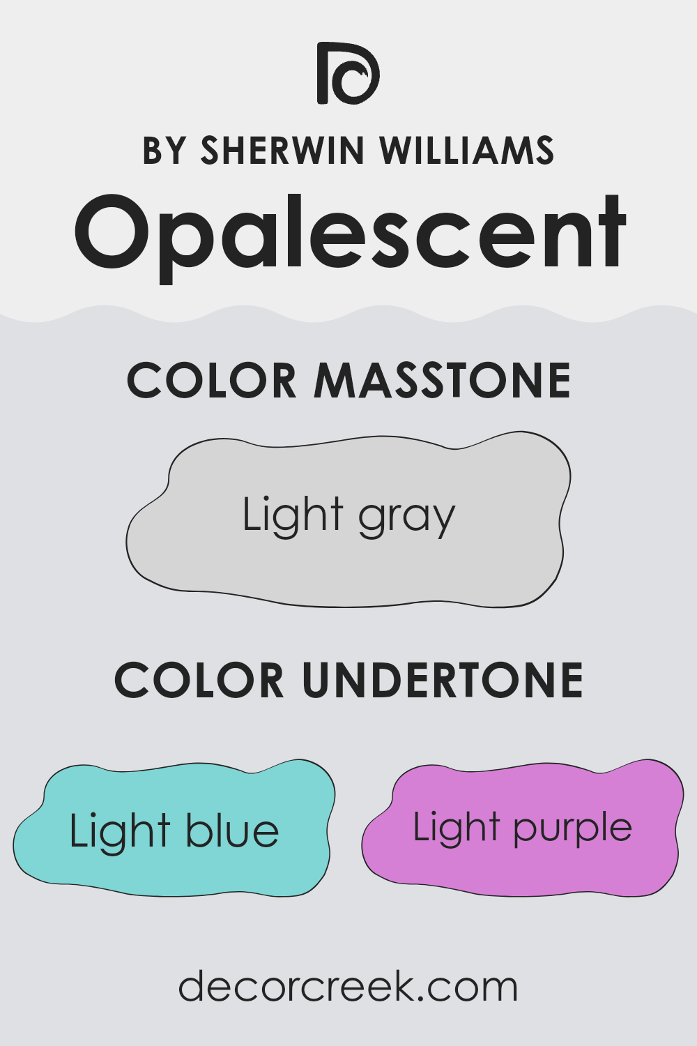
Undertones of Opalescent SW 9686 by Sherwin Williams
Opalescent is a unique color that can subtly change its appearance based on the lighting and surrounding colors due to its interesting undertones. Undertones are the underlying qualities of a color that might not be immediately noticeable but can significantly influence how a color looks in different environments.
This color has a variety of undertones including light blue, light purple, pale yellow, lilac, mint, pale pink, and grey. Each of these undertones plays a role in how the color appears once applied to interior walls. For instance, in a room with a lot of natural light, the light blue and mint undertones might make the walls look fresher and subtly vibrant. In contrast, in a space with less natural light, the grey undertone could become more dominant, giving the walls a more muted appearance.
The mixed presence of warm undertones like pale yellow and pale pink with cooler tones like lilac and light purple means that Opalescent can work well with a variety of decor styles and color schemes. It can pull in different directions depending on the colors it is paired with—feeling cooler or warmer—making it a very versatile paint color for home interiors. This adaptability can be particularly useful for tying together rooms with varying themes and colors.
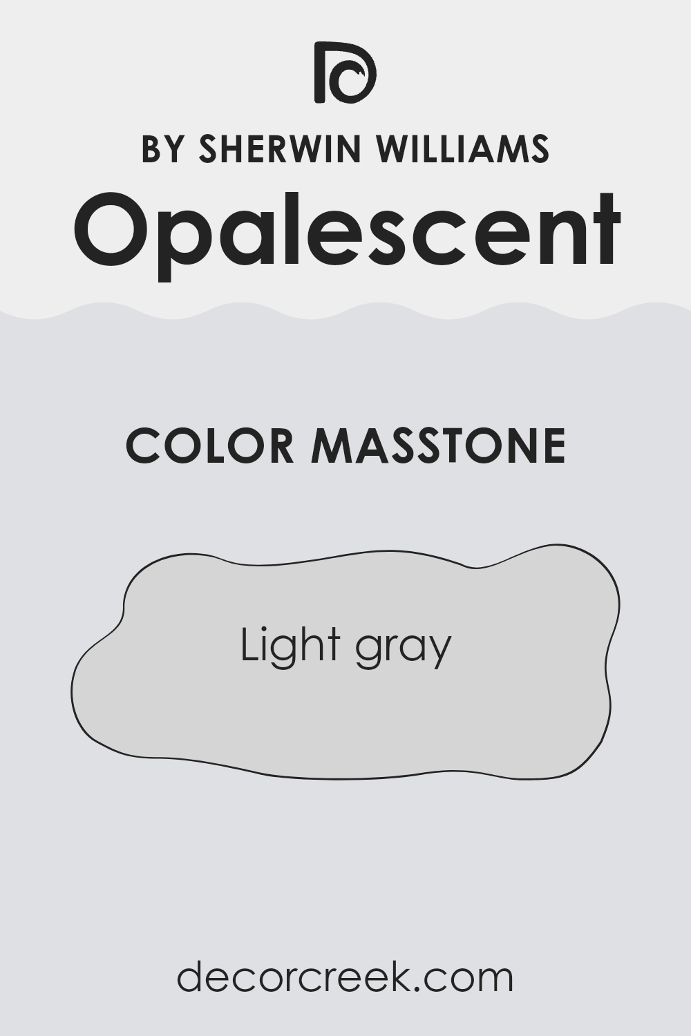
What is the Masstone of the Opalescent SW 9686 by Sherwin Williams?
OpalescentSW 9686 by Sherwin Williams is a light gray color with a code of #D5D5D5. This shade of gray is soft and subtle, making it a great choice for home interiors. It offers a clean and understated look, which can help make small spaces appear larger and brighter.
This color is versatile and can easily match with different decor styles and other colors. Whether you have modern, minimalist, or even more traditional furnishings, this gray can fit right in without clashing.
The lightness of this gray helps in reflecting light, brightening rooms that may not receive a lot of natural sunlight. It’s also relaxing to look at, which makes it suitable for bedrooms and living areas where comfort is key. Another advantage is its ability to hide small imperfections on walls due to its light yet forgiving shade. Overall, OpalescentSW 9686 is a practical choice that delivers both beauty and functionality in home settings.
How Does Lighting Affect Opalescent SW 9686 by Sherwin Williams?
Lighting has a significant impact on how we perceive colors, as different types of light can change the appearance of a color in a room. The color Opalescent, by Sherwin Williams, is a great example to look at under various lighting conditions.
In artificial light, such as that from incandescent bulbs, Opalescent takes on a warmer tone. The creamy aspects of the color become more pronounced, making the space feel cozy and inviting. Fluorescent lighting, which is cooler, might make the same color look a bit sharper and more crisp, highlighting its subtle blue and gray tones more than the creamy ones.
In natural light, the look of Opalescent can vary widely depending on the direction the room faces and the time of day. In a north-facing room, which generally receives less direct sunlight and more of a cool, indirect light, Opalescent will appear more muted. It keeps a soft, pleasant look but leans slightly towards its cooler tones.
South-facing rooms, in contrast, get lots of natural light throughout the day. Here, the color will appear brighter and more vivid, with its creamy quality standing out and giving the room a light, airy feel.
East-facing rooms enjoy bright light in the morning, when the sun rises. In these rooms, Opalescent sparkles in the morning with a fresh, gentle vibe, and then transitions into a softer, more subdued color as the day progresses and the natural light diminishes.
West-facing rooms, receiving the evening light, make Opalescent glow warm and welcoming towards the end of the day, ideal for relaxing evenings.
Thus, the same color, Opalescent, displays a variety of characters depending on the lighting conditions. The way light interacts with color is essential to consider when choosing paint colors for a space to ensure you achieve the desired mood and effect.
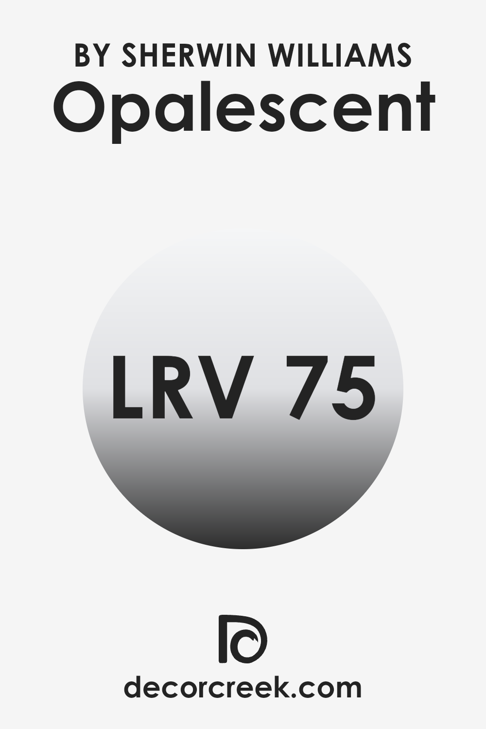
What is the LRV of Opalescent SW 9686 by Sherwin Williams?
LRV stands for Light Reflectance Value, and it measures the amount of light a paint color reflects or absorbs when it’s on your walls. This measurement ranges from 1 to 100, where a higher value means the color reflects more light and a lower value means it absorbs more light.
This is important because the amount of light a color reflects impacts how bright or dark a room feels. A room painted with a high LRV color will generally appear lighter and can make the space feel more open and airy.
In the case of Opalescent SW 9686, with an LRV of 74.644, this color is on the higher end of the scale, meaning it reflects a good amount of light. This characteristic makes it a great choice for spaces that you want to feel brighter and more spacious, such as a small room or a darker room with limited natural light. In essence, this light-reflecting quality can help to create an environment that feels more welcoming and less cramped, optimizing the use of light in the space to create a more pleasant atmosphere.
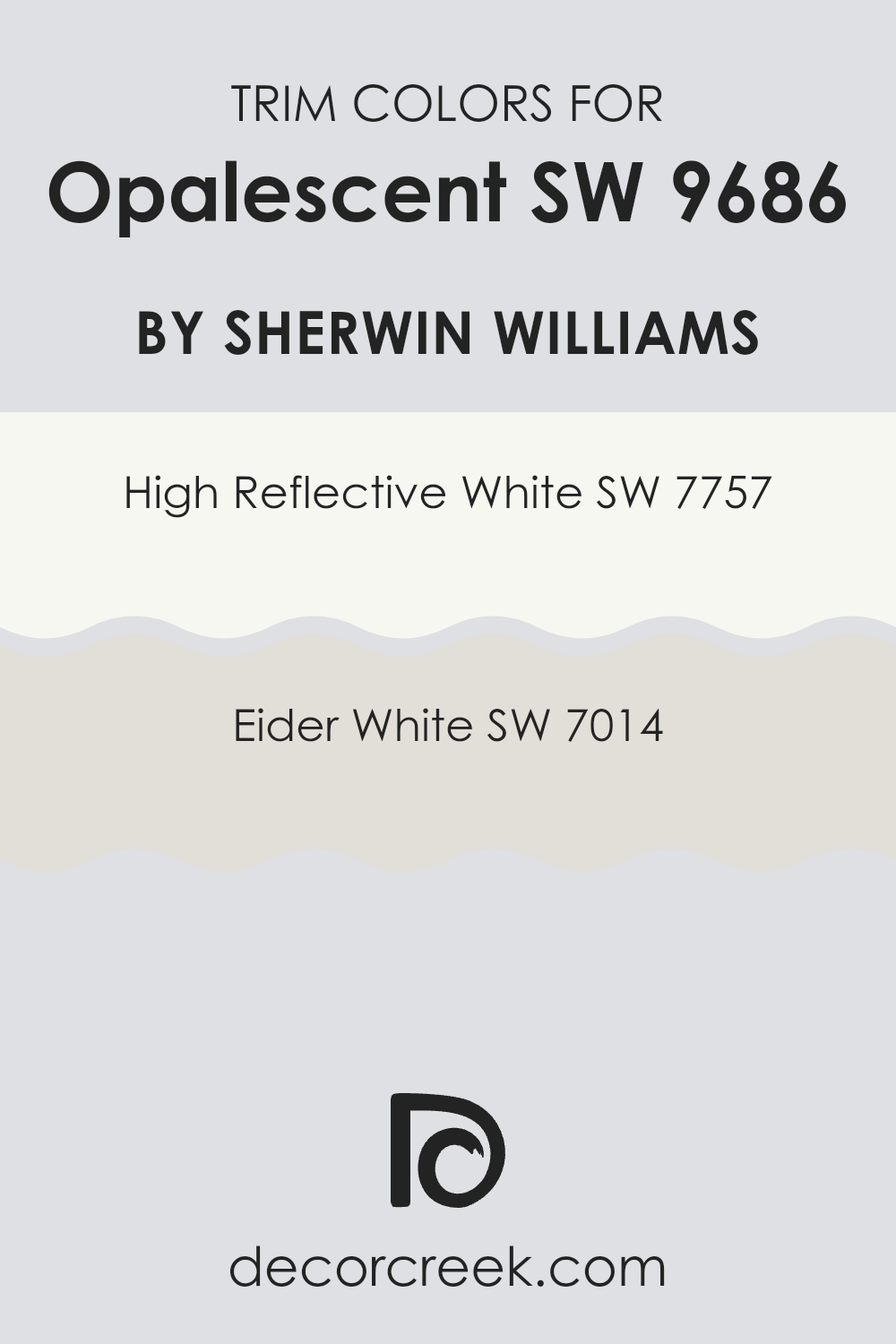
What are the Trim colors of Opalescent SW 9686 by Sherwin Williams?
Trim colors play a critical role in enhancing the visual appeal of a wall color by creating a distinct border that frames and complements the main color. When considering Opalescent by Sherwin Williams, a soft and gentle shade, the choice of trim color can either subtly blend with or sharply contrast to bring forward the wall’s true hue and texture.
Using a trim color like High Reflective White or Eider White can significantly affect how the main wall color is perceived, giving a clean and finished look to the space. The right trim color not only defines the junctions between walls, ceilings, and floors but also highlights architectural details, adding depth and dimension to the room.
High Reflective White is a brilliant, crisp white that serves as a striking contrast against softer, lighter hues like Opalescent. It reflects a lot of light, making it a good choice for spaces that aim to feel more open and airy. On the other hand, Eider White has a subtler, warmer undertone that provides a gentler transition from the wall color, enhancing the space’s overall cohesion without creating too stark a contrast. Utilizing these colors as trims introduces a finishing touch that truly allows the walls to stand out effectively.
You can see recommended paint colors below:
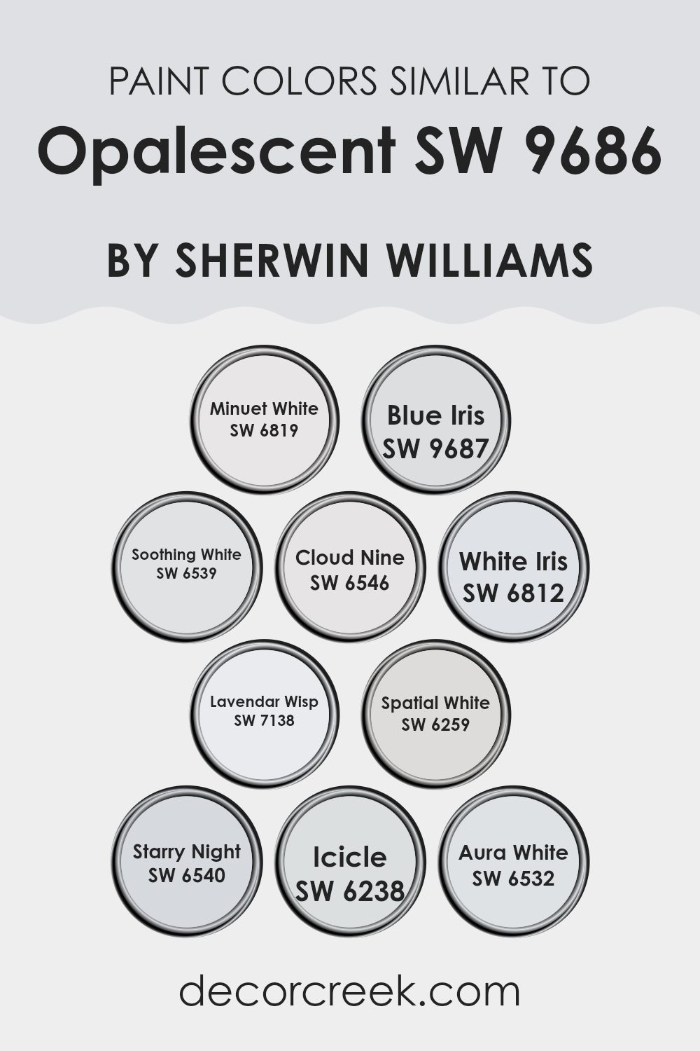
Colors Similar to Opalescent SW 9686 by Sherwin Williams
Choosing similar colors for a room or home can greatly enhance the overall aesthetic and mood. When colors like Opalescent and its akin shades are used together, they create a cohesive and harmonious look. Similar colors help in blending different elements of a room seamlessly, giving a subtle and soothing transition from one space to another.
It creates a unified appearance, avoiding harsh contrasts and promoting a visually soothing experience. These subtle variations can also help in making small spaces appear bigger and beautifully tied together.
For instance, Minuet White offers a gentle off-white tone that serves as a fantastic backdrop for subtle accents. Blue Iris adds a mild, dusky blue hue, bringing a hint of color without overwhelming the senses. Soothing White is an inviting shade that offers a calm and mild creamy background.
Cloud Nine gives a light grayish tint, perfect for those preferring a hint of neutrality. White Iris introduces a faint violet undertone, adding delicate interest. Lavender Wisp appears with a soft lavender touch, providing a gentle pop of color.
Spatial White, leaning towards a light gray, adds depth while maintaining brightness. Starry Night steps it up with a deeper blue, adding drama in a subtle manner. Icicle presents a very light bluish tint, refreshing the palette subtly. Lastly, Aura White complements by providing a pure, clear white, illuminating and reflecting other colors beautifully. Each of these options offers a slight variation that can be intuitively mixed and matched to achieve a layered yet cohesive look.
You can see recommended paint colors below:
- SW 6819 Minuet White
- SW 9687 Blue Iris
- SW 6539 Soothing White
- SW 6546 Cloud Nine
- SW 6812 White Iris
- SW 7138 Lavendar Wisp
- SW 6259 Spatial White
- SW 6540 Starry Night
- SW 6238 Icicle
- SW 6532 Aura White
How to Use Opalescent SW 9686 by Sherwin Williams In Your Home?
Opalescent SW 9686 by Sherwin Williams is a soft, subtle color that can bring a light and airy feel to any room in your home. Its gentle tone makes it perfect for creating a calming atmosphere in places like your bedroom or bathroom, where you want to relax.
Additionally, its light-reflecting properties can help make a small space appear bigger and brighter. This color pairs well with crisp whites or rich, dark hues, allowing for versatility in your decorating scheme.
Use it as a main wall color, or as an accent to add a touch of freshness without overpowering your space. Whether you’re updating your living area or giving your kitchen a fresh look, Opalescent can add a gentle, inviting touch to your home’s overall aesthetic.
Opalescent SW 9686 by Sherwin Williams vs White Iris SW 6812 by Sherwin Williams
Opalescent and White Iris are both colors by Sherwin Williams, each providing a unique feel to any space. Opalescent is a soft, gentle color with a hint of gray, making it a subtle choice that’s easy to match with other colors. It’s the kind of color that quietly complements the area without demanding attention, perfect if you want a peaceful and understated look.
On the other hand, White Iris offers a touch more vibrancy with a bluish-purple tone that adds a hint of cheer and playfulness to rooms.
This color is slightly more expressive than Opalescent and is great for injecting a bit of personality into a space while still keeping things light and airy. When choosing between the two, consider the mood you’re aiming for: Opalescent is ideal for a soft, neutral backdrop, whereas White Iris is better if you prefer a splash of mild, cheerful color.
You can see recommended paint color below:
- SW 6812 White Iris
Opalescent SW 9686 by Sherwin Williams vs Aura White SW 6532 by Sherwin Williams
Opalescent and Aura White by Sherwin Williams are two distinct colors that can change the feel of a room in different ways. Opalescent is a subtle, light gray with a hint of blue that gives off a soft and airy feel, making it perfect for creating a peaceful and relaxing atmosphere in spaces like bedrooms or bathrooms.
On the other hand, Aura White is a clearer, brighter white. It’s great for making smaller rooms appear larger and more open, or for providing a crisp backdrop for colorful decor. When considering both colors, Aura White offers a more neutral base, allowing it to pair easily with any other color.
Opalescent, with its slight tint, adds a touch of personality and can be used to introduce a gentle cool tone to a space without overwhelming it. Depending on the lighting and surrounding colors, Opalescent might show more of its blue undertones, while Aura White remains consistently bright and clean.
You can see recommended paint color below:
- SW 6532 Aura White
Opalescent SW 9686 by Sherwin Williams vs Blue Iris SW 9687 by Sherwin Williams
Opalescent and Blue Iris, both from Sherwin Williams, offer distinctly different vibes for any space. Opalescent is a soft, almost magical color that can make a room feel lighter and more open. It’s a subtle shade that doesn’t overpower, making it ideal for creating a soothing and unobtrusive background.
On the other hand, Blue Iris is a deeper, more pronounced hue. It carries a bold presence, adding a dramatic flair to walls it adorns. Its richer tone can make large spaces feel more intimate and can also serve as a striking accent color.
While Opalescent is versatile and blends well in various settings due to its muted nature, Blue Iris stands out and demands attention. Depending on your decorating goals, you might choose Opalescent for a gentle, airy feel or Blue Iris for a more dramatic and lively effect. Both colors offer unique aesthetics, but the choice depends on the desired impact and mood for the room.
You can see recommended paint color below:
Opalescent SW 9686 by Sherwin Williams vs Minuet White SW 6819 by Sherwin Williams
Opalescent and Minuet White are both elegant colors by Sherwin Williams, each bringing its own unique feel to spaces. Opalescent is a soft, muted tone that has a slightly pearly finish, giving it a subtle shimmer that adds interest and depth to walls without overwhelming the space. This makes it great for rooms where you want a touch of elegance without a strong color statement. It works well in bedrooms and living rooms where a gentle ambiance is desired.
On the other hand, Minuet White is a cleaner, clearer shade of white with a crisp finish. It provides a fresh and bright look, making it ideal for kitchens and bathrooms where a clean, open feel is important. This color reflects more light and can make small spaces appear larger and more welcoming.
Both colors are versatile and work well in a variety of decorating styles, but the choice between them would depend on the specific feel you want for your room and how much natural light it receives.
You can see recommended paint color below:
- SW 6819 Minuet White
Opalescent SW 9686 by Sherwin Williams vs Starry Night SW 6540 by Sherwin Williams
Opalescent SW 9686 and Starry Night SW 6540 by Sherwin Williams are two distinct colors that offer different vibes for interior spaces. Opalescent is a very pale, almost neutral color with a gentle hint of softness, making it perfect for creating a calm and welcoming feeling in a room. It reflects light beautifully, which can make small spaces appear larger and more open.
On the other hand, Starry Night SW 6540 is a deep, vibrant blue that brings a bold and energetic touch to any space. This color can make a strong statement whether used on an accent wall or throughout a room. It pairs beautifully with bright whites and metallic finishes for a modern look, or with warm woods for a more classic feel.
In summary, if you’re looking for a color that is subtle and versatile, Opalescent would be a great choice. If you prefer something more striking and lively, Starry Night could be the perfect fit. Both colors have their unique appeal depending on your desired atmosphere.
You can see recommended paint color below:
- SW 6540 Starry Night
Opalescent SW 9686 by Sherwin Williams vs Spatial White SW 6259 by Sherwin Williams
Opalescent (SW 9686) and Spatial White (SW 6259) from Sherwin Williams are two distinct colors that serve different decorative purposes. Opalescent has a soft, muted essence, blending pale gray with subtle lavender undertones. This gives it a unique, almost ethereal quality, making it ideal for creating a gentle, soothing atmosphere in any room. It works well in spaces that aim for a peaceful, understated look.
In contrast, Spatial White is much brighter and cleaner. It’s a pure white that reflects light strongly, helping to make spaces appear larger and more open. This color is perfect for those wanting to create a sharp, crisp environment. It pairs well in settings that require a straightforward, fresh look without the complexity of undertones.
Both colors can be used effectively for different purposes: Opalescent for a soft, nuanced appeal, and Spatial White for a clear, expansive feel. Combining them can also yield attractive results, using Spatial White for trim and accents to highlight the subtle depth of Opalescent.
You can see recommended paint color below:
- SW 6259 Spatial White
Opalescent SW 9686 by Sherwin Williams vs Cloud Nine SW 6546 by Sherwin Williams
Opalescent by Sherwin Williams is a unique shade that catches the eye because of its subtle reflective quality, giving a gentle hint of varied colors much like an opal. It presents as a white with a slight iridescence which may reflect pale greens, blues, or pinks depending on the light, making it a dynamic choice for those looking to add a bit of interest to their walls without committing to a bold color.
In contrast, Cloud Nine is a clearer, more straightforward white. It does not have the same reflective qualities as Opalescent and tends to maintain its pure and simple white hue under various lighting conditions. This makes Cloud Nine a great option for spaces where a consistent and clean look is desired.
While both colors can brighten up a room, Opalescent offers a hint of playful light reflection, adding a subtle character, whereas Cloud Nine provides a calm and clear presence, ideal for creating a straightforward and fresh look.
You can see recommended paint color below:
- SW 6546 Cloud Nine
Opalescent SW 9686 by Sherwin Williams vs Lavendar Wisp SW 7138 by Sherwin Williams
The two colors, Opalescent and Lavender Wisp by Sherwin Williams, present gentle but distinct vibes for any space. Opalescent is almost ghost-like—very subtle and nearly neutral with a hint of soft pink that shines through depending on the light. It’s a great choice for anyone wanting a hint of color without overwhelming a room.
In contrast, Lavender Wisp is a clear, soft purple with bluish undertones that suggest a calm and relaxing environment but adds a bit more personality than Opalescent. It stands out a bit more on walls and would be ideal for spaces meant to have a calming effect, like bedrooms or bathrooms.
Overall, Opalescent is quieter and more understated, perfect for those who prefer minimalism or have a lot of colorful decor items. Lavender Wisp, however, offers a gentle nudge of color and can help define a space while maintaining a peaceful atmosphere. Both colors are muted and light, but Lavender Wisp moves slightly towards a more defined color expression.
You can see recommended paint color below:
- SW 7138 Lavendar Wisp
Opalescent SW 9686 by Sherwin Williams vs Icicle SW 6238 by Sherwin Williams
Opalescent SW 9686 and Icicle SW 6238 from Sherwin Williams are two distinct colors. Opalescent is a soft, warm white with a hint of pink that gives it a cozy and welcoming feel. This color is great for adding a subtle warmth to a room without overwhelming it with color. It’s perfect for living spaces or bedrooms where you want a gentle, inviting atmosphere.
On the other hand, Icicle SW 6238 is a cooler, crisper white with blue undertones. This color offers a clean and fresh look, making it ideal for bathrooms, kitchens, or any area that benefits from a clear, bright appearance. It’s particularly effective in spaces that get a lot of natural light, as the light emphasizes the color’s coolness.
When deciding between the two, consider the mood and functionality of the room. Opalescent works well in areas where you want comfort and warmth, while Icicle is better suited for creating a sharp, fresh environment.
You can see recommended paint color below:
Opalescent SW 9686 by Sherwin Williams vs Soothing White SW 6539 by Sherwin Williams
Opalescent SW 9686 by Sherwin Williams and Soothing White SW 6539 also by Sherwin Williams are both unique, yet they serve different stylistic moods and atmospheres. Opalescent has a subtle, shimmering quality that reflects light beautifully, giving a soft glow to any room. This color can lighten up a space while adding a hint of warmth. It’s a good choice for adding a bit of character without overwhelming a space with too much color intensity.
On the other hand, Soothing White is exactly what you might expect from its name––a clean, calming white. It’s more straightforward than Opalescent, providing a crisp background that works well in any area. It’s perfect for those who want a more classic look or a canvas that allows other elements in the room to stand out.
In essence, choosing between these two depends on what mood you want to set. Opalescent, with its glow, adds a subtle charm, while Soothing White offers a clear, calm base, great for any decor.
You can see recommended paint color below:
- SW 6539 Soothing White
In conclusion, SW 9686 Opalescent by Sherwin Williams is a really cool color that can make any room look bright and happy. It’s like a mix between sky blue and a soft gray, which makes it perfect whether you’re changing up your bedroom or giving the living room a new look. What’s great about this color is that it doesn’t just pick one mood; it sort of changes depending on how much light is shining on it. Sometimes it looks more blue, and other times, it leans toward gray.
It’s a paint color that works for everyone – whether you’re a kid who loves bright spaces or an adult looking for something calm but not boring. You can use it in small rooms to make them feel bigger or splash it on a feature wall to catch everyone’s eye when they walk in. Plus, it blends well with other colors, so you can add your favorite yellows, pinks, or greens to make the room feel even more fun.
Trying out SW 9686 Opalescent might just be the best way to change up your room without doing something too drastic. It’s simple, pretty, and makes every room feel just right.
Ever wished paint sampling was as easy as sticking a sticker? Guess what? Now it is! Discover Samplize's unique Peel & Stick samples.
Get paint samples

