Introducing the stunning SW 9687 Blue Iris by Sherwin Williams, a paint color that brings a fresh and vibrant look into any space.
This particular shade of blue is unique in its richness and depth, making it a fantastic choice for those looking to add a touch of sophistication and energy to their home or office.
Unlike other blues, Blue Iris has a lively yet serene quality that appeals to a wide range of tastes, effortlessly enhancing the aesthetics of any room it graces.
Choosing the right paint color can sometimes feel overwhelming, but Blue Iris stands out as a versatile and beautiful option that works well in various settings.
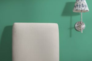
Whether you’re updating a cozy bedroom, giving a living room a modern twist, or adding character to a kitchen, this shade has the power to transform your space with its elegant and refreshing vibe.
Its ability to pair well with different colors and materials means you can integrate it seamlessly into your existing decor or use it as a foundation for a brand-new theme.
In this article, we will explore the many ways SW 9687 Blue Iris can be used to elevate your interior design, providing practical tips and inspiration for incorporating this stunning color into your decorating projects.
If you’re looking for a paint color that combines beauty, sophistication, and a hint of playfulness, Blue Iris by Sherwin Williams might just be the perfect choice.
What Color Is Blue Iris SW 9687 by Sherwin Williams?
Blue Iris by Sherwin Williams is a stunningly rich color that strikes a perfect balance between bold and serene.
This shade draws inspiration from the natural elegance of the iris flower, offering a deep, vibrant blue that can add a touch of sophistication to any space. As a color that pairs exceptionally well with a wide range of interior styles, Blue Iris is versatile.
It is particularly impactful in modern and contemporary settings, where its depth can create a focal point, or in coastal and Mediterranean-inspired interiors, adding a fresh, breezy vibe.
When it comes to pairing with materials and textures, Blue Iris shines. It works beautifully with natural wood, from light oak to darker walnut, bringing out the warmth of the wood grains.
Metallic finishes like brushed brass or matte black can add a modern twist, creating a chic, contrasting look.
In terms of textures, linen and cotton fabrics in neutral tones offer a soft, organic feel that complements the richness of Blue Iris, while velvet adds a layer of luxury and depth, making the space feel more inviting.
Overall, Blue Iris is a versatile color that can transform any room into a more dynamic and elegant space, working in harmony with a variety of materials and textures to create interiors that are both beautiful and timeless.
Ever wished paint sampling was as easy as sticking a sticker? Guess what? Now it is! Discover Samplize's unique Peel & Stick samples.
Get paint samples

Is Blue Iris SW 9687 by Sherwin Williams Warm or Cool color?
Blue Iris by Sherwin Williams is a unique and vibrant color that brings a fresh and lively energy into any home. This shade is part of the cool color family, and it has a way of making spaces feel more open and airy.
With its deep but bright tone, it provides a perfect balance between boldness and tranquility. When used in homes, Blue Iris can transform a room into a serene haven or a dynamic space, depending on how it’s applied.
For living rooms or bedrooms, applying this color on a feature wall can add a beautiful focal point without overwhelming the space.
In smaller doses, like for accent pieces or furniture, it injects a pop of color that brightens up the room. Its versatility also means it can work well with different themes and decor styles, from modern minimalist to cozy cottage.
Moreover, Blue Iris has the power to improve the mood of a room. Colors have a significant impact on feelings and ambiance, and this shade is no exception.
It encourages a sense of calm and creativity, making it ideal for spaces where relaxation or concentration is key. Whether you’re looking to refresh your home with a modern vibe or create a peaceful retreat, Blue Iris offers a beautiful way to achieve your vision.
Undertones of Blue Iris SW 9687 by Sherwin Williams
Blue Iris by Sherwin Williams is a unique color that carries subtle undertones of light blue (#80D5D5) and light purple (#D580D5).
Undertones are like secret ingredients in a color recipe that can change how we perceive the main color. For Blue Iris, these light blue and light purple undertones play a big role in how it looks and feels in a room.
Think of undertones as a background melody in a song. They can enhance the main color, add depth, or even change the color’s vibe depending on the light and surrounding colors.
When you look at Blue Iris, you might first notice its primary hue, but then the undertones add an extra layer, making the color more complex and interesting.
In interior walls, the light blue undertone adds a sense of calmness and tranquility, making spaces feel serene and spacious. It’s like having a breath of fresh air in your room.
On the other hand, the light purple undertone brings a touch of warmth and softness, creating a cozy and inviting atmosphere. This blend makes Blue Iris a great choice for rooms where you want to relax and unwind.
The way natural and artificial light hit the walls can also affect how these undertones reveal themselves.
During the day, natural light might highlight the cooler light blue, while at night, artificial lights could draw out the warmer light purple, showing how versatile and dynamic Blue Iris can be in different settings.
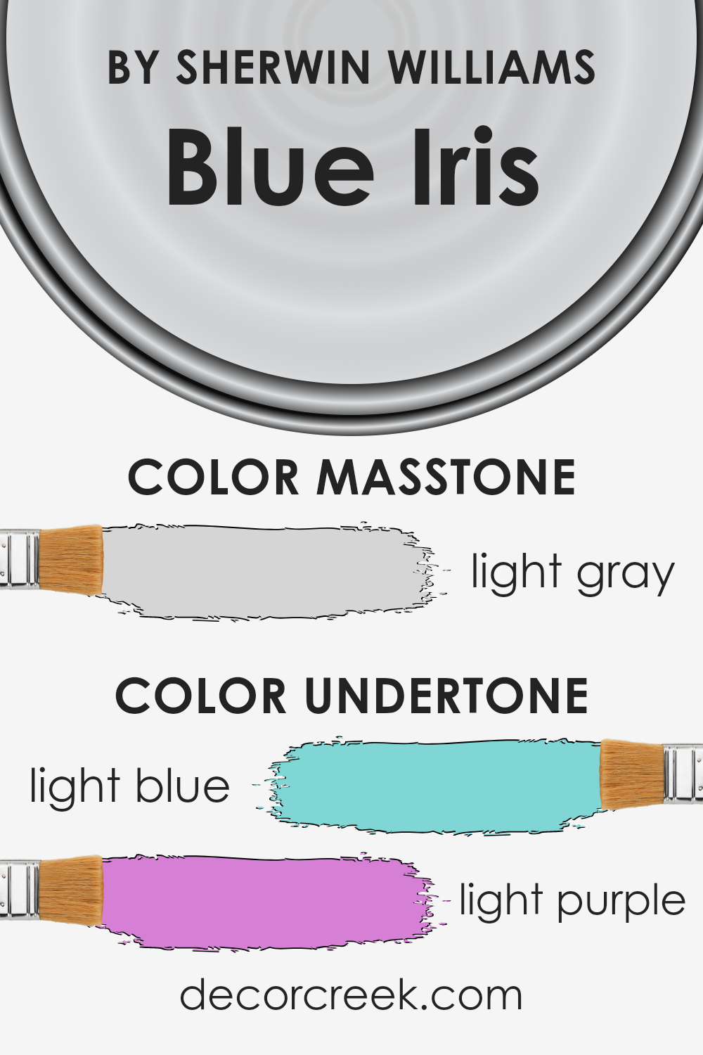
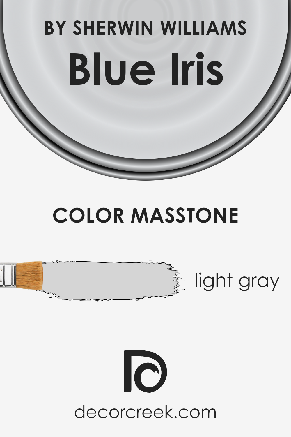
What is the Masstone of the Blue Iris SW 9687 by Sherwin Williams?
Blue Iris SW 9687 by Sherwin Williams has a masstone of light gray, a color that brings a soft and serene feeling into homes.
This particular shade of gray is incredibly versatile and can work wonders in a variety of spaces, whether you’re looking to create a calm and soothing bedroom or a bright and airy living room.
The light gray masstone can make small rooms feel bigger and more open, as it reflects light better than darker colors.
It acts as a neutral backdrop, allowing furniture and décor to stand out, which means you can easily switch up accent colors without the need to repaint.
Additionally, this shade of gray blends seamlessly with other colors, from bright hues to deeper tones, providing a harmonious balance in your home’s color scheme.
It’s an unobtrusive color that adds a touch of elegance without overwhelming the space, making it an excellent choice for anyone looking to refresh their home with a modern and chic feel.
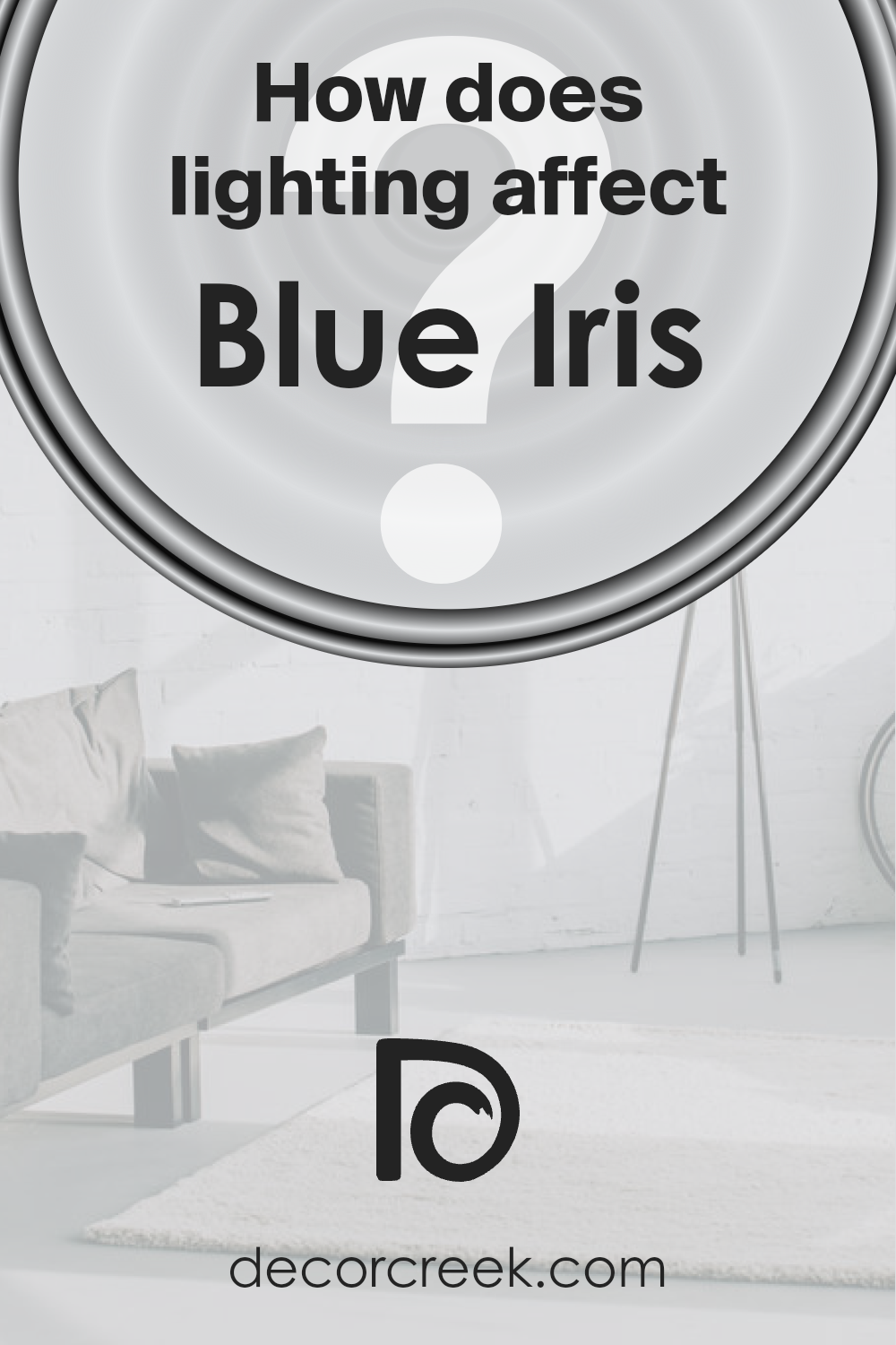
How Does Lighting Affect Blue Iris SW 9687 by Sherwin Williams?
Lighting plays a crucial role in how we perceive colors, significantly impacting the appearance and mood of a space.
When we talk about a specific color, like Sherwin Williams’ Blue Iris, understanding how it changes under different lighting conditions is key to maximizing its beauty in any room.
This deep, vibrant shade can look dramatically different depending on the light source—whether it’s basking in natural sunlight or under the glow of artificial lighting.
Artificial lighting can greatly influence how Blue Iris is seen. In rooms with incandescent bulbs, which emit a warm, yellowish glow, Blue Iris may appear softer and slightly more purple-toned, as the warm light tends to mute its cooler attributes.
On the other hand, LED or fluorescent lighting, which is closer to daylight and can be cooler, might make Blue Iris appear sharper and more vivid, bringing out its true depth and the richness of the blue more prominently.
Natural light, ever-changing throughout the day, also affects how we see this color.
In north-facing rooms, which receive less direct sunlight and tend to have cooler, softer light, Blue Iris may appear more muted and shadowy, emphasizing its serene and tranquil qualities.
South-facing rooms, flooded with warm and bright sunlight for most of the day, can make Blue Iris look more lively and radiant, enhancing its vibrant qualities.
East-facing rooms enjoy bright morning light, making Blue Iris feel crisp and fresh in the mornings, but it might take on a cooler, more subdued look as the day progresses and natural light diminishes.
West-facing rooms, however, get the full strength of the sun in the late afternoon, which means Blue Iris can look stunningly vivid and dynamic in the evening, potentially taking on a slight warmth as the sun sets.
Understanding how lighting—both artificial and natural—affects the appearance of colors like Blue Iris helps in making informed decisions about paint choices for a room, ensuring the color performs beautifully under various lighting conditions throughout the day and across different seasons.
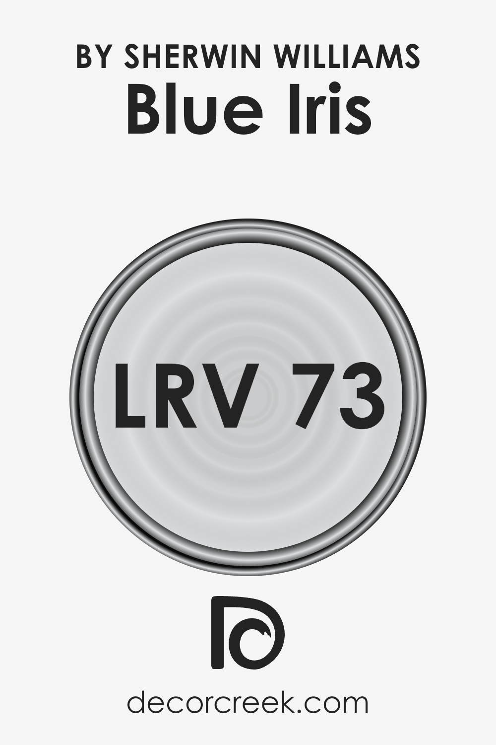
What is the LRV of Blue Iris SW 9687 by Sherwin Williams?
LRV stands for Light Reflectance Value, which is a measure of the amount of visible and usable light that a paint color reflects or absorbs.
This value is measured on a scale from 0 to 100, where 0 is pure black, absorbing all light, and 100 is pure white, reflecting all light. LRV plays a crucial role in choosing paint colors for your space because it can significantly affect the appearance and ambiance of a room.
A higher LRV means the color reflects more light, making spaces appear larger and brighter. Conversely, a lower LRV color absorbs more light, which can make a room feel cozier but smaller and darker.
Regarding the color Blue Iris with an LRV of 72.969, this high LRV indicates that it reflects a great deal of light. This property makes it an excellent choice for spaces that you want to appear more open, airy, and bright.
When applied to walls, Blue Iris with its high LRV will help in maximizing natural light during the day, reducing the need for artificial lighting. This can especially come in handy in rooms that are smaller or have limited light sources.
However, it’s important to consider the direction of the room and the quality of light it receives, as these factors can influence how the color appears at different times of the day.
LRV – what does it mean? Read This Before Finding Your Perfect Paint Color
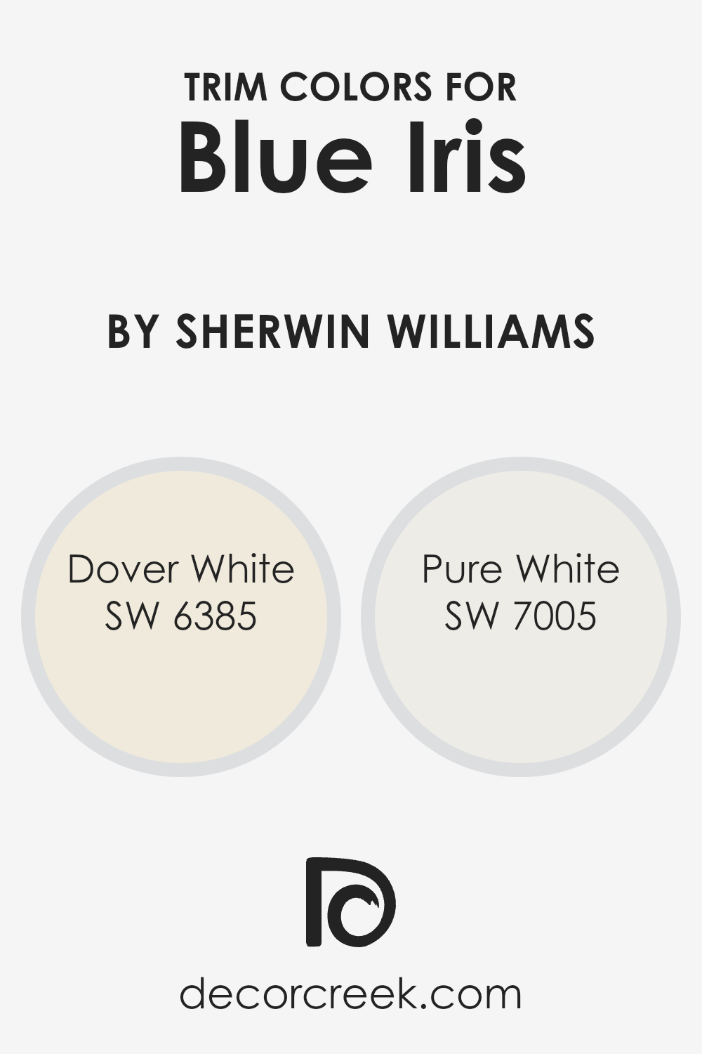
What are the Trim colors of Blue Iris SW 9687 by Sherwin Williams?
Trim colors are the hues chosen to accentuate or complement the main color of a wall or space, playing a crucial role in interior and exterior design.
For example, when using a vibrant shade like Blue Iris by Sherwin Williams, selecting the right trim color can enhance the overall aesthetic appeal and create a visually appealing contrast.
The trim color can highlight the architectural features of a room, frame windows and doors beautifully, and tie together the look of a space, making the choice of trim colors an important aspect of design considerations.
Using Dover White (SW 6385) as a trim color provides a soft, creamy backdrop that gently complements the boldness of Blue Iris, bringing a warm and inviting feel to the space without overwhelming the senses.
It offers a subtle contrast that is sophisticated yet approachable.
On the other hand, Pure White (SW 7005) presents a clean, crisp edge against Blue Iris, delivering a more striking contrast that can make the walls pop and give the space a fresh, modern look.
This sharp delineation can make the architectural details stand out, presenting a clear and intentional design choice that showcases both harmony and an eye-catching balance between the wall and trim colors.
You can see recommended paint colors below:
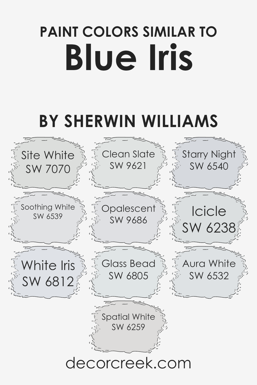
Colors Similar to Blue Iris SW 9687 by Sherwin Williams
Choosing similar colors to Blue Iris by Sherwin Williams can greatly enhance the aesthetics and feel of a space. Similar colors harmonize with each other, creating a cohesive look that is pleasing to the eye.
These colors work together by sharing a common hue, saturation, or lightness, which allows for a smooth transition from one color to the next within a space.
This continuity can make a room feel more spacious, balanced, and tranquil. By selecting similar shades, such as soft whites and delicate blues, decorators can craft environments that feel intentionally designed and thoughtfully curated.
Among the colors similar to Blue Iris, Site White offers a subtle backdrop, a quiet base that allows for versatility in decor, lending itself to a serene and uncluttered look.
Soothing White leans into a gentle creaminess that wraps a room in warmth, making spaces feel inviting and comfortable. White Iris introduces a hint of lavender undertone that whispers sophistication and depth.
Spatial White brings an airy lightness, mimicking the expanse of the sky, while Clean Slate provides a slight grayish tone for a more grounded, neutral feel.
Opalescent has a soft, ethereal quality, adding a touch of whimsy. Glass Bead shines with a crisp brightness, reflecting light beautifully to energize a room.
Starry Night offers a deeper contrast, a nod to the night sky, adding drama and focus. Icicle’s cool tone refreshes a palette, offering a clean, crisp edge.
Lastly, Aura White encapsulates purity with a barely-there pink undertone, bringing a soft, nurturing vibe. Together, these colors support and enhance the richness of Blue Iris, allowing for endless possibilities in design.
You can see recommended paint colors below:
- SW 7070 Site White
- SW 6539 Soothing White
- SW 6812 White Iris
- SW 6259 Spatial White
- SW 9621 Clean Slate
- SW 9686 Opalescent
- SW 6805 Glass Bead
- SW 6540 Starry Night
- SW 6238 Icicle
- SW 6532 Aura White
How to Use Blue Iris SW 9687 by Sherwin Williams In Your Home?
Blue Iris SW 9687 from Sherwin Williams is a beautiful color choice for anyone looking to bring a unique touch to their home.
This shade combines the calmness of blue with a hint of joyful vibrancy, making it perfect for creating a relaxed yet lively atmosphere in any room.
One way to use Blue Iris in your home is by painting an accent wall. This can add a pop of color without overwhelming the space.
It works really well in living rooms or bedrooms, providing a soothing backdrop that complements both light and dark furniture.
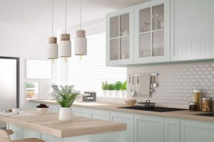
You can also consider using Blue Iris for kitchen cabinets or bathroom vanities for an unexpected twist on traditional wood tones.
It pairs nicely with marble countertops and metallic fixtures, offering a modern look that’s still warm and inviting.
For those who love DIY projects, painting old furniture with Blue Iris could be a fun weekend undertaking. It’s an affordable way to breathe new life into a piece, giving it a fresh, stylish edge that stands out in any room.
Remember, adding new colors to your home is about experimenting and having fun. Blue Iris is versatile enough to suit different spaces and styles, offering plenty of opportunities to refresh your home’s look.
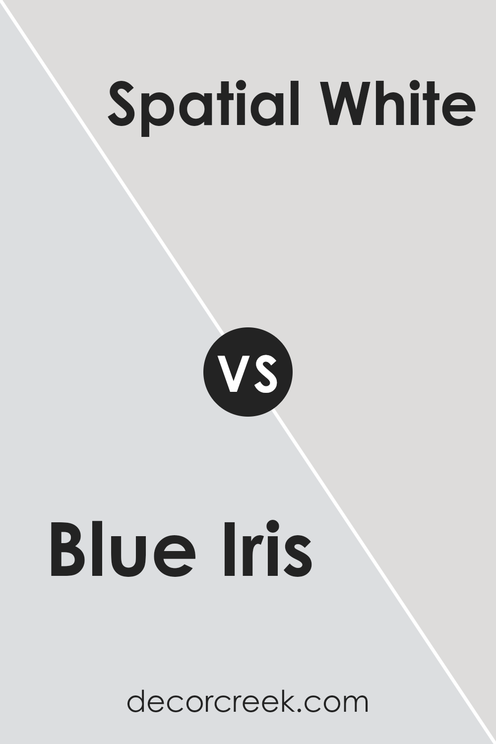
Blue Iris SW 9687 by Sherwin Williams vs Spatial White SW 6259 by Sherwin Williams
Blue Iris and Spatial White, both by Sherwin Williams, offer distinct vibes and visual impacts in any space. Blue Iris stands out with its rich, deep blue tone that adds a sense of sophistication and depth.
It’s a color that makes a statement, perfect for creating a focal point or adding character to a room. On the other hand, Spatial White is much lighter and offers a clean, airy feel.
This color can make spaces feel larger and more open, bringing a sense of calm and simplicity. When comparing the two, Blue Iris brings drama and boldness with its dark hue, while Spatial White offers a fresh, minimalist look.
Whether used together or separately, each color has its unique charm, with Blue Iris leaning towards a striking, cozy atmosphere and Spatial White enhancing brightness and a sense of peace.
You can see recommended paint color below:
- SW 6259 Spatial White
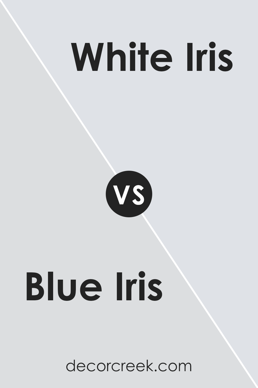
Blue Iris SW 9687 by Sherwin Williams vs White Iris SW 6812 by Sherwin Williams
Blue Iris and White Iris by Sherwin Williams are two distinct shades offering unique vibes for any space. Blue Iris stands out with its deep, rich hue that effortlessly adds a sense of sophistication and depth.
It’s perfect for creating a striking accent wall or anchoring a room with its bold, confident character. On the other hand, White Iris offers a softer, more serene look.
This color is light and airy, making it ideal for spaces you want to feel open and bright. Its understated elegance can complement a wide range of décor, providing a fresh, clean backdrop that enhances other colors used alongside it.
While Blue Iris makes a statement with its intensity, White Iris brings a gentle, calming presence, proving both can transform a space in very different but equally beautiful ways.
You can see recommended paint color below:
- SW 6812 White Iris
Blue Iris SW 9687 by Sherwin Williams vs Glass Bead SW 6805 by Sherwin Williams
Blue Iris and Glass Bead by Sherwin Williams are both unique, but they bring different vibes to a space. Blue Iris is a deep, rich blue with a hint of purple that makes it stand out.
It’s bold and can add a sense of sophistication and calmness to any room. On the other hand, Glass Bead is much lighter. It’s a soft, serene green with a touch of blue, offering a refreshing and clean look.
This color can make a room feel more open and airy. While Blue Iris can create a focal point or a cozy corner with its depth and intensity, Glass Bead is perfect for brightening up a space and giving it a more relaxed feel.
Both colors are beautiful in their own right, but your choice between them would depend on the atmosphere you want to create.
You can see recommended paint color below:
- SW 6805 Glass Bead
Blue Iris SW 9687 by Sherwin Williams vs Aura White SW 6532 by Sherwin Williams
Looking at Blue Iris and Aura White, both by Sherwin Williams, it’s easy to see that they cater to different tastes and spaces. Blue Iris is a deep, vibrant shade that brings a sense of boldness and sophistication to any area.
It’s a color that can make a strong statement, whether on a feature wall or as an accent in decor. On the other hand, Aura White is much lighter and softer.
It’s a serene and clean shade that can brighten up a room and give it a fresh, airy feel. Aura White works great as a base color, allowing other colors, like Blue Iris, to really pop when used together.
It’s also versatile, blending well with various decor styles from modern to classic. While Blue Iris adds depth and drama, Aura White offers a restful and open atmosphere.
The two together can create a balanced and harmonious look, with each bringing out the best in the other.
You can see recommended paint color below:
- SW 6532 Aura White
Blue Iris SW 9687 by Sherwin Williams vs Icicle SW 6238 by Sherwin Williams
Blue Iris and Icicle are two colors by Sherwin Williams, each with its unique character. Blue Iris is a rich, deep blue that’s bold and stands out. It has a strong presence and can make a statement in any space.
This color can bring a touch of sophistication and depth to rooms, creating a focal point or accentuating details.
On the other hand, Icicle is a lot lighter and leans towards a soft, muted gray with a hint of blue. It’s very subtle and offers a serene, calming vibe. Icicle is excellent for creating a peaceful and airy atmosphere in a space.
It works well in rooms where you want to relax and unwind, like bedrooms and bathrooms.
In comparison, Blue Iris is more dramatic and intense, suitable for creating striking contrasts, while Icicle is gentle and soothing, perfect for a more laid-back or minimalist look.
Both colors have their charm and can be used effectively depending on the mood you want to achieve in your space.
You can see recommended paint color below:
- SW 6238 Icicle
Blue Iris SW 9687 by Sherwin Williams vs Clean Slate SW 9621 by Sherwin Williams
Let’s talk about Blue Iris and Clean Slate, both from Sherwin Williams. Blue Iris is a deep, intriguing shade that leans towards the cooler end of things, almost whispering of serene evenings and the depth of the night sky.
It’s the kind of blue that feels both rich and calming at the same time.
On the other hand, Clean Slate steps in with a vibe that’s a tad more grounded and muted.
It’s a color reminiscent of stormy skies and the sea during a calm, making it a perfect backdrop for spaces aiming for a touch of sophistication without being too loud.
When comparing the two, Blue Iris offers a more profound and enveloping feel, potentially making rooms feel cozier and more intimate.
Clean Slate, with its slightly lighter persona, offers a breath of fresh air and flexibility, fitting in almost anywhere without overwhelming the senses.
Both colors carry their unique charm, but your choice would depend on the mood you’re looking to create. Blue Iris wraps you in a velvety night sky, while Clean Slate offers a serene horizon.
You can see recommended paint color below:
- SW 9621 Clean Slate
Blue Iris SW 9687 by Sherwin Williams vs Starry Night SW 6540 by Sherwin Williams
Blue Iris and Starry Night, both by Sherwin Williams, offer distinct vibes due to their unique tones. Blue Iris is a deep, rich blue with a touch of purple, giving it a sophisticated and somewhat luxurious appearance.
It’s a color that stands out and brings depth to any space, ideal for creating a statement wall or accent pieces in a room.
On the other hand, Starry Night is a lighter, more vibrant blue. It has an airy, refreshing feel to it, reminiscent of a clear, bright sky on a summer evening.
This color can open up a space, making it feel more lively and welcoming. It’s perfect for bedrooms, bathrooms, or any area where you want to add a pop of cheer without overwhelming the senses.
In summary, Blue Iris offers a deeper, more complex hue for those looking to add a touch of elegance, while Starry Night provides a fresher, brighter atmosphere.
Choosing between them depends on the mood you’re aiming to achieve in your space.
You can see recommended paint color below:
- SW 6540 Starry Night
Blue Iris SW 9687 by Sherwin Williams vs Soothing White SW 6539 by Sherwin Williams
Blue Iris and Soothing White by Sherwin Williams are two contrasting shades that serve different purposes in interior design. Blue Iris is a deep, vibrant blue that stands out with a strong personality.
This color can make a bold statement in any room, perfect for creating a focal point or adding depth.
It carries a sense of sophistication and confidence, making it suitable for spaces where you want to inspire creativity or focus.
On the other hand, Soothing White is a calm and comforting shade, exuding a sense of peace and serenity.
It’s incredibly versatile, acting as a blank canvas that can either stand alone for a minimalist look or serve as a backdrop to let other colors, like Blue Iris, pop.
This light shade can help make a space feel larger, brighter, and more open, promoting a relaxed and welcoming atmosphere.
When used together, Blue Iris can bring a splash of energy and drama to a space, while Soothing White can soften and balance the overall look, creating a harmonious blend of tranquility and vibrance.
You can see recommended paint color below:
- SW 6539 Soothing White
Blue Iris SW 9687 by Sherwin Williams vs Opalescent SW 9686 by Sherwin Williams
Blue Iris and Opalescent from Sherwin Williams are two distinct colors. Blue Iris is a vivid, deep blue with a hint of purple that gives it a rich and intense appearance.
It’s a color that can make a bold statement in a room, adding depth and vibrancy. Because of its strong presence, it’s great for accent walls or spaces where you want a splash of color.
On the other hand, Opalescent is much softer and subtler. It has a light, almost ethereal quality, blending hints of gray with soft, pearly tones to create a tranquil and airy feel.
This color is perfect for creating a serene and calming environment, making it ideal for bedrooms, bathrooms, or any space where relaxation is key.
While Blue Iris brings energy and dynamism to a space with its deep, bold hue, Opalescent offers a gentle touch, infusing spaces with a sense of calm and peace.
Both colors have their unique charm, catering to different tastes and design needs.
You can see recommended paint color below:
- SW 9686 Opalescent
Blue Iris SW 9687 by Sherwin Williams vs Site White SW 7070 by Sherwin Williams
Blue Iris is a striking color, offering a deep, rich tone that really stands out. It’s the kind of color that adds a lot of personality and depth to a space, making it perfect for someone looking to make a bold statement.
On the other hand, Site White presents a clean, crisp backdrop.
It’s much lighter, almost the opposite of Blue Iris, offering a neutral base that can easily blend with other colors and decorations.
While Blue Iris draws the eye and sets a mood, Site White is all about creating a bright, open feeling. It’s versatile, working well in any space to either calm down vibrant colors or complement softer tones.
If you’re aiming for drama and character, go with the former; if your goal is to keep things light and airy, the latter is your best bet. Together, they could even work wonderfully, with Site White balancing out the intensity of Blue Iris.
You can see recommended paint color below:
- SW 7070 Site White
Conclusion
Blue Iris, a stunning color offered by Sherwin-Williams, stands out for its versatility and beauty. This particular shade offers a perfect balance, making it an excellent choice for anyone looking to add a touch of sophistication and tranquility to their space.
Its unique ability to blend with a variety of decor styles and palettes makes it a go-to option for designers and homeowners alike. Whether for a calming bedroom ambiance or a vibrant living area touch, Blue Iris provides a refreshing and contemporary look.
In conclusion, Blue Iris proves to be more than just a color; it’s a statement of style and comfort.
Its adaptability to different settings ensures it fits seamlessly into any room, enhancing the overall aesthetic appeal.
For those looking to refresh their space with a color that combines modernity with timeless elegance, Blue Iris by Sherwin-Williams is an impeccable choice. Its popularity is a testament to its appeal, offering an easy yet impactful way to transform any interior.

Ever wished paint sampling was as easy as sticking a sticker? Guess what? Now it is! Discover Samplize's unique Peel & Stick samples.
Get paint samples