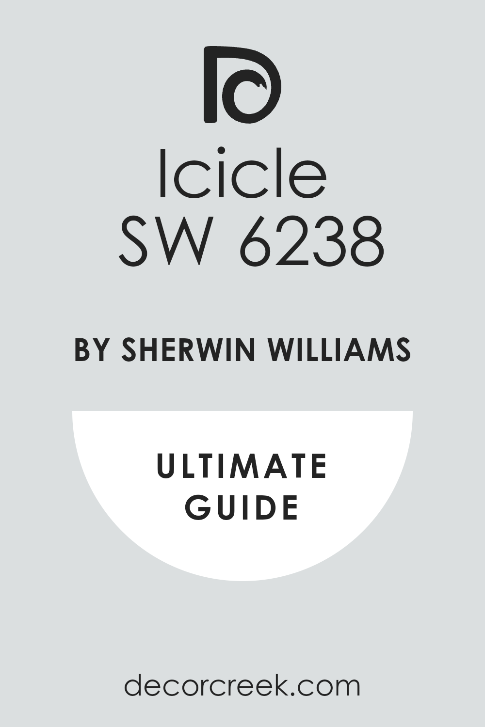
If you’re thinking about giving your space a fresh, new look with paint, let me tell you about a color I think you might love: SW 6238 Icicle by Sherwin Williams. This shade is a subtle, cool gray that has a calm and soothing effect, making it perfect for creating a serene atmosphere in your home. Whether you’re looking to paint a bedroom, a home office, or even your living room, Icicle could be the ideal choice.
One of the greatest things about this color is how versatile it is. It pairs beautifully with a wide range of decor styles and complements both modern and classic designs.
Plus, it works well with different color schemes, so you can easily match it with your existing furniture and accessories or use it as a base to design a new room from scratch.
When you apply Icicle to your walls, it adds a soft, clean look that also helps to make small rooms appear bigger and more open.
From my experience, this color truly revitalizes a space, providing a subtle backdrop that enhances other elements in the room without overwhelming them. Think about how this shade could transform your home into a peaceful sanctuary that you’ll enjoy every day.
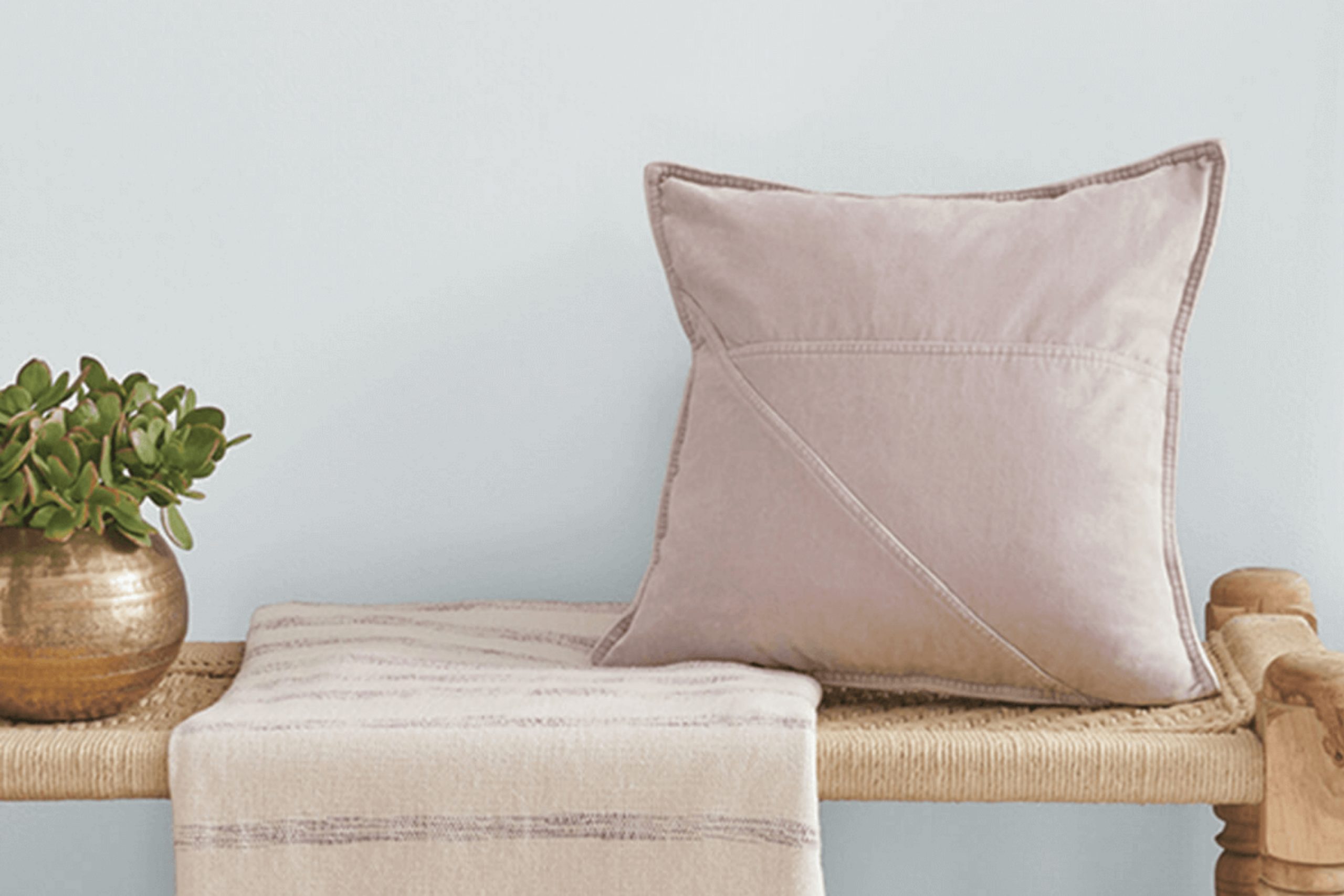
What Color Is Icicle SW 6238 by Sherwin Williams?
Icicle by Sherwin Williams is a cool, light gray shade that carries subtle blue undertones, making it a refreshing choice for any room. This color has a crisp quality that mimics the clarity of ice, lending a clean and airy feel to spaces. It works especially well in modern and minimalist interior designs due to its simplicity and understated elegance. Because of its neutrality, Icicle pairs wonderfully with a wide range of materials and textures.
In rooms with a lot of natural light, this color looks almost ethereal and helps to make small spaces appear brighter and more open. When used in interiors, it’s a fantastic backdrop for rich woods, adding warmth and organic character to the environment. It also matches well with metallic finishes like silver or chrome, enhancing a modern look with a sleek, polished touch.
Textures such as soft cotton or linen in upholstery or drapery complement its light, breezy feel, whereas leather pieces can introduce a contrast that grounds the space with a touch of luxury.
In essence, Icicle is versatile and can be used to create a clean, fresh look in your home, pairing well with many designs and textures to suit various tastes and styles.
Is Icicle SW 6238 by Sherwin Williams Warm or Cool color?
Icicle SW 6238 by Sherwin Williams is a cool, soft gray paint color that brings a fresh and clean look to any room. This particular shade is light enough to make small spaces appear larger and brighter, while also fitting seamlessly into larger areas without overwhelming them. It has a subtle blue undertone, commonly associated with a calm and relaxing atmosphere, making it an excellent choice for bedrooms and bathrooms where comfort is key.
The versatility of Icicle allows it to be paired with a wide range of colors and decor styles. It looks stunning when combined with bright whites for a crisp look, or it can be coordinated with darker colors like navy or charcoal for a bold contrast. This flexibility makes it convenient for homeowners to use throughout their home, maintaining a cohesive look without being too uniform.
Due to its light reflectiveness, Icicle also works well in rooms that don’t receive much natural light, making spaces feel open and airy. It’s a practical and stylish choice that easily adapts to different lighting and furnishings.
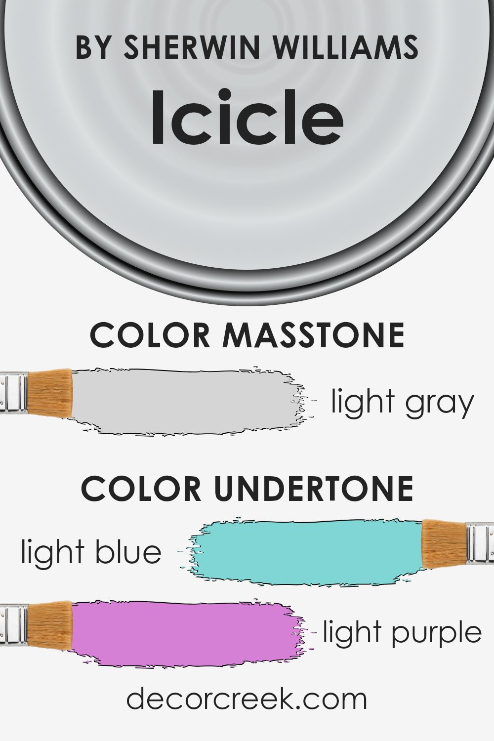
Undertones of Icicle SW 6238 by Sherwin Williams
Icicle SW 6238 by Sherwin Williams is a versatile paint color with a spectrum of undertones that influence how it appears in different lighting and settings. The primary undertones of this color include light blue, light purple, pale yellow, lilac, mint, pale pink, and grey. Each undertone adds a subtle nuance that can change the overall feel of the color.
Undertones play a critical role in how we perceive colors. For instance, a light blue undertone can give a fresh, cool feel to a space, while a light purple adds a touch of gentle warmth. Undertones like pale yellow and lilac can make a wall color feel softer and more inviting, whereas grey can help ground the lighter, more vibrant undertones, providing balance and depth.
When applied to interior walls, the undertones of Icicle influence the mood and ambiance of a room. In a space with ample natural light, the light blue and mint undertones might become more prominent, creating a calm, refreshing atmosphere. In artificial light, the pale pink or light purple may stand out, offering a warm and cozy environment. The pale yellow and lilac undertones can make the space feel welcoming and comfortable.
The mix of undertones also means that Icicle is highly adaptable – it can complement various decor styles and color schemes, making it a practical choice for many homes. Importantly, the perception of this color can vary significantly depending on the lighting conditions and surrounding colors, which is crucial to consider when choosing this paint for a room.
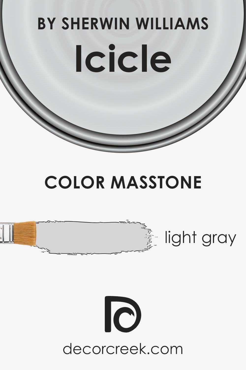
What is the Masstone of the Icicle SW 6238 by Sherwin Williams?
IcicleSW 6238 by Sherwin Williams is a light gray shade, visually close to #D5D5D5. Its neutral tone makes it highly versatile for home decor, allowing it to blend seamlessly with a wide array of color palettes and styles. Its lightness gives a crisp and clean appearance to a room, making spaces feel more open and airy. This quality is especially beneficial in smaller rooms or areas with limited natural light, as it helps to make them appear larger and brighter.
The subtle nature of this light gray does not overwhelm, making it an excellent choice as a base color for walls. It pairs well with both bright accents and deeper hues, providing a balanced backdrop that supports various design elements without competing for attention.
Whether in a modern setting with bold colors or in a more traditional space with soft, muted tones, IcicleSW 6238 maintains its charm, enhancing the overall aesthetic of a home and providing a steady, calming presence.
How Does Lighting Affect Icicle SW 6238 by Sherwin Williams?
Lighting has a significant impact on how we perceive colors, because different types of light can change how a color looks. For example, a paint color such as Icicle by Sherwin Williams can appear differently under various lighting conditions.
In artificial light, such as that from LED or fluorescent bulbs, Icicle might lean towards a cooler tone because these lights often give off a bluish hue. This can make the color appear more crisp and vibrant. On the other hand, in natural sunlight, which is generally warmer, Icicle will look softer and may even have a slightly warmer grey tint.
The orientation of a room can further affect how colors like Icicle are perceived. In north-facing rooms, which receive less direct sunlight and tend to have cooler, bluish light, Icicle might look more true to its cool grey tone, making the room feel a bit cooler. In contrast, in south-facing rooms that get a lot of natural light, the color might seem lighter and warmer, adding a subtle, welcoming warmth to the space.
East-facing rooms get bright light in the morning which can make Icicle look very soft and slightly warm in the morning, turning more neutral as the day progresses. Finally, in west-facing rooms, the afternoon and evening light can make the color appear much warmer and richer.
Overall, the appearance of Icicle in any room can vary throughout the day and under different lighting conditions. This variability makes it a versatile color choice, adaptable to many settings and styles, influencing the mood and spatial perception of a room significantly.
What is the LRV of Icicle SW 6238 by Sherwin Williams?
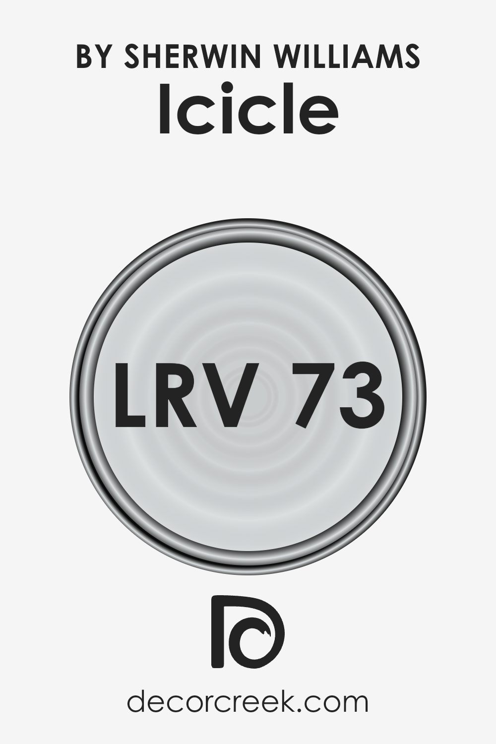
LRV stands for Light Reflectance Value, which measures the amount of light a paint color reflects or absorbs from its surroundings. It’s a scale where lower values indicate darker colors that absorb more light, and higher values represent lighter colors that reflect more light back into the room. This value is crucial for choosing paint colors as it helps in understanding how bright or dark a color will appear once applied to the walls, impacting the overall mood and feel of a space.
For the color Icicle (SW 6238), with an LRV of around 73.278, it falls into the category of lighter shades that reflect quite a bit of light.
This high LRV means that Icicle is capable of making spaces appear more open and airy, which is great for smaller rooms or areas with limited natural light. In such settings, Icicle will bounce back most of the light that hits it, reducing the need for excessive artificial lighting and making the space feel larger.
Coordinating Colors of Icicle SW 6238 by Sherwin Williams
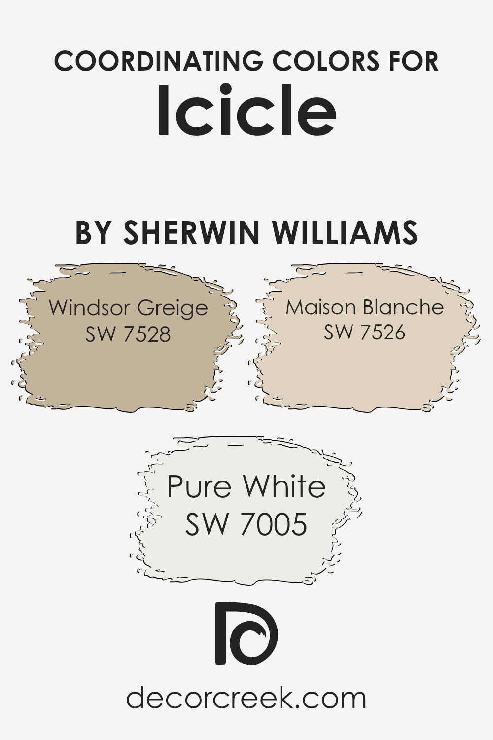
Coordinating colors are essentially hues that complement one another on the color spectrum, thereby creating a harmonious and visually appealing palette. When applied thoughtfully, these colors enhance the overall aesthetic, balance, and flow of a room. For instance, if you were starting with a base color like a light gray, pairing it with carefully selected coordinating colors can bring depth and warmth to your space without overwhelming it with contrast.
One of the coordinating colors that works well with a light gray is Windsor Greige SW 7528. This is a warm greige (a mix between gray and beige) that adds a subtle touch of earthiness to the ambiance, making it perfect for areas where you want to foster a welcoming and cozy atmosphere.
Another great coordinating color is Pure White SW 7005. It is a crisp and clean color that brightens up spaces and offers a refreshing contrast to deeper tones, ideal for trim, ceilings, or even cabinetry to create a fresh and airy feel. Lastly, Maison Blanche SW 7526 offers a sophisticated twist on an off-white, providing a gentle warmth that pairs beautifully with both vibrant and muted shades, making it extremely versatile for various design elements around the home.
By incorporating these coordinating colors, you can easily create a beautifully balanced look that feels both polished and inviting.
You can see recommended paint colors below:
- SW 7528 Windsor Greige (CHECK A SAMPLE)
- SW 7005 Pure White (CHECK A SAMPLE)
- SW 7526 Maison Blanche (CHECK A SAMPLE)
What are the Trim colors of Icicle SW 6238 by Sherwin Williams?
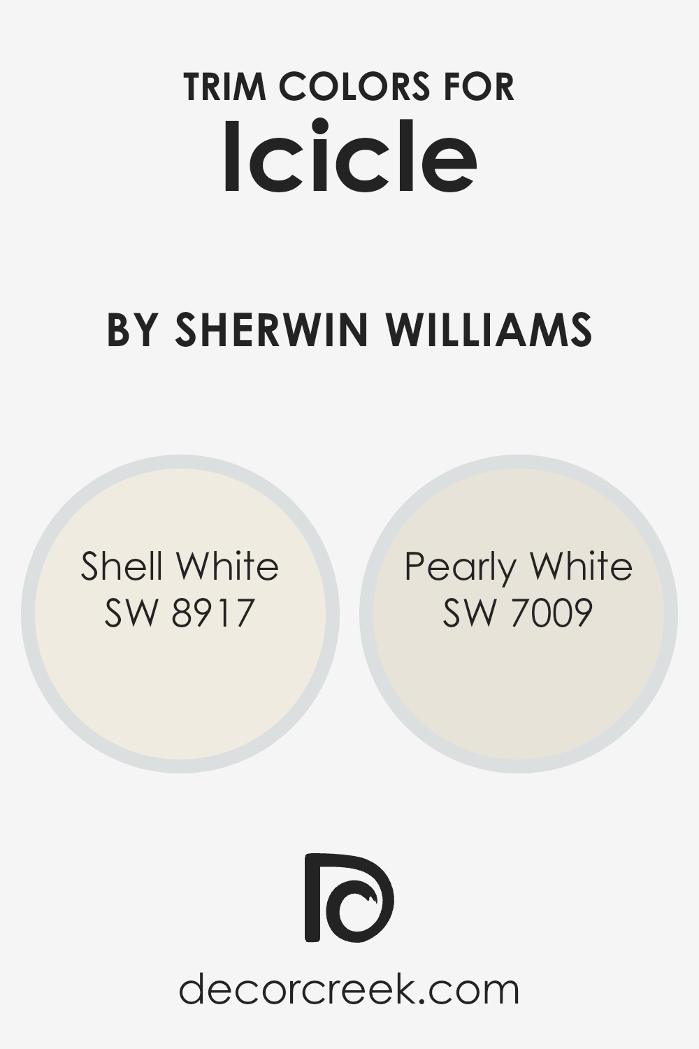
Trim colors are specific shades used to accentuate or highlight the architectural details and edges of a room, such as baseboards, moldings, windows, and door frames. They are crucial because they help define and enhance the overall aesthetic of a space, providing a visual boundary that can make wall colors pop and add a polished look to the interiors.
For instance, using a trim color like SW 8917 Shell White or SW 7009 Pearly White with a muted or subtle main color like Icicle by Sherwin Williams can create a crisp, clean contrast that draws the eye while giving a finished look to the room.
SW 8917 Shell White is a soft, warm white with a hint of creaminess, making it perfect for creating a cozy yet bright feel as a trim color. This color works well in providing a gentle transition between bolder wall colors and the trim, softening the overall impact while maintaining a fresh and welcoming atmosphere.
On the other hand, SW 7009 Pearly White is a cooler, more neutral white with a subtle gray undertone. This trim color is excellent for adding a modern touch and enhancing sharper, more defined looks, especially against cooler-toned wall colors, giving a room a more streamlined aesthetic.
You can see recommended paint colors below:
Colors Similar to Icicle SW 6238 by Sherwin Williams
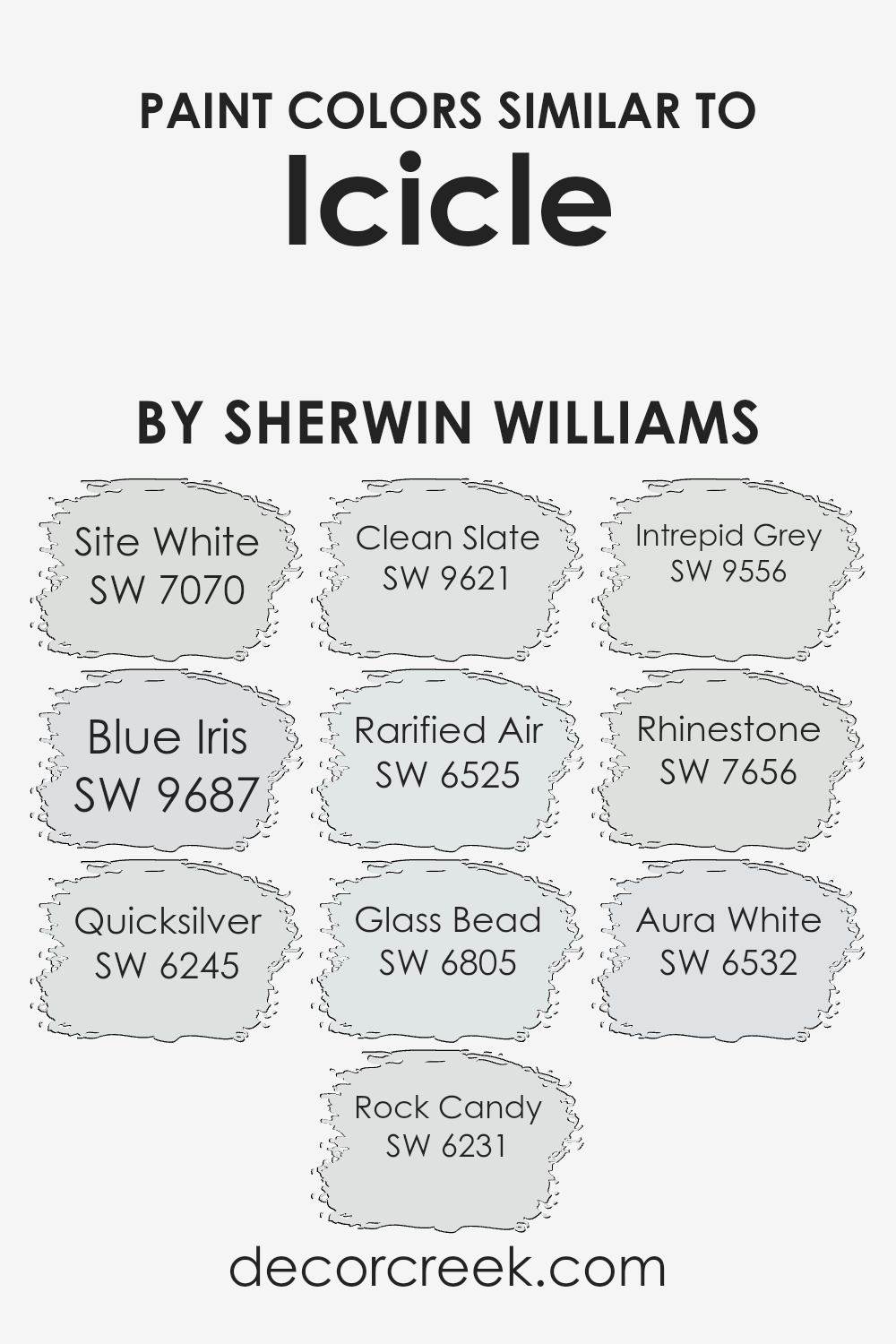
Using similar colors in design can create a harmonious and fluid look, which is ideal for spaces aiming for a continuous and cohesive atmosphere. Colors like SW 7070 – Site White, which is a clean and subtle white, or SW 9687 – Blue Iris, which offers a soft, muted version of blue, work well together because they share an understated intensity.
The gentle gray of SW 6245 – Quicksilver and the light touch of blue in SW 6231 – Rock Candy communicate a refreshing but calming palette when combined.
Similarly, tones such as SW 9621 – Clean Slate, a cool gray with blue undertones, and SW 6525 – Rarified Air, an airy, almost ethereal blue, blend seamlessly to foster an inviting space. The very pale blue of SW 6805 – Glass Bead, and SW 9556 – Intrepid Grey, a deeper gray, provide options for layering depths of color that are soothing to the eye.
Adding to these choices, SW 7656 – Rhinestone, a very light gray, and SW 6532 – Aura White, a faintly warm white, round out a palette that allows endless possibilities for creating environments that are visually cohesive yet distinctly unique. By using colors like these, it’s easy to design spaces that feel intentionally styled and comfortable.
You can see recommended paint colors below:
- SW 7070 Site White (CHECK A SAMPLE)
- SW 9687 Blue Iris (CHECK A SAMPLE)
- SW 6245 Quicksilver (CHECK A SAMPLE)
- SW 6231 Rock Candy (CHECK A SAMPLE)
- SW 9621 Clean Slate (CHECK A SAMPLE)
- SW 6525 Rarified Air (CHECK A SAMPLE)
- SW 6805 Glass Bead
- SW 9556 Intrepid Grey (CHECK A SAMPLE)
- SW 7656 Rhinestone (CHECK A SAMPLE)
- SW 6532 Aura White
Colors that Go With Icicle SW 6238 by Sherwin Williams
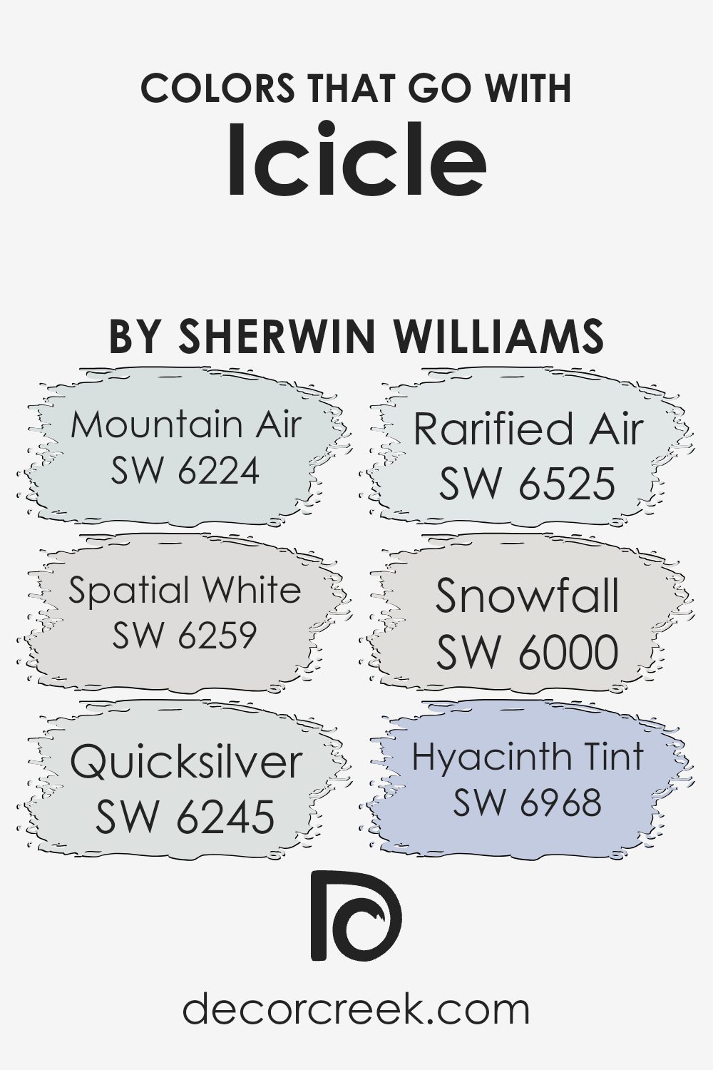
Choosing complementary colors for Icicle SW 6238 by Sherwin Williams is crucial for creating a harmonious and visually appealing space. When paired correctly, these colors enhance the ambiance of a room, making it feel more inviting and balanced. The right color combinations can also highlight architectural details or guide the eye toward specific areas of a room, paving the way for a more effective interior design.
For instance, Mountain Air SW 6224 is a soft, airy blue that adds a hint of freshness and lightness when used alongside Icicle. It works well in spaces that aim for a clean and open atmosphere. Spatial White SW 6259 is another great match, acting as a bright but subtle background that allows furnishings and art to stand out.
Moving to a slightly darker shade, Quicksilver SW 6245 offers a modern, metallic grey that provides a sleek contrast to the cooler tones of Icicle. Rarified Air SW 6525, with its pale blue whisper, can be used to enhance a feeling of spaciousness in smaller or more confined spaces. Snowfall SW 6000, a pure, crisp white, works beautifully to create a crisp and seamless look when combined with the icy tones of Icicle.
Lastly, Hyacinth Tint SW 6968 brings a playful splash of subdued violet, adding a gentle burst of color that keeps the palette interesting yet cohesive. By using these colors together, you can achieve a well-rounded and inviting atmosphere in any interior setting.
You can see recommended paint colors below:
- SW 6224 Mountain Air (CHECK A SAMPLE)
- SW 6259 Spatial White (CHECK A SAMPLE)
- SW 6245 Quicksilver (CHECK A SAMPLE)
- SW 6525 Rarified Air (CHECK A SAMPLE)
- SW 6000 Snowfall (CHECK A SAMPLE)
- SW 6968 Hyacinth Tint (CHECK A SAMPLE)
How to Use Icicle SW 6238 by Sherwin Williams In Your Home?
Icicle SW 6238 by Sherwin Williams is a soft, subtle shade of gray with a hint of blue, making it an excellent choice for creating a calm and welcoming atmosphere in your home. This color suits any room, whether you want to freshen up your living room, bathroom, or bedroom. Its light tone helps to make small spaces appear bigger and brighter.
Icicle SW 6238 pairs well with crisp whites or deeper grays for a balanced look. It’s also versatile enough to work with brighter colors, like yellows or greens, for those who prefer a bit of contrast. For a relaxed feel, you could paint all the walls in this color, or just choose one wall for a subtle accent. Adding this color in your home can make it feel more modern and clean, a perfect backdrop to let your furniture and decor stand out.
Icicle SW 6238 by Sherwin Williams vs Site White SW 7070 by Sherwin Williams
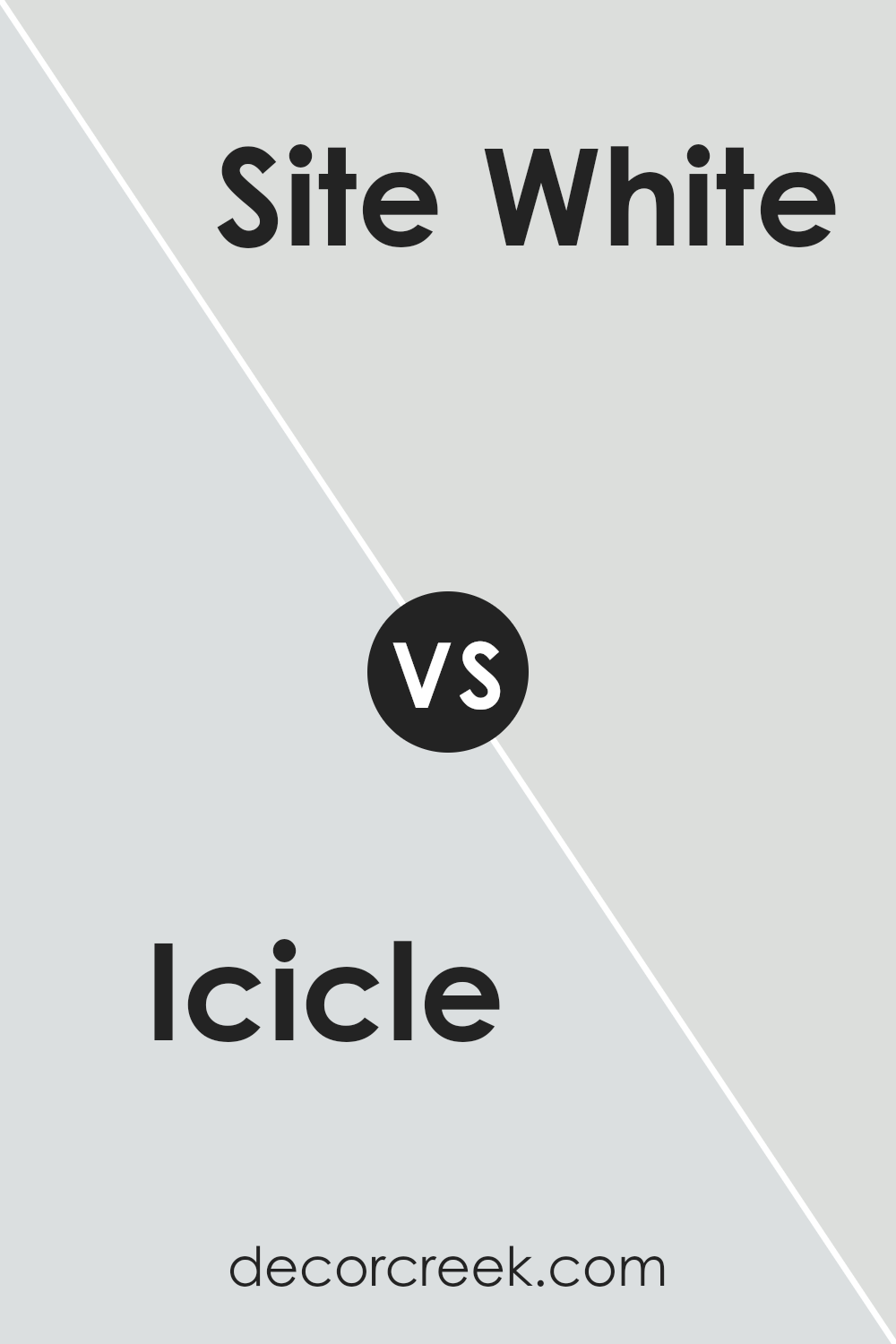
Icicle and Site White by Sherwin Williams are both attractive colors, but they bring different vibes to a space. Icicle is a cool gray with a subtle blue undertone, giving it a fresh and crisp look. This makes it perfect for a modern setting or for brightening up a small room.
On the other hand, Site White is a warmer gray with a hint of green. This color gives a softer and more inviting feel, suitable for creating a cozy environment in places like living rooms or bedrooms.
Both colors are versatile and work well with various decor styles, but your choice might depend on the atmosphere you want to create—cool and rejuvenating with Icicle or warm and welcoming with Site White.
You can see recommended paint color below:
- SW 7070 Site White (CHECK A SAMPLE)
Icicle SW 6238 by Sherwin Williams vs Quicksilver SW 6245 by Sherwin Williams
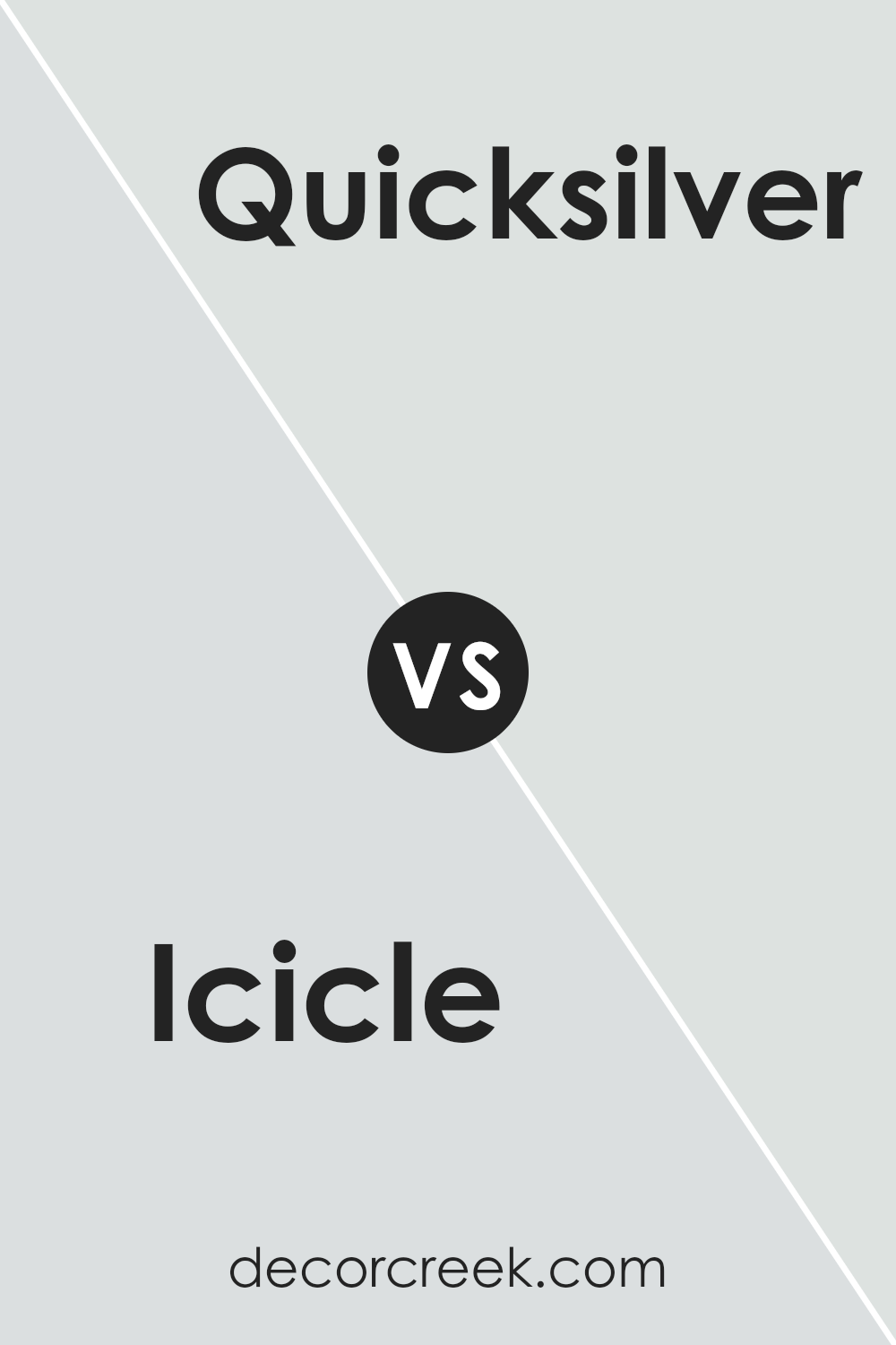
The colors Icicle and Quicksilver by Sherwin Williams are both in the cool-toned spectrum but have distinct undertones and brightness that set them apart. Icicle is a light and bright gray that brings a clean and airy feel to a space. It’s a very subtle color that can make small spaces appear larger and well-lit rooms look vibrant.
On the other hand, Quicksilver is a darker gray with a slight blue undertone, giving it a cooler feel compared to Icicle. This color works well in areas where you want to add a bit more depth or create a slightly more grounded atmosphere.
While both colors can complement a modern aesthetic, Icicle suits spaces needing a lighter touch, and Quicksilver fits better in areas where a stronger, yet still soft, impact is desired.
You can see recommended paint color below:
- SW 6245 Quicksilver (CHECK A SAMPLE)
Icicle SW 6238 by Sherwin Williams vs Glass Bead SW 6805 by Sherwin Williams
Icicle SW 6238 and Glass Bead SW 6805, both by Sherwin Williams, are distinct in their vibe and visual impact. Icicle is a cool, almost silvery gray that gives a clean and crisp feel to any space. It’s a color that works well in modern environments or where you want a subtle backdrop that doesn’t overpower the room’s accents.
In contrast, Glass Bead is a vibrant teal that adds a splash of energy and brightness to interiors. This color is much more lively and stands out compared to Icicle, making it a great choice for areas where you want to make a statement or add a focal point.
Both colors offer unique aesthetics: Icicle keeping things minimal and understated, and Glass Bead bringing an upbeat, dynamic touch. Whether you choose one or the other depends on the mood and atmosphere you want to create in your space.
You can see recommended paint color below:
- SW 6805 Glass Bead
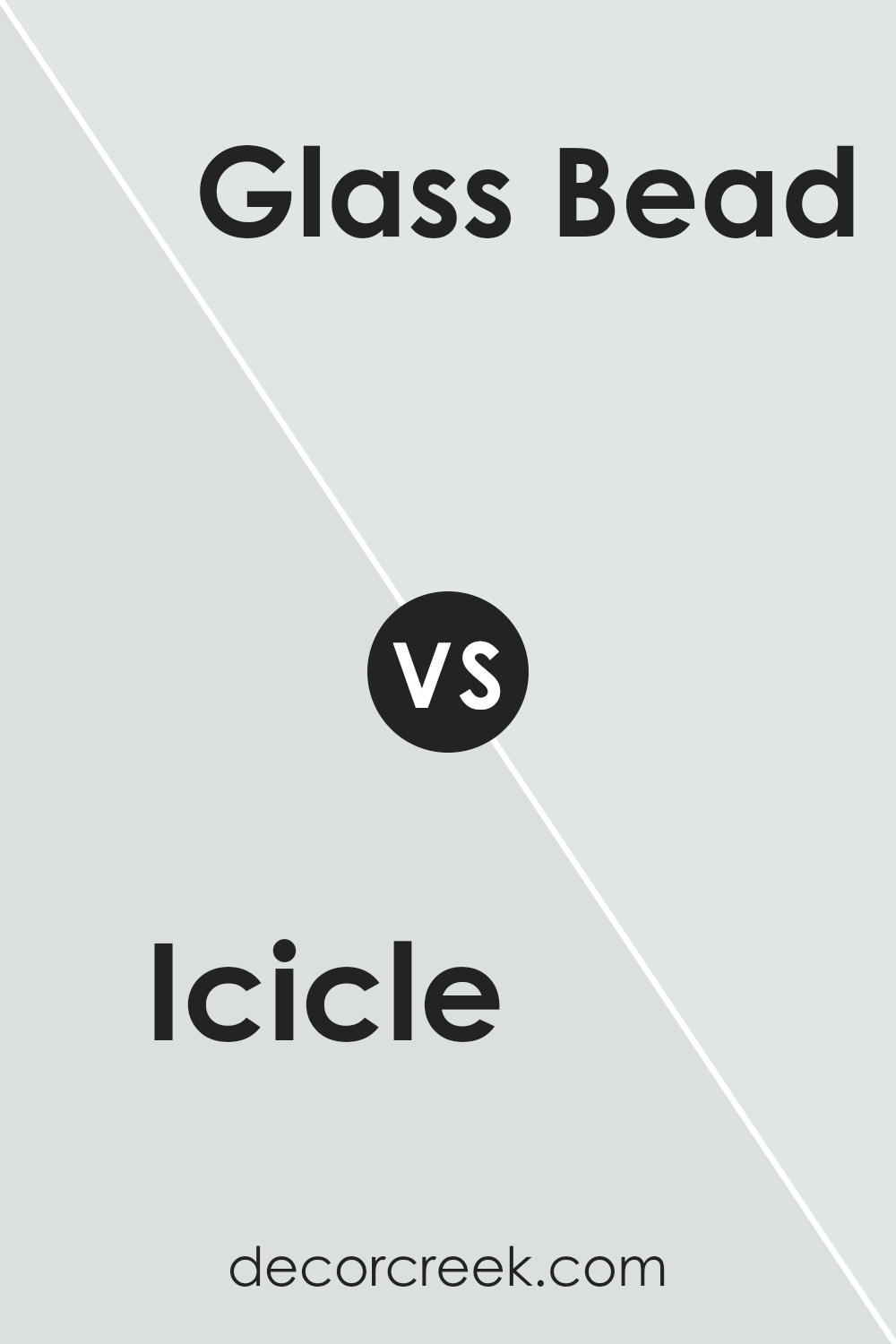
Icicle SW 6238 by Sherwin Williams vs Rarified Air SW 6525 by Sherwin Williams
The two Sherwin Williams colors, Icicle and Rarified Air, present subtle yet distinct tones that can influence the feel of a space. Icicle is a cooler, light gray that almost mimics the clear, crisp nature of ice. This hue tends to reflect more light, making it a good fit for areas where you want to create a bright, airy environment.
On the other hand, Rarified Air is a soft, pale blue with a gentle touch that adds a calm, refreshing quality to any room. The light blue shade of Rarified Air can give a sense of openness and airiness, much like a clear sky. Even though both colors are light and can help a small room appear larger, their tones set them apart, with Icicle leaning towards neutral coolness and Rarified Air offering a hint of cheerful blue.
These differences make each color suited to different styles and preferences, depending on the desired atmosphere.
You can see recommended paint color below:
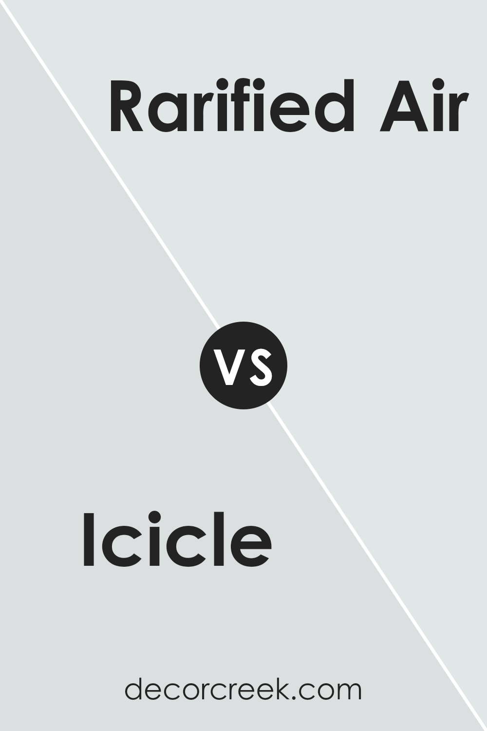
Icicle SW 6238 by Sherwin Williams vs Intrepid Grey SW 9556 by Sherwin Williams
Icicle SW 6238 and Intrepid Grey SW 9556 by Sherwin Williams are both stylish colors that would look great in many homes, but they have their differences. Icicle is a very light, cool grey that almost looks white. It’s great for making small spaces appear bigger or creating a clean, fresh feel in a room.
On the other hand, Intrepid Grey is a darker grey shade. It offers a stronger presence with a bit more warmth compared to Icicle, making it ideal for creating contrast or adding depth to a space. If you’re looking to brighten up a room, Icicle would be the better choice.
However, if you want a cozy, grounding effect, Intrepid Grey would work better. Both shades work well with modern decor and can be easily matched with other colors.
You can see recommended paint color below:
- SW 9556 Intrepid Grey (CHECK A SAMPLE)
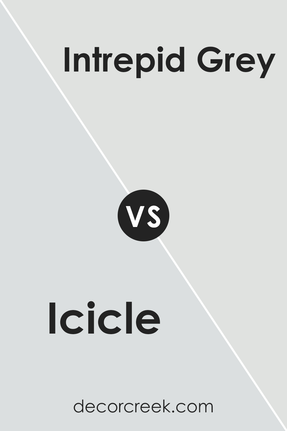
Icicle SW 6238 by Sherwin Williams vs Aura White SW 6532 by Sherwin Williams
“Icicle” and “Aura White” are both colors by Sherwin Williams, but they offer different tones and moods. “Icicle” is a cool blue-gray shade that gives a clean and calm feel to a space. It’s great for creating a soothing environment, making it ideal for bedrooms and bathrooms where you want to promote a sense of relaxation.
On the other hand, “Aura White” is a slightly warmer color with a soft white tone that also pulls hints of very light gray. This color is more neutral and flexible, making it a good choice for any room in the house. It can help make small spaces appear bigger and brighter.
Both colors are quite light, but “Icicle” adds a cooler touch, whereas “Aura White” brings warmth and a welcoming feel. Depending on the atmosphere you want to achieve, you might choose “Icicle” for a more crisp, refreshing look, or “Aura White” for a more inviting space.
You can see recommended paint color below:
- SW 6532 Aura White
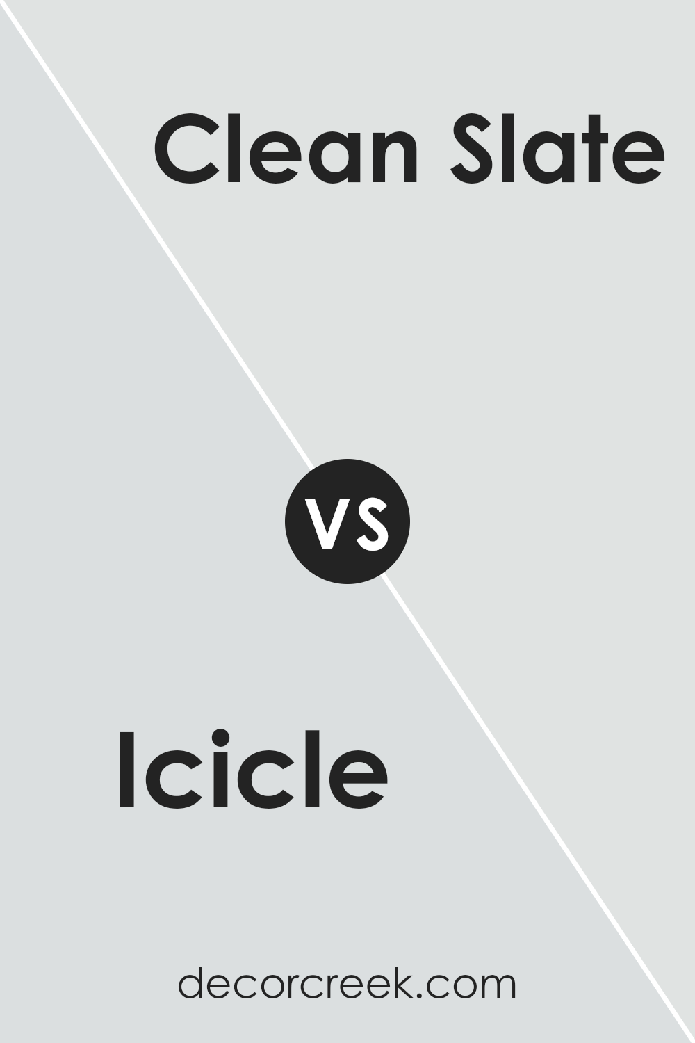
Icicle SW 6238 by Sherwin Williams vs Clean Slate SW 9621 by Sherwin Williams
Icicle and Clean Slate, both by Sherwin Williams, have distinct tones that create different moods in a space. Icicle is a cool, almost translucent shade that reminds one of a clear, frosty day. It is light and airy, making it perfect for creating a fresh and open feeling in a room. It can particularly brighten up small spaces or rooms without much natural light.
On the other hand, Clean Slate is a dark, rich gray that suggests strength and stability. This color has a grounding effect and is ideal for adding depth and maturity to a space. Its bold nature works well in larger areas or as an accent wall, providing a dramatic backdrop that can highlight décor or furniture.
Both colors have their unique appeal, with Icicle bringing in more lightness and Clean Slate offering a strong, defining presence. They can be used separately or even together to balance light and dark tones in a space.
You can see recommended paint color below:
- SW 9621 Clean Slate (CHECK A SAMPLE)
Icicle SW 6238 by Sherwin Williams vs Rock Candy SW 6231 by Sherwin Williams
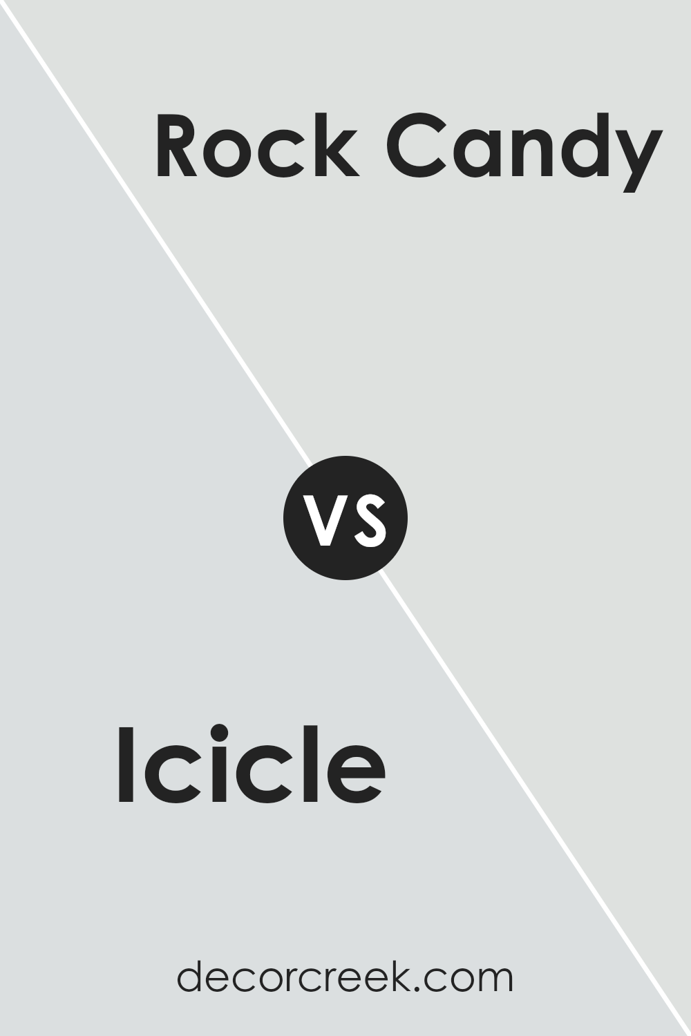
Comparing Icicle and Rock Candy by Sherwin Williams, both colors offer a clean and fresh look, but they have slightly different tones that could influence the mood and feel of a space. Icicle is a cool, soft gray with hints of blue, giving it a slightly crisp feel that mirrors a chilly winter day. This makes it a great choice for creating a calm, understated environment, particularly in modern or minimalistic settings.
On the other hand, Rock Candy is a lighter shade, leaning more towards a pure, subtle gray without strong undertones. This color is incredibly versatile and works well in small rooms or spaces without much natural light, as it can help make these areas appear brighter and more open.
Both shades are neutral, making them easy to pair with a wide range of decor styles and colors. Whether you choose Icicle for its cool undertones or Rock Candy for its neutral brightness, both colors provide a clean backdrop for any room.
You can see recommended paint color below:
Icicle SW 6238 by Sherwin Williams vs Rhinestone SW 7656 by Sherwin Williams
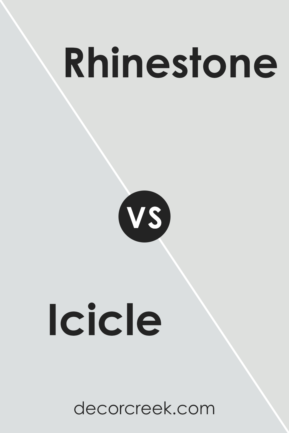
Icicle SW 6238 and Rhinestone SW 7656 are two paint colors by Sherwin Williams that show subtle differences in shade and mood, making each suitable for different spaces or preferences. Icicle is a cool, very pale gray that almost leans towards a soft white. It’s perfect if you want a clean, crisp look in a room.
It reflects light beautifully, making spaces appear larger and more open. In contrast, Rhinestone is also a light gray, but it has slightly warmer undertones. This warmth makes Rhinestone a great option for those who want a neutral backdrop that still provides a hint of coziness.
Both colors are light enough to be versatile in various settings, enhancing natural light and contributing to a fresh atmosphere. Depending on the room’s purpose and the amount of natural light it receives, you might choose Icicle for a brighter, sharper feel or Rhinestone for a gentle, inviting ambiance.
You can see recommended paint color below:
- SW 7656 Rhinestone (CHECK A SAMPLE)
Icicle SW 6238 by Sherwin Williams vs Blue Iris SW 9687 by Sherwin Williams
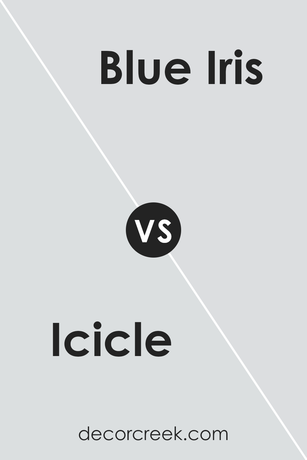
Icicle and Blue Iris by Sherwin Williams are two distinct colors, each with its own unique vibe. Icicle is a light, airy grey with subtle blue undertones. It offers a clean and refreshing look, ideal for creating a bright and open space. It’s a versatile color that pairs well in many settings, enhancing the sense of light in smaller rooms or providing a calm backdrop in a busier area.
On the other hand, Blue Iris is a much deeper and vibrant shade. This color is a bold blue with a hint of purple, giving it a lively and striking presence. It’s perfect for adding a splash of drama and energy to any space. Blue Iris works well when used for accent walls or in areas where you want to make a strong style statement.
Both colors are unique, with Icicle providing a soothing foundation and Blue Iris offering a dynamic burst of color. Each has its place depending on the mood and atmosphere you’re looking to create in your space.
You can see recommended paint color below:
Conclusion
In writing about SW 6238 Icicle by Sherwin Williams, I’ve shared lots about this soothing paint color. Icicle is not just a simple gray; it has a hint of blue that makes it special and can make any room feel calm and peaceful like a quiet, snowy day. This color works well in many parts of a home, such as the living room or bedroom, bringing a fresh and clean feeling.
From my findings, Icicle is versatile – it pairs nicely with many other colors, whether you choose bold or soft shades. It also adapts well to different lighting, looking a bit bluer in some lights and more gray in others, which is pretty interesting!
Using Icicle can refresh your space without making it too bright or overwhelming. It’s perfect for anyone wanting to give their room a gentle and serene look. After studying this color, I’m truly impressed by its subtle beauty and flexibility. If you’re thinking about repainting, Icicle is definitely a color worth considering for a tranquil and stylish outcome.
Ever wished paint sampling was as easy as sticking a sticker? Guess what? Now it is! Discover Samplize's unique Peel & Stick samples.
Get paint samples


