As you consider refreshing your room, you might find yourself drawn to the subtle elegance of Benjamin Moore’s 2147-50 Pale Sea Mist. This color is more than just paint; it’s a breath of ocean air brought into your home.
It carries the softness of a calm sea and the quiet mood of a misty morning. If you’re searching for a hue that adds a gentle touch of nature to your walls without feeling too strong, Pale Sea Mist could be the perfect choice.
The shade acts like a neutral with a twist, offering flexibility while keeping things interesting. It pairs beautifully with whites and grays, providing a soft backdrop that enhances other elements in your room rather than stealing the spotlight.
Whether you aim to create a calm bedroom or a refreshing living area, Pale Sea Mist works well with many styles and preferences, adjusting quietly to your design vision with its soothing presence.
Choosing this paint could be your next step toward a more peaceful and inviting home environment.

What Color Is Pale Sea Mist 2147-50 by Benjamin Moore?
Pale Sea Mist is a soft, subtle green hue offered by Benjamin Moore, providing a gentle touch of color to any room. This color reflects the peaceful feel of a foggy seascape early in the morning, bringing a refreshing lightness that can make small rooms appear larger and inviting. It is ideal for creating a relaxed, airy atmosphere in any part of the home.
When it comes to integrating Pale Sea Mist into various interior styles, it shines in settings aiming for a light, breezy feel, such as coastal, modern, or Scandinavian decor. The color pairs beautifully with minimalist designs, where its subtle vibrancy adds depth without feeling too strong. In a coastal-themed room, it works wonderfully with whites and blues, echoing the colors of the sea and sandy beaches.
For materials, Pale Sea Mist goes well with natural wood, which complements its green undertones. Think pale oak or birch that keeps the room open and bright. It is also stunning when matched with textures such as linen or cotton in furnishings, which helps enhance its light and fresh vibe. Whether used for walls or as an accent in fabrics and accessories, Pale Sea Mist offers a refreshing and gentle element to an interior, helping to create a calm and welcoming environment.
Is Pale Sea Mist 2147-50 by Benjamin Moore Warm or Cool color?
Pale Sea Mist 2147-50 by Benjamin Moore is a soft, gentle color that brings a light and airy feel to any room. This shade is a mix of green and gray tones, creating a subtle and soothing atmosphere that works well in many areas of a home.
Its flexibility is a great feature; it suits various styles, whether you want a more modern look, a coastal vibe, or even a country-style setting. Because of its muted quality, it pairs nicely with stronger colors like deep blues or rich browns, providing a balance that can make rooms feel more welcoming without feeling too strong.
When used in a room, Pale Sea Mist increases the perception of light, making smaller rooms appear brighter and more open. This is particularly useful in areas like bathrooms or smaller bedrooms where you might want to enhance the natural light. Additionally, it is a color that can help smooth the transition between indoor and outdoor areas, especially when used near large windows overlooking a garden or patio.
Undertones of Pale Sea Mist 2147-50 by Benjamin Moore
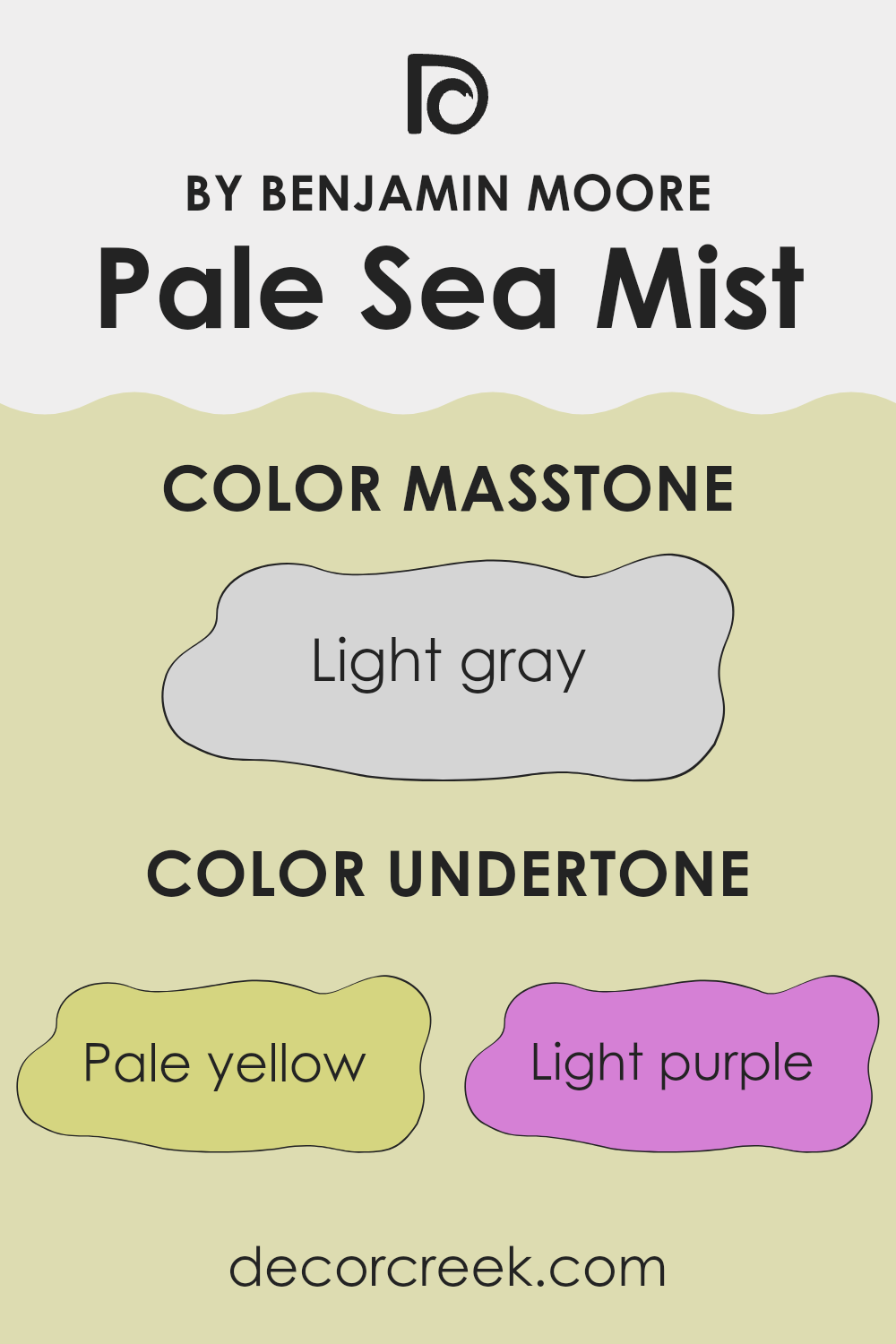
Pale Sea Mist, a paint color by Benjamin Moore, reveals a subtle complexity due to the presence of various undertones. Undertones are the hints of color that sit beneath the main color’s surface, affecting the color’s overall appearance in subtle ways. In Pale Sea Mist, these undertones include pale yellow, light purple, light blue, pale pink, mint, lilac, and grey.
Understanding undertones is crucial because they can significantly alter the color perception depending on the lighting and surrounding colors. For instance, pale yellow can bring a soft warmth to the color, making it feel more welcoming.
Light purple and lilac add a hint of coolness, which can give a calm, collected feel to a room. Light blue and mint offer a fresh vibe, potentially making rooms feel more airy and open. Pale pink can add a gentle, soothing quality, while grey can provide a steadying, neutral base that grounds the other undertones.
When Pale Sea Mist is used on interior walls, these undertones interact with each other and the room’s lighting. Natural light can enhance the coolness of the blue and purple undertones, making the room feel cooler.
In artificial lighting, the yellow and pink undertones might become more noticeable, warming up the room. This interplay makes Pale Sea Mist a flexible choice for interiors, suitable for different settings and styles. The presence of these undertones ensures the color provides a dynamic yet harmonious backdrop for any room, subtly shifting in character as the day progresses.
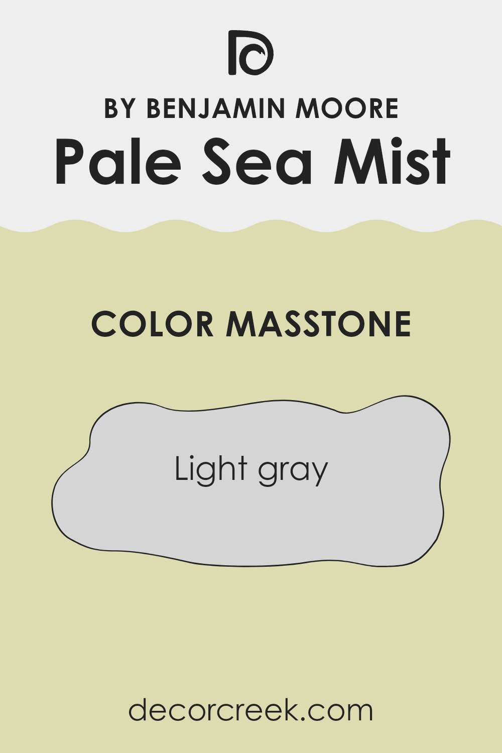
What is the Masstone of the Pale Sea Mist 2147-50 by Benjamin Moore?
Pale Sea Mist 2147-50 by Benjamin Moore is a gentle shade of light gray. Its subtle tone is very adaptable, making it a favored choice for various rooms in a home. This color has a natural softness that works well in rooms needing a touch of brightness while maintaining a calm feel. Because it is a lighter shade, it can make smaller rooms look bigger and more open.
When applied to walls, this shade acts as an excellent backdrop, allowing furniture and artwork to stand out. It’s also easy to match with many different colors, from vibrant hues to softer pastels, giving homeowners freedom in decorating.
In well-lit areas, Pale Sea Mist reflects light, enhancing the overall brightness of a room. In rooms with less natural light, it helps prevent feelings of confinement, keeping the room airy. Overall, this color is a practical and attractive choice for anyone looking to refresh their living interior.
decorcreek.com
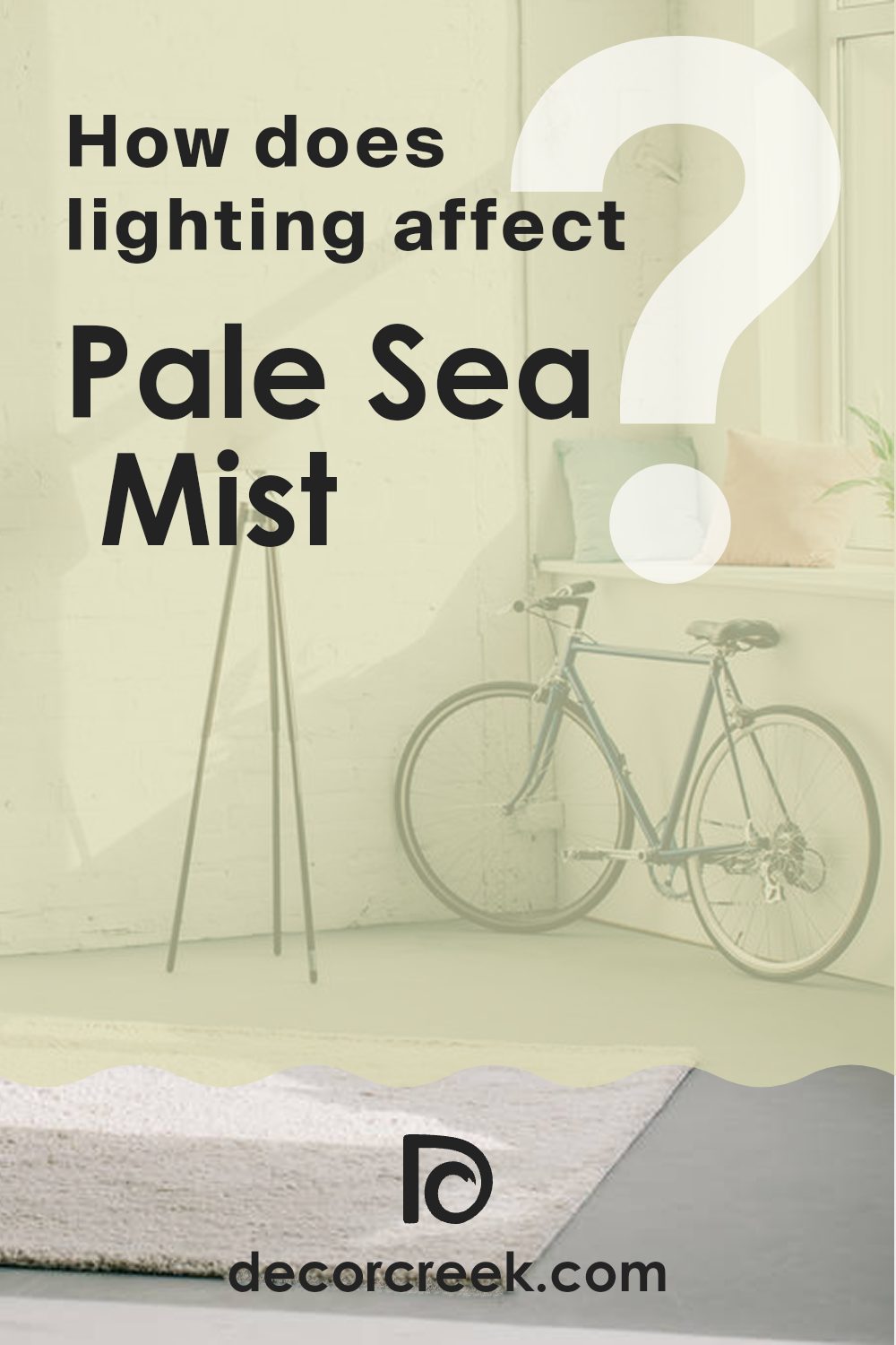
How Does Lighting Affect Pale Sea Mist 2147-50 by Benjamin Moore?
Lighting plays a crucial role in how we perceive colors in our environment. The way a particular color looks can change significantly depending on whether it is lit by natural sunlight or artificial light, and its appearance can also vary depending on the direction the room faces.
For instance, the color Pale Sea Mist by Benjamin Moore is a nuanced shade that behaves differently under various lighting conditions. Under artificial lighting, such as LED or fluorescent lights, this color tends to appear slightly more vibrant and cooler. The subtle green tones in the paint can become more noticeable, lending a fresh and lively feel to the room.
In natural light, however, the color can look quite different. In rooms with plenty of sunlight, such as those facing south, Pale Sea Mist will appear lighter and more airy as it reflects the brightness of the sun. This makes the room feel open and cheerful. On the other hand, in a north-facing room, which receives less direct sunlight, the same color might look a bit muted and softer. This creates a calm and relaxed atmosphere, but the color won’t stand out as much.
Rooms facing east receive sunlight in the morning when the light is warmer. In these rooms, Pale Sea Mist may have a subtle warm glow in the morning, making the room feel welcoming. As the day progresses, the color will lose this warmth and return to its true cooler tone.
In west-facing rooms, the situation is the opposite of east-facing rooms. Here, the color remains true to its cooler tone during the morning and gains warmth in the late afternoon and evening as the sun sets. This shift can make the room feel different at various times of the day.
In essence, the lighting direction and type strongly influence how Pale Sea Mist appears and can impact the mood and feel of any room. Adjusting lighting conditions can help achieve the desired effect with this adaptable color.
decorcreek.com
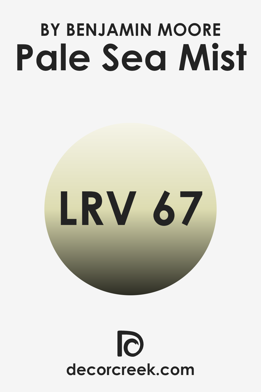
What is the LRV of Pale Sea Mist 2147-50 by Benjamin Moore?
LRV stands for Light Reflectance Value, which is a measurement of how much light a paint color reflects back into a room as opposed to absorbing it. This value is given on a scale where higher numbers mean the paint reflects more light.
For example, if a color has a high LRV, it will make a room feel brighter since it reflects a lot of light. On the other hand, colors with low LRV absorb more light, which can make an interior feel cozier or smaller. This is an important factor to consider when choosing paint colors, especially for smaller or darker rooms where maximizing light is essential.
The LRV of Pale Sea Mist is 67.42, which means it is on the higher end of the scale, reflecting a good amount of light. This quality makes it an excellent choice for rooms that don’t receive a lot of natural sunlight or are smaller in size, as it can help make the area appear more luminous and open. Since it is a lighter color, it naturally makes the room feel airy and open, which can be particularly appealing in living areas or bedrooms where a light, fresh ambiance is desired.
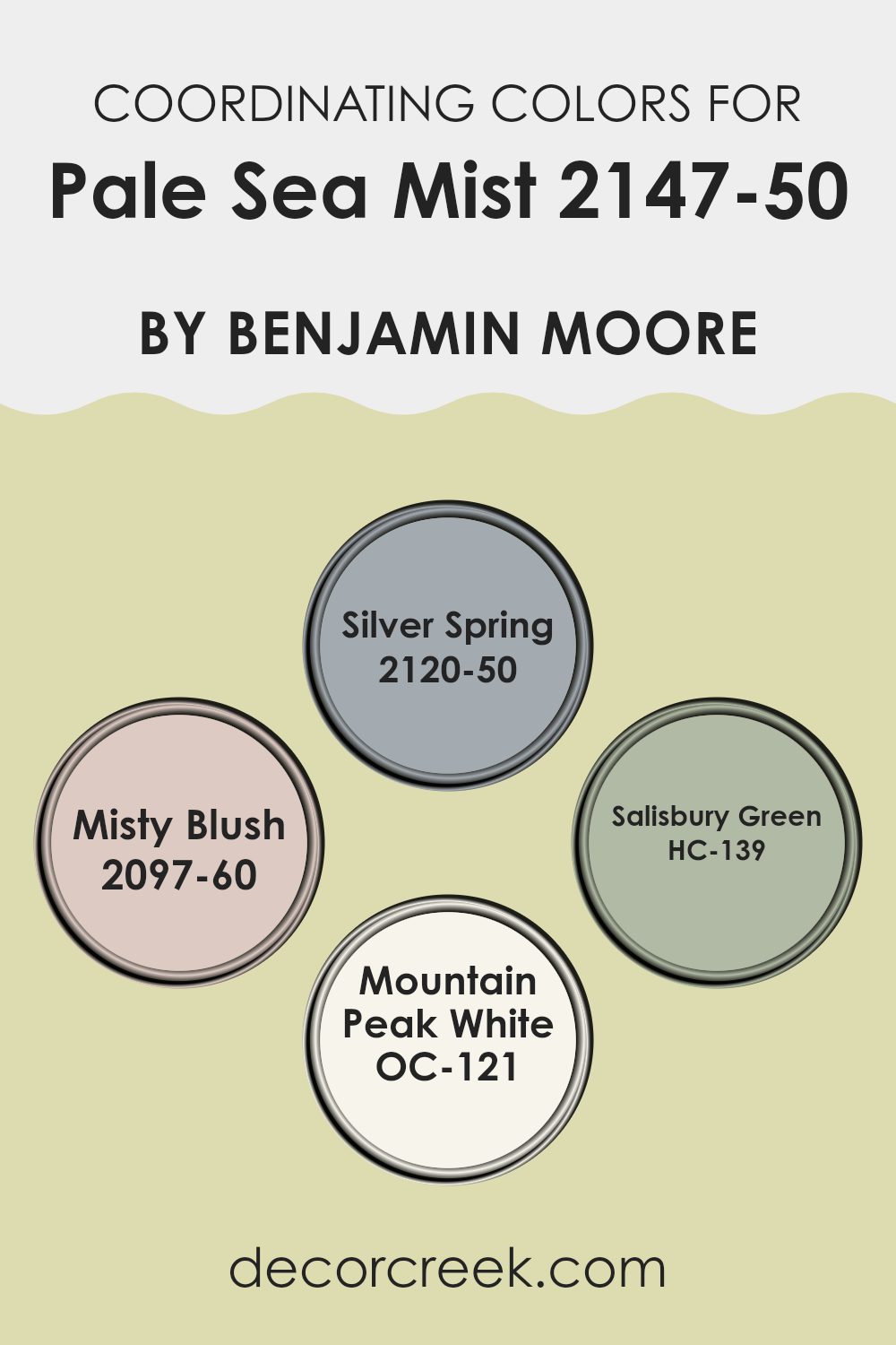
Coordinating Colors of Pale Sea Mist 2147-50 by Benjamin Moore
Coordinating colors are hues selected to harmonize well with a primary color, helping to create a unified and appealing visual experience. They often share similar undertones or sit on opposite ends of the color spectrum, providing a balanced contrast. The goal of using coordinating colors is to support the overall look without feeling too strong next to the primary color; in this case, Pale Sea Mist by Benjamin Moore.
Silver Spring is a gentle light gray that reflects a subtle vibrancy, making it an excellent choice for a soothing environment. This color pairs nicely with the cooler undertone of Pale Sea Mist, creating a smooth blend in rooms seeking a fresh, clean look. Misty Blush offers a soft pink hue, which brings a warm, gentle pop of color that can brighten a room beautifully when combined with cooler tones like Pale Sea Mist.
Salisbury Green stands out with its deeper, lush green shade, offering a pleasing contrast that anchors the lighter, airier Pale Sea Mist, ideal for adding a natural, earthy feel to a room. Finally, Mountain Peak White is a crisp, clean white that works wonderfully as a balancing color. It helps brighten and widen rooms, supporting Pale Sea Mist by giving the interior a more open and airy feel. Overall, these colors together offer a balanced palette that complements the calmness and lightness of Pale Sea Mist, improving any room in a tasteful and effective way.
You can see recommended paint colors below:
- 2120-50 Silver Spring
- 2097-60 Misty Blush
- HC-139 Salisbury Green
- OC-121 Mountain Peak White
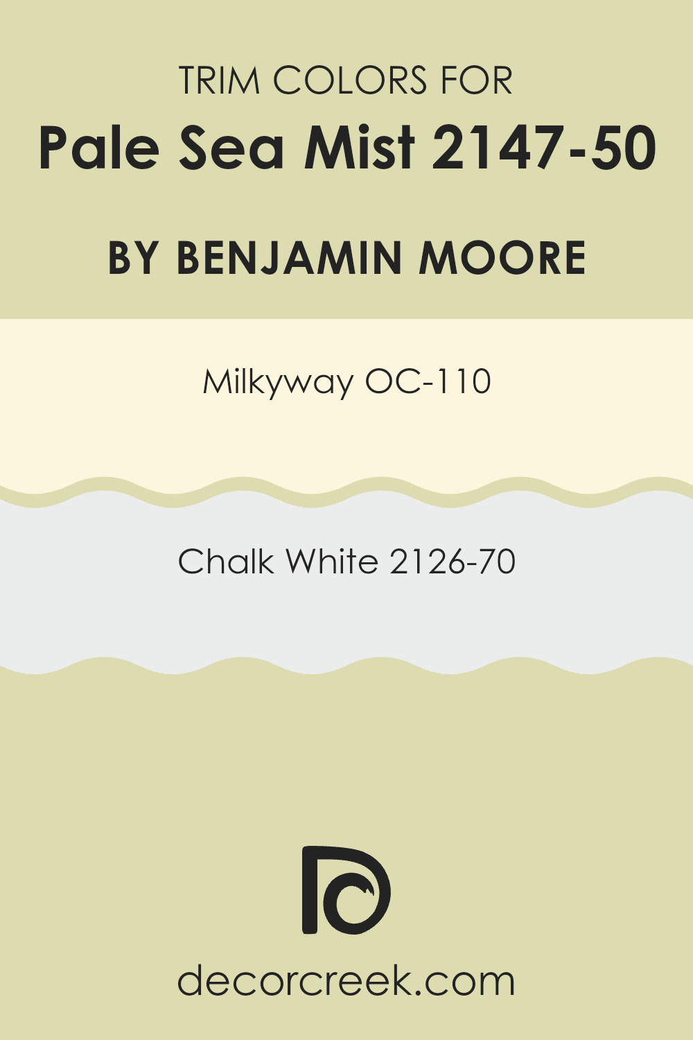
What are the Trim colors of Pale Sea Mist 2147-50 by Benjamin Moore?
Trim colors are specific shades used to highlight architectural features, such as window frames, doors, and skirting boards, from the rest of the wall colors in a room or on the exterior of a house. They play a crucial role in defining rooms and can subtly enhance the overall aesthetic of a room.
For a soft and airy color like Pale Sea Mist by Benjamin Moore, selecting the right trim color can add a touch of clarity and continuity. Trim colors like OC-110 Milkyway and 2126-70 Chalk White are excellent choices as they can provide a subtle contrast that complements the main hue without feeling too strong, thereby keeping the room feeling coherent and neatly finished.
OC-110 Milkyway is a gentle, warm white with a hint of cream that brings a soft richness to the trim, making it a great partner for the cooler tones of Pale Sea Mist. When used as a trim color, Milkyway softly outlines the architectural elements with a warm glow, creating a welcoming atmosphere. On the other hand, 2126-70 Chalk White is a pure, clean white with a crisp finish that offers a sharper contrast. This shade is particularly effective in brightening the edges and making the wall color stand out a bit more, thus providing a fresh and clean overall look that enhances the aesthetic appeal of the room.
You can see recommended paint colors below:
- OC-110 Milkyway
- 2126-70 Chalk White
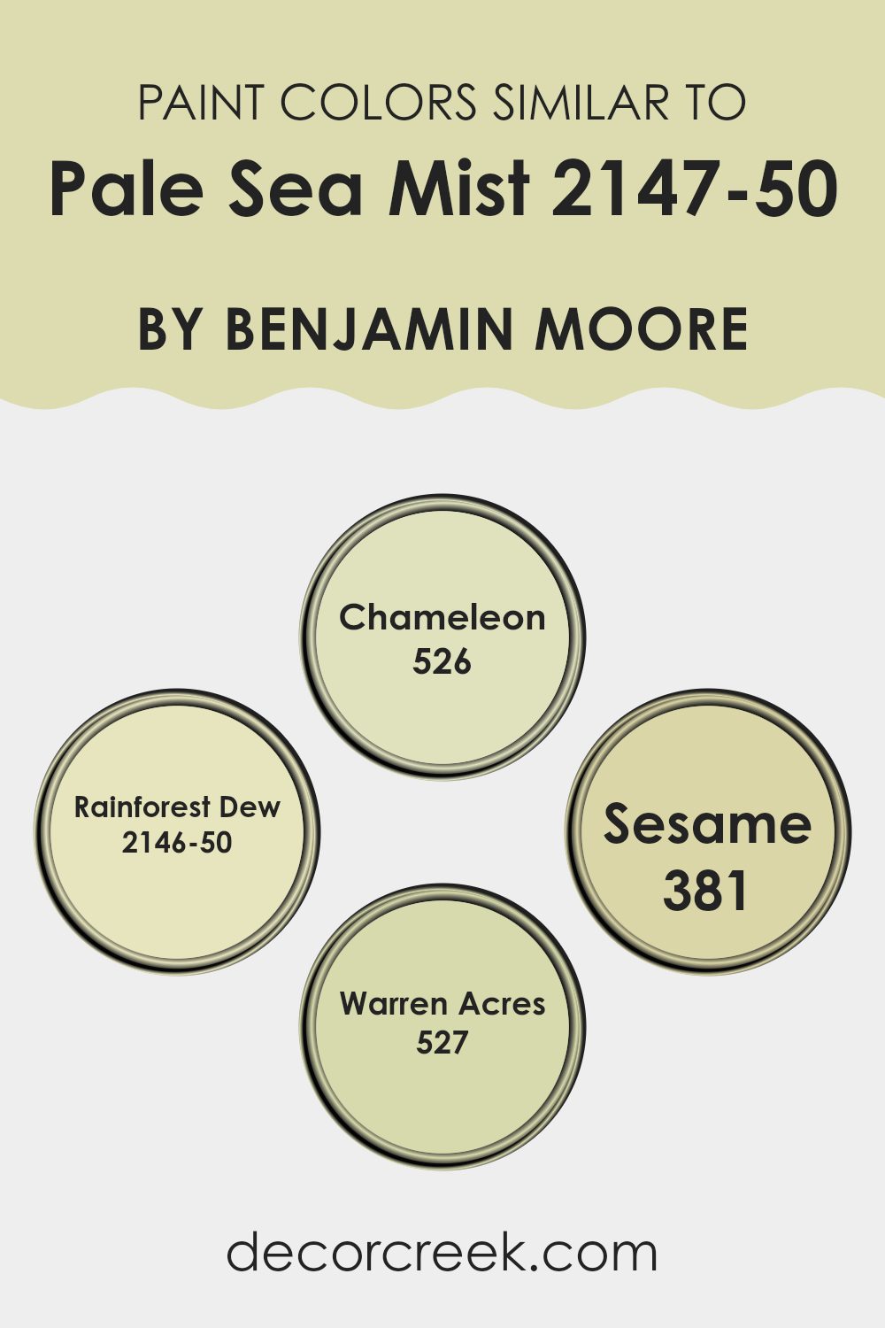
Colors Similar to Pale Sea Mist 2147-50 by Benjamin Moore
Choosing similar colors when designing a room is essential for creating a harmonious and cohesive look. Similar colors are shades that closely relate on the color wheel, providing a subtle variation that can enhance the overall aesthetic without creating a stark contrast.
This unified appearance is calming to the eye and allows for a smooth transition between rooms or within a single decorative scheme. For instance, when working with a base color like Pale Sea Mist by Benjamin Moore, incorporating tones that sit close to it can enhance the ambiance without overshadowing the primary hue.
Chameleon is a dynamic green that carries a lively yet not too strong presence, adding a fresh vibe to the decor. Rainforest Dew brings a touch of softness to interiors with its gentle green, reminiscent of early morning foliage under a misty sky. Sesame introduces a slightly dustier hue that reflects the comfort and warmth of natural elements, blending easily with muted greens and neutrals.
Lastly, Warren Acres offers a deeper green, providing a rich backdrop that complements lighter, subtle greens for a grounded, inviting environment. By using shades like these, you can achieve a balanced and pleasant visual flow that enriches both the feel and function of any room.
You can see recommended paint colors below:
- 526 Chameleon
- 2146-50 Rainforest Dew
- 381 Sesame
- 527 Warren Acres
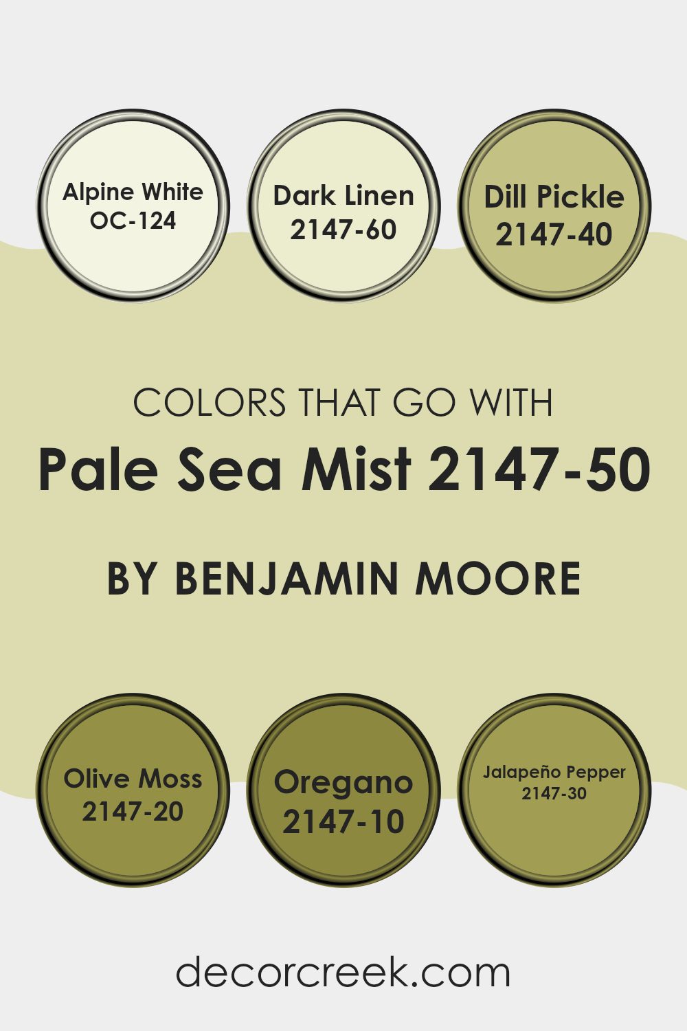
Colors that Go With Pale Sea Mist 2147-50 by Benjamin Moore
When you’re thinking about decorating a room, choosing the right colors that complement each other are crucial to create a cohesive look. Pale Sea Mist 2147-50 by Benjamin Moore is a lovely, gentle hue that lays a perfect foundation.
When paired with colors like OC-124 Alpine White, a clean and crisp shade, it enhances the freshness of Pale Sea Mist, making a room feel airy and open. Next, consider 2147-60 Dark Linen, a subtle, muted beige that adds a touch of warmth without feeling too strong next to the gentle nature of Pale Sea Mist.
For a bit of drama and natural vibrancy, 2147-40 Dill Pickle introduces a light, lively green that suggests a hint of springtime charm. If you’re wanting a bolder step, 2147-20 Olive Moss provides a deeper green, adding depth and interest to the palette, perfect for an accent wall or rich decor accents.
To deepen the theme, 2147-10 Oregano offers an earthy, dark green that brings an organic feel to the room, ideal for grounding the lighter shades. On the brighter side, 2147-30 Jalapeño Pepper is a vibrant green that brings fresh energy, sparking life into the decor scheme. These complementing shades not only add visual interest but also help in creating a balanced environment that feels connected and thoughtfully designed.
You can see recommended paint colors below:
- OC-124 Alpine White
- 2147-60 Dark Linen
- 2147-40 Dill Pickle
- 2147-20 Olive Moss
- 2147-10 Oregano
- 2147-30 Jalapeño Pepper
How to Use Pale Sea Mist 2147-50 by Benjamin Moore In Your Home?
Pale Sea Mist 2147-50 by Benjamin Moore is a soft, airy shade of green that brings a light and refreshing touch to any room. Its subtle tone works well in rooms that need a hint of color without feeling too strong on the senses. This paint is a great option for creating a calm atmosphere in bedrooms, bathrooms, and living areas. It pairs beautifully with light woods, whites, and neutral decor, making it flexible for various design styles.
To use Pale Sea Mist in your home, try painting it on all walls of a small room to make the area feel larger and brighter. In a larger area, you can use it as an accent wall, complemented by more neutral shades.
It also looks charming on kitchen cabinets or bathroom vanities for a gentle splash of color. Additionally, this shade can refresh old furniture pieces to give them a new life. Whether you’re updating a single room or revamping your entire home, Pale Sea Mist offers a gentle, refreshing hue that’s easy to work with.
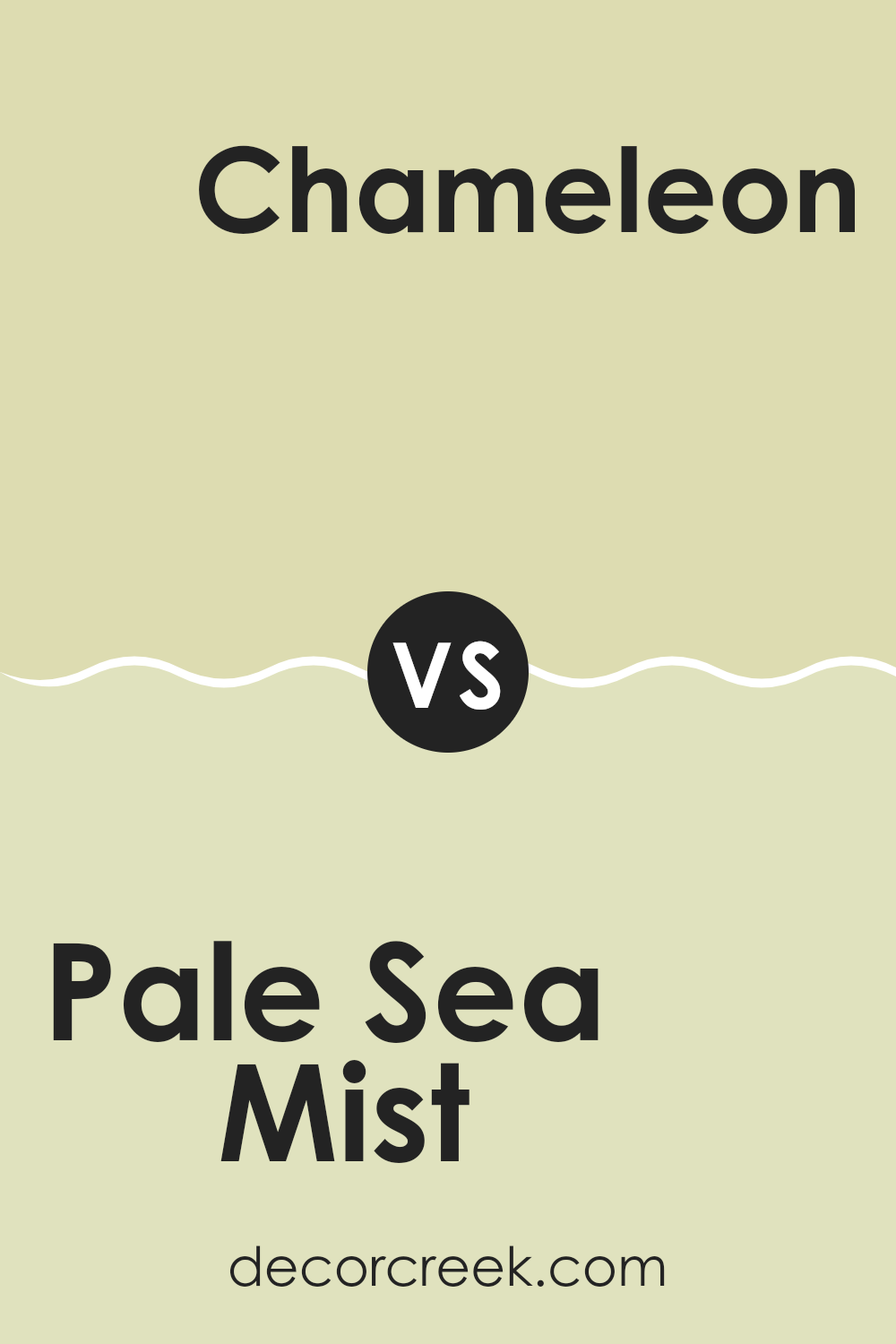
Pale Sea Mist 2147-50 by Benjamin Moore vs Chameleon 526 by Benjamin Moore
Pale Sea Mist, a light and fresh shade, offers a sense of clean, airy atmosphere to a room. It is subtle and quiet, making it a flexible choice for rooms where you want a relaxed vibe and a feeling of more light.
On the other hand, Chameleon brings more personality with its green tone that adapts based on the surrounding light. This color can make a room feel naturally cozy and welcoming due to its warmth.
Both colors are great choices, but their impact changes depending on your decor goals. Pale Sea Mist is perfect for those seeking a clear, open room, while Chameleon is ideal for creating a more grounded, warm setting.
You can see recommended paint color below:
- 526 Chameleon
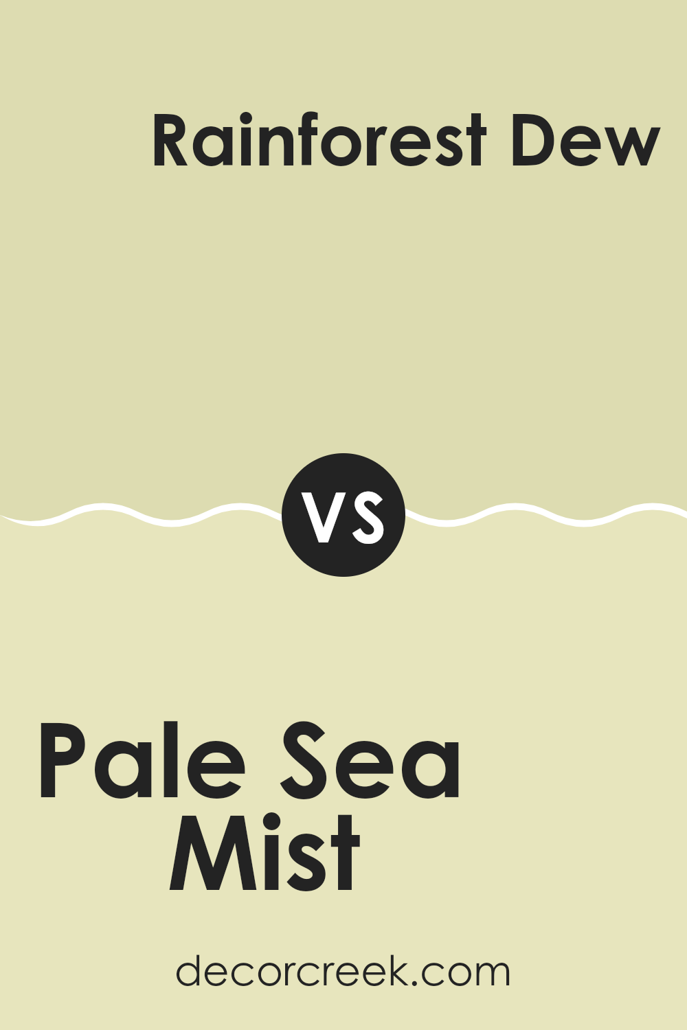
Pale Sea Mist 2147-50 by Benjamin Moore vs Rainforest Dew 2146-50 by Benjamin Moore
Pale Sea Mist and Rainforest Dew, both by Benjamin Moore, are soothing, light colors, but they have different tones that set them apart. Pale Sea Mist leans toward a soft, muted green with a hint of gray, giving it a fresh and clean look that’s very subtle and calming. It’s great for creating a gentle, airy feel in a room, making rooms feel more open and relaxed.
On the other hand, Rainforest Dew has a slightly more vibrant green hue, reminiscent of early morning dew on fresh leaves. It’s a bit brighter than Pale Sea Mist, which can make a room feel lively and refreshing. This color works well in rooms where you want to bring in a natural, earthy vibe without feeling too strong on the senses.
Both colors can enhance a room differently: Pale Sea Mist works well for a light, minimalist aesthetic, while Rainforest Dew is ideal for adding a touch of nature-inspired vitality.
You can see recommended paint color below:
- 2146-50 Rainforest Dew
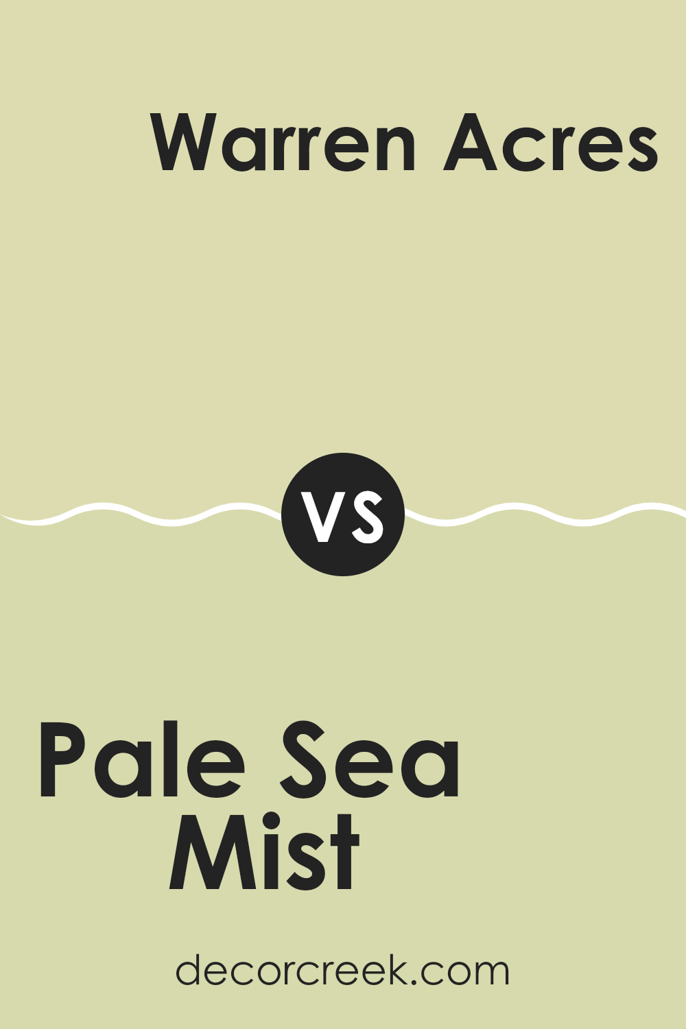
Pale Sea Mist 2147-50 by Benjamin Moore vs Warren Acres 527 by Benjamin Moore
Pale Sea Mist by Benjamin Moore is a light, airy shade that captures the calm mood of a foggy morning by the sea. Its hint of green makes it refreshing and gently lively, perfect for creating a peaceful atmosphere in any room.
Meanwhile, Warren Acres is another gentle color but leans more toward a soft green, reminiscent of a lush, grassy field in early spring. This shade carries a natural warmth and is slightly more pronounced in its green tones compared to Pale Sea Mist, which feels cooler and more understated.
Both colors are excellent choices for those looking to add a touch of nature’s calmness to their interiors, but Warren Acres offers a bit more energy, while Pale Sea Mist brings a cooler, more muted presence. Together, they can harmonize well, bringing the best of soft greens and misty hues to a room.
You can see recommended paint color below:
- 527 Warren Acres
Pale Sea Mist 2147-50 by Benjamin Moore vs Sesame 381 by Benjamin Moore
Pale Sea Mist and Sesame by Benjamin Moore are two distinct colors that have unique characteristics. Pale Sea Mist is a light, soft green with a hint of gray. It gives off a fresh and airy feel, making it perfect for creating a calming room. It’s especially suitable for bedrooms or bathrooms where a gentle and soothing atmosphere is desired.
On the other hand, Sesame is a warmer tone, appearing as a sandy beige. This color is adaptable and emits a cozy vibe, making it excellent for living rooms or entryways where a welcoming and comfortable ambiance is important. Sesame can blend well with various decor styles, from modern to rustic, adding a neutral, yet inviting backdrop to any room.
Comparing the two, Pale Sea Mist offers a cooler touch, reminiscent of a misty morning by the sea, while Sesame provides a hearty, earthy feel, much like the seed it’s named after. Both colors are great choices depending on the mood and style you want to achieve in your room.
You can see recommended paint color below:
- 381 Sesame
After reading and thinking about 2147-50 Pale Sea Mist by Benjamin Moore, I’ve come to really appreciate this paint color. It’s like a whisper of blue and green mixed together, soft enough to make any room feel calm and cheerful at the same time. When I think about using this color in a room, I picture it making the walls look gentle and inviting, kind of like how it feels to look at the sky on a clear spring day.
I’ve learned that Pale Sea Mist isn’t just for one kind of room; it can look good everywhere, whether it’s a cozy bedroom, a busy kitchen, or even a bathroom. It has a light touch that doesn’t shout for attention but still adds something special to the walls.
Overall, if someone is looking for a paint color that is calm but still fun, Pale Sea Mist could be a perfect choice. It’s easy to like and could make any room a bit more joyful. After seeing all its benefits, I have a good feeling that Pale Sea Mist is a color that could make a lot of people happy with their homes.
Ever wished paint sampling was as easy as sticking a sticker? Guess what? Now it is! Discover Samplize's unique Peel & Stick samples.
Get paint samples

