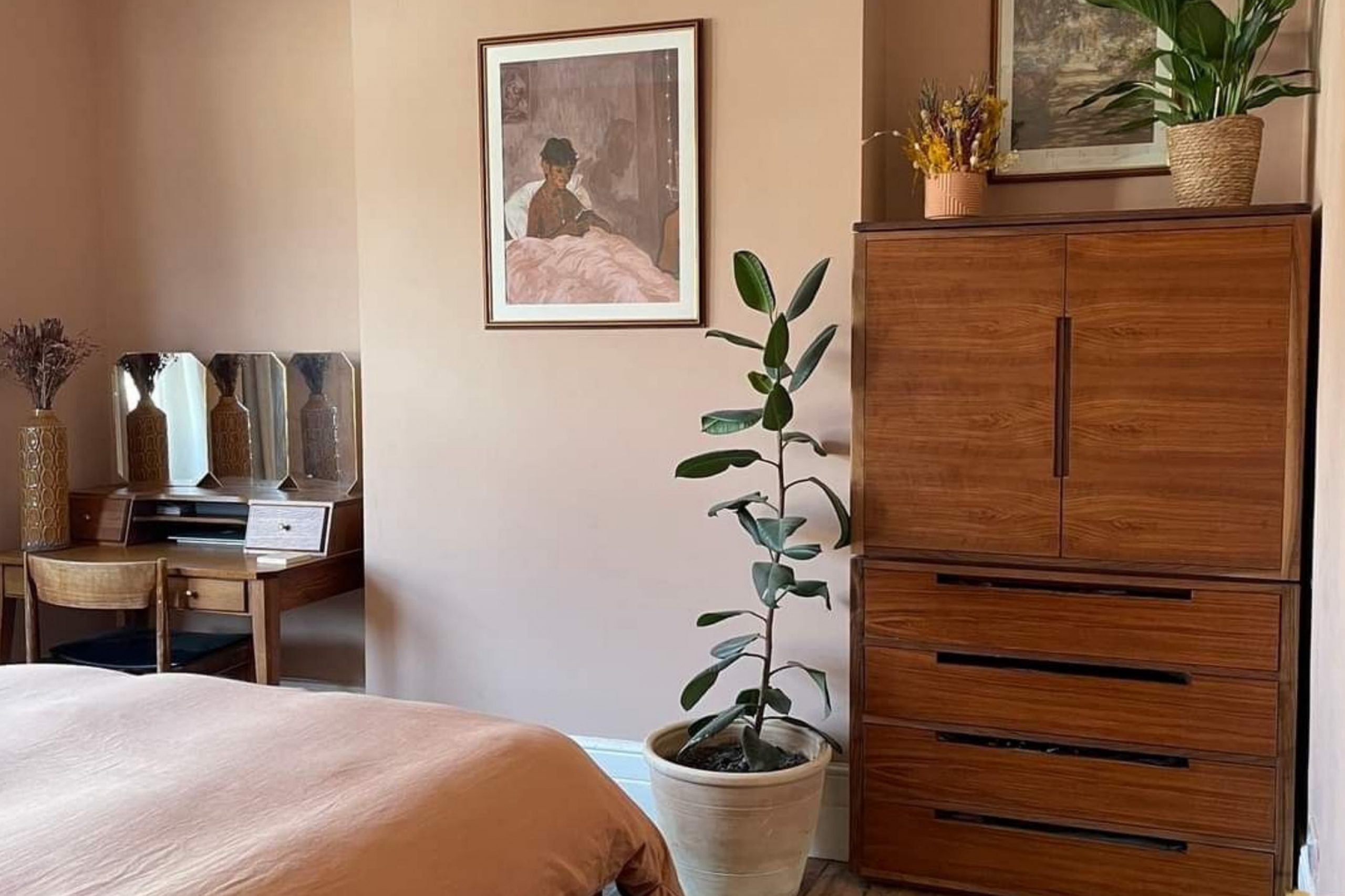
This shade is much more than just a color on a chart; it has a unique ability to bring spaces to life. There’s a comforting quality to Pinky Beige that makes it the perfect choice for those looking to create a cozy, inviting atmosphere in their homes.
Painting walls with this hue made my rooms feel larger yet intimate, creating a welcoming space for family and friends. It’s a color that seems to change slightly throughout the day, from warm in the morning light to softer in the evening shadows.
Pairing it with the right furnishings and accessories, I found it to seamlessly work with various design styles, from traditional to modern.
Pinky Beige became a versatile backdrop that inspired creativity while still providing a sense of calm. It’s perfect for living rooms, bedrooms, or any space where I wanted to feel relaxed and at ease.
Selecting Pinky Beige for my home was a delightful decision, one that continues to bring joy and warmth to my everyday surroundings. This color offers more than just visual appeal—it’s an experience of comfort and style that I truly appreciate.
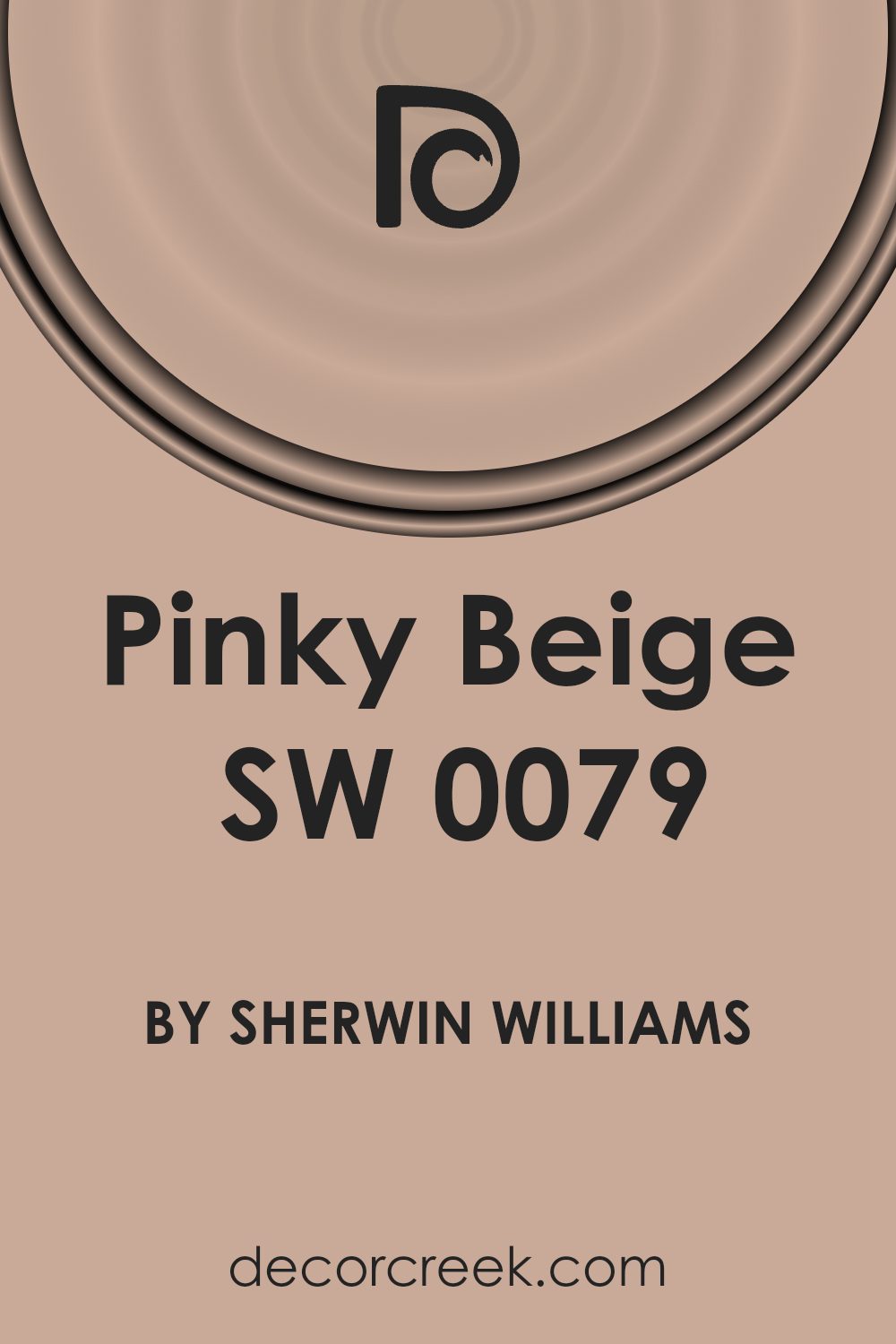
What Color Is Pinky Beige SW 0079 by Sherwin Williams?
Pinky Beige SW 0079 by Sherwin Williams is a soft, muted color that combines the warmth of beige with a hint of pink. This gentle tone creates a cozy and inviting atmosphere, making it an excellent choice for various interior settings.
In terms of interior styles, Pinky Beige fits beautifully with traditional and transitional designs. It complements classic furniture pieces and adds a warm backdrop to spaces that feature vintage or antique decor. This color also works well in bohemian or eclectic styles, where its subtlety allows more vibrant textiles and accessories to stand out.
Pinky Beige pairs wonderfully with materials like natural wood, providing a harmonious balance. Light to medium-toned wood floors, furniture, or accents can enhance the warmth of the color, while white or off-white trim adds crispness and definition.
In terms of textures, this shade works well with soft fabrics such as linen and cotton, which emphasize its comfortable and approachable feel. Layering it with plush throws and cushions will enhance the coziness in any space.
For a modern touch, consider pairing this color with metallic accents in gold or brass, adding a touch of elegance. Pinky Beige is versatile and blends seamlessly with soft pastels or muted earth tones, giving you plenty of options for creating a warm and welcoming environment.
Is Pinky Beige SW 0079 by Sherwin Williams Warm or Cool color?
Pinky Beige SW 0079 by Sherwin Williams is a versatile color that brings warmth and softness to home interiors. This shade combines a gentle pink hue with a warm beige, creating a cozy and inviting atmosphere. It’s an excellent choice for living rooms, bedrooms, or any space where you want to feel comfortable and relaxed.
The subtle pink undertone adds a touch of warmth without being too bold, making it easy to pair with other colors. It works well with neutral tones, such as whites and grays, and can also complement darker shades like navy or forest green.
This adaptability makes it suitable for various styles, from traditional to modern. In rooms with natural light, Pinky Beige can give walls a soft glow, enhancing the overall ambiance. Its calming effect makes it a great choice for areas where people gather, encouraging conversation and a sense of well-being.
Undertones of Pinky Beige SW 0079 by Sherwin Williams
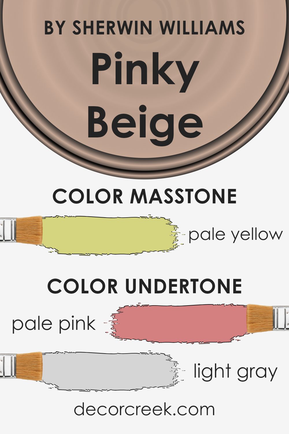
Pinky Beige (SW 0079) by Sherwin Williams is a unique color that combines various undertones, influencing how we see it in different settings. The undertones include shades of pale pink, light gray, light purple, mint, gray, lilac, light blue, orange, yellow, olive, and light green. These subtle hints change how the main color looks depending on the lighting and surrounding colors.
When you use Pinky Beige on interior walls, the pale pink and light purple undertones might add a soft and gentle feel to the room. It can create a warm atmosphere, making spaces feel cozy and inviting.
The gray and light gray undertones can provide a more neutral base, helping the color adapt to different furniture and decor styles. This balance allows the color to fit well in both modern and traditional settings.
The mint and light green undertones bring a fresh and uplifting energy, while the light blue and lilac hints add a touch of calm. Meanwhile, the orange and yellow undertones can inject a hint of liveliness, creating a cheerful environment.
The olive undertone adds a subtle earthiness, grounding the color and making it versatile. Overall, the combination of these undertones makes Pinky Beige a flexible and appealing choice for interior walls.
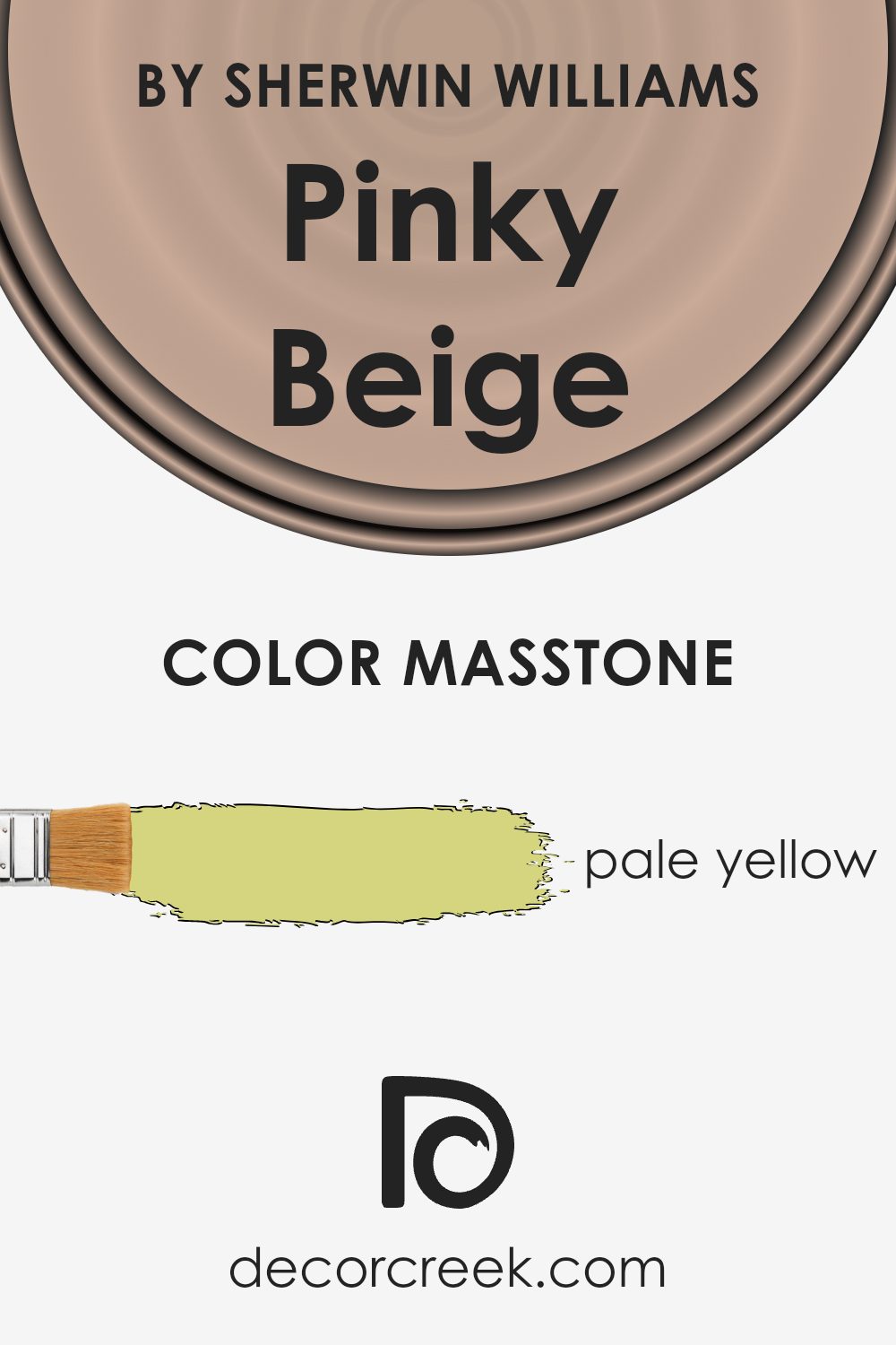
What is the Masstone of the Pinky Beige SW 0079 by Sherwin Williams?
Pinky Beige (SW 0079) by Sherwin Williams is a versatile color with a masstone of pale yellow (#D5D580). This pale yellow undertone gives it a warm and inviting feel. In homes, Pinky Beige can create a cozy and welcoming atmosphere, making spaces feel more comfortable and pleasant.
Its subtle warmth blends well with natural light, enhancing rooms with a soft glow that feels sunny and cheerful without being overpowering.
This color works nicely in living rooms and bedrooms as it complements both warm and cool color schemes, offering flexibility in interior design. It pairs well with neutral shades, soft pastels, and even some brighter accents, making it easy to coordinate furnishings and decor.
The pale yellow masstone also prevents Pinky Beige from feeling too dark or heavy, keeping spaces light and airy. Overall, this color is a great choice for creating a balanced and harmonious look in various parts of a home.
How Does Lighting Affect Pinky Beige SW 0079 by Sherwin Williams?
Lighting can greatly influence how we perceive colors, including paint colors like Pinky Beige SW 0079 by Sherwin Williams. Different types of lighting can change the appearance of a color on your walls, making it crucial to consider light sources when choosing a paint color.
- Artificial Light: In artificial light, the warm undertones of Pinky Beige can become more prominent. Incandescent bulbs, which emit a warm, yellow light, may enhance the beige tones, making the room feel cozier. Fluorescent lighting, which is cooler, might make the color appear slightly duller.
- Natural Light: The effect of natural light on this color changes throughout the day. Morning light can cast a soft, cool glow, which might make Pinky Beige appear a bit more muted. In contrast, afternoon sunlight is warmer and can bring out the pink undertone, giving the color a richer appearance.
- North-Facing Rooms: These rooms receive cooler, indirect light, which can make colors appear darker and somewhat bluer. Pinky Beige might look a bit more muted and cooler in tone, possibly downplaying the pink undertone.
- South-Facing Rooms: Abundant natural light often fills south-facing rooms with warmth and brightness throughout the day. Pinky Beige in these rooms will likely appear vibrant, fully showcasing its pink and beige tones.
- East-Facing Rooms:Morning sunlight in east-facing rooms can make Pinky Beige appear brighter and more lively in the early hours. As the day progresses, the space receives less natural light, which might make the color look softer and a bit shadowed later in the day.
- West-Facing Rooms: Warm afternoon and evening light in west-facing rooms can intensify the pink undertone, giving the color a warm, glowing feel. In the mornings, the color might seem subtler and slightly cooler due to less direct sunlight.
Understanding these lighting effects can help you decide whether Pinky Beige SW 0079 is suitable for your space, ensuring the color meets your expectations at different times of the day.
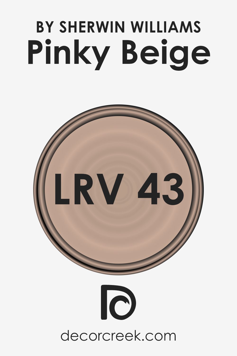
What is the LRV of Pinky Beige SW 0079 by Sherwin Williams?
Light Reflectance Value (LRV) is a measurement used in the paint industry to indicate how much light a color reflects or absorbs. On a scale from 0 to 100, a lower LRV means a color absorbs more light, while a higher LRV indicates a color reflects more light.
If a color has a low LRV, it will appear darker and may make a room feel more intimate or cozy because it absorbs more of the light. Conversely, a color with a high LRV reflects more light and makes a space feel more expansive and airy because it’s brighter. Simply put, LRV helps predict how light or dark a color will look once it’s on the walls.
For the color Pinky Beige, which has an LRV of 43.373, it sits in the middle of the LRV scale. This means it reflects a moderate amount of light. In a room, this color will appear neither too dark nor too bright; it strikes a balance. With its mid-range LRV, Pinky Beige can help create a comfortable and neutral feel.
It’s not so dark that it will make a room feel cramped, but it won’t be overly bright, either. This makes it a versatile choice for spaces where a soft, balanced light is desired. The color won’t overpower a room and will work well in spaces where you want a warm and inviting look.
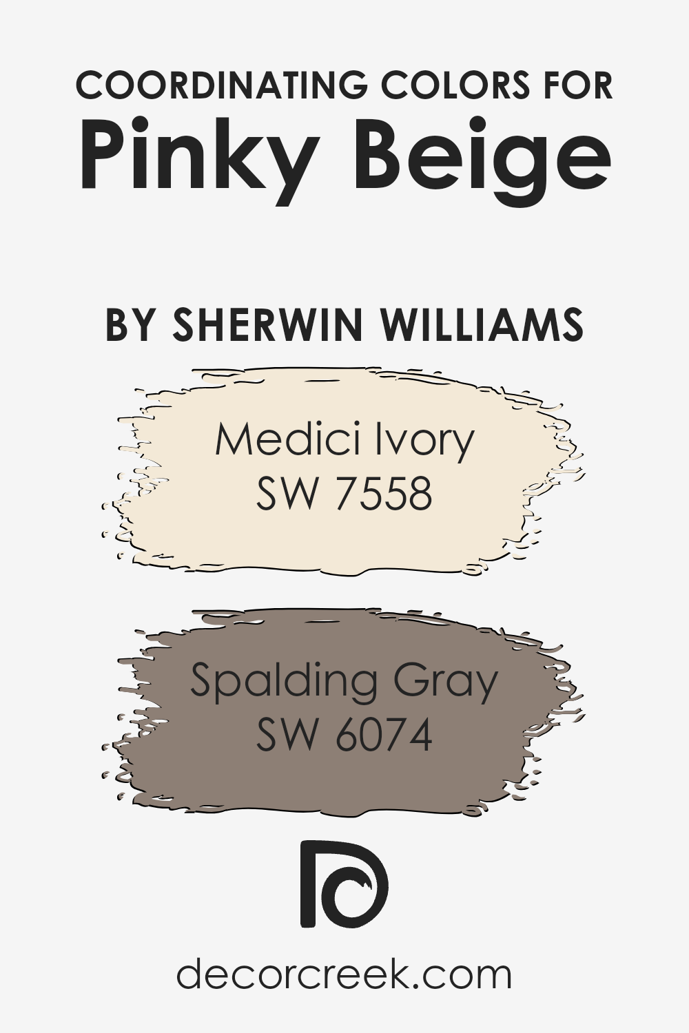
Coordinating Colors of Pinky Beige SW 0079 by Sherwin Williams
Coordinating colors are shades that complement and enhance a main color, creating a harmonious and cohesive look in a space. The main color, Pinky Beige by Sherwin Williams, pairs beautifully with coordinating colors like Medici Ivory and Spalding Gray.
When you use these colors together, they balance each other, providing contrast without clashing. This balance is key for creating an inviting atmosphere in any room.
Medici Ivory is a warm, soft shade with creamy undertones that adds a gentle brightness to a room. It works well with Pinky Beige, bringing out the pink undertones and adding a light, airy feel. On the other hand, Spalding Gray is a relaxed, muted gray that provides depth and contrast to the pinky hues.
This color grounds the space, offering a more neutral backdrop that enhances the surrounding colors. When used together, these shades create a balanced and pleasing environment, suitable for any space that benefits from warmth and subtle harmony.
You can see recommended paint colors below:
- SW 7558 Medici Ivory
- SW 6074 Spalding Gray
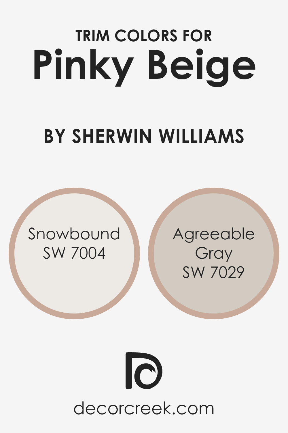
What are the Trim colors of Pinky Beige SW 0079 by Sherwin Williams?
Trim colors are the shades used to accentuate the edges and details of a room, such as baseboards, window frames, and moldings. They’re essential in making the primary wall color stand out and defining the architectural features of a space.
For Sherwin Williams’ Pinky Beige, using the right trim color can enhance its warm, comforting hue. Pinky Beige is a soft, inviting shade that pairs beautifully with neutral tones. By selecting the right trim color, you not only frame the room stylishly but also balance the overall color scheme for a more cohesive look.
SW 7004 – Snowbound and SW 7029 – Agreeable Gray are excellent choices for trim colors against Pinky Beige. Snowbound is a crisp, clean white that can brighten and add a fresh contrast to the gentle warmth of Pinky Beige. It’s perfect for those who want to achieve a modern and airy feel.
On the other hand, Agreeable Gray is a warm gray with taupe undertones, offering a subtle yet inviting contrast.
It works well for those who prefer a softer and more harmonious blend with Pinky Beige, adding depth without overpowering the main color. Using these trim colors not only highlights architectural elements but also enhances the visual appeal of the room.
You can see recommended paint colors below:
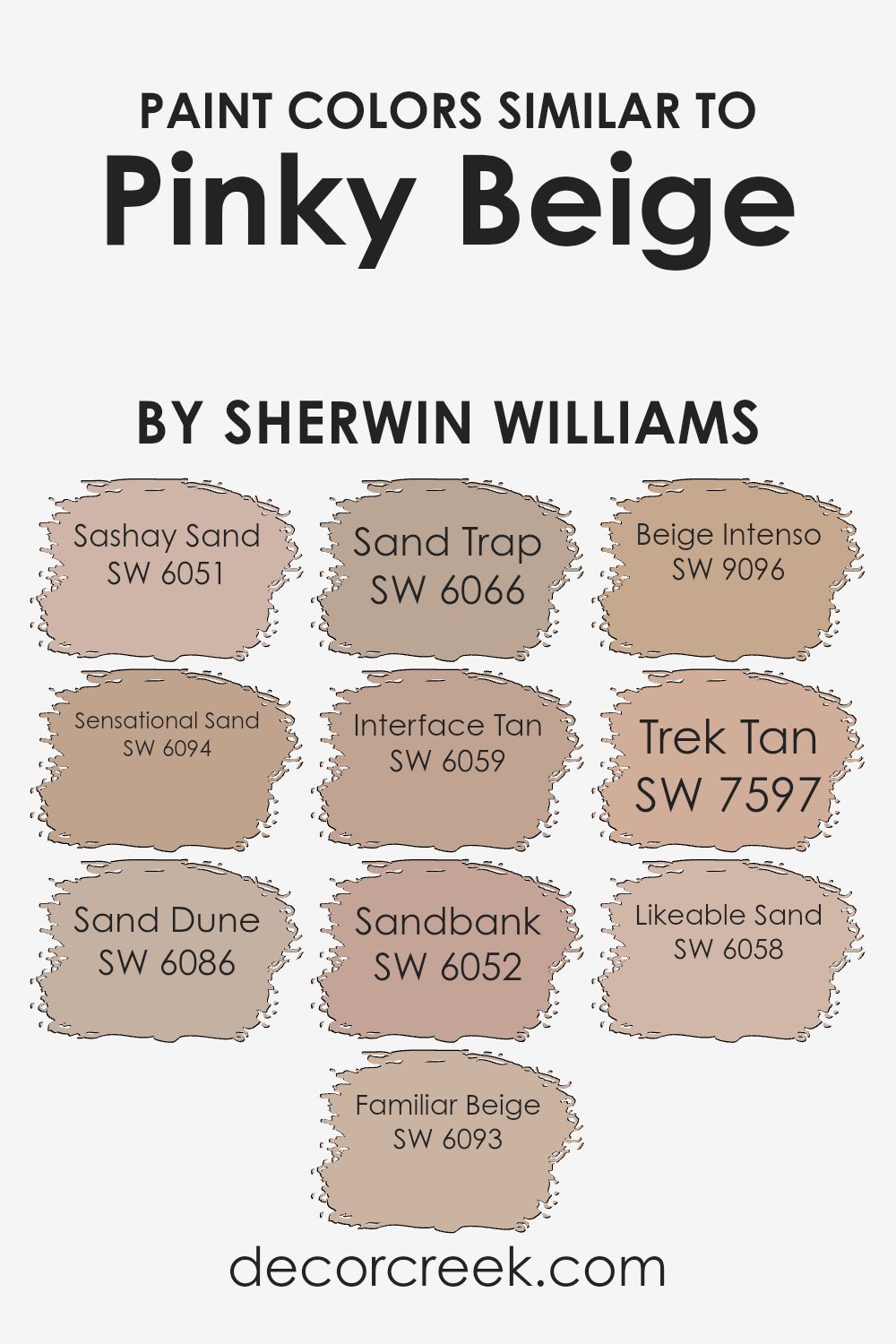
Colors Similar to Pinky Beige SW 0079 by Sherwin Williams
Similar colors add depth and harmony to any space by allowing a room to flow seamlessly from one shade to another. These hues complement the base color, such as Sherwin Williams’ Pinky Beige, by sharing similar warm undertones while offering subtle variations.
SW 6051 – Sashay Sand is a soft, pinkish hue that adds a gentle warmth to a room, while SW 6094 – Sensational Sand brings in a muted brightness, offering a slightly richer warmth. SW 6086 – Sand Dune presents as a neutral tone with a hint of brown, creating a cozy and inviting atmosphere.
Similarly, SW 6093 – Familiar Beige integrates calming undertones that create a comfortable and welcoming environment.
Further enhancing the range, SW 6066 – Sand Trap gives off a warm, earthy feel that adds texture to walls. SW 6059 – Interface Tan blends a subtle, versatile tan that fits well in any setting, while SW 6052 – Sandbank evokes a soft, natural tone that grounds the room.
SW 9096 – Beige Intenso offers a bolder beige that stands out without overpowering. SW 7597 – Trek Tan brings in a darker, richer tone that adds depth, and SW 6058 – Likeable Sand rounds out the palette with a light, creamy color that enhances the softness of a space. Together, these colors create a cohesive look that complements your home’s decor.
You can see recommended paint colors below:
- SW 6051 Sashay Sand
- SW 6094 Sensational Sand
- SW 6086 Sand Dune
- SW 6093 Familiar Beige
- SW 6066 Sand Trap
- SW 6059 Interface Tan
- SW 6052 Sandbank
- SW 9096 Beige Intenso
- SW 7597 Trek Tan
- SW 6058 Likeable Sand
How to Use Pinky Beige SW 0079 by Sherwin Williams In Your Home?
Pinky Beige SW 0079 by Sherwin Williams is a warm, neutral color that can create a cozy and inviting atmosphere in your home. This color has a subtle pink undertone, which adds a hint of warmth without being overwhelming. It works well in spaces where you want a soft, welcoming feel, like living rooms or bedrooms.
Pairing Pinky Beige with whites, creams, or light grays can help balance the color and create a relaxing space. You can also add textures like wood or textiles to enhance the comfort of the room.
Pinky Beige is versatile and can be used on all of the walls for a cohesive look or as an accent color to add a touch of warmth. It works well in both traditional and contemporary settings, allowing it to blend seamlessly with different styles of furniture and decor. This makes it a great choice for any space in your home.
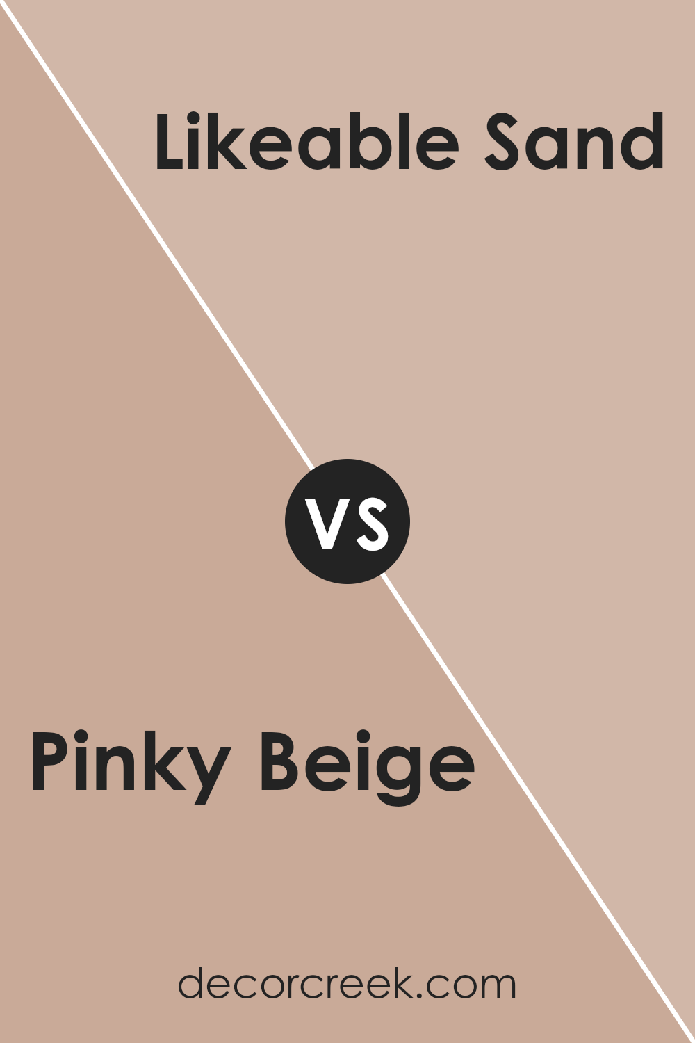
Pinky Beige SW 0079 by Sherwin Williams vs Likeable Sand SW 6058 by Sherwin Williams
Pinky Beige SW 0079 and Likeable Sand SW 6058 are both warm and inviting colors from Sherwin Williams, but they each have unique characteristics. Pinky Beige is a softer color with a hint of pink, giving it a gentle and cozy feel. It’s a great choice for spaces where you want a touch of warmth without being too bold.
On the other hand, Likeable Sand is a more neutral shade with a slight tan undertone. It lacks the pink hue, making it a bit more versatile and easy to pair with other colors.
While both colors work well in living areas or bedrooms, Pinky Beige adds a subtle touch of color, whereas Likeable Sand offers a more classic, earthy tone.
Both colors can create a welcoming atmosphere but will give different vibes depending on the room’s lighting and furnishings.
You can see recommended paint color below:
- SW 6058 Likeable Sand
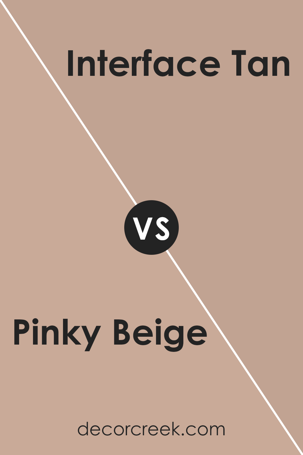
Pinky Beige SW 0079 by Sherwin Williams vs Interface Tan SW 6059 by Sherwin Williams
Pinky Beige (SW 0079) by Sherwin Williams is a soft, warm color with pink and beige undertones. It is a gentle and inviting shade that can create a cozy atmosphere in a room. This color can work well in living rooms or bedrooms where a calming and welcoming environment is desired.
On the other hand, Interface Tan (SW 6059) by Sherwin Williams is a deeper, more muted color. It has a richer, earthy tone compared to Pinky Beige, adding warmth and depth without being overpowering. Interface Tan can be an excellent choice for spaces where a grounded and stable feel is desired, such as an office or library.
While both colors are warm and inviting, Pinky Beige offers a light, soft touch, while Interface Tan presents a bolder, earthier presence. Selecting between them depends on whether you want a softer or more substantial color influence in your space.
You can see recommended paint color below:
- SW 6059 Interface Tan
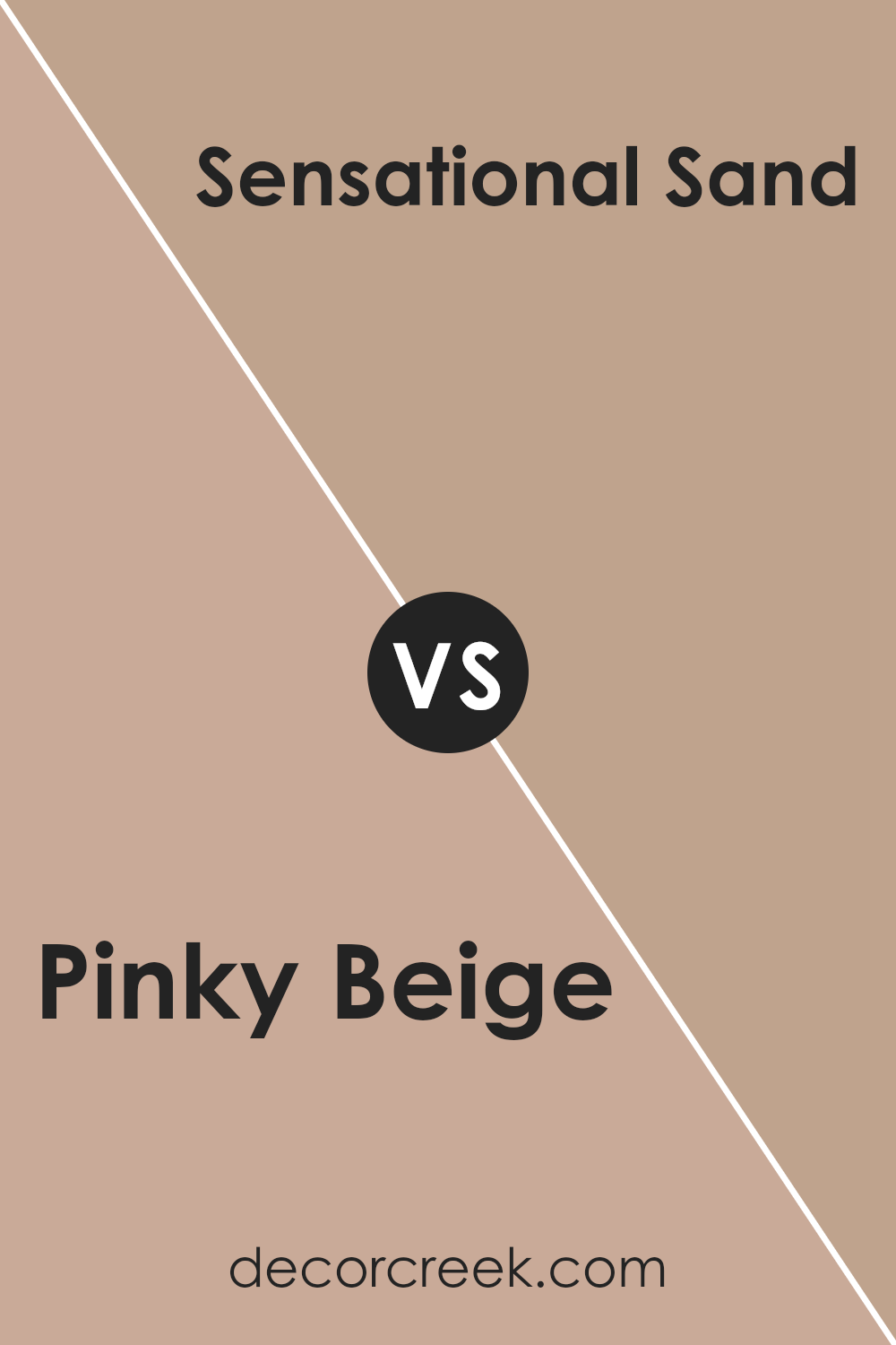
Pinky Beige SW 0079 by Sherwin Williams vs Sensational Sand SW 6094 by Sherwin Williams
Pinky Beige SW 0079 and Sensational Sand SW 6094 by Sherwin Williams are both warm, neutral colors, but they offer different vibes. Pinky Beige is a soft blend of pink and beige, providing a warm, gentle touch. It has a slightly rosy undertone, which adds a hint of warmth and softness to a room. This color works well in spaces where you want a cozy, inviting atmosphere.
On the other hand, Sensational Sand is a bit more muted and grounded. It leans towards a tan or light brown hue, creating a natural and calm setting. This color is versatile and pairs well with a variety of other colors, making it a solid choice for those who prefer a more subtle look.
Overall, while both colors are warm and neutral, Pinky Beige offers a touch of rosy warmth, whereas Sensational Sand brings a more earthy, subdued feel to your space.
You can see recommended paint color below:
- SW 6094 Sensational Sand
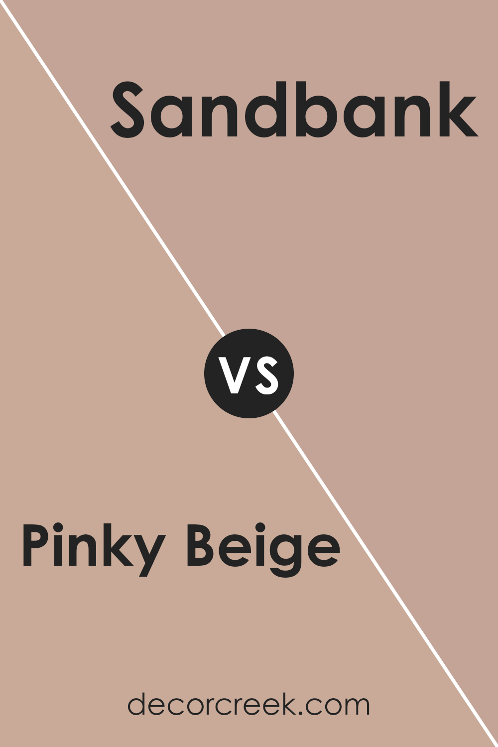
Pinky Beige SW 0079 by Sherwin Williams vs Sandbank SW 6052 by Sherwin Williams
Pinky Beige SW 0079 and Sandbank SW 6052 by Sherwin Williams are two fairly neutral colors, but they offer different vibes. Pinky Beige is a softer, more delicate color that includes a hint of pink, adding warmth and a subtle touch of color to any room.
It’s a great choice if you’re looking to create a cozy and gentle atmosphere. On the other hand, Sandbank is more of a sandy, earthy tone with beige and brown undertones.
It’s slightly darker and provides a more grounded feel to spaces. Pinky Beige is usually chosen for its warm and inviting presence, while Sandbank might be preferred in settings where you want a more natural and earthy look.
Both colors are versatile and can pair well with various other colors, but the choice between them depends on whether you want a hint of pinkish warmth or a more classic beige feel.
You can see recommended paint color below:
- SW 6052 Sandbank
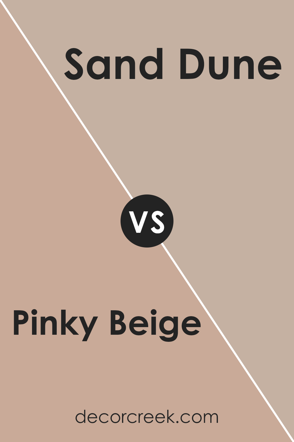
Pinky Beige SW 0079 by Sherwin Williams vs Sand Dune SW 6086 by Sherwin Williams
Pinky Beige SW 0079 and Sand Dune SW 6086 are warm tones that bring different moods to a space. Pinky Beige is a soft, gentle color with a hint of pink, creating a warm and welcoming environment. It’s ideal for spaces where you want a subtle touch of color without overwhelming the room.
On the other hand, Sand Dune is a sandy, earthier hue, leaning more towards a neutral beige with a slightly warmer undertone. This color is versatile and works well in various settings, providing a calming background that complements many designs.
While Pinky Beige adds a touch of softness and a hint of elegance due to its pink undertones, Sand Dune offers a more natural, grounded feeling. Both colors are excellent choices for creating inviting and comfortable spaces, but your choice depends on whether you prefer a hint of pink warmth or a classic neutral tone.
You can see recommended paint color below:
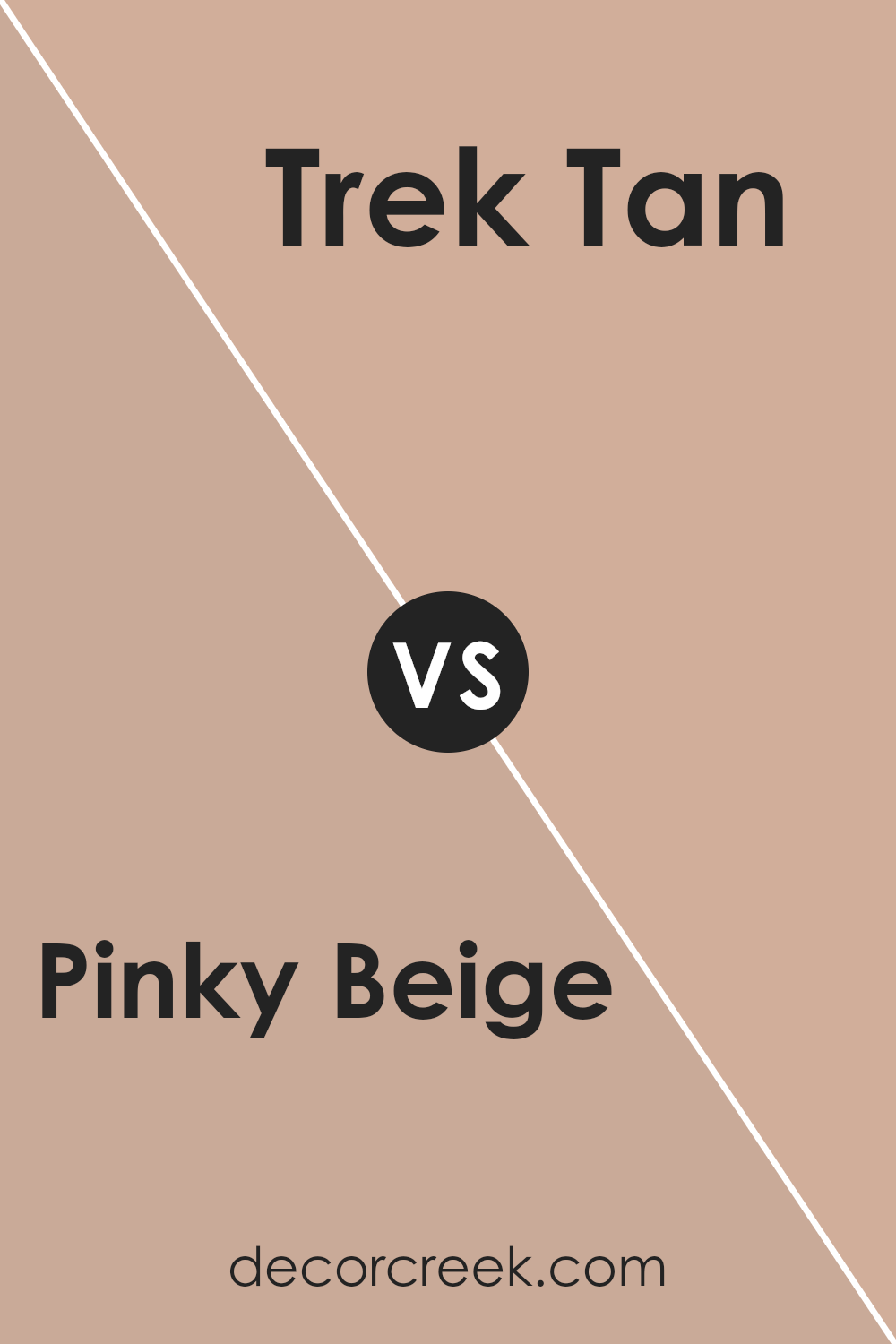
Pinky Beige SW 0079 by Sherwin Williams vs Trek Tan SW 7597 by Sherwin Williams
Pinky Beige SW 0079 by Sherwin Williams is a soft, warm color with a rosy undertone, making it feel cozy and inviting. It’s a light and neutral shade that has a touch of pink, adding a gentle charm to any room. On the other hand, Trek Tan SW 7597 is a deeper, earthy shade of brown.
It has a strong, natural feel, reminiscent of the outdoors. While Pinky Beige is light and airy, giving spaces an open and breezy vibe, Trek Tan brings a grounded, rich atmosphere.
Pinky Beige is great for creating a feeling of lightness and openness, perfect for living rooms or bedrooms wanting a subtle hint of color. Trek Tan, with its warm tan hue, works well in spaces looking for a more traditional or rustic feel. Both colors offer a warm touch but in very different ways—one through softness and the other through depth.
You can see recommended paint color below:
- SW 7597 Trek Tan
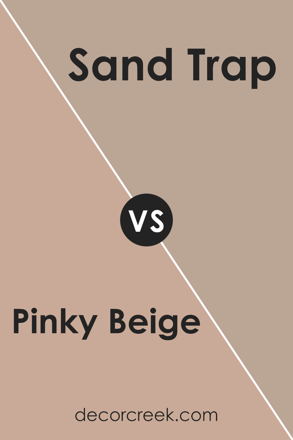
Pinky Beige SW 0079 by Sherwin Williams vs Sand Trap SW 6066 by Sherwin Williams
Pinky Beige and Sand Trap are two warm, neutral colors from Sherwin Williams. Pinky Beige is a soft, warm color with a hint of pink that gives it a slightly rosy undertone. It’s a cozy color that can make spaces feel inviting and warm.
On the other hand, Sand Trap is a bit warmer and more earthy, with a beige tone that is closer to the color of sand. It has more of a brownish undertone, making it feel a bit richer and more grounded. When you put them side by side, Pinky Beige feels lighter and a bit more playful due to its pink tones, while Sand Trap gives off a more subdued and natural vibe.
Both colors can work in various settings, but Pinky Beige might be better suited for spaces where you want a soft, gentle aesthetic, whereas Sand Trap might be ideal for creating a warm, cozy, and grounded environment.
You can see recommended paint color below:
- SW 6066 Sand Trap
Pinky Beige SW 0079 by Sherwin Williams vs Familiar Beige SW 6093 by Sherwin Williams
Pinky Beige and Familiar Beige are two warm, neutral colors by Sherwin Williams. Pinky Beige has a soft pink undertone that gives it a slightly rosy appearance. It adds a gentle touch of warmth to a room, making it feel cozy and inviting. This color works well in spaces where you want a hint of color without overpowering the other elements in the room.
Familiar Beige, on the other hand, is a traditional beige with a more straightforward taupe undertone. It’s a versatile and timeless shade that creates a classic, comfortable atmosphere. This color works as a great backdrop and pairs easily with both warm and cool accents.
While Pinky Beige offers a subtler, more unique hue, Familiar Beige provides a more conventional choice that is easy to complement with various styles and décor. Both create a warm and welcoming environment but cater to slightly different tastes with their undertone differences.
You can see recommended paint color below:
- SW 6093 Familiar Beige
Pinky Beige SW 0079 by Sherwin Williams vs Beige Intenso SW 9096 by Sherwin Williams
Pinky Beige (SW 0079) and Beige Intenso (SW 9096) by Sherwin Williams are two distinct shades with unique qualities. Pinky Beige is a lighter, softer hue with a subtle pink undertone, giving spaces a warm and gentle feel. It’s excellent for creating a cozy and inviting atmosphere.
In contrast, Beige Intenso is a deeper, richer shade with more pronounced beige tones. It offers a strong and grounded look, making it suitable for rooms where a more substantial color presence is desired.
Pinky Beige works well in spaces where light and airy vibes are appreciated, such as living rooms or bedrooms, as it reflects light beautifully and creates a sense of openness. Beige Intenso, on the other hand, is perfect for adding depth to dining rooms or study areas, providing a more traditional and robust aesthetic.
Both colors can complement various other tones, but their impact in a room will differ due to their distinct undertones and depths.
You can see recommended paint color below:
- SW 9096 Beige Intenso

Pinky Beige SW 0079 by Sherwin Williams vs Sashay Sand SW 6051 by Sherwin Williams
Pinky Beige and Sashay Sand are both soft, neutral colors from Sherwin Williams that offer a warm and inviting feel, but they have distinct differences. Pinky Beige is a blend of pink and beige tones, giving it a slightly rosy hue. This color can add a touch of warmth and coziness to a room without being overly bold.
On the other hand, Sashay Sand is a bit more muted, with stronger beige and tan undertones. It tends to have a more subdued and earthy appearance compared to Pinky Beige, making it versatile and easy to pair with various decor styles.
While both colors have a warm and neutral base, Pinky Beige stands out with its hint of pink, adding a soft touch of color, whereas Sashay Sand maintains a classic beige look for a more traditional setting. Both colors work well in creating a welcoming atmosphere, but the choice between them depends on the desired emphasis on pink tones.
You can see recommended paint color below:
- SW 6051 Sashay Sand
Conclusion
After spending some time learning about Sherwin Williams’ SW 0079 Pinky Beige, I’ve realized how special this color is. Pinky Beige isn’t just an ordinary color; it has a gentle and calming feel that can make a room feel more friendly and warm.
It’s a soft mix of pink and beige, which means it’s not too bright but not too dull either. This makes it a great choice for many different rooms in a house.
You can use Pinky Beige in the living room to make it cozy or in a bedroom where you want to relax. It even goes well in the bathroom or kitchen because it pairs nicely with other colors. You could match it with white for a clean look or darker colors for something a bit bolder.
What I like about Pinky Beige is how it can be both gentle and pretty without taking over everything else. It’s like having a quiet friend who makes everyone feel happy just by being there. So if you’re thinking about painting a room, Pinky Beige could be a good choice.
It helps create a warm and welcoming feel for everyone who comes into your home.
Ever wished paint sampling was as easy as sticking a sticker? Guess what? Now it is! Discover Samplize's unique Peel & Stick samples.
Get paint samples

