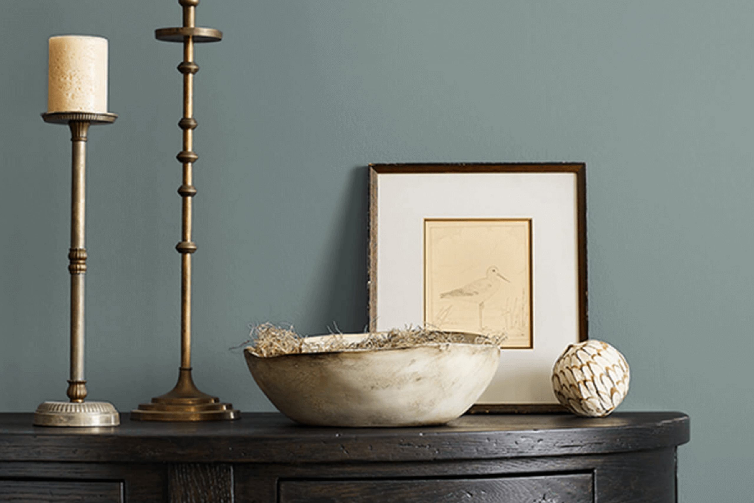
Choosing the right paint color for your home can be a bit overwhelming with all the options out there. Let me tell you about my experience with SW 9644 Portsmouth by Sherwin Williams, a color that might just be what you’re looking for. I stumbled upon it while searching for something unique yet timeless for my living room.
Portsmouth is a rich, deep hue that strikes a balance between boldness and traditional elegance. As someone who appreciates subtlety in design, I found this color to be surprisingly versatile. It has a way of providing a strong background without overpowering the room. Whether you’re aiming for a cozy, intimate setting or a more formal atmosphere, Portsmouth adapts beautifully.
The color interacts differently as the day progresses, shifting subtly with the changing light. In the morning, it carries a soft, welcoming tone that energizes the start of the day. By evening, it deepens, creating a soothing backdrop that’s perfect for winding down.
If you’re on the hunt for a color that complements various decor styles and evolves with your space, SW 9644 Portsmouth could be the finishing touch your home needs. It’s not just a paint color; it’s a backdrop for life’s moments.
What Color Is Portsmouth SW 9644 by Sherwin Williams?
Portsmouth is a deep, vibrant green shade with hints of blue undertones, creating a fresh and invigorating feel. This color stands out for its ability to inject a sense of energy and vitality into any space. Because of its boldness and depth, Portsmouth works exceptionally well in modern and contemporary home decors, where its vibrancy can be balanced with clean lines and simple design elements.
In terms of pairing, this color matches beautifully with natural wood tones, from light beech to darker walnuts. These earthy materials help to soften the intensity of Portsmouth, providing a warming contrast to its cooler undertones. For textures, consider incorporating linens or wool in neutral shades to bring out the richness of the green without overwhelming the senses.
Metallic accents in brushed nickel or stainless steel can also add a sleek touch, enhancing the modern vibe of the room.
Portsmouth is ideal for focusing areas such as living rooms or study spaces, where its freshness aids concentration and boosts mood.
It’s also well-suited for accent walls or furniture pieces, providing a dynamic burst of color that can anchor a room’s aesthetic or provide a striking focal point. Whether used in large areas or as a decorative accent, Portsmouth can enliven any interior with its powerful yet welcoming aura.
Is Portsmouth SW 9644 by Sherwin Williams Warm or Cool color?
PortsmouthSW 9644 by Sherwin Williams is a versatile paint color that blends green and blue hues, creating a subtle and refreshing feel in any room. This shade is light enough to make small spaces appear larger, yet has enough depth to add character to larger areas.
It works exceptionally well in bathrooms and kitchens where it complements natural light, giving these spaces a crisp and clean look. Furthermore, because of its neutral yet lively nature, it pairs beautifully with both light woods and white trim, enhancing the fresh aesthetic of a home.
For those looking to create a cozy atmosphere, PortsmouthSW 9644 is also an excellent choice for living rooms or bedrooms. It pairs well with soft textiles and natural materials, such as cotton throws or wooden furniture, gently amplifying a feeling of comfort and homeyness without overpowering the space with bold color. Overall, this color is a great choice for anyone wanting to add a fresh touch to their home in a subtle way.
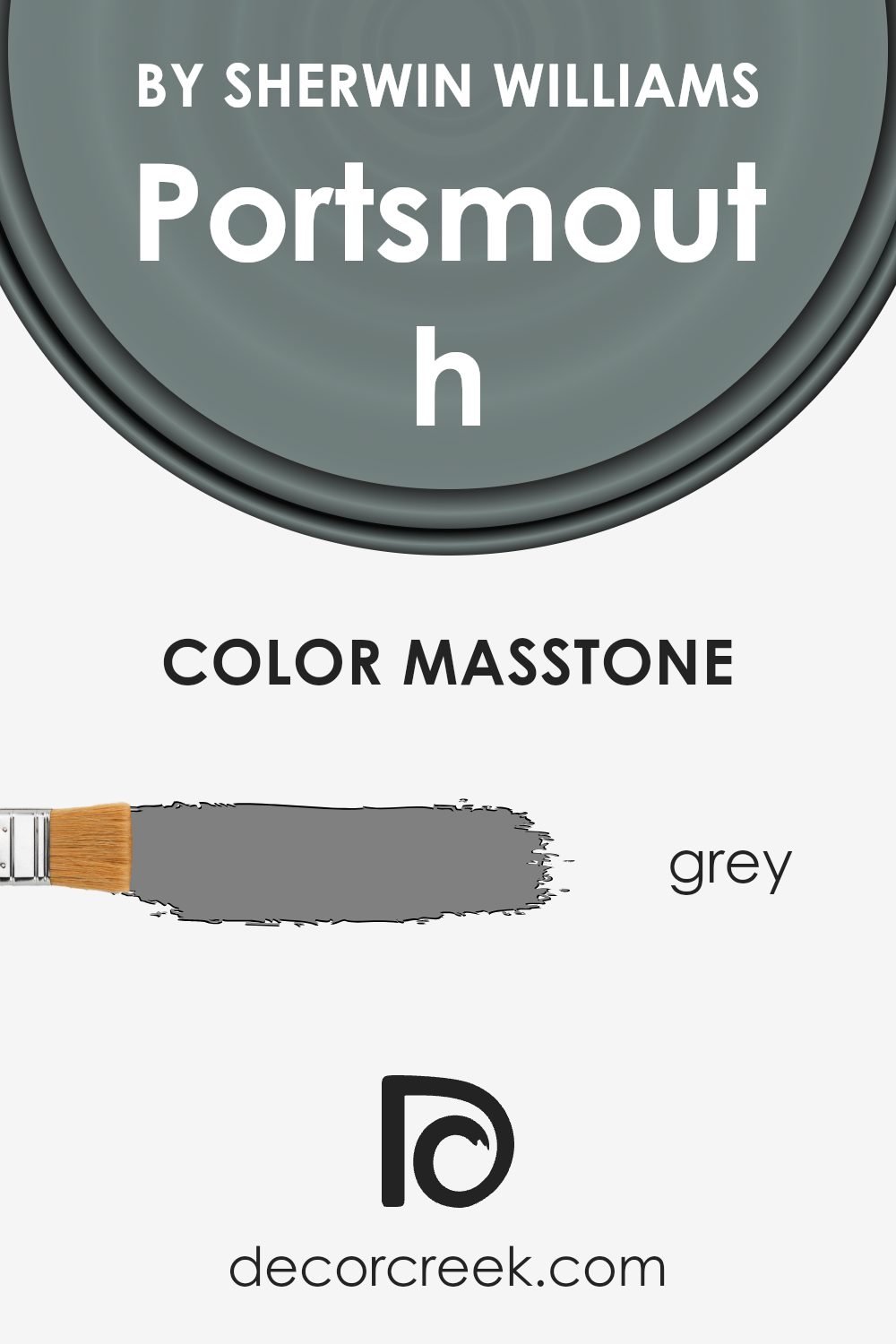
What is the Masstone of the Portsmouth SW 9644 by Sherwin Williams?
PortsmouthSW 9644 by Sherwin Williams has a masstone color of grey, which carries a balanced and neutral shade. This subtle tone, often associated with stability and practicality, is extremely versatile and suits a wide range of home styles and spaces.
Grey serves as a fantastic backdrop in homes because it pairs well with almost any color, allowing homeowners to add personal touches with vibrant accessories, fabrics, or furniture without worrying about clashes.
In well-lit rooms, grey can appear lighter and more airy, making the space feel larger. In rooms with less natural light, it adds depth and formality. Also, since grey is a timeless color, using it on walls or in major furniture pieces can be seen as a smart investment, as it’s unlikely to go out of style. Grey can also help to hide imperfections or marks, making it a practical choice for high-traffic areas in the house.
How Does Lighting Affect Portsmouth SW 9644 by Sherwin Williams?
Lighting has a significant impact on the appearance of colors. The same paint shade can look quite different depending on the light source. This is because light affects how we perceive color. Natural light changes throughout the day and varies depending on the room direction, whereas artificial lighting comes in different types and intensities.
Considering the color Portsmouth by Sherwin Williams, its perception can vary under different lighting conditions. Under artificial light, the quality of light—whether it’s LED, fluorescent, or incandescent—plays a crucial role. LEDs can make colors appear vibrant, highlighting Portsmouth’s richness.
Fluorescent lights, however, might wash out the color slightly, giving it a more subdued quality. Incandescent lighting tends to warm up colors, making Portsmouth feel cozier and more inviting.
In natural light, the time of day and the direction the room faces significantly affect how Portsmouth looks.
In north-facing rooms, which don’t receive a lot of direct sunlight, Portsmouth might appear slightly darker and more muted. This cooler, indirect light emphasizes the deeper tones in the paint.
In south-facing rooms, abundant direct sunlight can make Portsmouth pop with brightness and vivacity. The light brings out the warmth and depth of the color, making the room feel lively and dynamic.
East-facing rooms get the morning sun, which is warm and yellowish. Early in the day, Portsmouth will appear warm and welcoming. As the day progresses and natural light diminishes, the color might look softer and slightly dimmer.
West-facing rooms experience the strongest sunlight in the late afternoon, which can intensify the colors. Portsmouth in such a room would appear brighter and more intense in the afternoon than in the morning.
Thus, when choosing colors like Portsmouth, consider the room’s orientation and the type of artificial lighting to predict how the paint will look at different times and under different conditions.

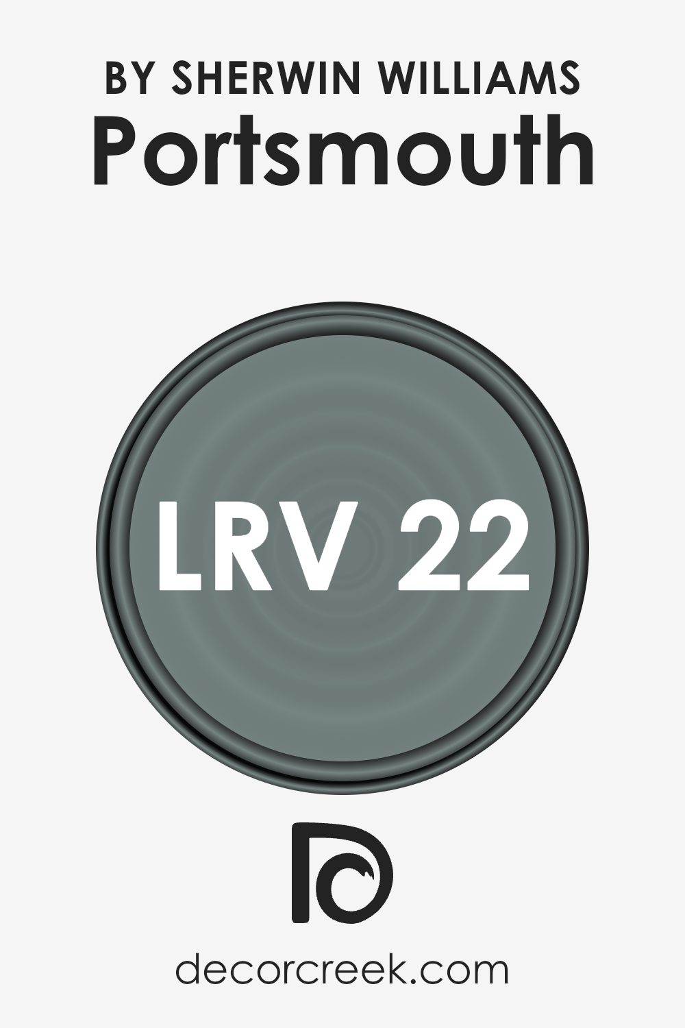
What is the LRV of Portsmouth SW 9644 by Sherwin Williams?
LRV stands for Light Reflectance Value, which measures the percentage of light a paint color reflects from or absorbs into a painted surface. Basically, it’s a metric that helps determine how light or dark a color will look once it’s on your walls. Higher LRV values mean the color reflects more light, making it appear lighter.
Conversely, lower LRV values mean the color absorbs more light, making it appear darker. This value helps in deciding how a color will feel in your space depending on how much natural or artificial light you have. It’s especially important in smaller or dimly lit rooms where a higher LRV can make the room feel more open and brighter.
Looking at the LRV of 21.942 for this specific color, it’s on the lower end of the scale, meaning it’s quite deep and absorbs more light than it reflects. This characteristic can make a room feel cozier and more enclosed. In spaces without much light, this color could make the room feel smaller and darker. However, if used in a well-lit area or combined with lighter colors and decor, it can add a rich, grounding effect and create a nice contrast. This makes it versatile for accent walls or for rooms where you want to generate a more intimate atmosphere.
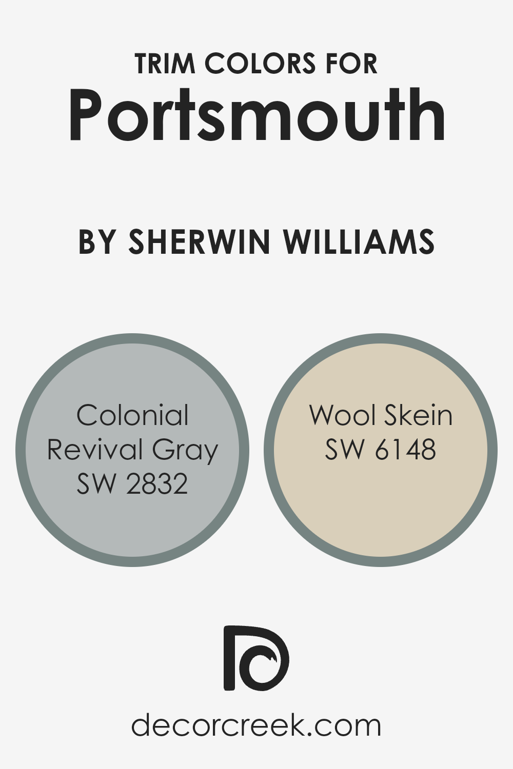
What are the Trim colors of Portsmouth SW 9644 by Sherwin Williams?
Trim colors are used to highlight and define architectural features and details on both the exterior and interior of buildings. They play a crucial role in framing and setting off the main color of a space, like the Portsmouth paint by Sherwin Williams, by providing contrast or complementing the overall design.
Choosing the right trim color can enhance the overall aesthetic appeal and can also impact the perceived size and shape of the space. For Portsmouth, colors like SW 2832 – Colonial Revival Gray and SW 6148 – Wool Skein are ideal trim choices because they can subtly complement its strong presence without overpowering it.
SW 2832 – Colonial Revival Gray is a gentle gray that can bring out the rich tones of Portsmouth by providing a subtle contrast. It helps in highlighting the trim details without being too stark or overwhelming, making it a good choice for those looking for a balanced look.
On the other hand, SW 6148 – Wool Skein is a lighter, warm neutral that offers a softer edge to the deeper tones of Portsmouth. This color can help in creating a smooth transition between different materials and textures, ensuring a harmonious look throughout the space.
Both these colors support the main hue without taking away from its character, making them practical options for enhancing the overall design.
You can see recommended paint colors below:
- SW 2832 Colonial Revival Gray
- SW 6148 Wool Skein
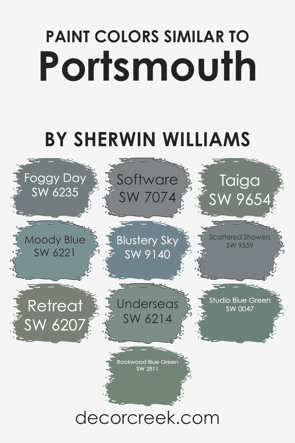
Colors Similar to Portsmouth SW 9644 by Sherwin Williams
Similar colors play an essential role in interior design by creating a harmonious atmosphere and aesthetic continuity. These similar hues can enhance the visual flow from room to room, making spaces feel more cohesive and well-planned.
Colors like Foggy Day and Moody Blue offer subtle variations that still relate closely, allowing designers to add layers of interest without overwhelming a space. For instance, Foggy Day brings a subdued, overcast sky-like tone, while Moody Blue deepens the mood with its richer, more contemplative blue that’s perfect for creating a relaxed vibe.
Further, Retreat and Rookwood Blue Green each add distinct but harmonious touches to a palette revolving around blue and green tones. Retreat has an earthy quality, offering a muted green that suggests a quiet, secluded ambience.
In contrast, Rookwood Blue Green dives into deeper, more historical hues that recall vintage aesthetics yet feel entirely modern. The use of Software, Blustery Sky, and Underseas illustrates how darker shades can be employed to generate dynamic contrasts, yet all three retain a comforting connection through their bluish undertones.
Software is a gray that hints at technological sleekness, Blustery Sky has a stormier presence, and Underseas introduces a nautical depth, reminiscent of marine depths. Similarly, Taiga, Scattered Showers, and Studio Blue Green expand this exquisite palette by offering green-centric shades that range from the mystic and leafy shades of Taiga, through the soft, delicate hue of Scattered Showers, to the subtle creativity evoked by Studio Blue Green. All these colors, though independent, collaborate seamlessly, creating visually soothing environments.
You can see recommended paint colors below:
- SW 6235 Foggy Day
- SW 6221 Moody Blue
- SW 6207 Retreat
- SW 2811 Rookwood Blue Green
- SW 7074 Software
- SW 9140 Blustery Sky
- SW 6214 Underseas
- SW 9654 Taiga
- SW 9559 Scattered Showers
- SW 0047 Studio Blue Green
How to Use Portsmouth SW 9644 by Sherwin Williams In Your Home?
Portsmouth SW 9644 by Sherwin Williams is a beautiful shade that can add a warm, welcoming touch to any room in your home. If you’re thinking about using this color, consider painting your living room or bedroom walls with it to create a cozy, inviting atmosphere.
This color also works well in a kitchen or dining area, as it complements wood finishes and brings a homey feel to spaces where you gather with family and friends.
Accents like curtains, cushions, or a throw rug in this color can also enhance a room with neutral walls, adding a subtle splash of warmth without overwhelming the space. Additionally, Portsmouth pairs nicely with light creams, soft blues, or even darker shades like charcoal, giving you plenty of options to mix and match decor items to suit your style and the existing elements in your home.
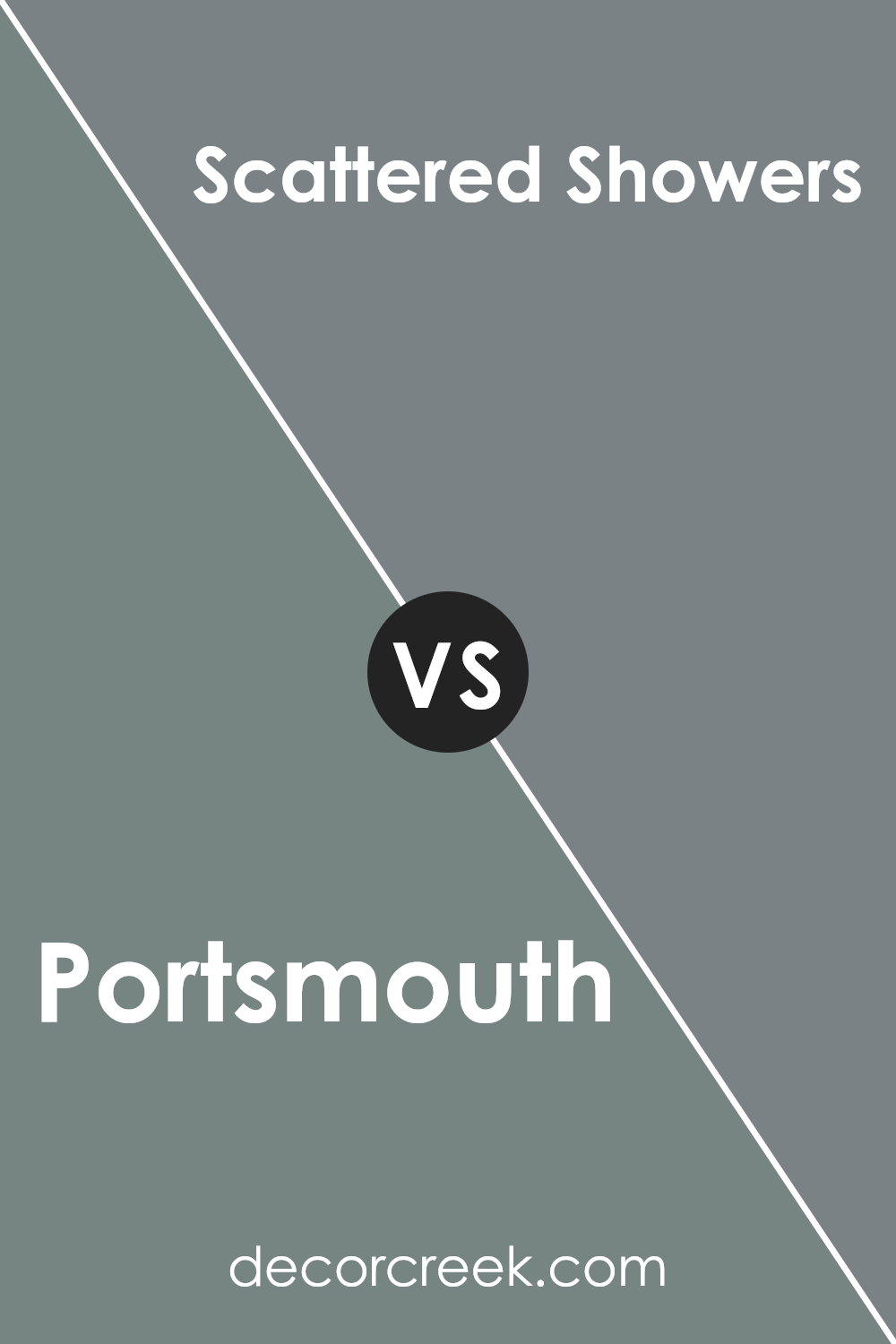
Portsmouth SW 9644 by Sherwin Williams vs Scattered Showers SW 9559 by Sherwin Williams
Portsmouth and Scattered Showers are two distinct shades by Sherwin Williams. Portsmouth is a deep, vibrant blue with a hint of green, giving it a strong and prominent presence in any space.
This color is great for making a statement or accenting a room that needs a touch of robust character. In contrast, Scattered Showers is a much lighter, softer gray that leans towards blue. It’s subtle and gentle, perfect for creating a calm and inviting atmosphere. This color works well in spaces where you want to promote a relaxed vibe, like bedrooms or bathrooms.
When comparing both, Portsmouth stands out as the bolder choice, ideal for feature walls or decor items, while Scattered Showers suits areas where a soothing effect is desired.
You can see recommended paint color below:
- SW 9559 Scattered Showers
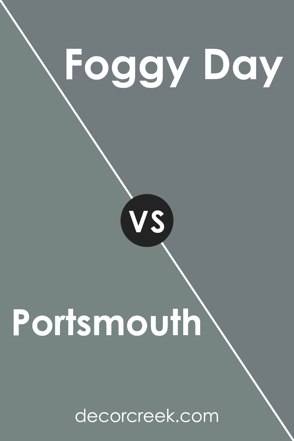
Portsmouth SW 9644 by Sherwin Williams vs Foggy Day SW 6235 by Sherwin Williams
Portsmouth and Foggy Day are two distinct paint shades from Sherwin Williams. Portsmouth is a deeper, richer blue that brings a strong, prominent presence to any space.
It tends to make a statement and can anchor a room with its solid hue. On the other hand, Foggy Day is a softer, neutral gray that offers a subtle, versatile backdrop suitable for many settings. This shade is quietly supportive and can easily blend with different decor styles without overpowering them.
Both colors are great choices, but their impact is quite different: Portsmouth adds a bold splash of color, while Foggy Day provides a gentle, understated elegance. They each create different moods and can work beautifully in various kinds of spaces depending on the effect you’re going for.
You can see recommended paint color below:
- SW 6235 Foggy Day
Portsmouth SW 9644 by Sherwin Williams vs Software SW 7074 by Sherwin Williams
Portsmouth and Software by Sherwin Williams are both unique in their own ways. Portsmouth is a lighter, more neutral color with a beige undertone, making it versatile and easy to use in any room. It gives off a warm and welcoming feel, suitable for spaces where you want a cozy atmosphere.
On the other hand, Software is a much darker shade, leaning towards a deep charcoal gray. This color is ideal for adding a bold statement or for creating contrast in a space that feels too bright. While Portsmouth reflects more light, making a room appear larger, Software absorbs light, which can make a space feel more enclosed but also more intimate.
Both colors can work well in different settings depending on the mood you want to create. They also pair nicely together for a balanced and harmonious look.
You can see recommended paint color below:
- SW 7074 Software

Portsmouth SW 9644 by Sherwin Williams vs Retreat SW 6207 by Sherwin Williams
Portsmouth and Retreat, two colors by Sherwin Williams, offer distinct vibes for any room. Portsmouth is a lighter, creamier beige with a soothing warmth that makes spaces feel welcoming and cozy. It is quite versatile, pairing well with both soft and bold color accents, infusing a gentle, inviting atmosphere wherever it’s used.
On the other hand, Retreat stands out with its deeper, gray-green hue. This color provides a more grounded, earthy feel, giving a room a sense of stability and calm. Retreat is perfect for spaces where you want to create a more focused, cozy environment, like studies or bedrooms.
Both colors work well in various settings, but while Portsmouth brightens a space with its creamy warmth, Retreat defines a space with its richer, more muted tones. This makes Portsmouth ideal for creating a light, airy feel, whereas Retreat is better for establishing a snug, sheltered ambiance.
You can see recommended paint color below:
Portsmouth SW 9644 by Sherwin Williams vs Taiga SW 9654 by Sherwin Williams
Portsmouth and Taiga are both paint colors by Sherwin Williams. Portsmouth is a deeper, rich navy blue that suggests a strong, traditional vibe. It’s a color that can make a space feel more grounded and cozy, perfect for creating a statement wall or for use in rooms where you want to instill a sense of calm and focus, like studies or bedrooms.
On the other hand, Taiga shifts away from the boldness of Portsmouth to offer a softer, muted green. This color is reminiscent of nature and can bring a fresh and calming energy to any room. It’s ideal for spaces where you want to promote relaxation and connection with the outdoors, like bathrooms or living areas.
Both colors have their unique appeal and can significantly influence the mood and style of a room, whether you’re looking for something more assertive and stately or gentle and soothing.
You can see recommended paint color below:
- SW 9654 Taiga
Portsmouth SW 9644 by Sherwin Williams vs Underseas SW 6214 by Sherwin Williams
Portsmouth and Underseas are two distinct shades by Sherwin Williams, each having their own unique character. Portsmouth is a deep, vivid blue with a strong presence, evoking the feeling of a bold, clear sky or a pristine ocean on a bright day. It’s quite punchy and can make a statement in any space, making rooms feel alive and dynamic.
On the other hand, Underseas is a darker, more subdued green with hints of blue. This color resembles the deep, mysterious parts of the ocean. It’s less bright than Portsmouth, offering a more grounded and calm aesthetic. This makes it ideal for areas where you want to induce a sense of calm and quiet.
Both colors bring their special touch to interiors but serve different moods and atmospheres. Portsmouth is more about vibrancy and energy, while Underseas leans towards a natural and soothing environment. They could potentially complement each other well, especially in a themed space that aims to capture the essence of natural waterscapes.
You can see recommended paint color below:
- SW 6214 Underseas
Portsmouth SW 9644 by Sherwin Williams vs Studio Blue Green SW 0047 by Sherwin Williams
Portsmouth SW 9644 by Sherwin Williams is a deep, rich navy blue with a slightly gray undertone. This color provides a strong backdrop, making it ideal for accent walls or furniture to create a bold statement. It can make a room feel cozy and comforting, owing to its dark and somewhat muted tone.
On the other hand, Studio Blue Green SW 0047 by Sherwin Williams is a softer shade, blending teal and green with a hint of gray. This color is lighter and provides a refreshing, calm atmosphere to any space. It’s versatile enough to be used in various settings, from bathrooms to bedrooms, without overpowering the space.
While both colors derive from a cool palette, Portsmouth leans towards a traditional, classy navy, while Studio Blue Green offers a more modern, gentle touch with its blend of blue and green. They each have unique vibes – Portsmouth providing depth and focus, and Studio Blue Green adding a fresh, airy feel.
You can see recommended paint color below:
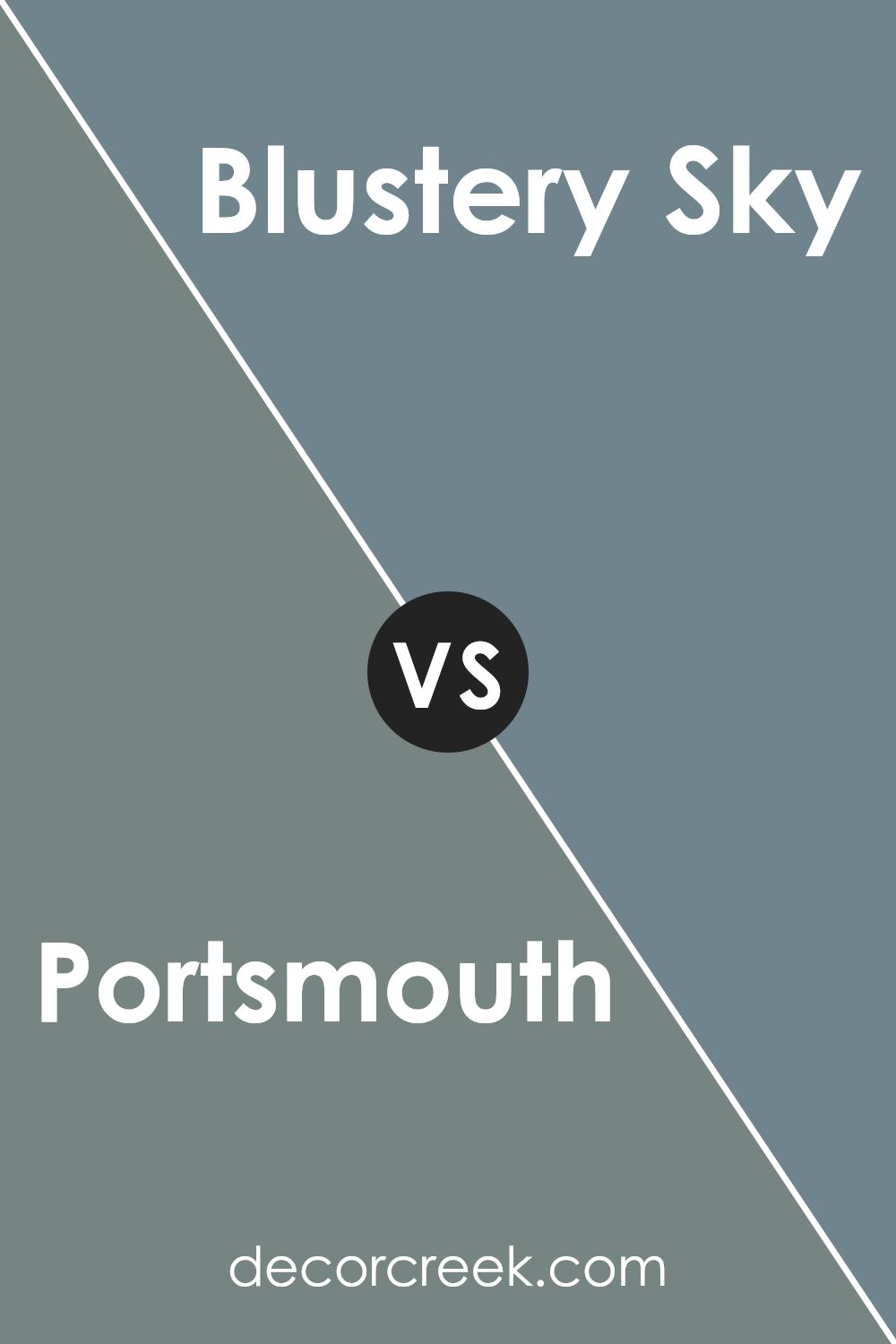
Portsmouth SW 9644 by Sherwin Williams vs Blustery Sky SW 9140 by Sherwin Williams
Portsmouth and Blustery Sky are two distinct colors by Sherwin Williams. Portsmouth is a dark teal color that holds a sense of richness and depth, making it an excellent choice for creating a strong visual impact in a space. It can give a room a more formal yet appealing atmosphere.
On the other hand, Blustery Sky is a lighter, softer blue with gray undertones. This shade is great for those looking to add a calm and gentle ambiance to their décor without being too bold. It can make spaces feel more open and airy. Both colors are versatile but cater to different aesthetic preferences and can coordinate well with various interior styles.
Portsmouth might be better suited for accent walls or furniture pieces, while Blustery Sky works well for larger areas, including bedrooms and bathrooms. Choosing between them depends on the mood you want to set and the natural light in your space.
You can see recommended paint color below:
- SW 9140 Blustery Sky
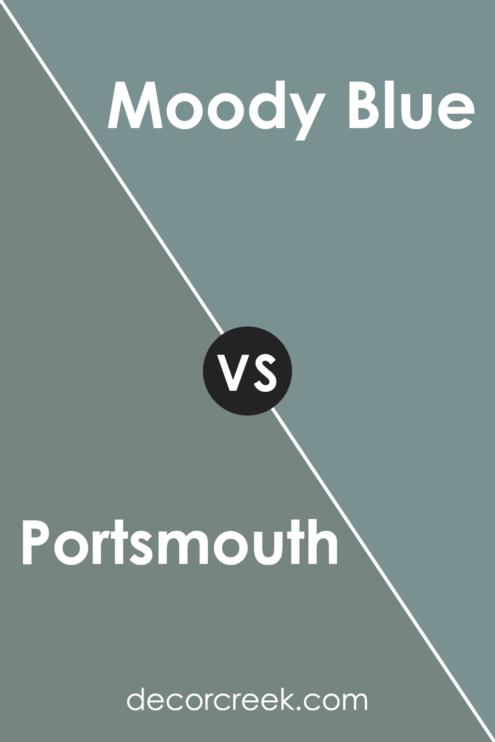
Portsmouth SW 9644 by Sherwin Williams vs Moody Blue SW 6221 by Sherwin Williams
Portsmouth and Moody Blue, both by Sherwin Williams, present unique tones for distinct decorating preferences. Portsmouth is a deep, rich blue with a gray undertone that gives it a calm and understated look. It’s ideal for spaces where you want a touch of color without overwhelming the room. This makes it great for living rooms or bedrooms where a peaceful atmosphere is desired.
Moody Blue, on the other hand, is a darker shade that leans towards teal but retains a strong blue essence. It has a more dramatic and intense appearance compared to Portsmouth. This color works well in areas that benefit from a bolder statement, like accent walls or bathroom cabinets.
Both colors offer their own charm and can dramatically change the mood of a space. While Portsmouth provides a subtle and soft background, Moody Blue brings vibrancy and depth, making it more striking. The choice between them depends on the visual impact you want to achieve in your space.
You can see recommended paint color below:
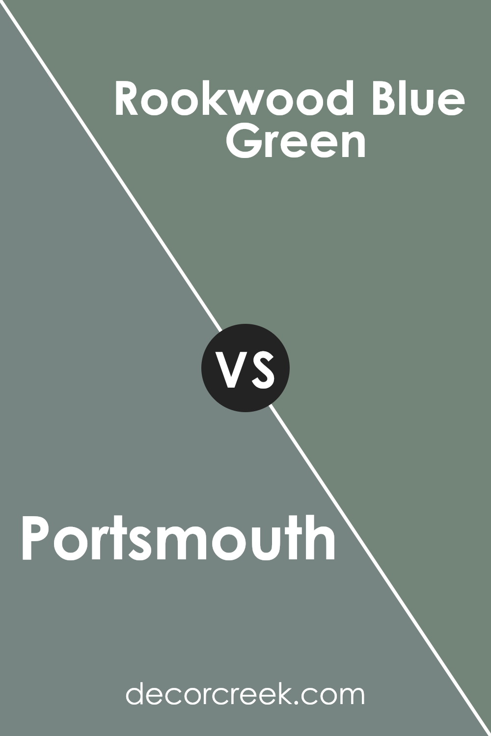
Portsmouth SW 9644 by Sherwin Williams vs Rookwood Blue Green SW 2811 by Sherwin Williams
Portsmouth SW 9644 is a warm, gentle beige with subtle gray undertones that make it a versatile choice for any space. It creates a cozy, inviting atmosphere that is easy on the eyes, pairing well with various decor styles and other colors. Because of its neutral tone, it serves as an excellent background, allowing furniture and artwork to stand out.
In contrast, Rookwood Blue Green SW 2811 has a richer, deeper hue that combines blue and green tones, leaning more towards a vintage aesthetic. This color is perfect for those looking to add a touch of personality and depth to a room. It works particularly well in spaces that benefit from a striking visual element, such as bathrooms or accent walls.
Both colors offer unique vibes: Portsmouth is soft and adaptable while Rookwood Blue Green provides a dynamic, slightly bold look that can act as a centerpiece in a design scheme.
You can see recommended paint color below:
- SW 2811 Rookwood Blue Green
Final Thoughts
As I finish writing about SW 9644 Portsmouth by Sherwin Williams, I’d like to share a few final thoughts. This color is amazing! It’s a kind of green that makes you think of a peaceful walk in a lush, green forest. It’s bright enough to make a room feel cheerful and welcoming, but it has a richness that adds a lovely depth to any wall it’s on. Portsmouth is perfect for anyone looking to give their room a fresh, natural feel without it being too bold or in your face.
I found that Portsmouth works really well in lots of different rooms. Whether it’s your living room, bedroom, or even the bathroom, this color brings a touch of nature indoors. It looks beautiful when paired with light woods, white trim, or soft creams, creating a cozy and warm environment that feels just right.
Overall, choosing SW 9644 Portsmouth could be a great decision if you’re looking to refresh your home with a new paint color. It’s calming, inviting, and just plain pretty.
It’s a color that I think would make anyone feel happy and at ease in their home.
Ever wished paint sampling was as easy as sticking a sticker? Guess what? Now it is! Discover Samplize's unique Peel & Stick samples.
Get paint samples

