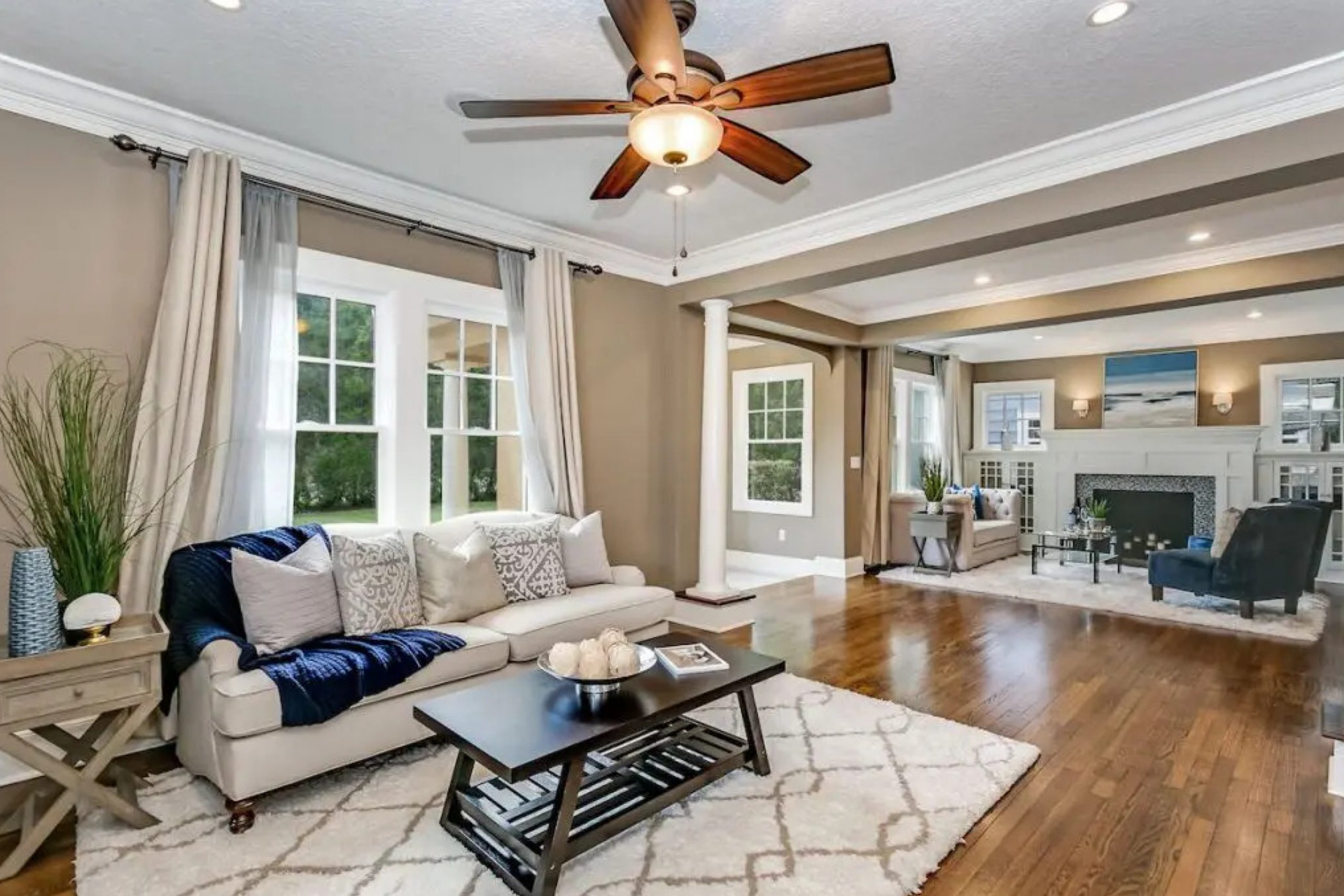
If you’re looking for a color that seamlessly blends warmth and versatility, SW 6100 Practical Beige by Sherwin Williams might just be your perfect pick. I recently had the chance to use this shade in a living room makeover, and I have to say, it’s wonderfully balanced. It’s not just a simple beige; there’s a subtle depth to it that plays beautifully with different types of lighting and complements a variety of decor styles.
I found that Practical Beige offers a cozy backdrop that suits spaces meant for relaxation and gatherings. It pairs well with soft whites and rich wood tones, bringing out a welcoming, homely feel. Whether you’re aiming to create a serene and inviting space or looking to set a sophisticated tone, this color has a soft, neutral canvas that encourages you to layer in your own personality with other colors and textures.
So if your space needs a touch of softness with the flexibility to match various furnishings and accents, Practical Beige could be an excellent choice.
It helps enhance the other elements in the room without overpowering them, ensuring that everything comes together just right.
What Color Is Practical Beige SW 6100 by Sherwin Williams?
Practical Beige by Sherwin Williams is a warm and neutral color that brings a cozy and inviting atmosphere to any space. It has a subtle richness that prevents it from appearing bland, making it an ideal backdrop for a variety of decorating styles. Its earthy tones help create a comfortable, lived-in feel, which is perfect for spaces where relaxation is key, such as living rooms and bedrooms.
This versatile color works exceptionally well with classic interior designs, such as traditional or rustic styles, due to its warm undertones that echo natural elements. It also fits beautifully in modern and minimalist decor when paired with clean lines and simple designs. Practical Beige acts as a soft base, allowing furniture and decor in brighter or bolder colors to stand out, while also complementing materials with natural textures.
When it comes to materials, Practical Beige pairs wonderfully with wood, from light pine to rich mahogany, enhancing the depth of wood grains. It also looks great with leather, adding to a room’s warmth, or with soft textiles like cotton and linen in both upholstery and draperies, creating a gentle and welcoming environment.
Metal accents in bronze or gold tones also work well with this color, adding a touch of warmth without overwhelming the subtle beauty of the beige.
Is Practical Beige SW 6100 by Sherwin Williams Warm or Cool color?
The color Practical Beige by Sherwin Williams is a versatile and warm shade of beige that can make homes feel cozy and welcoming. This paint color is ideal for those who want a neutral backdrop that works with a variety of decorating styles and colors. Whether you’re looking to paint a living room, bedroom, or even a kitchen, Practical Beige adds a gentle warmth without overpowering the space.
This shade is excellent for creating a soft, inviting atmosphere in a room. It pairs well with other neutral tones, but can also provide a balance to brighter colors, making them stand out without clashing.
In homes with natural light, Practical Beige looks especially beautiful as it reflects the light, enhancing the feeling of space and openness. It’s practical for families as well, hiding everyday marks and scuffs better than lighter colors would. Overall, Practical Beige is a great choice for anyone looking for a dependable and adaptable paint color for their home.
Undertones of Practical Beige SW 6100 by Sherwin Williams
Practical Beige is a versatile paint color that subtly incorporates various undertones, making it adaptive to different lighting and decor settings. Undertones are the hues that peek through the main color when exposed to different lighting or placed next to other colors. They play a crucial role in perception, as they can shift how a color looks depending on its environment.
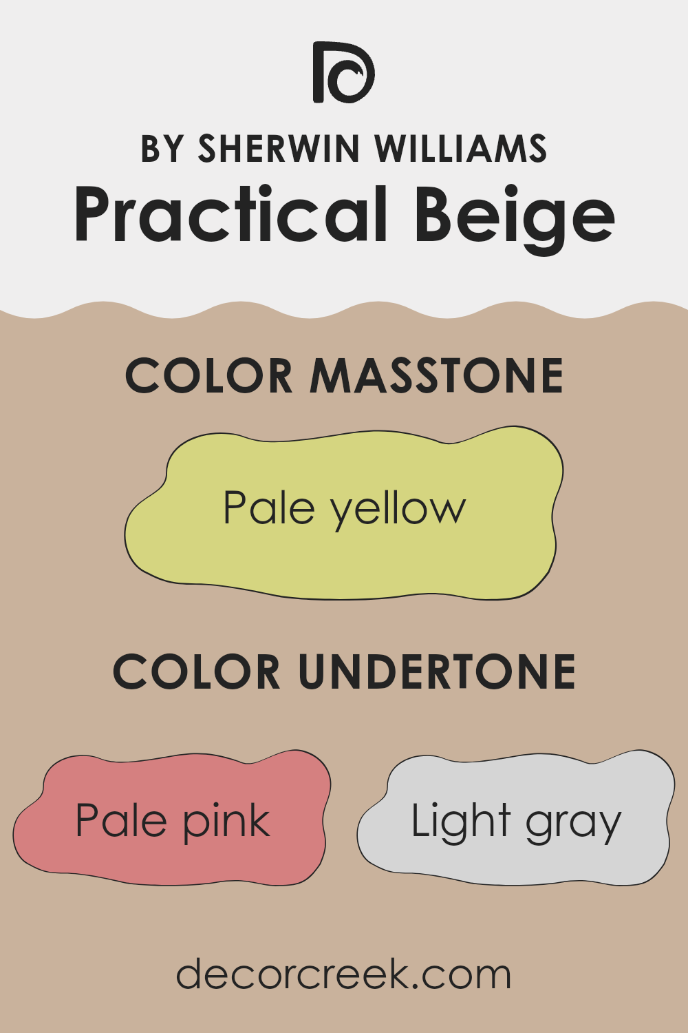
The undertones in Practical Beige are diverse, ranging from pale pink and light gray to light purple and mint. These slight color variations can influence the ambiance of a room. For example, pale pink and lilac undertones add a soft, warm feel, ideal for creating a cozy environment. In contrast, light gray and blue undertones introduce a cooler, more neutral vibe, which can make the space feel more open and airy.
When painted on interior walls, the effect of Practical Beige’s undertones is quite remarkable. Depending on the room’s natural and artificial lighting, the walls might appear warmer, inviting a calming atmosphere, or cooler, providing a crisp, modern look. This adaptability makes Practical Beige an excellent choice for various room styles and functions, from living rooms and bedrooms to home offices.
Moreover, additional undertones like mint, yellow, and light green can bring a slight vibrancy to the room, offering a subtle hint of color without overwhelming the senses.
This flexibility ensures that the walls can complement a wide range of furnishings and decor styles, making it easier to update the look of a space without needing a complete color overhaul.
What is the Masstone of the Practical Beige SW 6100 by Sherwin Williams?
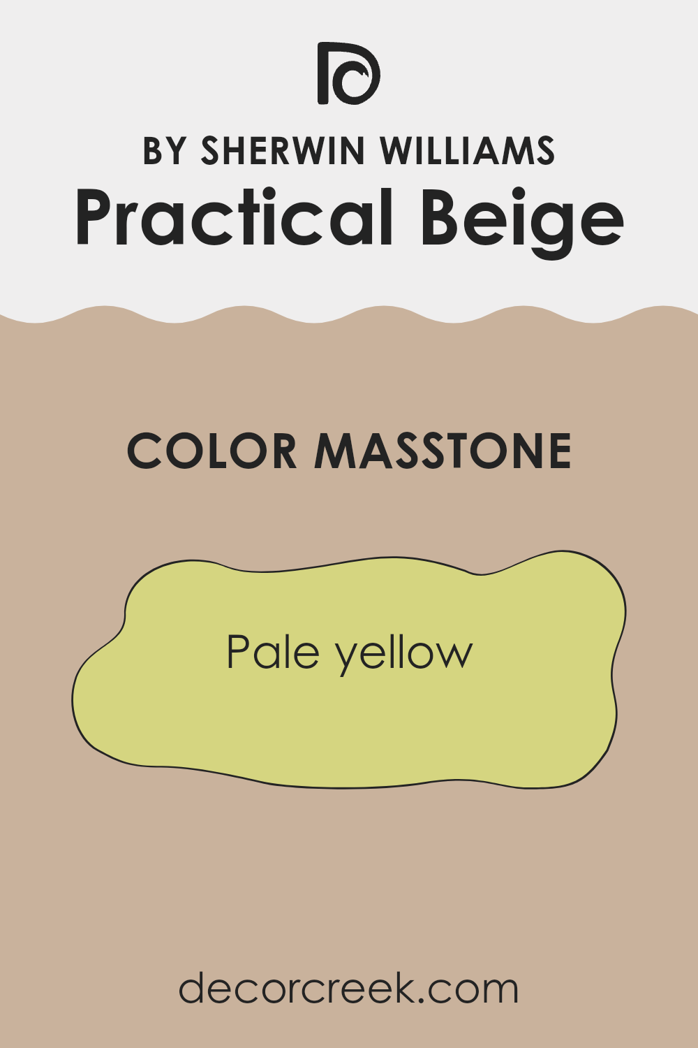
Practical Beige SW 6100 by Sherwin Williams has a masstone of pale yellow, displayed as color code #D5D580. This gentle and muted shade brings light and warmth into a space without being too bold or overpowering.
The subtle yellow undertone of this beige adds a touch of brightness, making it an excellent choice for rooms that could use a lift in energy and coziness. Whether used in a living room, bedroom, or hallway, this color offers a welcoming feel.
Its versatility also allows it to blend seamlessly with various decor styles, from modern to traditional. Furthermore, being a lighter shade, it helps small rooms appear more spacious and open. It’s a practical color choice for anyone looking to create a warm and inviting home environment.
How Does Lighting Affect Practical Beige SW 6100 by Sherwin Williams?
Lighting plays a crucial role in how we perceive colors. The same color can appear different under various lighting conditions due to the light’s intensity, source, and even the time of day. Different types of light can either warm up or cool down a color.
Taking the color Practical Beige as an example, its appearance can shift dramatically depending on the lighting. In artificial light, such as that from incandescent bulbs, this beige tends to look warmer and richer due to the yellow-orange tone of the bulb. This makes the space feel cozier and more inviting. In contrast, under fluorescent lighting, which is cooler, it may appear slightly duller and more muted, as these lights typically cast a blueish tone.
When it comes to natural light, the direction of the room plays a significant role in how Practical Beige looks. In north-facing rooms, where the light is cooler and more even throughout the day, this beige will have a softer, more subtle appearance. It won’t feel as warm because the light tends to be bluer, which can slightly wash out warmer colors.
In south-facing rooms, which receive the most sunlight throughout the day, Practical Beige will look warmly welcoming and vibrant, as the stronger, warmer light enhances its natural undertones. This setting is ideal to show off the richness of beige colors.
East-facing rooms get most of their light in the morning when the sun is rising. Here, Practical Beige will look bright and cheerful in the morning but might lose some of its luster as the day progresses and the sunlight fades.
Lastly, rooms facing west receive intense evening light. The color will look softer during the morning and become vivid and warm in the afternoon and evening as the sun sets. This can make evenings feel particularly cozy.
Understanding these differences can help in choosing the right paint for your room, ensuring that it always looks its best under any lighting.
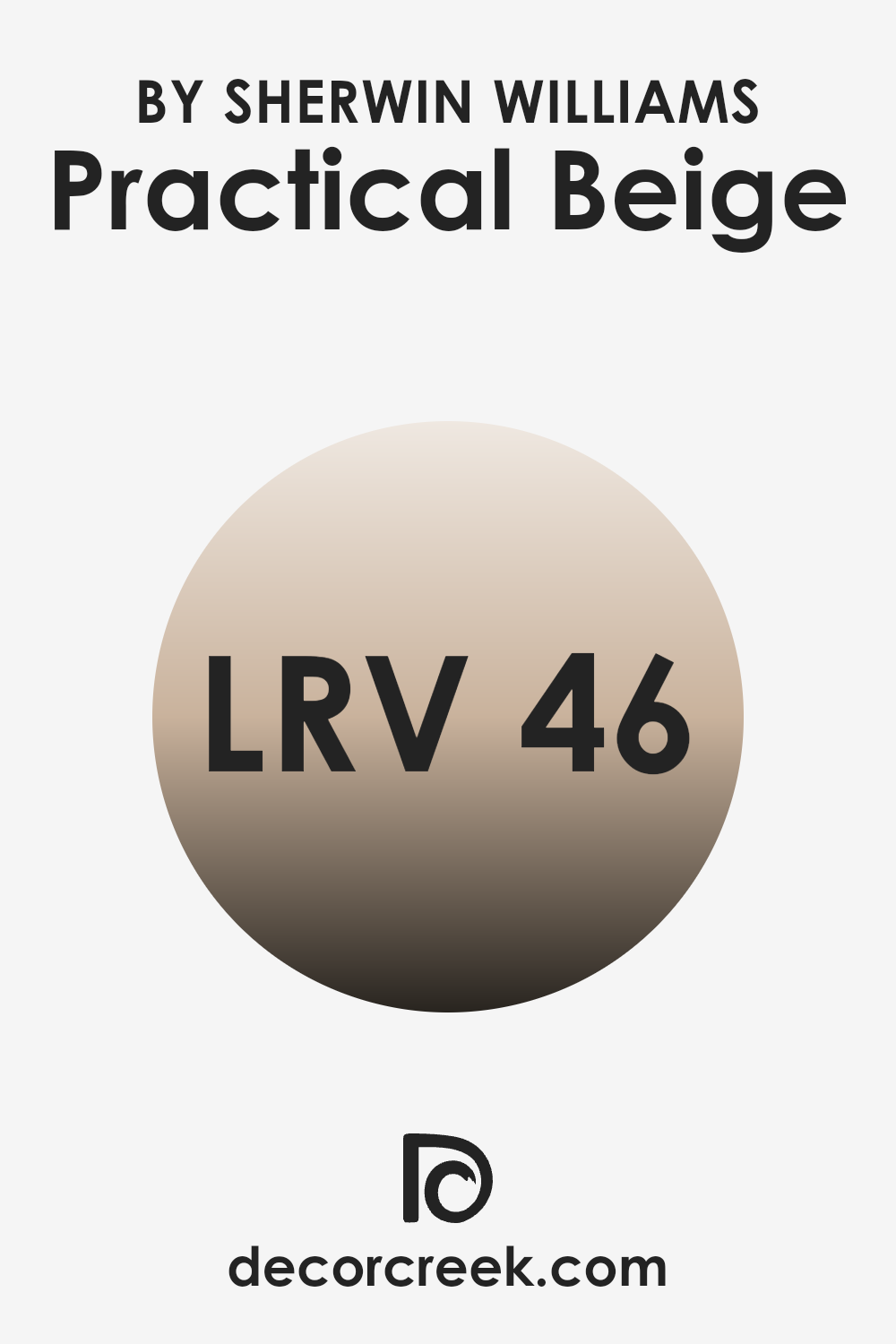
What is the LRV of Practical Beige SW 6100 by Sherwin Williams?
LRV stands for Light Reflectance Value, which measures the percentage of light a paint color reflects back into a room as compared to how much it absorbs. This value can range from 1 (very dark, absorbing most light) to 99 (very light, reflecting most light). Understanding LRV is crucial for homeowners and designers, because it helps predict how a color will look under different lighting conditions.
A higher LRV means the color appears lighter and can make spaces feel bigger and brighter, while a lower LRV usually makes a color look darker and can make rooms feel cozier or smaller.The LRV for Practical Beige, which is 46, indicates that it is a mid-tone color.
This means it neither reflects nor absorbs light excessively, but sits comfortably in the middle, providing a balanced look under most lighting conditions. In practical terms, a room painted in this shade will not appear overly bright or stark, nor too dark or confined. Instead, it will offer a soft, warm ambience, making it suitable for spaces where you want to strike a balance between cozy and welcoming without making the space feel tight or gloomy.
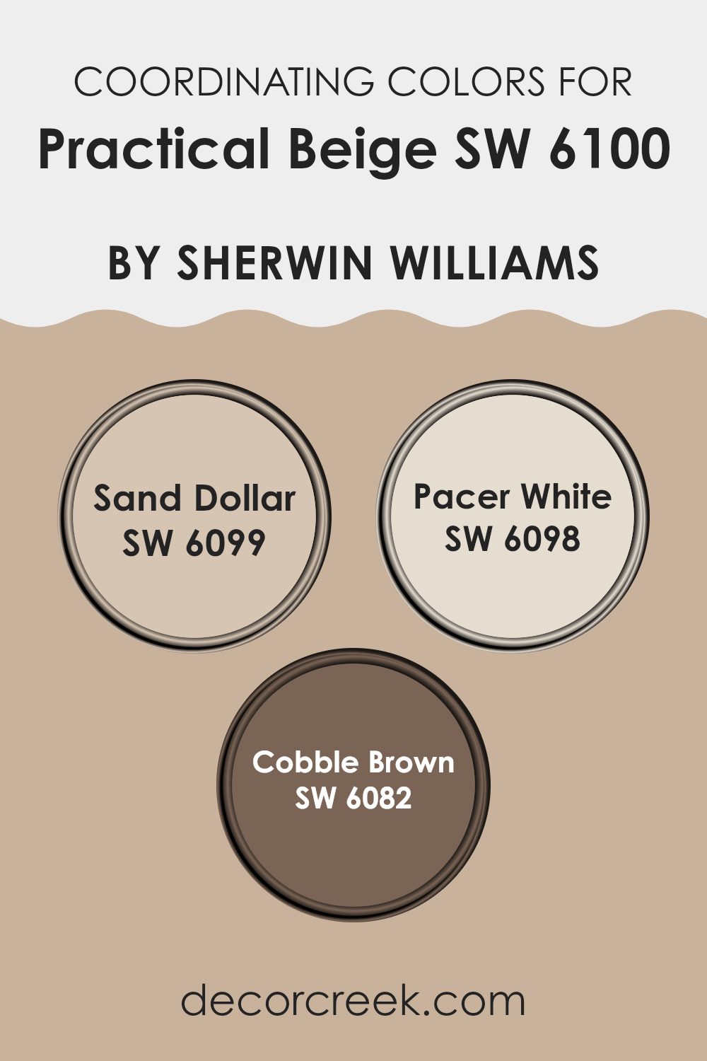
Coordinating Colors of Practical Beige SW 6100 by Sherwin Williams
Coordinating colors are chosen to complement a main color, enhancing its appeal and creating a cohesive look in a space. For instance, when working with Practical Beige SW 6100, a warm, neutral shade, picking the right coordinating colors ensures that the beige doesn’t appear bland. Such coordinating shades are selected for their ability to support and subtly contrast with the main color, enhancing the overall aesthetics without overpowering the primary hue.
Sand Dollar SW 6099, for instance, is a light, almost creamy color that offers a smooth transition from the deeper tone of Practical Beige, providing a gentle contrast that can make a room feel open and airy.
Pacer White SW 6098 is another great coordinating color, with an even lighter, more neutral presence that can help brighten spaces and bring a refreshed feel to a beige-themed room. Lastly, Cobble Brown SW 6082 serves as a robust complement, with its darker, richer earth tone that grounds the scheme, adding depth and warmth to spaces that feature Practical Beige as the main color.
You can see recommended paint colors below:
- SW 6099 Sand Dollar
- SW 6098 Pacer White
- SW 6082 Cobble Brown
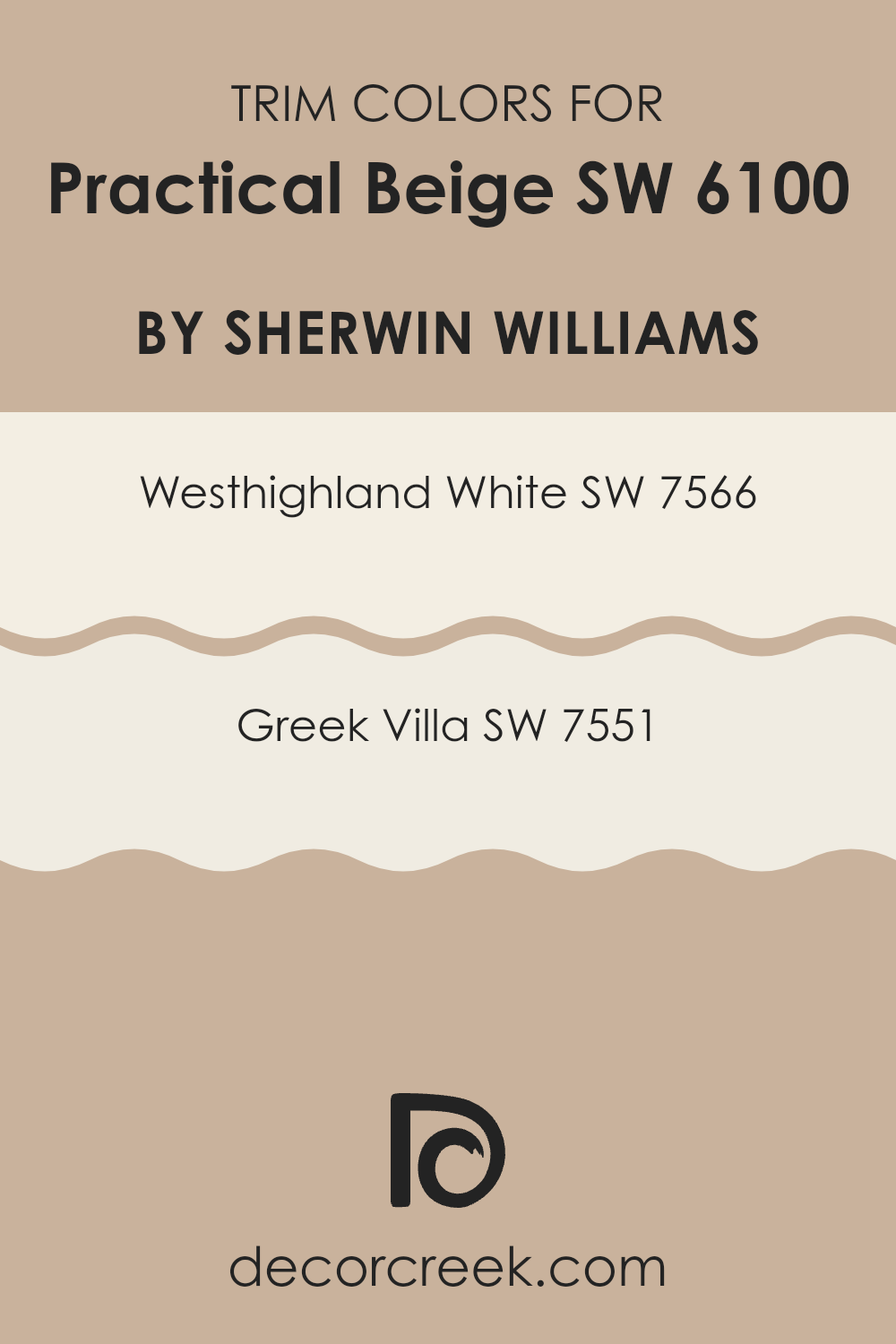
What are the Trim colors of Practical Beige SW 6100 by Sherwin Williams?
Trim colors are used on the moldings, door frames, window frames, baseboards, and other architectural features to enhance and complement the main color of a room, in this case, Practical Beige by Sherwin Williams.
Using the right trim color can provide a clean, finished look and help define and add crisp lines to the space. Choosing a trim color like SW 7566 – Westhighland White or SW 7551 – Greek Villa can highlight the lighter undertones in Practical Beige, creating a cozier and more inviting feel.
Westhighland White is a bright and crisp white that provides a strong contrast with softer beige tones, making it ideal for adding vibrancy and freshness to a room. Greek Villa, on the other hand, is a soft and warm off-white, offering a more subtle transition from the depth of Practical Beige.
This choice can help in softening the overall aesthetic, making the environment feel more relaxed and welcoming. Both colors are great for providing balance and enhancing the visual appeal of Practical Beige by adding depth and character to the living spaces.
You can see recommended paint colors below:
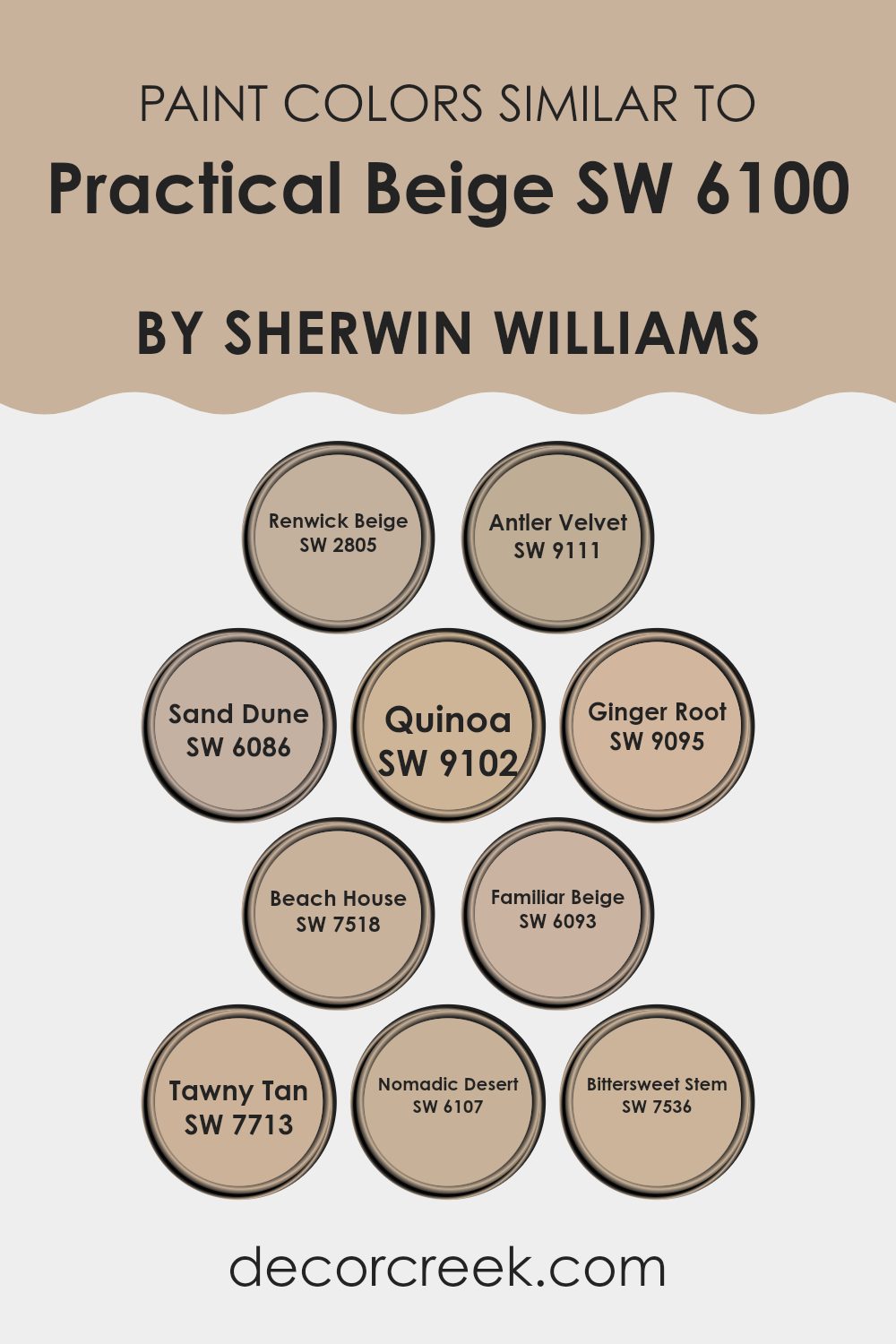
Colors Similar to Practical Beige SW 6100 by Sherwin Williams
Similar colors are crucial in the realm of interior design because they help to create a cohesive and harmonious look. By using shades like Renwick Beige, which has a touch of earthiness, or Antler Velvet, a softer, slightly grayer beige, designers can subtly vary the mood in different rooms while maintaining a unified palette throughout the home. Sand Dune adds a slightly darker touch, giving depth to the space without overwhelming it with too much darkness.
Beyond creating a balanced ambiance, similar colors such as Quinoa and Ginger Root can be strategically used to highlight architectural features or delineate different functional areas without the stark contrasts that can sometimes make a space feel disjointed.
Quinoa carries a warm, inviting tone, whereas Ginger Root offers a hint of a dusty rose undertone, perfect for adding a touch of warmth. Beach House and Familiar Beige are great for reflecting light, making them ideal for spaces that you want to appear more open and airy. Meanwhile, Tawny Tan and Nomadic Desert provide stronger earth tones that can ground a design scheme, adding a sense of stability and warmth. Finally, Bittersweet Stem, with its subtle green undertone, is excellent for introducing a slight, refreshing twist to an otherwise neutral palette.
You can see recommended paint colors below:
- SW 2805 Renwick Beige
- SW 9111 Antler Velvet
- SW 6086 Sand Dune
- SW 9102 Quinoa
- SW 9095 Ginger Root
- SW 7518 Beach House
- SW 6093 Familiar Beige
- SW 7713 Tawny Tan
- SW 6107 Nomadic Desert
- SW 7536 Bittersweet Stem
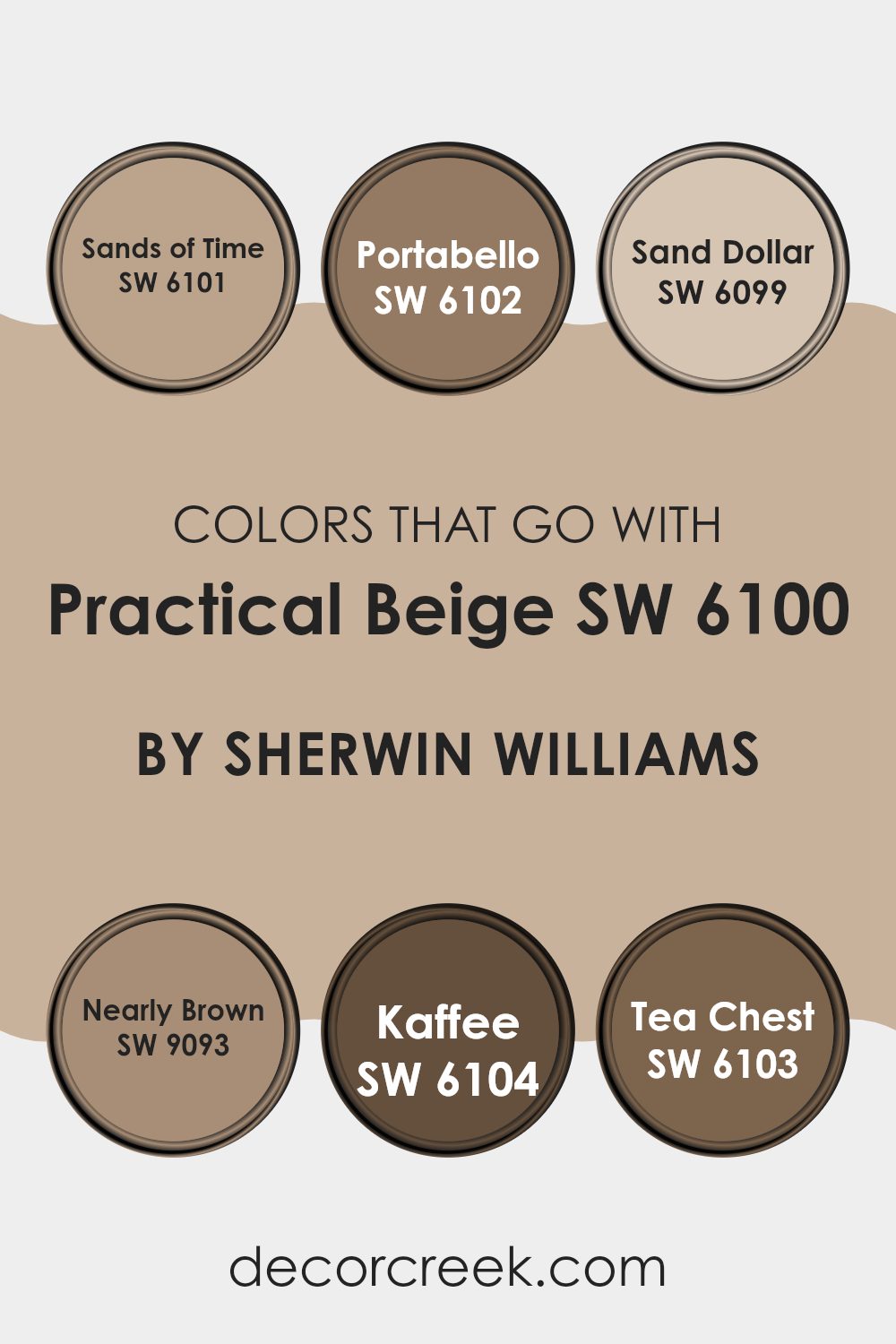
Colors that Go With Practical Beige SW 6100 by Sherwin Williams
Choosing colors that harmoniously complement Practical Beige SW 6100 by Sherwin Williams is crucial for creating a cohesive and appealing look in any space. Practical Beige is a warm, inviting base, and the selected coordinating colors, like Sands of Time SW 6101 and Portabello SW 6102, enhance its versatility and help in achieving a balanced decor. These complementary colors allow for a variety of designs from subtle and cozy to rich and enveloping atmospheres depending on which you choose to pair with Practical Beige.
Sands of Time SW 6101 is a gentle beige that slightly leans towards a lighter, creamier shade than Practical Beige, offering a soft contrast that brightens spaces subtly. Nearby, Portabello SW 6102 presents a deeper, earthy tone that draws from the brown family, providing a solid grounding effect that pairs nicely with lighter neutrals.
Sand Dollar SW 6099 is another lighter option, almost acting as a bridge between beige and soft white, enabling it to lighten a room beautifully without stark contrasts. Nearly Brown SW 9093 edges towards a deeper spectrum, resembling a dark taupe that works well for adding depth and interest. For those looking for a more dramatic flair, Kaffee SW 6104 offers a deep, rich brown that can create a striking feature when used appropriately.
Lastly, Tea Chest SW 6103 introduces a medium brown shade peppered with warm undertones, perfect for adding warmth and a semblance of nature-inspired comfort. Together, these shades offer a rich palette that complements Practical Beige, ensuring tasteful and lively interior spaces.
You can see recommended paint colors below:
- SW 6101 Sands of Time
- SW 6102 Portabello
- SW 6099 Sand Dollar
- SW 9093 Nearly Brown
- SW 6104 Kaffee
- SW 6103 Tea Chest
How to Use Practical Beige SW 6100 by Sherwin Williams In Your Home?
Practical Beige SW 6100 is a warm neutral paint color that offers a comforting and inviting atmosphere in any home. This shade is versatile, making it a great choice for many different spaces such as living rooms, bedrooms, and even kitchens. It pairs well with a variety of decor styles from rustic to modern.
When used in a living room, Practical Beige can help create a cozy vibe that makes guests feel welcome. In a bedroom, it provides a soothing backdrop, ideal for relaxing at the end of the day. For those looking to refresh their kitchen, this color works beautifully on walls and even on cabinets for a light, airy feel.
Additionally, Practical Beige can harmonize with brighter colors and works well with both light and dark furniture. This makes it easy to match with existing home furnishings and decorations. Whether you want a wall color that doesn’t overpower the room or something that can be a foundation for various color schemes, Practical Beige is a reliable choice.
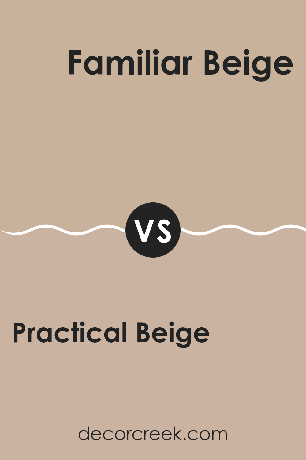
Practical Beige SW 6100 by Sherwin Williams vs Familiar Beige SW 6093 by Sherwin Williams
Practical Beige and Familiar Beige, both by Sherwin Williams, are quite subtle in their differences. Practical Beige leans a bit warmer and has a touch more depth, making it a solid choice for spaces where you want a cozy, welcoming feel. It’s great for living rooms and bedrooms where a slightly stronger color presence is desired without overwhelming the space.
On the other hand, Familiar Beige has a lighter, softer look, which can make small rooms appear bigger and more open. It’s especially suitable for areas that get a lot of natural light, as it reflects the light beautifully, keeping the space airy and fresh.
Both colors are versatile and neutral, fitting well with various decor styles and colors. Practical Beige works well with richer, darker furniture, while Familiar Beige pairs nicely with light woods and modern pastels. Choosing between them depends on your room’s size, lighting, and the mood you want to create.
You can see recommended paint color below:
- SW 6093 Familiar Beige
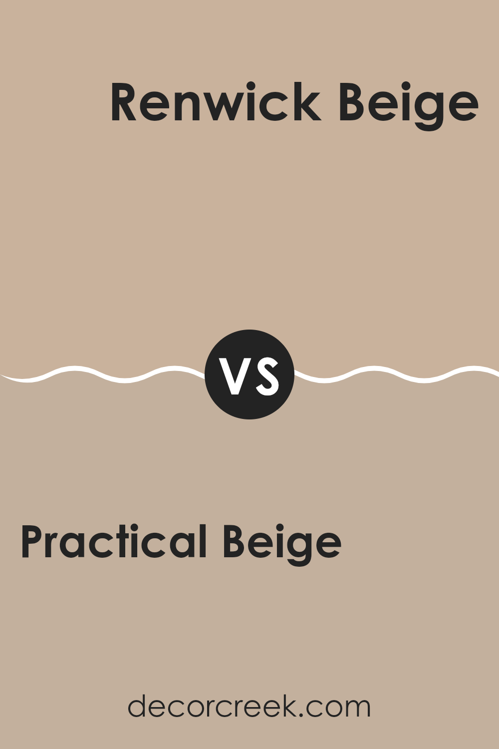
Practical Beige SW 6100 by Sherwin Williams vs Renwick Beige SW 2805 by Sherwin Williams
Practical Beige and Renwick Beige, both by Sherwin Williams, are similar yet distinct beige shades. Practical Beige leans towards a lighter, softer hue with a warm undertone that makes spaces feel welcoming and cozy. It’s a versatile color that works well in various rooms, providing a neutral background that complements a wide range of décor.
On the other hand, Renwick Beige is a deeper beige with a richer tone and slightly more saturation. This color adds a bit more warmth to spaces, making it ideal for areas where a more pronounced, yet still neutral, backdrop is desired.
It pairs well with stronger accent colors and larger furniture pieces, giving a room a grounded appearance. Both colors offer a neutral palette, but Practical Beige serves better in spaces needing a lighter touch, while Renwick Beige fits well in settings where a more substantial feel is desired.
You can see recommended paint color below:
- SW 2805 Renwick Beige
Practical Beige SW 6100 by Sherwin Williams vs Beach House SW 7518 by Sherwin Williams
Practical Beige and Beach House are two neutral colors by Sherwin Williams, each offering a distinct vibe to any space where they are used. Practical Beige is a warm and welcoming color, leaning towards a classic beige that carries a sense of warmth.
It’s perfect for creating a cozy and comfortable atmosphere in living rooms and bedrooms. On the other hand, Beach House has a cooler tone, reminiscent of a sandy beach on a cloudy day. This color is great for spaces where you want a touch of elegance without making the area feel too stark or chilly.
It works well in kitchens and bathrooms where the lighter, softer hue helps in making the space appear larger and more open. Together, these colors can complement each other beautifully in a home, offering a balanced palette that combines both warmth and subtlety.
You can see recommended paint color below:
Practical Beige SW 6100 by Sherwin Williams vs Tawny Tan SW 7713 by Sherwin Williams
Practical Beige and Tawny Tan are two paint colors by Sherwin Williams with subtle differences that might influence your choice depending on your decorating goals. Practical Beige is a lighter shade that can help make a small room feel bigger and brighter. It’s a versatile color that works well in various spaces, providing a soft, neutral backdrop that complements many decor styles and colors.
On the other hand, Tawny Tan leans towards a warmer, richer tone with a bit more depth than Practical Beige. This color can add a sense of warmth and coziness to a room, making it ideal for spaces where you want to create a more inviting atmosphere, such as living rooms or bedrooms.
Both colors offer their own unique benefits, with Practical Beige offering a more neutral and light-enhancing effect, while Tawny Tan brings warmth and depth. Your choice might depend on the mood you want to set and the particular characteristics of the room.
You can see recommended paint color below:
- SW 7713 Tawny Tan
Practical Beige SW 6100 by Sherwin Williams vs Nomadic Desert SW 6107 by Sherwin Williams
Practical Beige and Nomadic Desert are two colors by Sherwin Williams that offer subtle yet distinctive tones. Practical Beige is a soft, neutral beige that provides a calm and light atmosphere to any room. It works well in spaces where you want a clean and straightforward look without any fuss. This color pairs nicely with a wide range of decor, making it very versatile for home use.
In contrast, Nomadic Desert is a deeper beige that leans towards a sandy, warm hue. It brings a cozy warmth to the environment, making it ideal for spaces where you want to feel more enclosed and comfortable. It’s slightly richer than Practical Beige, offering a hint of warmth that can make large rooms feel more inviting.
Both colors are neutral, but the choice between them depends on the type of warmth you want to introduce and how prominent you want the color to be in your space. Nomadic Desert’s richer tone works better for creating a snug feel, while Practical Beige keeps things light and airy.
You can see recommended paint color below:
Practical Beige SW 6100 by Sherwin Williams vs Ginger Root SW 9095 by Sherwin Williams
“Practical Beige” and “Ginger Root” are two colors from Sherwin Williams that offer subtle, warm tones for your home. “Practical Beige” is a soft, light beige that has a clean and straightforward feel.
It works well in almost any space, providing a calm background that allows furniture and decorations to stand out. On the other hand, “Ginger Root” is a warmer hue with a slightly golden undertone. This color adds a bit more personality and warmth, making a room feel cozy and inviting.
While both colors are neutral, “Ginger Root” carries a bit more depth, making it ideal for spaces where you want a hint of warmth without overwhelming the senses. Whether you choose the lighter “Practical Beige” or the richer “Ginger Root,” both colors create a pleasant and welcoming atmosphere in your home.
You can see recommended paint color below:
- SW 9095 Ginger Root
Practical Beige SW 6100 by Sherwin Williams vs Bittersweet Stem SW 7536 by Sherwin Williams
Practical Beige is a warm, cozy beige color that can make any room feel welcoming and relaxed. It’s a versatile shade that works well in a variety of spaces, whether you’re painting a living room or a bedroom. This color pairs beautifully with both dark and light accents, making it easy to incorporate into any decor style.
Bittersweet Stem, on the other hand, is a deeper, grayish-green hue that brings a subtle touch of nature indoors. It’s perfect for creating a calm, grounded atmosphere in a space. This color is great for areas where you want to add a bit of sophistication without going too bold. It pairs nicely with wooden furniture and natural elements.
Both colors offer their unique charm and can significantly influence the mood of a room. Practical Beige is ideal for a universal, cozy backdrop, while Bittersweet Stem serves well in adding a gentle, nature-inspired touch to interiors.
You can see recommended paint color below:
- SW 7536 Bittersweet Stem
Practical Beige SW 6100 by Sherwin Williams vs Quinoa SW 9102 by Sherwin Williams
Practical Beige and Quinoa are both neutral shades, but they have different tones that could change the atmosphere of a room. Practical Beige is a soft, warm beige that has a creamy quality, making it easy to fit into many spaces without overwhelming them. It gives a cozy feel, perfect for living rooms or bedrooms where comfort is key.
On the other hand, Quinoa is a lighter shade, often coming off as a sandy color that carries a bit more freshness. Its brighter tone can make small spaces appear larger and more open, which is excellent for kitchens or small offices where you want to keep things light and airy.
Both colors are versatile and work well as bases that allow other colors in the decor to stand out. Practical Beige works best for adding warmth, while Quinoa is ideal if you’re looking to create a more open, refreshing space. Choosing between them would depend on the kind of vibe you want for your room.
You can see recommended paint color below:
- SW 9102 Quinoa
Practical Beige SW 6100 by Sherwin Williams vs Antler Velvet SW 9111 by Sherwin Williams
Practical Beige is a warm and soft beige that has a subtle cozy feel. It’s great for creating a welcoming and comfortable space that feels laid-back and homey. This color is versatile, pairing well with a wide range of other hues, making it a solid choice for any room in the house.
Antler Velvet, on the other hand, is a darker, slightly more saturated shade with brownish-grey undertones. This color lends a stronger, earthier quality to a space and can add a bit more drama or focus. Antler Velvet works especially well in areas where you want a bit more impact or depth on the walls.
Both colors are neutral, meaning they can easily fit into various decor styles without clashing with other colors. While Practical Beige is lighter and might make a room feel larger and airier, Antler Velvet, with its deeper tone, can make a space feel more grounded and cozy.
You can see recommended paint color below:
- SW 9111 Antler Velvet
Practical Beige SW 6100 by Sherwin Williams vs Sand Dune SW 6086 by Sherwin Williams
Practical Beige and Sand Dune are both warm neutrals from Sherwin Williams, but there are distinct differences between them. Practical Beige is lighter and leans towards a creamy, soft beige that gives a room a bright and airy feel. It blends well with various decor styles and brings a sense of calm to spaces without making them feel bland.
On the other hand, Sand Dune has a deeper, more grounded tone. This color is closer to a tan or khaki, providing a stronger sense of warmth and coziness. It works well in areas where you want to add a bit more character or need a color that holds its own against other bold features in a room.
Both colors work well in multiple spaces, from living rooms to bedrooms. Practical Beige is better for those who prefer a lighter room atmosphere, while Sand Dune suits those looking for a cozier, more enclosed feel. These subtle differences make each color unique in setting the mood and style of a space.
You can see recommended paint color below:
In wrapping up my thoughts on Sherwin Williams’ SW 6100 Practical Beige, this paint color has proven itself as a solid choice for anyone looking to freshen up their home. I’ve learned that Practical Beige is like the super friendly kid in class that gets along with everyone. It works well with all sorts of colors, whether they’re loud and colorful or more chilled out. It’s also very forgiving, meaning if you mess up a little bit when you’re painting, it won’t be too noticeable, which is super helpful!
I found out that because Practical Beige is such a calm color, it makes any room feel warmer and more welcoming, without making things look too flashy. It’s perfect for living rooms, bedrooms, and even the kitchen, adding just the right amount of warmth.
Overall, choosing Practical Beige can be a really smart move if you’re trying to decide on a new color for your walls. It’s pretty, not too bright or too dark, and it goes well with almost everything.
Plus, it makes the area feel cozy, which is always nice. I definitely think it’s a paint color that can make your home look and feel lovely without too much effort.
Ever wished paint sampling was as easy as sticking a sticker? Guess what? Now it is! Discover Samplize's unique Peel & Stick samples.
Get paint samples

