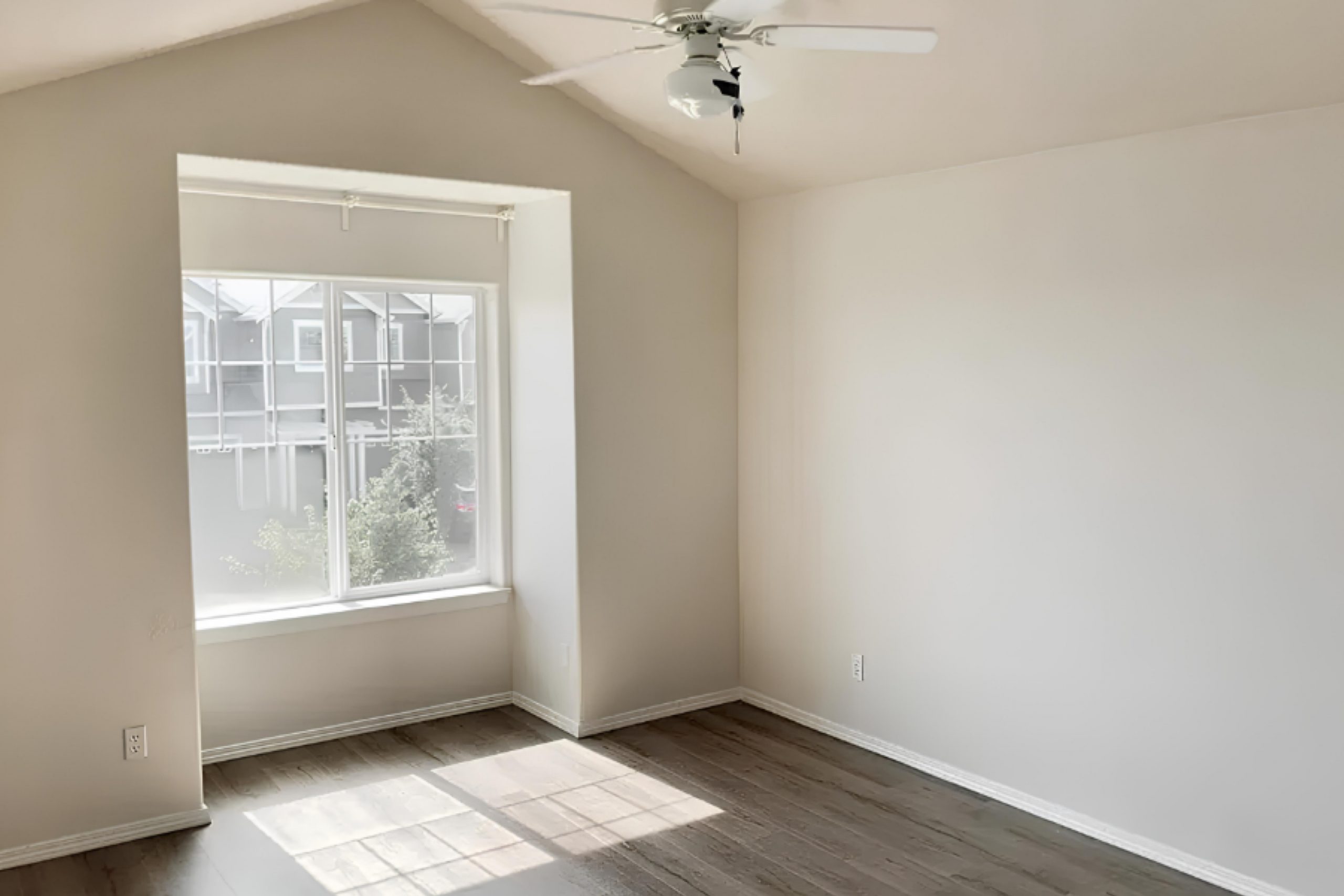
SW 6098 Pacer White by Sherwin Williams is a color that stands out for its simplicity and warmth. When I first applied it to my walls, it brought a sense of coziness and brightness to the space that I hadn’t experienced before. Its soft, warm undertone adds just the right amount of warmth without overwhelming the room. Pacer White works seamlessly with various design elements, making it a versatile choice for any home.
In natural light, it shines with a gentle glow, while under artificial lighting, it maintains its inviting charm. This color pairs beautifully with both bold and subtle shades, allowing you to mix and match with ease.
Whether you’re looking to refresh a living room, bedroom, or even a hallway, Pacer White offers a neutral backdrop that can either stand alone or complement other shades in your decor.
For anyone considering a fresh start with their interior, Pacer White offers a timeless option that won’t go out of style. It brings a sense of calm and clarity that can transform a space without requiring a complete overhaul, making it an ideal choice for those who appreciate subtlety and elegance in their home environment.
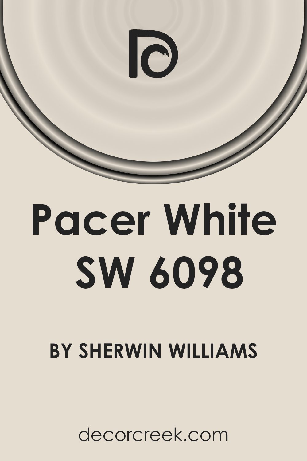
What Color Is Pacer White SW 6098 by Sherwin Williams?
Pacer White by Sherwin Williams is a soft, off-white color with a warm undertone.
This gentle shade brings a sense of light and openness to a room, making it a versatile choice for various interior styles. It fits seamlessly into traditional settings, adding a classic and welcoming feel. In a modern or minimalist space, its subtle warmth softens the edges, creating a cozy atmosphere without overwhelming the senses.
This color pairs beautifully with natural materials like light or medium-toned woods, which highlight its warmth. It also complements soft textiles such as linen, cotton, and wool, adding depth and comfort to a room. For a touch of contrast, use metals like brushed brass or aged bronze. These provide a subtle shine that works well with Pacer White’s understated elegance.
In a coastal or farmhouse style home, Pacer White enhances the airy, relaxed vibe when combined with gentle blues or greens.
Accents of natural fibers like jute or rattan further enhance its appeal. In a more contemporary setting, pair it with clean lines and smooth surfaces to highlight its simplicity. Overall, Pacer White is a versatile choice that can adapt to various decor elements while maintaining a warm, inviting environment.
Is Pacer White SW 6098 by Sherwin Williams Warm or Cool color?
Pacer White (SW 6098) by Sherwin Williams is a versatile paint color that brings a warm and inviting feel to homes. Its neutral tone has a subtle hint of beige, making it a great choice for a variety of spaces. This color works well in living rooms, kitchens, and bedrooms by creating a cozy and calm atmosphere. Pacer White complements both traditional and modern furnishings, allowing for flexibility in decor.
Because it reflects light well, Pacer White can make spaces feel larger and more open, which is especially useful in smaller rooms or areas lacking natural light.
It pairs nicely with a range of other colors, from bold accents to softer, muted shades. When used on walls, it provides a neutral backdrop that allows artwork and furniture to stand out. Overall, Pacer White is an excellent option for those seeking a warm and adaptable color for their home interiors.
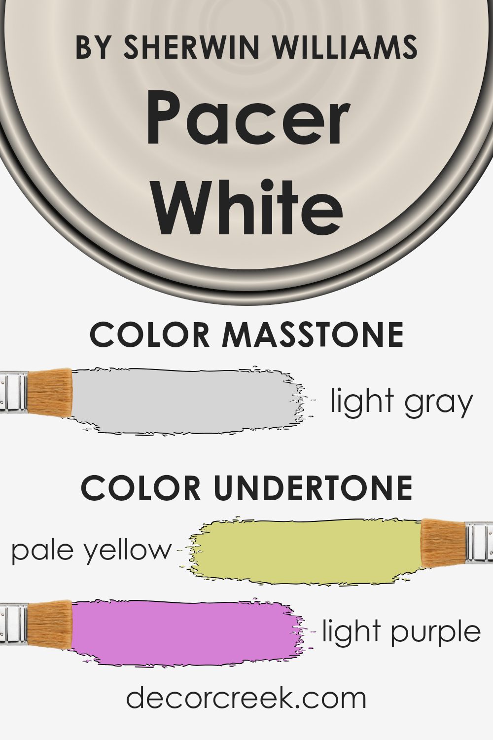
Undertones of Pacer White SW 6098 by Sherwin Williams
Pacer White by Sherwin Williams is a versatile color with various subtle undertones that can change its appearance depending on the lighting and surroundings. These undertones include pale yellow, light purple, light blue, pale pink, mint, lilac, and grey. Each of these undertones can influence how we perceive the main color.
When a paint like Pacer White has pale yellow undertones, it can appear warmer and more inviting, especially in rooms with plenty of natural sunlight. This can make a space feel cozier. On the other hand, light purple and lilac undertones might give a slightly cooler and more contemporary feeling, which could be seen in shadowed areas or under artificial lighting.
The light blue and mint shades can infuse a sense of freshness and calmness to a room, making it feel open and airy, especially during the daytime. The pale pink undertones can add a gentle and soft touch without being overly feminine. Lastly, the grey undertones provide balance and neutrality, allowing the color to pair well with many other colors in a home.
Overall, the subtle undertones in Pacer White can make it appear different throughout the day and in various lighting conditions, affecting the atmosphere of any room where it is used.
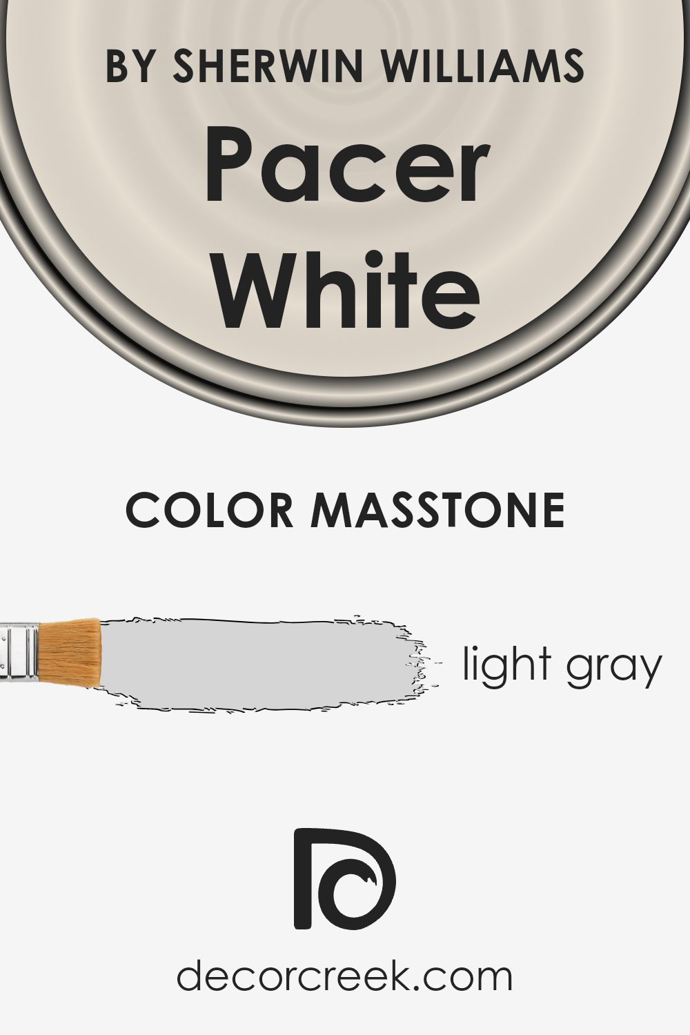
What is the Masstone of the Pacer White SW 6098 by Sherwin Williams?
Pacer White (SW 6098) by Sherwin Williams is a light gray color, with the masstone being a soft, muted shade of gray (#D5D5D5). This gentle hue pairs well with a variety of home styles and color schemes. It is versatile, providing a neutral backdrop that works in almost any space.
The light gray tone brings a sense of balance and calm, making it ideal for living rooms, bedrooms, or even bathrooms.
Its understated nature helps it blend well with both warm and cool colors. It can lighten a room without overwhelming it, which is particularly beneficial in smaller spaces or areas with limited natural light. Additionally, it complements wooden furniture and details beautifully, allowing these elements to stand out.
Moreover, Pacer White offers a modern touch, making rooms feel airy and spacious. Its ability to harmonize with multiple designs and color palettes makes it a popular choice for many homeowners.
How Does Lighting Affect Pacer White SW 6098 by Sherwin Williams?
Lighting plays a significant role in how we perceive colors, and this can particularly impact how a paint color looks in various settings. Pacer White, by Sherwin Williams, is a warm, earthy off-white color. Its appearance can change dramatically under different lighting conditions.
In natural light, Pacer White will usually appear as a warm, soft beige. In a north-facing room, which generally has cooler, grayish light, Pacer White may lean more towards a cooler, muted tone. This is because the soft, indirect light from the north lacks the brightness and warmth of the sun. As a result, colors can appear more subdued and slightly grayer.
In south-facing rooms, which receive warm, bright sunlight for most of the day, Pacer White will show its true warmth and creaminess. The natural daylight enhances its undertones, making it glow and feel more inviting and cozy. This makes south-facing rooms an excellent choice if you want to highlight the warmer undertones of the color.
East-facing rooms get direct sunlight in the morning, which is warm and bright but turns cooler as the day progresses. In such rooms, Pacer White will look quite warm and welcoming in the morning light, but it can shift to a more neutral tone by the afternoon.
West-facing rooms experience opposite light conditions to east-facing ones. In the morning, they receive indirect, cooler light, causing Pacer White to appear more muted. However, as the afternoon progresses and the sun shifts, the rooms are flooded with warm light, enhancing the color’s creamy and cozy feel.
Under artificial light, the impact on Pacer White will depend on the type of bulbs used.
Incandescent and warm LED lights can enhance its warm tones, while cool LED or fluorescent lights might make it appear slightly more subdued or grayer. It’s essential to consider these elements to ensure the color meets your expectations in any space.
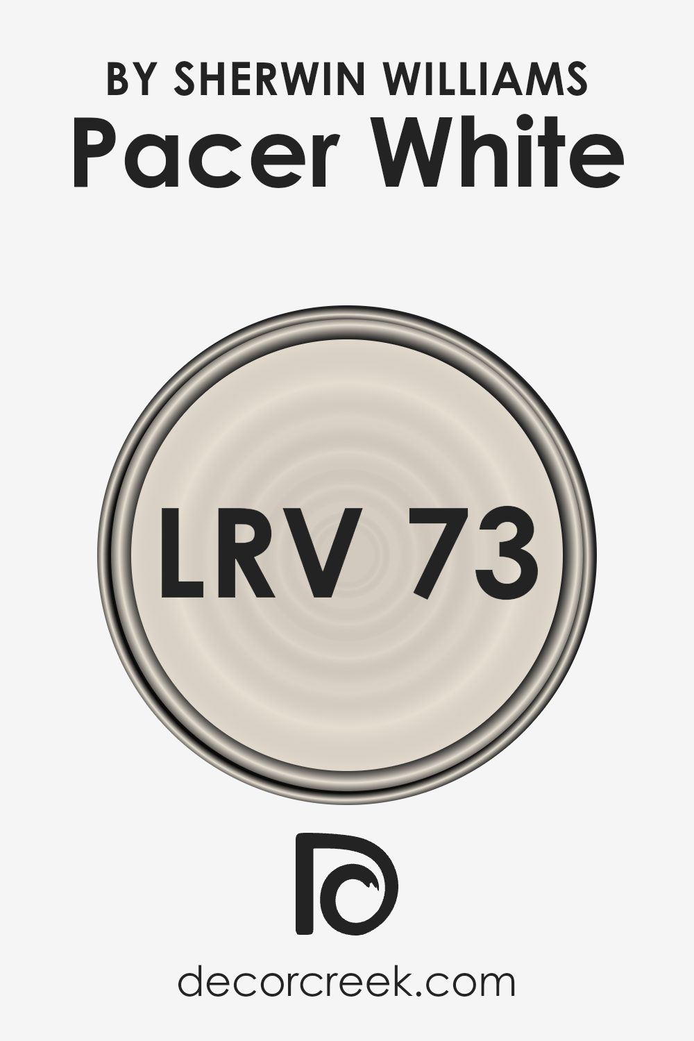
What is the LRV of Pacer White SW 6098 by Sherwin Williams?
LRV stands for Light Reflectance Value, which measures the amount of light a color reflects. It ranges from 0 to 100, where 0 means the color absorbs all light (like black), and 100 means it reflects all light (like white). The LRV is important because it influences how colors appear in different lighting conditions.
In rooms with little natural light, a higher LRV can help make the space feel brighter and more open, as it reflects more light around the room. Conversely, colors with a low LRV can make a space feel more intimate and cozy, absorbing more light and potentially making the room feel smaller.
For Pacer White, which has an LRV of 72.792, this means it is on the lighter side of the scale, reflecting a good amount of light. This makes it a versatile color choice for walls because it can help brighten a room, making it feel airy and spacious.
In rooms with plenty of natural light, Pacer White will enhance the brightness, while in dimmer spaces, it will help prevent the room from feeling too dark. Being a light color, it pairs well with both cool and warm color palettes, allowing it to work in a variety of settings and styles.
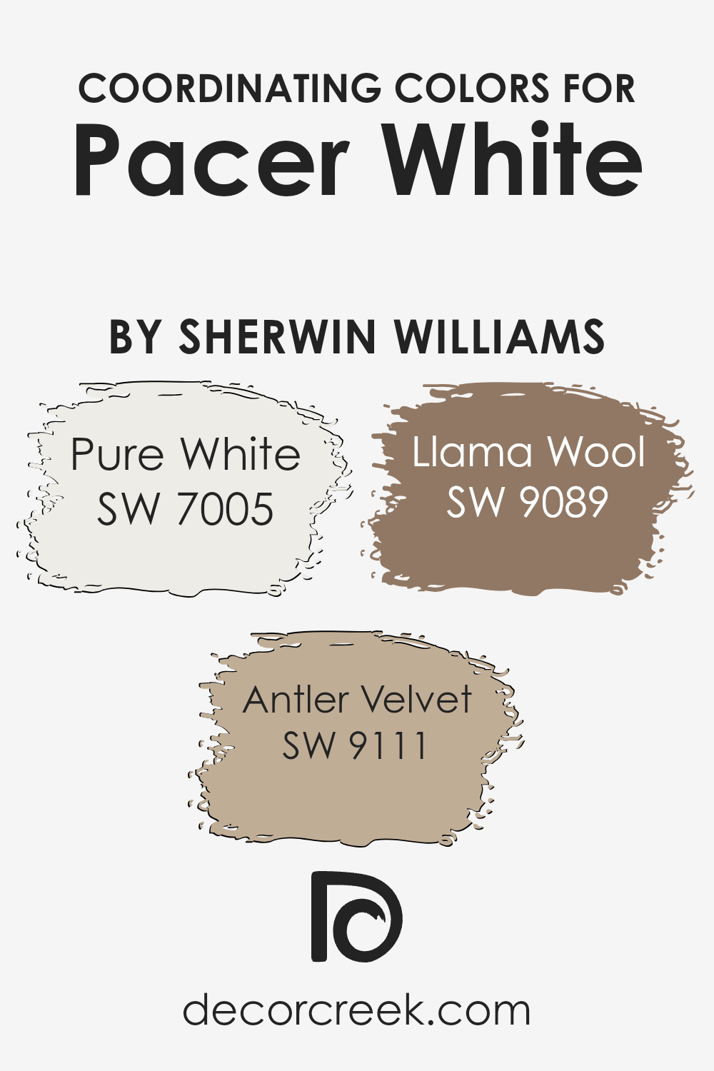
Coordinating Colors of Pacer White SW 6098 by Sherwin Williams
Coordinating colors are hues that complement each other, creating a harmonious and pleasing look when used together in a space. Pacer White by Sherwin Williams is a warm, inviting shade that serves as an excellent base.
To enhance this shade, you can pair it with other compatible colors like Pure White, Antler Velvet, and Llama Wool. These colors work together by sharing undertones or contrasting appealingly to balance each other out, adding depth and interest to a room.
Pure White is a clear, crisp white that offers a clean backdrop without overpowering other colors. It works well alongside Pacer White by highlighting its soft warmth, providing a fresh and airy feel. Antler Velvet is a rich, earthy brown that adds a touch of coziness and sophistication.
Its depth contrasts nicely with the lighter Pacer White, making it perfect for accent walls or furniture.
Wool, on the other hand, is a soft, muted beige with a hint of gray, which subtly complements Pacer White by adding a gentle warmth and softness. Together, these colors can create a balanced and inviting environment, suitable for both modern and traditional interiors.
You can see recommended paint colors below:
- SW 7005 Pure White
- SW 9111 Antler Velvet
- SW 9089 Llama Wool
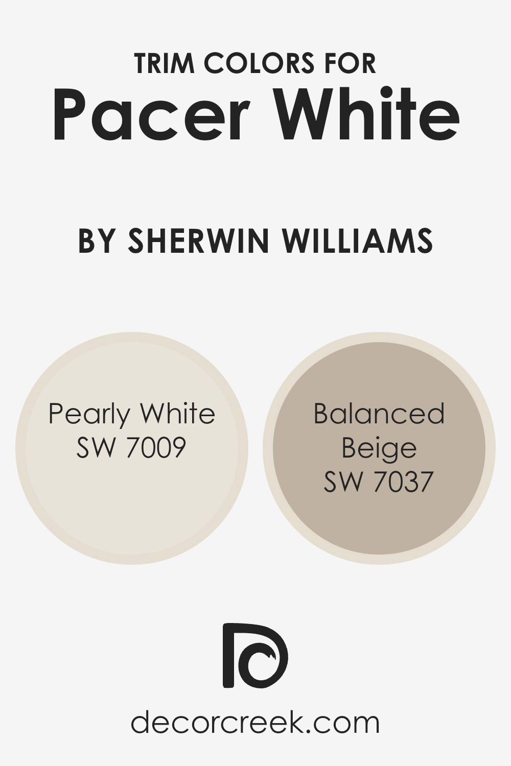
What are the Trim colors of Pacer White SW 6098 by Sherwin Williams?
Trim colors are the shades applied to the moldings, baseboards, and door frames of a room, which serve to outline and highlight designs around windows and doors. They play a crucial role in completing the look of a room, offering contrast or complementing the main wall color.
Using trim colors like SW 7009 – Pearly White and SW 7037 – Balanced Beige can greatly enhance the appearance of a space painted in Pacer White by Sherwin Williams.
These trim colors provide clear outlines and make each architectural feature stand out, while Pacer White acts as a soft and welcoming backdrop. The right trim colors can tie all of the room’s elements together, ensuring that the overall design feels cohesive and intentional.
Pearly White is a gentle, off-white shade that offers a subtle brightness without being too stark, making it versatile to pair with most colors, including Pacer White.
It gives a clean and classic finish to the trim, acting as a perfect neutral that quietly enhances the wall color. On the other hand, Balanced Beige introduces a warm and inviting touch.
As a trim color, it adds depth and warmth that contrasts nicely with the lighter Pacer White, providing a cozy yet refined result. By using these two distinct trim options, the room can achieve either a light and airy feel or a more grounded and warm atmosphere, depending on the desired mood.
You can see recommended paint colors below:
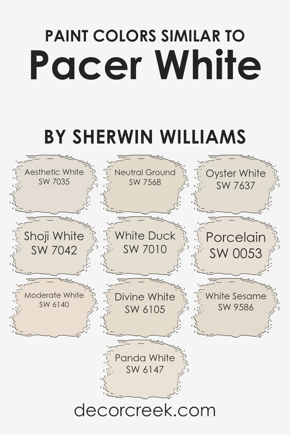
Colors Similar to Pacer White SW 6098 by Sherwin Williams
Similar colors to Pacer White by Sherwin Williams play an important role in creating a harmonious and cohesive space. These colors are chosen for their subtle differences, allowing them to work well together while maintaining a unified look. Aesthetic White (SW 7035) is a soft, warm white that brings a gentle touch to any room. Shoji White (SW 7042) offers a minimalist feel with its hint of beige undertone.
Moderate White (SW 6140), with its creamy texture, adds warmth to interior spaces without overpowering them. Panda White (SW 6147) introduces a touch of gray, creating a calm and neutral vibe that pairs beautifully with other natural colors.
Neutral Ground (SW 7568) is an off-white with beige undertones that adds a grounded feel to any design. White Duck (SW 7010) leans toward the gray spectrum, making it ideal for modern settings. Divine White (SW 6105) provides a subtle, inviting warmth without being too bright. Oyster White (SW 7637) is a versatile off-white with a hint of gray, perfect for subtle contrast.
Porcelain (SW 0053) brings a classic and timeless feel with its clean, pure appearance, while White Sesame (SW 9586) gives a touch of warmth and softness. Each of these colors complements Pacer White by offering variation in tone and depth, allowing for flexibility in design choices.
You can see recommended paint colors below:
- SW 7035 Aesthetic White
- SW 7042 Shoji White
- SW 6140 Moderate White
- SW 6147 Panda White
- SW 7568 Neutral Ground
- SW 7010 White Duck
- SW 6105 Divine White
- SW 7637 Oyster White
- SW 0053 Porcelain
- SW 9586 White Sesame
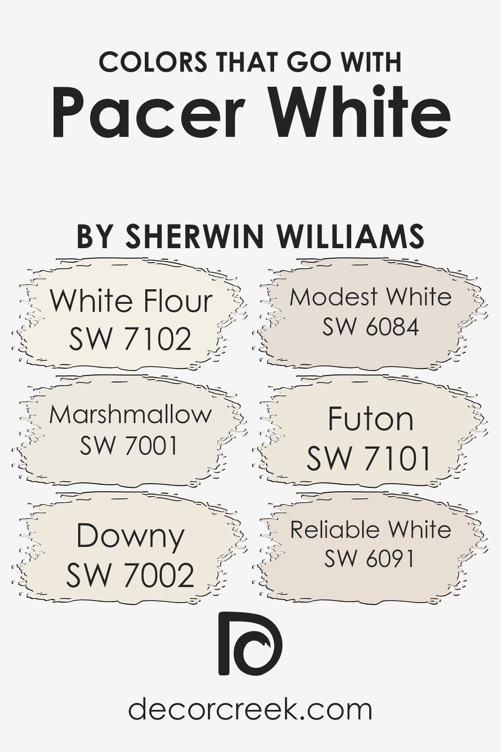
Colors that Go With Pacer White SW 6098 by Sherwin Williams
Choosing colors that match Pacer White SW 6098 by Sherwin Williams is vital because they can change the whole feel of a room. For example, SW 7102 White Flour adds a creamy softness that makes spaces feel welcoming and warm.
SW 7001 Marshmallow is slightly paler, offering a gentle brightness without overpowering the main tone of Pacer White. These subtle shifts can highlight different elements of your space, creating harmony and balance. It’s not just about matching but creating a soothing environment that pleases the eyes.
SW 7002 Downy pairs nicely with Pacer White by bringing a delicate, light touch that doesn’t overpower the space. Meanwhile, SW 6084 Modest White offers a neutral and calm backdrop, making other colors and textures stand out.
SW 7101 Futon introduces a touch of warmth, blending seamlessly with Pacer White for a comforting vibe. A slightly deeper option, SW 6091 Reliable White, provides just enough contrast to make Pacer White’s versatile beige tones pop.
Each of these colors contributes to an overall feeling of subtle variation and depth, working together to create a cohesive look. Balancing these hues ensures your space feels put together and inviting.
You can see recommended paint colors below:
- SW 7102 White Flour
- SW 7001 Marshmallow
- SW 7002 Downy
- SW 6084 Modest White
- SW 7101 Futon
- SW 6091 Reliable White
How to Use Pacer White SW 6098 by Sherwin Williams In Your Home?
Pacer White SW 6098 by Sherwin Williams is a great choice for anyone looking to brighten up their home with a warm, inviting color. This soft, creamy shade works well in many rooms and pairs nicely with a variety of other colors. In living rooms, Pacer White can create a cozy yet airy atmosphere, making the space feel more open and welcoming.
It’s also a good option for kitchens and dining areas, where its warmth can complement wood tones and other natural materials.
In bedrooms, Pacer White provides a calming backdrop, perfect for relaxation after a long day. This color is also ideal for enhancing natural light in any room, giving spaces a pleasant glow. For an interesting contrast, Pacer White can be paired with bold accent colors like navy or charcoal.
Overall, it’s a versatile option for those who appreciate a classic and comfortable look in their home.
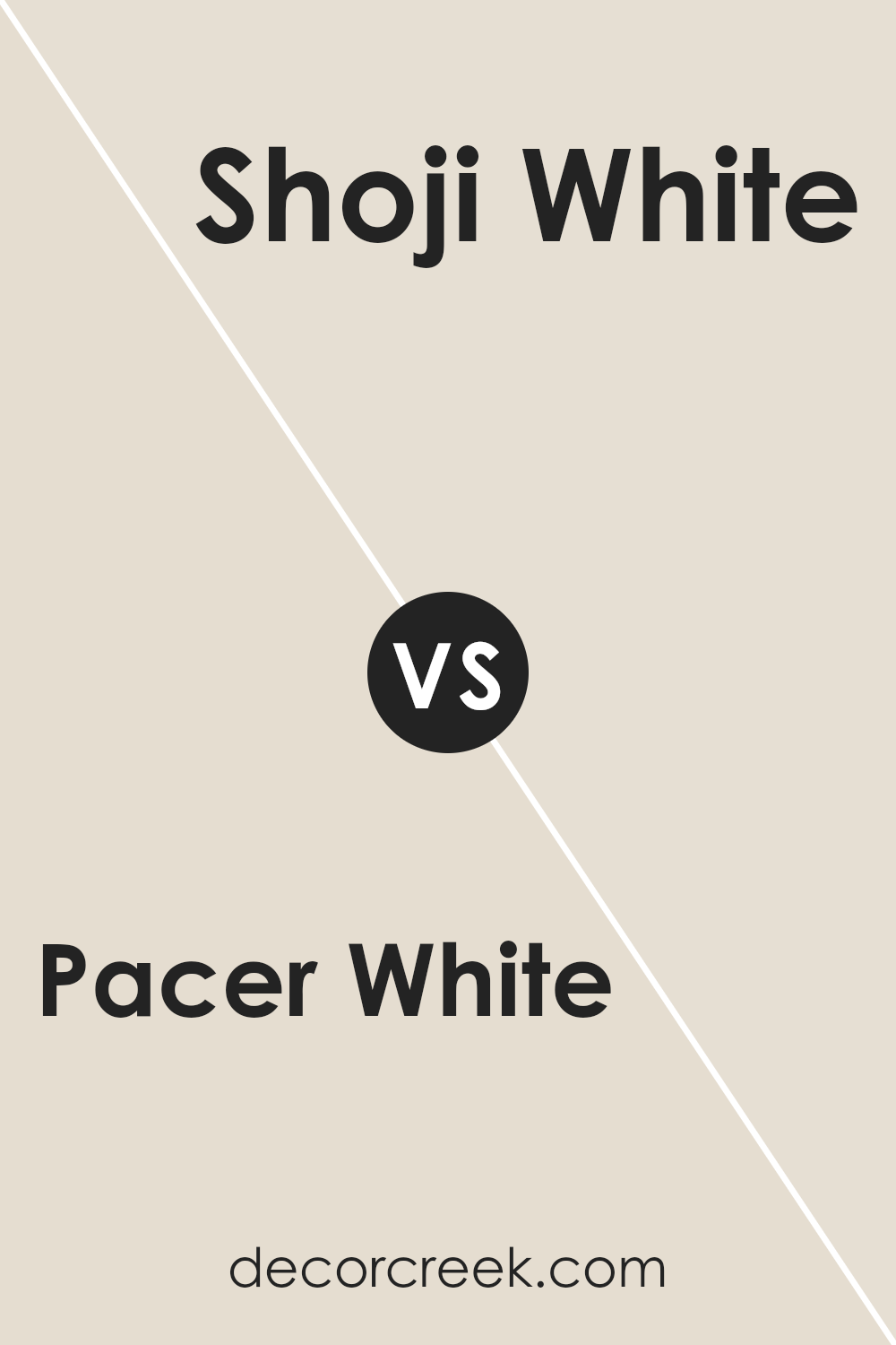
Pacer White SW 6098 by Sherwin Williams vs Shoji White SW 7042 by Sherwin Williams
Pacer White (SW 6098) and Shoji White (SW 7042) are both popular off-white paint colors by Sherwin Williams, but they offer different undertones and overall feels.
Pacer White is a soft, warm white with subtle yellow undertones, giving it a cozy and inviting appearance. It’s great for creating a comfortable and cheerful space. In contrast, Shoji White is a cooler white with slight gray and beige undertones. This makes it more versatile for modern settings, offering a clean and slightly muted look.
While Pacer White tends to warm up a room, Shoji White provides a more neutral backdrop, allowing other colors in the decor to stand out. Both colors are great for walls, but the choice between them depends on whether you prefer a warmer or cooler appearance. Pacer White suits traditional or rustic styles, while Shoji White complements more contemporary or minimalist designs.
You can see recommended paint color below:
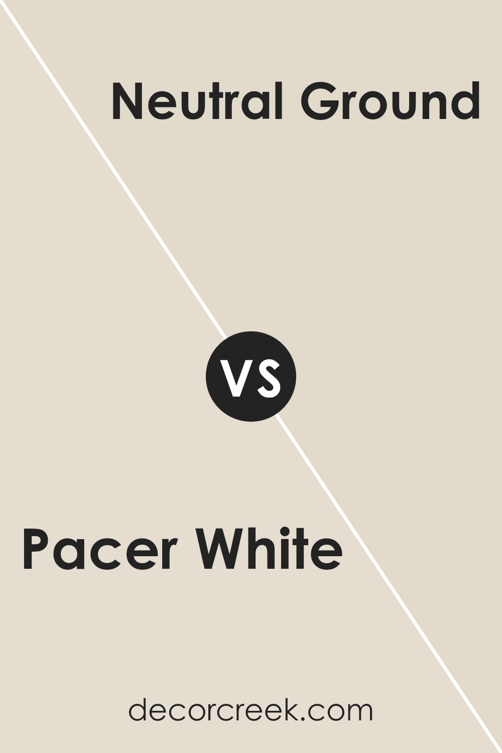
Pacer White SW 6098 by Sherwin Williams vs Neutral Ground SW 7568 by Sherwin Williams
Pacer White and Neutral Ground are both popular paint colors by Sherwin Williams, offering subtle differences in their hues. Pacer White is a soft white with warm undertones, making it well-suited for creating a cozy and inviting atmosphere. It gives off a gentle creaminess that can brighten up a space without being too stark or cold.
On the other hand, Neutral Ground is a light beige with a slightly greyer undertone compared to Pacer White. It leans more towards a neutral tone, which can make it a versatile choice for different design styles. Neutral Ground can add a touch of warmth without overwhelming a room’s ambiance.
While both colors are subtle and versatile, Pacer White is typically a bit warmer and more off-white, whereas Neutral Ground offers a more muted, beige appearance. Choosing between them depends on whether you prefer a warmer, creamier look or a more neutral, understated style.
You can see recommended paint color below:
Pacer White SW 6098 by Sherwin Williams vs Panda White SW 6147 by Sherwin Williams
Pacer White SW 6098 and Panda White SW 6147 are two popular off-white paint colors by Sherwin Williams. Pacer White has a warm undertone with a subtle hint of beige, making it versatile for various settings. It creates a welcoming and cozy atmosphere, perfect for living rooms or bedrooms.
On the other hand, Panda White has a slightly cooler tone compared to Pacer White. It features a touch of gray, which gives it a more modern and crisp feel. This makes it ideal for spaces where a clean and fresh look is desired, such as kitchens or bathrooms.
While both are neutral shades, Pacer White leans more towards warmth, while Panda White offers a cooler, softer look. Choosing between the two depends on the mood you want to set and the lighting in your space. Both colors are great for achieving a neutral palette that can complement other colors and decor.
You can see recommended paint color below:
Pacer White SW 6098 by Sherwin Williams vs Moderate White SW 6140 by Sherwin Williams
Pacer White SW 6098 and Moderate White SW 6140 by Sherwin Williams are two soft, neutral paint colors that can both bring warmth to a space, but they have subtle differences that can impact a room’s atmosphere.
Pacer White is a slightly warmer shade, with more yellow undertones compared to its counterpart. It can give a cozy, inviting feel to a room without being overbearing.
On the other hand, Moderate White is a bit cooler and has taupe undertones, which can lend a more balanced and versatile look to a space. It pairs well with both warm and cool color schemes.
Both colors can be used in various rooms, from living areas to bedrooms, and each works well with a range of decor styles, but the choice between them might depend on the desired warmth or neutrality and the existing lighting and furnishings in the room.
You can see recommended paint color below:
Pacer White SW 6098 by Sherwin Williams vs Aesthetic White SW 7035 by Sherwin Williams
Pacer White SW 6098 and Aesthetic White SW 7035, both by Sherwin Williams, are popular white paint colors but with different vibes. Pacer White is a warm, off-white with subtle yellow and beige undertones, giving it a cozy and inviting look. It’s perfect for creating a soft, welcoming atmosphere in any room.
On the other hand, Aesthetic White is a bit cooler and slightly grayish. This gives it a more neutral appearance, making it versatile for various styles and spaces. It’s a great choice if you want a calm and understated backdrop that isn’t too stark or too warm.
Both colors work well in many settings, but the choice between them depends on the feel you want to create. Pacer White adds warmth and comfort, while Aesthetic White offers a neutral and modern touch. Both can complement other colors easily, but their undertones set them apart.
You can see recommended paint color below:
Pacer White SW 6098 by Sherwin Williams vs White Duck SW 7010 by Sherwin Williams
Pacer White SW 6098 and White Duck SW 7010 are two popular colors by Sherwin Williams. Pacer White is a warm, off-white shade with a hint of beige. It’s versatile and pairs well with both bold and neutral colors. This makes it a great choice for living rooms or bedrooms where you want a cozy but bright atmosphere.
White Duck, on the other hand, is also an off-white, but it leans more towards a light greige (a mix of gray and beige). It has slightly cooler undertones compared to Pacer White, giving it a more subdued look.
When comparing the two, Pacer White feels warmer and more inviting, while White Duck offers a softer, more muted tone. Both work well in different settings depending on the mood you want to create. If you’re looking for warmth, Pacer White is ideal. For a softer appearance, White Duck might be better.
You can see recommended paint color below:
Pacer White SW 6098 by Sherwin Williams vs Oyster White SW 7637 by Sherwin Williams
Pacer White (SW 6098) and Oyster White (SW 7637) are two popular neutral colors by Sherwin Williams. Pacer White is a soft, warm white with subtle beige undertones, making it a cozy choice for spaces where warmth is desired. It pairs well with earthy tones and lends a welcoming feel to any room.
On the other hand, Oyster White is cooler and has more grey undertones. It is closer to a true off-white and gives a clean, crisp look, working well in modern or minimalist settings. While Pacer White can make a room feel warm and inviting, Oyster White provides a more refined, fresh appearance.
Both colors are versatile, but their different undertones will affect the mood of a space. Choosing between them depends on the desired atmosphere: Pacer White for a warmer, cozier vibe and Oyster White for a cooler, more contemporary look.
You can see recommended paint color below:
Pacer White SW 6098 by Sherwin Williams vs Porcelain SW 0053 by Sherwin Williams
Pacer White (SW 6098) and Porcelain (SW 0053) are both light, neutral shades by Sherwin Williams, yet they each bring unique qualities to a room. Pacer White is a warm white with subtle beige undertones, making it cozy and inviting. It works well in spaces where you want a soft and soothing atmosphere. This color can easily match with various furniture styles and decorations, giving a comfortable and homely feel.
Porcelain, on the other hand, is a cooler shade with slight blue-gray hints. It offers a clean and crisp appearance, ideal for spaces where you want a touch of elegance and clarity. This color pairs beautifully with modern interiors and complements metallic and slick materials.
Both shades are versatile and can suit different rooms, but your choice depends on whether you prefer the warmth of Pacer White or the cool sophistication of Porcelain for your space.
You can see recommended paint color below:
Pacer White SW 6098 by Sherwin Williams vs White Sesame SW 9586 by Sherwin Williams
Pacer White SW 6098 and White Sesame SW 9586 are both colors from Sherwin Williams, but they have their differences. Pacer White is a warm, soft white with a hint of creaminess, giving rooms a cozy and inviting feel. It’s a versatile color that complements various decor styles, making it an excellent choice for living rooms, bedrooms, or kitchens.
On the other hand, White Sesame offers a cooler, lighter shade with a subtle hint of gray. This gives it a modern and clean appearance, perfect for creating a fresh look in any space. It’s a good option for minimalist or contemporary settings where you want the walls to feel crisp and bright.
In summary, if you’re after warmth and coziness, Pacer White might be your pick. For a cooler, more modern vibe, White Sesame could be the way to go. Both are great choices, but the best one depends on your desired aesthetic.
You can see recommended paint color below:
Pacer White SW 6098 by Sherwin Williams vs Divine White SW 6105 by Sherwin Williams
Pacer White and Divine White by Sherwin Williams are two shades of white that differ subtly. Pacer White SW 6098 has a warm tone, with an undertone leaning towards a soft beige. It’s great for creating a cozy, inviting atmosphere, making spaces feel comfortable and homely.
Divine White SW 6105, on the other hand, is another warm white but with a slightly lighter hue compared to Pacer White. It has a subtle creaminess that can brighten a space without being too stark.
Both colors work well with warm palettes, complement wood tones, and are suited for living rooms, bedrooms, and areas where you want warmth. However, if you prefer a bit more depth and warmth, Pacer White might be the choice, while Divine White offers a lighter, slightly crisper look. Both are versatile but differ in their intensity and brightness, which can affect the overall feel of a room.
You can see recommended paint color below:
It’s a nice, warm shade of white that can make any room feel cozy and welcoming. Imagine the soft, gentle warmth of a late afternoon sun shining through your window—that’s the kind of warmth Pacer White brings to your home.
It’s not too bright and not too dull, which makes it a great choice for walls that you want to look clean and fresh without feeling cold. Whether painting a bedroom, living room, or even a kitchen, Pacer White can create a pleasant background.
This paint color is like your favorite pair of comfy sneakers—it goes with just about everything. You can team it up with bold, colorful decorations or keep things calm with soft, neutral colors. Either way, it makes everything look just right.
In short, SW 6098 Pacer White is a fantastic pick for anyone who wants a home that feels warm and inviting. It’s a color that gets along with everyone and makes any place feel a little more like home. Plus, it’s perfect for making any room feel just right, whether you’re hanging out with family, reading a book, or playing games. This color is a winner!
Ever wished paint sampling was as easy as sticking a sticker? Guess what? Now it is! Discover Samplize's unique Peel & Stick samples.
Get paint samples

