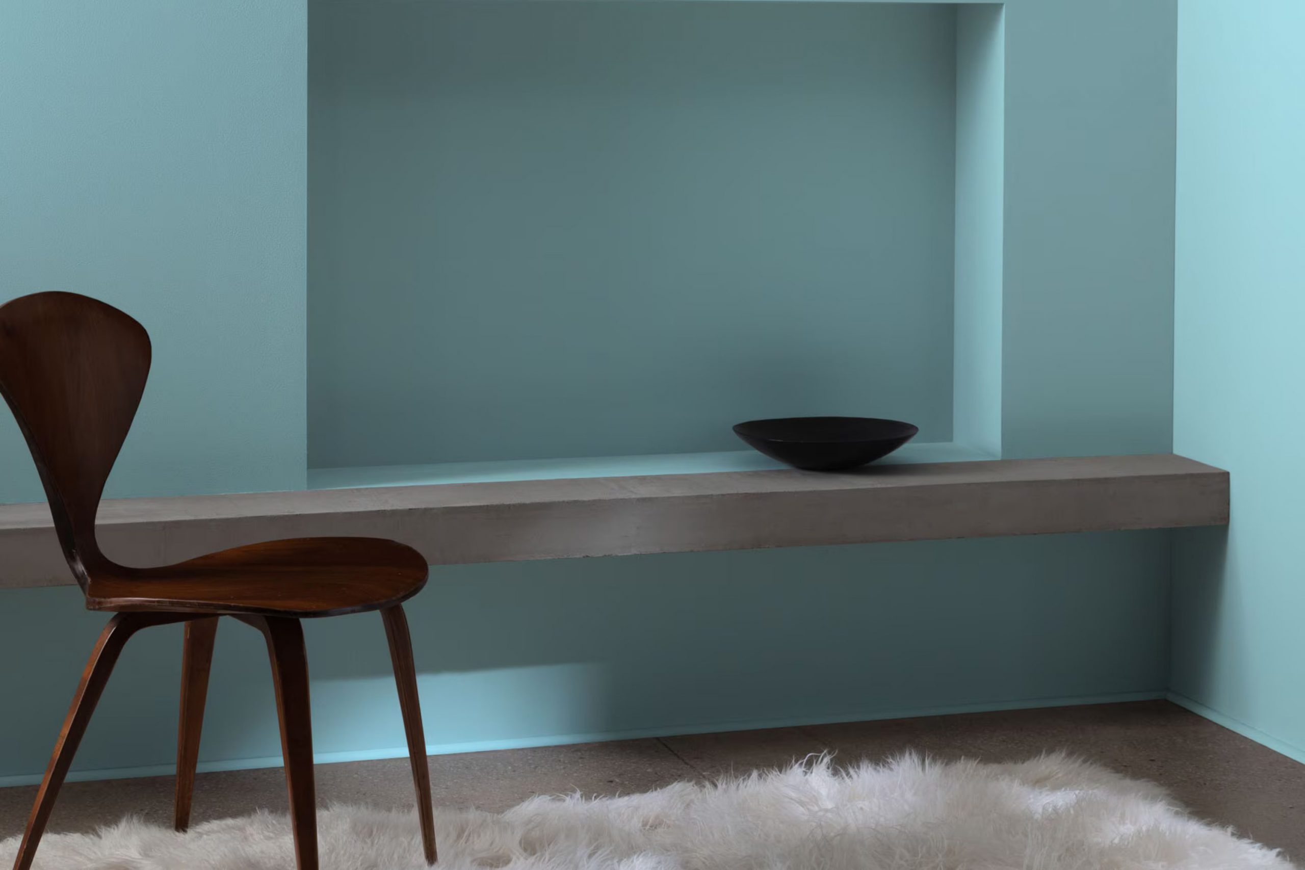
I recently had the chance to use 2135-40 Province Blue by Benjamin Moore for a bedroom makeover, and I want to share my experience with you. If you’re looking for a paint color that adds a calm and gentle vibe to your room, then Province Blue might just be what you need. This color is a soft, muted blue with just a hint of green, giving it a refreshing feel without being overly vibrant. It’s subtle enough to work as a neutral, yet distinct enough to give a room some character.
In my project, the goal was to create a peaceful retreat where one could relax at the end of a busy day. Province Blue turned out to be the perfect backdrop—it made the room appear brighter and more welcoming. I paired it with soft whites and natural wood tones, which complemented its cool hue beautifully.
If you’re considering a new look for your own room, think about how different lighting conditions in your room could enhance this adaptable shade. From natural morning light to artificial lighting at night, Province Blue shifts in tone, always maintaining a soothing presence.
Whether you’re redecorating a living area, bedroom, or even a bathroom, this shade can help create a peaceful yet stylish atmosphere.
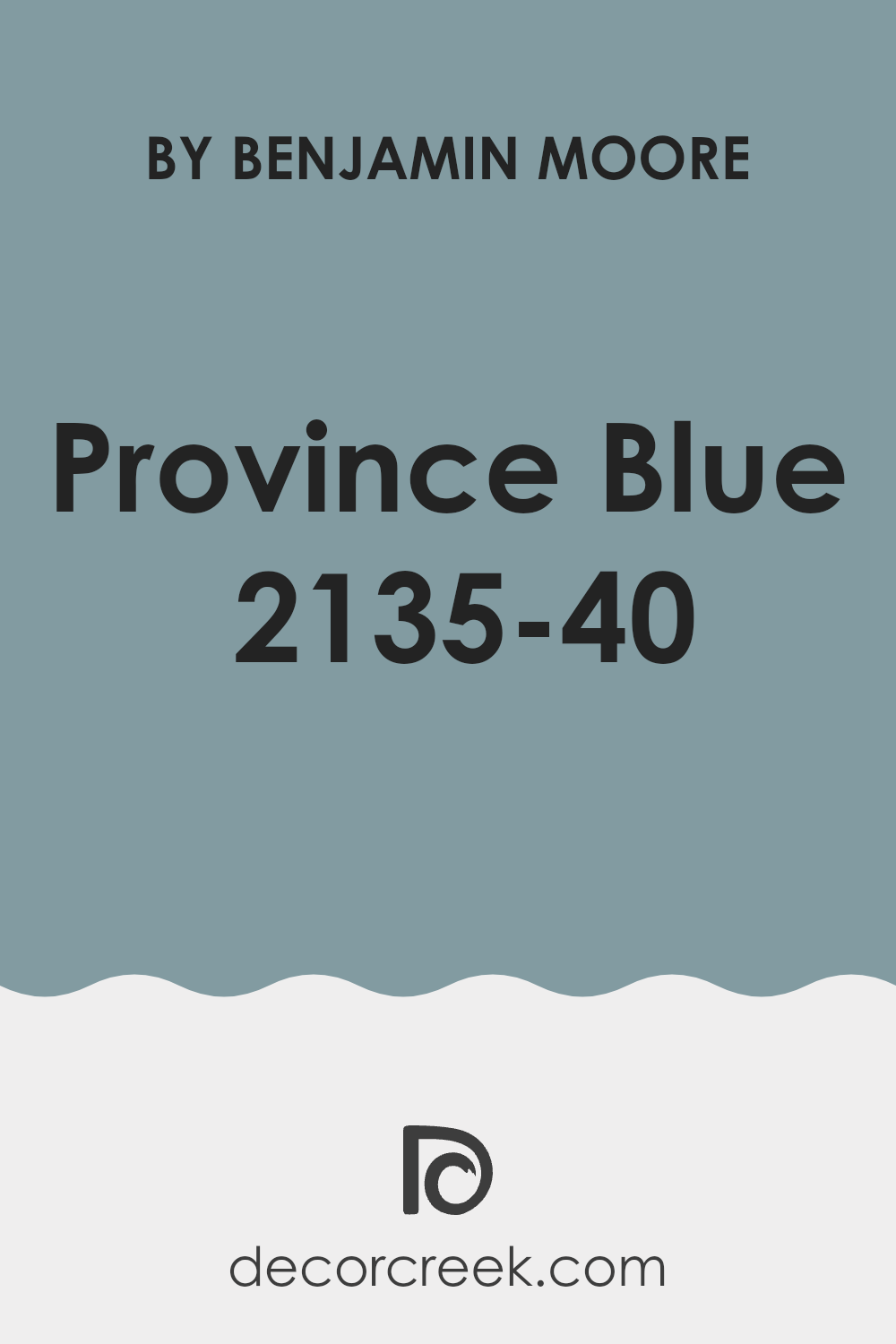
What Color Is Province Blue 2135-40 by Benjamin Moore?
Province Blue by Benjamin Moore is a rich, soothing blue that brings a subtle depth to any room. Its balanced tone strikes a nice middle ground—not too dark and not overly light, making it adaptable for various uses. This particular shade of blue has a soft, inviting quality that works well for creating a calm and welcoming atmosphere. It’s especially effective in bedrooms and bathrooms where you would want a relaxing vibe.
Province Blue pairs beautifully with natural materials like light woods, adding a fresh and airy feel to the interior. It also complements textures like linen or cotton, which help maintain a relaxed and comfortable setting. When matched with metallic elements such as brushed nickel or soft gold, it introduces a hint of understated elegance without being overly flashy.
This color fits wonderfully in interior styles that lean towards casual elegance or modern simplicity. For a coastal look, combining it with whites and sandy neutrals can mimic the soothing qualities of the beach. It also looks stunning in a minimalist setting, where its depth adds character without making the room feel too heavy.
Overall, Province Blue is a flexible color choice that can easily adapt to both contemporary and traditional styles, making it a go-to for anyone looking to refresh their interior.
Is Province Blue 2135-40 by Benjamin Moore Warm or Cool color?
Province Blue 2135-40 by Benjamin Moore is a unique shade that brings a fresh, welcoming vibe to any room. This color is a mix of blue and gray, making it adaptable for different areas around the home. It works well in places where you want to create a calm and friendly atmosphere, like living rooms and bedrooms.
Because it’s not too bright, it helps smaller rooms appear a bit larger and more open. This color pairs well with both light and dark furniture, giving you flexibility in decorating. In a room with lots of natural light, Province Blue feels lighter and can give a breezy feel.
In rooms with less light, it adds depth and interest without making the area feel closed in. It’s also a great backdrop for artwork or colorful decor items, as it doesn’t clash and actually makes colors pop. This makes it a practical choice for anyone looking to refresh their home in a subtle yet effective way.
Undertones of Province Blue 2135-40 by Benjamin Moore
Province Blue 2135-40 is a unique paint color that shows different shades depending on its environment due to its rich undertones. Undertones are subtle colors that lie beneath the surface of the paint and influence how it appears in various lighting conditions or when paired with different décor elements.
For example, the lilac and light purple undertones in Province Blue add a soft, gentle feel to the color, making it excellent for creating a cozy atmosphere in bedrooms. The hints of mint and light turquoise can give a fresh and airy vibe, ideal for bathrooms and kitchens, where a clean and refreshing look is often desired.
Light blue and blue undertones ensure that the main color remains cool and calm, perfect for a soothing setting. When used on interior walls, the darker undertones such as navy and dark blue add depth, making the room feel more enclosed and intimate. In contrast, lighter undertones like pale pink and pale yellow can make the area seem brighter and more open.
Due to these undertones, Province Blue can shift its appearance subtly throughout the day. In natural light, it might lean towards its cooler, lighter undertones, making the room feel lively and open. In the evening, under artificial lighting, the darker undertones might become more prominent, giving the room a more grounded, comforting feel.
In conclusion, the variety of undertones in Province Blue allows for flexibility in styling interiors with different themes and moods. This adaptability, combined with the undertones mentioned, makes it a flexible choice for various rooms.

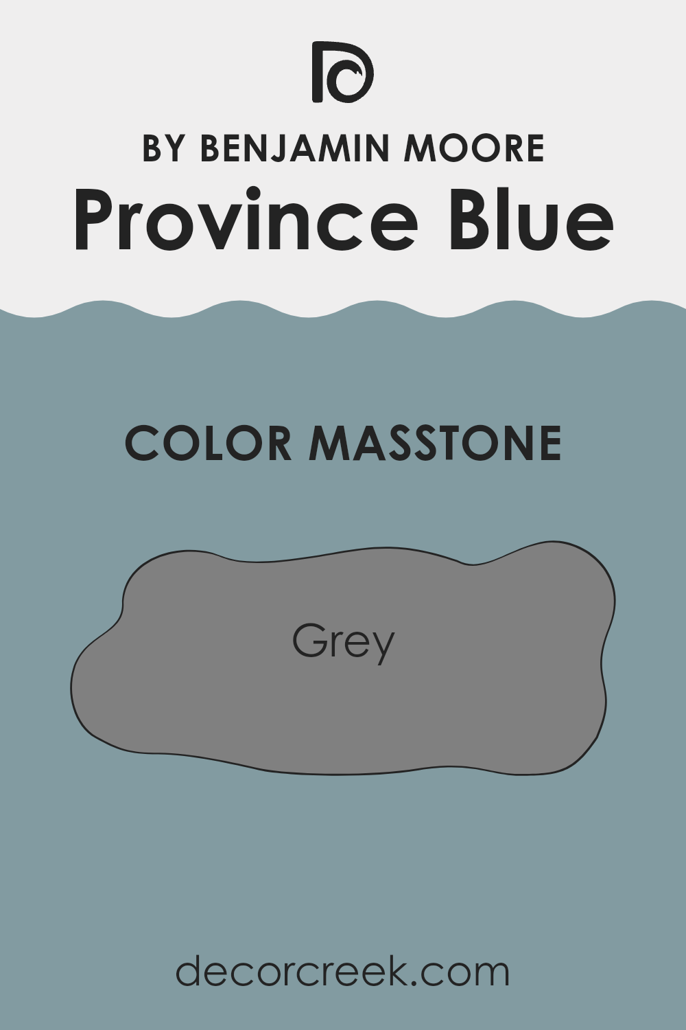
What is the Masstone of the Province Blue 2135-40 by Benjamin Moore?
Province Blue 2135-40 by Benjamin Moore is a unique color with a grey base, similar to the standard grey (#808080). In homes, this grey foundation gives the color a cool, neutral quality, making it extremely adaptable and easy to use in various decorating styles.
Whether in a modern setting or a more traditional room, its neutrality helps blend with other colors easily, supporting a balanced environment. The grey undertone also means it can be soothing in rooms like bedrooms or living areas, where calm is often appreciated.
This shade can balance brighter colors or stand alone for a minimalistic look. Ideal for walls, accents, or furniture, its flexibility makes it a go-to choice for those looking to create a pleasant, welcoming atmosphere without the intensity of bolder shades. Furthermore, its ability to reflect light gently can help make smaller rooms appear larger, enhancing the sense of openness.
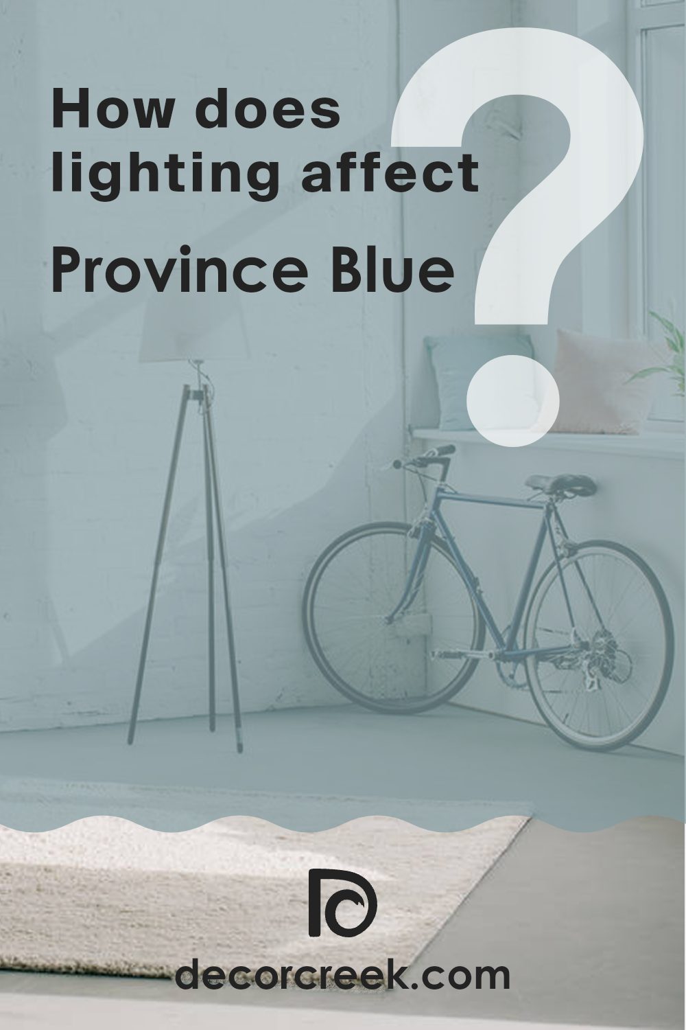
How Does Lighting Affect Province Blue 2135-40 by Benjamin Moore?
Lighting greatly affects how we perceive colors in our surroundings. Different light sources can noticeably change the look of a color, shaping the overall mood and function of a room.
Taking Province Blue from Benjamin Moore as an example, its appearance can shift depending on the type and amount of light. In natural light, the true nature of the color appears most clearly, especially under sunlight. The subtle blue tones can seem crisp and lively, giving a fresh and pleasant feel to any room.
Under artificial light, the change depends on the type of bulbs used. Incandescent lighting often highlights warmer undertones, making Province Blue appear slightly greener. Fluorescent lighting, however, can make it look cooler, emphasizing its blue side and creating a calmer, more relaxed impression.
How this color behaves also varies with the direction of the room’s windows:
- North-facing rooms: These rooms receive cooler, limited light, which can make Province Blue appear softer and a bit deeper in tone.
- South-facing rooms: With plenty of daylight, this color appears brighter and more vivid, bringing an energetic touch to the room.
- East-facing rooms: Morning light makes Province Blue look clear and fresh early in the day, but it becomes more subdued as daylight fades.
- West-facing rooms: In the evening, warm sunlight enhances the richness of Province Blue, giving it a cozy and expressive look.
Understanding how light interacts with this shade can help you choose the right setting for it, ensuring the room maintains the desired mood throughout the day.
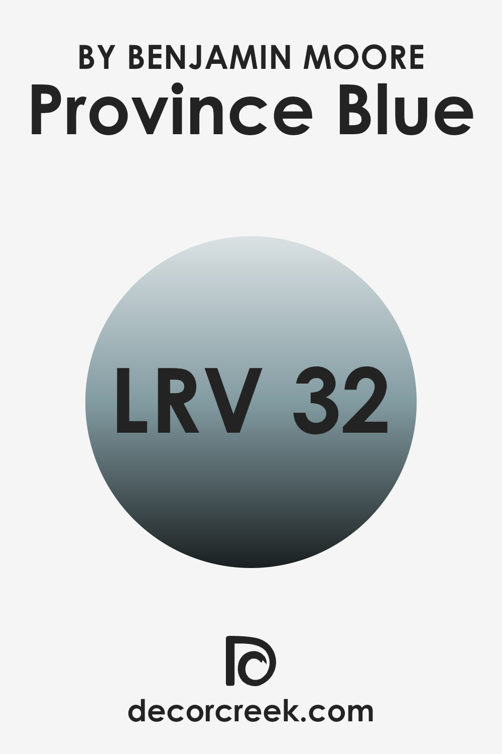
What is the LRV of Province Blue 2135-40 by Benjamin Moore?
LRV stands for Light Reflectance Value, a measure used to describe the percentage of light a paint color reflects back into a room as compared to the total light it receives. It’s basically a gauge of how bright or dark a color appears when applied to walls.
Colors with higher LRV are lighter, making rooms feel more open and airy, as they reflect more light. On the other hand, colors with lower LRV can make an area seem cozier but smaller, as they absorb more light. For the color mentioned, with an LRV of 31.57, it falls into the category of darker colors, absorbing more light than it reflects.
This means it won’t brighten up a room as much as higher LRV colors might. Instead, it will add depth and warmth, making it a good choice for larger areas or rooms with plenty of natural or artificial light. When used in smaller rooms or areas with limited light, it can make the room feel more compact and intimate.
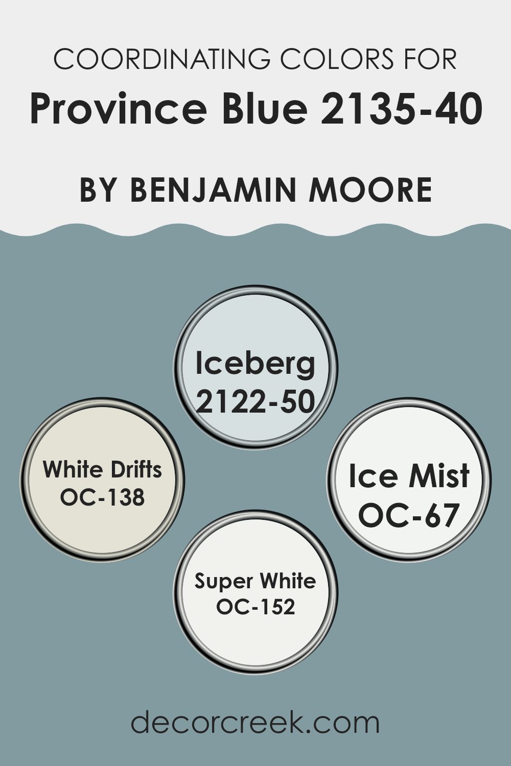
Coordinating Colors of Province Blue 2135-40 by Benjamin Moore
Coordinating colors are those that complement a main hue on a color scheme, creating a balanced and visually appealing look. When used together, coordinating colors can enhance the overall aesthetics of an area by adding depth and highlights that bring out the best in the primary color. For instance, when decorating with a shade like Province Blue by Benjamin Moore, selecting the right coordinating colors is crucial for achieving a cohesive decor.
One such coordinating color is Iceberg, a subtle and gentle blue that mirrors the lightness of a chilly, clear sky, making it a perfect pairing for the deeper tones of Province Blue. It has a refreshing vibe that can brighten up rooms while still maintaining a sense of balance with the cooler main color.
Another light and airy choice is White Drifts, an off-white with a hint of warmth, which offers a soft contrast to the coolness of Province Blue, providing a smooth transition in rooms that aim for a calm and collected atmosphere. Similarly, Ice Mist is an ultra-light blue with just a whisper of color, offering a crisp, clean look when paired with bolder shades, ideal for creating a feeling of openness and light in any room.
Lastly, Super White is the quintessence of purity in color form, delivering stark contrast that can make the rich tones of Province Blue truly stand out, ideal for trim work or accents that need to pop without overpowering.
You can see recommended paint colors below:
- 2122-50 Iceberg
- OC-138 White Drifts
- OC-67 Ice Mist
- OC-152 Super White
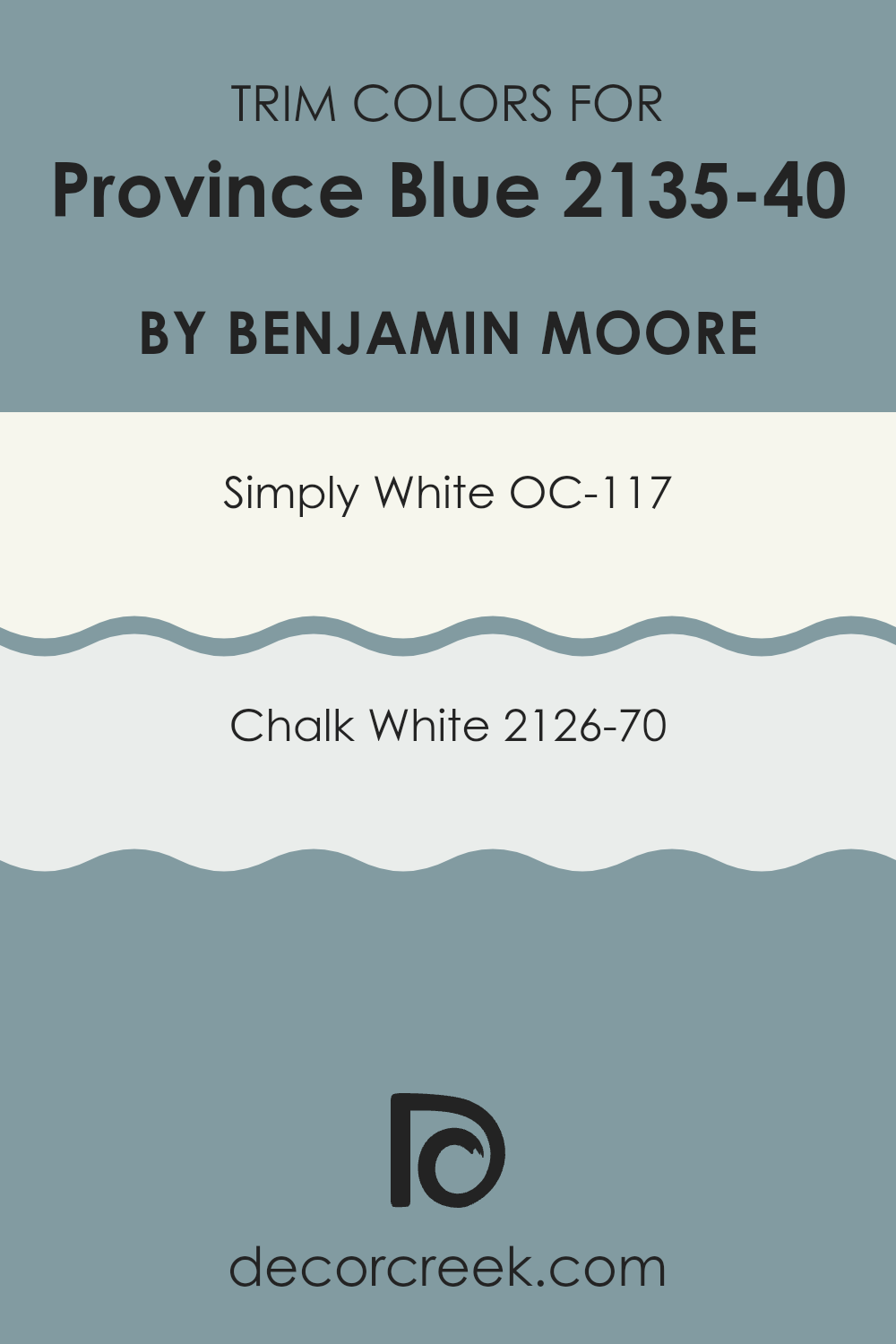
What are the Trim colors of Province Blue 2135-40 by Benjamin Moore?
Trim colors are selected to complement the main color on a wall by highlighting architectural details like door frames, moldings, and baseboards. In the case of Province Blue by Benjamin Moore, using contrasting trim colors can accentuate the features of a room, enhancing the overall visual appeal and creating a clean, finished look.
Simply White and Chalk White are two trim colors that work well with Province Blue, as they provide a crisp border that defines the area neatly, thereby making the wall color stand out more distinctly.
Simply White OC-117 is a clean and warm white that brings a bright and airy feel to the room, making it a popular choice for trims to balance richer wall colors like Province Blue. Chalk White 2126-70 has a softness to it that can subtly soften the stronger hues of blue, giving a gentle contrast that remains fresh and inviting. Both colors help in creating a pleasing separation between walls and trim, aiding in highlighting the room’s architectural beauty without overpowering it with strong contrasts.
You can see recommended paint colors below:
- OC-117 Simply White
- 2126-70 Chalk White
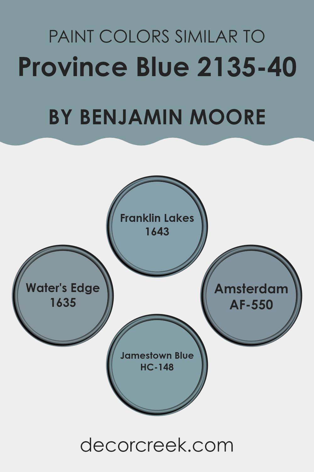
Colors Similar to Province Blue 2135-40 by Benjamin Moore
Choosing similar colors, like those in the palette surrounding Province Blue by Benjamin Moore, ensures a harmonious and visually pleasing environment. These shades, which share common undertones and intensity, create a smooth visual flow, allowing effortless transitions from one area to another without abrupt shifts. Such consistency can effectively enhance the mood and continuity of your rooms, making them feel more unified and connected.
For instance, Franklin Lakes is a subtly richer blue that can add a touch of depth to areas needing a more pronounced but still calm color presence. Water’s Edge offers a slightly more vivid blue that captures a refreshing feel, ideal for brightening up a room while maintaining a peaceful atmosphere.
Amsterdam, another close relative in this color family, leans toward a deeper, inkier hue that can give a bold yet balanced look, supporting stronger accents in interior décor. Finally, Jamestown Blue is a lighter blue with hints of gray, perfect for achieving a soft, gentle setting in rooms meant for relaxation or focus. Together, these colors form a cohesive palette that enhances the visual experience by building upon the foundational tones set by Province Blue.
You can see recommended paint colors below:
- 1643 Franklin Lakes
- 1635 Water’s Edge
- AF-550 Amsterdam
- HC-148 Jamestown Blue
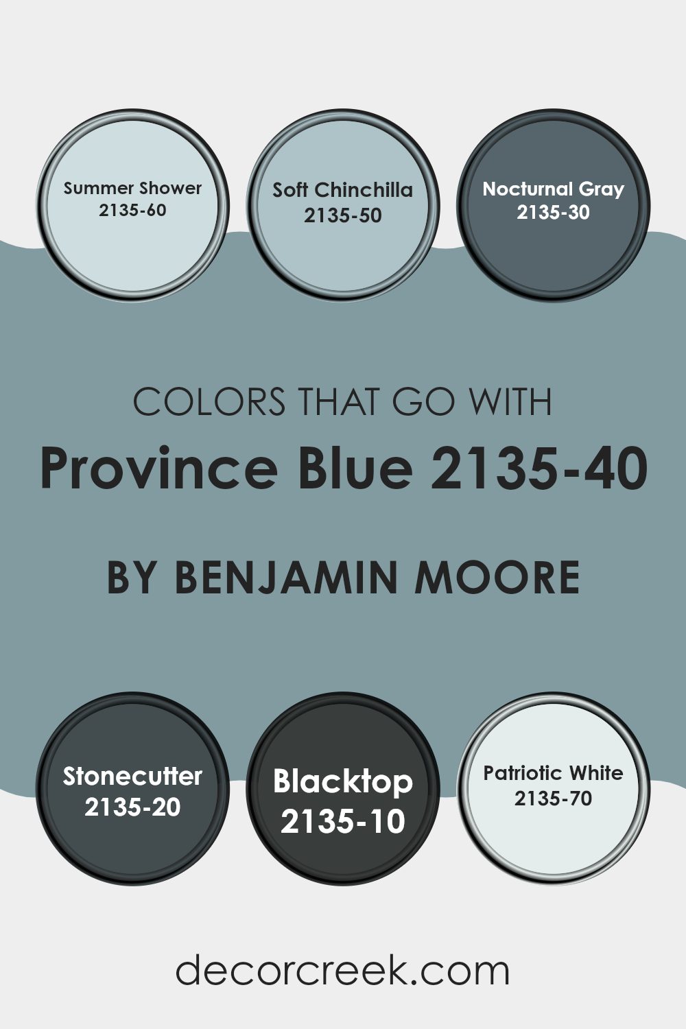
Colors that Go With Province Blue 2135-40 by Benjamin Moore
Choosing the right colors to complement Province Blue 2135-40 by Benjamin Moore is crucial for creating a harmonious and visually appealing environment. Province Blue itself is a subtle, soothing color that serves as an adaptable backdrop, and pairing it with the right shades can either brighten a room or bring about a more cozy and grounding feel.
For instance, Summer Shower 2135-60 is a light, almost airy blue that adds a sense of freshness when used alongside Province Blue, making the room feel more open. Soft Chinchilla 2135-50, on the other hand, is a gentle gray with a hint of blue that provides a soft contrast, enhancing the depth of the area without making it feel heavy.
Looking at deeper options, Nocturnal Gray 2135-30 offers a rich, robust gray that pairs well with Province Blue for a more striking and bold look, ideal for accent walls or furniture. Stonecutter 2135-20, being another strong option but slightly lighter than Nocturnal Gray, gives off a steady and grounded impression, perfect for areas that require a touch of formality. Blacktop 2135-10 is the darkest of the palette, a powerful black that can be used sparingly to add dramatic flair or convey elegance in details and trims.
Finally, Patriotic White 2135-70 is a clean, crisp white that brings out the vibrant tones of Province Blue, providing a refreshing contrast that can help make other elements in the room stand out. All these colors together create a palette that allows for various combinations, each capable of setting a different mood and style according to personal taste and the purpose of the room.
You can see recommended paint colors below:
- 2135-60 Summer Shower
- 2135-50 Soft Chinchilla
- 2135-30 Nocturnal Gray
- 2135-20 Stonecutter
- 2135-10 Blacktop
- 2135-70 Patriotic White
How to Use Province Blue 2135-40 by Benjamin Moore In Your Home?
Province Blue 2135-40 by Benjamin Moore is an adaptable paint color that brings a fresh and calming feel to any room. With its unique blend of blue and gray tones, this shade is perfect for creating a cozy atmosphere in your home.
You can use it in different ways, depending on what mood you want to create. For example, it works beautifully in a bedroom where you want a gentle, relaxing environment, making it easier to unwind and get a good night’s sleep.
In a living room or study, Province Blue adds a touch of quiet charm, pairing well with whites, creams, and wooden finishes to create a warm and inviting area. It’s also an excellent choice for bathrooms, as its water-inspired hue supports a clean and refreshing look. Adding accessories or artwork in bold colors against a Province Blue background can provide a lively contrast to enrich the room. This color fits well in many home styles, from modern to traditional.
Province Blue 2135-40 by Benjamin Moore vs Amsterdam AF-550 by Benjamin Moore
Province Blue by Benjamin Moore is a soft, muted blue with a hint of gray. This color has a calming and subtle feel, making it adaptable for many rooms. It’s light enough to feel soothing but carries enough depth to make a statement on walls or furniture.
Amsterdam by Benjamin Moore, on the other hand, is a richer, deeper shade of blue with slight green undertones. This color is bold and creates a more dramatic look. It can bring depth and a sense of comfort to rooms, making it a great choice for accent walls or areas where a stronger visual impact is desired.
Both colors share a blue foundation, but their effects differ due to variations in shade and undertone. Province Blue works well in a variety of settings thanks to its lighter, more neutral tone, while Amsterdam suits areas that can carry a deeper, more expressive color.
You can see recommended paint color below:

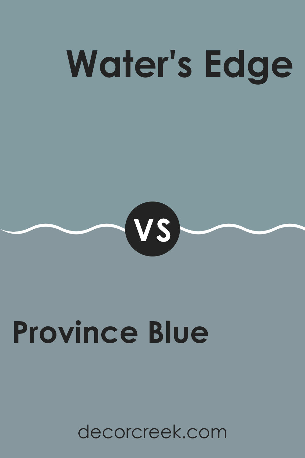
Province Blue 2135-40 by Benjamin Moore vs Water’s Edge 1635 by Benjamin Moore
Province Blue and Water’s Edge are both colors by Benjamin Moore, but they offer distinct vibes. Province Blue is a deeper, muted blue with a grayish tone, making it a great choice for a calm and mature atmosphere.
It fits well in rooms meant for focus and relaxation, like bedrooms or offices. On the other hand, Water’s Edge has a brighter, more vibrant quality. This color leans towards a lighter blue that mimics the cheerful aspect of a sunny day near a lake or sea.
It adds a fresh and lively feel to any room, ideal for areas that benefit from a burst of energy, such as bathrooms or kitchens. Both colors offer unique qualities, where Province Blue provides a grounding presence and Water’s Edge brings a refreshing touch.
You can see recommended paint color below:
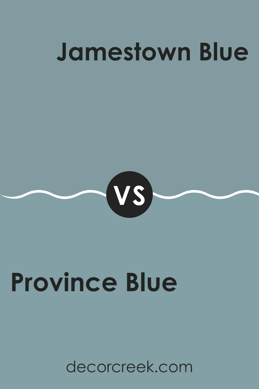
Province Blue 2135-40 by Benjamin Moore vs Jamestown Blue HC-148 by Benjamin Moore
Province Blue by Benjamin Moore is a soothing color with a grayish-blue tone that has a gentle and calming presence in any room. It’s slightly muted, which makes it adaptable for various decorating styles, fitting well in bedrooms, bathrooms, or living areas.
On the other hand, Jamestown Blue is also by Benjamin Moore but is a bit more vivid and has a traditional blue hue that leans toward a classic navy. This color brings a bolder blue presence into a room, making it great for creating a focal point or accent walls.
While both colors share a blue base, Province Blue is cooler and more understated, which makes it an excellent choice for a minimalist or modern look. Jamestown Blue, with its richer tone, works well where a stronger, more pronounced color is needed. Whether to choose one over the other really depends on the mood and style you want to achieve in your room.
You can see recommended paint color below:
- HC-148 Jamestown Blue
Province Blue 2135-40 by Benjamin Moore vs Franklin Lakes 1643 by Benjamin Moore
Province Blue and Franklin Lakes are two distinct colors by Benjamin Moore, each offering a unique vibe to any room. Province Blue is a deeper shade, lending a sense of calm and stability. Imagine the color of twilight skies or deep, still waters. This makes it a great choice for a peaceful, reflective area in your home, such as a bedroom or a reading nook.
On the other hand, Franklin Lakes is lighter and has a more subtle tone, leaning towards a soft, airy gray with undertones that can appear almost silvery. It’s an adaptable color that can work well in places that need a touch of lightness, like bathrooms or small kitchens, without feeling too cold.
Overall, Province Blue provides a stronger color statement and can anchor a room with its depth, whereas Franklin Lakes offers a softer, more neutral look that blends easily with different styles and colors.
You can see recommended paint color below:
- 1643 Franklin Lakes

After reading about the 2135-40 Province Blue paint by Benjamin Moore, I think it’s a really great choice for someone wanting to change up a room! This color is a gentle blue that can make a room feel calm and happy. Whether it’s a bedroom, living room, or even a kitchen, this blue shade could really make the place look lovely without being too bright or too dark.
People often pick colors based on how they make them feel, and Province Blue seems like a color that would make most people feel good. It’s not too bold, so it won’t make your room look smaller or too cramped. Plus, it goes well with many other shades. This means you can have fun picking out different colors for furniture, curtains, and decorations that will look nice with the blue walls.
Overall, 2135-40 Province Blue by Benjamin Moore sounds like a smart pick if you want to repaint a room in your home. It’s pretty, not too loud, and it can make a room feel just right.
It’s a great choice for anyone wanting to refresh their home with a new shade!
Ever wished paint sampling was as easy as sticking a sticker? Guess what? Now it is! Discover Samplize's unique Peel & Stick samples.
Get paint samples

