This color has an enchanting quality that makes it feel like a gentle whisper of nature right on your walls. It’s not too bold, yet it isn’t so muted that it fades away into the background. Instead, it strikes the perfect balance, bringing a refreshing and calming vibe to any space.
In my experience with this shade, SW 6219 Rain seems to effortlessly blend with various design styles, adding a touch of serenity and peace. Whether I’m considering a room makeover or a simple accent wall, this color stands out as a versatile choice.
The gentle blue-green tone works well with natural materials and colors, creating a sense of harmony and balance.
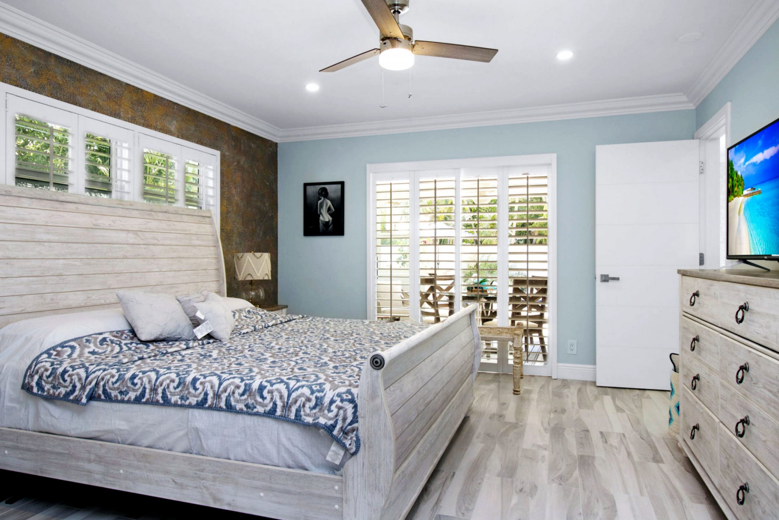
From bedrooms to living rooms to bathrooms, I’ve noticed that this color offers a seamless way to enhance a space without overwhelming it. It invites a sense of calmness and ease, making any room feel like a soothing retreat.
Whether you’re looking to refresh your interiors or create a new focal point, SW 6219 Rain makes a wonderful option for bringing in a peaceful atmosphere.
What Color Is Rain SW 6219 by Sherwin Williams?
Rain SW 6219 by Sherwin Williams is a soft, muted blue-green color that evokes a cool, calming feeling. It has a soothing quality that can create a peaceful atmosphere in any room. This gentle hue is versatile and works well with various interior styles, making it a popular choice for many homeowners.
In coastal or beach-themed interiors, Rain is perfect for emulating the colors of the sea and sky, offering a refreshing and airy vibe. It also complements modern minimalist spaces, bringing a subtle pop of color without overwhelming the simplicity of the design.
In traditional or transitional homes, it provides a sophisticated backdrop that harmonizes with classic and contemporary elements.
Pairing well with natural materials, Rain looks great alongside light wood finishes, such as oak or maple, enhancing a connection to nature. It can also be used with crisp white trim or cabinetry for a clean, fresh appearance.
Textural elements like woven baskets, jute rugs, and linen fabrics complement this hue, adding depth and warmth to the space. Metals like brushed nickel or matte black can introduce a touch of contrast and modernity.
Whether in living rooms, bedrooms, or bathrooms, Rain SW 6219 can bring soothing color to your home.
Is Rain SW 6219 by Sherwin Williams Warm or Cool color?
RainSW 6219 by Sherwin Williams is a soothing cool blue-green color. It can create a calming and pleasant atmosphere in your home. This color works well in spaces where you want to feel relaxed, such as bedrooms or living rooms. Its soft hue can also make smaller spaces feel more open and airy.
When paired with neutral colors like whites or grays, SW 6219 can add a pop of gentle color without being overwhelming. It also pairs nicely with natural wood tones, giving rooms a cozy and warm feeling.
If you have a lot of natural light, this color can look brighter and more vibrant during the day, while in dim lighting, it can create a cozy and inviting feel. Overall, Rain SW 6219 is a versatile color that can add peace and comfort to the home, working effectively in various design styles.
Undertones of Rain SW 6219 by Sherwin Williams
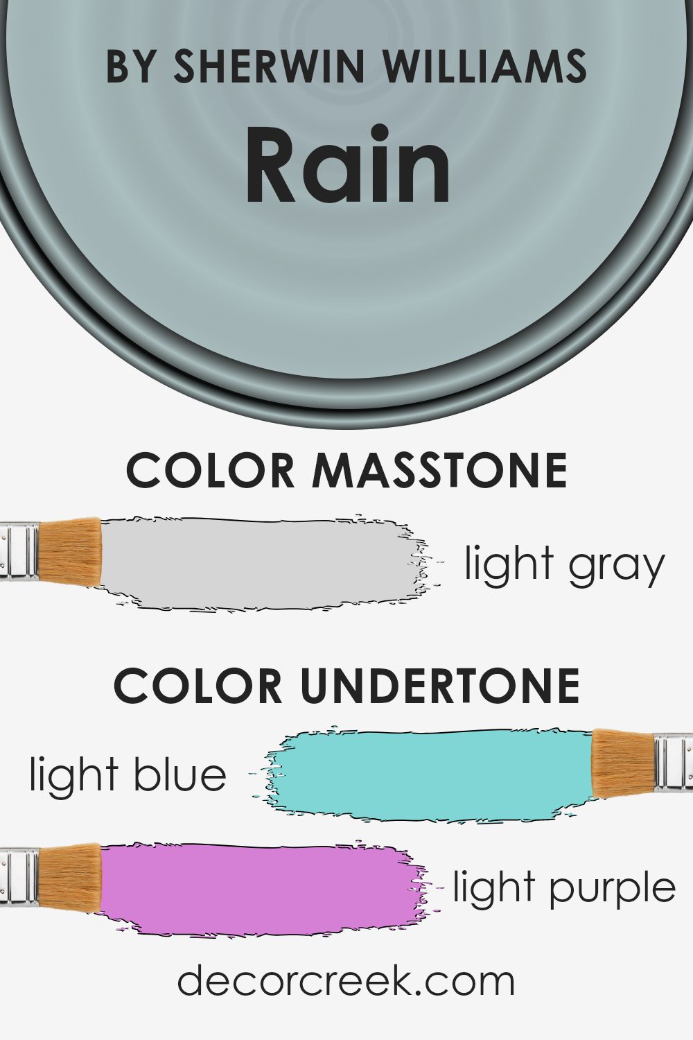
Rain, by Sherwin Williams, is a soft and calming color that can change depending on its surroundings. The undertones in this paint play a big role in how we perceive it. Light blue provides a cool, refreshing feel, while light purple and lilac can impart a slightly more vibrant or playful aspect.
Pale yellow adds a gentle warmth, preventing the color from feeling too cool or dull. Mint contributes a fresh, lively touch to the overall hue, while pale pink introduces a subtle softness.
When used on interior walls, these undertones can greatly influence the atmosphere of a room. For example, the blue undertones may make a space feel large and airy. If the light in the room highlights the purple undertones instead, the room might feel more vibrant and energetic.
A sunny room that picks up on the pale yellow aspect may feel warm and inviting.
The gray undertones bring balance, ensuring the color doesn’t become overwhelming, regardless of the light. This balancing act of undertones allows the color to be versatile, working in different settings and lighting conditions.
This flexibility can help it blend seamlessly with both cool and warm furnishings, making it a popular choice for various interior styles.
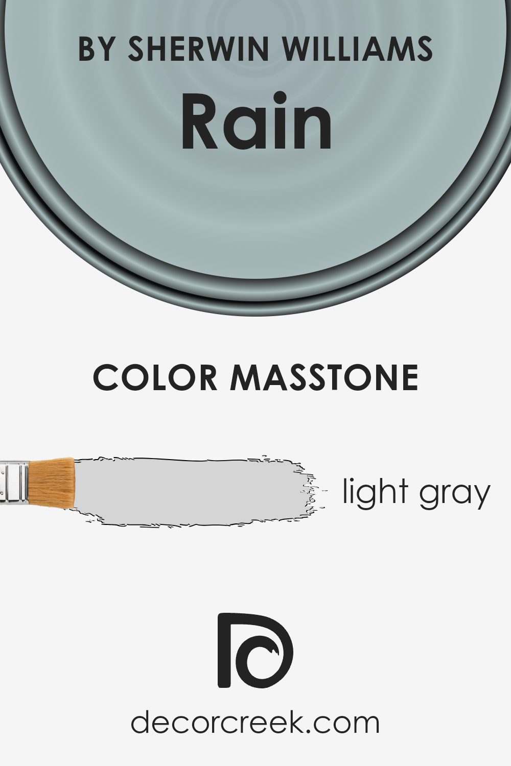
What is the Masstone of the Rain SW 6219 by Sherwin Williams?
RainSW 6219 by Sherwin Williams is a light gray color with a masstone of #D5D5D5. This light gray shade can work well in various home settings, providing a neutral backdrop that complements many styles. Its subtle hue helps create a soft and calming atmosphere in any room. Because it’s neutral, it pairs nicely with both bold and muted colors.
In living rooms, this color can make the space feel open and airy, especially when paired with natural light and bright accents. In bedrooms, it fosters a restful environment, encouraging relaxation and peace.
Bathrooms can benefit from its clean and fresh look, making the space feel larger and tidy.
This light gray is versatile. It suits modern interiors and classic styles, offering a perfect balance that is neither too dark nor too light. RainSW 6219 is a great choice if you aim for a subtle, peaceful vibe at home while also allowing room for personal touches through furniture and decor.
How Does Lighting Affect Rain SW 6219 by Sherwin Williams?
Lighting plays a crucial role in how we perceive colors. The color Rain SW 6219 by Sherwin-Williams can appear differently based on the type of light it is exposed to. Understanding how this color behaves in different lighting situations can help in making informed decisions about its use in various rooms.
Natural light from the sun changes in color temperature throughout the day. Morning light from the east brings a warm, yellow tone, while afternoon light from the west tends to be warmer and reddish. In contrast, north-facing rooms receive cooler, bluer light throughout the day, whereas south-facing rooms get more consistent, bright, and warm light.
In a north-facing room, which generally lacks direct sunlight, Rain SW 6219 can look cooler and appear more like a soft, muted blue. The cool light can make the space feel refreshing but might also make it appear slightly darker if there isn’t enough ambient light.
In south-facing rooms, the warm, consistent light helps this color show its true gentle blue-green nature, giving the room a brighter and more inviting feel.
East-facing rooms benefit from warm, yellowish sunlight in the morning. Rain SW 6219 in such light may look brighter and slightly warmer than it truly is, enhancing the soft green undertones. As the day progresses, the color can appear more muted.
In west-facing rooms, the light becomes rich and warm in the afternoon and evening, which can enhance any green tones in the paint, making it appear warmer and more vibrant.
Artificial light sources such as LEDs, incandescent, or fluorescent lights can also alter the appearance of colors. LED lighting can vary, but generally, it can either neutralize or enhance certain undertones, making Rain SW 6219 appear more blue or green depending on the bulb’s warmth. Incandescent lighting, which is warmer, might bring out the color’s green undertones. Fluorescent lights, typically cooler, can enhance the blue tones.
Understanding how Rain SW 6219 interacts with different lighting helps in choosing complementary colors for decor and ensuring the room’s ambiance meets your expectations.

What is the LRV of Rain SW 6219 by Sherwin Williams?
Light Reflectance Value, or LRV, is an important factor when choosing paint colors. It measures the percentage of light a color reflects. The scale ranges from 0, which is absolute black and reflects no light, to 100, which is pure white and reflects all light.
When picking a paint color, knowing its LRV can help predict how it will look in a room under different lighting conditions. Colors with higher LRV values reflect more light, making them appear brighter and more open, while lower LRV values absorb more light, giving a space a more intimate and cozy feel.
For Rain (SW 6219) by Sherwin-Williams, the LRV is 49.204. This means it’s somewhere in the middle of the scale. It’s neither too light nor too dark, offering a balanced appearance. This mid-range LRV means Rain reflects a moderate amount of light, so it won’t dramatically brighten a room like a very pale color, but it also won’t make the space feel too dark.
It’s versatile and can work well in different types of spaces, adapting to both natural and artificial lighting to offer a comforting backdrop.

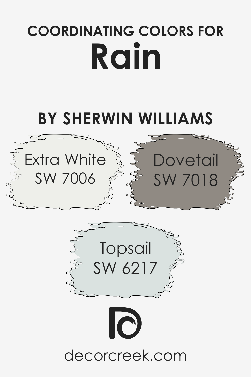
Coordinating Colors of Rain SW 6219 by Sherwin Williams
Coordinating colors are a set of colors that are chosen to complement one another in a harmonious way. They help create balance and a pleasing aesthetic in a space. When selecting coordinating colors for a particular shade, it’s important to consider how they interact and support each other without competing.
Rain by Sherwin Williams is a calming blue-green hue that works well with several other colors. One such coordinating color is Extra White (SW 7006), which is a crisp, clean white that brightens and highlights any area, making it feel open and airy.
It serves as a perfect backdrop to emphasize the soothing quality of Rain.
Another complementary shade is Topsail (SW 6217), a soft, muted blue with a hint of green. It mirrors the freshness of Rain while bringing a light, refreshing touch to the palette. This makes for a seamless transition across spaces, tying rooms together effortlessly.
Dovetail (SW 7018) adds a bit more depth with its warm grey tone, offering a more grounded and neutral element to the combination. Dovetail balances the cooler shades of Rain and Topsail, providing subtle contrast and warmth.
Together, these colors create an inviting and cohesive atmosphere, making any living space feel more connected and unified.
You can see recommended paint colors below:
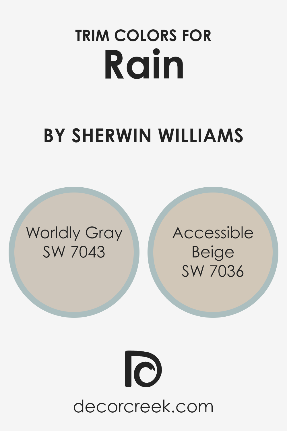
What are the Trim colors of Rain SW 6219 by Sherwin Williams?
Trim colors are the shades used on the edges or borders of walls, doors, and windows to create contrast and harmony with the primary color of a room. In the case of Rain SW 6219 by Sherwin Williams, choosing the right trim color is crucial because it can enhance the calming light blue-green hue of the walls.
Worldly Gray SW 7043 is a neutral shade that works well as a trim color alongside Rain. It has a soft, earthy undertone that can bring warmth and a touch of sophistication, blending seamlessly with a variety of decorating styles.
On the other hand, Accessible Beige SW 7036 complements Rain by adding depth with its warm, beige tones, creating a cozy and inviting atmosphere.
Worldly Gray and Accessible Beige play significant roles when used alongside Rain. Worldly Gray’s neutral tone provides a gentle contrast that subtly frames and defines the space, while its understated warmth prevents the room from feeling too cold.
Accessible Beige, with its warm undertones, adds an inviting warmth that balances the coolness of Rain, creating a harmonious environment. These colors serve to enhance the overall aesthetic by either complementing or providing contrast, making the space more visually interesting and appealing.
You can see recommended paint colors below:
- SW 7043 Worldly Gray
- SW 7036 Accessible Beige
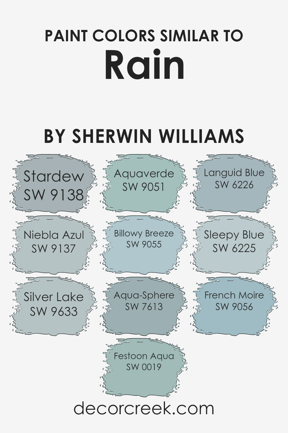
Colors Similar to Rain SW 6219 by Sherwin Williams
Choosing colors that are similar to Rain by Sherwin Williams can create a harmonious and balanced space. These related shades work well together by maintaining a consistent mood while adding variety and depth to the design. For instance, Stardew is a soft, cool blue that brings a sense of calm and peace.
Niebla Azul introduces a misty, muted blue-gray that complements other blues with its quiet elegance. Silver Lake is a subtle silver-gray with a hint of blue, perfect for adding a gentle, refreshing touch. Festoon Aqua offers a vibrant, green-blue tone that injects energy and life without overwhelming.
Aquaverde, with its delicate mix of blue and green, reflects the gentle hues of nature, providing a refreshing backdrop.
Billowy Breeze is airy and light, evoking the feeling of a gentle wind with its soft blue-green tint. Aqua-Sphere is deeper, resembling the rich, calming aspects of ocean waters. Languid Blue brings a softer, more faded blue, perfect for creating a restful space.
Sleepy Blue, true to its name, offers a muted, soothing blue that encourages relaxation. Lastly, French Moire provides a classic, sophisticated blue with a subtle hint of gray, adding depth without drawing too much attention. These colors coming together can make any room feel both cohesive and inviting without being overpowering.
You can see recommended paint colors below:
- SW 9138 Stardew
- SW 9137 Niebla Azul
- SW 9633 Silver Lake
- SW 0019 Festoon Aqua
- SW 9051 Aquaverde
- SW 9055 Billowy Breeze
- SW 7613 Aqua-Sphere
- SW 6226 Languid Blue
- SW 6225 Sleepy Blue
- SW 9056 French Moire
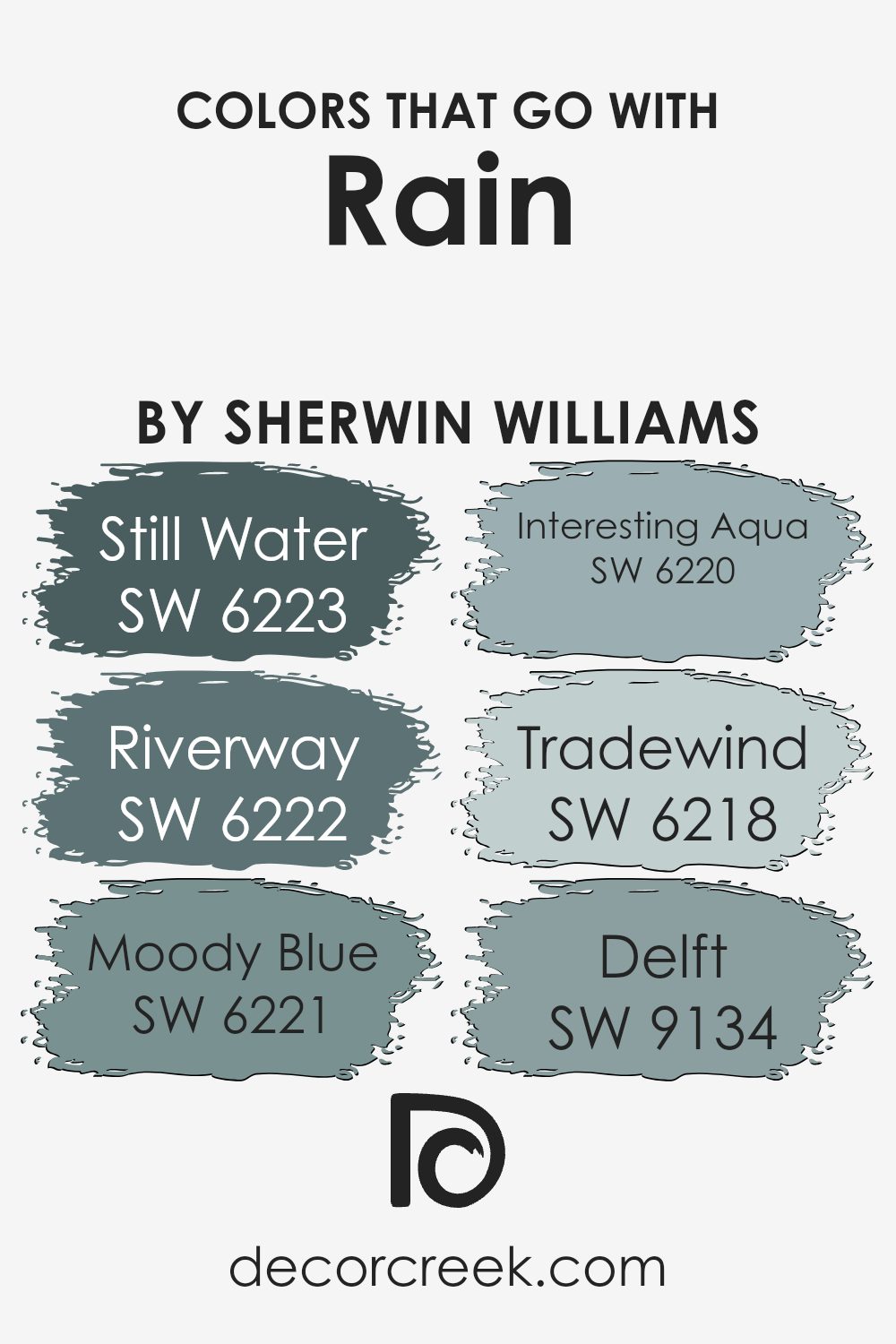
Colors that Go With Rain SW 6219 by Sherwin Williams
Colors that pair well with Sherwin Williams’ Rain SW 6219 are essential because they enhance its characteristics and offer a balanced and cohesive look to a room. Rain is a soft blue-gray, reminiscent of a gentle sky or a calm sea, which can make any space feel peaceful and welcoming.
It works well when accompanied by colors that either complement or contrast slightly, providing just the right mix of harmony and interest. Each color brings its unique vibe and mood, vital for anyone looking to create a specific atmosphere in their living space.
SW 6223 – Still Water is a deeper, richer blue-green that adds depth and a moody feeling. SW 6222 – Riverway leans into a darker greenish-blue, adding a bold and refreshing touch. SW 6221 – Moody Blue carries a muted blue tone, offering a soft and reflective quality. SW 6220 – Interesting Aqua is a light and airy blue-green, perfect for brightening up a space.
SW 6218 – Tradewind presents a gentle, cool bluish tone, providing an airy, breezy feel. Lastly, SW 9134 – Delft is a slightly darker blue, adding a sense of richness and grounding balance.
Together with Rain, these colors create a palette that feels balanced and restful, making any room look complete and inviting.
You can see recommended paint colors below:
- SW 6223 Still Water
- SW 6222 Riverway
- SW 6221 Moody Blue
- SW 6220 Interesting Aqua
- SW 6218 Tradewind
- SW 9134 Delft
How to Use Rain SW 6219 by Sherwin Williams In Your Home?
Rain SW 6219 by Sherwin Williams is a soothing and soft blue-gray paint color. It works well in various parts of the home, adding a calming and fresh atmosphere. In a bedroom, this color can create a peaceful and relaxing space conducive to rest. Pair it with white or light-colored furniture to keep the room airy and clean.
In the living room, Rain SW 6219 can bring a touch of nature indoors, especially when combined with plants and natural textures like wood or stone. This color is also great for bathrooms, giving a crisp and clean feel when matched with white tiles and silver fixtures.
In children’s rooms or nurseries, it provides a gentle background that’s not too vibrant or overwhelming. Overall, Rain SW 6219 is versatile and blends well with both modern and traditional styles, making it a favorite for anyone looking to add subtle color to their home.
Rain SW 6219 by Sherwin Williams vs Sleepy Blue SW 6225 by Sherwin Williams
Rain SW 6219 and Sleepy Blue SW 6225, both by Sherwin Williams, offer a calming feel but have distinct characteristics. Rain is a soft grayish-blue that can be perceived as a cool and comforting color, making spaces feel larger and more open. It pairs well with neutral tones and is ideal for creating a peaceful atmosphere in bedrooms or living rooms.
On the other hand, Sleepy Blue is a slightly lighter shade with a touch more blue. It appears more airy and fresh, adding a gentle brightness to any space. This color works well in bathrooms or kitchens where a light and airy feeling is desirable.
Both colors are versatile and can complement a wide range of other colors and décor styles. While Rain offers a bit more depth and grounding, Sleepy Blue provides a light and uplifting tone. Choosing between them depends on whether you want a cozier or more airy environment.
You can see recommended paint color below:
- SW 6225 Sleepy Blue
Rain SW 6219 by Sherwin Williams vs Niebla Azul SW 9137 by Sherwin Williams
Rain SW 6219 by Sherwin Williams is a soft, muted blue with greenish undertones, reminiscent of a calm sky after a drizzle. This main color brings a gentle and soothing vibe to spaces, making it ideal for bedrooms or living areas where relaxation is a priority.
On the other hand, Niebla Azul SW 9137, also by Sherwin Williams, is a slightly deeper shade of blue with hints of gray. This color has a cooler and more modern feel, making it suitable for contemporary settings or rooms that benefit from a touch of sophistication.
While both colors share a blue base, Rain leans more towards a greenish hue, creating warmth. In contrast, Niebla Azul’s gray undertones give it a cooler and more polished appearance. Together, these colors can complement each other by using Rain for walls and Niebla Azul for accents or furniture to create a balanced and inviting environment.
You can see recommended paint color below:
- SW 9137 Niebla Azul
Rain SW 6219 by Sherwin Williams vs Silver Lake SW 9633 by Sherwin Williams
Rain SW 6219 by Sherwin Williams is a calming and muted shade of blue. It has a touch of gray, giving it a soft and soothing feel. This color can make a room feel peaceful and relaxed, almost like being by the water on a cloudy day.
Silver Lake SW 9633, also by Sherwin Williams, is a light gray color. It’s a neutral shade that adds a sense of openness and cleanliness to any space. Silver Lake is versatile and pairs well with many colors, making it a good choice for those who like to keep their options open when it comes to decor.
When comparing the two, Rain is more about bringing a gentle blue hue into a room, while Silver Lake offers a straightforward, neutral backdrop. Rain is ideal for adding a bit of color without being overwhelming, whereas Silver Lake works well for creating a modern and minimalistic look. Both are good choices, depending on the mood or style you want to achieve in your space.
You can see recommended paint color below:
- SW 9633 Silver Lake

Rain SW 6219 by Sherwin Williams vs French Moire SW 9056 by Sherwin Williams
Rain SW 6219 is a calming blue-green shade by Sherwin Williams, exuding a relaxed and airy feel. It often brings to mind a peaceful day by the ocean, making it a great choice for spaces that aim to provide a soothing atmosphere. Its light tone helps it pair well with whites and other pastel colors, offering versatility in various design settings.
On the other hand, French Moire SW 9056, also by Sherwin Williams, presents a more muted, dusty blue. It carries a touch more gray, giving it a classic and timeless appeal. This color works beautifully in spaces requiring a subtle yet sophisticated backdrop, as it doesn’t overwhelm a room.
It’s perfect for creating an elegant setting without being too bold and combines well with both lighter and darker colors for added depth.
Both colors have their unique charm, whether you want a more laid-back vibe with Rain or a gentle, understated look with French Moire.
You can see recommended paint color below:
- SW 9056 French Moire
Rain SW 6219 by Sherwin Williams vs Festoon Aqua SW 0019 by Sherwin Williams
Rain SW 6219 and Festoon Aqua SW 0019 by Sherwin Williams are two distinct colors with unique characteristics. Rain is a soft, muted gray with a hint of blue, giving it a calm and neutral quality. It’s versatile, making it suitable for many spaces as it blends well with various decor styles. Rain can serve as a subtle backdrop, allowing other design elements to stand out.
On the other hand, Festoon Aqua is a bolder choice, with its vibrant aqua hue bringing a sense of freshness and energy to a room. It’s brighter and more energetic compared to the subdued tone of Rain. Festoon Aqua works well as an accent color, adding a pop of color that draws attention and creates a lively atmosphere.
While both colors can complement different spaces, Rain offers a more understated and soothing ambiance, whereas Festoon Aqua adds a lively touch.
You can see recommended paint color below:
- SW 0019 Festoon Aqua
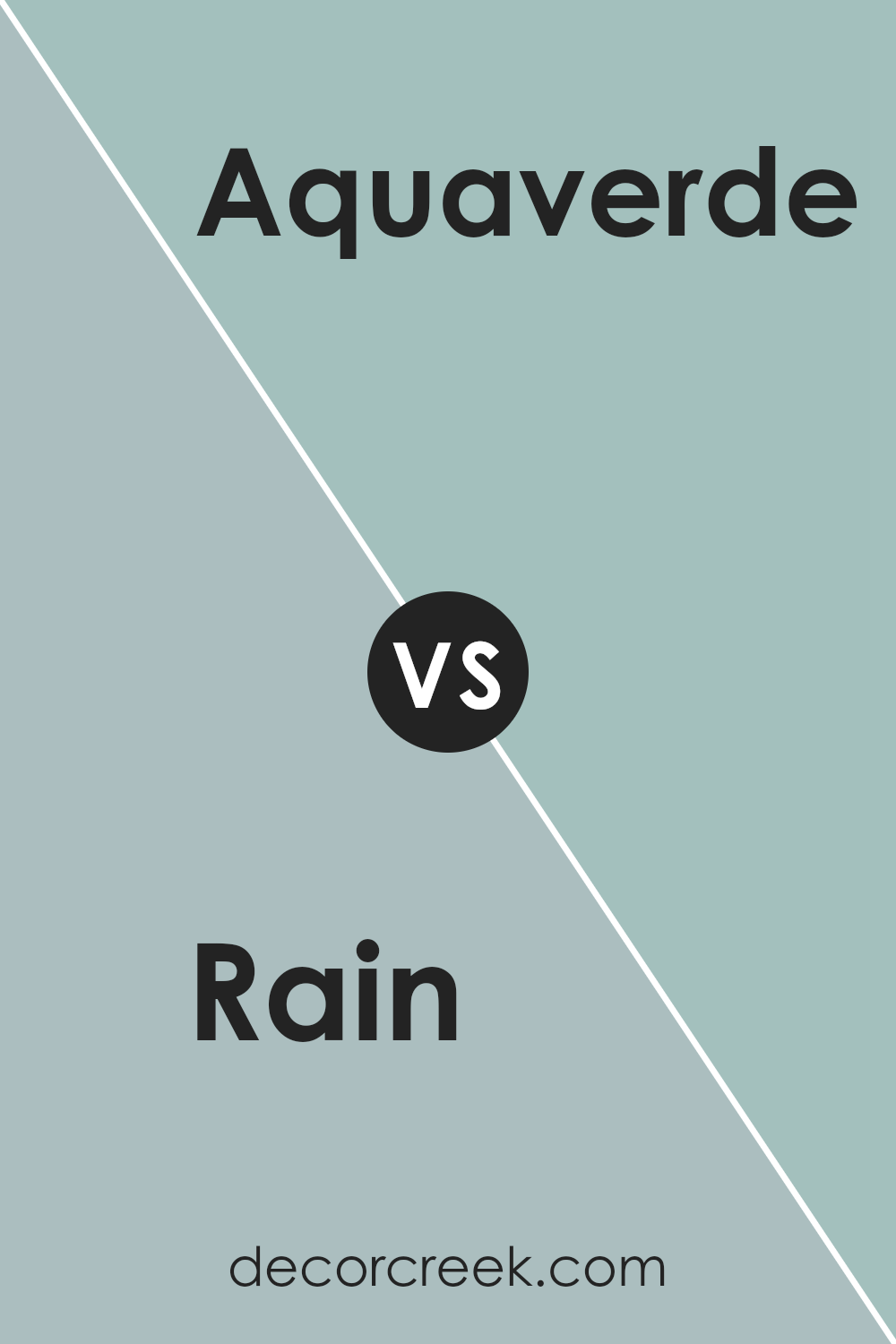
Rain SW 6219 by Sherwin Williams vs Aquaverde SW 9051 by Sherwin Williams
Rain (SW 6219) and Aquaverde (SW 9051) are two colors from Sherwin Williams with distinct characteristics. Rain is a cool grayish-blue, creating a soft, calming effect. It’s versatile, suitable for bedrooms or living spaces where a relaxed atmosphere is desired.
On the other hand, Aquaverde is a brighter, light turquoise color that brings in a more vibrant and fresh feel. It works well in spaces where a pop of color is needed, such as a bathroom or accent wall.
Rain is more muted, making it a great backdrop for a variety of decor styles. It can pair well with neutral tones or darker blues for a cohesive look. Aquaverde, with its lively nature, pairs nicely with whites or contrasting bold colors to add energy to a room. Both colors have their unique appeal, with Rain offering subtlety and Aquaverde bringing a cheerful touch to interiors.
You can see recommended paint color below:
- SW 9051 Aquaverde
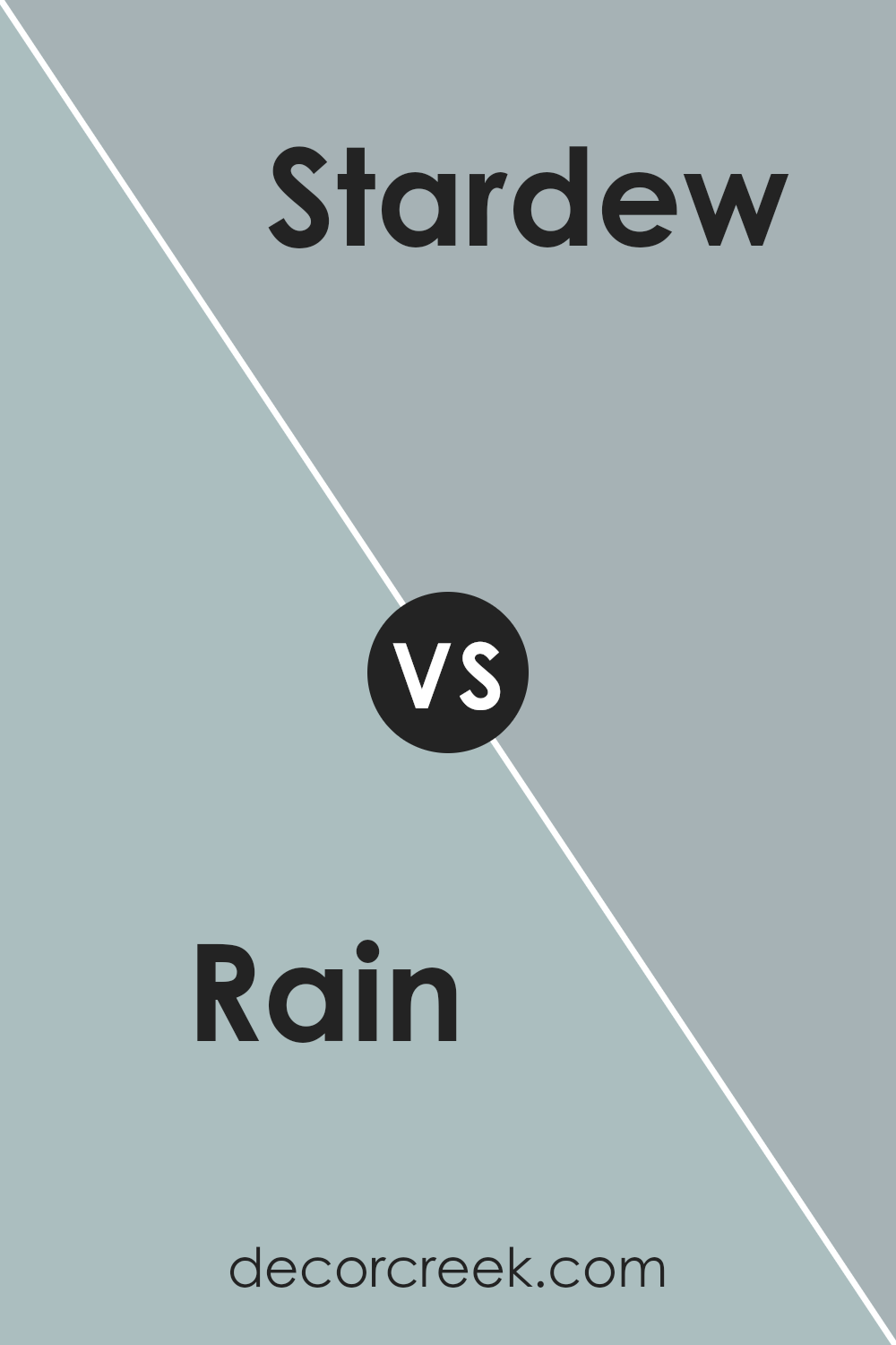
Rain SW 6219 by Sherwin Williams vs Stardew SW 9138 by Sherwin Williams
Rain SW 6219 and Stardew SW 9138 by Sherwin Williams are both shades of blue, but they each have their own feel and use. Rain is a soft, medium-toned blue with hints of green, giving it a natural, calming presence. It’s a versatile color that creates a peaceful atmosphere, making it great for bedrooms or living spaces where relaxation is key.
On the other hand, Stardew SW 9138 is a deeper, more muted blue-gray. It has a sophisticated feel due to its slightly darker and more subdued nature, making it suitable for spaces where a touch of elegance is desired. Stardew works well in dining rooms or offices, where it provides a calm but focused environment.
While both colors are inviting, Rain offers a lighter, more refreshing look, whereas Stardew provides a slightly more mature and grounded feel. Each color has its unique charm, allowing them to be used in different settings to suit various moods and functions.
You can see recommended paint color below:
- SW 9138 Stardew
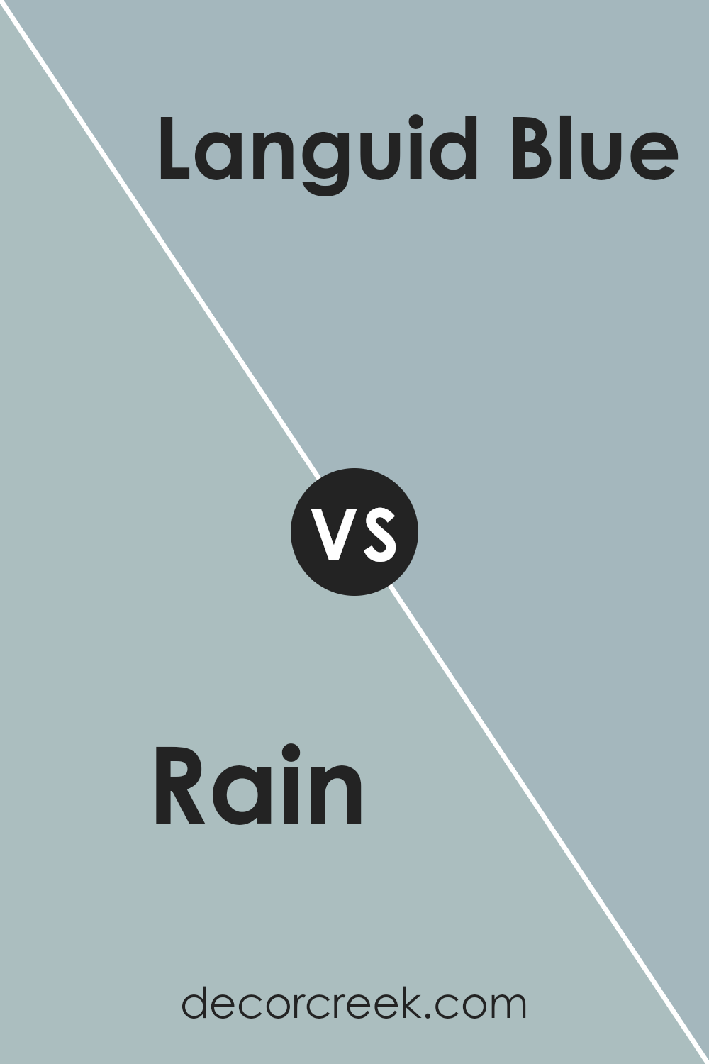
Rain SW 6219 by Sherwin Williams vs Languid Blue SW 6226 by Sherwin Williams
Rain SW 6219 and Languid Blue SW 6226 are two popular paint colors by Sherwin Williams. Rain is a versatile and calming blue-green shade. It works well in spaces where you want to create a relaxing atmosphere, making it suitable for bedrooms and bathrooms.
The color is deeper and has a bit more gray in it, giving it a more neutral feel that pairs nicely with whites and soft earth tones.
On the other hand, Languid Blue is a lighter and airier blue. It leans towards a classic sky blue, which feels brighter and more refreshing. This color can open up a space, making it ideal for living rooms or kitchens where you want a touch of lightness and energy. While both colors are calming and work well in different settings, Rain has a deeper, more grounded quality, whereas Languid Blue brings a sense of openness and freshness.
You can see recommended paint color below:
- SW 6226 Languid Blue
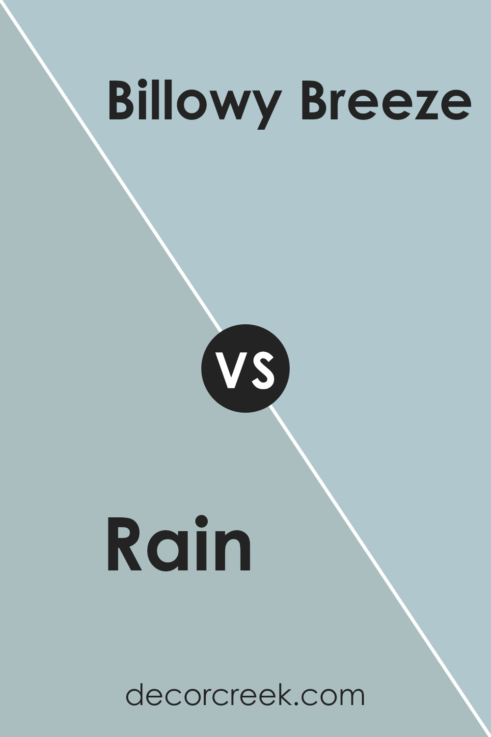
Rain SW 6219 by Sherwin Williams vs Billowy Breeze SW 9055 by Sherwin Williams
“Rain” by Sherwin Williams is a calming and muted blue-gray tone. It’s soft and creates a comforting feeling, working well in any room where relaxation is key. This color has a subtle depth, making it versatile for both walls and accents.
On the other hand, “Billowy Breeze” is a lighter, airy blue. It’s fresh and bright, bringing a sense of openness and lightness to a room. This color is perfect for spaces where you want a touch of energy without being overwhelming.
When comparing the two, “Rain” leans more towards a neutral palette due to its gray undertones, whereas “Billowy Breeze” feels more vibrant and uplifting because of its clear blue hue. Both colors can complement coastal or minimalist styles, but “Rain” is better for a calming atmosphere, while “Billowy Breeze” suits spaces needing a refreshing, airy vibe.
You can see recommended paint color below:
- SW 9055 Billowy Breeze
Rain SW 6219 by Sherwin Williams vs Aqua-Sphere SW 7613 by Sherwin Williams
Rain (SW 6219) by Sherwin Williams is a calming medium blue with green undertones. It has a soothing, grounded feel that’s reminiscent of a gentle rainfall. Its shade works well in creating a peaceful and relaxing atmosphere in any room. This color pairs beautifully with natural elements like wood and stone, adding a touch of nature indoors.
On the other hand, Aqua-Sphere (SW 7613) is a softer, lighter blue with a hint of gray. It’s more airy and has a refreshing quality to it. Aqua-Sphere is perfect for spaces where you want to feel fresh and open. It’s a cheerful and uplifting color that can make a room feel bigger and brighter.
When comparing these two blues, Rain brings a deeper, more comforting vibe, while Aqua-Sphere offers lightness and clarity. Both are excellent choices depending on whether you want a cozy space or a more open and fresh environment.
You can see recommended paint color below:
- SW 7613 Aqua-Sphere
Conclusion
After taking a closer look at SW 6219 Rain by Sherwin Williams, I can confidently say it’s a beautiful color that can make any room feel fresh and lively. This gentle shade of blue seems to bring a bit of the outside sky inside, which can feel really nice on a sunny day or calm you down on a rainy day.
This color can look great in many parts of your home, like the living room, bedroom, or even the bathroom.
When you pair Rain with other colors, such as whites, grays, or greens, it can look even better. Think of it like wearing your favorite pair of blue jeans—they go with almost anything! This makes Rain a really handy choice for anyone who wants a home that feels comfy and welcoming.
To sum it up, SW 6219 Rain is more than just a paint color; it’s a way to make your home feel cheerful and peaceful. So, if you want a color that makes you smile and feel at ease, Rain might just be the perfect choice for you.
Ever wished paint sampling was as easy as sticking a sticker? Guess what? Now it is! Discover Samplize's unique Peel & Stick samples.
Get paint samples

