If you’re on the hunt for a fresh paint color that’s both versatile and pleasing, SW 6218 Tradewind by Sherwin-Williams might be just what you need. This shade is a soft, understated blue that has a hint of gray, making it a perfect fit for a calm and relaxing environment. Tradewind is ideal for those looking to add a touch of freshness to their space without overpowering it with bold colors.
This particular color works well in various areas of the home, from bedrooms and bathrooms to kitchens and living areas. Its ability to complement different decors and themes means you can use it in modern, coastal, or traditional settings. Whether you’re looking to paint an entire room or just an accent wall, Tradewind offers a subtle charm that pairs nicely with many colors and finishes.
Moreover, this shade promotes a light and airy feel, making your space appear brighter and more open.
Choosing the right paint can be a game-changer for your home’s aesthetic, and SW 6218 Tradewind by Sherwin-Williams is a choice that you won’t regret. It’s a simple yet effective way to refresh your living environment.
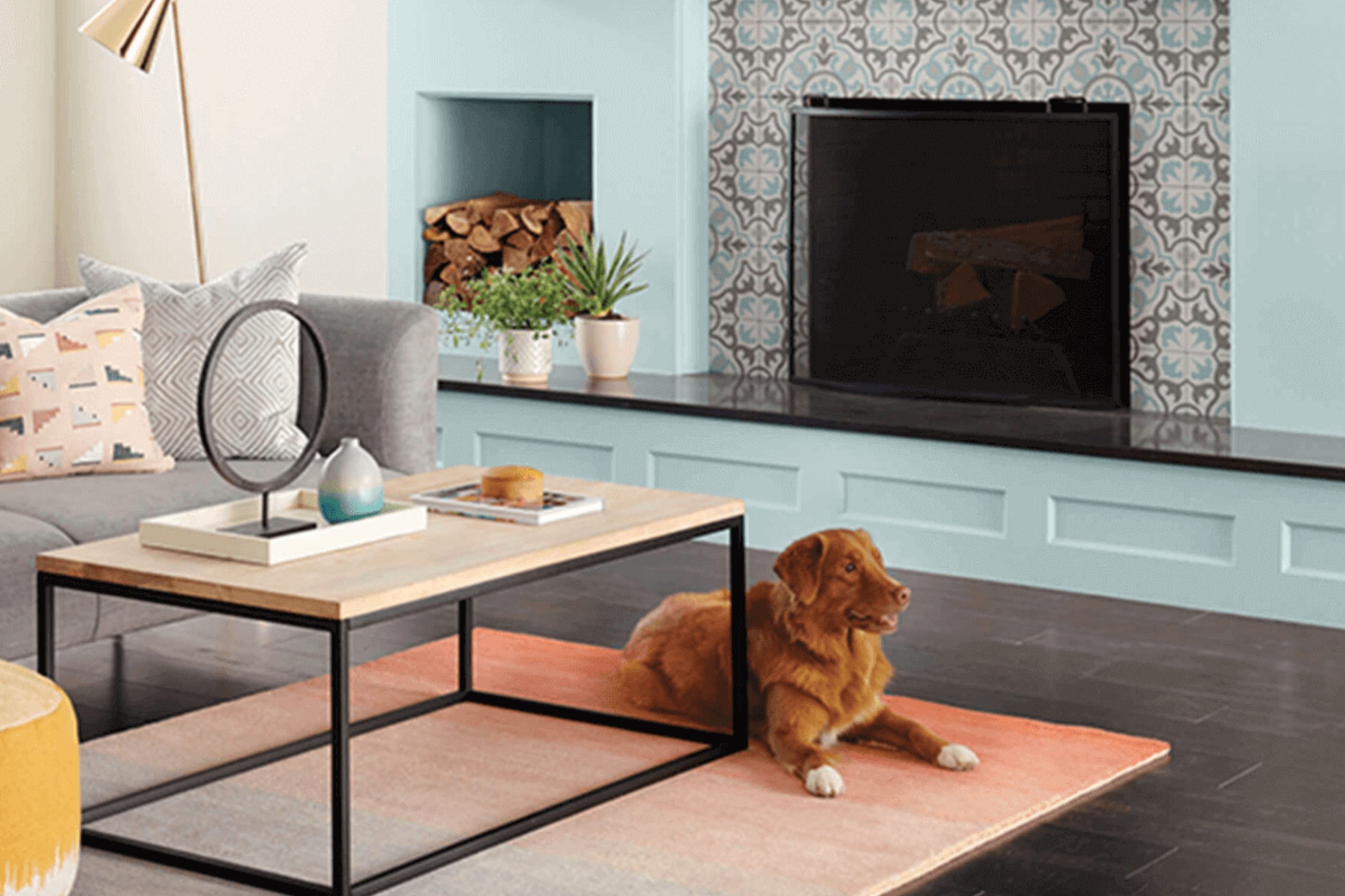
What Color Is Tradewind SW 6218 by Sherwin Williams?
The color Tradewind by Sherwin Williams is a gentle blue with a slightly greenish tint that reminds one of a soft sea breeze. This unique shade is calming and works exceptionally well in spaces designed for relaxation and peace, such as bedrooms and bathrooms.
Tradewind can seamlessly blend into various interior styles, particularly coastal, modern farmhouse, and Scandinavian due to its clean and airy feel. In a coastal themed room, it mirrors the relaxed vibe of sandy beaches and ocean waves.
When applied in a room with a modern farmhouse style, it complements natural elements like wood and stone, enhancing a fresh, open atmosphere. In Scandinavian decor, its light touch helps maintain a sense of minimalism while adding just enough color to create visual interest.
This color pairs beautifully with materials that evoke a natural and light feeling. Wood, whether pale oak or rich walnut, complements its blue-green hue, making wooden furniture or flooring ideal partners. Additionally, linens and soft cotton fabrics in neutral tones or clean white can highlight its gentle nature.
Metals like copper and silver also match well, adding a touch of modernity to the soothing backdrop that Tradewind provides. Together, these combinations can create a soothing, inviting space that feels both refreshed and cohesive.

Is Tradewind SW 6218 by Sherwin Williams Warm or Cool color?
Tradewind is a gentle shade of blue with a touch of gray, making it a popular choice for homes looking to create a calm and relaxing atmosphere. This color is a favorite among homeowners for its ability to pair well with both modern and traditional interiors. Its subtle gray undertone prevents it from overpowering a room while the blue offers a cooling effect, making it particularly appealing for bedrooms, bathrooms, and living spaces that benefit from a sense of calm.
Tradewind is versatile enough to complement various decor styles and color schemes. It matches well with creams, beiges, and whites for a soft, muted palette. For a bolder look, it can be paired with brighter colors like mustard or coral, which add a vibrant contrast to the peaceful blue.
Because Tradewind reflects natural light beautifully, it can help make a small space appear brighter and more spacious. Its adaptability and soothing qualities make it a smart choice for anyone looking to refresh their home with a touch of color.
Undertones of Tradewind SW 6218 by Sherwin Williams
Undertones play a crucial role in how a paint color presents itself in various lighting conditions. Imagine undertones as subtle shades that linger beneath the surface of the main color, impacting its overall hue and feel. For the paint in discussion, its undertones include light blue, light purple, pale yellow, lilac, mint, pale pink, and grey. These undertones add depth and complexity, influencing the color’s appearance in different environments.
When applied to interior walls, this color behaves uniquely depending on the room’s lighting and surrounding colors. For instance, in a space with ample natural light, the light blue and mint undertones might make the walls appear more vibrant and refreshing.
Conversely, in a room with less natural light, the grey and pale yellow undertones could make the color appear softer and more muted.
These undertones can also affect mood and perception. A room painted in this color with its spectrum of undertones might feel cozy and welcoming due to the pale yellow and pale pink tones, or fresh and calm because of the light blue and lilac. The choice of furniture and decor also plays a role; warmer colored furnishings can highlight the yellow and pink undertones, while cooler toned decor might emphasize the blue and grey.
Understanding these undertones helps in choosing the right paint for the desired atmosphere and in achieving harmony between the walls and the room’s elements. This knowledge ensures that the walls will complement the space and enhance the overall aesthetic appeal.
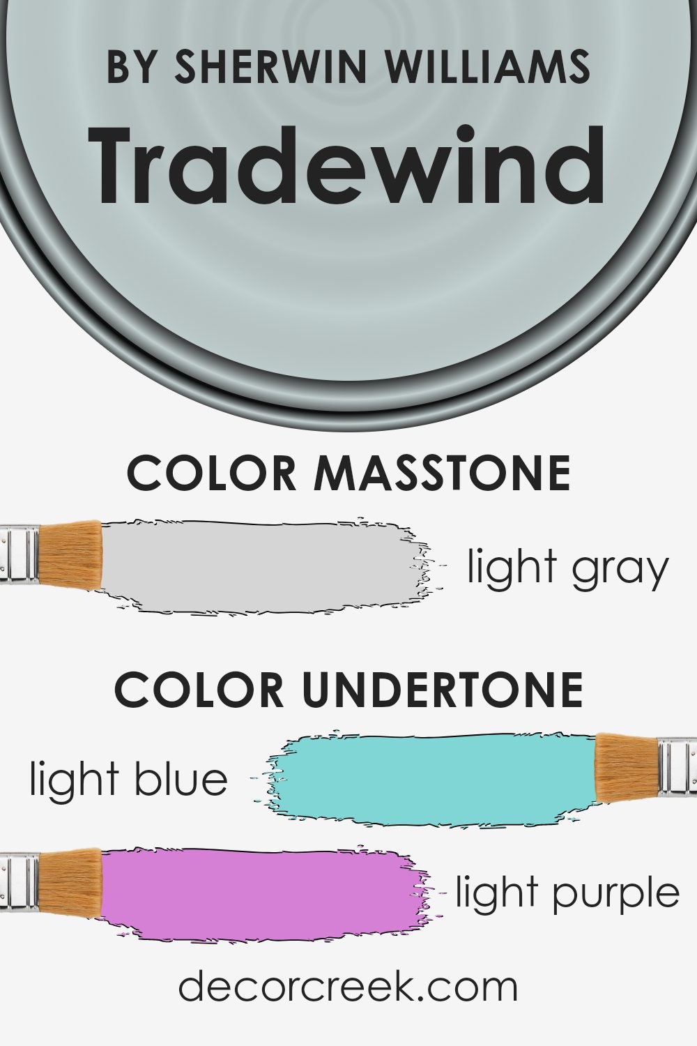
What is the Masstone of the Tradewind SW 6218 by Sherwin Williams?
TradewindSW 6218 by Sherwin Williams has a masstone of Light Gray, which brings a gentle and refreshing feel to spaces. Its light gray hue, represented by the color code #D5D5D5, is very adaptable, making it perfect for different rooms in a home. This light gray color is exceptionally suitable for creating a calm and relaxing environment, ideal for spaces where you want to wind down and relax, like bedrooms and living rooms.
Because it’s a neutral color, it pairs well with many other colors, whether you want to match it with bold hues for a dynamic contrast or keep things low-key with other neutrals for a more muted look. This versatility allows homeowners to use it broadly, from walls and cabinets to accents.
Additionally, light gray helps to make rooms look bigger and brighter by reflecting light, an excellent choice for smaller spaces or areas with limited natural light.
How Does Lighting Affect Tradewind SW 6218 by Sherwin Williams?
Lighting plays a crucial role in how we perceive colors, often affecting their brightness, hue, and intensity. One color that exemplifies these variations with different lighting conditions is Tradewind by Sherwin Williams, a subtle, gentle blue with a hint of gray.
In artificial light, the qualities of Tradewind are largely dependent on the type of bulb used. For example, warm lighting tends to soften the blue, making it appear more muted and cozy. On the other hand, cooler LED bulbs highlight the blue tones, giving the color a crisper look.
This can be quite useful in a space where you want a clear, fresh shade of blue during the night or in rooms without windows.
In natural light, Tradewind reflects the light’s true colors more faithfully throughout the day. Under the bright, direct light often found in south-facing rooms, the color can appear lighter and more vibrant, brightening up the space.
In contrast, in north-facing rooms, which get less direct sunlight, Tradewind may look slightly more subdued and can sometimes lean towards its gray undertones, making it perfect for a calming atmosphere.
East-facing rooms receive the warm, yellow light of the morning sun, which can make Tradewind look softer and slightly warmer in the mornings, transforming as the light shifts throughout the day. West-facing rooms, bathed in the intense, warm light of late afternoons, can pull out the more vibrant blue in Tradewind during sunset hours, creating a dynamic change in the room’s feel as the day progresses.
In summary, Tradewind’s perception is significantly influenced by its lighting environment: clearer and more vibrant in well-lit, south-facing settings, and softer in dimmer, north-facing rooms. It adapts uniquely in east and west settings, demonstrating flexibility and variation with natural light transitions.

What is the LRV of Tradewind SW 6218 by Sherwin Williams?
LRV stands for Light Reflectance Value, which measures the percentage of light a paint color reflects from or absorbs into a painted surface. It ranges from a scale of 1 to 99, where higher values indicate that the paint reflects more light, making the space feel brighter.
Colors with a high LRV are typically used to make small rooms appear larger and more open, while darker colors with a lower LRV can make a space feel more cozy and intimate. Understanding LRV can help you choose the right paint color depending on the amount of natural or artificial light your room receives, as well the size of the room.
For the color Tradewind with an LRV of around 60, this means it is a mid-range color that reflects a moderate amount of light. In practical terms, this makes it versatile enough to be used in a variety of spaces, whether they are well-lit or slightly darker. Tradewind can help balance out rooms that don’t get a lot of natural sunlight without making them feel cramped, all while maintaining a fresh look.
Its LRV also makes it a good choice for larger areas, as it won’t feel overwhelmingly bright or stark, adding a lively yet soft touch to the overall ambiance of any room.

Coordinating Colors of Tradewind SW 6218 by Sherwin Williams
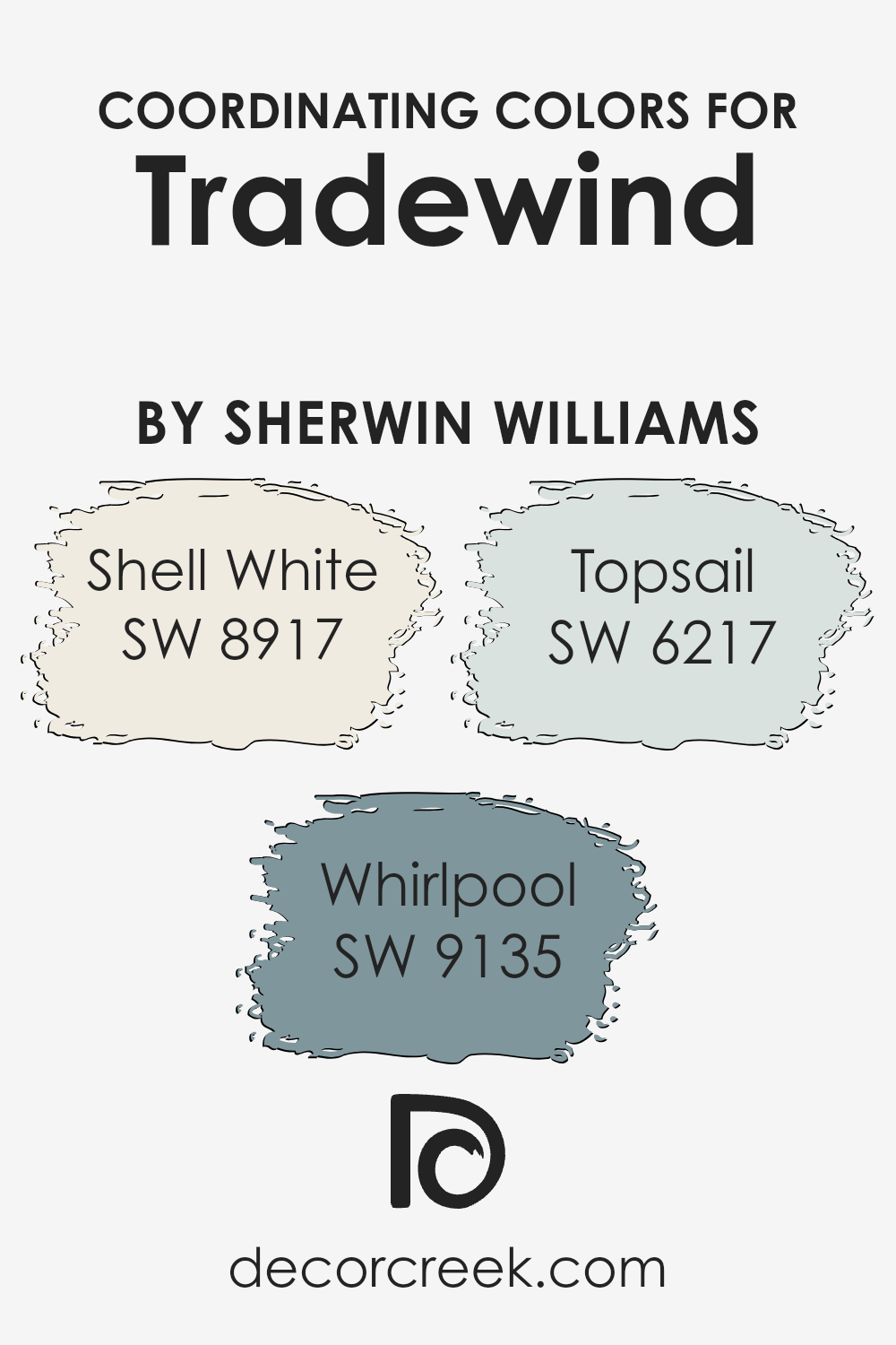
Coordinating colors work together harmoniously to enhance the overall aesthetic of a space, creating a balanced and pleasing environment. When we look at Tradewind by Sherwin Williams, a soothing blue with a gentle hint of green, it’s complemented by a selection of coordinating colors that enhance its cool, calm nature without overwhelming it.
These coordinating colors include Shell White, Whirlpool, and Topsail, each chosen for their ability to support and enrich the primary hue of Tradewind.
Shell White is a soft, clean white with a touch of warmth that offers a subtle contrast without clashing with Tradewind. It works beautifully as a neutral base or trim color, providing a fresh and airy backdrop that allows Tradewind to shine. Whirlpool, on the other hand, is a deeper blue that echoes the depth of Tradewind but with a bolder, more pronounced presence.
It’s ideal for creating accents or for use in areas where a stronger color statement is desired. Lastly, Topsail is a lighter shade that leans towards a pale, sky blue. It’s perfect for giving a room a breezy, light feel while still maintaining a connection with the calming vibe of Tradewind. Together, these colors create a cohesive palette that allows for versatility in design while maintaining a coherent look.
You can see recommended paint colors below:
- SW 8917 Shell White (CHECK A SAMPLE)
- SW 9135 Whirlpool (CHECK A SAMPLE)
- SW 6217 Topsail (CHECK A SAMPLE)
What are the Trim colors of Tradewind SW 6218 by Sherwin Williams?
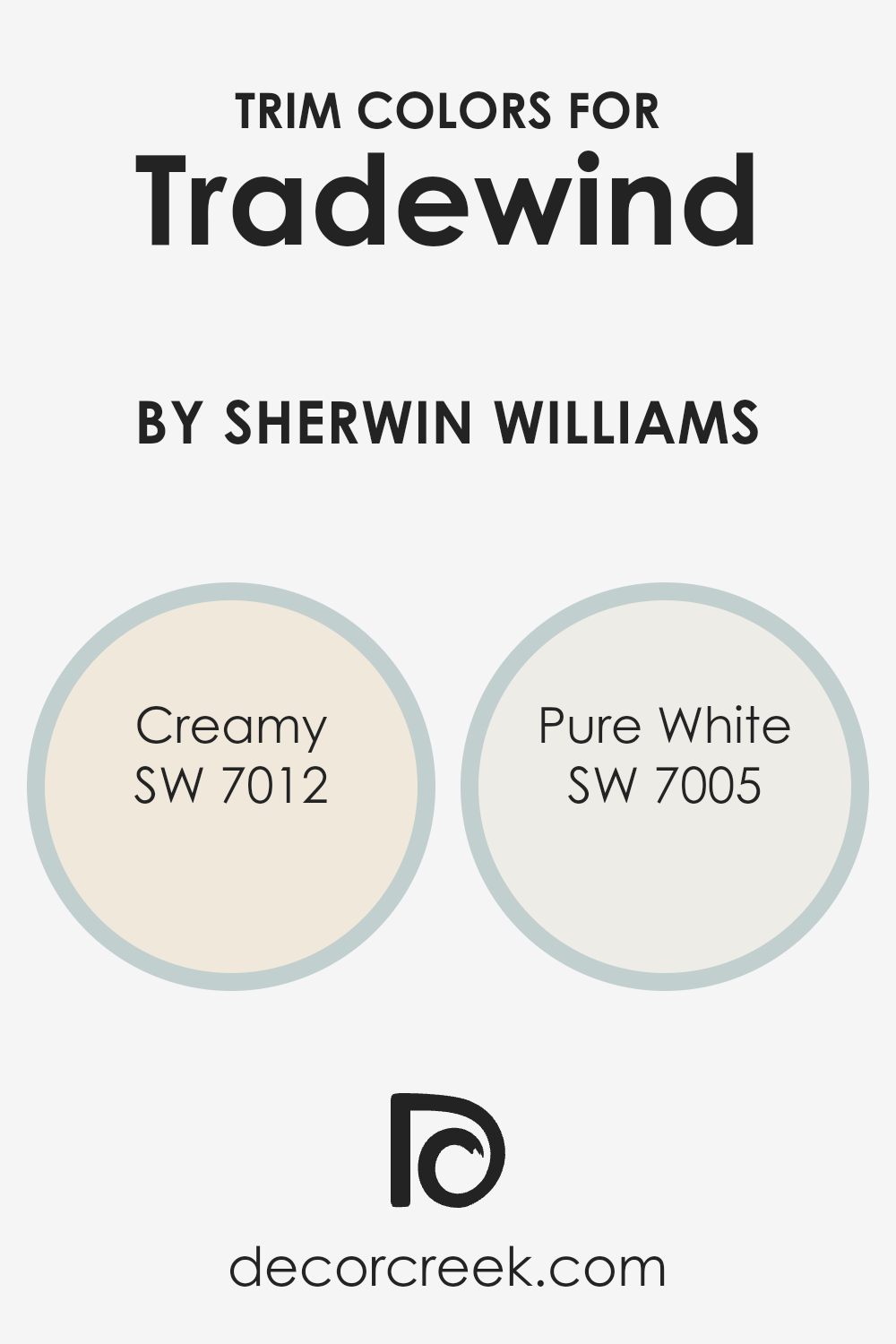
Trim colors are specific shades used to accentuate or highlight the architectural details and edges like door frames, window frames, and skirting in a space. When carefully chosen, trim colors complement the main wall color, enhancing the overall look and feel of a room. For example, using the right trim colors with Tradewind SW 6218 by Sherwin Williams can really make the walls pop and give a clean, finished look to the space.
SW 7012 – Creamy is a soft, warm off-white tone that adds a gentle contrast against the cooler hues of Tradewind, providing a subtle yet inviting appeal. On the other hand, SW 7005 – Pure White is a bright, crisp white that offers a more striking contrast, making the blue shades in Tradewind much more pronounced and lively.
Both choices can effectively highlight tones of Tradewind SW 6218, depending on the desired impact and ambiance in the room. Choosing the right one depends on how much you want the trim to stand out against the calmness of Tradewind.
You can see recommended paint colors below:
Colors Similar to Tradewind SW 6218 by Sherwin Williams
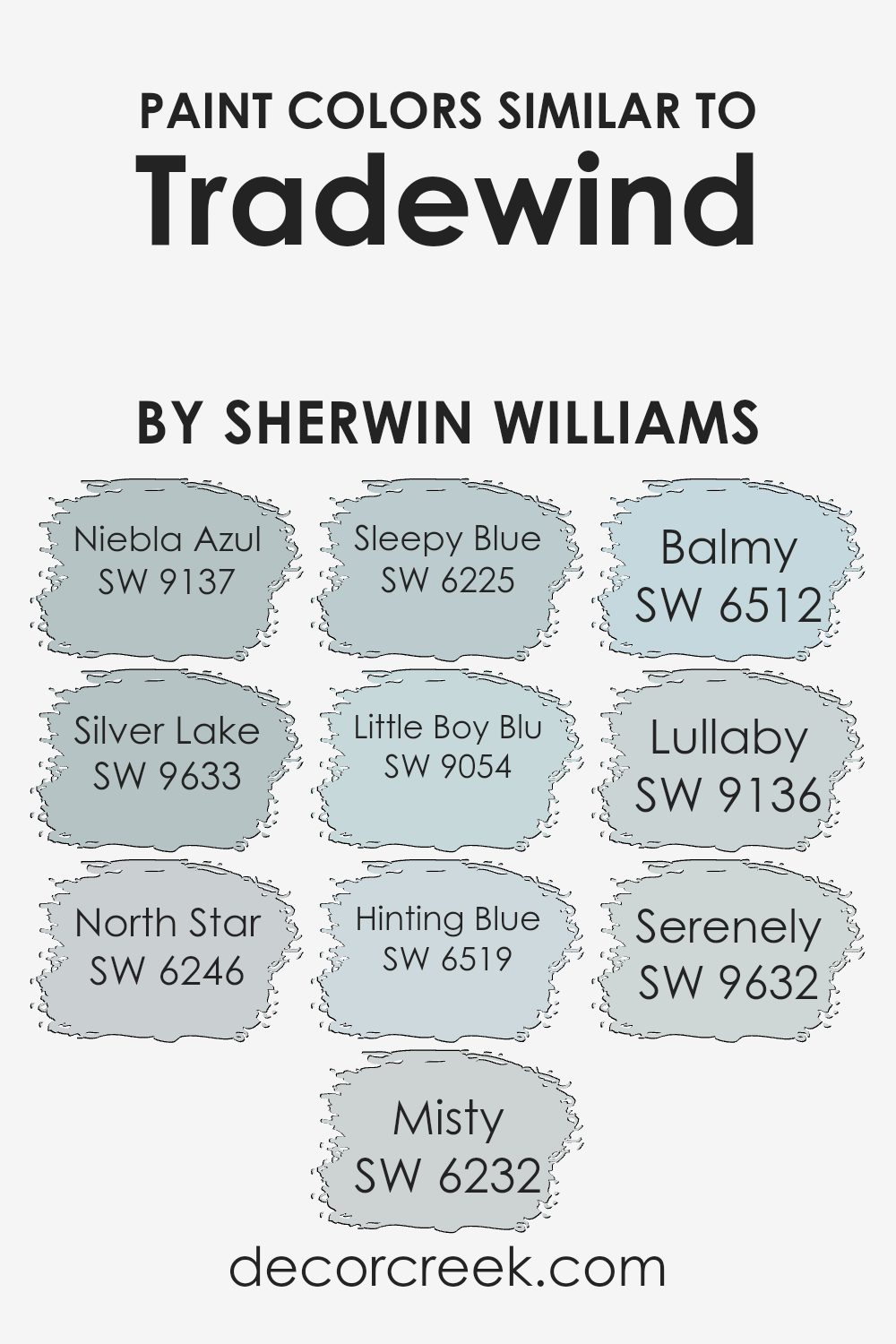
Similar colors are vital in creating a visually harmonious space, as they provide a subtle and soothing backdrop to interiors, allowing room for bolder accents or furnishings to stand out. Colors like Niebla Azul, Silver Lake, and North Star share a cool, calming palette that can make any room feel more inviting.
These shades of blue and gray work well together because they share a certain softness, making transition between spaces smooth and aesthetically pleasing. When colors like Misty, Sleepy Blue, and Little Boy Blu are used in the same area, they help create a cohesive look that feels intentional and well-designed.
For example, Niebla Azul is a gentle gray-blue that evokes a misty morning sky, while Silver Lake offers a slightly more robust blue-gray that resembles the surface of a quiet lake at dawn. North Star provides a soft, muted gray that complements its more colorful counterparts.
Similarly, Misty is a light, airy blue that suggests a hint of the sky on a cloudy day, and Sleepy Blue has a dreamy quality that works beautifully in bedrooms.
Little Boy Blu is just a touch brighter, offering a fresh and youthful vibe. Each of these colors has its unique attribute but collectively, they support each other to achieve a cohesive and pleasant environment.
You can see recommended paint colors below:
- SW 9137 Niebla Azul (CHECK A SAMPLE)
- SW 9633 Silver Lake (CHECK A SAMPLE)
- SW 6246 North Star (CHECK A SAMPLE)
- SW 6232 Misty (CHECK A SAMPLE)
- SW 6225 Sleepy Blue (CHECK A SAMPLE)
- SW 9054 Little Boy Blu (CHECK A SAMPLE)
- SW 6519 Hinting Blue (CHECK A SAMPLE)
- SW 6512 Balmy (CHECK A SAMPLE)
- SW 9136 Lullaby (CHECK A SAMPLE)
- SW 9632 Serenely (CHECK A SAMPLE)
Colors that Go With Tradewind SW 6218 by Sherwin Williams
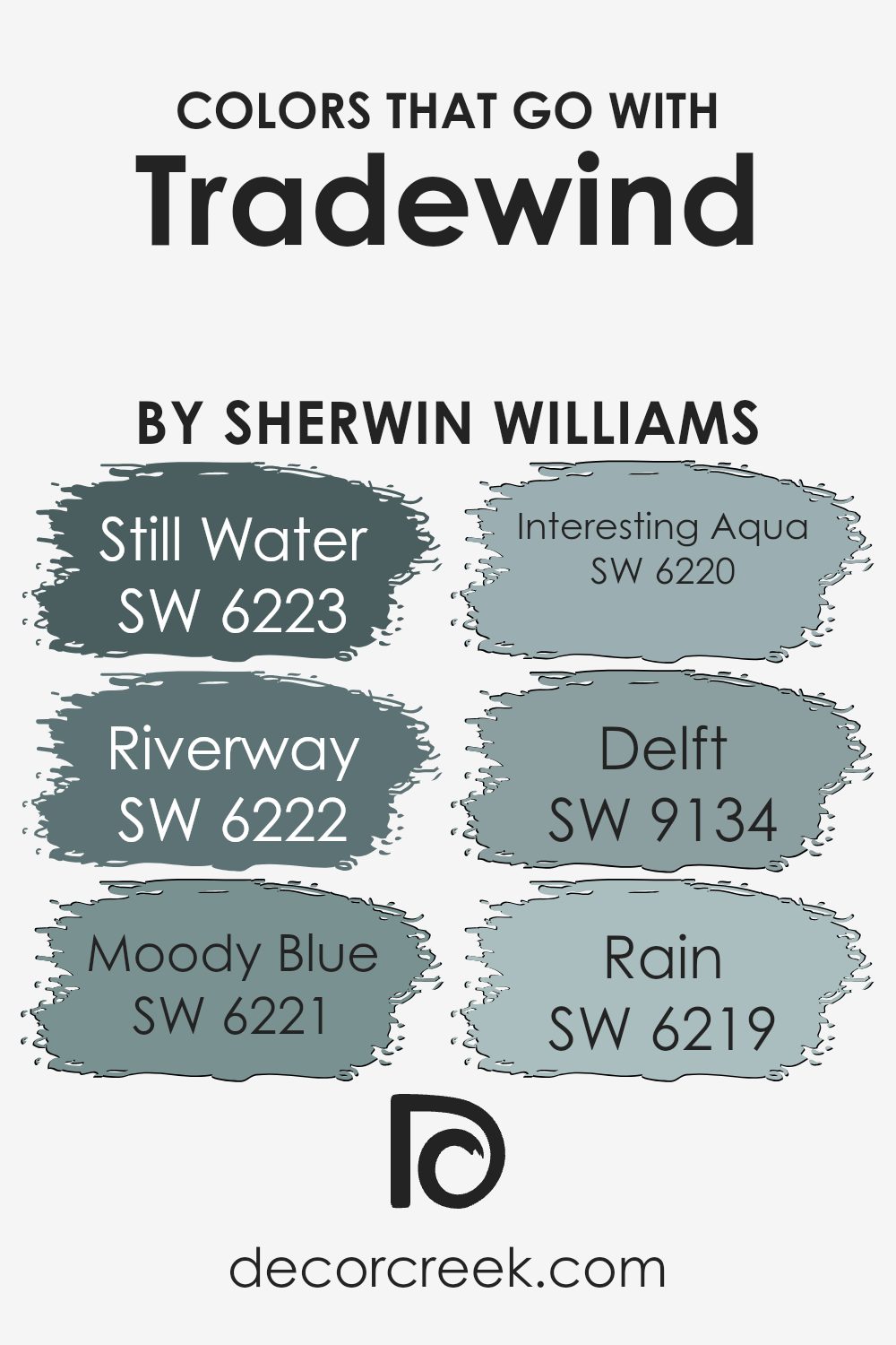
Choosing colors that pair well with Tradewind SW 6218 by Sherwin Williams can significantly enhance the atmosphere of any space. Whether decorating a living room, bedroom, or office, the right color combinations can create a cohesive and visually appealing environment.
Complementary colors like Still Water SW 6223 and Riverway SW 6222 add depth and allow for functional yet attractive design. Still Water is a lighter blue that provides a soft contrast to Tradewind, bringing a calm and relaxed air to the room. Riverway, on the other hand, is a deeper teal that offers a striking, yet harmonious balance, enriching the space without overpowering it.
When looking to add a touch of mystery or a soothing vibe, colors like Moody Blue SW 6221, Interesting Aqua SW 6220, and Rain SW 6219 are beautiful choices. Moody Blue, a darker blue with a hint of grey, works well to give a room an anchored feel. Interesting Aqua offers a fresher and slightly vibrant quality, injecting life into the space.
If you’re aiming for something lighter, Rain provides a gentle touch of soft blue that mixes well with Tradewind, ensuring the space feels airy and light.
Lastly, Delft SW 9134 is another option that brings a timeless blue charm with a hint of vibrancy, making any room look fresh and inviting without any effort. All these colors interact harmoniously with Tradewind, ensuring the decor has a balanced, cohesive look that is both pleasing to the eye and comforting to live in.
You can see recommended paint colors below:
- SW 6223 Still Water (CHECK A SAMPLE)
- SW 6222 Riverway (CHECK A SAMPLE)
- SW 6221 Moody Blue (CHECK A SAMPLE)
- SW 6220 Interesting Aqua (CHECK A SAMPLE)
- SW 9134 Delft (CHECK A SAMPLE)
- SW 6219 Rain (CHECK A SAMPLE)
How to Use Tradewind SW 6218 by Sherwin Williams In Your Home?
Tradewind by Sherwin Williams is a popular paint color that falls into the blue category with soft gray undertones. This versatile shade is a great choice for homeowners looking to add a fresh and airy feel to their spaces without overpowering the room with a strong color. It works exceptionally well in bathrooms and bedrooms, providing a calming backdrop that enhances relaxation. In a living room, Tradewind can give the space a relaxed, welcoming vibe.
This color pairs beautifully with white trim and cabinetry, highlighting its gentle blue hue and making rooms feel more spacious. For a modern look, you can match it with darker grays or navy accents, such as in throw pillows or artwork, to create a striking contrast.
Using Tradewind is also a practical way to refresh old furniture pieces or kitchen cabinets for a new look without an extensive renovation. Additionally, it is known for its good coverage and durability, making it a reliable choice for busy homes.
Tradewind SW 6218 by Sherwin Williams vs North Star SW 6246 by Sherwin Williams
Tradewind and North Star are two soothing colors from Sherwin Williams. Tradewind is a gentle blue with a hint of gray, creating a calm and relaxing vibe in any room. It resembles a light sea breeze and is perfect for spaces where you want a peaceful, airy feel.
On the other hand, North Star is a softer and lighter shade that leans more towards a neutral gray with subtle blue undertones. This color is great for those who prefer a more understated look but still enjoy a touch of color. It’s ideal for modern spaces and works well in small rooms to make them appear more spacious.
Overall, while both colors bring their own unique qualities to a space, Tradewind offers a more noticeable blue tone, adding coolness to the environment, whereas North Star provides a minimalist touch, blending seamlessly into modern decor.
You can see recommended paint color below:

Tradewind SW 6218 by Sherwin Williams vs Lullaby SW 9136 by Sherwin Williams
Tradewind and Lullaby by Sherwin Williams are both calm and soothing colors but have distinct tones. Tradewind is a soft, gray-blue that feels like the ocean on a cloudy day. It’s subtle and gentle, making it great for creating a soothing atmosphere in spaces like bedrooms or bathrooms where you want to relax.
On the other hand, Lullaby is a lighter, gentle gray with a hint of blue. This color is leaning more towards a neutral palette, providing a clean and airy feel, ideal for nurseries or any room in need of a soft, simple backdrop. While both colors promote a peaceful setting, Tradewind leans a bit cooler due to its deeper blue tones in contrast to Lullaby’s understated vibe, which is closer to classic gray.
This makes each suitable for different decor styles and preferences depending on the mood you want to set in a room.
You can see recommended paint color below:
- SW 9136 Lullaby (CHECK A SAMPLE)

Tradewind SW 6218 by Sherwin Williams vs Silver Lake SW 9633 by Sherwin Williams
The main color, Tradewind, and the second color, Silver Lake, both by Sherwin Williams, offer distinct tones ideal for creating different moods in a space. Tradewind is a softer, lighter blue with a gentle, calming effect, making it perfect for areas like bedrooms or bathrooms where a soothing atmosphere is desired.
On the other hand, Silver Lake has a dustier, more muted appearance, presenting a subtle blend of gray and blue. This color suits spaces that require a neutral backdrop with a touch of warmth, such as living rooms or offices.
Although both share a blue base, Tradewind leans towards a clearer, more vibrant sky blue, while Silver Lake, being slightly grayish, provides a more understated and versatile look. These qualities make each color unique in its right, catering to different aesthetic and functional needs in home decor.
You can see recommended paint color below:
- SW 9633 Silver Lake (CHECK A SAMPLE)

Tradewind SW 6218 by Sherwin Williams vs Balmy SW 6512 by Sherwin Williams
Tradewind SW 6218 and Balmy SW 6512 are both soothing shades offered by Sherwin Williams, yet they have distinct tones that set them apart. Tradewind is a cool gray that has a hint of blue, giving it a gentle and refreshing feel. This color is great for creating a calm and inviting atmosphere in spaces like bedrooms or bathrooms.
On the other hand, Balmy is a lighter color with a more pronounced presence of blue, leaning towards a soft, pastel-like tone. This makes it an excellent choice for brightening up a room while still maintaining a relaxed vibe. It’s perfect for areas that receive a lot of natural light, enhancing the light and airy feel.
Both colors are versatile and can be easily paired with a variety of decor styles, from modern to traditional. However, Balmy’s lighter and airier quality might make it more suitable for smaller spaces, where it can help make the area appear larger. Tradewind, with its slightly deeper tone, might be better suited for larger rooms or accent walls, where it can add depth without overwhelming the space.
You can see recommended paint color below:
- SW 6512 Balmy (CHECK A SAMPLE)
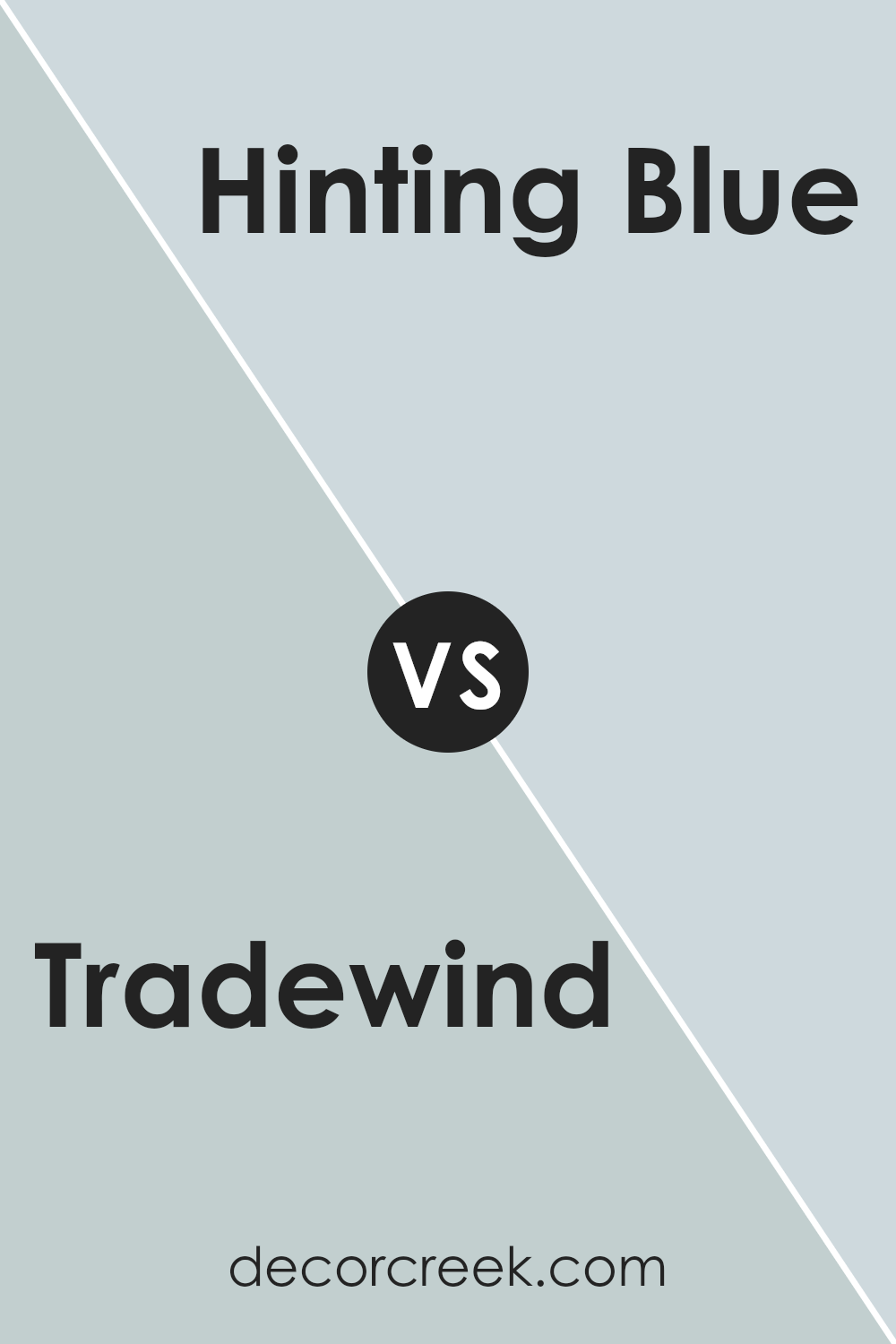
Tradewind SW 6218 by Sherwin Williams vs Hinting Blue SW 6519 by Sherwin Williams
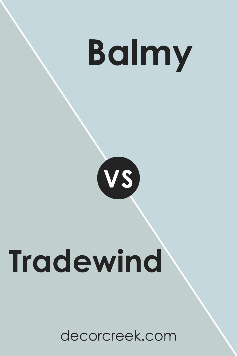
Tradewind and Hinting Blue, both by Sherwin Williams, are soft, soothing colors that can create a peaceful atmosphere in any space but have distinct tones and effects. Tradewind is a gentle grayish-blue that lends a cool and calm vibe, perfect for spaces meant for relaxation like bedrooms or bathrooms. It leans slightly towards a sea-inspired feel, which makes it a great choice for creating a breezy and light environment.
Hinting Blue is a lighter, airier shade compared to Tradewind. It borders more on a pale, sky blue, giving it a more uplifting and open feel. This makes it ideal for smaller spaces or areas that need a touch of brightness without being overwhelming. It can also enhance rooms that benefit from a more subtle touch of color, such as modern kitchens or nurseries.
Both colors pair well with neutral tones and can help brighten dark corners but achieve slightly different moods based on their unique undertones.
You can see recommended paint color below:
- SW 6519 Hinting Blue (CHECK A SAMPLE)
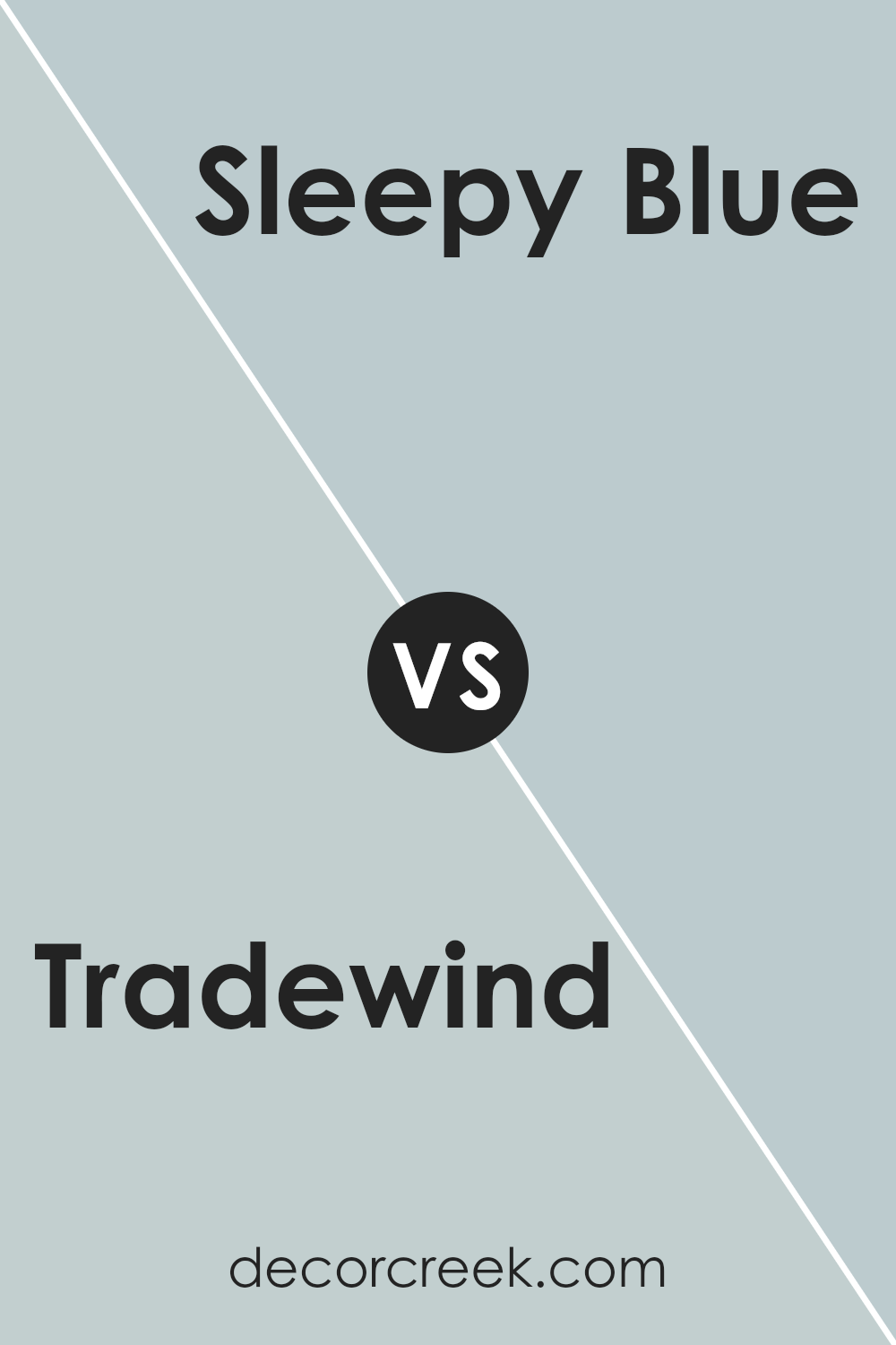
Tradewind SW 6218 by Sherwin Williams vs Sleepy Blue SW 6225 by Sherwin Williams
Tradewind and Sleepy Blue, both by Sherwin Williams, offer distinct tones that can significantly influence the mood of a room. Tradewind is a light, airy blue-green that feels fresh and soothing. It’s a versatile color that works well in spaces meant for relaxation such as bedrooms and bathrooms.
On the other hand, Sleepy Blue is a purer, soft blue with a calm presence, leaning more towards a classic blue without the green undertone. This makes it ideal for creating a peaceful, restful environment, perfect for areas where you want to unwind.
When comparing both, Tradewind offers a hint of vibrancy due to its greenish hints, making it slightly more energizing than Sleepy Blue. Sleepy Blue, however, maintains a more straightforward and gentle approach with its clean and clear blue, providing a quieter backdrop for any room. Together, these colors could work well in different rooms of a house depending on the desired atmosphere.
You can see recommended paint color below:
- SW 6225 Sleepy Blue (CHECK A SAMPLE)
Tradewind SW 6218 by Sherwin Williams vs Niebla Azul SW 9137 by Sherwin Williams
The main color, Tradewind, is a soft, light blue-gray shade that gives a gentle and calming effect to any space. It pairs well with both light and dark furniture, making it versatile for different home styles. This color offers a subtle coolness that is refreshing and clean.
On the other hand, Niebla Azul is a deeper, more saturated blue with hints of gray. This shade is stronger and can make more of a statement in a room. It works well in spaces where a touch of drama is desired, without overwhelming the area. Niebla Azul is perfect for creating a cozy, yet striking atmosphere.
When comparing the two, Tradewind is lighter and more laid back, ideal for achieving a peaceful vibe. Niebla Azul, while also peaceful, provides a bit more intensity and depth, making it suitable for those who want a bolder feel in their decorating scheme. Both colors maintain a cool palette but offer different levels of warmth and impact.
You can see recommended paint color below:
- SW 9137 Niebla Azul (CHECK A SAMPLE)

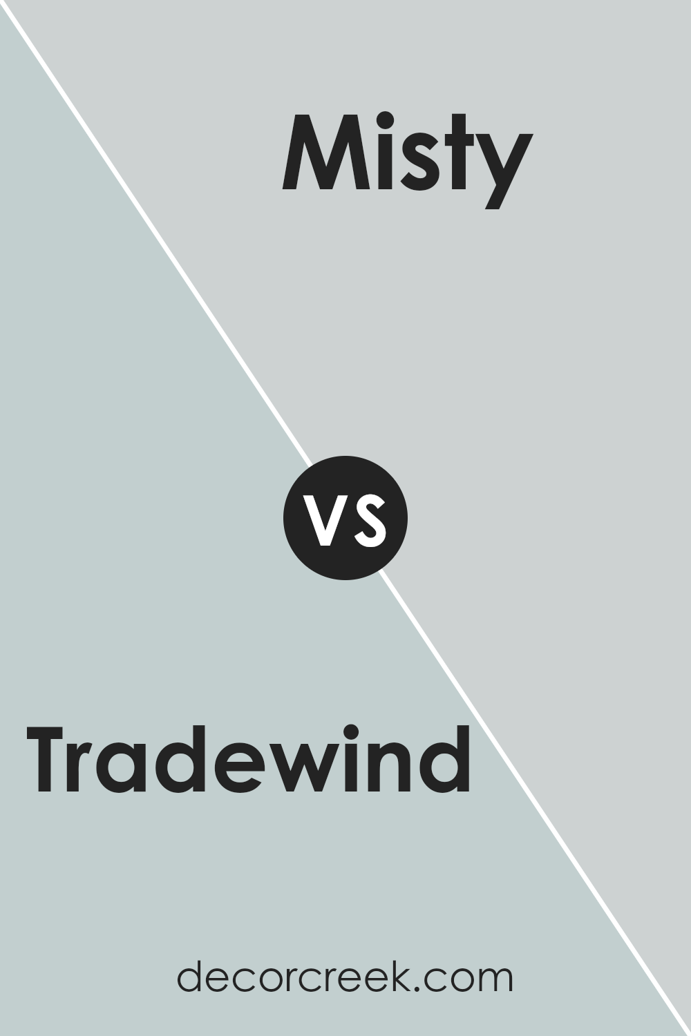
Tradewind SW 6218 by Sherwin Williams vs Misty SW 6232 by Sherwin Williams
Tradewind by Sherwin Williams is a soft, soothing blue with a hint of green. It has a refreshing feel that can nicely brighten up a room while maintaining a calming atmosphere. It suggests a gentle breeze and could work well in spaces meant for rest or quiet reflection, like bedrooms or reading nooks.
Misty, also by Sherwin Williams, leans more towards a very light gray with subtle blue undertones. It is softer and more neutral compared to Tradewind. This color is great for those looking for a minimalistic or modern vibe. It’s especially effective in small spaces or areas with limited natural light, as it helps make the space appear larger and more open.
When comparing these two, Tradewind offers a stronger presence of color, giving a more distinct character to a space with its blue-green hues. Misty, on the other hand, offers versatility and works as an excellent backdrop for various design elements, supporting a wider range of colors and decor styles.
You can see recommended paint color below:
Tradewind SW 6218 by Sherwin Williams vs Little Boy Blu SW 9054 by Sherwin Williams
Tradewind and Little Boy Blu by Sherwin Williams are both calming, pleasing shades of blue. Tradewind is a soft, grey-toned blue that has a gentle, muted feel, making it ideal for creating a peaceful atmosphere in any room. It doesn’t overwhelm the senses and works well as a neutral background or a main color in a more understated color scheme.
On the other hand, Little Boy Blu is a clearer, brighter blue. It leans slightly towards a sky blue and can add a cheerful touch to spaces. This color stands out more compared to Tradewind and would be great for adding a vivid pop of color to a room without being too bold or overpowering.
Both colors work nicely in spaces where you want to promote a sense of calm and relaxation, but your choice depends on whether you prefer a more subtle or slightly vibrant atmosphere. They can be used separately or even together for a layered blue look.
You can see recommended paint color below:
- SW 9054 Little Boy Blu (CHECK A SAMPLE)

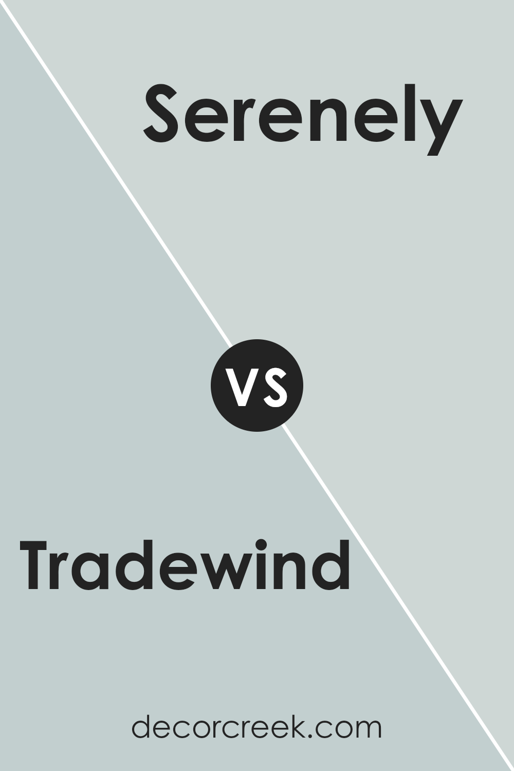
Tradewind SW 6218 by Sherwin Williams vs Serenely SW 9632 by Sherwin Williams
Tradewind and Serenely are two appealing colors from Sherwin Williams that each bring their unique touch to a space. Tradewind is a soft blue with a hint of gray, giving it a soothing yet cheerful vibe. It’s ideal for creating a relaxed atmosphere in any room, making it feel light and airy.
On the other hand, Serenely tends more towards a muted green shade, offering a gentle and calming effect. This color is perfect for areas where you want to encourage rest and a stress-free environment, as it subtly introduces a touch of nature indoors.
When comparing the two, Tradewind’s bluish tint might be preferred in settings where a cooler tone is desired, while Serenely’s green undertones suit spaces that benefit from a warmer, earthier feel. Both colors are versatile but serve different aesthetic goals depending on what ambience you’re aiming to achieve.
You can see recommended paint color below:
- SW 9632 Serenely (CHECK A SAMPLE)
Conclusion
Tradewind SW 6218 by Sherwin Williams is a refreshing and versatile shade of blue that offers a calm and cheerful vibe to any space. It pairs well with both light and dark accents, making it a reliable choice for anyone looking to freshen up their home decor. This color works beautifully in bedrooms and living spaces, providing a soothing atmosphere that encourages relaxation and comfort.
Incorporating Tradewind SW 6218 into home decor can be done through various means like painting walls or using it in accessories such as throw pillows and curtains. Its ability to complement a wide range of styles, from modern to traditional, ensures it can fit seamlessly into any decorating scheme.
Whether aiming for a subtle background tone or a striking focal point, this color proves to be a practical and stylish choice.

Ever wished paint sampling was as easy as sticking a sticker? Guess what? Now it is! Discover Samplize's unique Peel & Stick samples.
Get paint samples


