Choosing the right paint color can sometimes feel like a daunting task, but certain shades stand out for their timeless appeal and versatility. SW 7630 Raisin by Sherwin Williams is one such color. It’s a deep, warm burgundy that adds a rich, inviting tone to any room.
Whether you’re looking to paint a cozy study, a dining room, or bring some sophistication to your bedroom, Raisin could be the perfect choice for you. This particular shade has a unique ability to create a warm, enveloping atmosphere while also serving as a striking backdrop for both classic and contemporary decor.
It pairs beautifully with a wide range of colors, from soft neutrals to vibrant hues, allowing for flexibility in your design schemes.
If you’re planning a makeover for a space in your home and hoping for a color that combines drama with earthiness, SW 7630 Raisin deserves consideration.
What Color Is Raisin SW 7630 by Sherwin Williams?
The color Raisin by Sherwin Williams is a deep, warm burgundy with a hint of brown, which creates a cozy and inviting atmosphere in any room. This hue is versatile and exudes a natural earthiness, making it easy to integrate into various interior designs. Raisin works exceptionally well in classical, rustic, and contemporary styles, offering a rich backdrop that enhances other elements in a space.
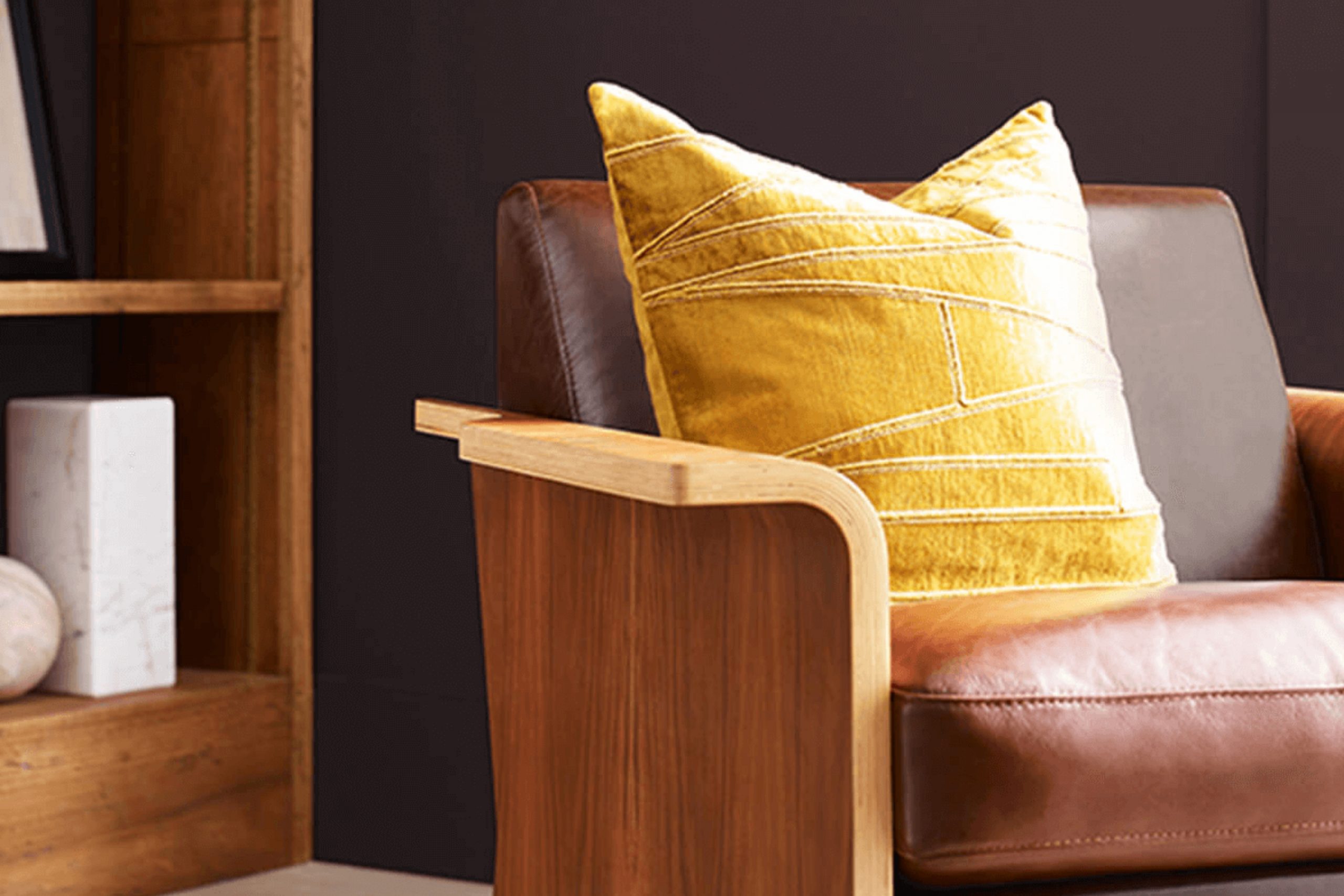
In terms of pairing, Raisin complements natural wood finishes beautifully, from light oak to darker walnut. These combinations promote a grounded, organic feel that is both welcoming and calming. Additionally, this color looks stunning when matched with metal accents, particularly in bronze or gold tones, which add a touch of elegance without overwhelming the senses.
For textiles, Raisin pairs nicely with plush materials like velvet or wool, which underline the warmth and depth of the color. It also works well with lighter fabrics, such as creams or soft beiges, creating a balance that lightens the room while maintaining its cozy vibe.
Overall, Raisin proves to be a dynamic choice that lends a rich, comforting aura to any space, making it ideal for living rooms, studies, or bedrooms where warmth and comfort are cherished.
Is Raisin SW 7630 by Sherwin Williams Warm or Cool color?
Raisin is a rich, deep brown with a hint of purple that adds warmth and depth to any room. Produced by Sherwin Williams, it’s perfect for creating a cozy and welcoming atmosphere. This color works well in living areas and bedrooms, where you want to promote a sense of comfort and relaxation.
Its dark hue makes it great for accent walls, providing a solid, grounding effect that pairs nicely with lighter colors like creams and beiges. In smaller spaces, using Raisin can make the area feel more intimate and protected.
However, because it’s a dark color, it’s important to balance it with good lighting and lighter accessories to prevent the space from feeling too enclosed. Raisin also hides marks and smudges well, which is ideal for high-traffic areas. Overall, it’s a versatile color that brings warmth and character to a home.
Undertones of Raisin SW 7630 by Sherwin Williams
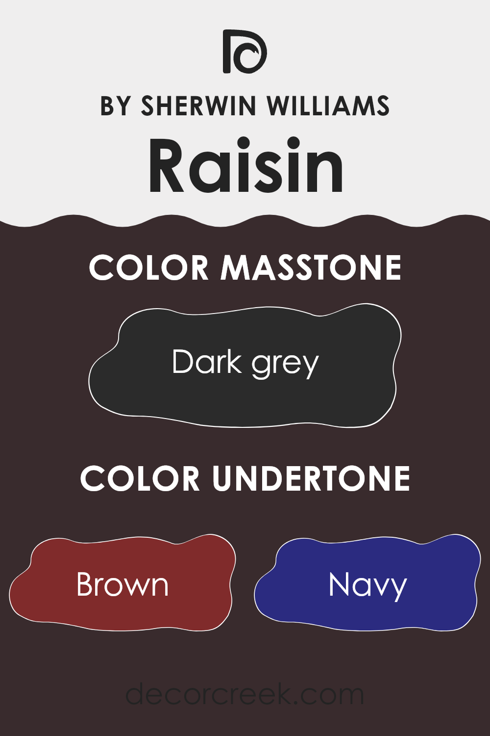
Raisin is a unique paint color that can create a warm and inviting atmosphere in any room. Understanding its undertones is key to utilizing it effectively. This color has a rich mix of brown, navy, dark green, purple, olive, dark turquoise, and grey. These undertones can subtly influence how the color appears depending on the lighting and surrounding colors.
In general, undertones are slight hints of colors that are mixed into the main hue. They can make a color look cooler or warmer and affect how it complements other colors in a space. For instance, in bright daylight, Raisin might show more of its brown or purple undertones, bringing a cozy feel to a living room or bedroom. In artificial lighting, the navy or dark green might become more prominent, adding depth and interest to the color.
When applied to interior walls, Raisin can offer a dynamic experience as the natural light changes throughout the day. In a room with plenty of sunlight, the warmth of brown and purple can make the space feel inviting, while in a less lit area, the cooler navy and green undertones might provide a subtle, rich backdrop, enhancing the furnishings and decor.
Whether used in a small area as an accent or as the main color scheme, Raisin has the versatility to fit various design preferences and create different moods in a space.
What is the Masstone of the Raisin SW 7630 by Sherwin Williams?
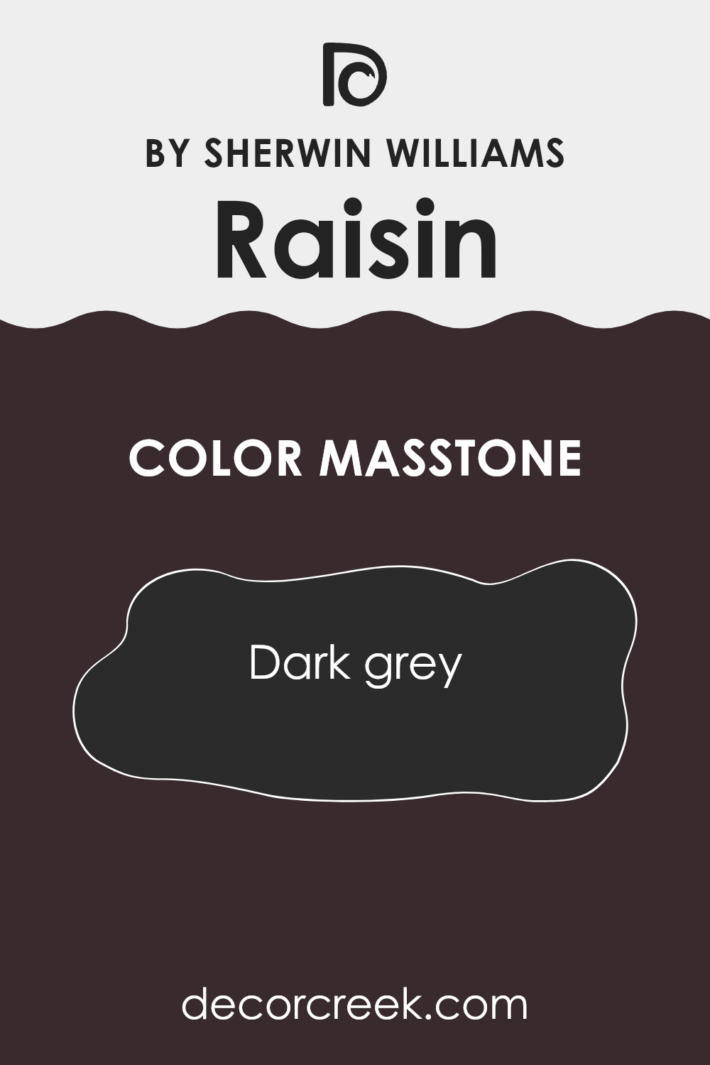
The color RaisinSW 7630 by Sherwin Williams has a masstone of dark gray. This dark gray shade, coded as #2B2B2B, is versatile and brings a strong, solid feel to home interiors. When used on walls, this color tends to make rooms appear cozier and more compact, which can be great for creating a snug atmosphere, particularly in larger spaces that need to feel more intimate.
Since it’s a dark color, it works well in homes that get a lot of natural light, preventing the space from feeling too bright. However, in smaller or less-lit areas, using this dark gray should be balanced with lighter colors in decor or furnishings to prevent the room from feeling too closed in.
It’s a practical choice for high traffic areas or rooms where you want to hide marks or stains, such as mudrooms or kids’ play areas, because darker colors are more forgiving with wear and tear. Overall, this dark gray color can add a solid, grounding element to your home décor.
How Does Lighting Affect Raisin SW 7630 by Sherwin Williams?
Lighting plays a crucial role in how we perceive colors. The color or type of light can enhance or alter the appearance of paint colors on our walls. For instance, Raisin by Sherwin Williams, a warm and deep plum hue, behaves differently under various lighting conditions.
Under artificial light, Raisin can appear more intense and moody due to the yellow and warm tones in typical indoor lighting conditions, which tend to enrich this color’s depth.
Rooms with warm-toned LED or bulb lights will emphasize the red and brown undertones in Raisin, making it a cozy choice for spaces meant for relaxation and evening activities.
In natural light, Raisin changes as the day progresses. North-facing rooms, which receive less direct sunlight and tend to have cooler, more bluish light, will show Raisin as a more subdued and shadowy hue.
It won’t be as lively, but it maintains its warmth.
In south-facing rooms, with abundant sunlight throughout the day, Raisin will show its brightest side, displaying more vibrancy and a fuller richness. The ample light helps reveal all the subtleties of this deep color, making the room feel warm and inviting.
East-facing rooms get plenty of light in the morning and less in the afternoon. Here, Raisin will look quite vibrant and dynamic in the morning when the light is warmer, gradually becoming more muted as the day goes on.
Lastly, west-facing rooms, which receive stronger light in the afternoons and evenings, will make Raisin appear very warm and rich during these times. The color can shift from being somewhat muted in the morning to more lively and intense in the afternoon and evening.
Therefore, understanding how Raisin interacts with light in different room orientations helps in deciding where to use this color to its best effect.
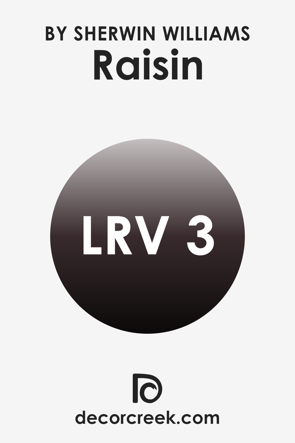
What is the LRV of Raisin SW 7630 by Sherwin Williams?
LRV, or Light Reflectance Value, is a measure that indicates how much light a color reflects compared to how much it absorbs. Measured on a scale from zero to one hundred, where zero is perfect absorption (absorbing all light) and one hundred is perfect reflection (reflecting all light back), the LRV helps in determining how light or dark a color will appear once applied to a surface.
Higher LRV values indicate lighter colors that might make a space feel more open and bright, while lower values mean darker colors which can make a room feel smaller or cozier.
With an LRV of 2.791, Raisin is a very dark shade which means it absorbs much more light than it reflects. When applied to walls, this color can dramatically affect the perception of the space’s size and lighting. In rooms with ample natural light, using a deep color like Raisin can add a sense of depth and richness. However, in a dimly lit or smaller room, it could make the space appear even smaller and somewhat denser. This makes Raisin a better choice for larger, well-lit areas or as an accent color, rather than covering all walls in smaller or poorly lit rooms.
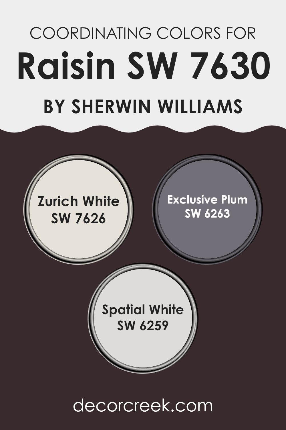
Coordinating Colors of Raisin SW 7630 by Sherwin Williams
Coordinating colors are hues that complement each other and enhance the overall aesthetics when used together in design. By pairing colors effectively, you can create a space that feels harmonious and visually pleasing. For example, Raisin SW 7630 by Sherwin Williams pairs beautifully with a selection of coordinating colors, each chosen to either contrast or blend smoothly with its deep, warm tone.
First, there’s Zurich White SW 7626, a neutral, creamy white that offers a clean and calming background, allowing a strong color like Raisin to stand out without overwhelming the space. It’s perfect for trim, ceilings or an adjoining wall to invite brightness into a richly toned room.
Next, Exclusive Plum SW 6263 is a deeper shade that aligns closely with the intensity of Raisin but adds a slight purplish hint, perfect for adding depth and interest to decor without clashing. Ideal for an accent wall or complementary decor items, it keeps the color scheme coherent yet exciting.
Lastly, Spatial White SW 6259 is another light option but with a subtle gray undertone, providing a modern twist that works superbly with contemporary designs. It supports the boldness of Raisin while maintaining a fresh and airy atmosphere in any space. Together, these coordinating colors offer a balanced and attractive palette for any decorating project.
You can see recommended paint colors below:
- SW 7626 Zurich White
- SW 6263 Exclusive Plum
- SW 6259 Spatial White
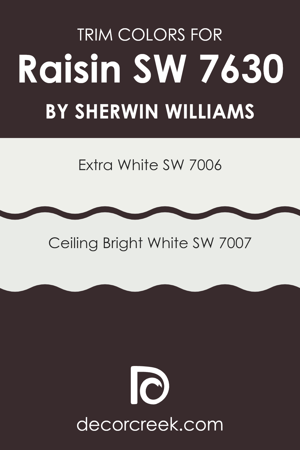
What are the Trim colors of Raisin SW 7630 by Sherwin Williams?
Trim colors are used to accentuate and define the edges, outlines, and features of a room such as door frames, window sills, and skirting boards. They play a crucial role in enhancing the visual aesthetics of a space, creating a crisp, clean finish that contrasts with the wall colors, like the rich tones of a color like Raisin.
For a color as deep and vibrant as Raisin by Sherwin Williams, choosing the right trim colors can dramatically highlight its richness and depth, making features stand out while also ensuring that the space does not feel overwhelmed by the dark tone.
For instance, SW 7006 – Extra White, is a pure, bright white color that provides a sharp contrast to deeper hues. This starkness can effectively frame darker walls, allowing their colors to pop while keeping the space feeling light and open.
Another option, SW 7007 – Ceiling Bright White, leans towards a slightly softer side of white, offering a subtle differentiation that can soften intense colors without sacrificing contrast. Both colors bring their unique attributes to a décor, enhancing the overall aesthetic and tying the different elements of a room together in a cohesive manner.
You can see recommended paint colors below:
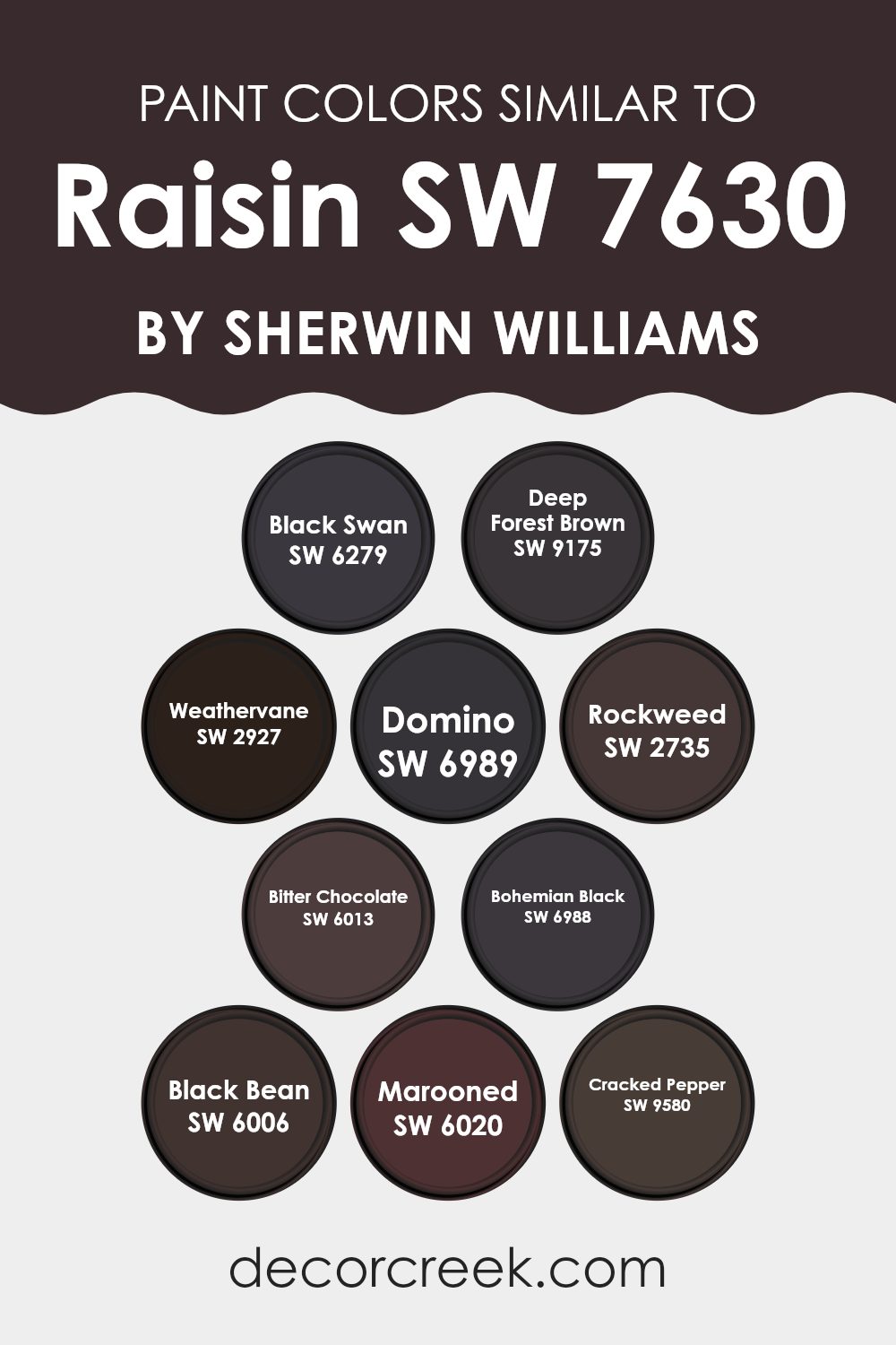
Colors Similar to Raisin SW 7630 by Sherwin Williams
Choosing similar colors is crucial for creating a harmonious and appealing color scheme. Colors that closely relate to one another like variations on a theme, offer a subtle yet effective way to establish a cohesive look in a design. They provide a unified and continuous feel to spaces, and work well to support the main color without causing abrupt transitions or harsh contrasts. For instance, utilizing different shades and tints around a base color can add depth and complexity while maintaining a balanced aesthetic.
For example, SW 6279 – Black Swan is a deep, dark hue that evokes the mystery of a shadowy night, making it a compelling complement. Similar in depth, SW 9175 – Deep Forest Brown reminds one of the rich, fertile earth of a dense forest. Both colors provide a grounding effect, ideal for creating a solid, understated background.
Colors like SW 2927 – Weathervane and SW 6989 – Domino carry on this theme of earthiness but with slight variances in tone, which can be used to create focal points or accents without overwhelming the primary color. Meanwhile, SW 2735 – Rockweed and SW 6013 – Bitter Chocolate offer a subtle nod to nature with their browns and greens, enhancing settings that benefit from a naturalistic look.
Dark and dramatic, SW 6988 – Bohemian Black provides a stark but stylish flair, perfect for modern spaces, while SW 6006 – Black Bean introduces a warmer, softer black that pairs well with a variety of decor styles.
Rich and enveloping, SW 6020 – Marooned adds a touch of elegance with its deep red, whereas SW 9580 – Cracked Pepper features a charcoal tone that works beautifully in a more neutral palette. Each color, while unique, shares an underlying connection that can be effectively utilized to design a room or home that feels both coherent and aesthetically pleasing.
You can see recommended paint colors below:
- SW 6279 Black Swan
- SW 9175 Deep Forest Brown
- SW 2927 Weathervane
- SW 6989 Domino
- SW 2735 Rockweed
- SW 6013 Bitter Chocolate
- SW 6988 Bohemian Black
- SW 6006 Black Bean
- SW 6020 Marooned
- SW 9580 Cracked Pepper
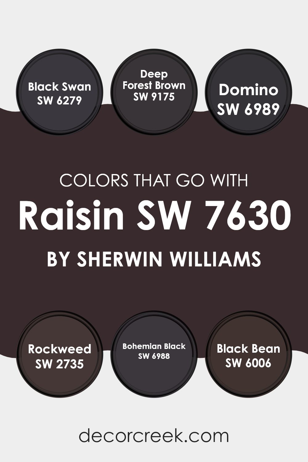
Colors that Go With Raisin SW 7630 by Sherwin Williams
Choosing the right colors to complement Raisin SW 7630 from Sherwin Williams is crucial as it helps in creating a harmonious and visually appealing space. Each color, when paired with Raisin, brings out unique aspects of this deep, rich hue.
For instance, Black Swan SW 6279 is akin to a soft, almost velvety black that can give a room a cozy, grounded feel when used alongside the subtle complexities of Raisin. Deep Forest Brown SW 9175, on the other hand, is a dark, earthy brown, adding a sensation of warmth and natural elegance that pairs beautifully with Raisin’s understated charm.
Moving towards the darker spectrum, Domino SW 6989 provides a solid, almost charcoal-like shade, making it perfect for creating a strong foundation in a space that features Raisin accents. Rockweed SW 2735 is named for its resemblance to dark seaweed, offering a unique blend of green and brown that can add a touch of nature to any palette including Raisin.
Bohemian Black SW 6988 is a true black with a hint of mystery, perfect for making the purple tones of Raisin pop, while Black Bean SW 6006 offers a deeper black with subtle brown tones, rounding out the color scheme by adding depth and intensity. These color selections help in achieving a balanced and cohesive aesthetic that is pleasing to the eye.
You can see recommended paint colors below:
- SW 6279 Black Swan
- SW 9175 Deep Forest Brown
- SW 6989 Domino
- SW 2735 Rockweed
- SW 6988 Bohemian Black
- SW 6006 Black Bean
How to Use Raisin SW 7630 by Sherwin Williams In Your Home?
Raisin SW 7630 by Sherwin Williams is a deep, rich color that blends deep purple and brown tones, making it a perfect choice for creating a warm and cozy atmosphere in your home.
This color is versatile enough to work in various spaces, from living rooms to bedrooms, adding depth and warmth. In a living room, you could paint one accent wall with Raisin to create a focal point and use lighter colors on other walls to balance the darkness.
In a bedroom, using Raisin can create a cozy, comforting cocoon, ideal for relaxing. It pairs well with soft creams, warm woods, and metallic accents like gold or bronze to add a touch of luxe to the space. For those who love a rustic or vintage feel, Raisin can also complement textures like leather and aged textiles, adding character to the room.
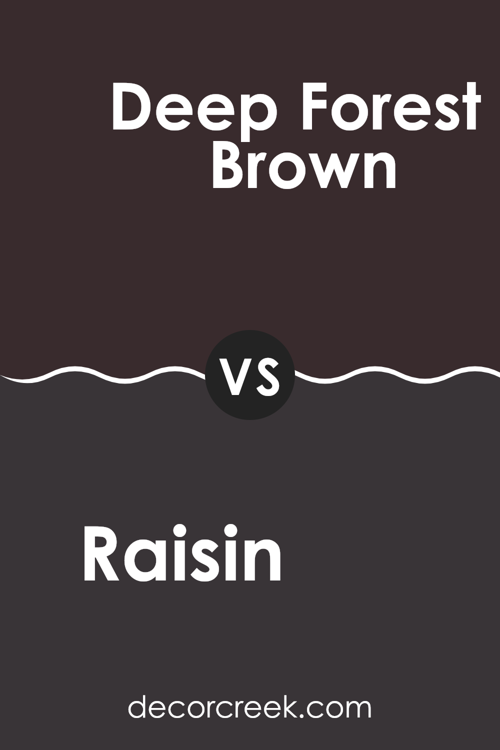
Raisin SW 7630 by Sherwin Williams vs Deep Forest Brown SW 9175 by Sherwin Williams
Raisin and Deep Forest Brown are both rich, dark colors, but they have different undertones and depth that set them apart. Raisin has a deep, purple-brown hue that adds a cozy and warm feel to spaces, making it a great choice for living rooms or bedrooms where you want a touch of subtle color.
On the other hand, Deep Forest Brown leans more towards a true dark brown, reminiscent of the bark of a tree deep in the woods. This color is denser and feels more grounded, which makes it ideal for areas where you might want a more traditional or rustic look, such as studies or dining rooms.
Both colors are versatile and can create a strong backdrop for lighter or brighter colors in furniture and decorations, enhancing the overall aesthetic of any room.
You can see recommended paint color below:
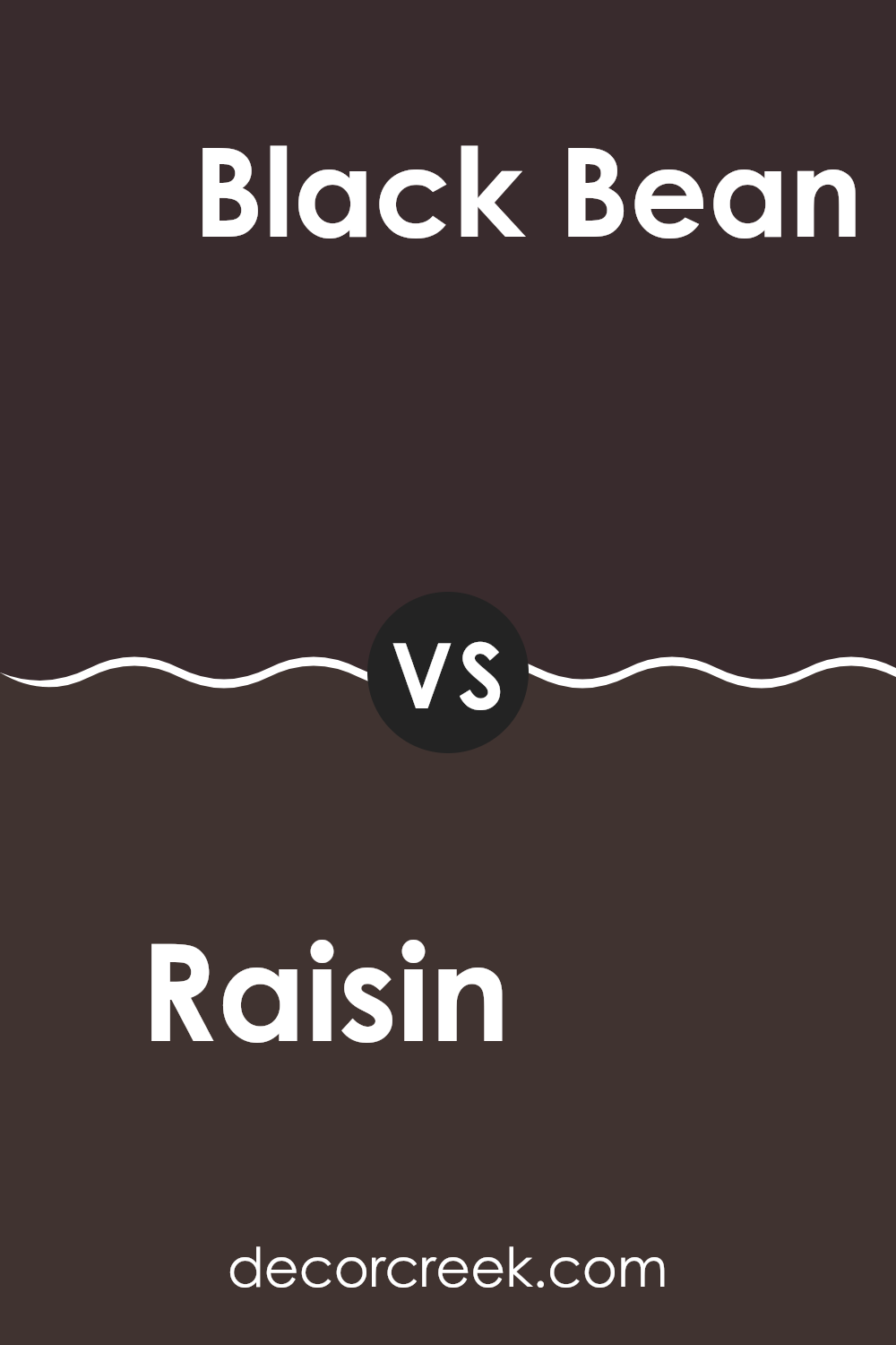
Raisin SW 7630 by Sherwin Williams vs Black Bean SW 6006 by Sherwin Williams
Raisin and Black Bean, both by Sherwin Williams, offer distinct dark tones that are perfect for creating a cozy atmosphere in any space. Raisin is a deep, rich purple with brown undertones, giving it a warm and inviting feel.
It works well in living rooms or bedrooms where you want a hint of color without overwhelming the space. On the other hand, Black Bean is a very dark brown that almost looks black. It’s ideal for creating a dramatic and bold look, suitable for accent walls or furniture pieces.
While Raisin adds a touch of subtle color, Black Bean provides a strong, solid presence that can anchor a room’s decor. Both colors are versatile but serve different purposes depending on the mood you’re aiming to achieve in your decorating project.
You can see recommended paint color below:
- SW 6006 Black Bean
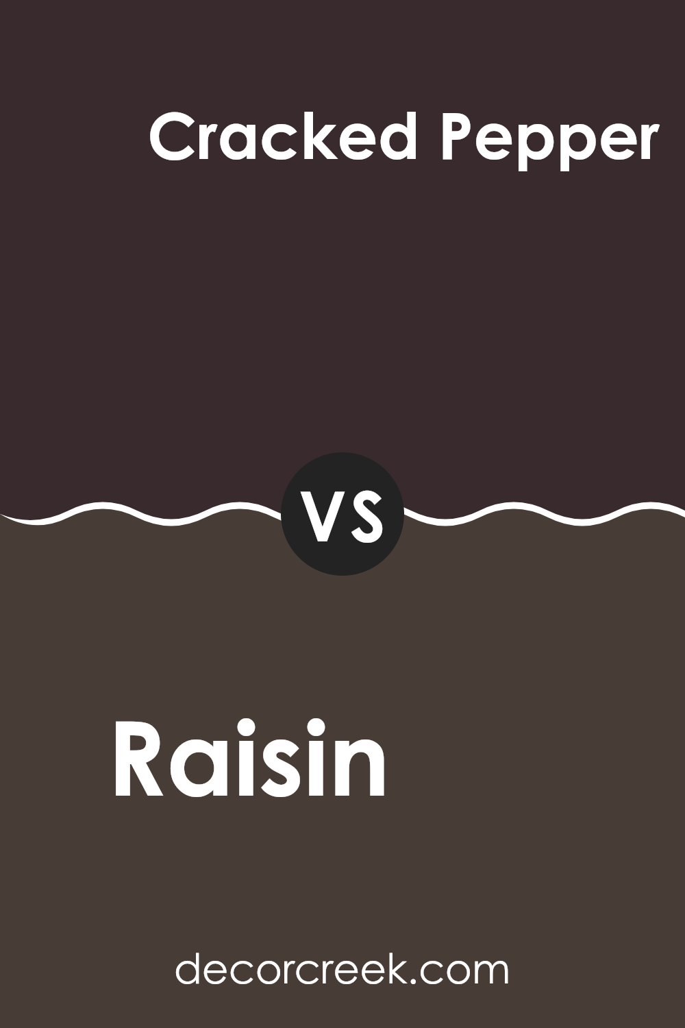
Raisin SW 7630 by Sherwin Williams vs Cracked Pepper SW 9580 by Sherwin Williams
Raisin and Cracked Pepper by Sherwin Williams are both dark, bold colors but each has its own unique vibe. Raisin is a deep, brownish-purple color much like the dried fruit it’s named after.
It has a warm and cozy feel, making it great for living spaces where you want a comfortable and welcoming atmosphere. On the other hand, Cracked Pepper is a nearly black shade of gray.
This color looks sharp and modern, and it’s perfect if you want to give a space a strong, clean appearance. While Raisin adds a touch of muted color and warmth, Cracked Pepper offers a more neutral and striking look. Both colors are versatile and can make a dramatic statement on walls, providing a rich backdrop to both bright and subdued accent colors.
You can see recommended paint color below:
- SW 9580 Cracked Pepper
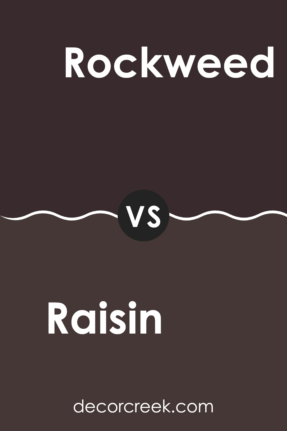
Raisin SW 7630 by Sherwin Williams vs Rockweed SW 2735 by Sherwin Williams
Raisin and Rockweed are two distinct colors from Sherwin Williams, offering unique visual experiences. Raisin is a deep, rich purple with brown undertones, which gives it a warm, cozy feel. This color can make spaces feel smaller and more intimate, perfect for areas where you want to relax or have a conversation.
On the other hand, Rockweed is a solid, dark green shade that mimics the natural colors of seaweed. It brings a sense of grounding and nature into a room, making it ideal for spaces that aim to have a connection to the outdoors or a more earthy vibe.
While Raisin adds a touch of elegance and depth to a room, Rockweed provides a robust, nature-inspired backdrop. Both colors can work well in spaces with natural materials and warm lighting, each creating a unique atmosphere. Choosing between them depends on the mood you want to set: Raisin for a cozy, inviting space, and Rockweed for a strong, nature-oriented environment.
You can see recommended paint color below:
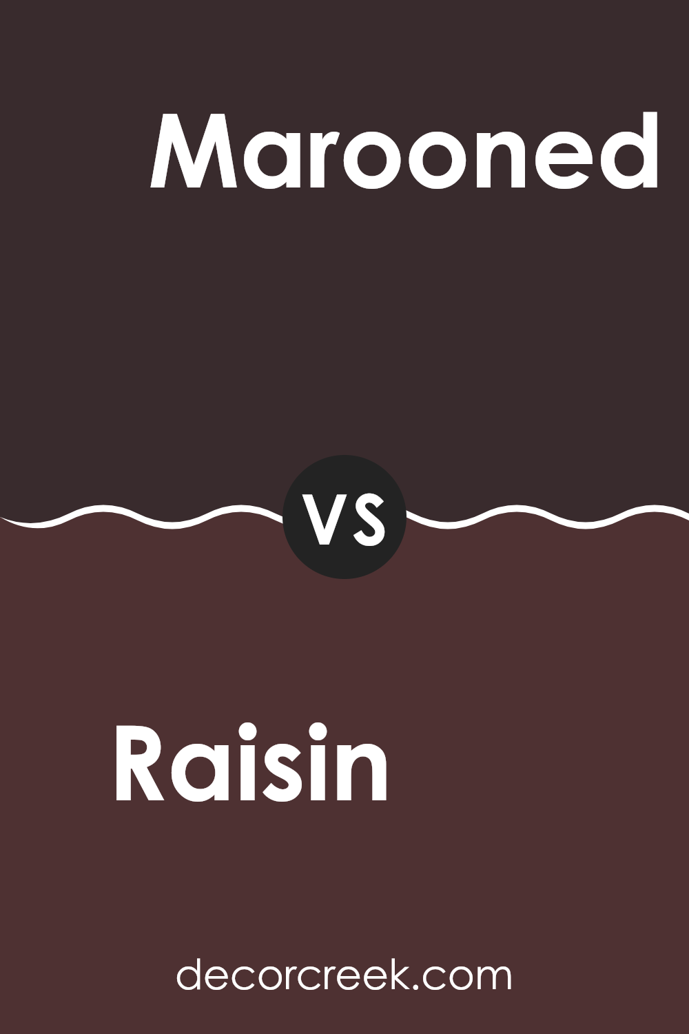
Raisin SW 7630 by Sherwin Williams vs Marooned SW 6020 by Sherwin Williams
Raisin and Marooned, both by Sherwin Williams, are distinct colors with their unique appeal. Raisin has a deep, rich brown tone with a hint of purple, creating a warm and cozy atmosphere. It’s perfect for spaces where you want a subtle touch of sophistication without making the room feel too dark.
On the other hand, Marooned is a dark red hue that leans slightly towards purple. It’s bolder than Raisin and stands out more prominently when used on walls or accent pieces. Marooned is ideal for adding a striking splash of color to a room, offering a sense of depth and warmth.
Together, Raisin and Marooned can complement each other well in a color scheme, with Raisin providing a muted background and Marooned acting as an engaging focal point.
You can see recommended paint color below:
- SW 6020 Marooned
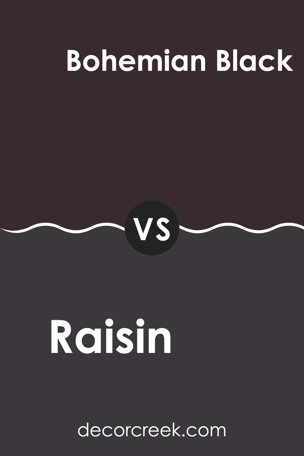
Raisin SW 7630 by Sherwin Williams vs Bohemian Black SW 6988 by Sherwin Williams
Raisin and Bohemian Black are two intriguing paint colors from Sherwin Williams. Raisin is a deep, warm burgundy with a hint of brown, creating a cozy and welcoming feel in any room. It’s versatile and works well in spaces that aim for a subtle richness, without overwhelming the senses.
Bohemian Black, on the other hand, is a strong and impactful color. It’s a very dark shade, almost a true black but with slight undertones that add depth. This color is perfect for making bold statements and works well in areas that can handle a dramatic flair like accent walls or furniture pieces.
Both colors are excellent for adding depth and intensity to a space, but their effects are quite different. Raisin is more about warmth and comfort, making a room feel enclosed and personal, while Bohemian Black is about creating striking contrasts and focal points. Depending on your style and the atmosphere you want to create, either could be a great choice.
You can see recommended paint color below:
- SW 6988 Bohemian Black
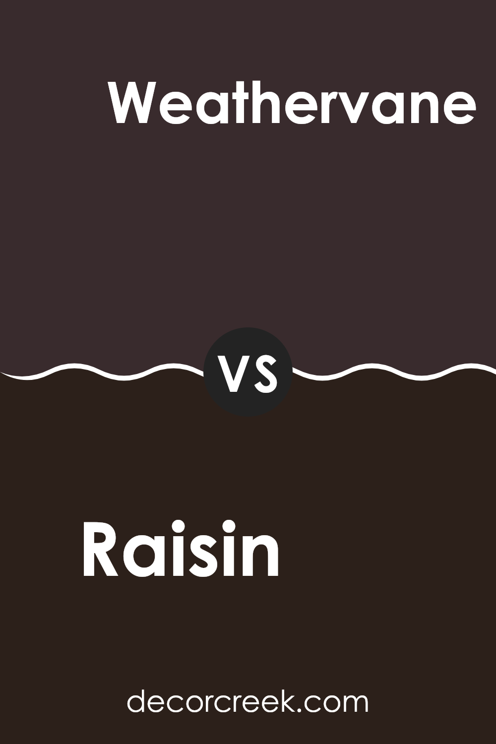
Raisin SW 7630 by Sherwin Williams vs Weathervane SW 2927 by Sherwin Williams
Raisin and Weathervane, both from Sherwin Williams, offer distinct shades that could suit different styles and moods in home decor. Raisin is a deep, dark brown with hints of burgundy, giving it a rich and warm feeling perfect for creating cozy, inviting spaces. This color works well in areas where you want to add some depth and warmth, such as living rooms or bedrooms.
Weathervane, on the other hand, is a medium to dark gray shade with cool undertones. This color is great for those looking to achieve a modern and straightforward look. It’s an excellent choice for exterior accents like shutters or doors, and also fits well in interior spaces that aim for a clean, contemporary feel.
Both colors are versatile but serve different purposes depending on the atmosphere you want to create. Raisin adds warmth and depth, making spaces feel more intimate, while Weathervane offers a crisp, modern vibe that can help sharpen a space’s style.
You can see recommended paint color below:
- SW 2927 Weathervane
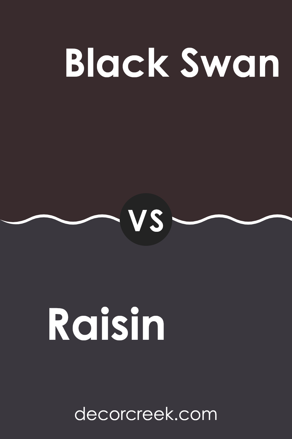
Raisin SW 7630 by Sherwin Williams vs Black Swan SW 6279 by Sherwin Williams
Raisin and Black Swan, both by Sherwin Williams, present a tasteful choice for anyone looking to add depth to their space. Raisin is a rich, deep brown with hints of purple that can add a cozy and warm feeling to any room. It works well in living areas and bedrooms where you might want a touch of subdued elegance without going too dark.
On the other hand, Black Swan is a very dark shade, closer to a soft black with undertones of blue. It is perfect for making bold statements, perhaps as an accent wall or in a space designed for focus and concentration like an office or library.
While both colors bring a strong presence to a room, Raisin offers a warmer approach, leaning towards a dark purplish-brown, whereas Black Swan leans towards a cooler, nearly-black tone. Choosing between them depends on the mood you want to set: welcoming and cozy with Raisin or striking and bold with Black Swan.
You can see recommended paint color below:
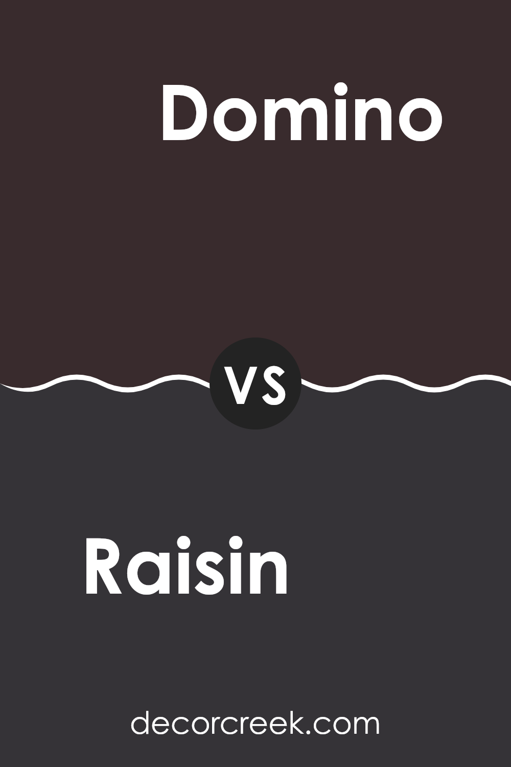
Raisin SW 7630 by Sherwin Williams vs Domino SW 6989 by Sherwin Williams
**Raisin and Domino by Sherwin Williams are two distinct shades that offer unique vibes for any space. Raisin is a deep, warm purple with brown undertones that feels cozy and grounding. It creates a welcoming atmosphere in a room, perfect for spaces where you want to relax and feel at ease, like living rooms or bedrooms.
On the other hand, Domino is a bold, almost black color with slight navy undertones. It’s much darker than Raisin and provides a strong, dramatic look. This color works well in areas where a touch of elegance and a modern feel are desired, such as accent walls or cabinets.
While both colors are dark, Raisin leans towards a soft warmth due to its purple-brown mix, whereas Domino offers a sharper, stark contrast by verging on black. Together, they can complement each other well in a space that aims for depth and character.**
You can see recommended paint color below:
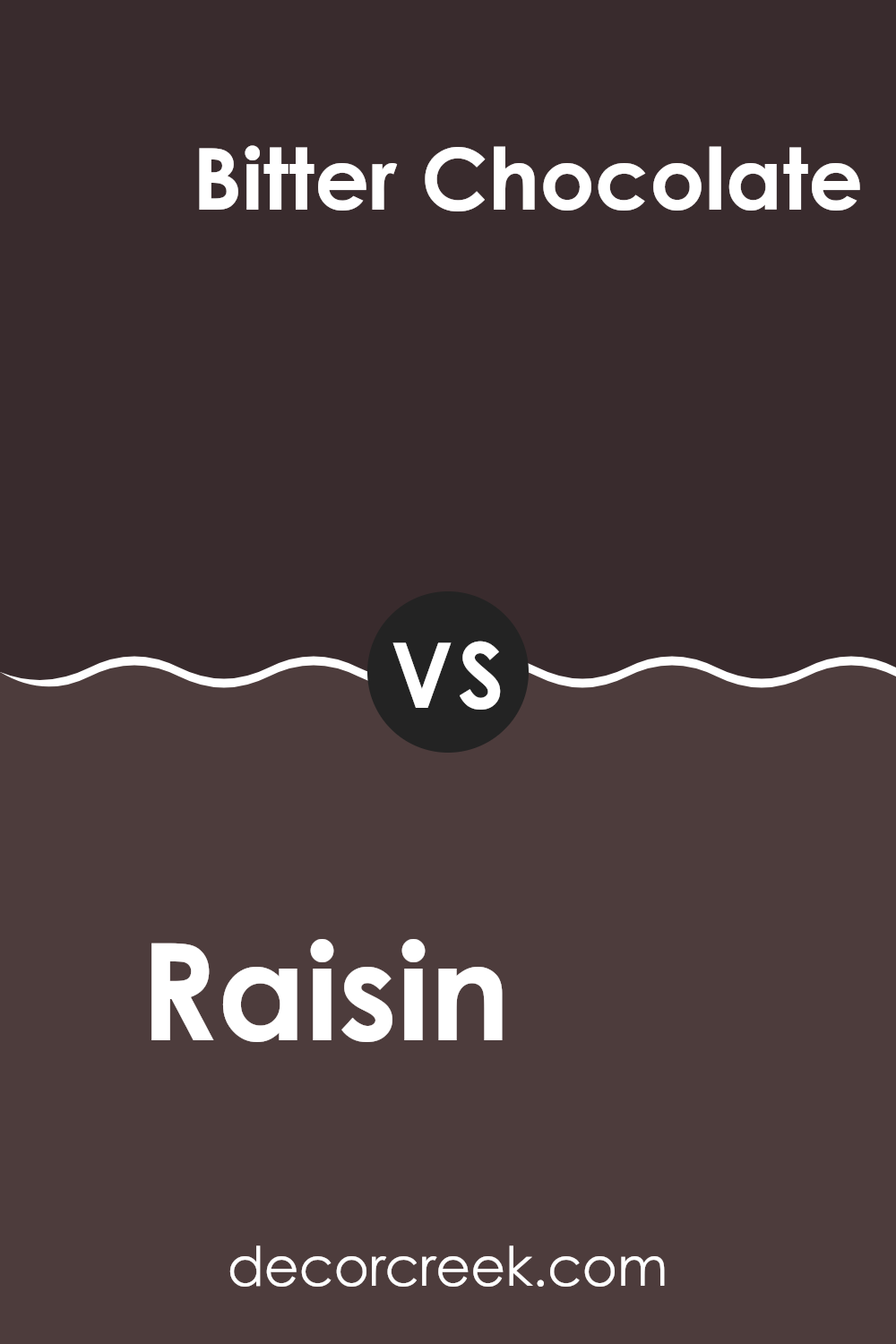
Raisin SW 7630 by Sherwin Williams vs Bitter Chocolate SW 6013 by Sherwin Williams
Raisin and Bitter Chocolate by Sherwin Williams are both rich, warm hues, but they have distinct differences in their tones and mood-setting capabilities. Raisin is a deep, warm berry color with a subtle purple undertone, offering a cozy and inviting feel to any space. It’s a versatile shade that can work well in living rooms or bedrooms to create a snug, welcoming atmosphere.
On the other hand, Bitter Chocolate is a much darker shade, resembling the deep, dark color of cocoa. This color is more intense and could lend a strong, bold look to an area. It’s excellent for making a dramatic statement, perhaps in a dining room or as an accent wall, providing a backdrop that contrasts beautifully with lighter furniture or decor.
Both colors share a richness that works well with natural materials like wood or leather, and they can also pair nicely with softer hues for a balanced palette. However, Raisin’s slightly lighter tone might be easier to incorporate into a variety of spaces compared to the more dominant presence of Bitter Chocolate.
You can see recommended paint color below:
- SW 6013 Bitter Chocolate
In summary, SW 7630 Raisin by Sherwin Williams is a paint color that looks a lot like a dried-up grape, which is what a raisin is! It has a deep, rich purple color with hints of brown. This color makes rooms feel cozy, warm, and inviting. It’s great for places where you want to relax, like a living room or a bedroom.
This color works well with other colors too. If you put it with light colors like cream or beige, it stands out and looks really pretty. If you mix it with dark colors like gray or black, it gives a more grown-up and stylish feel. People can use it in many different parts of their homes, such as on a wall, for painting furniture, or even just on one section of a wall to draw attention.
Overall, if you’re looking for a paint that adds a touch of warmth and charm to your home, SW 7630 Raisin could be a good choice. Plus, it’s fun to think that you’re using a color that’s named after a fruit snack you might have in your lunch box! It’s not just another purple; it’s unique because of how deep and comforting the shade is.
Whether you’re changing up your bedroom or adding some flair to your living room, Raisin can definitely do the job.
Ever wished paint sampling was as easy as sticking a sticker? Guess what? Now it is! Discover Samplize's unique Peel & Stick samples.
Get paint samples

