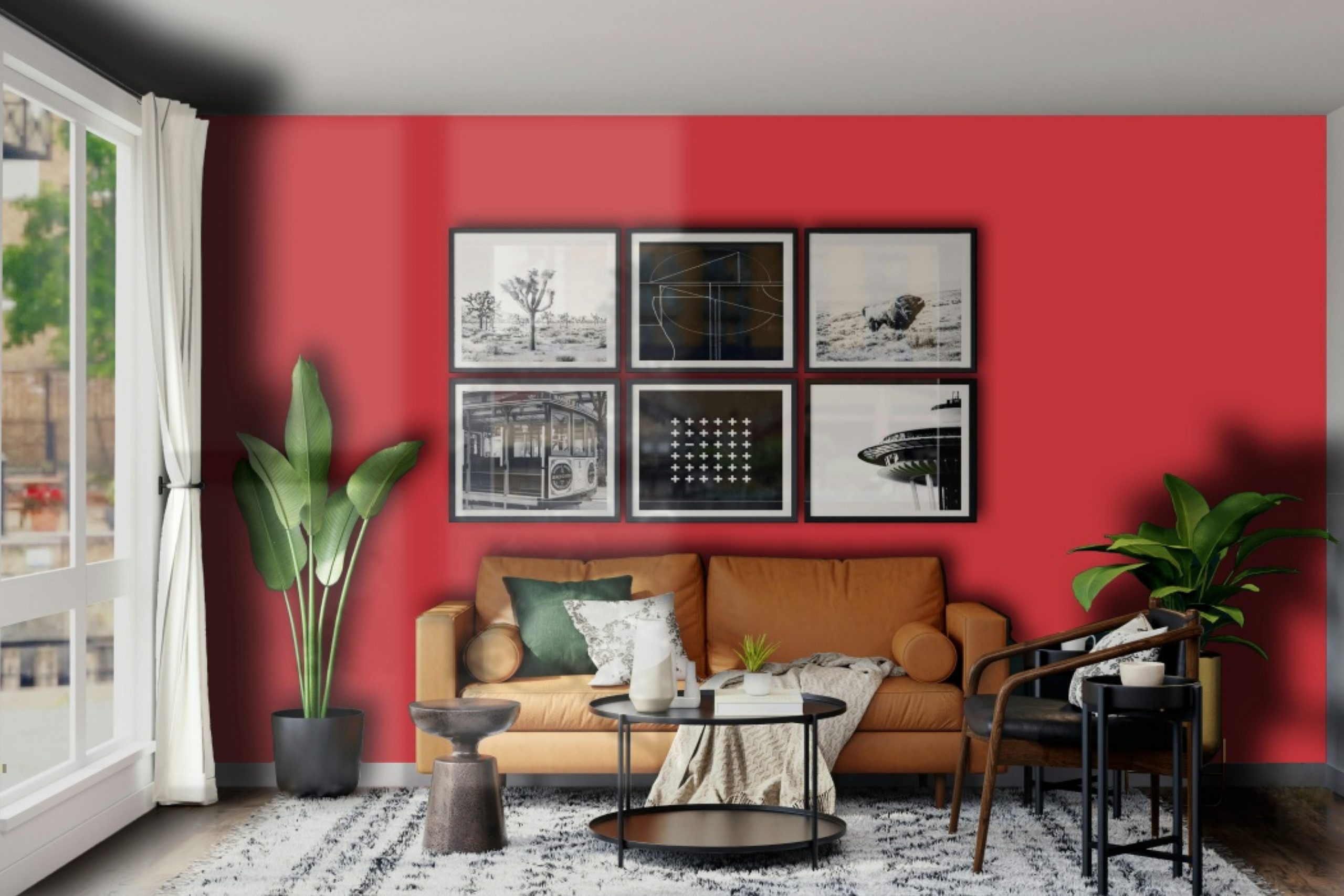
If you’re looking to add a bold and vibrant touch to your space, SW 6868 Real Red by Sherwin Williams might be the perfect choice for you. This vivid shade of red is not just any color; it’s a statement. Whether you’re planning to transform an accent wall, breathe new life into your kitchen cabinets, or give your exterior a standout look, Real Red brings energy and personality to any project.
Choosing the right paint color can significantly impact the vibe of your room. Real Red has the power to create a lively atmosphere, making it ideal for areas where you entertain guests or want to add a dynamic flair. It’s also versatile enough to work in a variety of settings, from modern to traditional.
When it comes to applying Real Red, it’s essential to consider the lighting and surrounding colors to ensure it creates the desired effect. In brighter spaces, it can appear even more vibrant, while in rooms with less natural light, it can add warmth and depth.
In short, if you’re looking to make a bold statement in your space, SW 6868 Real Red by Sherwin Williams could be the way to go. It’s not just about painting a wall; it’s about adding character and transforming your space into something uniquely you.
What Color Is Real Red SW 6868 by Sherwin Williams?
Real Red is a vibrant, bold color that instantly draws attention in any space. This Sherwin Williams hue is the epitome of classic red, boasting a depth and clarity that can make a strong statement or add a touch of drama. Perfect for those looking to infuse energy and passion into their decor, it works exceptionally well in a variety of interior styles, particularly modern, industrial, and even eclectic looks.
In modern interiors, Real Red can serve as a striking accent wall or can be used in accessories to punctuate a minimalist, white-and-black color scheme. For industrial spaces, this vivid red pairs wonderfully with raw materials like exposed brick, metal fixtures, and reclaimed wood, offering a pop of color that contrasts beautifully with the rugged textures. In eclectic rooms, it harmonizes with a mix of patterns and colors, bringing warmth and a sense of playfulness.
Real Red pairs well with a range of materials and textures. Leather furniture, whether vintage or contemporary, looks luxurious against this daring backdrop, while metal accents in silver, gold, or brass stand out with a sophisticated sheen. In terms of textures, smooth, glossy finishes complement its vibrancy, whereas softer, plush textures like velvet or faux fur add a level of comfort and luxury, making the color feel inviting.
This versatility ensures Real Red can create impactful, dynamic spaces tailored to personal tastes.
Is Real Red SW 6868 by Sherwin Williams Warm or Cool color?
Real Red SW 6868 by Sherwin Williams is a vivid and striking color that brings energy and boldness into any home. This vibrant red can transform a space, making it lively and dynamic. When used in a living room or dining area, it creates a warm and inviting atmosphere, encouraging lively conversations and gatherings. In smaller doses, such as an accent wall or decor, it adds pops of color that can break monotony and enhance the visual appeal of a room.
One of the unique aspects of Real Red is its ability to draw attention. It works well in spaces where you want to highlight architectural features or artwork. However, due to its intensity, it’s important to balance it with neutral tones like white, grey, or beige. These combinations can prevent the color from overwhelming the space.
Real Red also has versatility; it can fit into various design styles, from modern to traditional, depending on how it’s applied and what it’s paired with. Using this color in a home requires a thoughtful approach, but when done right, it can create stunning and lively interiors.
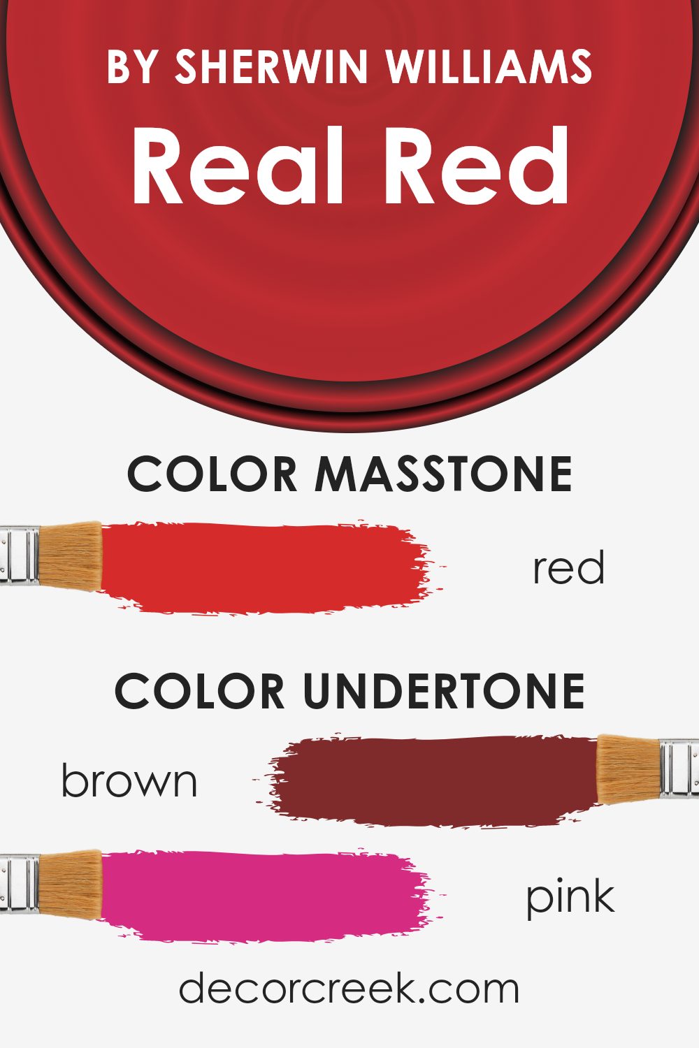
Undertones of Real Red SW 6868 by Sherwin Williams
Real Red by Sherwin Williams is a beautiful shade that at first glance captivates you with its bold and lively hue. However, it’s the undertones that truly give this color depth and versatility. The mix of brown, pink, orange, purple, olive, pale pink, and grey undertones add layers to the primary red, making it more than just a simple paint color.
Undertones play a crucial role in how we perceive color. They can subtly influence the mood of a room and complement various decor styles. For instance, a color with warm undertones, like orange or pink, can make a space feel more inviting and cozy. On the other hand, cool undertones, such as purple or grey, introduce a calmer, more soothing atmosphere.
When applied to interior walls, the richness of Real Red is nuanced by its undertones, affecting how the color appears under different lighting conditions. During daylight, the orange or pink undertones might make the color pop more vibrantly, infusing a lively energy into the room. In contrast, in artificial light, the purple or grey undertones can give the space a more sophisticated and serene vibe.
The olive and brown undertones can ground the color, ensuring it doesn’t overwhelm the space but instead complements wooden furniture and natural materials elegantly.
In essence, the undertones in Real Red offer flexibility and complexity, allowing this color to adapt beautifully within various interior styles and lighting conditions, enhancing the overall ambiance of a home.
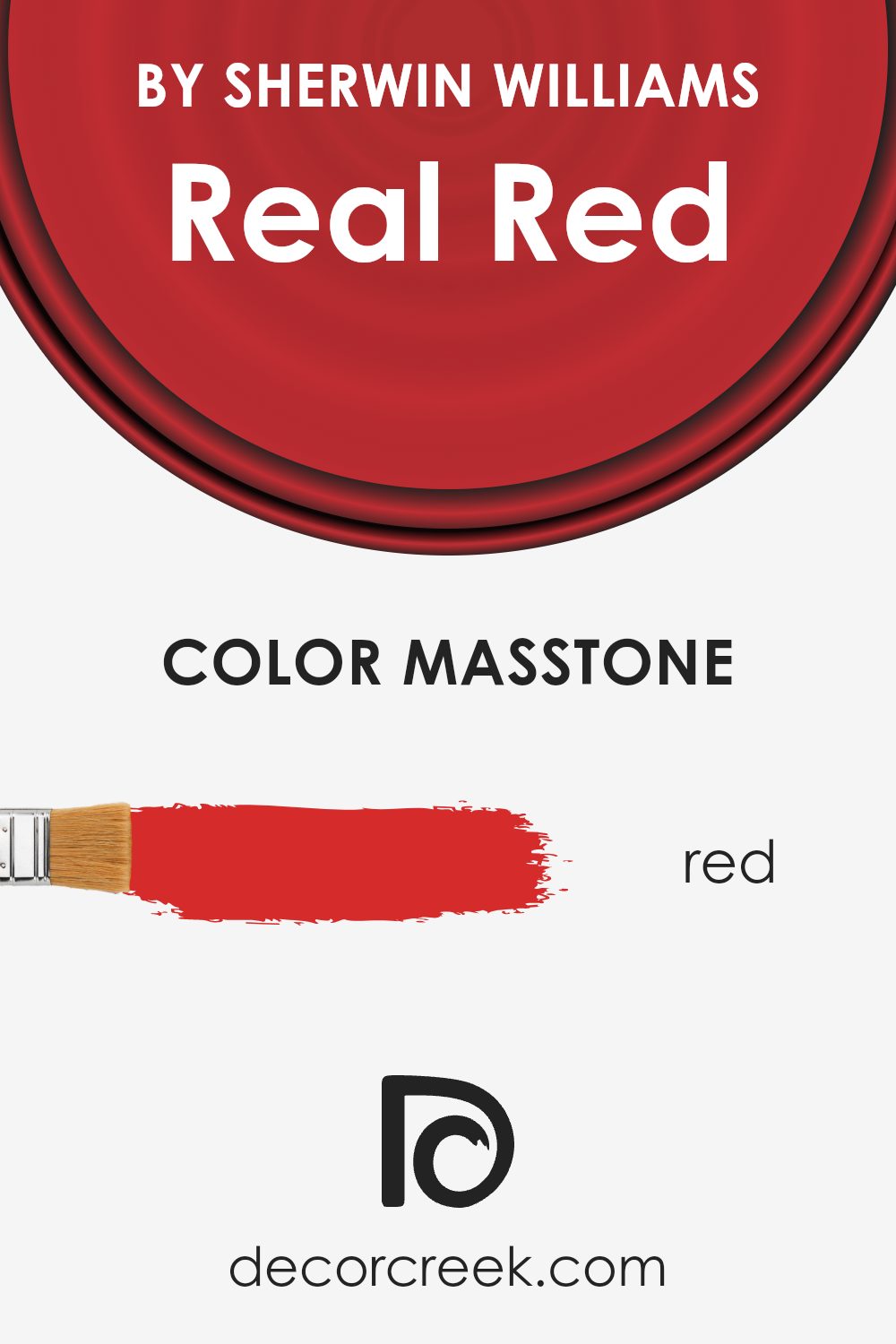
What is the Masstone of the Real Red SW 6868 by Sherwin Williams?
Real Red (#D52B2B) is a vibrant and bold color that brings a warm and energetic vibe to any home. Its deep red masstone creates a striking visual impact, making it a fantastic choice for areas you want to highlight or add a sense of drama to. This particular shade works well in spaces where you want to encourage conversation and liveliness, such as living rooms or dining areas. It’s also great for an accent wall, adding a pop of color without overwhelming the space.
In homes, this red can make large, open areas feel more intimate and cozy, while giving smaller spaces a big personality. Pairing it with neutral colors like whites, grays, and blacks can balance its intensity, while combining it with complementary colors can create a vibrant and cheerful environment.
Furniture and decor in natural wood tones also look stunning against this dynamic red, adding to its versatility in home design.
How Does Lighting Affect Real Red SW 6868 by Sherwin Williams?
Lighting plays a crucial role in how we perceive colors. The same shade can appear different under various light sources, which is why it’s essential to consider lighting when choosing paint colors for your spaces. Let’s take the vibrant color Real Red as an example to see how it changes under different lighting conditions.
In artificial light, colors can either be enhanced or dulled, depending on the type of bulb used. For Real Red, artificial light, such as from LED or incandescent bulbs, can add warmth, making the red appear richer and more intense. This type of lighting can make the color feel cozier in the evening, which is perfect for living rooms or dining areas where you want to create an atmosphere of warmth and comfort.
In natural light, the appearance of Real Red can vary dramatically throughout the day and depends on the direction your room faces. North-faced rooms receive less direct sunlight, which can make colors appear cooler. In such rooms, Real Red might not reach its fullest potential, looking somewhat muted and less vibrant. To counter this, additional artificial lighting could help bring out its warmth.
South-faced rooms bask in an abundance of natural light for most of the day, which can make Real Red appear brighter and more vivid. The natural sunlight enhances the color’s warmth, making it an excellent choice for spaces where you want to make a bold statement.
East-faced rooms get plenty of sunlight in the morning, making colors like Real Red look bright and cheerful. As the day progresses and the natural light diminishes, the color may appear softer, creating a cozy ambiance by late afternoon.
West-faced rooms receive the evening sun, which can cast a golden glow, intensifying the richness of Real Red. This warm, natural light can make the color look incredibly vibrant, perfect for spaces used more during the afternoon and evening.
Understanding how lighting affects colors like Real Red can help you create the desired mood in your space, making it feel just right at any time of the day.
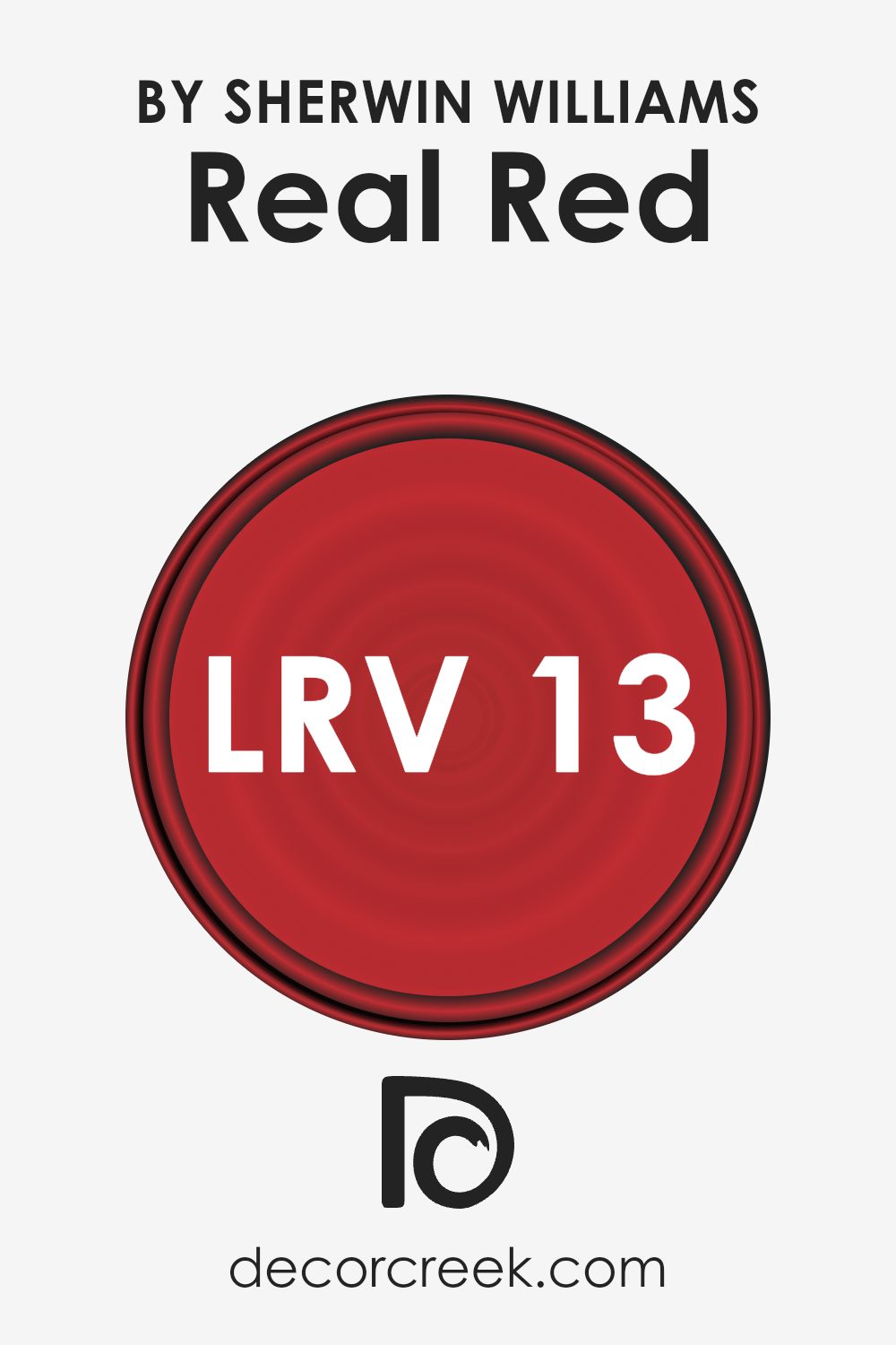
What is the LRV of Real Red SW 6868 by Sherwin Williams?
The LRV of the color Real Red (13.205) suggests it is on the darker end of the spectrum, meaning it will absorb more light than it reflects. This characteristic can significantly affect how this color appears on your walls, especially in terms of the mood and depth it adds to a space. In rooms with plenty of natural light, this color can appear vibrant and dynamic, while in spaces with limited light, it may seem even darker, highlighting its richness and depth.
The low LRV indicates that Real Red is better suited for spaces where a bold, intimate, and dramatic effect is desired, rather than areas where the aim is to create a light, airy feel.
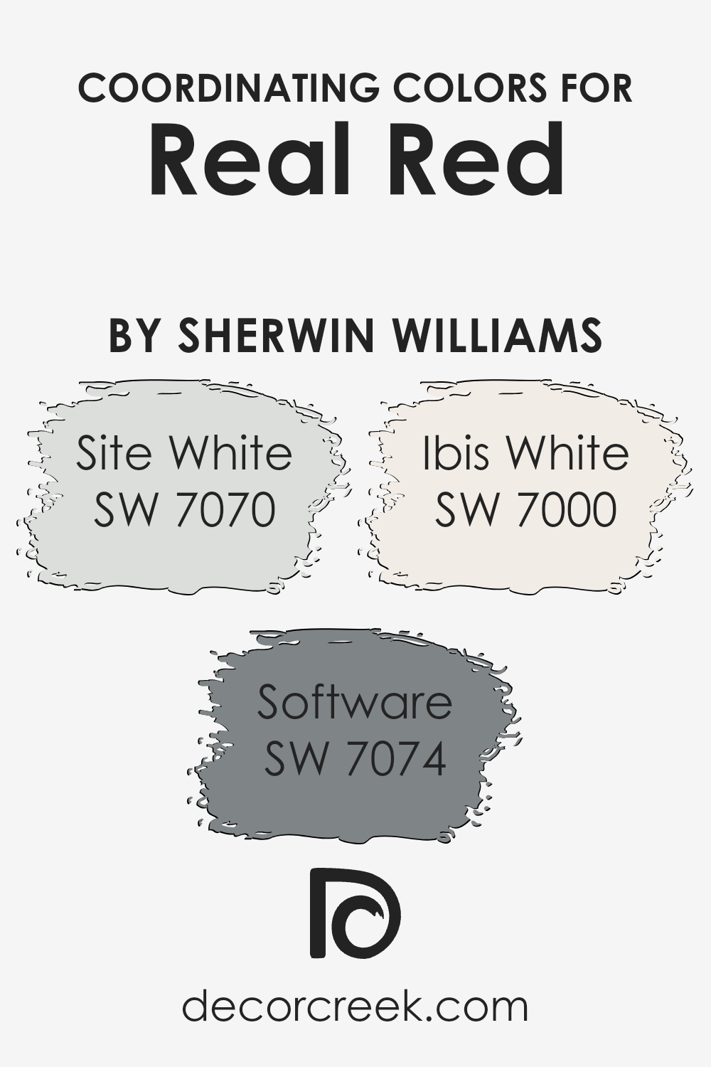
Coordinating Colors of Real Red SW 6868 by Sherwin Williams
Coordinating colors work together to create a harmonious palette for your space, enhancing the main hue without overwhelming it. In the case of a vibrant color like Real Red from Sherwin Williams, the right coordinating colors are crucial for balance. Coordinating colors like Site White, Software, and Ibis White are chosen for their ability to complement without competing with the main shade of red.
Site White offers a clean, crisp background that allows Real Red to stand out without overpowering the space. It’s a versatile shade that brings light and openness, making it an excellent choice for walls or trim where Real Red is used as an accent. Software, on the other hand, is a cooler, more subdued gray that can ground the energy of Real Red, adding a modern and sophisticated touch.
This color works well in spaces that aim for a contemporary feel with just the right amount of warmth. Lastly, Ibis White has a soft, barely-there warmth that pairs beautifully with Real Red, ensuring the space feels inviting and balanced. It’s perfect for creating a subtle contrast that enhances the richness of Real Red without diminishing its vibrancy.
Together, these coordinating colors provide a well-rounded palette that elevates the beauty of Real Red in any room.
You can see recommended paint colors below:
- SW 7070 Site White
- SW 7074 Software
- SW 7000 Ibis White
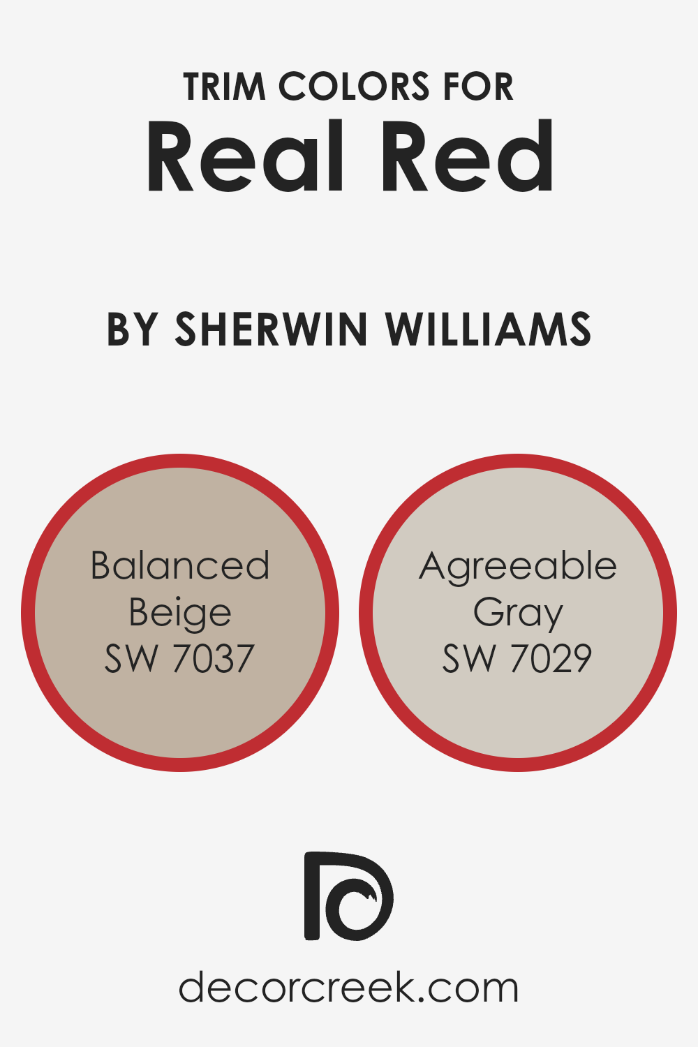
What are the Trim colors of Real Red SW 6868 by Sherwin Williams?
Trim colors are the shades used on the architectural elements like doors, window frames, and baseboards, which outline or highlight the main color of a wall or space. In the specific case of using a vibrant shade like Real Red by Sherwin Williams, choosing the right trim colors is crucial for achieving a balanced and polished look.
The use of trim colors helps in softening the boldness of the main color or, conversely, in making a subtle wall color pop. It creates a visual framework that enhances the overall aesthetic appeal of the room, ensuring that the vividness of a shade like Real Red doesn’t overwhelm the space but instead, appears elegant and cohesive.
Balanced Beige SW 7037 is a warm neutral that offers a soft, earthy contrast to the intensity of Real Red, grounding it without competing for attention. This color brings a sense of calm and sophistication to the trimming, allowing the red to stand out in a more refined manner.
On the other hand, Agreeable Gray SW 7029 provides a lighter, more understated option as a trim color. This shade is a gentle gray with warm undertones, creating a seamless transition that complements the boldness of Real Red by adding a modern and airy feel to the space. Both trim colors work well to frame and enhance the main color, contributing to a cohesive and inviting atmosphere.
You can see recommended paint colors below:
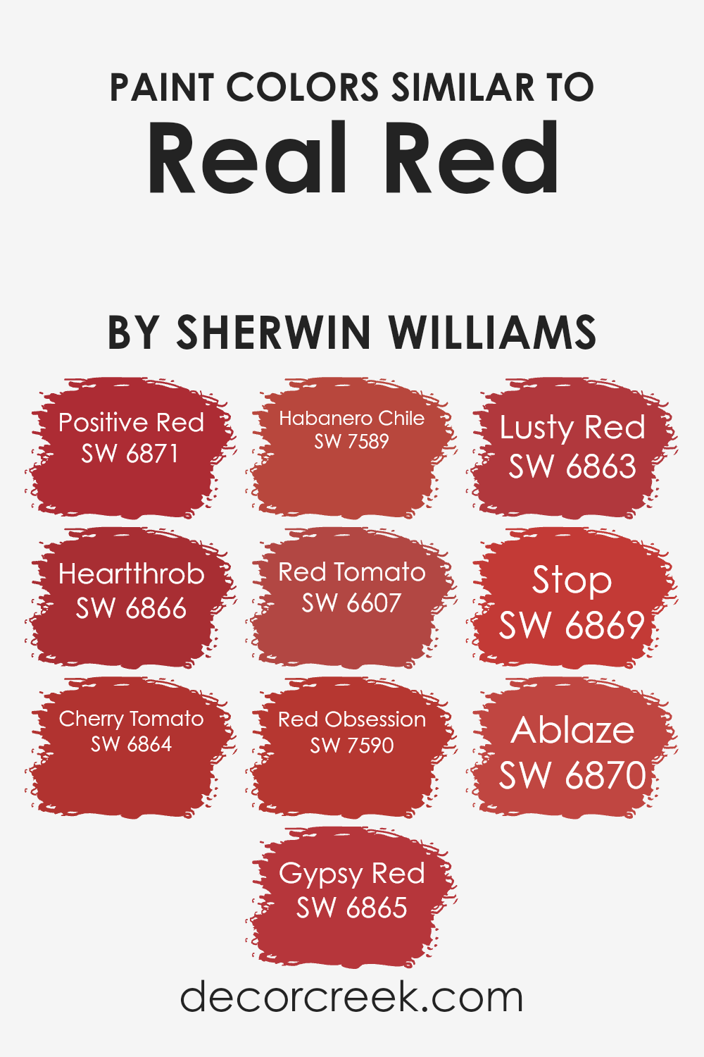
Colors Similar to Real Red SW 6868 by Sherwin Williams
Similar colors play a crucial role in design and decor, offering a nuanced way to create an atmosphere or set a mood without making drastic changes to a room’s color scheme. Colors like Real Red and its companions offer a palette that’s both vibrant and versatile. For instance, Positive Red brings a bright, energetic vibe that’s slightly more subdued than pure red, making it perfect for spaces that require a lively yet not overwhelming atmosphere.
Heartthrob steps it up with a deeper, more romantic feel, ideal for adding a touch of passion to interiors. Cherry Tomato, with its slightly orange undertone, injects a fresh and zesty energy, reminiscent of summer and freshness, whereas Gypsy Red introduces a more mysterious and rich aura, lending spaces a sophisticated edge.
On the other hand, Habanero Chile, with its fiery intensity, makes a bold statement, perfect for accent pieces or feature walls that aim to catch the eye. Red Tomato mixes the classic allure of red with a note of brightness, offering a balanced and inviting hue. Red Obsession and Lusty Red both flirt with the boundaries of deep, immersive reds, each adding a layer of drama and intensity to a room, making them great for areas reserved for evening gatherings.
Stop, as the name suggests, is a commanding color that demands attention, suitable for spaces designed to impress or make a statement. Lastly, Ablaze offers a dynamic and spirited hue, brimming with energy, perfect for invigorating a space with life and vitality. These similar colors, by providing a range of moods from subtle to bold, allow for cohesive yet diverse decor schemes that can transform any space.
You can see recommended paint colors below:
- SW 6871 Positive Red
- SW 6866 Heartthrob
- SW 6864 Cherry Tomato
- SW 6865 Gypsy Red
- SW 7589 Habanero Chile
- SW 6607 Red Tomato
- SW 7590 Red Obsession
- SW 6863 Lusty Red
- SW 6869 Stop
- SW 6870 Ablaze
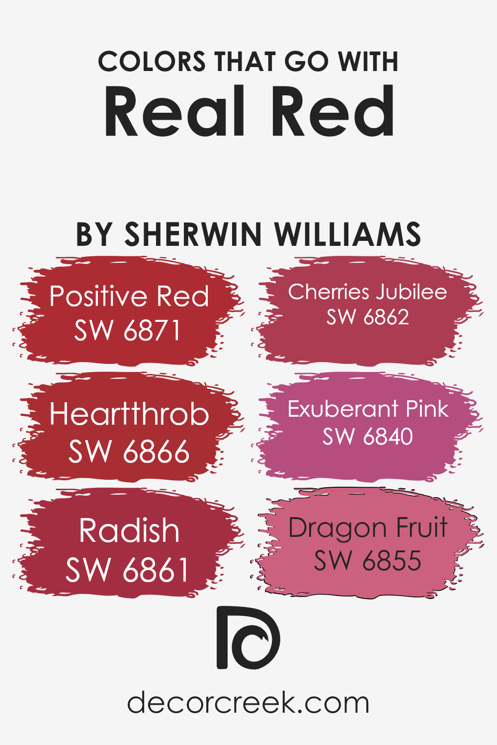
Colors that Go With Real Red SW 6868 by Sherwin Williams
Choosing the right colors to complement Real Red SW 6868 by Sherwin Williams is crucial because they help create a harmonious and visually appealing space. These companion colors ensure that Real Red doesn’t overwhelm a room but instead shines as a vibrant accent or a bold wall color.
Whether you’re decorating a living room or adding life to a bedroom, pairing it with the right shades can enhance the overall aesthetic and mood. They work by balancing Real Red’s intensity, adding depth, or providing contrast, which is essential for designing spaces that are both energetic and comfortable to live in.
The color Positive Red SW 6871 is a bright and lively shade that pairs well with Real Red, offering a slightly different tone that can create a dynamic yet cohesive look. Heartthrob SW 6866 is deeper and more intense, adding a romantic flair that enriches the space without overwhelming it. Radish SW 6861 has a unique blend of warmth and brightness, making it an excellent choice for adding variety while keeping the overall vibe upbeat.
Cherries Jubilee SW 6862 is a darker, richer hue that echoes the depth of Real Red, perfect for creating an elegant contrast. Exuberant Pink SW 6840 introduces a playful, spirited energy that lightens the atmosphere, making it ideal for vibrant, fun spaces. Lastly, Dragon Fruit SW 6855 has a tropical flair that provides a fresh twist, offering a punchy contrast that makes Real Red pop even more.
Together, these colors synergize with Real Red to create spaces that are inviting, stimulating, and full of personality.
You can see recommended paint colors below:
- SW 6871 Positive Red
- SW 6866 Heartthrob
- SW 6861 Radish
- SW 6862 Cherries Jubilee
- SW 6840 Exuberant Pink
- SW 6855 Dragon Fruit
How to Use Real Red SW 6868 by Sherwin Williams In Your Home?
Real Red SW 6868 from Sherwin Williams is a bold color that can truly transform a space in your home. This lively shade of red is perfect if you’re looking to add a pop of color to your living area, kitchen, or even on an accent wall. It’s a color that stands out, bringing energy and warmth wherever it’s used. Imagine having one wall in your living room painted in Real Red; it can serve as a fantastic backdrop to artwork, photographs, or even your TV, making the space more vibrant and inviting.
In the kitchen, cabinets or a kitchen island in this shade can create a fun and dynamic environment, perfect for cooking and gathering with family and friends. If painting a whole wall or cabinet seems too much, you can start small with door frames or a piece of furniture. This approach can give your room a fresh look without overwhelming the space with color. Remember, with a color as strong as Real Red, a little goes a long way in bringing warmth and personality to your home.
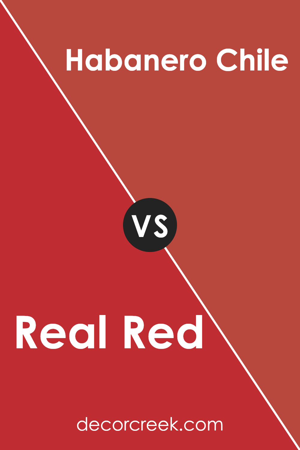
Real Red SW 6868 by Sherwin Williams vs Habanero Chile SW 7589 by Sherwin Williams
Real Red and Habanero Chile are two vibrant colors by Sherwin Williams, each with its own unique appeal. Real Red is a bold, true red that stands out with confidence. It’s the kind of red that grabs attention, making it perfect for spaces or items where you want to make a strong statement.
On the other hand, Habanero Chile brings a warmer, slightly earthy tone to the table. It’s not just red; it’s a red with depth, pulling in hints of orange to soften its impact. This makes Habanero Chile a great choice for creating a cozy yet dynamic atmosphere. While Real Red is pure and straightforward, Habanero Chile adds a touch of spice and complexity.
Both colors are striking, but the choice between them depends on the mood you want to set: bold and direct with Real Red, or warm and nuanced with Habanero Chile.
You can see recommended paint color below:
- SW 7589 Habanero Chile
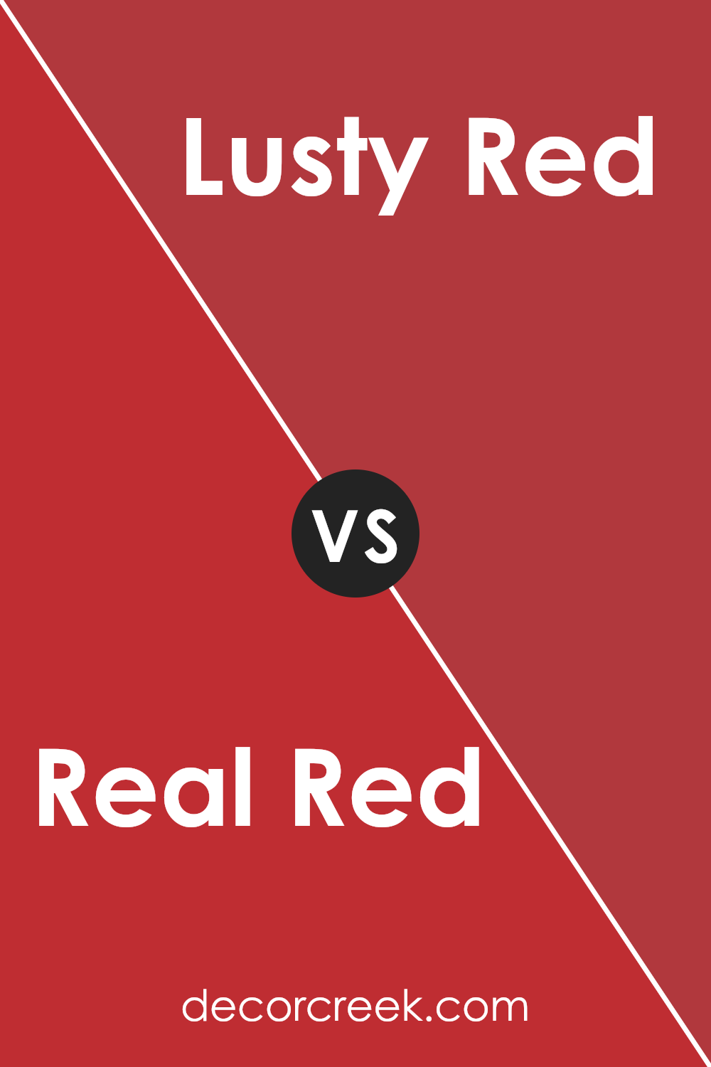
Real Red SW 6868 by Sherwin Williams vs Lusty Red SW 6863 by Sherwin Williams
Real Red and Lusty Red, both from Sherwin Williams, are vibrant shades that can pack a punch in any space. Real Red is a true, bold red that stands out with its pure, classic red hue. It’s a color that grabs attention and brings a lively energy into a room. It’s perfect for making a strong statement, whether on a front door or as an accent wall.
On the other hand, Lusty Red carries a slightly deeper tone, offering a richness that Real Red doesn’t. It leans a bit towards a warmer, more seductive shade of red, making it ideal for creating cozy, inviting spaces. While both colors are undoubtedly red, Real Red shouts with vibrancy, whereas Lusty Red whispers with a bit more subtlety and depth.
Each brings its own unique flavor to the table, with Real Red being more straightforward and Lusty Red offering a touch more complexity.
You can see recommended paint color below:
- SW 6863 Lusty Red
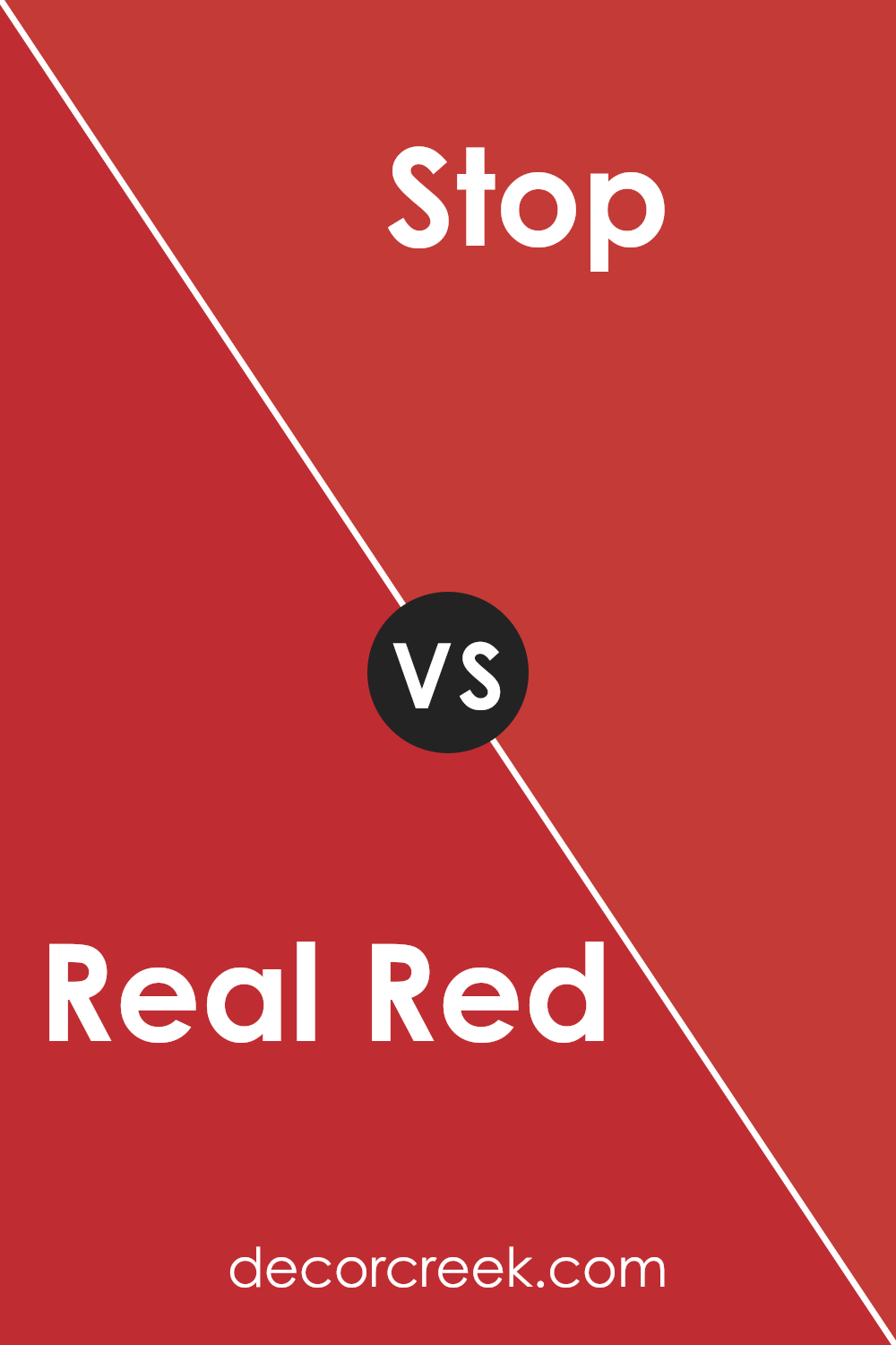
Real Red SW 6868 by Sherwin Williams vs Stop SW 6869 by Sherwin Williams
Real Red and Stop are both vibrant colors by Sherwin Williams, each bringing its own unique flair. Real Red is the quintessential red, bold and bright, evoking a classic feel that’s versatile for various uses. Its pure, striking tone makes it ideal for areas or items where you want to make a statement without overwhelming the space.
On the other hand, Stop is a shade darker, hinting at a more profound, slightly more intense character. This color adds depth and sophistication, perfect for accent walls or decor elements where you want a hint of drama without veering into too dark territory. While both colors share a red base, Real Red leans towards a traditional, vivid look, whereas Stop offers a tad more mystery and richness, giving a slightly different ambiance to environments they’re used in.
Choosing between them depends on the mood you’re aiming for: bright and energetic with Real Red or more grounded and thoughtful with Stop.
You can see recommended paint color below:
- SW 6869 Stop
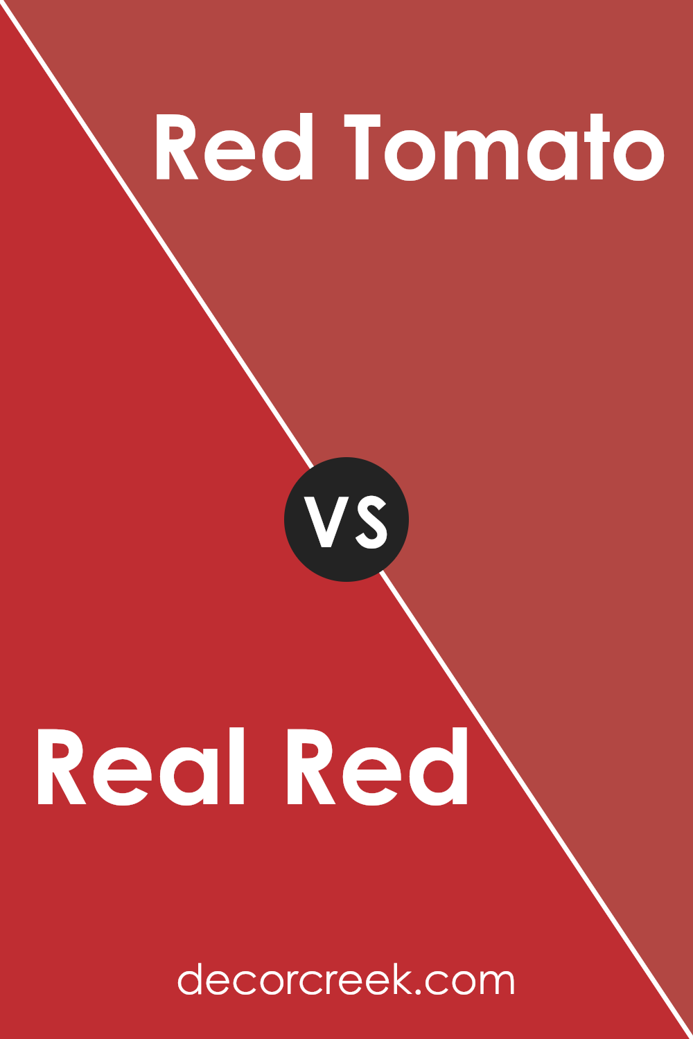
Real Red SW 6868 by Sherwin Williams vs Red Tomato SW 6607 by Sherwin Williams
Main color, Real Red, and the second color, Red Tomato, both from Sherwin Williams, are vibrant shades of red, but they have some noticeable differences. Real Red is a bold, true red. It’s the kind of red you might think of when you imagine a classic red sports car or a ripe apple. It’s strong and attention-grabbing, making a clear statement in any space.
On the other hand, Red Tomato is also a lively color, but it leans slightly towards orange, resembling the warm, inviting hue of a ripe tomato. This makes it a bit less intense than Real Red and gives it a warmer, more approachable feel. Although both colors can add energy and passion to a room, Real Red offers a more traditional red experience, while Red Tomato provides a warmer, slightly more playful option.
You can see recommended paint color below:
- SW 6607 Red Tomato
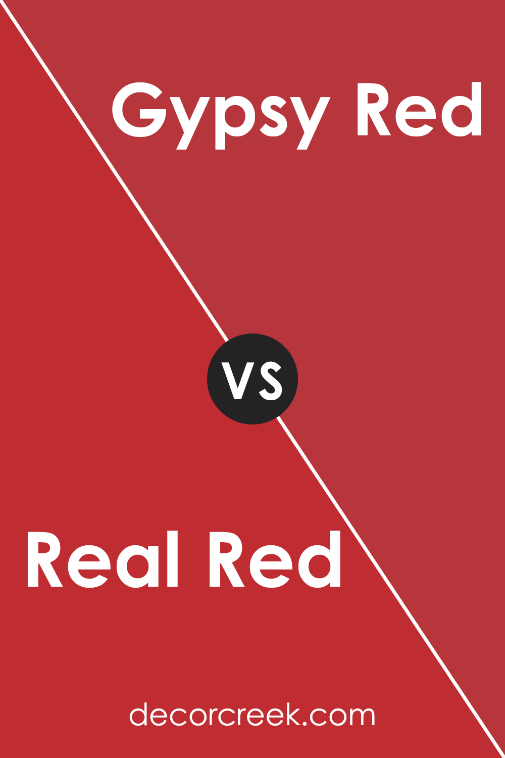
Real Red SW 6868 by Sherwin Williams vs Gypsy Red SW 6865 by Sherwin Williams
Real Red and Gypsy Red, both from Sherwin Williams, share a vibrant palette but with distinct tones. Real Red is bold and bright, a classic shade of red that pops with energy. It’s the kind of color that makes a statement, perfect for accent walls or decor elements that you want to really stand out. On the other hand, Gypsy Red has a softer presence.
It leans towards a more muted, earthy red, offering warmth and subtlety compared to the stark vibrancy of Real Red. Gypsy Red is ideal for creating a cozy atmosphere in a room, giving a sophisticated touch without overwhelming the senses. While both colors carry the essence of red, Real Red is about making a bold impact, and Gypsy Red is about adding depth and comfort.
Choosing between them depends on the mood you want to set: electrifying and eye-catching with Real Red or warmly inviting with Gypsy Red.
You can see recommended paint color below:
- SW 6865 Gypsy Red
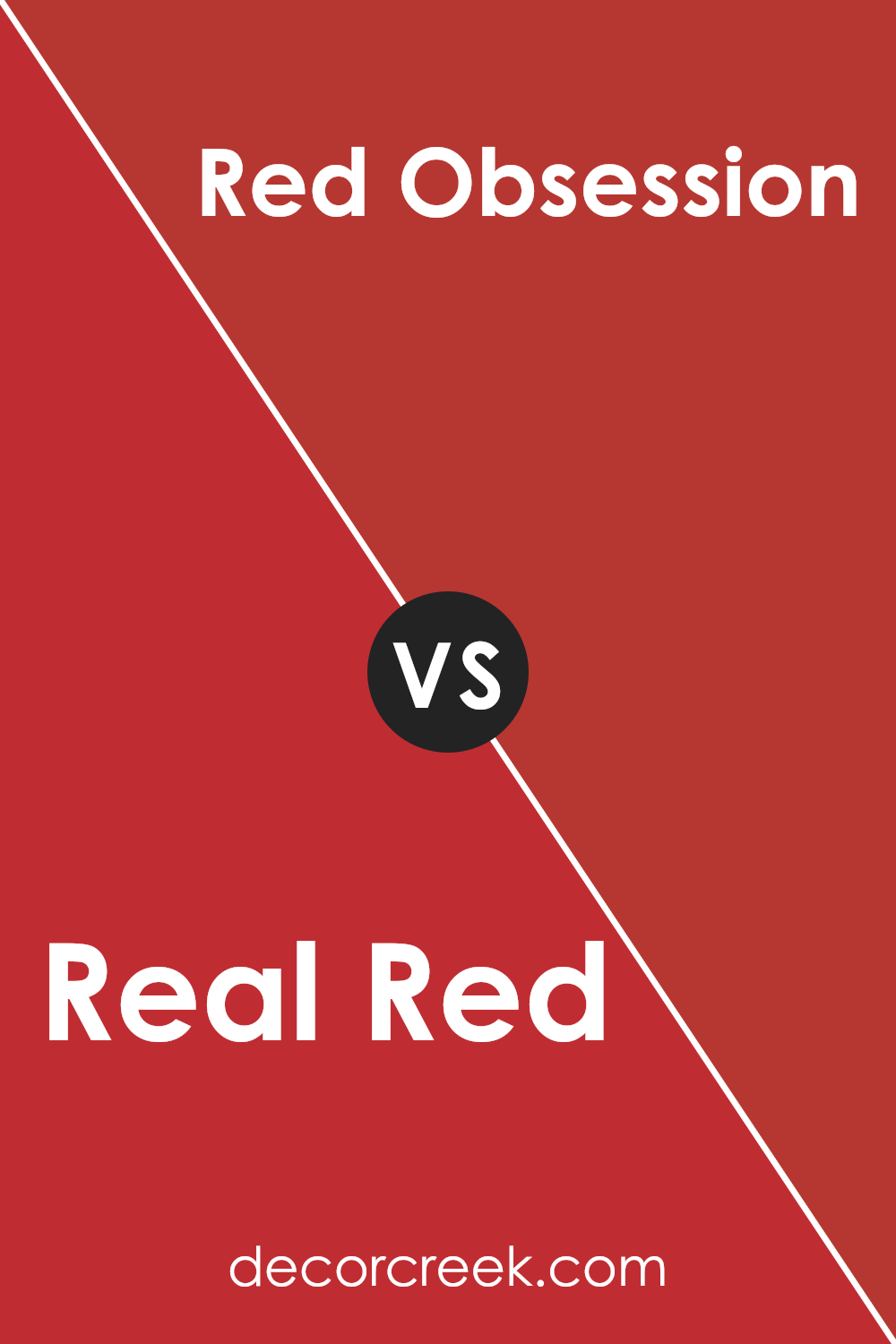
Real Red SW 6868 by Sherwin Williams vs Red Obsession SW 7590 by Sherwin Williams
Real Red and Red Obsession are two vibrant paints from Sherwin Williams, each with its unique charm. Real Red is a bold, true red color that stands out with its pure, energetic vibe. It’s the kind of red that draws attention, making it perfect for areas or items you want to highlight. On the other side, Red Obsession offers a deeper, more intense experience. It’s not just red; it’s red with depth, adding a touch of sophistication and warmth to spaces.
Comparing them, Real Red is your go-to for a lively, dynamic atmosphere. It’s bright and can inject life into any space, making it feel more open and inviting. Red Obsession, in contrast, is more grounded and refined, best suited for creating a cozy, intimate setting. It’s the ideal choice when you want richness and elegance, while Real Red is about making a bold, unapologetic statement.
Both colors showcase the power of red in different ways, allowing you to tailor your space to the desired mood and style.
You can see recommended paint color below:
- SW 7590 Red Obsession
Real Red SW 6868 by Sherwin Williams vs Heartthrob SW 6866 by Sherwin Williams
Real Red and Heartthrob, both from Sherwin Williams, are vibrant and strong colors, but they have their differences. Real Red is a true, classic red. It’s the kind of red you think of when you imagine red roses or a shiny red sports car. It’s bold and stands out, making a strong statement in any space.
On the other hand, Heartthrob has a slightly deeper tone. It leans a bit more towards a cherry red, giving it a richer, more romantic feel. This makes Heartthrob perfect for creating a cozy yet dynamic atmosphere, whereas Real Red is ideal for adding a pop of pure, energetic color.
Although both colors are great for adding drama and personality to a space, your choice between them would depend on the specific vibe you’re aiming for: Real Red for bold vibrancy and Heartthrob for a touch of romantic sophistication.
You can see recommended paint color below:
Real Red SW 6868 by Sherwin Williams vs Positive Red SW 6871 by Sherwin Williams
Real Red and Positive Red are two engaging colors from Sherwin Williams, each with its own unique vibe. Real Red is a bold, pure red that grabs attention. It’s the kind of red you’d see on a stop sign, vibrant and demanding to be noticed. It brings energy and excitement to a space, making it a great choice for areas where you want to add a lively pop of color.
Positive Red, on the other hand, has a slightly softer tone. It’s still red, but with a slightly more muted, warmer feel. This color is inviting and cheerful, creating a cozy atmosphere that’s perfect for living spaces where comfort is key. While it’s still energizing, it does so in a more subtle way compared to the intensity of Real Red.
Choosing between these two depends on the mood you’re aiming for. Real Red is for those who want a bold statement, while Positive Red suits spaces that benefit from a warm, inviting tone. Both colors stand out beautifully depending on the setting and what you pair them with.
You can see recommended paint color below:
- SW 6871 Positive Red
Real Red SW 6868 by Sherwin Williams vs Ablaze SW 6870 by Sherwin Williams
Real Red and Ablaze, both from Sherwin Williams, are vibrant and full of life, yet they offer distinct moods for any space. Real Red is a true, classic red. It’s bold and straightforward, making it a great choice for an area where you want a lively and strong vibe. It’s the sort of red you might think of when you imagine a traditional red rose or a fire engine – pure and unambiguous.
On the other hand, Ablaze adds a twist to this intensity with a slightly warmer undertone. It’s a red that leans a touch towards orange, giving it a fiery and energetic feel without losing the richness of red. This makes Ablaze perfect for spaces where you want warmth and vivacity, infusing the room with a sense of excitement and dynamism.
Choosing between these two depends on the atmosphere you’re aiming for: Real Red for a bold, classic statement, and Ablaze for a warmer, slightly more spirited vibe. Both colors pack a punch, but the subtle differences in their undertones can significantly influence the mood of your space.
You can see recommended paint color below:
- SW 6870 Ablaze
Real Red SW 6868 by Sherwin Williams vs Cherry Tomato SW 6864 by Sherwin Williams
Real Red and Cherry Tomato are both vibrant colors from Sherwin Williams, but they have different vibes. Real Red is what you think of when you imagine a classic red – bold and straightforward. It’s the sort of red you’d see on a fire engine or a traditional red lipstick. It’s strong and confident, making a statement in any space it’s used.
Cherry Tomato, on the other hand, is a brighter, slightly orange-toned red. It brings to mind the fresh, juicy color of ripe tomatoes. This shade is lively and energetic, making it perfect for adding a pop of color that’s not only warm but inviting. It’s a bit more playful and less formal than Real Red.
In comparing the two, Real Red leans towards a timeless, classic feel, while Cherry Tomato offers a fresher, zestier punch. Depending on the mood you want to set or the space you’re decorating, you might choose Real Red for a traditional, bold look, or Cherry Tomato if you’re after something more vibrant and cheerful.
You can see recommended paint color below:
- SW 6864 Cherry Tomato
Conclusion
In conclusion, Real Red is a bold and vibrant color that brings energy and excitement into any space. Ideal for those looking to make a statement, this shade stands out due to its deep and intense hue. It fits perfectly in areas that benefit from a splash of brightness, like accent walls or decorative pieces, giving a lively burst that can enhance creativity and mood.
However, when applying this color, it’s important to consider lighting and surrounding decor to maintain balance and ensure the red doesn’t overwhelm the space.
Overall, Real Red offers a dynamic and spirited choice for interior designs. Its striking presence can invigorate a room, making it an excellent option for anyone eager to introduce a touch of passion and boldness into their environment. Whether used in small doses or as a dominant theme, this color can transform ordinary spaces into memorable ones, adding a layer of depth and excitement without the need for complicated design schemes.

Ever wished paint sampling was as easy as sticking a sticker? Guess what? Now it is! Discover Samplize's unique Peel & Stick samples.
Get paint samples

