In the diverse world of color, where each hue has its own unique vibe and story to tell, finding the perfect color for your living space can be a bit daunting. However, if you’re looking for a color that’s warm, neutral, and universally appealing, Sherwin Williams’ Alpaca (SW 7022) stands out as an excellent choice.
In this comprehensive guide, we delve into the nitty-gritty of SW 7022 Alpaca, exploring its character, undertones, coordination with other colors, the effect of lighting, and more, to help you determine if it’s the right fit for your home.

What Color Is SW 7022 Alpaca?
Nestled comfortably in the color spectrum between gray and beige, Sherwin Williams Alpaca is a soft, inviting hue that adds a layer of sophistication and warmth to any space. The color, classified as a ‘greige’ (a blend of gray and beige), leans more towards beige, infusing a cozy and serene vibe that sets a perfect backdrop for a variety of home décor styles.
Furthermore, Alpaca is remarkably versatile. It maintains its warmth and depth in a variety of lighting conditions, making it an ideal color choice for rooms with a lot of natural light, as well as spaces that rely on artificial illumination.
Alpaca’s neutral characteristics make it a sophisticated yet understated choice that can serve as a beautiful canvas for a variety of design ideas.

Ever wished paint sampling was as easy as sticking a sticker? Guess what? Now it is! Discover Samplize's unique Peel & Stick samples.
Get paint samples

Is It a Warm Or Cool Color?
When it comes to classifying SW 7022 Alpaca as a warm or cool color, it’s safe to say that it falls more into the warm category. Despite being a part of the greige family, Alpaca has a subtle warmth due to its beige leanings. This warm attribute allows it to create an inviting, cozy atmosphere in any room it adorns.
Undertones of SW 7022 Alpaca
Understanding undertones – the colors beneath the surface color – is crucial to see how a color behaves under different circumstances. Here are the primary undertones for SW 7022 Alpaca:
- Gray: Despite its warm leanings, Alpaca has a significant gray undertone. This gives the color a beautiful balance and a neutral base that works well with a variety of colors.
- Beige: The beige undertone contributes to Alpaca’s overall warmth, making it a cozy and inviting color that feels like a warm hug.
- Taupe: There is also a subtle hint of taupe in Alpaca, which adds depth and complexity to the color and helps it blend well with other neutrals.
These undertones influence how we perceive the color, as they can appear more or less prominent depending on the lighting and surrounding colors. For instance, in a room with abundant natural light, the beige undertone might appear more pronounced, making the color seem warmer.
Conversely, in lower light conditions or when placed next to cool colors, the gray undertone might become more dominant.

Coordinating Colors of SW 7022 Alpaca
When it comes to coordinating colors, certain hues tend to enhance the features of Alpaca, creating a well-rounded and harmonious look. Here are some of the coordinating colors:
- SW 7641 Collonade Gray: A medium to dark true gray, Collonade Gray serves as a beautiful complement to Alpaca’s warm undertones, adding a touch of sophistication to the overall palette.
- SW 7036 Accessible Beige: This is a warm and neutral beige. It’s a little lighter than SW Alpaca, and when paired, they create a seamless transition and a cozy, enveloping ambiance.
- SW 7551 Greek Villa: Greek Villa is a warm, off-white color. Its lightness brings out the depth of SW Alpaca, resulting in a balanced and harmonious look.
- SW 6277 Special Gray: Special Gray is a medium to dark, cool gray. It contrasts well with SW Alpaca, accentuating its warmth and adding a modern edge to the décor.
Additional coordinating colors that are similar to the ones mentioned above include:
- SW 7043 Worldly Gray: This is a warm gray with a touch of green undertone. It adds a unique character when used with SW Alpaca and provides a subtle, earthy vibe to the space.
- SW 7015 Repose Gray: A light to medium gray, Repose Gray complements SW Alpaca by adding a neutral balance and creating a calming atmosphere.
- SW 7030 Anew Gray: A medium tone greige, Anew Gray can provide a richer backdrop to the softness of SW Alpaca, making the space feel more dynamic.
Coordinating colors are those that work well together to create a cohesive look. They can be from the same color family, or they can contrast to create interest.
The key to a well-coordinated color scheme is balance and harmony, and the right set of coordinating colors can enhance Alpaca’s appeal, providing depth, contrast, or unity, depending on what you aim to achieve.

How Does Lighting Affect SW 7022 Alpaca?
Lighting plays a crucial role in how a color appears to the naked eye. In the case of SW 7022 Alpaca, natural lighting brings out its warm beige undertones, making it appear slightly warmer and cozier. Meanwhile, under artificial lighting, Alpaca may lean more towards its gray undertone, appearing a bit cooler and neutral.
Furthermore, the type of artificial light used can also affect the appearance of Alpaca. For instance, warm white light bulbs might accentuate the beige undertones, making the color seem warmer, while cool white or daylight bulbs might bring out the gray undertones, rendering it cooler.

LRV of SW 7022 Alpaca
LRV, or Light Reflectance Value, is a measurement that indicates how much light a color reflects. It is scored on a scale of 0 (absolute black) to 100 (pure white). SW 7022 Alpaca has an LRV of 57, meaning it reflects a decent amount of light. This puts SW Alpaca in the light to medium range.
An LRV of 57 makes Alpaca versatile enough to work well in both small and large spaces. In smaller rooms, it can help create an illusion of more space and light, whereas in larger rooms, it can add depth and character without making the room feel cold or stark.
Additionally, an LRV of this level also means Alpaca strikes a fine balance between showing dirt or damage and causing glare – problems often associated with very dark or very light colors, respectively.

LRV – what does it mean? Read This Before Finding Your Perfect Paint Color
Trim colors for SW 7022 Alpaca
Trim colors are typically shades of white since white is versatile and pairs well with most colors. For SW Alpaca, trim colors could include the following options from the same brand:
- SW 7004 Snowbound: Snowbound is a bright, crisp white that creates a clean and fresh look when paired with Alpaca.
- SW 7012 Creamy: Creamy is a soft off-white color that complements Alpaca’s neutral tones, adding warmth and depth.
- SW 7008 Alabaster: Alabaster is a popular choice for trim as it has a slightly warm undertone, providing a subtle contrast to Alpaca’s cool grayish hue.
Trim colors refer to the paint color used for the architectural elements of a room, such as baseboards, crown moldings, window frames, and door trims. They are essential because they serve several purposes. First, choosing the right trim color can clearly distinguish the walls and architectural features, adding depth and dimension to the room.
Second, correctly selected trim colors can emphasize the beauty and craftsmanship of architectural elements by drawing attention to them. For example, using a contrasting trim color on crown moldings can make them stand out and become a focal point.
Finally, by selecting a trim color that harmonizes with the wall color, you can create a cohesive and unified look throughout the space.

Similar Colors for SW 7022 Alpaca
Knowing similar colors is important. Having knowledge of similar colors expands your choices when it comes to selecting paint. If you cannot find the exact shade you desire, you can explore these alternatives, which provide a similar aesthetic. For example, instead of SW 7022 Alpaca, you can use the following similar colors:
- Behr Road Runner
- BM London Fog
- PPG Intuitive
- Farrow & Ball Pavilion Gray
- Valspar Foggy Mirror
Also, if you plan to use SW 7022 Alpaca as the main wall color, knowing similar colors allows you to coordinate other elements in the room effectively. For example, you can select furniture, accessories, or fabrics that match or complement these colors, creating a cohesive and harmonious design scheme.
Finally, similar colors often share certain undertones or tonal qualities. Understanding these similarities can help you create color palettes that work well together. By incorporating these colors into your design, you can achieve a balanced and visually pleasing room.

Colors That Go Well With SW 7022 Alpaca
Different colors evoke different emotions and moods. By selecting colors that work well together, you can establish a specific ambiance or desired atmosphere in the room. For example, combining SW Alpaca with soft blues and greens can create a calming and serene environment. Below, you can find other colors that can be used with this hue:
- SW 7036 Accessible Beige: A warm neutral that complements Alpaca’s cool tones.
- SW 6204 Sea Salt: A soft and serene greenish-gray that pairs beautifully with Alpaca.
- SW 7005 Pure White A crisp white that creates a fresh and clean contrast with Alpaca.
- SW 6244 Naval: A deep navy blue that adds richness and depth to Alpaca’s subtle hue.
- SW 6183 Conservative Gray: A mid-tone gray that harmonizes well with Alpaca’s cool undertones.
- SW 7525 Tree Swallow: A soft, muted blue that complements the tranquil nature of Alpaca.
Using colors that look good together in the same room is important because when colors complement each other, they create a sense of harmony and balance in the space. This visual coherence enhances the overall aesthetics and creates a pleasing atmosphere.

How to Use SW 7022 Alpaca In Your Home?
SW 7022 Alpaca is a versatile color that can be used in various rooms throughout your home. Its neutral and sophisticated tone makes it suitable for different interior design styles. Here’s how you can use SW 7022 Alpaca in different areas of your home.
SW 7022 Alpaca In the Bedroom
SW 7022 Alpaca can create a serene and calming atmosphere in the bedroom. Use it as the main wall color to set a neutral and relaxing backdrop. Pair it with soft and muted tones like light blues, greens, or grays for bedding, curtains, and accents.
This color works well with styles such as Scandinavian, coastal, or contemporary, where a soothing and minimalist look is desired. Add in natural textures and cozy textiles to enhance the inviting and cozy feel of the space.

SW 7022 Alpaca In the Bathroom
SW 7022 Alpaca can bring a sense of tranquility and spa-like ambiance to the bathroom. Use it on the walls to create a soothing and serene backdrop. Pair it with crisp white fixtures, such as a bathtub or sink, to create a clean and fresh look. You can also incorporate natural elements like wood or stone accents to add warmth and texture.
SW 7022 Alpaca works well in both modern and traditional bathroom designs, adding an element of sophistication and elegance.

SW 7022 Alpaca In the Living Room
SW 7022 Alpaca can create a sophisticated and versatile living room space. Use it as the main wall color to create a neutral and timeless backdrop. Pair it with a combination of neutral and complementary colors, such as soft blues, warm grays, or earthy tones, for furniture, rugs, and accessories.
Alpaca complements various interior design styles, including contemporary, farmhouse, and transitional. Incorporate different textures and patterns to add visual interest and depth to the space.

SW 7022 Alpaca For the Exterior
Using SW 7022 Alpaca for the exterior of your home can create a classic and elegant look. It works well as a main body color, particularly when paired with crisp white trim and accents. This combination exudes a clean and sophisticated appearance.
Alpaca blends well with various architectural styles, including traditional, Colonial, and Craftsman. Consider using darker or contrasting colors for doors and shutters to add depth and visual appeal to the overall exterior design.

SW 7022 Alpaca In the Kitchen
SW 7022 Alpaca can be used in the kitchen to create a timeless and inviting space. Consider using it as a wall color to create a neutral backdrop. Pair it with white or light-colored cabinets for a fresh and clean look. Alpaca works well with different design styles, such as farmhouse, transitional, or coastal.
Incorporate natural materials like wood or stone for countertops, backsplash, and flooring to add warmth and texture to the space.

SW 7022 Alpaca For Kitchen Cabinets
Using SW 7022 Alpaca for kitchen cabinets can bring a touch of elegance and sophistication to the kitchen. Its neutral and versatile tone pairs well with various countertop materials, such as marble or quartz. Alpaca cabinets can work with different styles, including traditional, transitional, or even modern farmhouses.
Consider pairing them with brass or brushed nickel hardware for a timeless and refined look. Add in complementary colors or natural textures in the backsplash, flooring, and accessories to complete the overall design.

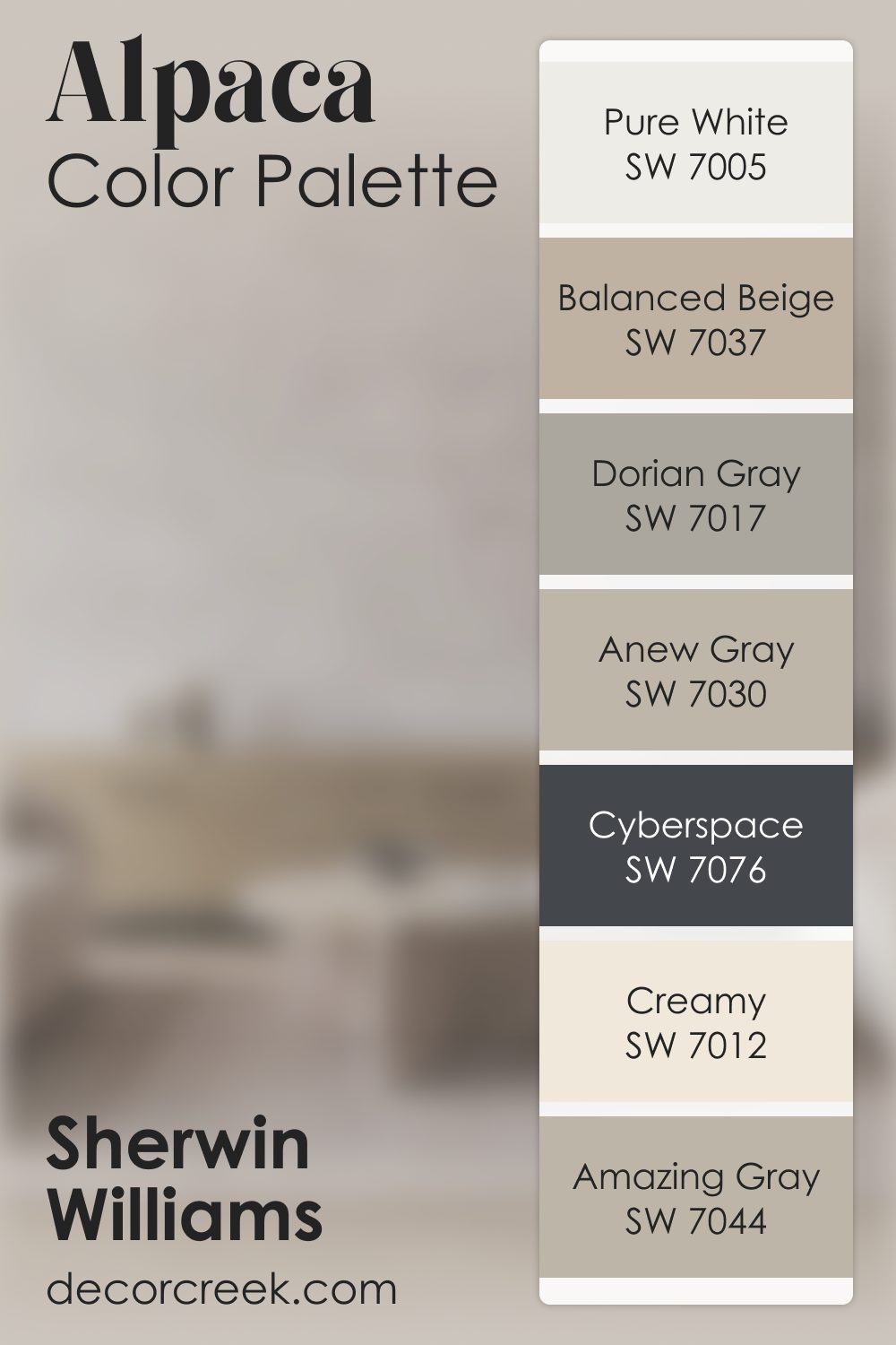
Alpaca SW 7022 by Sherwin Williams Color Palette
Alpaca brings a soft, gentle warmth that makes any room feel calm and welcoming, almost like a quiet blanket of comfort settling into the space. There is a peaceful softness in the way this shade sits on the wall, never too bold yet always present in the most soothing way.
Pure White brightens it lightly, adding a clean lift that keeps the palette open and airy. Amazing Gray and Anew Gray add smooth layers that feel natural and balanced, helping the palette flow with a soft, steady rhythm.
Balanced Beige warms the palette with an earthy touch, and Dorian Gray adds quiet depth that makes the entire combination feel grounded.
When I want stronger contrast, Cyberspace offers a bold anchor that strengthens the palette without overpowering it.
And Creamy softens everything again with a warm glow, wrapping the palette in gentle light. Together, these colors create a warm, calming atmosphere that feels easy, balanced, and beautifully comforting.
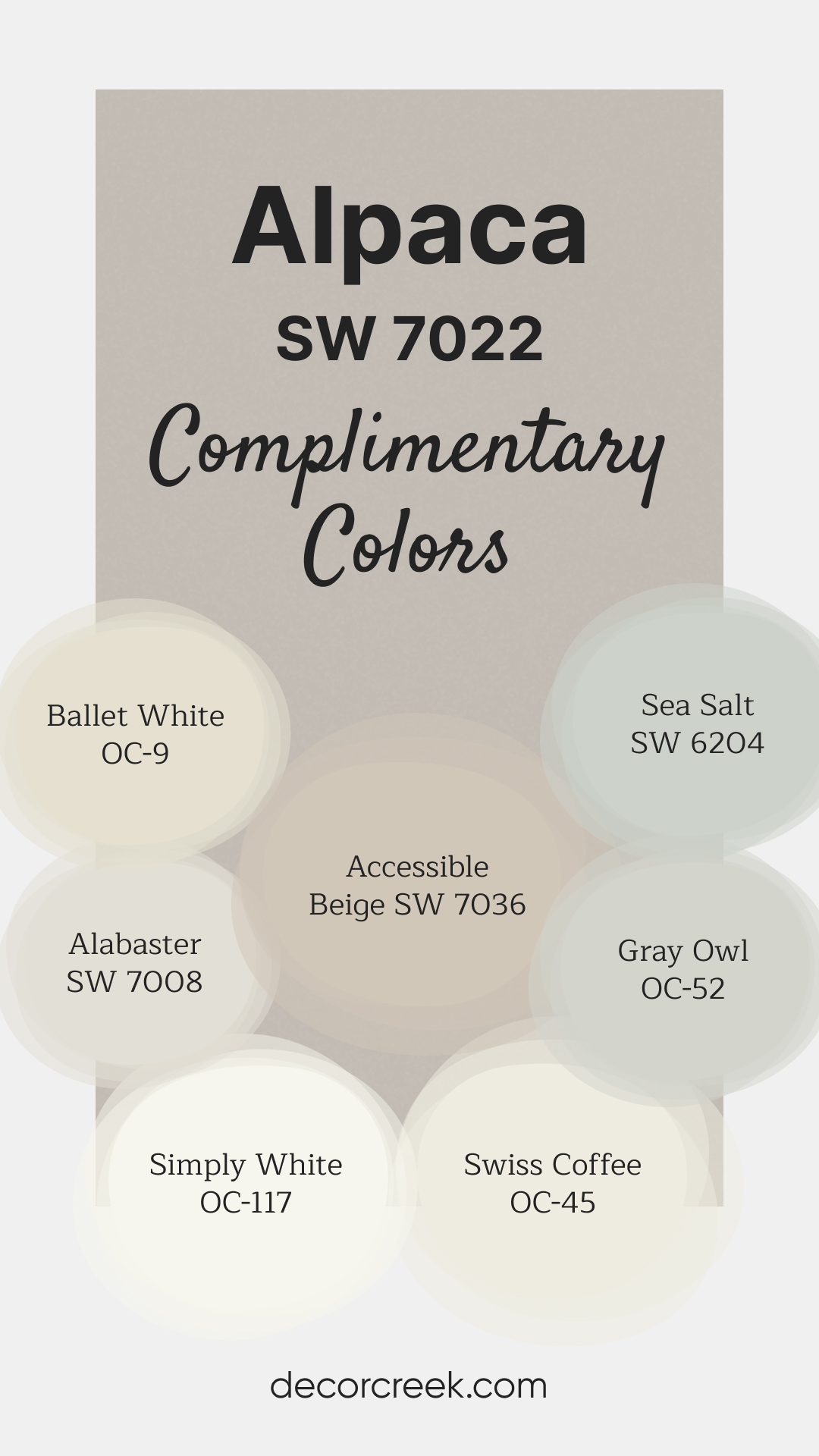
Complimentary Colors for Alpaca SW 7022 Paint Color by Sherwin-Williams
Alpaca SW 7022 by Sherwin-Williams is a warm gray that brings a touch of coziness and sophistication to any space. Its gentle undertones make it a great choice for creating a serene and balanced look, perfect for living rooms, bedrooms, or even open spaces.
This shade pairs beautifully with a variety of whites and neutrals, adding depth and harmony to any design. For a fresh contrast, try pairing Alpaca with whites like Simply White OC-117 and Alabaster SW 7008.
Accessible Beige SW 7036 and Ballet White OC-9 add subtle warmth, while Gray Owl OC-52 and Sea Salt SW 6204 introduce a hint of cool, refreshing color.
Swiss Coffee OC-45 completes the palette with a soft, warm finish, creating a cohesive.
Comparing SW 7022 Alpaca With Other Colors
Comparing colors is important because it allows us to make informed decisions in the realm of design and aesthetics. By comparing colors, we can explore different options, find alternatives, and identify complementary or harmonious combinations.
Whether it’s selecting trim colors, finding similar shades, or determining colors that go well together in a room, the act of comparing colors helps us create cohesive and visually appealing spaces. It enables us to consider various factors, such as the mood, style, and overall atmosphere we want to achieve. Let’s see how SW Alpaca compares with other colors below!
SW Alpaca vs. SW 7066 Gray Matters
SW Alpaca is a soft and subtle greige (gray + beige) that works well in various light conditions. It leans more towards the beige side, making it warmer and cozier. In contrast, SW Gray Matters is a more definitive gray. It has a cooler undertone, evoking a sense of tranquility and sophistication.
Although it still pairs well with a variety of colors, its cool undertone might make it more suitable for modern or minimalist aesthetics than the warmer Alpaca.

SW Alpaca vs. SW 7668 March Wind
When compared to SW Alpaca, SW 7668 March Wind is a slightly cooler and darker shade of gray. It offers a bit more depth and moodiness, making it a great choice for spaces where you want to create a more dramatic or intense effect. On the other hand, the warmer and softer Alpaca is excellent for creating an inviting and cozy ambiance.

SW Alpaca vs. SW 7029 Agreeable Gray
SW Alpaca and SW 7029 Agreeable Gray are both popular choices for versatile, neutral wall colors. Agreeable Gray, however, is a bit lighter and has a stronger gray presence than Alpaca. It’s often described as the perfect blend of gray and beige, making it a true greige. Alpaca, with its subtler, warmer beige leanings, might make a space feel cozier and more inviting.

SW Alpaca vs. SW 7008 Alabaster
SW Alabaster is a pure, bright white with just a hint of warmth, making it a go-to choice for a crisp, clean aesthetic. In contrast, SW Alpaca, with its blend of gray and beige, is more muted and warmer. While Alpaca adds depth and coziness to a room, Alabaster creates an open, airy feeling and can make small spaces seem larger.

SW Alpaca vs. SW 7043 Worldly Gray
While SW Alpaca carries more beige tones, SW 7043 Worldly Gray tilts more towards a true gray, although it’s still a warm gray with subtle green undertones. It offers a touch of complexity that makes it a unique and interesting choice for many spaces. However, Alpaca may still be the preferred option for those seeking a softer, warmer atmosphere.

SW Alpaca vs. SW 7506 Loggia
SW Loggia is a warm and earthy color, significantly darker than SW Alpaca, and carries rich brown undertones. It can add a deep, welcoming, and cozy feel to a room. While Alpaca provides a soft, neutral backdrop, Loggia might be more suitable for those who prefer a stronger, more rustic aesthetic.

Conclusion
SW 7022 Alpaca is a versatile and sophisticated color that can be used in various rooms and design styles. Its neutral and calming tone allows for easy pairing with different complementary colors and materials.
Whether it’s for bedroom walls, bathroom backdrops, living room aesthetics, exterior facades, or kitchen designs, SW Alpaca adds a touch of elegance and timelessness to any space. By considering its potential applications and comparing it with other colors, we can make well-informed decisions to create visually pleasing and harmonious environments.

Ever wished paint sampling was as easy as sticking a sticker? Guess what? Now it is! Discover Samplize's unique Peel & Stick samples.
Get paint samples
Frequently Asked Questions
⭐What is the undertone of SW 7022 Alpaca?
SW 7022 Alpaca has a cool undertone, leaning towards gray. It is a neutral shade that pairs well with various colors.
⭐Can SW 7022 Alpaca be used in small spaces?
Absolutely! SW 7022 Alpaca is a versatile color that works well in both large and small spaces. Its neutral tone can help create an illusion of openness and brightness in smaller areas.
⭐What are some recommended color combinations with SW 7022 Alpaca?
SW 7022 Alpaca pairs well with a range of colors. Some popular combinations include soft blues, warm grays, crisp whites, and earthy tones. These color choices can create a harmonious and balanced look.
⭐Is SW 7022 Alpaca suitable for both traditional and modern interior styles?
Yes, SW 7022 Alpaca is a versatile color that can complement various interior design styles. It works well in both traditional and modern settings, adding a touch of elegance and sophistication.
⭐How does SW 7022 Alpaca look in different lighting conditions?
SW 7022 Alpaca can appear slightly different in various lighting conditions. In natural light, it may showcase its cool gray undertones more prominently, while in artificial or warm lighting, it can lean towards a warmer gray. We recommend testing a sample of the color in your specific space to observe how it interacts with your lighting.


