This color is more than just a paint; it’s a versatile element that can transform any space. I noticed how it sits comfortably between warm and cool tones, making it adaptable to various styles and settings.
In my experience, Rockport Gray carries a soft elegance without overshadowing other design elements in a room. It’s subtle, yet it adds a layer of sophistication that I really appreciate.
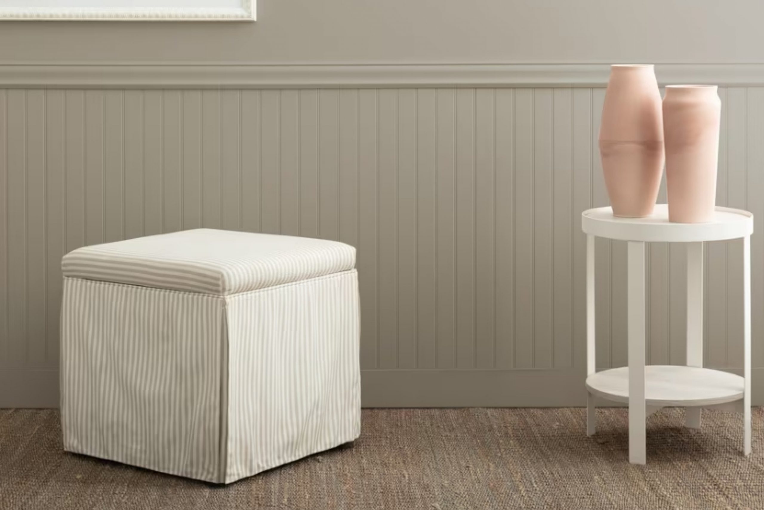
I found that Rockport Gray works wonderfully in living rooms, bedrooms, or even as an accent wall. It seems to have an uncanny ability to complement both modern and traditional décor. In my own home, this shade has provided a calming backdrop, effortlessly bringing together furniture and artwork.
It has a grounded quality that feels welcoming, which is something I value in a paint color. As I continue to experiment with home design, I keep coming back to HC-105 Rockport Gray because it perfectly balances neutrality with character.
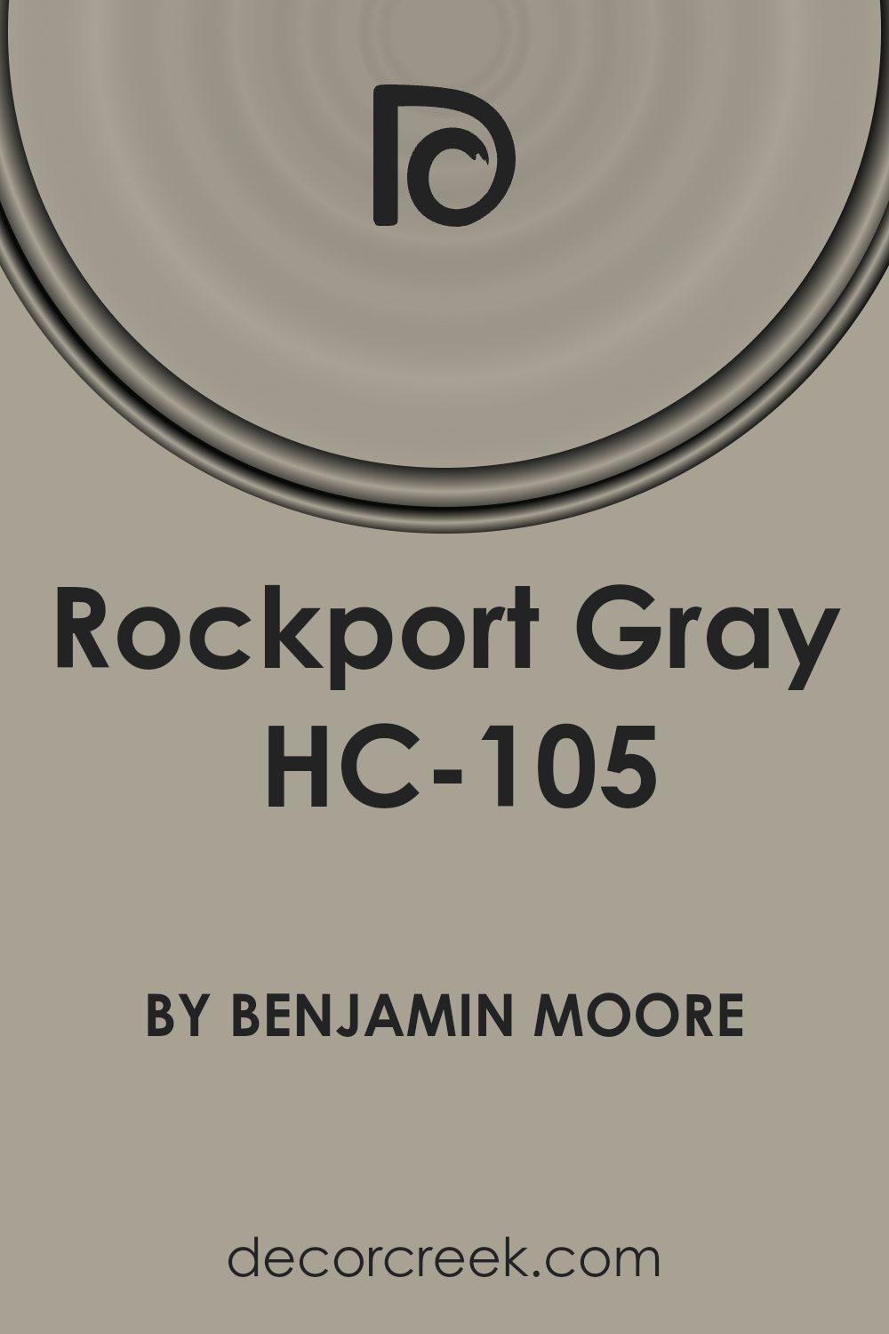
What Color Is Rockport Gray HC-105 by Benjamin Moore?
Rockport Gray (HC-105) by Benjamin Moore is a rich, medium-toned gray with warm undertones. This color offers a cozy and inviting feel, making it a versatile choice for various interior styles. It works particularly well in traditional, transitional, and modern spaces, providing a neutral backdrop that enhances architectural details and complements furnishings without overpowering them.
In a traditional setting, Rockport Gray can be paired with classic wood finishes and vintage pieces to create an elegant atmosphere
. It also suits contemporary spaces, where it can be combined with sleek metals, minimalistic furniture, and clean lines to achieve a balanced look.
This shade pairs well with materials like natural wood, which highlights the warm undertones of the gray. It also looks great alongside marble and stone, both of which can provide a sense of depth and texture. Soft textiles, such as wool, cotton, and linen, complement Rockport Gray by adding warmth and tactile interest.
Accents in complementary colors such as soft whites, taupes, or muted blues can enhance the space further.
Overall, Rockport Gray is a versatile color that provides a calm and inviting backdrop in various interior settings, harmonizing beautifully with different materials and textures.
Is Rockport Gray HC-105 by Benjamin Moore Warm or Cool color?
Rockport Gray HC-105 by Benjamin Moore is a popular paint color appreciated for its versatility in home decor. It is a medium-gray shade with warm undertones, which adds a cozy and inviting feel to spaces. This color works well in a variety of rooms, from living areas to bedrooms, because it provides a neutral backdrop that complements different styles and furnishings.
Rockport Gray can make spaces feel more expansive without overwhelming them. Its warm undertones allow it to pair nicely with both cool and warm colors, making it easy to coordinate with existing decor.
In living rooms, it creates a welcoming atmosphere, and in bedrooms, it offers a sense of calm.
For those who prefer natural materials, this shade acts as a great companion to wood finishes and metal accents.
Overall, Rockport Gray is a reliable choice for homeowners who want a balanced and adaptable color that enhances their interiors.
Undertones of Rockport Gray HC-105 by Benjamin Moore
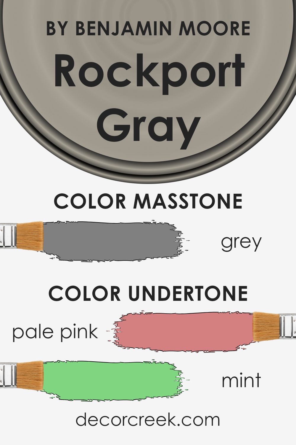
Rockport Gray HC-105 by Benjamin Moore displays a complex range of undertones that give the color its unique character. While it may seem like a straightforward medium gray, its undertones can shift dramatically under different lighting conditions.
For instance, Rockport Gray contains subtle warm undertones like pale pink and pale yellow, which can make it appear soft and inviting in a well-lit room. Additionally, undertones of mint and light green add a hint of freshness.
In contrast, cooler undertones such as lilac, light purple, and light blue can emerge in different settings, helping the gray take on a cooler, calmer feel. These undertones might appear more pronounced in spaces with cooler lighting.
Undertones like olive, browns, and dark turquoise add depth, providing a more earthy quality, while undertones like navy and dark blue might give it a more dramatic edge.
When applied to interior walls, these undertones can affect both the ambiance and energy of a room. A space might feel cozy and warm with ample natural light, highlighting the yellows and pinks, or more subdued and formal with artificial lighting that emphasizes cooler undertones.
Choosing this color allows flexibility, as it can adapt to the varying hues of décor and furniture nearby, making it a versatile choice.
What is the Masstone of the Rockport Gray HC-105 by Benjamin Moore?
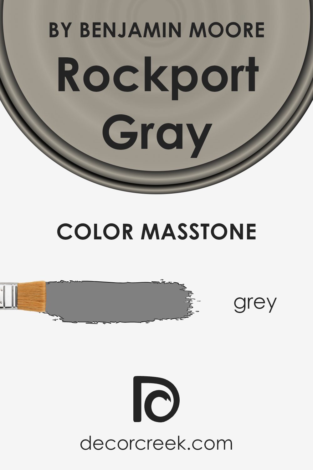
Rockport Gray HC-105 by Benjamin Moore is a warm, medium-to-dark shade of gray with a hint of brown, making it very adaptable for home interiors. The masstone of this color is close to a standard gray (#808080), which helps it blend easily with other colors, creating a balanced and neutral backdrop.
This neutral quality makes it suitable for living rooms, bedrooms, and even kitchens.
The gray tone in Rockport Gray is versatile and calming. It provides a perfect balance between light and dark, allowing it to pair well with both vibrant accents and softer tones. By not being too stark or cold, it adds a cozy and inviting feel to any room. It is ideal for those who want a neutral yet warm environment.
The color can stand alone beautifully or highlight architectural elements like trim and moldings. All in all, Rockport Gray is an excellent choice for creating a comfortable and harmonious home atmosphere.
How Does Lighting Affect Rockport Gray HC-105 by Benjamin Moore?
Lighting plays a crucial role in how we perceive colors. Natural and artificial light can change how a color looks to our eyes. The color Rockport Gray HC-105 from Benjamin Moore serves as an excellent example to understand these effects.
In natural light, colors can appear different depending on the room’s orientation. For instance, in north-facing rooms, which generally get less direct sunlight and can feel cooler, Rockport Gray might appear darker and cooler, with more of its gray undertones showing.
This happens because the light entering these rooms is usually more diffused and has a blue tint, which can emphasize cooler tones in paint.
On the other hand, south-facing rooms receive plenty of warm, direct sunlight throughout the day. In these spaces, Rockport Gray will likely look lighter and warmer, with its brown undertones more pronounced. The warm light can bring out the subtle richness in the color, making it feel inviting and cozy.
In east-facing rooms, Rockport Gray will look different in the morning compared to the afternoon. Morning light tends to be bright and yellowish, which can make the color seem warm and lively.
As the day progresses and the sunlight fades, the color might take on a more neutral gray appearance.
West-facing rooms experience the opposite, with cooler light in the morning and warmer sunlight in the afternoon and evening. In these rooms, Rockport Gray may start the day looking more muted and neutral but will warm up as the day goes on.
Under artificial light, such as LED or incandescent bulbs, Rockport Gray’s appearance can vary based on the bulb’s color temperature. Warmer bulbs might enhance its brown undertones, while cooler, daylight-mimicking bulbs can emphasize its gray aspects.
Understanding these lighting effects helps in choosing the right space and time for using colors like Rockport Gray effectively.
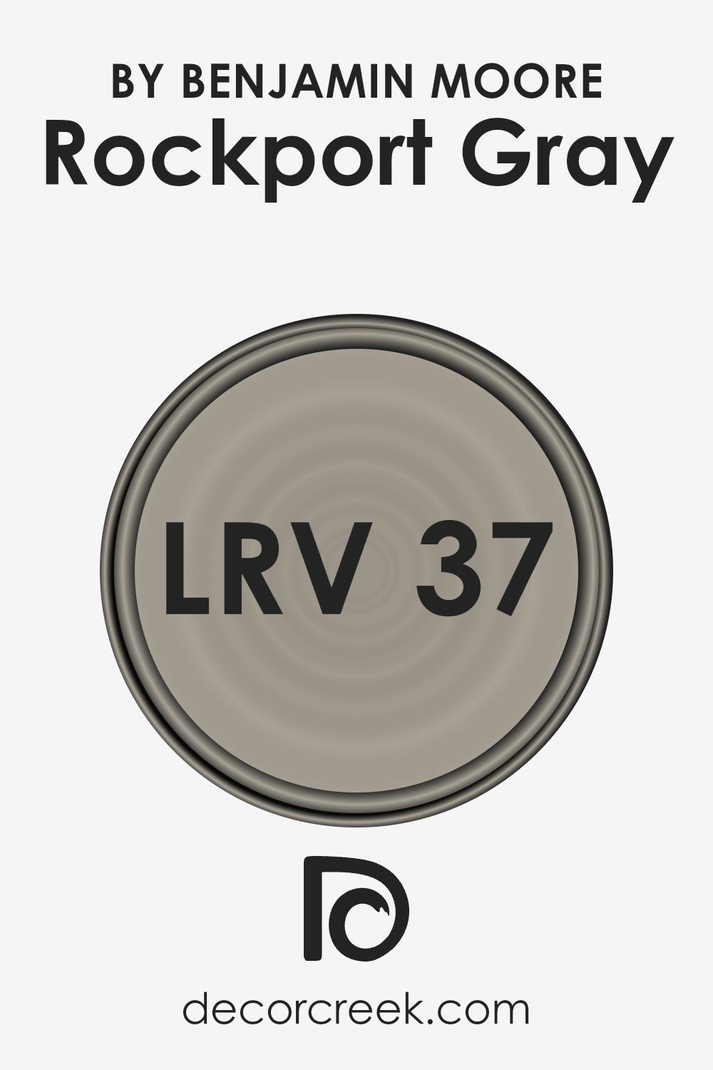
What is the LRV of Rockport Gray HC-105 by Benjamin Moore?
LRV, or Light Reflectance Value, is a measure of how much light a color reflects. It’s a scale from 0 to 100, where 0 is absolute black, reflecting no light, and 100 is pure white, reflecting all light. LRV is important because it helps us understand how light or dark a paint color will look in different lighting conditions.
Colors with high LRV reflect more light and can make a room feel brighter and more spacious. On the other hand, colors with low LRV absorb more light, making spaces feel cozier and sometimes smaller.
With an LRV of 36.61, Rockport Gray is on the medium-dark range of the LRV scale. This means it doesn’t reflect a lot of light; instead, it absorbs more than it reflects. In a room, it can feel warm and inviting without being too dark. Under certain lighting, Rockport Gray might look very different.
In a well-lit space, it could appear lighter and more open, while in a dimly lit room, it might come across as richer and darker. This makes it a versatile color, able to create a cozy atmosphere or contribute to a calm ambiance, depending on its surroundings and the lighting conditions.
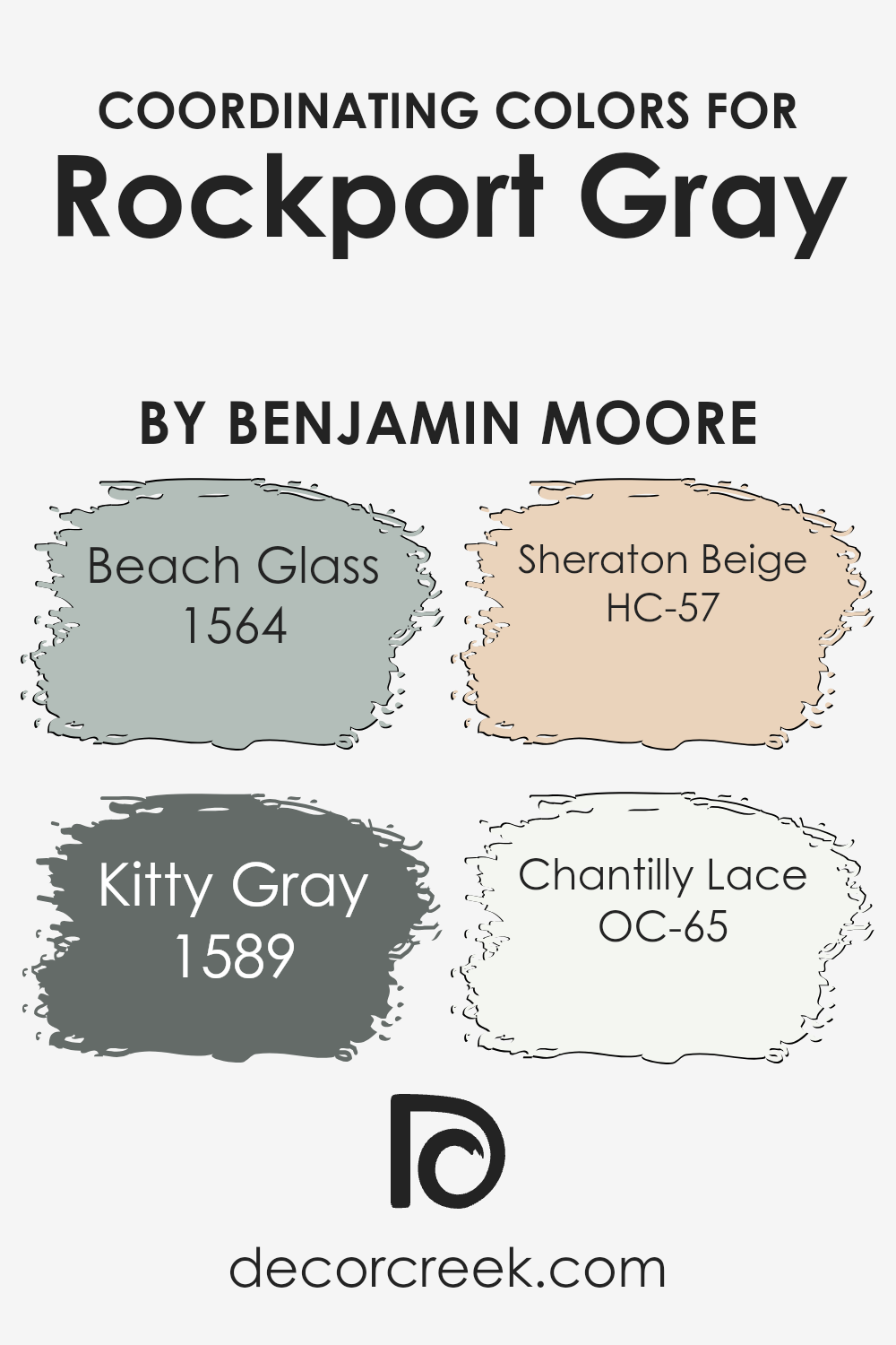
Coordinating Colors of Rockport Gray HC-105 by Benjamin Moore
Coordinating colors are hues that work well together by balancing and complementing each other, creating a pleasing and cohesive look. When choosing coordinating colors for Rockport Gray, you want shades that enhance and highlight its natural beauty without clashing.
A harmonious palette can significantly impact the overall ambiance and aesthetic appeal of a space.
Beach Glass (1564) is a soft, cool green-blue that evokes a sense of calm and relaxation, reminiscent of gentle ocean waves. It pairs beautifully with Rockport Gray, adding a touch of freshness and vitality. Kitty Gray (1589) is a muted, sophisticated gray that complements the warmth of Rockport Gray, providing a gentle contrast that adds depth to any room.
Sheraton Beige (HC-57) introduces a warm, earthy tone that harmonizes with the neutral palette, bringing a subtle hint of coziness.
Lastly, Chantilly Lace (OC-65) is a crisp, clean white that adds brightness and clarity to the space, offering a perfect backdrop to highlight the gray tones.
Together, these colors create an elegant and balanced environment, enhancing the timeless appeal of Rockport Gray.
You can see recommended paint colors below:
- 1564 Beach Glass
- 1589 Kitty Gray
- HC-57 Sheraton Beige
- OC-65 Chantilly Lace
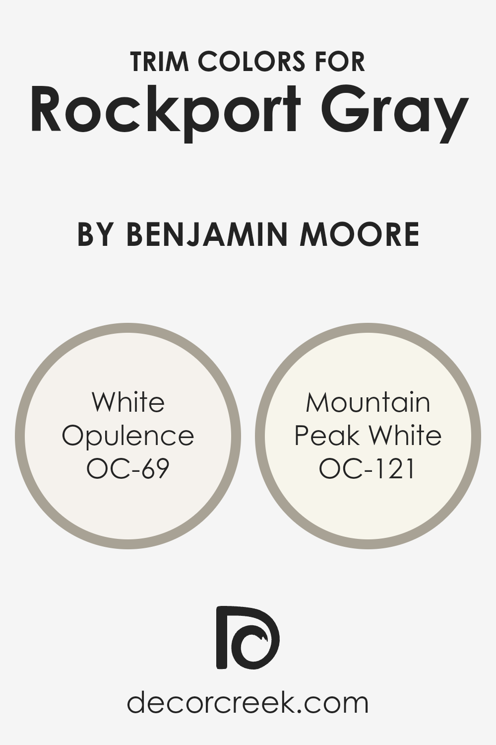
What are the Trim colors of Rockport Gray HC-105 by Benjamin Moore?
Trim colors are used to highlight and define the architectural features of a space, such as windows, doors, and molding, and they play a crucial role in enhancing the overall aesthetic of a room. When using Rockport Gray, a deep and rich gray by Benjamin Moore, choosing the right trim color can significantly influence the room’s overall vibe and appearance.
Trim colors like OC-69, White Opulence, and OC-121, Mountain Peak White, work well with Rockport Gray because they offer a contrast that highlights the depth of the gray without overwhelming it.
They add a crispness against Rockport Gray, ensuring the overall look is balanced and pleasing to the eye.
These trim options help frame the gray beautifully, allowing each hue to complement the other while maintaining a clean and distinctive appearance.
OC-69, White Opulence, is a warm and inviting shade of white, providing a soft and subtle contrast that brightens the space without clashing with Rockport Gray’s strong undertones. This gentle white is perfect for creating an inviting atmosphere that feels both fresh and welcoming.
On the other hand, OC-121, Mountain Peak White, is a brighter white with a hint of warmth. It offers a more pronounced contrast to Rockport Gray, making the trim stand out more clearly while maintaining a delicate balance.
Both of these whites work well as trim colors, each adding a touch of elegance and refinement to the overall look, allowing Rockport Gray to remain the focal point without being overshadowed.
You can see recommended paint colors below:
- OC-69 White Opulence
- OC-121 Mountain Peak White
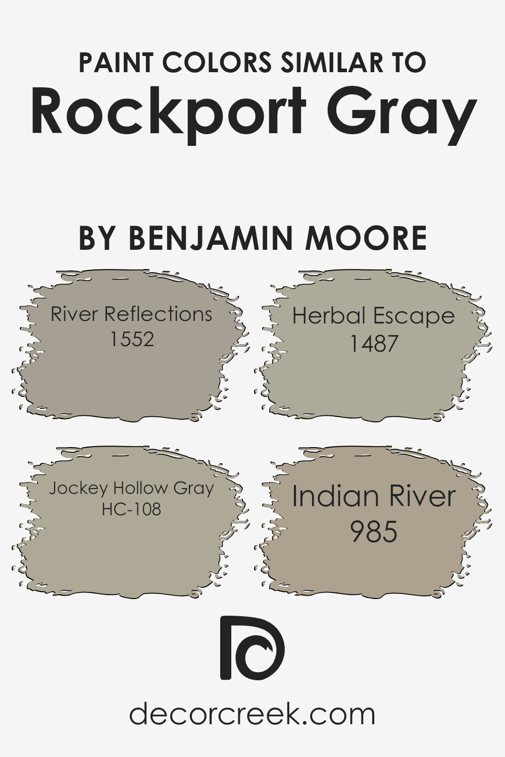
Colors Similar to Rockport Gray HC-105 by Benjamin Moore
Similar colors play an essential role in design by providing a sense of harmony and balance to any space. These colors, which are close on the color spectrum, can create a cohesive look that’s both pleasing and calming to the eye. For the shade Rockport Gray, Benjamin Moore offers several complementary hues.
One such color is River Reflections, a soft, muted gray with a hint of blue that captures the look and feel of a quiet stream on a cloudy day. This can add a sense of softness and calm to a room, making it a great choice for living areas or bedrooms.
Another similar color is Jockey Hollow Gray, which carries a subtle warmth that can enhance a cozy atmosphere. Herbal Escape introduces a touch of nature with its rich, green undertone, perfect for spaces that want a hint of earthiness without overpowering the room.
Lastly, Indian River combines earthy brown with gray, offering a neutral tone that grounds the space and pairs well with natural elements like wood and stone.
Together, these colors complement the timeless appeal of Rockport Gray, making them versatile choices for creating depth and interest within a room while maintaining a unified look.
You can see recommended paint colors below:
- 1552 River Reflections
- HC-108 Jockey Hollow Gray
- 1487 Herbal Escape
- 985 Indian River
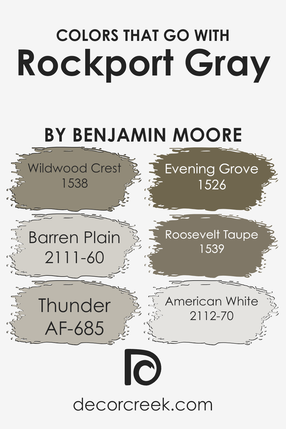
Colors that Go With Rockport Gray HC-105 by Benjamin Moore
Rockport Gray HC-105 by Benjamin Moore is a versatile color that pairs beautifully with several other shades to create a harmonious space. Wildwood Crest (1538) is a rich, earthy green that brings a natural and calming feel when paired with Rockport Gray.
The subtle undertones of this shade complement the gray, adding a touch of warmth and nature-inspired flair to any room. Barren Plain (2111-60) is a soft, light gray with minimal undertones, offering a peaceful backdrop that enhances the depth and sophistication of Rockport Gray.
Its understated presence ensures that the primary color stands out without being overpowering.
On the bolder side, Thunder (AF-685) is a deep gray with a hint of brown, adding contrast and depth to the overall palette. Its strong presence can add definition and elegance.
Evening Grove (1526), on the other hand, is a dark, lush green that pairs well, providing an element of lushness and richness.
Roosevelt Taupe (1539) is a deep taupe that introduces warmth, making spaces feel more inviting. And finally, American White (2112-70) is a soft off-white that brightens the space, balancing darker tones and giving a fresh and airy touch.
Together, these colors create a well-rounded and welcoming atmosphere, enhancing Rockport Gray’s beauty and versatility.
You can see recommended paint colors below:
- 1538 Wildwood Crest
- 2111-60 Barren Plain
- AF-685 Thunder
- 1526 Evening Grove
- 1539 Roosevelt Taupe
- 2112-70 American White
How to Use Rockport Gray HC-105 by Benjamin Moore In Your Home?
Rockport Gray HC-105 by Benjamin Moore is a versatile and neutral paint color that homeowners love for its balanced tone. It is a warm gray with subtle brown and green undertones, making it a perfect choice for different spaces in the home.
For living rooms, it creates a cozy atmosphere that pairs well with both modern and traditional furniture. In kitchens, Rockport Gray can add warmth and elegance, especially when combined with white cabinets or stainless steel appliances.
It also works beautifully in bedrooms, creating a comfortable and calming environment that promotes relaxation.
If you have open spaces, using this shade can help unify the different areas of your home. When considering trim colors, white or cream shades can highlight the gray and add a fresh, clean look.
Rockport Gray is also great for exteriors, as it complements natural surroundings and looks stunning in various lighting conditions.
Overall, this color is an excellent choice for those seeking a timeless and adaptable design.
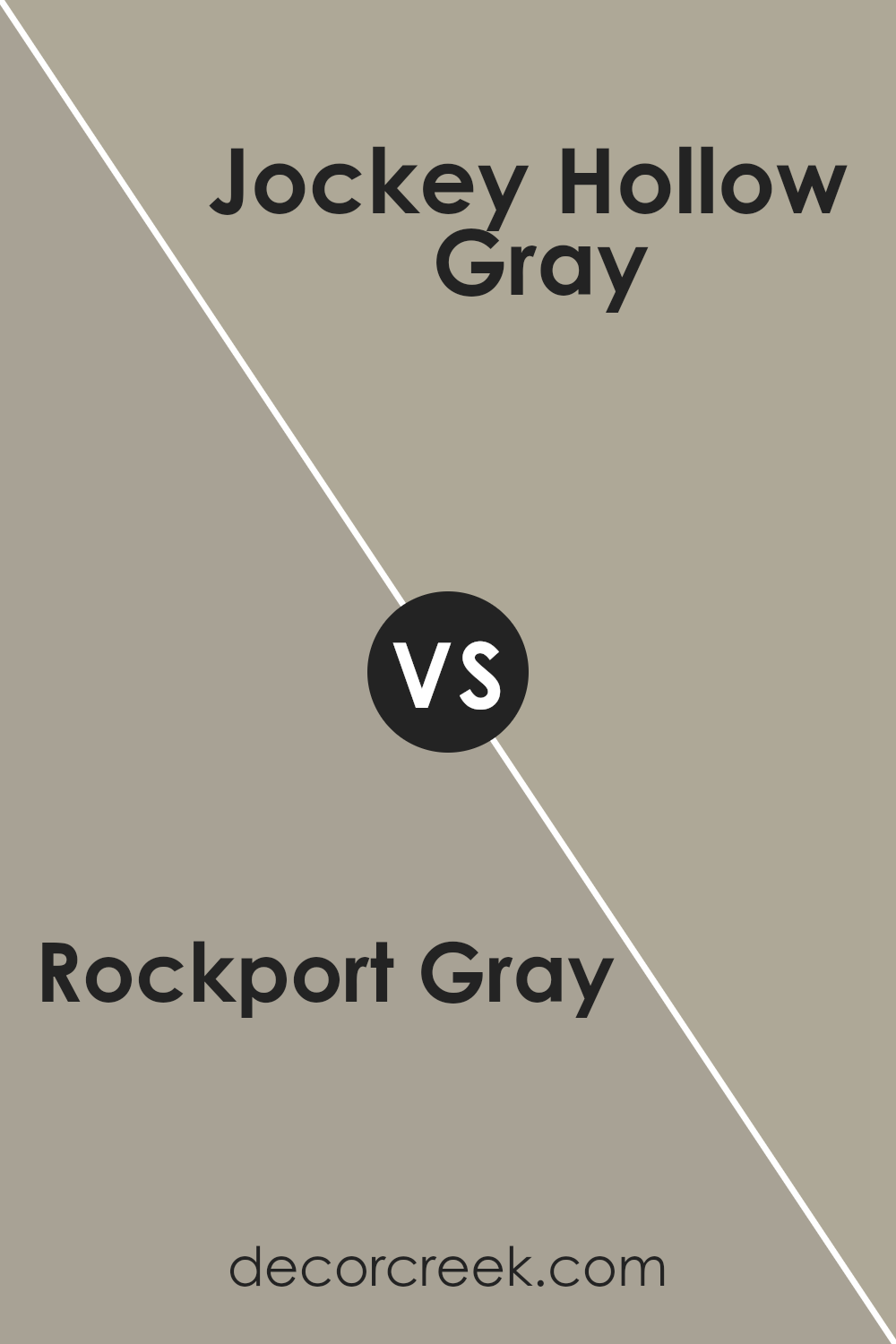
Rockport Gray HC-105 by Benjamin Moore vs Jockey Hollow Gray HC-108 by Benjamin Moore
Rockport Gray (HC-105) and Jockey Hollow Gray (HC-108) are two shades of gray from Benjamin Moore. Rockport Gray is a medium, warm gray with subtle brown undertones, giving it a cozy and earthy feel. It works well in rooms where you want a touch of warmth while maintaining a neutral palette. It can pair beautifully with white trim for a classic look.
On the other hand, Jockey Hollow Gray is slightly darker and moodier than Rockport Gray.
It has more pronounced green undertones, providing a cooler vibe. This shade is excellent for creating drama and depth, making it suitable for accent walls or intimate spaces like libraries or dining rooms.
While both colors are versatile and work well with a variety of styles, Rockport Gray leans towards a more inviting atmosphere, while Jockey Hollow Gray adds a touch of sophistication and elegance.
You can see recommended paint color below:
- HC-108 Jockey Hollow Gray
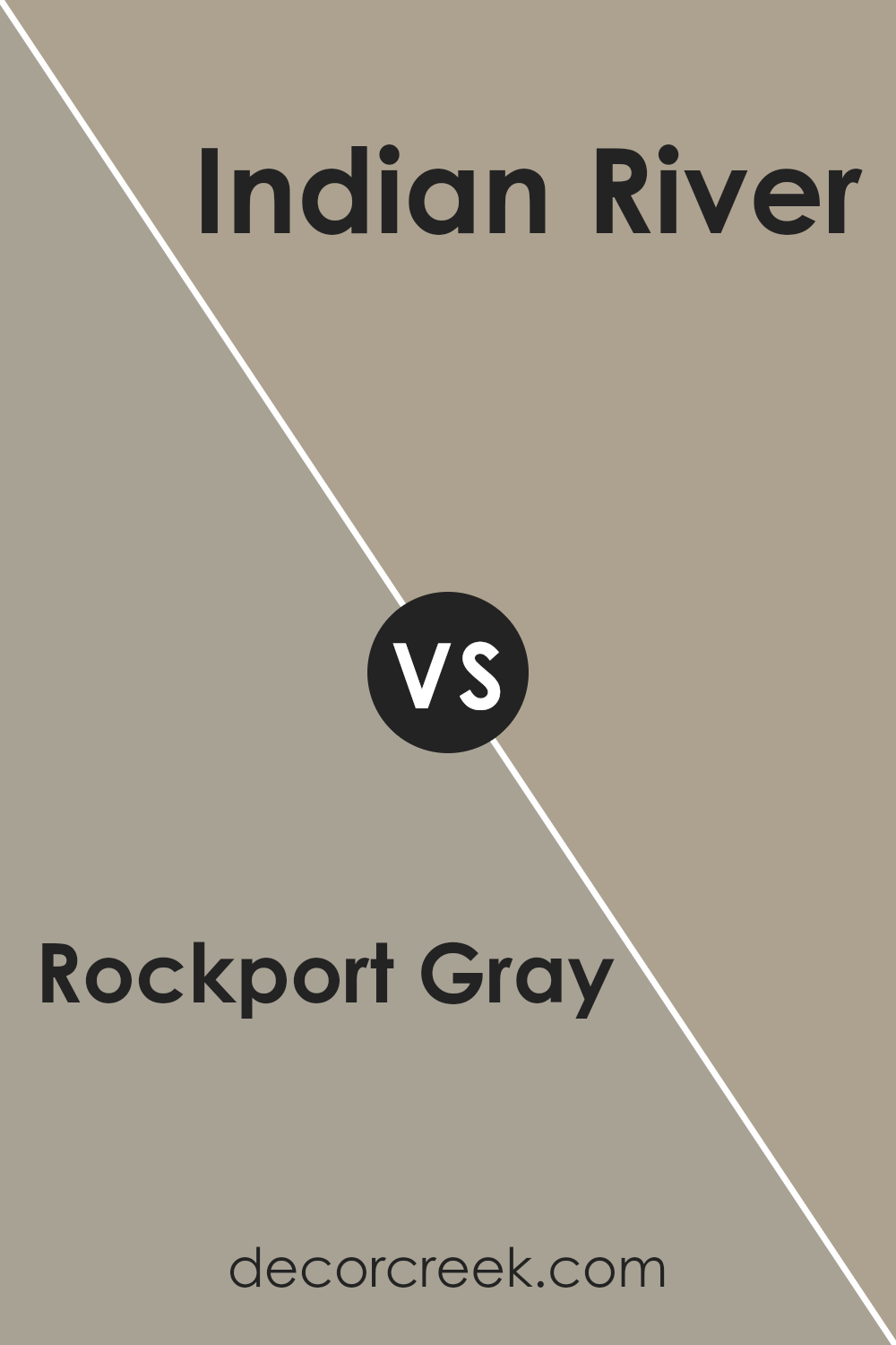
Rockport Gray HC-105 by Benjamin Moore vs Indian River 985 by Benjamin Moore
Rockport Gray HC-105 and Indian River 985 by Benjamin Moore are two similar yet distinct paint colors. Rockport Gray is a medium gray with a warm, soothing undertone, making it versatile for various settings. It’s a balanced color that works well with different decor styles, offering a neutral backdrop that pairs easily with whites, blacks, and bold colors.
On the other hand, Indian River is a medium taupe with more pronounced warm undertones. It leans slightly towards beige, giving it a cozy, welcoming feel that’s ideal for creating a comfortable atmosphere.
While both colors are warm, Indian River has a slightly earthier tone compared to the more straightforward gray of Rockport Gray.
Both colors are excellent choices for those looking to introduce a warm gray to their space, but Rockport Gray offers a cooler, more traditional gray look, whereas Indian River provides a touch of warmth and earthiness.
You can see recommended paint color below:
- 985 Indian River
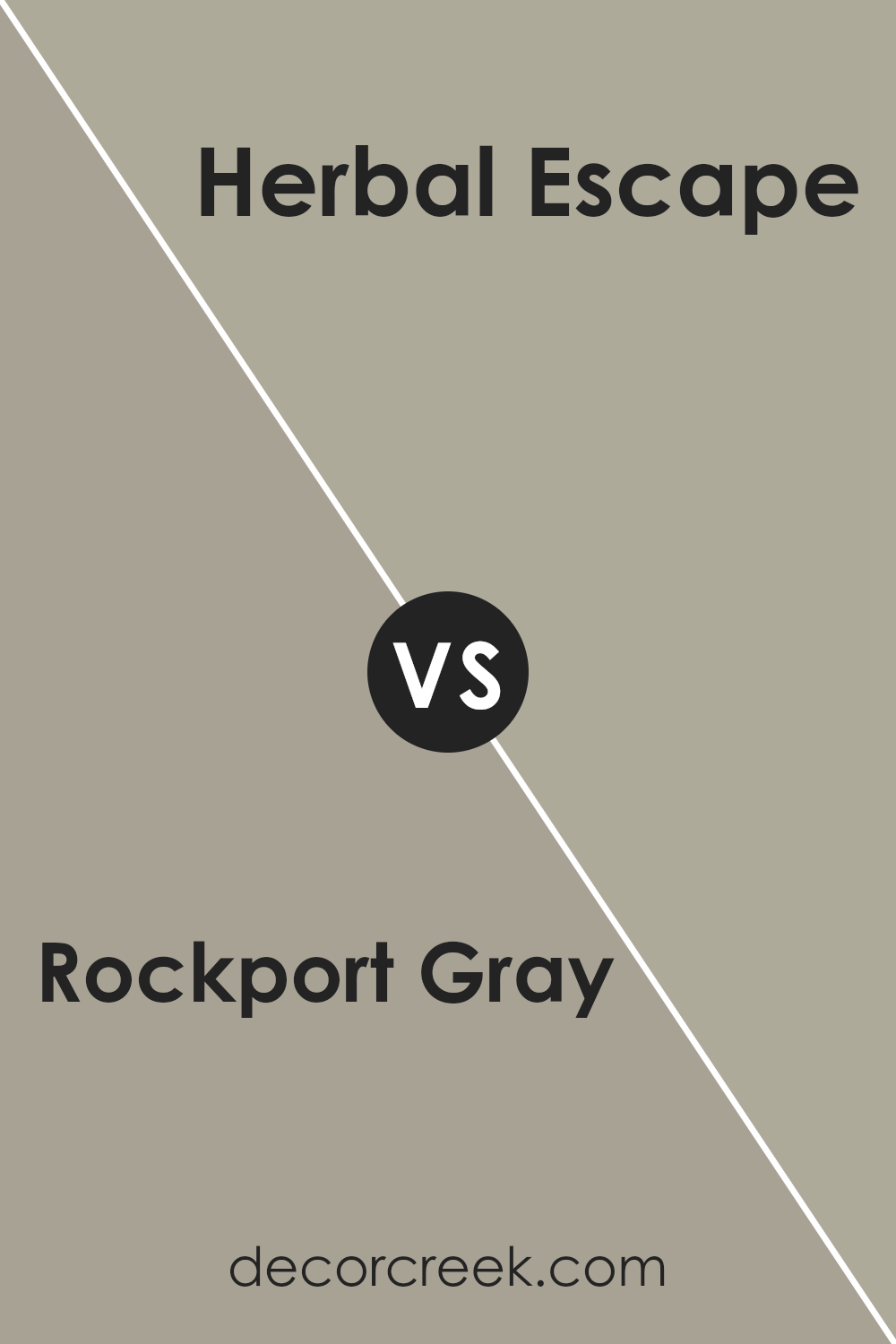
Rockport Gray HC-105 by Benjamin Moore vs Herbal Escape 1487 by Benjamin Moore
Rockport Gray is a versatile, neutral gray that carries a warm undertone, making it suitable for a variety of settings. It’s the kind of color that can easily fit into both modern and traditional spaces due to its understated elegance. This gray doesn’t overpower a room but rather complements other colors and elements in the space.
On the other hand, Herbal Escape is a much more vibrant, energetic color. It is a warm, earthy green that brings a sense of nature and freshness into a room.
While Rockport Gray acts as a subtle backdrop, Herbal Escape makes a bold statement and can be used to create focal points or add warmth to a space.
Together, these colors can balance each other well, with Rockport Gray providing a calm, neutral base and Herbal Escape injecting life and color.
You can see recommended paint color below:
- 1487 Herbal Escape
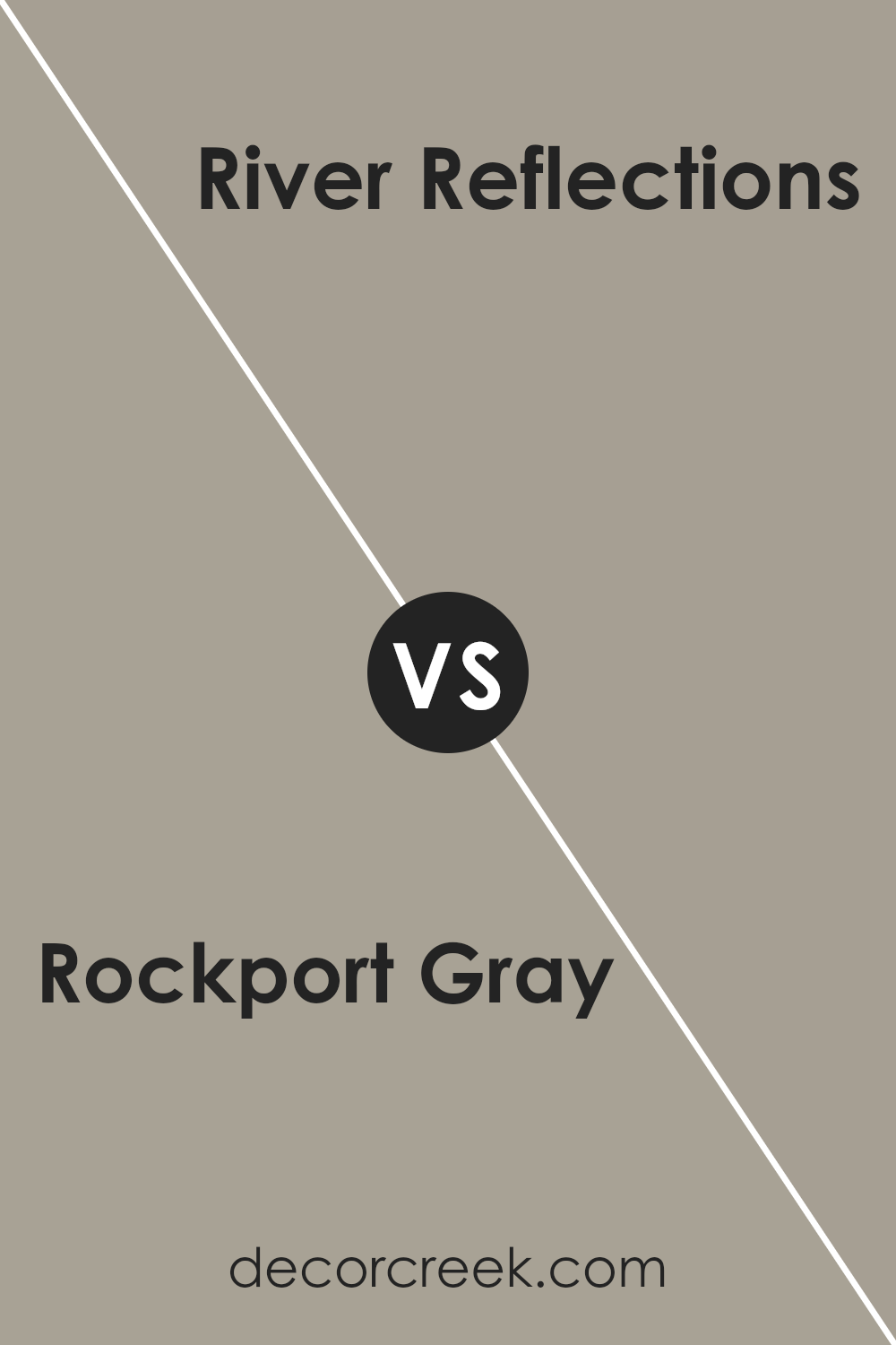
Rockport Gray HC-105 by Benjamin Moore vs River Reflections 1552 by Benjamin Moore
Rockport Gray HC-105 and River Reflections 1552 are two elegant colors from Benjamin Moore that offer distinct vibes. Rockport Gray is a medium gray with warm undertones, which makes it versatile and easy to pair with other colors. It works well in both traditional and modern settings, adding a cozy and inviting atmosphere to any room.
On the other hand, River Reflections is a softer gray with blue undertones. This gives it a cooler, more refreshing feel compared to Rockport Gray. It’s perfect for creating a calm and airy space, making it a great option for bedrooms or bathrooms.
When choosing between these colors, consider the mood you want to create. Rockport Gray adds warmth and depth, while River Reflections brings a hint of coolness and freshness. Both colors are neutral enough to complement a variety of décor styles, but their subtle differences can significantly impact the overall feel of a room.
You can see recommended paint color below:
- 1552 River Reflections
Conclusion
HC-105 Rockport Gray by Benjamin Moore is a wonderfully balanced color that makes any room feel just right. When I first looked at it, I noticed how it feels like a mix between warm and cool shades. This balance makes it special because it works well in different parts of a home.
Imagine having a wall color that looks great with both bright and dark furniture. That’s exactly what Rockport Gray does.
It gives a cozy feeling to living rooms or bedrooms, like a warm hug from a favorite blanket. At the same time, it’s calm and soothing, making it perfect for places where you need to relax, like a reading nook or a study area.
I also think it’s awesome in areas like kitchens or hallways because it doesn’t clash with anything; it just always seems to fit in.
Talking about how it looks with other colors, it’s like it knows how to be friends with both white and bold shades, making it easy to decorate.
For me, if I have to pick a color that I can always count on to make a room feel nice and ready for any occasion, I would say HC-105 Rockport Gray is the one. It’s like having a good friend who always knows how to make things better, just by being there.
Ever wished paint sampling was as easy as sticking a sticker? Guess what? Now it is! Discover Samplize's unique Peel & Stick samples.
Get paint samples

