Introducing the AF-685 Thunder from Benjamin Moore, a paint color that’s quickly gaining popularity among homeowners and interior designers alike. This particular shade is part of Benjamin Moore’s Affinity Collection, renowned for its ability to pair beautifully with a wide array of colors, ensuring a harmonious palette throughout your home.
Thunder AF-685 stands out with its unique blend of warmth and neutrality, making it a perfect backdrop for various design styles, from modern minimalist to cozy traditional. Its versatility is key, allowing it to adapt to any room, whether it’s creating a serene atmosphere in the bedroom or offering a calm and collected vibe in the living room.
One of the reasons Thunder has become a favorite choice is its unparalleled ability to balance depth with a sense of openness. It provides just enough color to make a statement, while its underlying neutrality means it won’t overpower the space or clash with your furniture and decor. This makes it an excellent option for those looking to add a touch of sophistication without committing to a bold or bright color scheme.
Whether you’re updating a single room or transforming your entire home, AF-685 Thunder offers a timeless elegance that can elevate any space. Its appeal lies in its simplicity and the warm, inviting ambiance it creates, making it a go-to choice for creating a stylish and comfortable home environment.
What Color Is Thunder AF-685 by Benjamin Moore?
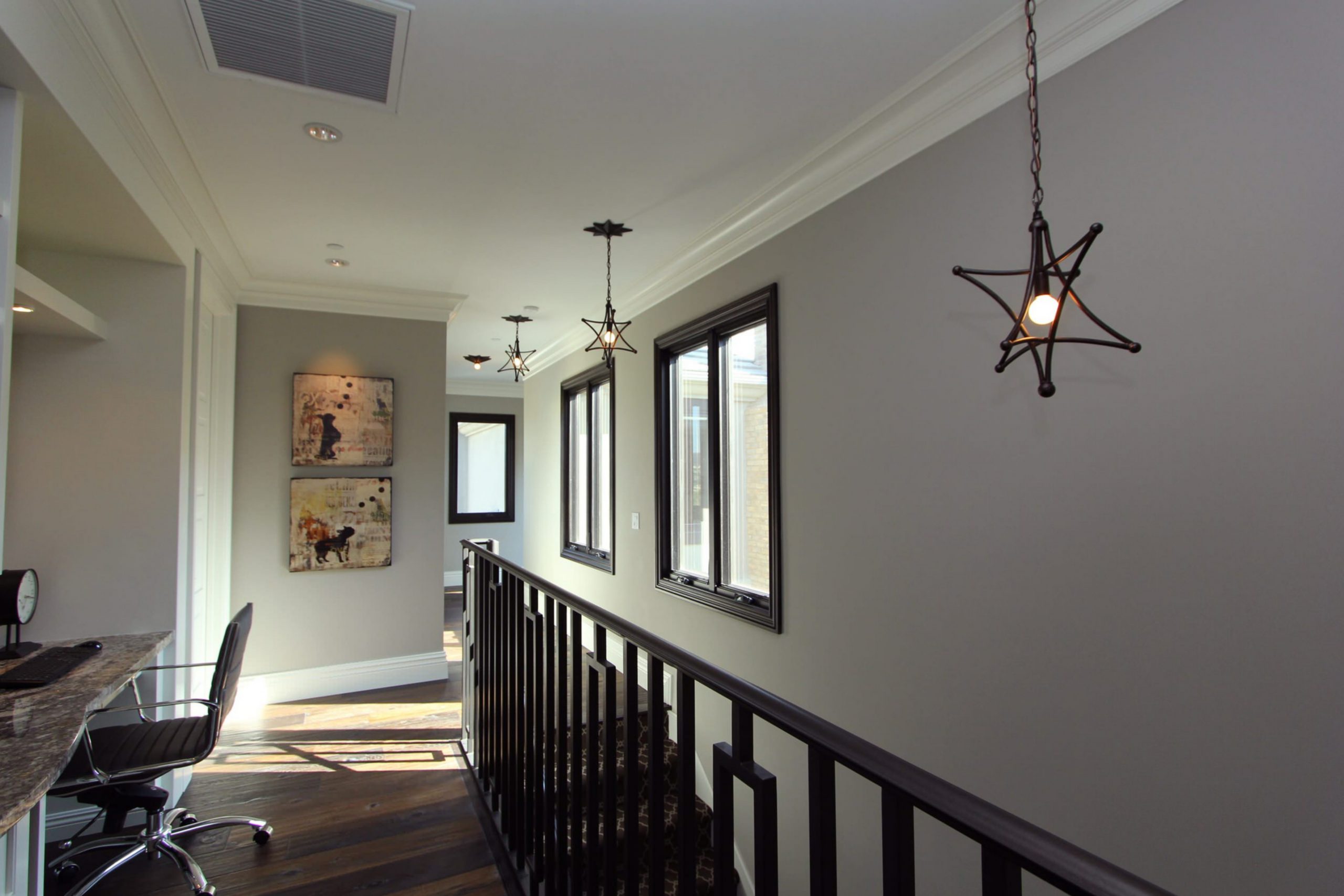
Thunder AF-685 by Benjamin Moore is a versatile gray that strikes the perfect balance between warm and cool tones. This unique quality makes it an exceptional choice for a variety of interior styles, from modern minimalist to cozy traditional. Its adaptability means it can beautifully complement a range of décors without overwhelming the senses.
One of the most appealing aspects of Thunder AF-685 is its ability to blend seamlessly with different materials and textures. Imagine pairing it with glossy white ceramics for a fresh and clean look, or with rich wooden elements for a warm and inviting atmosphere. It also works wonders with metallic finishes like brushed nickel or copper, adding a touch of sophistication to any space.
In terms of interior styles, Thunder AF-685 fits effortlessly into contemporary settings, thanks to its understated elegance. It’s equally at home in rustic designs, where its depth can enhance the natural beauty of wooden beams and furniture. For those leaning towards a more traditional vibe, Thunder AF-685 provides a solid foundation that can be dressed up with classic furnishings and textured fabrics like linen or tweed.
In conclusion, Thunder AF-685 by Benjamin Moore is a highly adaptable color that offers endless possibilities for creating stylish and cohesive interiors. Its ability to pair well with a variety of materials and textures makes it a go-to choice for anyone looking to add a touch of sophistication to their home.
Is Thunder AF-685 by Benjamin Moore Warm or Cool color?
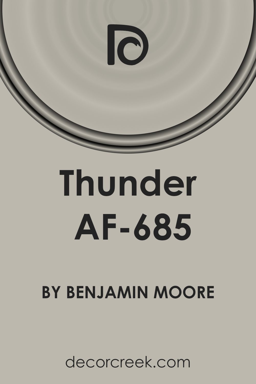
The Thunder AF-685 by Benjamin Moore is a versatile paint color that brings a warm, inviting atmosphere to any home. Its unique shade can be described as a mid-tone gray with hints of taupe, making it a perfect neutral. This color works wonders in various spaces due to its warm undertones. It pairs beautifully with natural light, giving rooms a soft, airy feel during the day and creating a cozy, intimate ambiance in the evening. Whether you’re painting a living room, bedroom, or even kitchen cabinets, Thunder AF-685 offers a sophisticated backdrop that complements both modern and traditional decor.
Its adaptability means it can match a wide range of furnishings and accessories, from bright and bold to soft and subtle. This color doesn’t overpower; instead, it supports the room, allowing other elements to shine. It’s especially helpful in spaces that need a touch of warmth without the heaviness of a darker color.
Thunder AF-685 can make small rooms seem larger and more inviting, while also adding depth and character to larger areas. Overall, it’s a fantastic choice for anyone looking to refresh their home with a color that’s both stylish and timeless.
Undertones of Thunder AF-685 by Benjamin Moore
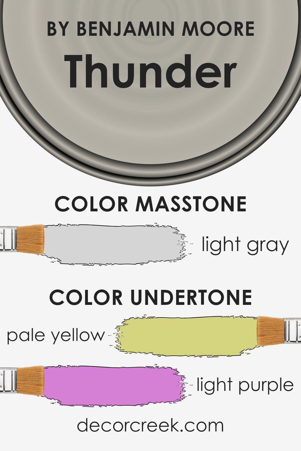
Thunder AF-685 by Benjamin Moore is a versatile paint color known for its rich depth and ability to blend well in various settings. The unique feature of this color is its range of subtle undertones, which includes shades like pale yellow, light purple, pale pink, light blue, mint, lilac, and grey. These undertones play a crucial role in how the color is perceived and can significantly influence the ambiance of a room.
The concept of undertones refers to the subtle colors lying beneath the surface of the main hue. They can enhance the primary color in certain lighting or make it shift in appearance under different conditions. For example, in a room with ample natural light, the pale yellow or light blue undertones of Thunder AF-685 might make the walls seem brighter and more inviting. In contrast, the grey or lilac undertones could give the space a more tranquil and cooler feel in a dimly lit room.
When applied to interior walls, the undertones of Thunder AF-685 can add depth and complexity to the space. They allow the color to interact dynamically with both the natural and artificial light, shifting subtly throughout the day. This can create a rich backdrop that complements a wide range of decor styles and can be particularly effective in adding warmth to modern, minimalist spaces or enhancing the cozy feel of more traditional rooms.
In short, the undertones in Thunder AF-685 make it more than just a simple paint color. They add character and versatility, making it an excellent choice for anyone looking to add a sophisticated touch to their interior walls.
What is the Masstone of the Thunder AF-685 by Benjamin Moore?
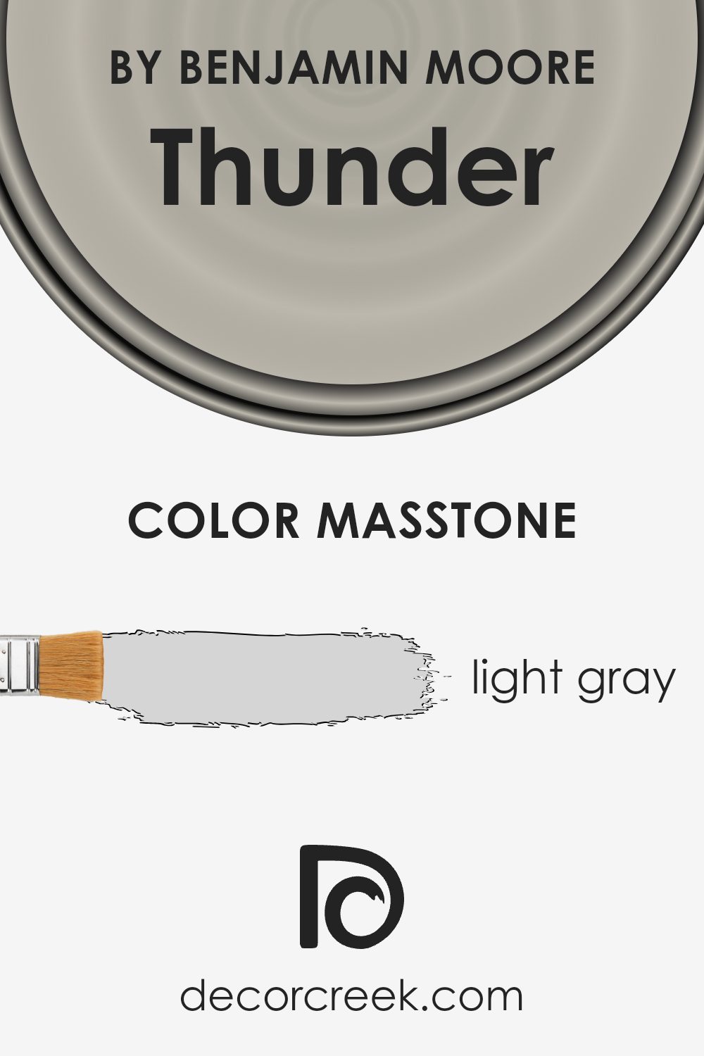
The color Thunder AF-685 by Benjamin Moore, with a masstone of light gray (#D5D5D5), offers a versatile and soothing choice for home interiors. This shade of gray acts as a neutral backdrop, easily pairing with a wide range of other colors. Whether you’re looking to create a calming bedroom, a bright and airy living room, or even a sleek modern kitchen, this light gray introduces a sense of balance without overpowering other elements in the room.
Its lightness helps to make spaces feel more open and spacious, reflecting natural light beautifully during the day and maintaining a soft glow under artificial lighting at night. This can be particularly advantageous in smaller rooms or areas with limited natural light, helping them appear larger and more inviting.
Moreover, the neutral quality of this light gray means it can support both bold and subdued decor styles. Whether you prefer contrasting dark furniture for a dramatic effect or soft pastels for a gentle ambiance, Thunder AF-685 provides a harmonious canvas. This adaptability makes it a go-to choice for anyone looking to update their home with a timeless and flexible color option.
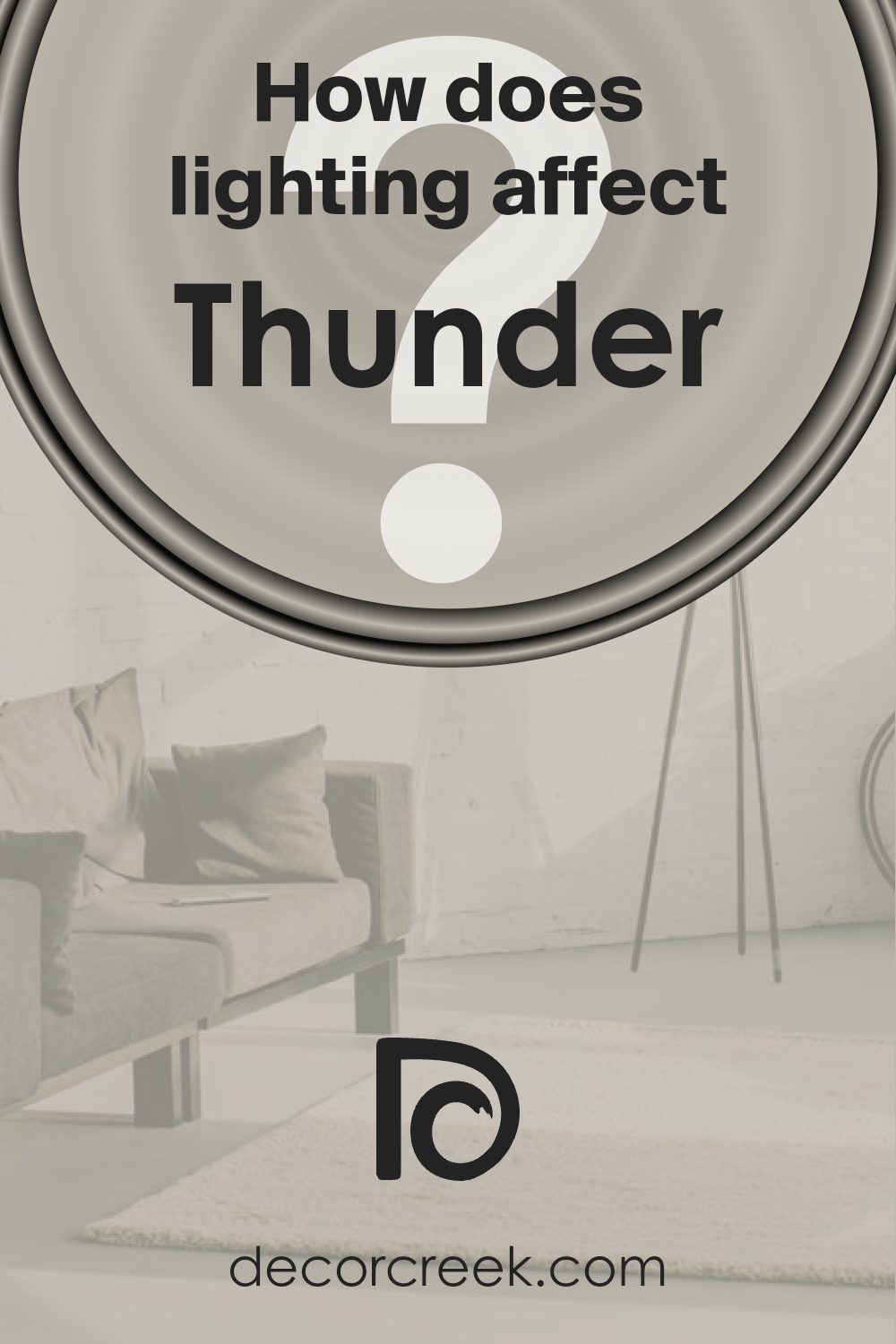
How Does Lighting Affect Thunder AF-685 by Benjamin Moore?
Lighting plays a crucial role in how we perceive colors, significantly influencing their appearance and mood in a room. The color Thunder AF-685 by Benjamin Moore is no exception. This subtle, warm gray with hints of taupe adapts differently under various lighting conditions, affecting its perceived hue and depth.
In artificial light, Thunder AF-685 tends to appear warmer and more inviting. This is because most artificial lighting, especially incandescent bulbs, emits a warmer spectrum, enhancing the taupe undertones of this color. As a result, rooms painted in Thunder AF-685 seem cozier and more welcoming under artificial lighting, making it an excellent choice for living areas and bedrooms where a sense of comfort is desired.
Under natural light, Thunder AF-685 can look significantly different depending on the direction the room faces and the time of day. In north-faced rooms, which receive less direct sunlight and can often seem cooler, Thunder might lean slightly more towards its gray aspects. This can give the room a serene and tranquil atmosphere, but it might also necessitate additional warm lighting or decor elements to balance the coolness, especially during the winter.
South-faced rooms soak in more direct sunlight, which can make Thunder AF-685 look lighter and reveal more of its warm taupe undertones. The natural brightness makes spaces appear airy and spacious, an ideal setting for gathering areas like the living room or kitchen.
In east-faced rooms, the color receives soft, warm morning light, making Thunder AF-685 appear softer and slightly warmer in the mornings while transitioning back to its cooler, true gray shade as the day progresses. This dynamic change can add an interesting visual element to spaces, keeping them lively.
West-faced rooms expose Thunder AF-685 to the intense and warm hues of the setting sun, making the color radiate warmth and depth in the afternoons and evenings. This creates a cozy retreat, perfect for bedrooms or reading nooks where a calming atmosphere is beneficial towards the end of the day.
Overall, the varying appearances of Thunder AF-685 in different lighting conditions highlight the adaptability of this color, making it a versatile choice for any room, provided consideration is given to the room’s orientation and the type of light it receives.
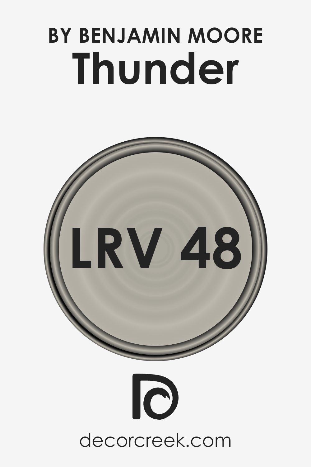
What is the LRV of Thunder AF-685 by Benjamin Moore?
For the color with an LRV of 47.58, like the one you mentioned, it’s smack in the middle of the scale. This means it’s neither too dark nor too light but offers a balanced reflection of light. In rooms with less natural light, this LRV can make the color appear slightly darker than in a well-lit area. Likewise, in a sunny room, this color will likely look lighter and more vibrant.
Choosing a color with this LRV is a good strategy if you want something that provides a bit of warmth to the space without overwhelming it with darkness or being too bright. It’s a versatile choice that can work well in many spaces, adjusting subtly to the room’s lighting.
Coordinating Colors of Thunder AF-685 by Benjamin Moore
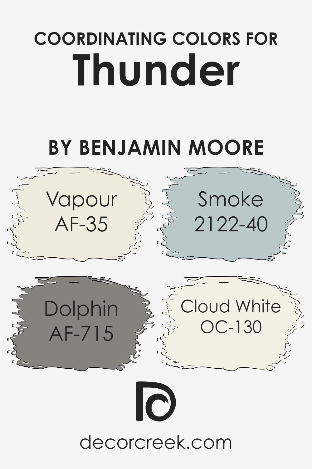
Coordinating colors are essentially colors that work well together to create a harmonious look in any space. They can complement each other or offer a contrasting effect that’s pleasing to the eye, depending on their placement on the color wheel. When it comes to choosing coordinating colors for Thunder AF-685 by Benjamin Moore, you have a palette that brings together both warm and cool tones to enhance the main hue.
These coordinating colors, like AF-35 Vapour, AF-715 Dolphin, 2122-40 Smoke, and OC-130 Cloud White, are chosen specifically for their ability to support and uplift the primary color in a way that creates a balanced and cohesive look.
For instance, AF-35 Vapour is a light and airy color that adds a breath of fresh air to any room, complementing the deeper and more pronounced tone of Thunder without overwhelming it. On the other hand, AF-715 Dolphin is a medium shade that bridges the gap between light and dark, providing depth and sophistication.
The color 2122-40 Smoke introduces a muted, soft gray that can add a layer of complexity and quiet elegance, while OC-130 Cloud White offers a clean, crisp finish that can brighten spaces and provide contrast in a subtle, understated way. Together, these colors work in harmony to create spaces that feel thoughtfully designed and visually appealing.
You can see recommended paint colors below:
- AF-35 Vapour (CHECK A SAMPLE)
- AF-715 Dolphin (CHECK A SAMPLE)
- 2122-40 Smoke (CHECK A SAMPLE)
- OC-130 Cloud White
What are the Trim colors of Thunder AF-685 by Benjamin Moore?
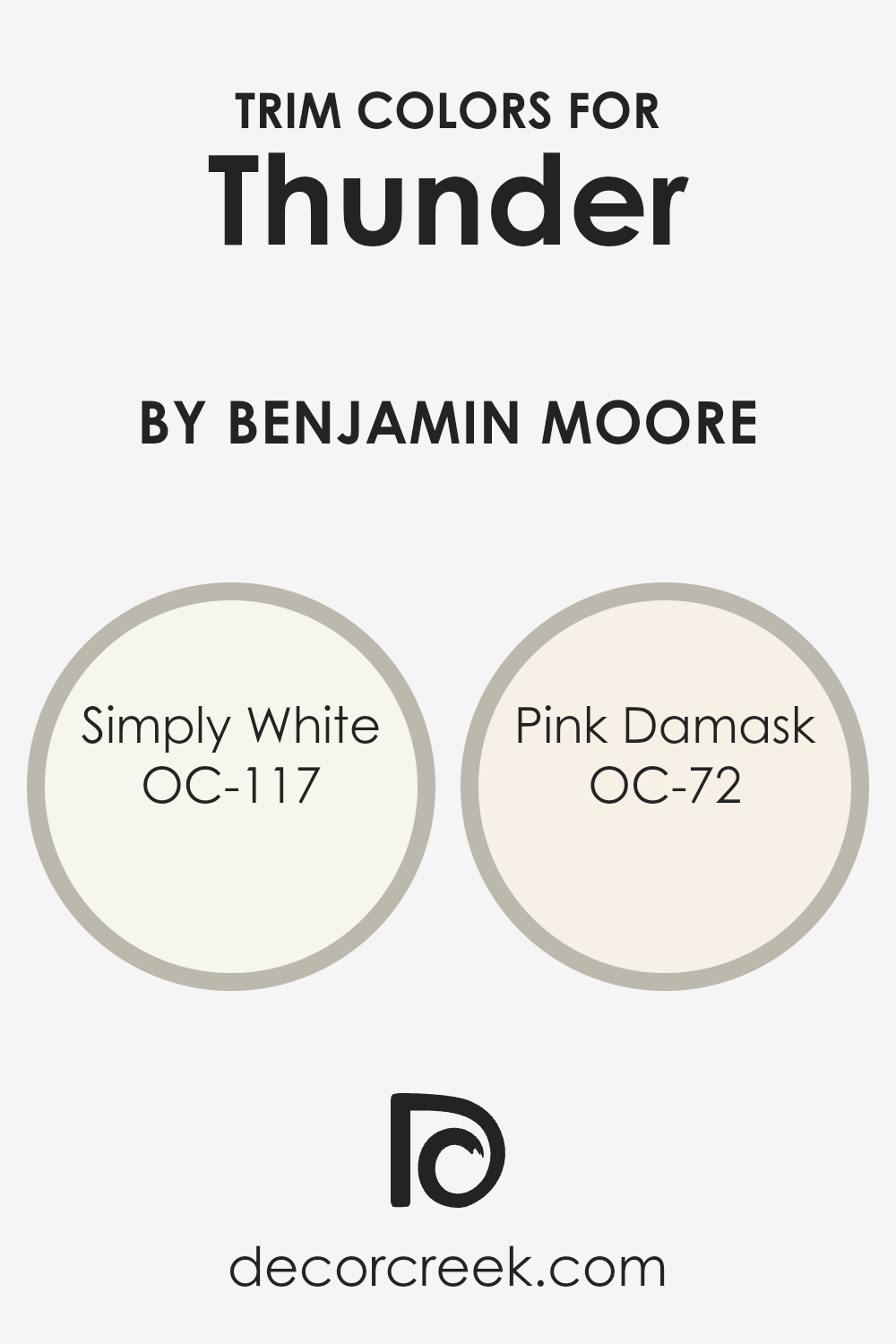
Trim colors, like OC-117 Simply White and OC-72 Pink Damask from Benjamin Moore, play a crucial role in defining the architectural details and enhancing the overall aesthetic of a space. By selecting appropriate trim colors, homeowners can create a beautiful contrast or complement to their main wall color, highlighting features such as door frames, window sills, and baseboards. This not only adds depth and dimension to the rooms but also brings a polished and finished look to the interiors. The choice of trim color can shift the ambiance from ordinary to extraordinary, defining the mood and character of the space.
OC-117 Simply White is a clean and crisp white that brings a fresh and airy feel to any room. It’s perfect for creating a bright and welcoming atmosphere, making small spaces appear larger and more open. On the other hand, OC-72 Pink Damask offers a subtle hint of warmth with its soft pink hue, adding a gentle touch of color and elegance.
This particular shade is ideal for adding a bit of personality and charm to a room without overwhelming it. Used as trim colors alongside a complementary wall color like Thunder AF-685 by Benjamin Moore, both Simply White and Pink Damask help in achieving a harmonious and inviting home environment.
You can see recommended paint colors below:
- OC-117 Simply White
- OC-72 Pink Damask
Colors Similar to Thunder AF-685 by Benjamin Moore
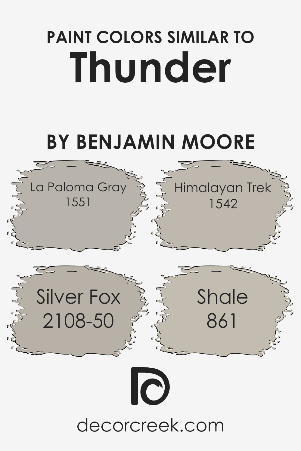
When refreshing a space, choosing the right color scheme is crucial, and similar colors can play a significant role in achieving a harmonious look. Colors similar to Thunder by Benjamin Moore, such as La Paloma Gray, Silver Fox, Himalayan Trek, and Shale, work well together because they share a balanced intensity and subtlety that complements without overwhelming.
These colors have a way of creating a serene and cohesive atmosphere, gently tying the elements of a room together. Their shared undertones mean they can easily transition from one space to another, providing a fluid visual experience that is pleasing to the eye.
La Paloma Gray offers a soothing mid-tone gray that brings a sense of calm and elegance to any space. This color is ideal for creating a neutral backdrop that is both sophisticated and inviting. Silver Fox, on the other hand, has a warmer hue, adding a soft, embracing touch to interiors that seek a hint of coziness amidst the sleekness.
Himalayan Trek introduces a deeper, earthier tone to the palette, grounding the space with its rich, natural vibe. Then there’s Shale, a light gray with a hint of blue, offering a refreshing but muted splash of color, perfect for brightening rooms without overpowering them. Collectively, these colors support a variety of design aspirations, from minimalist chic to comfortable, casual elegance, making them versatile choices for anyone looking to update their home.
You can see recommended paint colors below:
- 1551 La Paloma Gray (CHECK A SAMPLE)
- 2108-50 Silver Fox (CHECK A SAMPLE)
- 1542 Himalayan Trek (CHECK A SAMPLE)
- 861 Shale (CHECK A SAMPLE)
Colors that Go With Thunder AF-685 by Benjamin Moore
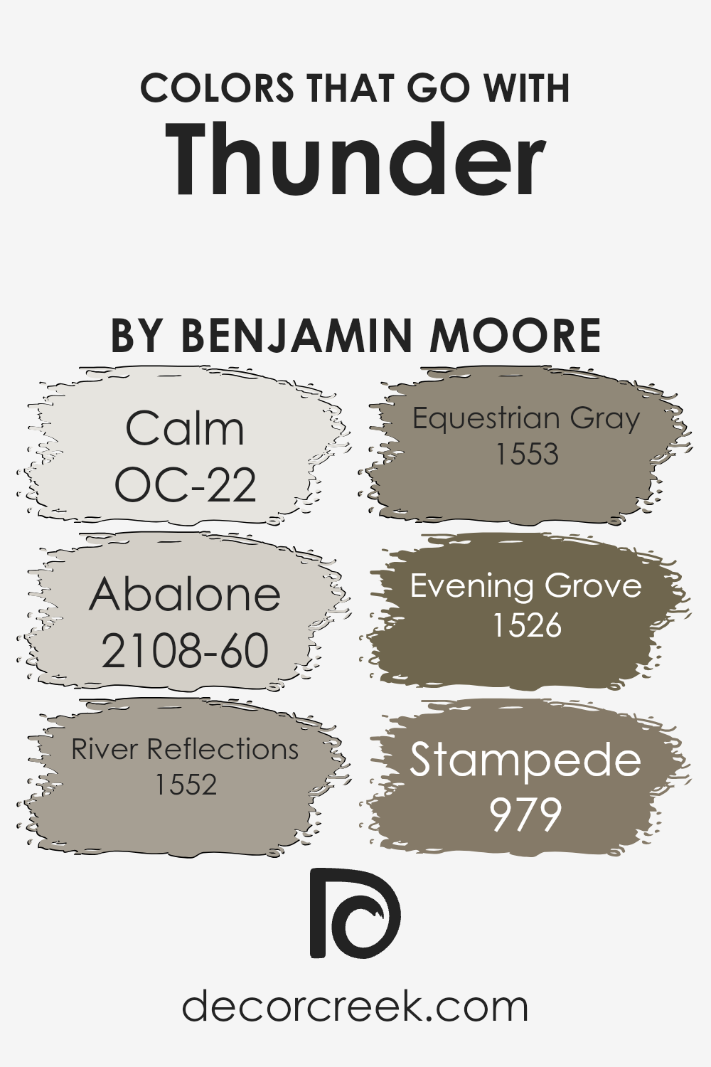
Colors that pair well with ThunderAF-685 by Benjamin Moore aren’t just about making a space look good; they’re pivotal in creating the right atmosphere and mood in any room. Thunder AF-685 is a flexible, medium-toned gray with a subtle hint of lavender, making it an exceptional base color. When combined with these complementary colors, it allows for a harmonious balance, either softening a room for a tranquil vibe or giving it an elegant touch.
OC-22 Calm is a soft, airy white, providing a subtle contrast to Thunder, lightening up spaces with a breezy feel. Abalone 2108-60, a warm gray with soft purple undertones, seamlessly blends with Thunder, adding depth and warmth to interiors without overwhelming. River Reflections 1552 is a richer, beige-gray that adds a dimension of coziness, perfect for creating inviting living spaces.
Equestrian Gray 1553, a deep, warm taupe, gives a room an earthy, grounded feel, coupling well with Thunder’s cooler tones for a natural balance. Evening Grove 1526 introduces a dark, forestry green, offering a bold contrast that highlights Thunder’s subtlety. Lastly, Stampede 979, a robust, chocolaty brown, enriches the palette, integrating a sense of luxury and warmth.
Together, these colors work in unity, providing a versatile range from calming havens to sophisticated spaces, all while highlighting ThunderAF-685’s chameleon-like ability to adapt and elevate its surroundings.
You can see recommended paint colors below:
- OC-22 Calm
- 2108-60 Abalone (CHECK A SAMPLE)
- 1552 River Reflections (CHECK A SAMPLE)
- 1553 Equestrian Gray (CHECK A SAMPLE)
- 1526 Evening Grove (CHECK A SAMPLE)
- 979 Stampede (CHECK A SAMPLE)
Thunder AF-685 by Benjamin Moore Color Palette
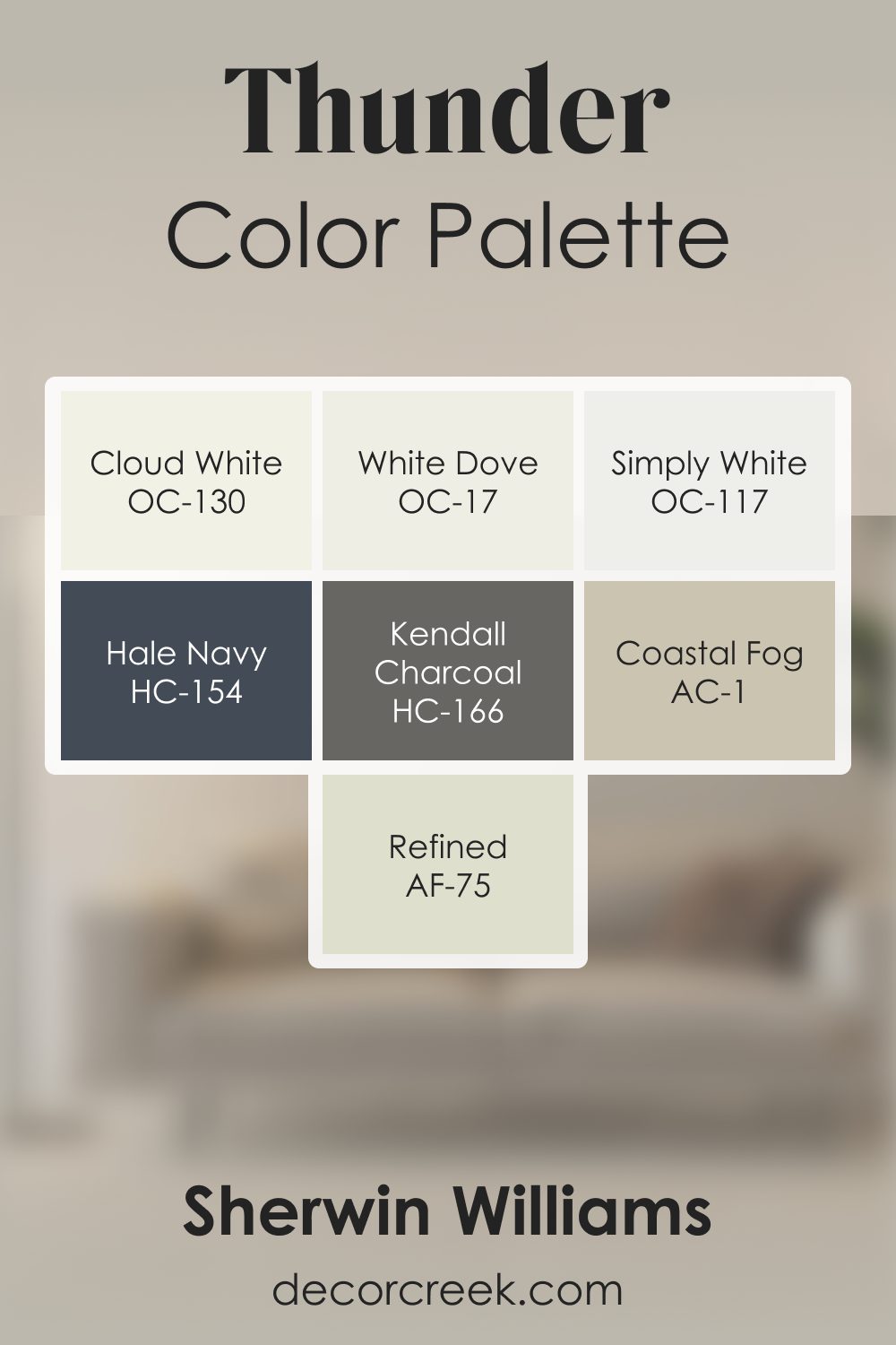
Thunder brings a warm, grounded gray tone that feels steady, comfortable, and full of natural character. This palette highlights that warmth with soft whites, rich accents, and warm supporting neutrals. White Dove, Cloud White, and Simply White brighten the palette with clean, soft light, helping Thunder feel open and easygoing.
Refined adds a warm transitional tone that blends beautifully with Thunder, creating a smooth gradient of warm gray notes.
Coastal Fog deepens the palette with earthy warmth that enhances both light and dark elements. Kendall Charcoal adds grounded strength, giving the palette structure and clarity.
Hale Navy introduces a cool, steady anchor that balances the warm grays with subtle depth.
Together, the palette creates a blend that feels welcoming, relaxed, and naturally balanced. It’s perfect for living rooms, offices, dining spaces, and bedrooms where warm grays and soft neutrals create a calm, inviting atmosphere with thoughtful depth.
How to Use Thunder AF-685 by Benjamin Moore In Your Home?
Thunder AF-685 by Benjamin Moore is a versatile color that stands out for its ability to blend well with different decor styles and settings in your home. This striking shade is part of the Affinity Color Collection, known for its ability to mix and match harmoniously. Thunder AF-685 offers a perfect balance between warm and cool tones, making it an ideal choice for those looking to create a cozy yet sophisticated space.
You can use Thunder AF-685 in various ways around your home. It’s great for living rooms or bedrooms where you want to create a soothing atmosphere. Since it’s a neutral color, it pairs beautifully with both bright accents and subdued hues, allowing for flexibility in decorating.
It works well on walls, creating a subtle backdrop that lets your furniture and art pieces stand out. You could also consider using it on kitchen cabinets for a modern, chic look, or in bathrooms for a serene, spa-like feel. This color is especially suited for creating a calm and inviting space that feels both stylish and comfortable.
Thunder AF-685 by Benjamin Moore vs Himalayan Trek 1542 by Benjamin Moore
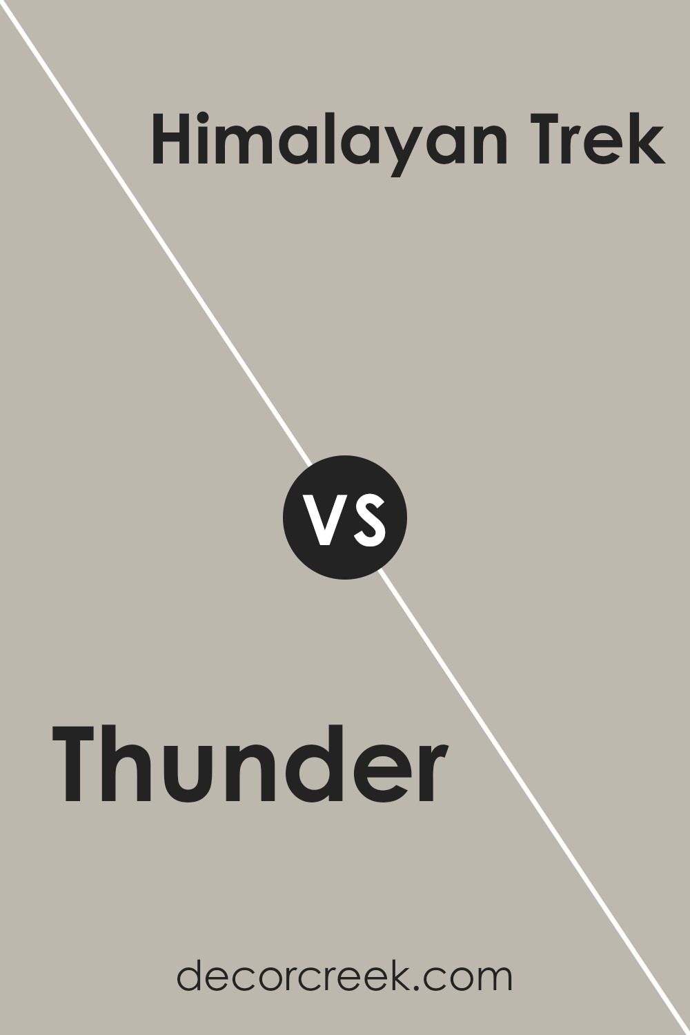
Thunder AF-685 and Himalayan Trek 1542, both by Benjamin Moore, are unique colors that offer different vibes for your space. Thunder AF-685 is a mid-tone gray that carries a subtle warmth, making it versatile for various rooms. It’s like a soft, cozy blanket on a cloudy day, providing a comforting backdrop that’s both neutral and inviting.
On the other hand, Himalayan Trek 1542 leans towards a beige-gray, a shade that whispers earthiness and natural charm. It’s lighter compared to Thunder, offering a breath of fresh air to any space. Think of it as the gentle touch of a breeze during a quiet, serene walk in the mountains.
While both colors bring their distinct personalities, they share a common ground in tranquility and sophistication. Thunder, with its slightly darker tone, offers depth and a hint of mystery, whereas Himalayan Trek brings an open, airy feel. Whether you’re looking to create a bold statement or a calm retreat, both colors serve as excellent choices, just with different tales to tell.
You can see recommended paint color below:
- 1542 Himalayan Trek (CHECK A SAMPLE)
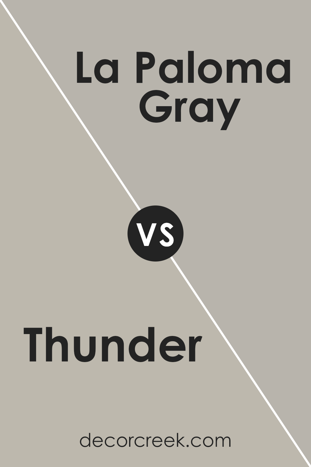
Thunder AF-685 by Benjamin Moore vs La Paloma Gray 1551 by Benjamin Moore
Thunder and La Paloma Gray are two shades by Benjamin Moore that both bring unique vibes to spaces. Thunder is a mid-tone gray that feels cozy and warm. It’s a versatile color that works well in many different rooms, like living rooms or bedrooms, giving them a sophisticated yet inviting atmosphere.
On the other hand, La Paloma Gray is a lighter shade of gray that leans a bit more towards the cooler side. It’s perfect for creating a serene and calming space, such as a peaceful home office or a tranquil bathroom. Although both are grays, Thunder provides a deeper, warmer hug to walls, whereas La Paloma Gray offers a breath of fresh air with its cooler, lighter touch. They could complement each other well in a home, with Thunder anchoring the space and La Paloma Gray brightening it up.
You can see recommended paint color below:
- 1551 La Paloma Gray (CHECK A SAMPLE)
Thunder AF-685 by Benjamin Moore vs Silver Fox 2108-50 by Benjamin Moore
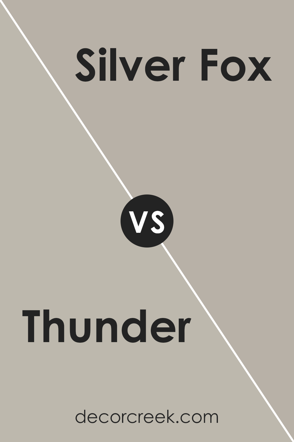
Thunder and Silver Fox, both by Benjamin Moore, are two sophisticated shades that bring unique vibes to spaces. Thunder is a deep, cozy gray that adds a touch of warmth to any room. It has an earthy, inviting feel making it perfect for creating a snug and welcoming atmosphere. Whether in a living room or a bedroom, Thunder offers a solid backdrop that pairs well with a wide range of decor styles.
On the other hand, Silver Fox steps in as a lighter gray, carrying a subtle hint of brown. This color projects a softer, more versatile look, making it fantastic for spaces where a light, airy feel is desired. It’s a fantastic choice for those looking for a neutral with a bit more personality, without overwhelming a space.
When comparing the two, Thunder brings a deeper, warmer tone that’s great for adding character, while Silver Fox offers a lighter, more adaptable option, perfect for creating a gentle, uplifting ambiance. Both colors can beautifully transform a room, depending on the desired mood and effect.
You can see recommended paint color below:
- 2108-50 Silver Fox (CHECK A SAMPLE)
Thunder AF-685 by Benjamin Moore vs Shale 861 by Benjamin Moore
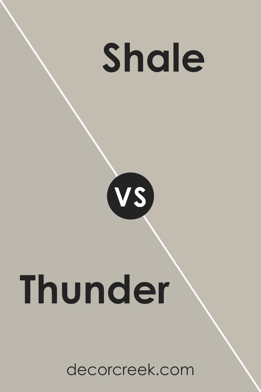
Thunder and Shale are two paint colors from Benjamin Moore that share similar vibes but have distinctive tones. Thunder is a warm, medium-light gray that gives off a cozy and welcoming feeling. It’s perfect for anyone looking to create a soothing and comfortable space in their home. On the other hand, Shale has a slightly cooler and darker tone compared to Thunder.
It leans more towards a deeper, richer gray with hints of a blue undertone, making it ideal for adding a bit of sophistication and depth to a room. While both colors are versatile and can be used in various settings, Thunder might be better suited for those who prefer a lighter, airier feel, whereas Shale could be the choice for someone wanting to add a touch of elegance and drama.
Ultimately, the best pick depends on the mood and style you’re aiming for in your space.
You can see recommended paint color below:
- 861 Shale (CHECK A SAMPLE)
Conclusion
In conclusion, the color Thunder AF-685 by Benjamin Moore stands out as a versatile and attractive choice for those looking to update their living spaces. Its soft neutral tone makes it easy to incorporate into various room designs, acting as a perfect backdrop that complements both modern and traditional decors. The color provides a sense of calmness and sophistication, allowing for creativity in decorating without overwhelming the senses.
Furthermore, its adaptability in pairing with different color palettes highlights its utility in home renovation projects. Whether one aims to create a cozy, inviting atmosphere or achieve a more refined and elegant look, Thunder AF-685 offers a balanced solution.
This paint color is a testament to Benjamin Moore’s commitment to providing high-quality, stylish options for homeowners and design enthusiasts alike.

Ever wished paint sampling was as easy as sticking a sticker? Guess what? Now it is! Discover Samplize's unique Peel & Stick samples.
Get paint samples


