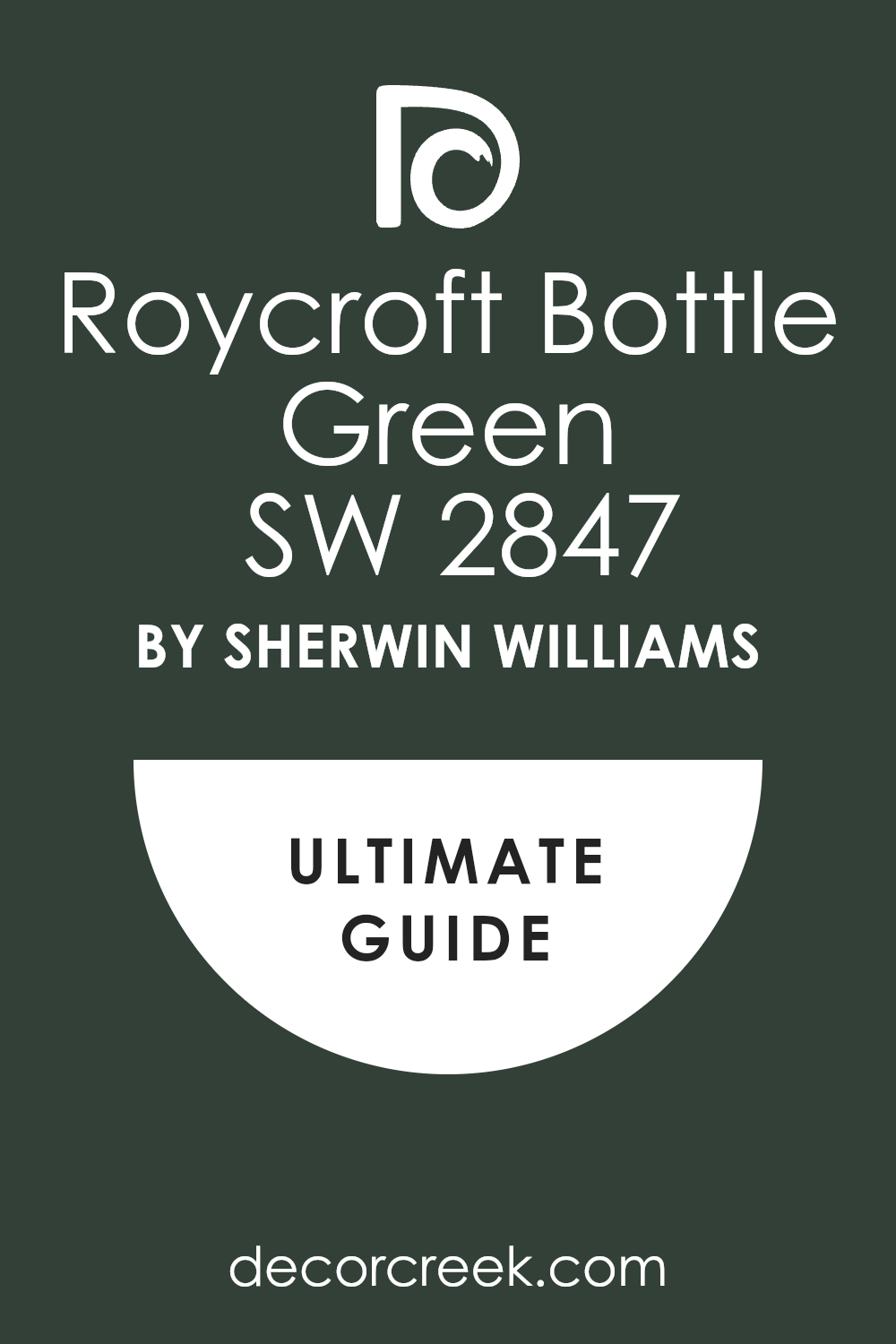
Introducing SW 2847 Roycroft Bottle Green by Sherwin Williams, a rich and distinctive shade of green that adds character and depth to any space. This particular color draws inspiration from the historic Roycroft community, renowned for its dedication to craftsmanship and artistry.
Ideal for those looking to create a strong, yet welcoming atmosphere, Roycroft Bottle Green works beautifully in both traditional and contemporary settings.
Whether you’re thinking about repainting your living room, bedroom, or even adding a touch of elegance to your kitchen cabinets, this shade provides a unique and stylish flair that can easily pair with various decor styles. Its deep green hue makes it a perfect choice for accent walls or full-room treatments, giving any project a touch of nature and sophistication without being overwhelming.
SW 2847 Roycroft Bottle Green by Sherwin Williams not only enhances the aesthetic appeal of your home but also promises excellent coverage and durability, ensuring your living spaces look great for years to come. Discover how this vibrant shade can breathe new life into your interiors and help reflect your personal style.
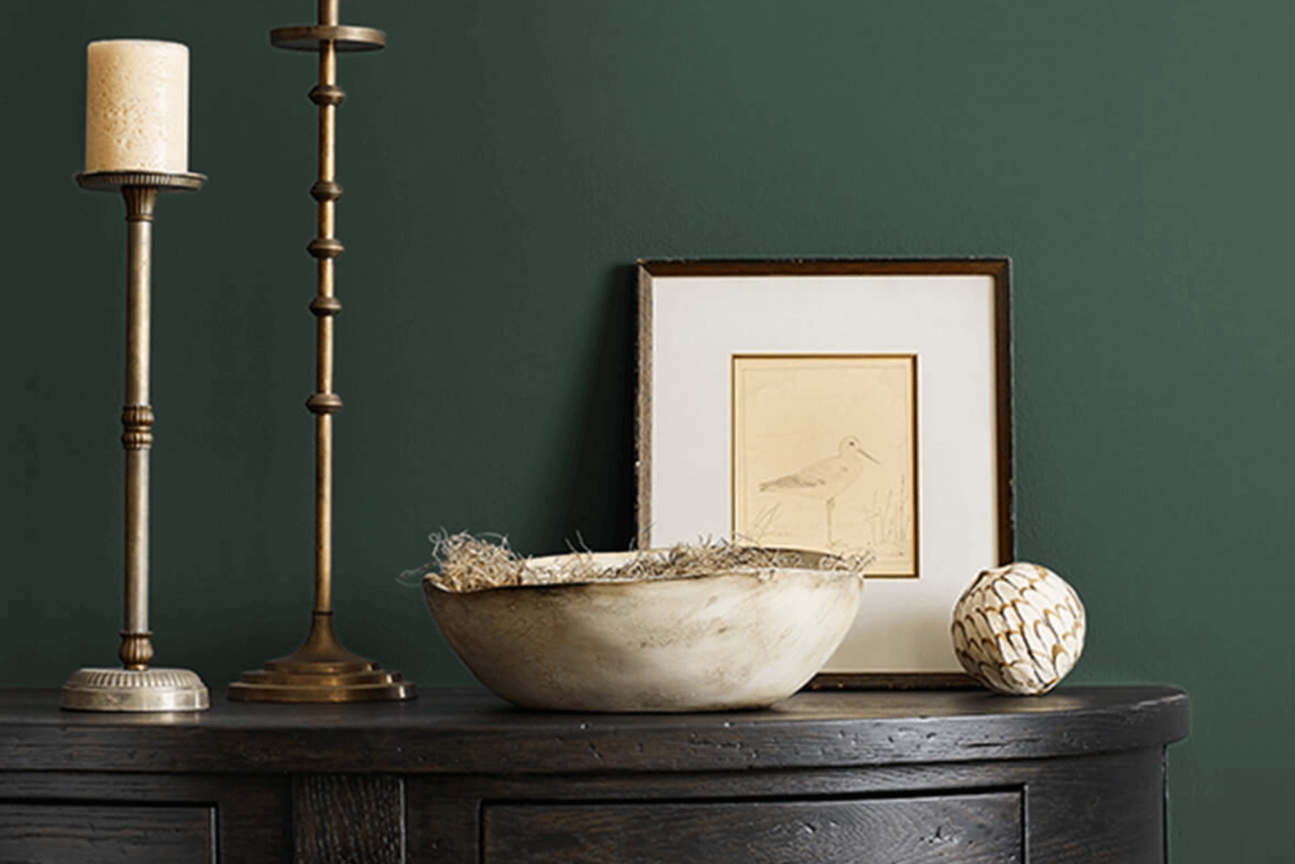
What Color Is Roycroft Bottle Green SW 2847 by Sherwin Williams?
Roycroft Bottle Green is a rich and deep shade of green that evokes the warmth and elegance of nature. This lush color has a timeless quality and brings a sense of calm and comfort to any space. It works especially well in traditional and rustic interior styles, where its earthy vibes complement natural materials and textures.
In traditional settings, this green creates a harmonious backdrop for classical wood furniture and ornate textiles, enhancing the luxurious feel of the decor. In rustic interiors, it pairs beautifully with exposed beams, brick, and raw wood, aligning perfectly with the organic and unrefined elements of this style.
This green is versatile in its application, thriving not just on walls but also on cabinetry and furniture where it adds depth and character. It pairs exceptionally well with natural materials like leather, linen, and wool, allowing their textures to stand out against its deep, rich background. Metals such as brass and copper also work wonderfully with this shade, adding a touch of glamour to the robust hue.
Roycroft Bottle Green can be used effectively in living rooms, studies, or bedrooms, offering a backdrop that is both relaxing and grounding. It can also add a dramatic flair to smaller spaces like bathrooms when used strategically. This color is perfect for creating a cozy, inviting atmosphere in any home.
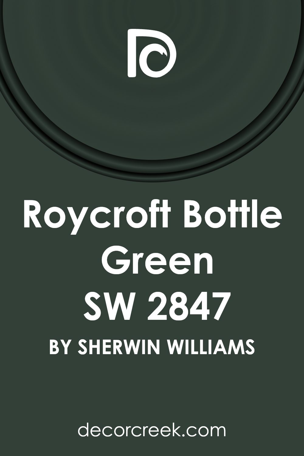
Is Roycroft Bottle Green SW 2847 by Sherwin Williams Warm or Cool color?
Roycroft Bottle Green is a rich, deep green paint color that adds a warm and cozy feel to any room. Ideal for creating a welcoming atmosphere, this shade is perfect for spaces where comfort and calm are key. When applied to the walls of a living room or study, it helps create an inviting space while still keeping a touch of nature-inspired beauty.
Since it’s a darker color, it works best in rooms with good natural light or plenty of well-placed lamps to prevent it from making the space feel too dark. It pairs beautifully with light neutrals like creams and whites, which help to balance its depth and prevent it from overwhelming the decor.
This color is also versatile enough to be used in accent pieces or furniture, providing a lovely contrast to lighter hues and adding depth to the overall interior design.
Undertones of Roycroft Bottle Green SW 2847 by Sherwin Williams
Roycroft Bottle Green is a paint color that’s deep and rich with a unique blend of undertones. This color includes dark green, navy, brown, dark turquoise, olive, purple, and grey undertones. These undertones can subtly influence how the color appears in different lights.
Undertones are essentially the underlying hues that are mixed into the main color, and they can significantly impact the way we perceive the color. For instance, in bright sunlight, the green or turquoise might stand out more, giving the color a fresh, lively look. In dimmer indoor light, the brown or navy undertones might become more dominant, making the paint appear more muted or grounded.
When this paint is used on interior walls, the undertones play an important role in setting the mood of the room. Each hidden hue can bring out different vibes. For example, the navy and purple can add a layer of depth and richness, ideal for creating a cozy corner or a formal space.
The green and turquoise undertones can keep the space feeling natural and calm.
Using a color like Roycroft Bottle Green in a room also means the decor and wall color can vary in appearance throughout the day depending on the natural light available. This constantly changing aspect makes it an interesting choice for dynamic living spaces. The diverse undertones ensure that it pairs well with a variety of furniture colors and styles, offering flexibility in interior design.
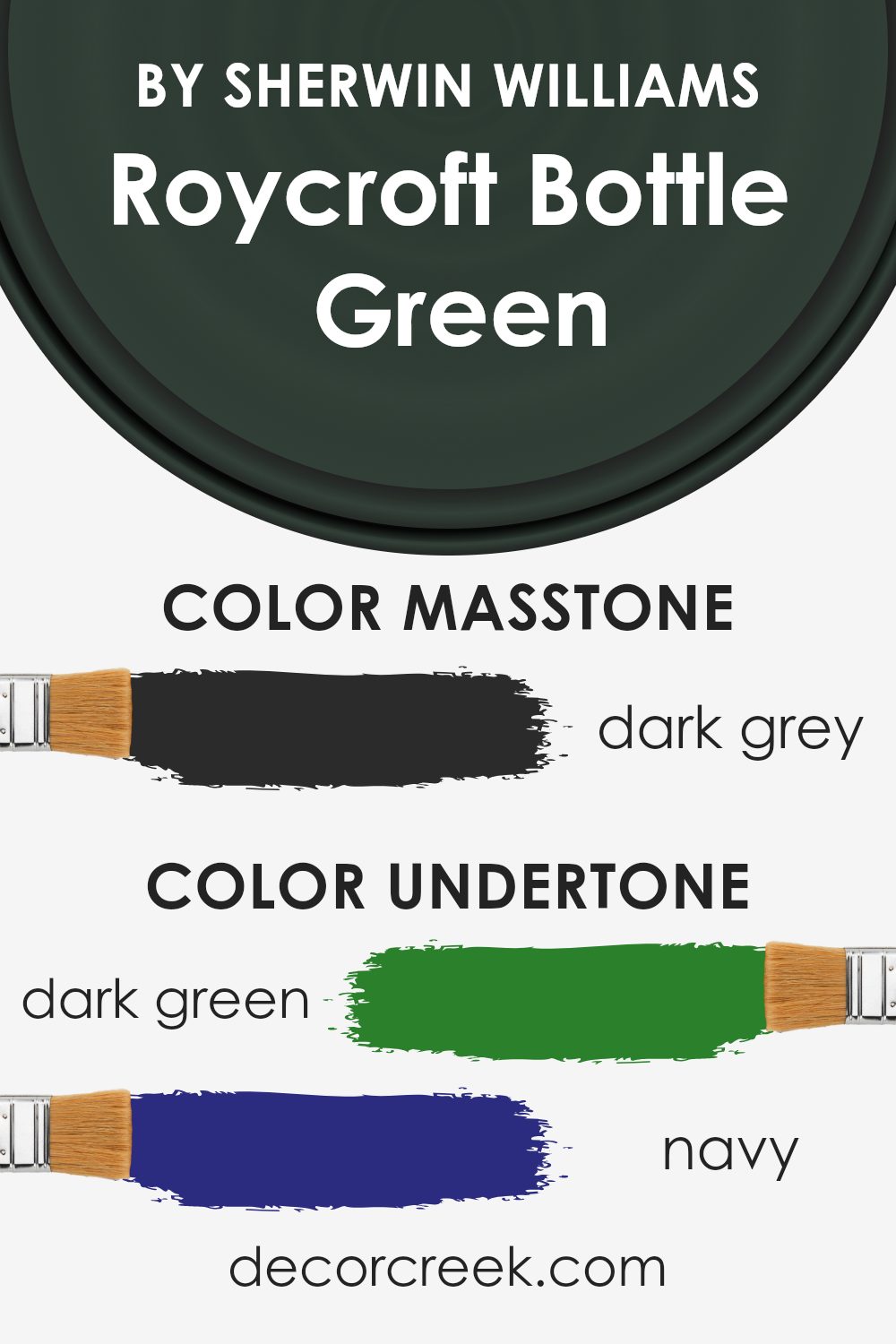
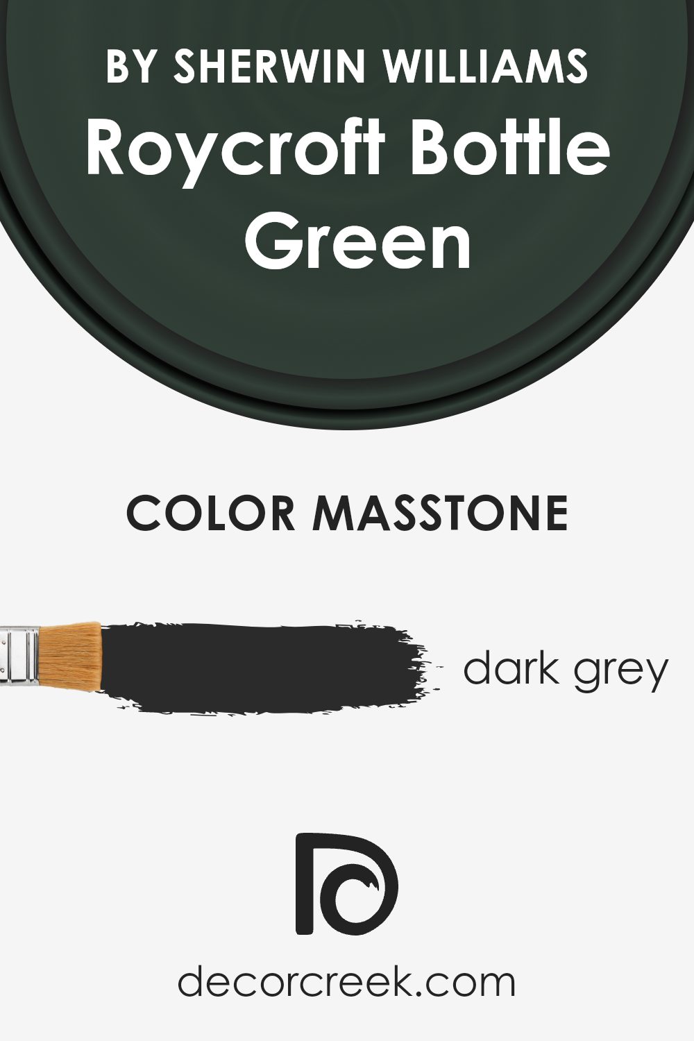
What is the Masstone of the Roycroft Bottle Green SW 2847 by Sherwin Williams?
Roycroft Bottle Green SW 2847 by Sherwin Williams has a masstone of dark grey, represented by the color code #2B2B2B. This deep, rich shade brings a strong presence into any room while maintaining a calm and grounded atmosphere. In home interiors, this dark grey gives a solid, foundational feel that pairs well with a wide range of décor styles, from modern to rustic.
Dark colors like this one can make large spaces feel cozier and more manageable. In smaller spaces, using it on accent walls or furniture can add depth without overwhelming the room. It’s especially effective in spaces where focus and concentration are needed, like home offices or reading corners, as its deep tone helps minimize distractions.
Additionally, its neutral character makes it easy to match with other colors, from bright and cheerful to soft and muted. This versatility allows homeowners to use it in various ways, ensuring it fits their personal taste and style.
How Does Lighting Affect Roycroft Bottle Green SW 2847 by Sherwin Williams?
Lighting greatly impacts how we perceive colors. This is because different light sources emit different spectrums of light, which can alter the appearance of colors in a room. For example, Roycroft Bottle Green by Sherwin Williams can look differently under various lighting conditions due to its deep, rich hue.
In natural light, Roycroft Bottle Green has a vibrant appearance, showing its true color during the bright hours of the day. Natural sunlight provides a broad spectrum of light, allowing all the subtle undertones in the green to be visible. However, the color’s appearance can shift subtly depending on the time of the day and the amount of cloud cover.
Under artificial light, such as LED or incandescent bulbs, Roycroft Bottle Green can appear differently. LED lights, which often have a cooler tone, might make the green seem sharper and more vivid, whereas warmer incandescent bulbs could make it appear deeper and slightly more muted, drawing out more of the color’s cozy feel.
The orientation of the room also plays a significant role in how this color is displayed. In a room facing north, natural light is cooler and more consistent throughout the day, which may make Roycroft Bottle Green appear more subdued and shadowy. South-facing rooms, however, receive more intense and warmer sunshine, which can make the green look brighter and more lively.
East-facing rooms expose colors to bright light in the morning, with the light becoming cooler as the day progresses. This brings out the freshness of Roycroft Bottle Green in the morning, which gradually gives way to a more balanced tone by the afternoon. Conversely, in west-facing rooms, the color will receive subdued light in the morning but warm and bright hues during the sunset hours, enhancing the depth of the green toward the evening.
Understanding how lighting affects colors like Roycroft Bottle Green can help in deciding how and where to use this color effectively within your spaces.
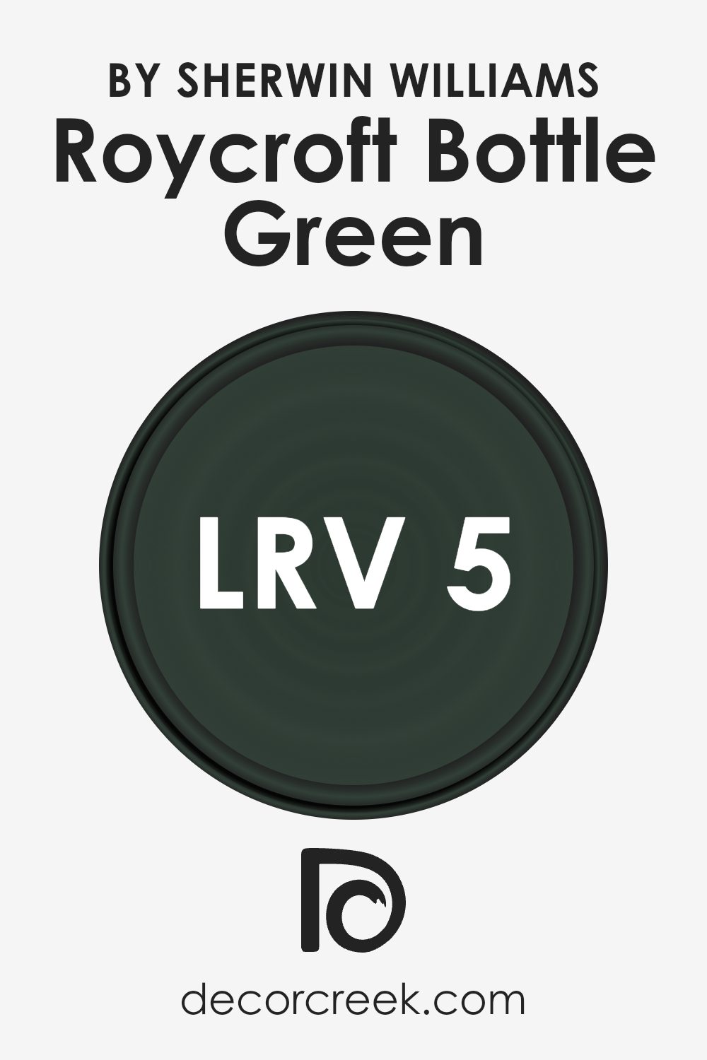
What is the LRV of Roycroft Bottle Green SW 2847 by Sherwin Williams?
LRV stands for Light Reflectance Value, which measures the amount of light a paint color reflects back into the room. Essentially, it’s a scale used to determine how light or dark a color will appear when applied to your walls. A higher number means the paint is lighter and will reflect more light, making a room feel brighter. Conversely, a lower LRV means the paint is darker and absorbs more light, which can make a space feel smaller or cozier depending on the size and natural light availability in the room.
With an LRV of 4.601, the mentioned color is quite dark. This means it will absorb a large amount of light instead of reflecting it. In a room, using a color with such a low LRV can create a bold, dramatic look but could also make the space appear smaller and more enclosed.
It’s best used in well-lit or large rooms to avoid a cramped feeling, and it can also serve as an accent wall to add depth and interest to a space without overwhelming it with darkness.
Coordinating Colors of Roycroft Bottle Green SW 2847 by Sherwin Williams
Coordinating colors are hues that complement one another on the color wheel and can be utilized together to create harmonious and visually appealing designs. When working with a deep, rich color like Roycroft Bottle Green by Sherwin Williams, choosing the right coordinating colors is key to achieving a balanced and beautiful look. Coordinating colors typically share similar saturation and brightness levels, ensuring that no single color overwhelms the others.
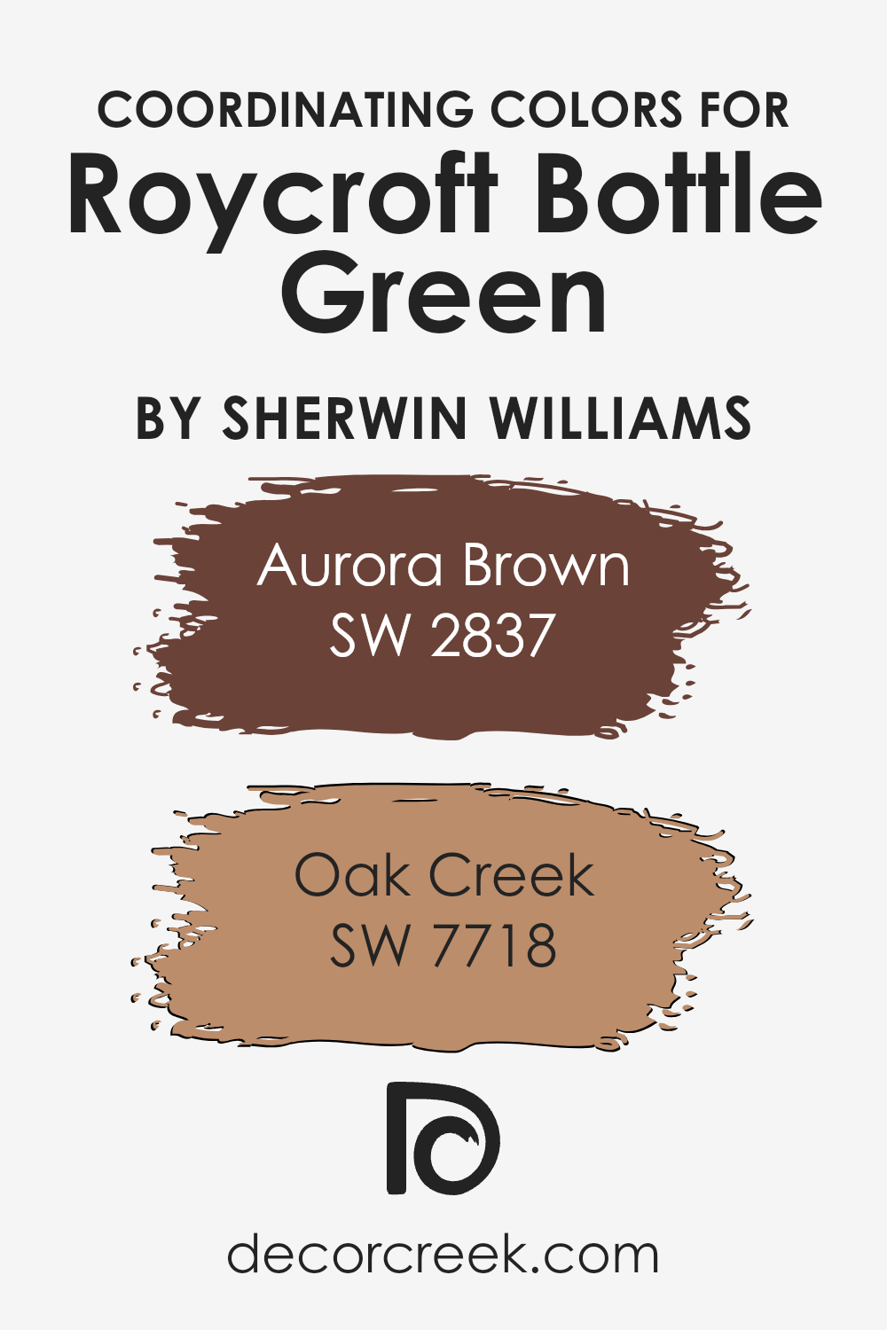
Two excellent coordinating colors for Roycroft Bottle Green are Aurora Brown and Oak Creek. Aurora Brown is a warm, earthy shade that provides a robust foundation when paired with the darker green. It’s reminiscent of fertile soil and wooden accents, making it ideal for spaces that aim for a grounded, inviting atmosphere.
On the other hand, Oak Creek presents itself as a softer, slightly muted reddish-brown that complements the green’s intensity by adding a subtle contrast. This color is perfect for creating a cozy and comforting environment, particularly well-suited for living areas or bedrooms where a touch of warmth is desirable. Together, these colors work with Roycroft Bottle Green to create a cohesive palette that enhances the overall aesthetic of any room.
You can see recommended paint colors below:
- SW 2837 Aurora Brown
- SW 7718 Oak Creek (CHECK A SAMPLE)
What are the Trim colors of Roycroft Bottle Green SW 2847 by Sherwin Williams?
Trim colors are essentially contrasting or complementary hues used to highlight architectural details and frames around doors, windows, and baseboards, enhancing the aesthetics of a room. Especially when paired with a strong, dark shade like Roycroft Bottle Green, selecting the right trim colors can dramatically impact the overall look and feel of a space.
A well-chosen trim color can accentuate details that might be overlooked, providing a clean and finished look to every room. It serves not just as a decorative element but also helps define the spaces and adds a sense of depth and texture to the walls.
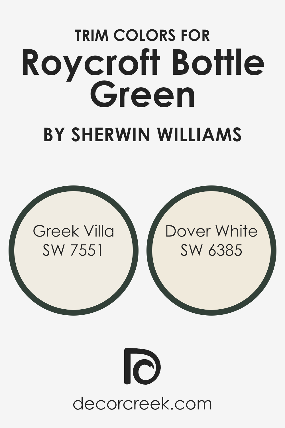
Greek Villa SW 7551 is a soft, creamy white that offers a touch of warmth without being too stark, making it a great option for trimming. Its warm undertones can brighten up Roycroft Bottle Green without overpowering it, creating a pleasant contrast that keeps the environment cozy and inviting.
Dover White SW 6385 is another excellent choice for trim; it’s a bit brighter than Greek Villa and brings a cheerful lightness to the space. This shade has a clean and fresh appeal that pairs nicely with darker, richer colors, ensuring that the design remains balanced and visually appealing.
You can see recommended paint colors below:
Colors Similar to Roycroft Bottle Green SW 2847 by Sherwin Williams
Similar colors play a key role in creating a visually coherent and harmonious space. When colors are close in shade or tone, they can blend seamlessly together, providing a subtle and unified look that is pleasing to the eye. This technique is especially valuable in interior design where the goal is often to create a cohesive atmosphere.
For instance, using variations of a single hue can add depth and dimension to a room without the stark contrasts that come with more varied color palettes. It’s a way to keep the environment feeling connected and flowing, even as different spaces or elements are introduced.
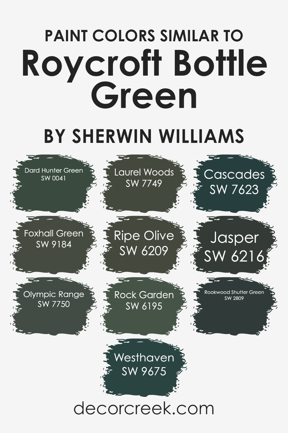
Focusing on the color Roycroft Bottle Green and its similar shades, such as Dard Hunter Green, which adds a robust depth with its slightly darker tone, and Foxhall Green, lighter with a touch of gray, we see this principle in action. Olympic Range lends an earthy richness, while Westhaven borders both green and gray, making it adaptable for various settings. Laurel Woods and Ripe Olive provide lush, deep green tones that mimic the natural beauty of a dense forest.
Rock Garden offers a subtle gray-green that resembles shaded undergrowth in rocky terrains. Cascades impresses with a deep, almost oceanic green, and Jasper infuses a hint of mystical dark tones. Lastly, Rookwood Shutter Green pulls in a historical vibe, drawing on classic influences for antique charm.
Each of these colors can be used together to foster a sense of continuity in decor, making any space feel thoughtfully curated and effortlessly stylish.
You can see recommended paint colors below:
- SW 0041 Dard Hunter Green (CHECK A SAMPLE)
- SW 9184 Foxhall Green (CHECK A SAMPLE)
- SW 7750 Olympic Range (CHECK A SAMPLE)
- SW 9675 Westhaven (CHECK A SAMPLE)
- SW 7749 Laurel Woods (CHECK A SAMPLE)
- SW 6209 Ripe Olive
- SW 6195 Rock Garden (CHECK A SAMPLE)
- SW 7623 Cascades (CHECK A SAMPLE)
- SW 6216 Jasper (CHECK A SAMPLE)
- SW 2809 Rookwood Shutter Green
How to Use Roycroft Bottle Green SW 2847 by Sherwin Williams In Your Home?
Roycroft Bottle Green is a rich and vibrant shade of green from Sherwin Williams. This color is perfect for someone looking to add a touch of nature and energy to their home. The green hue can make any room feel fresh and lively. It is ideal for a cozy den, adding depth and warmth, or as an accent wall in a living room to draw the eye and create a focal point.
Because it pairs well with neutral tones like creams, beiges, and browns, it’s easy to incorporate into most color schemes. In a bedroom, using this green can create a cozy and inviting atmosphere, especially when combined with soft lighting and complementary textiles.
It’s also a great choice for exterior doors and shutters, giving a welcoming impression to the exterior of a home. Using Roycroft Bottle Green is a simple way to bring a natural, energetic feel to your living space.
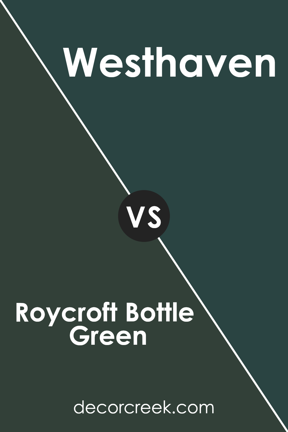
Roycroft Bottle Green SW 2847 by Sherwin Williams vs Westhaven SW 9675 by Sherwin Williams
Roycroft Bottle Green and Westhaven are two distinct colors from Sherwin Williams. Roycroft Bottle Green is a deep, dark green with a hint of blue. This makes it a great choice for creating cozy and inviting spaces, offering a strong, grounded look. On the other hand, Westhaven is noticeably lighter and tends more towards a soft grey with a subtle purple undertone.
This color can make rooms feel more open and airy, providing a gentle and calming atmosphere without being too bold. While both colors can work well in various settings such as living areas or bedrooms, the choice between them depends on the mood you want to set.
Roycroft Bottle Green suits a setting where you want depth and a touch of tradition, whereas Westhaven is ideal for lighter, more contemporary spaces.
You can see recommended paint color below:
- SW 9675 Westhaven (CHECK A SAMPLE)
Roycroft Bottle Green SW 2847 by Sherwin Williams vs Rock Garden SW 6195 by Sherwin Williams
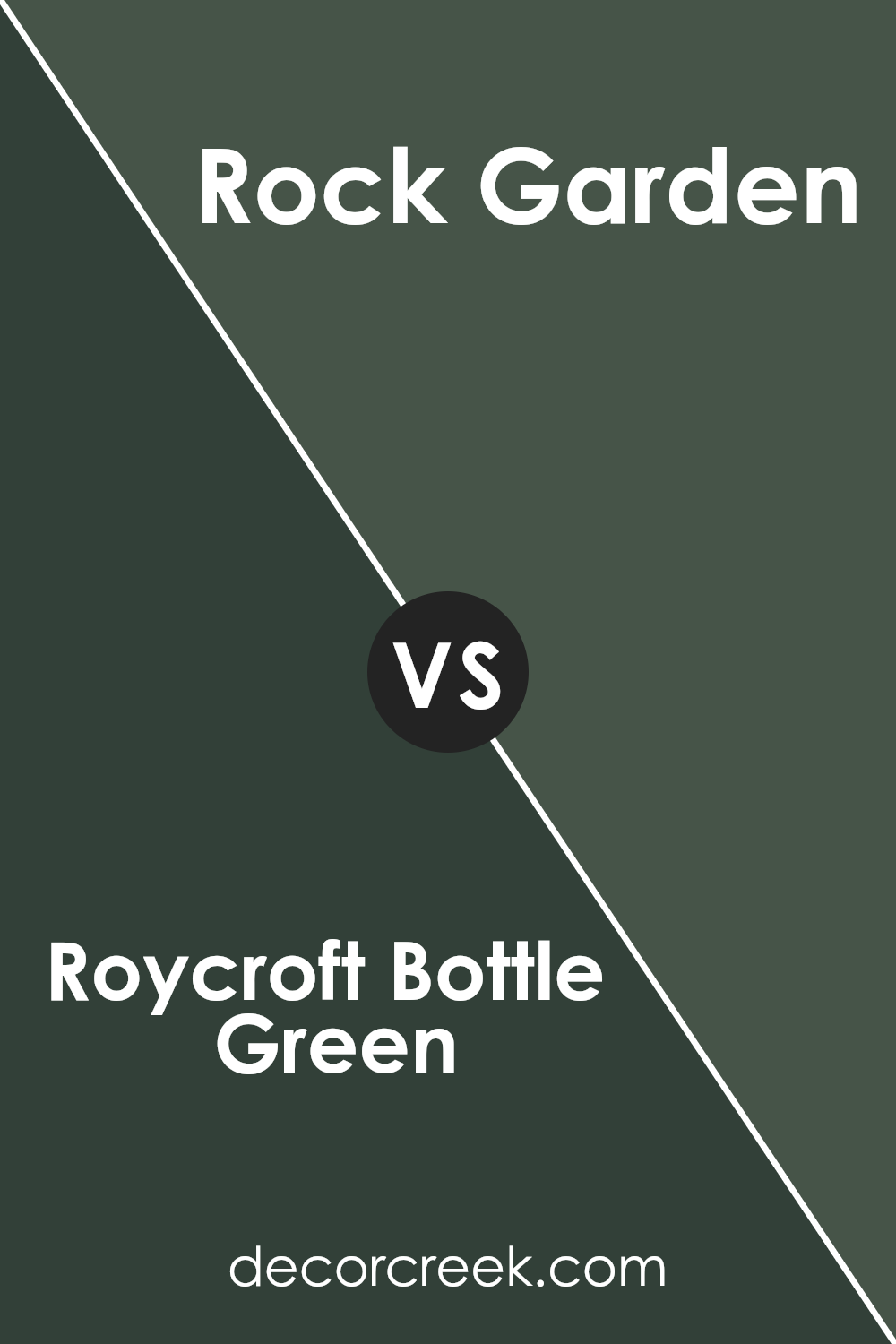
Roycroft Bottle Green and Rock Garden, both by Sherwin Williams, are two distinct shades of green. Roycroft Bottle Green is a deep, dark green that has a rich and traditional vibe. It brings to mind the lush, dense foliage of a forest, making it ideal for spaces where you want to create a cozy and somewhat formal atmosphere.
On the other hand, Rock Garden is a lighter, softer green with hints of gray. This color feels more relaxed and is perfect for creating a calm, comforting space without being too bright. While Roycroft Bottle Green sets a more dramatic and classic tone, Rock Garden offers a gentler, more laid-back feel.
Both colors can be used effectively in decor but will set very different moods in a room depending on what you’re going for.
You can see recommended paint color below:
- SW 6195 Rock Garden (CHECK A SAMPLE)
Roycroft Bottle Green SW 2847 by Sherwin Williams vs Foxhall Green SW 9184 by Sherwin Williams
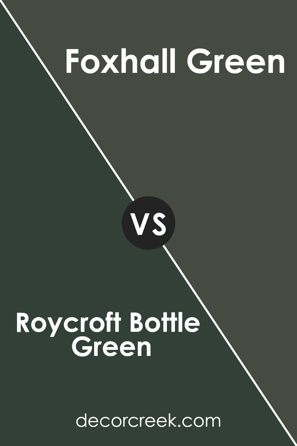
Roycroft Bottle Green and Foxhall Green are two shades offered by Sherwin Williams. Roycroft Bottle Green is a deep, rich green that has a hint of teal. This shade tends to bring a strong presence into a space because of its depth and darkness. It suits well in areas where a bold, cozy feel is desired, like in a study room or a snug reading nook.
On the other hand, Foxhall Green is lighter and has more yellow undertones, giving it a fresher appearance. This color works well in spaces that benefit from a bright and airy feel, such as kitchens or sunrooms. It’s also versatile enough to be appealing in both modern and traditional settings.
When choosing between these two, consider the mood and function of your room. Roycroft Bottle Green sets a more dramatic tone, while Foxhall Green offers a refreshing and welcoming vibe. Both colors are beautiful in their own right and can greatly enhance a room’s decor depending on the intended impact.
You can see recommended paint color below:
- SW 9184 Foxhall Green (CHECK A SAMPLE)
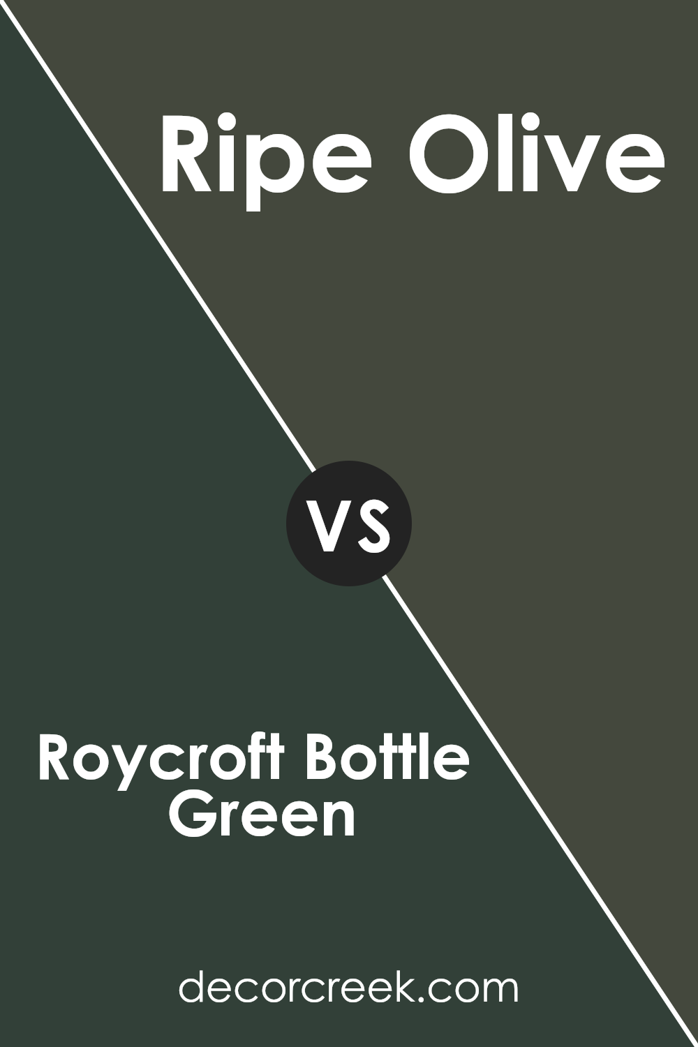
Roycroft Bottle Green SW 2847 by Sherwin Williams vs Ripe Olive SW 6209 by Sherwin Williams
Roycroft Bottle Green and Ripe Olive, both by Sherwin Williams, are two deep greens with distinct characters. Roycroft Bottle Green is a darker shade that leans towards a traditional look, which can make a room feel grounded and cosy. It’s a color that pairs well with natural wood and autumnal tones, giving off a classic and earthy vibe.
On the other hand, Ripe Olive is slightly lighter and carries a more subtle gray undertone. This makes it more versatile for different spaces, adding a touch of freshness without overwhelming the senses. Ripe Olive, due to its balanced hue, works well in both modern and traditional settings, offering a touch of nature with a modern twist.
While both colors share a base of green, their different undertones and depths can impact the mood and style of a space significantly.
You can see recommended paint color below:
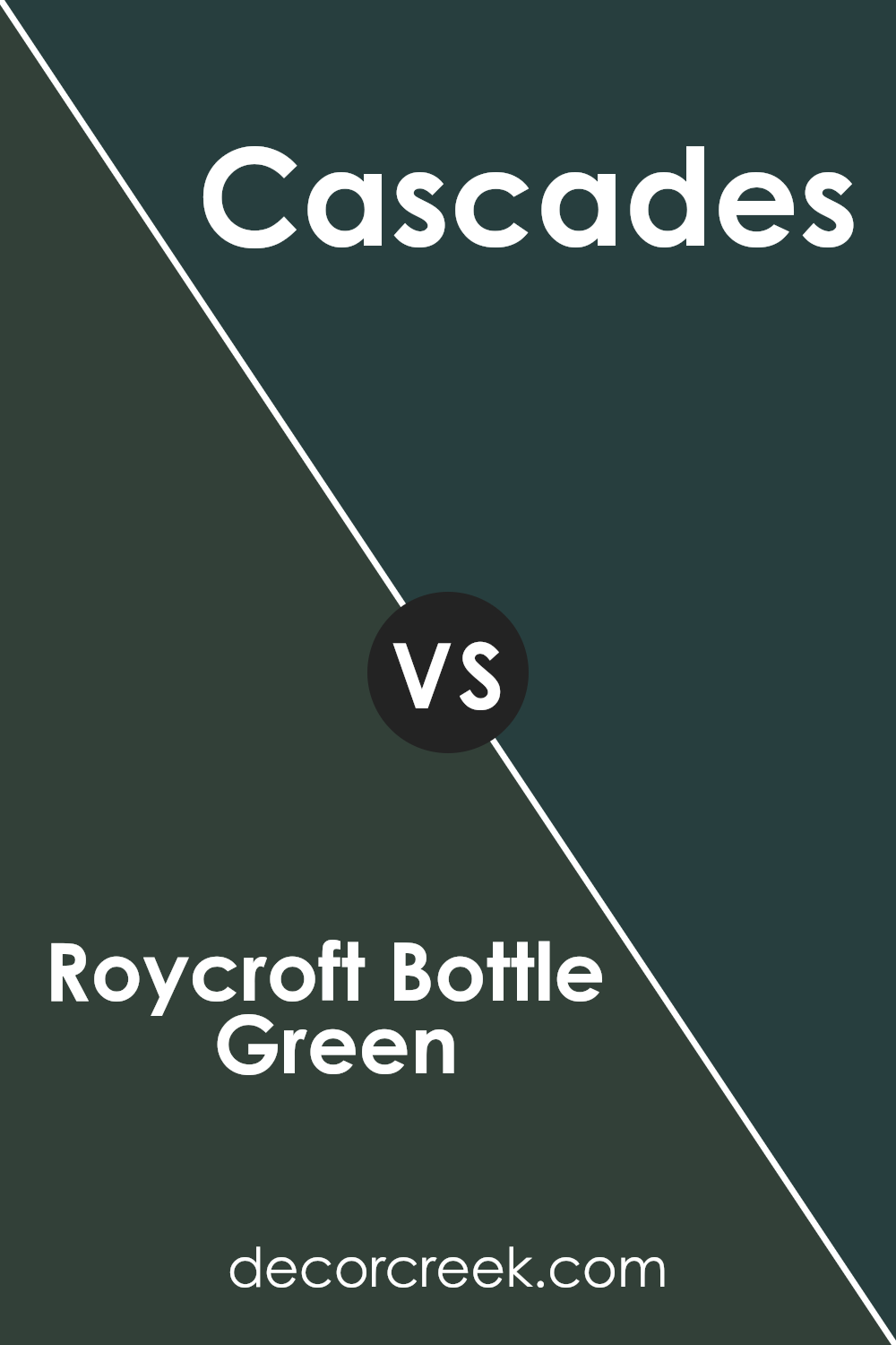
Roycroft Bottle Green SW 2847 by Sherwin Williams vs Cascades SW 7623 by Sherwin Williams
Roycroft Bottle Green and Cascades are both deep, rich colors from Sherwin Williams that are perfect for adding a strong statement to any space. Roycroft Bottle Green is a dark, earthy green that leans towards a traditional look. It has a strong presence due to its depth and can add a lot of character to places like libraries or studies.
On the other hand, Cascades is a shade lighter and has a hint of blue, giving it a cooler tone. This color could be great for bedrooms or bathrooms where a calming but impactful color is desired. While both colors are dark, Cascades offers a slightly fresher appearance due to its bluish tint, compared to the more straightforward green hue of Roycroft Bottle Green.
These differences make each color suitable for different spaces depending on the mood and style you want to achieve.
You can see recommended paint color below:
- SW 7623 Cascades (CHECK A SAMPLE)
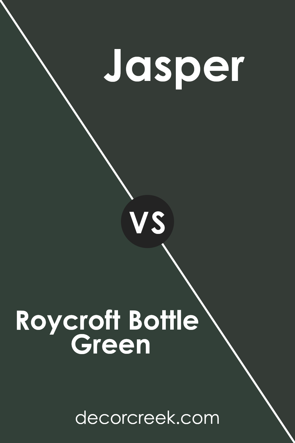
Roycroft Bottle Green SW 2847 by Sherwin Williams vs Jasper SW 6216 by Sherwin Williams
Roycroft Bottle Green and Jasper are two distinctive shades by Sherwin Williams. Roycroft Bottle Green is a deep, rich green with a hint of earthiness, making it a great choice for spaces where a strong, grounding feel is desired. It tends to absorb light, giving a cozy, enclosed feel to rooms.
On the other hand, Jasper is a lighter, more vibrant teal-green that has a fresher, more lively look. This color reflects more light, which can make a room feel more open and airy. Both colors can work well in a home, but your choice depends on the mood you want to create. Roycroft Bottle Green suits a more traditional or reserved decor, while Jasper fits well in a modern or energetic space.
Both are versatile colors that can pair well with a variety of decor styles and preferences.
You can see recommended paint color below:
Roycroft Bottle Green SW 2847 by Sherwin Williams vs Laurel Woods SW 7749 by Sherwin Williams
Roycroft Bottle Green and Laurel Woods are both shades of green by Sherwin Williams, but they have different vibes. Roycroft Bottle Green is a deep, dark green that gives off a bold and rich feel. It’s the kind of color you might see in a classic library or on elegant cabinetry. On the other hand, Laurel Woods is also a dark green, but it leans slightly towards a grayish, earthy tone. It has a natural feel, reminiscent of a dense forest or the muted color of tree bark.
While both colors are dark and can create a cozy atmosphere, Roycroft Bottle Green is more traditional with its pure, saturated green. Laurel Woods, however, offers a softer look because of the subtle gray undertones, making it more versatile for various spaces.
Each color would work well in different settings depending on the mood you want to achieve. Roycroft Bottle Green might be better for a more formal, statement area, whereas Laurel Woods could blend beautifully in a relaxed, casual room.
You can see recommended paint color below:
- SW 7749 Laurel Woods (CHECK A SAMPLE)

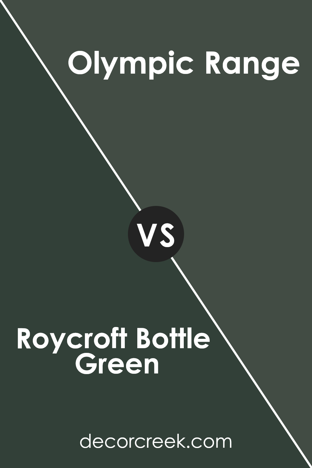
Roycroft Bottle Green SW 2847 by Sherwin Williams vs Olympic Range SW 7750 by Sherwin Williams
The main color, Roycroft Bottle Green, is a rich, deep green with a slight hint of teal. It presents a classic and timeless feel, making it great for spaces where a touch of formality is desired. It pairs well with natural wood tones, gold accents, and creamy whites for a balanced and inviting look.
On the other hand, Olympic Range is a much lighter and brighter shade of green. It offers a more vibrant and refreshing look, reminiscent of lush forests in spring. This color is perfect for brightening up spaces and introducing an element of cheerfulness. It works well in areas that get a lot of natural sunlight and can be complemented by other vibrant colors or soft neutrals for a refreshing ambiance.
Both colors offer distinct qualities: Roycroft Bottle Green leans towards a more subdued and elegant appearance, while Olympic Range is lively and fresh. Depending on the mood and function of the room, either color can enhance the space beautifully.
You can see recommended paint color below:
- SW 7750 Olympic Range (CHECK A SAMPLE)
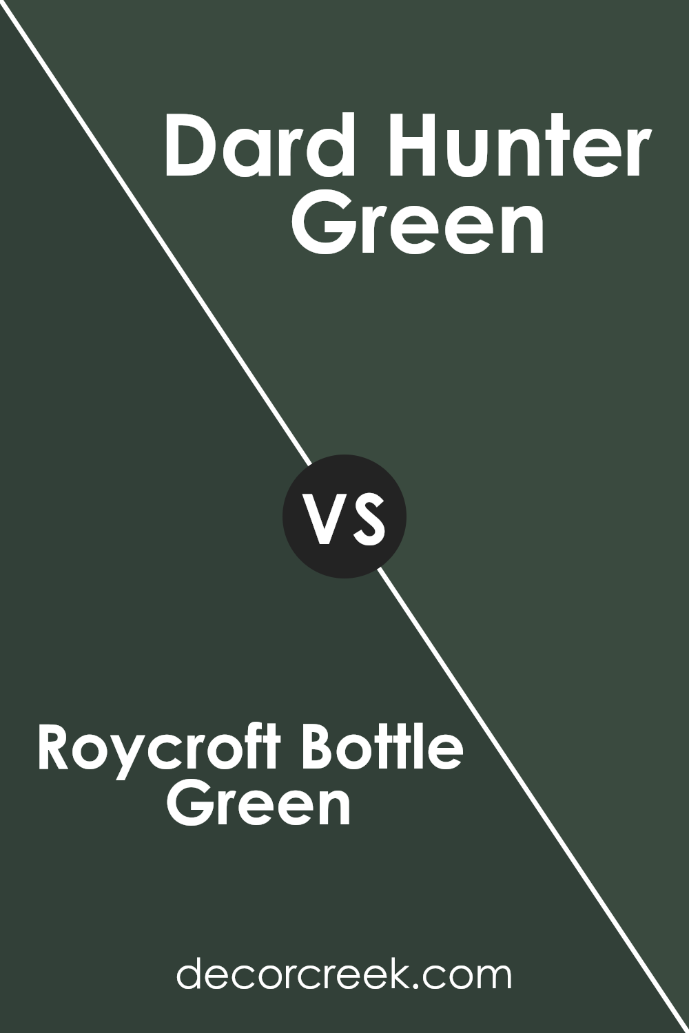
Roycroft Bottle Green SW 2847 by Sherwin Williams vs Dard Hunter Green SW 0041 by Sherwin Williams
Roycroft Bottle Green and Dard Hunter Green are two distinct shades from Sherwin Williams. Roycroft Bottle Green is deeper and more intense. Its rich, dark tone is reminiscent of a lush forest, making it perfect for creating cozy and inviting spaces. It pairs well with natural materials like wood and stone.
On the other hand, Dard Hunter Green is a slightly brighter green. This hue has a more vibrant presence, making it a great choice for areas where you want to add a touch of freshness without overwhelming the space. It works beautifully in traditional settings, yet it also has enough brightness to feel modern.
Both colors offer unique possibilities for interior design. While Roycroft leans towards a heavier, more traditional look, Dard Hunter injects energy and freshness, making it versatile for various decor styles. Each can dramatically change a room depending on how it’s used. Choose Roycroft for a denser, more enveloping feel, or Dard Hunter for a livelier, energetic atmosphere.
You can see recommended paint color below:
- SW 0041 Dard Hunter Green (CHECK A SAMPLE)
Roycroft Bottle Green SW 2847 by Sherwin Williams vs Rookwood Shutter Green SW 2809 by Sherwin Williams
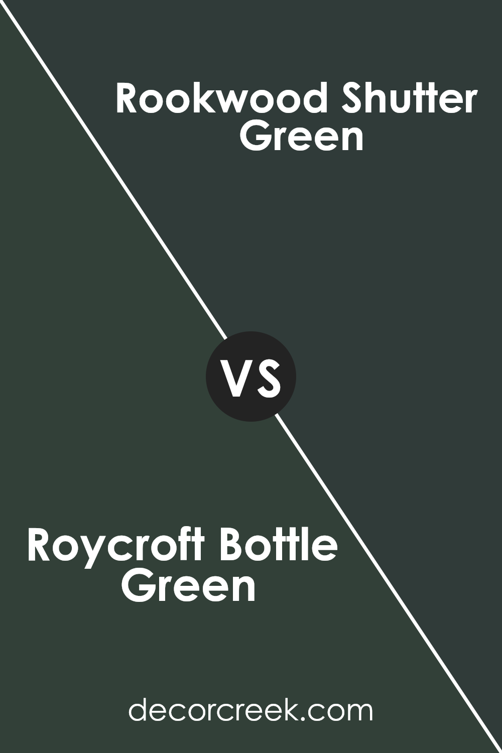
Roycroft Bottle Green and Rookwood Shutter Green are two classic greens from Sherwin Williams. Roycroft Bottle Green is a dark, rich green that brings to mind deep forests or old-timey glass bottles. It’s a strong color that stands out and works well in spaces where you want a feel of nature and depth.
On the other hand, Rookwood Shutter Green is slightly lighter than Roycroft Bottle Green. It has a more muted tone, making it easier to pair with other colors in a home décor setting. This shade could be perfect for exterior shutters or doors, giving a subtle nod to nature without overwhelming the senses.
Both colors are grounded and earthy, making them great choices for someone looking to bring elements of the outdoors into their space. However, their different depths mean they serve slightly different moods and design needs. Roycroft Bottle Green could be more dramatic, while Rookwood Shutter Green might be more versatile and understated.
You can see recommended paint color below:
- SW 2809 Rookwood Shutter Green
Conclusion
Roycroft Bottle Green by Sherwin Williams is a deep, rich green that brings a sense of nature and warmth to any space. It’s perfect for those looking to add a touch of elegance and comfort to their home. Whether used in a cozy study or as an accent in a living room, this color makes rooms feel more inviting and homey, proving to be a versatile choice for both modern and traditional decor.
The color’s ability to pair well with natural materials like wood and stone also makes it a favorite for many homeowners and designers. It’s particularly effective in spaces where the goal is to create a calm and grounded atmosphere.
As a result, Roycroft Bottle Green can help enhance the overall aesthetic of any interior space without overwhelming it, making it a practical choice for walls, furniture, or cabinets.
Ever wished paint sampling was as easy as sticking a sticker? Guess what? Now it is! Discover Samplize's unique Peel & Stick samples.
Get paint samples


