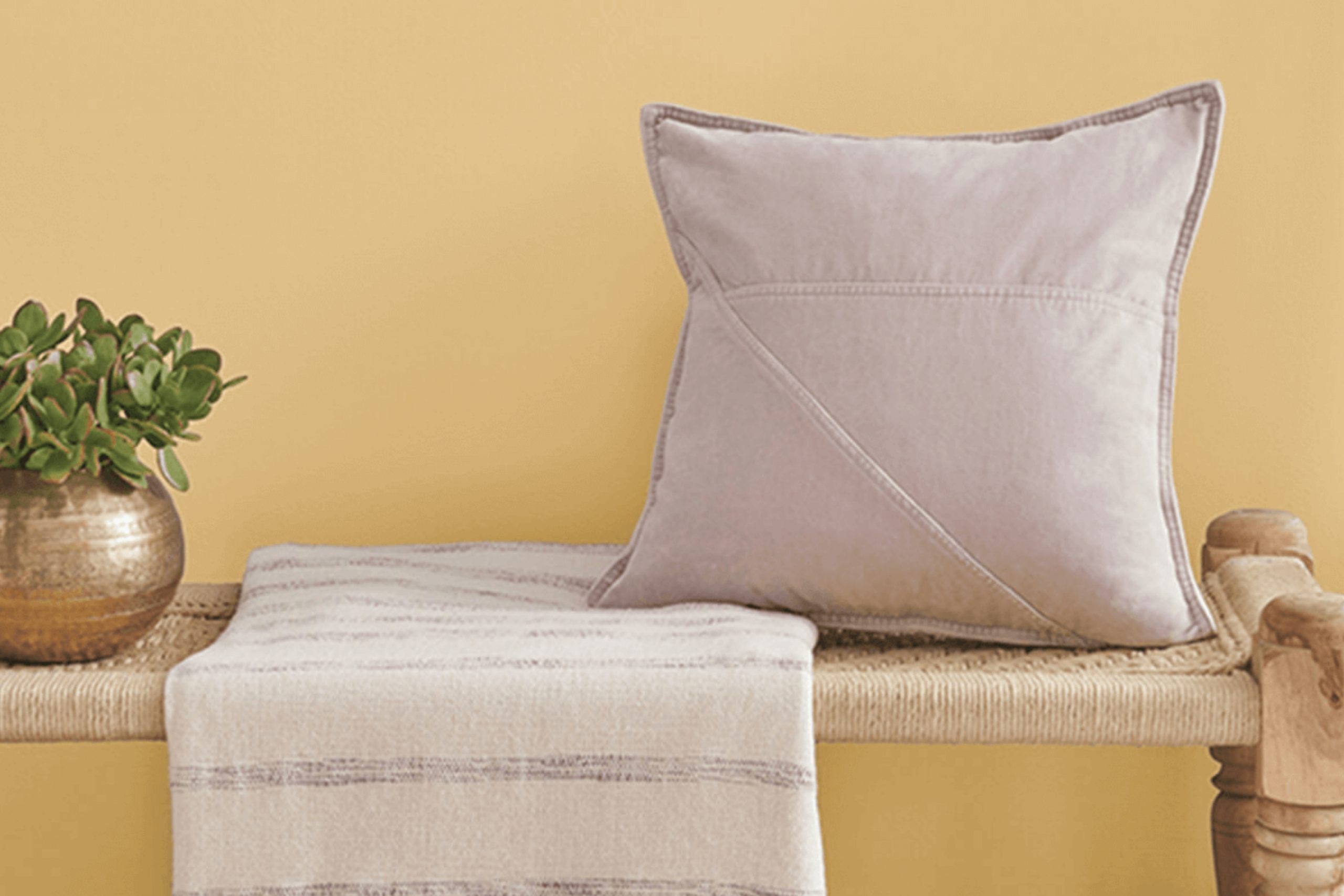
When I think about creating a peaceful and pleasant room in my home, my mind often turns to the soothing colors in the world of interior design. One color that has really caught my attention is SW 6394 Sequin by Sherwin Williams. Its warm, golden undertone instantly makes any room feel inviting and cozy. It seems like the perfect way to bring a touch of sunshine inside, even on the gloomiest of days.
Choosing the right color for a room can sometimes be challenging, but Sequin seems to make the decision easy. It’s a flexible shade that pairs beautifully with both modern and traditional decor. Its subtle glow doesn’t just sit on the walls—it radiates warmth and comfort, making the room feel welcoming to anyone who steps in.
What I love most about Sequin is how it plays with natural light. In the morning, it reflects the gentle sun, creating a cheerful vibe. Later in the day, as the light softens, the color turns warm and intimate. It has this amazing ability to adapt, making it both lively and peaceful, depending on the time and mood.
If you’re like me and enjoy a home that feels both warm and stylish, SW 6394 Sequin might just be the perfect choice.
What Color Is Sequin SW 6394 by Sherwin Williams?
Sequin by Sherwin Williams is a warm, golden hue with a hint of sunflower. It’s a cheerful color that brings a sense of warmth and comfort to any room. The tone is bold yet inviting, making it an excellent choice for creating cozy and lively environments.
This color works particularly well in interior styles like bohemian, eclectic, or mid-century modern, where vibrant palettes are appreciated. Its sunny disposition can brighten up living rooms, kitchens, or even a child’s playroom, where an energetic atmosphere is desired.
When it comes to pairing, Sequin complements natural materials such as light wood, wicker, and rattan, which amplify its warmth. Textures like cotton, linen, and wool in neutral tones can balance its intensity and create a harmonious look.
For contrast, deep charcoal, navy blue, or forest green can be used to ground the color, while metallic accents in brass or bronze can enhance its richness and add a touch of elegance without overpowering the room. Overall, Sequin is a flexible color choice for those who wish to infuse their interiors with a sunny, inviting vibe, and it looks stunning whether in large areas or as a pop of color against a more neutral backdrop.
Is Sequin SW 6394 by Sherwin Williams Warm or Cool color?
Sequin SW 6394 by Sherwin Williams is a warm, muted yellow that can add a cozy and inviting feel to any room. It’s soft and gentle, making it a flexible choice for both small and large areas. When used on walls, this color can create a welcoming environment that feels cheerful without being overpowering.
In living rooms, Sequin can blend well with neutral furniture and earth-toned accessories, creating a harmonious look that feels relaxed yet stylish. In kitchens, it can pair nicely with white or light wood cabinets, adding a touch of warmth and a hint of sunny brightness.
For bedrooms, Sequin SW 6394 offers a soothing backdrop that works well with various bedding colors, from soft blues to light grays. Its gentle hue can help create a restful atmosphere. Overall, this color is adaptable and can work in many settings, providing a pleasant background that complements various styles.
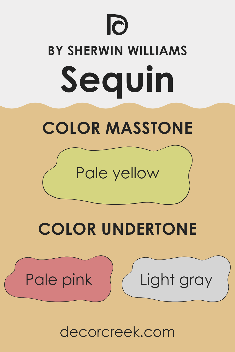
Undertones of Sequin SW 6394 by Sherwin Williams
Sequin SW 6394 by Sherwin Williams is a warm, flexible color that blends a soft beige with subtle undertones. These undertones influence how the color appears under different lighting and in various settings. For instance, pale pink undertones can give a hint of warmth, making areas feel cozy and inviting, while light gray undertones can add a touch of coolness, balancing the warmth and providing a more neutral backdrop.
Other undertones like light purple or lilac can introduce a gentle refined vibe, while mint or light green offer a fresh, clean feel. Light blue undertones can provide a calming effect, whereas a yellow undertone can brighten the room, making it feel cheerful and energetic. Olive undertones offer an earthy aspect, grounding the color, while orange can add vibrancy.
When applied to interior walls, Sequin adapts to its surroundings. In a room with ample natural light, its lighter undertones like mint and light pink might stand out, creating a airy feel. In dimmer settings, the deeper tones like olive or gray might emerge, making the room feel snug. Overall, these undertones give Sequin great adaptability, allowing it to complement a wide range of interior designs.
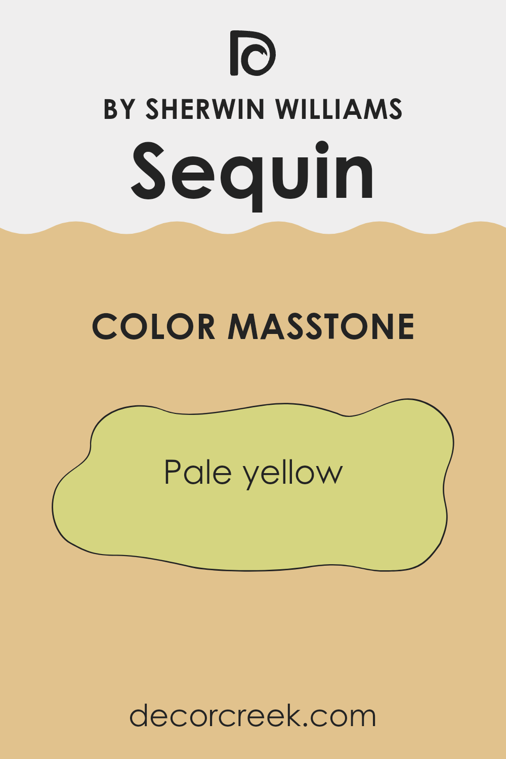
What is the Masstone of the Sequin SW 6394 by Sherwin Williams?
Sequin SW 6394 by Sherwin Williams is a pale yellow that adds a warm and cheerful touch to any room. This color is known for its ability to brighten areas, making them feel more open and welcoming.
It works particularly well in areas like kitchens, living rooms, or bathrooms, where a fresh and inviting atmosphere is desired. The pale yellow masstone creates a soothing backdrop that pairs nicely with both light and dark decor elements. It can highlight natural light, enhancing the room’s airy feel during the day.
Additionally, this shade of yellow can bring a touch of coziness, making it a great choice for areas where people gather and spend time together. Overall, Sequin SW 6394 offers versatility and can easily fit in with a variety of design styles, providing a friendly and lively ambiance to homes.
How Does Lighting Affect Sequin SW 6394 by Sherwin Williams?
Lighting can significantly affect how we perceive colors in a room. Natural and artificial lights have different qualities and can change the appearance of a color, making it a crucial factor to consider when choosing a paint color like Sequin SW 6394 by Sherwin Williams.
In natural light, colors often look more vibrant and accurate to their true shade. However, the orientation of the room can influence this greatly. In a north-facing room, which typically receives cooler and steady light throughout the day, Sequin SW 6394 might appear a bit muted and cooler due to the lack of direct sunlight.
This means the golden undertone of Sequin could feel more subdued, offering a gentler glow. On the other hand, south-facing rooms get warm, direct sunlight, especially in the middle of the day. Here, Sequin SW 6394 is likely to appear more vibrant and warm, enhancing its golden tones and making the room feel bright and welcoming.
East-facing rooms get the gentle, warm light of the morning, which can make Sequin SW 6394 look pleasant and lively during the early hours. However, as the day progresses, the light becomes cooler, and the color might take on a slightly more neutral tone.
In west-facing rooms, the light is cooler and dimmer in the morning but becomes intense and warm in the late afternoon. In these rooms, Sequin SW 6394 could appear softer and more subdued earlier in the day and become richer and more golden as the sun sets, adding a cozy feel to the room.
Artificial lighting can also alter how Sequin SW 6394 is perceived. Incandescent bulbs give off a warm light that can enhance the golden tones of the color. Meanwhile, fluorescent and LED lights vary, with cooler tones potentially making the color seem less warm and slightly muted. It’s always important to test paint samples under various lighting conditions to ensure the desired effect.
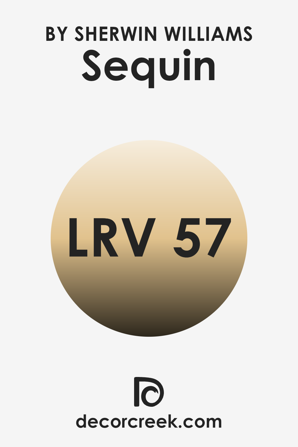
What is the LRV of Sequin SW 6394 by Sherwin Williams?
LRV, which stands for Light Reflectance Value, is an important number to consider when choosing paint colors for your walls. It indicates how much light a color reflects or absorbs. The LRV scale ranges from 0 to 100, where 0 means the color absorbs all light (like pure black) and 100 represents a color that reflects all light (like pure white).
A higher LRV means a color will reflect more light, making a room feel brighter and more open. Conversely, a lower LRV results in a color that absorbs more light, often making a room feel cozier or more intimate.
When it comes to the color Sequin by Sherwin Williams, with an LRV of 56.751, it sits in the middle of the spectrum. This value suggests that Sequin will reflect a moderate amount of light, providing a balanced look in a room. It won’t feel too dark or too light, making it a flexible choice for many rooms.
In a room with plenty of natural light, Sequin can help enhance the brightness without being overpowering. In darker areas, it maintains enough lightness to prevent the room from feeling too closed in. It’s a great option if you’re looking for a color that can adapt well to different lighting conditions while maintaining a fresh and lively atmosphere.
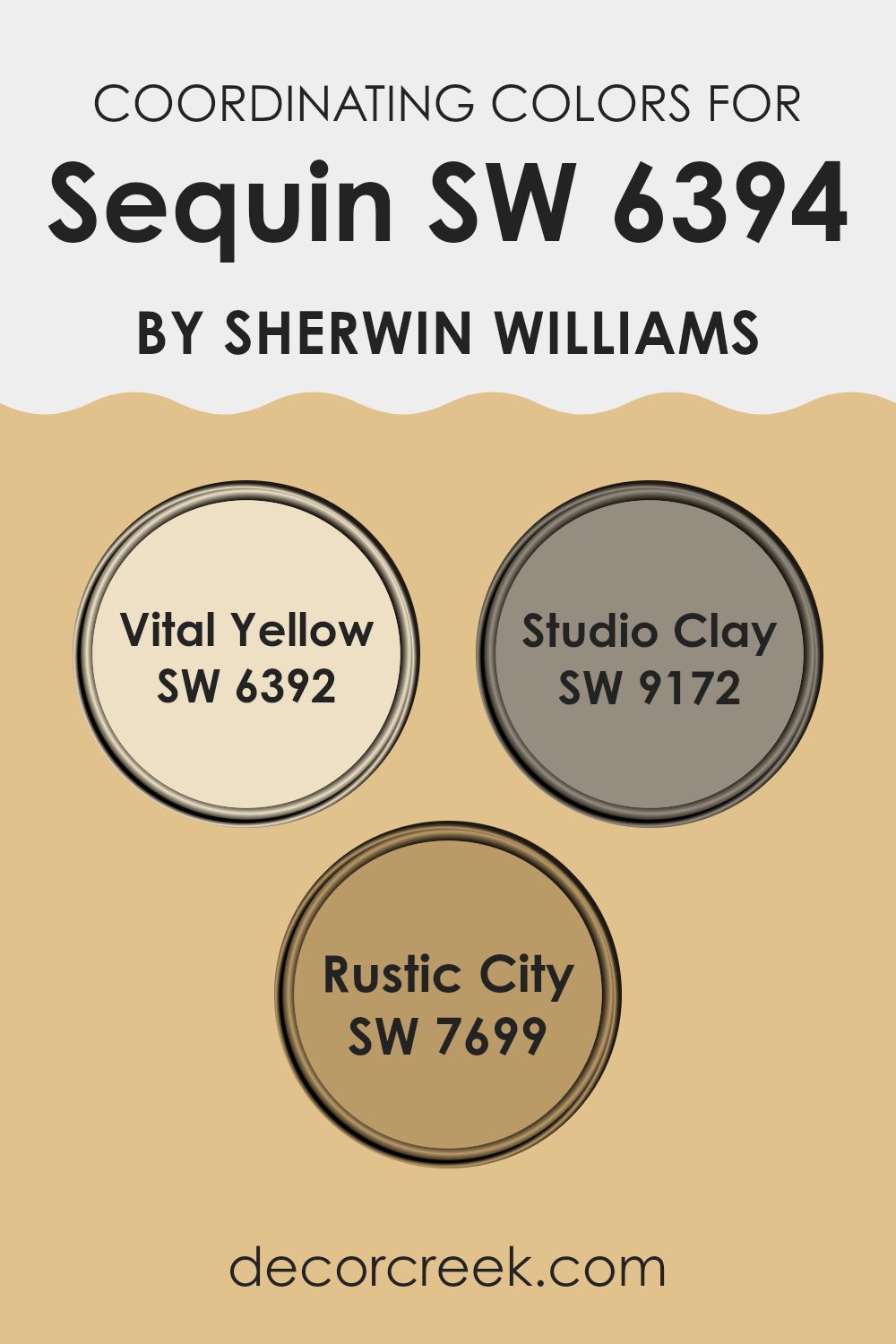
Coordinating Colors of Sequin SW 6394 by Sherwin Williams
Coordinating colors are hues that naturally complement and enhance each other, creating a cohesive and visually pleasing color scheme. They work together harmoniously to enhance the beauty of individual colors and create balance in a room. In the case of Sequin, a color by Sherwin Williams, the coordinating colors that pair well are Vital Yellow, Studio Clay, and Rustic City. These colors are carefully chosen to work together, as they share undertones or complementary contrasts that make them look great side by side.
Vital Yellow is a cheerful and energizing shade, bringing a lively spark with its bright and sunny disposition. Studio Clay offers a warm, earthy tone that grounds a room, lending an organic feel with its rich, clay-like presence.
Rustic City, on the other hand, is a deeper, muted brown with hints of warmth, evoking a sense of coziness reminiscent of well-worn leather or cityscapes at dusk. Together, these colors coordinate beautifully for a welcoming, inviting atmosphere. By combining them, different elements in a room can be highlighted, creating a dynamic yet cohesive look, with each color playing off the strengths of the others.
You can see recommended paint colors below:
- SW 6392 Vital Yellow
- SW 9172 Studio Clay
- SW 7699 Rustic City
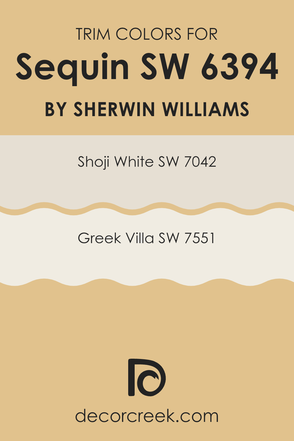
What are the Trim colors of Sequin SW 6394 by Sherwin Williams?
Trim colors refer to the hues used on moldings, baseboards, windows, and door frames to create contrast or harmony with the main wall color. They accentuate details and give areas a polished look. When paired with Sequin SW 6394 by Sherwin Williams, selecting the right trim colors can make a significant difference in enhancing its soft, warm tone.
The goal is to choose colors that complement the main color, making the room feel cohesive and appealing. Trim colors like SW 7042 Shoji White or SW 7551 Greek Villa are excellent choices for this purpose as they both bring out different qualities of Sequin, ensuring that the overall look is complete and thoughtfully designed.
Shoji White SW 7042 is a lovely off-white color with a slightly gray undertone, helping it blend well with a variety of colors while maintaining a fresh backdrop. It subtly highlights the softer tones of Sequin without overshadowing it.
On the other hand, Greek Villa SW 7551 is a creamy white with subtle warmth, enhancing the golden undertones in Sequin. It adds a gentle contrast that keeps the room feeling light and inviting. Both these trim colors are flexible and create an elegant finish that can work in various interior styles, ensuring that the environment remains inviting and visually interesting.
You can see recommended paint colors below:
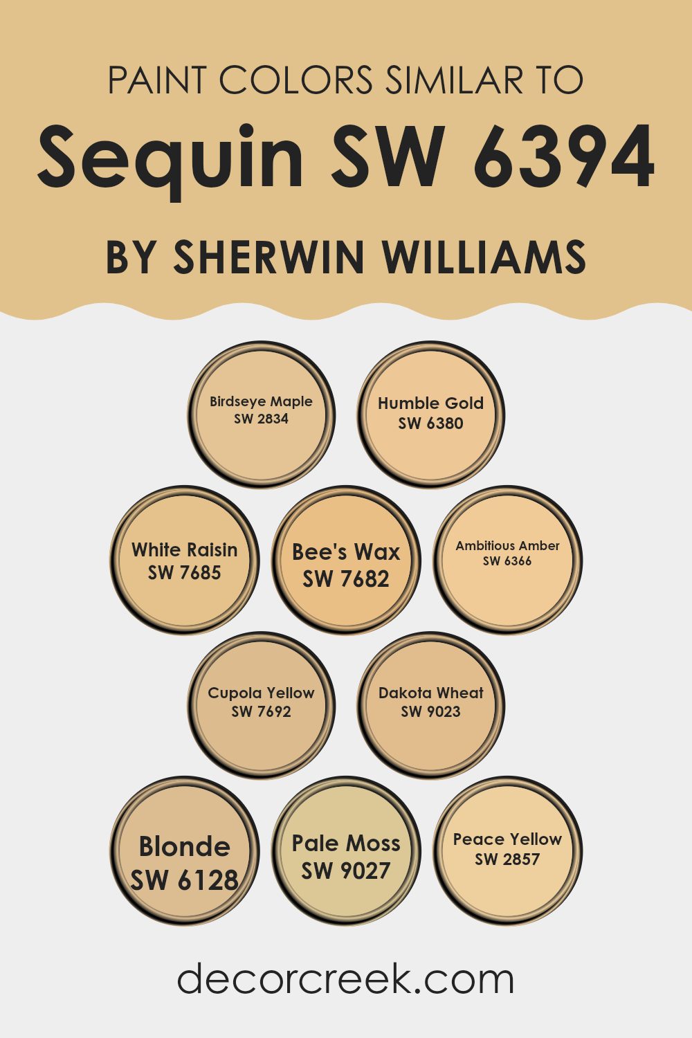
Colors Similar to Sequin SW 6394 by Sherwin Williams
Similar colors can create a sense of harmony and unity in any design. When colors like Birdseye Maple, Humble Gold, and White Raisin are used together, they complement one another beautifully, giving a warm and cohesive look. Birdseye Maple, with its soft, light beige tone, acts as a subtle neutral backdrop, allowing other colors to shine.
Humble Gold adds warmth with its rich, mustard-like hue, and pairs seamlessly with the buttery tones of White Raisin. Bee’s Wax offers a touch of brightness with its sunny yellow tint, bringing energy to the palette without overpowering it.
Ambitious Amber brings a deeper, golden glow that adds depth to the mix. Meanwhile, Cupola Yellow appears slightly brighter and more yolk-like, injecting playfulness into the arrangement. Dakota Wheat provides an earthy, grounded feel with its mellow golden tone, while Blonde lightens the atmosphere with its creamy hue. Pale Moss introduces a hint of green, offering a refreshing balance and bringing in a nature-inspired element.
Lastly, Peace Yellow ties everything together with its gentle, muted tone, creating a peaceful ambiance. These similar colors blend harmoniously, working together to provide warmth and cohesion, while keeping the room inviting and pleasing to the eye.
You can see recommended paint colors below:
- SW 2834 Birdseye Maple
- SW 6380 Humble Gold
- SW 7685 White Raisin
- SW 7682 Bee’s Wax
- SW 6366 Ambitious Amber
- SW 7692 Cupola Yellow
- SW 9023 Dakota Wheat
- SW 6128 Blonde
- SW 9027 Pale Moss
- SW 2857 Peace Yellow
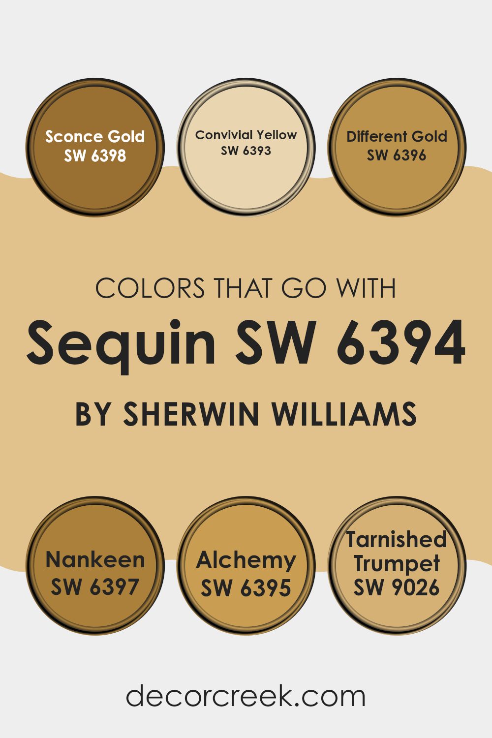
Colors that Go With Sequin SW 6394 by Sherwin Williams
Choosing the right colors to pair with Sequin SW 6394 by Sherwin Williams is important because they help create a balanced and harmonious look in any room. Using colors that complement Sequin can make a room feel cohesive and well-thought-out. For example, Sconce Gold SW 6398 is a rich golden hue that adds warmth and depth, working beautifully with Sequin’s lighter tone to create a cozy atmosphere. Convivial Yellow SW 6393 brings a cheerful and bright energy, making it a perfect partner for Sequin if you want a lively and sunny area.
Different Gold SW 6396 offers a muted, earthy gold that enhances the elegance of the Sequin, adding a touch of class without overpowering it. Nankeen SW 6397 is a soft, subtle color with a gentle tone that blends seamlessly with Sequin, creating a soothing and inviting environment.
Alchemy SW 6395 offers a slightly darker shade that can highlight Sequin’s vibrancy while adding depth to the room. Lastly, Tarnished Trumpet SW 9026 brings a rustic touch that complements Sequin’s fresh and bright character, adding an element of charm. Together, these colors help create a well-coordinated and inviting room that enhances the beauty of Sequin SW 6394.
You can see recommended paint colors below:
- SW 6398 Sconce Gold
- SW 6393 Convivial Yellow
- SW 6396 Different Gold
- SW 6397 Nankeen
- SW 6395 Alchemy
- SW 9026 Tarnished Trumpet
How to Use Sequin SW 6394 by Sherwin Williams In Your Home?
Sequin SW 6394 by Sherwin Williams is a light, cheerful pink color that can add a fresh touch to any room in your home. Its soft and inviting hue makes it suitable for a variety of areas. In a living room, it can bring warmth and a welcoming feel, especially when paired with neutral furniture and accessories.
In a bedroom, Sequin offers a gentle and soothing vibe, perfect for creating a relaxing environment. Accent the walls with white or cream trim for a crisp contrast. This pink shade can also work well in a girl’s bedroom or nursery, providing a youthful and playful atmosphere.
Additionally, it can be used in small doses, like on an accent wall or within decorative elements, to add a touch of color without overpowering the room. Sequin SW 6394’s flexibility and charm make it a great choice for adding a bit of personality to your home.
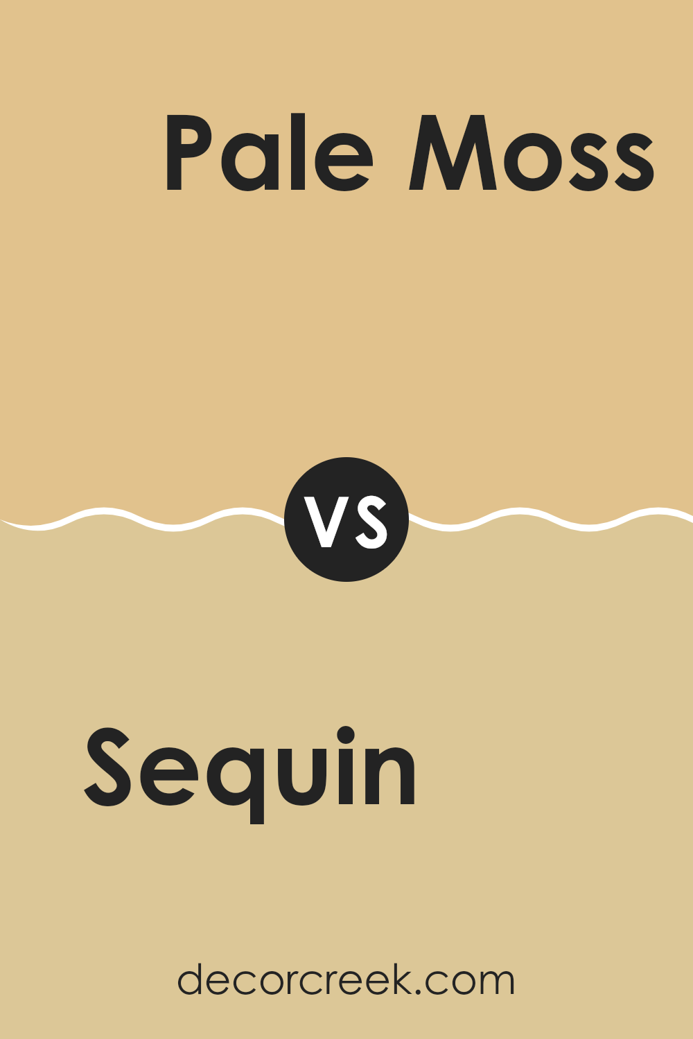
Sequin SW 6394 by Sherwin Williams vs Pale Moss SW 9027 by Sherwin Williams
Sequin SW 6394 and Pale Moss SW 9027 are both colors by Sherwin Williams, but they bring different vibes to a room. Sequin is a warm, golden yellow that can add a bright and cheerful touch to any room. It’s a vibrant and eye-catching color, perfect for creating a lively atmosphere. In contrast, Pale Moss is a soft, muted green with a hint of gray.
This tone has a calming and natural feel, making it ideal for rooms meant for relaxation. While Sequin can energize and uplift, Pale Moss gently soothes and grounds a room. Both colors can work well together or separately, depending on the mood you want to set.
Pair them in different areas to balance warmth and relaxation across your home. Whether you want an energetic splash with Sequin or a peaceful backdrop with Pale Moss, these colors offer flexible options for your walls.
You can see recommended paint color below:
- SW 9027 Pale Moss
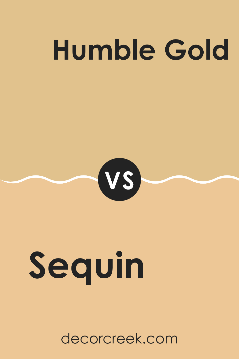
Sequin SW 6394 by Sherwin Williams vs Humble Gold SW 6380 by Sherwin Williams
Sequin SW 6394 and Humble Gold SW 6380 are both warm, inviting colors from Sherwin Williams, but they each offer unique qualities. Sequin is a soft, muted gold with subtle undertones, giving it a gentle and soothing appearance. It’s like a gentle ray of sunshine, providing a peaceful and calming atmosphere.
On the other hand, Humble Gold is a richer and deeper golden hue. It has more intense yellow and brown undertones, offering a warmer and more vibrant feel. This color can make a room feel cozier and more energetic compared to the softer nature of Sequin.
When choosing between the two, consider the mood you want to create. Sequin works well in areas where a light and airy feel is desired, while Humble Gold is great for adding warmth and richness. Both can work beautifully on walls, but their impact will vary based on the room’s lighting and décor.
You can see recommended paint color below:
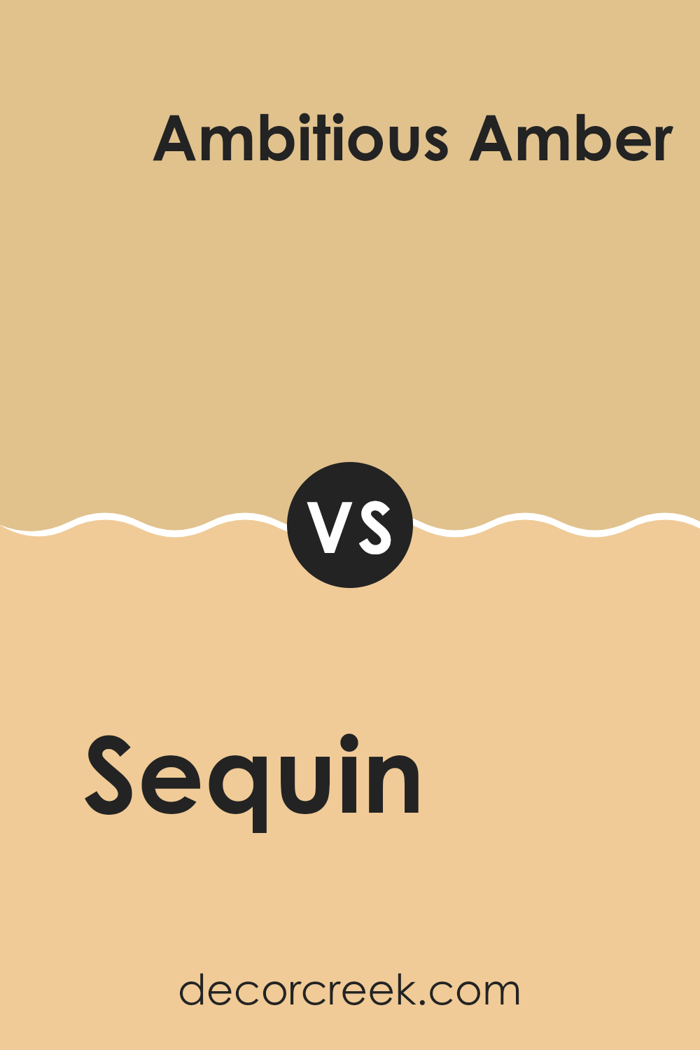
Sequin SW 6394 by Sherwin Williams vs Ambitious Amber SW 6366 by Sherwin Williams
Sequin SW 6394 by Sherwin Williams is a bright, sunny yellow that brings a lively and cheerful vibe to any room. It’s vibrant and eye-catching, perfect for adding warmth and energy. This color is great for lively areas such as kitchens or playrooms where you want to create a feeling of brightness and positivity.
On the other hand, Ambitious Amber SW 6366 is a deeper, more golden yellow. While still warm and inviting, it carries a touch of richness that makes it feel a bit more grounded than Sequin. Ambitious Amber adds coziness and is ideal for areas where you want a welcoming and friendly atmosphere, like dining rooms or entryways.
Both colors bring a sunny personality, but Sequin is more energizing, whereas Ambitious Amber provides a bit more warmth and depth. Together, they can complement each other well if you’re looking to balance energy and comfort in your home.
You can see recommended paint color below:
- SW 6366 Ambitious Amber
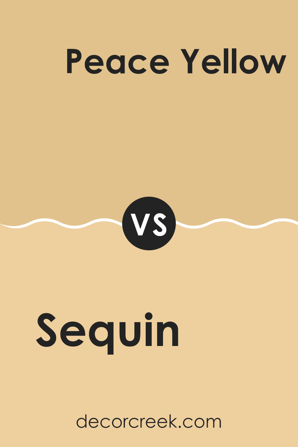
Sequin SW 6394 by Sherwin Williams vs Peace Yellow SW 2857 by Sherwin Williams
Sequin SW 6394 and Peace Yellow SW 2857 are both lively, warm colors from Sherwin Williams that bring a sense of brightness and cheer to a room. Sequin is a lively and vibrant golden yellow, exuding energy and warmth. This color is bold and can make a room feel lively and inviting. It’s flexible enough for accent pieces or an entire room.
On the other hand, Peace Yellow is a softer, more subdued shade. It’s gentle and slightly muted compared to Sequin, offering a cozy and welcoming ambiance without being overpowering. Peace Yellow has a comforting quality that works well in areas where you want to encourage relaxation and a homely feel.
When considering which color to use, Sequin would suit areas where you desire high energy, like a kitchen or a lively living area. Peace Yellow might be more suited for bedrooms or reading corners, where you want a softer, calming touch.
You can see recommended paint color below:
- SW 2857 Peace Yellow
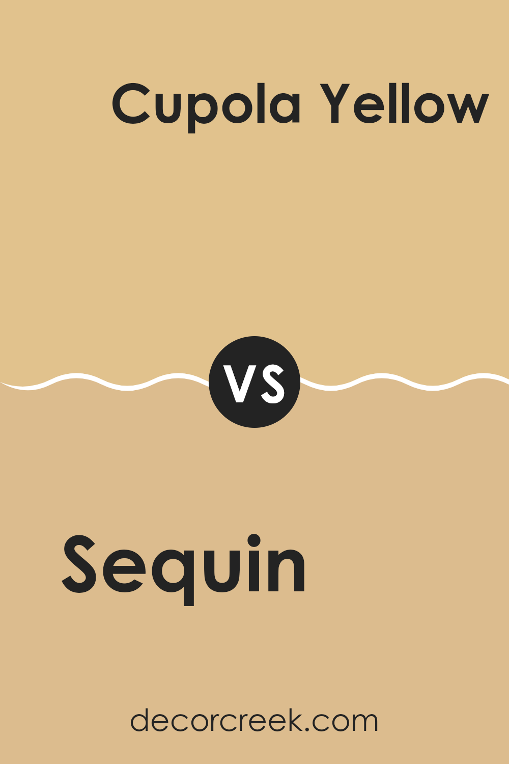
Sequin SW 6394 by Sherwin Williams vs Cupola Yellow SW 7692 by Sherwin Williams
Sequin (SW 6394) by Sherwin Williams is a warm, muted yellow with a natural and earthy feel. It is a soft shade that works well in creating cozy and inviting rooms. This color is flexible and pairs nicely with natural materials and neutral tones, adding a touch of brightness without being overpowering.
On the other hand, Cupola Yellow (SW 7692) by Sherwin Williams is a richer, darker yellow that has a stronger presence. It has more depth and intensity compared to Sequin, making it a bolder choice for those looking to make a statement. Cupola Yellow brings warmth and energy to a room, making it suitable for areas that want a cheerful and lively atmosphere.
While both colors share the base of yellow, Sequin is more understated and gentle, ideal for subtle warmth, whereas Cupola Yellow commands attention with its bolder hue. Both can brighten up a room, but their impact differs in tone and mood.
You can see recommended paint color below:
- SW 7692 Cupola Yellow
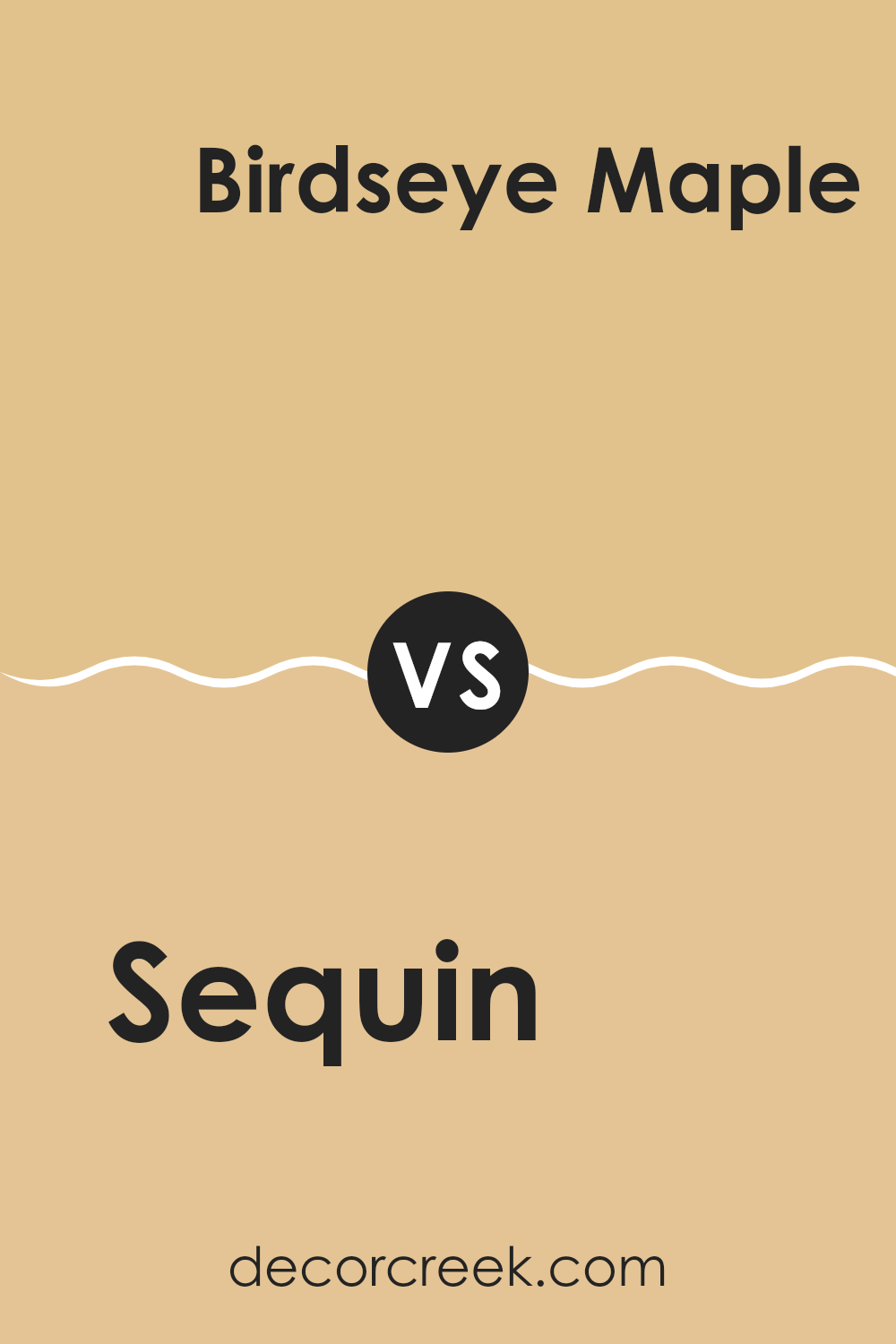
Sequin SW 6394 by Sherwin Williams vs Birdseye Maple SW 2834 by Sherwin Williams
Sequin SW 6394 and Birdseye Maple SW 2834 by Sherwin Williams are warm, earthy tones that each offer a distinct feel. Sequin is a soft, muted yellow with a hint of gold, creating a warm and inviting atmosphere.
It’s reminiscent of sunny days and can brighten up a room without being overpowering. On the other hand, Birdseye Maple is a light, creamy beige with subtle undertones of yellow. It offers a more neutral backdrop, providing a soft and calming presence in a room.
While both colors carry warm undertones, Sequin has a more pronounced yellow hue, making it ideal for adding a cheery touch to areas like kitchens or living rooms. Birdseye Maple, being more subdued, works well in bedrooms and offices where a calming environment is desired. Together, they can complement each other beautifully, with Sequin adding vibrancy and Birdseye Maple providing balance.
You can see recommended paint color below:
Sequin SW 6394 by Sherwin Williams vs White Raisin SW 7685 by Sherwin Williams
Sequin SW 6394 and White Raisin SW 7685 by Sherwin Williams are two warm, inviting colors. Sequin is a bright, cheerful golden yellow that brings energy and optimism to a room. It’s perfect for adding a lively touch to any room. On the other hand, White Raisin is a softer, subdued yellow with hints of beige, offering a calm and cozy feel.
While Sequin is bold and eye-catching, ideal for feature walls or lively rooms, White Raisin works well as a neutral background that blends seamlessly with other colors. It can make a room feel warm without being overpowering. Both colors pair well with earthy tones, whites, and natural materials.
Choosing between them depends on the atmosphere you want to create. If you want a room to feel bright and energetic, Sequin is the way to go. For a more subtle, relaxing vibe, White Raisin is a great choice.
You can see recommended paint color below:
- SW 7685 White Raisin
Sequin SW 6394 by Sherwin Williams vs Dakota Wheat SW 9023 by Sherwin Williams
Sequin SW 6394 and Dakota Wheat SW 9023 by Sherwin Williams are two warm, earthy tones that bring a sense of coziness to a room. Sequin is a golden yellow, radiating warmth and a sense of cheerfulness. It’s a vibrant color that can brighten up a room and make it feel inviting and lively.
On the other hand, Dakota Wheat is a softer, more subdued hue. It is a light wheat color with hints of beige and golden undertones. This color feels more understated and creates a calm, welcoming environment. It’s flexible and can blend well with various styles, making it a practical choice.
When used together, Sequin can be the accent color that pops against the more neutral Dakota Wheat. This combination can add both depth and lightness to a room, providing balance while keeping things warm and inviting. Both colors are ideal for creating a cozy and cheerful atmosphere in any room.
You can see recommended paint color below:
Sequin SW 6394 by Sherwin Williams vs Blonde SW 6128 by Sherwin Williams
Sequin SW 6394 and Blonde SW 6128 by Sherwin Williams are warm, inviting colors but have different vibes. Sequin is a rich, golden hue with a hint of mustard, making it bold and eye-catching. It works well as an accent color, especially in rooms where you want a burst of energy and cheerfulness.
On the other hand, Blonde is a lighter, more mellow shade. It resembles a sunlit wheat field, exuding a sense of warmth and comfort without being overpowering. Blonde is flexible and can easily complement a wide range of other colors, making it suitable for areas where a softer touch is desired.
While Sequin brings a sense of bold excitement, Blonde provides a calm and welcoming backdrop. Both colors evoke warmth, but the intensity and effect they bring to a room set them apart.
You can see recommended paint color below:
- SW 6128 Blonde
Sequin SW 6394 by Sherwin Williams vs Bee’s Wax SW 7682 by Sherwin Williams
Sequin SW 6394 and Bee’s Wax SW 7682, both by Sherwin Williams, are warm, inviting colors that add character to any room. Sequin is a vibrant golden-yellow shade that brings energy and brightness to a room. It can be used to create a lively and cheerful atmosphere.
On the other hand, Bee’s Wax is a deeper, more muted yellow with a hint of gold. It has a softer, warmer tone compared to Sequin, making it feel more grounded and cozy. Bee’s Wax can create a comforting and relaxed environment.
While Sequin stands out with its eye-catching brilliance, Bee’s Wax provides a more understated, calming presence. Both colors work beautifully in areas needing warmth and personality, but Sequin is ideal for accent walls or lively areas, whereas Bee’s Wax suits rooms where a subtle, cozy ambiance is desired. Together, they can be used to balance brightness and warmth in a home.
You can see recommended paint color below:
- SW 7682 Bee’s Wax
After spending time with SW 6394 Sequin by Sherwin Williams, I feel I’ve found a truly special color. When I look at it, I see a tone that is cheerful and warm, almost like the sun casting a gentle light. This color is like a friendly smile; it makes everything around it look happy and welcoming.
What I love most about Sequin is how easygoing it is. Whether it’s on the walls of a cozy room, part of a fun piece of furniture, or even in a cool painting, it fits right in and makes everything look lively.
I think Sequin has a great personality. It can remind you of sunshine and make you feel like you’re getting a warm hug just by being around it. It seems to say, “I’m here to make your day brighter.”
If you’re looking for a way to add a burst of happiness to a room, Sequin could be the perfect choice. It’s like adding a splash of joy wherever it goes, and it makes any place feel more like a happy home. I believe it’s a great pick for anyone wanting to bring a little more joy and warmth into their world.
Ever wished paint sampling was as easy as sticking a sticker? Guess what? Now it is! Discover Samplize's unique Peel & Stick samples.
Get paint samples

