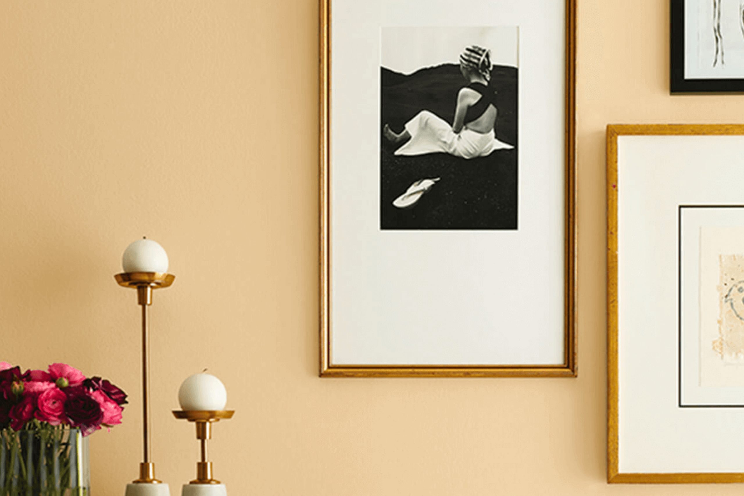
When you hear the name Birdseye Maple, you might think of the richly patterned wood known for its unique beauty. Sherwin Williams’ SW 2834 Birdseye Maple paint color captures that essence perfectly. It’s a warm, inviting hue with a touch of elegance that feels both familiar and refined.
Imagine opening a door to a cozy room painted in this color; it instantly wraps you in comfort. It’s not too bold, yet it has enough character to make a room memorable. Picture how it might complement wooden furniture or how it could act as a subtle backdrop to your favorite decor.
Using Birdseye Maple on your walls can create a calming atmosphere while adding a touch of style. This color seems to have a way of bringing a room together, making it feel harmonious and welcoming. Whether you’re painting a living room, a bedroom, or even a study, this shade can fit seamlessly into different environments and complement a wide range of styles.
Curious how Birdseye Maple can change your room? Consider giving it a try, and see how it enhances your home into a warm, inviting retreat.
What Color Is Birdseye Maple SW 2834 by Sherwin Williams?
Birdseye Maple by Sherwin Williams, known as SW 2834, is a soft, warm shade with undertones of beige and cream. This color mimics the gentle depth of the natural wood called birdseye maple, characterized by its unique grain pattern. The color brings coziness and comfort to a room, creating an inviting and homely atmosphere. Its neutral tone makes it adaptable and easy to incorporate into different design styles.
Birdseye Maple is an excellent choice for traditional interiors, where its warmth complements dark wood furniture and classic details. It also works well in rustic or farmhouse designs, where its subtle elegance pairs beautifully with natural materials such as wood, leather, and stone. In modern or minimalist areas, Birdseye Maple can soften the overall look when combined with clean lines and stark colors like white or charcoal.
In terms of materials, Birdseye Maple goes nicely with light wood tones, natural fibers, and fabrics like linen and wool, which add texture and depth to a room. It pairs well with metal accents, particularly brass and copper, for a touch of warmth.
Overall, Birdseye Maple is a classic color that harmonizes with a variety of textures and materials, making it both adaptable and appealing.
Is Birdseye Maple SW 2834 by Sherwin Williams Warm or Cool color?
Birdseye Maple SW 2834 by Sherwin Williams is a warm, neutral paint color that brings a cozy feel to home interiors. Its light, honey-brown tone makes it adaptable, allowing it to work well in various rooms such as living rooms, bedrooms, and kitchens.
This color is inviting and provides an excellent backdrop for both traditional and modern décor. The warmth of Birdseye Maple creates a comfortable atmosphere that feels welcoming and homely. In living areas, this paint color can make the room feel more open and airy due to its gentle, light-reflecting qualities.
It pairs nicely with earth tones and muted greens, adding depth and richness to the room. In kitchens, Birdseye Maple can complement wooden cabinets and stone countertops beautifully, creating a harmonious look. Its adaptability is one of its best features, as it blends well with different color schemes and styles, making it a popular choice for many homeowners seeking a classic look.
Undertones of Birdseye Maple SW 2834 by Sherwin Williams
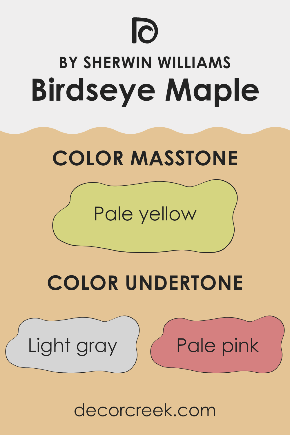
Birdseye Maple SW 2834 by Sherwin Williams is a complex color with a mix of different undertones. The main undertones include light gray, pale pink, light purple, mint, yellow, light blue, gray, orange, lilac, light green, and olive. These undertones play a big role in how we see this paint color on walls.
Undertones are the subtle colors that lie beneath the main color, affecting its overall appearance. For instance, if a wall is painted with Birdseye Maple, the presence of mint and light green undertones can make it look fresher and more vibrant. In contrast, gray and olive tones can add a more subdued, earthy feel. This means the color can look different under various lighting conditions.
In a room with lots of natural light, the lighter, more cheerful undertones like pale pink and light blue might stand out, giving the room an airy feel. Meanwhile, in dimmer areas, the gray and lilac elements might dominate, creating a cozy atmosphere. The balance of warm tones like yellow and orange against cooler shades can impact the mood and setting, making Birdseye Maple an adaptable choice for interiors depending on the light and surrounding décor.
What is the Masstone of the Birdseye Maple SW 2834 by Sherwin Williams?
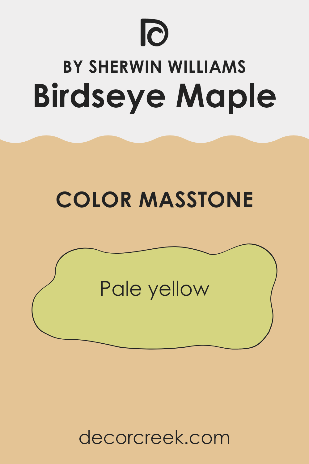
Birdseye Maple (SW 2834) by Sherwin Williams is a pale yellow color, resembling a soft, warm sunshine (#D5D580). This gentle hue brings warmth and brightness to a room, making it an excellent choice for areas where you want to create a welcoming and cheerful atmosphere.
It’s particularly effective in smaller rooms or areas that lack natural light, as the light color can help make these rooms feel larger and more inviting. When used on walls, Birdseye Maple’s warm undertone pairs well with neutral furnishings and light wood accents, creating a cozy and harmonious environment.
It also works nicely in kitchens, dining rooms, or living areas, where its sunny character adds a bit of character and cheer. The softness of the color prevents it from being intense, so it maintains a subtle presence that doesn’t dominate the room. Overall, Birdseye Maple provides a sunny, upbeat vibe in any part of the home.
How Does Lighting Affect Birdseye Maple SW 2834 by Sherwin Williams?
Lighting plays a crucial role in how we perceive colors. The appearance of a color can change drastically under different lighting conditions. Sherwin Williams’ Birdseye Maple (SW 2834) is a warm, reddish-brown hue that can look quite different depending on the type of light it’s in.
Under natural light, Birdseye Maple tends to show its truest form. However, the orientation of a room can affect how this color is perceived. In north-facing rooms, which typically have cooler, softer light, Birdseye Maple might appear a bit more muted or subdued since this type of light can make warm colors look slightly cooler. Therefore, Birdseye Maple might look a little less vivid and more subtle in northern light.
In south-facing rooms, the light is generally warmer and more intense, particularly in the midday and afternoon. This bright, warm light can make Birdseye Maple appear more vibrant and alive, enhancing its warmth and bringing out the rich undertones in the color. The warm daylight complements the warm tones in the paint, reinforcing its richness.
East-facing rooms get warm, yellow light in the morning and cooler light later in the day. In morning light, Birdseye Maple will likely seem warm and radiant, taking on a golden glow. As the day progresses and the light becomes cooler, the color might appear slightly more understated.
West-facing rooms receive the warmest light later in the day. In the afternoon and evening, this light can be quite intense and golden, making Birdseye Maple look particularly warm and inviting. It highlights the rich, earthy tones, creating a cozy and welcoming atmosphere.
Under artificial lighting, the type of bulb can also affect how Birdseye Maple appears. Incandescent bulbs will enhance the warm tones, making them look more intense, while fluorescent lighting might mute these tones, giving a slightly cooler appearance.
Each lighting condition alters the color slightly, so it’s important to consider where the color will be used and under what lighting to achieve the desired effect.
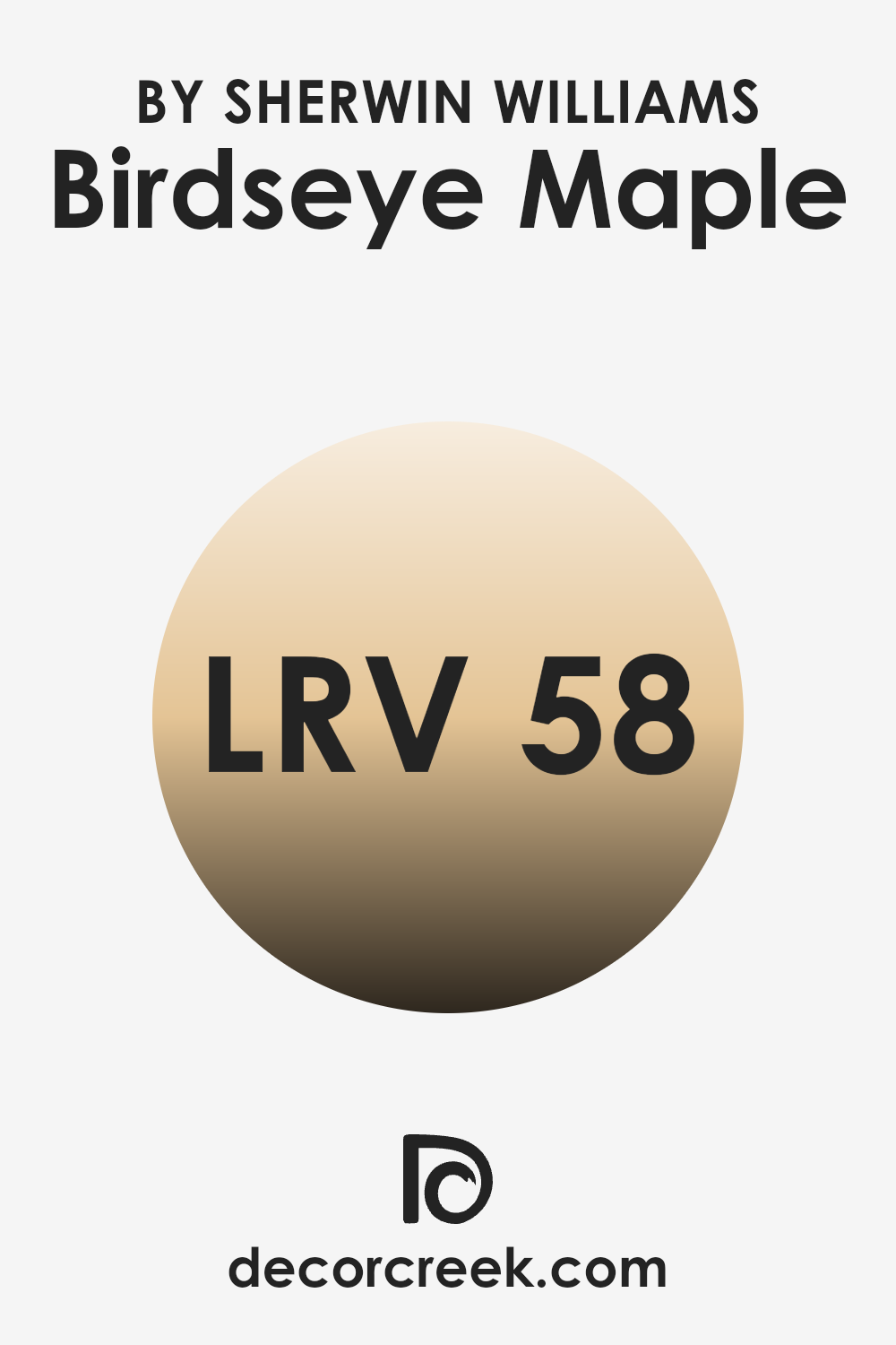
What is the LRV of Birdseye Maple SW 2834 by Sherwin Williams?
LRV stands for Light Reflectance Value, which measures the amount of light a color reflects and absorbs. The scale ranges from 0 to 100, where 0 represents absolute black (no light reflected) and 100 is pure white (all light reflected). In simple terms, the higher the LRV, the lighter and more reflective the color, making a room feel brighter.
On the other hand, a lower LRV means the color absorbs more light, creating a more cozy or intimate feel. LRV is an important consideration when selecting paint colors, as it affects how a color will look under different lighting conditions and influences the ambiance of a room.
With an LRV of 58.378, the Birdseye Maple color by Sherwin Williams has a mid-range reflectance level. This means it balances between reflecting and absorbing light. As a result, Birdseye Maple maintains a warm, inviting tone without overpowering a room with brightness. In areas that get a moderate amount of natural light, this color can make a room feel comfortable and welcoming without feeling too dark or too washed out. It’s great for areas where you want a pleasant and homely atmosphere, ensuring the room feels lively yet calm at the same time.
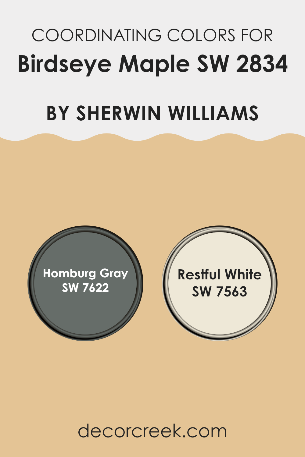
Coordinating Colors of Birdseye Maple SW 2834 by Sherwin Williams
Coordinating colors are hues that harmonize well together, creating a cohesive and pleasing look in a room. These colors are chosen based on their ability to complement and enhance one another, often through similar undertones or contrast. When choosing coordinating colors for a paint like Birdseye Maple by Sherwin-Williams, it’s important to select hues that will either balance or accentuate its warm, inviting tone.
For example, Homburg Gray works as a coordinating color with Birdseye Maple, offering a rich, deep gray with cool undertones that can provide a subtle contrast, making the warm tones of Birdseye Maple stand out without clashing. Restful White is another excellent coordinating choice. It’s a soft, warm white that adds a gentle brightness to a room.
The subtle warmth in Restful White compliments Birdseye Maple, enhancing its natural, cozy feel. When these colors are used together in a design, they create a balanced atmosphere. Using contrasting and complementary colors in this way helps to achieve a harmonious look and feel, making rooms feel well-thought-out and inviting.
You can see recommended paint colors below:
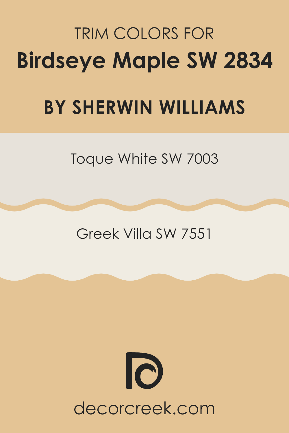
What are the Trim colors of Birdseye Maple SW 2834 by Sherwin Williams?
Trim colors are crucial for bringing out the character and style of any interior or exterior room, especially when matched with a bold main shade like Birdseye Maple. This soft, earthy color from Sherwin Williams provides a warm and inviting ambiance that benefits greatly from the right trim to provide contrast and definition. Trim colors like SW 7003 Toque White and SW 7551 Greek Villa are perfect because they complement the rich tones of Birdseye Maple while adding depth and clarity.
Toque White is a chic white with a subtle hint of warmth, making it an adaptable choice that maintains brightness without feeling stark. Meanwhile, Greek Villa is creamy and soft, striking a balance by adding an elegant touch without overpowering the warmth of the main color.
Incorporating these trim colors with Birdseye Maple not only helps to highlight the intricate wood patterns often associated with interiors but also enhances the architectural features of the room. Toque White provides a crisp, clean finish that pairs well with detailed moldings or window casings, offering a fresh appearance that stands out against the main color.
Greek Villa, on the other hand, brings a gentle warmth that seamlessly ties in with the overall cozy feel, offering a seamless transition from walls to trim. Both choices are integral in creating a harmonious environment where the main hue of Birdseye Maple is both supported and accentuated by its trimming counterparts, lending balance and cohesion to the entire room.
You can see recommended paint colors below:
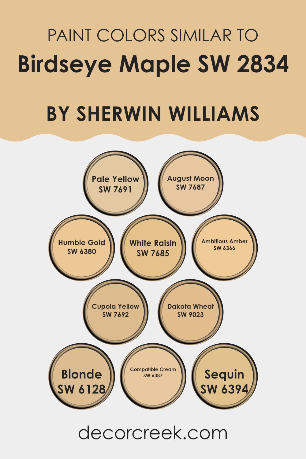
Colors Similar to Birdseye Maple SW 2834 by Sherwin Williams
When choosing colors similar to Birdseye Maple (SW 2834) by Sherwin-Williams, it’s important to consider tones that complement each other smoothly and create a balanced look. These colors work together seamlessly due to their warm, inviting undertones. Take, for example, SW 7691 Pale Yellow—a gentle, creamy hue that provides a subtle brightness without overpowering the room.
SW 7687 August Moon has a golden touch that adds warmth, reminiscent of a late afternoon glow, creating a cozy atmosphere. Humble Gold (SW 6380) is richer and adds depth, with its warm, sunlit feel, while White Raisin (SW 7685) offers a softer, muted yellow that is both gentle and soothing.
Ambitious Amber (SW 6366) brings in a playful, lively touch with its vibrant undertone, making it perfect for adding a cheerful note. SW 7692 Cupola Yellow is a slightly deeper shade, offering an earthy warmth that feels grounded and charming. Dakota Wheat (SW 9023) provides a soft, neutral backdrop with its light, wheat-like tone, perfect for adaptable decorating.
Blonde (SW 6128) is a mellow, light shade that exudes a sense of calm and harmony. Compatible Cream (SW 6387) embodies a soft, creamy tone that effortlessly complements other colors, while Sequin (SW 6394) adds a hint of golden sparkle, completing the palette with a touch of elegance. Together, these colors create a cohesive environment, ensuring a pleasing visual experience that feels both inviting and harmonious.
You can see recommended paint colors below:
- SW 7691 Pale Yellow
- SW 7687 August Moon
- SW 6380 Humble Gold
- SW 7685 White Raisin
- SW 6366 Ambitious Amber
- SW 7692 Cupola Yellow
- SW 9023 Dakota Wheat
- SW 6128 Blonde
- SW 6387 Compatible Cream
- SW 6394 Sequin
How to Use Birdseye Maple SW 2834 by Sherwin Williams In Your Home?
Birdseye Maple SW 2834 by Sherwin Williams is a warm, inviting paint color that can create a cozy atmosphere in any home. Its soft, muted shade of beige with subtle undertones of gray makes it an adaptable choice for various rooms.
This color works well in living rooms, bedrooms, or dining areas, providing a comforting backdrop that complements a range of decor styles. In the living room, Birdseye Maple can enhance the warmth of wood furniture and pair nicely with earthy tones or vibrant accents.
In the bedroom, it can contribute to a restful atmosphere, making the room feel welcoming and peaceful. Adding crisp white or light-colored trim can make the walls pop, adding a touch of elegance without being too bold. Pairing this color with natural materials like wood or stone can enhance the overall look, creating a harmonious environment that feels both current and classic.
Birdseye Maple SW 2834 by Sherwin Williams vs Dakota Wheat SW 9023 by Sherwin Williams
Birdseye Maple (SW 2834) and Dakota Wheat (SW 9023) by Sherwin Williams are two distinct yet harmonious colors. Birdseye Maple is a warm, earthy tone with a reddish-brown hue reminiscent of natural wood. It exudes warmth and coziness, making it ideal for creating inviting areas in living areas or bedrooms.
On the other hand, Dakota Wheat is a soft, golden yellow. Its gentle warmth adds a cheerful and sunny feel to any room. Unlike the earthy tone of Birdseye Maple, Dakota Wheat brightens rooms and can be used in kitchens or dining areas to add a touch of vibrancy.
When combined, these colors can create a balanced and welcoming atmosphere. Birdseye Maple provides depth and richness, while Dakota Wheat brings a light, airy touch. Whether used separately or together, each adds its own appeal to home interiors.
You can see recommended paint color below:
Birdseye Maple SW 2834 by Sherwin Williams vs Compatible Cream SW 6387 by Sherwin Williams
Birdseye Maple (SW 2834) by Sherwin Williams is a warm, earthy brown that can bring a cozy feel to any room. It has a rich, natural tone reminiscent of woodgrain, making it adaptable for various styles, from rustic to traditional. It’s a color that can make a room feel inviting and grounded.
On the other hand, Compatible Cream (SW 6387) by Sherwin Williams is a soft and gentle cream color. It offers a lighter touch, giving areas an open and airy feeling. Its warmth is subtle, and it works beautifully in areas where you want to add a bit of brightness without using stark white.
When comparing the two, Birdseye Maple can add depth and warmth, while Compatible Cream provides lightness and a sense of openness. Together, they can complement each other wonderfully, with Birdseye Maple anchoring the room and Compatible Cream adding a touch of brightness.
You can see recommended paint color below:
- SW 6387 Compatible Cream
Birdseye Maple SW 2834 by Sherwin Williams vs Blonde SW 6128 by Sherwin Williams
Birdseye Maple (SW 2834) and Blonde (SW 6128) from Sherwin Williams offer two distinct color experiences. Birdseye Maple is a warm, mid-tone brown that brings a sense of coziness and comfort to a room. It has a rich, natural feel, reminiscent of the fine wood grain from which it takes its name. This makes it great for creating a welcoming atmosphere, especially in living rooms or libraries.
On the other hand, Blonde is a light, golden yellow that feels sunny and cheerful. It can brighten up a room and make it feel more open and airy. Blonde is an adaptable color that works well in kitchens or bathrooms, where a light and fresh feeling is desired.
Together, Birdseye Maple can provide a grounding backdrop, while Blonde can add lightness and energy to the same room, creating a balanced and inviting environment.
You can see recommended paint color below:
- SW 6128 Blonde
Birdseye Maple SW 2834 by Sherwin Williams vs Ambitious Amber SW 6366 by Sherwin Williams
Birdseye Maple SW 2834 and Ambitious Amber SW 6366 are two distinct colors from Sherwin Williams. Birdseye Maple is a warm, earthy brown with subtle orange undertones, resembling the rich texture of wood. It brings a cozy and inviting atmosphere, ideal for creating a comfortable and grounded room, such as a living room or study.
On the other hand, Ambitious Amber is a vibrant, sunny yellow with golden tones. It radiates energy and positivity, making it a great choice for areas where you want to infuse warmth and cheerfulness, like a kitchen or playroom.
When compared, Birdseye Maple offers a more subdued and natural feel, well-suited for areas needing a calm, rustic charm. Ambitious Amber, however, is lively and bold, perfect for adding a splash of brightness and uplifting the mood in any room. Both colors serve unique purposes and can be used to complement various design styles.
You can see recommended paint color below:
- SW 6366 Ambitious Amber
Birdseye Maple SW 2834 by Sherwin Williams vs White Raisin SW 7685 by Sherwin Williams
Birdseye Maple SW 2834 by Sherwin Williams is a warm, medium-toned brown with hints of orange and red. It brings a cozy and inviting atmosphere to a room, making it ideal for traditional settings where a rich, earthy feel is desired. It can add depth and a feeling of comfort to any room.
On the other hand, White Raisin SW 7685 is a light, creamy yellow with a soft, warm undertone. It creates a bright and cheerful environment without being overpowering. This color suits areas where a light, sunny atmosphere is wanted, such as kitchens or living rooms.
When comparing the two, Birdseye Maple offers a grounded, warm appearance, while White Raisin provides a light, uplifting vibe. Birdseye Maple might be used to create an intimate setting, while White Raisin can help open up a room, making it feel more spacious and inviting. Both colors bring warmth, but in distinctly different ways.
You can see recommended paint color below:
- SW 7685 White Raisin
Birdseye Maple SW 2834 by Sherwin Williams vs Pale Yellow SW 7691 by Sherwin Williams
Birdseye Maple SW 2834 and Pale Yellow SW 7691 by Sherwin Williams are two distinct color choices, each bringing its unique charm to a room. Birdseye Maple is a warm, soft beige that exudes a sense of coziness and comfort. It pairs well with natural materials and can create a welcoming atmosphere in a room. It’s adaptable and works nicely with various wood tones, adding warmth without overpowering.
On the other hand, Pale Yellow SW 7691 is a light, cheerful color. This soft yellow can brighten a room and add a touch of freshness and vitality. It’s perfect for areas where you want to infuse some energy and light, such as kitchens or bathrooms.
While Birdseye Maple offers warmth and comfort, Pale Yellow brings in brightness and a hint of sunshine. Together, they can balance each other, with one providing subtlety and the other adding a lively touch.
You can see recommended paint color below:
- SW 7691 Pale Yellow
Birdseye Maple SW 2834 by Sherwin Williams vs Sequin SW 6394 by Sherwin Williams
Birdseye Maple SW 2834 by Sherwin Williams is a warm, earthy wood tone, giving off a cozy and welcoming feel. It’s similar to the natural color of wood with a hint of reddish-brown, making it adaptable for creating comforting rooms. It’s great for living rooms or study areas where a touch of warmth is desired.
On the other hand, Sequin SW 6394 is a lively, golden yellow reminiscent of sunlight. This bright, cheerful color can make a room feel more vibrant and energized. It’s perfect for kitchens, bathrooms, or any room where a little sunshine can brighten the mood.
Pairing Birdseye Maple with Sequin creates a balanced mix of warmth and brightness. Birdseye Maple brings grounding and stability, while Sequin adds a pop of cheerfulness. Together, these colors can create environments that feel both comfortable and lively, making them suitable for various home settings.
You can see recommended paint color below:
- SW 6394 Sequin
Birdseye Maple SW 2834 by Sherwin Williams vs Cupola Yellow SW 7692 by Sherwin Williams
Birdseye Maple SW 2834 and Cupola Yellow SW 7692 by Sherwin Williams are two distinct colors that bring different vibes to a room. Birdseye Maple is a warm brown with a hint of orange, like the rich look of polished wood. It gives rooms a cozy and inviting feel, making them perfect for relaxing areas, like living rooms or studies.
On the other hand, Cupola Yellow is a lively and cheerful color. It’s a soft yellow with a touch of warmth. This color can brighten up any room, making it feel sunny and welcoming. It’s great for kitchens, dining areas, or any room needing a boost of energy.
While Birdseye Maple adds a sense of comfort and richness, Cupola Yellow injects fun and enthusiasm. Both colors can complement each other well, with Birdseye Maple offering grounding warmth and Cupola Yellow bringing in a bright, happy feel.
You can see recommended paint color below:
- SW 7692 Cupola Yellow
Birdseye Maple SW 2834 by Sherwin Williams vs August Moon SW 7687 by Sherwin Williams
Birdseye Maple SW 2834 and August Moon SW 7687 are both warm colors by Sherwin Williams, but they have distinct characteristics. Birdseye Maple is a rich, earthy brown with a subtle warmth that brings a sense of coziness and comfort to a room. It’s ideal for creating a welcoming atmosphere, making it suitable for living rooms or dens.
In contrast, August Moon is a soft, muted yellow that exudes a gentle warmth. This color brightens up a room without being overpowering, making it a great choice for areas where you want a cheerful yet calm vibe, such as kitchens or bedrooms.
While Birdseye Maple adds depth and warmth, August Moon offers a light and airy feel. Together, these colors can complement each other, with Birdseye Maple grounding the room and August Moon adding a touch of brightness, creating a balanced and inviting environment.
You can see recommended paint color below:
- SW 7687 August Moon
Birdseye Maple SW 2834 by Sherwin Williams vs Humble Gold SW 6380 by Sherwin Williams
Birdseye Maple SW 2834 and Humble Gold SW 6380 by Sherwin Williams offer distinct styles for any room. Birdseye Maple is a soft, neutral shade with creamy undertones, making it adaptable and calming. It’s great for creating a subtle, warm backdrop that doesn’t overpower. This color can work well in living rooms or bedrooms, providing a sense of coziness.
On the other hand, Humble Gold is a rich, warm yellow with a hint of orange, bringing energy and cheerfulness to a room. It can brighten up a room and make it feel inviting and lively. This shade is particularly suitable for kitchens or dining areas where a bit of vibrancy can enhance the atmosphere.
While Birdseye Maple offers understated elegance, Humble Gold brings a pop of color and warmth. Both colors can complement each other or stand alone, depending on the mood and style you desire for your home.
You can see recommended paint color below:

After reading about SW 2834 Birdseye Maple by Sherwin Williams, I’ve learned that it is a really inviting and cozy color. It’s like a warm, gentle hug you would get from your favorite blanket. This color is a soft, gentle shade that looks a bit like the inside of a maple tree with its light brown and creamy tones. It makes me think of the calmness of nature, and how peaceful it feels to be surrounded by trees.
What makes Birdseye Maple special is that it isn’t loud or too bright. Instead, it’s like a quiet friend that makes any room feel more comfortable and welcoming. You might think of a sunny afternoon spent reading a book or playing indoors, feeling happy and at peace.
If I were to use Birdseye Maple in my room, it would help create a cozy and inviting place where I feel at home. It reminds me how colors can change how a room feels, and I like how this one seems to add a gentle touch of nature indoors.
Overall, Birdseye Maple seems like a wonderful choice for anyone looking to make their home feel warm and calm, just like being safe and sound in a comfy spot.
Ever wished paint sampling was as easy as sticking a sticker? Guess what? Now it is! Discover Samplize's unique Peel & Stick samples.
Get paint samples

