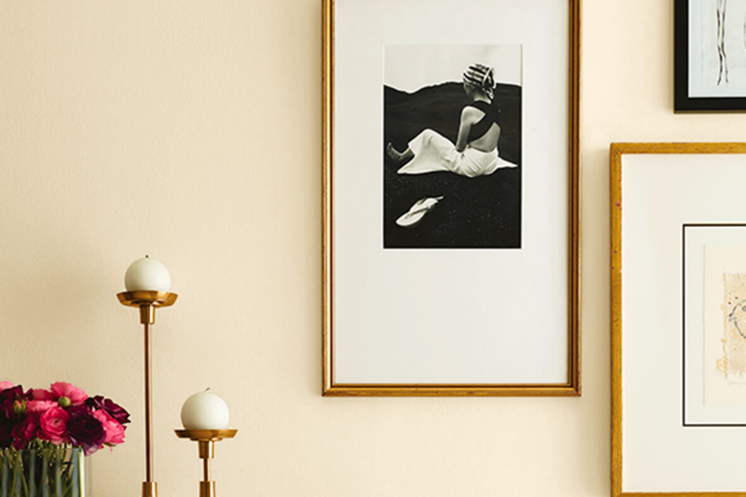
Let me introduce you to SW 6392 Vital Yellow by Sherwin Williams, a color that instantly brightens up any room with its vibrant, cheerful hue. As a fan of creating lively and inviting environments, I find that this particular shade of yellow brings a fresh burst of energy wherever it’s applied.
Whether you’re looking to spruce up a kitchen, add warmth to a living room, or make an entryway more welcoming, Vital Yellow does it all with an effortless charm. This zesty yellow isn’t just visually appealing; it also sets a positive tone, stimulating creativity and happiness.
In my experience, it pairs beautifully with various colors, allowing for flexible design schemes. From contemporary to classic, this shade is truly adaptable, fitting into any decor style. I’ll show you how this dynamic color can refresh a mundane room into a radiant, lively area that feels both cozy and inspiring.
Follow along as I share tips on how best to utilize Vital Yellow in your decorating adventures.
What Color Is Vital Yellow SW 6392 by Sherwin Williams?
Vital Yellow by Sherwin Williams is a vibrant and energetic shade of yellow that brings a burst of sunshine into any room. This lively hue has a warm undertone that makes it cozy and welcoming, perfectly suited for creating a cheerful atmosphere in your home. Vital Yellow is particularly effective in adding a spark of brightness to areas that may not get a lot of natural light. Its vividness helps lift the mood, making it a great choice for social rooms like the living room, kitchen, or dining area.
When it comes to interior styles, Vital Yellow works wonders in contemporary settings due to its bold and fresh vibe. It also fits well in eclectic decor schemes where various colors and patterns blend together harmoniously. For a chic and modern look, consider pairing this yellow with cool grays or crisp whites, which balance its brightness while maintaining a fresh and airy feel.
In terms of materials and textures, Vital Yellow pairs beautifully with natural wood, which complements its warmth. Think oak tables or walnut chairs that add a touch of organic character. Additionally, incorporating metals like brushed nickel or stainless steel can give a sleek, modern finish.
For textures, soft, plush fabrics or smooth, glossy finishes in furniture or decor pieces create interesting contrasts, enriching the visual appeal of the room.

Is Vital Yellow SW 6392 by Sherwin Williams Warm or Cool color?
Vital Yellow by Sherwin Williams is a bright and energizing color that brings a cheerful atmosphere to any room. This shade of yellow is vibrant without being overpowering, making it a great choice for kitchens and living areas where a lively vibe is desired.
In rooms with plenty of natural light, Vital Yellow appears even more vivid, enhancing the light-filled quality of the room. Using this color in small areas, like a bathroom or a hallway, can make the area feel more open and welcoming. It pairs well with neutral tones such as white or gray, which help balance its brightness and prevent it from overpowering the area.
Additionally, incorporating accents in blues or greens can create a refreshing contrast. Ideal for family homes, Vital Yellow adds a sense of joy and energy, making it perfect for rooms where families gather and spend time together.
Undertones of Vital Yellow SW 6392 by Sherwin Williams
Vital Yellow is a vibrant shade that can brighten up any room. Understanding its undertones can really help in deciding how and where to use it. Undertones are subtle colors that lie beneath the main color and can change how it looks under different lighting conditions or when paired with other colors.
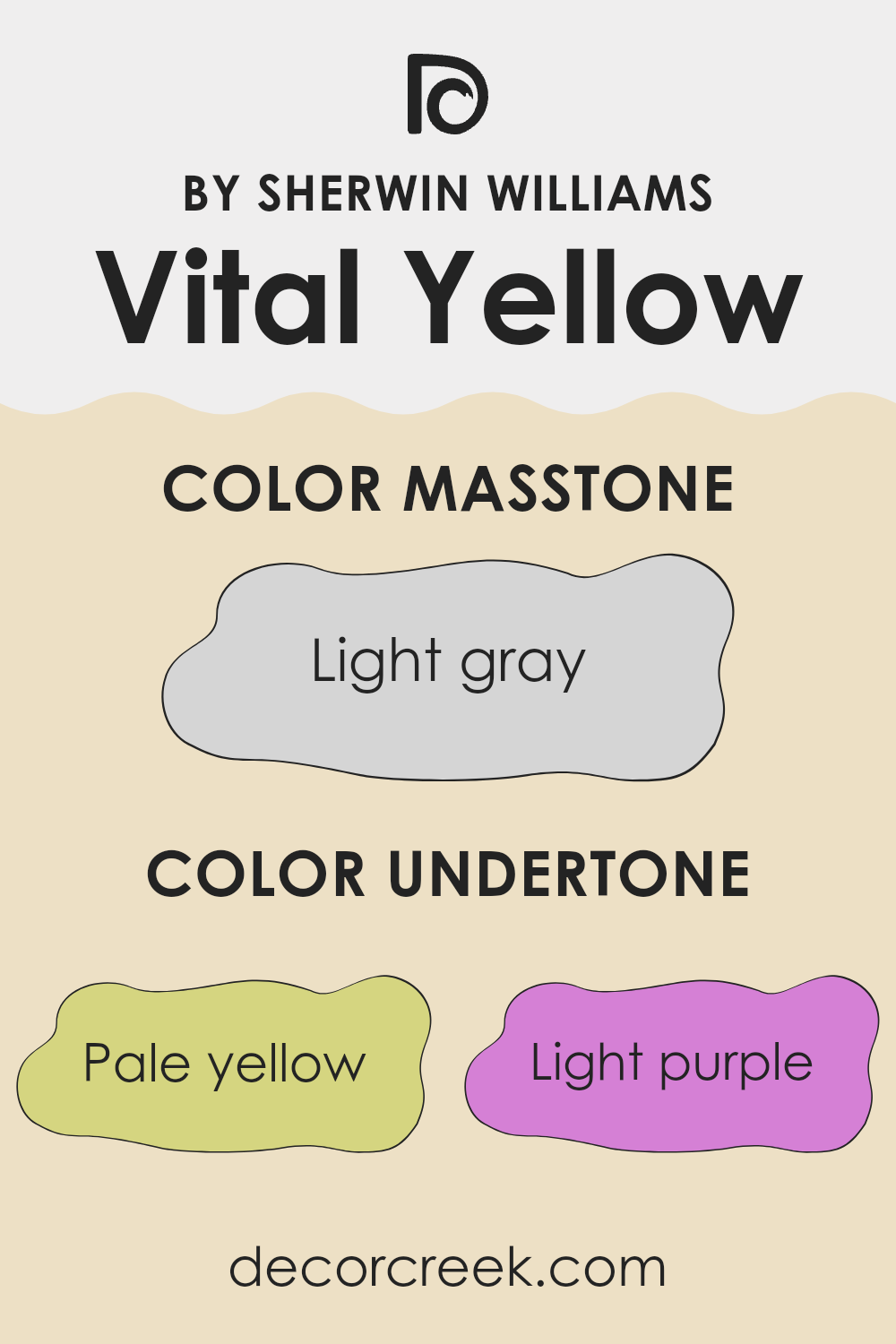
For Vital Yellow, the undertones are quite diverse. Pale yellow, light purple, light blue, pale pink, mint, lilac, and grey all play a role in influencing its final appearance. Even though Vital Yellow is primarily yellow, these undertones can make the paint seem softer, cooler, or more neutral depending on the surrounding light and decor.
In terms of interior walls, these undertones can affect the mood and feel of a room. For instance, the light purple and lilac undertones could add a hint of calmness to an otherwise bright yellow, making the area feel more relaxed. The mint and light blue undertones can give a fresher, cooler vibe, which is excellent for rooms you want to feel airy and light. Grey and pale pink can help ground the brightness of the yellow, making the wall color easier on the eyes and more flexible across various furniture styles and room functions.
Therefore, when painting a room with Vital Yellow, consider the room’s lighting and the colors of adjacent rooms to ensure the undertones complement your overall design and intended atmosphere. These subtle hues could enhance the dynamics of your area without overpowering it with bright color.
What is the Masstone of the Vital Yellow SW 6392 by Sherwin Williams?
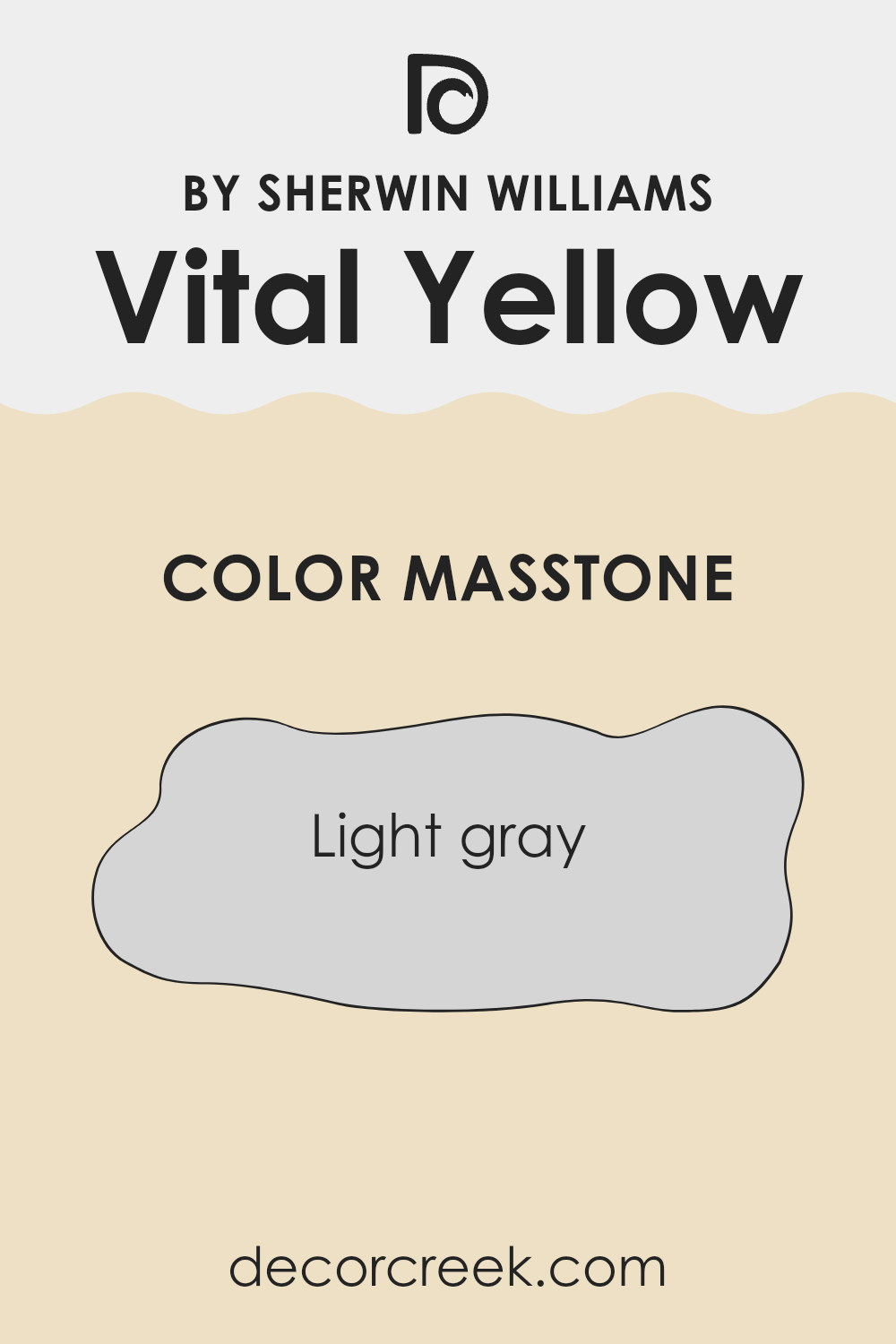
Vital Yellow SW 6392 by Sherwin Williams has a masstone of light gray, with the color code #D5D5D5. This neutral, soft gray tone is quite flexible and easy to use in various parts of a home. Since it isn’t a very dark or very bright color, it offers a quiet backdrop that allows other elements in a room to stand out.
It’s perfect for those who want a gentle color that doesn’t overwhelm the area or make a room feel too closed in. In living areas, such as a family room or a kitchen, this light gray can help reflect some light, making the room appear brighter and more open.
It pairs well with bolder colors in decorations or furniture, allowing those features to become focal points without clashing. This makes it a good choice for anyone looking to have a color in their home that supports a variety of decorating styles and color schemes.
How Does Lighting Affect Vital Yellow SW 6392 by Sherwin Williams?
Lighting plays a crucial role in how colors are perceived. When light changes, the appearance of colors can shift dramatically. This is particularly evident in the case of vibrant hues like Vital Yellow. Let’s look into how this color interacts with different lighting conditions and the direction of room exposure.
Artificial Light: In rooms primarily lit by artificial sources, such as LED or incandescent bulbs, Vital Yellow tends to appear warmer. Artificial lighting can highlight the brighter tones of this yellow, making it feel cozy and invigorating in evening settings.
The exact effect can vary depending on the type of bulb. For example, LED lights that mimic daylight will retain much of the color’s true hue, while warmer bulbs can enhance its golden tones.
Natural Light: Natural light, depending on the time of day, can dramatically alter how Vital Yellow looks. Under bright, midday sunlight, the color will show its truest form – vibrant and lively. In softer, diffused morning or late afternoon light, it may appear slightly muted but still retains much of its cheerful essence.
North-Faced Rooms: These rooms receive the least amount of sunlight, often casting a cooler light that can slightly dull the vibrancy of Vital Yellow. The color may lose a bit of its punch but will still help illuminate the area due to its inherent brightness.
South-Faced Rooms: Here, Vital Yellow shines brightly. South-facing rooms get abundant sunlight, enhancing the warm, sunny qualities of the color. It remains vibrant throughout the day and brings a constant cheerful ambiance to the room.
East-Faced Rooms: In east-facing rooms, the morning light can make Vital Yellow look exceptionally brilliant. As the day progresses and the direct sunlight diminishes, the color will look more subdued yet still maintain a warm presence.
West-Faced Rooms: These rooms benefit from the intense afternoon and evening light, which can make Vital Yellow appear very intense and dynamic. In the late evenings, as the light fades, the color will hold onto its warmth, providing a pleasant glow.
In conclusion, Vital Yellow’s reaction to different lighting conditions and room orientations illustrates how lighting can significantly influence color perception. This vibrant shade can either be boosted or muted by the light it’s exposed to, making it a flexible color choice for various living areas.

What is the LRV of Vital Yellow SW 6392 by Sherwin Williams?
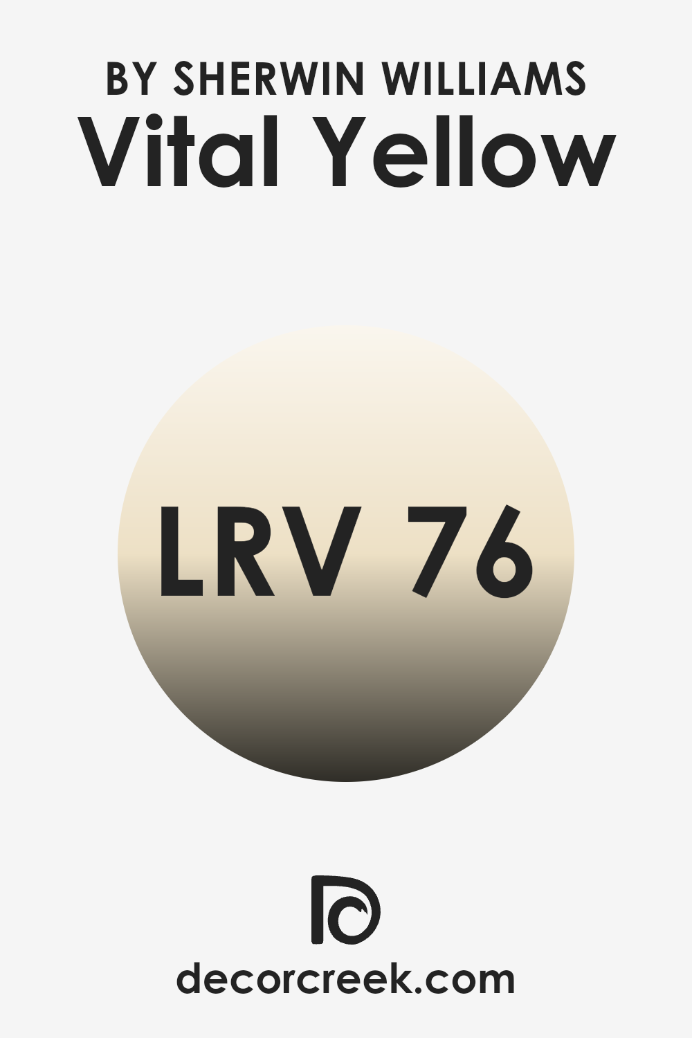
LRV stands for Light Reflectance Value, which is a measure used to indicate how much light a paint color reflects or absorbs. This value is usually represented on a scale ranging from 1 to 100, where higher values indicate that the color reflects more light. LRV is important because it helps determine how light or dark a color will appear when painted on the walls of a room. Colors with a higher LRV make a room feel brighter and larger because they reflect more light.
On the other hand, colors with a lower LRV absorb more light, making a room feel cozier but smaller. The LRV for the color Vital Yellow is 75.58, which means it is a very light-reflective shade. This high LRV allows the color to make areas feel airy and illuminated.
When used on walls, Vital Yellow will brighten the room significantly, making it a good choice for rooms that are smaller, darker, or have less natural light. The cheerful brightness of this color can also enhance the mood of a room, making it feel more open and welcoming. Therefore, this particular shade is effective in enlivening interiors and bringing a sense of freshness to any area.
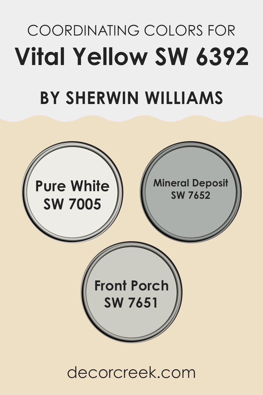
Coordinating Colors of Vital Yellow SW 6392 by Sherwin Williams
Coordinating colors are carefully selected shades that work harmoniously with a primary color to create a visually appealing color scheme. For example, with a vibrant hue like Vital Yellow from Sherwin Williams, choosing the right coordinating colors is key to setting a desired mood and tone in any room. Such colors often complement, balance, or subtly contrast with the main color, enhancing the overall aesthetic without overpowering the senses.
For Vital Yellow, coordinating color options include Pure White, Mineral Deposit, and Front Porch. Pure White is a crisp and clean shade that brings a feeling of freshness and clarity when paired with the brightness of Vital Yellow, making the room feel airy and light.
Mineral Deposit is a soft, muted gray with a hint of blue, offering a cooling counterbalance to the warm intensity of Vital Yellow, perfect for creating a more grounded and calm atmosphere. Front Porch, another gray shade, leans slightly towards green, providing a subtle and natural contrast that is perfect for those looking to incorporate a touch of neutrality to balance the vibrant yellow. These colors together ensure a balanced palette that enhances the energy of Vital Yellow while maintaining a harmonious look.
You can see recommended paint colors below:
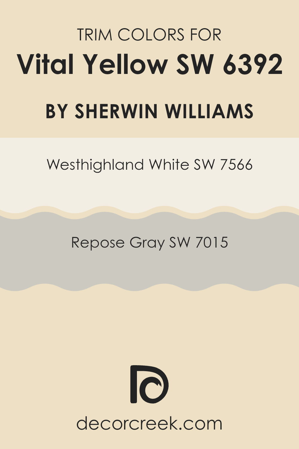
What are the Trim colors of Vital Yellow SW 6392 by Sherwin Williams?
Trim colors are the hues used for painting architectural trim elements like door frames, window casings, and baseboards, which frame and accent wall colors. Using trim colors thoughtfully can beautifully complement and accentuate the main color on your walls, enhancing the overall aesthetic of a room. For a bold and cheerful color like Vital Yellow by Sherwin Williams, selecting the right trim colors is crucial, as they help balance the brightness and draw attention to the architectural features of an area.
Westhighland White SW 7566 is a clean and bright white color that provides a crisp contrast to the lively tone of Vital Yellow, making it an excellent choice for trim. This white helps to break the intensity of the yellow, ensuring that the room feels balanced and not overpowering.
Repose Gray SW 7015, on the other hand, is a gentle gray that offers a subtle contrast with a warmer undertone. The use of Repose Gray as a trim gives a softer transition from the energetic yellow, creating a room that feels harmonious and inviting. Either of these trim colors would make wonderful choices to complement Vital Yellow by effectively defining the area in a pleasing and stylish way.
You can see recommended paint colors below:
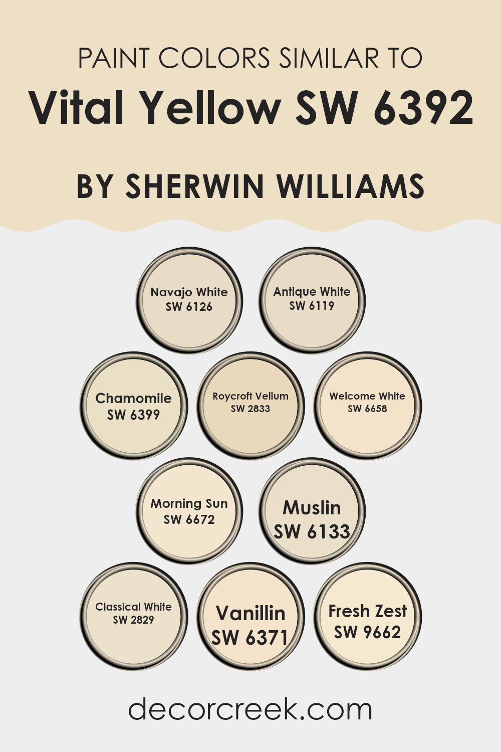
Colors Similar to Vital Yellow SW 6392 by Sherwin Williams
Choosing similar colors like those to Vital Yellow can create a harmonious and visually pleasing environment. These colors, ranging from soft tans to gentle yellows, blend well together because they share common undertones that provide a subtle continuity throughout a room. Such color choices are particularly useful in creating a cohesive look in areas where one wishes to combine several hues without creating a jarring transition.
For example, Navajo White and Antique White offer a creamy, soft backdrop that pairs beautifully with bolder, warm tones. Chamomile and Morning Sun both suggest a bright, cheerful ambiance, with the former leaning slightly more towards a muted, herbal tone and the latter offering a sun-kissed glow.
Roycroft Vellum and Classical White stand out as more muted, lending a soft, understated elegance that complements well with more saturated colors. Meanwhile, Welcome White and Vanillin provide a gentle contrast, their crispness highlighting the richness of other colors without overpowering them.
Muslin, with its quiet warmth, and Fresh Zest, with a hint of vivacious energy, round out the options, ensuring that there’s a perfect shade to enhance natural light or add a subtle lift to a cozy corner. With such a variety of similar yet distinct options, you can achieve a balanced palette that gently ties together diverse design elements.
You can see recommended paint colors below:
- SW 6126 Navajo White
- SW 6119 Antique White
- SW 6399 Chamomile
- SW 2833 Roycroft Vellum
- SW 6658 Welcome White
- SW 6672 Morning Sun
- SW 6133 Muslin
- SW 2829 Classical White
- SW 6371 Vanillin
- SW 9662 Fresh Zest
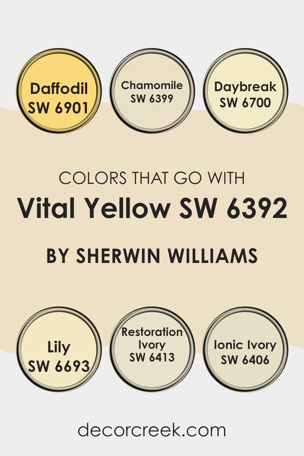
Colors that Go With Vital Yellow SW 6392 by Sherwin Williams
When you decorate with Vital Yellow SW 6392 by Sherwin Williams, choosing complementary colors is crucial to creating a harmonious room. These coordinating colors enhance the vibrant hue of Vital Yellow, creating a balanced and inviting atmosphere. For instance, Daffodil SW 6901 is a cheerful, sun-kissed shade that pairs beautifully with Vital Yellow, offering a smooth transition between energetic areas. Similarly, Chamomile SW 6399 provides a softer yellow that works well in rooms where you want a gentle yet cheerful ambiance.
Daybreak SW 6700 and Lily SW 6693 are also great companions for Vital Yellow. Daybreak offers a fresh, light green that reminds you of early morning freshness, perfect for bringing a sense of newness to any room.
Lily, being a slightly deeper yellow, complements Vital Yellow without overpowering the senses, ideal for adding depth and warmth. Additionally, Restoration Ivory SW 6413 and Ionic Ivory SW 6406 serve as neutral bases that ground the lively yellow, preventing it from dominating the area.
Restoration Ivory gives off a calming white with a hint of yellow warmth, suitable for creating a cozy feel, while Ionic Ivory offers a subtle warmth, perfect for rooms that aim for a soft and welcoming vibe. Each of these colors works in tandem with Vital Yellow to enhance the overall aesthetic, ensuring a lively yet cohesive environment.
You can see recommended paint colors below:
- SW 6901 Daffodil
- SW 6399 Chamomile
- SW 6700 Daybreak
- SW 6693 Lily
- SW 6413 Restoration Ivory
- SW 6406 Ionic Ivory
How to Use Vital Yellow SW 6392 by Sherwin Williams In Your Home?
Vital Yellow by Sherwin Williams is a vibrant and energizing color that can add a cheerful touch to any room in your home. This lively shade of yellow works well in areas where you want to create a welcoming and happy atmosphere, such as kitchens or dining areas. It pairs exceptionally well with white trims or cabinets, which help balance its brightness and prevent it from overpowering the area.
You can also use Vital Yellow in smaller doses if you prefer not to cover an entire room. For example, painting an accent wall or a piece of furniture can inject some warmth and brightness without dominating the area. Another great use is in hallways or entryways, where it can make the area appear more inviting right from the moment you step through the door.
Overall, Vital Yellow offers a fresh and friendly vibe, making it perfect for creating lively, enjoyable rooms in your home. It is especially ideal for anyone looking to add a splash of energy and cheerfulness to their surroundings.
Vital Yellow SW 6392 by Sherwin Williams vs Muslin SW 6133 by Sherwin Williams
Vital Yellow is a bright, energetic color that instantly brightens up any room. It’s a pure, vibrant shade that is reminiscent of sunshine, making it perfect for adding a cheerful touch to a room. On the other hand, Muslin is a soft, subtle beige that offers a calming effect.
It’s a neutral color that pairs well with almost any decor style and adds a gentle warmth to the environment. Where Vital Yellow is bold and eye-catching, Muslin is understated and flexible, creating a backdrop that allows other colors to stand out.
These two colors could complement each other in a room where you want a balance between something lively and something more laid-back. For instance, using Muslin on the walls with accents in Vital Yellow could create a pleasing contrast that enlivens the room without overpowering it.
You can see recommended paint color below:
Vital Yellow SW 6392 by Sherwin Williams vs Chamomile SW 6399 by Sherwin Williams
Vital Yellow is a bright, bold color that really pops. It has a strong, sunny quality that grabs attention and can liven up any room. This makes it perfect for areas where you want to add some cheerfulness, like kitchens or playrooms.
On the other hand, Chamomile is a much softer yellow. It’s muted and gentle, providing a calming effect. This color is great for rooms where you want to relax, such as bedrooms or living areas. It offers warmth without being too overpowering, making it easy to match with other decor elements.
Both colors share a yellow base, but their vibes are quite different. Vital Yellow is energetic and fun, while Chamomile is more low-key and soothing. Choosing between them depends on what mood you want to create in a room.
You can see recommended paint color below:
Vital Yellow SW 6392 by Sherwin Williams vs Welcome White SW 6658 by Sherwin Williams
Vital Yellow and Welcome White by Sherwin Williams are two distinct colors with unique vibes. Vital Yellow is a bright, energetic color that adds a lively touch to any room. It’s bold and cheerful, making it perfect for areas where you want to add a dash of enthusiasm or warmth, such as a kitchen or playroom.
On the other hand, Welcome White is a soft and clean color that brings a sense of calm and simplicity to a room. It pairs well with virtually any other shade, making it incredibly flexible for both modern and classic design styles. Welcome White is ideal for creating a refreshed and airy feel, suitable for living rooms, bathrooms, or small areas to make them appear larger.
Both colors serve different purposes but can be combined for a balanced look, with the bright yellow bringing warmth and the white offering a cool contrast.
You can see recommended paint color below:
- SW 6658 Welcome White
Vital Yellow SW 6392 by Sherwin Williams vs Antique White SW 6119 by Sherwin Williams
Vital Yellow and Antique White by Sherwin Williams are two distinct shades that cater to different moods and settings. Vital Yellow is a bright, cheerful color that brings a sense of energy and liveliness to a room. It’s a bold choice, perfect for areas where you want to inject optimism and vibrance, such as kitchens or playrooms.
In contrast, Antique White is a soft, creamy hue that offers a subtle, calming presence, making it ideal for rooms where you seek relaxation and a neutral backdrop, like living rooms or bedrooms.
While Vital Yellow activates a room with its sunny demeanor, Antique White provides a gentle, clean look that pairs well with almost any decor style, enhancing other colors used in the area. Both colors have their unique appeal but serve different purposes in interior design based on the atmosphere you aim to achieve.
You can see recommended paint color below:
Vital Yellow SW 6392 by Sherwin Williams vs Vanillin SW 6371 by Sherwin Williams
Vital Yellow is a bright, energizing color. It’s the type of yellow that stands out in a room, adding a cheerful and lively feel. It’s perfect for areas like kitchens or playrooms where you want a sense of happiness and activity. The intensity of Vital Yellow makes it a strong choice if you want to create a vibrant, inviting atmosphere.
On the other hand, Vanillin is a soft, creamy white. It gives off a gentle, soothing vibe, making it a great choice for more relaxed areas such as bedrooms or living rooms. This color has a subtle warmth to it, providing a cozy, comforting environment without clashing with other more vivid colors.
When compared, these two colors serve different purposes in home decor. Vital Yellow is more about energy and vibrancy, while Vanillin is about creating a calm, gentle backdrop. Together, they could complement each other well, especially in a room that balances lively design with soothing elements.
You can see recommended paint color below:
- SW 6371 Vanillin
Vital Yellow SW 6392 by Sherwin Williams vs Classical White SW 2829 by Sherwin Williams
Vital Yellow is a bold and lively color that truly stands out. It’s a bright, cheerful yellow that can energize and brighten up any room. This color is perfect if you want to create a happy and inviting atmosphere in a room. It pairs well with other vivid colors and can also beautifully offset neutral tones.
In contrast, Classical White is a soft and pure white shade that offers a clean and simple backdrop for any room. It’s subtle enough not to overpower any accents or features in a room, making it a flexible choice for walls, trim, or cabinets. Classical White can help make a small area appear larger and brighter.
Together, Vital Yellow and Classical White can be combined to create a fresh and modern look. The yellow adds a pop of color and warmth, while the white keeps the overall feel light and airy. This pairing can work well in a variety of rooms, providing a balance between vibrancy and calm.
You can see recommended paint color below:
Vital Yellow SW 6392 by Sherwin Williams vs Morning Sun SW 6672 by Sherwin Williams
Vital Yellow and Morning Sun are two distinct shades from Sherwin Williams. Vital Yellow is a bold, bright yellow that is very lively. It stands out and is great for areas where you want to add energy and vibrancy. It’s ideal for making a statement in a room, whether that’s on an accent wall or for a piece of furniture that you really want to draw attention to.
On the other hand, Morning Sun is a lighter, softer yellow. It is much more subtle and gives off a gentle, cheerful vibe without being too overpowering. This color works well in rooms that get a lot of natural light, enhancing a bright, airy feel, and is particularly good for bedrooms or living areas where you want a light, uplifting atmosphere.
Both colors bring warmth to any room, but the choice between them depends on how bold or soft you want the feeling to be. Vital Yellow is more in-your-face, while Morning Sun is quieter and more understated.
You can see recommended paint color below:
- SW 6672 Morning Sun
Vital Yellow SW 6392 by Sherwin Williams vs Roycroft Vellum SW 2833 by Sherwin Williams
Vital Yellow is a bright and energetic color that stands out with its vividness. The tone is warm, full of life, and perfect for rooms where you want to inject a pop of cheerfulness and excitement. It’s particularly great for areas like kitchens or playrooms where you want to create a lively atmosphere.
On the other hand, Roycroft Vellum is a much softer shade, leaning towards a warm beige with subtle gray undertones. This color gives off a quiet, understated feel, making it a good choice for places where you want a calm, cozy ambiance such as living rooms or bedrooms. It pairs well with a variety of decor styles and brings a soothing warmth to walls without overpowering the room.
When comparing these two, Vital Yellow is significantly brighter and can energize a room, while Roycroft Vellum tends to pull back, offering a gentle backdrop that’s easy on the eyes. Each serves different purposes depending on the mood and function you want to achieve in a room.
You can see recommended paint color below:
- SW 2833 Roycroft Vellum
Vital Yellow SW 6392 by Sherwin Williams vs Fresh Zest SW 9662 by Sherwin Williams
Vital Yellow and Fresh Zest, both by Sherwin Williams, are vibrant colors that brighten up any room but have distinct differences. Vital Yellow is a bold, pure yellow that resembles sunlight, bringing a cheerful and energetic vibe to a room. It’s perfect for creating a focal point or adding a burst of positivity.
On the other hand, Fresh Zest has a greenish tint, making it a milder color than Vital Yellow. This hue is reminiscent of early spring leaves or a lime peel, giving it a fresh and slightly softer feel compared to the more intense Vital Yellow. It works well in areas where you want a pop of color without overpowering the room.
Both colors are great choices for adding life and energy to décor, but the choice between them would depend on the mood you’re aiming to create and whether you prefer a pure yellow or a greenish-yellow.
You can see recommended paint color below:
- SW 9662 Fresh Zest
Vital Yellow SW 6392 by Sherwin Williams vs Navajo White SW 6126 by Sherwin Williams
Vital Yellow and Navajo White from Sherwin Williams are two distinct shades that offer different vibes for your room. Vital Yellow is a vibrant and energetic color. It’s a bright, sunny shade that grabs attention and brings a lively, cheerful feel to any area. It’s great if you want to create a room that feels invigorating and fun.
On the other hand, Navajo White is a soft, creamy color. It’s much more subtle and muted compared to Vital Yellow. Navajo White creates a warm, welcoming feeling and is flexible enough to work in almost any room. It’s excellent for those who like a calm and soothing backdrop that still adds a touch of warmth.
Both colors are great choices depending on what atmosphere you’re aiming for—lively and exciting with Vital Yellow, or gentle and comforting with Navajo White.
You can see recommended paint color below:
In wrapping up my thoughts on Sherwin Williams’ SW 6392 Vital Yellow, I must say that this color truly stands out. It’s like the bright, happy color of sunshine and it really lights up any room. Whether you’re painting a bedroom, a kitchen, or just adding a splash of color here and there, Vital Yellow makes the place feel warm and welcoming.
I learned that it goes well with lots of other colors, which means you can use it in many different styles and with other decorations easily. Vital Yellow isn’t just pretty, but it also creates a positive, cheerful vibe wherever it’s used, making it a great choice for anyone looking to liven up their home.
After discussing and looking at this color, I am really impressed and I think it’s a fantastic choice for anyone wanting to add energy and brightness to their rooms with a color that’s full of life and joy.

Ever wished paint sampling was as easy as sticking a sticker? Guess what? Now it is! Discover Samplize's unique Peel & Stick samples.
Get paint samples

