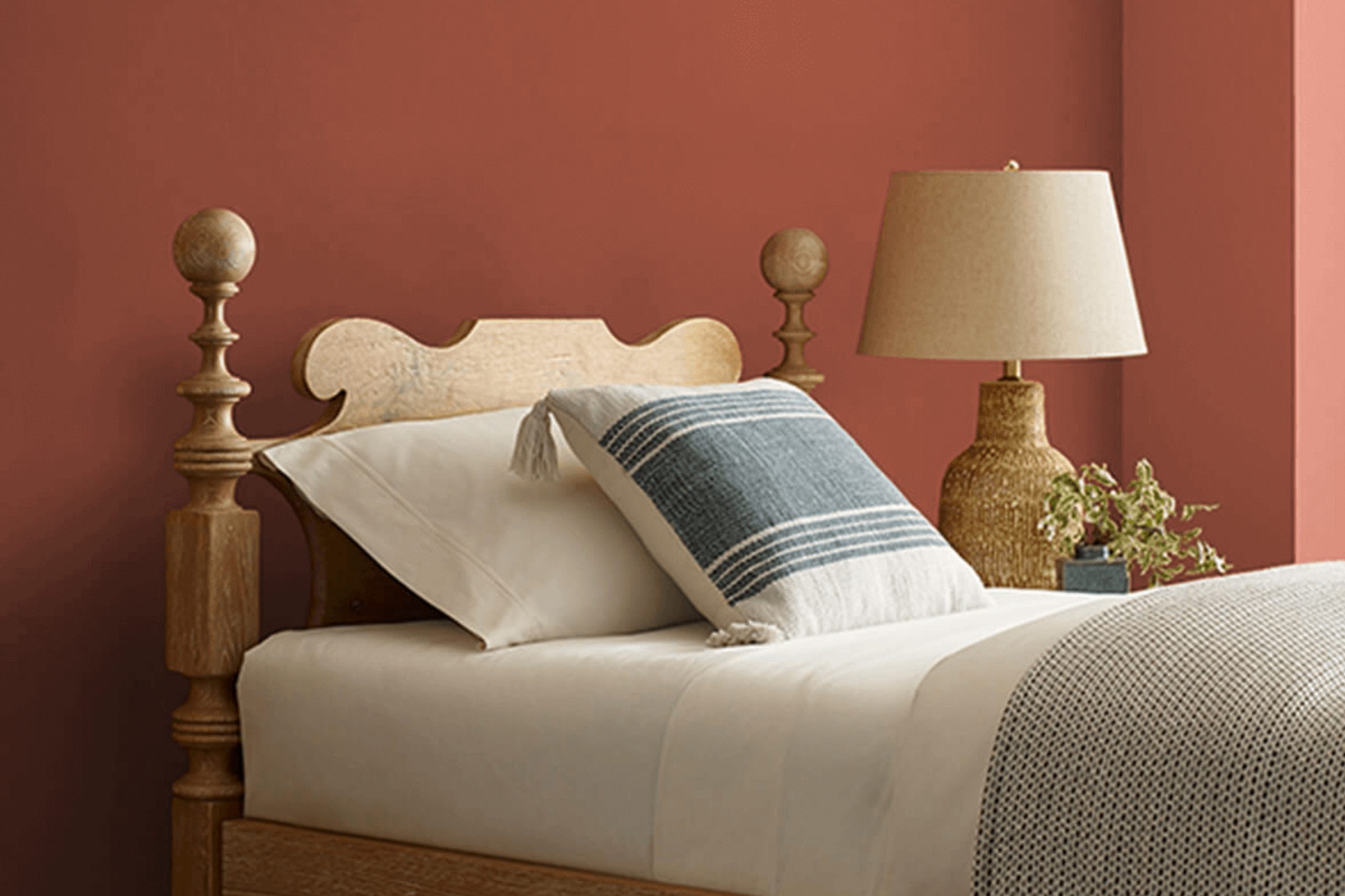
When I think about colors that make a room feel warm and inviting, SW 7598 Sierra Redwood by Sherwin Williams immediately comes to mind. This rich, earthy red has a flexible quality that resonates well with both traditional and modern settings. You won’t find it intense; instead, it offers a comforting depth that speaks to the grounded beauty of the natural world.
Imagine how a room could come alive with this hue: it’s elegant yet approachable, adding an air of sophistication without any pretense. It pairs beautifully with warm neutrals, soft whites, and even cool, muted blues, allowing you to create a balanced and harmonious palette.
Whether you plan to use it as an accent or main color, it has the potential to change a room into a welcoming retreat. And it’s not just about aesthetics. The color evokes a sense of coziness, perfect for creating an area where you can relax with family or entertain guests.
Sierra Redwood has that classic appeal, effortlessly blending with both rustic and refined interior styles. It’s a choice that can bring energy to your home, sparking interest while maintaining an inviting atmosphere. If you want your area to tell a story of warmth and connection, this shade might just be the perfect addition.
What Color Is Sierra Redwood SW 7598 by Sherwin Williams?
Sierra Redwood by Sherwin-Williams is a warm, earthy red that brings a rich and cozy feel to any room. It’s a deep, natural hue that echoes the colors found in nature, reminiscent of clay or terracotta. This flexible color fits seamlessly into various interior styles, particularly those that highlight organic elements. In rustic or farmhouse settings, it complements exposed wood beams and stone accents, enhancing the homey atmosphere.
In more contemporary or industrial areas, Sierra Redwood can provide a striking contrast to sleek, metal finishes and modern furniture. It pairs well with materials like natural wood, leather, and linen, adding warmth and depth. Use it alongside textured fabrics such as wool or burlap to create an inviting and comfortable room.
Combining Sierra Redwood with neutral tones, such as beige, taupe, or grey, can balance its richness and create a harmonious look. For more Mediterranean-inspired interiors, this color can be matched with terracotta tiles and wrought iron details to highlight its earthy appeal. It also works well in bohemian areas where eclectic patterns and mixed materials come together, using Sierra Redwood as a grounding element.
Overall, this color is a wonderful choice for adding warmth and character to any home.
Is Sierra Redwood SW 7598 by Sherwin Williams Warm or Cool color?
Sierra Redwood SW 7598 by Sherwin Williams is a warm, earthy red color that can add a rich feeling to any room in a home. This color is inspired by the reddish hues found in natural redwood trees, making it ideal for bringing a touch of nature indoors. It works well as an accent wall or in larger areas like living rooms and dining areas.
Its cozy tone can make a room feel inviting and comforting, perfect for gatherings with family and friends. In homes with lots of natural light, Sierra Redwood can appear lighter and more vibrant, adding energy to the room.
In dimmer settings, it creates a more intimate and cozy atmosphere. This color pairs nicely with neutral tones like beige, cream, or gray, and it can also complement wood finishes beautifully. Whether used in a modern or traditional setting, Sierra Redwood adds warmth and character to home interiors.
Undertones of Sierra Redwood SW 7598 by Sherwin Williams
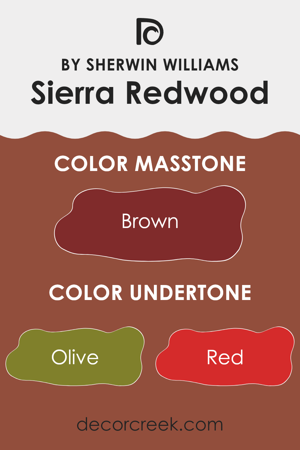
Sierra Redwood SW 7598 by Sherwin Williams is a rich, earthy hue reminiscent of the deep tones of redwood forests. Its primary visuals suggest a warm reddish-brown, but its undertones are what give it depth and complexity. This color carries subtle hints of olive and dark green, which can add a touch of nature and earthiness. The red and orange elements make the color appear warm and inviting. Meanwhile, the purple and pink notes soften it, adding a gentle undertone that can make a room feel cozy.
When applied to interior walls, these varied undertones influence how the paint looks under different lighting conditions. For instance, in a room with warm lighting, the red and orange undertones are likely to stand out more, creating a snug and welcoming atmosphere.
In cooler lighting, the gray and dark turquoise shades might come through, giving the room a more calm and balanced feel. The interplay of these undertones means the color can adapt to its surroundings, working well in both modern and traditional settings. This flexibility makes it a suitable choice for living rooms where you want a balance of warmth and elegance, as well as a touch of nature-inspired peace.
What is the Masstone of the Sierra Redwood SW 7598 by Sherwin Williams?
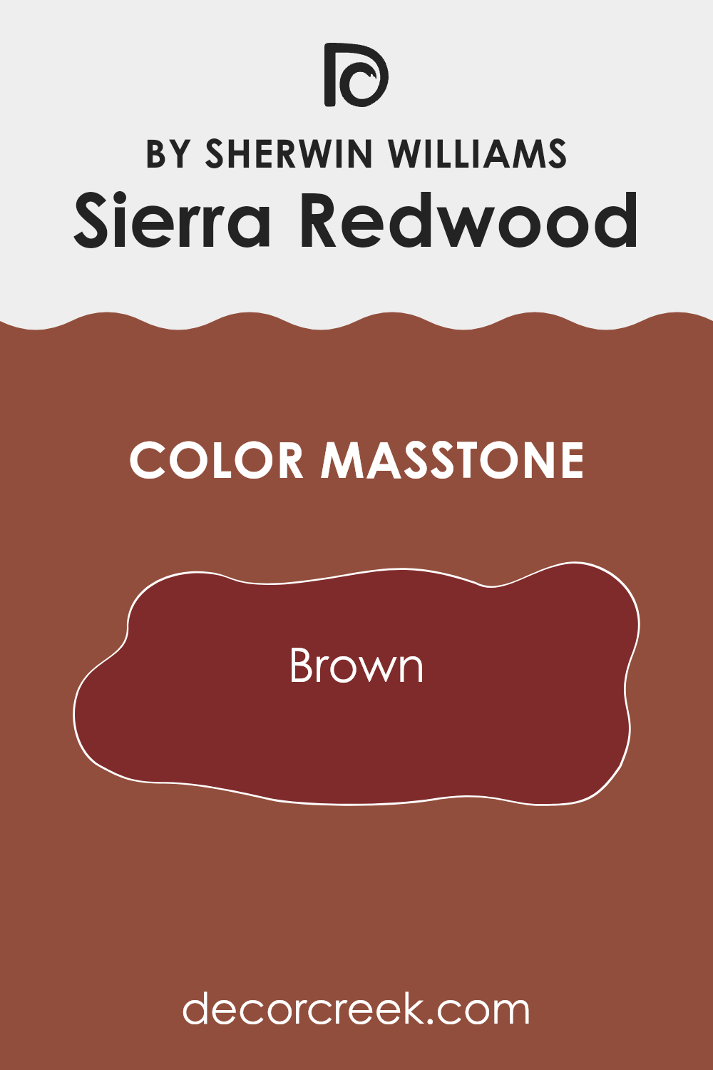
Sierra Redwood (SW 7598) by Sherwin Williams features a rich brown masstone, similar to the color code #802B2B. This warm, earthy color brings a cozy and inviting feel to areas. Its brown undertone makes it flexible and perfect for creating a grounded atmosphere in any room.
In living rooms, it can enhance warmth and comfort, making it a great choice for walls or as an accent color for furniture and decor. In dining areas, it adds a touch of elegance while maintaining an inviting vibe.
The color’s earthy quality makes it a good match for natural materials like wood and stone, blending seamlessly with these elements to create a harmonious look. It can also add depth and dimension to smaller rooms without overpowering them. Overall, the masstone makes this color an excellent choice for those looking to add warmth and richness to their home.
How Does Lighting Affect Sierra Redwood SW 7598 by Sherwin Williams?
Lighting plays a crucial role in how we perceive colors. The same paint color can look quite different depending on the type of light it is in. Sierra Redwood by Sherwin Williams is a warm, rich reddish-brown color. Its appearance changes with lighting conditions, affecting how it looks in various rooms throughout the day.
In natural light, Sierra Redwood can appear more vibrant and lively. This is because natural light has a broad spectrum of colors, which brings out the richness and depth of this hue. In contrast, under artificial lighting, which often has a more limited spectrum (like fluorescent with its cool tone or incandescent with its warmer tone), Sierra Redwood might look either cooler or warmer depending on the light bulbs used.
In rooms facing north, which generally receive cooler and less direct sunlight, Sierra Redwood might appear a bit darker and cooler, as the lack of direct sunlight means the color doesn’t “light up” as much as in other rooms. This can make it feel slightly more muted, which can be cozy or intense depending on room size and furnishings.
In south-facing rooms, the opposite is true. These rooms receive plenty of bright, warm sunlight throughout the day, making Sierra Redwood appear more vivid and warm. The ample light can bring out the paint’s natural warmth and enhance its intensity, adding brightness and energy.
East-facing rooms get morning light which is soft and can be a bit warm. Sierra Redwood in the morning can appear very lively, but as the sun moves, the color might gradually deepen. In the afternoon, these rooms may seem slightly cooler, impacting how warm the color feels.
West-facing rooms get sunlight in the late afternoon and evening. The warm, golden tones of afternoon sunlight can enhance Sierra Redwood’s warmth, making it appear especially rich and inviting during sunset hours. However, the mornings might seem less vivid as the light is indirect.
Overall, Sierra Redwood’s appearance changes with the direction the room faces and the lighting type, highlighting the importance of testing paint samples under different conditions.
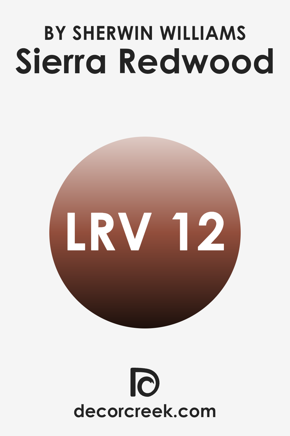
What is the LRV of Sierra Redwood SW 7598 by Sherwin Williams?
Light Reflectance Value, or LRV, measures how much light a color reflects or absorbs. The scale goes from 0 to 100, where 0 is absolute black, reflecting no light, and 100 is pure white, reflecting all light. When it comes to painting your walls, understanding LRV helps you predict how light or dark a room will feel.
A lower LRV means the color absorbs more light, making areas feel cozier or smaller, as it captures and holds onto more shadows. Conversely, a higher LRV means greater light reflection, which can make areas seem larger and brighter.
With an LRV of 11.9, the color Sierra Redwood is quite dark. Its low LRV suggests it will absorb a lot of light, creating a warm and intimate setting. In a room with limited natural light, this hue might make the room feel even more enclosed, emphasizing its depth and richness. However, in a well-lit area, it can add a striking, bold character without overpowering the room. A color with such a low LRV is perfect for accent walls or cozy areas where you desire warmth and an inviting atmosphere.
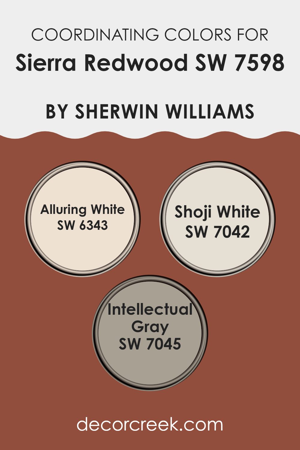
Coordinating Colors of Sierra Redwood SW 7598 by Sherwin Williams
Coordinating colors are hues that complement each other and are used together to create a pleasing aesthetic in a room. These colors work harmoniously, enhancing the overall look and feel of a room. When you use coordinating colors with a vibrant color like Sierra Redwood, they help balance the intensity and create an inviting atmosphere.
For instance, Alluring White is a soft, warm white that provides a gentle backdrop to let the bold nature of Sierra Redwood stand out while adding a touch of warmth to the surroundings. Meanwhile, Shoji White offers a subtle hint of gray, making it a flexible choice that ties together different elements in a room and enhances both light and texture.
Intellectual Gray brings an elegant depth that complements Sierra Redwood by grounding its warmth with a deeper, neutral tone. Together, these colors create an environment that feels cohesive and thoughtful, where each hue has its own role in contributing to the room’s overall appeal. By choosing these complementary shades, you can design a room that feels balanced and welcoming, allowing the boldness of a color like Sierra Redwood to shine without overpowering the senses.
You can see recommended paint colors below:
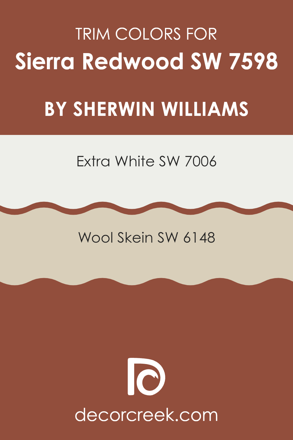
What are the Trim colors of Sierra Redwood SW 7598 by Sherwin Williams?
Trim colors refer to the shades used for the edges, moldings, and borders of a room, offering contrast or complement to the main wall color. They play a pivotal role in design as they highlight architectural details and can alter the perceived size and area of a room. When paired with Sierra Redwood by Sherwin-Williams, which is a deep, earthy red, selecting the right trim colors brings balance and cohesion to the room.
Trim colors can make the main color pop or gently blend, adding layers and depth to the overall aesthetic. The choice of trim color is essential in defining the mood and style of a room, making the design appear complete and polished.
SW 7006 – Extra White and SW 6148 – Wool Skein are excellent choices for trim colors with Sierra Redwood. SW 7006 – Extra White is a crisp, clean white that brightens and adds a fresh touch. It provides a sharp contrast to the rich red tones, making the walls stand out more vividly.
On the other hand, SW 6148 – Wool Skein is a soft, warm neutral with subtle beige undertones. It gives a gentle transition from the bold red, creating a more cohesive and calm atmosphere. These colors, when used in trim, enrich Sierra Redwood by accentuating its warmth or highlighting its rich hue, depending on the desired effect in the room.
You can see recommended paint colors below:
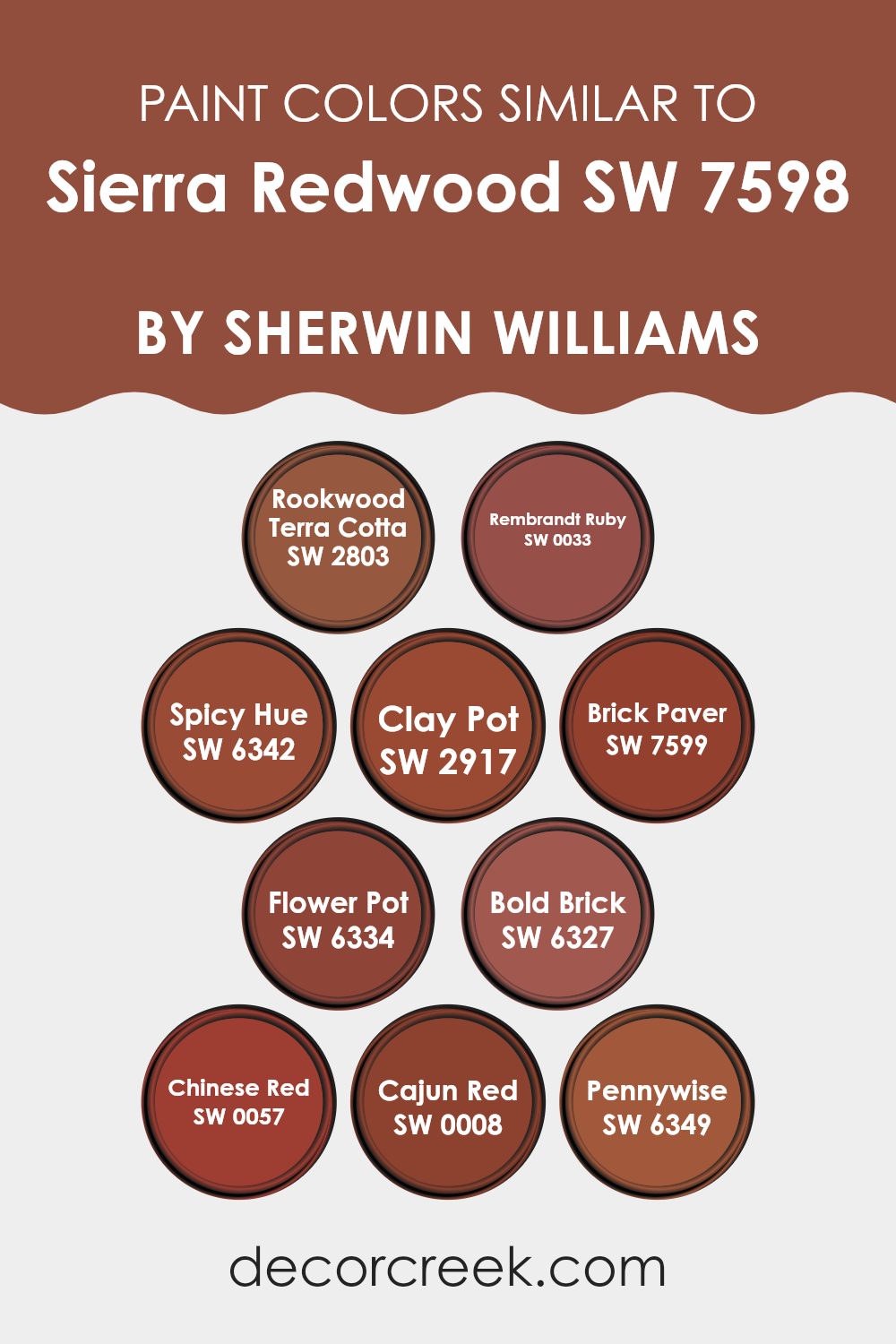
Colors Similar to Sierra Redwood SW 7598 by Sherwin Williams
Similar colors play an essential role in design by creating harmony and balance. When working with Sierra Redwood, certain shades like Rookwood Terra Cotta and Rembrandt Ruby can enhance its earthy warmth. Rookwood Terra Cotta carries a rich, clay-like tone, perfect for areas that need a grounded, rustic touch. Rembrandt Ruby, on the other hand, brings a deep red shade that can add a pop of vibrance. Both colors complement Sierra Redwood beautifully, as they share a warm base.
Spicy Hue and Clay Pot each add their own character. Spicy Hue injects energy and vigor, being a lively shade of orange-red that stands out without overpowering. Clay Pot offers a softer, more muted look, reminiscent of natural earth materials.
Meanwhile, Brick Paver brings depth with its brownish-red tone, creating a cozy atmosphere. In contrast, Flower Pot is bright and lively, reminiscent of terracotta, perfect for lively areas. Bold Brick, with its rich and intense hue, feels strong and confident, while Chinese Red offers a bold, classic red that draws attention.
Another option, Cajun Red, is a deep, warm color that projects a sense of comfort, much like Pennywise, which carries softer red undertones. These shades together create a cohesive palette that can make any room feel warm and inviting.
You can see recommended paint colors below:
- SW 2803 Rookwood Terra Cotta
- SW 0033 Rembrandt Ruby
- SW 6342 Spicy Hue
- SW 2917 Clay Pot
- SW 7599 Brick Paver
- SW 6334 Flower Pot
- SW 6327 Bold Brick
- SW 0057 Chinese Red
- SW 0008 Cajun Red
- SW 6349 Pennywise
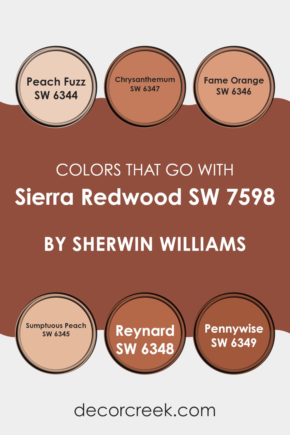
Colors that Go With Sierra Redwood SW 7598 by Sherwin Williams
When choosing colors to pair with Sierra Redwood SW 7598 by Sherwin Williams, it’s important to consider how they complement and enhance each other. Sierra Redwood is a rich, earthy red that can create a warm and inviting atmosphere. Colors like Peach Fuzz SW 6344, a light and soft peachy tone, work well because they offer a gentle contrast and keep the room feeling light.
Chrysanthemum SW 6347, a deeper orange with a hint of earthiness, complements Sierra Redwood with its natural warmth, while Fame Orange SW 6346 adds a punch of energy with its bright and lively hue. These colors together form a palette that feels grounded but also cheerful.
Sumptuous Peach SW 6345 is a wonderful choice to add a soothing touch, as it brings in just the right balance of softness. Reynard SW 6348, a deeper, more muted orange, introduces a touch of sophistication, adding depth to the overall look.
Pennywise SW 6349, with its warm, terracotta-like shade, echoes the earthy undertones of Sierra Redwood, creating a seamless blend that wraps the room in warmth. When combined, these colors work together to create a harmonious and inviting environment that feels both lively and cozy.
You can see recommended paint colors below:
- SW 6344 Peach Fuzz
- SW 6347 Chrysanthemum
- SW 6346 Fame Orange
- SW 6345 Sumptuous Peach
- SW 6348 Reynard
- SW 6349 Pennywise
How to Use Sierra Redwood SW 7598 by Sherwin Williams In Your Home?
Sierra Redwood by Sherwin Williams is a warm and inviting paint color perfect for adding richness to your home. This deep, earthy red brings a sense of coziness and comfort to any room. If you want to create a welcoming atmosphere in your living room, Sierra Redwood can be used as an accent wall, adding depth and focus without overpowering the room.
In the dining room, this color helps create an intimate and engaging setting, making it ideal for gatherings and dinners. It also works wonderfully in a study or library, providing a warm backdrop that encourages relaxation and focus.
Pair it with neutral tones like beige or cream to balance its intensity, or combine it with natural textures like wood and leather for a harmonious look. You can even use this bold color in smaller doses through accessories like throw pillows or artwork for a subtle touch of warmth and style.
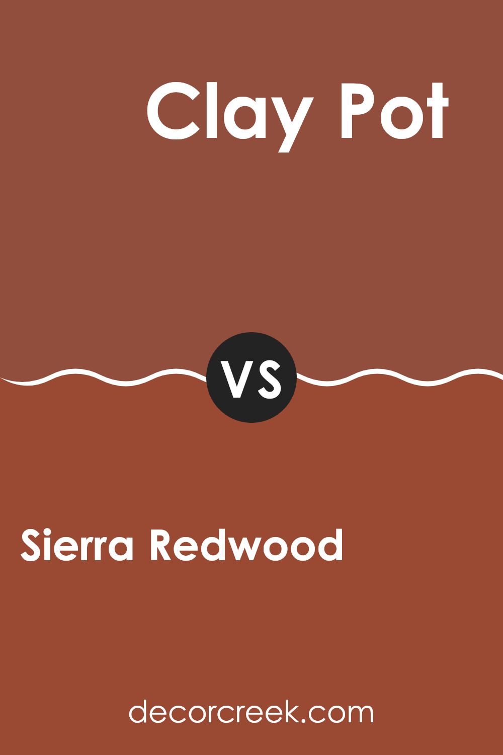
Sierra Redwood SW 7598 by Sherwin Williams vs Clay Pot SW 2917 by Sherwin Williams
Sierra Redwood SW 7598 and Clay Pot SW 2917 are two warm and earthy colors from Sherwin Williams. Sierra Redwood is a deep, rich reddish-brown color. It gives off a cozy and inviting feeling, like the bark of a tree in a forest. It’s a color that could make a room feel warm and comfortable, perfect for a living area or bedroom.
Clay Pot, on the other hand, is lighter and has more of an orange tone. It resembles the color of terracotta pottery, with its warm, sun-kissed appearance. This color feels more vibrant and lively compared to the deep tones of Sierra Redwood.
Both colors are warm and can bring a touch of nature indoors. Sierra Redwood is the choice for a more intense, grounded atmosphere, while Clay Pot offers a brighter and more cheerful vibe. They each have their own charm, depending on the look and feel you want in your room.
You can see recommended paint color below:
- SW 2917 Clay Pot
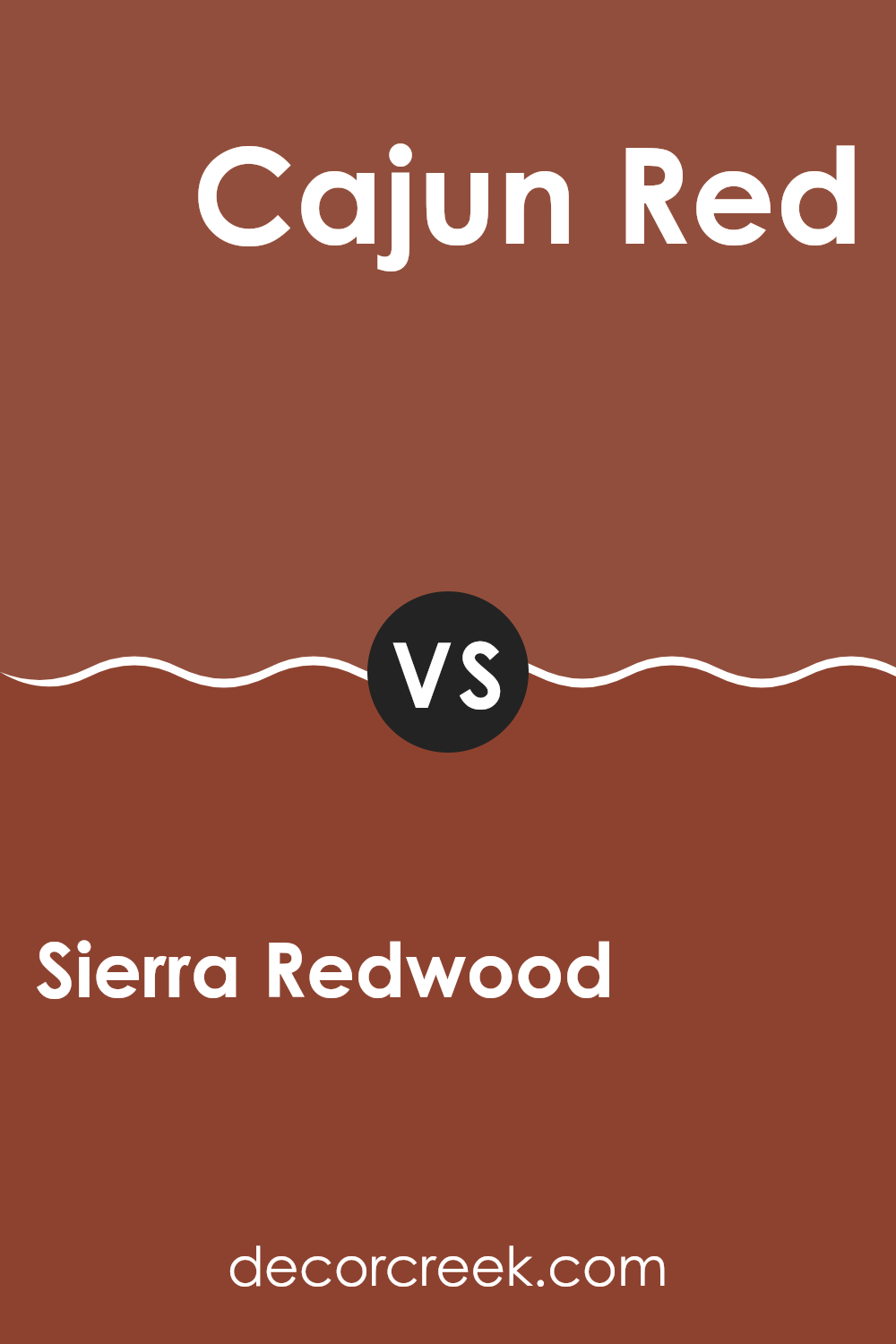
Sierra Redwood SW 7598 by Sherwin Williams vs Cajun Red SW 0008 by Sherwin Williams
Sierra Redwood and Cajun Red are both bold and warm, but they have distinct differences. Sierra Redwood is a rich, earthy tone with brown and orange undertones. It brings a sense of natural warmth and coziness, reminiscent of autumn leaves or a cozy cabin in the woods. This color works well in areas where you want to create a welcoming and comfortable atmosphere.
On the other hand, Cajun Red is a more vibrant and intense red with fiery undertones. This color is lively and full of energy, like the vibrant spices used in Cajun cooking. It makes a strong statement and is perfect for adding a pop of color to a room or creating a dynamic focal point.
While both colors are warm and inviting, Sierra Redwood leans towards a more subdued and earthy vibe, whereas Cajun Red stands out as a lively and energetic choice. Both can be used to add warmth, but their moods are quite different.
You can see recommended paint color below:
- SW 0008 Cajun Red
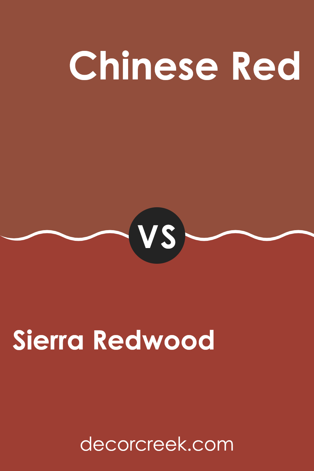
Sierra Redwood SW 7598 by Sherwin Williams vs Chinese Red SW 0057 by Sherwin Williams
Sierra Redwood and Chinese Red are two rich, warm colors by Sherwin Williams. Sierra Redwood is an earthy, brick-like red with brown undertones that creates a warm and inviting feel. It’s ideal for areas where you want a cozy but subtle atmosphere, like a living room or study.
On the other hand, Chinese Red is a brighter, more intense red with orange undertones. It brings energy and vibrancy, making it great for accent walls or areas where you want a bold statement.
While both colors share a red base, Sierra Redwood leans toward a muted, natural look, whereas Chinese Red commands attention with its vivid hue. Choosing between the two largely depends on the mood you wish to create. If you’re looking for understated warmth, go for Sierra Redwood. But if you want a lively and bold feel, Chinese Red is the way to go.
You can see recommended paint color below:
- SW 0057 Chinese Red
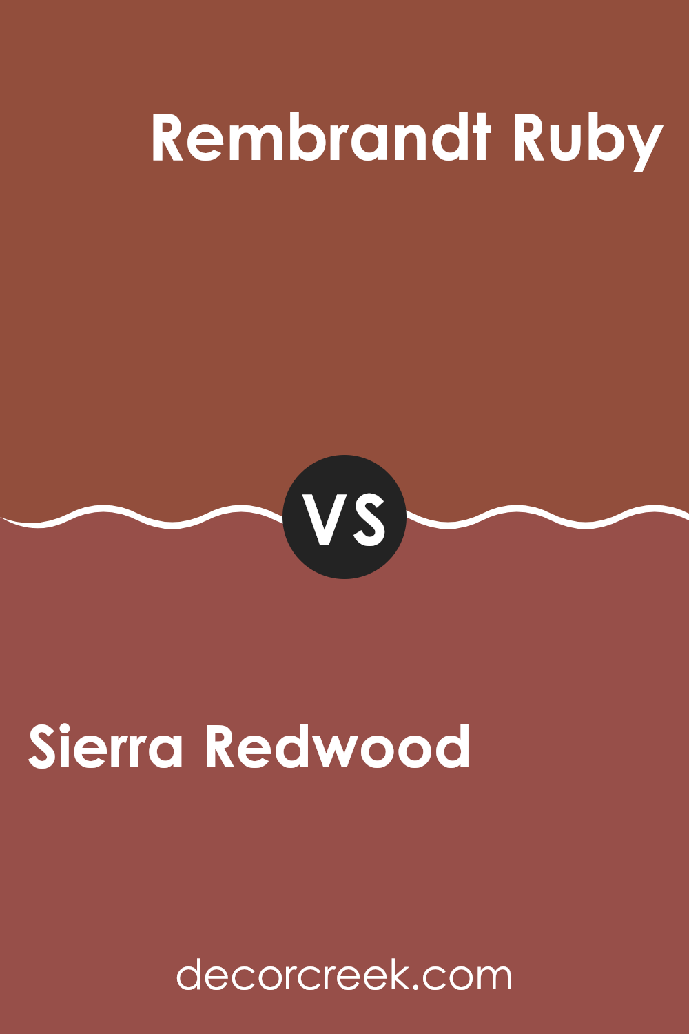
Sierra Redwood SW 7598 by Sherwin Williams vs Rembrandt Ruby SW 0033 by Sherwin Williams
Sierra Redwood and Rembrandt Ruby are two beautiful colors by Sherwin Williams. Sierra Redwood is a warm, earthy red with brown undertones. It gives off a cozy, natural feel, reminiscent of rich wood or the bark of a redwood tree. It’s a grounded color that feels welcoming and warm, making it a great choice for living areas that aim for a comfortable ambiance.
On the other hand, Rembrandt Ruby is a deeper, more intense red. It’s a bold color that has a touch of elegance and drama. This shade is perfect for creating a striking feature wall or adding a pop of color to a room. Rembrandt Ruby stands out more and can bring a sense of energy and passion to a room.
While both are reds, Sierra Redwood is more muted and earthy, while Rembrandt Ruby is vibrant and intense. Both colors can add warmth and style but in different ways.
You can see recommended paint color below:
- SW 0033 Rembrandt Ruby
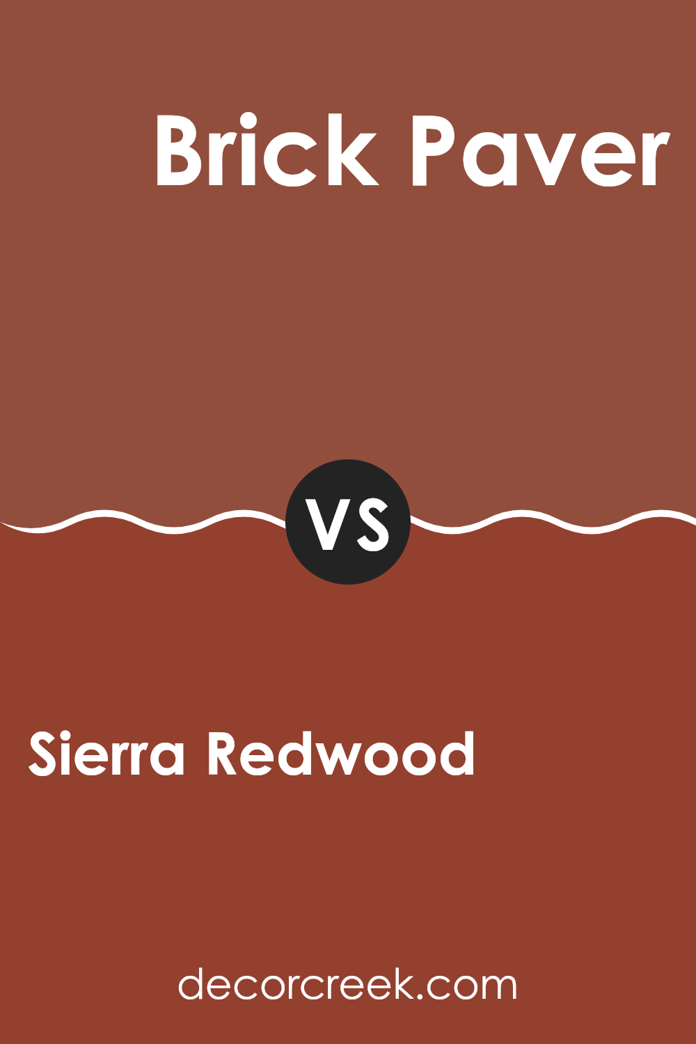
Sierra Redwood SW 7598 by Sherwin Williams vs Brick Paver SW 7599 by Sherwin Williams
Sierra Redwood (SW 7598) and Brick Paver (SW 7599) are two warm colors from Sherwin Williams that have similar earthy tones. Sierra Redwood is a rich, reddish-brown color that mimics the appearance of natural redwood trees. It has a warm, inviting feel and can add a rustic touch to any room.
Brick Paver, on the other hand, is slightly brighter and leans more towards an orange-red, resembling the color of traditional clay bricks. Both colors create a cozy and comfortable atmosphere, but they have subtle differences.
Sierra Redwood’s deeper tone gives it a more traditional look, making it ideal for areas where you want a classic and grounded feel. Brick Paver’s brighter hue can be used to make a bold statement or to add a splash of color to a room. When choosing between these shades, consider the amount of light in your room and the mood you want to achieve.
You can see recommended paint color below:
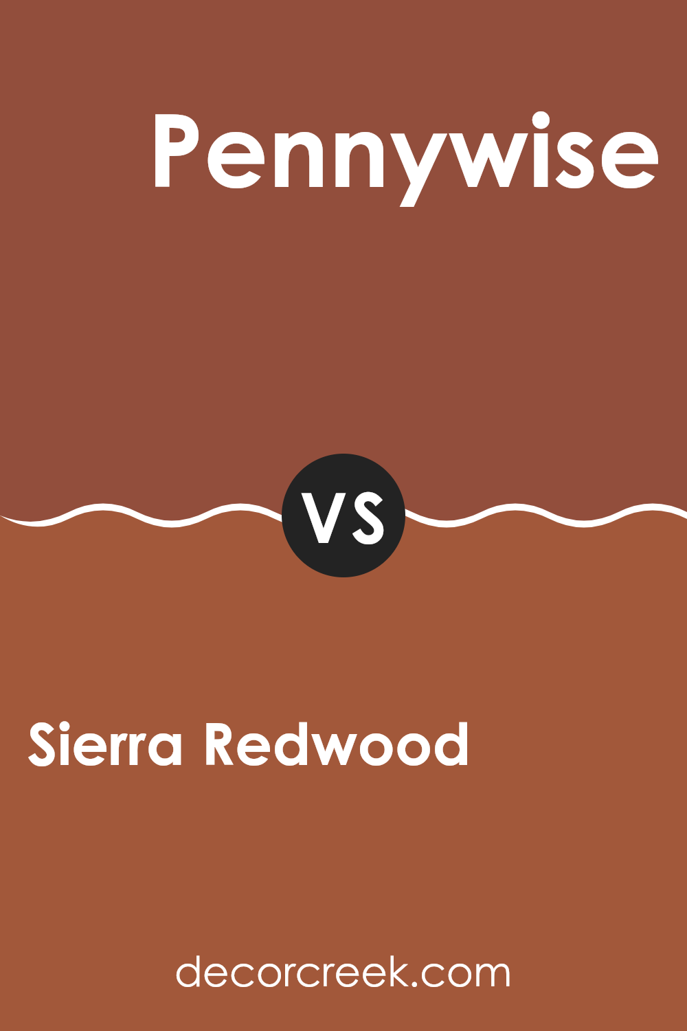
Sierra Redwood SW 7598 by Sherwin Williams vs Pennywise SW 6349 by Sherwin Williams
Sierra Redwood (SW 7598) and Pennywise (SW 6349) are two warm and inviting colors by Sherwin Williams. Sierra Redwood is a rich, earthy red that evokes the natural warmth of redwood trees. It has strong brown undertones, making it feel grounded and cozy. This shade is perfect for creating a welcoming and hearty atmosphere, easily bringing warmth to any room.
On the other hand, Pennywise is a more vibrant color, sitting between red and orange. It has an energetic and cheerful vibe, with an intensity that can enliven a room. While Sierra Redwood might work well in a living room for a comfortable setting, Pennywise could be an excellent choice for accent walls or areas where a pop of color is needed.
Both colors are rich and warm but suit different moods—Sierra Redwood is calming and earthy, whereas Pennywise is bold and lively.
You can see recommended paint color below:
- SW 6349 Pennywise
Sierra Redwood SW 7598 by Sherwin Williams vs Spicy Hue SW 6342 by Sherwin Williams
Sierra Redwood and Spicy Hue are two warm paint colors from Sherwin Williams, each offering a unique character to areas. Sierra Redwood is a rich, earthy red with brown undertones. It provides a warm, cozy feeling and works well in rooms where you want a welcoming and intimate atmosphere.
In contrast, Spicy Hue is a vibrant, lively orange-red. Its boldness can energize a room, bringing a cheerful and dynamic vibe. While Sierra Redwood leans more towards a deep, grounded shade, Spicy Hue exudes brightness and liveliness. Sierra Redwood pairs nicely with neutral tones like beige or cream, enhancing its warmth.
Spicy Hue, on the other hand, can be complemented with cooler colors like soft blues or greens to balance its intensity. Both colors add warmth and richness, but their tones and applications can offer different moods for a room, whether you want a cozy retreat or an energetic room.
You can see recommended paint color below:
Sierra Redwood SW 7598 by Sherwin Williams vs Rookwood Terra Cotta SW 2803 by Sherwin Williams
Sierra Redwood (SW 7598) and Rookwood Terra Cotta (SW 2803) are two warm and inviting colors by Sherwin Williams, but they have different vibes. Sierra Redwood is a rich, earthy red with deep undertones. It feels cozy and robust, almost like the color of aged wood or autumn leaves, making it a great choice for adding warmth.
On the other hand, Rookwood Terra Cotta brings a softer and more muted tone. It’s a warm, burnt orange with hints of rust, reminiscent of classic terracotta pots. This color has a historical charm, perfect for creating a welcoming and classic atmosphere.
While both colors offer warmth, Sierra Redwood’s intensity makes it feel more dramatic compared to Rookwood Terra Cotta’s softer, more subdued appearance. Depending on the mood you want, Sierra Redwood is bolder, while Rookwood Terra Cotta offers a gentle warmth that is easier on the eyes.
You can see recommended paint color below:
- SW 2803 Rookwood Terra Cotta
Sierra Redwood SW 7598 by Sherwin Williams vs Flower Pot SW 6334 by Sherwin Williams
Sierra Redwood SW 7598 and Flower Pot SW 6334 are two warm and inviting colors from Sherwin Williams. Sierra Redwood is a rich, earthy red-brown that brings a sense of nature and warmth into a room. It’s a flexible shade that can create a cozy atmosphere, making it ideal for living areas or accent walls.
Flower Pot, on the other hand, is a brighter, more vibrant terracotta. It adds a cheerful and lively touch to any room. While Sierra Redwood leans more toward a classic and muted palette, Flower Pot is a bit more energetic and bold, bringing in a hint of playfulness.
Both colors can complement natural materials like wooden furniture and rustic decor. However, if you prefer a softer, more grounded look, Sierra Redwood may be the better choice. For those who like a bit more flair and color pop, Flower Pot might be more appealing.
You can see recommended paint color below:
- SW 6334 Flower Pot
Sierra Redwood SW 7598 by Sherwin Williams vs Bold Brick SW 6327 by Sherwin Williams
Sierra Redwood (SW 7598) and Bold Brick (SW 6327) by Sherwin Williams are two vibrant colors that are both warm and inviting. Sierra Redwood is a rich reddish-brown, reminiscent of the earthy tones found in nature, with hints of deep red and brown mixed together. It’s ideal for adding a cozy and earthy feel to a room.
On the other hand, Bold Brick is a more vibrant red, featuring brighter and more intense tones. It has an energetic feel, with its boldness making it a great choice for areas that you want to feel lively and full of energy. While both colors are warm, Bold Brick stands out with its vividness, making it more eye-catching.
When placed side by side, Sierra Redwood offers a more subdued and subtle warmth, while Bold Brick is all about making a statement. Both can create inviting rooms but suit different moods.
You can see recommended paint color below:
- SW 6327 Bold Brick
After looking at the SW 7598 Sierra Redwood by Sherwin Williams, I realize how amazing this color can be for different rooms and projects. It’s a warm, reddish-brown shade, almost like the trees you’d see in a forest. This color can make a room feel cozy and inviting, like a warm hug. It’s not too bright, so it won’t be too much for your eyes, but it still stands out nicely.
I think Sierra Redwood is great for living rooms, bedrooms, or even an accent wall if you just want a pop of color. It works well with earthy tones, like greens and creams, helping rooms look connected with nature. It gives the feeling of being in a calm, comfortable place.
I also see how it can change the look and feel of furniture or cabinets if someone decides to paint them with this color. It makes things look fresh and new without losing that feeling of homeliness.
Overall, I appreciate the warmth and cheerfulness Sierra Redwood brings. It’s like adding a piece of nature into a house, helping everyone feel at home. This color can definitely make any house feel more welcoming and snug for family and friends.

Ever wished paint sampling was as easy as sticking a sticker? Guess what? Now it is! Discover Samplize's unique Peel & Stick samples.
Get paint samples

