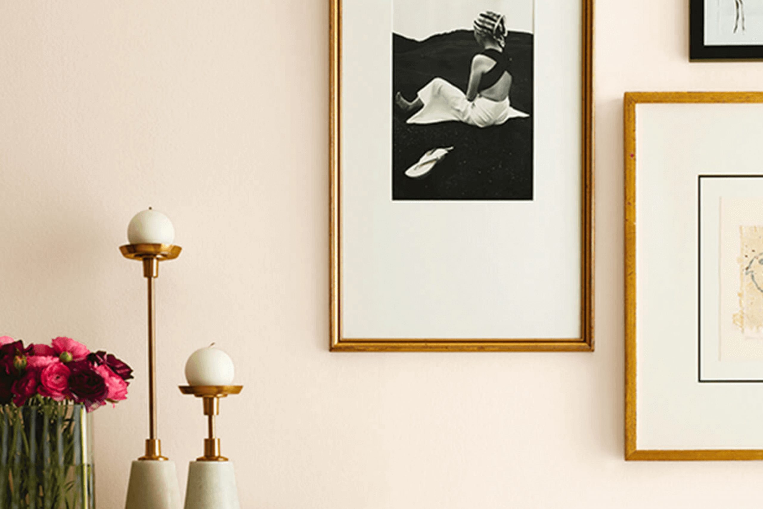
Alluring White stands out because it’s not just any typical white. It has a warm and welcoming undertone that brings a soft, cozy vibe to any room without overpowering the existing decor. In fact, it integrates seamlessly with various styles, whether your home leans towards modern minimalist or more traditional.
In using Alluring White, I noticed how it beautifully reflects natural light, making my space feel brighter and more open. It’s versatile, too, pairing wonderfully with vibrant colors or playing into a more muted palette.
If you’re looking to refresh a room or perhaps give a new life to old furniture, this shade could be your go-to choice.
It’s amazing how a simple paint job using Alluring White transforms the feel of your surroundings. From personal experience, this color indeed adds a subtle, yet significant charm to spaces it graces.
What Color Is Alluring White SW 6343 by Sherwin Williams?
Alluring White by Sherwin Williams is a gentle and inviting shade of white that brings a clean and fresh look to any room. Its subtle warmth helps it stand out from more stark, cold whites, making it a versatile choice for various interior styles. This color works exceptionally well in modern and minimalist designs, where its simplicity can help create a sleek and tidy appearance. It is also suitable for rustic themes, where its warmth complements natural elements like wood and stone.
In terms of pairing with materials and textures, Alluring White blends beautifully with natural wood, enhancing its grains and rich textures. It also pairs well with metals such as copper or brass, which add a touch of warmth that matches its cozy undertones.
Soft textiles like cotton or linen in muted colors can help maintain a calm and welcoming atmosphere in rooms painted with this shade. Additionally, this color complements glass accents, which can add a touch of brightness and reflection, amplifying the sense of space and light in the interior.
Overall, Alluring White is an excellent choice for those looking for a white that is not too stark but still maintains a clean and lively vibe. Its ability to pair with a myriad of materials and textures makes it adaptable for many home styles.
Is Alluring White SW 6343 by Sherwin Williams Warm or Cool color?
Alluring White from Sherwin Williams is a soft and warm white tone that brings a cozy and inviting feel to any room. This shade is excellent for creating a welcoming atmosphere, making it ideal for spaces like living rooms and bedrooms where comfort is key.
The warmth in this white makes it pair well with natural elements like wooden furniture and green plants, enhancing a feel of homeliness without overpowering the space. When used on walls, Alluring White makes the room seem larger and brighter, as the light color reflects light better than darker shades.
This can be especially useful in smaller or darker rooms that need a touch of brightness. Moreover, this color matches easily with a wide variety of decor styles and colors, providing a neutral backdrop that lets other colors in furnishings and fabrics stand out. It’s a versatile choice that can help create a friendly and relaxed environment in any home.
Undertones of Alluring White SW 6343 by Sherwin Williams
Alluring White by Sherwin Williams is a versatile paint color that appears simple at first but has complex undertones that can subtly influence the atmosphere of a room. Understanding undertones is key to choosing the right paint color because they can affect how colors look under different lighting conditions and when paired with different décor elements.
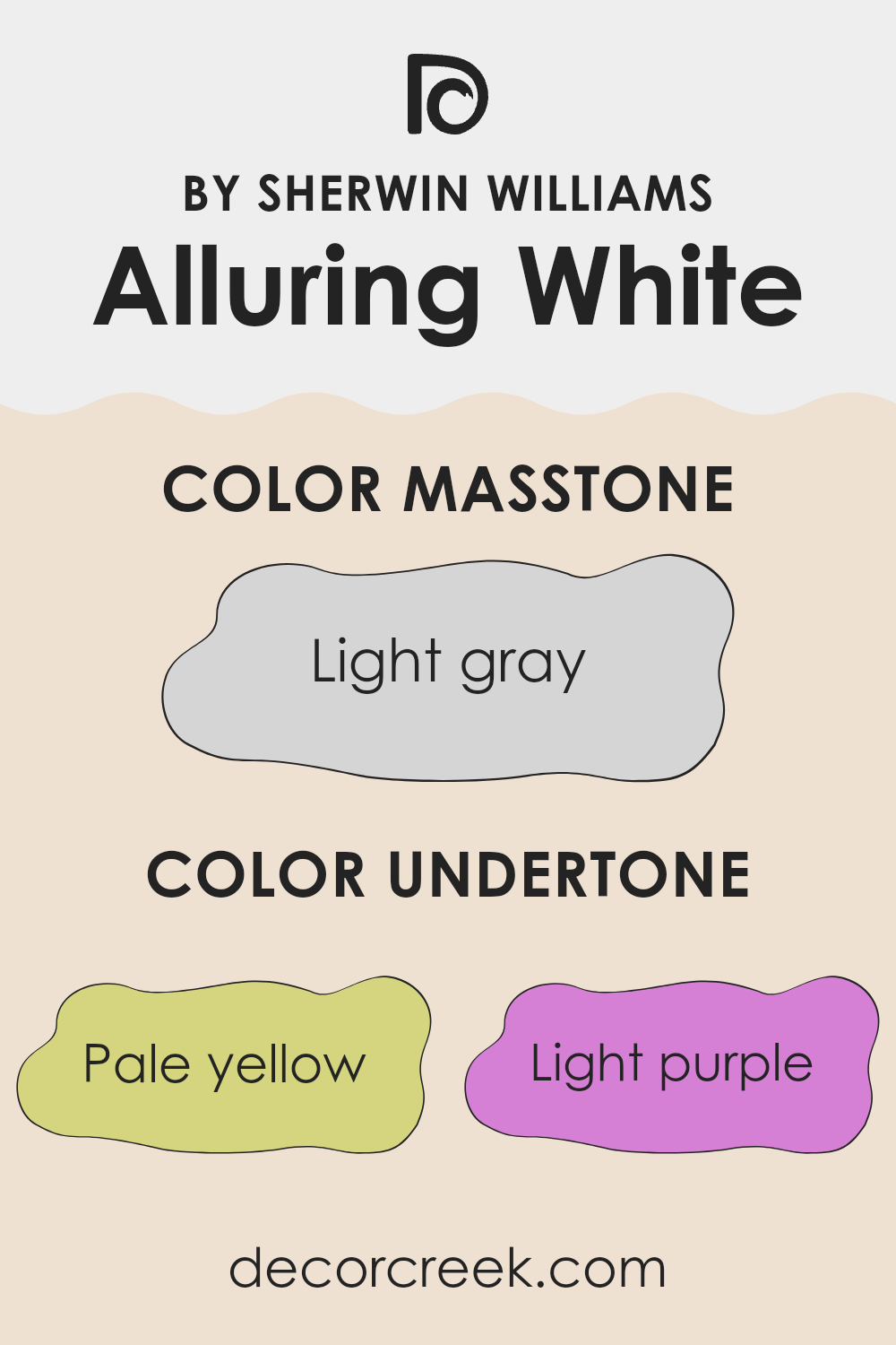
The undertones of this particular shade include pale yellow, light purple, light blue, pale pink, mint, lilac, and grey. Each of these undertones contributes to the overall look of the paint in unique ways. For instance, pale yellow can make a space feel warmer and more welcoming, while light blue can add a touch of cool freshness.
Pale pink brings in a soft, gentle feel, and lilac can give a subtle hint of playfulness.
Grey, being neutral, helps balance out the brighter undertones, ensuring that the color maintains a certain lightness and doesn’t lean too strongly towards any particular hue. This makes Alluring White a great option for interior walls as it can adapt to various lighting conditions and compliment different styles of furniture and accessories.
When used on interior walls, the blend of these undertones means that Alluring White will interact dynamically with both natural and artificial light, shifting subtly throughout the day. This can create a lively environment that feels responsive and engaging. Whether you’re looking to create a calm space or an energizing area, the varied undertones make this color a flexible choice.
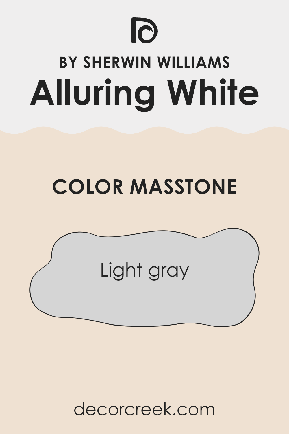
What is the Masstone of the Alluring White SW 6343 by Sherwin Williams?
Alluring White SW 6343 by Sherwin Williams has a masstone of light gray (#D5D5D5), which makes it a versatile paint choice for homes. This shade of light gray blends well in various settings and lighting conditions, making it a practical option for most rooms.
Its neutrality means it can support a wide range of decor styles and colors without clashing. When applied to walls, it provides a clean and subtle backdrop, allowing furniture and art to stand out. It’s also forgiving when it comes to marks and smudges, making it a good choice for high-traffic areas like living rooms and hallways.
This color can make small spaces appear larger by reflecting light, giving rooms an airy feel. Overall, its light gray tone offers a fresh and gentle atmosphere, making any home space feel more open and pleasant.
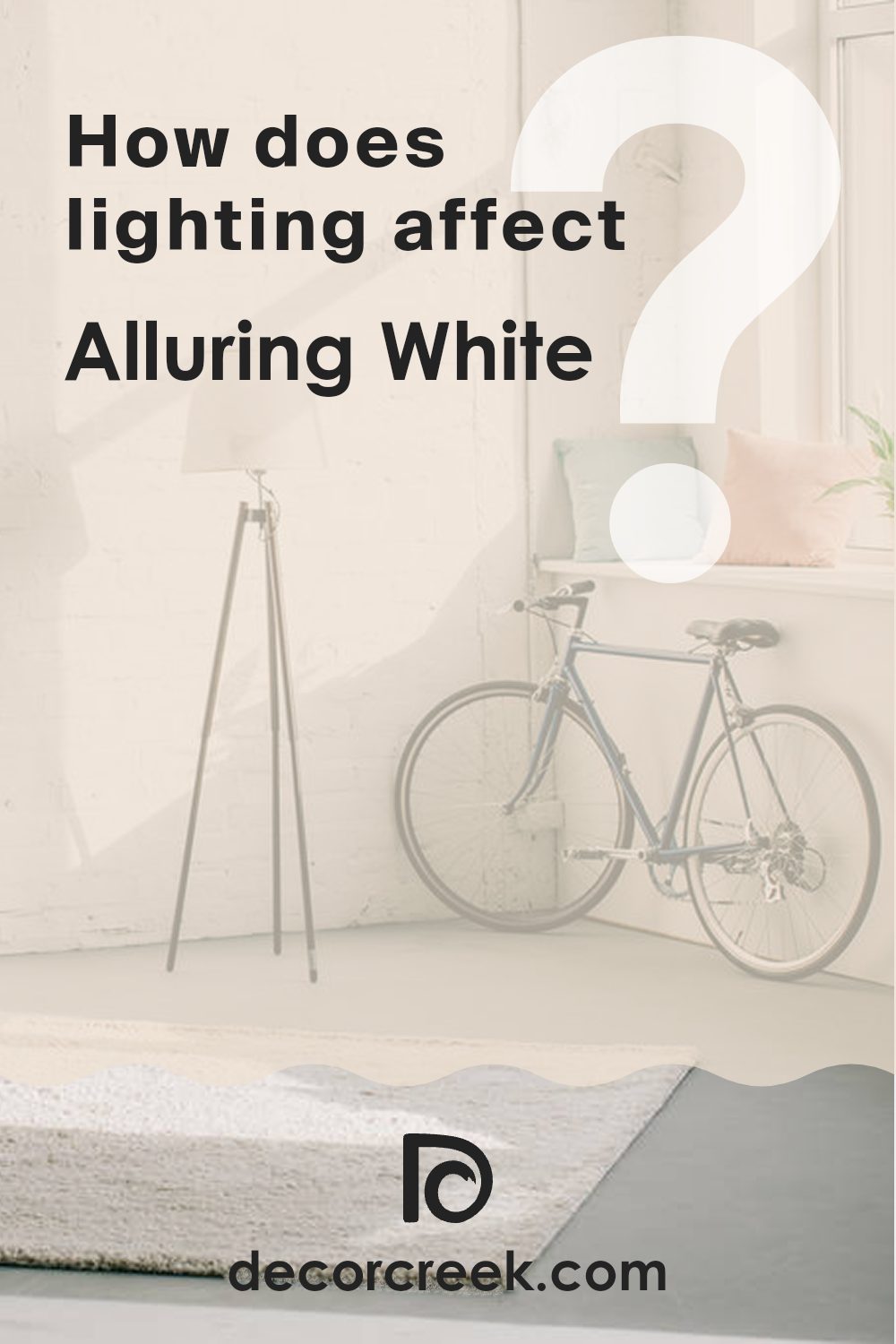
How Does Lighting Affect Alluring White SW 6343 by Sherwin Williams?
Lighting plays a critical role in how we perceive colors. The type of light can dramatically change how a color looks on your walls. Alluring White by Sherwin Williams, for example, can appear differently under various lighting conditions.
Artificial Light: In rooms lit with artificial lights like incandescent bulbs, Alluring White tends to look warmer, bringing out beige or soft yellow undertones. LED or fluorescent lighting, on the other hand, might make it appear crisper and cooler, leaning more toward a pure white.
Natural Light: Natural lighting brings out the truest form of the color. Alluring White looks bright and fresh under natural sunlight, making it appear very light and airy. The quality of natural light, however, changes based on the direction of the room and time of day.
– North-Faced Rooms: Rooms that face north often receive less direct sunlight, which can make colors appear slightly cooler and shadowier. In north-facing rooms, Alluring White will likely look more muted and could take on a subtle gray tone.
– South-Faced Rooms: These rooms enjoy abundant sunlight most of the day, which can make the paint look brighter and truer to its original shade. Alluring White will shine in its purest form with a vivid, clean appearance.
– East-Faced Rooms: East-facing rooms get plenty of light in the morning, making Alluring White look soft and warm early in the day. As the light fades, the color can appear cooler and more subdued.
– West-Faced Rooms: Light in these rooms peaks in the afternoon to evening, warming up colors later in the day. Alluring White will transform throughout the day, starting cooler in the morning and turning warmly vibrant by sunset.
Remember, to get a feel for how Alluring White or any other color will look in your specific space, it’s a good idea to test the paint in different areas and observe how it responds to the varying light throughout the day. This approach ensures that you are satisfied with the appearance of your chosen color under different lighting conditions.
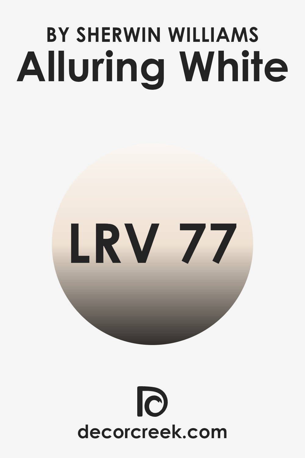
What is the LRV of Alluring White SW 6343 by Sherwin Williams?
LRV stands for Light Reflectance Value, a measure used to determine how much light a paint color reflects or absorbs. This value is expressed on a scale from 0 to 100, where 0 represents pure black, absorbing all light, and 100 represents pure white, reflecting all light back.
This is crucial in choosing paint colors because it helps predict how light or dark a color will look once applied to your walls. A higher LRV means the color will appear lighter and can make a room feel more open and bright, while a lower LRV means the color will look darker, which can bring a cozier and more enclosed feel to a space.
Considering the LRV of 76.859 for the color in question, it is on the higher side of the scale, meaning it is a light color that will reflect a good amount of light. This makes it an excellent choice for rooms that you want to appear brighter and more spacious. In spaces with less natural light, using a color with a high LRV like this can help make the room seem lighter and more welcoming.
This specific LRV indicates that the shade is likely to maintain its light and airy appearance in most lighting conditions, helping to enhance the overall feel of the room without making it seem stark or overly bright.
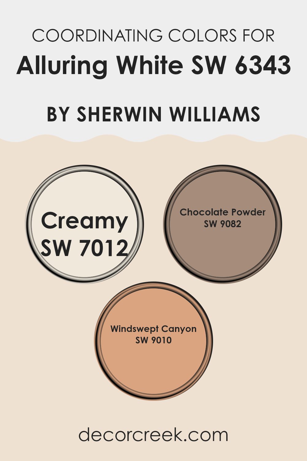
Coordinating Colors of Alluring White SW 6343 by Sherwin Williams
Coordinating colors are shades that complement each other well, creating a harmonious look when used together in interior design. These colors often share similar tones or contrast effectively to bring balance and coherence to a space. When considering Alluring White by Sherwin Williams, an ideal set of coordinating colors includes Creamy, Chocolate Powder, and Windswept Canyon, each offering unique elements that beautifully align with the clean and airy feel of Alluring White.
Creamy is a soft, warm white that brings a gentle brightness to interiors, making it a perfect pairing for Alluring White as it maintains a light, airy atmosphere without stark contrasts. Chocolate Powder offers a rich, deep brown tone that adds depth and warmth to spaces, providing a striking but balanced contrast to lighter tones.
Windswept Canyon, with its muted earthy hue, creates a natural, comforting feel and works wonderfully to complement the subtle nuances of Alluring White, giving the space a cohesive look that feels both inviting and well put together. These colors together help create a visually appealing environment that feels cohesive and inviting.
You can see recommended paint colors below:
- SW 7012 Creamy
- SW 9082 Chocolate Powder
- SW 9010 Windswept Canyon
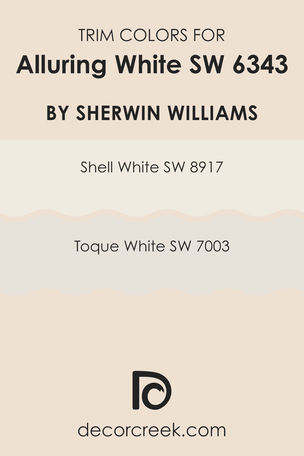
What are the Trim colors of Alluring White SW 6343 by Sherwin Williams?
Trim colors are specific shades used to accentuate and define the edges, corners, doorways, and moldings in a room. By using colors like SW 8917 – Shell White and SW 7003 – Toque White from Sherwin Williams as trim colors, you can enhance the main wall color, Alluring White, by providing a subtle contrast that defines spaces clearly and helps features stand out.
Trim colors are important because they provide a visual framework for the room, highlighting the architectural details and ensuring that each element pops in relation to the overall design.
Shell White (SW 8917) is a soft, muted white that has a warm undertone, making it a gentle complement to the brighter, more neutral Alluring White. It adds a touch of warmth to the trim, which can make a space feel more welcoming. Toque White (SW 7003), on the other hand, is a bit cooler than Shell White but still very subtle.
This shade offers a slightly more pronounced contrast to Alluring White, which can help in sharpening the lines and making the architecture of a space more pronounced. Both choices are excellent for bringing out the best in Alluring White without overwhelming it.
You can see recommended paint colors below:
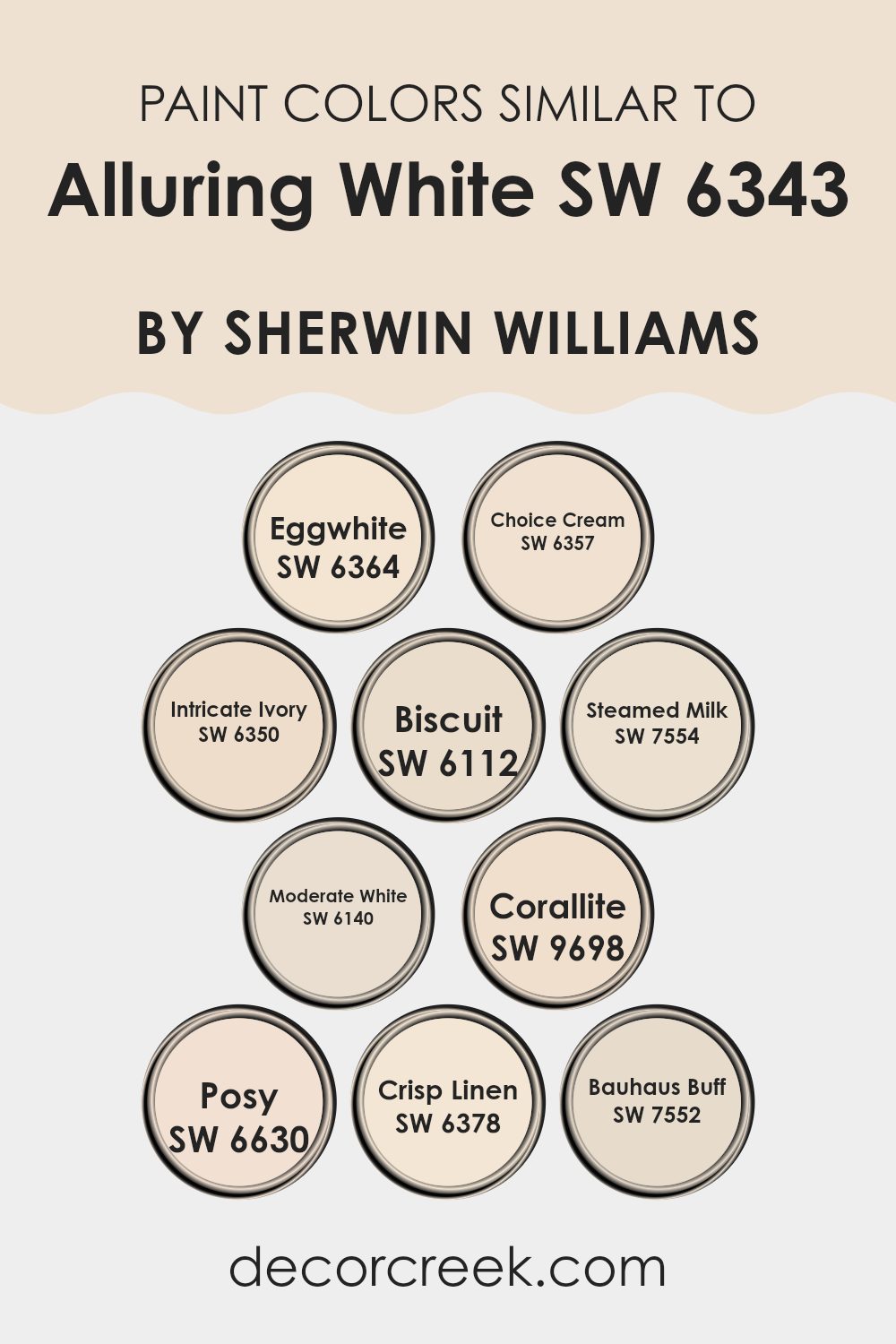
Colors Similar to Alluring White SW 6343 by Sherwin Williams
Choosing similar colors can be very important for creating a cohesive and pleasing aesthetic in any space. Colors that are similar naturally work together to create a harmonious look, and this is particularly true with shades related to Alluring White by Sherwin Williams. Similar hues like Eggwhite, Choice Cream, Intricate Ivory, and others offer slight variations that can add depth and interest without overwhelming the senses.
These subtle differences allow each color to stand out on its own while still contributing to a unified design theme. Such colors are ideal for anyone looking to achieve a clean, unified look in their decorating scheme.
For example, Eggwhite is a soft, warm white with a hint of yellow, adding a cozy feel to any room. Choice Cream is another warm hue but with a richer, creamier base that exudes a welcoming vibe. Intricate Ivory offers a touch of elegance with its slightly deeper tone than traditional ivory. Moving on, Biscuit is a muted beige that works well as a neutral backdrop.
Steamed Milk, a calming neutral shade, provides a slightly toasted look. Moderate White strikes a balance with its hint of grey, making it perfect for modern spaces. Corallite introduces a very faint pinkish tone, offering a unique twist. Posy is a gentle pink with enough neutrality to remain subtle.
Crisp Linen has a clean, fresh appearance that mimics the look of freshly laundered linens, and Bauhaus Buff rounds out the selection with its subtle yellow undertones, providing a hint of warmth. Each of these colors shares a commonality yet maintains individual characteristics, making them versatile for blending or standing alone depending on the design intent.
You can see recommended paint colors below:
- SW 6364 Eggwhite
- SW 6357 Choice Cream
- SW 6350 Intricate Ivory
- SW 6112 Biscuit
- SW 7554 Steamed Milk
- SW 6140 Moderate White
- SW 9698 Corallite
- SW 6630 Posy
- SW 6378 Crisp Linen
- SW 7552 Bauhaus Buff
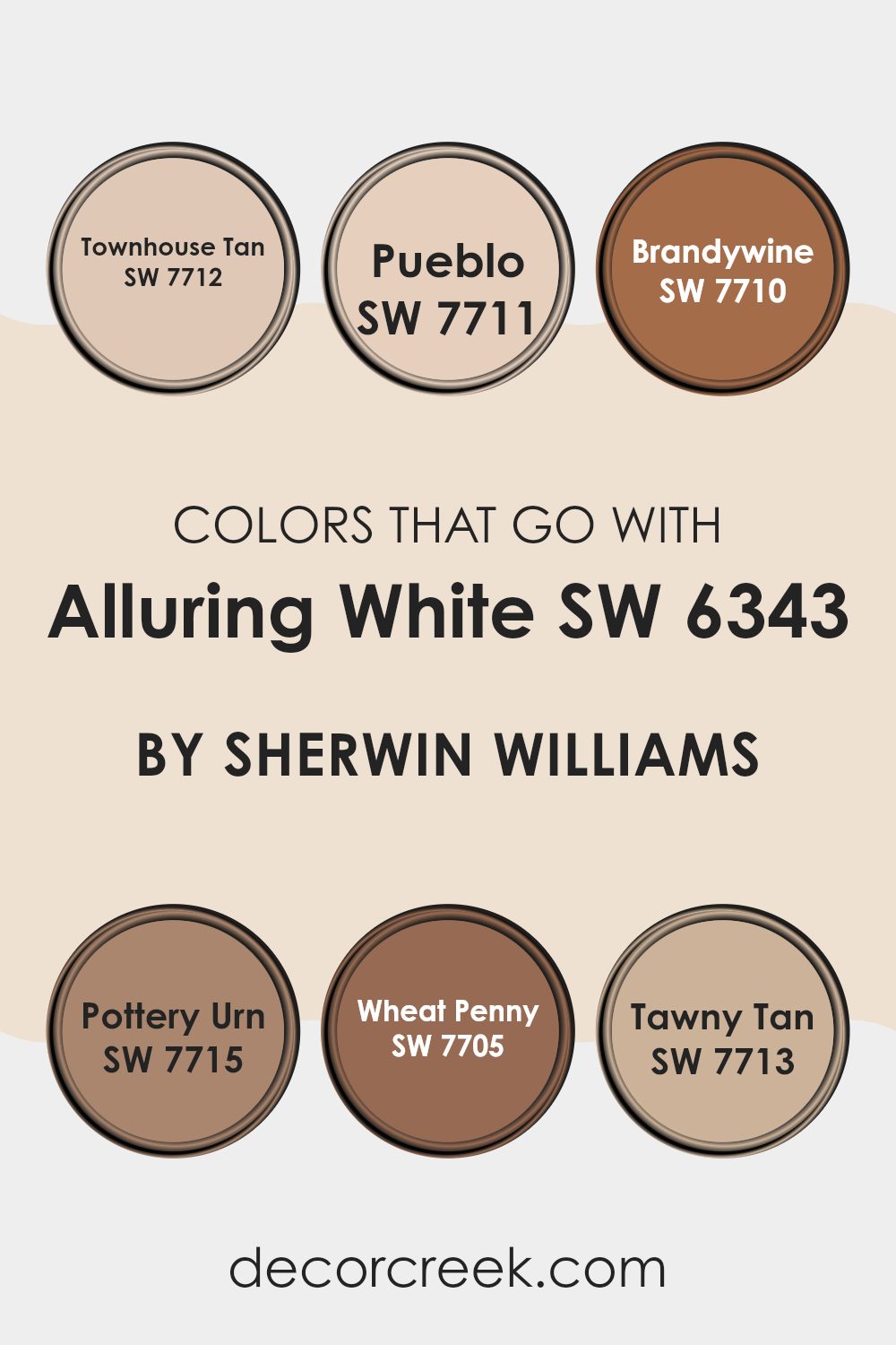
Colors that Go With Alluring White SW 6343 by Sherwin Williams
Choosing the right colors to complement Alluring White (SW 6343) by Sherwin Williams is vital because colors can significantly impact the overall feel and aesthetic of a space. When paired thoughtfully, these auxiliary colors enhance the environment, bringing out the best features of Alluring White. The color becomes a canvas, allowing the accompanying shades to stand out and define the character of the room.
For instance, Townhouse Tan (SW 7712) is a warm, inviting beige that creates a cozy atmosphere when used alongside Alluring White. It offers a subtle richness that doesn’t overpower the softer base. Pueblo (SW 7711) is another warm tone, but with a duskier feel that adds depth and interest.
Brandywine (SW 7710), with its deeper red hue, introduces a pop of vibrant color that draws the eye and enriches the environment. Moving to a darker shade, Pottery Urn (SW 7715) carries a heavier, brown tone that makes spaces feel grounded and balanced.
Wheat Penny (SW 7705) has a charming, rust-like color that wonderfully warms up a room, perfect for creating inviting spaces. Lastly, Tawny Tan (SW 7713) is a muted brown with a hint of softness that makes it versatile for combining with both light and dark hues. Each of these colors adds their own unique touch to Alluring White, ensuring the space feels complete and beautifully harmonized.
You can see recommended paint colors below:
- SW 7712 Townhouse Tan
- SW 7711 Pueblo
- SW 7710 Brandywine
- SW 7715 Pottery Urn
- SW 7705 Wheat Penny
- SW 7713 Tawny Tan
How to Use Alluring White SW 6343 by Sherwin Williams In Your Home?
Alluring White by Sherwin Williams is a charming and versatile paint shade that can make any room in your house feel welcoming and bright. This color, a soft white with gentle hints of cream, serves as a perfect backdrop for various decor styles, from modern minimalism to cozy rustic. It’s especially good for smaller spaces or rooms with limited natural light, as it reflects light well, helping spaces appear larger and more open.
You can use Alluring White in practically any room. In the living room, it pairs beautifully with both vibrant colors and subdued tones, allowing your furniture and artwork to stand out.
It’s also an excellent choice for bedrooms, creating a calm, restful environment that’s perfect for relaxing at the end of the day. In bathrooms and kitchens, this color works well too, offering a clean and fresh look that’s easy to maintain. Simply put, Alluring White is a flexible paint color that can make your home look lovely without much effort.
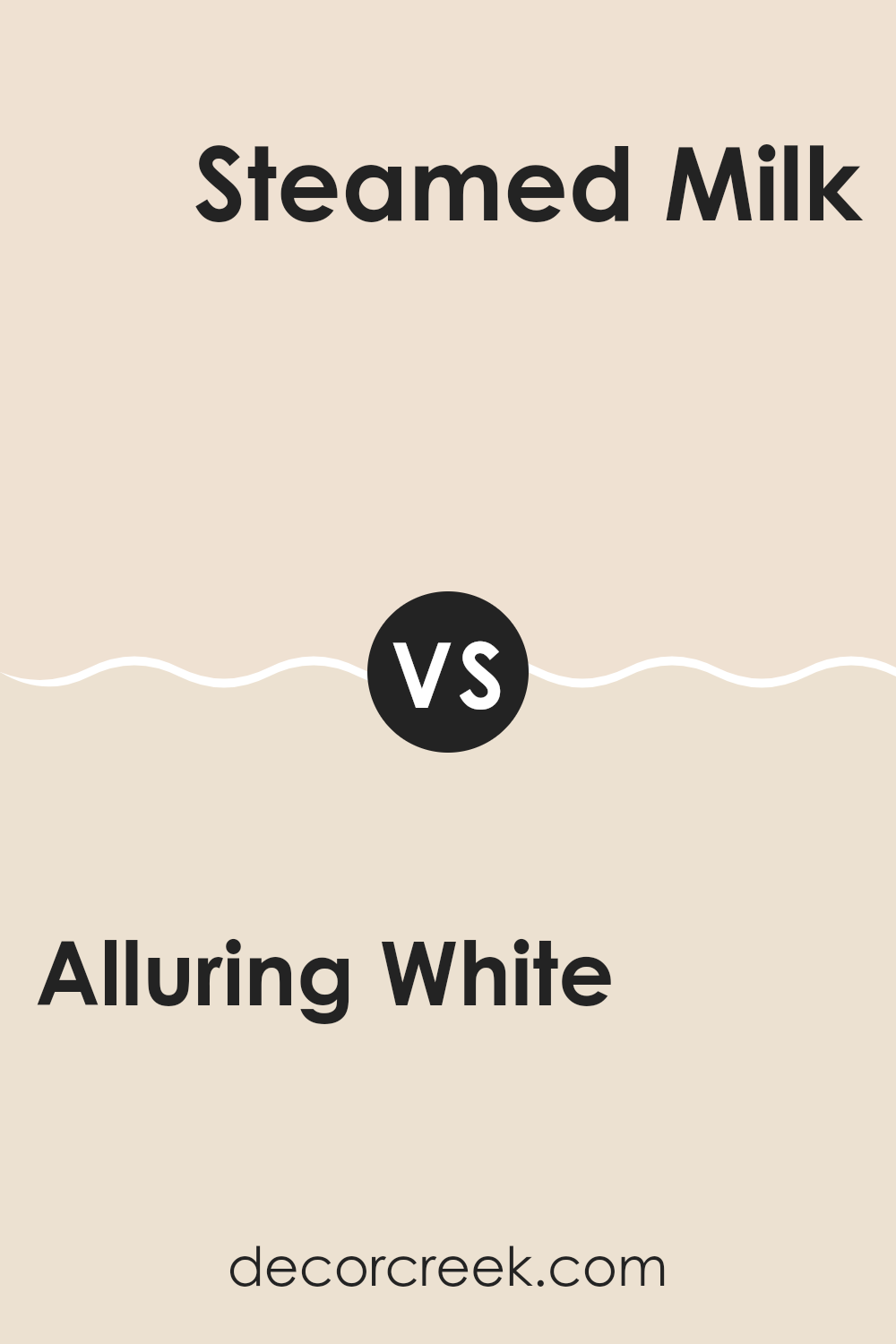
Alluring White SW 6343 by Sherwin Williams vs Steamed Milk SW 7554 by Sherwin Williams
Alluring White and Steamed Milk, both by Sherwin Williams, present gentle and warm tones that can give rooms a cozy and welcoming feel. Alluring White leans more towards a clean and bright white compared to Steamed Milk. It has a slight undertone that can make spaces feel fresh without being too stark.
On the other hand, Steamed Milk has a creamier base, adding softness and warmth to the walls it graces. This color is perfect for those who prefer a hint of warmth to avoid the clinical feel that some pure whites can have. Both colors work well in various lighting conditions, enhancing natural light in a room or softening the effect of artificial lighting.
While Alluring White is ideal for creating a vibrant, light-enhanced space, Steamed Milk offers a more muted ambiance perfect for relaxed settings. These paints are versatile and can effectively complement other colors and interior styles.
You can see recommended paint color below:
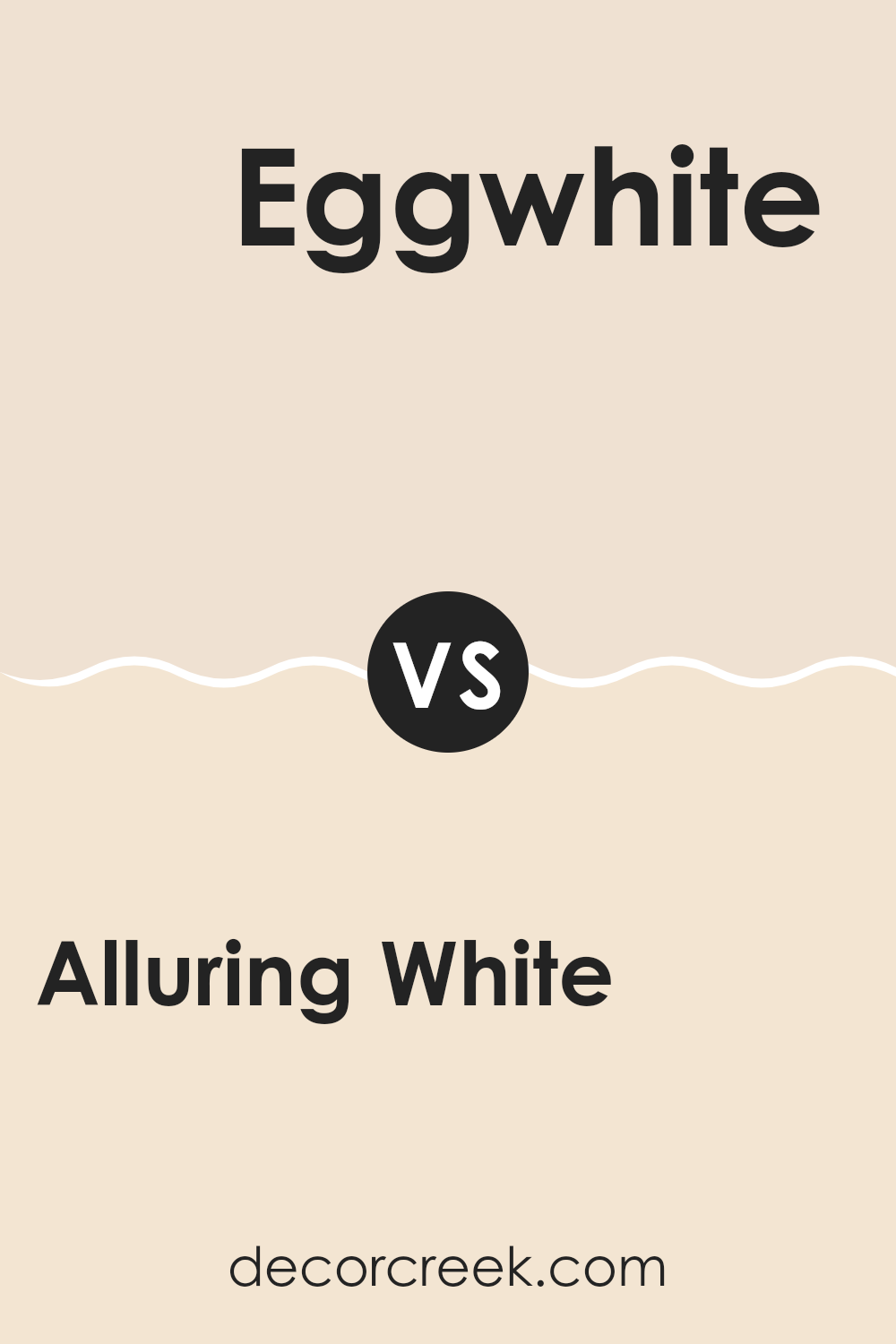
Alluring White SW 6343 by Sherwin Williams vs Eggwhite SW 6364 by Sherwin Williams
Alluring White and Eggwhite, both by Sherwin Williams, are two subtly different shades that can impact the feel of a room. Alluring White has a crisp, clean quality with a hint of warmth, making it perfect for creating a bright and inviting space. It’s particularly effective in areas that need a fresh, open look.
On the other hand, Eggwhite leans slightly more towards a creamy, soft tone. This color can add a cozy, gentle ambiance to any room, lending itself well to spaces where comfort and softness are desired. Eggwhite is excellent for living areas or bedrooms where a less stark white is preferable.
When deciding between the two, consider the amount of natural light your room gets and the mood you want to set. Alluring White can refresh a darker space, while Eggwhite is ideal for a softer, warmer atmosphere.
You can see recommended paint color below:
Alluring White SW 6343 by Sherwin Williams vs Moderate White SW 6140 by Sherwin Williams
Alluring White SW 6343 and Moderate White SW 6140, both by Sherwin Williams, offer subtle differences in their shades that can impact the feel of a room. Alluring White tends to have a brighter, crisper look that brings a clean and fresh vibe to spaces. It’s ideal for enhancing natural light in a room and works well in various settings, effectively reflecting light and making small spaces appear larger.
On the other hand, Moderate White is a bit warmer and cozier compared to Alluring White. With subtle undertones that lean towards a beige or taupe, Moderate White offers a more muted and soft appearance, making it perfect for creating a cozy and welcoming atmosphere. It pairs beautifully with a wide range of colors, adding a gentle warmth to any space without overwhelming it with color.
Choosing between these two depends on the desired feel—bright and airy with Alluring White, or warm and inviting with Moderate White.
You can see recommended paint color below:
Alluring White SW 6343 by Sherwin Williams vs Posy SW 6630 by Sherwin Williams
Alluring White by Sherwin Williams is a gentle and warm white with a subtle hint of creaminess, making it an excellent choice for creating a cozy and welcoming atmosphere in any room. Its soft nature allows it to blend seamlessly with various decor styles and complements different color schemes effectively.
On the other hand, Posy by Sherwin Williams is a vibrant and cheerful pink that adds a playful touch to spaces. This color is bolder and more expressive, perfect for areas where you want to inject energy and a sense of fun. It stands out more than Alluring White and can be used as an accent color to add a pop of brightness to a room.
While Alluring White is more neutral and versatile, suitable for larger areas or as a backdrop, Posy brings a dynamic feel and works well in smaller doses or in specific areas that benefit from a lively hue. Together, these colors could work well if you’re looking to balance neutrals with striking accents.
You can see recommended paint color below:
- SW 6630 Posy
Alluring White SW 6343 by Sherwin Williams vs Biscuit SW 6112 by Sherwin Williams
Alluring White by Sherwin Williams is a bright and clean shade, perfect for spaces that need a fresh and open feel. Its purity makes it ideal for creating a lively and inviting atmosphere. Because it reflects light well, it can make smaller rooms appear more spacious and welcoming.
In contrast, Biscuit by Sherwin Williams is a warmer, more neutral color. It has a soft, creamy tone that offers a cozy and comfortable vibe, making it great for living areas or bedrooms where a calming influence is desired. The warm undertones of Biscuit provide a gentle backdrop that works well with a variety of decor styles, from rustic to modern.
While Alluring White brings a more vivid brightness to a room, Biscuit lends a subtle warmth, each creating distinct moods and aesthetics depending on what you want to achieve in your space.
You can see recommended paint color below:
Alluring White SW 6343 by Sherwin Williams vs Bauhaus Buff SW 7552 by Sherwin Williams
Alluring White and Bauhaus Buff, both from Sherwin Williams, offer distinct vibes for different decorating needs. Alluring White is a vibrant, true white, providing a crisp and clean look that really opens up a space. It’s perfect for creating a fresh, bright backdrop that makes other colors pop.
On the other hand, Bauhaus Buff is a warmer, subtle beige. It brings a cozy and soft atmosphere to any room, making it ideal for areas where comfort is key, like living rooms or bedrooms. This color tends to add a gentle, welcoming tone to spaces, pairing well with a wide range of decor styles.
While Alluring White reflects more light, making rooms feel larger, Bauhaus Buff offers a more muted elegance that can help hide imperfections in walls. The choice between them depends on what mood or style you’re aiming for in your space.
You can see recommended paint color below:
Alluring White SW 6343 by Sherwin Williams vs Crisp Linen SW 6378 by Sherwin Williams
Alluring White and Crisp Linen are both light, refreshing shades, but each offers a different kind of vibe. Alluring White is a soft, warm white. It has a cozy, inviting feel, making it perfect for spaces where you want to relax, like living rooms and bedrooms.
It carries a hint of creaminess that adds a gentle warmth to walls, without overpowering the room. On the other hand, Crisp Linen leans closer to a pure white. It’s cleaner and brighter, giving spaces a fresh, airy feel.
This makes it ideal for kitchens and bathrooms where you want a clean and open look. Both colors work well in various lighting conditions and can help make small rooms appear larger. However, the choice between them depends on the kind of mood or atmosphere you want to create in your space.
You can see recommended paint color below:
- SW 6378 Crisp Linen
Alluring White SW 6343 by Sherwin Williams vs Intricate Ivory SW 6350 by Sherwin Williams
Alluring White and Intricate Ivory, both from Sherwin Williams, present subtle differences in their tones that can impact the feel of a space. Alluring White is a clean and bright shade that brings a fresh and airy feel to any room.
It reflects light beautifully, making spaces appear larger and more open. On the other hand, Intricate Ivory offers a warmer tone, with a hint of beige that adds a cozy, welcoming vibe to environments.
This color is great for those looking to create a soft, inviting atmosphere without going too dark. When choosing between the two, consider the amount of natural light your room receives and the kind of ambiance you want to achieve. Alluring White is better for achieving a sharp, modern look, while Intricate Ivory is ideal for a more muted, homey feel.
You can see recommended paint color below:
Alluring White SW 6343 by Sherwin Williams vs Choice Cream SW 6357 by Sherwin Williams
Alluring White and Choice Cream, both colors by Sherwin Williams, offer subtle but distinct atmospheres for any room. Alluring White is a soft, pure white that’s incredibly flexible. It’s great for creating a clean and bright feel, making spaces appear larger and more open. This shade is ideal for anyone looking to add freshness to their surroundings without overwhelming them with color.
On the other hand, Choice Cream has a warmer tone, leaning slightly towards yellow. This warmth offers a cozy, inviting feeling, making it perfect for living areas or bedrooms where you want a gentle, soothing vibe. Unlike the cooler brightness of the previous color, Choice Cream adds a hint of color that can make a space feel more intimate and comforting.
Overall, while both are light, Alluring White leans towards crisp and pure, whereas Choice Cream introduces warmth and coziness, making them suitable for different tastes and spaces.
You can see recommended paint color below:
Alluring White SW 6343 by Sherwin Williams vs Corallite SW 9698 by Sherwin Williams
Alluring White and Corallite by Sherwin Williams are quite distinct in their color profiles, catering to different tastes and interior themes. Alluring White is a soft and gentle white with a hint of warmth, making it a versatile backdrop for almost any space. It’s particularly effective in creating a clean and inviting atmosphere, allowing other elements of the decor to stand out.
On the other hand, Corallite is a vibrant coral shade that brings a cheerful and energizing vibe to a room. This color is perfect for those looking to inject some personality into their space with a lively pop of color. While Alluring White is subtle and tends to blend seamlessly with surroundings, Corallite demands attention and can dominate a space if not balanced correctly.
Both colors offer unique possibilities and can dramatically alter the mood and style of a room depending on how they are used. Choosing between them depends on the desired effect and the existing elements in the space.
You can see recommended paint color below:
- SW 9698 Corallite
Conclusion
I learned a lot about how Alluring White works well in different rooms and with different kinds of lights. During the day, natural light makes the walls shine, and at night, the color still looks gentle with my lamps on. What’s great is that decorating around Alluring White is easy. It goes well with almost every color. I can have blue pillows or green plants; everything looks nice.
Using Alluring White has made my room a nicer place to be. It’s not just a simple white; it has a gentle warmth that makes my space feel welcoming and cozy. If you’re thinking about painting your room and want a color that feels like a happy, sunny day, this shade is a good pick.
It makes every day a little brighter because it’s such a friendly and soft color. Now, my room looks beautiful, and I feel happy every time I walk in.
Ever wished paint sampling was as easy as sticking a sticker? Guess what? Now it is! Discover Samplize's unique Peel & Stick samples.
Get paint samples

