SW 9682 Silent Ripple by Sherwin Williams is a paint color that stands out for its subtle and gentle hue. This shade is perfect for creating a calm and soothing atmosphere in any room. It has a way of blending seamlessly with different decor styles, making it highly versatile for interior design.
Whether you’re looking to refresh your living space or add a touch of calm to your bedroom, SW 9682 Silent Ripple offers a beautiful backdrop.
It reacts uniquely under different lighting conditions, sometimes appearing more blue or green, depending on the light. This quality allows for a dynamic look throughout the day.
Ideal for those interested in a minimalistic and clean aesthetic, this color works well in both modern and traditional spaces.
It pairs well with a wide range of decor elements—from wood furniture and metal fixtures to various fabric textures. Using SW 9682 Silent Ripple in your home can help you achieve a fresh and inviting look.
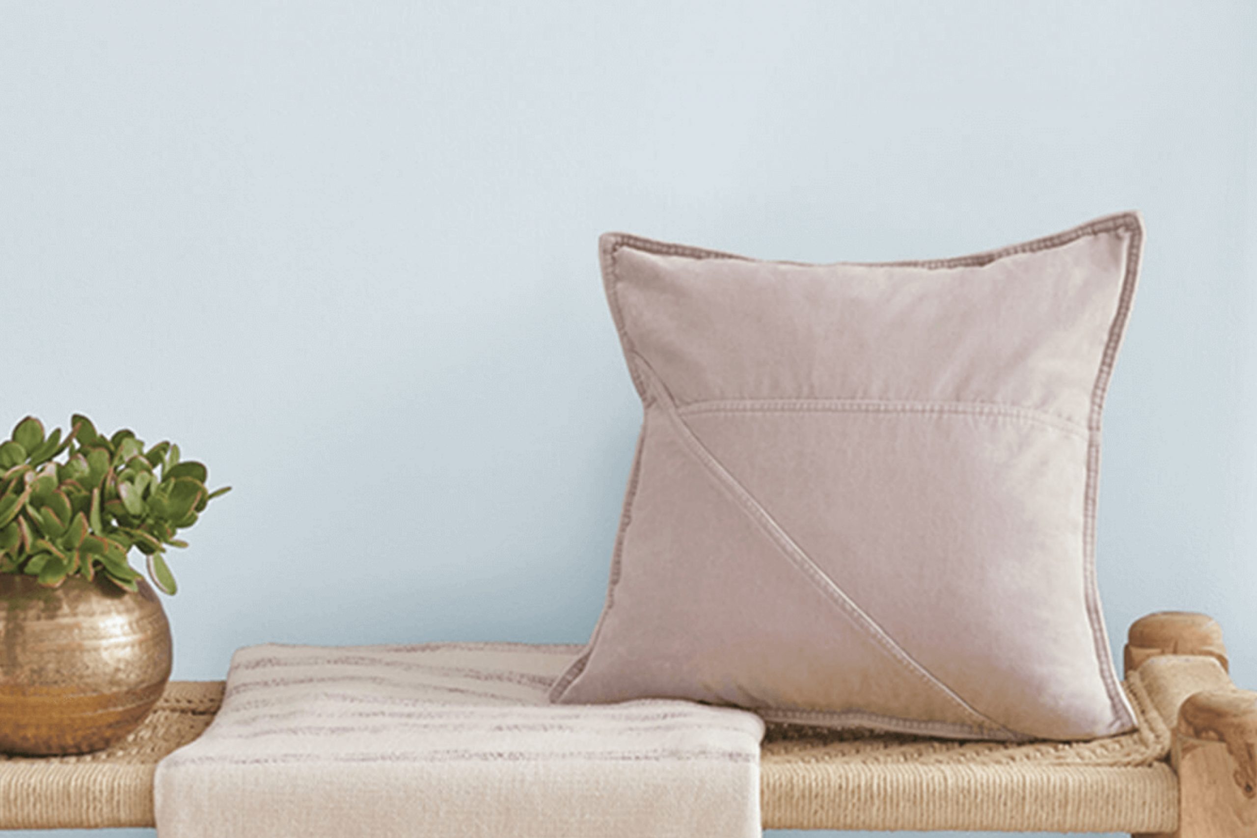
What Color Is Silent Ripple SW 9682 by Sherwin Williams?
Silent Ripple is a soothing shade of blue with a slight gray undertone that gives it a subtle and soft appearance. This color can act as a neutral backdrop or a subtle pop of color, depending on the surrounding elements in a space. It’s perfect for creating a calming atmosphere in any room, making it ideal for bedrooms, bathrooms, and living spaces where relaxation is key.
In terms of interior design styles, Silent Ripple fits beautifully with modern minimalist, coastal, and Scandinavian decors. Its cool and gentle hue pairs seamlessly with crisp whites and natural materials such as light woods, wicker, and linen, enhancing the light and airy feel characteristic of these styles. Adding textiles like cotton throws or wool rugs can also complement its understated vibe.
For a cohesive look, Silent Ripple works well with materials like marble and ceramic, which provide a smooth texture contrast while maintaining a simple and clean aesthetic. Metal accents in silver or brushed nickel can offer a slight shimmer that subtly highlights the color’s cool undertones.
When used in a space, Silent Ripple creates a peaceful and inviting environment, perfect for unwinding after a long day.
Is Silent Ripple SW 9682 by Sherwin Williams Warm or Cool color?
Silent Ripple is a paint color by Sherwin Williams that brings a fresh and calm feel to any room. This shade is a soft, muted blue with hints of gray, making it very adaptable and easy to work with in various spaces in a home. When used in bedrooms, it creates a soothing atmosphere that is ideal for relaxing and getting a good night’s sleep.
In living rooms and kitchens, it can complement both modern and traditional decor, adding a touch of quiet elegance without being too bold.
This color also works well in small spaces like bathrooms or hallways, as it can make them appear larger and more open due to its light and airy quality.
Overall, Silent Ripple is a versatile choice that can help freshen up a home while keeping the environment peaceful and welcoming. It pairs nicely with white or light wood furniture and accents, completing a clean and cohesive look.
Undertones of Silent Ripple SW 9682 by Sherwin Williams
Silent Ripple is a unique paint color with a variety of undertones that subtly influence its appearance in different lighting and settings. Undertones are like hidden colors within the main color, and they can alter how we perceive the main hue. In the case of Silent Ripple, the undertones include light blue, light purple, pale yellow, lilac, mint, pale pink, and grey.
These undertones play a crucial role in how the color looks once applied to interior walls. For instance, the light blue and mint undertones can give a fresh and airy feel to a room, making it appear more open. The light purple and lilac add a gentle touch of warmth, which can make the space feel more inviting.
Pale yellow can brighten up a room, especially in natural light, enhancing the overall luminosity of the space.
Pale pink undertones provide a subtle softness, which is excellent for creating a cozy atmosphere. Lastly, the grey undertone helps to balance the brightness of the color, ensuring that it doesn’t overwhelm the space but instead offers a calm and soothing backdrop.
When Silent Ripple is used on interior walls, these undertones can make the room adapt slightly under different lighting conditions. In daylight, the space might feel vibrant and lively, while at night, it could appear more subdued and comforting. This adaptability makes Silent Ripple a versatile choice for many spaces, providing a dynamic look that changes throughout the day.
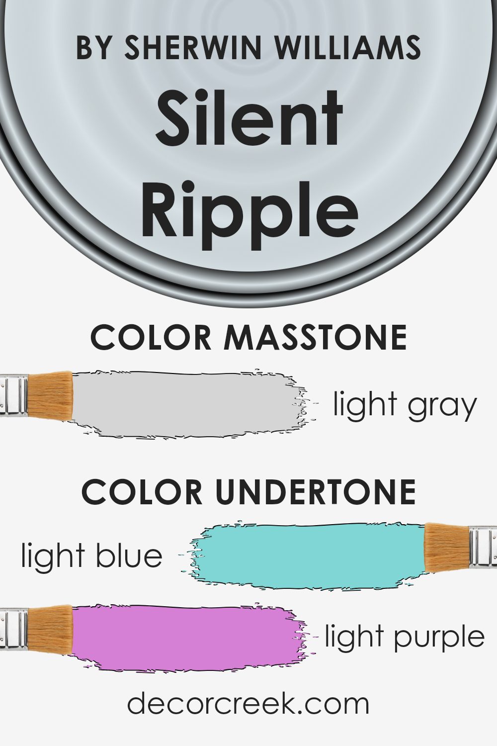
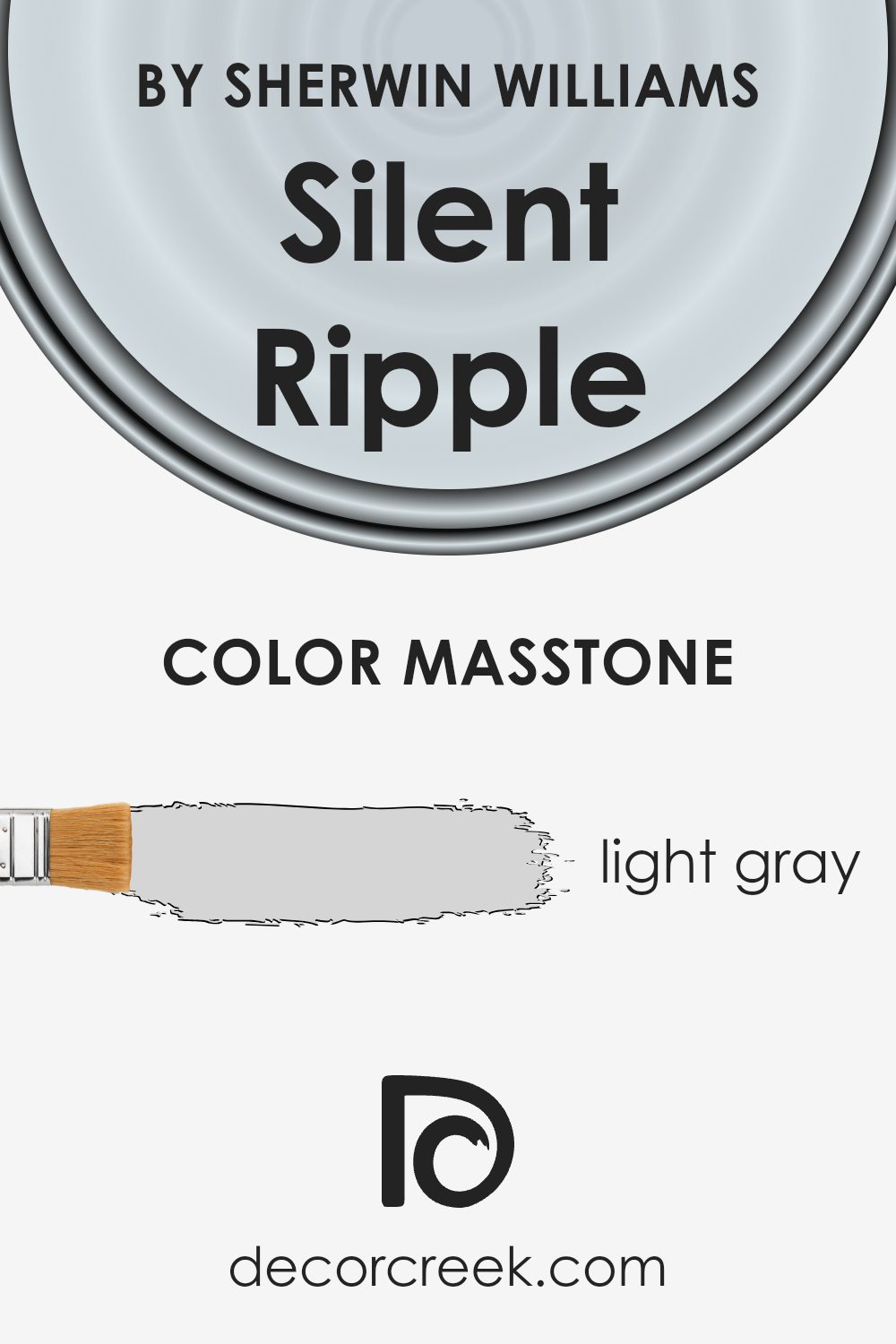
What is the Masstone of the Silent Ripple SW 9682 by Sherwin Williams?
Silent Ripple SW 9682 by Sherwin Williams is a light gray color, similar to #D5D5D5. This neutral shade is versatile and works well in various areas of a home. It’s particularly effective in creating a calm and inviting atmosphere without being too bold. Being a light gray, it reflects more light, making spaces appear larger and airier, which is a great trick for smaller rooms or areas with limited natural light.
This color also pairs easily with other colors, whether bright or muted, making it a practical choice for decorating. You can use it as a base color on walls and then add pops of color through furniture and decor items to add interest and personality to your space.
Silent Ripple is a cool tone, which means it can help balance out rooms that receive a lot of sunlight, keeping them cool and comfortable. In summary, this light gray is an adaptable and forgiving color choice for any home.
How Does Lighting Affect Silent Ripple SW 9682 by Sherwin Williams?
Lighting plays a crucial role in how colors appear in different environments. It can significantly impact the look and feel of a paint color, such as Silent Ripple by Sherwin Williams, depending on the type of light and the direction of the room it is used in.
In artificial light, colors can vary based on the type of bulb used. Incandescent bulbs, which emit a warm, yellowish glow, can make Silent Ripple look more muted and slightly warmer. This can create a cozy atmosphere in a room. In contrast, fluorescent lighting, which is cooler, could make the paint appear sharper and slightly bluer, making the room feel more alert and lively.
Natural light also affects paint colors, but in different ways throughout the day and depending on the room’s orientation. In north-facing rooms, light is cooler and more consistent throughout the day. Here, Silent Ripple might look more subdued and slightly cooler, potentially giving the room a calm and steady feel.
South-facing rooms benefit from intense, warm light for most of the day. This lighting can make Silent Ripple look brighter and more vibrant, bringing out any subtle warm undertones in the paint.
In east-facing rooms, the light is warm and bright in the morning but becomes cooler as the day progresses. Silent Ripple may appear lively and bright in the morning, then turn softer and more shadowed in the afternoon and evening.
West-facing rooms get softer morning light that turns warm and bright in the evenings. Silent Ripple could appear calm and gentle in the morning and transform into a richer, more dynamic color towards the evening.
Understanding how light affects paint colors like Silent Ripple can help you decide the best room and lighting to enhance its appearance, creating the desired atmosphere in your home.
What is the LRV of Silent Ripple SW 9682 by Sherwin Williams?
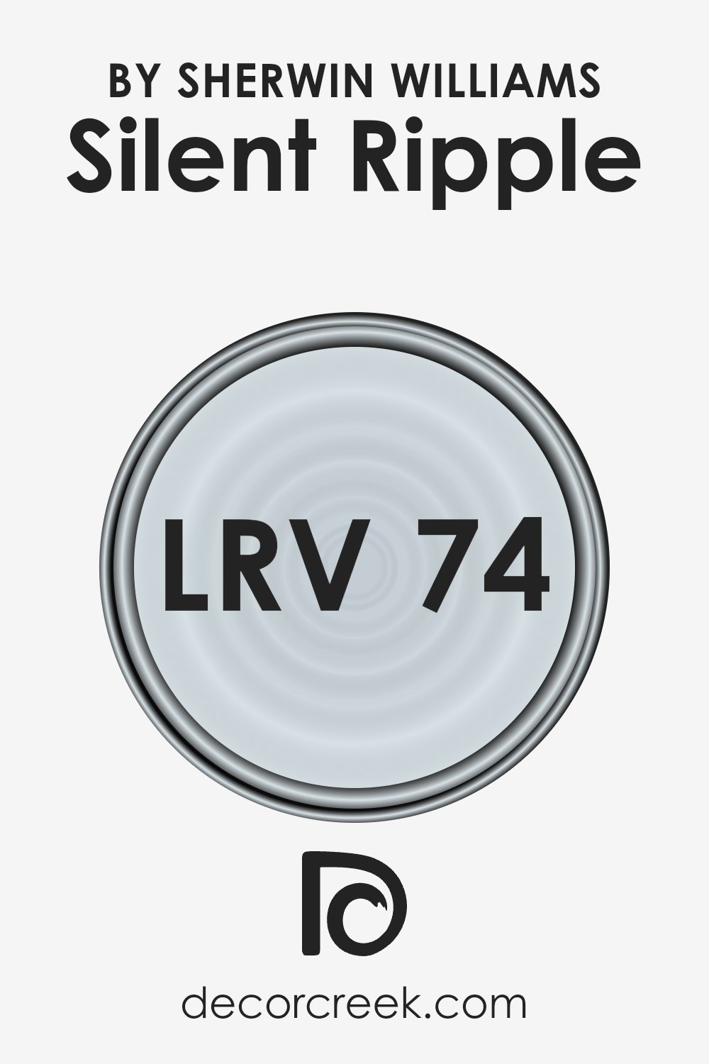
LRV stands for Light Reflectance Value, which is a measurement used to determine how much light a paint color reflects. This is expressed on a scale where lower values indicate that a color absorbs more light, making the room feel cozier and smaller; higher LRV colors reflect more light, brightening up a space and making it appear larger. Understanding the LRV of paint can have a significant impact on your decorating choices, especially when considering how different lighting conditions in your space will interact with the color on your walls.
For example, the LRV of Silent Ripple is 73.724, indicating that it is a light color that will reflect much of the light that hits it.
This makes it a great choice for rooms that might be naturally darker or smaller, as it can help make the area feel more airy and open. In spaces with ample natural light, this paint color will appear particularly vibrant and can help create a lively, refreshing atmosphere. Conversely, in less well-lit areas, the high LRV ensures that the space remains looking light and does not feel cramped.
What are the Trim colors of Silent Ripple SW 9682 by Sherwin Williams?
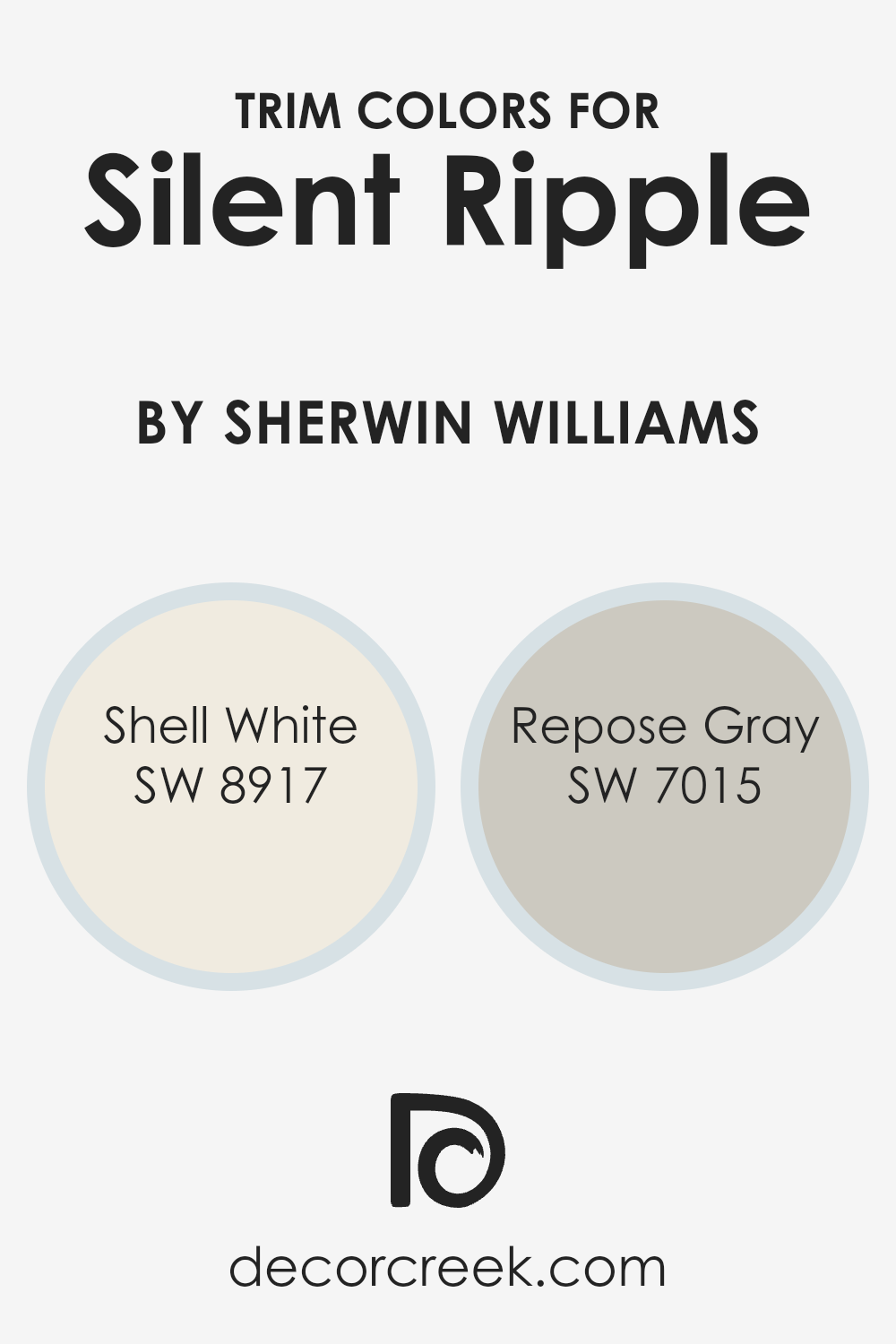
Trim colors, such as SW 8917 – Shell White and SW 7015 – Repose Gray, are used to accentuate or highlight the architectural features of a home, such as window frames, doors, and baseboards. These colors often contrast with the main wall color to draw attention to details or create a cohesive look that complements the entire space.
For example, when using a primary color like Silent Ripple by Sherwin Williams, selecting the right trim color is crucial for achieving a balanced and aesthetically pleasing environment. The right trim colors add depth and can make the main color stand out more, enhancing the overall appeal of the room.
SW 8917 – Shell White is a clean, crisp white that brings a fresh brightness to any space, making it a universal choice for trim that can lighten darker hues or add a crisp edge to softer colors. On the other hand, SW 7015 – Repose Gray is a neutral, light gray that offers a subtle contrast, particularly effective in adding a gentle definition against both light and dark wall colors.
This versatile gray works well in a variety of settings, providing a soft yet distinct boundary that can help define different areas or features within a room. Together, these colors offer flexibility in design and can help enhance the overall visual impact of the primary wall color.
You can see recommended paint colors below:
Colors Similar to Silent Ripple SW 9682 by Sherwin Williams
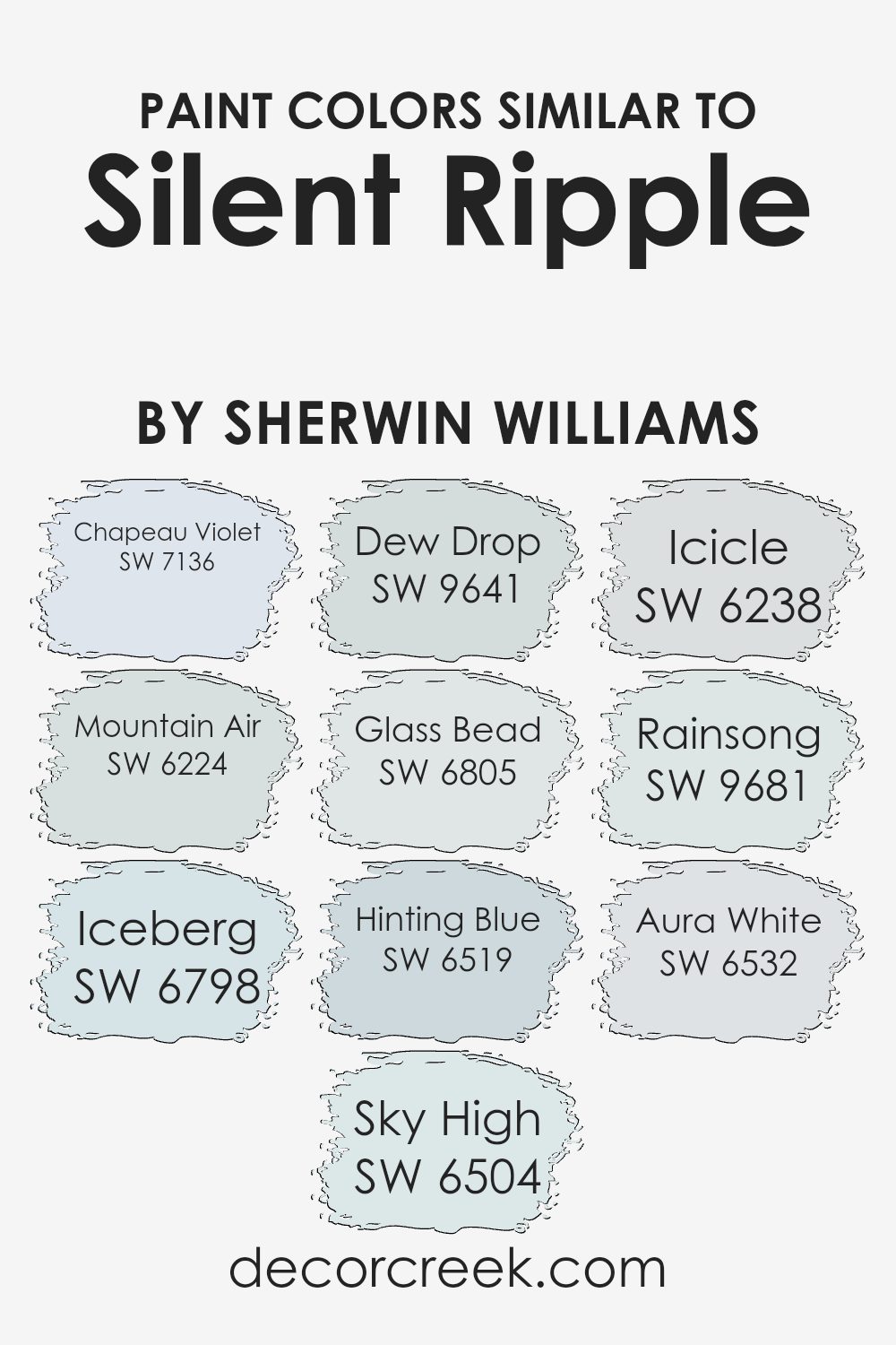
When decorating a space, using similar colors can create a harmonious and soothing atmosphere. Colors like Silent Ripple and its counterparts play a significant role in achieving a cohesive look, as they flow seamlessly from one to the other without stark contrasts disrupting the visual space.
This continuity of color can make a room appear larger and more unified. For instance, colors like SW 7136 – Chapeau Violet lends a subtle richness with its muted purple hue, while SW 6224 – Mountain Air offers a breath of freshness with its light blue tone.
These similar colors each bring their own unique feel while still keeping in line with a consistent color palette. SW 6798 – Iceberg, for example, introduces a very pale blue that reminds one of a clear, frozen lake, and when paired with something like SW 6504 – Sky High, which resembles the light blue of a daytime sky, it can enhance the airy feel of a room.
Similarly, SW 9641 – Dew Drop provides a gentle touch of blue-green, much like the color of morning dew, adding a subtle hint of energy. When these colors are used together, they not only complement each other but also help in creating a space that feels cohesive and thoughtfully designed.
Whether you’re considering painting a whole room or just looking for an accent wall, these shades work together beautifully to create a friendly and welcoming environment.
You can see recommended paint colors below:
- SW 7136 Chapeau Violet
- SW 6224 Mountain Air (CHECK A SAMPLE)
- SW 6798 Iceberg (CHECK A SAMPLE)
- SW 6504 Sky High (CHECK A SAMPLE)
- SW 9641 Dew Drop (CHECK A SAMPLE)
- SW 6805 Glass Bead
- SW 6519 Hinting Blue (CHECK A SAMPLE)
- SW 6238 Icicle (CHECK A SAMPLE)
- SW 9681 Rainsong (CHECK A SAMPLE)
- SW 6532 Aura White
How to Use Silent Ripple SW 9682 by Sherwin Williams In Your Home?
Silent Ripple SW 9682 by Sherwin Williams is a gentle blue shade that easily pairs with various colors, making it versatile for different spaces in your home. This soothing color is perfect for creating a calm atmosphere in bedrooms or bathrooms, where you might want to relax after a long day. You can also use it in a home office or study area, as its cool tone helps maintain focus and reduces stress.
If you’re thinking of adding a fresh coat of paint to your living room, Silent Ripple can give the walls a clean and fresh look, while still feeling cozy and inviting. Pair it with soft whites or even darker furniture pieces for a balanced look.
This color works great as an accent wall too, combined with lighter shades on other walls to keep the room bright yet interesting. Whether you’re updating one room or several, Silent Ripple offers a refreshing touch that’s easy to live with every day.
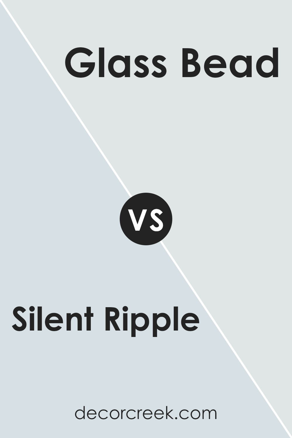
Silent Ripple SW 9682 by Sherwin Williams vs Glass Bead SW 6805 by Sherwin Williams
Silent Ripple and Glass Bead by Sherwin Williams are both unique, but they offer different vibes for a room. Silent Ripple is a subtle gray with a gentle touch of blue. This color is calm and low-key, making it great for a peaceful and relaxing space like a bedroom or a cozy reading area. It’s versatile enough to work well in various lighting situations, maintaining its soothing quality no matter the setting.
On the other hand, Glass Bead is a vibrant teal that adds a pop of color and energy to any space. It is bright and lively, perfect for spaces where you want to make a statement or add some cheer, like a bathroom or a kitchen. Glass Bead can also uplift the mood in creative spaces, such as an office or a craft room.
In summary, Silent Ripple offers a muted, peaceful feel while Glass Bead brings energy and brightness to a room, making them suited for different purposes and atmospheres.
You can see recommended paint color below:
- SW 6805 Glass Bead
Silent Ripple SW 9682 by Sherwin Williams vs Hinting Blue SW 6519 by Sherwin Williams
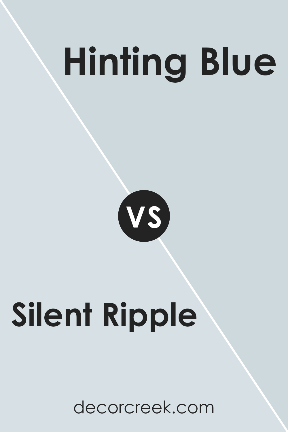
Silent Ripple and Hinting Blue are both colors by Sherwin Williams, but they bring different vibes to a room. Silent Ripple is a soft, light grey with a subtle hint of blue. It’s a neutral shade that’s very versatile, making it easy to pair with a variety of decor styles and colors. This color can make a space feel more open and airy.
On the other hand, Hinting Blue is a clearer, more defined light blue. It’s brighter and can add a gentle but noticeable pop of color to a room. This shade gives off a fresh and clean look, making it a great choice for bathrooms or kitchens.
Both colors reflect a lot of light, making spaces appear larger and brighter. Depending on what atmosphere you want in your room, Silent Ripple works well for a neutral, subtle backdrop, while Hinting Blue adds a touch of soft vibrancy.
You can see recommended paint color below:
- SW 6519 Hinting Blue (CHECK A SAMPLE)
Silent Ripple SW 9682 by Sherwin Williams vs Sky High SW 6504 by Sherwin Williams
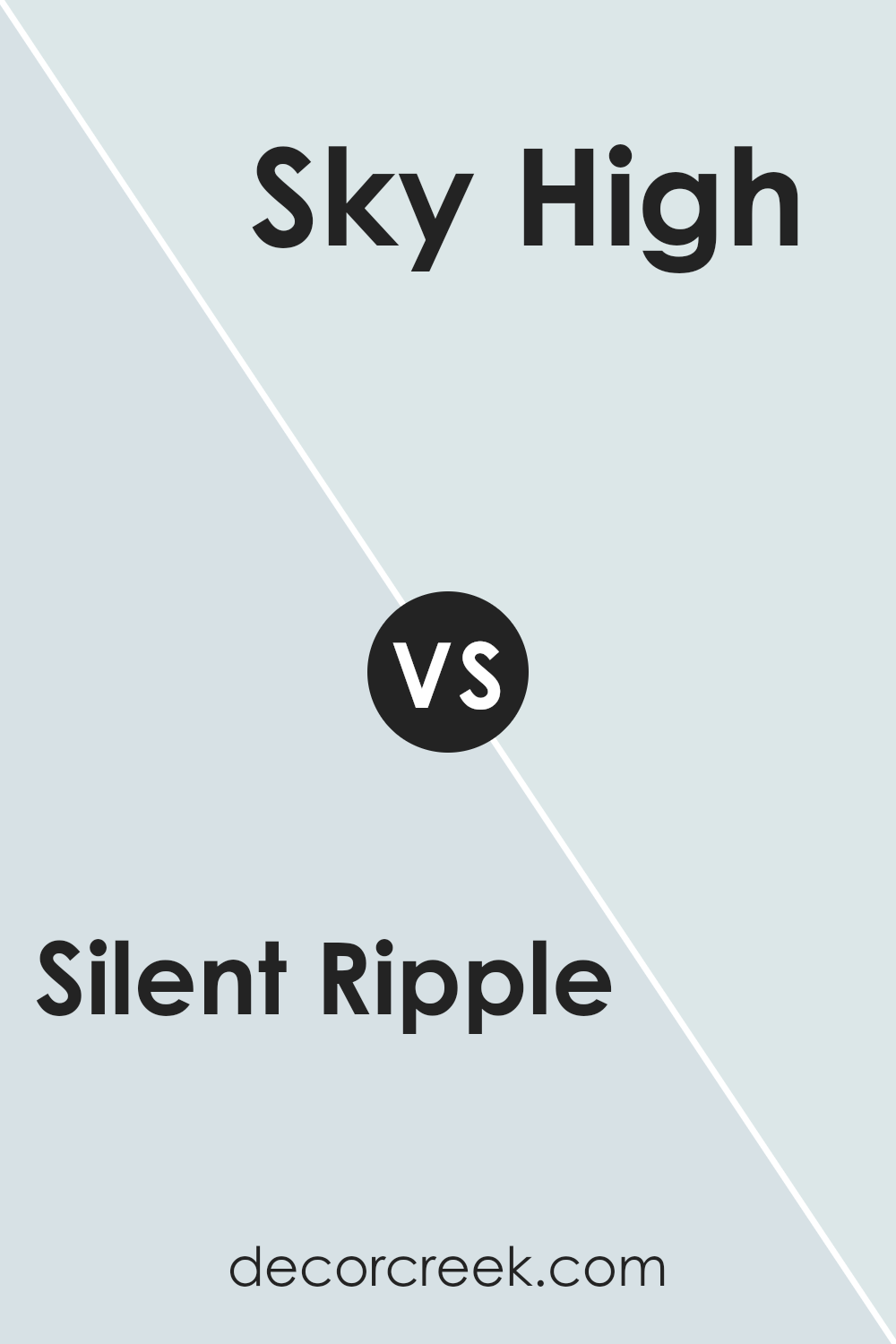
Silent Ripple and Sky High are two different shades by Sherwin Williams. Silent Ripple is a deep blue with a grayish tone, resembling the quiet part of the ocean where the waves begin to form. This color is ideal for creating a cozy and peaceful atmosphere in rooms since it has a soothing effect.
On the other hand, Sky High is a much lighter and brighter blue. It mimics the clear sky on a sunny day, bringing a cheerful and airy feel to spaces. This color is great for making smaller rooms appear larger and more open.
While Silent Ripple tends to add depth and a touch of mystery to a space, Sky High offers a sense of freshness and openness. Both colors can work beautifully in a home but serve different purposes depending on the mood you want to set.
You can see recommended paint color below:
- SW 6504 Sky High (CHECK A SAMPLE)
Silent Ripple SW 9682 by Sherwin Williams vs Rainsong SW 9681 by Sherwin Williams
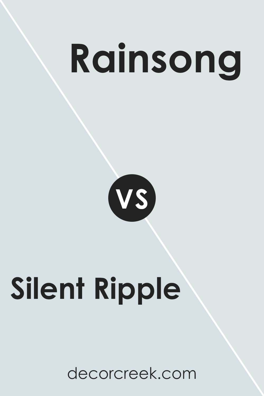
Silent Ripple and Rainsong by Sherwin Williams are two similar yet distinct colors. Silent Ripple is a deeper shade that could remind one of a calm sea or a shaded forest area, giving a sense of depth and richness to any space. It’s great for creating a cozy and comforting atmosphere, particularly in well-lit rooms or spaces that could benefit from a touch of sophistication.
On the other hand, Rainsong is a lighter tone, slightly more on the grey side compared to Silent Ripple. This color brings a fresh and airy feel to a room, making it appear more open and spacious. It’s perfect for smaller or darker spaces that need a lift to feel more inviting.
Both colors are versatile and can be used in various settings, from bedrooms and living rooms to offices and kitchens. Whether you choose the deeper Silent Ripple or the lighter Rainsong depends on the mood you want to set and the characteristics of the space you’re decorating.
You can see recommended paint color below:
- SW 9681 Rainsong (CHECK A SAMPLE)
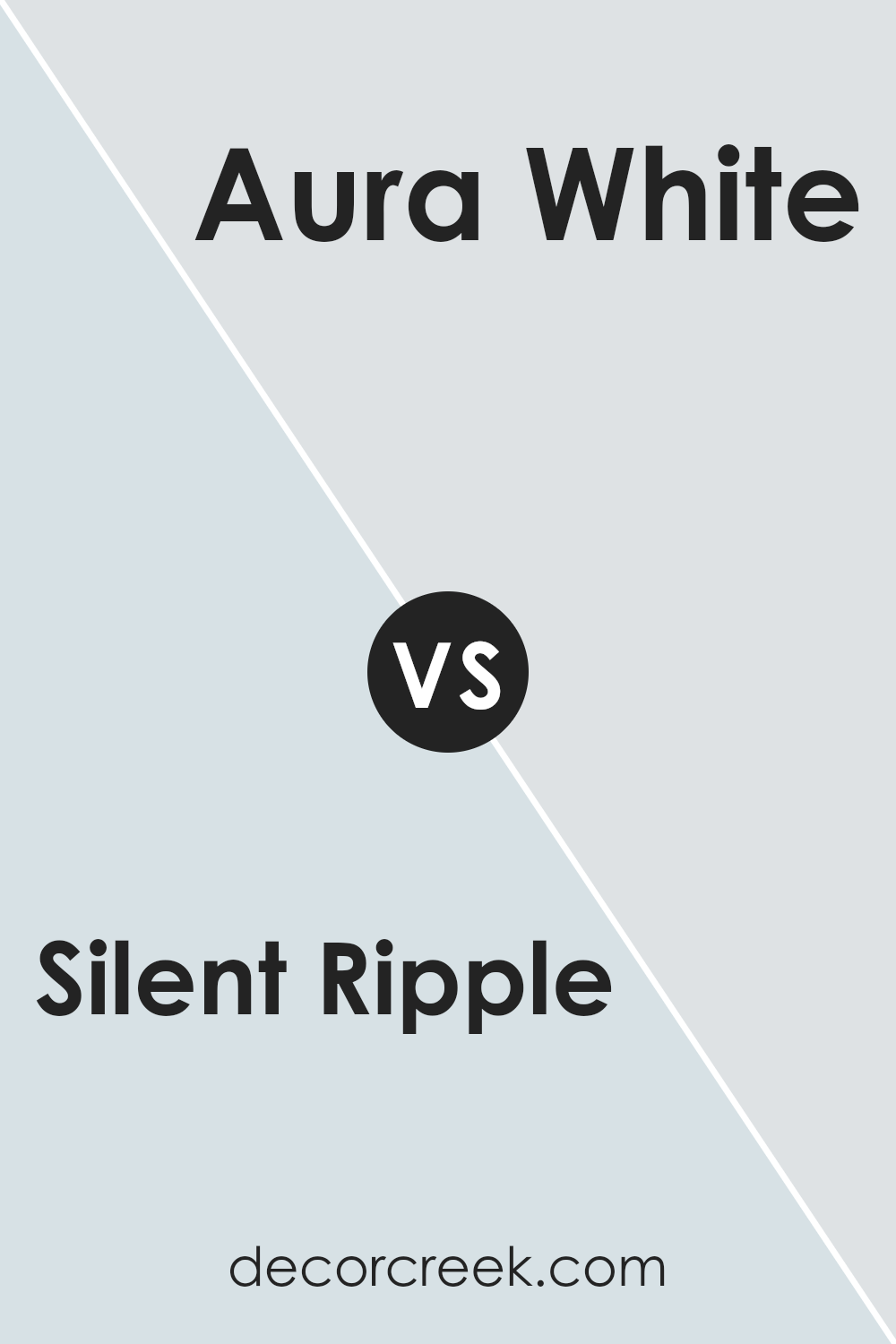
Silent Ripple SW 9682 by Sherwin Williams vs Aura White SW 6532 by Sherwin Williams
Silent Ripple and Aura White are two colors that offer distinct vibes for decorating spaces. Silent Ripple is a subtle teal hue with a calm, gentle feel, reminiscent of still waters. It’s a darker shade that pairs well with brighter accents or can add depth and interest to a quiet room.
Aura White, on the other hand, is a soft, pale gray color. It’s very light, almost giving the illusion of pure white, making it a fantastic choice for anyone looking to create a clean and open atmosphere.
This color reflects light beautifully and can make small spaces appear larger and more inviting. Both colors have their unique charm, with Silent Ripple bringing a touch of nature inside, and Aura White providing a neutral backdrop that can be built upon with various decor styles. Whether you choose the quiet allure of Silent Ripple or the airy feel of Aura White, both colors offer fresh possibilities for any living space.
You can see recommended paint color below:
- SW 6532 Aura White
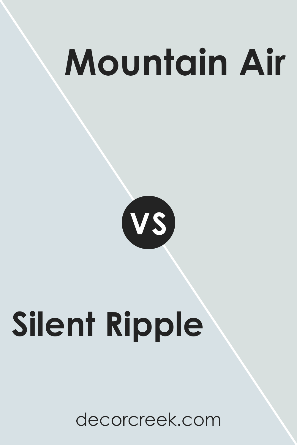
Silent Ripple SW 9682 by Sherwin Williams vs Mountain Air SW 6224 by Sherwin Williams
Silent Ripple and Mountain Air, both by Sherwin Williams, present unique shades that are quite distinct from each other. Silent Ripple is a deeper, muted teal-like hue that adds a subtle touch of character to any space without overpowering it.
This color can make a room feel cozy yet still retain a fresh vibe. On the other hand, Mountain Air is a light and airy gray-blue. It is much lighter compared to Silent Ripple and tends to open up a space, giving it a breezy and clean feel.
This color is excellent for creating a soothing atmosphere in areas meant for relaxation. While Silent Ripple could be well-suited for accent walls or a bedroom, Mountain Air would shine in living spaces and bathrooms, providing a crisp, refreshing look. Both colors offer their distinctive aesthetics, whether you want a pop of depth or a touch of lightness.
You can see recommended paint color below:
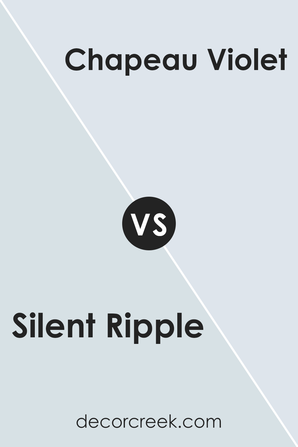
Silent Ripple SW 9682 by Sherwin Williams vs Chapeau Violet SW 7136 by Sherwin Williams
Silent Ripple and Chapeau Violet by Sherwin Williams are two distinct shades that offer unique vibes for any space. Silent Ripple is a soft, subtle gray with a cool undertone, making it perfect for a calm and soothing environment. It’s light enough to make small rooms feel more spacious while still adding a touch of color.
On the other hand, Chapeau Violet stands out with its deeper, richer purple hue. This color can add a dramatic flair to any room, providing a strong presence that commands attention. It works well in larger spaces or as an accent wall to create a focal point.
While Silent Ripple is more understated and can easily blend with various decor styles, Chapeau Violet is bolder and can set the tone of a room. Both colors are versatile in their own right, but the choice between them would depend on the atmosphere you’re aiming to achieve in your space.
You can see recommended paint color below:
- SW 7136 Chapeau Violet
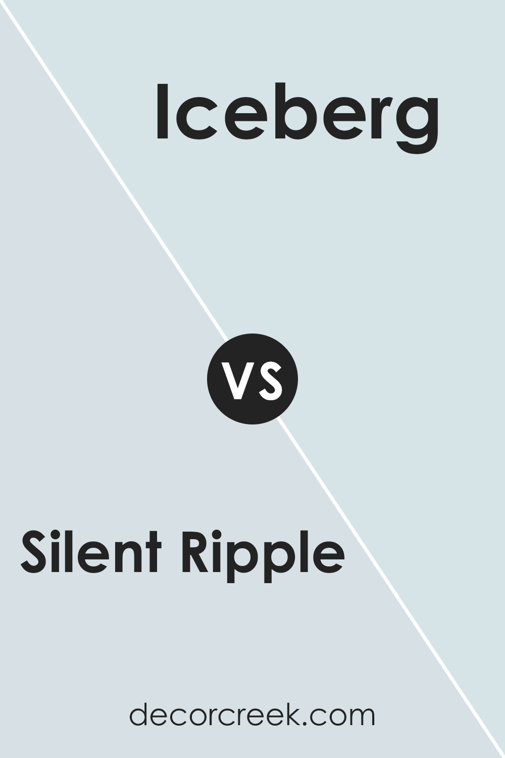
Silent Ripple SW 9682 by Sherwin Williams vs Iceberg SW 6798 by Sherwin Williams
Silent Ripple and Iceberg, both from Sherwin Williams, are distinct shades with their unique qualities. Silent Ripple is a deeper, more muted gray with subtle blue undertones. This color provides a calming effect, suitable for spaces where a touch of warmth and depth is desired without overwhelming the room with darkness. It pairs well with both bright accents and other neutrals.
On the other hand, Iceberg is a much lighter shade that leans more clearly towards a crisp, fresh blue. It reflects more light, making it a great choice for making smaller spaces appear bigger and more open. Iceberg gives off a clean, invigorating feel, perfect for bathrooms or kitchens where a refreshing vibe is appreciated.
These two colors could work nicely in the same home, with Silent Ripple featured in a cozy, personal space like a bedroom, and Iceberg brightening up a more functional, active area. Both bring their own personality to a space, complementing different types of decor and personal tastes.
You can see recommended paint color below:
- SW 6798 Iceberg (CHECK A SAMPLE)
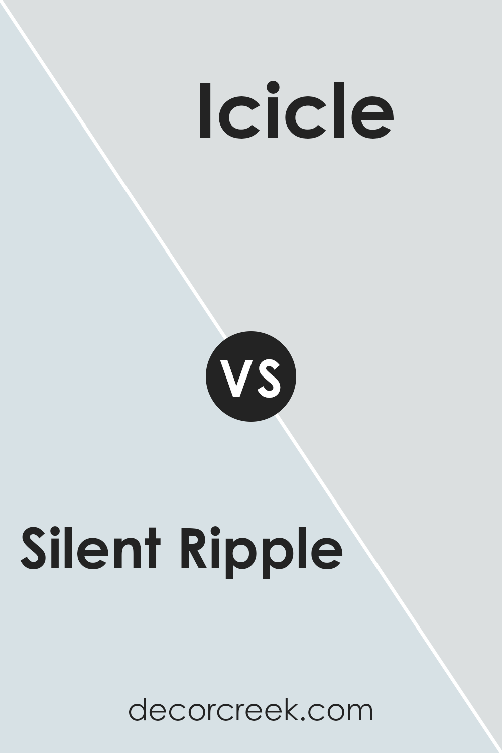
Silent Ripple SW 9682 by Sherwin Williams vs Icicle SW 6238 by Sherwin Williams
Silent Ripple and Icicle by Sherwin Williams are two cool-toned colors with unique yet subtly distinct characteristics. Silent Ripple has a soft, muted green hue that gives off a calm, gentle vibe. It’s like looking at a peaceful, slow-moving stream, which makes it perfect for creating a relaxing environment in spaces like bedrooms or calm living areas.
On the other hand, Icicle is much lighter, leaning towards a crisp, clean gray with a hint of blue. Its understated elegance is well-suited for modern spaces that aim for a fresh and airy feel, such as bathrooms or small offices that could benefit from a sense of openness.
Despite both being cool-toned, Silent Ripple provides a touch of warmth due to its pale green essence, making it feel a little cozier. Icicle, being closer to a pure gray, offers a more neutral backdrop, allowing for versatility in decor choices. Whether used in contrast or as complementary shades, both colors can enhance a space beautifully, depending on the intended mood and aesthetic.
You can see recommended paint color below:
- SW 6238 Icicle (CHECK A SAMPLE)
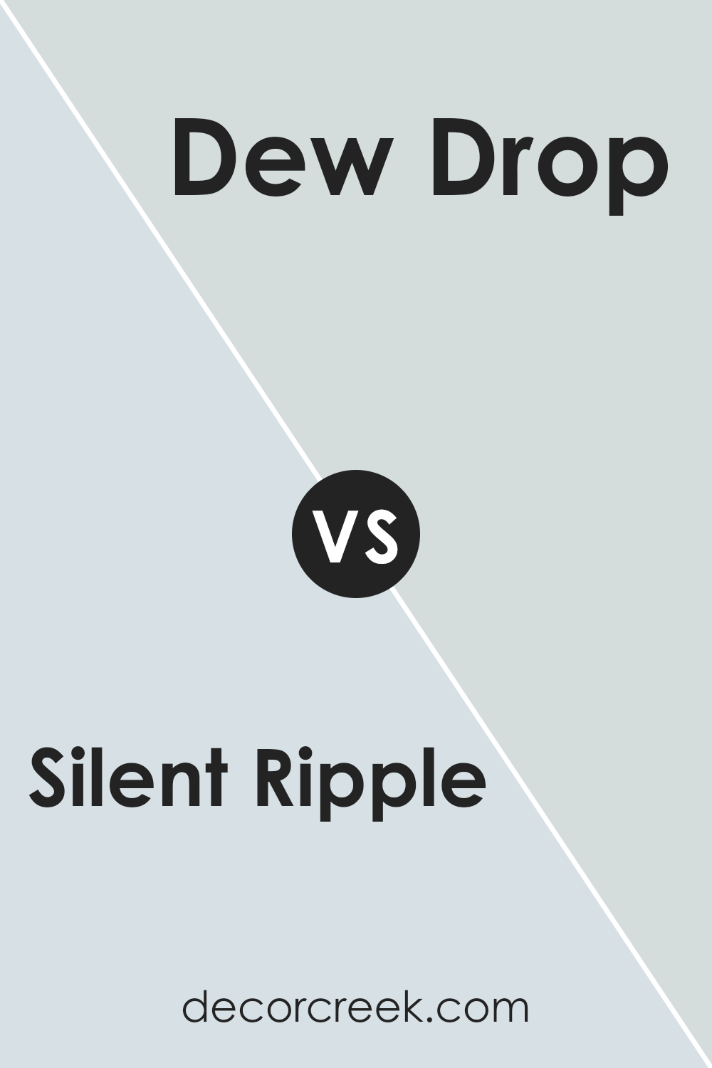
Silent Ripple SW 9682 by Sherwin Williams vs Dew Drop SW 9641 by Sherwin Williams
Silent Ripple and Dew Drop are two distinct colors by Sherwin Williams that bring their unique ambiance to a space. Silent Ripple is a deeper green with gray undertones, creating a calm and subtle mood. It’s like the color of a dense forest in the early morning mist, offering both richness and depth. This makes it a great choice for spaces intended to have a cozy, more enclosed feel.
Dew Drop, on the other hand, is much lighter, with a soft, airy blue tone that mimics the morning sky. Its brightness opens up a room, giving a sense of freshness and light. It’s perfect for making smaller rooms appear larger and more inviting.
In summary, while Silent Ripple offers a moodier, forest-like quietude, Dew Drop brings an open, sky-like clarity to interiors. Whether one chooses the earthy depth of Silent Ripple or the breezy lightness of Dew Drop depends on the atmosphere they wish to achieve in their space.
You can see recommended paint color below:
- SW 9641 Dew Drop (CHECK A SAMPLE)
Conclusion
Silent Ripple SW 9682 by Sherwin Williams is an exceptional shade that brings a calm and gentle vibe to any space. Its unique tone falls between blue and green, making it a versatile choice for those looking to freshen up their interiors without overpowering them.
This color works wonderfully in rooms that aim for a subtle yet inviting atmosphere, like living rooms or bedrooms, blending well with both contemporary and traditional decor.
Incorporating Silent Ripple into your home can be a smart move for creating a cozy, calming environment. Whether used on a feature wall, throughout a room, or in smaller accents, this color pairs beautifully with neutral tones, enhancing the overall aesthetic without demanding too much attention. Those interested in a modern, gentle look will find Silent Ripple a delightful option that adds just the right touch of personality to their space.
Ever wished paint sampling was as easy as sticking a sticker? Guess what? Now it is! Discover Samplize's unique Peel & Stick samples.
Get paint samples


