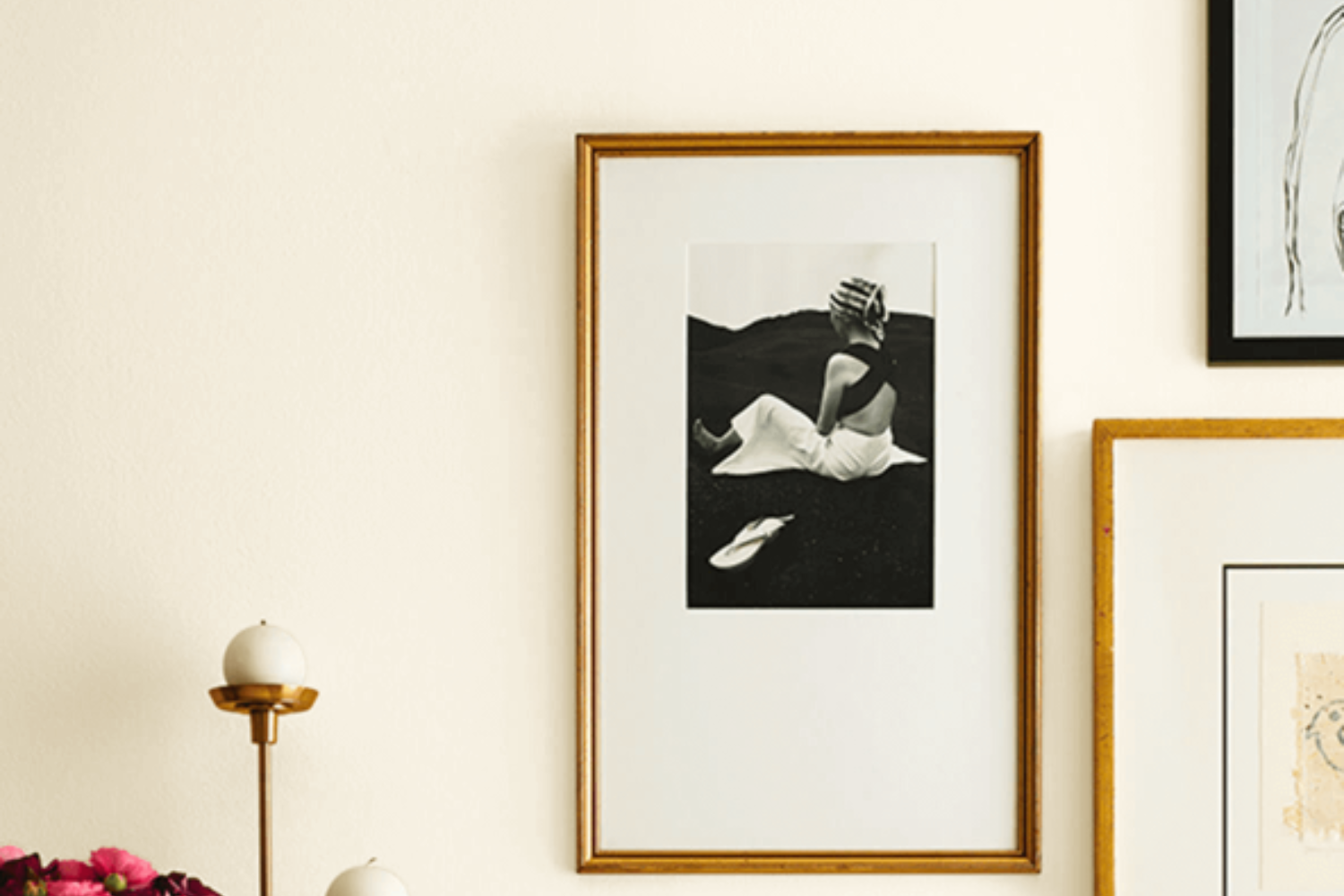
SW 8917, known as Shell White, is a beautiful color option from Sherwin Williams’ extensive palette. This shade embodies tranquility and simplicity, making it perfect for anyone looking to bring a sense of calm and clean aesthetics into their space. Shell White is not just a mere white; its subtle undertones provide a warm, inviting glow that can easily transform any room into a peaceful sanctuary. Ideal for those who prefer a minimalist approach, this color coordinates wonderfully with various decor styles, from modern to traditional.
Choosing the right paint color can sometimes feel overwhelming, but Shell White offers a versatile solution that pairs well with numerous color schemes and materials. Whether you’re updating a cozy corner of your home or giving a fresh look to an entire area, this paint can help you achieve the desired ambiance without much fuss.
Its adaptability makes it a great choice for walls, trim, or even cabinetry, providing a seamless blend throughout different spaces.
If you’re thinking about refreshing your living area, bedroom, or kitchen, Shell White by Sherwin Williams is definitely worth considering. Its ability to create a light and airy environment can make your decorating process a breeze, allowing you to achieve professional-looking results with ease.
What Color Is Shell White SW 8917 by Sherwin Williams?
Shell White by Sherwin Williams is a soft and subtle shade that brings a sense of calm and serenity to any space. It’s a versatile color, able to create a light and airy ambiance, making it perfect for those looking to refresh their interiors with a touch of simplicity and elegance. This color has a slightly warm undertone, ensuring it pairs beautifully with a variety of materials and textures without feeling cold or impersonal.
Shell White works exceptionally well in interior styles that prioritize comfort and simplicity, such as Scandinavian, Modern Minimalist, and Coastal. In Scandinavian spaces, its softness complements the natural light and simple lines, enhancing the sense of openness and tranquility.
In Modern Minimalist interiors, Shell White serves as a perfect backdrop, allowing statement pieces and artwork to stand out without overwhelming the senses. For a Coastal look, it captures the light and breezy feel of the seaside, pairing wonderfully with blues, greens, and sandy tones.
When it comes to materials, Shell White pairs splendidly with light woods, bringing out their warmth and texture. It also works well with natural elements like stone and linen, adding to the organic and earthy feel of a space. In rooms with plenty of natural light, this color takes on a luminous quality, making the room feel more spacious and welcoming. Shell White is a timeless color choice that can help create a peaceful and inviting atmosphere in any home.
Ever wished paint sampling was as easy as sticking a sticker? Guess what? Now it is! Discover Samplize's unique Peel & Stick samples.
Get paint samples

Is Shell White SW 8917 by Sherwin Williams Warm or Cool color?
Shell White by Sherwin Williams is a popular paint color choice for homeowners looking to add a fresh, clean vibe to their spaces. This specific shade of white has a warm undertone that makes it incredibly versatile and welcoming. Unlike stark whites, Shell White adds a soft, cozy feel to the room without overpowering it with brightness. This subtlety is why many people love using it.
This color works wonders in homes because it’s excellent at reflecting natural light, making spaces appear larger and more open. It’s a perfect backdrop for any decor style, whether you’re aiming for a modern, minimalistic look or a more traditional, cozy aesthetic. The warmth of Shell White ensures that rooms never look too cold or sterile, a common concern with white paints.
For those looking to sell their homes or simply update their living space, Shell White is a smart choice. It appeals to a wide range of tastes, making it easier to envision potential buyers or guests feeling at home. Moreover, its flexibility in matching with various furnishings and accent colors allows for endless decorating possibilities, ensuring that each room maintains its unique character while still fitting seamlessly together under one unifying shade.
Undertones of Shell White SW 8917 by Sherwin Williams
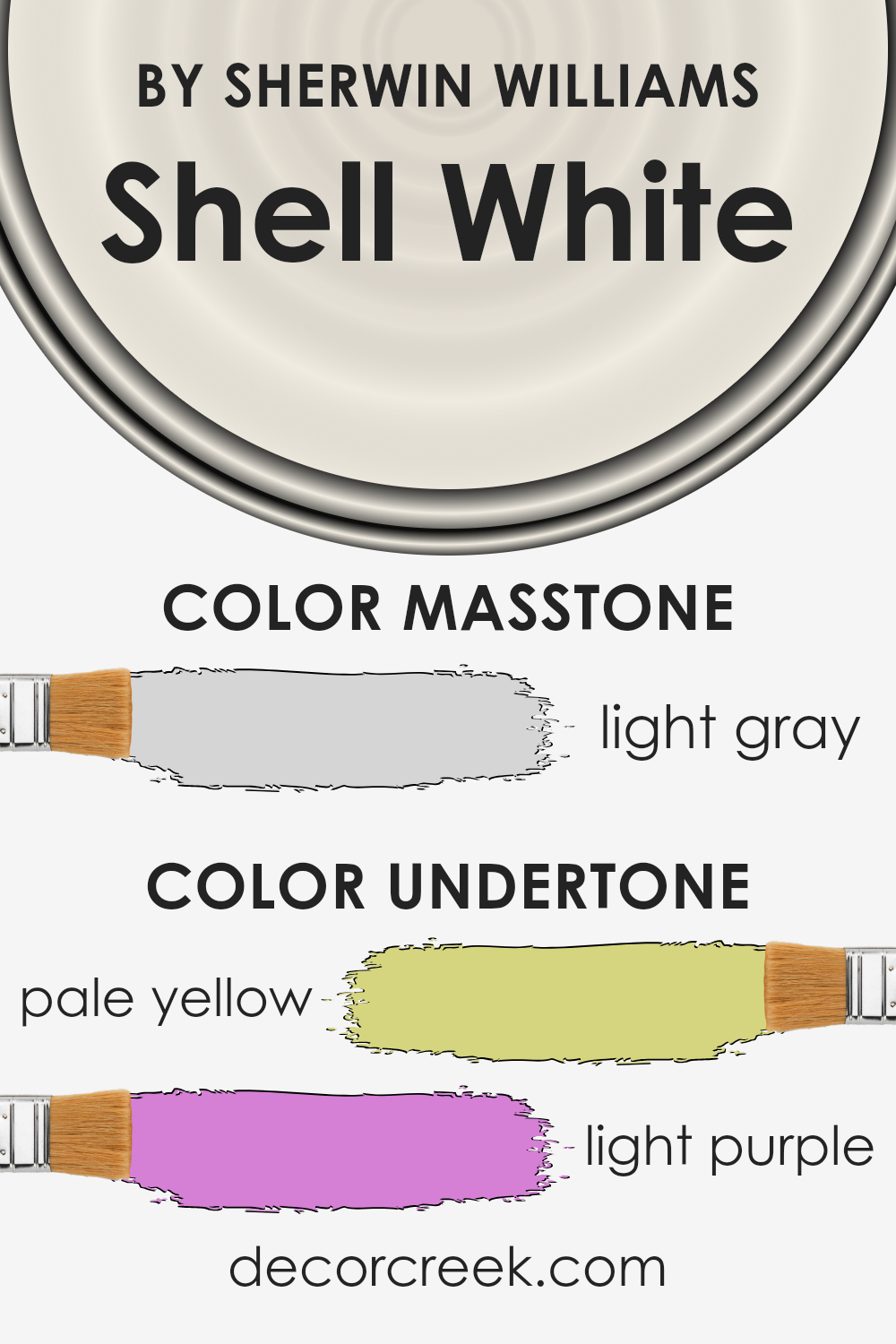
Shell White by Sherwin Williams is a unique color that can transform a room depending on its undertones. When we talk about undertones, we’re referring to the subtle colors hidden beneath the surface of the primary color. These undertones can significantly influence how we perceive the main color. In the case of Shell White, it possesses undertones of pale yellow and light purple. This mix is fascinating because it brings together the warmth of yellow with the coolness of purple.
The presence of a pale yellow undertone adds a soft, warm glow to the paint, making rooms feel cozy and inviting. It’s perfect for spaces where you want to create a soothing and welcoming atmosphere. On the other hand, the light purple undertone introduces a touch of calmness and serenity, counterbalancing the warmth of yellow with its cooler, more tranquil vibe.
This blend can make Shell White appear slightly different under various lighting conditions, sometimes looking more warm and other times cooler.
When this paint is applied to interior walls, these undertones play a crucial role in affecting the ambiance of the room. In natural daylight, the pale yellow might become more pronounced, creating a bright and airy feel. Conversely, in artificial light, the light purple might stand out more, giving the room a cooler and more relaxed atmosphere.
Understanding these undertones is essential for deciding which rooms to paint with Shell White, as the effect can vary from one space to another depending on the lighting and surrounding colors.
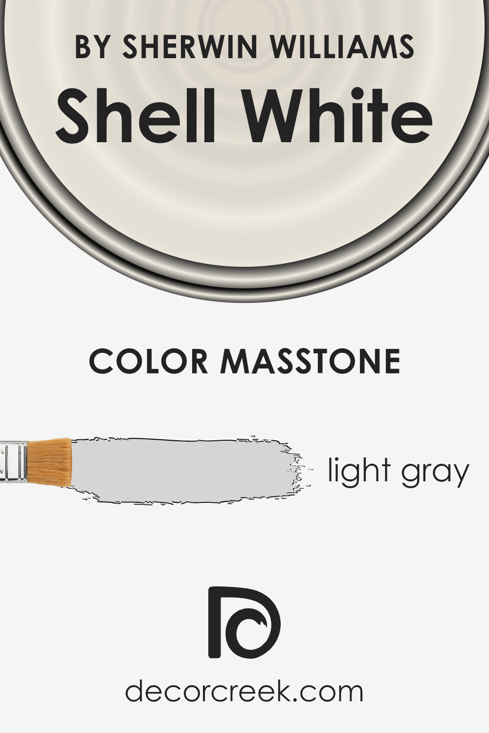
What is the Masstone of the Shell White SW 8917 by Sherwin Williams?
Shell White, with its masstone of light gray (#D5D5D5), brings a soft and airy feel to any home it adorns. This subtle shade works wonders in spaces that aim for a serene and peaceful ambiance. Its versatility means it can fit into nearly any decor style, from modern minimalism to cozy traditional.
The light gray masstone ensures that it can pair easily with other colors, making it a great choice for walls in rooms that already have bold furniture or art pieces. It’s also ideal for smaller spaces. The reason? Light gray hues like this can make rooms feel more open and spacious, as they reflect light better than darker shades. Whether it’s applied in a sun-soaked living room or a softly lit bedroom, Shell White adds a layer of tranquility without overwhelming the senses.
Plus, its understated elegance allows for personal style to shine through, making a home feel more tailored and welcoming.
How Does Lighting Affect Shell White SW 8917 by Sherwin Williams?
Lighting plays a crucial role in how we perceive colors. It can change a color’s appearance, making it look completely different under various light sources. Let’s talk about how this affects a specific paint color, Shell White, and how it appears in different lighting conditions, including natural light from various directions and artificial light.
- In artificial light, the character of Shell White can shift depending on the type of bulbs used. Under warm artificial lighting, like incandescent bulbs, it tends to look creamier, adding a cozy feel to the space. Cooler artificial light, such as from LED bulbs, can make it appear brighter and more crisp, perfect for modern spaces aiming for a clean aesthetic.
- When it comes to natural light, the direction of the light source plays a significant role. In north-faced rooms, which often receive cooler, indirect light, Shell White maintains a consistent, soft appearance throughout the day, leaning towards its true color but may appear slightly more shadowed.
- In south-faced rooms, bathed in warm, direct sunlight for most of the day, Shell White warms up significantly, giving off a brighter, more vibrant glow. This can make spaces feel more open and inviting.
- East-faced rooms catch the morning sun, which is warm and soft. Here, Shell White will have a gentle, welcoming appearance in the morning, transitioning to a cooler tone as the day progresses and the natural light diminishes.
- West-faced rooms experience the opposite effect; the color is cooler during the first part of the day and warms up in the late afternoon and evening as the sun sets. Shell White will transform from appearing more neutral in the morning to a warmer, more inviting color by the evening.
Understanding these nuances can help you choose the right paint color for your space, ensuring that Shell White works harmoniously with both the natural and artificial lighting in your home.
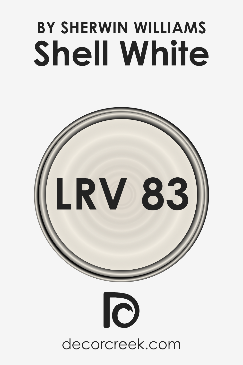
What is the LRV of Shell White SW 8917 by Sherwin Williams?
For the specific color with an LRV of 83.247, it’s quite high on the scale, indicating it is a very light color that will reflect a lot of light. This means it will help make a room feel airy and spacious. It’s an excellent choice for smaller rooms or spaces without much natural light, as it can brighten them up.
However, the true impact of its light-reflecting properties will also depend on the direction of the room and the type and amount of light it receives. In a north-facing room, it might appear slightly cooler, while in a south-facing room, it could look warmer and even more inviting.
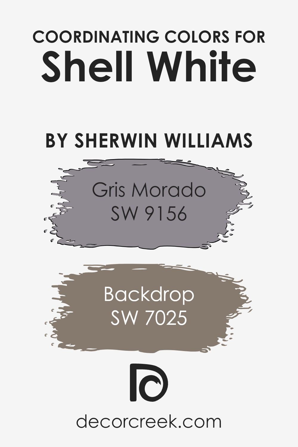
Coordinating Colors of Shell White SW 8917 by Sherwin Williams
Coordinating colors are hues that complement each other and work well together in a space, creating a harmonious and pleasing look. When you have a base color like Shell White by Sherwin Williams, selecting coordinating colors involves finding shades that both contrast and complement this primary hue, enhancing the overall aesthetic of a room without overwhelming it. These coordinating colors can add depth, highlight architectural features, or bring warmth or coolness to the space, depending on the palette chosen.
- For instance, Gris Morado SW 9156 is a subtle, sophisticated purple-gray tone that adds a touch of elegance and depth when paired with the light and airy Shell White. Its muted hue serves as a beautiful backdrop for decor elements, allowing them to shine without creating a visually aggressive contrast.
- Then there’s Backdrop SW 7025, a rich, warm gray that grounds the ethereal quality of Shell White, offering a solid, earthy base that enhances the sense of comfort in any room.
The color Backdrop can transform a space into a cozy retreat, providing a neutral yet impactful contrast that makes Shell White pop in a gentle, understated manner. Together, Gris Morado and Backdrop with Shell White create a palette that’s both versatile and visually appealing, making it easy to design a cohesive and inviting space.
You can see recommended paint colors below:
- SW 9156 Gris Morado
- SW 7025 Backdrop
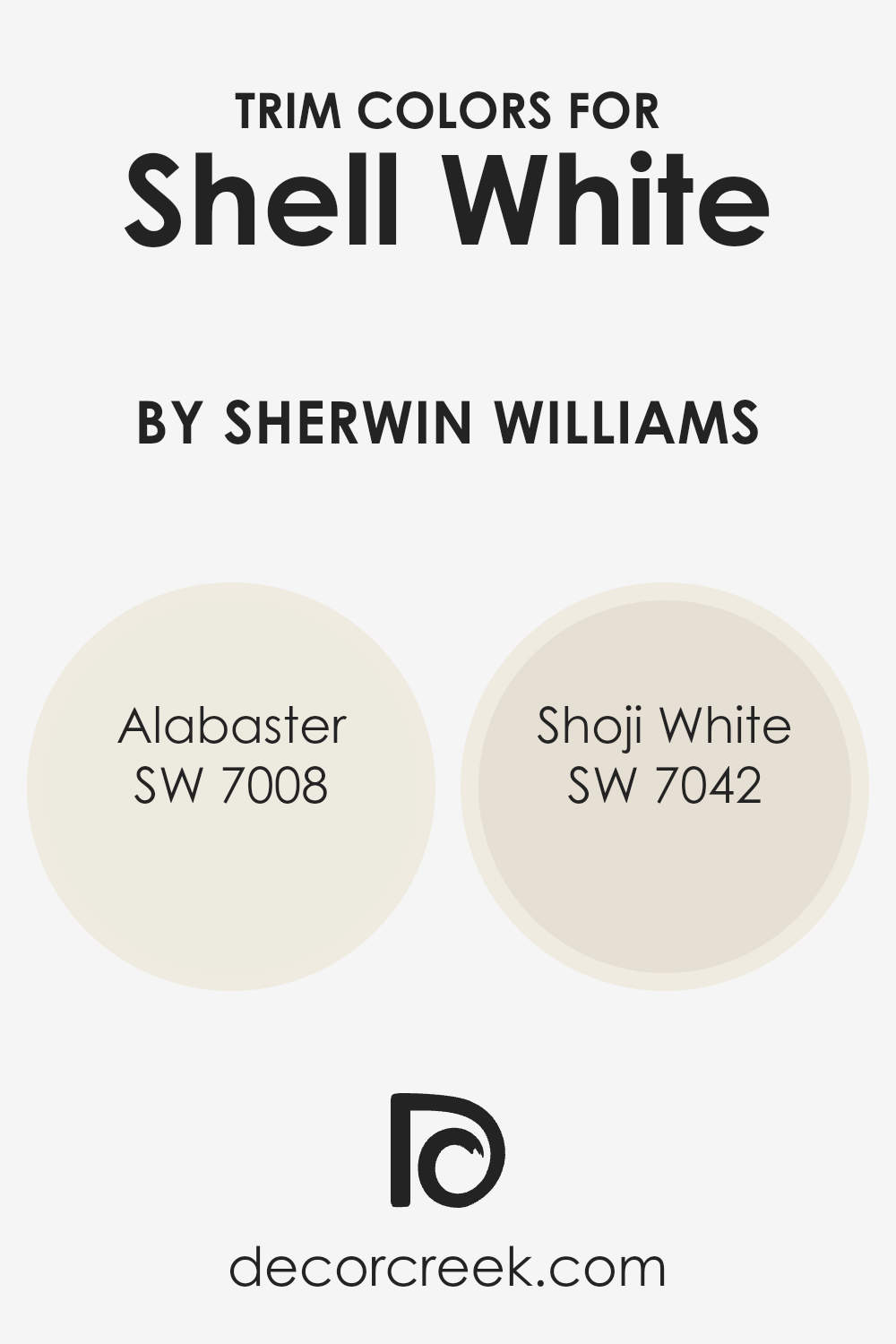
What are the Trim colors of Shell White SW 8917 by Sherwin Williams?
Trim colors are essentially the shades chosen to accentuate or complement the main color on walls, often used for baseboards, door frames, window trims, and moldings. Choosing the right trim color can significantly enhance the overall look of a room, creating contrast, highlighting architectural details, or seamlessly blending with the main wall color for a subtle effect. For a gentle and sophisticated color like Shell White by Sherwin Williams, selecting the right trim color is crucial. The aim is to either softly frame the space, adding a layer of elegance, or gently define the architectural features without overwhelming the primary hue.
Alabaster (SW 7008) by Sherwin Williams is a warm, soft white with a neutral base that prevents it from being too stark. Used as a trim color alongside Shell White, it would subtly highlight the walls with a soft, inviting glow, perfect for creating a serene and cozy atmosphere.
Shoji White (SW 7042), on the other hand, offers a slightly contrasting approach. This color has a warm, beige undertone that provides a bit of depth, making it an excellent choice for adding dimension to Shell White walls without creating too harsh of a contrast.
Together, these trim colors complement Shell White by enhancing its natural beauty and creating a cohesive, refined space.
You can see recommended paint colors below:
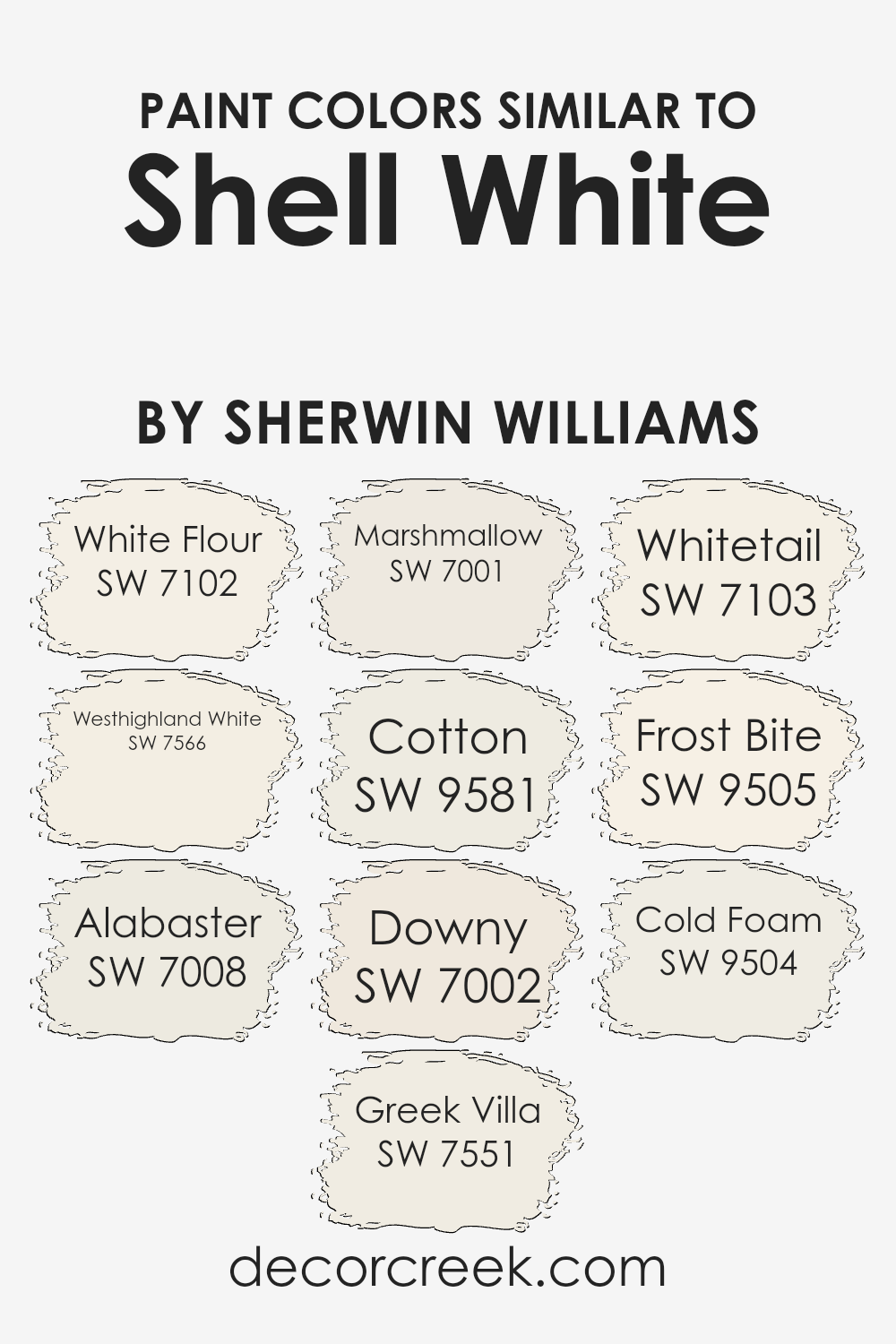
Colors Similar to Shell White SW 8917 by Sherwin Williams
In interior design, using similar colors is a strategy that can create a feeling of harmony and cohesion in a space. When colors share a close relationship on the color spectrum, such as the shades similar to Shell White by Sherwin Williams, they work together to produce a soothing and seamless aesthetic. These shades, though varied, contribute to a unified look because they possess a fundamental base that is closely related, allowing for subtle contrasts that can make a room feel both expansive and connected.
By selecting hues with slight differences, you can add depth and complexity to your decor without the risk of clashing.
- For instance, White Flour and Westhighland White, though both light and airy, offer subtle undertones that can warm or cool a space gently.
- Alabaster and Greek Villa provide a creamy, dreamy backdrop, ideal for creating a tranquil environment with a hint of richness.
- Moving slightly towards more distinctive tones, Marshmallow brings a soft, gentle purity to the table, inviting light into the space, while Cotton offers a crisp, clean feel, perfect for a minimalistic look. Downy and Whitetail lean towards freshness, contributing to a light and open atmosphere.
- On the cooler side, Frost Bite and Cold Foam introduce a brisk, refreshing vibe, making them perfect for achieving a modern, energized look.
Each color, while maintaining its individuality, supports a collective aesthetic that enhances the overall design without overwhelming the senses. Through their subtle differences and shared heritage, these shades can create a cohesive yet dynamic space that feels both unified and inviting.
You can see recommended paint colors below:
- SW 7102 White Flour
- SW 7566 Westhighland White
- SW 7008 Alabaster
- SW 7551 Greek Villa
- SW 7001 Marshmallow
- SW 9581 Cotton
- SW 7002 Downy
- SW 7103 Whitetail
- SW 9505 Frost Bite
- SW 9504 Cold Foam
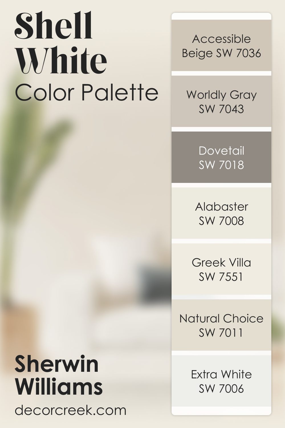
Shell White SW 8917 by Sherwin Williams Color Palette
Shell White SW 8917 brings a gentle glow to interiors, and this palette helps you build a warm, inviting look around it. Natural Choice, Accessible Beige, and Worldly Gray add quiet neutrals that support the main shade with a soft, grounded feel.
Alabaster and Extra White lighten the palette without washing it out, giving your room a fresh, open look.
Greek Villa brings a creamy softness that blends beautifully with Shell White, making everything feel comforting and steady. For depth, Dovetail steps in with a rich gray that adds character without feeling harsh. Together, these shades create a palette that works beautifully in open living areas, bedrooms, or hallways where you want a warm and welcoming feeling.
This combination brings a gentle sense of balance that feels natural and encouraging in any home.
How to Use Shell White SW 8917 by Sherwin Williams In Your Home?
Shell White SW 8917 by Sherwin Williams is a beautiful, soft white color that can make your home feel more welcoming and airy. It’s perfect for anyone looking to add a touch of brightness to their space without the starkness that can come with pure white. You can use Shell White in many ways around your home. For example, painting your living room or bedroom walls with this color can open up the space and give it a fresh, clean look. It’s also a great choice for kitchens and bathrooms, where it can help reflect light and make these smaller spaces seem bigger.
Additionally, Shell White works well for trim, doors, and ceiling to create a cohesive and polished look. It pairs nicely with a wide range of colors, so you can use it as a neutral backdrop for bold accents or keep the palette soft and subtle with pastel or earth tones. Whether you’re updating a single room or giving your whole home a makeover, Shell White can help you achieve a serene and inviting atmosphere.
Shell White SW 8917 by Sherwin Williams vs Cold Foam SW 9504 by Sherwin Williams
Shell White and Cold Foam by Sherwin Williams are two unique colors that bring different vibes to a space. Shell White has a soft, warm tone that feels welcoming and cozy, reminiscent of a sunlit beach with gentle waves. It’s a versatile color that can brighten up any room, making it feel more spacious and inviting. On the other hand, Cold Foam is cooler and has a crisp, clean feel to it. It’s like looking at a frothy sea from a different angle, where the water reflects the sky on a clear day.
This color can give a room a fresh, modern look, perfect for creating a serene and tranquil atmosphere. While both colors are inspired by the sea, Shell White adds warmth and light, creating a cozy ambiance, whereas Cold Foam brings a fresh, airy feel, making it great for a more minimalist or contemporary decor. It all comes down to the mood you want to set in your space – cozy and warm with Shell White or fresh and modern with Cold Foam.
You can see recommended paint color below:
- SW 9504 Cold Foam
Shell White SW 8917 by Sherwin Williams vs Whitetail SW 7103 by Sherwin Williams
Shell White and Whitetail, both by Sherwin Williams, are two shades of white paint that share some similarities but also have distinct differences. Shell White has a warm and creamy undertone, making it a perfect choice for spaces where you want to add a hint of coziness without overwhelming the room with color. It’s like the soft white you see on a sunny beach, gentle and inviting.
On the other hand, Whitetail stands out for its slightly cooler and brighter tone. It’s the kind of white that feels fresh and clean, making a room feel more spacious and airy. Whitetail is great for areas that get a lot of natural light, as it reflects the light beautifully, enhancing the sense of openness.
Both colors are versatile and can complement a variety of decor styles, but the choice between them comes down to the mood you want to create. Shell White offers warmth and a subtle, inviting atmosphere, while Whitetail provides a crisp, clean backdrop that can make a room feel more open and light-filled.
You can see recommended paint color below:
Shell White SW 8917 by Sherwin Williams vs White Flour SW 7102 by Sherwin Williams
Shell White and White Flour, both by Sherwin Williams, are subtle yet distinct shades of white. Shell White leans towards a soft, warm white with hints of beige. This makes it a cozy and inviting option for any space, adding a touch of warmth to walls or trim.
On the other hand, White Flour is slightly cooler and brighter, offering a clean and crisp backdrop. It’s perfect for illuminating a room or creating a sharp contrast with other colors. While Shell White can add a cozy, almost calming effect, White Flour aims for a fresh and airy vibe. Both are incredibly versatile, but the choice between them depends on the atmosphere you want to create. Shell White is ideal for a warm, welcoming space, whereas White Flour suits those looking for a brighter, more refreshing look.
You can see recommended paint color below:
Shell White SW 8917 by Sherwin Williams vs Marshmallow SW 7001 by Sherwin Williams
Shell White and Marshmallow, both by Sherwin Williams, are two colors that might seem similar at first glance, but they have their unique characteristics. Shell White has a warm undertone that gives off a cozy and inviting vibe. It’s a versatile color that can make spaces feel open and airy.
On the other hand, Marshmallow is slightly cooler and can add a crisp, clean look to any room. While both colors are light and can help in making a small space appear larger, Marshmallow offers a bit more brightness, making it perfect for areas that you want to feel more refreshed and energized. In contrast, Shell White brings warmth into the room, making it ideal for creating a relaxing atmosphere. Choosing between them comes down to the mood you want to set in your space and whether you prefer a warmer or a cooler hue.
You can see recommended paint color below:
Shell White SW 8917 by Sherwin Williams vs Downy SW 7002 by Sherwin Williams
Shell White and Downy, both by Sherwin Williams, are two unique shades that beautifully complement a range of designs. Shell White has a soft, serene vibe, offering a clean and subtle backdrop that feels both warm and inviting. It’s a color that works well in spaces aiming for a calm and minimalist aesthetic.
On the other hand, Downy steps in as a slightly cooler, gentle gray with a hint of warmth. This makes it incredibly versatile, fitting just right into spaces that desire a neutral color with a bit more depth than a traditional off-white. While Shell White lends itself to a pure, simplistic charm, Downy offers a touch of sophistication and a modern edge. In choosing between the two, consider the mood you want to create: Shell White for a bright and airy feel, or Downy for a nuanced, contemporary look.
Both shades promise to elevate your space with their understated elegance.
You can see recommended paint color below:
Shell White SW 8917 by Sherwin Williams vs Alabaster SW 7008 by Sherwin Williams
Shell White and Alabaster are both popular shades from Sherwin Williams, known for their warm, inviting feels. Despite their similarities, there are distinct differences that set them apart. Shell White has a slightly brighter, more vivid tone compared to Alabaster.
This makes it a go-to for spaces where you want a fresh, airy feel without going too stark or clinical. On the other hand, Alabaster tends to lean towards a softer, more muted vibe. It brings a cozy warmth to rooms, making it ideal for creating a comfortable, relaxed atmosphere. While both colors are versatile and can beautifully complement various decor styles, Shell White might be preferred for more light-filled, vibrant spaces.
Alabaster, with its subtle, creamy warmth, is excellent for achieving a gentle, inviting environment. Choosing between them depends on the mood and brightness you’re aiming to achieve in your space.
You can see recommended paint color below:
Shell White SW 8917 by Sherwin Williams vs Cotton SW 9581 by Sherwin Williams
Shell White and Cotton by Sherwin Williams are both beautiful, light colors, but they have their unique characteristics. Shell White leans more towards a soft, warm hue that gives a cozy and inviting feel to spaces. It’s the kind of color that can make a room feel more intimate and homey, perfect for living areas and bedrooms where you want a gentle, soothing tone.
On the other hand, Cotton has a cleaner, crisper vibe. It’s a bit cooler compared to Shell White, making it ideal for creating a fresh and airy atmosphere. This color works great in kitchens, bathrooms, or any space where you want to evoke a sense of cleanliness and brightness.
While both colors are subtle and can be versatile in different settings, your choice between them might come down to the mood you want to set. Shell White offers warmth and a welcoming feel, whereas Cotton brings a crisp and clean energy to the space.
You can see recommended paint color below:
- SW 9581 Cotton
Shell White SW 8917 by Sherwin Williams vs Frost Bite SW 9505 by Sherwin Williams
Shell White and Frost Bite by Sherin Williams are two distinct colors, each offering a unique vibe. Shell White is a soft, warm, and inviting hue that brings a sense of calm and tranquility to any space. It has a creamy aspect to it, making it feel cozy and comfortable, perfect for creating a peaceful and restful environment.
On the other hand, Frost Bite presents a cooler, crisper appearance. This color leans towards a fresh, clean look, resembling the first light frost of winter. It’s brighter and more energizing, superb for spaces that aim to feel more alive and vibrant while maintaining a sense of refreshing coolness.
Comparing the two, Shell White provides warmth and a welcoming atmosphere, while Frost Bite offers a sharp, refreshing energy, making them excellent for different moods and settings.
You can see recommended paint color below:
- SW 9505 Frost Bite
Shell White SW 8917 by Sherwin Williams vs Greek Villa SW 7551 by Sherwin Williams
Shell White and Greek Villa are two popular colors by Sherwin Williams, each with its own unique charm. Shell White has a soft and subtle vibe, creating a serene and calming atmosphere in any room. It’s perfect for those who want a clean, minimalistic look. Its understated elegance makes it versatile, easily pairing with various decor styles.
On the other hand, Greek Villa brings a bit more warmth to the table. It has a creamy undertone that adds a cozy, welcoming feel to spaces. This color is excellent for anyone looking to add a hint of warmth without overwhelming the room. Greek Villa is also incredibly versatile, working well in many different lighting situations and complementing a wide range of accent colors and interior designs.
When comparing the two, the main difference lies in their underlying tones. Shell White leans more towards a pure, neutral white, while Greek Villa offers a warmer, creamier touch. Depending on what ambiance you’re aiming for, both colors offer unique possibilities for transforming spaces with their distinct characteristics.
You can see recommended paint color below:
Shell White SW 8917 by Sherwin Williams vs Westhighland White SW 7566 by Sherwin Williams
Shell White and Westhighland White are two paint colors from Sherwin Williams that are both soft and subdued, yet they carry distinct differences. Shell White has a gentle warmth to it, almost like it’s holding onto a hint of sunlight. This makes it a great choice if you want a room to feel cozy and inviting without tipping into actual color. It’s perfect for spaces that need a touch of brightness but in a very subtle way.
On the other hand, Westhighland White leans a bit more towards a classic, neutral white. It’s slightly brighter and crisper, making it an excellent pick for areas that you want to feel more open and airy. This color reflects light beautifully, helping to make small spaces appear larger and more welcoming.
Both colors offer their unique take on white, with Shell White providing a warm, almost creamy feel, and Westhighland White offering a clean, straightforward backdrop. Whether you’re looking for a hint of coziness or a sharp, fresh start, these colors have you covered. Their differences, though subtle, can significantly affect the mood and feel of a room.
You can see recommended paint color below:
Conclusion
Shell White by Sherwin Williams is a versatile color that seamlessly blends with various decor styles and spaces. Its understated elegance brings a sense of calm and serenity to any room, making it perfect for those looking to create a peaceful and inviting atmosphere.
The color’s ability to reflect light beautifully enhances the sense of space, making it an excellent choice for both small and large rooms. It pairs well with a wide range of colors, from bold and vibrant to soft and neutral, allowing for flexibility in design options.
The popularity of Shell White can be attributed to its timeless appeal and functionality. Its neutrality serves as a perfect backdrop, allowing furniture and art to stand out, making it ideal for both minimalistic and opulent design schemes. Regardless of the changing trends, Shell White remains a go-to color for professionals and homeowners alike, proving its enduring appeal in the world of interior design. Its adaptability and charm make it not just a color but a smart investment in creating spaces that feel both sophisticated and welcoming.
Ever wished paint sampling was as easy as sticking a sticker? Guess what? Now it is! Discover Samplize's unique Peel & Stick samples.
Get paint samples
