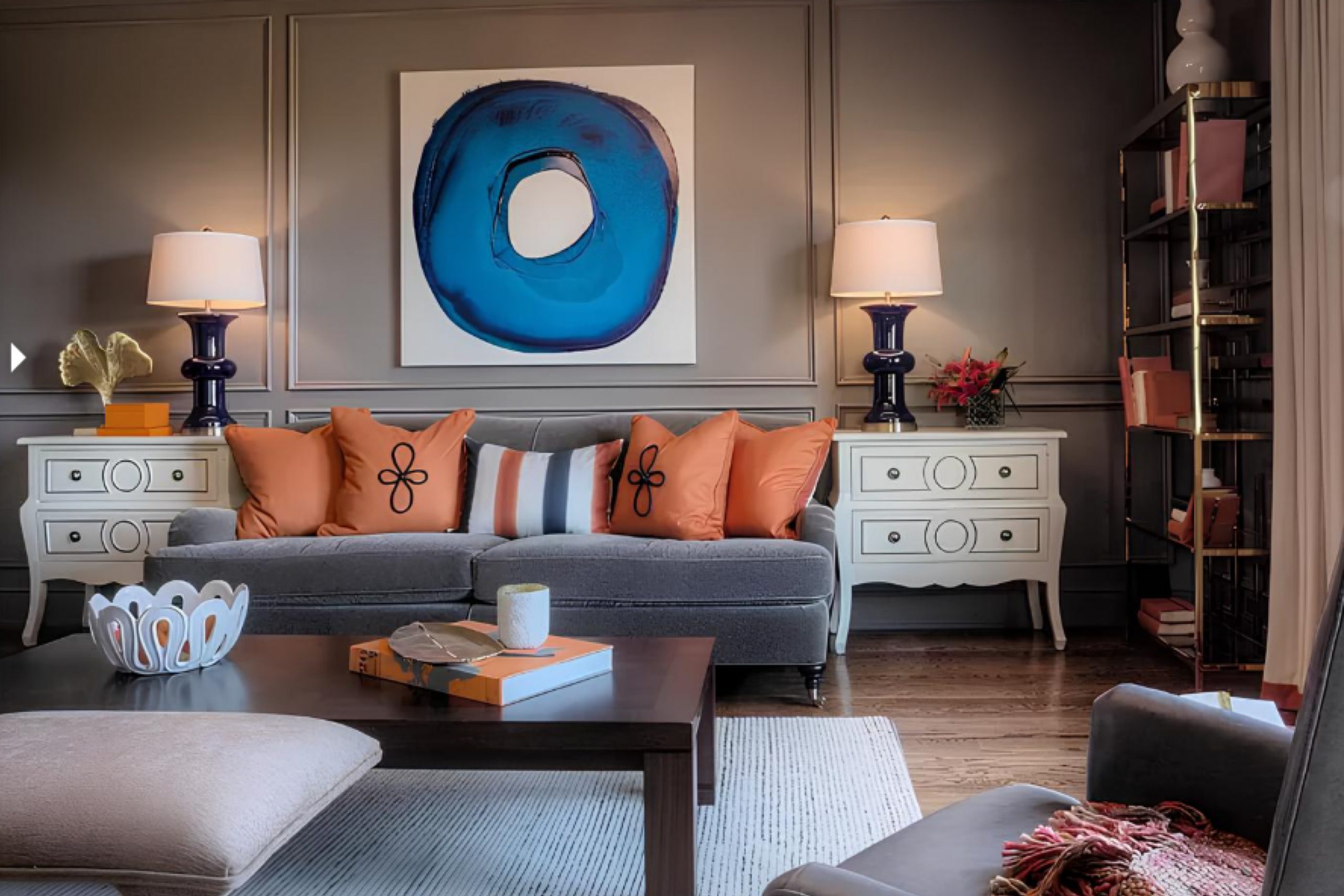
As I walk you through the soothing shade of SW 6004 Mink by Sherwin Williams, imagine the rich depth it brings to any space. Picture this gentle gray-brown hue in your living room, softly enveloping the walls and creating a cozy, inviting atmosphere. It pairs beautifully with both modern and traditional decor, adding a touch of sophistication without overpowering the room.
In rooms with abundant natural light, Mink appears more vibrant and lively, whereas, in dimmer spaces, it exudes a subtle, calming warmth. It’s versatile for accent walls, full rooms, or even exterior applications, complementing wood finishes and metallic accents alike.
This color has a muted elegance that works well with soft creams, deep blues, or even bold blacks, allowing you to mix and match decor elements freely.
Whether you’re updating a single room or transforming your entire home, the understated beauty of Mink offers a solid foundation for your decorating endeavors.
It’s a color that quietly asserts itself, providing a backdrop that enhances everything around it.
What Color Is Mink SW 6004 by Sherwin Williams?
The color Mink by Sherwin Williams is a deep, rich gray with a hint of brown, giving it a warm and inviting feel. This versatile shade can add depth and character to any space, making it an ideal choice for those looking to create a cozy and stylish environment. It has a subtle elegance that works well in many settings, harmonizing beautifully with natural materials like wood, leather, and wool, enhancing their texture and warmth.
In terms of interior styles, Mink is particularly suited for modern, rustic, or industrial themes. Its grounding quality can balance the sleek lines of contemporary furniture in a modern setting or complement the rugged textures in a rustic room. In an industrial-inspired space, this color pairs well with metallic elements like iron or steel, providing a soft contrast to hard surfaces.
Mink works beautifully in a range of spaces from living rooms and kitchens to bedrooms and bathrooms. When matched with soft textiles like velvet or linen, it creates a welcoming atmosphere. For a coherent look, combine it with light neutrals like creamy whites or beiges that can keep spaces feeling airy while providing a subtle contrast against Mink’s deeper tone.
Accent elements in emerald green or navy blue can also enhance the richness of Mink, adding a chic touch to the overall decor.
Is Mink SW 6004 by Sherwin Williams Warm or Cool color?
Sherwin Williams’ MinkSW 6004 is a unique and warm shade of gray that offers versatility for home decor. This color has a deep richness that works well in various spaces, from living rooms to bedrooms, adding a cozy and inviting feel.
It pairs beautifully with both light and dark furniture, making it easy for homeowners to incorporate into their existing style. The neutrality of MinkSW 6004 means it can complement a wide range of accent colors, from soft pastels to vibrant hues, allowing for personalized design choices. In rooms with plenty of natural light, MinkSW 6004 looks slightly lighter, highlighting its warm undertones.
In spaces with less light, it provides a grounding effect that can make large rooms feel more intimate. This adaptability makes it a practical choice for those looking to add a touch of warmth without overwhelming their space with darker colors. Overall, MinkSW 6004 is a smart pick for anyone looking to refresh their home with a cozy, adaptable, and stylish color choice.
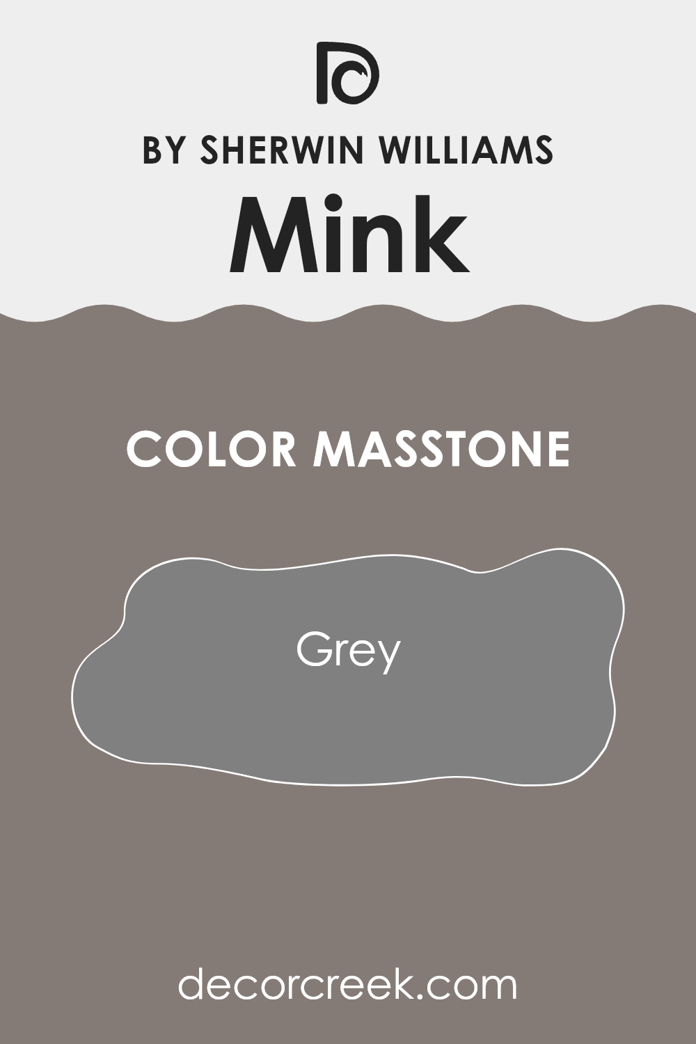
What is the Masstone of the Mink SW 6004 by Sherwin Williams?
Mink SW 6004 by Sherwin Williams is a unique shade that has a masstone of grey, specifically Grey (#808080). This neutral grey tone serves as a versatile backdrop for various home styles and decor choices. Being a middle ground between black and white, it provides a subtle depth that isn’t overpowering.
This makes it especially useful in spaces that need a touch of elegance without the use of bold colors. The neutrality of Mink allows it to flawlessly blend with other colors, whether they are bright or muted, enabling a harmonious color scheme in any room.
It works well in living areas, bedrooms, and even bathrooms, offering a steady and calming hue that can help make a space feel more grounded and cohesive. Its ability to pair easily with various textures and furnishings means it can fit seamlessly into both modern and traditional homes, enhancing the overall aesthetic without dominating it.
Whether used as a primary color or as an accent, Mink provides a stylish, yet understated, effect.
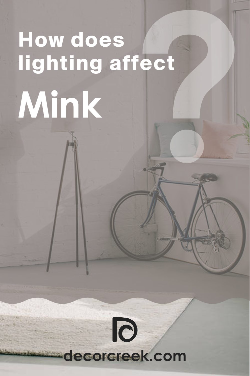
How Does Lighting Affect Mink SW 6004 by Sherwin Williams?
Lighting plays a crucial role in how we perceive colors in different environments. The specific shade of paint applied to a wall can appear differently based on the light source illuminating it. One color, Mink by Sherwin Williams, is a great example to illustrate this phenomenon. This color is a deep, warm gray that can exhibit various undertones depending on the lighting conditions.
In artificial light, Mink tends to look richer and warmer. Most artificial lights, especially incandescent bulbs, bring out the yellow and red undertones in colors, making Mink appear more inviting and snug.
This makes it a lovely choice for living rooms and dining areas where evenings are spent under the cozy glow of lamps and overhead lights.
In natural light, the color changes as the day progresses.
Mink’s true grey quality is more noticeable under natural daylight, which generally provides a balanced light that does not distort colors too much. However, natural light varies greatly depending on the orientation of the room.
1. North-faced rooms: North-facing rooms often receive cooler, somewhat indirect light. Here, Mink might show its cooler, more shadowy side. The color might appear slightly more muted and subtle due to the lack of intense sunlight.
2. South-faced rooms: These rooms benefit from abundant, warm light for most of the day. In such rooms, Mink can show a warmer, more vibrant side, enhancing the coziness of the space.
3. East-faced rooms: Morning light from the east is warm and bright but can turn bluer as the day goes on. Mink will look warm and welcoming in the morning and take on a cooler tone as the afternoon approaches.
4. West-faced rooms: Evening light from the west is warm and can bring out the warmer undertones of Mink. As the sun sets, the color will appear softer and richer, making spaces feel cozy and relaxed as the day ends.
Understanding how lighting affects Mink can help you decide the best use of the color in different rooms of your home based on the natural light each room receives.
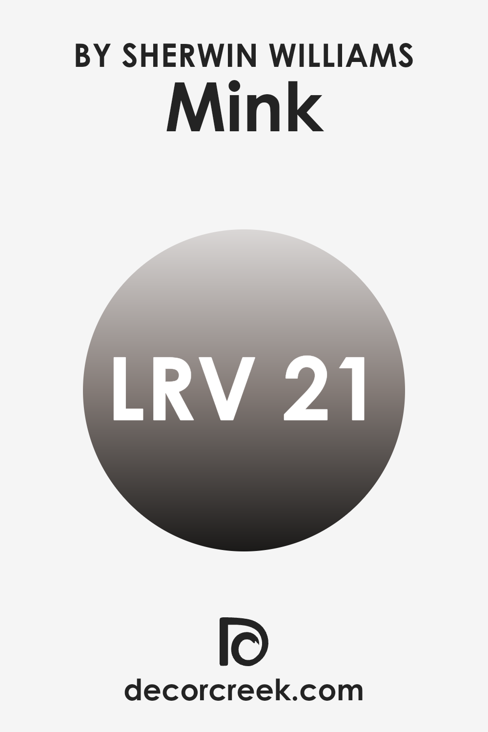
What is the LRV of Mink SW 6004 by Sherwin Williams?
LRV stands for Light Reflectance Value, a measure indicating the amount of light a paint color reflects compared to the amount it absorbs. The scale ranges from one to 99, where lower numbers indicate darker shades that absorb more light, and higher numbers represent lighter colors that reflect more light.
This value is crucial when choosing paint colors because it helps predict how light or dark a color will look in a space. A higher LRV can make a small room feel more open and airy, while a lower LRV can make a space feel cozier but smaller.
The color MinkSW 6004 by Sherwin Williams has an LRV of 20.528, placing it on the darker end of the scale.
In a well-lit room with plenty of natural or artificial light, this color will show its true depth and richness.
However, in a less lit area, it can appear almost black, potentially making the space feel smaller and more enclosed.
When using darker colors like this one, it’s important to consider the room’s lighting to ensure that the color enhances the space as intended.
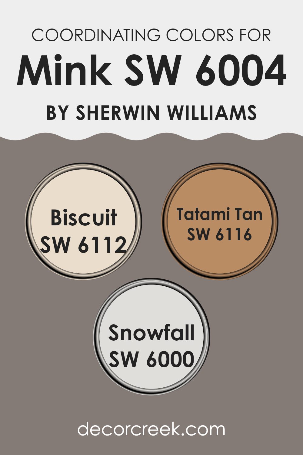
Coordinating Colors of Mink SW 6004 by Sherwin Williams
Coordinating colors are hues that pair well together to create visually appealing schemes for interior design. These can be chosen based on their positions on the color wheel, their intensities, or their undertones to complement a primary color.
For instance, when using a nuanced shade like Mink from Sherwin Williams, selecting coordinating colors such as Biscuit, Tatami Tan, and Snowfall allow for a balanced and harmonious look. Each coordinating color typically supports the primary color by enhancing its inherent qualities without overpowering it, enabling an overall cohesive appearance in any room.
Biscuit is a warm, welcoming cream color that provides a gentle contrast to the deeper tones of Mink, offering a soft backdrop that highlights richer colors. Tatami Tan adds an earthy, grounded feel; it’s a shade that brings a sense of warmth and natural elegance to spaces, making it ideal for areas where you want to add depth without overwhelming brightness.
On the other hand, Snowfall is a very light, nearly white hue that brings brightness and a sense of openness, making it perfect for trim or ceilings where you want to create an illusion of more space or offer a crisp, clean finish to complement the more subdued Mink tone.
You can see recommended paint colors below:
- SW 6112 Biscuit
- SW 6116 Tatami Tan
- SW 6000 Snowfall
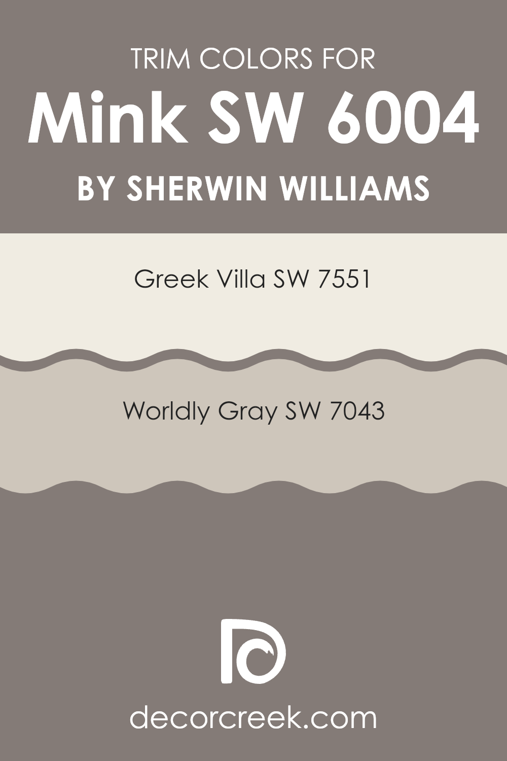
What are the Trim colors of Mink SW 6004 by Sherwin Williams?
Trim colors are used to highlight and accentuate the architectural details of a room or exterior, providing definition and contrast to the main wall color. For instance, if you have a rich, dark hue like Mink by Sherwin Williams on your walls, choosing the right trim color can enhance the overall aesthetic and bring a polished look to your space. Trim colors can be crucial in making design elements stand out or in tying together various aspects of a room, acting almost like a frame in an artwork.
For a color like Mink, a lighter trim such as SW 7551 – Greek Villa can be very effective. Greek Villa is a warm, creamy white that’s not too stark, providing a gentle distinction without clashing with the deep tones of Mink.
On the other hand, using SW 7043 – Worldly Gray as a trim offers a more muted, subtle contrast. Worldly Gray is a soft, medium gray that harmonizes well with darker shades, ensuring that the transition between the wall and trim is smooth and pleasing to the eye. Both choices can help define the space clearly without overshadowing the primary color.
You can see recommended paint colors below:
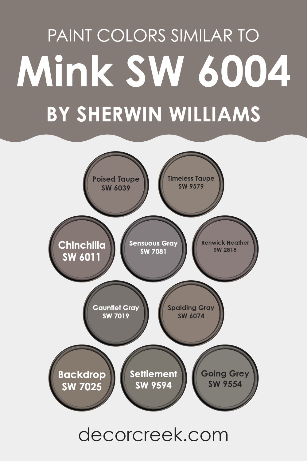
Colors Similar to Mink SW 6004 by Sherwin Williams
Choosing similar colors, such as the tones related to Mink by Sherwin Williams, can create a harmonious and visually cohesive space. These colors, ranging from serene grays to rich taupes, work together seamlessly, allowing for an aesthetic that is both pleasing and easy to integrate into various design styles. By using similar shades, you can achieve a look that feels balanced and thoughtfully curated, with each color complementing the next.
For instance, Poised Taupe is a balanced blend of warm and cool tones, perfect for creating a cozy yet modern look. Timeless Taupe has a slightly more robust and earthy feel, making it ideal for spaces that call for a touch of warmth. Chinchilla adds a bit of depth with its darker, almost smoky hue, while Sensuous Gray offers a cooler counterpoint with subtle violet undertones.
Renwick Heather stands out with its deeper, more complex gray that pairs well in sophisticated settings. Gauntlet Gray provides a strong, statement-making base, and Spalding Gray is a lighter gray that offers soft, versatile backdrops for any room. Backdrop is a cooler, more neutral gray that works well in modern designs.
Settlement has a unique blend, resembling aged plaster, perfect for adding texture visually through color. Finally, Going Grey is a light, airy gray that brings a fresh and calming effect to any space. Together, these colors provide a spectrum that facilitates fluid design transitions and a unified aesthetic.
You can see recommended paint colors below:
- SW 6039 Poised Taupe
- SW 9579 Timeless Taupe
- SW 6011 Chinchilla
- SW 7081 Sensuous Gray
- SW 2818 Renwick Heather
- SW 7019 Gauntlet Gray
- SW 6074 Spalding Gray
- SW 7025 Backdrop
- SW 9594 Settlement
- SW 9554 Going Grey
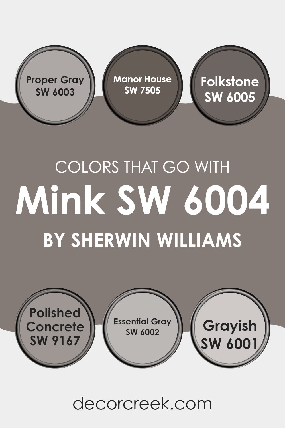
Colors that Go With Mink SW 6004 by Sherwin Williams
Choosing the right colors to coordinate with Mink SW 6004 by Sherwin Williams is crucial because it helps create a cohesive and visually appealing space. Colors that harmonize with Mink, such as Proper Gray SW 6003, Manor House SW 7505, and others, bring balance and allow for versatility in decor.
For example, Proper Gray is a light, soft gray that offers a subtle contrast to the deeper tones of Mink, making it perfect for creating a gentle yet distinct feel in a room. Manor House, on the other hand, is a richer, darker gray that complements Mink by adding depth and a sense of grounding to the environment.
Folkstone SW 6005 and Polished Concrete SW 9167 are also excellent companions to Mink. Folkstone presents as a mid-tone gray that strikes a nice middle ground, neither too light nor too dark, fitting seamlessly into various design schemes without overpowering the primary color.
Polished Concrete provides a modern touch with its slightly cooler hue, lending a fresh and contemporary look, especially in minimalist or modern settings. Additionally, Essential Gray SW 6002 and Grayish SW 6001 offer more variations.
Essential Gray is a fundamental neutral gray that works well in almost any space, facilitating a smooth color flow. Grayish is unique because it blends gray with hints of blue, adding a subtle layer of interest and helping to create a visually dynamic space when paired with Mink. Together, these colors ensure that the chosen aesthetic achieves both contrast and continuity effectively.
You can see recommended paint colors below:
- SW 6003 Proper Gray
- SW 7505 Manor House
- SW 6005 Folkstone
- SW 9167 Polished Concrete
- SW 6002 Essential Gray
- SW 6001 Grayish
How to Use Mink SW 6004 by Sherwin Williams In Your Home?
Mink SW 6004 by Sherwin Williams is a rich, deep taupe that adds a cozy, warm feel to any room. This versatile color can be used in various ways throughout your home to create a welcoming atmosphere. If you’re thinking about painting your living room or bedroom, Mink is a great choice because it pairs well with both dark and light furniture, making it easy to match with your existing decor.
In the kitchen, you might consider using Mink for cabinets or an accent wall to give the space a stylish look without being overwhelming. This color also works well in bathrooms, where it can create a calming backdrop for white fixtures and bright towels.
To add a touch of elegance to your home office or study, you could paint the walls Mink. This would provide a neutral background that’s easy on the eyes during long hours of work.
Overall, Mink SW 6004 is a practical, stylish choice for anyone looking to update their home with a new paint color. It’s easy to apply and can blend seamlessly with many styles and tastes.
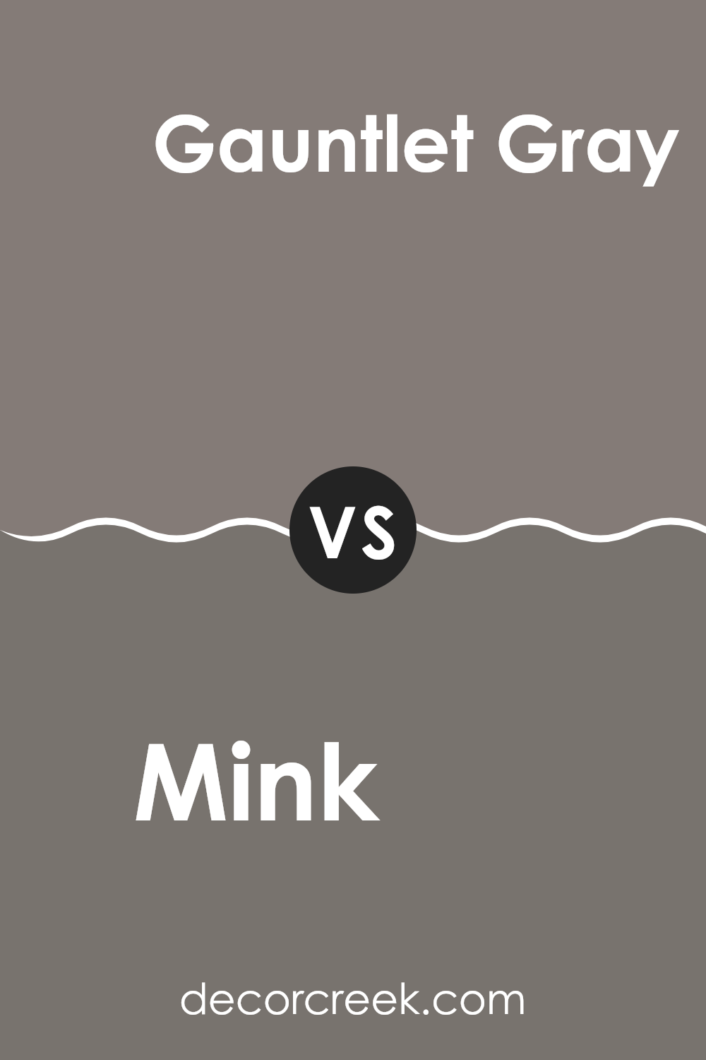
Mink SW 6004 by Sherwin Williams vs Gauntlet Gray SW 7019 by Sherwin Williams
Mink (SW 6004) and Gauntlet Gray (SW 7019) are two gray shades from Sherwin Williams, but they offer different vibes for room settings. Mink is a softer, lighter gray with a warm undertone, making it a great choice for creating a cozy and welcoming atmosphere in living spaces or bedrooms. Its subtle warmth helps balance rooms that don’t get a lot of natural sunlight.
On the other hand, Gauntlet Gray is a darker gray that leans more towards a slate color. It’s ideal for adding drama or making a bold statement in a space. Due to its deeper tone, it works well in larger rooms or as an accent wall, paired with lighter colors to prevent it from overpowering the space.
Both colors are versatile and pair well with a variety of decor styles, but the choice between them would depend on the mood you’re trying to set in your room and how much natural light the room receives.
You can see recommended paint color below:
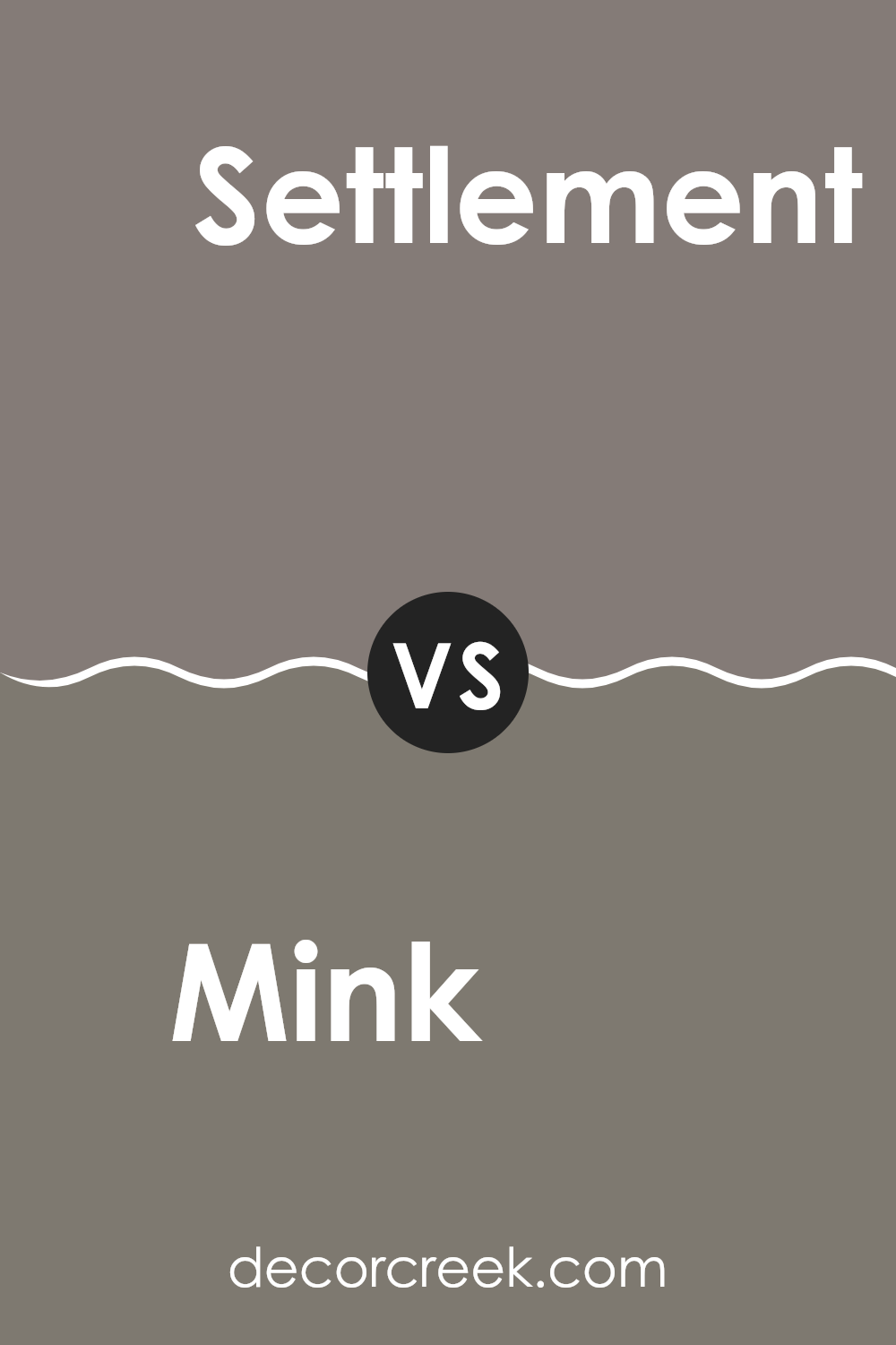
Mink SW 6004 by Sherwin Williams vs Settlement SW 9594 by Sherwin Williams
Mink and Settlement are two paint colors from Sherwin Williams that have their unique appeal. Mink is a rich, warmer gray with deep brown undertones, giving it a cozy and inviting vibe that makes it perfect for living rooms or bedrooms.
It has a more traditional feel and can make a space feel grounded and secure. On the other hand, Settlement is a lighter, muted beige with a hint of gray. It’s a softer color that can help make a small room feel bigger and brighter.
Settlement works well in areas that get a lot of light and can be used in any room to give it a clean, fresh look. Together, these colors could complement each other nicely, with Mink providing depth and warmth, and Settlement offering a light, airy background.
You can see recommended paint color below:
- SW 9594 Settlement
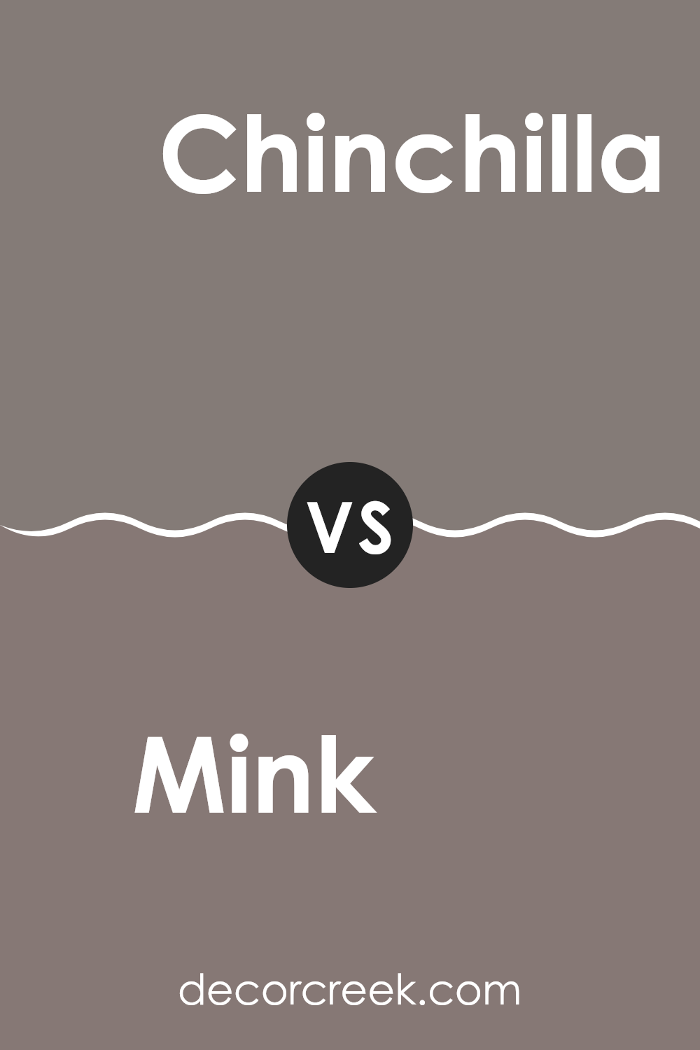
Mink SW 6004 by Sherwin Williams vs Chinchilla SW 6011 by Sherwin Williams
Mink and Chinchilla by Sherwin Williams are two interesting shades that are great for giving rooms a cozy feeling. Mink is a soft, muted gray with a touch of brown, making it warm and inviting. This color works well in living rooms or bedrooms where you want a peaceful yet cozy atmosphere.
On the other hand, Chinchilla is a bit darker and leans more towards a rich, deep gray with a slight hint of purple. This shade is perfect for creating a cozy, snug feel, perhaps more suited for an office or a den where its depth adds a bit of character without being too bold.
Both colors are neutral, so they match well with various decors, yet each brings its own unique vibe to a space. Whether you choose the lighter touch of Mink or the deeper tone of Chinchilla, both offer a pleasant background for everyday living.
You can see recommended paint color below:
- SW 6011 Chinchilla
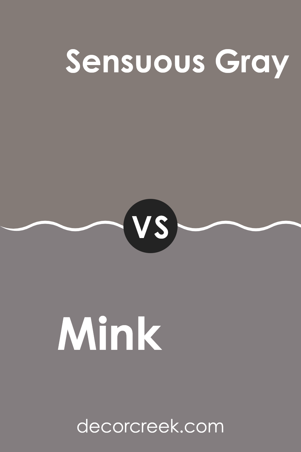
Mink SW 6004 by Sherwin Williams vs Sensuous Gray SW 7081 by Sherwin Williams
Mink (SW 6004) and Sensuous Gray (SW 7081) are both colors by Sherwin Williams, but they have distinct tones that set them apart. Mink is a deep, soft brown with a subtle hint of gray, creating a warm and cozy feel in a space. It’s a versatile color that can work well in living areas or bedrooms, providing a comforting backdrop that complements a variety of decor styles and other colors.
On the other hand, Sensuous Gray is a much cooler tone, blending gray with touches of purple. This color leans more towards a neutral, contemporary look, making it ideal for modern living spaces or bathrooms. It adds a touch of elegance without being too bold.
Both colors offer unique vibes: Mink adds warmth and a sense of homeliness, while Sensuous Gray gives off a cooler, more refined air. Depending on the mood you want to set in your room, you might choose one over the other.
You can see recommended paint color below:
- SW 7081 Sensuous Gray
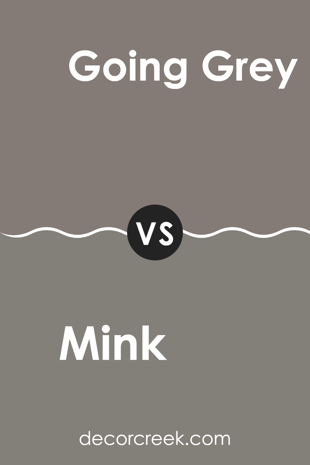
Mink SW 6004 by Sherwin Williams vs Going Grey SW 9554 by Sherwin Williams
Mink (SW 6004) and Going Grey (SW 9554) from Sherwin Williams are two distinct colors with their unique charm and functionality in interior design. Mink is a deeper, warmer color with a dusky undertone that brings a cozy and comfortable feeling to any room. It pairs well with natural materials like wood and leather, making it a great choice for living rooms or studies.
On the other hand, Going Grey is a lighter, neutral grey that offers a fresh and clean appearance. This shade is incredibly versatile and works beautifully in modern and minimalist decor styles. It can help brighten a space while maintaining a subtle and understated look.
When comparing both, Mink provides a richer, more enveloping feeling, ideal for creating a welcoming, intimate atmosphere. Going Grey, in contrast, offers a more open and airy vibe, excellent for making smaller spaces appear larger. Each color serves different purposes depending on the mood and size of the room you’re decorating.
You can see recommended paint color below:
- SW 9554 Going Grey
Mink SW 6004 by Sherwin Williams vs Renwick Heather SW 2818 by Sherwin Williams
The two colors Mink and Renwick Heather both come from Sherwin Williams but they have distinctly different tones and feelings. Mink is a deeper, softer gray with a slight warmth to it, making it cozy and inviting. It’s a versatile color that works well in many spaces, adding a touch of understated elegance without being too bold.
On the other hand, Renwick Heather is a richer, darker shade that leans more towards a brownish-gray. This color provides a stronger statement and can give a room a more grounded, stable feeling. It tends to make spaces feel more enclosed and cozy, which can be great for creating a snug, intimate atmosphere.
When comparing these two, Mink is lighter and can help to open up a room and make it appear more spacious, while Renwick Heather, being darker, works well in larger spaces or as an accent wall to add depth and interest. Both colors have their unique charm and can beautifully enhance the space depending on the lighting and accompanying decor.
You can see recommended paint color below:
- SW 2818 Renwick Heather

Mink SW 6004 by Sherwin Williams vs Backdrop SW 7025 by Sherwin Williams
Mink SW 6004 and Backdrop SW 7025, both from Sherwin Williams, offer unique shades for those looking to paint their spaces. Mink is a soft, muted gray with a warm undertone that makes it cozy and welcoming. This color is ideal for living spaces or bedrooms where a calm and comfortable atmosphere is desired. It pairs well with brighter colors and natural wood finishes for a balanced look.
On the other hand, Backdrop SW 7025 is slightly darker and cooler. This shade is more of a true medium gray, providing a neutral backdrop perfect for modern decor styles. It works well in areas that get a lot of light, ensuring that the space feels neither too bright nor too dark.
Backdrop is also great for those who enjoy changing up their decor often, as it goes well with many different colors and materials. Choosing between Mink and Backdrop largely depends on the mood and style one wants to achieve, as well as the room’s lighting and size.
You can see recommended paint color below:

Mink SW 6004 by Sherwin Williams vs Poised Taupe SW 6039 by Sherwin Williams
Mink and Poised Taupe, both by Sherwin Williams, are unique yet subtly different shades that can create distinct moods in a space. Mink is a deep, rich gray with a hint of brown, making it a perfect choice for an elegant and grounding atmosphere in a room. It’s great for creating a cozy, inviting space because of its depth and warmth.
On the other hand, Poised Taupe is a blend of gray and brown, but it’s lighter than Mink, offering a more balanced and neutral backdrop. It provides flexibility in decor, working well with both warm and cool tones, making it ideal for a variety of settings from modern to classic.
Both colors are versatile, but Mink serves well in areas where a strong, cozy anchor is desired, while Poised Taupe is better for spaces that need a softer, more flexible color foundation. Depending on the lighting and furnishings, each can bring a distinct character to a room.
You can see recommended paint color below:
- SW 6039 Poised Taupe

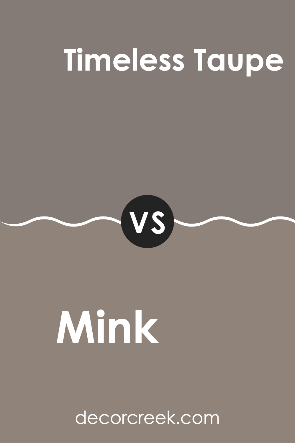
Mink SW 6004 by Sherwin Williams vs Timeless Taupe SW 9579 by Sherwin Williams
Mink SW 6004 by Sherwin Williams is a rich, warm grey that has a subtle brown undertone, giving it a cozy and inviting feel. It’s a versatile color that can create a soft, welcoming atmosphere in any room.
On the other hand, Timeless Taupe SW 9579 is a lighter shade, leaning more towards a classic taupe. This color includes a blend of gray and brown, but with a slightly more beige tone, making it feel warmer compared to Mink. Timeless Taupe offers a more neutral backdrop, suitable for spaces where you want to enhance natural light.
Both colors are great for creating a calm and comfortable environment, but Mink provides a deeper, cozier ambiance, while Timeless Taupe offers a brighter, more airy feel. Their subtle differences in depth and undertone make them suitable for various decorating styles and preferences.
You can see recommended paint color below:
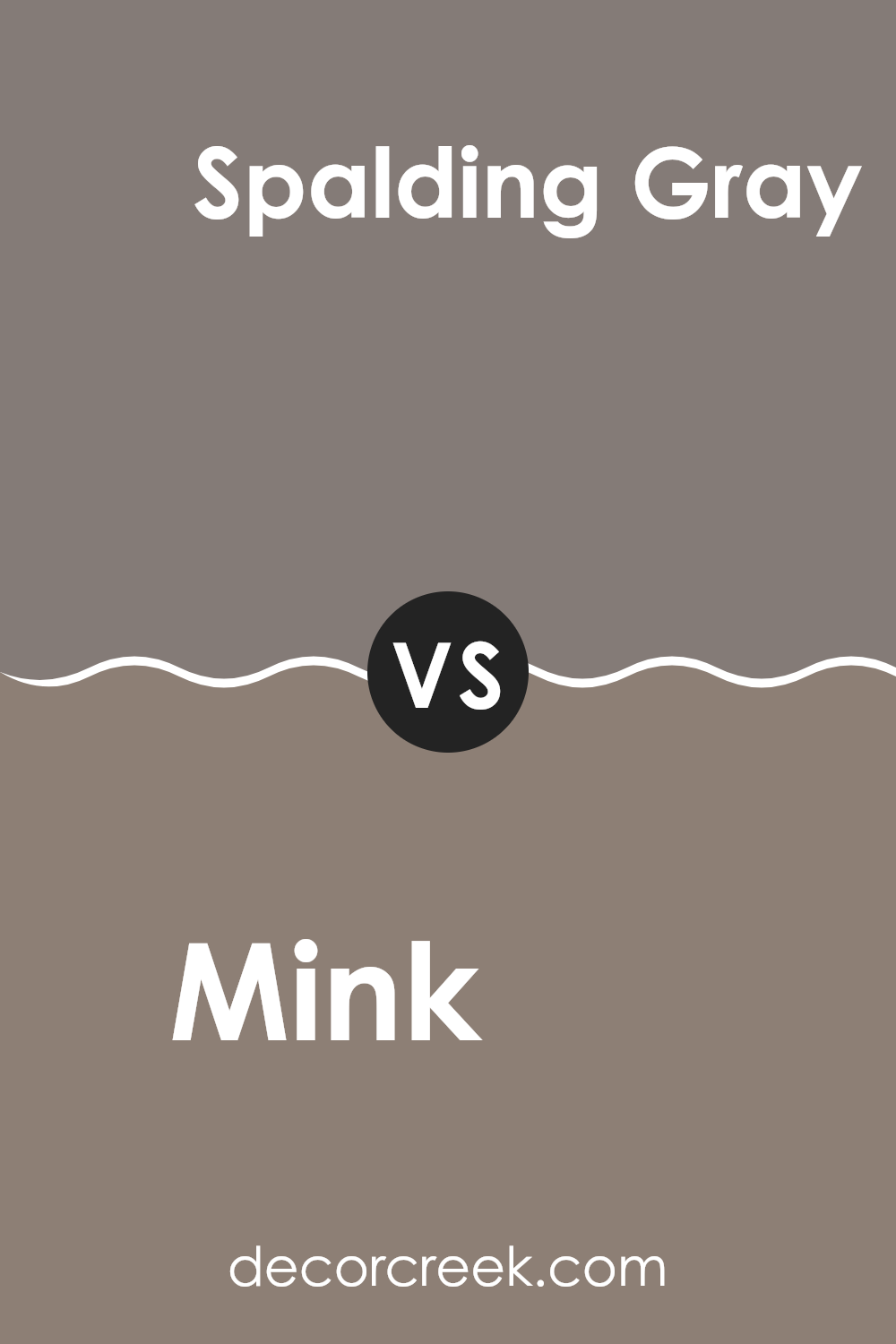
Mink SW 6004 by Sherwin Williams vs Spalding Gray SW 6074 by Sherwin Williams
Mink SW 6004 and Spalding Gray SW 6074 are both neutral colors from Sherwin Williams, but they have different tones that could affect the feel of a room. Mink is a soft, cozy gray-brown that offers a warm, inviting feel to spaces like living rooms or bedrooms. It pairs well with a variety of decorations, making it versatile for interior design.
On the other hand, Spalding Gray is a deeper gray with a hint of green. It’s a bit bolder than Mink and can make a strong statement when used on walls or as an accent color. It works well in areas that could benefit from a darker, more defined color presence, such as an office or a den.
Both colors are quite neutral, but Spalding Gray leans towards a cooler palette, while Mink provides a warmer atmosphere. Choosing between them would depend on the mood you want to create and the existing colors in your furniture and decorations.
You can see recommended paint color below:
Conclusion
After looking at SW 6004 Mink by Sherwin Williams, it’s clear that this paint color is a great choice if you want to add a cozy and classy feel to a room. Mink is like a warm hug—it surrounds you and makes you feel safe and happy, which is perfect for places like your bedroom or living room where you spend a lot of time relaxing.
Since it has a neutral tone, it mixes well with many different colors and decorations. This means you won’t have a hard time finding things like curtains or pillows to match. However, because it’s a bit dark, you should think about how much light your room gets so it doesn’t feel too closed in. Using bright white or light colors in other parts of the room can really help balance it out.
Overall, SW 6004 Mink by Sherwin Williams is an excellent choice if you’re looking to make a room feel warm, welcoming, and a little fancy, without making too much fuss. It’s like choosing the perfect sweater that not only keeps you warm but also looks great!
Ever wished paint sampling was as easy as sticking a sticker? Guess what? Now it is! Discover Samplize's unique Peel & Stick samples.
Get paint samples

