I want to tell you about a vibrant paint color called SW 6942 Splashy by Sherwin Williams. If you love colors that pop with personality, this is one you should check out. Splashy isn’t just any ordinary shade; it’s a bold, bright aqua that really makes a statement.
Whether you’re looking to add a playful splash to your bedroom walls or want to brighten up your kitchen, this color can do the job.
It’s also versatile. You can pair it with neutral tones to let it take center stage or combine it with equally vivid colors for a lively and dynamic theme.
If you’re thinking about giving your space a new look, you might find that Splashy adds that perfect burst of energy.
It’s amazing how a new paint color can totally change the feel of a room, and I think Splashy does just that with its cheerful vibe. So, if you’re ready to brighten up your home, Splashy could be the way to go.
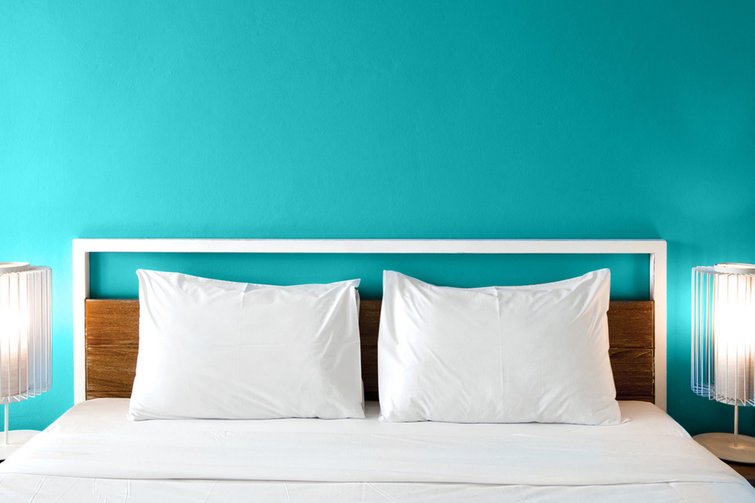
What Color Is Splashy SW 6942 by Sherwin Williams?
Splashy by Sherwin Williams is a vibrant, lively shade of teal that brings freshness and energy to any space. This dynamic color is perfect for those looking to add a playful, yet stylish touch to their home. Splashy has the unique ability to act as both a statement piece when used on large surfaces like walls, and an accent when applied to smaller areas or decorative elements.
In terms of interior styles, Splashy fits wonderfully in modern, contemporary, and eclectic settings. Its bold nature makes it a fantastic choice for anyone wanting to inject some personality into their living space.
This color particularly shines in areas that benefit from a spark of creativity, such as home offices or children’s play areas.
When it comes to pairing materials and textures, Splashy works excellently with natural wood, helping to balance its vibrant character with warm, earthy tones.
It also looks stunning when combined with metallic finishes like brushed nickel or copper, adding a touch of luxury to the energetic teal.
Textures such as velvet or silk in neutral colors can soften the intensity of Splashy while maintaining its lively charm. These combinations ensure that despite its boldness, Splashy remains versatile and practical for stylish interior designs.

Is Splashy SW 6942 by Sherwin Williams Warm or Cool color?
SplashySW 6942 by Sherwin Williams is a vibrant and cheerful color that can really brighten up a room. This bold blue-green hue is perfect for those who want to add a splash of fun and personality to their home.
When used in a living space, Splashy can make the room feel lively and energetic, great for spaces designed for entertainment and lively gatherings.
In smaller rooms, using Splashy on an accent wall can be a great way to incorporate this lively color without overwhelming the space. It pairs well with neutral tones like white or gray, which help balance its intensity.
Furniture and decor in natural wood or dark shades also contrast nicely with Splashy, creating an appealing visual impact.
Applying Splashy in a bathroom can create a fresh and invigorating atmosphere, ideal for starting the day on a positive note. Overall, this color is a great choice for anyone looking to liven up their home with a modern, upbeat vibe.
Undertones of Splashy SW 6942 by Sherwin Williams
SplashySW 6942 is a vibrant and complex color that can significantly influence the mood and appearance of any room. The color has a rich blend of undertones, including shades of blue, turquoise, navy, green, and even hints of purple, grey, and brown.
These undertones are subtle colors that lurk beneath the primary color, impacting how it is perceived under different lighting conditions and when paired with other colors.
When used on interior walls, the undertones in SplashySW 6942 can create a dynamic and lively atmosphere. For example, the blue and turquoise undertones can add a fresh and energetic feel to a space, making it feel more open and airy.
On the other hand, the navy and dark green undertones bring depth and warmth, which can make a large room feel more cozy and inviting.
Furthermore, the varying undertones can react differently depending on the lighting in a room. Natural light tends to bring out the cooler undertones like light turquoise and mint, making the walls appear bright and cheerful.
In artificial light, the darker undertones like navy and dark green may become more prominent, giving the room a more grounded and calming effect.
Thus, the complex mix of undertones in SplashySW 6942 allows it to be a versatile paint color that can adapt to many different styles and tastes, making it an excellent choice for those looking to add both color and character to their interior spaces.
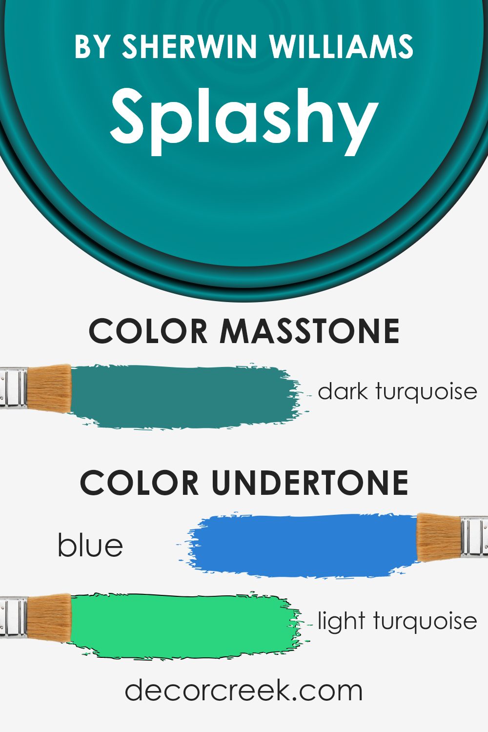
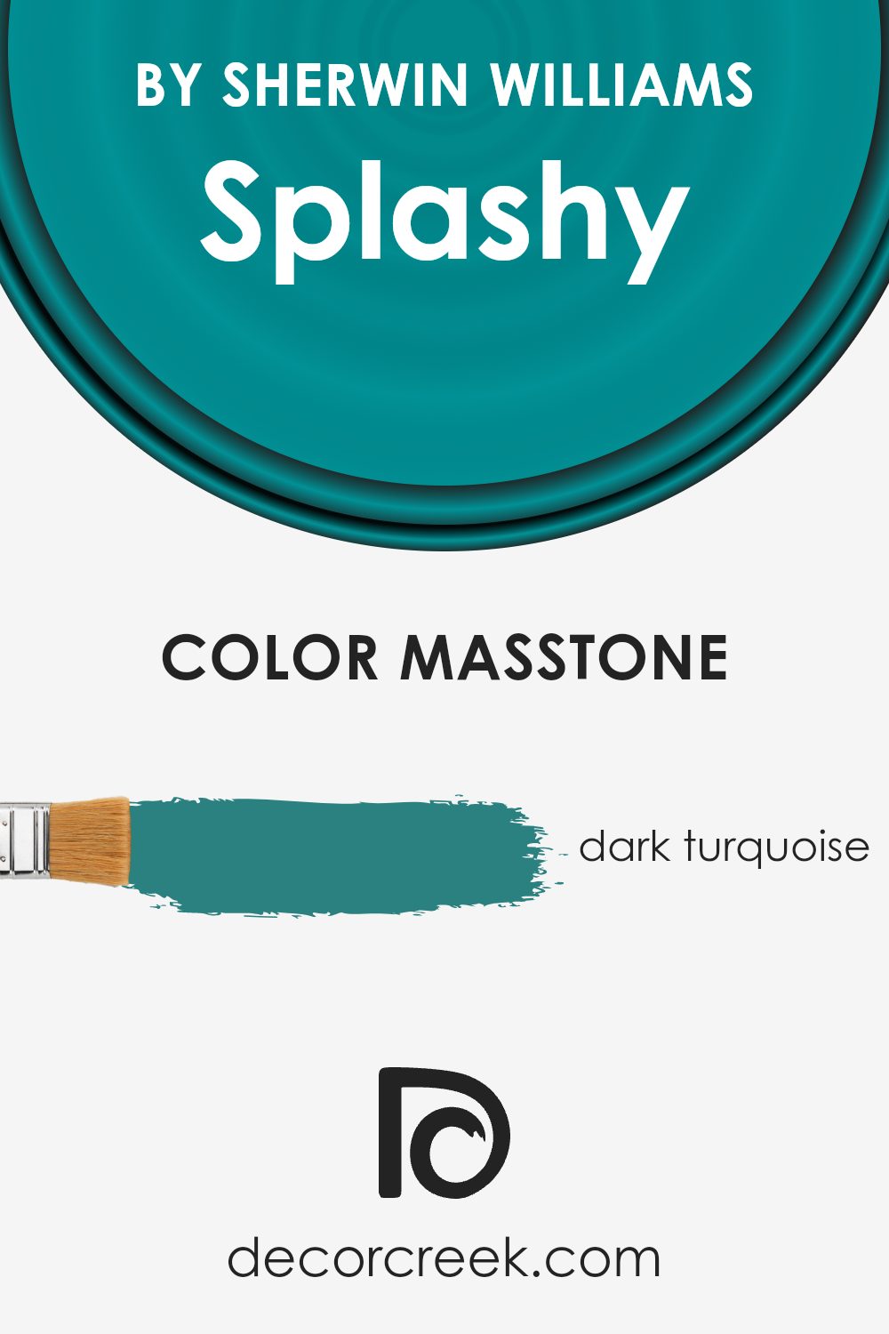
What is the Masstone of the Splashy SW 6942 by Sherwin Williams?
Sherwin Williams’ Splashy 6942 has a masstone of dark turquoise, a unique and appealing choice for home decor. This rich hue blends the calming properties of blue with the refreshing vibes of green, making it versatile for various spaces in the house.
In living areas or bedrooms, this color can create a cozy yet lively atmosphere. It’s excellent for balancing a room that has a lot of natural light, or invigorating a space that feels too dim.
Moreover, dark turquoise can act as a stunning backdrop for artworks or as an accent wall to highlight decorative elements. It pairs beautifully with light neutrals like creams and whites which can help keep the room feeling airy and open.
Additionally, wooden textures and metallic finishes also complement this deep color, adding a touch of earthiness or glam respectively. Using this color, therefore, offers both aesthetic appeal and a functional enhancement to living spaces.
How Does Lighting Affect Splashy SW 6942 by Sherwin Williams?
Lighting plays a crucial role in how we perceive colors in various environments. Colors can look vastly different under different lighting conditions due to the way light affects the way we see color tones and shades.
Taking the color Splashy, for instance, an energetic shade of aqua from Sherwin Williams, we notice it can change its appearance based on the light source. In artificial light, such as LED or incandescent lighting, Splashy tends to appear slightly more vivid and intense.
The artificial light, particularly warmer tones like those from incandescent bulbs, can enhance the yellow undertones, making the color appear greener than it does in natural light.
In natural light, the true color is more accurately represented, showing off its vibrant and fresh aqua tones.
Depending on the time of day and the amount of sunlight, the color can shift from a bright, lively aqua in direct sunlight to a cooler, more subdued shade when the sun is not as strong.
The orientation of rooms plays a role in how colors like Splashy interact with light. In north-facing rooms, which often receive less direct sunlight and can have a cooler, bluer light, Splashy may appear slightly muted and cooler, emphasizing more of its blue undertones.
South-facing rooms get a lot of sunlight throughout the day, making Splashy appear brighter and more true to its aqua nature due to the abundance of natural light.
East-facing rooms enjoy the morning sunlight, which can make Splashy look very bright and cheerful in the mornings and then transition to a slightly duller shade as the day progresses.
Conversely, west-facing rooms see the most intense light in the afternoons, thus the color will likely look softer in the morning but gain vibrancy during the sunset hours.
In any room, the appearance of the color Splashy from Sherwin Williams will change throughout the day and under different lighting conditions, showing a dynamic range of hues from its color palette.

What is the LRV of Splashy SW 6942 by Sherwin Williams?
LRV stands for Light Reflectance Value, which is a measure of how much light a color reflects or absorbs when painted on a surface. It ranges from 1 to 99 percent, with lower numbers indicating that the color absorbs more light and higher numbers showing that more light is reflected back.
This measurement helps in determining how a color will look once it’s applied to the walls of a room.
For instance, a higher LRV can make a room feel brighter and more open because it reflects more light around the space, while a lower LRV can make a space feel cozier and more enclosed because it absorbs more light.
In the case of the color with an LRV of 21.236, this means the color is on the darker side, absorbing more light than it reflects.
This tends to make the color appear more intense and saturated when used on walls. Such a color can dramatically influence the mood and visual size of a room.
In smaller or less brightly lit spaces, using a paint color with this LRV could make the space appear smaller and darker. Conversely, in a well-lit or larger space, this same color can add depth and richness, making the room feel more grounded and full.

Coordinating Colors of Splashy SW 6942 by Sherwin Williams
Coordinating colors are shades that complement each other well and create a harmonious look when used together in interior design. For example, when a vibrant color like SplashySW 6942 by Sherwin Williams is chosen as the primary color in a space, it is beneficial to select coordinating colors that will balance the boldness and allow the room to feel well-rounded.
Coordinating colors can be contrasting to bring out the vibrant features of the main hue or can be of a similar tone to create a subtle and cohesive appearance.
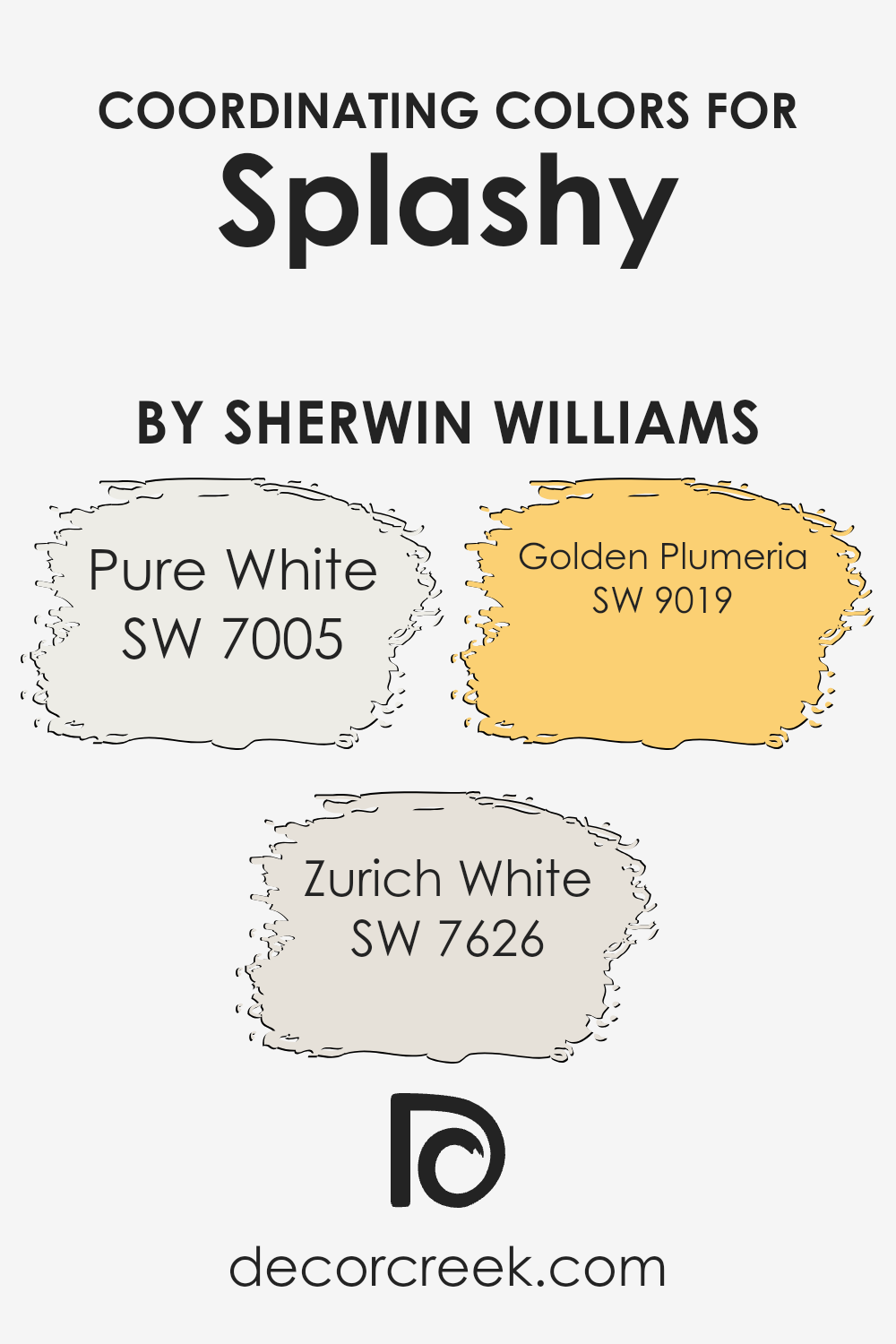
For SplashySW 6942, SW 7005 – Pure White serves as a perfect backdrop, providing a crisp and clean look that enhances the vividness without competing for attention. This fresh shade of white can make any space feel more open and airy.
SW 7626 – Zurich White offers a slightly warmer tone, lending a subtle contrast that is still in keeping with a light and neutral palette. This gentle color adds a touch of warmth to settings that need a softer look while still supporting the dominant color.
Lastly, SW 9019 – Golden Plumeria introduces a cheerful splash of color with its mellow yellow tone, enriching the overall palette without overpowering, making it an excellent choice for accents or features within the room.
You can see recommended paint colors below:
- SW 7005 Pure White (CHECK A SAMPLE)
- SW 7626 Zurich White (CHECK A SAMPLE)
- SW 9019 Golden Plumeria (CHECK A SAMPLE)
What are the Trim colors of Splashy SW 6942 by Sherwin Williams?
Trim colors are selected to complement or highlight the main colors used on walls or larger surfaces in a room. For a vibrant hue like Splashy by Sherwin Williams, choosing the right trim color can enhance the overall aesthetic and ensure that the vivid walls stand out attractively.
Proper trim colors act as a frame for different sections of a room, defining spaces succinctly and influencing how colors and decorations are perceived.
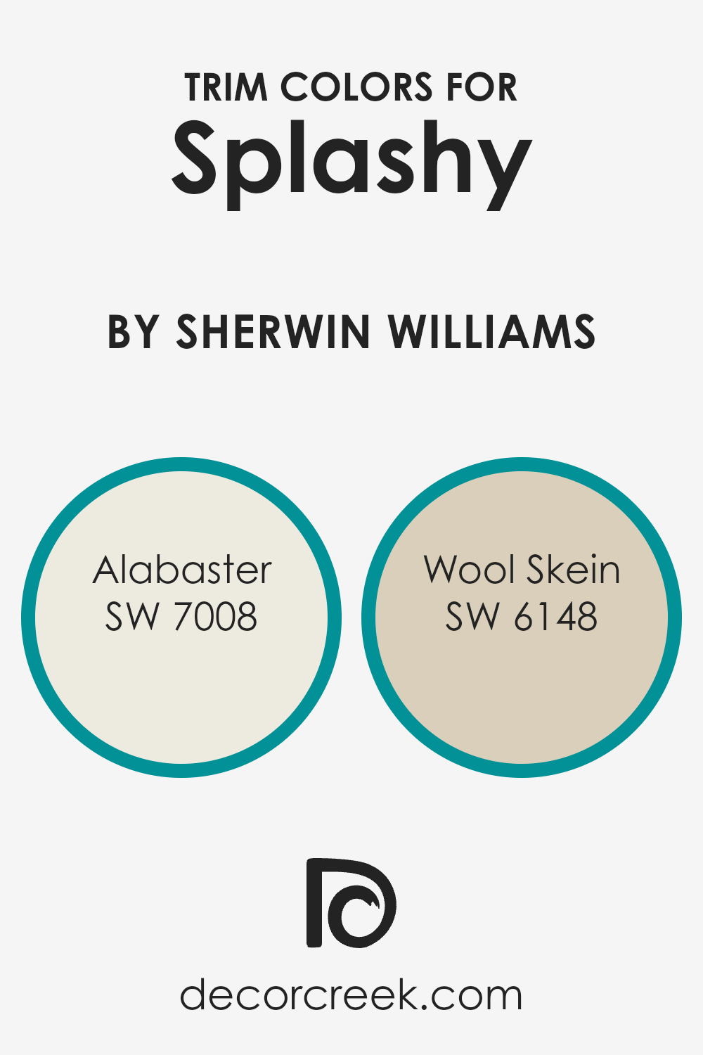
For a lively color like Splashy, Sherwin Williams recommends using Alabaster (SW 7008), a creamy, soft white that brings a calm balance to the bright walls, allowing the main color to pop without overwhelming the senses.
Another great option is Wool Skein (SW 6148), a subtle beige with warm undertones that provides a gentle contrast, softening the boldness of the main color while adding a touch of warmth to the overall decor.
These trim choices help in creating a harmonious space that feels welcoming and visually pleasing.
You can see recommended paint colors below:
- SW 7008 Alabaster (CHECK A SAMPLE)
- SW 6148 Wool Skein (CHECK A SAMPLE)
Colors Similar to Splashy SW 6942 by Sherwin Williams
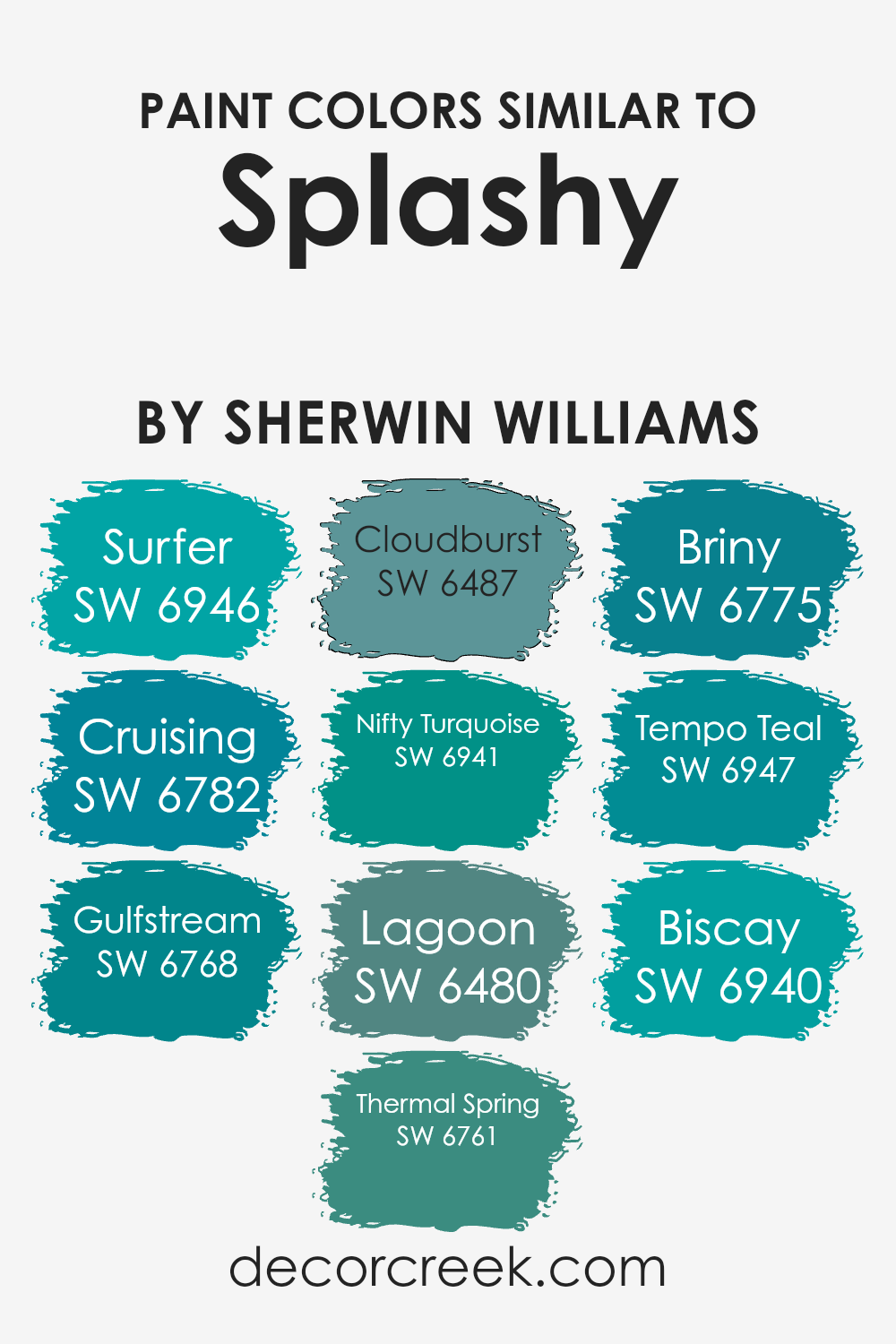
Understanding the importance of using similar colors, such as the variations close to Splashy by Sherwin Williams, is crucial in design for achieving a cohesive and harmonious look. These colors blend well together to create a smooth and visually appealing transition in spaces, making them feel unified.
Using shades like Surfer and Cruising, which are gentle on the eyes, designers can enhance a space without overwhelming it.
Gulfstream and Thermal Spring add a touch of brightness, bringing vibrancy and light to the design. Cloudburst offers a slightly muted option that works well as a background, allowing other colors to stand out.
Colors such as Nifty Turquoise and Lagoon provide deeper and richer tones, adding depth and interest to any area.
With Briny, there’s an aquatic feel that keeps the theme within a familiar chromatic spectrum.
Tempo Teal and Biscay, being among the darkest of this group, anchor the lighter shades, ensuring that they do not float away visually. Using these colors together allows for a flexible palette that can create either a calm background or a dynamic focal point, depending on how they are used.
The ability to mix and match these similar colors freely means endless possibilities for designers to craft spaces that are both beautiful and functional.
You can see recommended paint colors below:
- SW 6946 Surfer
- SW 6782 Cruising (CHECK A SAMPLE)
- SW 6768 Gulfstream (CHECK A SAMPLE)
- SW 6761 Thermal Spring (CHECK A SAMPLE)
- SW 6487 Cloudburst (CHECK A SAMPLE)
- SW 6941 Nifty Turquoise (CHECK A SAMPLE)
- SW 6480 Lagoon (CHECK A SAMPLE)
- SW 6775 Briny (CHECK A SAMPLE)
- SW 6947 Tempo Teal
- SW 6940 Biscay
Colors that Go With Splashy SW 6942 by Sherwin Williams
Choosing complementary colors for Splashy SW 6942 by Sherwin Williams is vital because it helps in creating a harmonious and balanced look in any space. Whether you are designing a cozy living room or a playful kids’ area, these colors work splendidly together to offer a vibrant and cheerful atmosphere.
By selecting compatible colors, you facilitate a visually appealing environment, enhancing both the aesthetic and the mood of the room.
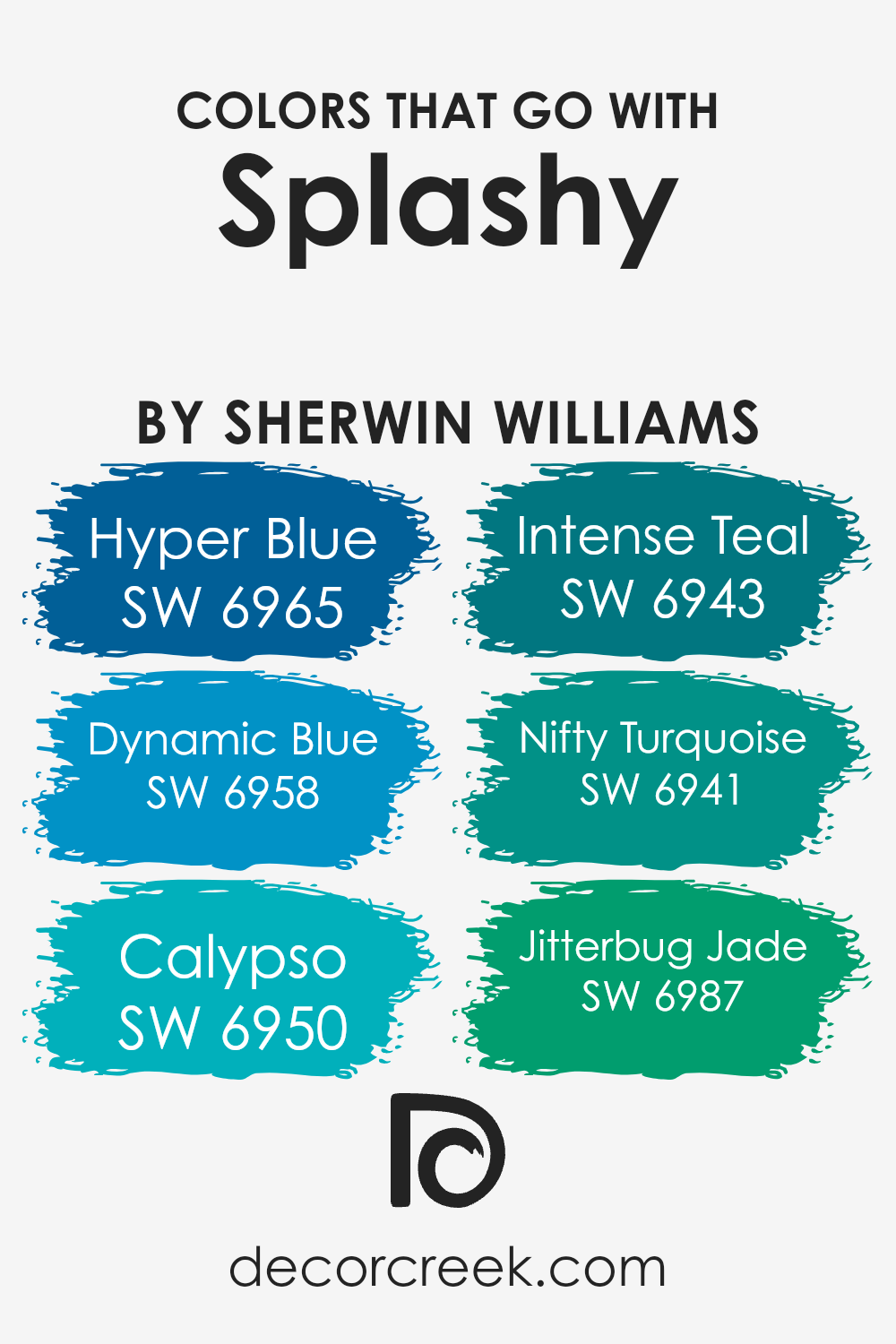
For instance, combining SW 6942 with SW 6965 – Hyper Blue introduces a bold, lively blue that exudes energy and fun. It’s a great choice for areas where you want to stimulate activity and excitement. Matching it with SW 6958 – Dynamic Blue provides a slightly lighter blue shade, which still holds much of the lively character but with a softer touch, making it perfect for a space that needs a bit of calming yet cheerful blue.
SW 6950 – Calypso, on the other hand, adds a tropical flair with its deep, oceanic tone, splendid for adding a dash of drama and depth.
Pairing Splashy with SW 6943 – Intense Teal brings in a rich, deep teal that’s perfect for creating a focal point or accent wall in a modern space.
SW 6941 – Nifty Turquoise offers a lighter and more airy turquoise, wonderful for brightening up a space or giving it a fresh, youthful vibe.
Lastly, SW 6987 – Jitterbug Jade introduces a vibrant jade shade that provides a crisp, refreshing look, ideal for spaces that aim to energize and inspire.
By selecting any of these shades to go with Splashy, you can effectively design a space that feels both cohesive and visually striking.
You can see recommended paint colors below:
- SW 6965 Hyper Blue (CHECK A SAMPLE)
- SW 6958 Dynamic Blue (CHECK A SAMPLE)
- SW 6950 Calypso (CHECK A SAMPLE)
- SW 6943 Intense Teal (CHECK A SAMPLE)
- SW 6941 Nifty Turquoise (CHECK A SAMPLE)
- SW 6987 Jitterbug Jade (CHECK A SAMPLE)
How to Use Splashy SW 6942 by Sherwin Williams In Your Home?
Splashy by Sherwin Williams is a vibrant and cheerful shade of blue that can add a lively touch to any room in your home. If you’re looking to brighten up a space, this color is a great choice. You could use it in a kid’s bedroom or a playroom to create a fun and inviting atmosphere.
It also works well in bathrooms or laundry rooms, where its fresh, clean vibe helps to enhance the feeling of cleanliness and freshness.
For those who prefer a bold look, consider painting an accent wall in your living room or dining area with Splashy. This can turn the wall into a standout feature, adding a pop of color that draws the eye and adds interest to the space. Additionally, pairing Splashy with neutral furniture and decor can keep the room balanced and not too overwhelming.
So, if you’re looking to add some color to your home, Splashy is a fantastic option to consider.
Splashy SW 6942 by Sherwin Williams vs Nifty Turquoise SW 6941 by Sherwin Williams
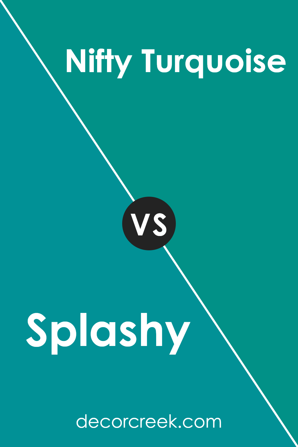
Splashy and Nifty Turquoise are two distinct colors from Sherwin Williams. Splashy is a vibrant, lively shade of teal that adds a pop of color to any space. It’s bright and energetic, making it perfect for creating a cheerful and inviting atmosphere.
On the other hand, Nifty Turquoise is slightly more subdued compared to Splashy. It leans towards a softer, more muted turquoise, ideal for adding a touch of calmness without being too bold.
Both colors are great for adding character to a room, but the choice between them depends on the mood you want to set. Splashy works well in spaces where you want a fun, dynamic feel, while Nifty Turquoise is better suited for a more relaxed environment.
You can see recommended paint color below:
- SW 6941 Nifty Turquoise (CHECK A SAMPLE)
Splashy SW 6942 by Sherwin Williams vs Gulfstream SW 6768 by Sherwin Williams
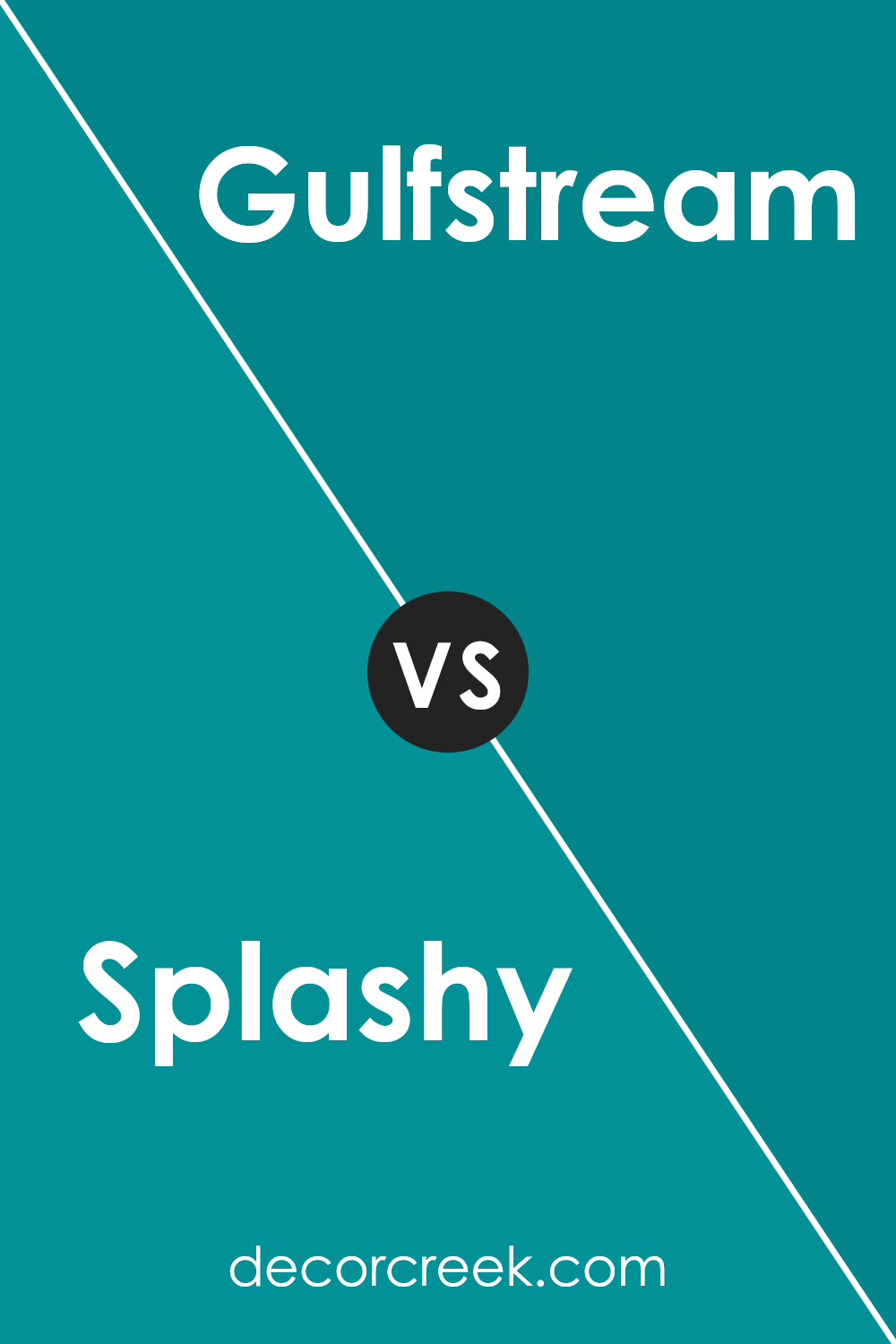
Splashy and Gulfstream, both from Sherwin Williams, offer distinct color vibes for any space. Splashy is a vibrant, energetic green, almost like a fresh grass tone, that really pops and adds liveliness to a room. It’s bold and can make a statement whether on an accent wall or throughout the space.
On the other hand, Gulfstream is a soothing aqua color that leans more towards a calm and refreshing feel. It resembles the clear, tropical waters and can create a relaxed atmosphere, perfect for places where you want to wind down.
Both colors are great choices but serve different moods and themes. Splashy is more about vibrancy and standing out, while Gulfstream tends to calm the senses, much like a gentle sea breeze. Depending on what feeling you want to bring to a room, either could be the perfect pick.
You can see recommended paint color below:
- SW 6768 Gulfstream (CHECK A SAMPLE)
Splashy SW 6942 by Sherwin Williams vs Cruising SW 6782 by Sherwin Williams
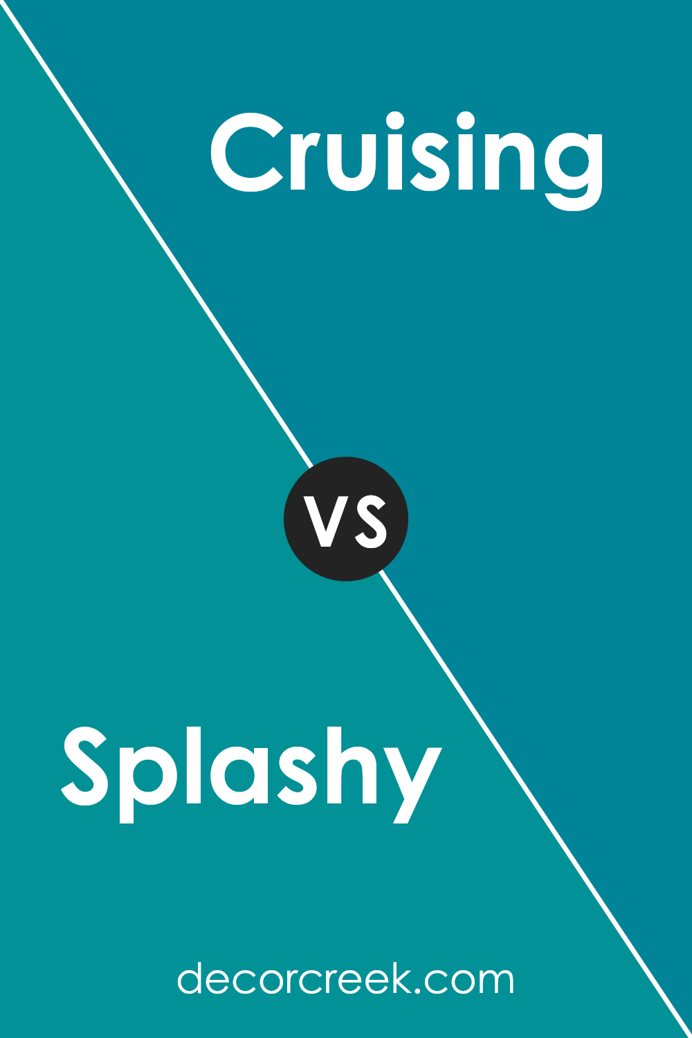
Splashy and Cruising are two vibrant colors from Sherwin Williams, each with its own distinct vibe. Splashy is a bold, bright aqua color that really stands out. It has a fresh and energetic feel, making it perfect for spaces where you want to add a lively touch.
On the other hand, Cruising is a calm, deep blue. It’s less intense than Splashy and provides a more relaxed and soothing atmosphere.
This color is great for areas where you want to promote rest and calmness. Although both colors come from the blue family, Splashy leans towards a greenish, lighter tone, whereas Cruising is closer to a true blue.
These differences make Splashy pop out more, while Cruising tends to blend in gently with its surroundings.
You can see recommended paint color below:
- SW 6782 Cruising (CHECK A SAMPLE)
Splashy SW 6942 by Sherwin Williams vs Thermal Spring SW 6761 by Sherwin Williams
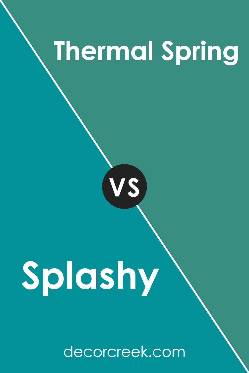
Splashy SW 6942 and Thermal Spring SW 6761 are two vibrant colors offered by Sherwin-Williams, each bringing its own unique vibe to a space. Splashy is a bold, lively teal that seems to pop with energy, making it a great choice for areas where you want to add a sense of fun or vibrancy.
It’s a color that stands out and can easily become the focal point of a room.
On the other hand, Thermal Spring SW 6761 is a lighter, more subdued aqua shade that feels fresh and calming. This color is softer and tends to blend into spaces, giving them a light, airy feel. It’s an excellent option for creating a relaxed atmosphere in places like bathrooms or bedrooms.
When comparing these two, Splashy is more intense and eye-catching, while Thermal Spring is gentler and more soothing to the eye. Depending on your room’s desired mood and function, each color has its advantages.
You can see recommended paint color below:
- SW 6761 Thermal Spring (CHECK A SAMPLE)
Splashy SW 6942 by Sherwin Williams vs Tempo Teal SW 6947 by Sherwin Williams
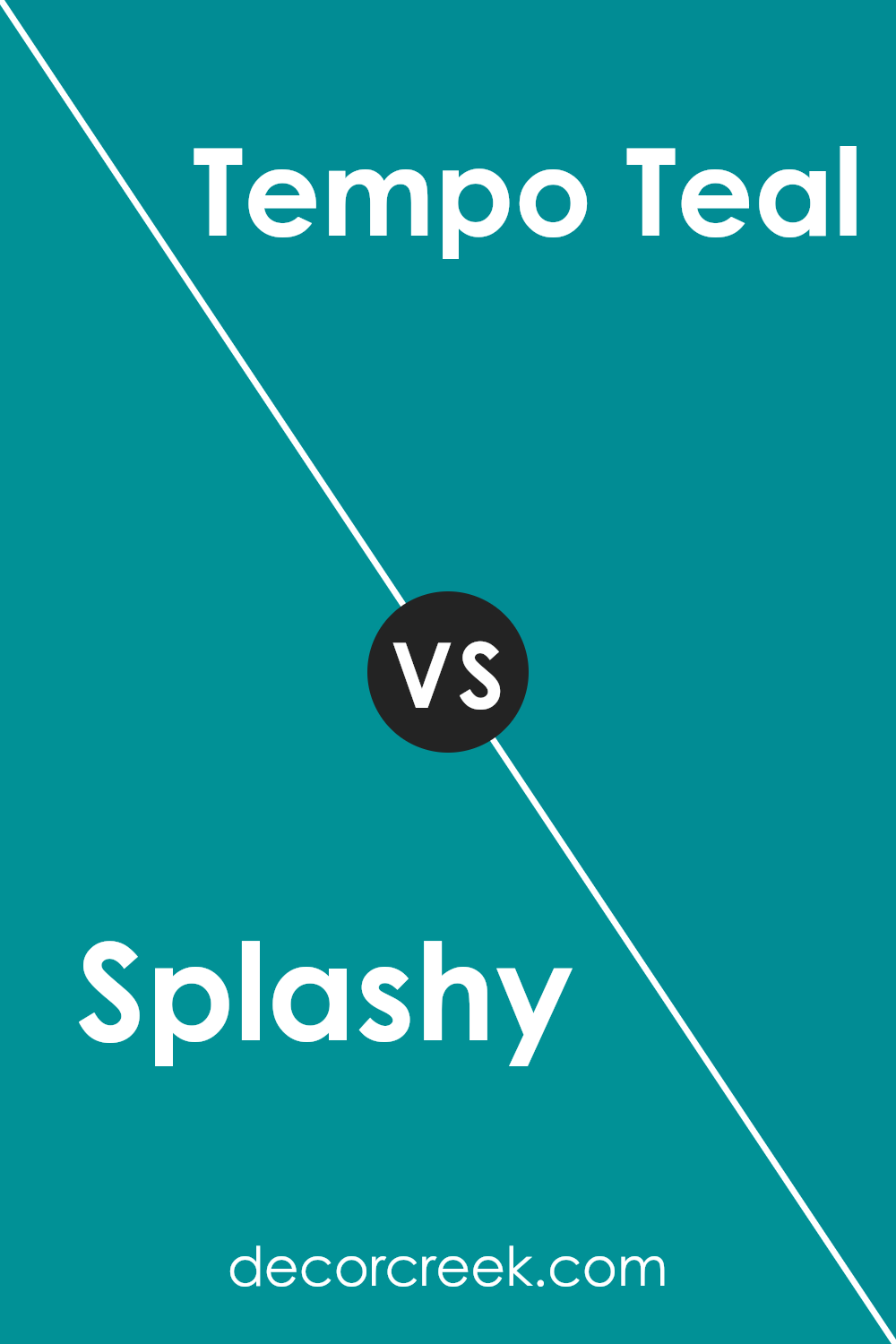
Splashy and Tempo Teal are two vibrant colors by Sherwin Williams, each bringing its unique flavor to spaces. Splashy is a bright, energetic aqua that pops with freshness and can instantly lighten up any room with its lively vibe.
This color is perfect for creating a fun and cheerful atmosphere in spaces like kitchens or children’s rooms.
On the other hand, Tempo Teal is a deeper, more subdued teal shade. It offers a sense of calmness and is more restrained compared to Splashy. It’s ideal for areas where you want a touch of color while maintaining a more relaxed feel, like living rooms or bedrooms.
Both colors are excellent for adding personality and mood to a space but serve different emotional and design purposes.
Splashy works well where you want to inject vivacity and brightness, while Tempo Teal is better suited for creating a cooler, more grounded aesthetic.
You can see recommended paint color below:
- SW 6947 Tempo Teal
Splashy SW 6942 by Sherwin Williams vs Biscay SW 6940 by Sherwin Williams
Splashy and Biscay are two vibrant colors from Sherwin Williams that offer different vibes for room settings. Splashy is a bold, bright turquoise that immediately draws attention and adds a lively touch to any space. It’s perfect for creating a fun and energetic atmosphere.
In contrast, Biscay is a slightly more muted shade, leaning towards a soft, sea-inspired blue. This color is excellent for those looking to add a calm but still colorful element to their room without overwhelming the space with brightness.
Both colors work well in a variety of settings, whether it’s a playful children’s room or a chic living area, but the choice between them largely depends on the desired mood you want: vibrant energy with Splashy or a gentle, soothing ambiance with Biscay.
You can see recommended paint color below:
- SW 6940 Biscay
Splashy SW 6942 by Sherwin Williams vs Cloudburst SW 6487 by Sherwin Williams
Splashy and Cloudburst, both by Sherwin Williams, offer unique visual experiences. Splashy, a vibrant and intense turquoise, brings a lively and energetic feel to any space. Its vividness can really make a room pop and adds a playful touch that can liven up a dull area.
On the other hand, Cloudburst is a much darker shade, closer to navy, which provides a more muted and understated elegance.
This color is ideal for those who prefer a more subdued environment, as it can give a room a calm and collected atmosphere.
While Splashy works well in spaces that aim for a fun and inviting ambiance, Cloudburst suits areas where a more formal or relaxed tone is desired.
Both colors reflect light differently, with Splashy reflecting more light, enhancing its brightness, while Cloudburst absorbs light, which contributes to its deeper appearance.
You can see recommended paint color below:
Splashy SW 6942 by Sherwin Williams vs Lagoon SW 6480 by Sherwin Williams
Splashy, by Sherwin Williams, is a vibrant, energetic shade of aqua. It carries a bright, playful tone that immediately brightens up a space and gives it a cheerful feel. This color is great for areas where you want to add a punch of life or create a fun, lively atmosphere.
On the other hand, Lagoon, also by Sherwin Williams, is a deeper, more subdued shade of teal.
It provides a more relaxed and calming effect, making it suitable for spaces where a peaceful and soothing ambiance is desired. Lagoon’s richer hue can add depth and a hint of drama to a room without overwhelming it.
Both colors are aquatic-themed but differ significantly in mood and impact. While Splashy is lighter and more spirited, suitable for invigorating a space, Lagoon is ideal for creating a cozy, quiet corner.
They can work beautifully together, with Splashy bringing brightness and Lagoon adding depth.
You can see recommended paint color below:
- SW 6480 Lagoon (CHECK A SAMPLE)
Splashy SW 6942 by Sherwin Williams vs Briny SW 6775 by Sherwin Williams
Splashy and Briny are two vibrant colors by Sherwin Williams, both sharing a connection to lively, energetic themes but with noticeable differences in their appearance. Splashy is a bold, vivid turquoise that has a dynamic and cheerful vibe. It’s bright enough to make a statement in any space, whether it’s used on a focus wall or as an accent color.
In contrast, Briny is a lighter shade of blue-green that leans towards a fresh, ocean-like feel.
This color is perfect for creating a refreshing and airy atmosphere in any room, making spaces feel open and bright. Although both colors share a similar blue-green palette, Splashy offers a more intense and eye-catching look, while Briny provides a cooler, more subtle touch, ideal for a calming environment.
Mixing these colors in design can add depth and interest, balancing vivid excitement with light freshness.
You can see recommended paint color below:
- SW 6775 Briny (CHECK A SAMPLE)
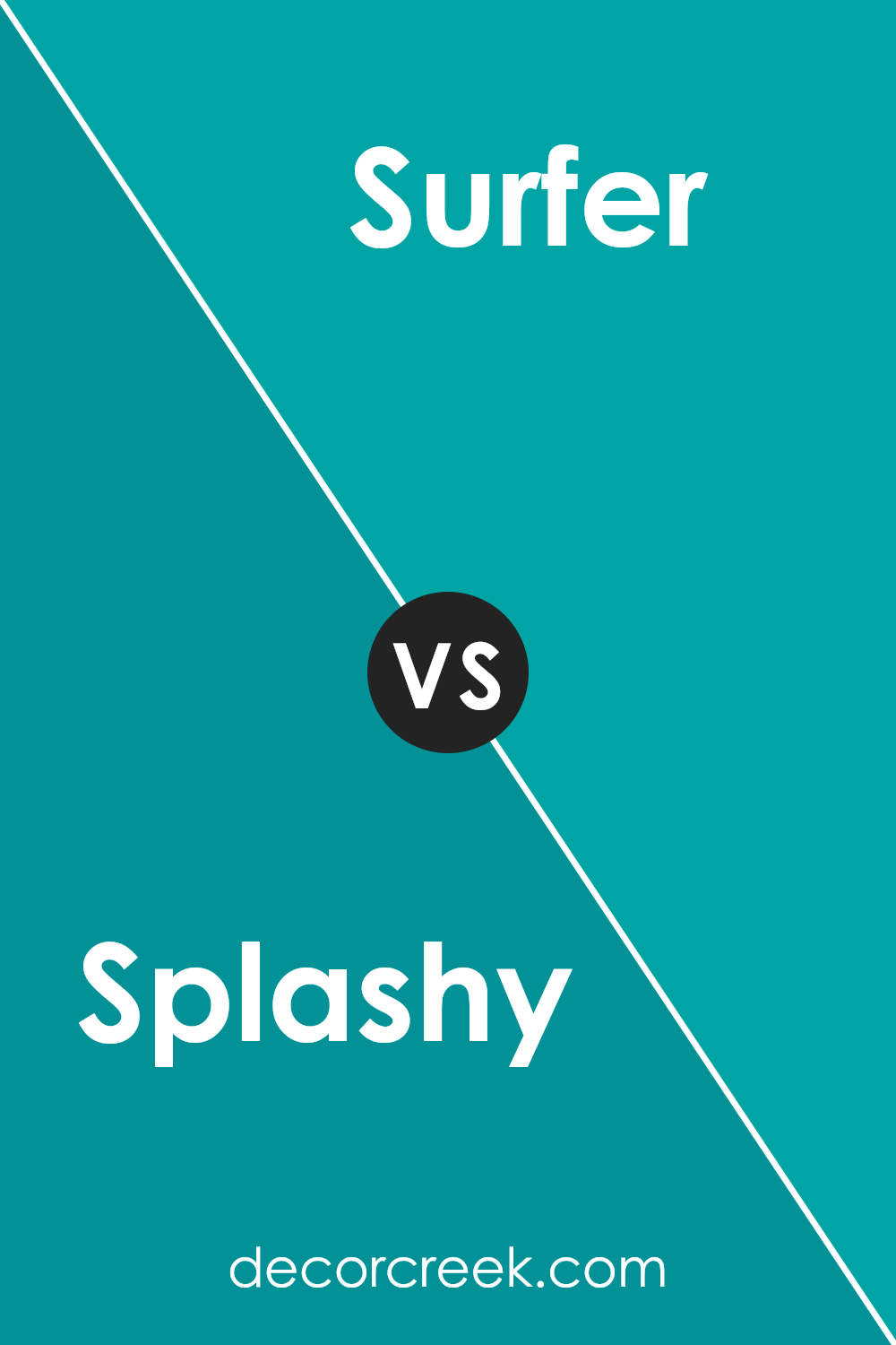
Splashy SW 6942 by Sherwin Williams vs Surfer SW 6946 by Sherwin Williams
Splashy and Surfer, both by Sherwin Williams, are vibrant and lively colors, yet they hold distinct personalities. Splashy is a bold aquamarine that commands attention. It’s bright and cheerful, perfect for spaces where you want to inject energy and a sense of play.
On the other hand, Surfer is a deeper teal that leans slightly towards the green side compared to Splashy. This color offers a more grounded feel but still carries a fresh vibe.
It is ideal for creating a cozy, inviting atmosphere in a room. While Splashy seems to pull in the brightness of a sunny day, Surfer mirrors the depth of ocean waters. Both colors work well in a modern setting and can bring life to interiors when used thoughtfully.
Whether you choose the lively splash of Splashy or the deeper, calming influence of Surfer, each color has the potential to make any space more appealing and energetic.
You can see recommended paint color below:
- SW 6946 Surfer
Conclusion
In summary, SW 6942 Splashy by Sherwin Williams is a bright and cheerful paint color that can make any room feel more lively and fun. It’s like when you add a splash of color to your drawings, and suddenly they look so much better!
This color is strong and pretty, just like the bright blue ocean on a sunny day. It’s perfect for making places like your bedroom or playroom exciting and inviting.
Using Splashy in your home can help to make the space more enjoyable, especially if you like colors that remind you of fun times like playing in the park or at the beach.
It’s not just for walls either; you can use it for things like doors or furniture to add little bursts of happiness around your home.
Overall, if you or your family are thinking about adding some new color to your house or room, Splashy by Sherwin Williams could be a great choice.
It’s lively, fun, and can make your room feel bright and happy all the time.

Ever wished paint sampling was as easy as sticking a sticker? Guess what? Now it is! Discover Samplize's unique Peel & Stick samples.
Get paint samples


