Color influences every aspect of our lives, from the clothes we wear to the walls of our homes. The right color can ignite joy, inspire creativity, create a soothing atmosphere, or bring a sense of calm to a busy day. One color that has been making waves in the interior design scene is SW 6487 Cloudburst by Sherwin-Williams.
This article will delve deep into this fascinating hue, its undertones, coordinating and similar colors, the impact of lighting and its Light Reflectance Value (LRV), ideal trim colors, and the colors that pair well with it.
What Color Is SW 6487 Cloudburst?
SW 6487 Cloudburst is a distinctive shade of blue inspired by the sky on a rainy day. It carries the freshness of an overcast afternoon, encapsulating both the serenity of the blue sky and the mystery of the impending storm. It’s an exquisite blend of blue and gray, resulting in a tranquil and calming hue that effortlessly adds a touch of sophistication to any space.
In its essence, SW 6487 Cloudburst is a deep, muted blue-gray that exudes an air of tranquility and elegance. Its serene vibe can make any room feel more relaxing and peaceful, making it a popular choice for bedrooms and bathrooms.
The gray undertones add a level of complexity to this color, lending it a more refined and polished look compared to other, more straightforward blues.

Ever wished paint sampling was as easy as sticking a sticker? Guess what? Now it is! Discover Samplize's unique Peel & Stick samples.
Get paint samples

Is It a Warm Or Cool Color?
SW 6487 Cloudburst is considered a cool color. Cool colors, which include shades of blue, green, and violet, are known for their ability to evoke feelings of calmness and tranquility. They’re often associated with water, sky, and foliage, creating a relaxing and refreshing vibe in a room. The cool nature of Cloudburst makes it a perfect choice for creating a serene atmosphere in your space.
Undertones of SW 6487 Cloudburst
When it comes to SW 6487 Cloudburst, there are three primary undertones to consider:
- Blue: The most dominant undertone in Cloudburst is blue, which gives this color its soothing and tranquil quality.
- Gray: The gray undertone is what adds depth and sophistication to this color. It makes Cloudburst a more complex and refined blue, setting it apart from other, more straightforward blues.
- Purple: Though not as prominent as the blue and gray undertones, a slight hint of purple can be seen in certain lighting conditions, giving Cloudburst an additional layer of complexity.
Undertones play a crucial role in how we perceive color. They can influence a color’s warmth or coolness and how it looks under different lighting conditions.
More importantly, understanding the undertones of color can help you choose complementary and harmonious colors for a cohesive design scheme.

Coordinating Colors of SW 6487 Cloudburst
When pairing SW 6487 Cloudburst with other colors, consider these options:
- SW 6476 Glimmer : A light, silvery blue, Glimmer adds a touch of brightness without overpowering the cool, calming effect of Cloudburst.
- SW 7634 Pediment : This neutral, slightly grayish shade provides a solid, grounding contrast to Cloudburst, allowing it to stand out.
- SW 7580 Carnelian : A deep, robust red, Carnelian offers a bold contrast, creating a vibrant and dynamic color scheme when paired with Cloudburst.
Additionally, these colors can harmonize well with SW 6487 Cloudburst:
- SW 6218 Tradewind : A soft, muted blue, Tradewind pairs well with Cloudburst for a layered, monochromatic look.
- SW 7072 Online : As a cool, dark gray color, Online can provide a grounding contrast, allowing Cloudburst to take center stage.
- SW 7008 Alabaster : This pure white offers a crisp, clean contrast, highlighting the sophistication of Cloudburst.
Coordinating colors are those that work well together to create a balanced and harmonious look. They can be used in various ways, such as on adjacent walls, as accent colors, or for trims and furniture. Understanding coordinating colors can help create a cohesive design scheme that elevates the overall aesthetic of a room.

How Does Lighting Affect SW 6487 Cloudburst?
Lighting significantly impacts how we perceive SW 6487 Cloudburst. In natural light, it appears as a rich, cool blue-gray. However, under artificial light, depending on its type, it can either enhance the blue undertone or bring out its slight purple undertone. For instance, in warm, yellow light, Cloudburst can seem slightly more purple, while cool, white light can emphasize its tranquil blue side.
This shift in perception under different lighting conditions can dramatically change the vibe of a room, demonstrating the importance of considering your light sources when choosing paint colors.

LRV of SW 6487 Cloudburst
Light Reflectance Value (LRV) measures the percentage of light a color reflects. The LRV of SW 6487 Cloudburst is 26, meaning it reflects 26% of the light falling on it. This LRV puts Cloudburst in the medium-dark range, giving it the ability to add depth and richness to a room.
A lower LRV, like 26, means the color absorbs more light, making it appear darker and more saturated. This makes Cloudburst a great choice for creating cozy, intimate spaces. It can also be used to contrast with lighter colors, allowing certain elements in the room to pop.
Moreover, understanding the LRV of color can help with lighting decisions. For instance, a room painted with Cloudburst might require more or brighter lighting compared to a room painted with a color that has a higher LRV.

LRV – what does it mean? Read This Before Finding Your Perfect Paint Color
Trim Colors of SW 6487 Cloudburst
Choosing the right trim color is crucial as it frames the room and highlights the primary wall color. For SW 6487 Cloudburst, these shades of white can work beautifully:
- SW 7005 Pure White : This clean, bright white contrasts sharply with Cloudburst, giving the room a fresh, modern look.
- SW 7008 Alabaster : A warmer off-white color, SW Alabaster can soften the effect of Cloudburst, creating a more cozy, inviting atmosphere.
- SW 7012 Creamy : This slightly yellowish white adds warmth to the room, balancing out the coolness of Cloudburst.
Trim colors create a transition between the wall and the elements of a room, like doors and windows. The right trim color can highlight architectural details, frame the room, and help the wall color stand out.

Colors Similar to SW 6487 Cloudburst
Knowing similar colors to SW 6487 Cloudburst can be useful when you’re trying to match existing decor or when Cloudburst isn’t available. They include:
- Behr Cabana Blue
- PPG Treasure Isle
- Valspar Tropical Oasis
- BM Rendezvous Bay
While these colors aren’t exact matches, they carry the same blue-gray essence of Cloudburst. They can be used as alternatives or complementary colors, providing options when designing a room.

Colors That Go With SW 6487 Cloudburst
Pairing SW 6487 Cloudburst with colors that complement it can create a balanced, harmonious design. Consider these options:
- SW 7070 Site White: This cool, soft gray subtly contrasts with Cloudburst without overpowering it.
- SW 7006 Extra White: This pure white brings out the sophistication of Cloudburst.
- SW 6235 Foggy Day: This muted, cool blue-gray color complements Cloudburst beautifully for a layered look.
- SW 6039 Poised Taupe: This warm, earthy taupe provides a pleasant contrast to Cloudburst.
- SW 6345 Sumptuous Purple: This deep, rich purple brings a surprising yet harmonious contrast.
- SW 7029 Agreeable Gray: This light, neutral gray blends seamlessly with Cloudburst.
Pairing colors that look good together create a cohesive, harmonious design that is visually appealing. It can help set the mood of a room, tie together different elements, and enhance the overall aesthetic.

How to Use SW 6487 Cloudburst In Your Home?
SW 6487 Cloudburst is a versatile color that can be used in various rooms and in multiple interior design styles. Its tranquil and sophisticated vibe makes it an excellent choice for modern, contemporary, coastal, and even Scandinavian designs.
Its calming nature makes it suitable for bedrooms and bathrooms, while its sophistication allows it to add a touch of elegance in the living room or kitchen. It can even be used for exteriors, creating a striking and inviting curb appeal.
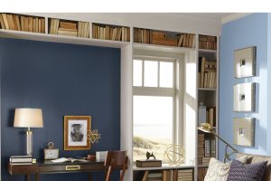
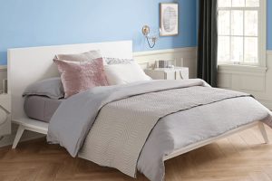
How to Use SW 6487 Cloudburst in the Bedroom?
SW Cloudburst is perfect for creating a serene and calming ambiance in a bedroom. The cool, tranquil blue-gray encourages relaxation and restful sleep. Pair it with warm white linens and natural wood tones to create a cozy, inviting sanctuary. Using Cloudburst on an accent wall behind the bed can create a dramatic focal point, adding depth and interest to the room.
For a more modern and sophisticated bedroom design, consider pairing Cloudburst with metallic accents in gold or silver. The shimmering metallics will stand out against the cool blue-gray, creating a chic, contemporary aesthetic. Rich, dark wood furniture will also complement Cloudburst beautifully, lending a sense of luxury and warmth to the room.

How to Use SW 6487 Cloudburst in the Bathroom?
In a bathroom, SW Cloudburst can evoke a feeling of tranquility reminiscent of a calm sea or a cloudy sky. It pairs beautifully with crisp whites found in sinks, tubs, and toilets, creating a clean and refreshing palette. Introduce natural textures, such as stone or pebbles, for a spa-like ambiance.
For a nautical-themed bathroom, try pairing Cloudburst with coastal elements like weathered woods, rope accents, and ocean-inspired decor. For a more luxurious feel, use it with marble surfaces, crystal light fixtures, and plush white towels. The muted blue-gray will give the space a sophisticated flair without being overly opulent.

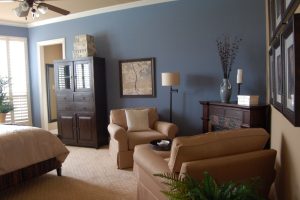
How to Use SW 6487 Cloudburst in the Living Room?
SW Cloudburst can create an inviting and relaxing atmosphere in a living room. Its cool, calm vibe can make even large spaces feel cozy and intimate. Paired with a soft white trim and neutral furnishings, Cloudburst can make the room feel both spacious and comfortable.
For a contemporary look, pair Cloudburst with clean lines, sleek surfaces, and pops of bold, vibrant colors, such as bright red or sunny yellow. On the other hand, for a more traditional style, try combining Cloudburst with classic furniture shapes, vintage accents, and a palette of warm, earthy colors.

How to Use SW 6487 Cloudburst for an Exterior?
On a home’s exterior, Cloudburst can create a striking appearance that is both unique and inviting. It’s a great way to give a modern twist to traditional architectural styles. Paired with white trim, it creates a crisp, clean look that is timeless yet contemporary.
For a coastal or beachy vibe, pair Cloudburst with accents of pale, sandy beige, and oceanic blues. For homes with a lot of natural stone or brick, Cloudburst can provide a beautiful contrast that highlights these elements. Consider using it on the front door for a stylish and welcoming entrance.

How to Use SW 6487 Cloudburst in the Kitchen?
In a kitchen, SW Cloudburst can create a peaceful, serene ambiance that is still sophisticated and chic. It can help make the space feel more open and airy. Pair Cloudburst with white cabinets and countertops for a refreshing, clean look or with wood tones for a warmer, cozy feel.
For a more dramatic, contemporary kitchen, consider pairing Cloudburst with stainless steel appliances and glossy black countertops. The contrast will make Cloudburst stand out, and the cool blue-gray will balance the sleek, modern elements of the design.

How to Use SW 6487 Cloudburst for the Kitchen Cabinets?
Using SW Cloudburst on kitchen cabinets can create a unique and stylish look. The blue-gray color can act as a neutral, blending seamlessly with a variety of design elements. It pairs beautifully with white or gray countertops, stainless steel appliances, and wood or tile floors.
For a more daring and modern look, consider using Cloudburst on the lower cabinets with a lighter color on the upper ones. This two-toned approach can create visual interest and depth in the kitchen. Pair with gold or brass hardware for a chic, contemporary aesthetic.

Comparing SW 6487 Cloudburst With Other Colors
Comparing paint colors is crucial in determining the right shade for your design project. Each color has its unique personality, undertones, and behavior under different lighting conditions. Comparing colors allows you to discern these differences and choose a color that will harmonize with your existing décor, fit your design style, and evoke the desired mood or feeling. Check out how SW Cloudburst compares with other colors.
SW 6487 Cloudburst vs. SW 7072 Online
SW 7072 Online is a cool, dark gray color. Compared to Cloudburst, it lacks the blue undertone, making it more neutral. However, both colors share a cool, calming nature and can work together to create a monochromatic scheme.

SW 6487 Cloudburst vs. SW 6218 Tradewind
SW Tradewind is a soft, muted blue that leans more towards blue than Cloudburst. While Cloudburst has a touch of gray, making it more subdued, Tradewind has a more pronounced blue presence, making it brighter and more vibrant.

SW 6487 Cloudburst vs. SW 7008 Alabaster
SW Alabaster is a warm off-white, a stark contrast to the cool blue-gray of Cloudburst. This difference allows Alabaster to highlight the sophistication of Cloudburst when used as a trim color, creating a crisp, clean look.

SW 6487 Cloudburst vs. SW 6345 Sumptuous Purple
SW Sumptuous Purple is a deep, rich purple that brings a dramatic contrast to Cloudburst. The cooler, calming nature of Cloudburst can balance the boldness of Sumptuous Purple, creating a harmonious blend of drama and tranquility.

SW 6487 Cloudburst vs. SW 6235 Foggy Day
SW Foggy Day is a cool, muted blue-gray similar to Cloudburst but lighter. The lighter tone of Foggy Day can make spaces feel more open and airy compared to the more intimate and cozy vibe of Cloudburst.
SW 6487 Cloudburst vs. SW 7029 Agreeable Gray
SW Agreeable Gray is a light, warm gray that contrasts with the cool blue-gray of Cloudburst. This contrast can create a balanced color scheme, with Agreeable Gray adding warmth to the coolness of Cloudburst.
Conclusion
SW 6487 Cloudburst is a versatile, sophisticated color that offers endless possibilities in interior and exterior design. Its cool, calming blue-gray hue, coupled with its slightly purple undertone, lends itself to a wide range of styles, from modern and contemporary to coastal and Scandinavian.
Cloudburst’s medium-dark LRV gives it the ability to add depth and richness to spaces, making them feel cozy and intimate.
SW 6487 Cloudburst is more than just a paint color. It’s a design tool that can transform spaces, evoke moods, and express personal style. Whether you’re creating a peaceful sanctuary, a sophisticated living space, or a striking exterior, Cloudburst can help you achieve your vision with its calming yet compelling charm.

Ever wished paint sampling was as easy as sticking a sticker? Guess what? Now it is! Discover Samplize's unique Peel & Stick samples.
Get paint samples
Frequently Asked Questions
⭐What undertones does SW 6487 Cloudburst have?
Cloudburst has a primary undertone of blue, with hints of gray and a subtle secondary undertone of purple. This makes it a cool color that can evoke feelings of tranquility and sophistication.
⭐What are some good coordinating colors for Cloudburst?
Some good coordinating colors for Cloudburst are SW 6476 Glimmer, a light and soft blue, SW 7634 Pediment, a neutral and versatile gray, and SW 7580 Carnelian, a rich and warm red. Other similar colors include SW 7070 Site White, SW 6235 Foggy Day, and SW 7006 Extra White.
⭐How does lighting affect Cloudburst?
Lighting can significantly influence how Cloudburst appears. In natural light, Cloudburst tends to show more of its blue undertone. In artificial light, it may appear more gray, and the subtle purple undertone may become more noticeable.
⭐What does an LRV of 26 mean for Cloudburst?
LRV, or Light Reflectance Value, is a measure of how much light a color reflects. An LRV of 26 means that Cloudburst is in the medium-dark range. This means it can make spaces feel cozy and intimate, but it may also darken small rooms with limited light.
⭐Can I use Cloudburst on my home's exterior?
Yes, Cloudburst can be an excellent choice for home exteriors. It provides a striking, modern twist to traditional architectural styles and pairs beautifully with white trims for a crisp, clean look.