In my recent work as a designer, I came across Benjamin Moore’s AF-310 Subtle, and it struck me as a unique choice for anyone looking to refresh their home. This color stands out in its simplicity and warmth, creating a soft, welcoming atmosphere wherever you apply it. The adaptability of AF-310 Subtle makes it ideal for living rooms, bedrooms, or even kitchens, fitting seamlessly with various decor styles and preferences.
This shade particularly appeals to those who prefer neutral tones with just enough depth to make a statement without overpowering the senses. Its ability to blend with other colors and materials also allows you to mix and match furnishings and decor items effortlessly, giving you room to play around with your existing items or add new pieces that complement this subtle hue.
Thinking about your next painting project, AF-310 Subtle by Benjamin Moore could be the perfect color to give your home a fresh look while maintaining a cozy and relaxed vibe.
Whether you’re aiming for a modern minimalist style or a more traditional feel, this shade could very well be the answer to creating the ambiance you’re seeking in your personal room.
What Color Is Subtle AF-310 by Benjamin Moore?
SubtleAF-310 by Benjamin Moore is an adaptable off-white color that exudes a warm and inviting feel. This shade’s light and creamy nature make it an ideal backdrop for numerous design styles. It pairs particularly well with the minimalist approach, supporting a clutter-free room that emphasizes simplicity and practicality. In addition, this color works beautifully in rustic settings that incorporate natural elements like wood and stone, enhancing the cozy, homey vibe of the room.
This particular paint shade also harmonizes well with a variety of materials and textures. The warmth of SubtleAF-310 complements the rich grain of wooden furniture and flooring, making the wood’s natural color appear even more vibrant. When used with metal accents, such as brass or copper, it brings out a soft luster in the metal, creating a gentle contrast that isn’t overpowering.
For textiles, pairing it with more tactile materials like linen or wool throws will add layers to your décor and enhance the overall comfort of your rooms.
Whether you are looking to create a peaceful reading nook or a bright, welcoming living room, this color provides a perfect canvas, supporting various decoration choices while keeping the environment cozy and attractive.
Is Subtle AF-310 by Benjamin Moore Warm or Cool color?
SubtleAF-310 by Benjamin Moore is an adaptable shade of gray that works wonderfully in many different areas of a home. Its light and neutral tone means it can easily match with various styles and decorations, from modern to traditional.
This shade is particularly useful in rooms that are either small or lacking in natural light, as it can help make areas feel bigger and brighter. It doesn’t overpower a room, making it a great choice for walls, providing a gentle backdrop that allows furniture and artworks to stand out.
It’s also low maintenance, hiding smudges and light dirt better than lighter shades, making it practical for high traffic areas like hallways and living rooms. Overall, this color can create a quiet, peaceful atmosphere in a home, making it a favorite choice for bedrooms and bathrooms where you might want a calm, gentle environment.
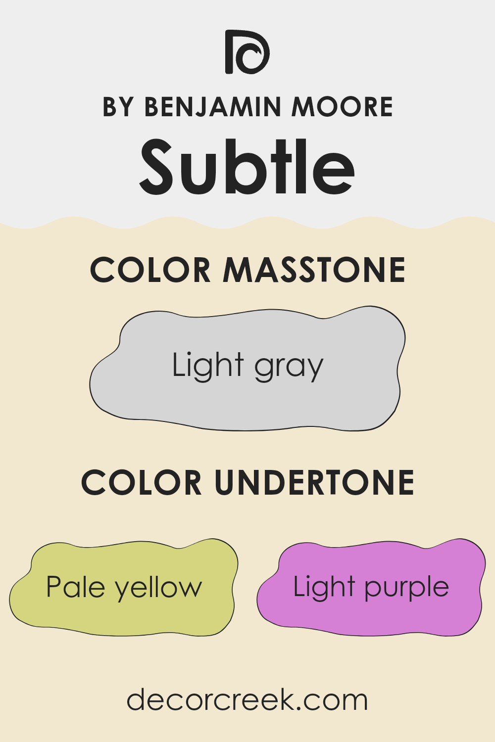
Undertones of Subtle AF-310 by Benjamin Moore
SubtleAF-310 is a unique paint color that includes a complex mix of undertones. Undertones are the subtle colors that can be detected beneath the main color when viewed under different lighting conditions or when placed next to other colors.
They play a critical role in how we perceive the main color. For SubtleAF-310, these undertones include pale yellow, light purple, light blue, pale pink, mint, lilac, and grey. Each of these adds a different dimension to the color, affecting its overall appearance. When used on interior walls, SubtleAF-310’s blend of undertones influence the mood and feel of a room.
For instance, pale yellow can make a room feel more welcoming and cozy, while light blue gives a calming effect. Light purple can infuse a touch of quiet elegance, and pale pink brings a soft, soothing presence. The mint undertone adds a hint of freshness, lilac can lend a gentle, almost whimsical feel, and grey offers a stable, neutral base that ties all the other colors together.
These undertones ensure that SubtleAF-310 doesn’t just appear as a flat, single color. Instead, it shifts subtly with changes in light and surrounding colors. This makes it adaptable and engaging, able to fit within a variety of decor styles and preferences. On walls, this color can make rooms appear more lively, soothing, or fresh depending on the lighting and the colors used around it.
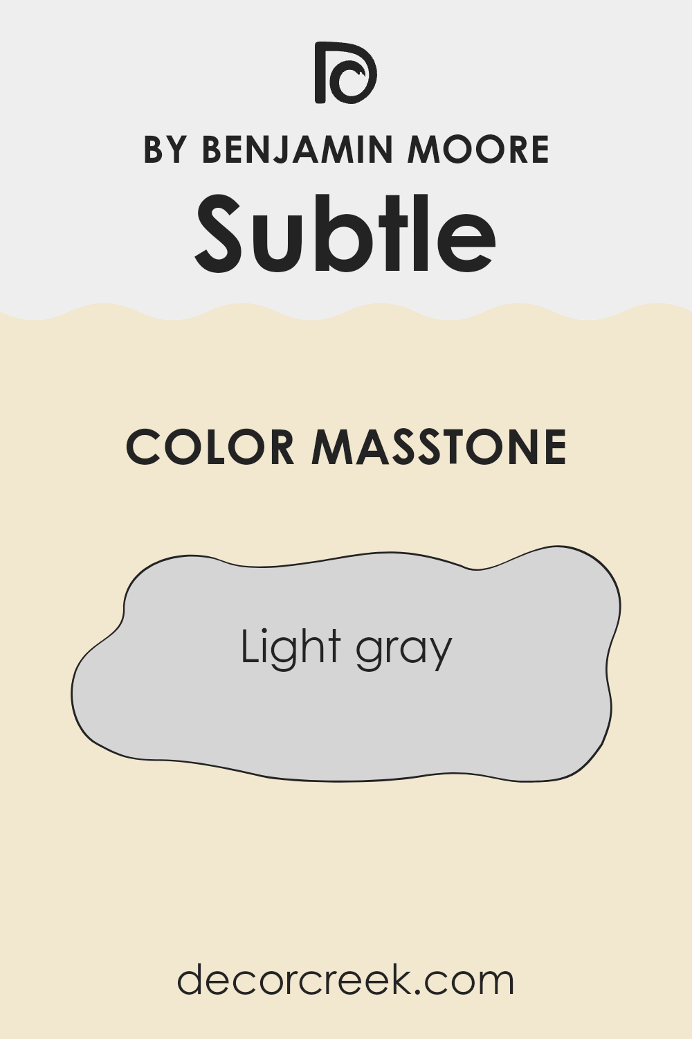
What is the Masstone of the Subtle AF-310 by Benjamin Moore?
SubtleAF-310 by Benjamin Moore, also known as Light Gray (#D5D5D5), is an adaptable paint color ideal for home interiors. Its light gray masstone is soft and neutral, making it easy to combine with other colors. This characteristic ensures it fits seamlessly into almost any decorating style, whether you have a modern, minimalist, or traditional decor.
The subtlety of this shade means it can serve as a peaceful background, letting furniture and art pieces stand out without overpowering the room with color. Because of its neutral tone, Light Gray (#D5D5D5) can also help rooms appear larger and more open.
It reflects natural and artificial light beautifully, brightening up rooms that might otherwise feel small or cramped. This quality makes it a smart choice for painting smaller areas or places with limited light. Overall, this color is a safe and practical option for those looking to refresh their home’s look while maintaining a calm and welcoming atmosphere.
How Does Lighting Affect Subtle AF-310 by Benjamin Moore?
Lighting plays a critical role in how colors appear in different environments. Depending on the type of light—whether natural or artificial—a color can look significantly different. In general, natural light brings out the truest version of a color, while artificial light can add different tones depending on its type (for instance, white LED vs. yellow incandescent).
Considering the color reference provided, which is a very subtle shade, we can observe how it behaves under different lighting conditions. In natural light, this color shows its true hue without distortion. It’s a muted tone, so under the bright exposure of sunlight, it appears slightly lighter and more airy. This makes it suitable for rooms meant to feel open and calm.
Under artificial lighting, the same color might look a little different. For example, under warm incandescent light, it might appear warmer and richer, somewhat softening the room’s atmosphere. In cooler LED lighting, the color might look sharper and slightly more blueish, which could make the room feel more crisp and alert.
The orientation of the room also affects how this color is perceived:
– In north-facing rooms that get less direct sunlight, this color might appear shadowy and cooler, possibly making the room feel slightly chillier.
– South-facing rooms, flooded with plenty of sunlight, will make the color look vibrant and lively, enhancing its warmer undertones.
– In east-facing rooms, morning light can make the color feel fresh and bright in the morning but might look a bit dull in the evening.
– West-facing rooms will receive intense light in the afternoon, which may make the walls look very bright during that time and possibly cast a warmer glow on the color towards evening.
Overall, when choosing colors for a room, consider these factors to ensure you get the desired effect under different lighting conditions throughout the day.
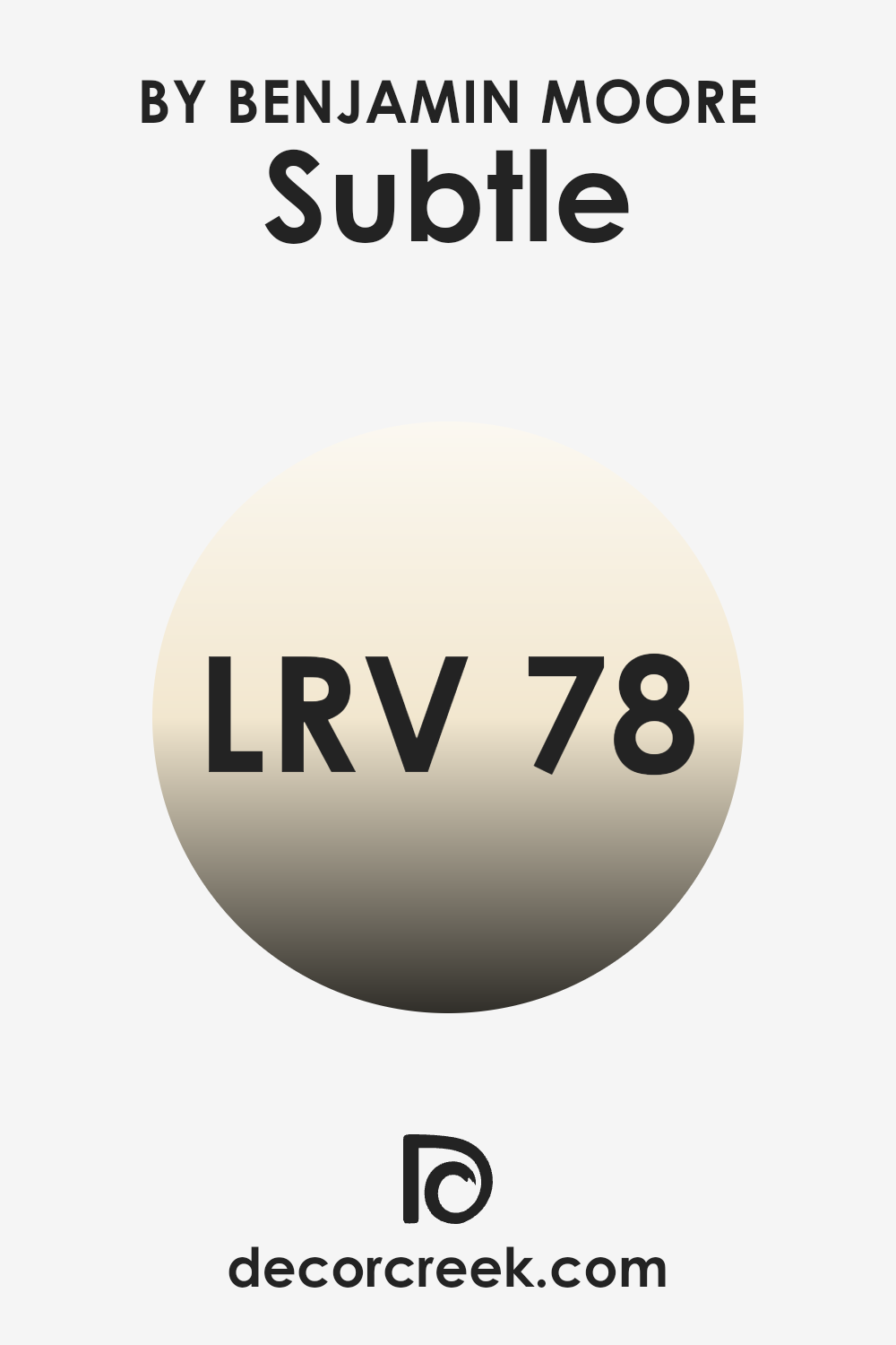
What is the LRV of Subtle AF-310 by Benjamin Moore?
LRV stands for Light Reflectance Value, which is a measure used to indicate how much light a paint color reflects or absorbs. When a wall is painted with a color, the LRV number tells us how bright or dark that color will appear under natural or artificial light.
A higher LRV means the color reflects more light, making it appear brighter and larger. On the other hand, a lower LRV means the color absorbs more light and can make a room feel smaller or cozier because it looks darker.
The LRV of SubtleAF-310 by Benjamin Moore is quite high at 77.86. This means that it is a light color that will reflect a good amount of light, contributing to a brighter appearance in a room. Painting walls with this color can make a room feel more open and airy. It’s particularly beneficial in areas that are smaller or have less natural light, as it can help make the room feel less cramped by reflecting more light around.
This trait makes it a good choice for anyone looking to create a light and welcoming atmosphere in their home or office.
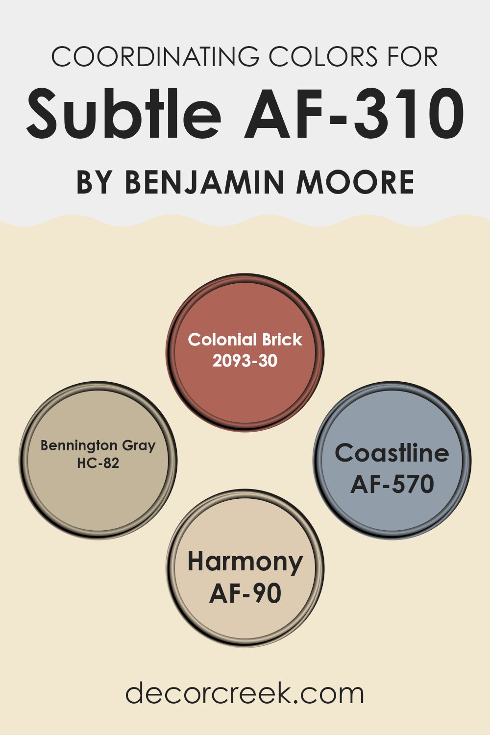
Coordinating Colors of Subtle AF-310 by Benjamin Moore
Coordinating colors are shades that complement each other when used together in a room. They are designed to enhance the overall aesthetic and create a balanced, harmonious look. Generally, these colors are selected based on their ability to support the main color, ensuring that the end result is pleasing to the eye. Coordinating colors can vary in tone and saturation, ranging from neutrals that add subtle contrast to more vibrant shades that bring energy and depth to a design.
For instance, 2093-30 – Colonial Brick is a rich, warm red color that adds a traditional and cozy feel to rooms. It works well with earthy tones and can provide a striking accent when paired with neutral shades. HC-82 – Bennington Gray is a classic soft gray with warm undertones, making it flexible for various decorative styles and easy to combine with both light and dark hues.
AF-570 – Coastline offers a crisp, clear blue that reflects a fresh and airy atmosphere, perfect for creating a relaxed environment. Lastly, AF-90 – Harmony is a soft, muted beige with a soothing presence, ideal for creating a calm and inviting room. These colors support and complement each other, ensuring a cohesive look when used together in decor.
You can see recommended paint colors below:
- 2093-30 Colonial Brick
- HC-82 Bennington Gray
- AF-570 Coastline
- AF-90 Harmony
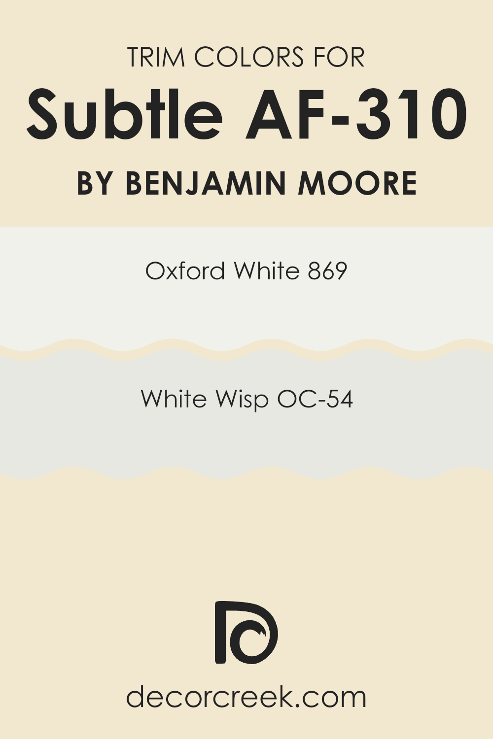
What are the Trim colors of Subtle AF-310 by Benjamin Moore?
Trim colors are selected finishes used on the edges, frames, and borders of architectural elements like doors, windows, and baseboards, contrasting with or complementing the main wall colors to enhance aesthetic appeal and define spatial boundaries.
When using a nuanced shade like SubtleAF-310 by Benjamin Moore, choosing trim colors like 869 – Oxford White or OC-54 – White Wisp is crucial because they subtly highlight the main color, making the room’s details stand out without overpowering the senses.
869 – Oxford White is a clean and bright white that provides a fresh and crisp border that can help other colors in a room appear more distinct and refined.
On the other hand, OC-54 – White Wisp is a soft, almost ethereal white with a hint of gray, giving a gentle contrast that supports the main hue without causing a harsh visual break.
Both colors are excellent for creating a visually pleasing flow throughout a room that features Subtle AF-310.
You can see recommended paint colors below:
Colors Similar to Subtle AF-310 by Benjamin Moore
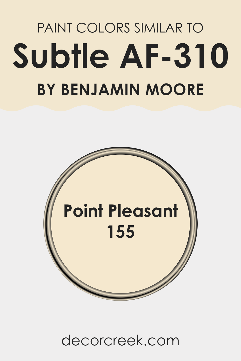
Similar colors are crucial in interior design because they create a harmonious atmosphere in a room, making it feel cohesive and thoughtfully put together. For example, if Subtle AF-310, a light neutral gray with warm undertones, is used as a primary color, incorporating colors like Point Pleasant 155 can enhance the overall aesthetic without overpowering it.
Point Pleasant, which shares a subtle warmth with Subtle AF-310 yet veers slightly towards beige, complements the base color while bringing its own unique character. This helps in achieving a layered yet unified look which is often desired in design for its ability to make rooms appear more welcoming and put together.
Point Pleasant 155 by Benjamin Moore is a color that suggests a mix of refinement and casual elegance without being overly striking. It is a part of the off-white family, having the capacity to add warmth to the walls while maintaining a light and airy feel essential for rooms seeking a minimal and clean look.
This works well in environments where a calm and cohesive look is desired, without making the decor feel monotonous or flat. The use of similar shades like these provides just enough contrast and visual interest to keep the room appealing.
You can see recommended paint color below:
- 155 Point Pleasant
How to Use Subtle AF-310 by Benjamin Moore In Your Home?
Subtle AF-310 by Benjamin Moore is a gentle and welcoming shade of gray that brings a calm and comfortable feeling to any room in your house. It is perfect if you want a color that isn’t too bold or overpowering, making it ideal for creating a relaxing atmosphere. This color works wonderfully in living rooms, where a neutral backdrop is often desired for both family gatherings and individual relaxation.
When decorating, Subtle AF-310 makes an excellent main wall color, providing a neutral backdrop that easily accommodates various colors and textures in your furniture and accessories. This shade is particularly suited for bedrooms, creating a calm environment that promotes rest and relaxation. Pair it with white trim or furniture for a crisp, clean contrast that keeps the room feeling fresh, open, and airy.
Overall, Subtle AF-310 is an adaptable choice that can help make your home look neat and tidy while adding a touch of quiet beauty.
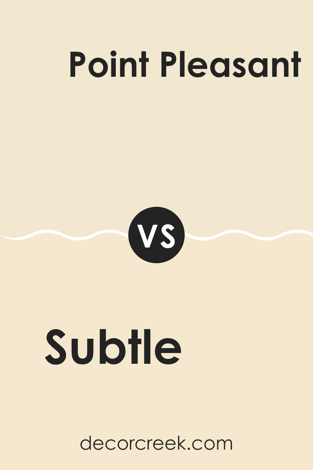
Subtle AF-310 by Benjamin Moore vs Point Pleasant 155 by Benjamin Moore
Subtle AF-310 and Point Pleasant 155 are two Benjamin Moore paint colors, each offering its own distinct aesthetic. Subtle AF-310 is a gentle, nearly neutral beige with warm undertones, ideal for creating cozy and inviting interiors. This color works beautifully in rooms where you want to introduce a touch of warmth without overpowering the area with too much color.
Point Pleasant 155, on the other hand, is a light gray that adds a clean and airy feel to any room. Its cooler tone sets it apart from Subtle AF-310, making it a great match for modern or minimalist interiors. This soft gray can visually expand smaller rooms, creating a brighter and more open atmosphere without feeling cold.
Both colors are flexible and can be used in various parts of a home, from living rooms to bedrooms, depending on the atmosphere you want to create. The warm beige of Subtle contrasts with the cool gray of Point Pleasant, giving decorators two adaptable, yet distinct options.
You can see recommended paint color below:
- 155 Point Pleasant
After trying out AF-310 Subtle by Benjamin Moore, I can honestly say it’s like a quiet magic trick for your room. This paint is not too loud or flashy, but it makes any room look fresh and clean. It’s cool because it can fit in anywhere, whether you want to spruce up your bedroom or make your living room feel new without doing a lot of work.
This color isn’t just a simple off-white; it has a small hint of grey that adds a special touch. It’s perfect for making small rooms appear a bit bigger and more open. And if you ever get bored with your environment, adding colorful decorations is easy against this gentle background. The paint also goes on smoothly and covers the walls really well, which means you won’t have to worry about patchy spots.
After seeing how it worked in my own home, I think AF-310 Subtle by Benjamin Moore could be a great choice for anyone wanting to give their place a soft and clean look. It’s simple, looks neat, and creates a nice backdrop for all kinds of fun room decorations. Whether you want a calm spot to read or a cool area to play, this paint could be just what you’re looking for.
Ever wished paint sampling was as easy as sticking a sticker? Guess what? Now it is! Discover Samplize's unique Peel & Stick samples.
Get paint samples

