Black
Black Blue
Blue Brown
Brown Gray
Gray Green
Green Neutral
 Orange
 White
White Yellow
Choosing the right paint color for your room can be a tricky task, but if you’re considering SW 9650 Succulent by Sherwin Williams, you’re off to a good start. This unique hue is a blend that might just be the perfect fit for your decorating goals. Its subtle depth makes it adaptable to different lighting and architectural styles, ensuring it complements a variety of home décor choices.
As you prepare to give your room a fresh look, knowing a few key details about this color can make all the difference. Firstly, consider the lighting in your room. SW 9650 Succulent interacts beautifully with natural light, revealing different undertones at various times of the day. It’s also flexible enough to stand out as an accent wall or work harmoniously as a complete backdrop for a room.
Moreover, the mood this color sets is calm and grounded, making it ideal for rooms where you want to unwind. Whether it’s in a bedroom, living area, or even a kitchen, SW 9650 Succulent adds a touch of elegance without feeling too strong.
So, before you make your final decision, think about what feelings and functionality you want to evoke in your room. With SW 9650 Succulent, you have the potential to create an environment that not only looks great but also feels right for you and your family.
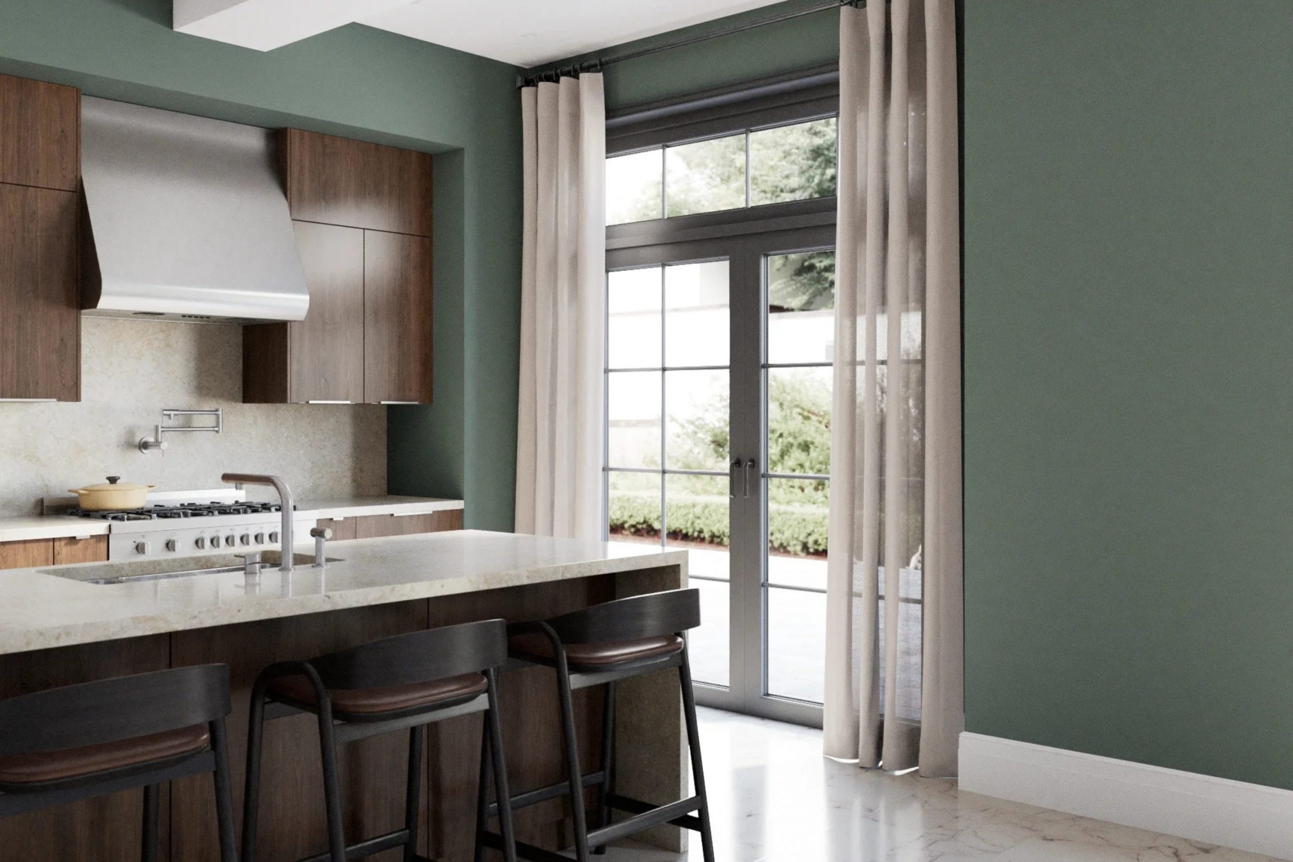
Is Succulent SW 9650 Right for My Home?
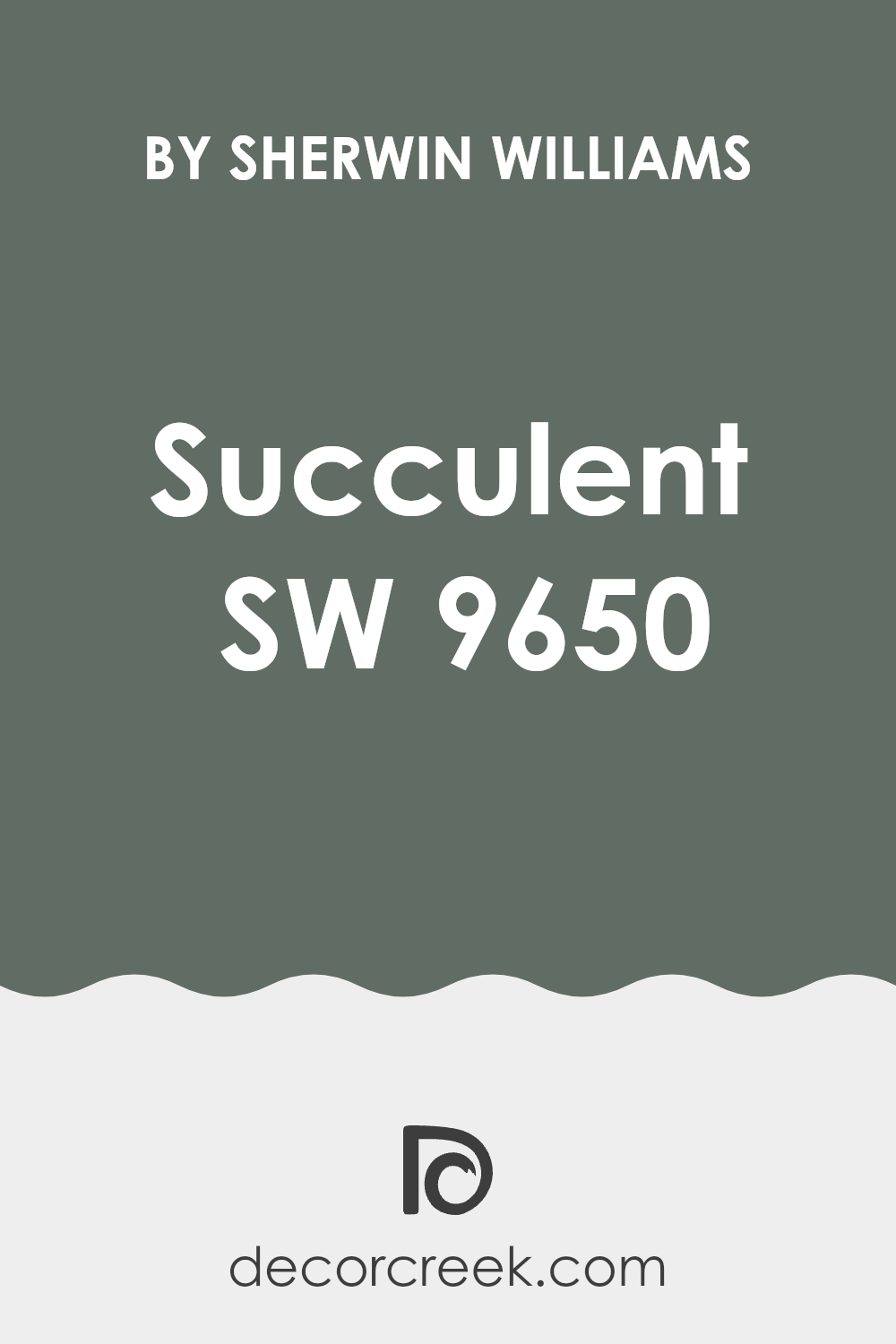
If I were to describe the color Succulent by Sherwin Williams, I’d say it’s a calming green with a hint of gray that makes it very modern and fresh. It’s subtle enough not to feel too strong in a room but distinctive enough to add character and depth.
I love how flexible it is! This color works really well in a variety of interior styles; it’s perfect for Scandinavian themes due to its clean and airy vibe, and it really shines in modern and minimalist designs where you want to add a touch of nature without going too bold.
When I think about what materials and textures pair well with Succulent, natural elements like light woods, linen, and cotton immediately come to mind. These materials help maintain the light and breezy feel of the color. Also, adding elements like stone and metal can create a pleasing contrast that highlights Succulent’s natural undernotes.
In terms of room uses, this color is fantastic in living rooms and bedrooms where you want a splash of color that also soothes. In my own home, adding Succulent as a focal wall or through decor items like cushions and throws alongside concrete accents and wood furniture really pulls the room together beautifully. It’s like bringing the calmness of a green garden inside, without the garden upkeep!
decorcreek.com
What are the right undertones of Succulent SW 9650 ?
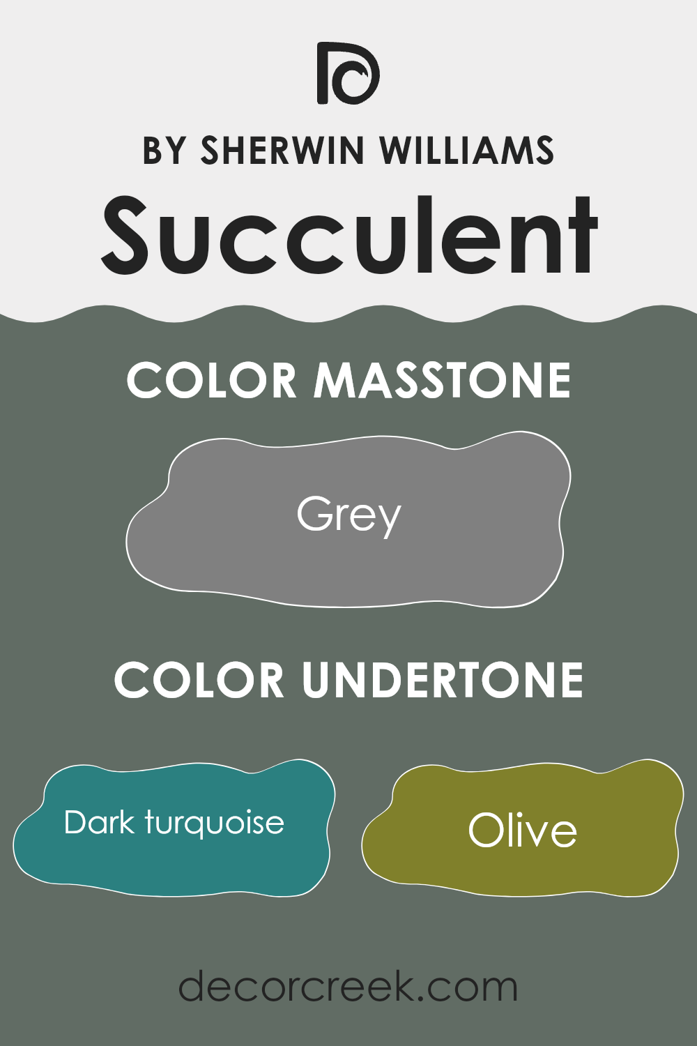
Succulent SW 9650 by Sherwin Williams is a unique color due to its wide range of undertones. These undertones include various shades from dark turquoise to light gray, each subtly influencing the overall perception of the color. For example, the presence of dark turquoise and navy gives it a somewhat cool feel, while brown and olive add a touch of warmth. This mix makes the color very flexible, suitable for various interior rooms.
Undertones play a crucial role in how we perceive color. They can make a paint color look completely different under various lighting conditions or when placed next to other colors. For instance, the violet and purple undertones in Succulent SW 9650 might stand out in a room with a lot of natural light, giving the walls a gentle, lively hue. In contrast, in a room with less light or at night, the darker undertones, like dark grey or dark green, might become more noticeable, making the color appear deeper and richer.
When used on interior walls, the complexity of Succulent SW 9650 allows it to adapt to different styles and furnishings. Whether you are aiming for a room with a modern look or something more traditional, the dynamic nature of this color can complement wood furniture, metals, and textiles of various colors. The broad spectrum of undertones can engage with different elements in a room, pulling together a coherent visual style that remains consistent across different lighting conditions throughout the day.
decorcreek.com
Trendy Trim Colors of Succulent SW 9650 by Sherwin Williams to use this year.
Trim colors are specific hues chosen to accent or complement the main colors of a room or exterior. For a unique and refreshing color like Succulent by Sherwin Williams, selecting the right trim colors can enhance its visual appeal and ensure a seamless blend with the other elements of your design.
Trim colors can highlight architectural details, frame sections of wall or room to give a more polished look, and even affect how the size and layout within the room are perceived.
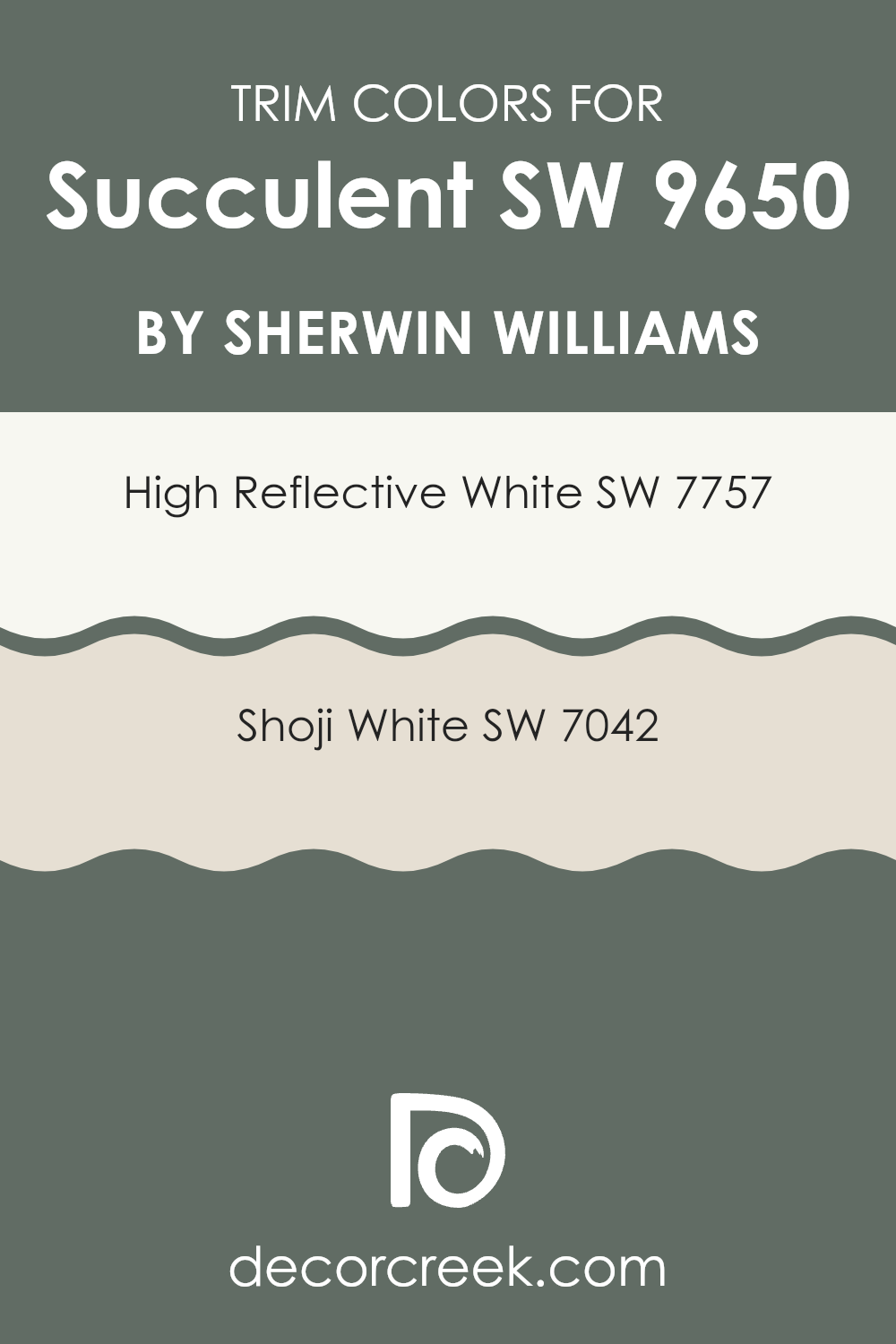
When considering trim colors for Succulent, SW 7757 – High Reflective White and SW 7042 – Shoji White are excellent choices. High Reflective White is a very bright and clean white that brings out the vibrant tones of Succulent, providing a crisp boundary that can make the walls seem more vivid and the room more airy and light-filled.
On the other hand, Shoji White offers a softer, off-white hue that creates a gentle contrast with Succulent, achieving a more subtle and harmonious transition between the wall color and the trim. This color can add depth and warmth to rooms, making it ideal for areas where a softer edge is preferred.
You can see recommended paint colors below:
- SW 7757 High Reflective White
- SW 7042 Shoji White
Evergreen Colors Similar to Succulent SW 9650 by Sherwin Williams
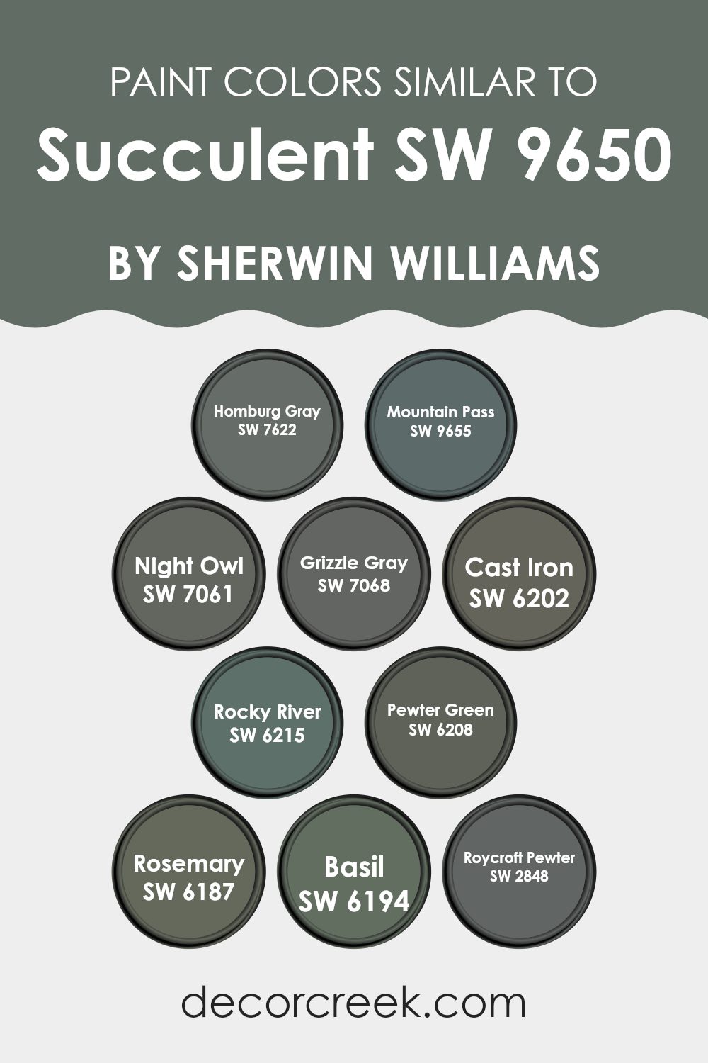
Similar colors are crucial for creating a harmonious and visually appealing look because they naturally blend together, providing a soothing effect to the eye. These colors, when used thoughtfully, can enhance the aesthetic coherence of a room, making it feel well-put-together.
Homburg Gray SW 7622 is a rich, deep gray with a hint of earthiness that brings warmth to rooms, while Mountain Pass SW 9655 offers a heavier, almost woodland-inspired shade that’s perfect for accent walls. Night Owl SW 7061 and Grizzle Gray SW 7068 both contribute a moody charm, the former being darker and more intense, and the latter a balanced medium gray.
Cast Iron SW 6202 is a bold, deep hue that makes a strong statement wherever it is used. Rocky River SW 6215 has a unique blend of blue and green, providing an organic feel reminiscent of a flowing river. Pewter Green SW 6208 adds a subtle splash of green to the traditionally deep gray, making it ideal for rooms that need a touch of nature.
Rosemary SW 6187 infuses a room with a dusky, herbal green, evoking the calmness of a garden, while Basil SW 6194 offers a slightly brighter, fresher green, uplifting any environment. Roycroft Pewter SW 2848 rounds out this palette with a historic vibe, reminiscent of artisan metalwork, perfect for adding depth and interest to a room. Each of these similar colors works together to create a flexible palette that can enhance various design styles, making any interior feel more cohesive and inviting.
You can see recommended paint colors below:
- SW 7622 Homburg Gray
- SW 9655 Mountain Pass
- SW 7061 Night Owl
- SW 7068 Grizzle Gray
- SW 6202 Cast Iron
- SW 6215 Rocky River
- SW 6208 Pewter Green
- SW 6187 Rosemary
- SW 6194 Basil
- SW 2848 Roycroft Pewter
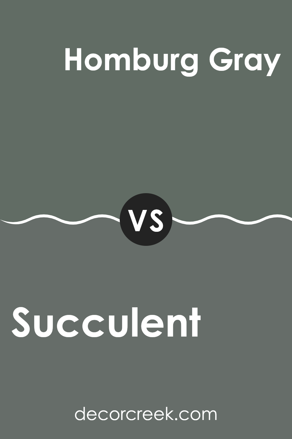
Succulent SW 9650 by Sherwin Williams vs Homburg Gray SW 7622 by Sherwin Williams
Succulent by Sherwin Williams is a lively green with a hint of blue, giving it a fresh, vibrant feel that can brighten up any room. It’s reminiscent of lush greenery and can make a room feel lively and inviting.
In contrast, Homburg Gray is a much deeper, almost charcoal gray that exudes a strong, grounded presence. This color is great for adding depth and a sense of stability to a room, making it perfect for creating a cozy, secure atmosphere.
While Succulent adds a burst of energy and freshness, Homburg Gray offers a calming, solid feel for rooms that need a touch of gravity or a neutral backdrop. Both colors work beautifully in different settings and can complement each other well, especially in a room that seeks balance between vibrancy and calm.
You can see recommended paint color below:
- SW 7622 Homburg Gray
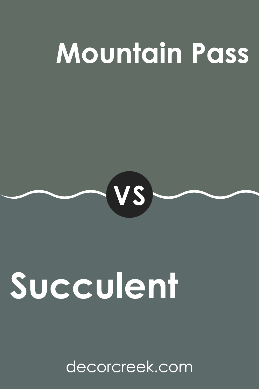
Succulent SW 9650 by Sherwin Williams vs Mountain Pass SW 9655 by Sherwin Williams
“Succulent” from Sherwin Williams is a rich, deep green that gives a sense of freshness and nature to any room. This color is vibrant and lively, making it a great choice for areas where you want to add some energy and brightness. In contrast, “Mountain Pass” is a darker, more muted green.
It has a more subdued feel, making it suitable for rooms where a calming and grounding atmosphere is desired. While “Succulent” leans towards a brighter, leafy hue, “Mountain Pass” brings in the depths of forest shades, offering a more reserved yet equally natural look.
Both colors reflect elements of nature, but the usage and effects they create can be quite different based on their intensity and tone. Whether looking to liven up a room with the cheerful green of “Succulent” or to set a more composed mood with “Mountain Pass,” both colors offer unique possibilities in home decor.
You can see recommended paint color below:
- SW 9655 Mountain Pass
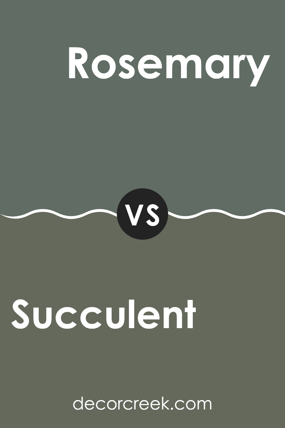
Succulent SW 9650 by Sherwin Williams vs Rosemary SW 6187 by Sherwin Williams
The main color, Succulent, is a bright and refreshing shade of green. It has a vibrant feel, which makes it perfect for rooms where energy and freshness are desired. It’s the kind of green that pops and brings a touch of nature indoors, somewhat reminiscent of fresh leaves or grass.
On the other hand, Rosemary is a darker, more muted green. It’s more subdued and has an earthy tone, making it ideal for areas where a calm and grounded atmosphere is preferred. This color could complement wood furnishings well and fits perfectly in rooms that aim for a more natural, understated look.
When you compare them, Succulent is lighter and livelier, likely making small rooms feel larger and more open. Rosemary, conversely, offers depth and warmth, contributing to a cozy and intimate feel. Each color serves a different purpose depending on the mood or style you want to achieve in a room.
You can see recommended paint color below:
Succulent SW 9650 by Sherwin Williams vs Rocky River SW 6215 by Sherwin Williams
Succulent from Sherwin Williams is a rich, deep green with gray undertones, giving it a muted yet impactful presence. This color is great for rooms where you want a touch of nature’s calm without going too bright. It pairs well with neutral tones and wood finishes, adding a cozy and grounded feel to any room.
On the other hand, Rocky River is a darker shade, leaning towards a deep teal with a subtle greenish influence. This color is stronger and more prominent, making it ideal for an accent wall or areas where you want to add a dramatic flair. Its depth makes it a good choice for larger rooms or furniture pieces.
Both colors offer unique vibes—Succulent is more understated and natural, while Rocky River stands out more and offers a bolder statement. Depending on the mood you’re trying to set, either could be a perfect fit.
You can see recommended paint color below:
- SW 6215 Rocky River

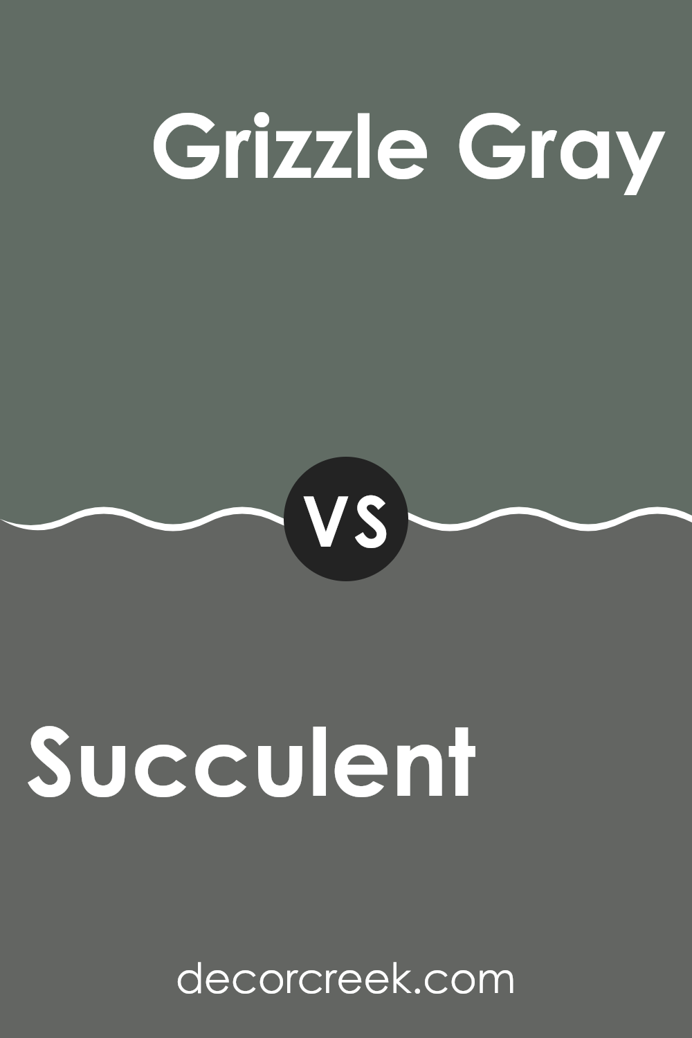
Succulent SW 9650 by Sherwin Williams vs Grizzle Gray SW 7068 by Sherwin Williams
Succulent by Sherwin Williams is a lively and fresh green hue, reminiscent of vibrant plant life. This color brings a sense of energy and rejuvenation to any room, making it especially suitable for areas where you want to inject a natural vibe without feeling too strong.
Grizzle Gray, on the other hand, is a solid and muted gray shade that provides a stark contrast to the brightness of Succulent. It offers a more subdued and neutral backdrop, ideal for those looking for a color that supports a variety of décor styles and colors without taking center stage.
When you compare these two, Succulent tends to add a pop of color and can enliven a room, whereas Grizzle Gray serves as a grounding element that complements bolder colors. The choice between them would depend on whether you’re aiming for a splash of brightness or a subtle, supporting hue in your decorating scheme.
You can see recommended paint color below:
- SW 7068 Grizzle Gray
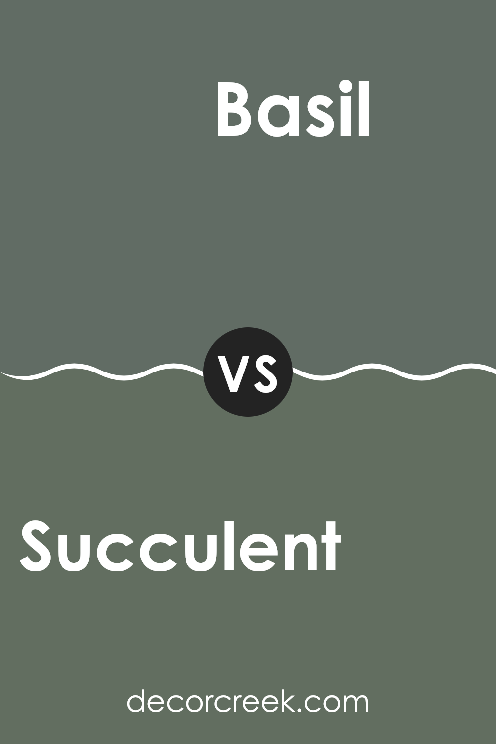
Succulent SW 9650 by Sherwin Williams vs Basil SW 6194 by Sherwin Williams
“Succulent” and “Basil” are two distinct green shades by Sherwin Williams. Succulent is a deep, rich green with a strong presence, resembling the dense color of lush foliage. It’s bold and striking, suitable for creating a statement in a room. On the other hand, Basil is a softer green, lighter and more muted.
It leans slightly towards a sage hue, making it very calming and easier to blend into a variety of decor styles.
Where Succulent might be preferred for accent walls or to highlight architectural features due to its depth and intensity, Basil works wonderfully as a main color for walls in rooms seeking a gentle, natural vibe. The contrast between these two shades is quite evident, with Succulent providing drama and depth, while Basil offers a subtle, muted background, perfect for rooms that aim for a lighter touch of green. Each color has its own unique appeal, depending on the atmosphere and functionality one wants to achieve in the room.
You can see recommended paint color below:
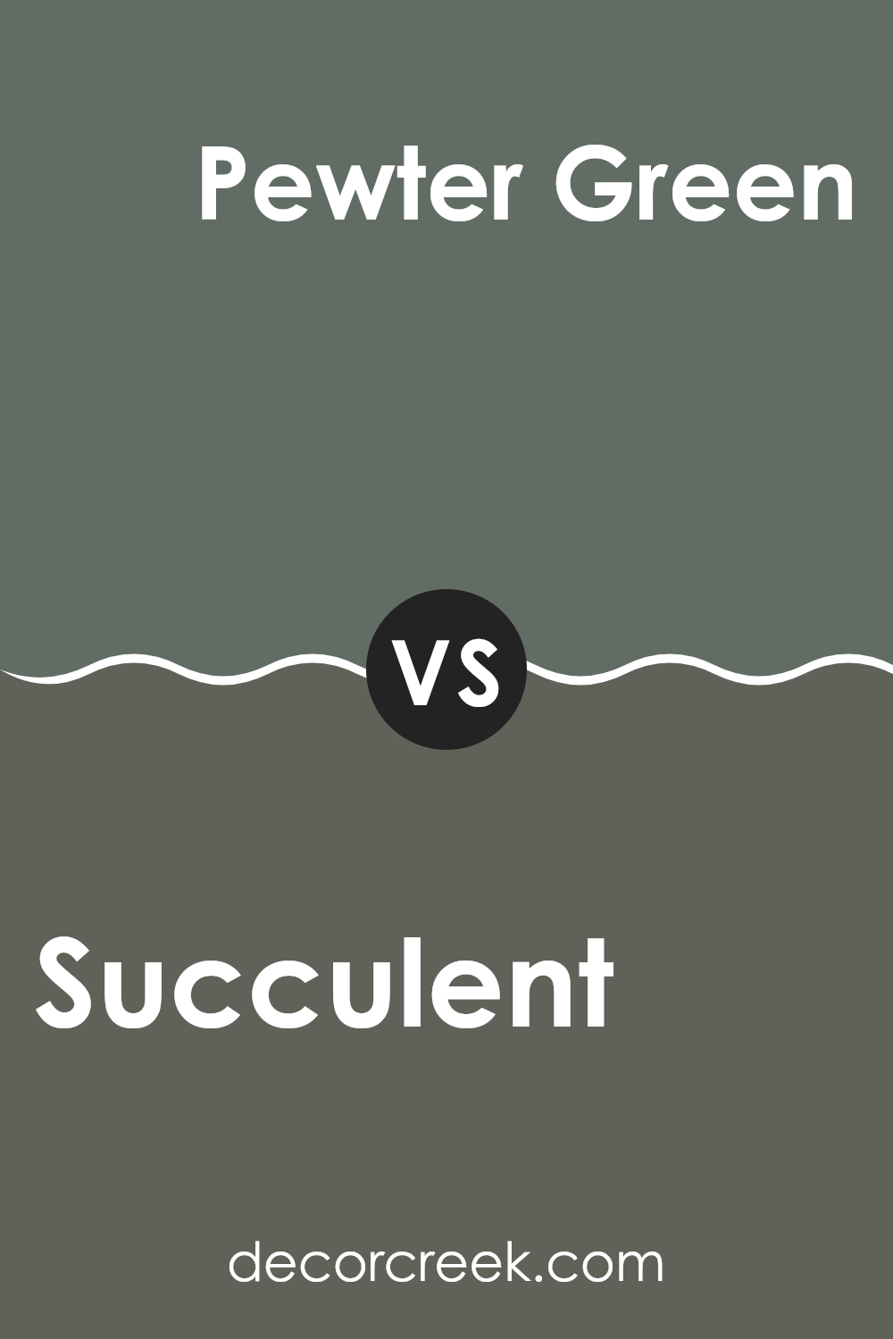
Succulent SW 9650 by Sherwin Williams vs Pewter Green SW 6208 by Sherwin Williams
Succulent and Pewter Green from Sherwin Williams are two distinct shades each offering its own unique vibe. Succulent is a lighter and more muted color that leans towards a soft green with a touch of gray. This hue is gentle and subtle, making it a great choice for creating a calm and friendly atmosphere in rooms like living rooms or bedrooms.
On the other hand, Pewter Green is a deeper, richer color closer to a traditional forest green. This tone is strong and pronounced, perfect for accent walls or furniture if you’re aiming to add a touch of nature’s depth to your decor. Pewter Green also works well in areas that benefit from a more grounded, commanding feel, like home offices or libraries.
Together, these colors could complement each other beautifully in a room, with Succulent providing a soft backdrop and Pewter Green bringing a bold focal point. Each color offers a different mood, allowing you to mix and match according to the feel you want in your room.
You can see recommended paint color below:
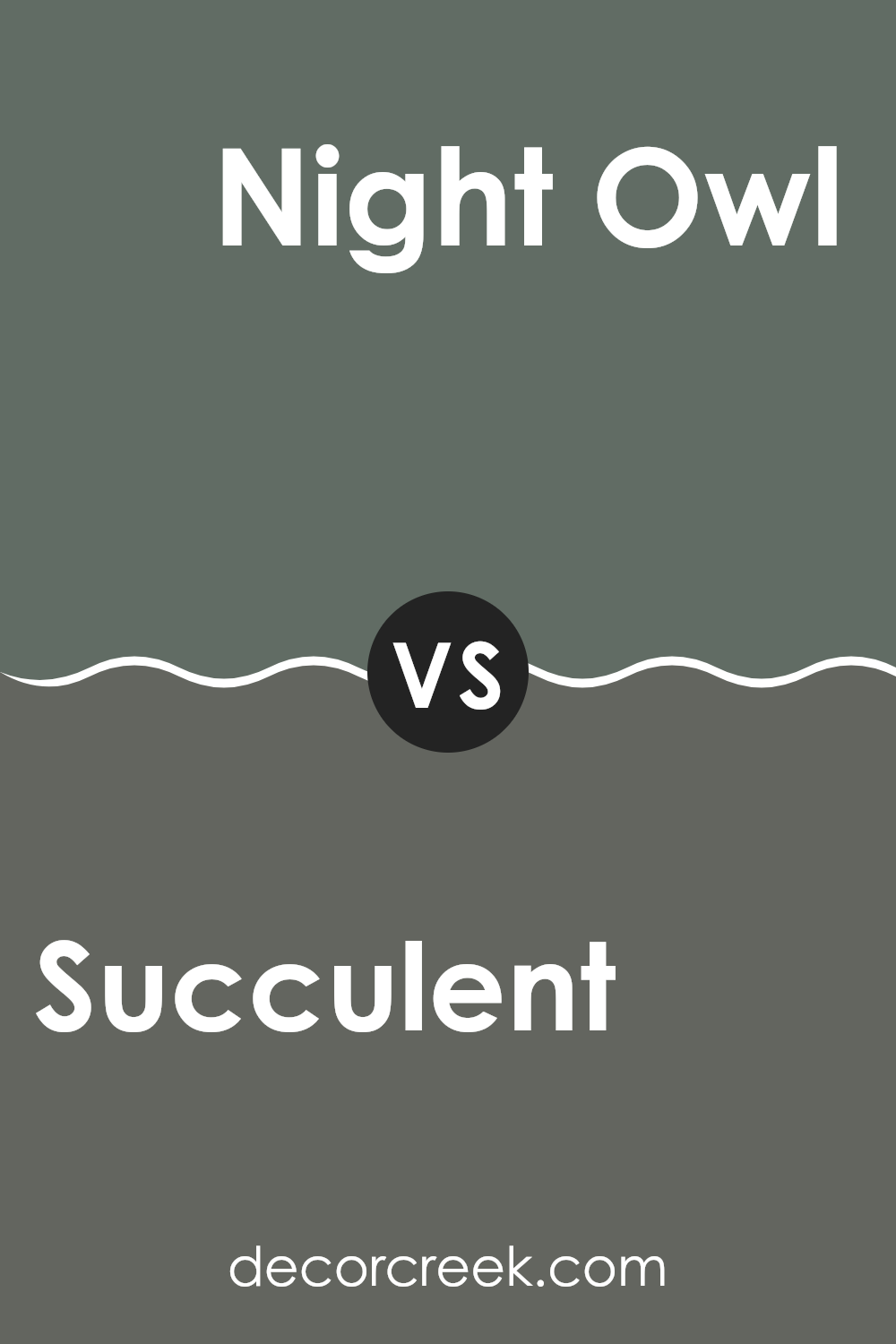
Succulent SW 9650 by Sherwin Williams vs Night Owl SW 7061 by Sherwin Williams
Succulent by Sherwin Williams is a fresh and lively green shade that brings a sense of renewal and energy to any room. It’s like the color of new leaves in spring, offering a vibrant yet soothing feel to a room. Its brightness makes it ideal for rooms where you want to add a touch of nature without feeling too strong.
In contrast, Night Owl by Sherwin Williams is a deep, grayish blue that suggests a more grounded and calm feeling. It’s reminiscent of a cloudy night sky and can give a room a cozy and secure atmosphere. This color works well in areas aimed to be more relaxing and less stimulating, such as bedrooms or reading nooks.
Both colors have their unique appeal, with Succulent adding vibrancy and life, while Night Owl provides a calming and subdued touch. The choice between them would depend on the mood you’re aiming to create in your room.
You can see recommended paint color below:
- SW 7061 Night Owl
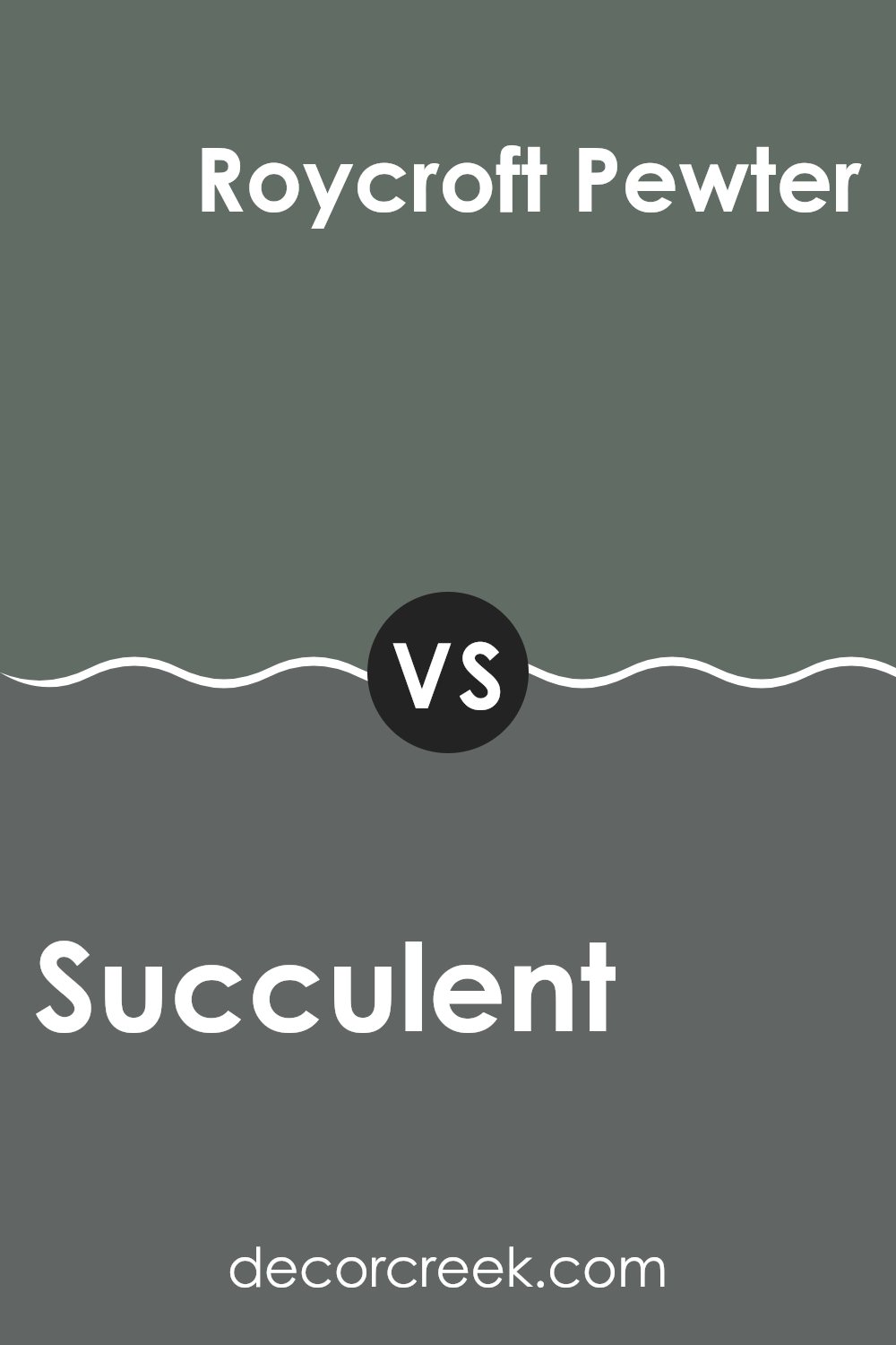
Succulent SW 9650 by Sherwin Williams vs Roycroft Pewter SW 2848 by Sherwin Williams
Succulent and Roycroft Pewter are two distinct colors offered by Sherwin Williams that can give very different feels to a room. Succulent is a deep, intense green with a vibrant and fresh tone, resembling the lush hue found in a dense garden. This color can add a breath of lively energy to any room, making it ideal for areas meant to feel alive and inviting.
On the other hand, Roycroft Pewter presents a more subdued and neutral experience. It is a dark gray color with warm undertones, making it a flexible and easy-to-use option for many settings. This color can help create a cozy and grounded atmosphere, which works well in areas intended for relaxation and quiet.
Overall, while Succulent brings a bold and refreshing splash of nature, Roycroft Pewter offers a calm and stable background. Both colors have their unique charm and can be effectively used in different ways depending on the desired look and mood of the room.
You can see recommended paint color below:
- SW 2848 Roycroft Pewter
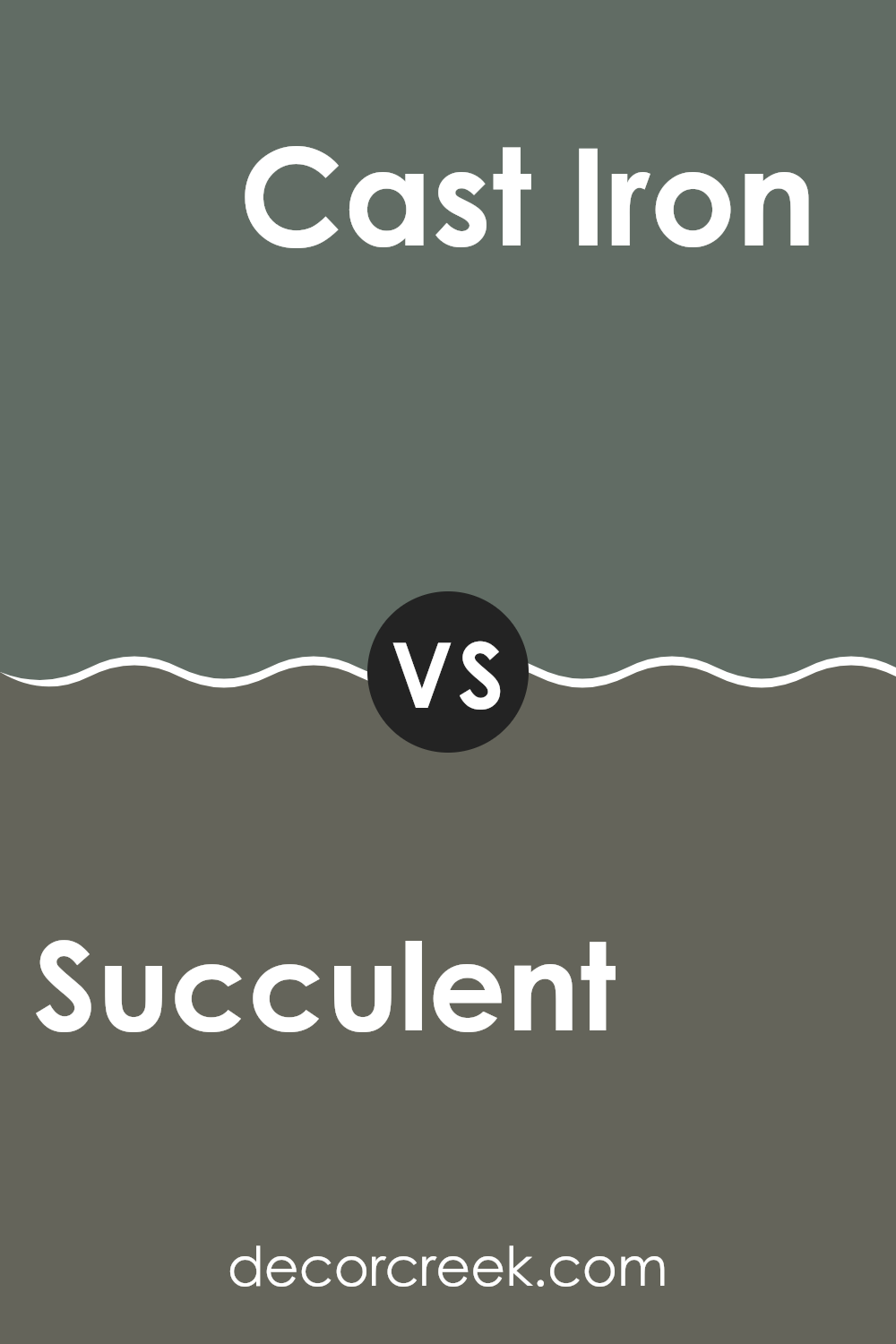
Succulent SW 9650 by Sherwin Williams vs Cast Iron SW 6202 by Sherwin Williams
Succulent SW 9650 and Cast Iron SW 6202, both from Sherwin Williams, offer unique shades that can significantly impact the mood and style of any room. Succulent is a vibrant green color that breathes life and freshness into a room, much like the lively greenery of a garden. It’s a lively and refreshing choice, ideal for creating an energetic and welcoming atmosphere.
On the other hand, Cast Iron SW 6202 presents a much darker, nearly black shade of gray. This color provides a strong, bold statement and works well in modern or industrial-themed decor. It can be used effectively as an accent wall or to bring depth and contrast when paired with lighter colors.
Both colors have distinct personalities: Succulent adds a pop of natural vibrancy, while Cast Iron offers depth and a modern feel. Choosing between them would depend on the desired ambiance and the specific design goals of a room.
You can see recommended paint color below:
Writing about the SW 9650 Succulent paint by Sherwin Williams has been really interesting! I learned that this paint color is like a breath of fresh air for any room. It’s soft, gentle, and reminds me of a calm day in a garden full of green leaves. This makes sense because the color feels natural and calming just like being in nature.
Using this paint can make your room look fresh and lively. It’s not too bright or too dull, but just right to make the walls look pretty and inviting. When I think about bedrooms, living rooms, or even kitchens, SW 9650 Succulent seems like a perfect choice because it doesn’t get too dirty too quickly and keeps its nice look for a long time.
Overall, I would definitely recommend SW 9650 Succulent if you want to make your home more beautiful. It’s a color that makes you feel good and relaxed, and it’s not hard to see why so many people might like it. It’s easy to see why picking this paint could be a great choice, making any room look better almost instantly!

decorcreek.com
Ever wished paint sampling was as easy as sticking a sticker? Guess what? Now it is! Discover Samplize's unique Peel & Stick samples.
Get paint samples