If you’re thinking about giving your home a fresh new look with paint, let me tell you about SW 6194 Basil by Sherwin Williams. As you venture into choosing the perfect shade, consider Basil, a versatile green that brings a touch of nature’s calmness into any space.
Green is a color known for its soothing qualities, making it ideal for areas where you want to relax or focus. Basil isn’t too bright or too subdued, striking a beautiful balance that works wonders in both modern and traditional settings.
This color fits beautifully in a kitchen, bathroom, or even a cozy reading nook, providing a backdrop that complements both wood finishes and more contemporary materials. Thinking about the overall aesthetic, whether you prefer accents in warm tones or cool hues, Basil adapts easily, allowing your personal style to shine through.
What’s more, Sherwin Williams paints are known for their quality and durability, ensuring that your gorgeous new walls stand up to the test of time. If you’re planning to refresh your space, consider how Basil might bring your rooms to life.
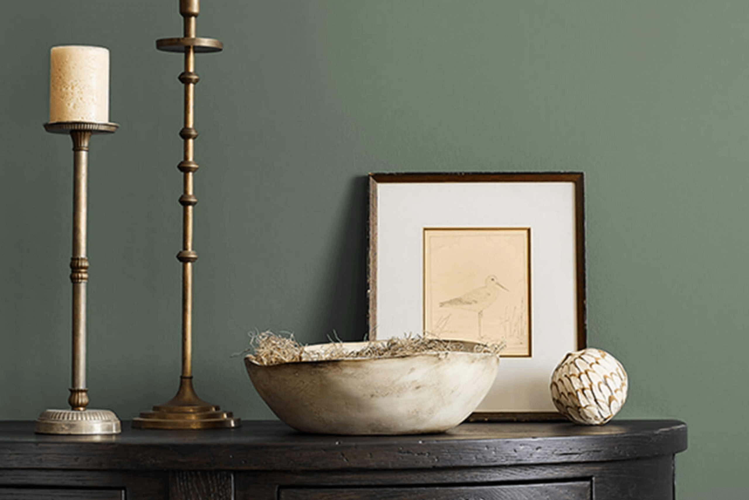
What Color Is Basil SW 6194 by Sherwin Williams?
Basil by Sherwin Williams is a rich, deep green that brings to mind lush foliage and natural environments. This color has a comforting, earthy quality that makes it ideal for creating cozy and inviting spaces. It pairs beautifully with natural materials like wood, stone, and linen, enhancing their textures and adding depth to the overall decor. Basil works exceptionally well with matte finishes, which complement its velvety look, and also with metallic accents in copper or brass for a slight hint of luxury.
This vibrant green shade is versatile and suits a variety of interior styles, particularly rustic, modern farmhouse, and bohemian decor. In rustic settings, it harmonizes with exposed beams and distressed wood, while in modern farmhouse interiors, it contrasts effectively against crisp white trim and soft gray furnishings.
Bohemian rooms benefit from its energy when combined with eclectic prints and a mix of colorful textiles.
Basil also supports an organic and eco-friendly atmosphere, making it a perfect backdrop for indoor plants and natural decor elements. When used in living rooms, bedrooms, or study areas, it creates an environment that feels both grounded and refreshing.
Whether as a primary wall color or as an accent, Basil by Sherwin Williams enhances spaces with a touch of nature’s vitality.
Is Basil SW 6194 by Sherwin Williams Warm or Cool color?
Basil 6194 by Sherwin Williams is a rich, deep green that brings a natural and grounding vibe to any room. This color, reminiscent of lush foliage, works well in homes because it pairs beautifully with a wide range of decorating styles, from rustic to modern.
In darker spaces, Basil can make the area feel cozier, while in well-lit rooms, it can highlight spaciousness and comfort. It’s an excellent choice for accent walls as it can draw attention without overwhelming the space.
The color also complements wood tones, metals, and neutral colors, making it versatile for furniture and decor. It’s particularly appealing in living rooms or studies, where its calming effect can enhance focus and relaxation.
Additionally, in bedrooms, the depth of Basil creates a soothing, enveloping atmosphere, promoting rest. Ideal for those looking to add a touch of nature-inspired aesthetics to their home, this shade is both stylish and practical.
Undertones of Basil SW 6194 by Sherwin Williams
Basil SW 6194 by Sherwin Williams is a unique color primarily because it displays a variety of undertones depending on the lighting and surroundings. Undertones are subtle colors that lie beneath the main color and can influence how it looks in different settings.
For example, Basil might show hints of olive, dark turquoise, or dark green under certain lights, which adds depth to the primary color. These variations in appearance make it a versatile choice for interior walls, adapting well to different room atmospheres and decor styles.
In a brightly lit room, lighter undertones like mint or light green might become more apparent, giving the walls a refreshing and lively feel. This can make the room feel more inviting and vibrant. In contrast, in settings with less natural light, darker undertones like dark grey or navy could dominate, providing a more grounded and rich appearance. This helps in creating a cozier and more relaxed atmosphere.
Understanding the effect of undertones can also assist in choosing complementary colors for furniture, curtains, and accessories. If you’re aware that a color like Basil has potential to exhibit purple or brown undertones, you might select decor items in shades that harmonize with these undertones for a cohesive look.
Overall, the multifaceted nature of Basil’s undertones means it can subtly alter its appearance from a cool to a warm tone, making it a superb choice for those wishing to add a dynamic yet harmonious element to their interior spaces.
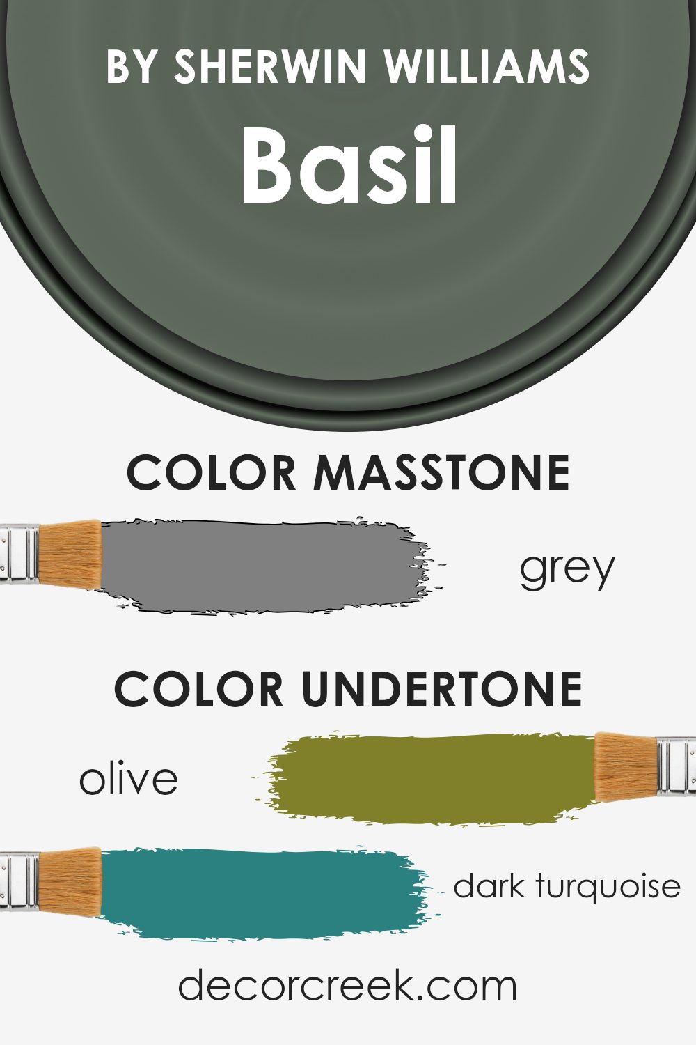
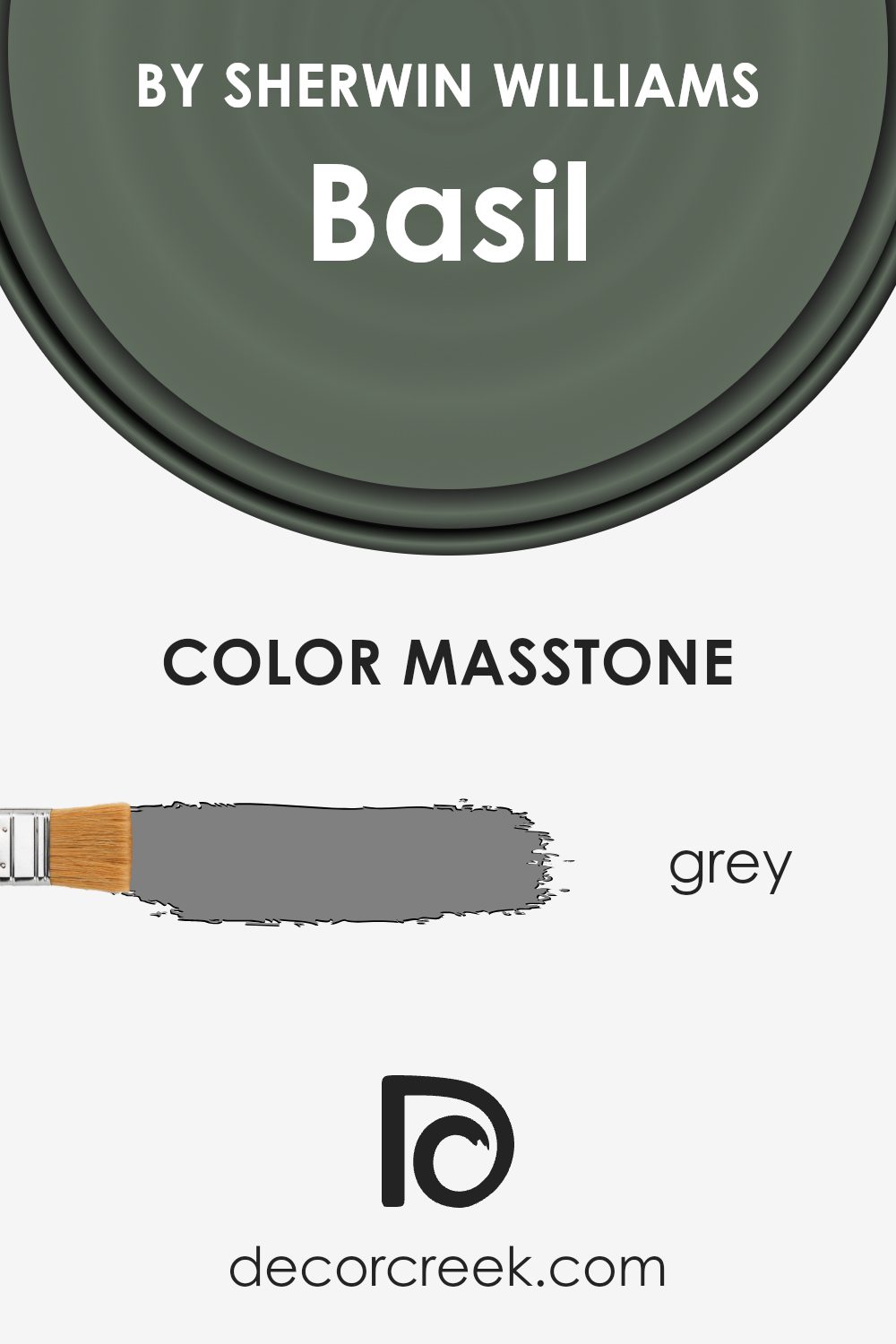
What is the Masstone of the Basil SW 6194 by Sherwin Williams?
Basil SW 6194 by Sherwin Williams has a masstone of grey, specifically referenced with the code #808080. This neutral shade serves as a versatile base in home decor, working well in various settings.
Grey, as a balanced color, sits between black and white, helping to soften the intensity of darker hues and adding depth to lighter tones. This makes Basil SW 6194 a great choice for those seeking a flexible backdrop that complements a wide range of other colors.
In a home environment, this shade of grey can help create a calming atmosphere without feeling too cold or stark. It’s particularly effective in spaces where the goal is to establish a contemporary look while maintaining a welcoming vibe. Whether used on living room walls, kitchen cabinets, or as an accent in the bedroom, the grey masstone of Basil SW 6194 offers a stylish yet understated canvas that works beautifully with both bold colors and softer, muted palettes.
This adaptability makes it a practical choice for many homeowners looking to balance modern aesthetics with cozy living.
How Does Lighting Affect Basil SW 6194 by Sherwin Williams?
Lighting plays a crucial role in how colors are perceived in any space. The same paint can look quite different under various lighting conditions, which is why considering the light exposure in a room is important when choosing a color like Basil, a vibrant shade offered by Sherwin Williams.
In artificial light, the intensity and type of the bulb can affect how Basil appears. Under warm light, such as from incandescent bulbs, this color might appear richer and slightly more muted, as the yellowish hue of the light can blend with the green, softening its appearance.
On the other hand, fluorescent lights, which are cooler, might make the green appear brighter and more vivid, as they highlight the blue undertones in the color.
Natural light brings out the truest form of this color, displaying its dynamic range throughout the day. In a north-facing room, which receives less direct sunlight and generally has cooler light, Basil can appear slightly more subdued and softer. The cooler light can enhance its calming qualities but might also make it seem a bit darker than it actually is.
In a south-facing room, which gets plenty of bright, warm sunlight throughout the day, Basil can look very lively and vibrant. The natural brightness helps in showcasing the color’s depth and vibrancy, making the room feel energetic and fresh.
East-facing rooms receive the most light in the morning. Here, Basil will appear bright and cheerful in the morning light, but as the day progresses and the intensity of the natural light decreases, the color might look softer and more shadowed.
Conversely, in west-facing rooms, the color will exhibit a softer tone in the morning and become more vibrant in the afternoon and evening as the sun sets. The warm, golden tones of the late-day sun will enrich the color, making it appear warmer.
Considering these factors when planning your space can help you achieve the desired effect with this versatile shade.

What is the LRV of Basil SW 6194 by Sherwin Williams?
LRV stands for Light Reflectance Value, a measure used to determine how much light a paint color will reflect or absorb once applied to a wall. This value is expressed on a scale from zero, indicating that no light is reflected and all is absorbed (making the surface perfectly black), to a higher number close to a hundred, which would mean the surface is reflecting nearly all the light and appears very bright or white.
The LRV helps you understand how light or dark a color can appear under different lighting conditions. It plays a crucial role in deciding the mood and aesthetic of a room; lighter colors can make a room feel more open and airy, whereas darker colors can provide a sense of coziness but may make a space feel smaller.
The specific LRV of 14.684 for this particular color means it has a relatively low ability to reflect light, classifying it as a darker shade. This low LRV suggests that when used on walls, the color will absorb more light than it reflects, potentially making rooms appear more enclosed and intimate.
When considering using this paint color, think about the lighting in your room. A room with ample natural or artificial light can counter the darkening effect of the paint, but in a naturally darker room, this color might make the space feel even smaller and darker.
To balance this, consider using this paint color on accent walls or pairing it with lighter colors in décor and furnishing to offset the darkness.

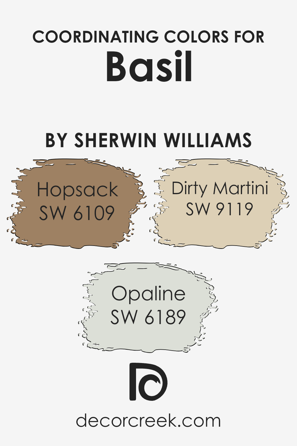
Coordinating Colors of Basil SW 6194 by Sherwin Williams
Coordinating colors are chosen to complement a primary color, enhancing the overall aesthetic of a room while maintaining a harmonious look. These coordinating shades work together by balancing the visual weight and temperature of colors, creating a cohesive and inviting space.
For instance, when paired with a primary color like a soft green, specific coordinating colors can accentuate its undertones, add depth, or create a gentle contrast to bring vibrancy to the décor.
One of the coordinating colors, SW 6109 – Hopsack, is a warm, robust beige that can add a sense of reliability and grounding to any space. It contrasts subtly with softer shades, providing a sturdy foundation that allows other colors to pop without overwhelming them.
Another shade, SW 6189 – Opaline, is a gentle, muted green that brings a soft, airy quality to the surroundings. It’s light enough to give a lift to darker colors while still holding its own in a palette.
The last of the coordinating colors, SW 9119 – Dirty Martini, is a muted olive green, providing a dusty, earthy element that works well with natural materials and can add a touch of calm maturity to any space.
These colors, when used together, ensure a smooth and appealing visual flow that enhances the environment without cluttering it.
You can see recommended paint colors below:
- SW 6109 Hopsack (CHECK A SAMPLE)
- SW 6189 Opaline (CHECK A SAMPLE)
- SW 9119 Dirty Martini (CHECK A SAMPLE)
What are the Trim colors of Basil SW 6194 by Sherwin Williams?
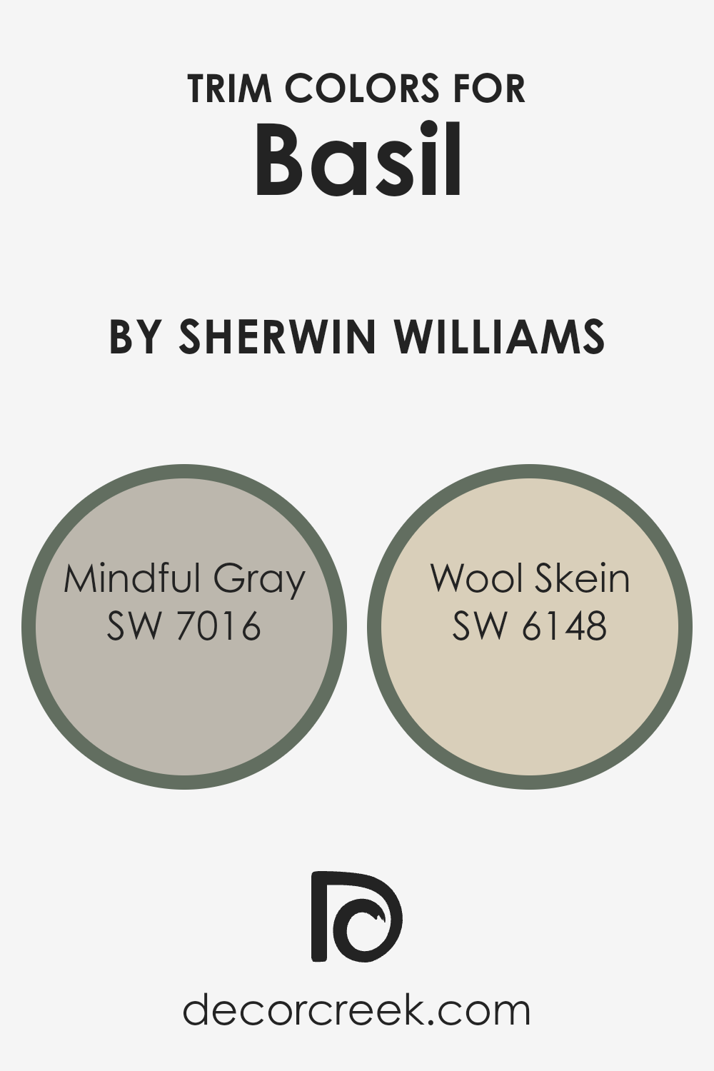
Trim colors are the additional hues used on elements like doors, window frames, and moldings to complement or contrast the main paint color on walls. For a rich, deep green like Basil by Sherwin Williams, selecting the right trim colors can effectively enhance the overall aesthetic appeal and define the architectural details of a space.
Mindful Gray and Wool Skein are excellent choices for trim colors as they both offer a subtle backdrop that allows the green to stand out, but with different undertones and weight that cater to varied design preferences.
Mindful Gray is a warm, soft gray with a touch of brown, giving rooms a cozy, welcoming feel that balances nicely against the cooler tones of Basil. In contrast, Wool Skein is a lighter, neutral shade with slight yellow undertones, offering a gentle contrast that highlights the vividness of the green, making it pop beautifully. These colors not only support the main wall color but also add a layer of visual interest and depth to the design scheme.
You can see recommended paint colors below:
- SW 7016 Mindful Gray (CHECK A SAMPLE)
- SW 6148 Wool Skein (CHECK A SAMPLE)
Colors Similar to Basil SW 6194 by Sherwin Williams
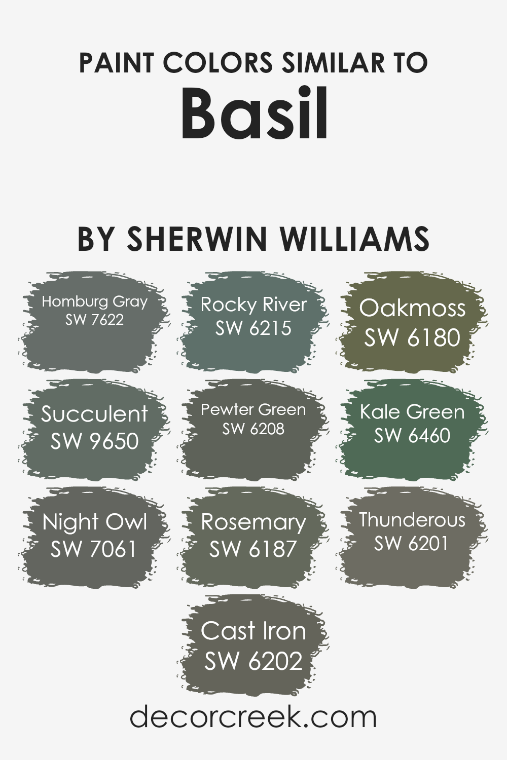
Similar colors are essential in design because they create a harmonious and cohesive look, which is soothing to the eye. For example, the sibling shades to SW 6194 Basil by Sherwin Williams each possess unique qualities while maintaining an underlying unity that ties the space together seamlessly.
Colors such as SW 7622 Homburg Gray lend a subtle and elegant gray tone that adds a touch of richness without overwhelming the senses, being slightly somber yet versatile. SW 9650 Succulent is a deeper hue that hints at lush vegetation, perfect for bringing a natural and comforting feel into a room.
Then, SW 7061 Night Owl presents as a mysterious dark gray that can give a grounding effect, ideal for creating a focal point in any area.
SW 6202 Cast Iron is a robust gray that resembles the color of untreated iron, providing a strong and sturdy vibe. SW 6215 Rocky River mirrors the color of a deep riverbed, making any space feel more connected to nature.
SW 6208 Pewter Green blends gray with green for a muted yet organic feel, evoking the worn surface of old pewter. Another green shade, SW 6187 Rosemary, recalls the earthy tones of the herb, enhancing a room with its subtle, natural undertones.
SW 6180 Oakmoss features a grounding, arboreal shade reminiscent of thick moss, adding depth to interiors. SW 6460 Kale Green offers the freshness of bright leafy greens, perfect for energizing a space.
Lastly, SW 6201 Thunderous is a deep, stormy gray that brings drama and intensity to the palette, ideal for adding a touch of mystery. Each of these colors complements SW 6194 Basil, ensuring design continuity and aesthetic harmony.
You can see recommended paint colors below:
- SW 7622 Homburg Gray
- SW 9650 Succulent (CHECK A SAMPLE)
- SW 7061 Night Owl (CHECK A SAMPLE)
- SW 6202 Cast Iron
- SW 6215 Rocky River (CHECK A SAMPLE)
- SW 6208 Pewter Green (CHECK A SAMPLE)
- SW 6187 Rosemary (CHECK A SAMPLE)
- SW 6180 Oakmoss (CHECK A SAMPLE)
- SW 6460 Kale Green (CHECK A SAMPLE)
- SW 6201 Thunderous (CHECK A SAMPLE)
Colors that Go With Basil SW 6194 by Sherwin Williams
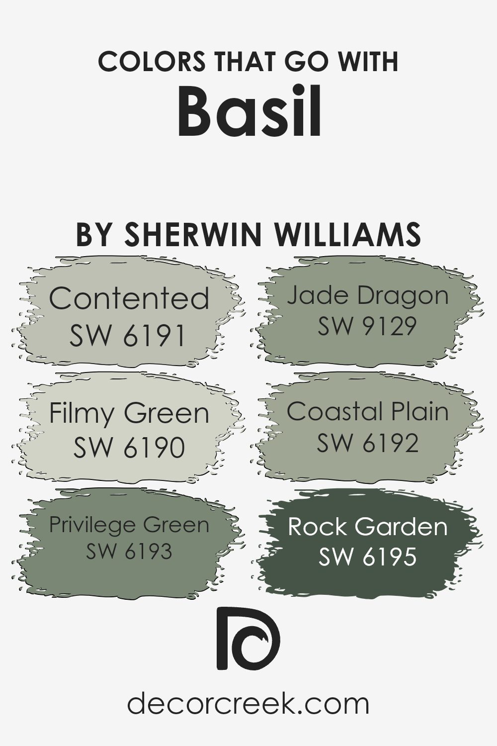
Choosing the right colors to pair with Basil SW 6194 by Sherwin Williams is crucial for creating a cohesive and appealing look in any space. When matching colors like Contented SW 6191—a calming gray-green—or Filmy Green SW 6190, which offers a soft, muted hue, you ensure that the environment feels harmonious and subtly vibrant. These pairings are ideal for bringing out the earthy, rich tones of Basil without overwhelming the senses.
Colors such as Privilege Green SW 6193, which has a deeper, more luxurious green tone, add a dramatic flair that complements the grounding feel of Basil. Similarly, Jade Dragon SW 9129 injects a touch of drama with its stronger and slightly brighter green, great for adding a focal point in a room.
Coastal Plain SW 6192 provides a touch of softness and lightness, working well in spaces that aim for a fresh and airy feel.
For those looking for something that feels grounded and sturdy, Rock Garden SW 6195, with its deeper, stony green, provides the perfect contrast to the vibrant freshness of Basil, rounding out a palette that is as refreshing as it is appealing. These color combinations are key to achieving a balanced and enjoyable space.
You can see recommended paint colors below:
- SW 6191 Contented (CHECK A SAMPLE)
- SW 6190 Filmy Green (CHECK A SAMPLE)
- SW 6193 Privilege Green (CHECK A SAMPLE)
- SW 9129 Jade Dragon (CHECK A SAMPLE)
- SW 6192 Coastal Plain (CHECK A SAMPLE)
- SW 6195 Rock Garden (CHECK A SAMPLE)
How to Use Basil SW 6194 by Sherwin Williams In Your Home?
Basil SW 6194 by Sherwin Williams is a deep, rich green color that offers a sense of calm and richness to any room. It works wonderfully if you’re thinking about creating a cozy, inviting atmosphere. For those looking to refresh their living room or bedroom, this shade is ideal for accent walls. It pairs beautifully with neutral colors like whites, beiges, and greys, allowing it to stand out without overwhelming the space.
In the kitchen, painting cabinets or an island with Basil can add a unique touch and make white countertops and appliances pop. It’s also a great choice for a bathroom if you want to give it a fresh, natural vibe without going too bright.
Additionally, Basil works well in a home office, where it can help set a calm and focused mood. Complement it with wooden furniture and natural decor items like plants to enhance the earthy, grounded feel. Whether it’s a small touch-up or a big change, using Basil SW 6194 can really improve the look and feel of your home.
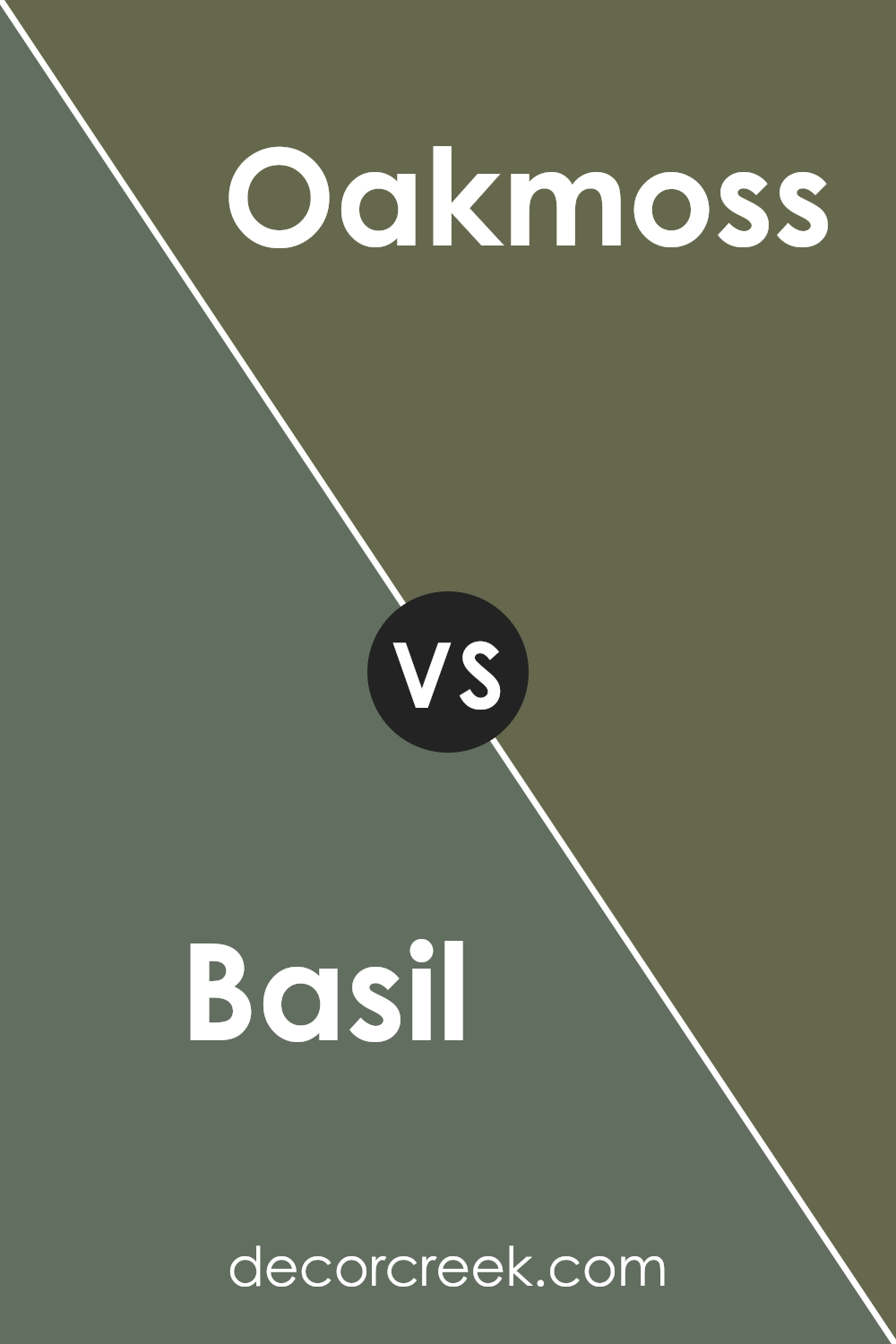
Basil SW 6194 by Sherwin Williams vs Oakmoss SW 6180 by Sherwin Williams
Basil SW 6194 and Oakmoss SW 6180, both by Sherwin Williams, are distinct yet harmonious colors. Basil SW 6194 is a light, vibrant green, offering a refreshing and lively tone reminiscent of fresh herbs. This color is perfect for spaces where a sense of energy and nature is desired, such as kitchens or sunrooms.
In contrast, Oakmoss SW 6180 is a deeper, earthier green. It has a grounding effect, making it suitable for creating a cozy and inviting atmosphere in areas like living rooms or studies. While Basil adds a pop of brightness, Oakmoss brings depth and warmth, making it more subdued and ideal for calming spaces.
Together, these colors can beautifully balance each other, combining freshness and comfort in any home’s palette.
You can see recommended paint color below:
- SW 6180 Oakmoss (CHECK A SAMPLE)
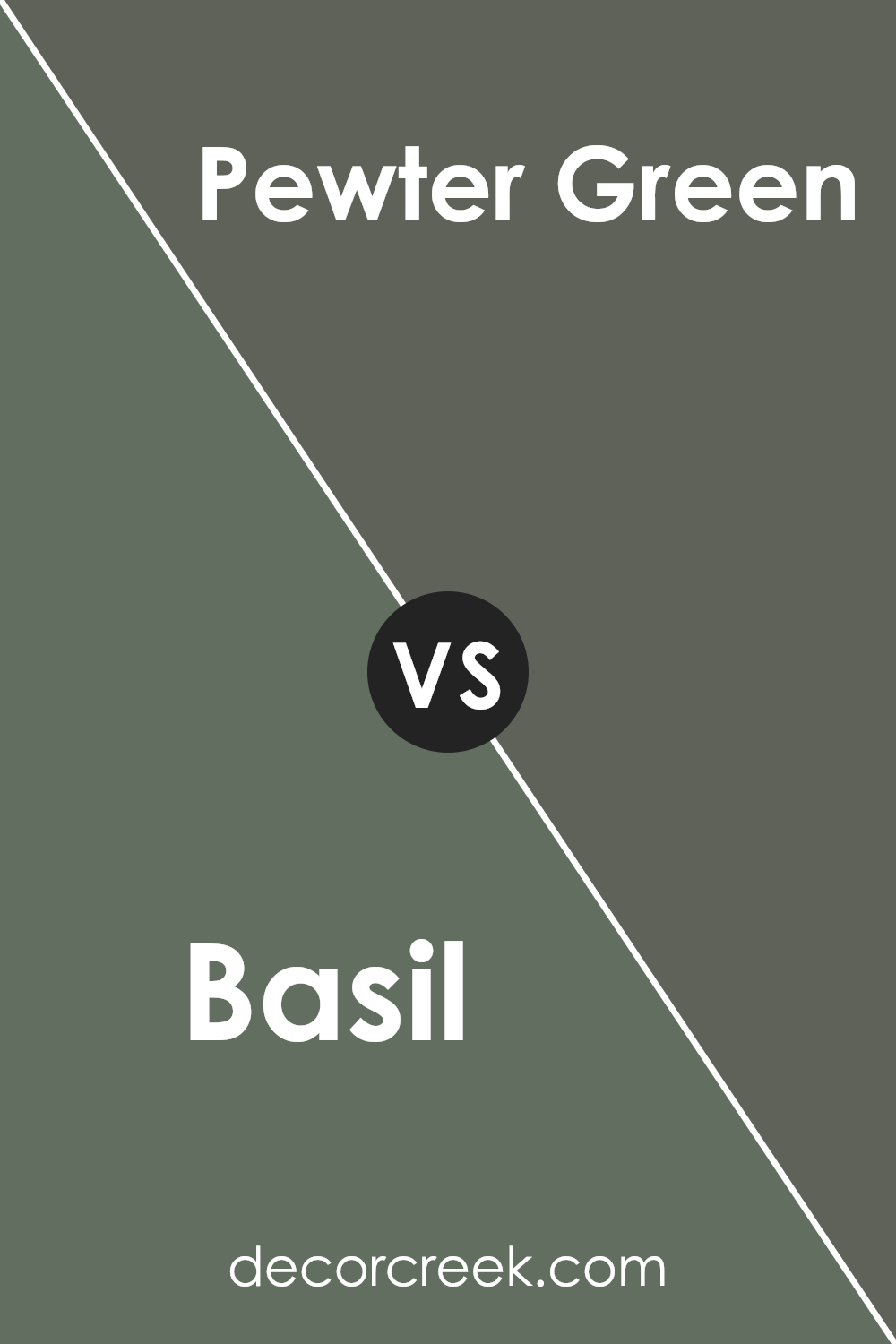
Basil SW 6194 by Sherwin Williams vs Pewter Green SW 6208 by Sherwin Williams
Basil SW 6194 and Pewter Green SW 6208 by Sherwin Williams are both shades of green, but they have different tones and feelings. Basil is a lighter, fresher shade of green, resembling the color of the basil herb. It brings a lively and bright feel to spaces, making it great for adding a touch of nature indoors.
On the other hand, Pewter Green is a darker, moodier green with grey undertones. This color is more muted and subtle, offering a grounded, calming feel, perfect for creating a more relaxed and cozy atmosphere.
The contrast between the two means they could complement each other well in a space, with Basil providing brightness and Pewter Green adding depth and sophistication.
You can see recommended paint color below:
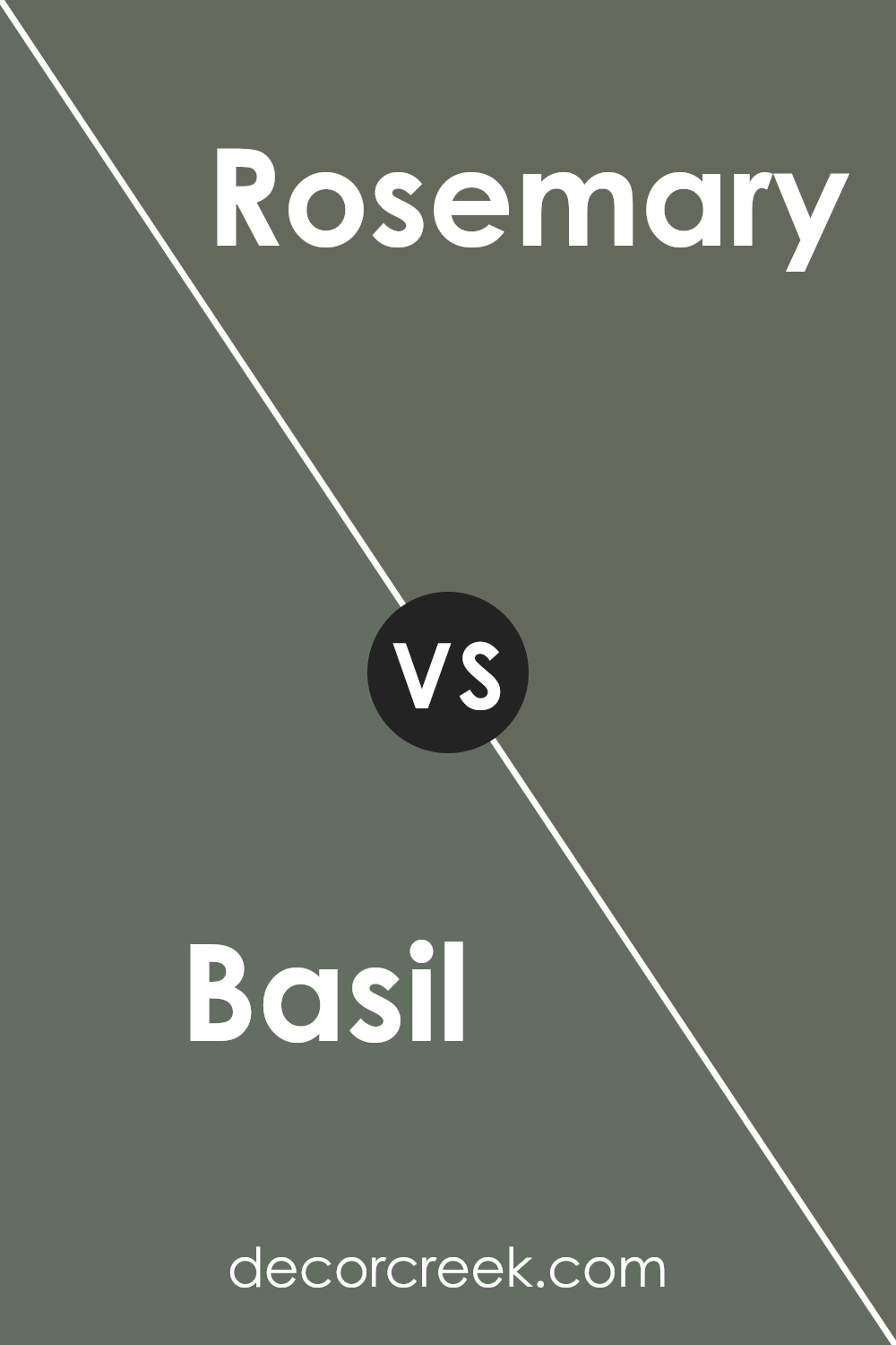
Basil SW 6194 by Sherwin Williams vs Rosemary SW 6187 by Sherwin Williams
Basil and Rosemary by Sherwin Williams are two distinct shades of green that offer different vibes for spaces. Basil is a lighter, fresher green that brings a vibrant and lively feel to a room. It’s perfect for spaces where you want to add a touch of nature without overwhelming the area with too strong a color.
On the other hand, Rosemary is a deeper, richer green. This hue can add a feeling of warmth and coziness, making it ideal for spaces where you want a more grounded, comforting atmosphere.
Both colors pair well with natural wooden elements and can promote a feeling of being connected to the outdoors, but the choice between them depends on the mood you aim to create in your space.
You can see recommended paint color below:
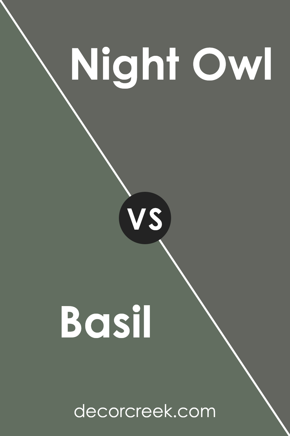
Basil SW 6194 by Sherwin Williams vs Night Owl SW 7061 by Sherwin Williams
The main color Basil is a soothing green shade that resembles the tones you might see in a lush garden. It’s gentle yet noticeable, offering a sense of calm and freshness to any space without overpowering. On the other hand, Night Owl is a deep gray with hints of blue, creating a mood that’s more reserved and quiet.
This color appears almost like a midnight sky and can make a room feel cozy and secure. These two colors, while both offering a sense of peacefulness, have distinct vibes: Basil brings an earthy, natural feel, while Night Owl provides a feeling of shelter and warmth.
They could complement each other well in a space that aims for balance and harmony, with Basil adding lightness and Night Owl giving depth.
You can see recommended paint color below:
- SW 7061 Night Owl (CHECK A SAMPLE)
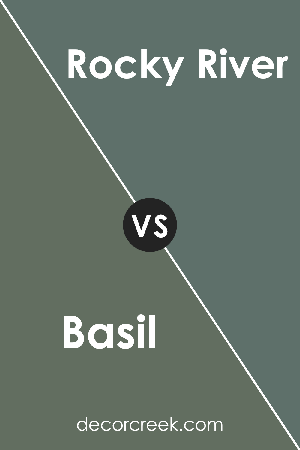
Basil SW 6194 by Sherwin Williams vs Rocky River SW 6215 by Sherwin Williams
Both Basil and Rocky River are green shades from Sherwin Williams, but they each bring a unique vibe to a space. Basil is a light, soft green that feels fresh and clean. It’s perfect for creating a relaxed and inviting atmosphere.
On the other hand, Rocky River is a deeper, more earthy green with hints of blue. This color is stronger and can add a touch of nature-inspired boldness to any room.
While Basil provides a gentle backdrop, ideal for brightening small spaces or complementing with light decor, Rocky River offers a more prominent presence, making it great for accent walls or rooms where you want the color to stand out.
Both colors work well in various settings, depending on the mood you want to create and the other colors you pair them with.
You can see recommended paint color below:
- SW 6215 Rocky River (CHECK A SAMPLE)
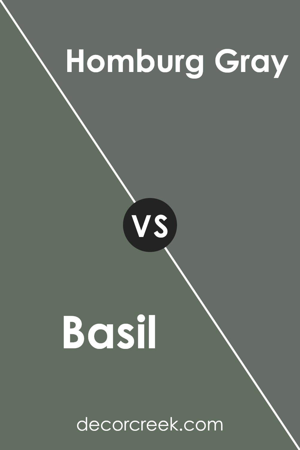
Basil SW 6194 by Sherwin Williams vs Homburg Gray SW 7622 by Sherwin Williams
The main color, Basil, is a soft and natural green shade that brings a feeling of freshness and calm to any space. It’s like the color of garden-fresh herbs and has a subtle vibrancy that can liven up a room without overwhelming it.
On the other hand, Homburg Gray is a much darker, almost charcoal-like gray with green undertones. This color is more grounding and can give a room a solid, balanced feel. Compared to Basil, Homburg Gray offers a stronger presence due to its deeper ,tone making it ideal for accent walls or for creating a more focused and cozy atmosphere.
Both hues are versatile and can be used in various design styles depending on the ambiance you want to achieve.
You can see recommended paint color below:
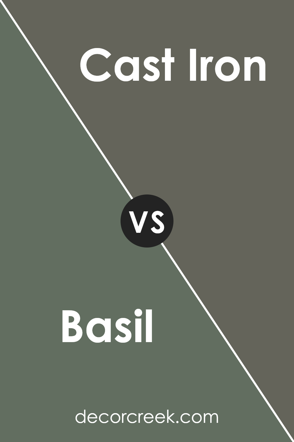
Basil SW 6194 by Sherwin Williams vs Cast Iron SW 6202 by Sherwin Williams
Basil SW 6194 by Sherwin Williams is a lively green shade that brings to mind the freshness of spring leaves. This color has a vibrant yet organic feel, making it ideal for spaces where you want to add a touch of nature’s vitality. It’s a great choice for kitchens or sunrooms where the bright, cheerful shade can lighten up the space.
On the other hand, Cast Iron SW 6202, is a much darker color, resembling the deep, grayish hue of metal. This cooler, almost steel-like color is perfect for creating a bold, striking effect in a space. It works well in modern settings or as an accent wall to contrast with lighter tones, providing a grounding effect.
While both colors are from Sherwin Williams and offer distinct vibes, Basil is energetic and fresh, whereas Cast Iron offers depth and strength. Each provides unique possibilities depending on the mood you want to set in your room.
You can see recommended paint color below:
- SW 6202 Cast Iron
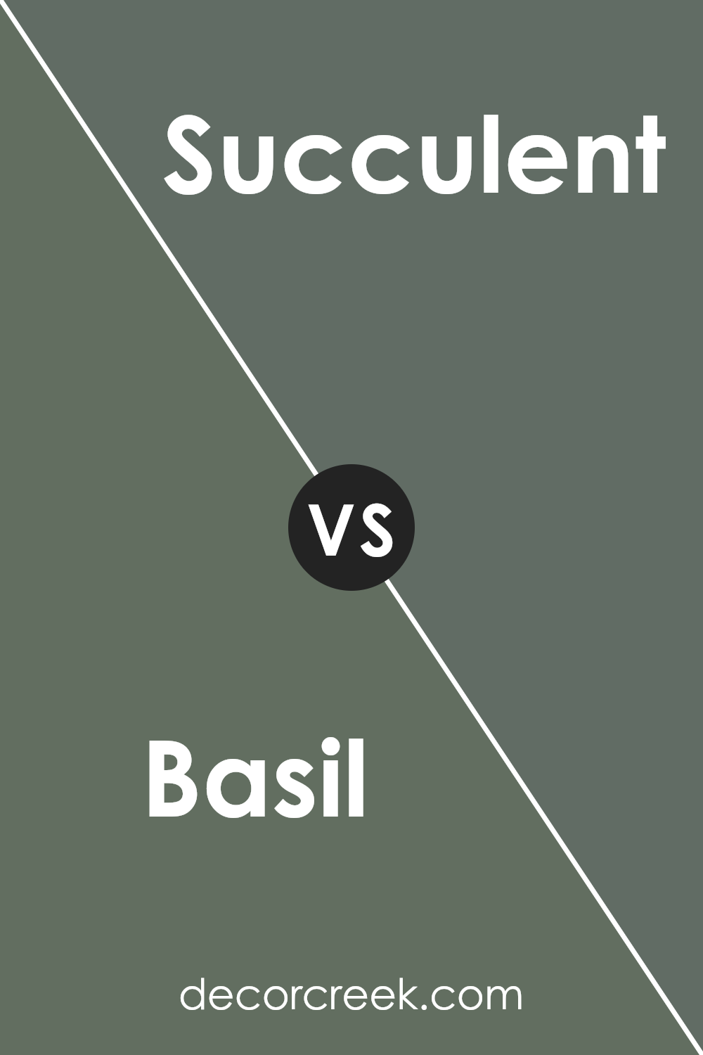
Basil SW 6194 by Sherwin Williams vs Succulent SW 9650 by Sherwin Williams
Basil SW 6194 and Succulent SW 9650, both by Sherwin Williams, are distinct yet complementary shades of green. Basil SW 6194 is a deep, herb-like green that gives off a strong sense of nature and lushness. It’s vivid enough to make a statement but also maintains an earthy mutedness that allows it to be versatile in various spaces.
On the other hand, Succulent SW 9650 is a lighter, more subdued shade of green. It has a softness to it that is perfect for creating a gentle and calming atmosphere in a room. While Basil SW 6194 is more pronounced and can anchor a space with its depth, Succulent SW 9650 works well in brightening a space and adding a touch of lightness.
Together, these two colors can harmonize beautifully, with Basil providing depth and Succulent offering a soothing contrast.
You can see recommended paint color below:
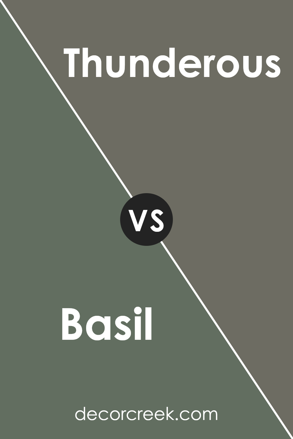
Basil SW 6194 by Sherwin Williams vs Thunderous SW 6201 by Sherwin Williams
Basil SW 6194 and Thunderous SW 6201 are two distinct colors from Sherwin Williams. Basil is a rich, deep green that gives a strong accent to any space. It’s the kind of color that can make a bold statement on a wall or bring a touch of nature indoors when used as an accent.
On the other hand, Thunderous is a dark, stormy gray with blue undertones. This color is versatile and works well in both traditional and modern spaces, providing a muted, yet powerful backdrop.
While Basil suggests lush greenery and can add a lively vibe to a room, Thunderous offers a more subdued, calming presence that pairs nicely with a variety of decor styles. Using Basil might be perfect for spaces where you want to add vibrancy and energy, whereas Thunderous could be better suited for creating a quiet, thoughtful atmosphere. Both colors are quite different in mood and impact, yet each offers unique possibilities for interior decorating.
You can see recommended paint color below:
- SW 6201 Thunderous (CHECK A SAMPLE)
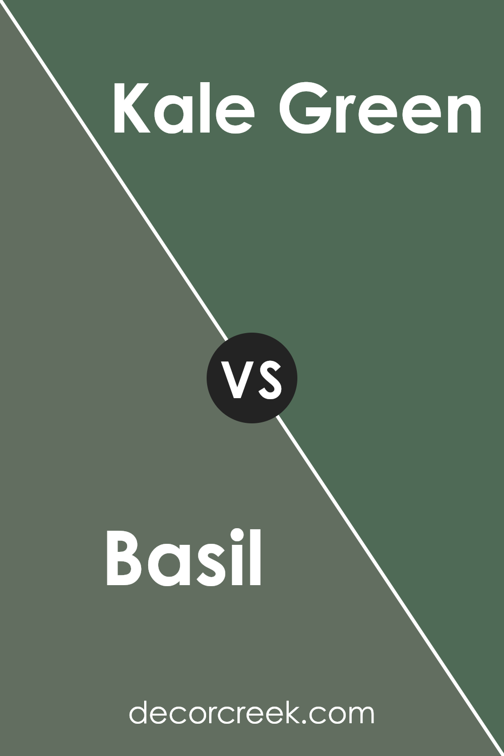
Basil SW 6194 by Sherwin Williams vs Kale Green SW 6460 by Sherwin Williams
Basil SW 6194 and Kale Green SW 6460 by Sherwin Williams are both shades of green, but they have unique tones that set them apart. Basil is a soft, muted green that has a subtle, soothing look. It’s lighter and has hints of gray, making it versatile for spaces where you want a touch of calm without overwhelming brightness.
On the other hand, Kale Green is a deeper, more vibrant shade. It’s a true green that stands out more boldly and can bring a lively and fresh feel to a room. Kale Green might be the better choice if you’re looking to make a statement with your color choice or if you want to add a splash of nature-inspired vibrancy.
Both colors work well in various settings but serve different moods and themes. Basil is more understated and blends easily, while Kale Green demands a bit more attention and pairs nicely with other strong accents.
You can see recommended paint color below:
- SW 6460 Kale Green (CHECK A SAMPLE)
Conclusion
Basil is a unique green that can bring a feeling of nature and calm to any room. It’s not too bright, but it’s also not too dark, making it just right for people who want to add a bit of color to their walls without overwhelming the space.
This shade of green works really well in places like the living room or even a bedroom because it’s peaceful and relaxing. Whether you’re putting it up all around the room or just on one wall as a special accent, Basil could be a great choice. Also, the color pairs well with a lot of other colors, so decorating becomes a lot easier.
So, if someone asked me if I’d recommend painting a room with SW 6194 Basil, I would definitely say yes. It’s a soothing color that brings a little bit of the outdoors inside and has a friendly vibe that makes any room feel more welcoming.
Ever wished paint sampling was as easy as sticking a sticker? Guess what? Now it is! Discover Samplize's unique Peel & Stick samples.
Get paint samples


